
Divi’s Fullwidth Header Module has lots of features that add interesting design elements to any Divi website. One example is the ability to reveal a background image when the user hovers over the module. This adds an extra level of detail that most users would not expect. This is easy to do with Divi.
In this post, we’ll see how to reveal a hover background image in your Divi Fullwidth Header Module. We’ll also create a fullwidth header from scratch based on one of Divi’s free Layout Packs.
Let’s get started.
- 1 Preview
- 2 Build the Hover Background Image Fullwidth Header
- 3 Create the Hover Background Image
-
4
Style the Hover Background Image Fullwidth Header Module
- 4.1 Hover Background Image Content
- 4.2 Hover Background Image Layout
- 4.3 Hover Background Image Scroll Down Icon
- 4.4 Hover Background Image Title Text
- 4.5 Hover Background Image Body Text
- 4.6 Hover Background Image Subtitle Text
- 4.7 Hover Background Image Button One
- 4.8 Hover Background Image Button Two
- 4.9 Hover Background Image Spacing
- 4.10 Hover Background Image Box Shadow
- 5 Results
- 6 Ending Thoughts
Preview
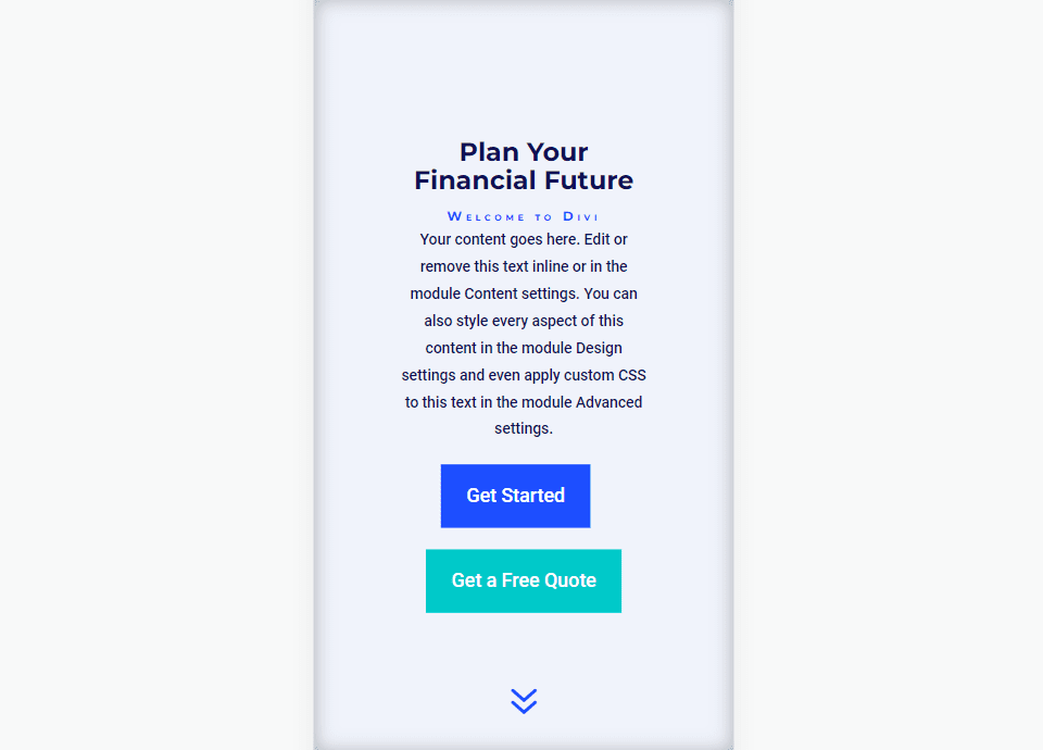
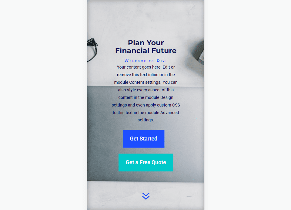
First, let’s see a preview of what we’ll build in this post. Since hovering with a mouse isn’t an option for phones, I’ve included the design for phones when the user touches the background.
Desktop Without Hover

Desktop With Hover

Phone Without Hover
Phone With Screen Tap
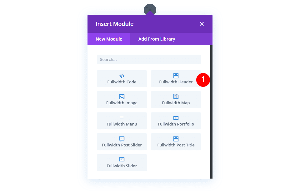
Build the Hover Background Image Fullwidth Header
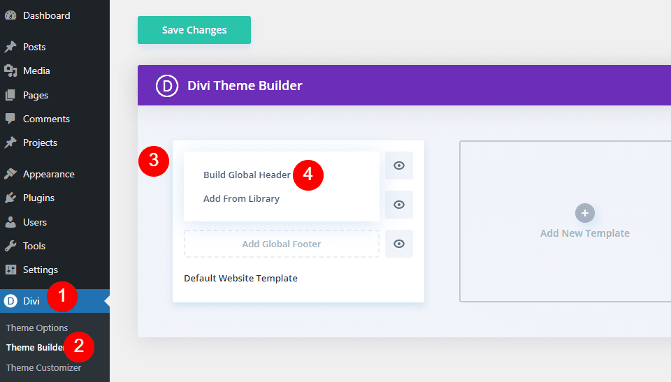
First, let’s build the fullwidth header that we’ll use in the example. Open the Divi Theme Builder and click Add Global Header to build a new template. Choose Build a Global Header to build it from scratch.
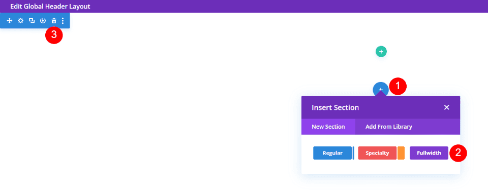
Next, add a Fullwidth Section and delete the Regular Section.
Finally, add a Fullwidth Header Module to your new section.
Now, we can create our hover revealed background and style the module. For this example, I’m using design cues from the hero section from the free Financial Services Landing Page that’s available within Divi.
Create the Hover Background Image
Before we style the module, let’s start with creating the hover reveal feature for the Fullwidth Header Module. Once we see how to create it and how it works, we’ll style the rest of the module to match our preview example.
Hover Reveal Background Image
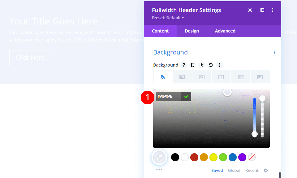
The hover revealed background has two elements. The first is the background color that shows as normal. We could also use a gradient or image if we wanted. The second is the element that shows when the user hovers over the Fullwidth Header Module. In our case, this is an image, but we could just as easily use a background color or gradient.
First, scroll down to Background. On the Background Color tab, change the Color to #f0f3fb.
- Background Color: #f0f3fb
Next, select the Hover State icon. This is a mouse cursor icon. Clicking it opens a set of tabs that allow us to choose between the regular and hover state settings. Select the Hover State tab to change to the hover options. Next, choose the Background Image tab and choose your background image. I’m using the background image from the Financial Services Layout Pack called financial-services-9.
- Hover State Background Image: financial-services-9
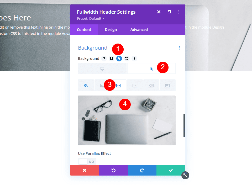
We now have an image that will reveal when the user hovers over the Fullwidth Header Module. All hover state options work in this way.
Style the Hover Background Image Fullwidth Header Module
Now that we have our hover background image in place, let’s style the rest of the module.
Hover Background Image Content
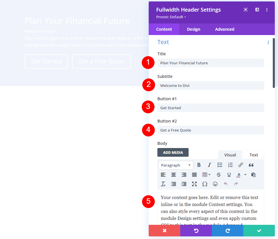
Let’s start with the content for the fields, body, and buttons. Add your Title, Subtitle, Button One, Button Two, and Body content.
- Title: Plan Your Financial Future
- Subtitle: Welcome to Divi
- Button One: Get Started
- Button Two: Get a Free Quote
- Body Content: your content
Hover Background Image Layout
Next, select the Design tab. Change Logo & Text Alignment to Centered.
- Logo & Text Alignment: Centered
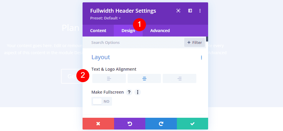
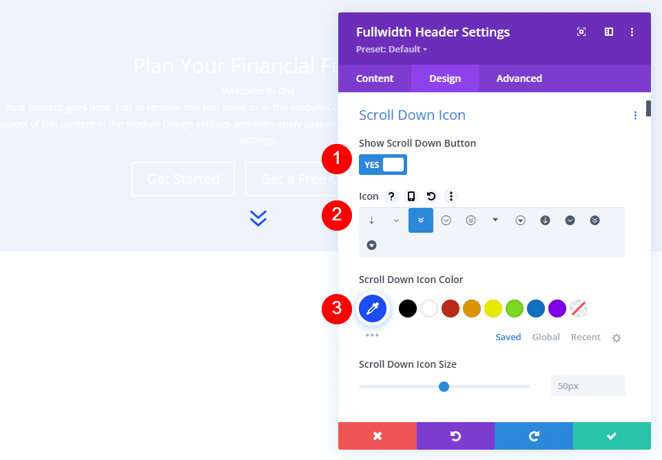
Hover Background Image Scroll Down Icon
Select Show Scroll Down Button. Select the third icon and change the Color to #1d4eff. Leave the Size at its default setting.
- Show Scroll Down Button: Yes
- Icon: 3rd
- Color: #1d4eff
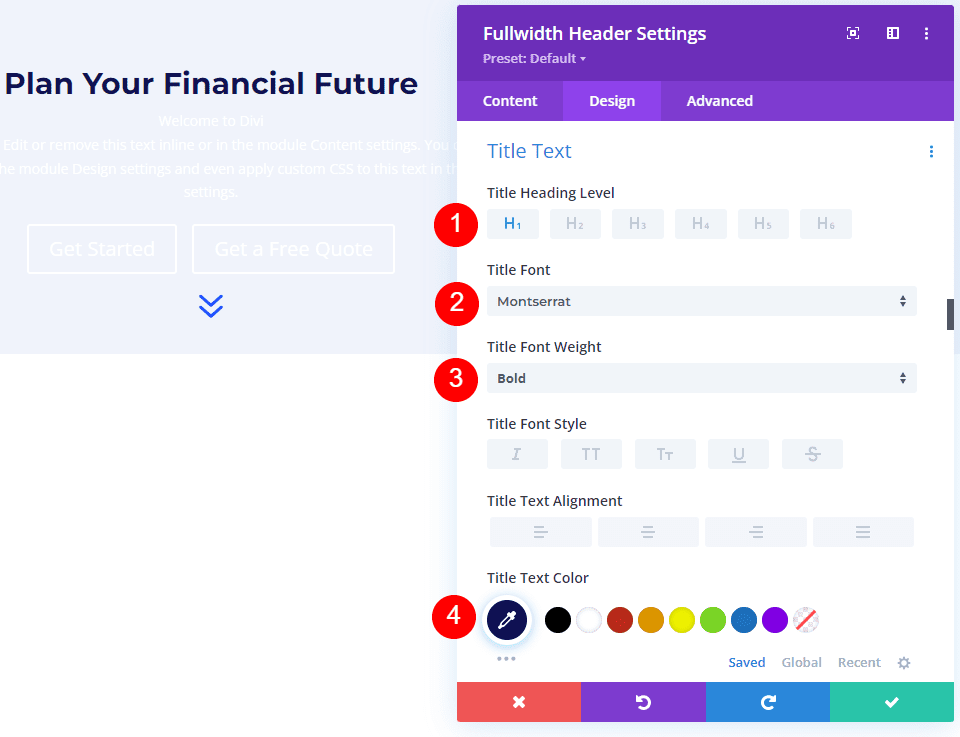
Hover Background Image Title Text
Next, scroll down to Title Text. Select H1 for the Heading Level. Choose Montserrat for the Font, set the Weight to bold, and change the Color to #0f1154.
- Heading Level: H1
- Font: Montserrat
- Weight: Bold
- Color: #0f1154
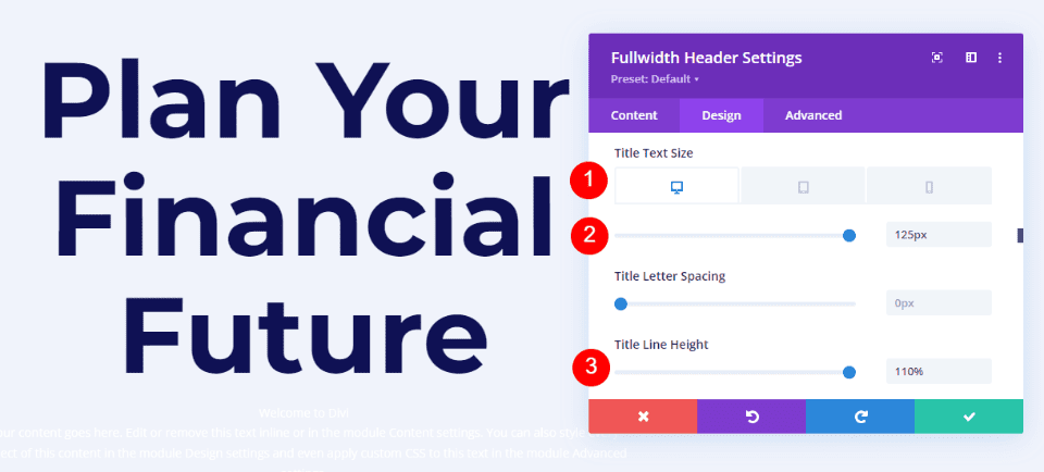
Change the Font Size to 125px for desktops, 40px for tablets, and 24px for phones. Set the Line Height to 110%. This gives us an oversized title that looks great on any screen size.
- Size: 125px desktop, 40px tablet, 24px phone
- Line Height: 110%
Hover Background Image Body Text
Next, scroll to Body Text. Change the Font to Roboto, set the Weight to medium, and change the Color to #0f1154.
- Font: Roboto
- Weight: Medium
- Color: #0f1154
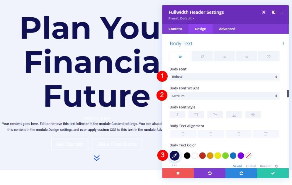
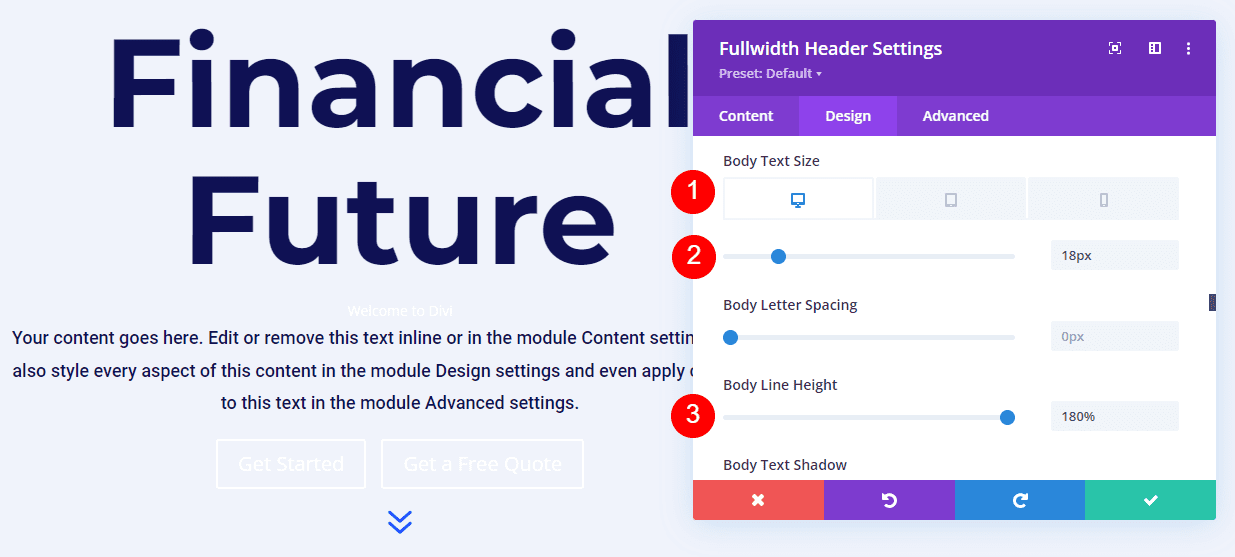
Change the Font Size to 18px for desktops and tablets, and 14px for phones. Set the Line Height to 180%. This gives the body text plenty of breathing room.
- Size: 18px desktop and tablet, 14px phone
- Line Height: 180%
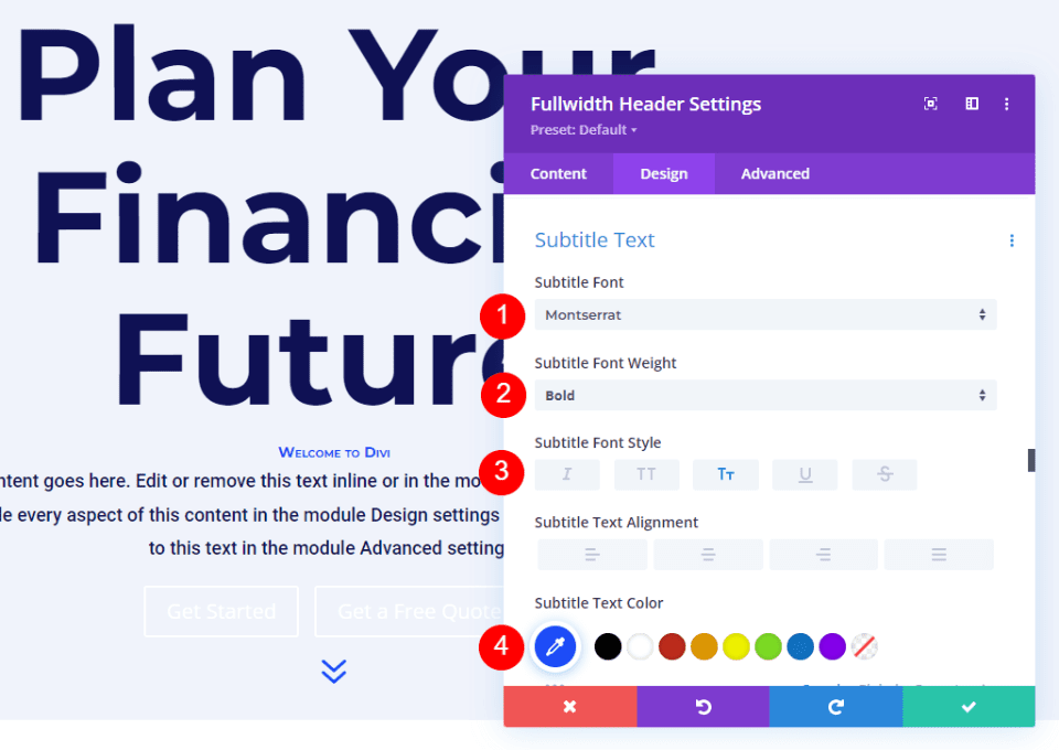
Hover Background Image Subtitle Text
Next, scroll to Subtitle Text. Change the Font to Montserrat. Set the Weight to bold, change the Style to TT, and change the Color to #1d4eff.
- Font: Montserrat
- Weight: Bold
- Style: TT
- Color: #1d4eff
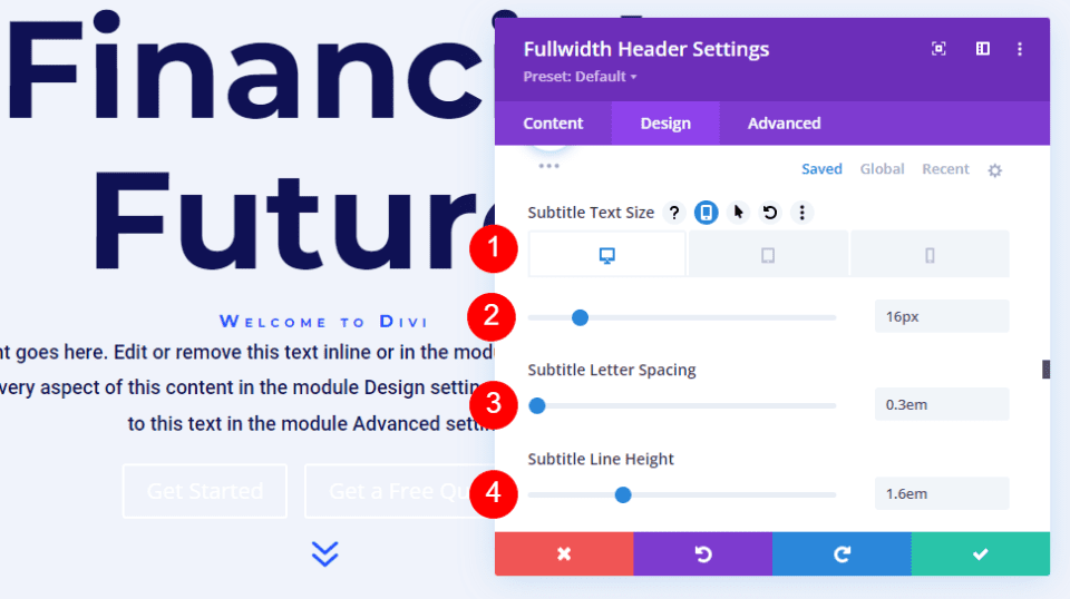
Change the Font Size to 16px for desktops, 14px for tablets, and 12px for phones. Change the Line Spacing to 0.3em and the Line Height to 1.6em. This sets the subtitle apart from both the title and content without taking up much room.
- Size: 16px desktop, 14px tablet, 12px phone
- Letter Spacing: 0.3em
- Line Height: 1.6em
Next, scroll down to Button One and enable Use Custom Styles for Button One. Change the Text Size to 18px. Change the Text Color to white and the Background Color to #1d4eff.
- Use Custom Styles for Button One: Yes
- Text Size: 18px
- Text Color: #ffffff
- Background Color: #1d4eff
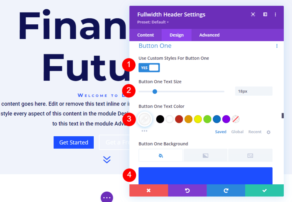
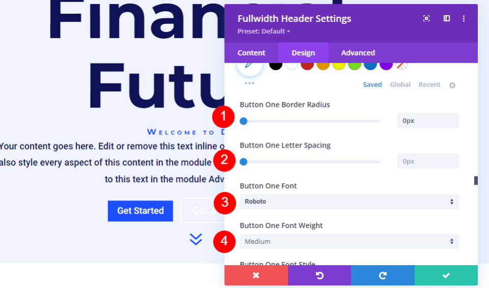
Next, change the Border Width and Radius to 0px. Choose Roboto for the Font and set the Weight to Medium.
- Width: 0px
- Radius: 0px
- Font: Roboto
- Weight: Medium
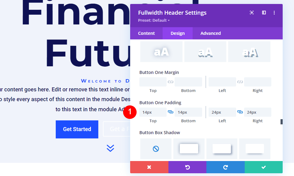
Scroll down to Button One Padding. Add 14px for the Top and Bottom Padding, and 24px for the Right and Left Padding.
- Padding: 14px Top and Bottom, 24px Left and Right
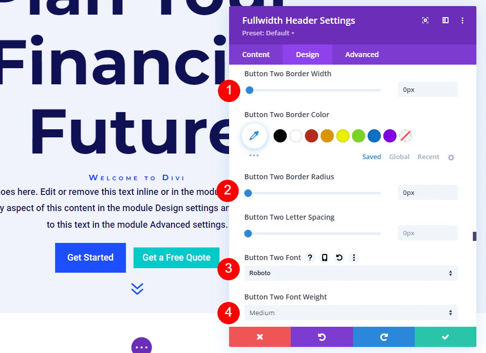
Next, scroll down to Button Two and enable Use Custom Styles for Button Two. Most of these settings are the same as Button One. Change the Text Size to 18px, the Text Color to white, and the Background Color to #00c9c9.
- Use Custom Styles for Button Two: Yes
- Text Size: 18px
- Text Color: #ffffff
- Background Color: #00c9c9
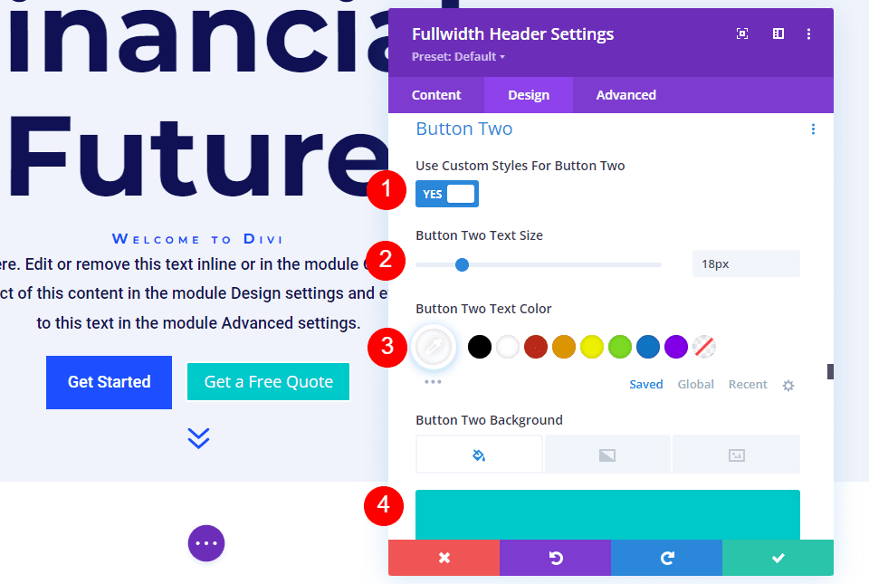
Next, change the Border Width and Radius to 0px. Choose Roboto for the Font and set the Weight to Medium.
- Width: 0px
- Radius: 0px
- Font: Roboto
- Weight: Medium
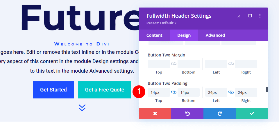
Scroll down to Button Two Padding. Add 14px for the Top and Bottom Padding, and 24px for the Right and Left Padding.
- Padding: 14px Top and Bottom, 24px Left and Right
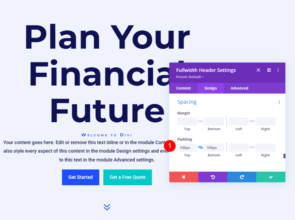
Hover Background Image Spacing
Next, scroll down to Spacing and add 100px Padding to the Top and Bottom. This increases the size of the fullwidth header without using the Fullscreen option in the Layout settings. In my examples, the fullwidth header leaves a little bit of space at the bottom of the screen where the next section shows. Of course, you could use the full-screen setting in place of the padding if you wanted.
- Padding: 100px Top and Bottom
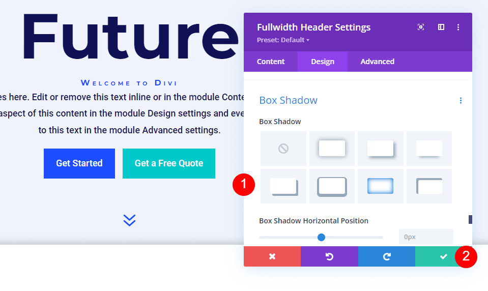
Hover Background Image Box Shadow
Lastly, scroll down to Box Shadow and choose the 6th Box Shadow option. This gives the header a more unique look. Close the Fullwidth Header Module and save your settings.
- Box Shadow: 6th
Results
Desktop Without Hover
Desktop With Hover
Phone Without Hover
Phone With Screen Tap
Ending Thoughts
That’s our look at how to reveal a hover background image in your Divi Fullwidth Header Module. The hover state for background images is a simple setting, but it can have a huge impact on the site’s design. It’s a great way to get attention. You can take the design even further if you wanted to add Gradient Stops, overlays, change images, and more. I recommend playing around with the Divi Fullwidth Header Module’s hover background settings to see what you can create.
We want to hear from you. Do you use a hover background image in your Divi Fullwidth Header Module? Let us know about it in the comments.


Great guide! 😀
What steps and design considerations are necessary to reveal a hover background image in a Divi Fullwidth Header Module, and how can this feature be effectively utilized in a website built using Divi? Additionally, what is the process for creating and customizing a fullwidth header from scratch in Divi Theme Builder, and how does the hover reveal feature for the Fullwidth Header Module work in terms of the technical and aesthetic elements involved?
this is excellent thank you