
Looking for a way to add interaction to client logos and matching testimonials? With Divi and its responsive content feature, it’s now easier than ever to show different content in a module’s default state and on hover. In today’s Divi tutorial, we’ll demonstrate that by showing you how to replace client logos with testimonials on hover (desktop) and click (tablet and phone). We’ll use the Blurb Module to help us get there! You’ll be able to download the layout’s JSON file for free as well!
Let’s get to it.
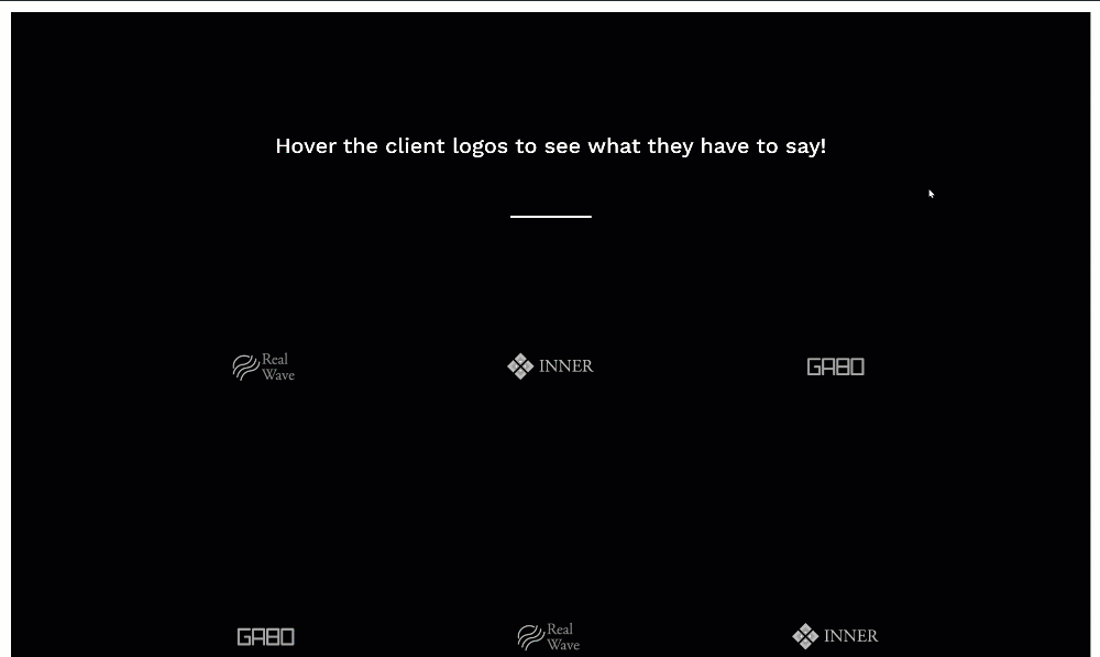
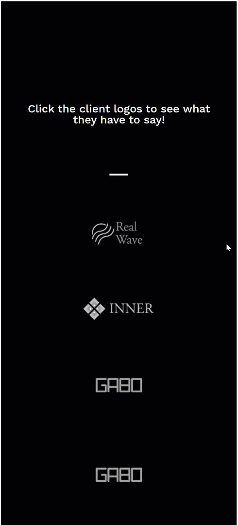
Preview
Before we dive into the tutorial, let’s take a quick look at the outcome across different screen sizes.
Desktop
Mobile
Download The Client Logos Layout for FREE
To lay your hands on the free client logos layout, you will first need to download it using the button below. To gain access to the download you will need to subscribe to our newsletter by using the form below. As a new subscriber, you will receive even more Divi goodness and a free Divi Layout pack every Monday! If you’re already on the list, simply enter your email address below and click download. You will not be “resubscribed” or receive extra emails.

Let’s Start Recreating!
Add New Section
Background Color
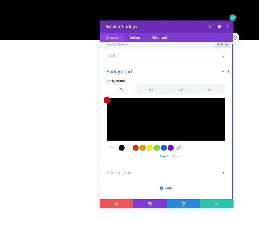
Start by adding a new section to a new or existing page. Open the section settings and change the background color.
- Background Color: #000000
Spacing
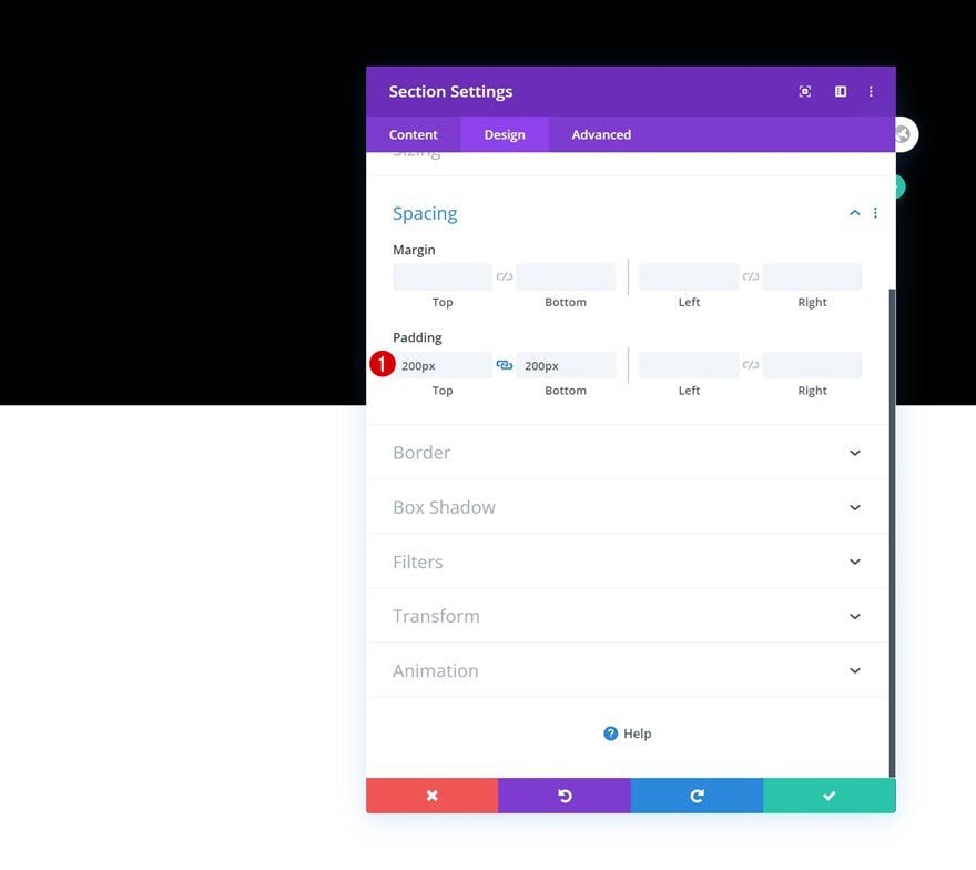
Add some custom top and bottom padding as well.
- Top Padding: 200px
- Bottom Padding: 200px
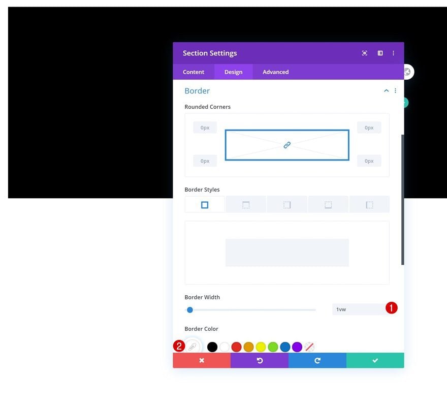
Border
Complete the section settings by adding a white border.
- Border Width: 1vw
- Border Color: #ffffff
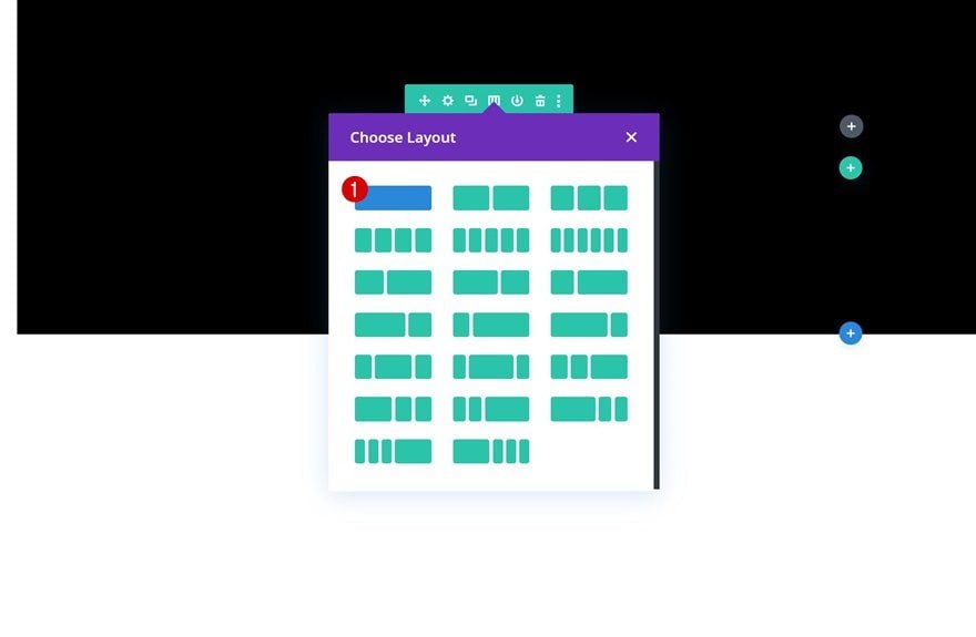
Add Row #1
Column Structure
Continue by adding a new row to the section using the following column structure:
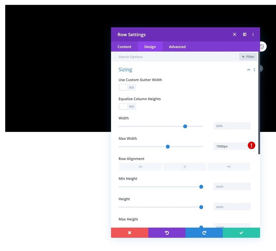
Sizing
Without adding any modules yet, open the row settings and increase the row’s max width.
- Max Width: 1500px
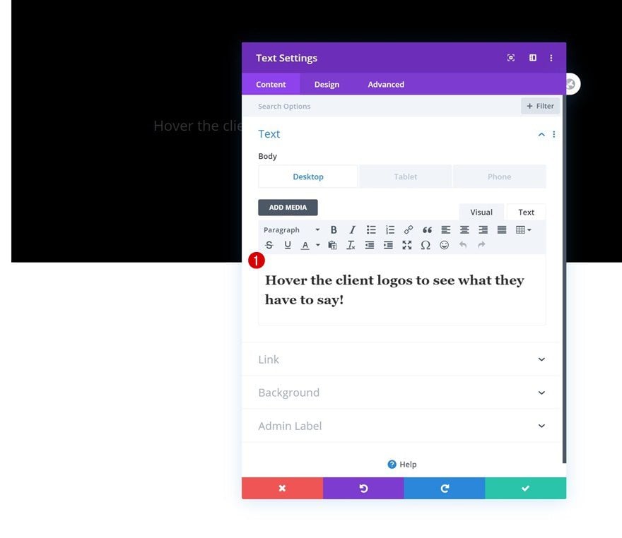
Add Text Module to Column
Add Responsive H2 Content
The first module we need in this row is a Text Module with some responsive H2 content.
- Desktop: Hover the client logos to see what they have to say!
- Tablet & Phone: Click the client logos to see what they have to say!
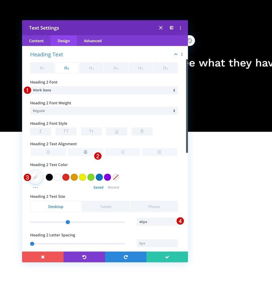
H2 Text Settings
Move on to the module’s design tab and change the H2 text settings as follows:
- Heading 2 Font: Work Sans
- Heading 2 Text Alignment: Center
- Heading 2 Text Color: #ffffff
- Heading 2 Text Size: 40px (Desktop), 30px (Tablet), 25px (Phone)
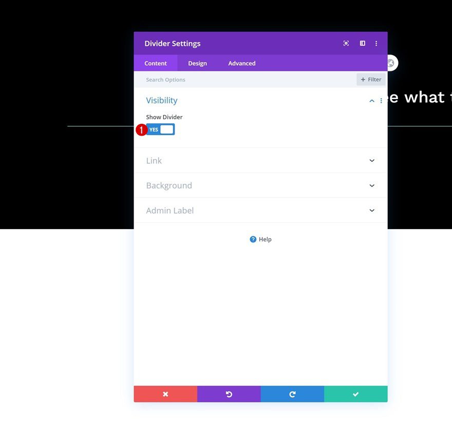
Add Divider Module to Column
Visibility
The next and last module we need in this row is a Divider Module. Make sure the ‘Show Divider’ option is enabled.
- Show Divider: Yes
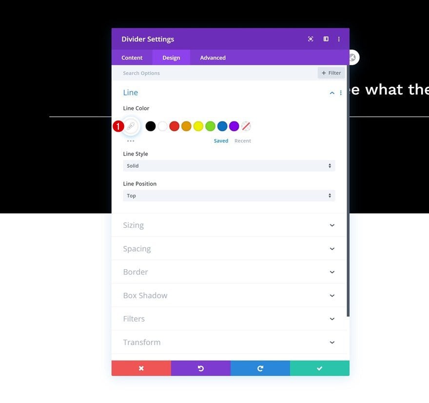
Line
Then, change the module’s line color.
- Line Color: #ffffff
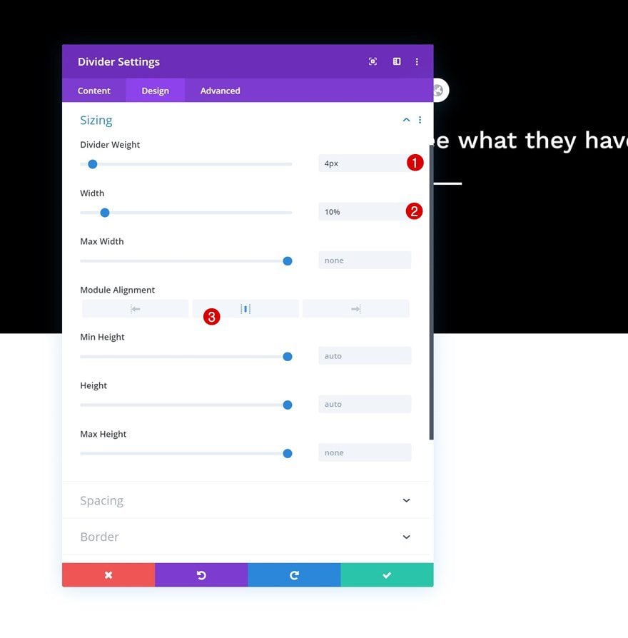
Sizing
Modify the module’s sizing settings as well.
- Divider Weight: 4px
- Width: 10%
- Module Alignment: Center
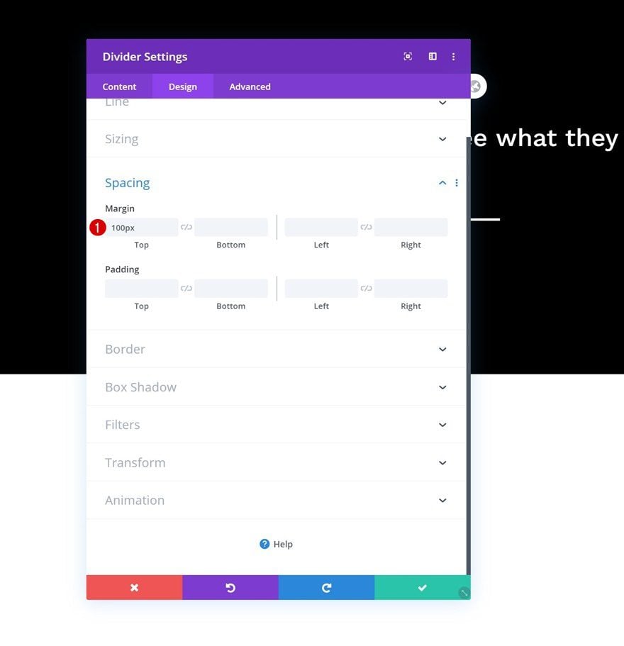
Spacing
Complete the module’s settings by adding some top margin.
- Top Margin: 100px
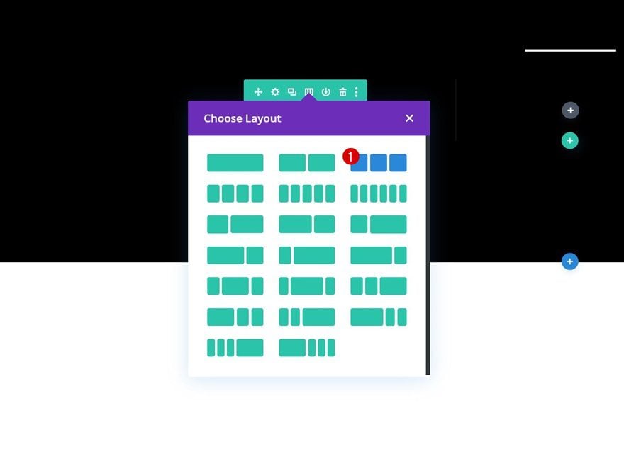
Add Row #2
Column Structure
Add another row right below the previous one and use the following column structure for it:
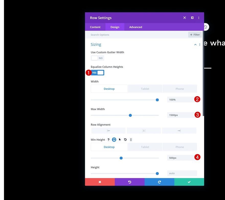
Sizing
Open the row settings and change the sizing settings across different screen sizes. Make sure you equalize the column heights as well, this will help with the next step; centering the column content.
- Equalize Column Heights: Yes
- Width: 100% (Desktop), 80% (Tablet & Phone)
- Max Width: 1500px
- Min Height: 500px (Desktop), auto (Tablet & Phone)
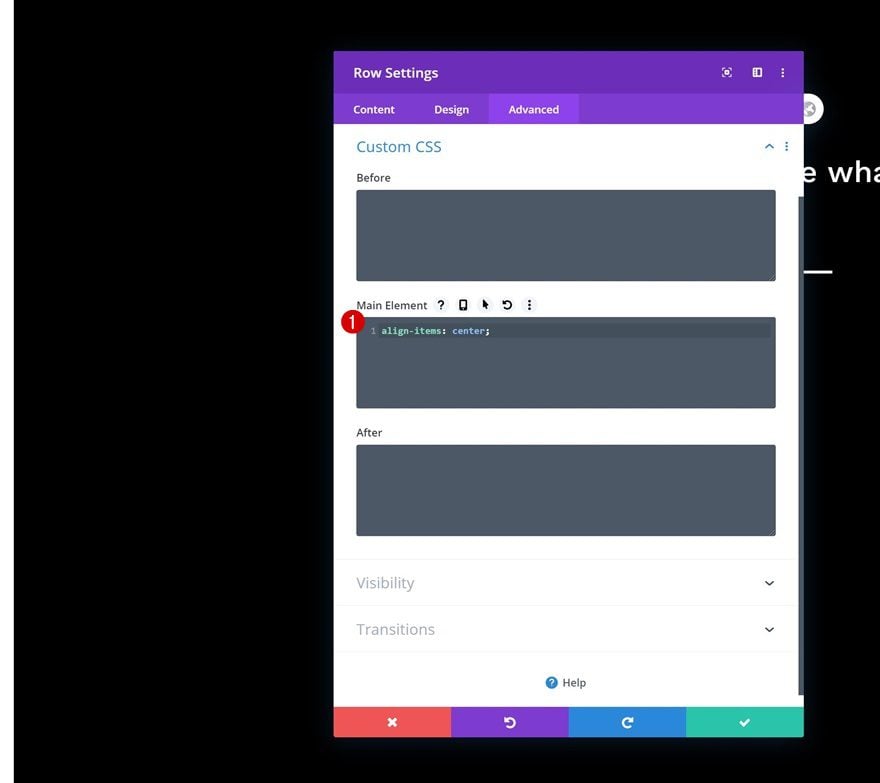
Main Element
To center the column content of your row, you will 1) need to enable the ‘Equalize Column Heights’ option (previous step) and 2) add the following line of CSS code to your row’s main element:
align-items: center;
Add Blurb Module to Column
Leave Default Content Empty
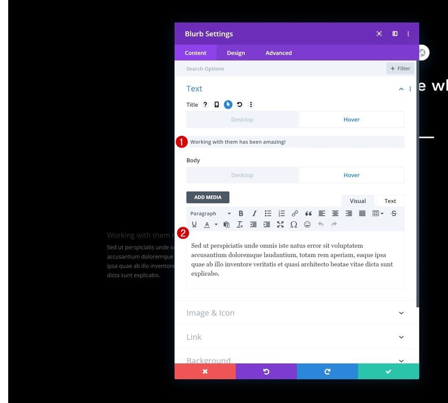
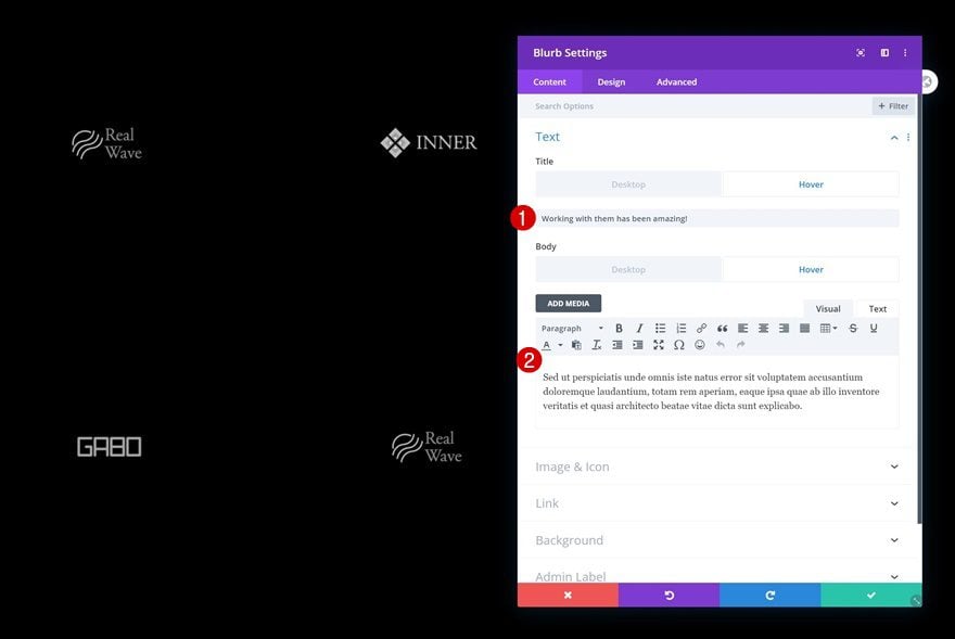
Now, to replace client logos on hover, we’ll use Blurb Modules. Start with the first one in column 1. Make sure you leave the default title and body content empty but continue to enable the hover option on both of them.
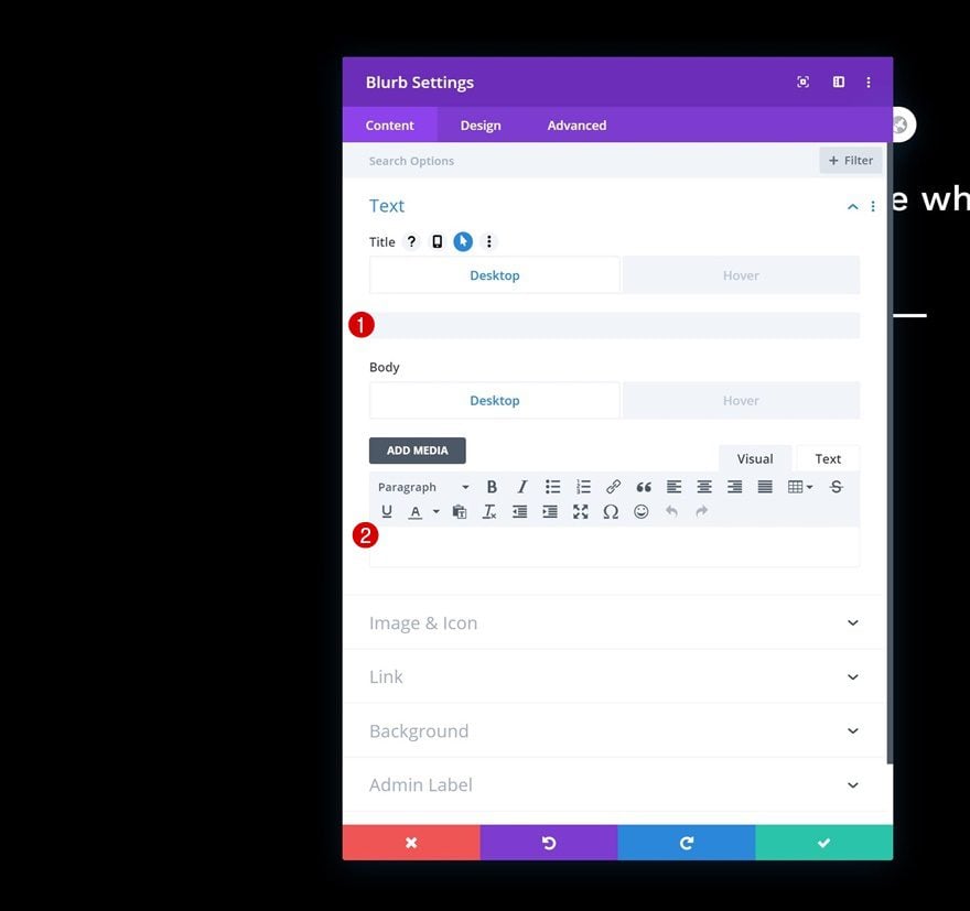
Add Content on Hover
Insert some written content of your choice in both hover fields.
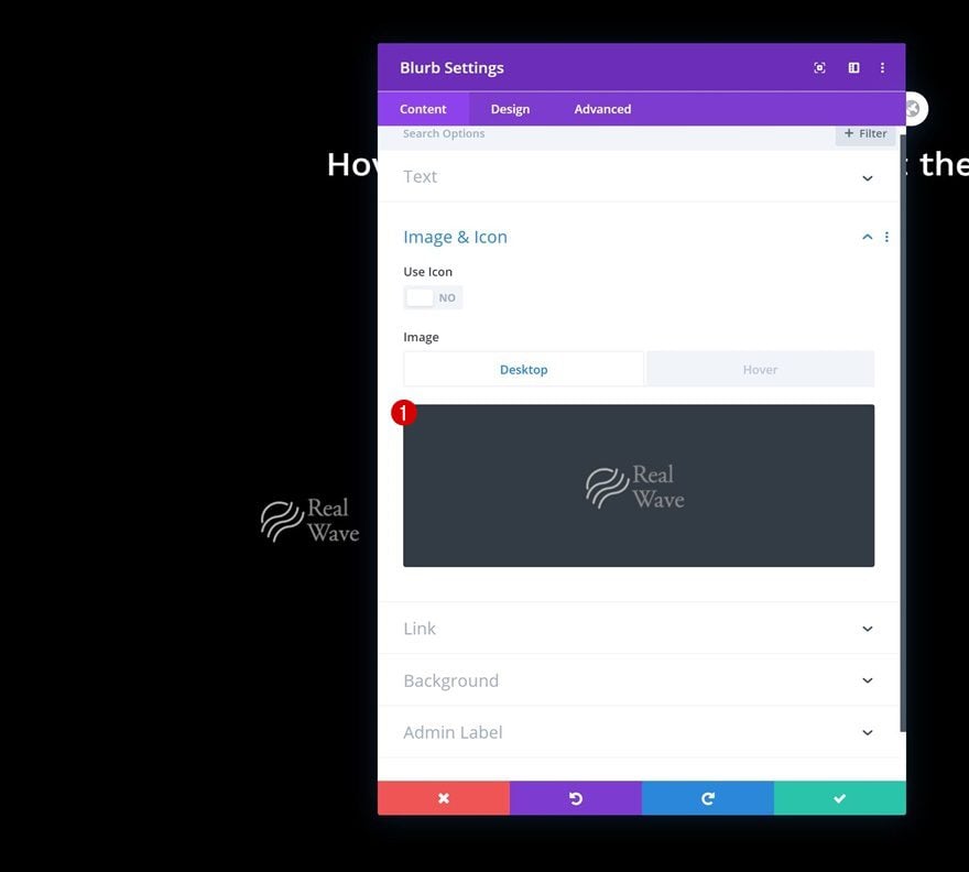
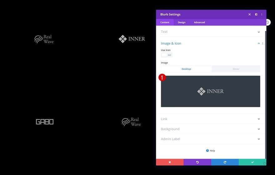
Default Image
Continue by uploading a company logo of your choice in the image & icon settings.
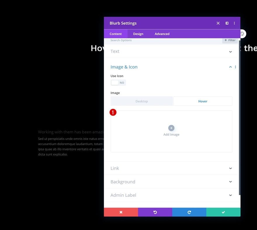
Remove Image on Hover
We’ll replace client logos on hover by removing them entirely in their hover state.
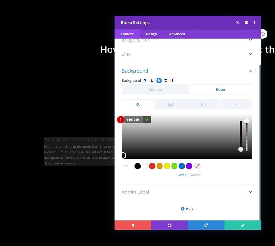
Hover Background Color
As you can notice in the preview of this post, we’re also changing the module’s background color on hover. Don’t use a default background color and add the following color code on hover:
- Background Color: #191919
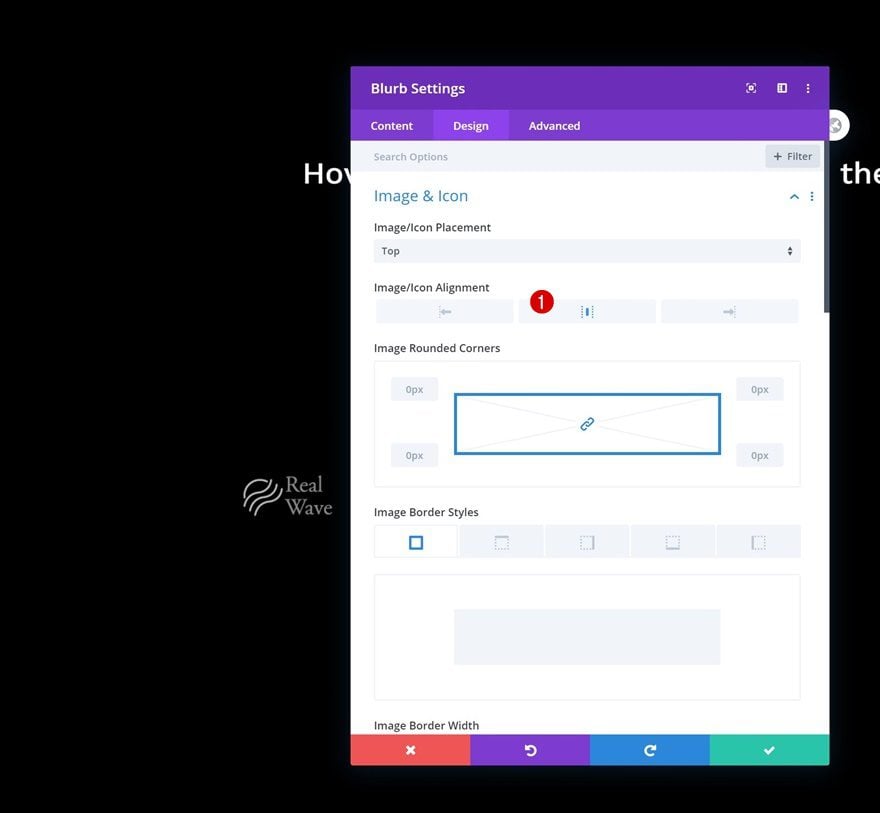
Image/Icon Settings
Move on to the module’s design tab and make sure the following image/icon alignment applies:
- Image/Icon Alignment: Center
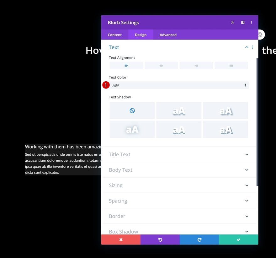
Text Settings
Since we’re using a black section background color, we’ll change the module’s text color in the general text settings.
- Text Color: Light
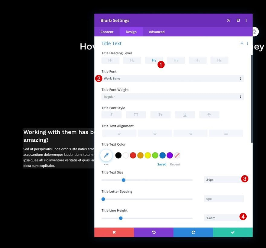
Title Text Settings
Next, modify the title text settings accordingly:
- Title Heading Level: H3
- Title Font: Work Sans
- Title Text Size: 24px
- Title Line Height: 1.4em
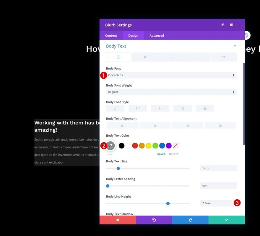
Body Text Settings
Make some changes to the body text settings as well.
- Body Font: Open Sans
- Body Text Color: #8c8c8c
- Body Line Height: 2.5em
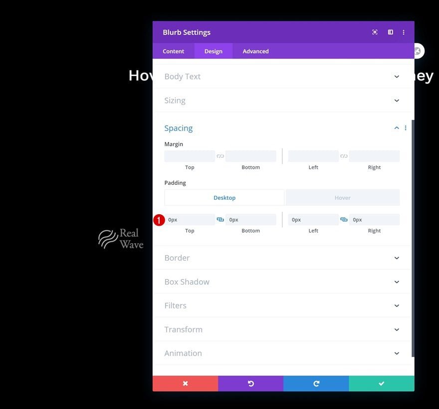
Default Spacing
Then, go to the spacing settings and make sure there’s no custom padding in the module’s default state.
- Top Padding: 0px
- Bottom Padding: 0px
- Left Padding: 0px
- Right Padding: 0px
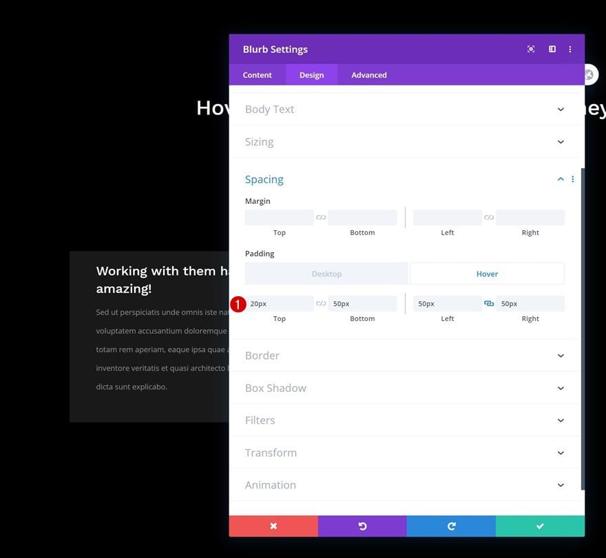
Hover Spacing
On hover, however, we’re creating some white space for our testimonial using the following values:
- Top Padding: 20px
- Bottom Padding: 50px
- Left Padding: 50px
- Right Padding: 50px
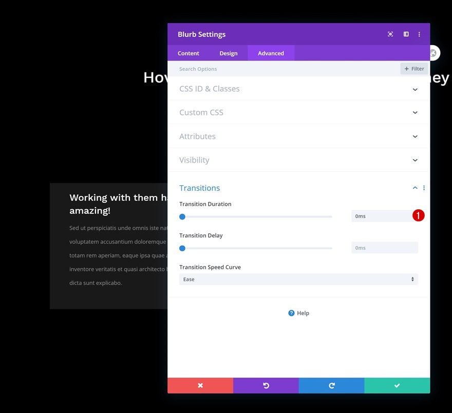
Transition
Complete the module’s settings by removing the default transition duration. This will allow the testimonial to appear right away when hovering/clicking the logo.
- Transition Duration: 0ms
Clone Blurb Module Twice & Place Duplicates in Remaining Columns
Once you’ve completed the first Blurb Module in column 1, you can clone the module twice and place the duplicates in the row’s remaining columns.

Clone Entire Row
You can now clone this row up to as many times as you want, depending on how many client logos you want to display.

Change Hover Content of Each Blurb Module Duplicate
Make sure you change the client logo in each duplicate Blurb Module.
Change Logo of Each Blurb Module Duplicate
Change each duplicate module’s hover content as well and you’re done!
Preview
Now that we’ve gone through all the steps, let’s take a final look at the outcome across different screen sizes.
Desktop
Mobile
Final Thoughts
In this post, we’ve shown you how to use Divi’s responsive options feature to replace client logos with testimonials on hover/click. This is an excellent way to save space on your pages and create interactive design across different screen sizes. Besides showing the tutorial, we’ve also shared the JSON file for free at the beginning of this post! If you have any questions, feel free to leave a comment in the comment section below.
If you’re eager to learn more about Divi and get more Divi freebies, make sure you subscribe to our email newsletter and YouTube channel so you’ll always be one of the first people to know and get benefits from this free content.


How were the logos saved to look like this?
I put this code in my css, and work for me:
.et_pb_blurb:hover .et_pb_main_blurb_image {
display:none;
}
Doesnt work as in the preview above when I add the json-file. The logo stays on to, above the text.
Wow. Thanks for putting it up for free. We definitely need to test the effect of testimonials on our website.
I am wondering how to import the downloaded files. Thanks
Also wondering the same, I clicked the Portability icon on the bottom toolbar within Divi Builder and the import screen gives me an error saying I can’t upload this JSON file. I’m using the latest version of Divi too, but not sure where else I’d be uploading this template.
I found where to import, I’ve never done this so took some browsing, Within WP Admin, go down to Divi in your admin sidebar, then under Divi, go to Divi Library, then click the “Import & Export” button at the top of the page, then choose the JSON file from this template download and it will be added to your library.
Then while editing the page with Divi Builder, click the Purple (+) button in the bottom Divi Tool bar. Choose to load from library and you should find the uploaded template available for use on your page.
Thanks Bill!