")
Menus are a vital part of any site so it makes sense to spend a little extra time and effort to make sure they display properly. In Divi, we can build custom menus quickly using Divi’s Menu module, which provides many of the style options we need. But it always helps to streamline the process of designing your website header by preparing some menu global presets beforehand. This will allow you to deploy a custom menu style framework with a click of a button so that you can spend more time tweaking the design to match the branding of your website. For example, if you want a centered menu with a logo and links that look like buttons, you can use a global preset to deploy that framework in a single click. This saves you valuable time and energy.
In this tutorial, we are going to share 5 menu module global presets you can use when building your custom Divi headers. Aside from the free download that includes all 5 presets, we are going to walk you through the process of creating those presets from scratch.
Let’s get started!
Sneak Peek
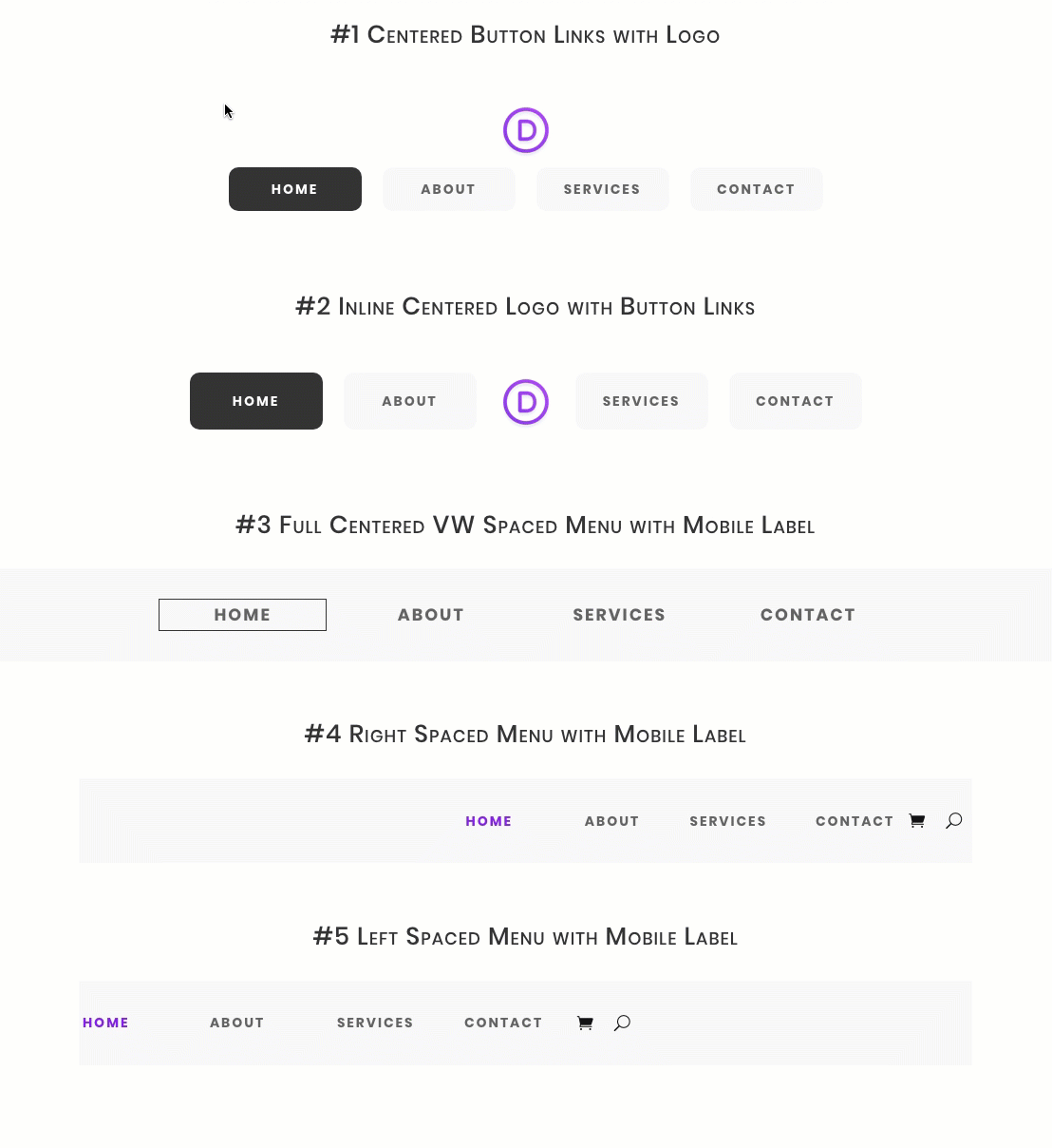
Here is a quick look at the design we’ll build in this tutorial.
Download the Layout for FREE
To lay your hands on the designs from this tutorial, you will first need to download it using the button below. To gain access to the download you will need to subscribe to our newsletter by using the form below. As a new subscriber, you will receive even more Divi goodness and a free Divi Layout pack every Monday! If you’re already on the list, simply enter your email address below and click download. You will not be “resubscribed” or receive extra emails.

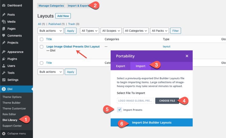
To use these menu global presets on your global header, you must first import the layout (with it’s presets) to the Divi Library as follows:
- Go to Divi > Divi Library.
- Click the import/export button at the top of the page.
- Select the Import tab in the portability popup
- Choose the layout JSON file to be imported
- Select Import Presets
- Click Import Button
Then go to the theme builder and edit the global header. Add a menu module where you want the logo to be and use the presets to style and place the menu accordingly.
Let’s get to the tutorial, shall we?
What You Need to Get Started

To get started, you will need to do the following:
- If you haven’t yet, install and activate the Divi Theme.
- Create a new page in WordPress and use the Divi Builder to edit the page on the front end (visual builder).
- Choose the option “Build From Scratch”.
After that, you will have a blank canvas to start designing in Divi.
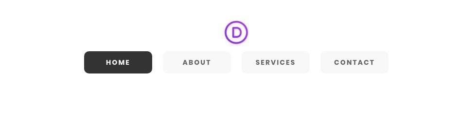
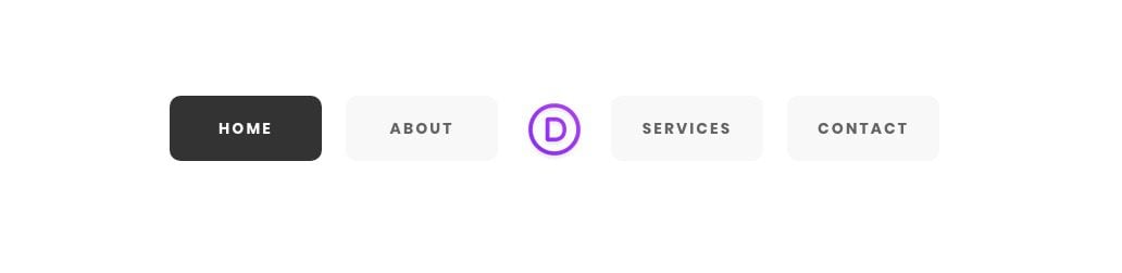
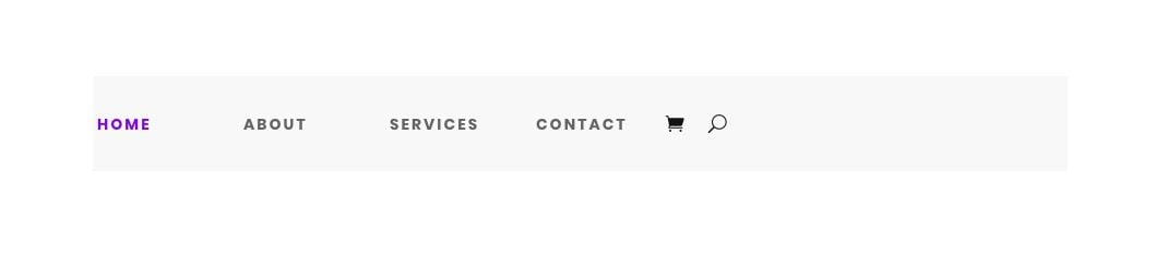
For our first menu style global preset, we are going to design a menu that has button links of equal width so that the menu looks symmetrical. We’ll even include hover states that match the active state of the menu button links.
To create this first menu global preset, add a one-column row to the regular section.
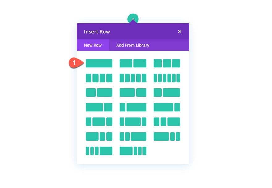
Then add a menu module to the row.
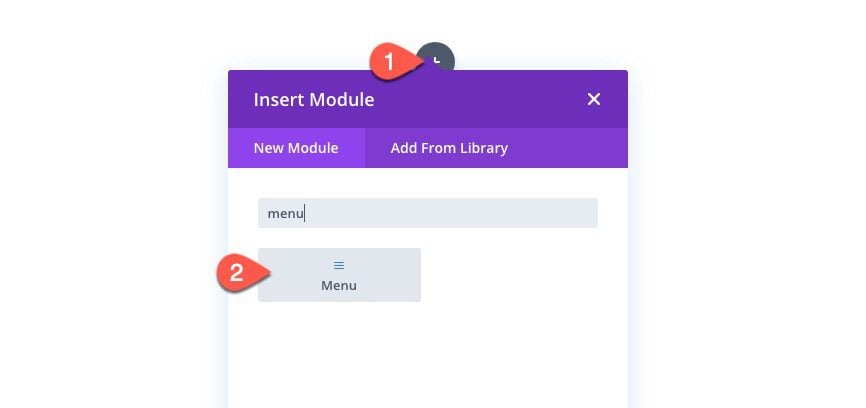
Open the menu settings and add a menu to the module.
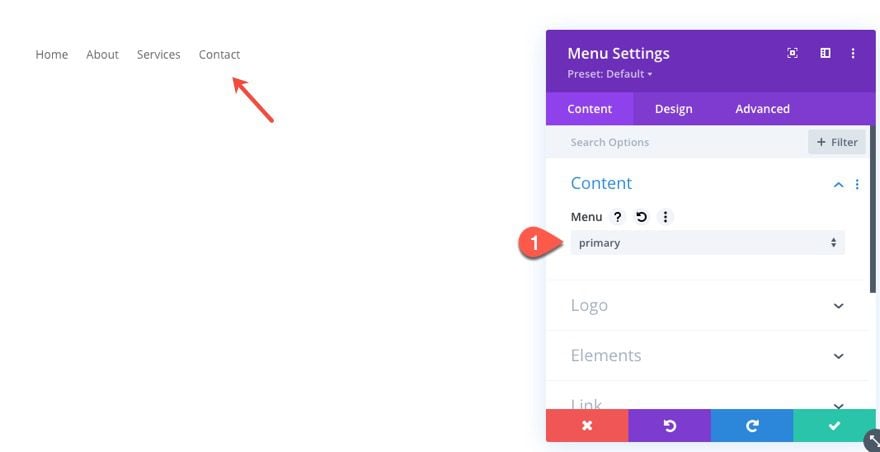
Then add the site logo as dynamic content to the module as well.
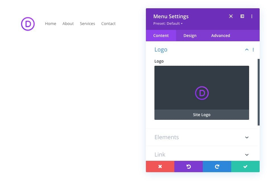
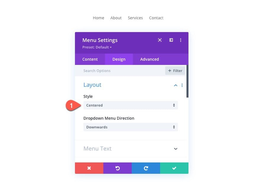
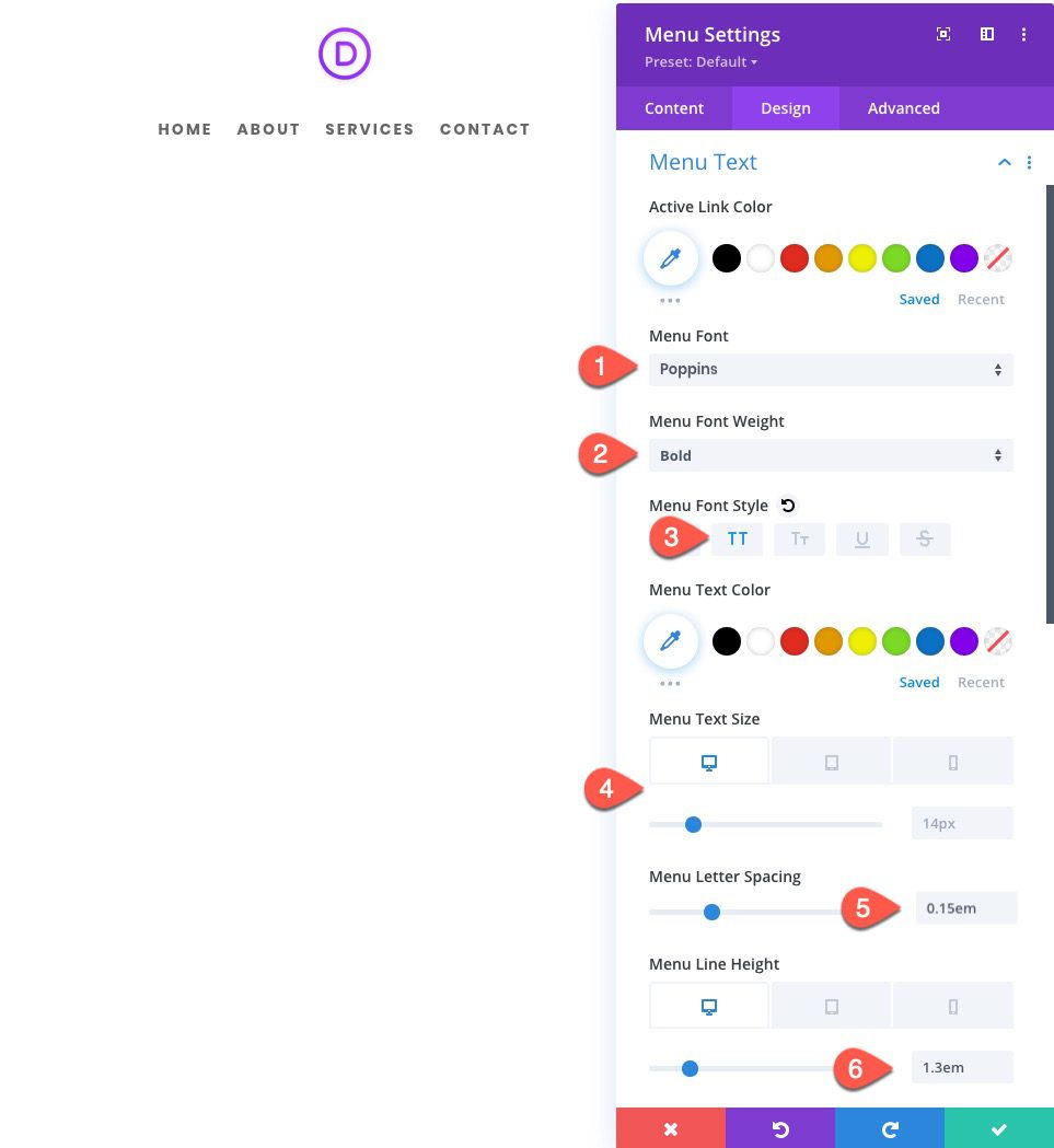
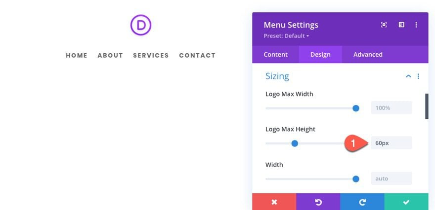
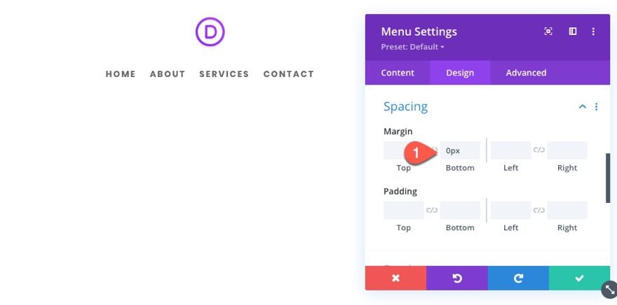
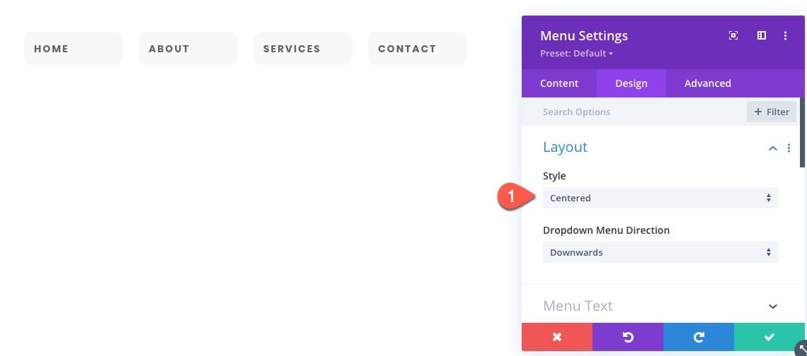
Under the design tab, update the following:
- Style: Centered
- Menu font: Poppins
- Menu Font Weight: Bold
- Menu Font Style: TT
- Menu Text Size: 14px (desktop), 24px (tablet and phone)
- Menu Letter Spacing: 0.15em
- Menu Line Height: 1.3em (desktop), 1.8em (tablet and phone)
- Logo Max Height: 60px
- Margin: 0px bottom
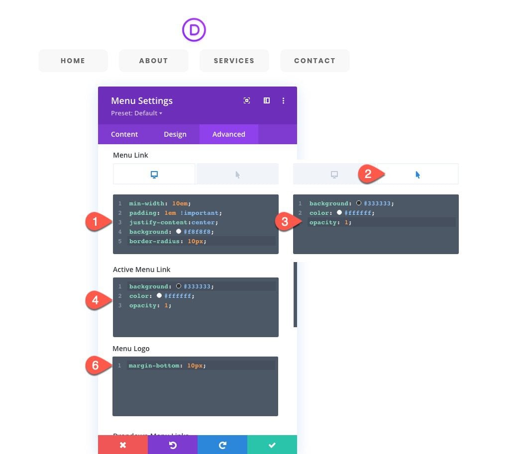
Under the Advanced tab, we are going to add some custom menu link styles so that they appear as buttons.
Menu Link CSS
Add the following Custom CSS to the Menu Link:
On Desktop…
min-width: 10em;
padding: 1em !important;
justify-content:center;
background: #f8f8f8;
border-radius: 10px;
On Hover…
background: #333333;
color: #ffffff;
opacity: 1;
Active Menu Link CSS
background: #333333;
color: #ffffff;
opacity: 1;
Menu Logo CSS
margin-bottom: 10px;
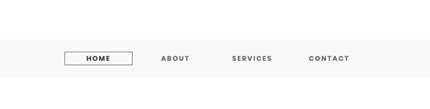
Style 1 Result
Here is the final result…
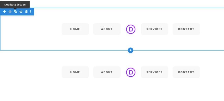
Adding Menu Style 1 as a Global Preset
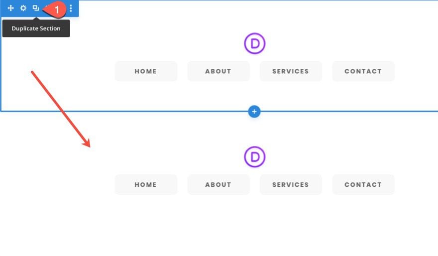
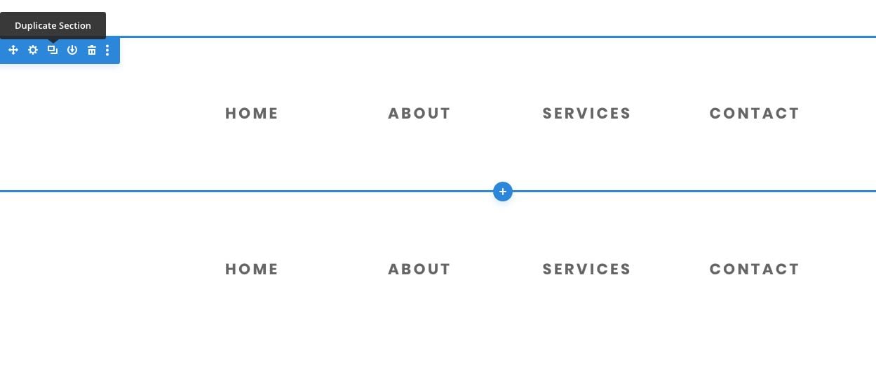
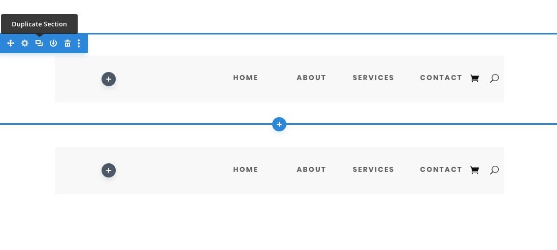
Duplicate Section
Before we add the menu style as a global preset, duplicate the entire section containing the menu module so that we can use the styles of the menu to jumpstart the next design.
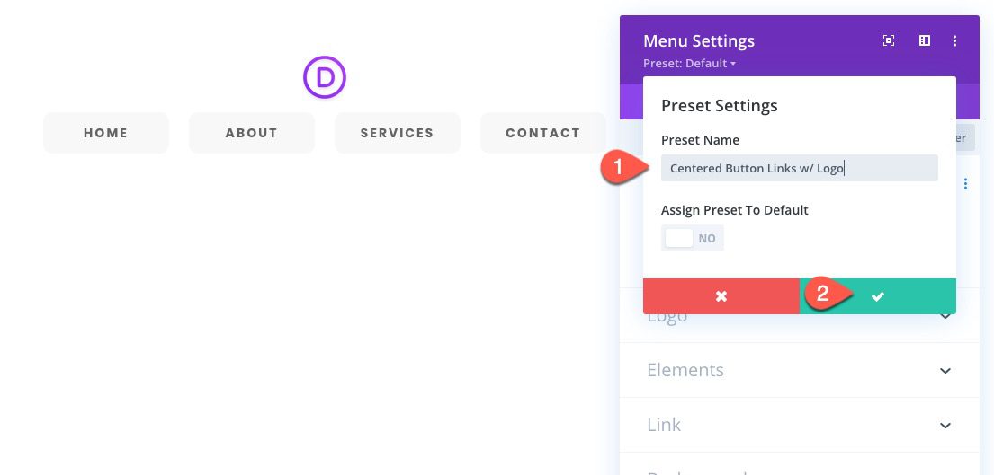
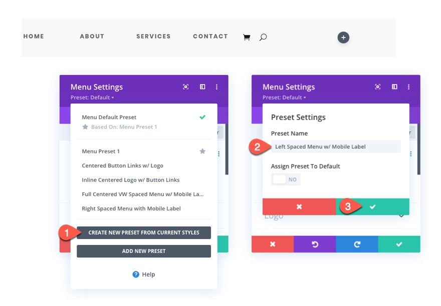
Create New Preset From Current Styles
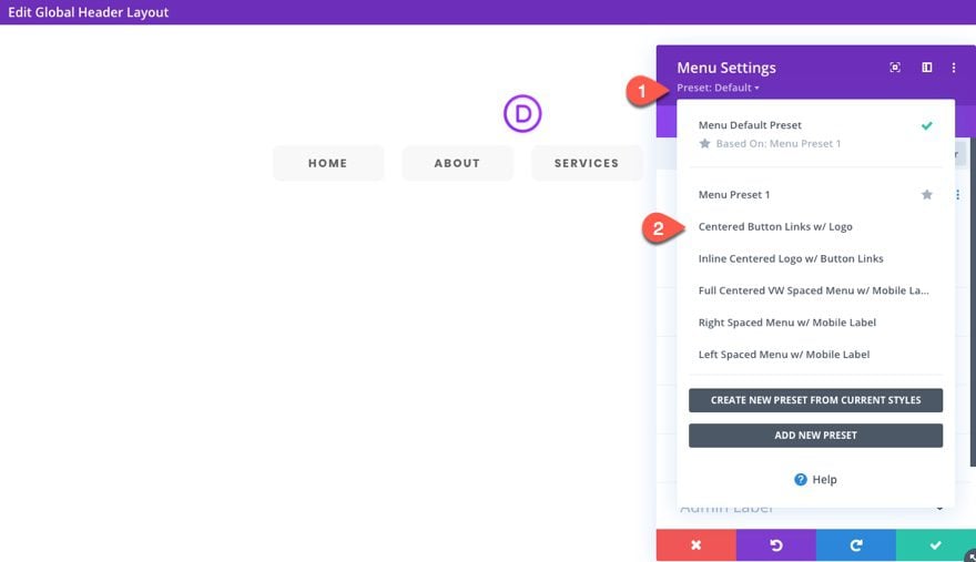
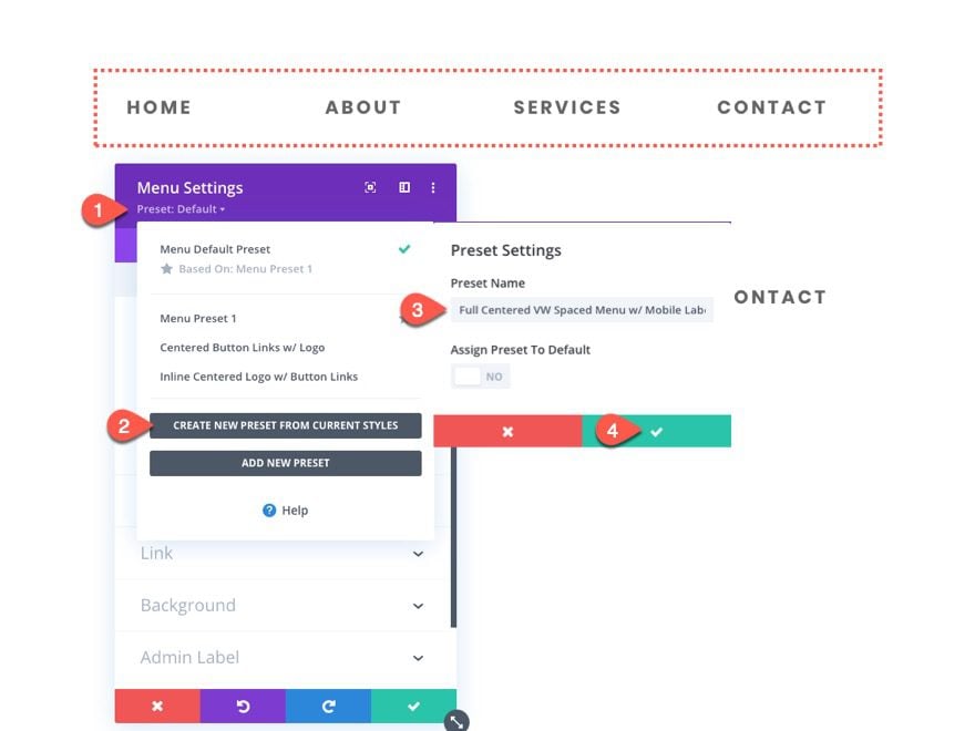
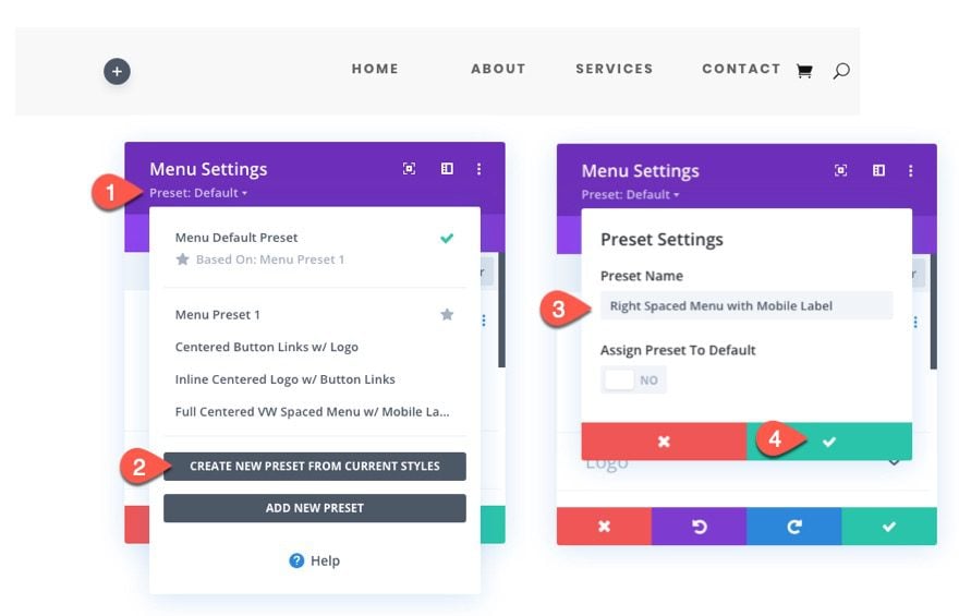
To add the global preset, open the settings of the original menu module we created and click the Preset dropdown link.
Select Create New Preset From Current Styles.
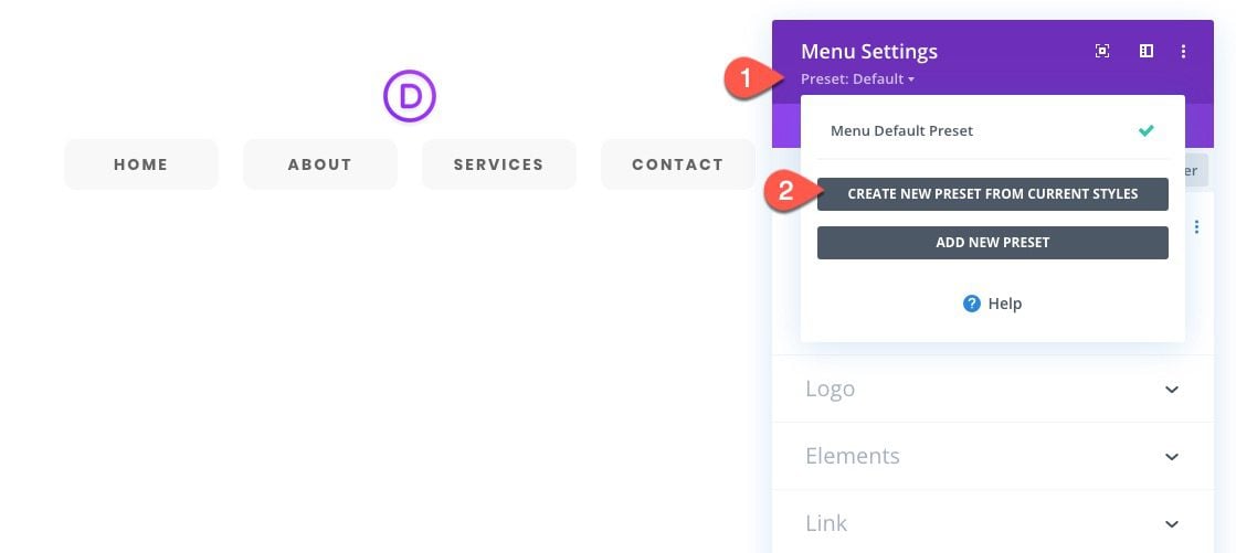
Give the new preset a name (“Centered Button Links w/ Logo”), then save the preset.
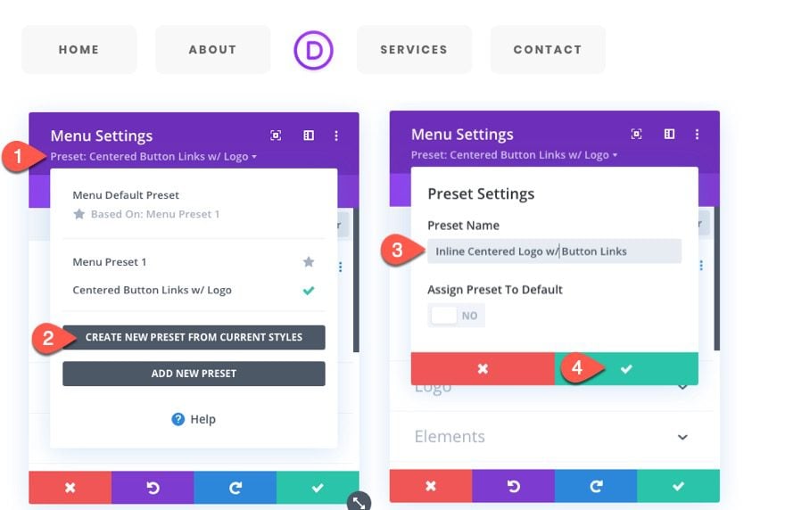
To create the second menu global preset, open the settings of the duplicate menu module from the previous design.
Under the design tab, update the style:
- Style: Inline Centered Logo
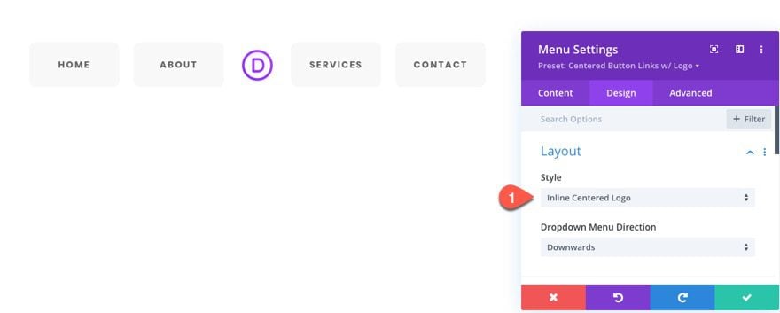
Because of the Custom CSS inherited from the previous module style, the menu links keep the button design while the logo rests perfectly in the center. The custom button link styling allows the menu links to keep a nice symmetrical design.
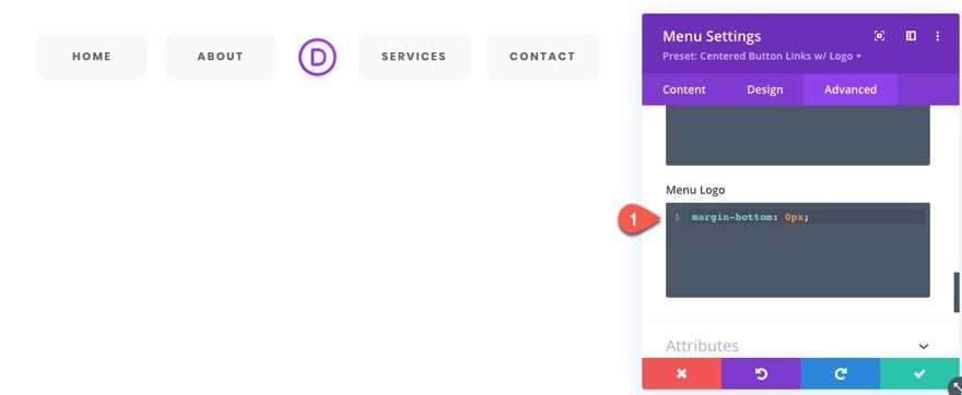
Under the Advanced tab, update the Menu Logo CSS as follows:
margin-bottom: 0px;
Style 2 Result
Here is the final result.
Adding Menu Style 2 as a Global Preset
Duplicate Section
Before we add the menu style as a global preset, duplicate the entire section containing the menu module (style 2) so that we can use the styles of the menu to jumpstart the next design.
Create New Preset From Current Styles
To add the global preset, open the settings of the original menu module for style 2 we created and click the Preset dropdown link.
Select Create New Preset From Current Styles.
Give the preset a name (“Inline Centered Logo w/ Button Links”) and save the preset.
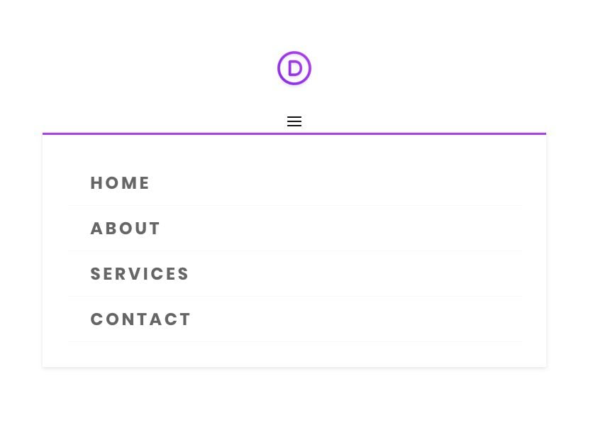
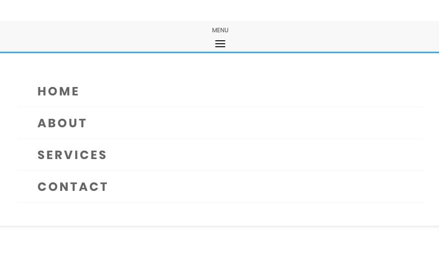
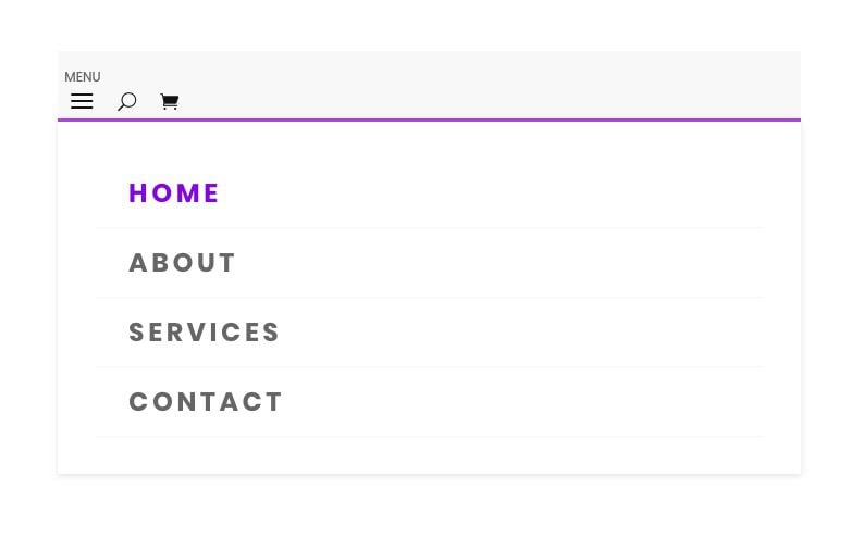
For this next menu style, we are going to design a fullwidth centered menu without a logo that has menu text that is sized and spaced with a vw length unit so that is scales with the browser width. It will also have a “menu” label above the hamburger icon on mobile.
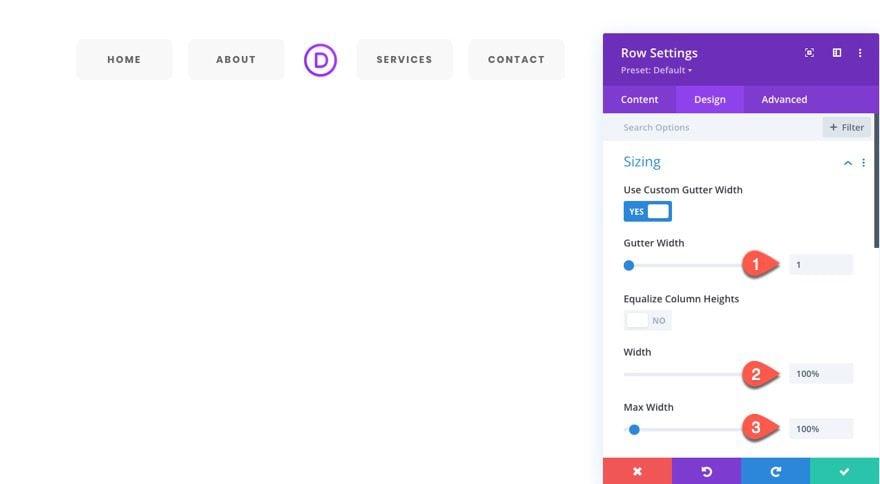
To create the third menu global preset, we will need a full-width row. Open the row settings that holds the duplicate menu and update the following:
- Gutter Width: 1
- Width: 100%
- Max Width: 100%
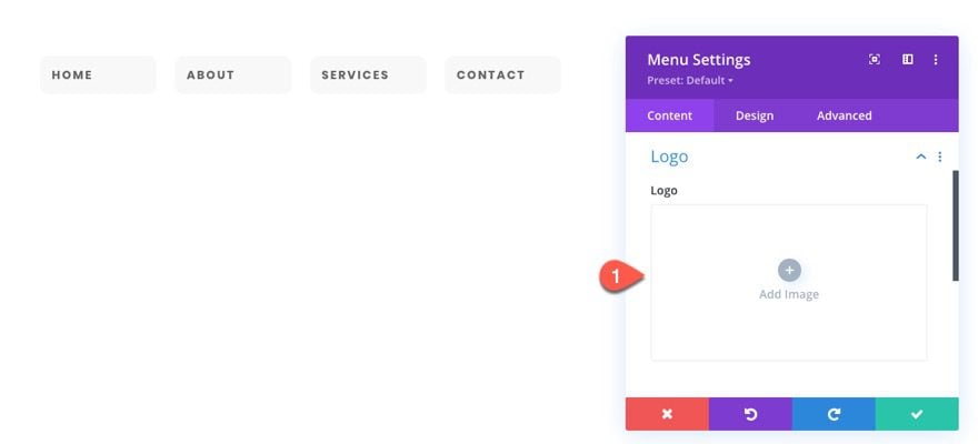
Open the settings of the menu module and delete the logo.
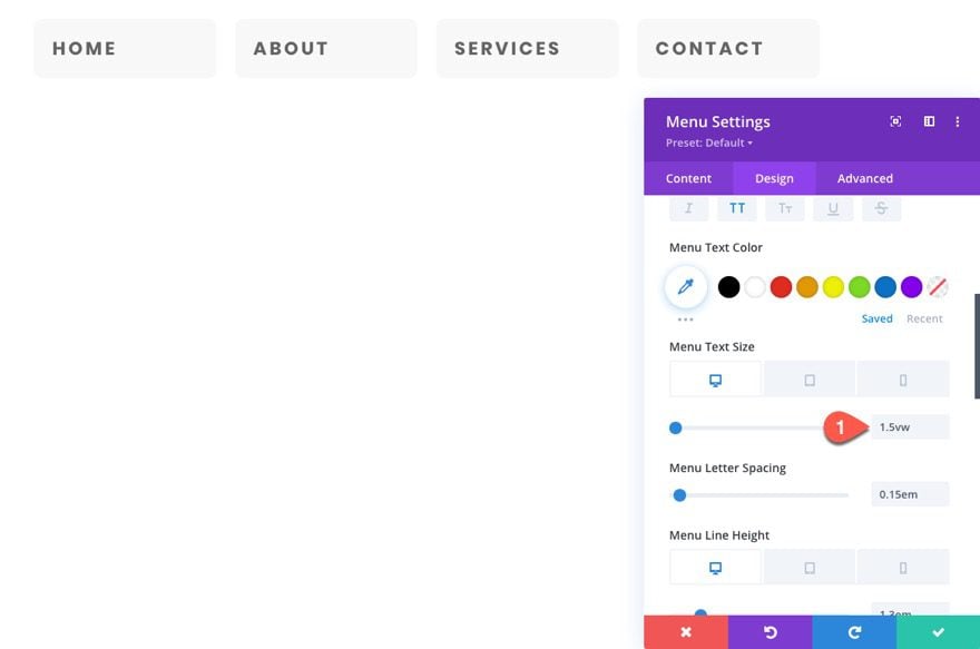
Under the design tab, update the style:
- Style: Centered
Then update the text size with the following VW length unit so that the text size scales with the browser width.
- Menu Text Size: 1.5vw (desktop)
To create a “menu” label for the mobile menu, we can add some custom CSS to the Before Psuedo Element on Tablet display as follows:
Before CSS
content: "MENU";
font-family: poppins;
font-size:12px;
position: absolute;
top:0;
left:50%;
transform: translate(-50%, -100%);
Notice that the font family is set to “poppins” to match the font being used by the menu links. You will need to update this if you are using a different font.
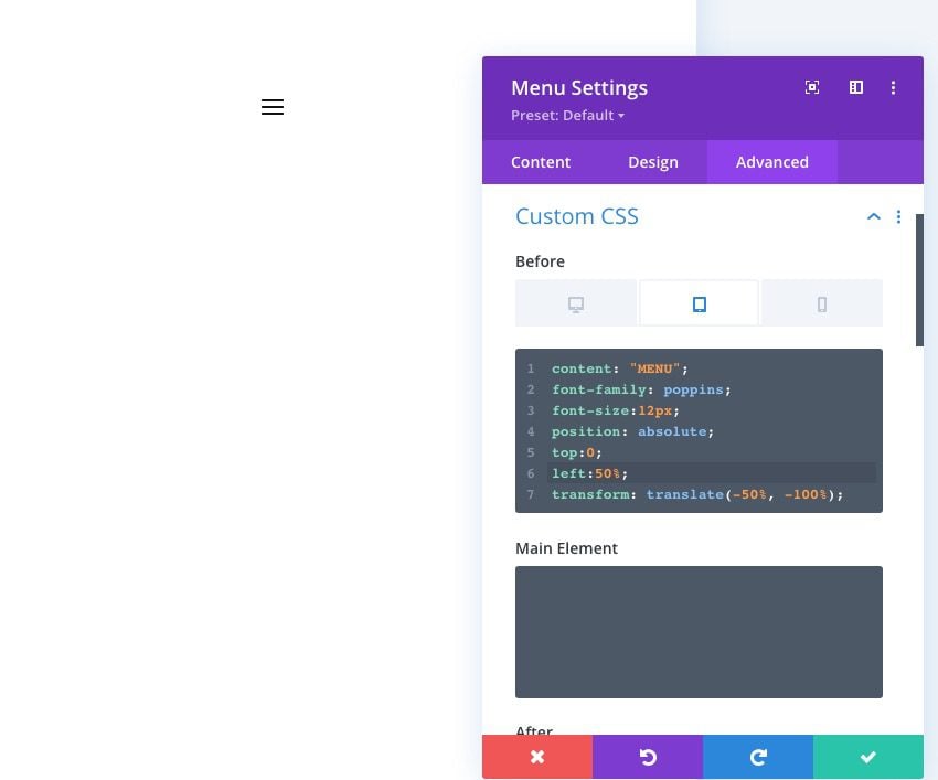
NOTE: This may or may not show on the visual builder. You may have to load the live page to see the result.
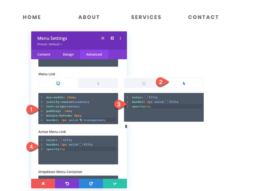
Next, we are going to add some additional spacing and menu link borders on hover. Continue to add the following Custom CSS:
Menu Link CSS (desktop):
min-width: 10em;
justify-content:center;
text-align:center;
padding: .3em;
margin-bottom: 8px;
border: 1px solid transparent;
Menu Link CSS (hover):
color: #333;
border: 1px solid #333;
opacity:1;
Active Menu Link CSS :
color: #333;
border: 1px solid #333;
opacity:1;
Style 3 Result
Adding Menu Style 3 as a Global Preset
Duplicate Section
Before we add the menu style as a global preset, duplicate the entire section containing the menu module (style 3) so that we can use the styles of the menu to jumpstart the next design.
Create New Preset From Current Styles
To add style 3 as a global preset, open the settings of the original menu module for style 3 we created and click the Preset dropdown link.
Select Create New Preset From Current Styles.
Give the preset a name (“Full Centered VW Spaced Menu with Mobile Label”) and save the preset.
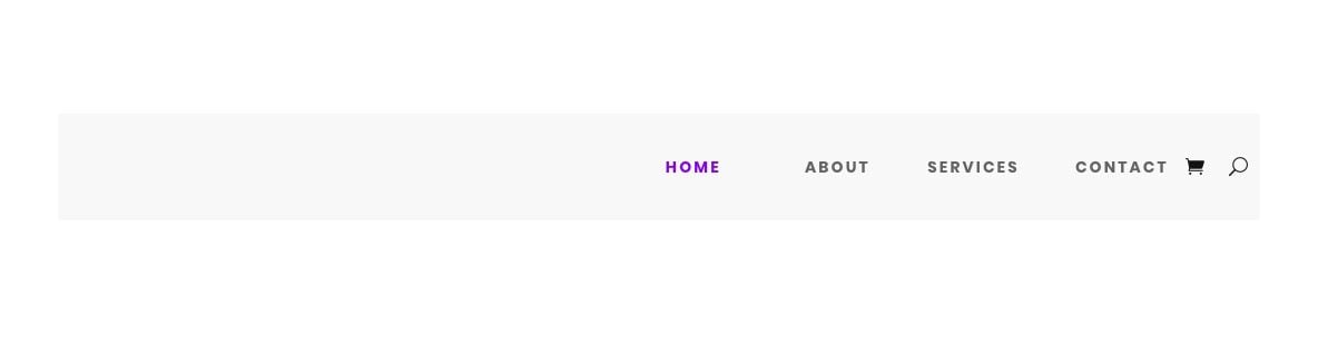
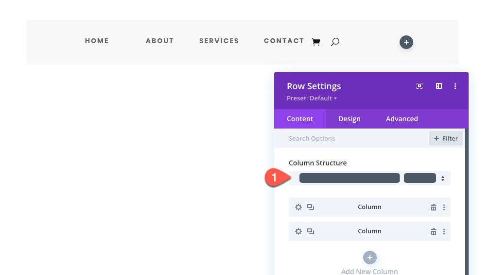
To create the fourth menu global preset, we will need to update the row’s column layout with a 0ne-fourth three-fourths layout. This will mimic a custom header layout that will include a menu module on the right and a separate spot for a logo image in the left column.
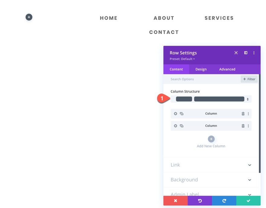
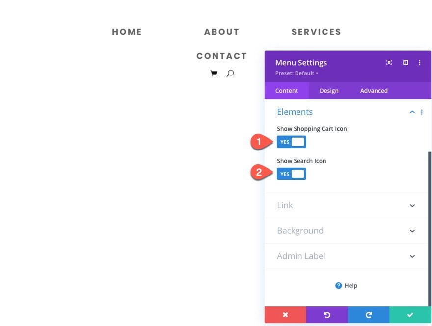
Make sure the menu is in the right column. Then open the menu settings and update the Elements options to show the shopping cart icon and search icon.
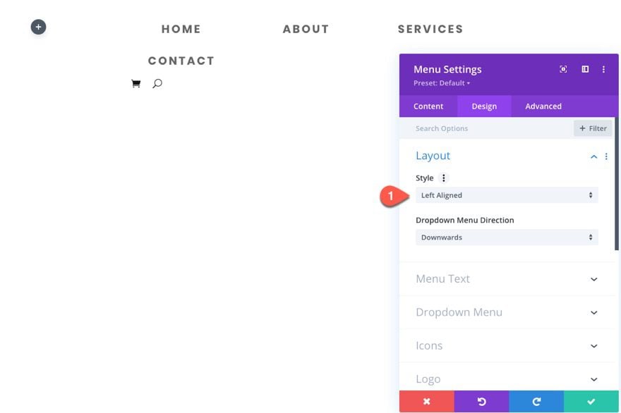
Under the design tab, update the style:
- Style: Left Aligned
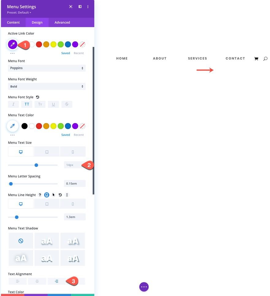
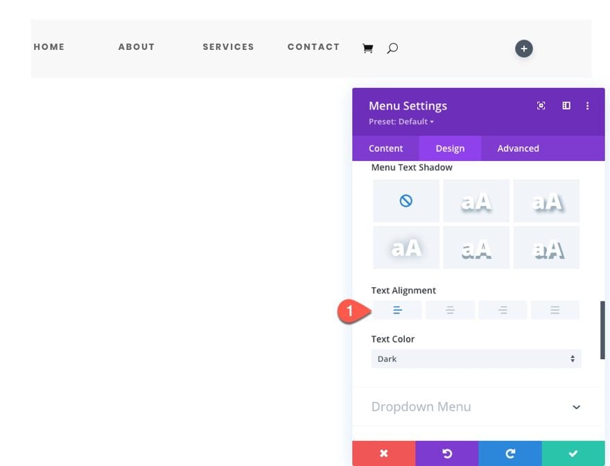
Next update the following link styles and text alignment:
- Active Link Color: #ac3cf7
- Menu Text Size (desktop): 14px
- Text Alignment: Right
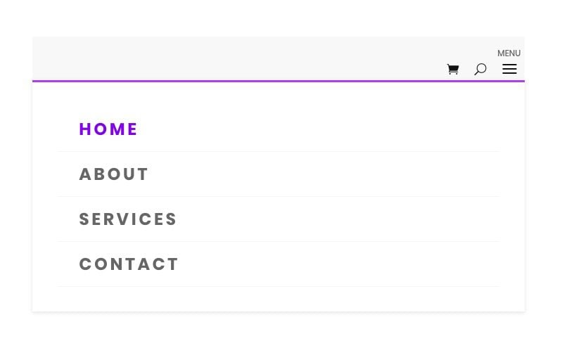
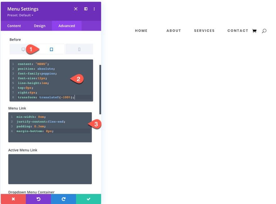
Now that our hamburger icon on mobile will be on the right side, we will need to adjust the placement of the menu label on mobile. Then we will add some menu link CSS to make sure the links are spaced and sitting flush on the right side of the column/row.
Add the following Custom CSS:
Before CSS (tablet)
content: "MENU";
position: absolute;
font-family:poppins;
font-size:12px;
line-height:1em;
top:0px;
right:6px;
transform: translateY(-100%);
Menu Link CSS:
min-width: 8em;
padding: 0.3em;
margin-bottom: 8px;
justify-content:flex-end;
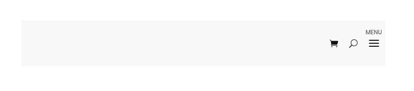
Style 4 Result
Here is the final result of our right-aligned menu. I added a light gray background to the row so you can see the alignment better.
Adding Menu Style 4 as a Global Preset
Duplicate Section
Before we add the menu style as a global preset, duplicate the entire section containing the menu module (style 4) so that we can use the styles of the menu to jumpstart the next design.
Create New Preset From Current Styles
To add style 4 as a global preset, open the settings of the original menu module for style 4 we created and click the Preset dropdown link.
Select Create New Preset From Current Styles.
Give the preset a name (“Right Spaced Menu w/ Mobile Label”) and save the preset.
To create this fourth menu global preset, we will need to update the row’s column layout with a 0ne-fourth three-fourths layout. This will mimic a custom header layout that will include a menu module on the left and a separate spot for a logo image (or CTA) in the right column.
Open the settings for the menu and update the text alignment for the menu links:
- Text Alignment: Left
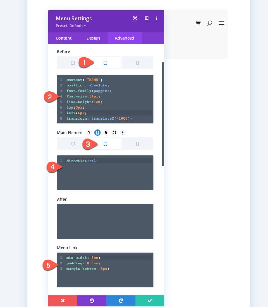
Then we need to adjust the mobile menu label so that it sits above the hamburger nav on the left side. And by adding the “direction:rtl” on tablet, we will make sure the mobile icons will align on the left on mobile as well.
Under the Advanced tab, update the following Custom CSS:
Before CSS (tablet):
content: "MENU";
position: absolute;
font-family:poppins;
font-size:12px;
line-height:1em;
top:0px;
left:6px;
transform: translateY(-100%);
Main Element (tablet):
direction:rtl;
Menu Link CSS:
min-width: 8em;
padding: 0.3em;
margin-bottom: 8px;
justify-content:flex-end;
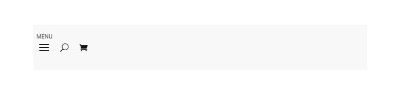
Here is the final result.
Final Results
Final Thoughts
Although the outward style of these menu modules is basic, the inner framework design of the menu layout is extremely helpful for jumpstarting the creative process. Furthermore, having a global preset with these frameworks will only speed up the process even more. Feel free to explore more ways to customize the menu module and add unique presets for your next projects.
I look forward to hearing from you in the comments.
Cheers!


How can I easily alter the colour of just one of the menu items?
eg. If i have Home, Services, Contact – how do I make just “Home” for instance a red color?
Is there a way to collapse the menus/sub menus on mobile? I created a sticky menu using divi menu module, it looks great on desktop but if on mobile i can’t see the rest of the menus/sub menus because of the limited screen area and i can’t scroll down because its a sticky menu. ty
Thanks Jason, this will be so helpful!
I’m wondering if ET could create a new category in the Layouts Library “resources” so we could easily select these layouts and not need to go through the download/import process.
Thanks!
just give default menu for divi builder
logo(left) + menu(right) = shortly when scroll
same on mobile:
logo(left) + hamburger menu(right)
or better on mobile we can add custom icons like:
logo(left) +social icon + basket + my profile + phone + hamburger menu(right)
Thanks for the suggestions, Alex.