
Responsive grids shouldn’t require dozens of media queries and custom CSS overrides. But until recently, that’s exactly what most page builders demanded. Divi 5’s CSS Grid framework changes that, providing you with layouts that adapt fluidly across screen sizes without requiring a single line of code. Whether you’re building a simple card grid or a complex bento layout, you can create responsive designs that work beautifully on every device, all from the visual editor.
Grid is one of several layout systems that make Divi 5 the most powerful way to build WordPress sites. Let’s see exactly what you can do with it.
How To Build A Responsive Grid
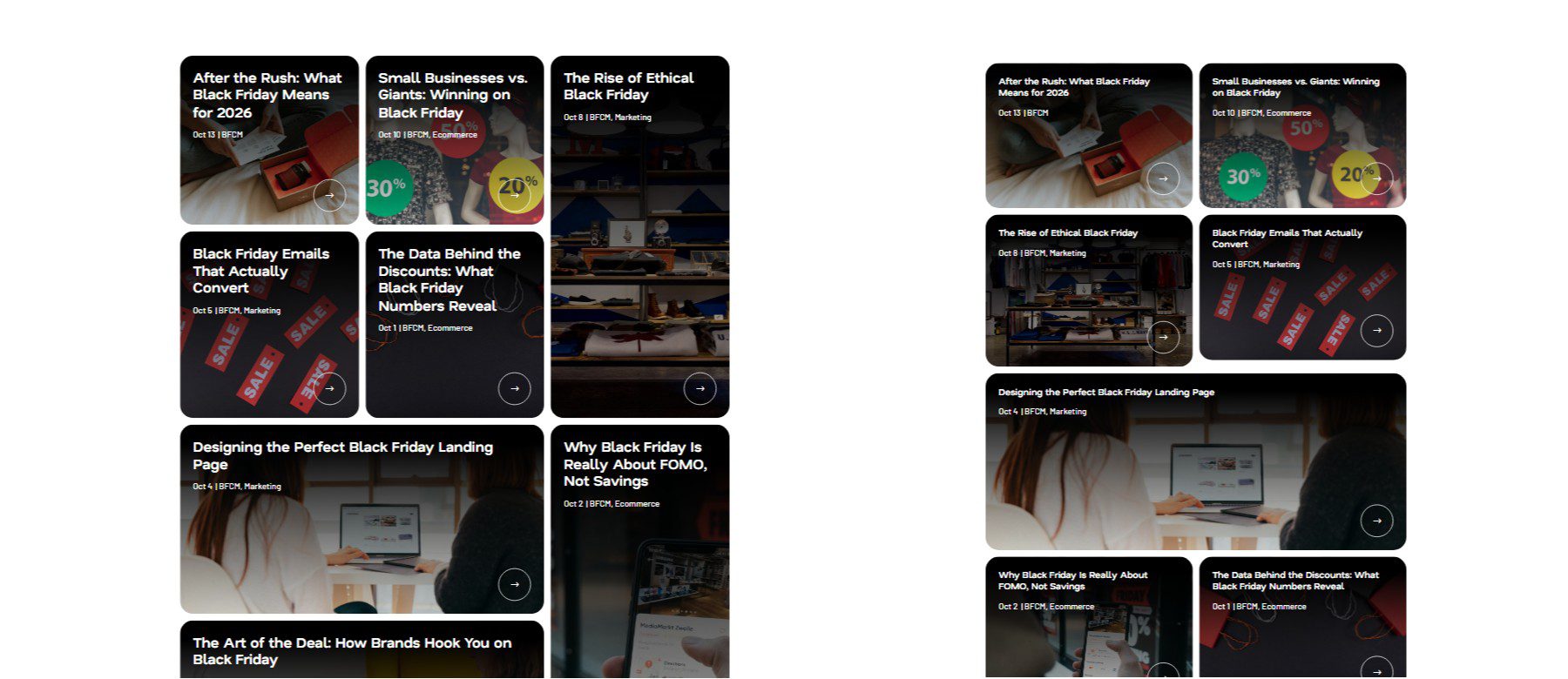
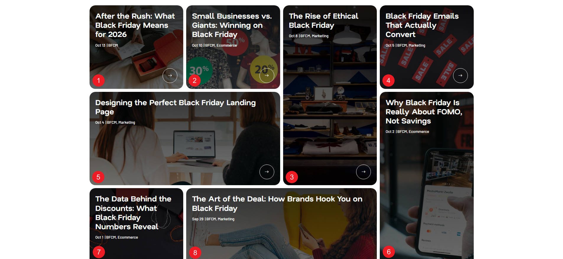
The first part of this is creating your Grid Layout at the base breakpoint (so, for Divi, on Desktop). We’ll use a Loop to create eight different grid items, but you can use something else, too. In the end, we’ll achieve this grid:

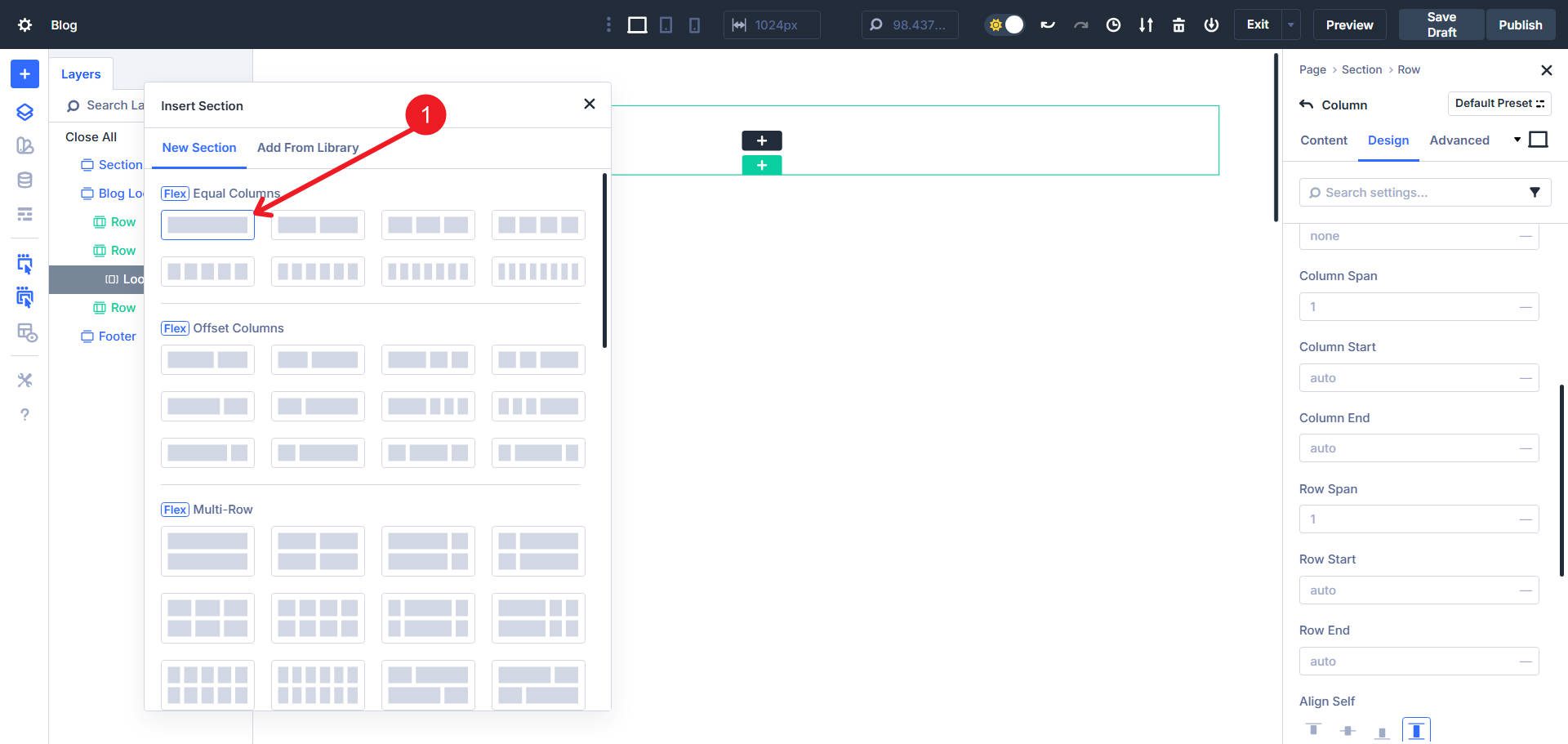
And here are this grid’s tablet and mobile views (left and right, respectively).
Step 1. Setting Up Your Page
Start by adding a new Section with a single Flex Row.
Configure the Row’s sizing to have these width values:
- Width: 90%
- Max Width: 1300px
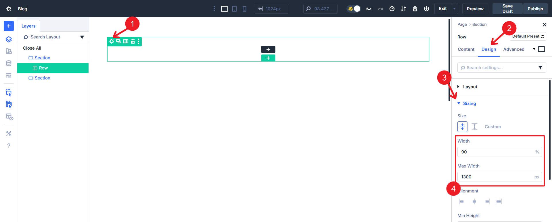
This constrains your grid to a centered container. Leave the Column’s sizing at its defaults — once we switch the row to grid layout, it will be controlled entirely by the Row’s Grid settings.
Finally, enable the Loop Builder on the Column to create eight looped instances. Each looped Column becomes a grid item. Design your loop however works for you, or try to emulate the example we are working with. For more details on configuring Loop Builder queries, see All Divi 5 Loop Builder Query Options Explained.
With these grid items created, we can now customize our Grid settings to make it optimally responsive.
Step 2. Building The Basic Grid Logic
We’ll create our grid layout on the Row container using Equal Width Column and setting the Number of Columns to 4. For now, everything else stays on default settings.
For the sake of this tutorial, I’ll add modules and dynamic content to my column so that it shows my post content in this loop. The loop and the styling are not the point of this tutorial. Each card uses Flexbox for its internal layout—if you want to learn more about working with Flex in Divi 5, see 5 Pitfalls To Avoid When Switching To Divi 5’s Flexbox Layout System.
Step 3. Set Grid Column Density At Major Breakpoints
On desktop, the grid has four columns, but we want to give each grid item a little more space on smaller screens. To do that, we will use a simple 4 → 3 → 2 column curve from the base device down.
To achieve this, click the Row that contains the looped Column items. Then navigate through the Design Tab > Layout > Grid. Make sure Column Widths is set to Equal Width Columns. To make this easy, open the Responsive Editor for Number Of Columns. This lets you easily set 4 columns on Desktop, 3 on Tablet, and 2 on Mobile.
This loosens the grid on smaller screens and makes viewing the content in each grid item easier. This is probably the biggest piece to making your grids responsive and is incredibly easy.
Step 4. Adjust Grid Spacing
At this point, we can also set up some needed gap values and use a Horizontal Gap of 0.75rem and a Vertical Gap of .75rem. If you ever feel that a grid is too tight or loose, you can set different grid gap values at different breakpoints, as we did with number of columns.
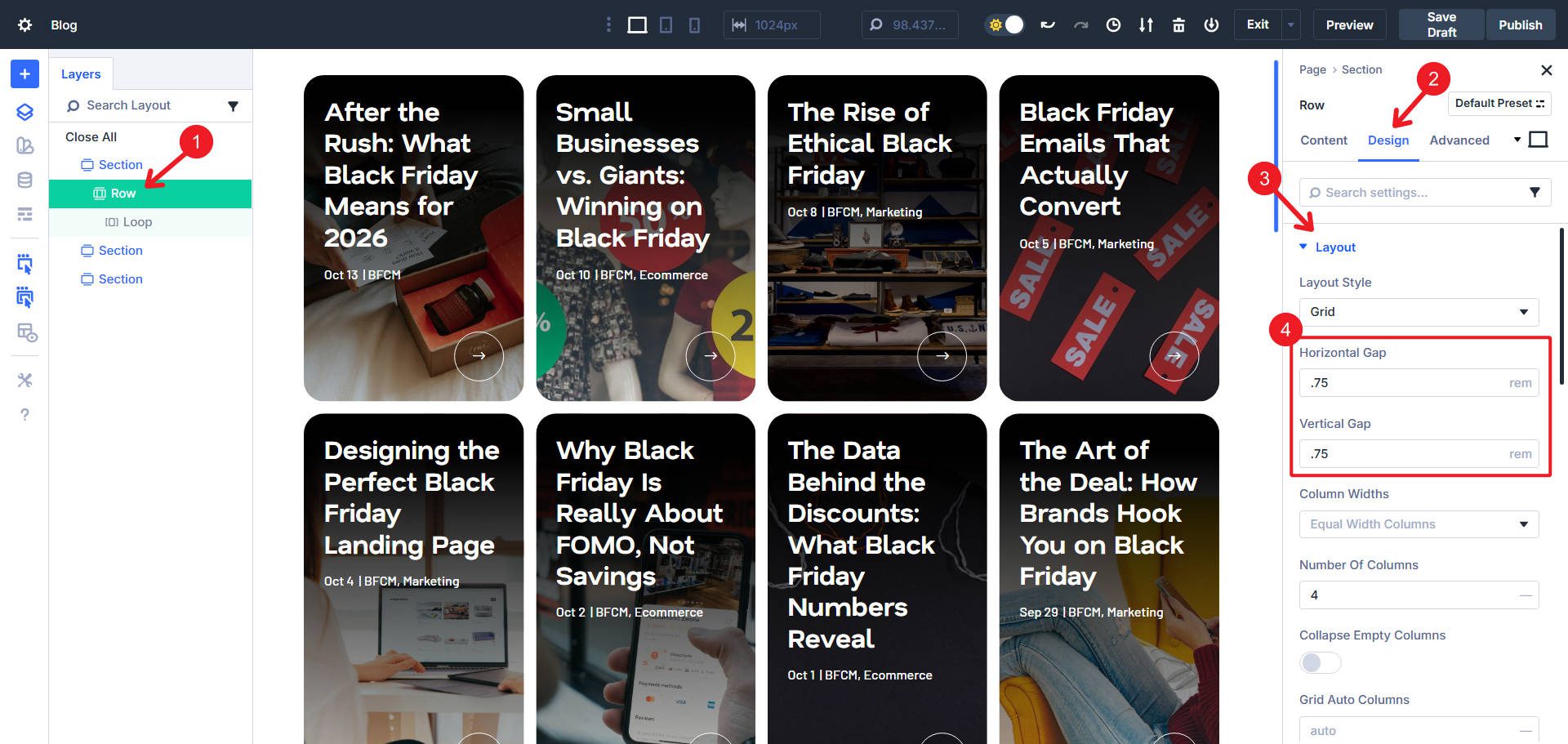
Gaps maintain spacing between grid items throughout the whole grid. This is much preferred over setting left/right margin on individual grid items.
Step 5. Create Bento Grid Offsets
A bento grid uses varied item spans to create visual interest. You’ll use nth-pattern rules to make specific grid items span two columns or two rows. These rules repeat every eight items, so the pattern scales seamlessly whether you have 8, 16, or 24 grid items.
Since we are working with a specific example, we know exactly what we need and can count the grid items and see which ones need the span adjustments. From the example screenshot above, I have noted that we need to adjust items 3, 5, 6, and 8.
Now, go through the Design Tab > Layout > Grid > Grid Offset Rules. You will add four rules:
- Custom nth-Child Rule: 8n+3 | Offset Rule: Row Span | Offset Value: 2
- Custom nth-Child Rule: 8n+5 | Offset Rule: Column Span | Offset Value: 2
- Custom nth-Child Rule: 8n+6 | Offset Rule: Row Span | Offset Value: 2
- Custom nth-Child Rule: 8n+8 | Offset Rule: Column Span | Offset Value: 2
The nth-pattern rules (like 8n+3) select every 8th item starting from a specific position, so the bento pattern repeats consistently, no matter how many grid items you add. So, if you just have eight grid items, 8n+3 will select the 3rd. But if you have 16 grid items, then 8n+3 will select the 3rd and 11th.
Now, you may notice “empty spaces” in your grid at different breakpoints. Depending on whether you have default breakpoint values set, you likely will see a gap on mobile. There is a unique grid setting that solves this. Under Grid Density, select the second icon for Auto.
Now, even with custom offset rules creating an asymmetrical grid, we are using native CSS Grid tooling that helps us stay responsive and have our grid looking good no matter what.
And really, that is it. Divi makes it really easy to create even a somewhat complex grid. Now you can move on to the next section of your website and get that much closer to hitting publish.
Other Divi Features For Mastering Grid Responsiveness
Now that you’ve built a responsive grid using a Row container, here are a few more techniques worth exploring. Grid isn’t limited to Rows—you can use it on Sections, Columns, Groups, and modules like Gallery and Portfolio.
Switch To Manual Mode For Advanced Control
If you already know CSS Grid, your skills transfer directly to Divi. Switch to Manual Width Columns and write grid templates like 1fr 1fr 1fr 1fr or repeat(auto-fit, minmax(300px, 1fr)). If you don’t know CSS Grid syntax yet, no problem—most everything is achievable through the Design tab options we’ve already covered. Divi’s support for Advanced Units means you can use sophisticated CSS whenever you’re ready.
Combine Grid And Flexbox
Grid and Flexbox solve different problems, and Divi 5 lets you use both together. In our bento grid, the Row uses Grid to manage the overall card placement and responsiveness across breakpoints.
Each individual card (built on the Column container) uses Flexbox to handle the internal layout—centering text, spacing images, or aligning buttons.
Grid handles the macro structure. Flexbox handles the micro details. This combination gives you really great control at every level.
Use Gap Instead Of Margin
In Step 4, we set Horizontal and Vertical Gaps to maintain consistent spacing throughout the grid. Gaps are superior to margin because they only apply *between* grid items—not on the outer edges—and they stay consistent no matter how your grid reflows across breakpoints. If you need unique spacing for a specific card, you can still apply margin or padding, but start with gaps as your foundation.
Customize Your Breakpoints
Divi 5 allows you to define custom breakpoints, rather than being locked into standard desktop/tablet/mobile widths. Adjust your grid columns, gaps, and offsets at the exact viewport widths where your design needs to change. See Customizable Responsive Breakpoints for details.
Build Responsive Websites In Divi 5 Today
You just built a responsive bento grid in minutes—no custom CSS, no media query debugging, just visual controls that work. This same workflow applies consistently across various platforms, including portfolio grids, product showcases, blog layouts, and landing page sections. Once you understand Grid, you can design entire sites faster than you ever could before.
Many WordPress sites are already running on Divi 5. If you haven’t made the switch yet, there’s never been a better time. Download it now and see how much faster you can build.


I try to create this structure, but almost from the first step I fail. I create the section with a single row, and then when I have to assemble the 8 loop instances, what it does is create 8 rows, not 8 columns, or at least it doesn’t look like what appears in the explanation. Is there anything else that needs to be done that isn’t mentioned in the video?
Hey, yea that would be frustrating. Look at the first video underneath the heading “Step 2. Building The Basic Grid Logic.” You have to set the Grid layout to have 4 columns.
You can also add a new Section, scroll down to the prebuilt Grid layouts, and find the 4 column option. But when I do tutorials, I like showing the more manual way so people get used to all of the layout options and fields. But either way works. Best of luck!