When it comes to building a header, the possibilities are endless. You can include anything you can imagine inside your Divi header if you use the Divi Theme Builder. Today, we’re adding another highly-requested header design tutorial to your list of resources. We’ll show you how to make your logo cross the primary and secondary menu bars inside your header. You’ll be able to download the JSON file for free as well!
Let’s get to it.
Preview
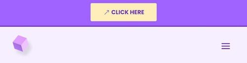
Before we dive into the tutorial, let’s take a quick look at the outcome across different screen sizes.
Desktop

Mobile
Download The Global Header Template for FREE
To lay your hands on the free global header template, you will first need to download it using the button below. To gain access to the download you will need to subscribe to our newsletter by using the form below. As a new subscriber, you will receive even more Divi goodness and a free Divi Layout pack every Monday! If you’re already on the list, simply enter your email address below and click download. You will not be “resubscribed” or receive extra emails.

1. Create New Global Header Template
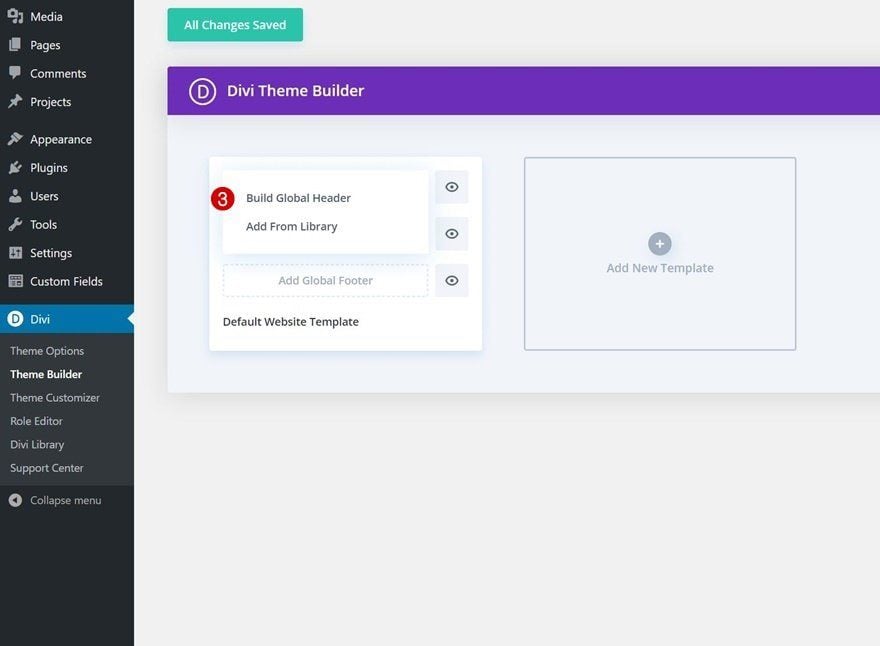
Go to Divi Theme Builder
Start by going to the Divi Theme Builder in the backend of your WordPress website. Once there, click on “Add Global Header”.
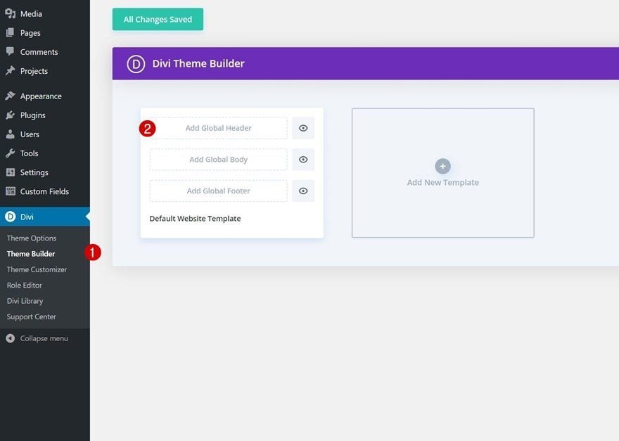
Add New Global Header
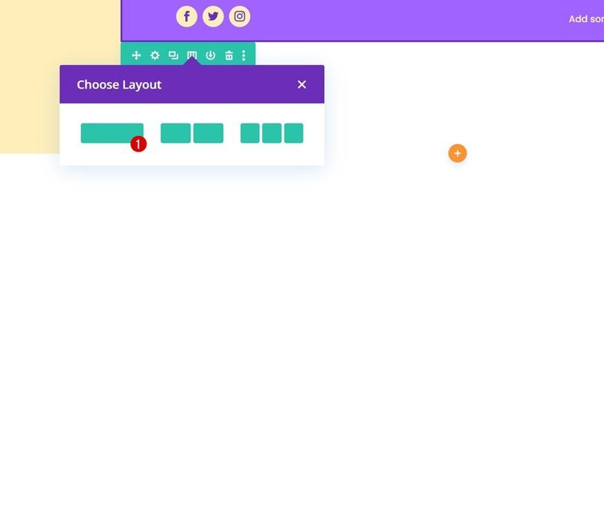
A dropdown menu will appear. To start building from scratch, continue by selecting “Build Global Header”.
2. Build Header Design
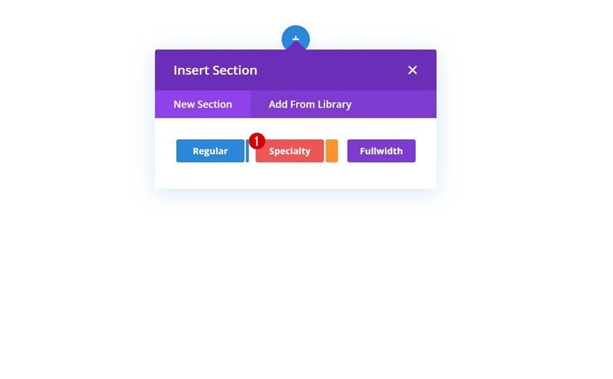
Add Specialty Section
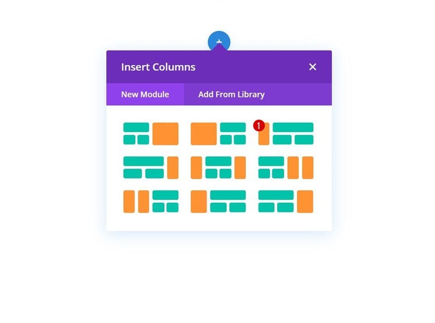
To build this design, we’re going to use a specialty section.
Column Structure
This is the column structure we’re using for our specialty section:
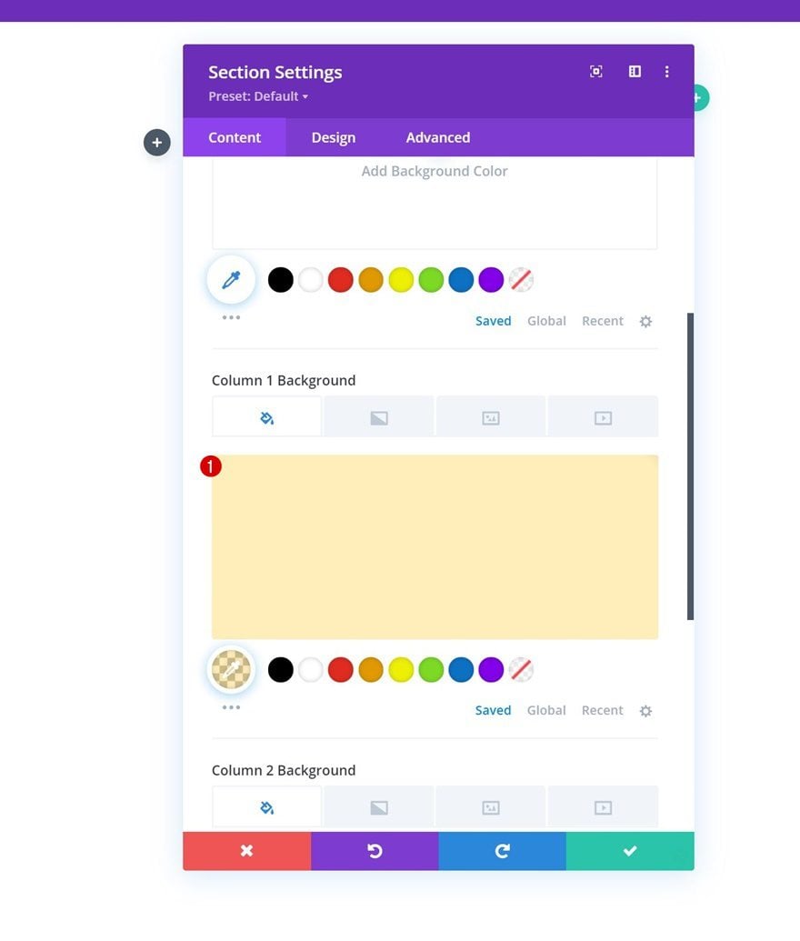
Column 1 Background Color
Once you’ve added the specialty section, open its settings and apply a column 1 background color.
- Column 1 Background Color: rgba(255,191,0,0.27)
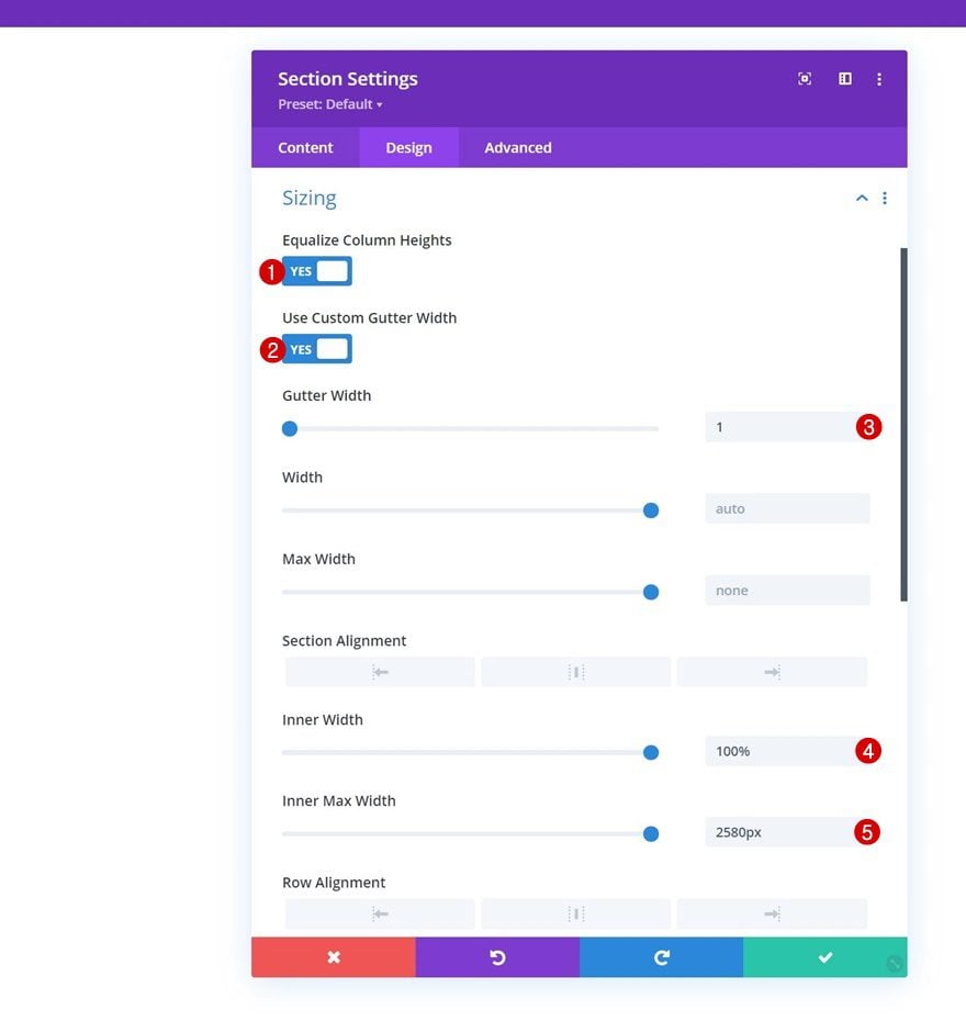
Sizing
Move on to the design tab and change the sizing settings as follows:
- Equalize Column Heights: Yes
- Use Custom Gutter Width: Yes
- Gutter Width: 1
- Inner Width: 100%
- Inner Max Width: 2580px
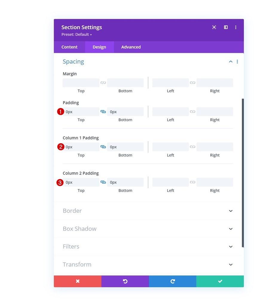
Spacing
Modify the spacing settings too.
- Top Padding: 0px
- Bottom Padding: 0px
- Column 1 Top Padding: 0px
- Column 1 Bottom Padding: 0px
- Column 2 Top Padding: 0px
- Column 2 Bottom Padding: 0px
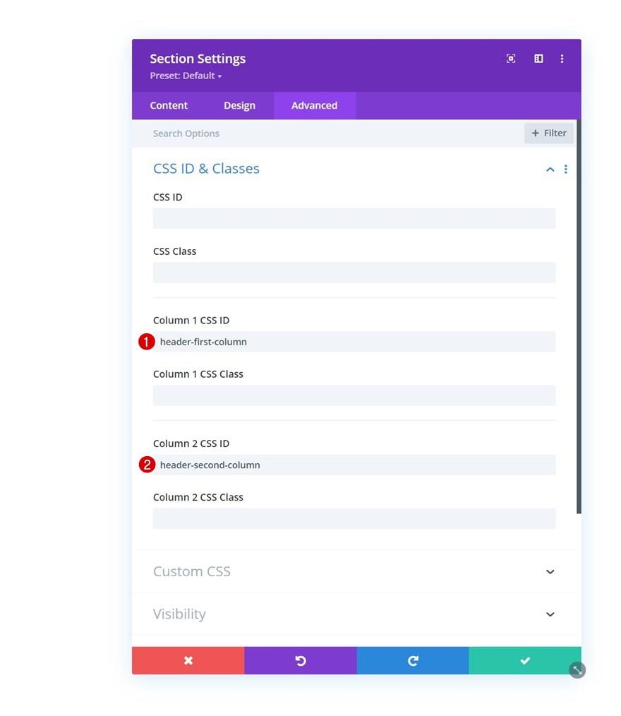
Column CSS IDs
Then, go to the advanced tab and apply a custom CSS ID to both columns.
- Column 1 CSS ID: header-first-column
- Column 2 CSS ID: header-second-column
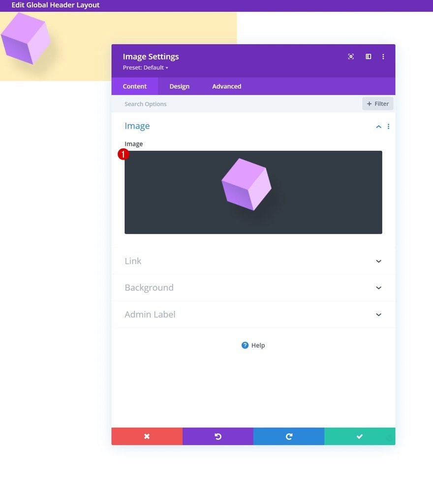
Add Image Module to Column 1
Upload Image
Time to add modules, starting with an Image Module in column 1. Upload your logo.
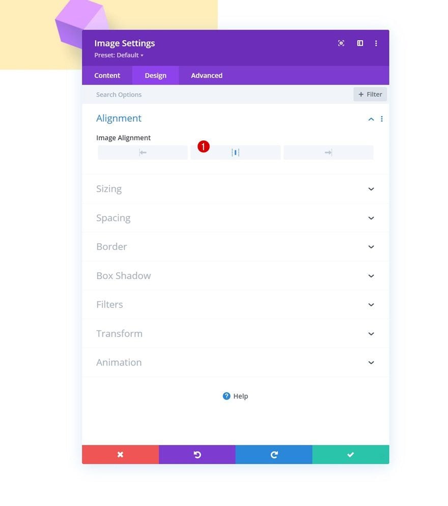
Alignment
Then, move on to the design tab and change the image alignment.
- Image Alignment: Center
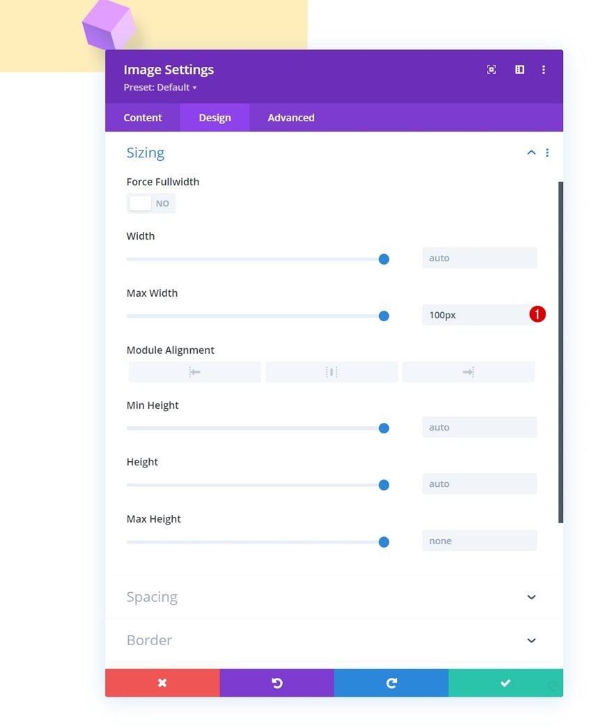
Sizing
Apply a max width to the sizing settings too.
- Max Width: 100px
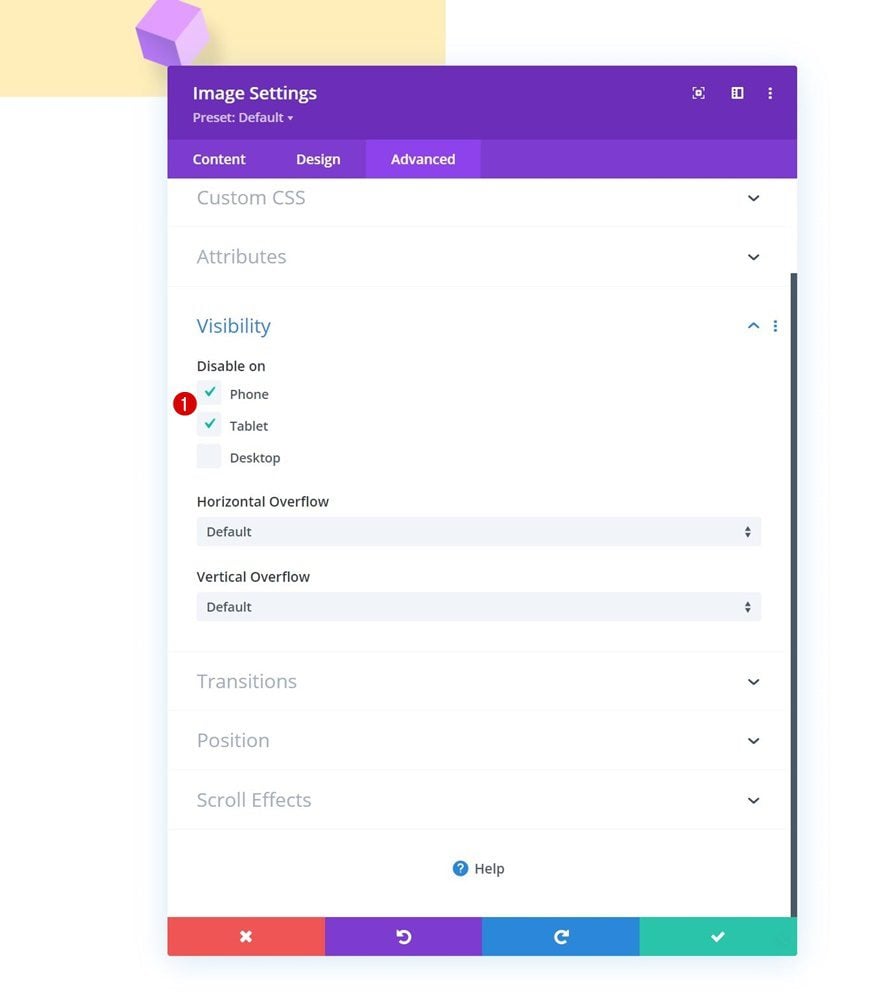
Visibility
And hide the module on smaller screen sizes.
Add Row #1 to Column 2
Column Structure
In column 2 of our specialty section, we’ll add a first row using the following column structure:
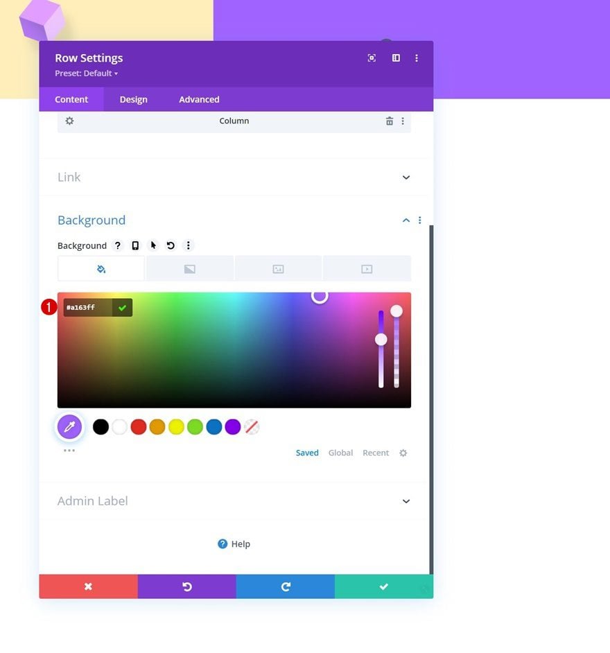
Background Color
Open the row settings and use the following background color:
- Background Color: #a163ff
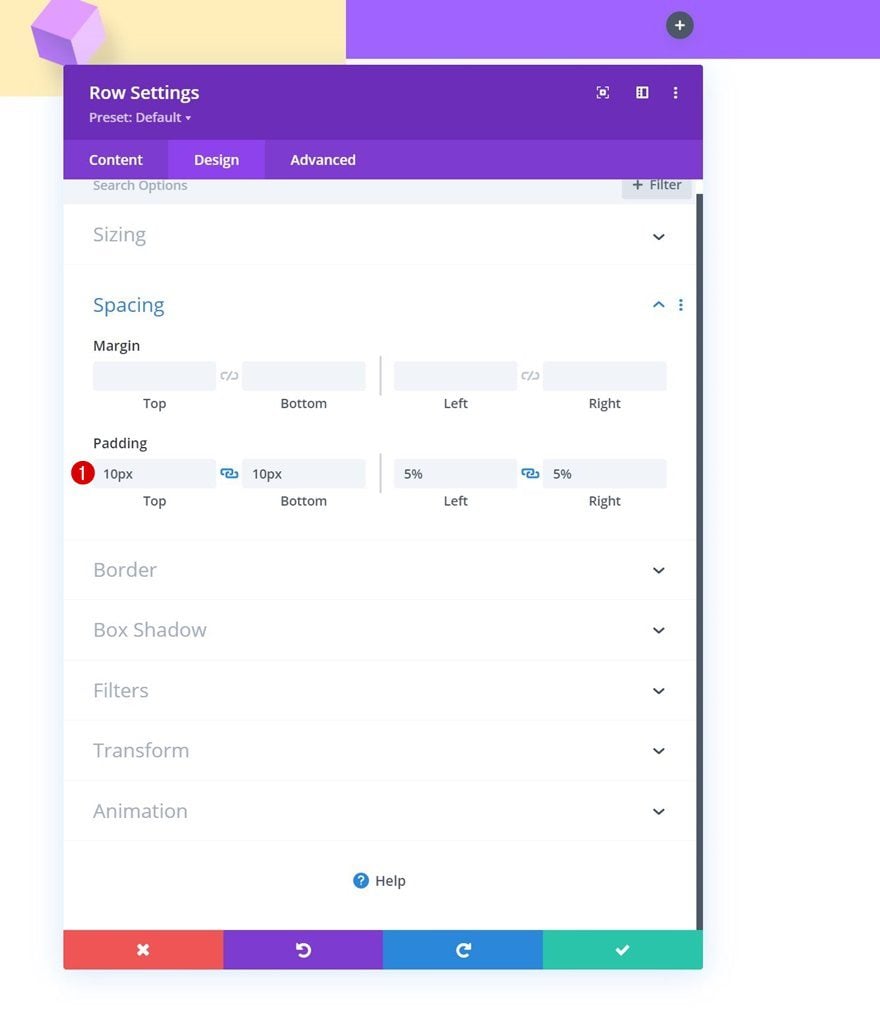
Spacing
Move on to the row’s design tab and change the spacing settings as follows:
- Top Padding: 10px
- Bottom Padding: 10px
- Left Padding: 5%
- Right Padding: 5%
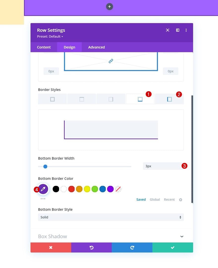
Border
Apply the following border settings next:
- Bottom Border Width: 3px
- Left Border Width:
- Desktop: 3px
- Tablet & Phone: 0px
- Border Color: #6c2eb9
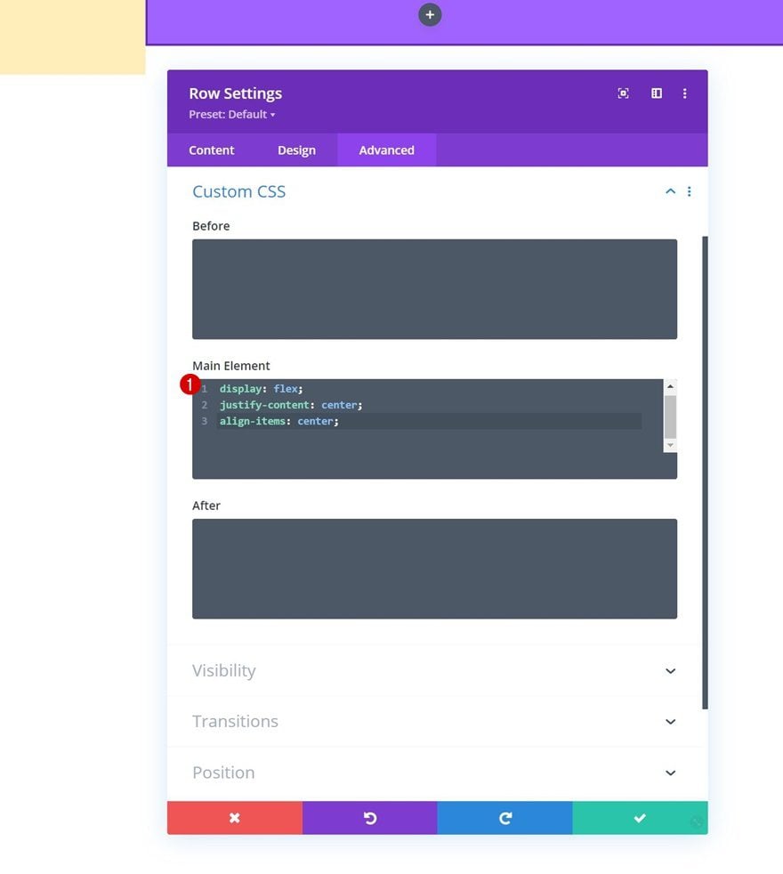
Main Element CSS
And use the following lines of CSS code inside the row’s main element:
display: flex;
justify-content: center;
align-items: center;
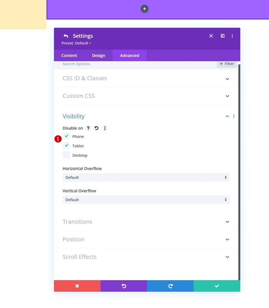
Hide Column 1 & 2 on Smaller Screen Sizes
To simplify the design on smaller screen sizes, we’ll open the column 1 and 2 settings and hide both of them on tablet and phone.
Add Social Networks
Time to add modules, starting with a Social Media Follow Module in column 1. Add the social networks of your choice.
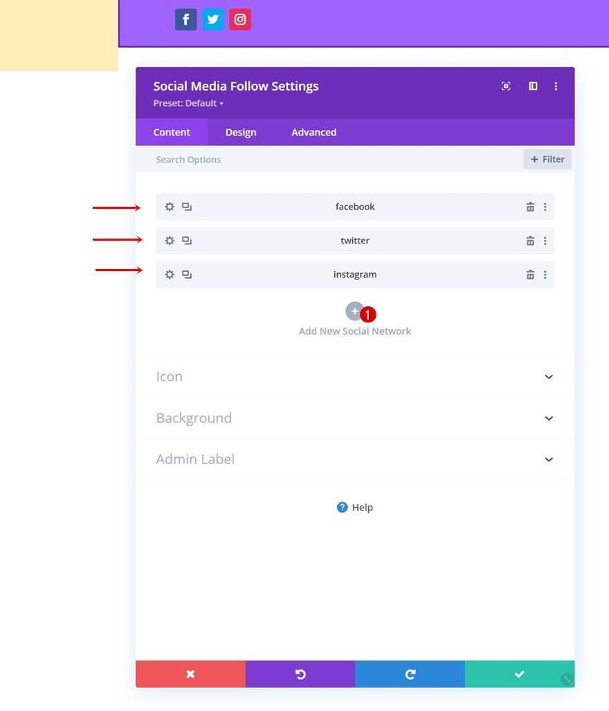
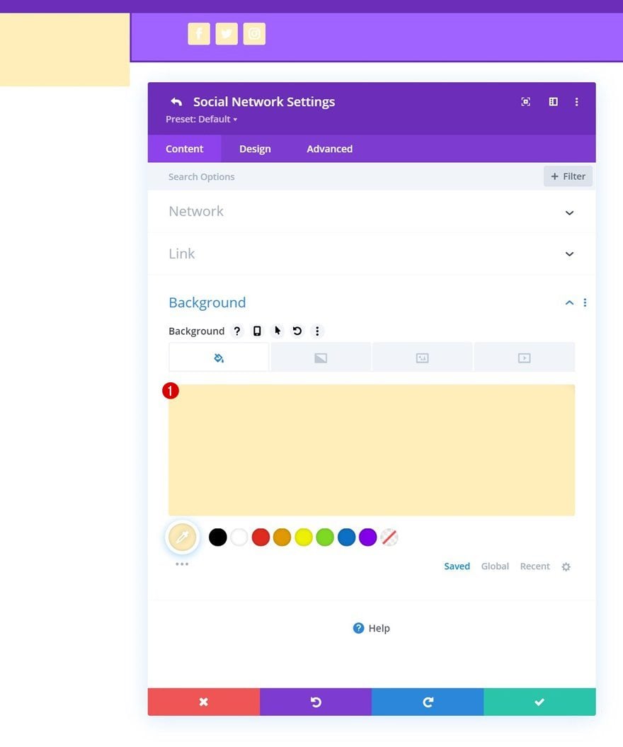
Individual Social Network Background Color
Modify each social network’s background color individually.
- Background Color: #ffeeba
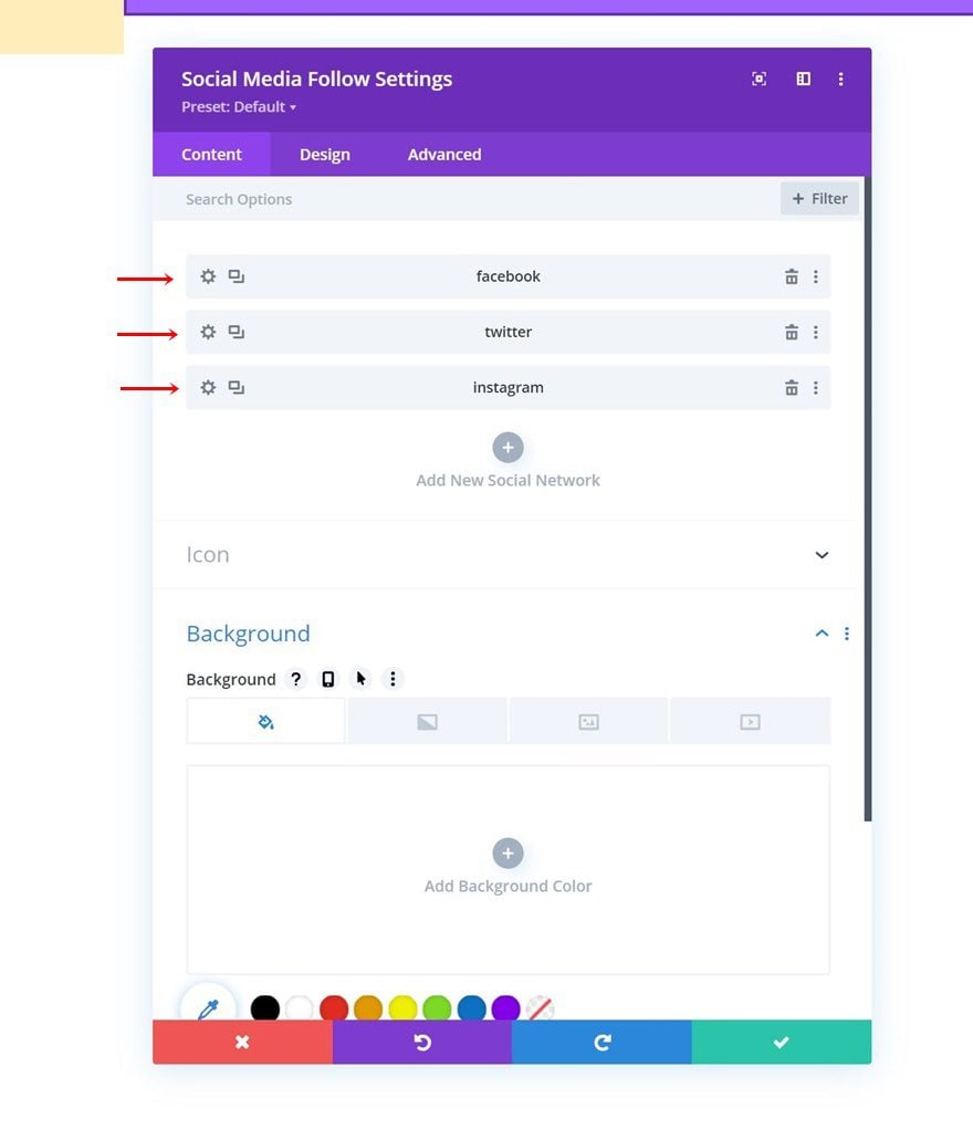
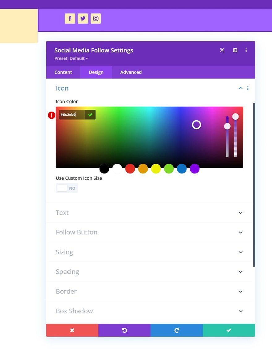
Icon Settings
Go back to the general module settings and change the icon color.
- Icon Color: #6c2eb9
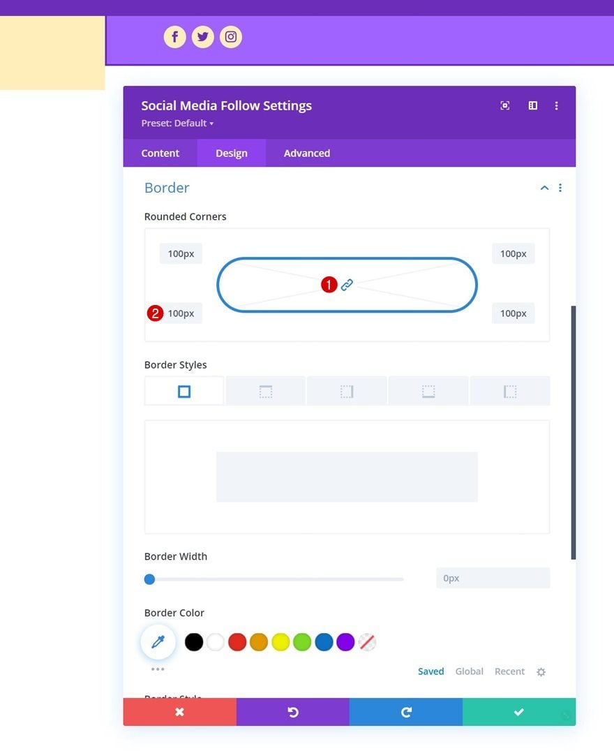
Border
Add some rounded corners to the border settings too.
- All Corners: 100px
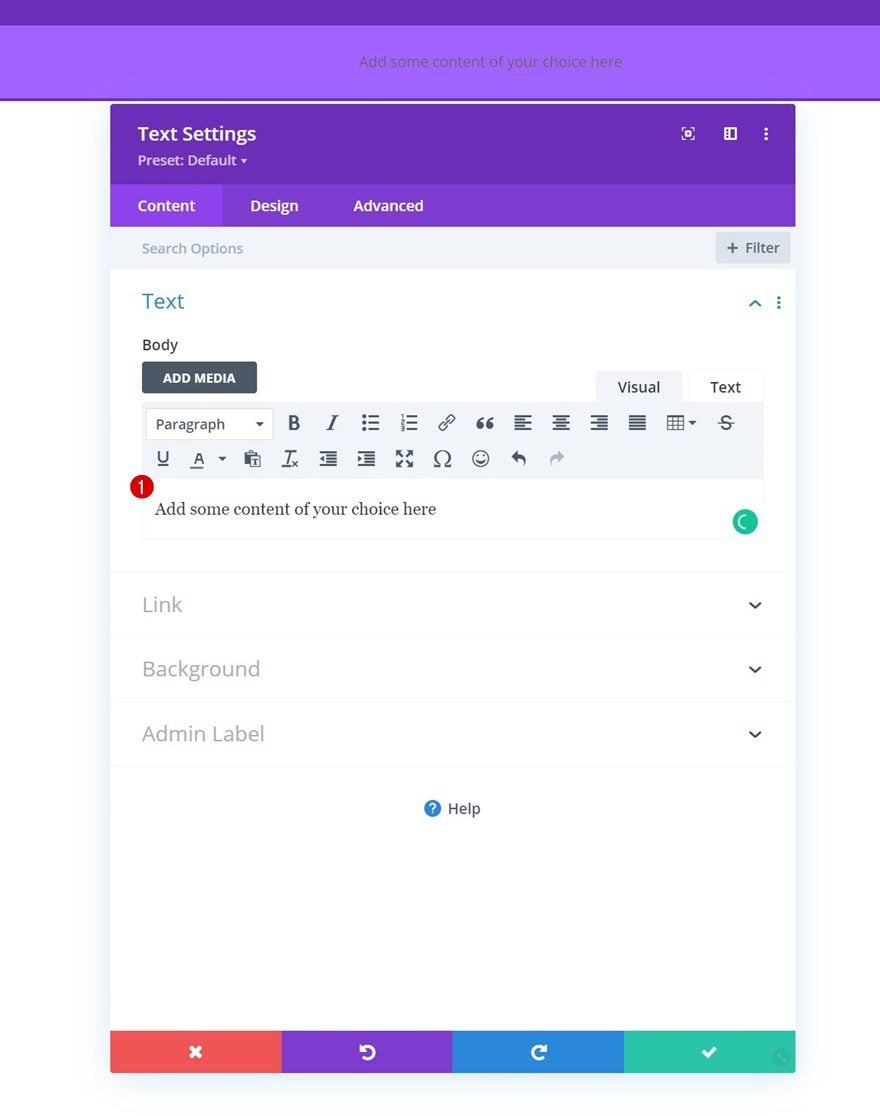
Add Text Module to Column 2
Add Content
Next, add a Text Module to column 2 with some content of your choice.
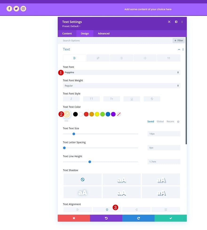
Text Settings
Change the module settings as follows:
- Text Font: Poppins
- Text Alignment: Center
Add Copy
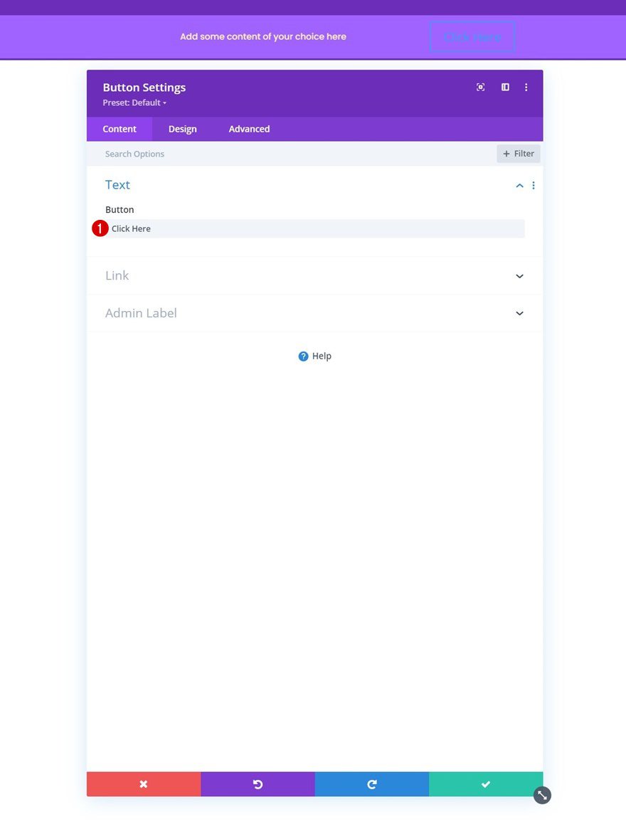
In column 3, the only module we need is a Button Module. Add some copy of your choice.
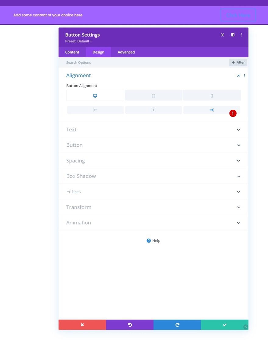
Button Alignment
Move on to the module’s design tab and change the button alignment across different screen sizes.
- Button Alignment:
- Desktop: Right
- Tablet & Phone: Center
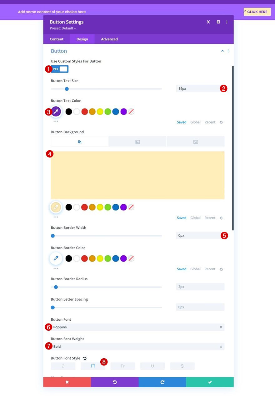
Button Settings
Style the button next.
- Use Custom Styles For Button: Yes
- Button Text Size: 14px
- Button Text Color: #6c2eb9
- Button Background Color: #ffeeba
- Button Font: Poppins
- Button Font Weight: Bold
- Button Font Style: Uppercase
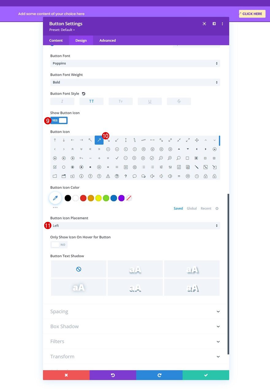
- Show Button Icon: Yes
- Button Icon Placement: Left
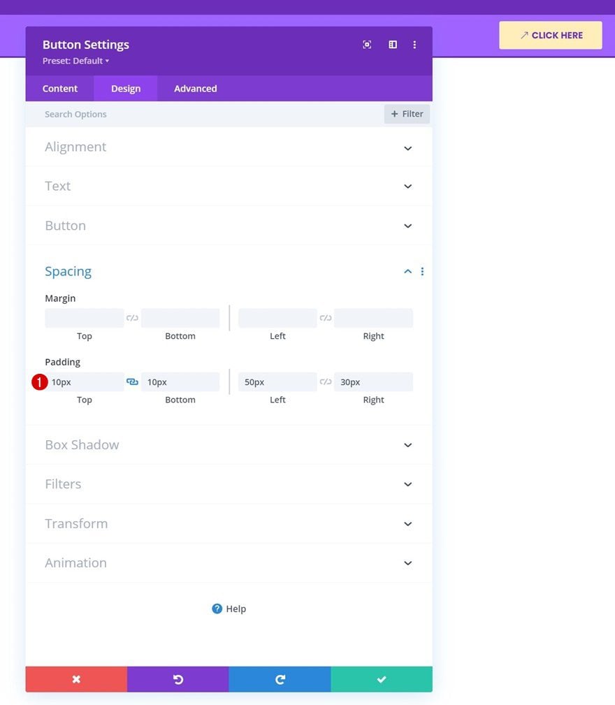
Spacing
And apply the following padding values:
- Top Padding: 10px
- Bottom Padding: 10px
- Left Padding: 50px
- Right Padding: 30px
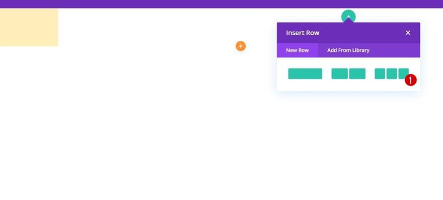
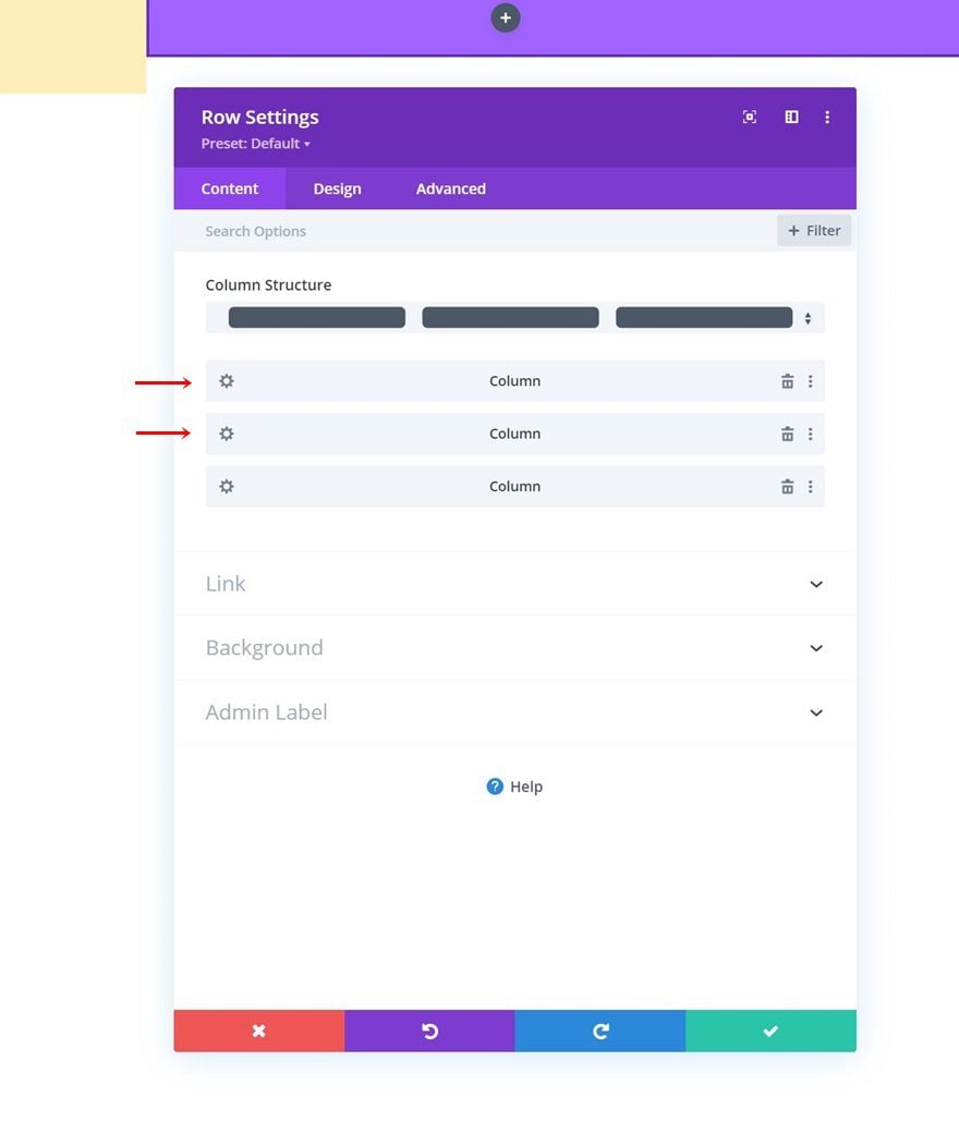
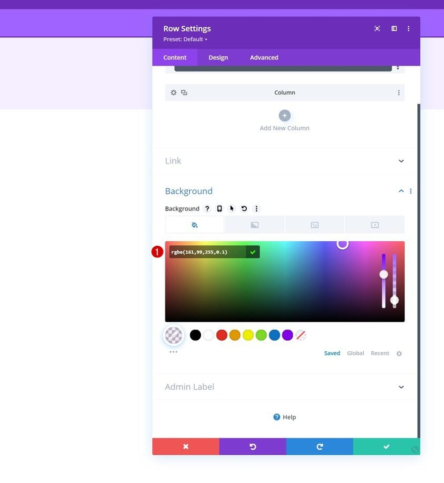
Add Row #2 to Column 2
Column Structure
The next and last row we need in our section’s second column uses the following column structure:
Background Color
Open the row settings and use the following background color:
- Background Color: rgba(161,99,255,0.1)
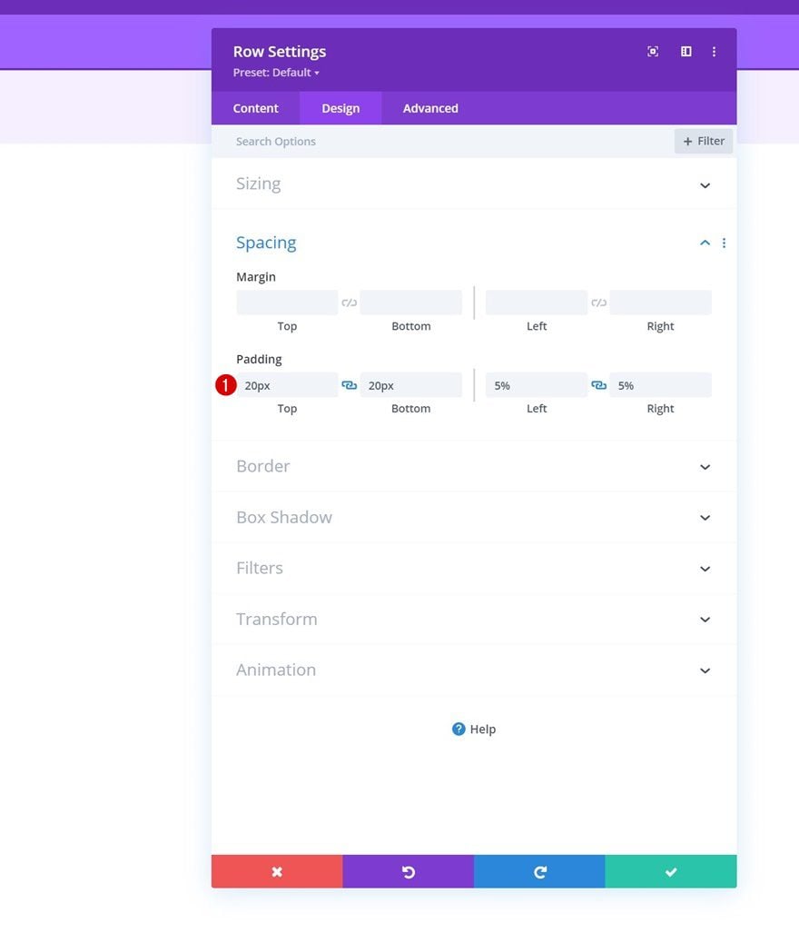
Spacing
Modify the row’s spacing settings next.
- Top Padding: 20px
- Bottom Padding: 20px
- Left Padding: 5%
- Right Padding: 5%
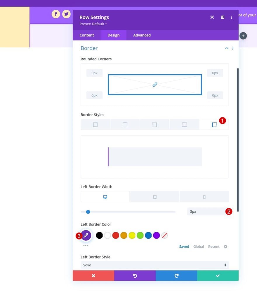
Border
Then, apply the following border settings:
- Left Border Width:
- Desktop: 3px
- Tablet & Phone: 0px
- Left Border Color: #6c2eb9
Select Menu
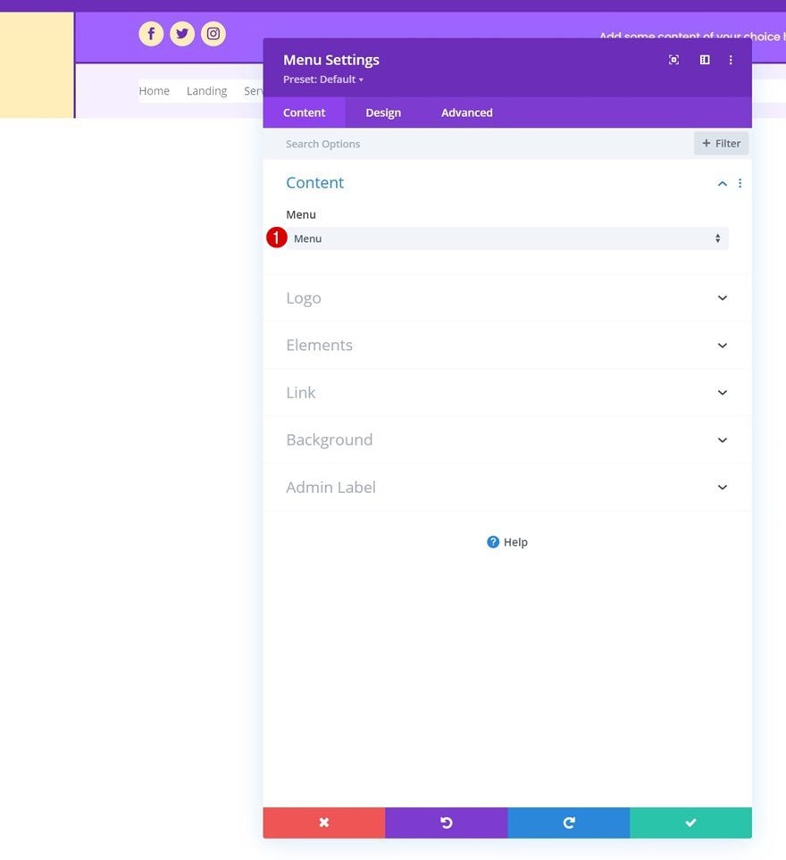
Then only module we need in this row is a Menu Module. Select a menu of your choice.
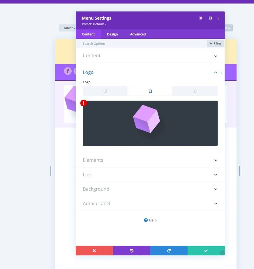
Upload Logo on Tablet & Phone
Then, upload a logo on tablet and phone only.
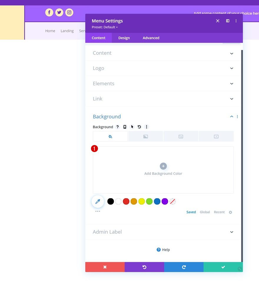
Remove Background Color
Remove the module’s background color next.
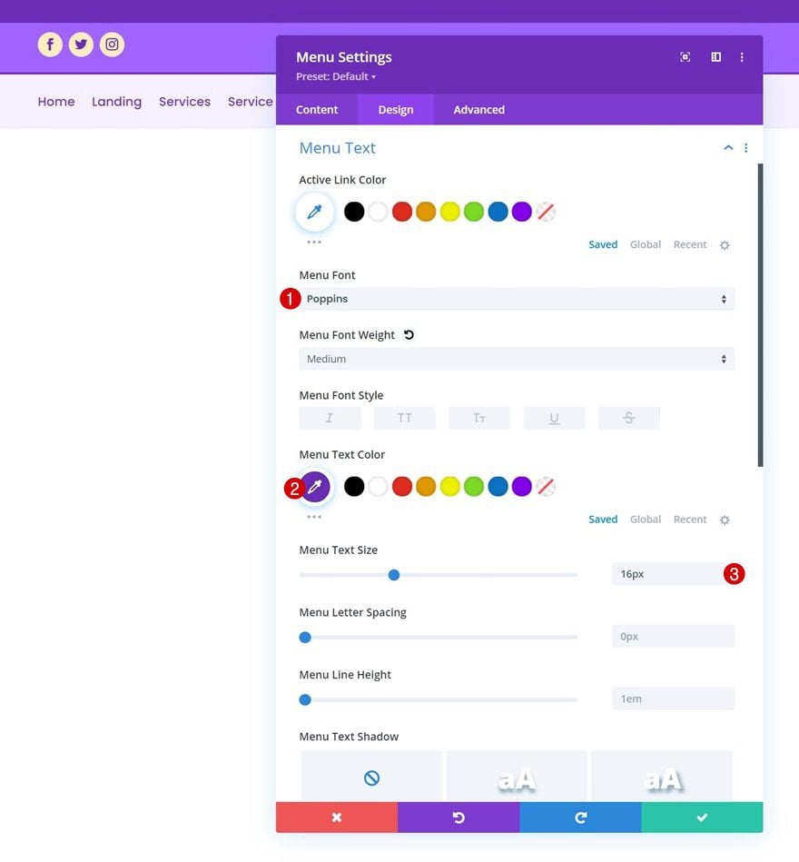
Menu Text Settings
Move on to the module’s design tab and change the menu text settings as follows:
- Menu Font: Poppins
- Menu Text Color: #6c2eb9
- Menu Text Size: 16px
Dropdown Menu Settings
Apply the following dropdown menu line color next:
- Dropdown Menu Line Color: rgba(0,0,0,0)
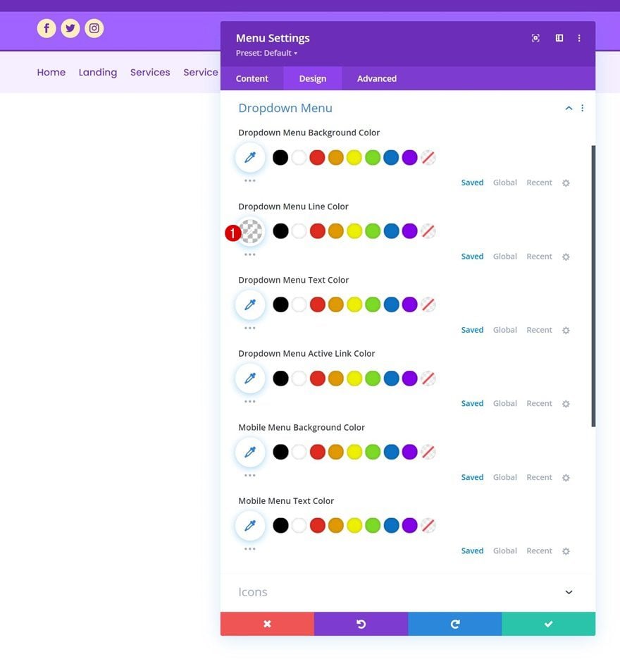
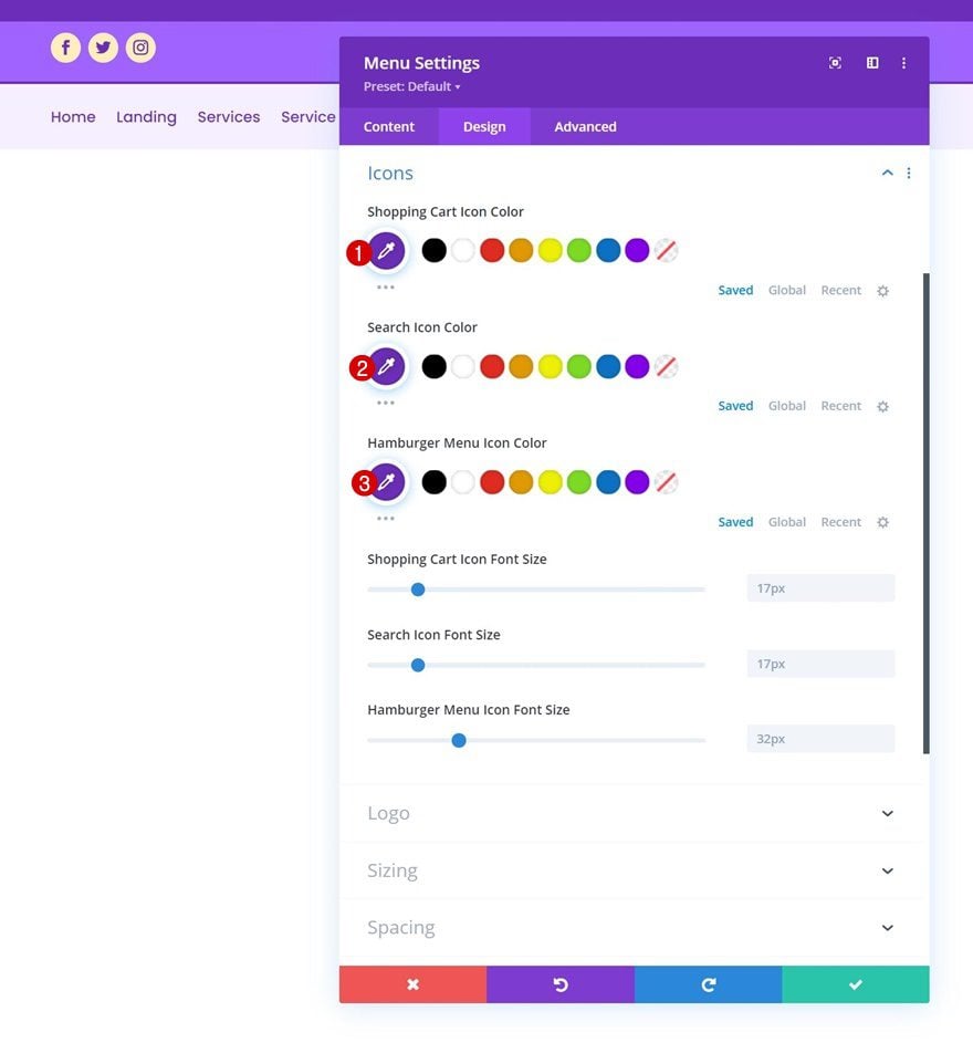
Icons Settings
Then, change the icon settings.
- Shopping Cart Icon Color: #6c2eb9
- Search Icon Color: #6c2eb9
- Hamburger Menu Icon Color: #6c2eb9
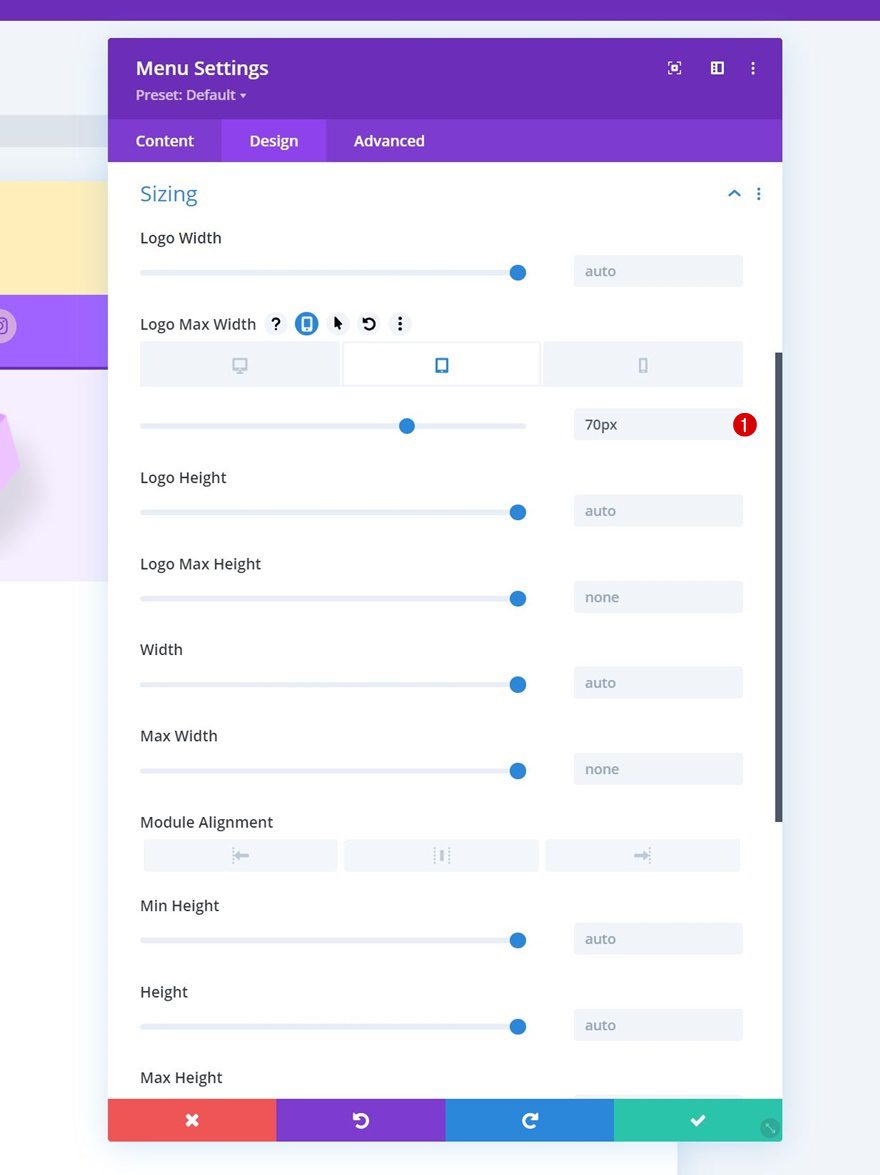
Sizing
Apply a logo max width on tablet and phone.
- Logo Max Width:
- Tablet: 70px
- Phone: 50px
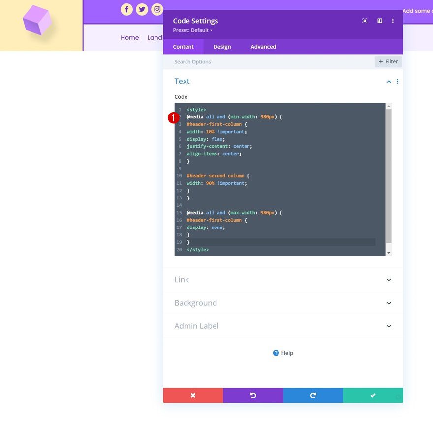
Add Code Module to Column 1
To change the proportions of our header design, we’re going to make some slight CSS modifications. To include the code, add a Code Module below the Image Module in column 1.
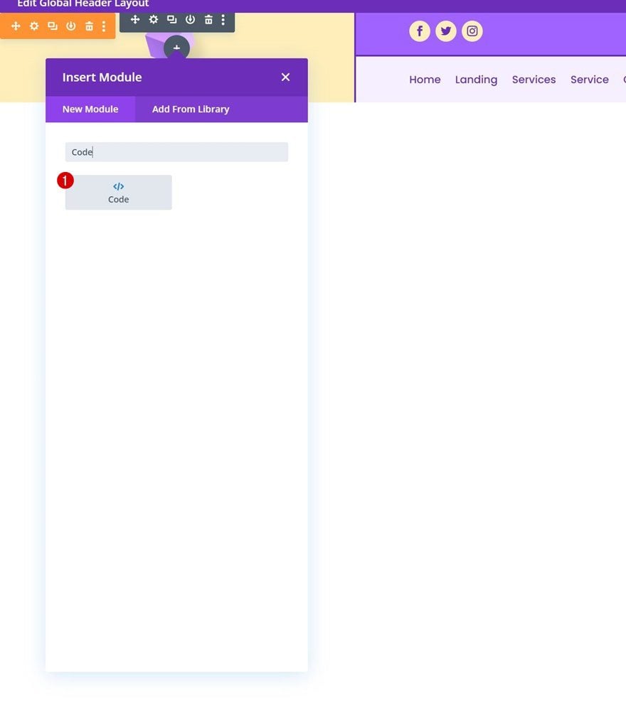
Add Style Tags
Place some style tags inside the code box.
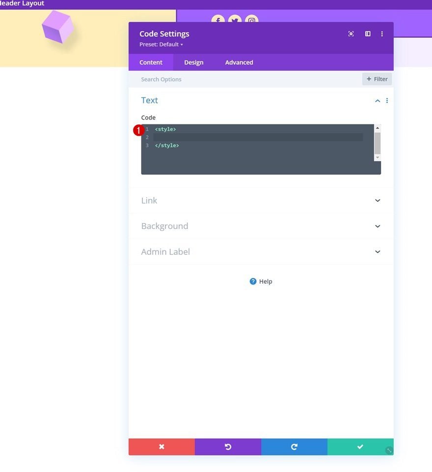
Insert CSS Code Between Style Tags
And place the following lines of CSS code in between the style tags:
@media all and (min-width: 980px) {
#header-first-column {
width: 10% !important;
display: flex;
justify-content: center;
align-items: center;
}

#header-second-column {
width: 90% !important;
}
}

@media all and (max-width: 980px) {
#header-first-column {
display: none;
}
}
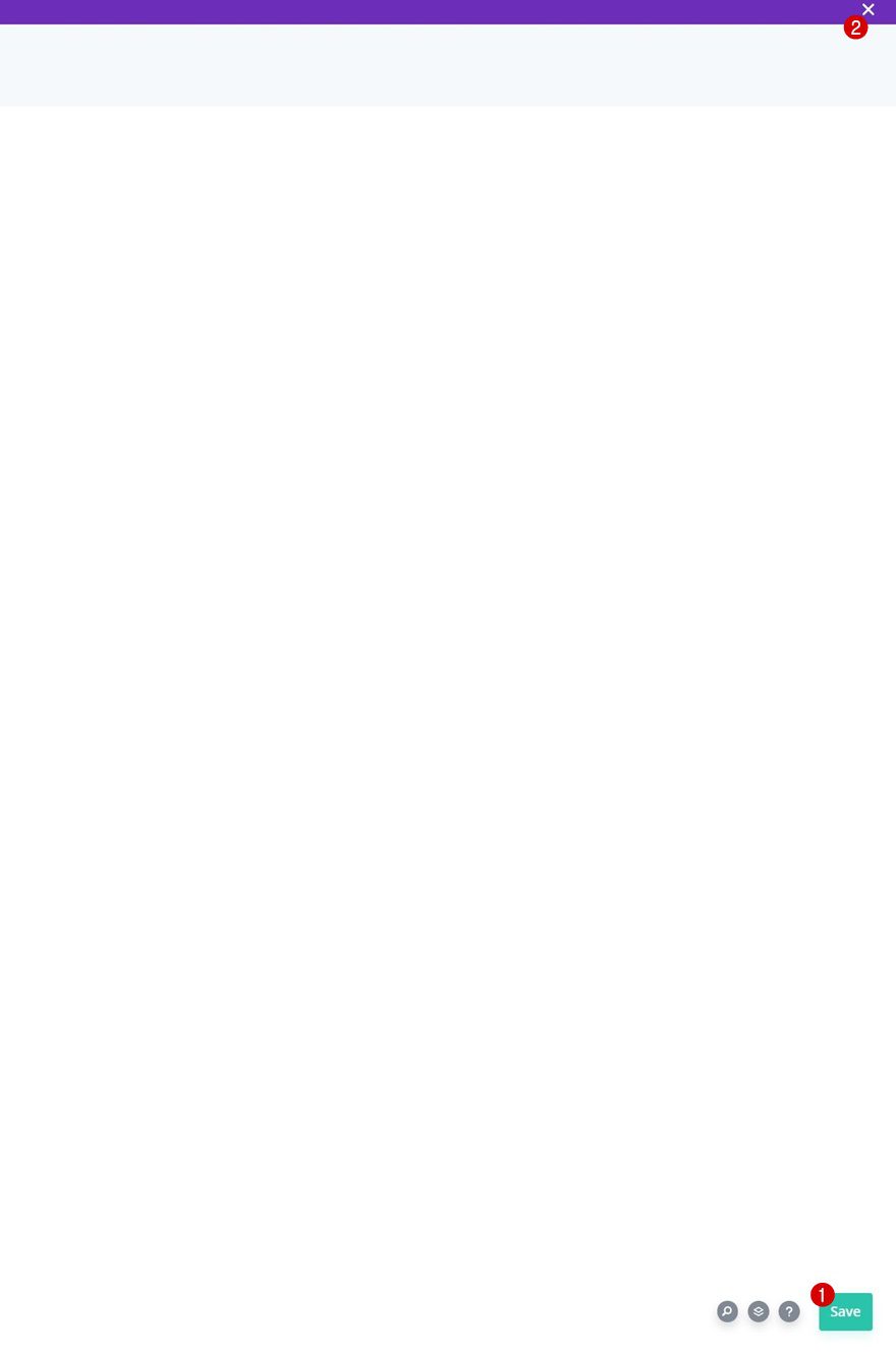
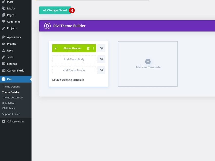
4. Save Divi Theme Builder Changes
Now that everything is in place, the only thing left to do is save all Divi Theme Builder changes and view the outcome!
Preview
Now that we’ve gone through all the steps, let’s take a final look at the outcome across different screen sizes.
Desktop
Mobile
Final Thoughts
In this post, we’ve shown you how to get creative with your Divi header. More specifically, we’ve shown you how to make your logo cross the primary and secondary menu bar inside your header. You were able to download the JSON file for free as well! If you have any questions or suggestions, feel free to leave a comment in the comment section below.
If you’re eager to learn more about Divi and get more Divi freebies, make sure you subscribe to our email newsletter and YouTube channel so you’ll always be one of the first people to know and get benefits from this free content.


I’ll second Callum’s comments. It would be good to see the CSS/Jquery and even better a demo site so you could see this in action.
thanks a lot for this very interesting tuto !
It would be nice to find the json into a templates librairy 😎
(like layouts librairy https://www.elegantthemes.com/layouts/)
Hi Don,
Thanks for the step by step tutorial. Its very much helpful, an awesome time saving way to do CSS.
Its perfect..to place logo perfectly in header
Thank you for this tutorial!
Nice, been looking for something like this. 🙂
This is pretty slick, and while there’s a bunch of other plugins that accomplish this, I like that you’re looking to develop skills for designers using the system.
I did notice in other articles as well that sometimes the CSS is explained, and others it is not. I would imagine that could be useful for others who have little experience with CSS (and even jQuery) to understand the *what and why* of any code used.