
Although a footer appears at the bottom of a page design, it’s a very important part of any website you create. People are used to the footer concept and they expect it on each website they visit. With Divi and its Theme Builder, you can create any footer design you want, but if you’re looking for a unique approach, you’ll love this tutorial. Today, we’ll show you how to interactively highlight contact details that appear in the first part of your footer. You’ll be able to download the JSON file for free as well!
Let’s get to it.
- 1 Preview
- 2 Download The Global Footer Template for FREE
- 3 Download For Free
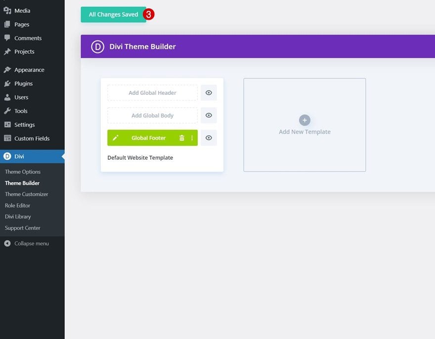
- 4 1. Create New Footer Template
-
5
2. Build Footer Design
- 5.1 Section Settings
- 5.2 Add Row #1
- 5.3 Add Text Module #1 to Column 1
- 5.4 Clone Text Module Twice
- 5.5 Add Row #2
- 5.6 Add Text Module #1 to Column 1
- 5.7 Add Text Module #2 to Column 1
- 5.8 Reuse Column 1
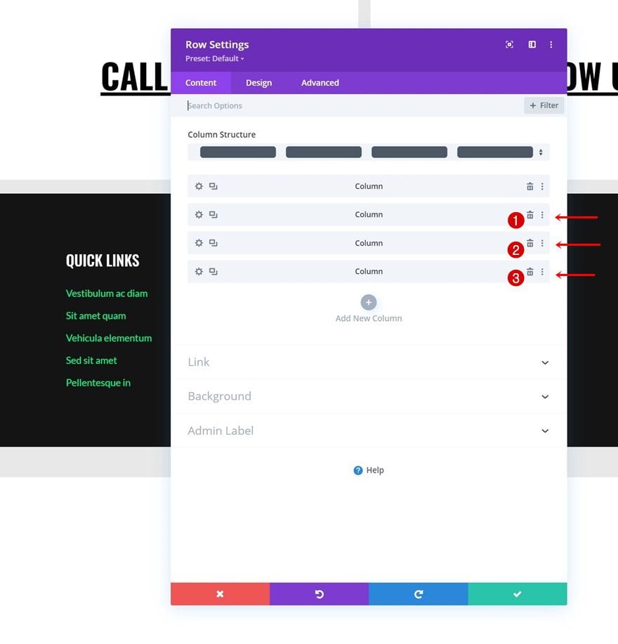
- 5.9 Add Row #3
- 5.10 Add Text Module to Column 1
- 5.11 Clone Text Module & Place Duplicate in Column 2
- 6 4. Save All Template & Theme Builder Changes
- 7 Preview
- 8 Final Thoughts
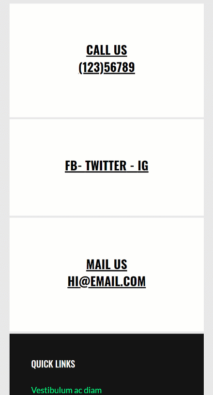
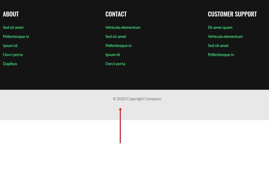
Preview
Before we dive into the tutorial, let’s take a quick look at the outcome across different screen sizes.
Desktop
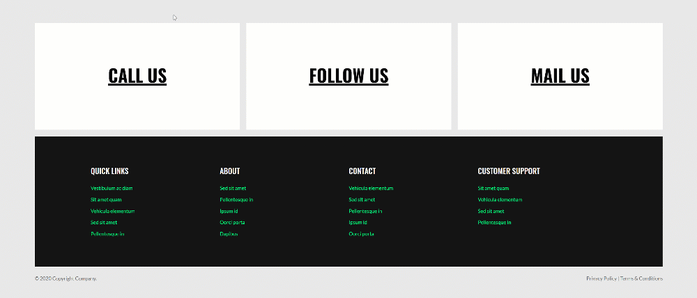
Mobile
To lay your hands on the free global footer template, you will first need to download it using the button below. To gain access to the download you will need to subscribe to our newsletter by using the form below. As a new subscriber, you will receive even more Divi goodness and a free Divi Layout pack every Monday! If you’re already on the list, simply enter your email address below and click download. You will not be “resubscribed” or receive extra emails.

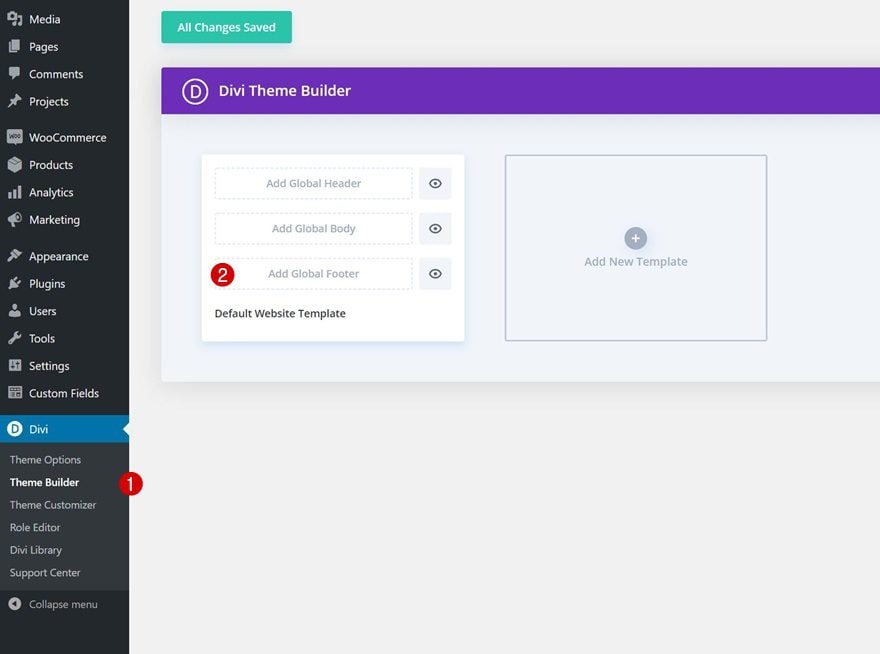
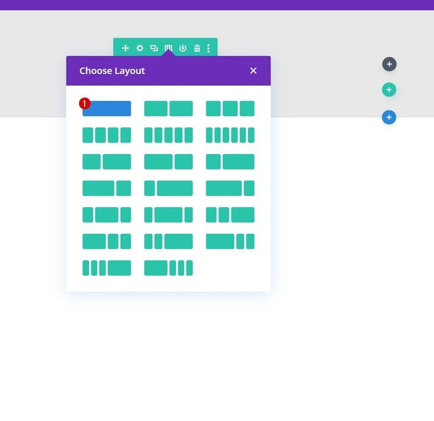
Start by going to the Divi Theme Builder in the backend of your WordPress website. There, add a new global or custom footer.
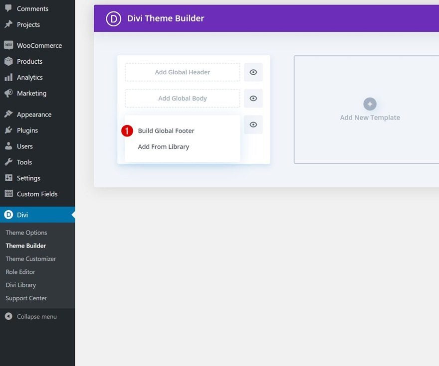
Start Building From Scratch
Start building the footer template from scratch.
Section Settings
Background Color
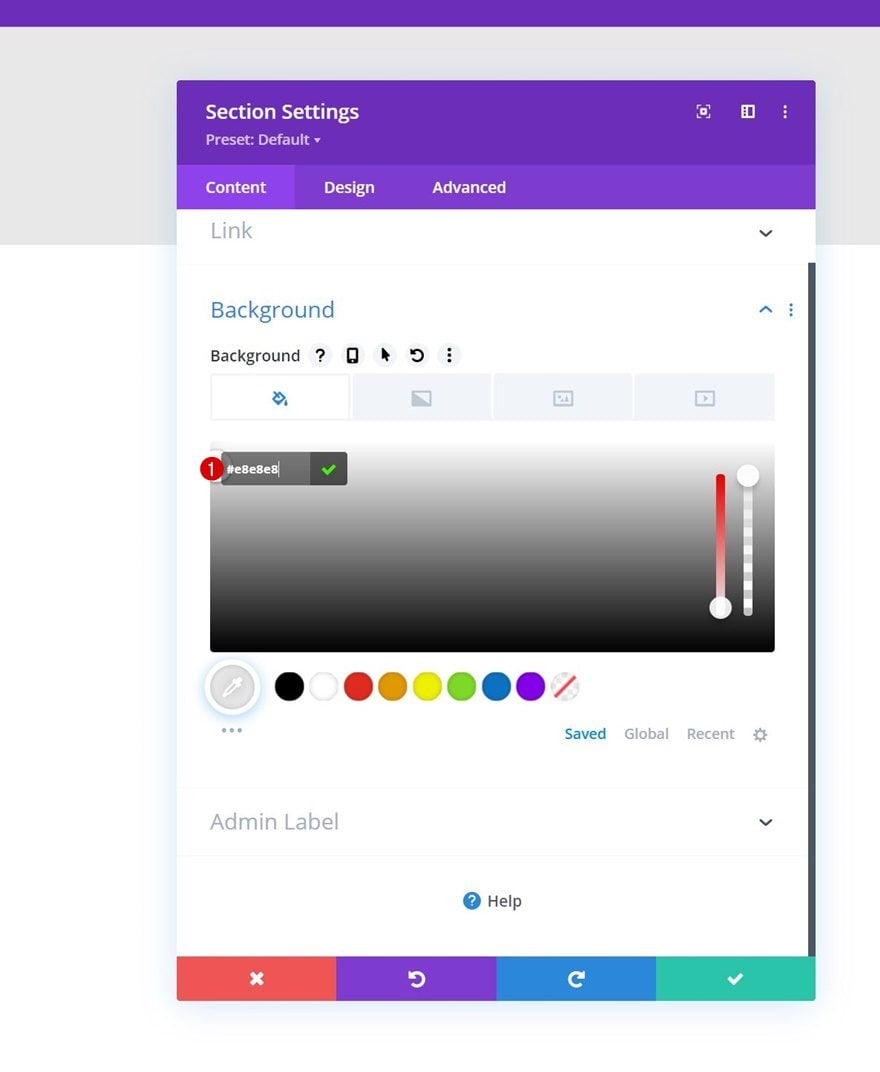
Once inside the template editor, you’ll notice a section is already there. Open the section settings and apply a background color.
- Background Color: #e8e8e8
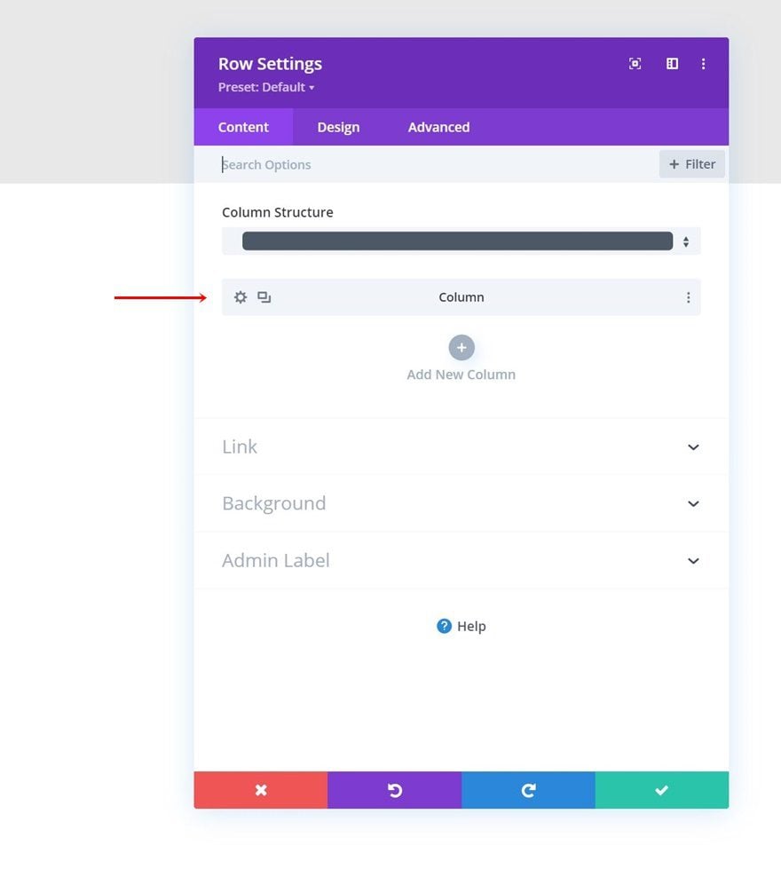
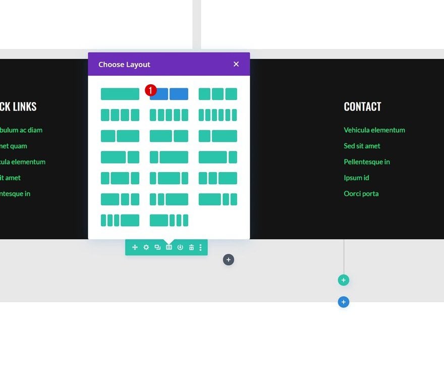
Add Row #1
Column Structure
Continue by adding a new row using the following column structure:
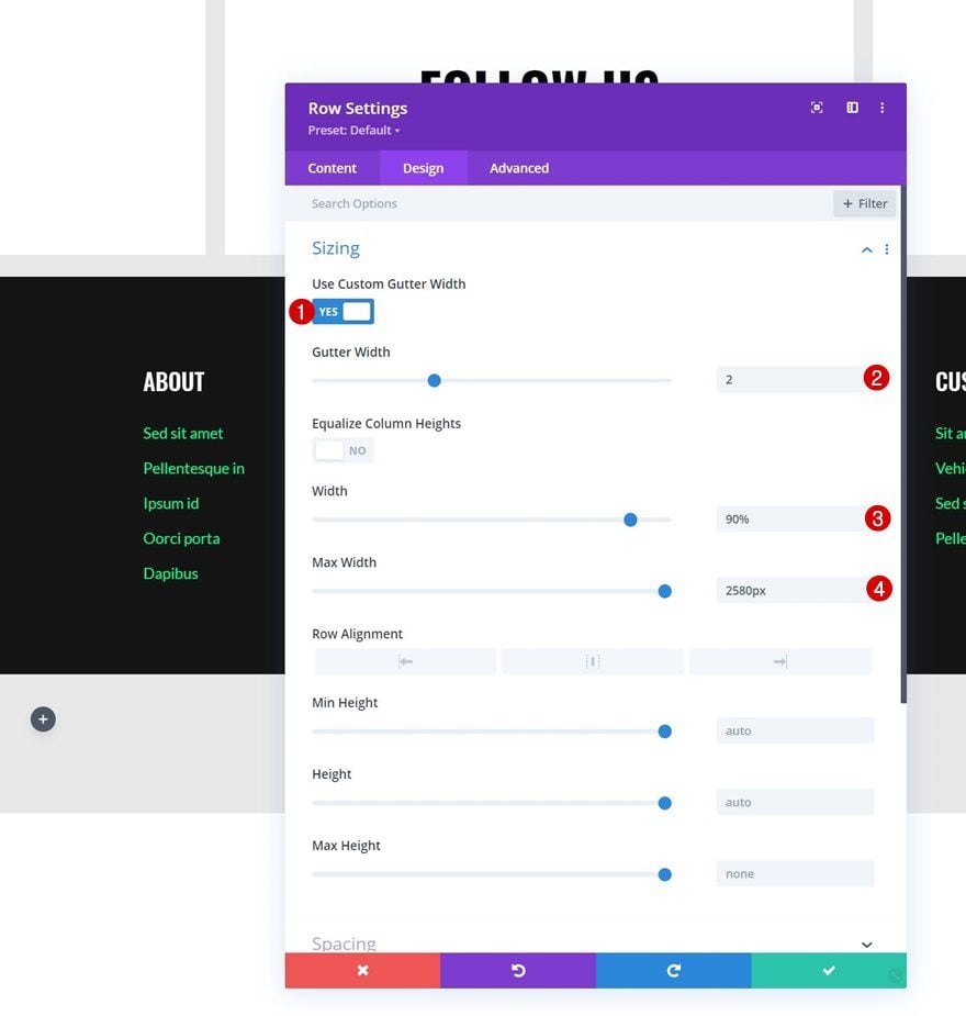
Sizing
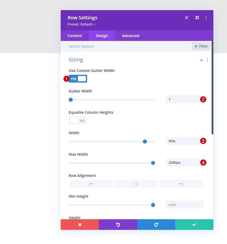
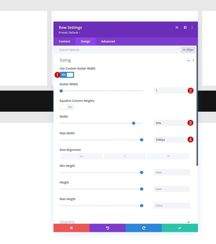
Without adding modules yet, open the row settings and modify the sizing settings as follows:
- Use Custom Gutter Width: Yes
- Gutter Width: 1
- Width: 90%
- Max Width: 2580px
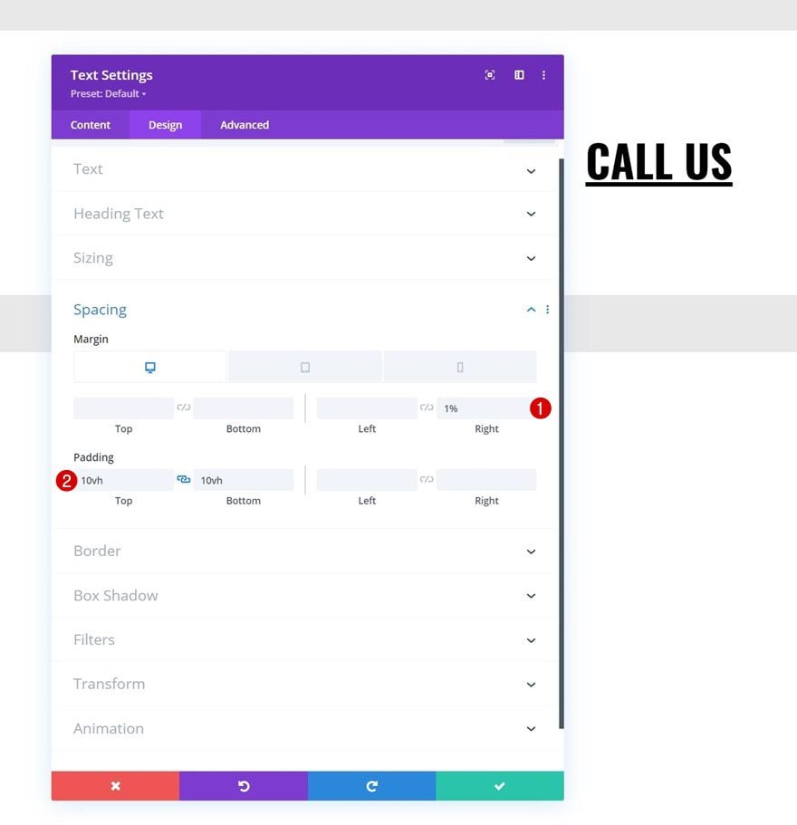
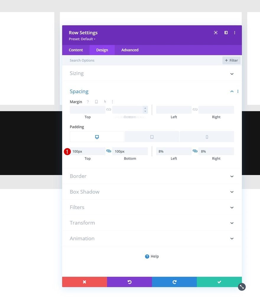
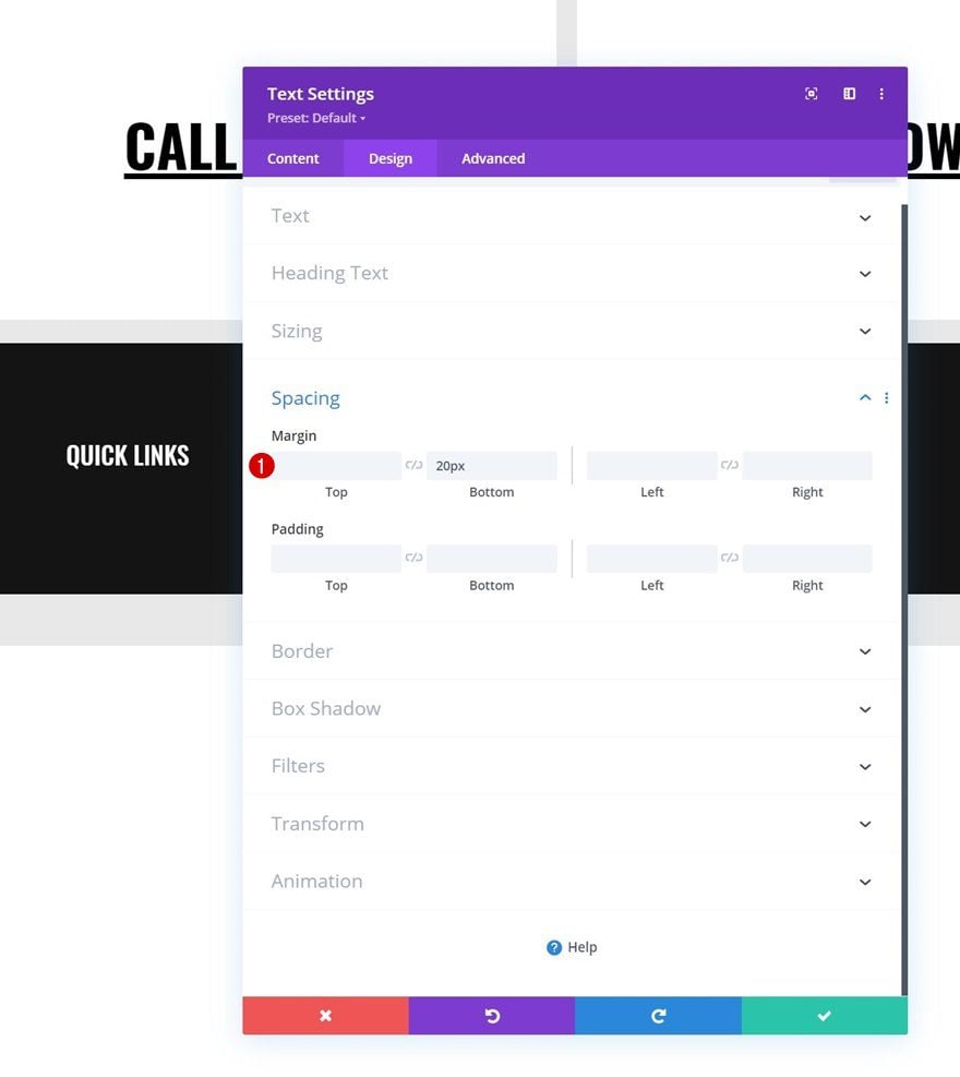
Spacing
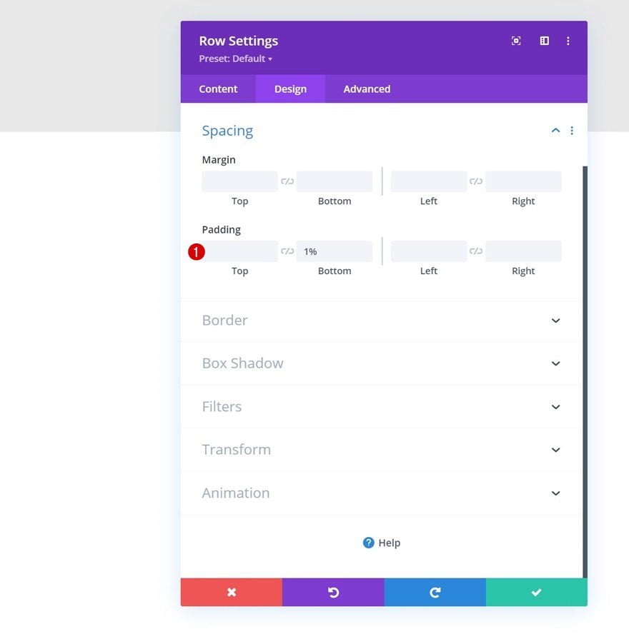
Add some bottom padding next.
- Bottom Padding: 1%
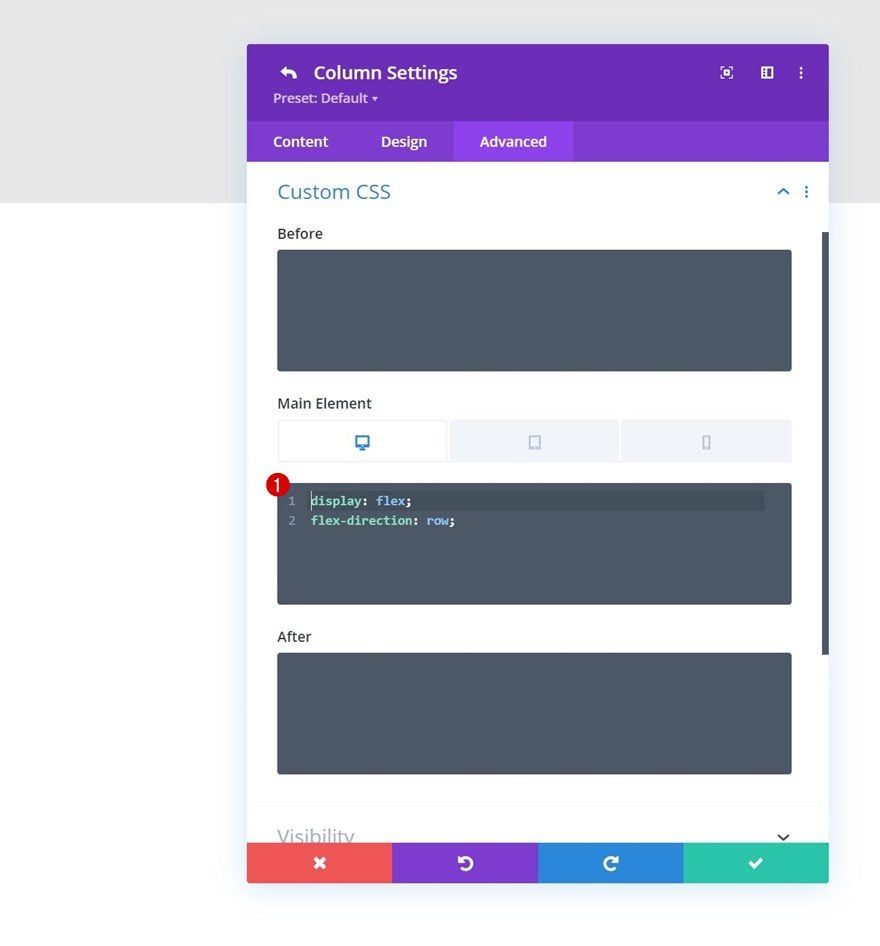
Column Main Element CSS
Then, open the column 1 settings, navigate to the advanced tab and apply the following responsive lines of CSS code to the column’s main element:
Desktop:
display: flex;
flex-direction: row;
Tablet & Phone:
display: block;
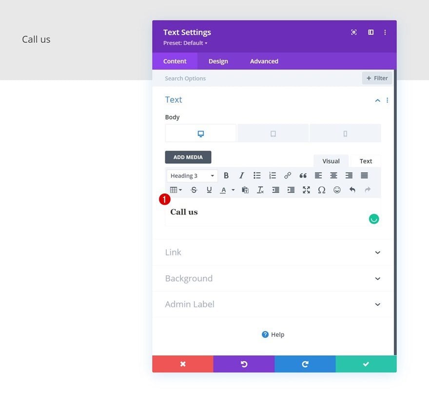
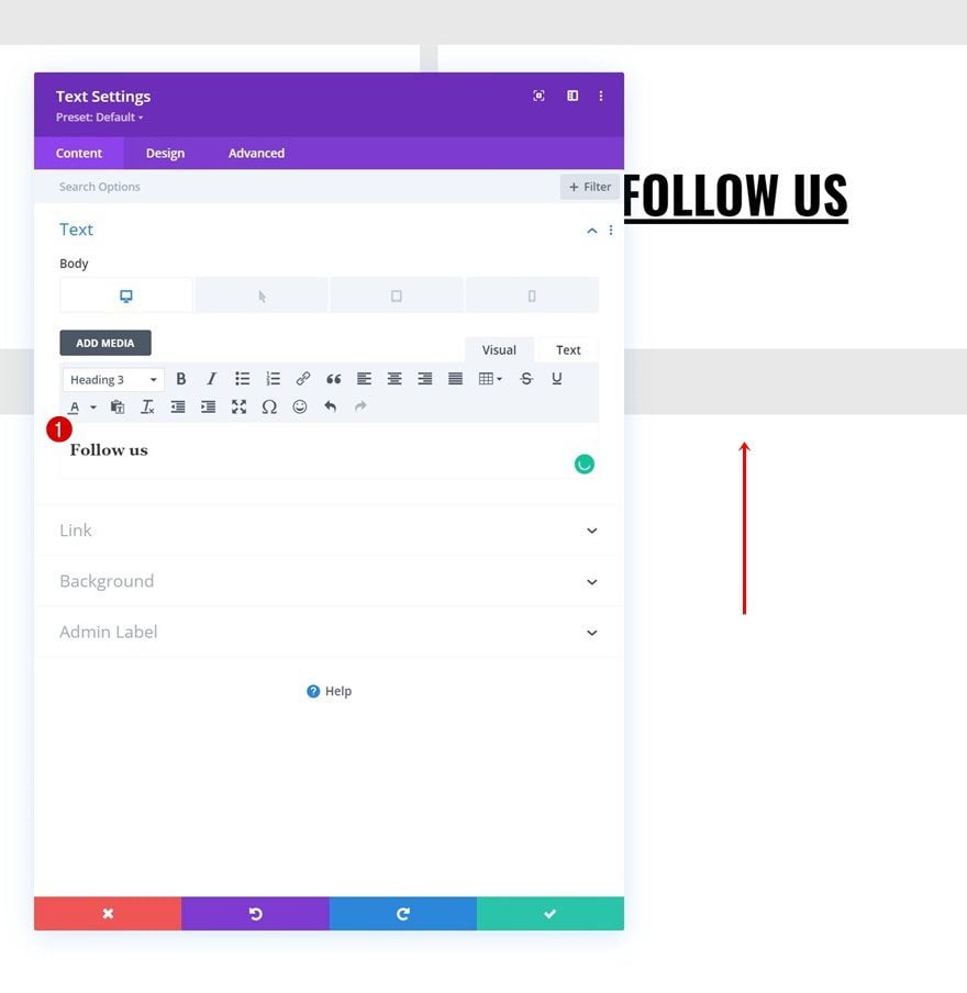
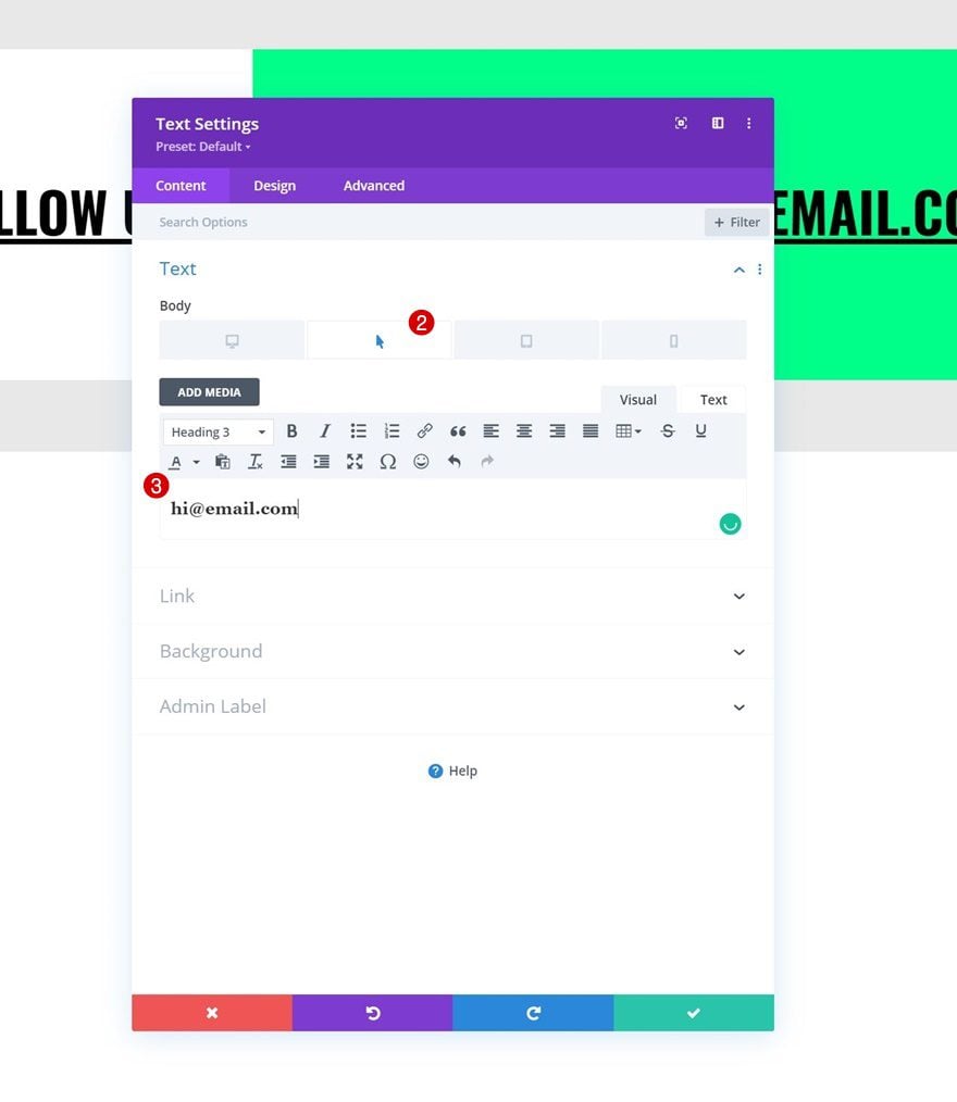
Add Text Module #1 to Column 1
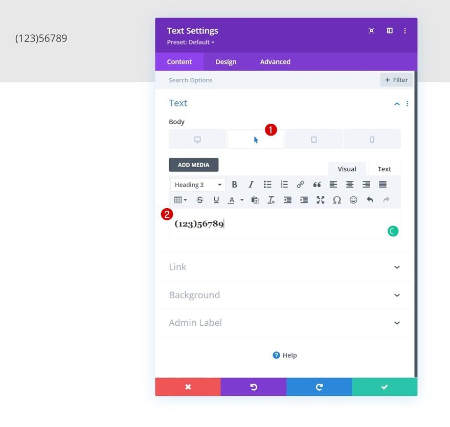
Responsive Content
Time to add modules, starting with a first Text Module. Add some responsive content of your choice. Make sure to include the phone number on tablet and mobile, where hover options aren’t as obvious.
Hover Content
Modify the hover content next.
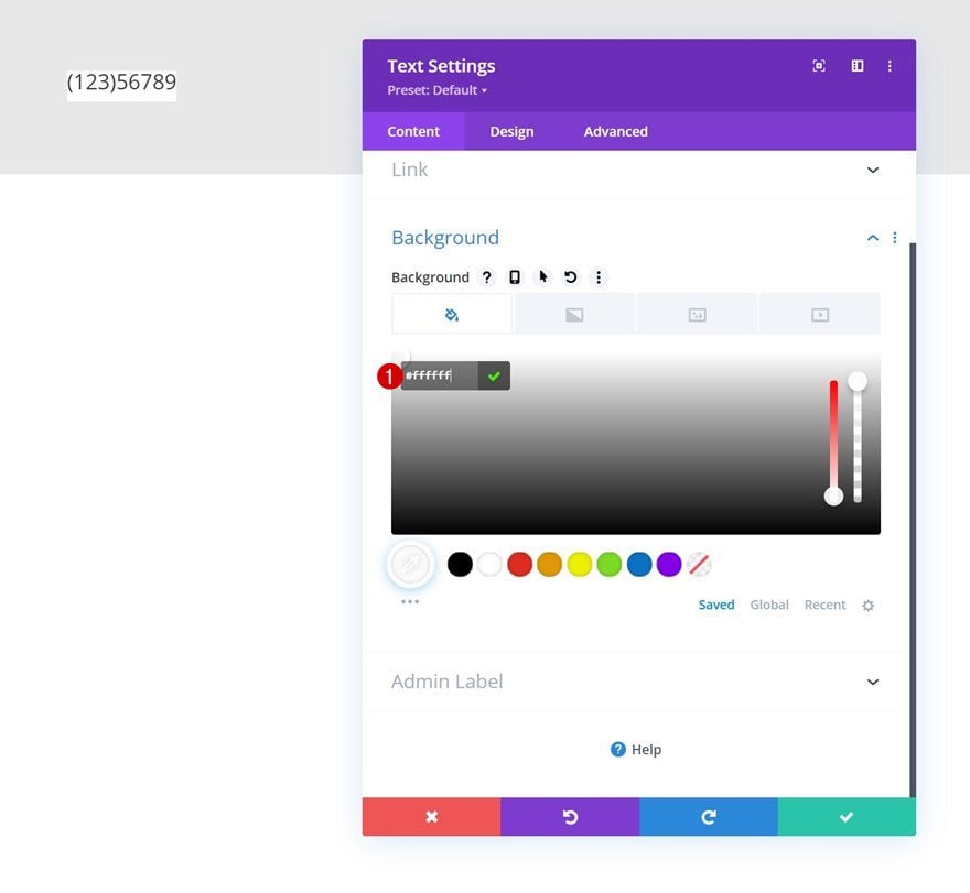
Background Color
Then, apply a background color.
- Background Color: #ffffff
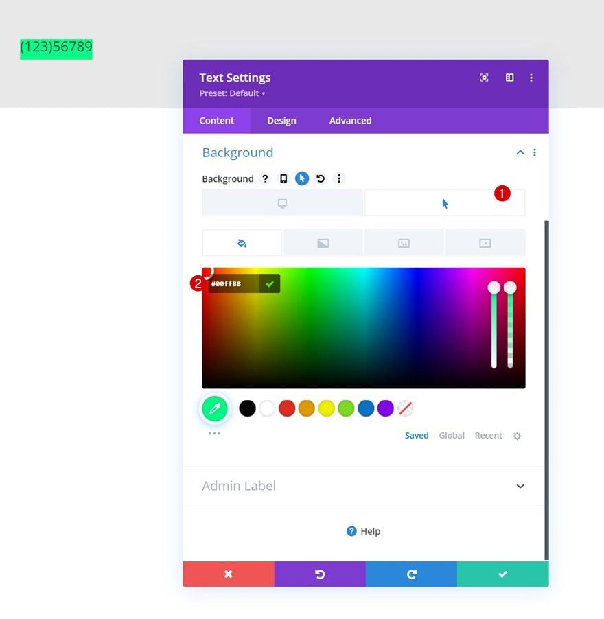
Hover Background Color
Modify the background color on hover.
- Hover Background Color: #00ff88
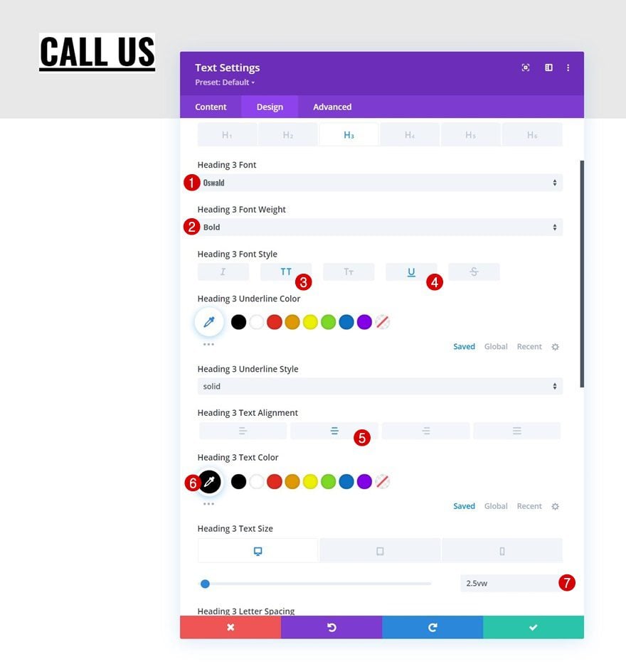
H3 Text Settings
Move on to the module’s design tab and change the H3 text settings as follows:
- Heading 3 Font: Oswald
- Heading 3 Font Weight: Bold
- Heading 3 Font Style: Uppercase & Underline
- Heading 3 Text Alignment: Center
- Heading 3 Text Color: #000000
- Heading 3 Text Size:
- Desktop: 2.5vw
- Tablet: 4.5vw
- Phone: 5.5vw
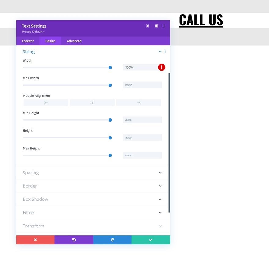
Sizing
Make sure the width is “100%” next.
- Width: 100%
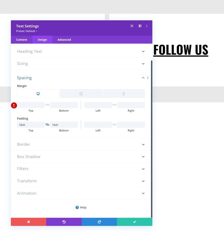
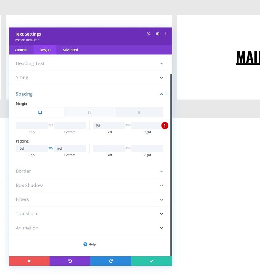
Spacing
Then, apply the following responsive spacing values:
- Bottom Margin:
- Desktop: /
- Tablet & Phone: 1%
- Right Margin:
- Desktop: 1%
- Tablet & Phone: 0%
- Top Padding: 10vh
- Bottom Padding: 10vh
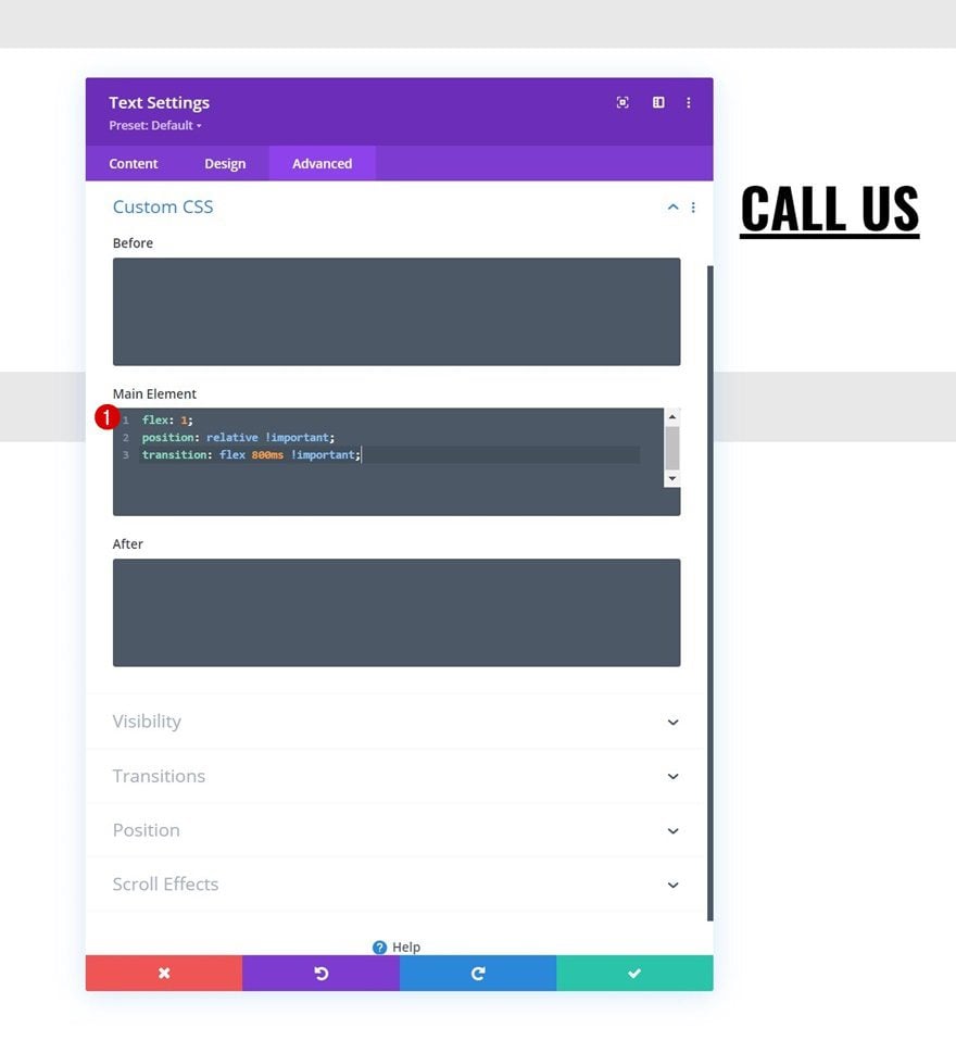
Main Element CSS
Apply the following lines of CSS code to the module as well:
flex: 1;
position: relative !important;
transition: flex 800ms !important;
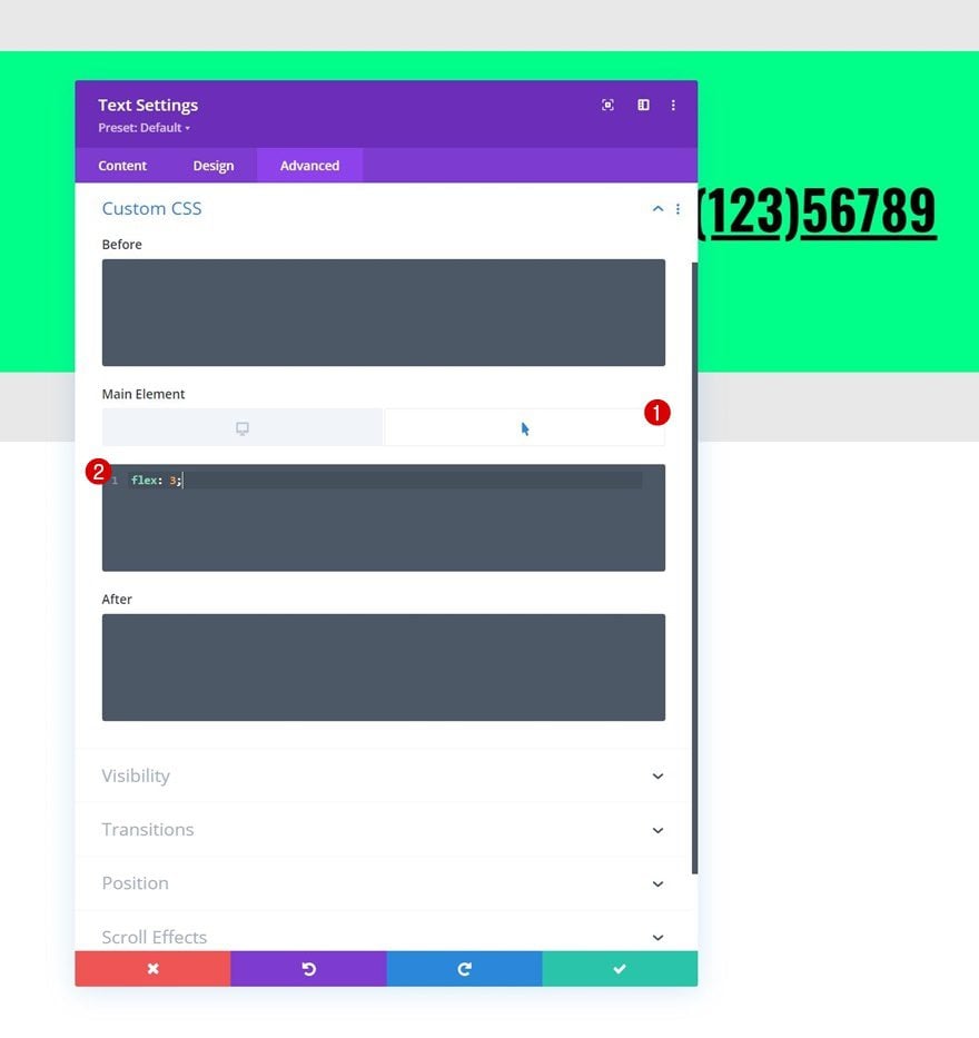
Hover Main Element CSS
And change the hover main element CSS flex property.
flex: 3;
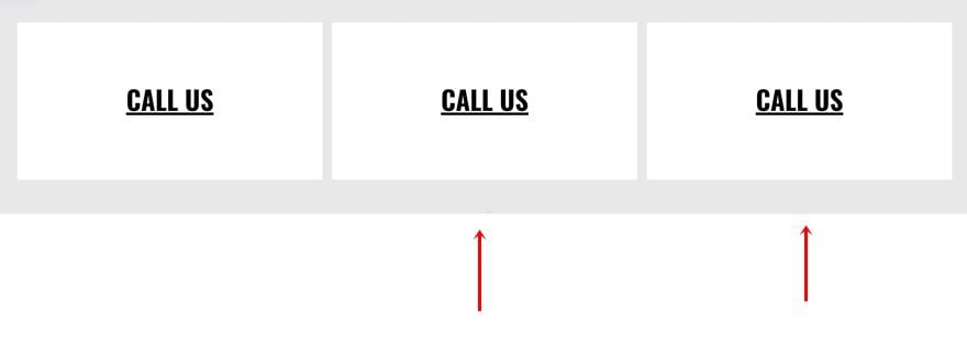
Clone Text Module Twice
Once you’ve completed the first module, you can clone it twice for reuse. You’ll notice that the duplicate modules will automatically appear next to each other.
Modify Text Module #2
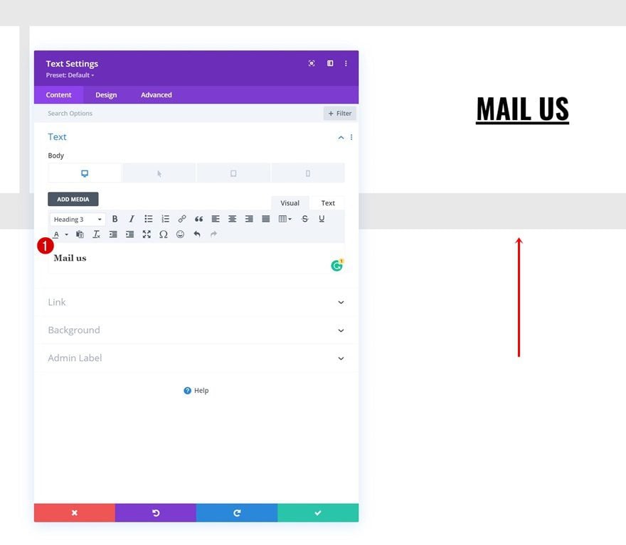
Change Content & Hover Content
Open the first duplicate Text Module and modify the responsive and hover content.
Change Spacing
Remove the right margin of this module too.
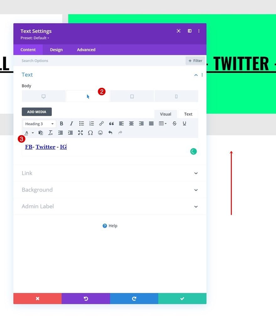
Modify Text Module #3
Change Content & Hover Content
Next, open the third Text Module’s settings and change the copy.
Change Spacing
Remove the right margin in the spacing settings and add some left margin instead.
- Left Margin:
- Desktop: 1%
- Tablet & Phone: 0%
Add Row #2
Column Structure
Add another row to the section using the following column structure:
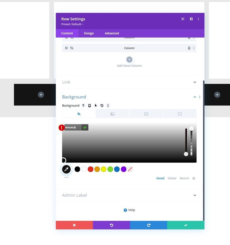
Background Color
Open the row settings and apply the following background color:
- Background Color: #141414
Sizing
Move on to the row’s design tab and change the sizing settings accordingly:
- Use Custom Gutter Width: Yes
- Gutter Width: 1
- Width: 90%
- Max Width: 2580px
Spacing
Modify the row’s spacing settings too.
- Top Padding:
- Desktop: 100px
- Tablet & Phone: 50px
- Bottom Padding:
- Desktop: 100px
- Tablet & Phone: 50px
- Left Padding:
- Desktop: 8%
- Tablet & Phone: 10%
- Right Padding:
- Desktop: 8%
- Tablet & Phone: 10%
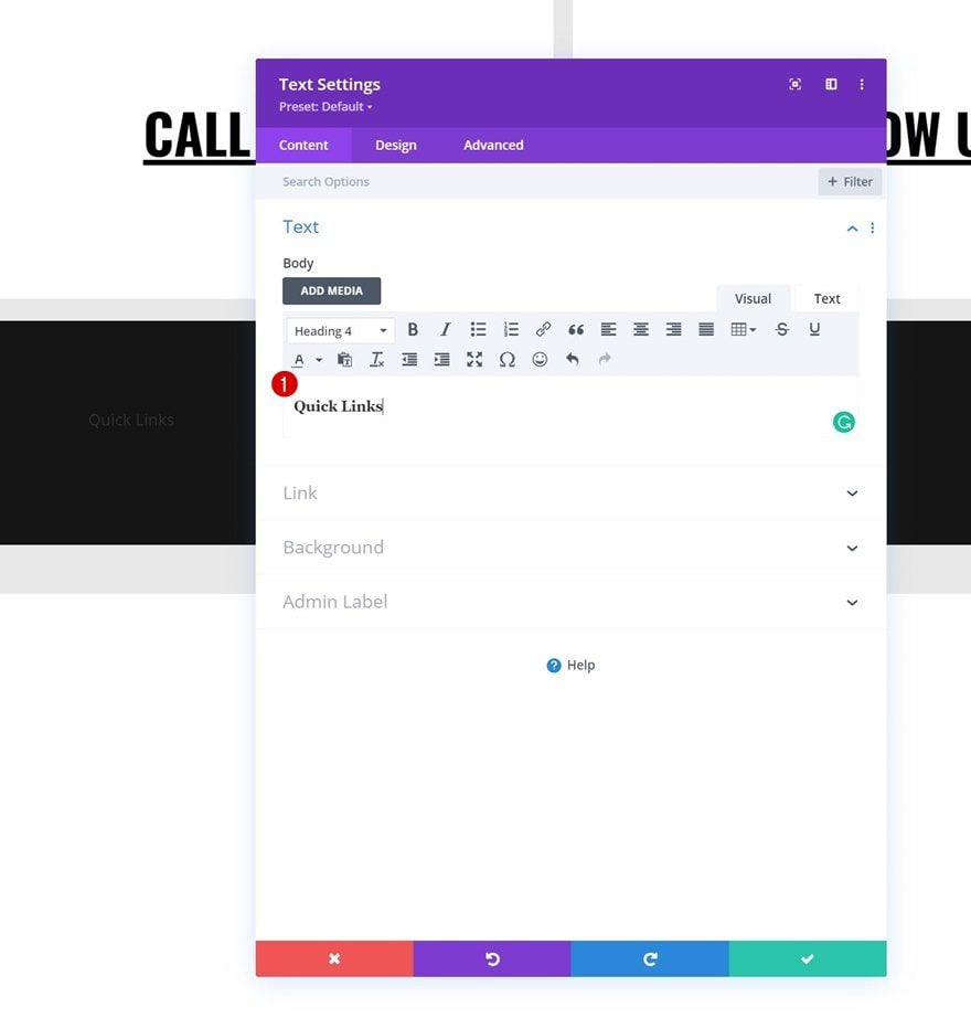
Add Text Module #1 to Column 1
Add H4 Content
Then, add a first Text Module to column 1 with some H4 content of your choice.
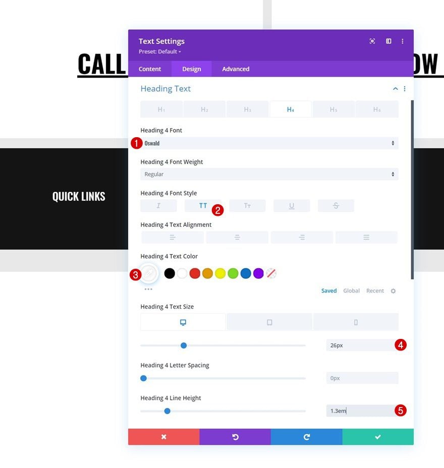
H4 Text Settings
Move on to the module’s design tab and change the H4 text settings as follows:
- Heading 4 Font: Oswald
- Heading 4 Font Style: Uppercase
- Heading 4 Text Color: #ffffff
- Heading 4 Text Size:
- Desktop: 26px
- Tablet: 22px
- Phone: 18px
- Heading 4 Line Height: 1.3em
Spacing
Apply some bottom margin too.
- Bottom Margin: 20px
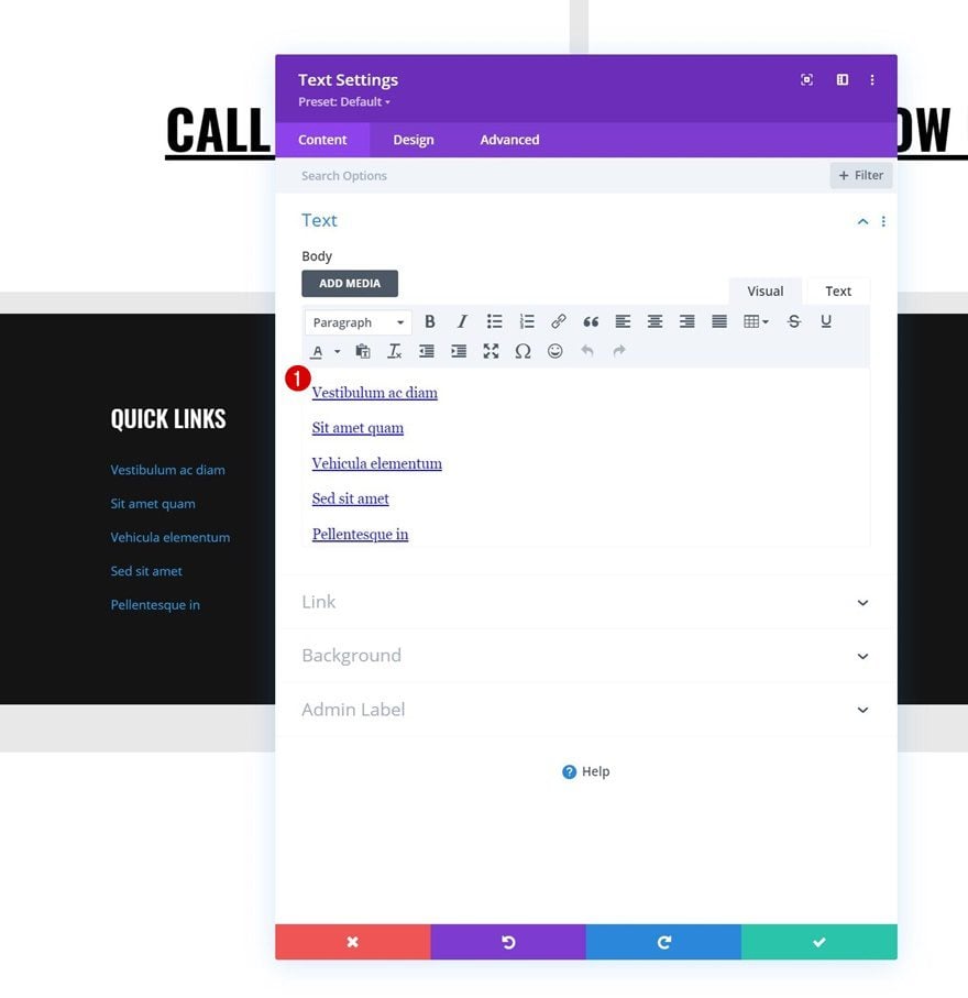
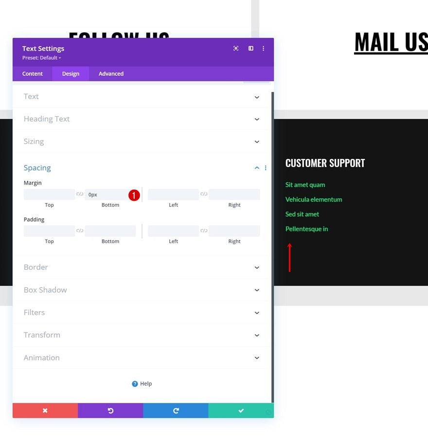
Add Text Module #2 to Column 1
Add Content
Add another Text Module below the previous one and include some footer items with links of your choice.
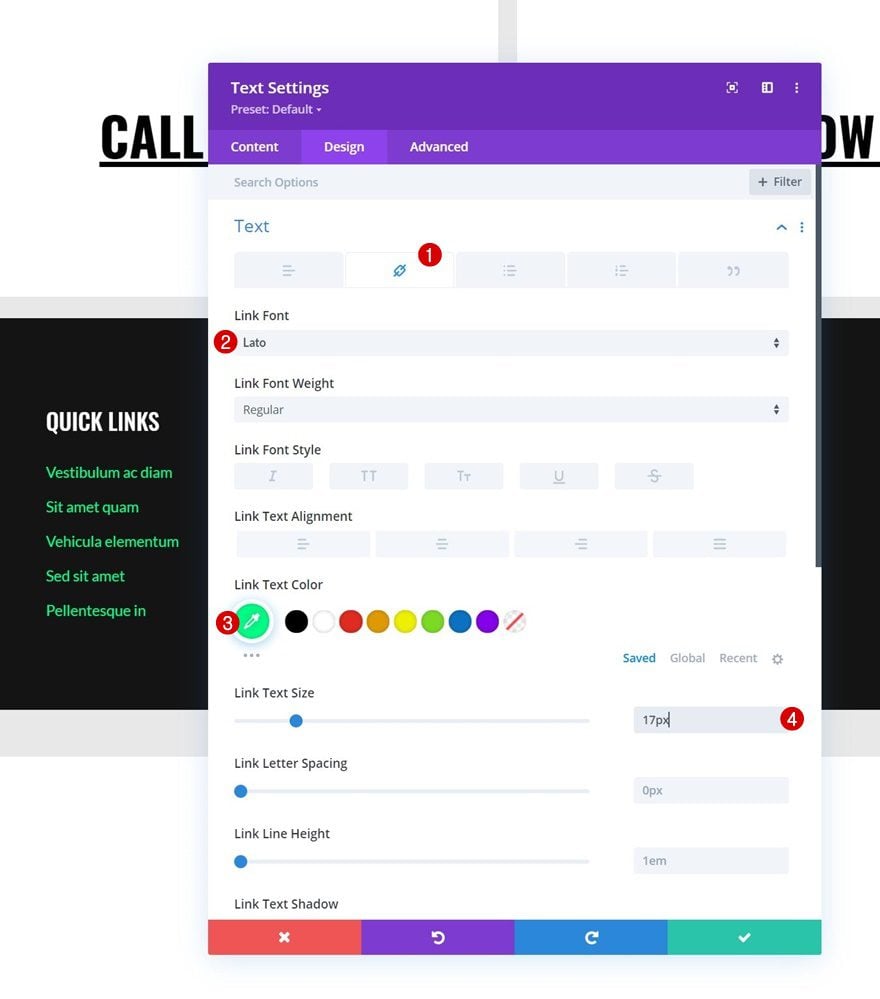
Link Text Settings
Change the module’s link text settings accordingly:
- Link Font: Lato
- Link Text Color: #00ff88
- Link Text Size: 17px
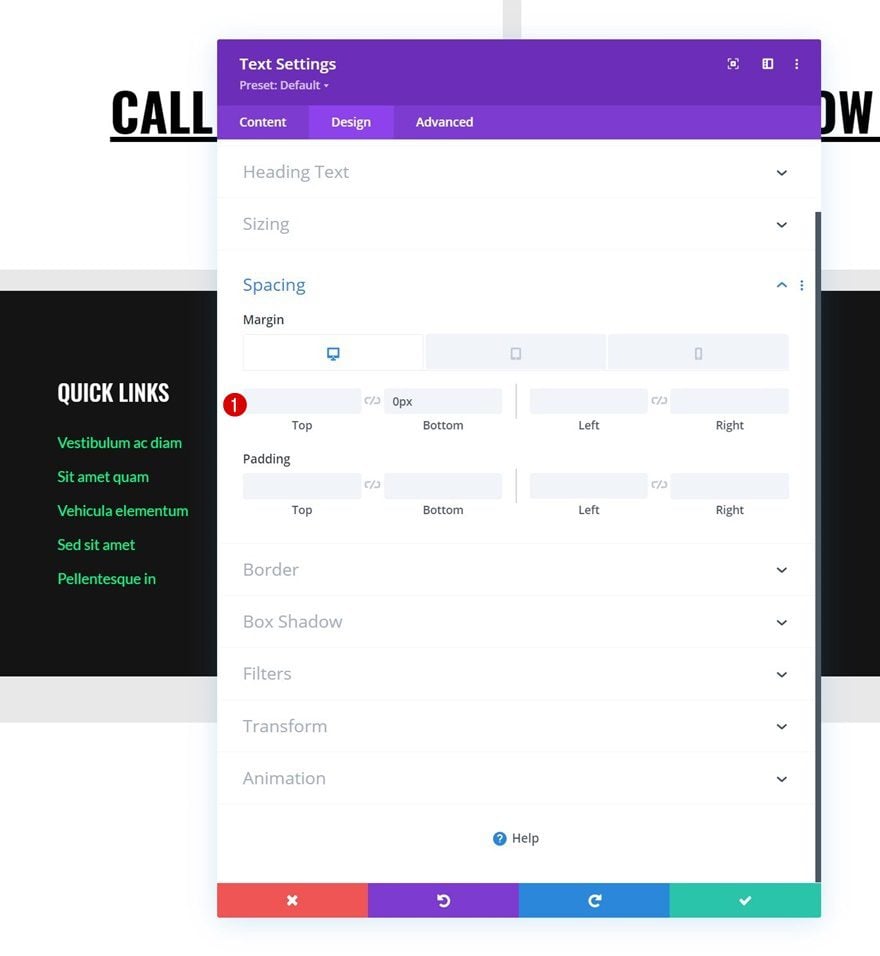
Spacing
Apply some responsive bottom margin next.
- Bottom Margin:
- Desktop: 0px
- Tablet & Phone: 50px
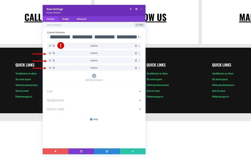
Reuse Column 1
Remove Column 2, 3 & 4
Once you’ve completed both Text Modules in column 1, you can delete the three remaining columns of the row.
Clone Column 1 Three Times
And reuse the first column by cloning it three times.
Change All Duplicate Content
Make sure you change all duplicate content in each new column.
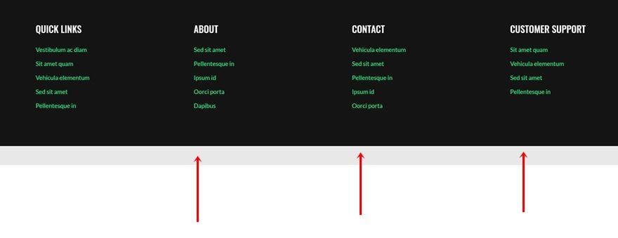
Remove Bottom Margin of Text Module #2 in Column 4
And remove the bottom margin of the last Text Module in column 4.
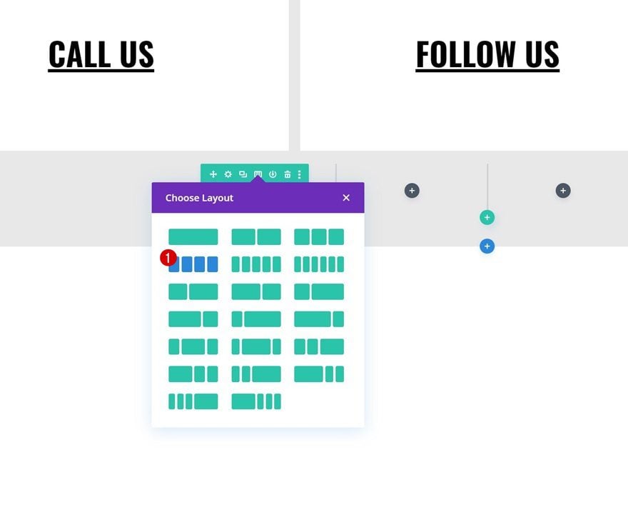
Add Row #3
Column Structure
On to the next and last row. Use the following column structure:
Sizing
Open the row settings and change the sizing settings as follows:
- Use Custom Gutter Width: Yes
- Gutter Width: 2
- Width: 90%
- Max Width: 2580px
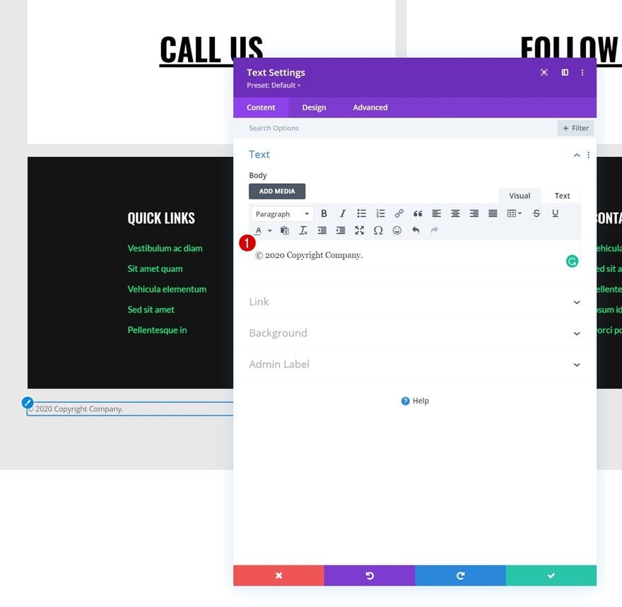
Add Text Module to Column 1
Add Content
Then, add a Text Module to column 1 with some content of your choice.
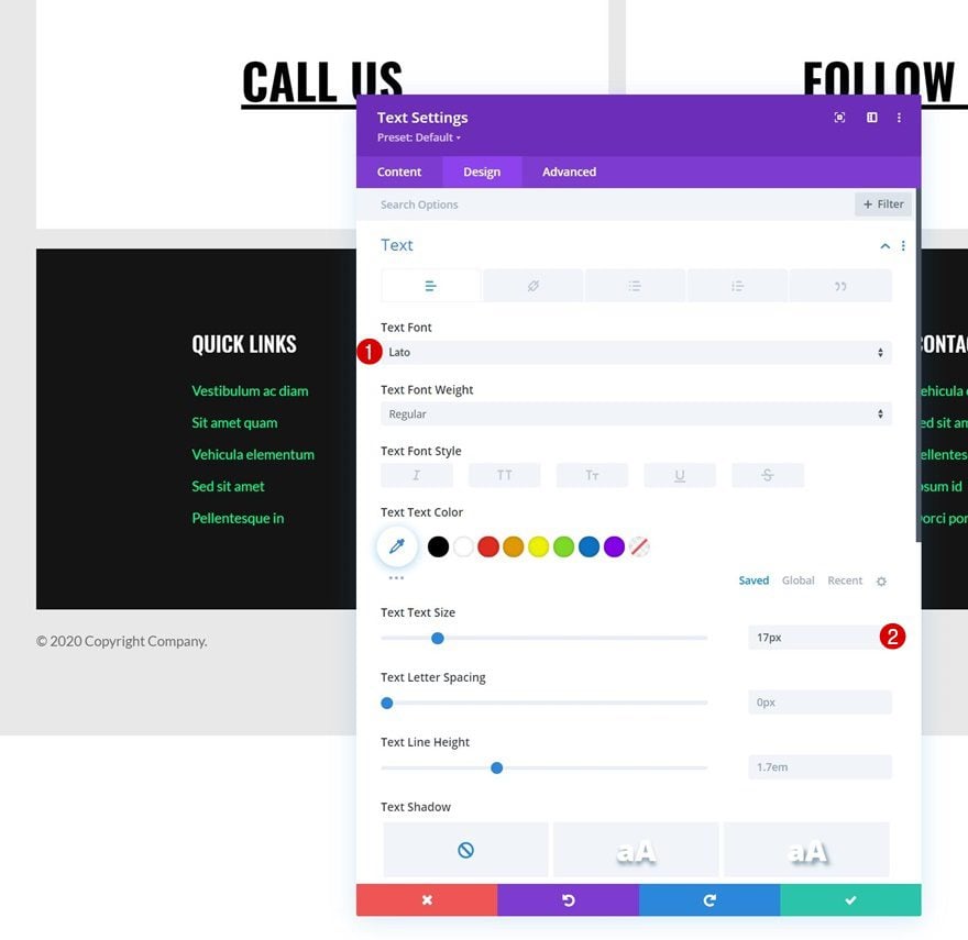
Text Settings
Change the module’s text settings accordingly:
- Text Font: Lato
- Text Size: 17px
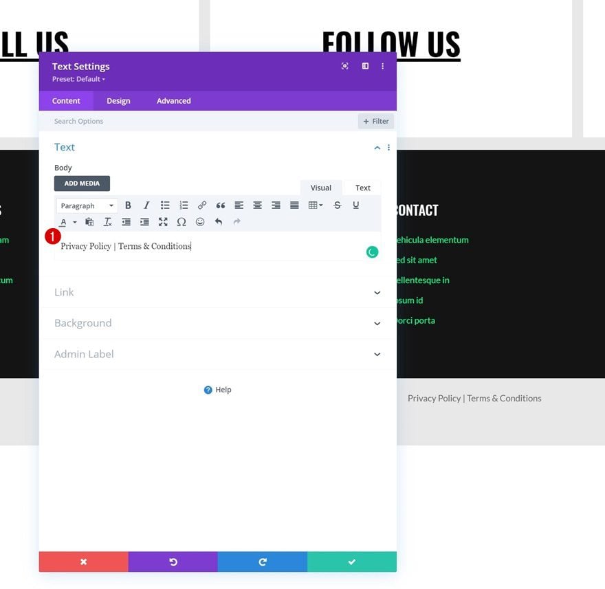
Clone Text Module & Place Duplicate in Column 2
Clone the Text Module in column 1 once, and place the duplicate in column 2.
Change Content
Change the duplicate module’s content.
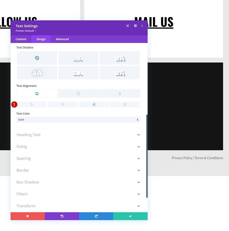
Change Text Alignment
And use a different responsive text alignment.
- Text Alignment:
- Desktop: Right
- Tablet & Phone: Left
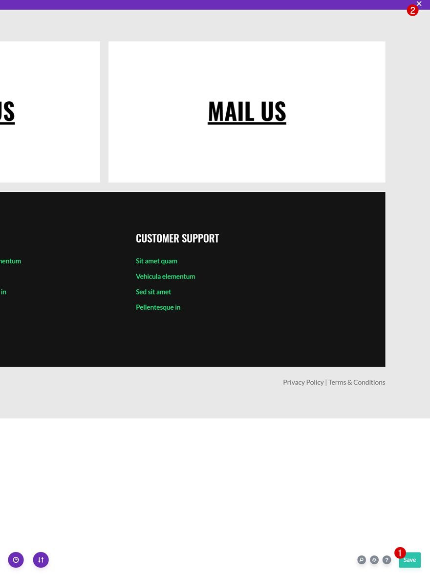
4. Save All Template & Theme Builder Changes
Once you’ve completed the sticky steps, make sure you save your template and theme builder changes before viewing the outcome on your website!
Preview
Now that we’ve gone through all the steps, let’s take a final look at the outcome across different screen sizes.
Desktop
Mobile
Final Thoughts
In this post, we’ve shown you how to get creative with your website’s footer. More specifically, we’ve shown you how to interactively highlight contact details using the Divi Theme Builder. You were able to download the JSON file for free as well! If you have any questions or suggestions, feel free to leave a comment in the comment section below.
If you’re eager to learn more about Divi and get more Divi freebies, make sure you subscribe to our email newsletter and YouTube channel so you’ll always be one of the first people to know and get benefits from this free content.


Cannot import layout with any of the three ways Divi has to import. All give “This file should not be imported in this context.” Layout Error
From dashboard > Divi > Divi Library . Did not work
From Visual Editor > where import/export icon is. Did Not work
From Page editor > Where import/export icon is. Did Not work
Any suggestions?
Thanks, great footer.
I can’t make divi-highight-contact-details-global-footer-template.json work.
When I import it says: “This file should not be inported in this context.” ?
Thanks, Donjete Vuniqi for sharing this guide.
This post will be helpful for our interns in adding footer sections on our client’s website.
I know Divi has already provided templates but for more customizations, this detailed guide will definitely save our time.
great!
P.D. the links of this post in the email do not work, I had to look for it on google using the post title