
Navigation is a vital part of the user experience on your website. It’s important to make sure your visitors can navigate seamlessly through your website without having to compromise on aesthetics. By default, the WordPress Primary Menu Bar is placed at the top of every page and is considered separate from the page design you choose to follow. In many cases, though, including your menu in the overall page design can bring stunning results. It’ll give your website a more coherent look and feel.
In this post, we’re going to show you how to include the primary menu bar in your Divi page design. This is a simple but dynamic change to the way the primary menu is typically displayed, bringing a unique look to any Divi project.
Let’s get to it!
Subscribe To Our Youtube Channel
- 1 Preview
- 2 Theme Customizer Settings
- 3 Add a New Page
- 4 Add New Section
- 5 Add Row #1
-
6
Add Row #2
- 6.1 Column Structure
- 6.2 Column 1 Background Color
- 6.3 Copy Button Gradient Background
- 6.4 Paste Gradient Background in Column 2
- 6.5 Column 3 Background Color
- 6.6 Sizing
- 6.7 Spacing
- 6.8 Box Shadow
- 6.9 Add Blurb Module #1
- 6.10 Clone Blurb Module Twice and Place in Remaining Columns
- 6.11 Change Blurb Module in Column 2
- 7 Disable Fixed Navigation
- 8 Preview
- 9 Final Thoughts
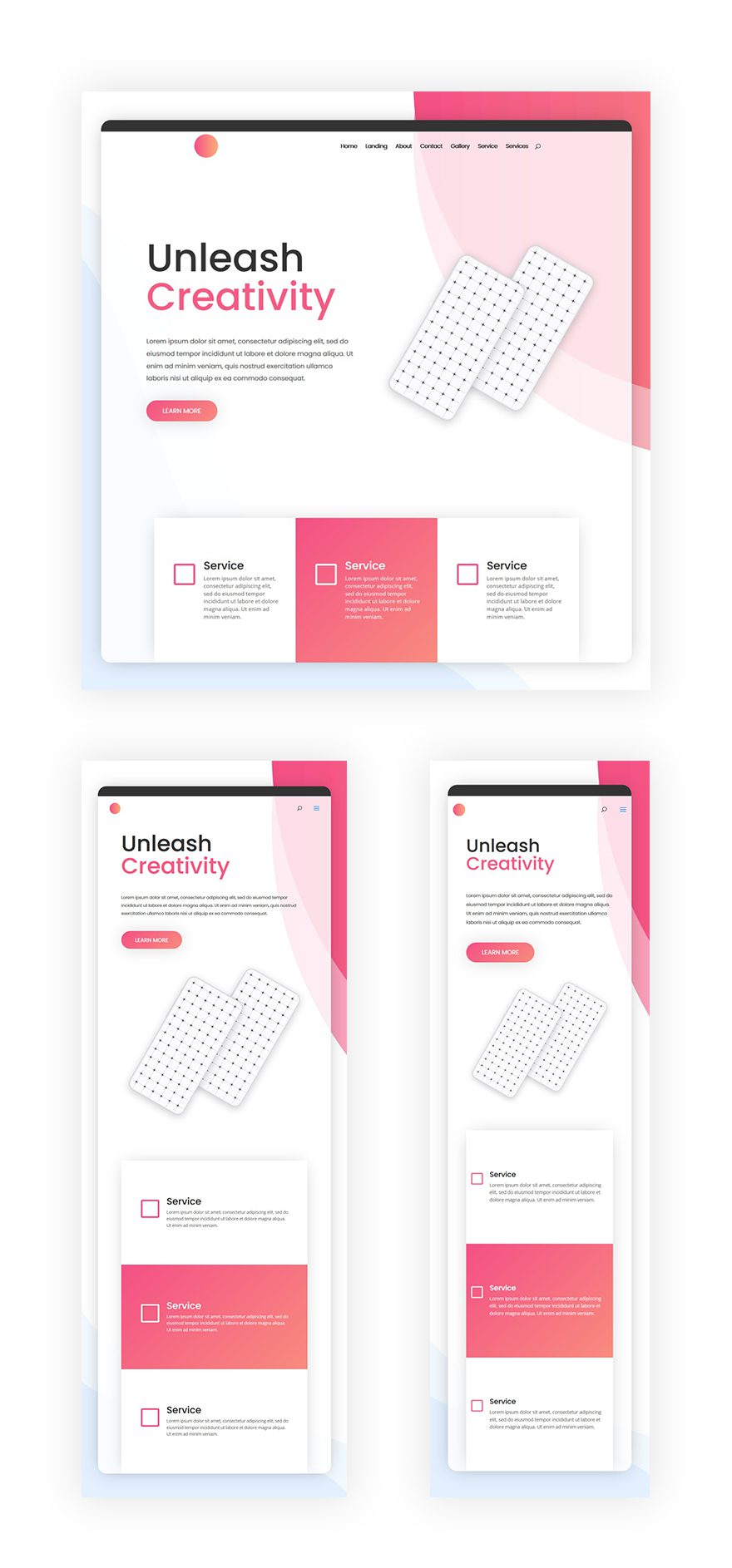
Preview
Let’s start off by taking a look at the end result on different screen sizes:
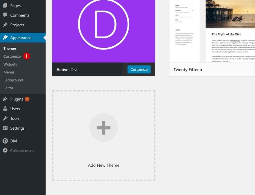
Theme Customizer Settings
Go to the Theme Customizer
Before we start building our design, let’s start off with some Theme Customizer changes. Go to your WordPress Dashboard > Appearance > Customize.
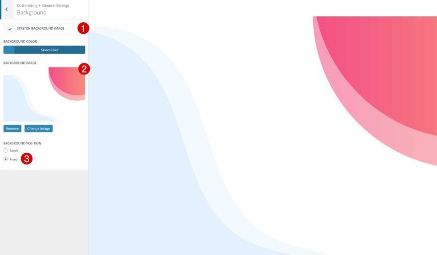
Save Background Image
Since we’re going to detach the Primary Menu Bar from the top, we’ll need something to cover the space it normally takes up. We’ll use the following background image so go ahead and save it on your computer:

Upload Background Image to General Settings
Then, go to General Settings > Background and upload the image to your website’s background.
- Strech Background Image: Enabled
- Background Position: Fixed
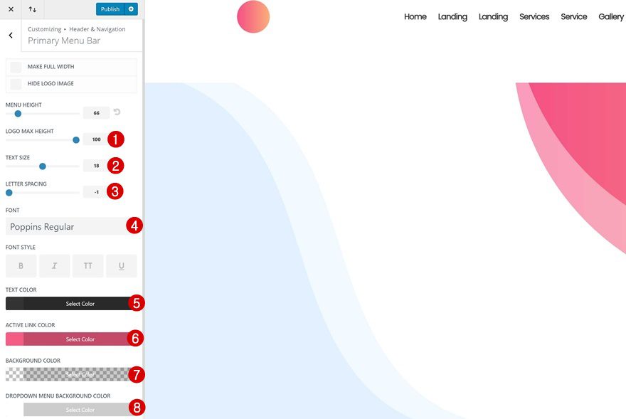
We’re also going to merge the Primary Menu Bar ready with our Divi design. To do that, we’ll need to modify the Primary Menu Bar settings first. Go to Header & Navigation > Primary Menu Bar and use the following settings:
- Logo Max Height: 100
- Text Size: 18
- Letter Spacing: -1
- Font: Poppins
- Text Color: #333333
- Active Link Color: #f55c83
- Background Color: rgba(255,255,255,0)
- Dropdown Menu Background Color: #FFFFFF
Add a New Page
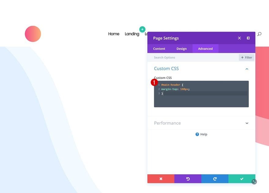
Page Custom CSS
To make the primary menu bar overlap our page design, we’ll need a bit of CSS code. You can choose whether you want to make the overlap apply on your entire website or just a page in particular. If you choose to add it to one page only, add the following CSS code to your page settings:
#main-header {
margin-top: 140px;
}

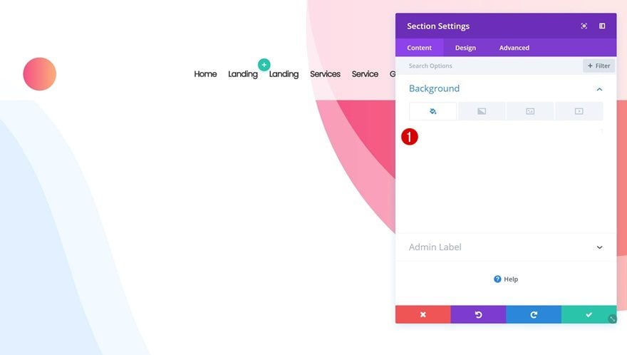
Add New Section
Background Color
Let’s get started with the design! Add a new page, switch over to Visual Builder and add your first section. Open the section settings next and add ‘rgba(255,255,255,0.81)’ as the background color. This will allow our website background image to show through.
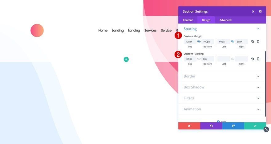
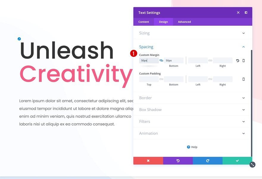
Spacing
Continue by going to the Spacing settings and addthe following custom margin and padding:
- Top & Bottom Margin: 100px
- Left & Right Margin: 60px
- Top Padding: 135px
- Bottom Padding: 0px
Rounded Corners
Add ’30px’ to each one of the corners of your section as well.
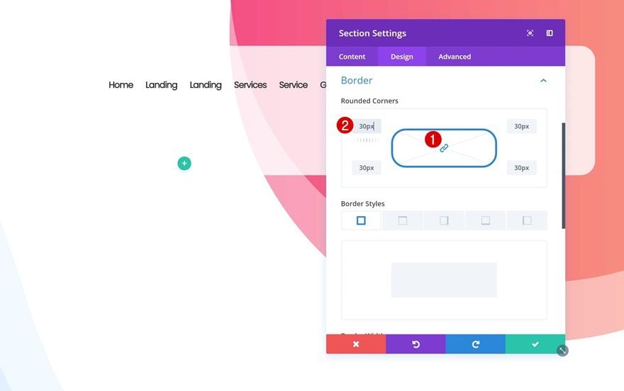
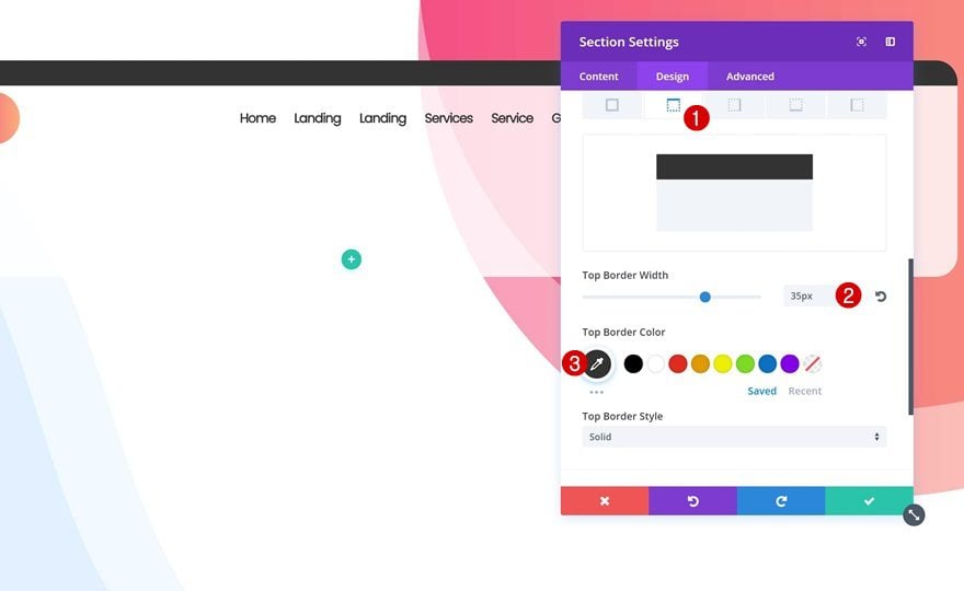
Border
Then, add a top border to your section:
- Top Border Width: 35px
- Top Border Color: #333333
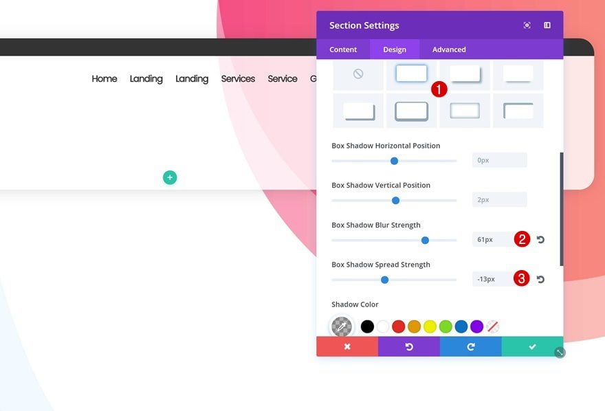
Box Shadow
To finish off, add a very subtle box shadow.
- Box Shadow Blur Strength: 61px
- Box Shadow Spread Strength: -13px
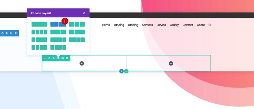
Add Row #1
Column Structure
Time to start adding rows and modules! Add your first row using two equally-sized columns.
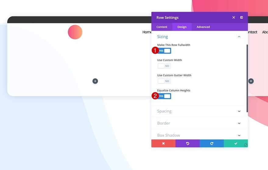
Sizing
Without adding any modules yet, open the row settings and change the Sizing settings:
- Make This Row Fullwidth: Yes
- Equalize Column Heights: Yes
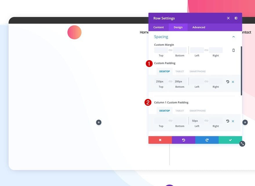
Spacing
Add some custom padding next:
- Top Padding: 250px (Desktop), 50px (Tablet & Phone)
- Bottom Padding: 200px (Desktop), 100px (Tablet), 50px (Phone)
- Column 1 Left Padding: 50px (Desktop), 0px (Tablet & Phone)
Add Title Text Module to Column 1
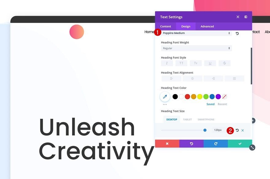
H1 Text Settings
We can now start adding the modules. We’ll start with the first column by adding a new title Text Module.
- Heading Font: Poppins
- Heading Font Weight: Medium
- Heading Text Size: 120px (Desktop), 80px (Tablet), 58px (Phone)
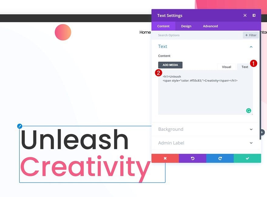
Add Different Color to Part of Copy
You can easily change the color of a word in your title by switching over to the Text tab and adding a color to your word of choice by using span tags.
Add Description Text Module to Column 1
Text Settings
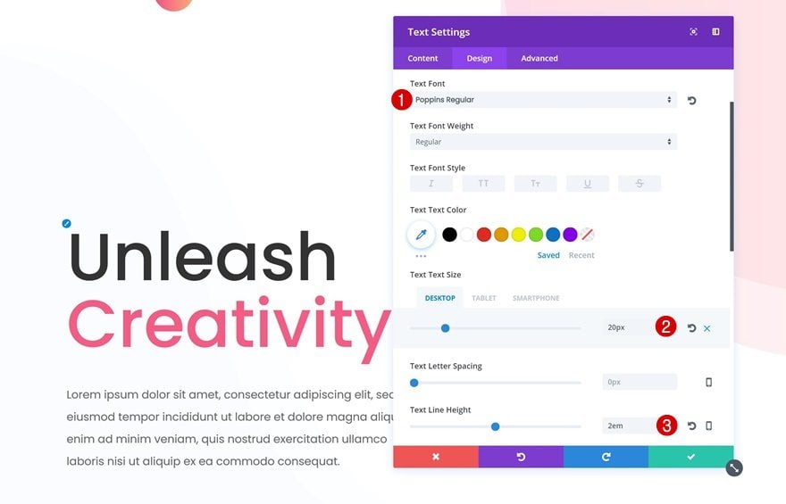
Right below the previous Text Module, go ahead and add a description Text Module using the following text settings:
- Text Font: Poppins
- Text Font Weight: Regular
- Text Size: 20px (Desktop), 15px (Tablet & Phone)
- Text Line Height: 2em
Spacing
We’ll need some extra margin for this Text Module:
- Top & Bottom Margin: 50px
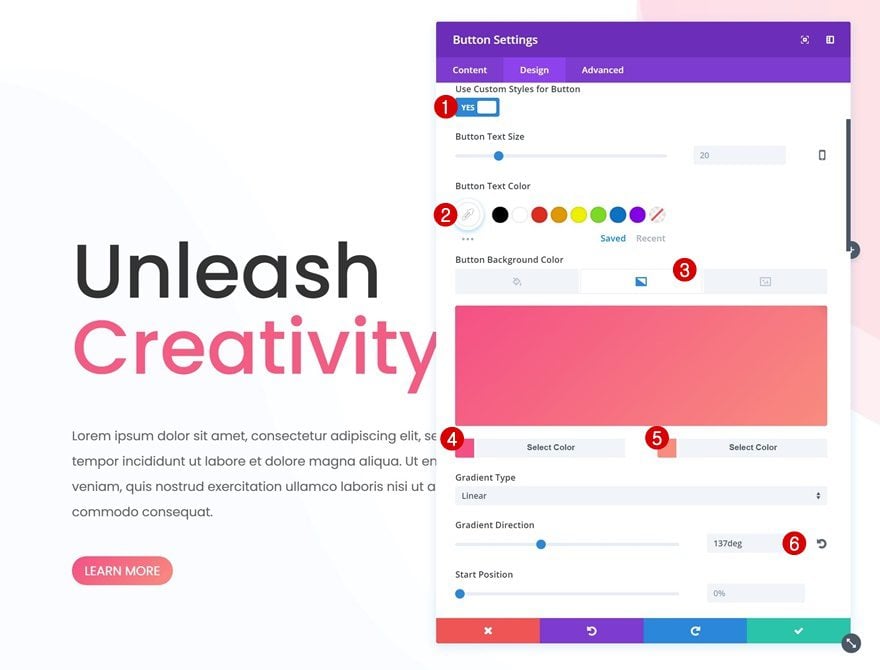
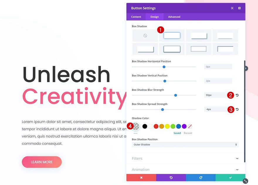
Button Settings
The last module in this column is a Button Module. After you’ve added the CTA copy, change the button styles:
- Use Custom Styles for Button: Yes
- Button Text Color: #FFFFFF
- Gradient Color 1: #f45085
- Gradient Color 2: #f88c7e
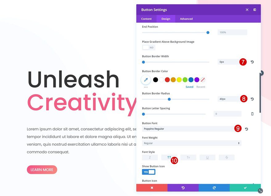
- Gradient Direction: 137deg
- Button Border Width: 0px
- Button Border Radius: 40px
- Button Font: Poppins
- Button Font Weight: Regular
- Font Style: Uppercase
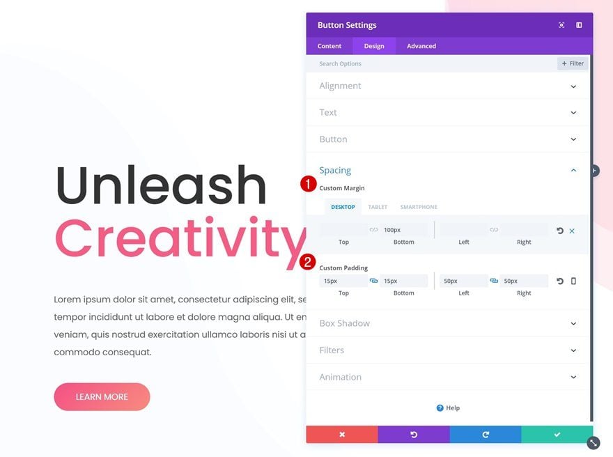
Spacing
Open the Spacing settings next and add some margin and padding to your button:
- Bottom Margin: 100px (Desktop), 20px (Tablet & Phone)
- Top & Bottom Padding: 15px
- Left & Right Padding: 50px
Box Shadow
Last but not least, we’ll use a very subtle box shadow to create more depth on our page:
- Box Shadow Blur Strength: 55px
- Box Shadow Spread Strength: -4px
- Shadow Color: rgba(84,84,84,0.25)
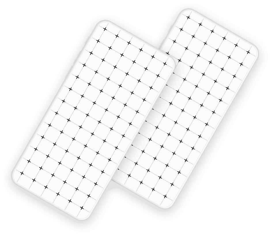
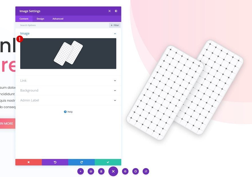
Add Image Module to Column 2
Save & Upload Image
The second column only contains an Image Module. We’re using a mockup that is part of Divi’s Digital Marketing Layout Pack. Go ahead and save the image below to your computer. After you do so, add it to the Image Module in your second column.
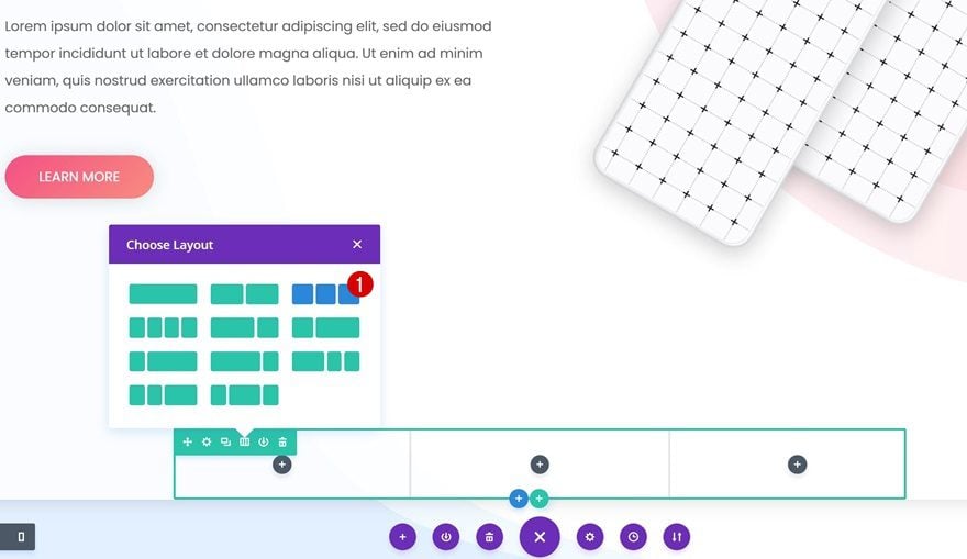
Add Row #2
Column Structure
Time to add the second row! Choose the following column structure for it:
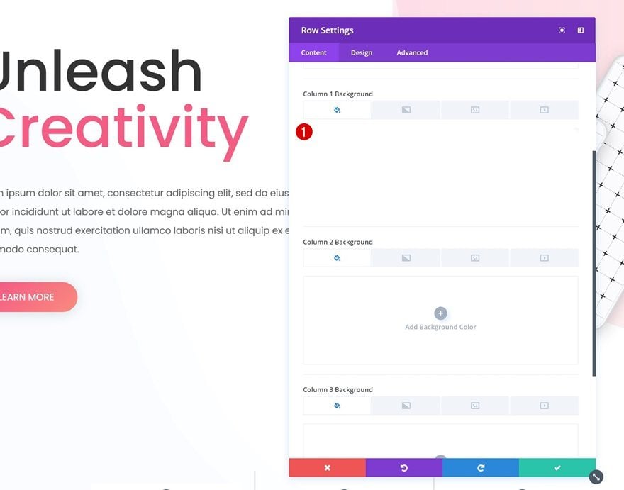
Column 1 Background Color
Then, open the row settings and add ‘#FFFFFF’ as the Column 1 Background Color.
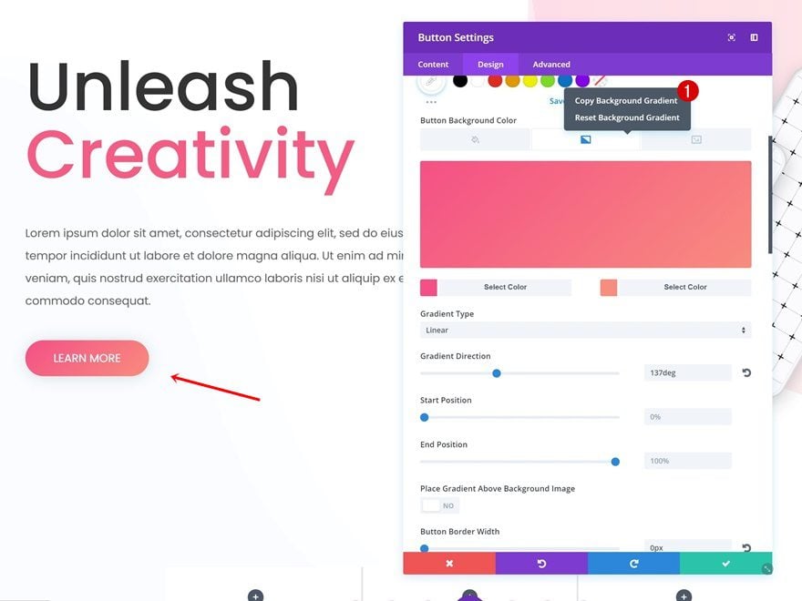
We’re going to save ourselves some time and copy the gradient we’ve already used for the Button Module. To do that, open the Button Module, go to the button settings, right-click the gradient background and copy it.
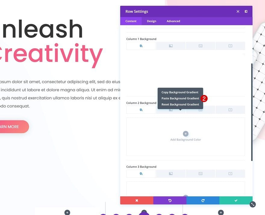
Paste Gradient Background in Column 2
Then, go back to your row settings and paste the gradient background in the second column.
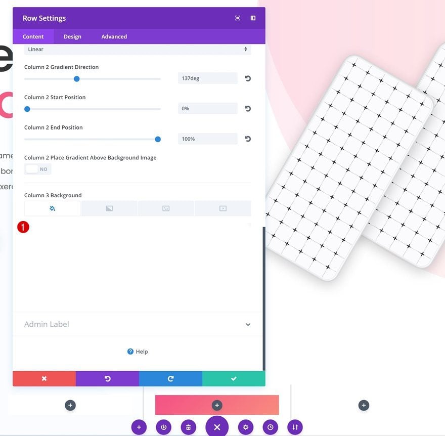
Column 3 Background Color
For the third column, we’re using the ‘#FFFFFF’ background color.
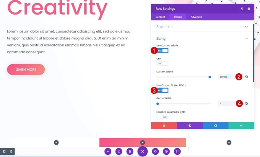
Sizing
Go to the Sizing settings next and change the settings:
- Use Custom Width: Yes
- Custom Width: 2600px
- Use Custom Gutter Width: Yes
- Gutter Width: 1
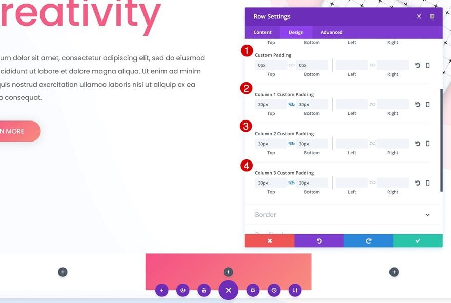
Spacing
We’ll need some extra padding as well:
- Top & Bottom Padding: 0px
- Column Top & Bottom Padding: 30px
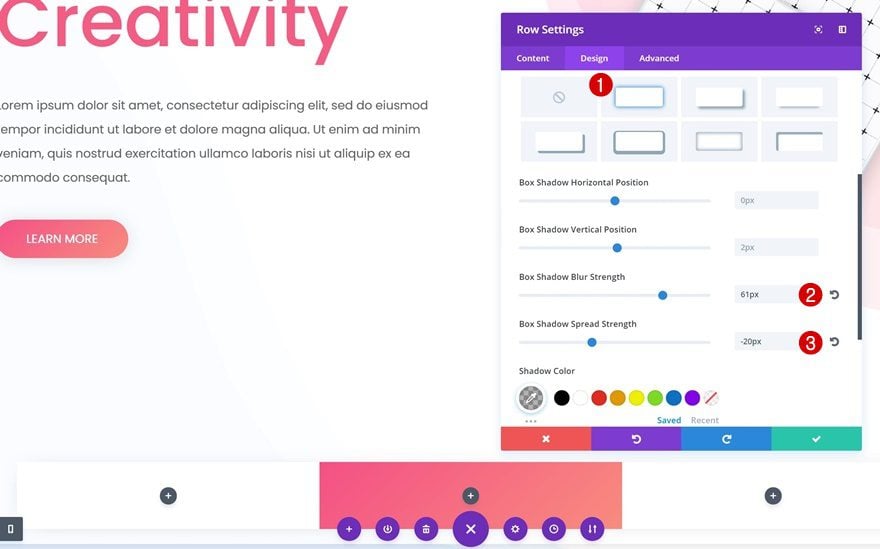
Box Shadow
Last but not least, we’ll use a subtle box shadow:
- Box Shadow Blur Strength: 61px
- Box Shadow Spread Strength: -20px
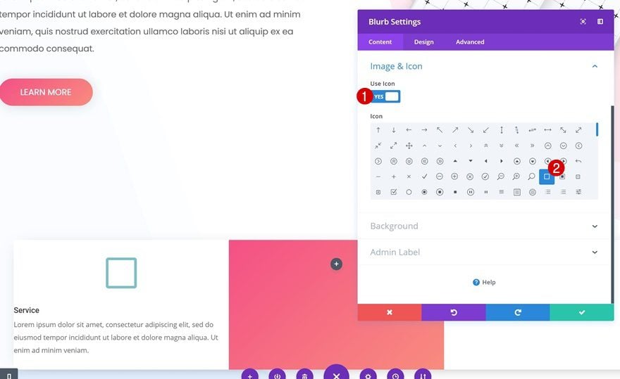
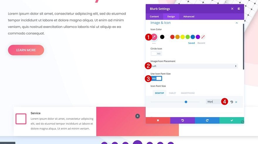
Add Blurb Module #1
Choose Icon
We’ll need three Blurb Modules in total. We’ll start off with one and clone it afterwards to save time. Go ahead and add a new Blurb Module to the first column. After adding your content, select an icon of choice.
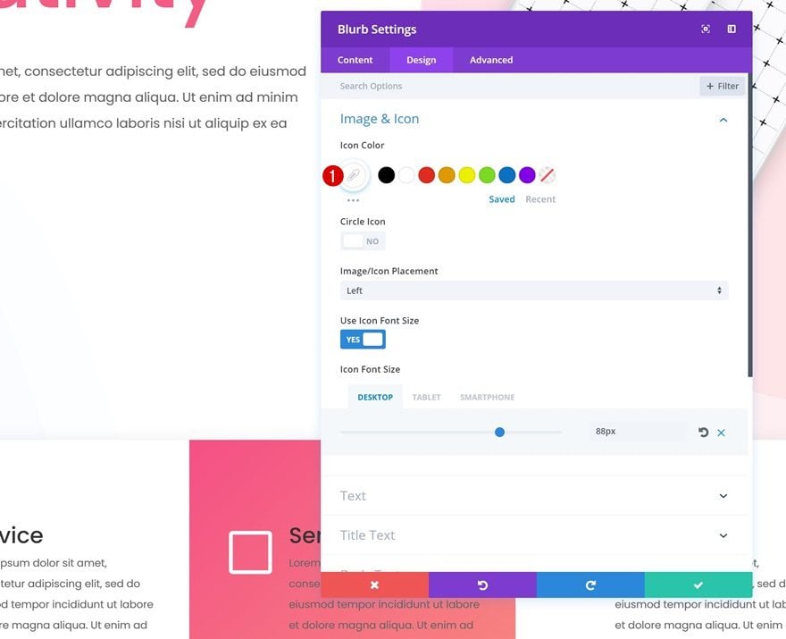
Icon Settings
Change the settings of your icon accordingly:
- Icon Color: #f55c83
- Icon Placement: Left
- Use Icon Font Size: Yes
- Icon Font Size: 88px (Desktop & Tablet), 50px (Phone)
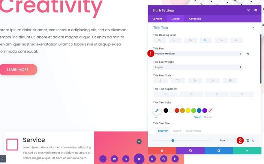
Title Text Settings
Open the title text settings next and make some changes:
- Title Font: Poppins
- Title Font Weight: Medium
- Title Text Size: 34px (Desktop & Tablet), 23px (Phone)
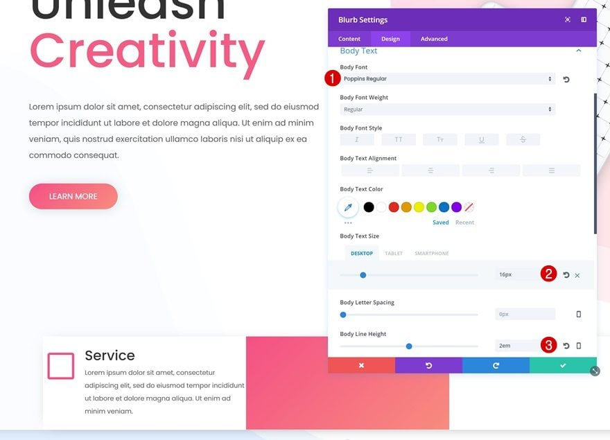
Body Text Settings
The body text needs to be modified as well:
- Body Font: Poppins
- Body Font Weight: Regular
- Body Text Size: 16px (Desktop), 14px (Tablet & Phone)
- Body Line Height: 2em
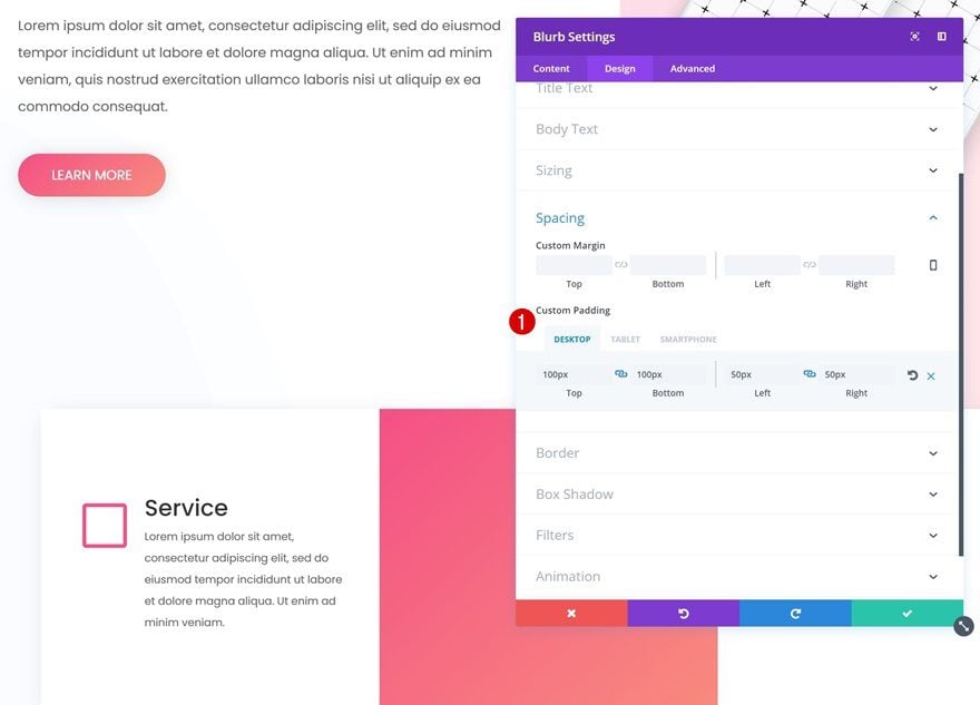
Spacing
And to create a more aesthetically appealing design, add some padding:
- Top Padding & Bottom Padding: 100px
- Left & Right Padding: 50px (Desktop & Tablet), 10px (Phone)
Clone Blurb Module Twice and Place in Remaining Columns
Go ahead and clone your Blurb Modules twice. After you do so, place them in the remaining columns.
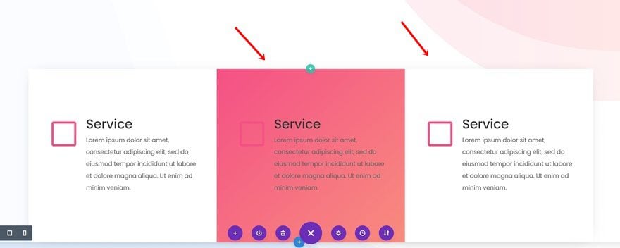
Change Blurb Module in Column 2
Change Icon Color
The third Blurb Modules doesn’t need any changes, the second one however does. Start by changing the Icon Color into white.
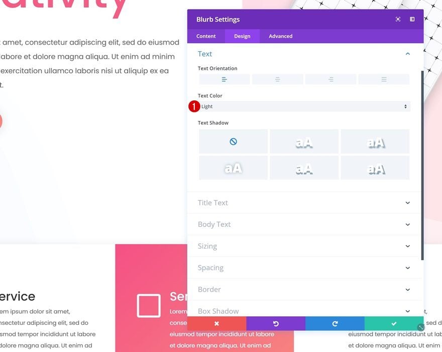
Change Text Color
Open the Text Settings next and change the Text Color to ‘Light’.
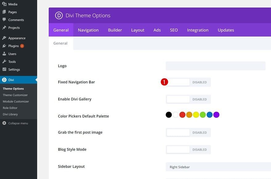
To make sure the Primary Menu Bar keeps its place within the design, we’ll need to disable the Fixed Navigation Bar as well. To do that, go to your WordPress Dashboard > Divi > Theme Options > Disable the ‘Fixed Navigation Bar’ option and save the settings.
Preview
Now that we’ve gone through all the steps, let’s take a final look at the result on different screen sizes:
Final Thoughts
In this post, we’ve shown you how to creatively include the primary menu bar in your overall Divi page design. This approach will help you create a more coherent look and feel on your website. We’ve created an example from scratch as well. If you have any questions or suggestions, make sure you leave a comment in the comment section below!


Thank you for this lovely idea 🙂
Like this style. Would be great if you used this idea to follow through and create one of your weekly layout packs.
Hey,
Thank You, for such useful information.
Your posts are always easy to understand and Helpful..
I usually use the Primary Menu Bar. Are there any tutorials on using Divi navigation module? I’d like to explore that more and see if it’s a bit more flexible.
I’ve been using Divi Ultimate Header plugin. It opens up a few more options for the whole nav area. It’s still a bit of a workaround, but it’s flexible, if you go into the library of layout for the headers.
It’s a bit pricey, but worth it in my opinion.
I would still love to see these posts accompanied by the layout at the end of the post.
We give away a lot of free downloads, but not every post is intended to provide a “plug and play” solution. Most of the time on our blog the goal is to educate. And the best way to learn Divi deeply, is by actually using its features and pushing its limits. That’s why we don’t always include the layouts of our finished tutorials.
Is there a live link to the finished example?
Great tutorial. I tried applying it and it looks great on desktop. One the other hand, it is not good on phone. Logo and hamburger icon are bit out of the top border bar. The heading title size of 120 breaks the word but looks fine when I selected a smaller size (92 instead of 120). I am testing this on a Nexus 6P. Is there something I am missing here?
*On the other hand 🙂
Really give another look to a page.
Very good idea.
thank you very much
That was nice, but what did it have to do with the navigation? All you did was turn off fixed navigation.
I love Divi, but the one place where it really needs to up the game is with the navigation options. And one that is sorely needed is left aligned logo with the nav bar below.
Currently we either have to use CSS or a plugin to extend the navigation options.
Awesome tutorial. This really demonstrates the power of the DIVI builder where your imagination is your only limits!