
Dark mode continues to grow in popularity as a convenient option for users to experience the web with less strain on the eyes. Let’s face it, we all tend to spend more time looking at screens than we probably should, so any additional comforts to the user experience (like dark mode) can go a long way. Operating Systems, programs, and browsers usually include built-in dark mode capabilities, but some developers are taking it to another level by including a custom dark mode experience for their website. The idea is to take more control over how their website looks in dark mode without having to compromise on branding and/or design.
In this tutorial, we are going to show you how to create a custom dark mode toggle in Divi from scratch without a plugin. With this dark mode toggle functionality, you will have control over the dark mode design and have a better user experience tailored to your brand.
Let’s get started!
- 1 Sneak Peek
- 2 Download the Layout for FREE
- 3 Download For Free
- 4 What You Need to Get Started
- 5 Part 1: Building the Dark Mode Toggle
- 6 Part 2: Adding Dark Mode Functionality to a Divi Page
- 7 Part 3: Adding the Dark Mode Toggle to a Global Header
- 8 Adjusting the Custom CSS Dark Mode Styles
- 9 Final Thoughts
Sneak Peek
Here is a quick look at the design we’ll build in this tutorial.
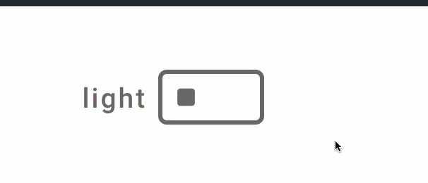
Here is the custom dark mode toggle we will build.
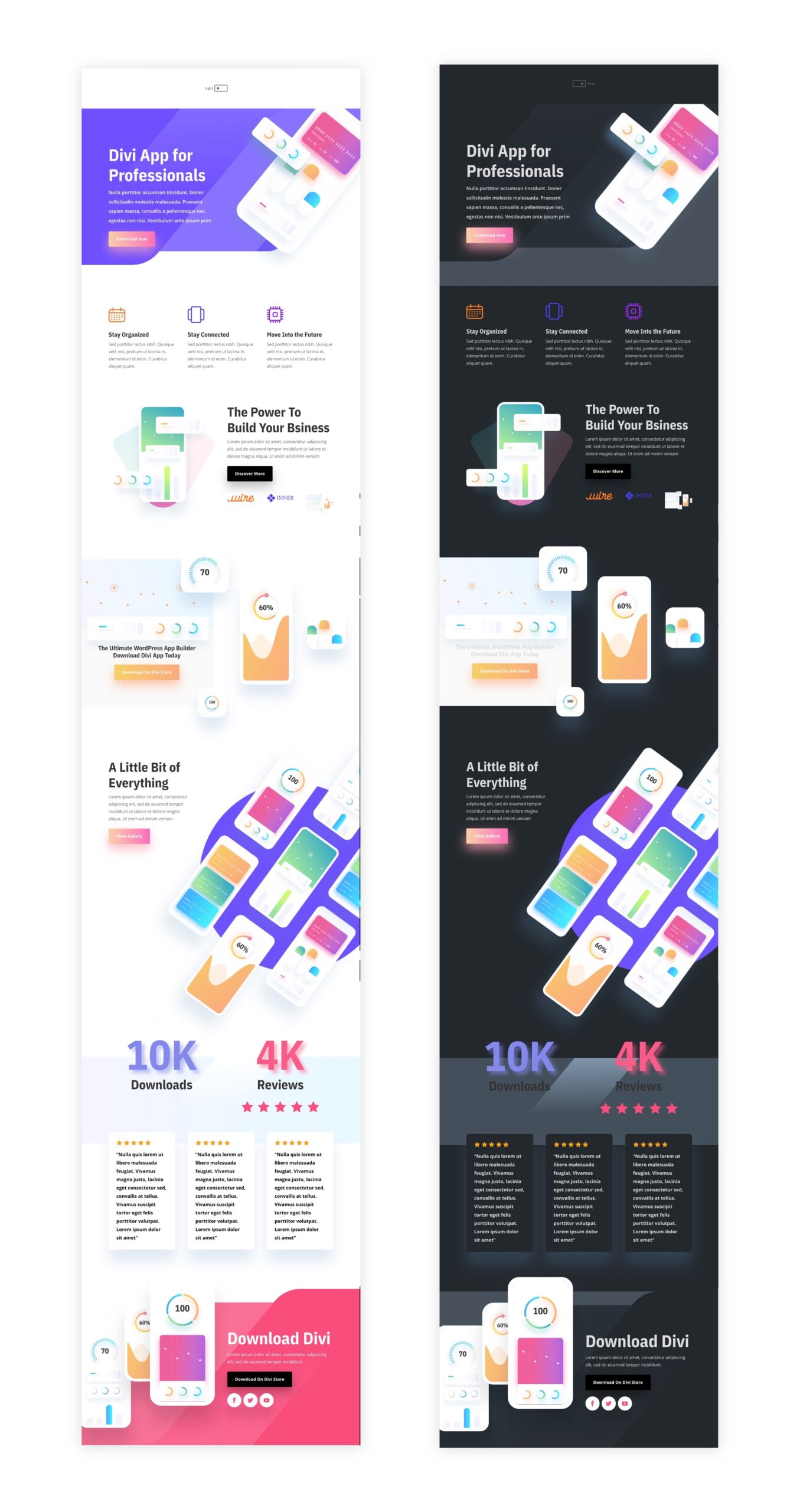
And here is the before and after for the dark mode applied to one of our premade layouts.
And here is the dark mode toggle added to a global header. Notice how the light/dark mode remains as you navigate the site.
Download the Layout for FREE
To lay your hands on the designs from this tutorial, you will first need to download it using the button below. To gain access to the download you will need to subscribe to our newsletter by using the form below. As a new subscriber, you will receive even more Divi goodness and a free Divi Layout pack every Monday! If you’re already on the list, simply enter your email address below and click download. You will not be “resubscribed” or receive extra emails.

To import the section layout to your Divi Library, navigate to the Divi Library.
Click the Import button.
In the portability popup, select the import tab and choose the download file from your computer.
Then click the import button.

Once done, the section layout will be available in the Divi Builder.
Let’s get to the tutorial, shall we?
What You Need to Get Started

To get started, you will need to do the following:
- If you haven’t yet, install and activate the Divi Theme.
- Create a new page in WordPress and use the Divi Builder to edit the page on the front end (visual builder).
- Choose the option “Build From Scratch”.
After that, you will have a blank canvas to start designing in Divi.
Part 1: Building the Dark Mode Toggle
In this first part of the tutorial, we are going to build a dark mode toggle with a page in Divi. Once the toggle is created with the code, you will be able to save it to the Divi Library and add it to any place on your website.
To start, add a one-column row to the default section while building with Divi on the front end from scratch.
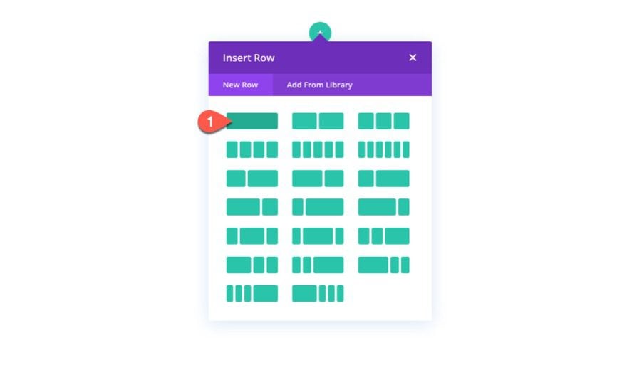
Add Blurb
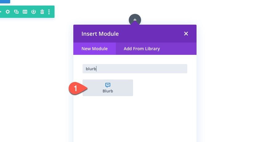
To build the custom toggle, we are going to design a blurb module with a little custom CSS.
Add a new blurb module to the row.
Content
Take out the default mock content for the title and body. Then add the square icon in place of the image.
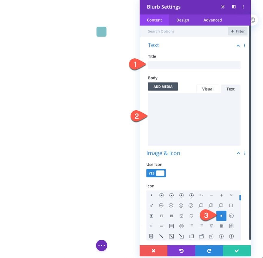
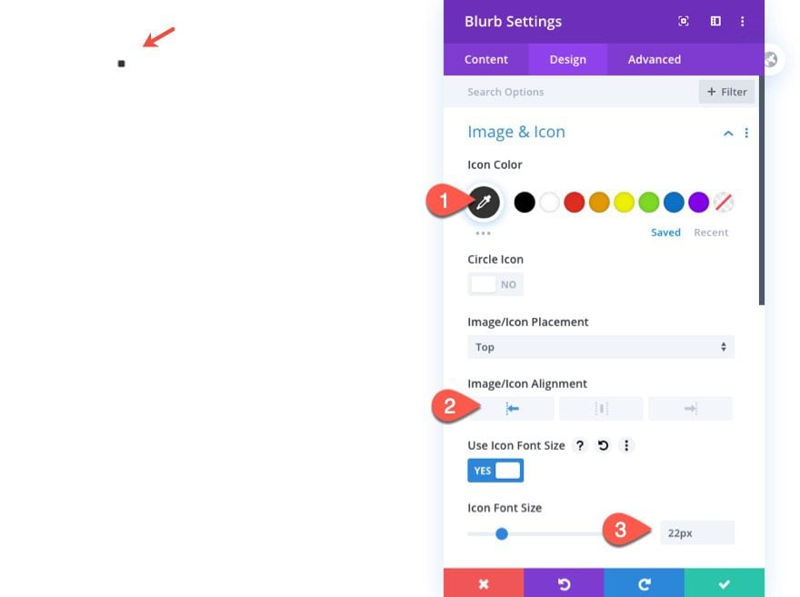
Design
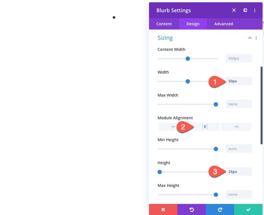
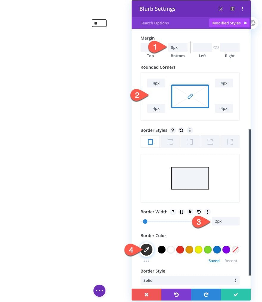
Jump over to the design settings and update the following:
- Icon Color: #666666
- Image/Icon Alignment: Left
- Icon Font Size: 22px
- Width: 50px
- Module Alignment: center
- Height: 25px
- Margin: 0px bottom
- Rounded Corners: 4px
- Border Width: 2px
- Border Color: #666666
Custom CSS
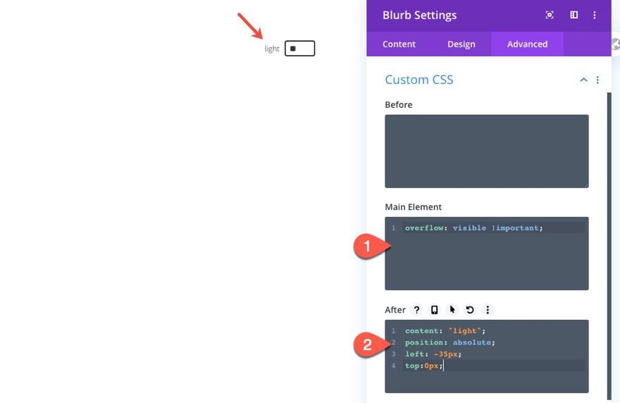
Once the design is in place, jump over to the advanced tab. Under the custom CSS, add the following custom CSS to the main element in order to make sure the overflow isn’t hidden from the rounded corners styling.
overflow: visible !important;
Then add the following custom CSS to the After element:
content: "light";
position: absolute;
left: -35px;
top:0px;
This adds a label to the blurb module that we will change from “light” to “dark” on click.
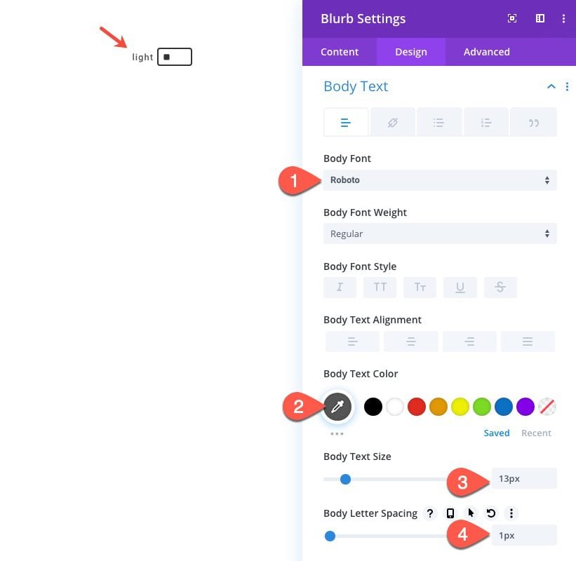
Body Text Design
Since the text in the after pseudo-element inherits the body text styles, we can add the body text styles using the Divi options as follows:
- Body Font: Roboto
- Body Text Color: #666666
- Body Text Size: 13px
- Body Letter Spacing: 1px
Adding Custom Code with a Code Module
To add the necessary Code (CSS/JQuery) to make the dark mode toggle work its magic, we will use a code module.
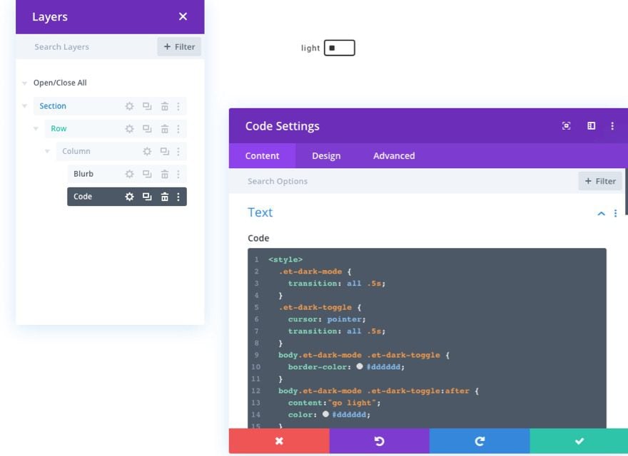
Create a new code module under the blurb module in the same column.
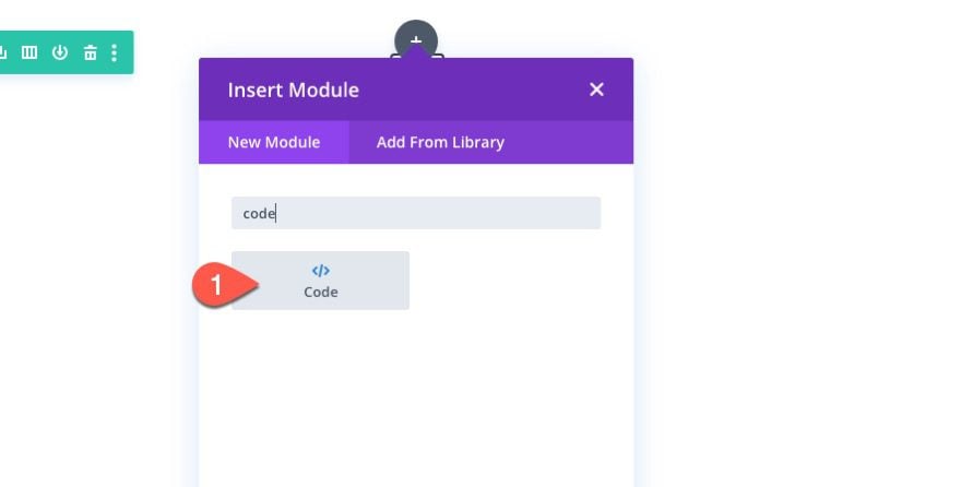
Then paste in the following code in the code box:
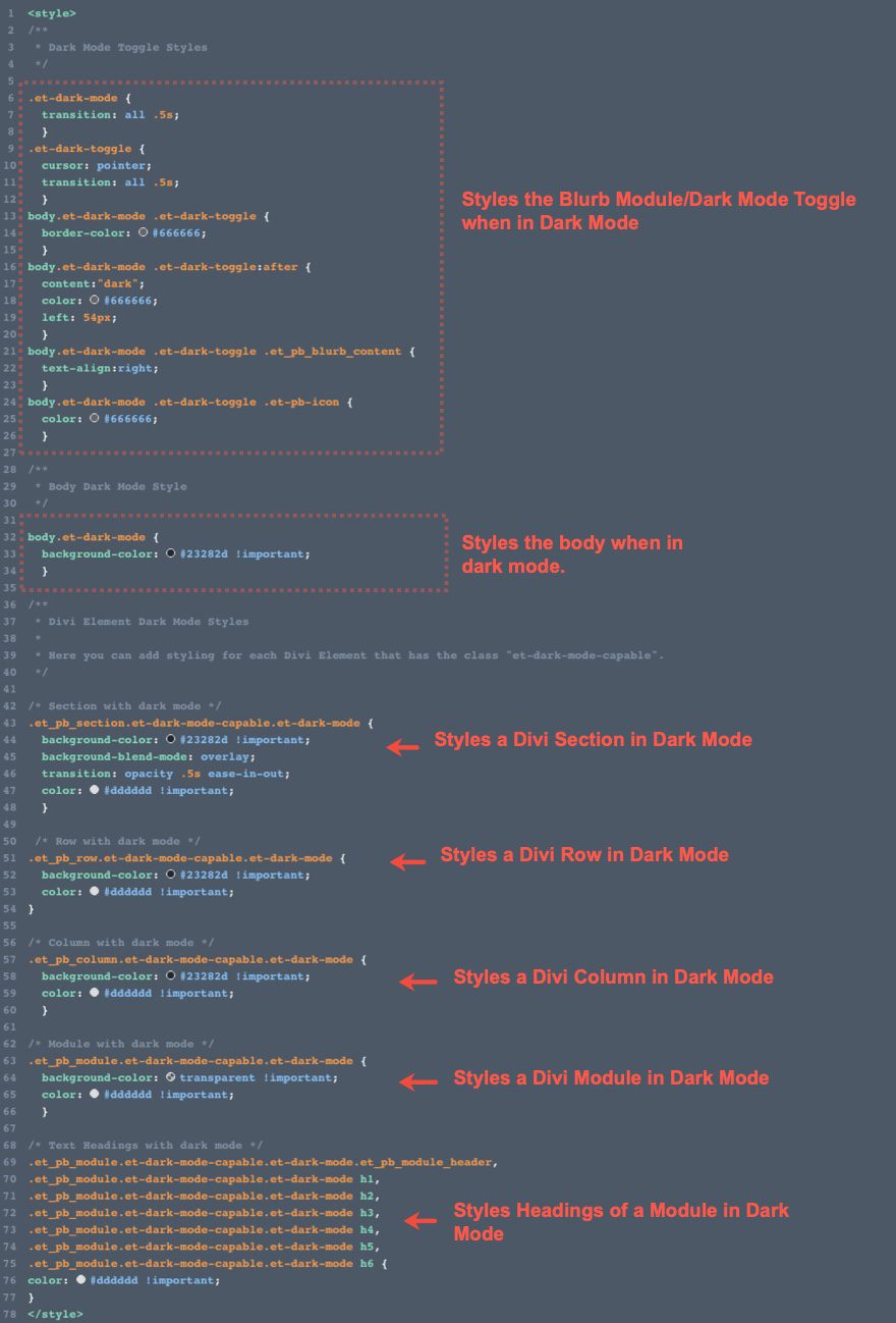
<style>
/**
 * Dark Mode Toggle Styles
 */
.et-dark-mode {
  transition: all .5s;
  }
.et-dark-toggle {
  cursor: pointer;
  transition: all .5s;
  }
body.et-dark-mode .et-dark-toggle {
  border-color: #666666;
  }
body.et-dark-mode .et-dark-toggle:after {
  content:"dark";
  color: #666666;
  left: 54px;
  }
body.et-dark-mode .et-dark-toggle .et_pb_blurb_content {
  text-align:right;
  }
body.et-dark-mode .et-dark-toggle .et-pb-icon {
  color: #666666;
  }
/**
 * Body Dark Mode Style
 */
body.et-dark-mode {
  background-color: #23282d !important;
  }
/**
 * Divi Element Dark Mode Styles
 *
 * Here you can add styling for each Divi Element that has the class "et-dark-mode-capable".
 */
/* Section with dark mode */
.et_pb_section.et-dark-mode-capable.et-dark-mode {
  background-color: #23282d !important;
  background-blend-mode: overlay;
  transition: opacity .5s ease-in-out;
  color: #dddddd !important;
  }
 /* Row with dark mode */
.et_pb_row.et-dark-mode-capable.et-dark-mode {
  background-color: #23282d !important;
  color: #dddddd !important;
}
/* Column with dark mode */
.et_pb_column.et-dark-mode-capable.et-dark-mode {
  background-color: #23282d !important;
  color: #dddddd !important;
  }
/* Module with dark mode */
.et_pb_module.et-dark-mode-capable.et-dark-mode {
  background-color: transparent !important;
  color: #dddddd !important;
  }
/* Text Headings with dark mode */
.et_pb_module.et-dark-mode-capable.et-dark-mode.et_pb_module_header,
.et_pb_module.et-dark-mode-capable.et-dark-mode h1,
.et_pb_module.et-dark-mode-capable.et-dark-mode h2,
.et_pb_module.et-dark-mode-capable.et-dark-mode h3,
.et_pb_module.et-dark-mode-capable.et-dark-mode h4,
.et_pb_module.et-dark-mode-capable.et-dark-mode h5,
.et_pb_module.et-dark-mode-capable.et-dark-mode h6 {
color: #dddddd !important;
}
</style>
<script>
  function storageAvailable(type) {
    try {
        var storage = window[type],
            x = '__storage_test__';
        storage.setItem(x, x);
        storage.removeItem(x);
        return true;
    }
    catch(e) {
        return e instanceof DOMException && (
            // everything except Firefox
            e.code === 22 ||
            // Firefox
            e.code === 1014 ||
            // test name field too, because code might not be present
            // everything except Firefox
            e.name === 'QuotaExceededError' ||
            // Firefox
            e.name === 'NS_ERROR_DOM_QUOTA_REACHED') &&
            // acknowledge QuotaExceededError only if there's something already stored
            storage.length !== 0;
    }
  }
  jQuery(document).ready(function($) {
      var storageAvailable = window.storageAvailable('sessionStorage');
      $(".et-dark-toggle").click(function() {
          $(".et-dark-mode-capable,body").toggleClass("et-dark-mode");
          if ( storageAvailable ) {
              $("body").hasClass("et-dark-mode") ?
              sessionStorage.setItem('etDarkModeEnabled','1'):
              sessionStorage.removeItem('etDarkModeEnabled');
          }
      });
      if (storageAvailable) {
          '1' == sessionStorage.getItem('etDarkModeEnabled') ?
          $(".et-dark-mode-capable,body").addClass("et-dark-mode"):
          $(".et-dark-mode-capable,body").removeClass("et-dark-mode");
      }
  });
</script>
Adding the Custom CSS Classes
The custom code requires that you have a custom CSS Class added to the blurb module or toggle. This will allow the blurb to trigger the dark mode toggle and functionality on click.
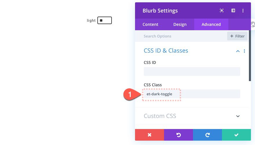
Blurb Module Class
Open the blurb module settings and add a custom CSS Class as follows:
- CSS Class: et-dark-toggle
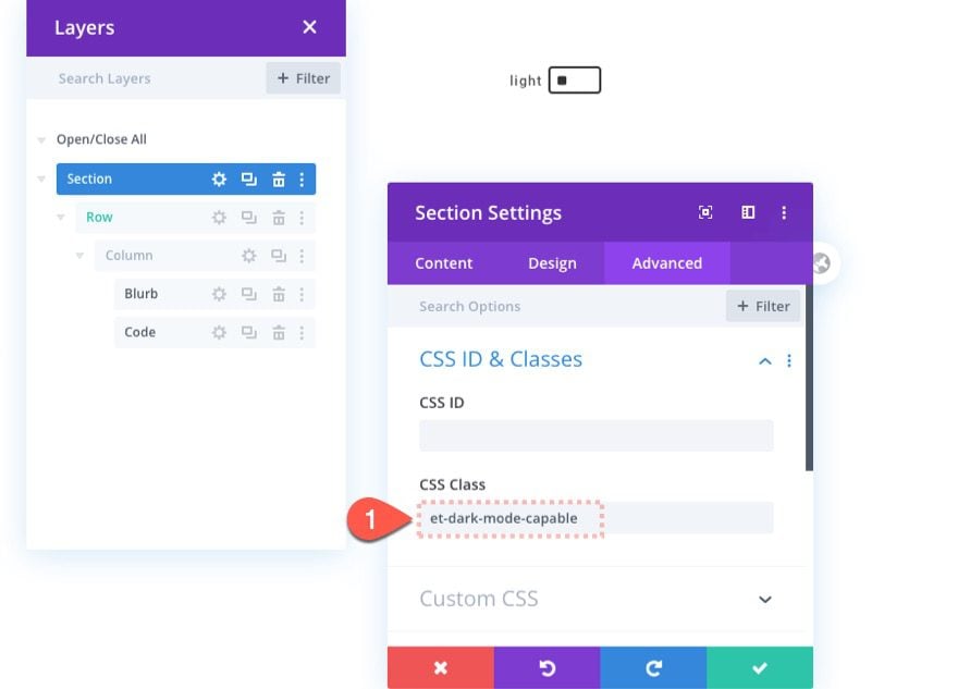
Dark Mode Capable Class
We also need to add a custom CSS Class to every Divi element that we want to have the capability of dark mode. Once the element has the CSS Class, that element will inherit the “dark mode” custom CSS in the code we added once dark mode has been toggled on. This method gives us more control over our dark mode design since some elements may not require any dark mode styles.
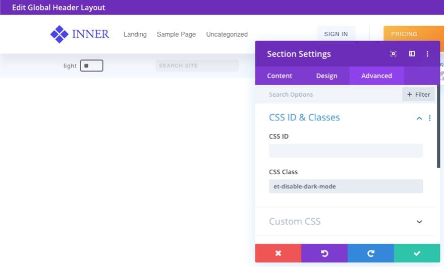
To start, we can add the dark mode to the section containing our dark mode toggle.
Open the section settings and add the following CSS Class:
- CSS Class: et-dark-mode-capable
Part 2: Adding Dark Mode Functionality to a Divi Page
Now that we have the code and CSS Classes in place, we are ready to apply the dark mode functionality and design to an entire page in Divi. To do this we are going to use our Mobile App Landing Page Premade Layout.
To add the layout, open the settings menu at the bottom of the visual builder and click the Add New Layout icon.
Then select the Mobile App Landing Page layout from under the premade layouts tab.
Make sure the “Replace existing content” option is NOT selected. You don’t want to erase the section with the dark mode toggle.

Since the dark mode style will only apply to elements with the CSS Class “et-dark-mode-capable”, we can choose to add to page a few different ways.
- We can add the CSS Class to each element on the page individually.
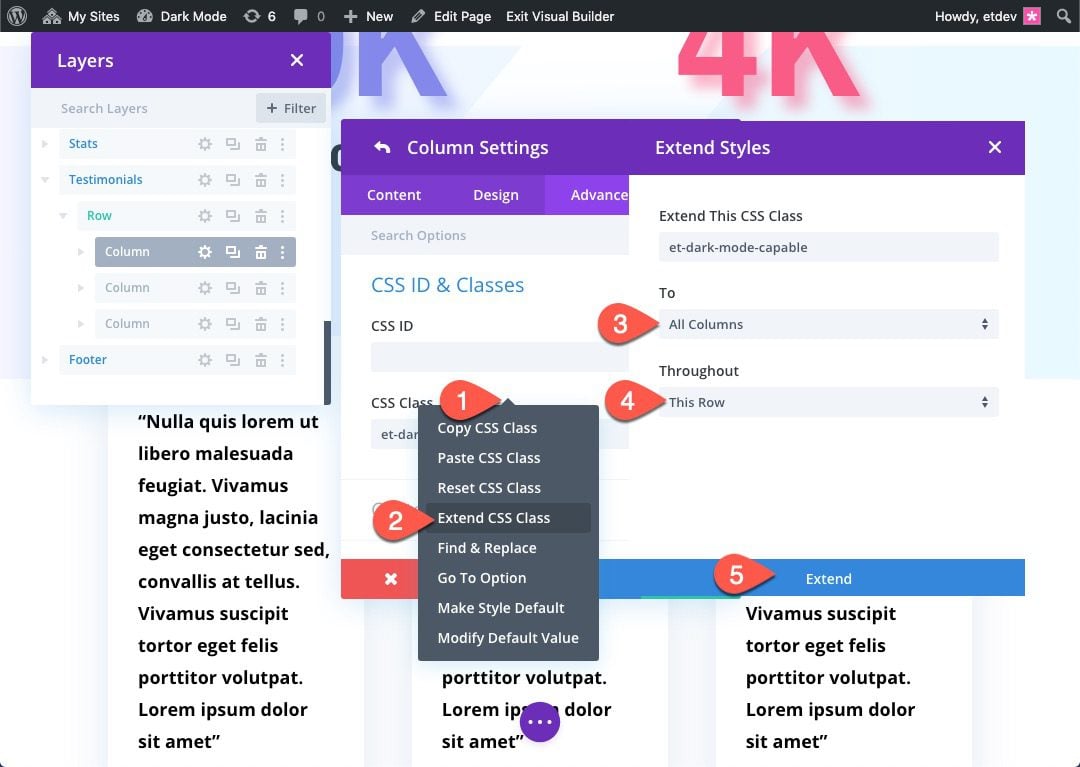
- We could extend the CSS Class to elements throughout the page (this would be quicker than doing each one manually). For example, we could open the section settings for the top section and extend the CSS Class for that section to all sections throughout the page.
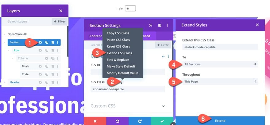
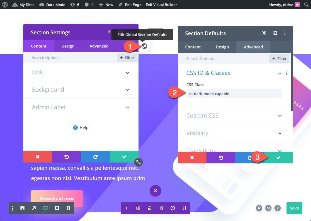
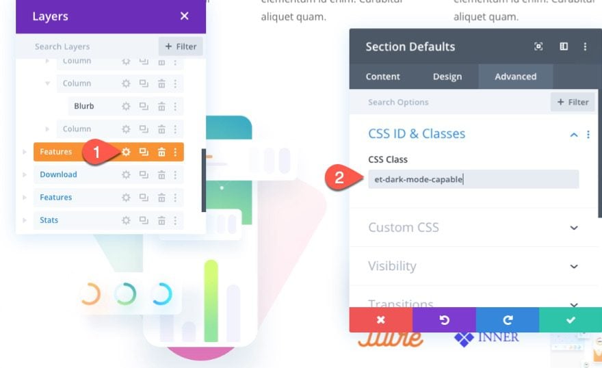
- We can add the CSS Class to the Global Defaults of the element. This will apply the CSS Class to all the elements site-wide, adding dark mode capability throughout the entire site. For example, we could open the section settings and click the global default icon to edit the Global Section Defaults. Then we can add the CSS Class and save it as a CSS Class for all sections site-wide.
Adding the CSS Class to Page Elements
For this example, we are going to update the page elements by adding the CSS Class to the Global Defaults to the sections and text modules. And we will also make a few additions to the other elements on the page as we go.
All Sections
To add the CSS Class to all the sections, open the settings for top section that contains the dark mode toggle. Then edit the global defaults for the section and add the following CSS Class to the Section Global Defaults:
- CSS Class: et-dark-mode-capable
All Specialty Sections
Add the CSS Class to the global defaults of the specialty section as well.
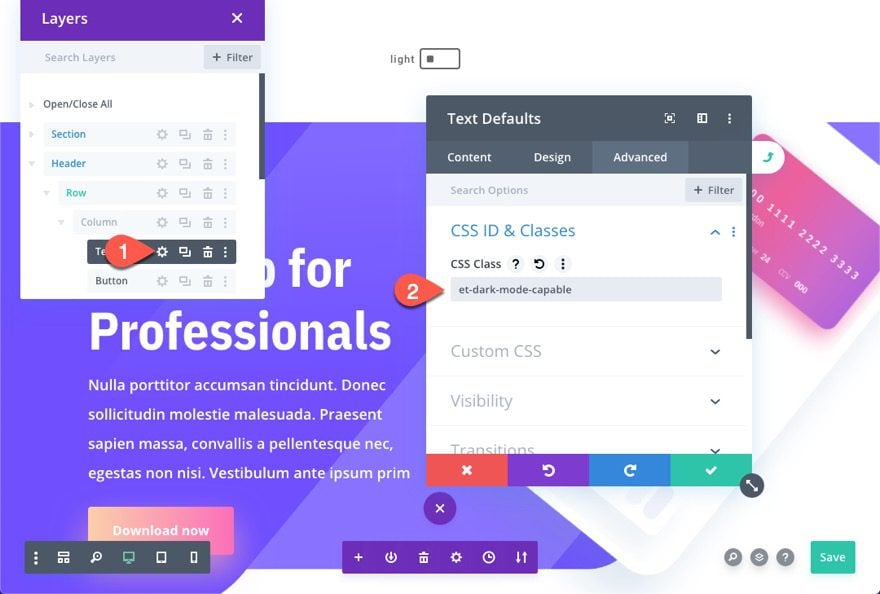
Text Modules
Next, open the settings for one of the text modules on the page and add the same CSS Class to the Text Global Defaults.
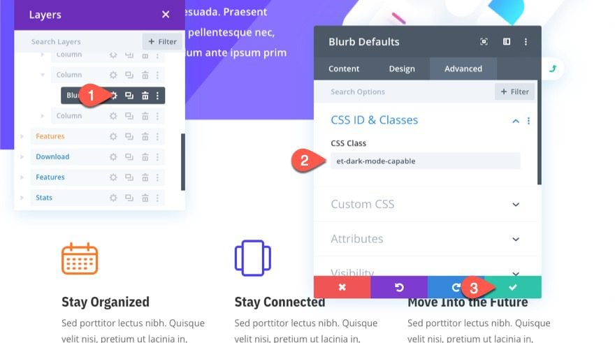
Blurbs
Next, open the settings for one of the blurbs in the page layout and add the CSS Class to the Blurb Global Defaults.
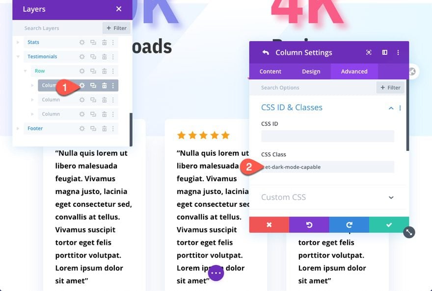
Testimonial Columns
Further down the page layout, there are a few testimonials, each inside a column with a custom white background. To override the column styles in dark mode, add the CSS class to one of the columns and extend it to the other columns within the row.
NOTE: It isn’t a great idea to add the CSS Class to the column’s global defaults because that will break some of the design elements (ie. its not a good idea to give all columns a dark background when most of the time column backgrounds are transparent).
To test out the result, jump over to the live page and click on the dark mode toggle at the top of the page.
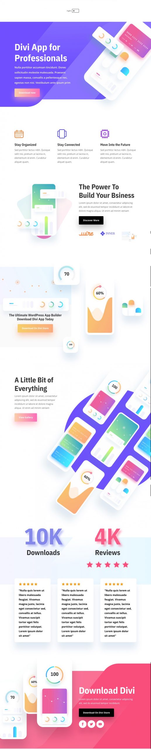
Here is what the page should look like in light mode.
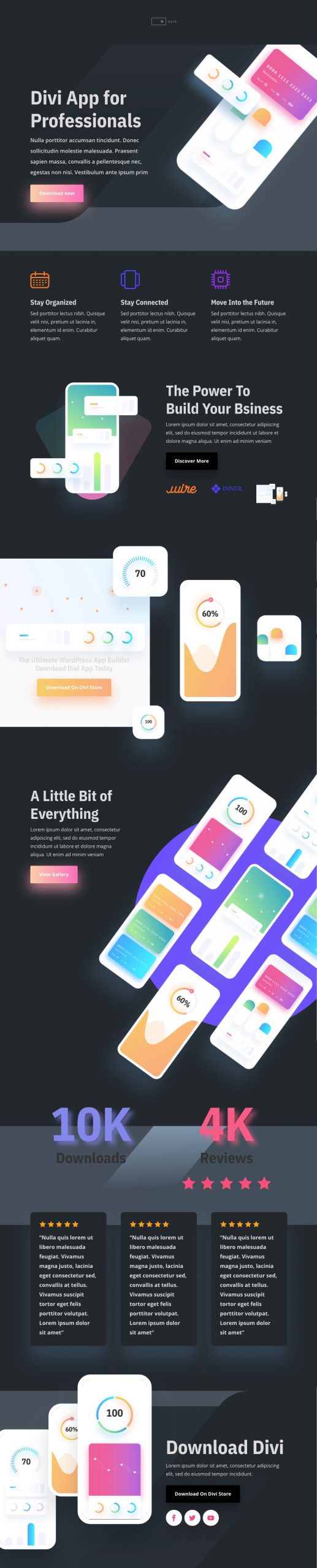
And here is what the page should look like in dark mode.
Part 3: Adding the Dark Mode Toggle to a Global Header
If you want to extend the dark mode functionality site-wide, it would be a good idea to add the dark mode toggle to you Divi Global Header. That way it will be available to users site-wide in one convenient place.
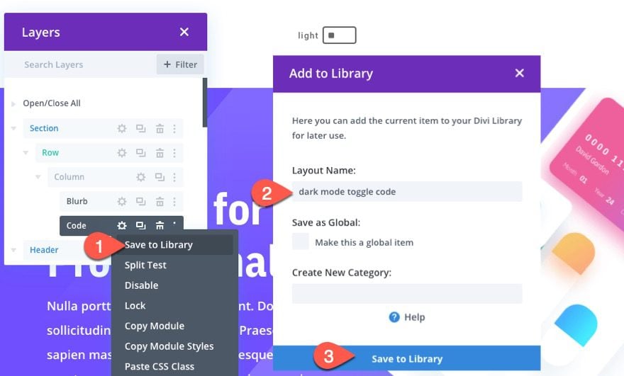
Saving the Dark Mode Toggle and Code to the Divi Library
But before you do that, we need to save the dark mode toggle and code to the Divi Library. This will make it easier to add to other areas of our site, including the global header.
Go back to the layout we built with Divi deployed on the front end. Then open the menu for the blurb module used to build the dark mode toggle and select save to library. Give the layout a name and save it to the library.
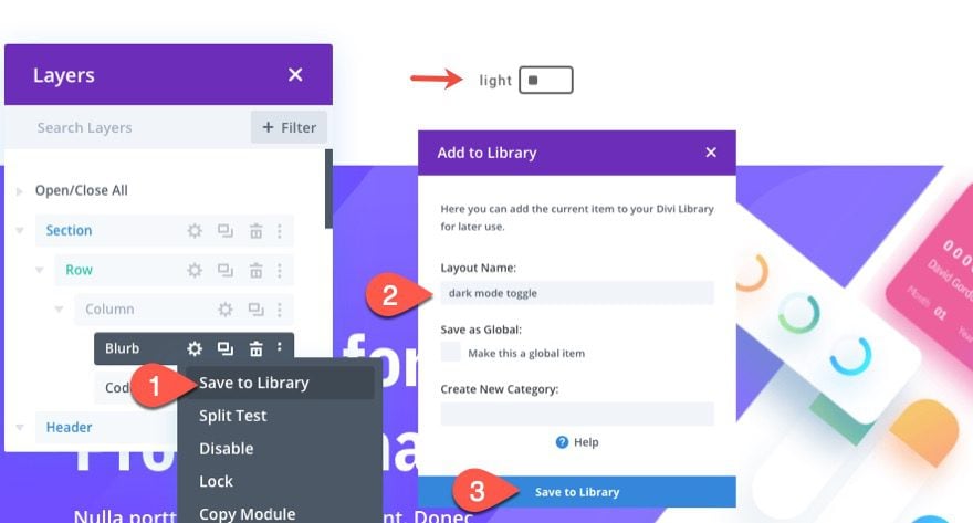
Next, save the code module to the Divi Library as well.
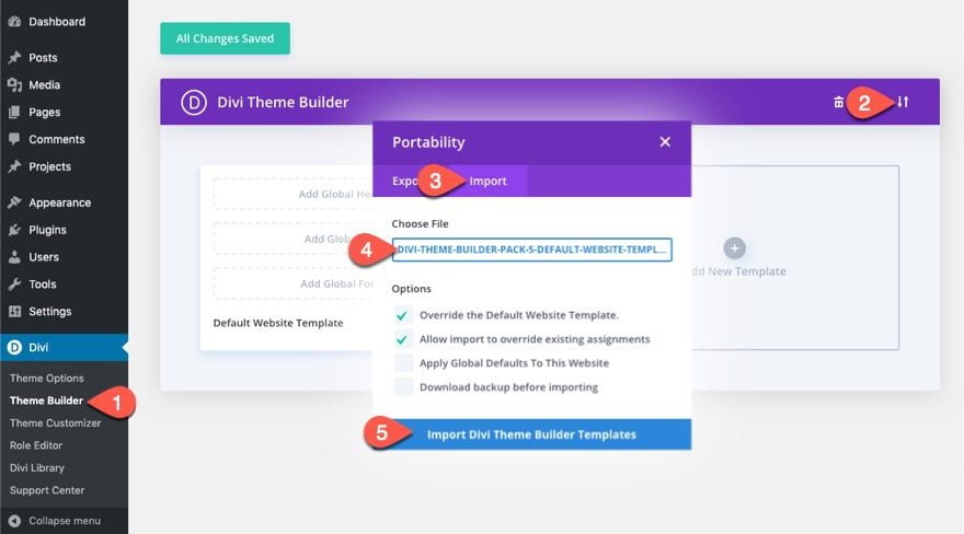
Importing a Premade Global Header Template
If you don’t already have a global header, you will need to build your own or use one of our premade theme builder packs.
For this tutorial, we are going to use the global header included in the fifth theme builder pack. To add the global header using the theme builder, you will need to download the theme builder pack and then use the portability options to import the JSON file called “divi-theme-builder-pack-5-default-website-template.json”.
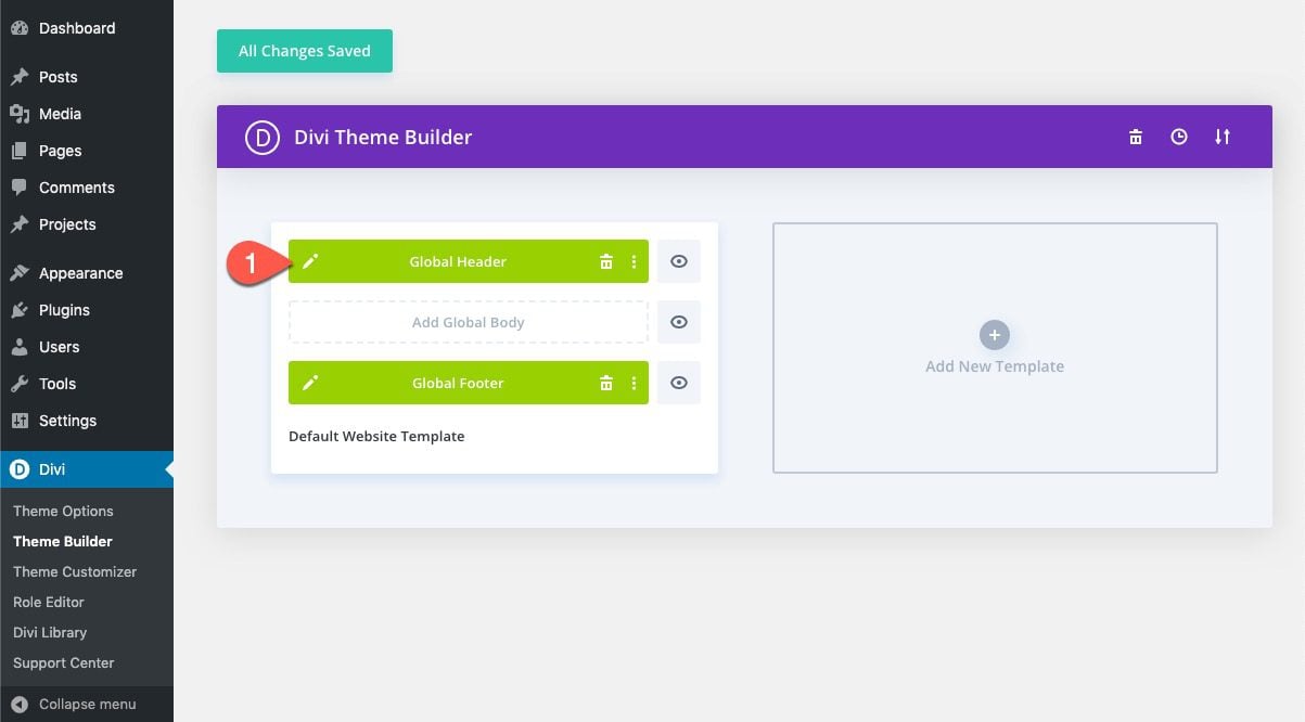
Once the template has been loaded, click to edit the Global Header.
Then add the dark mode toggle from the library to column 1 in the second row of the header.
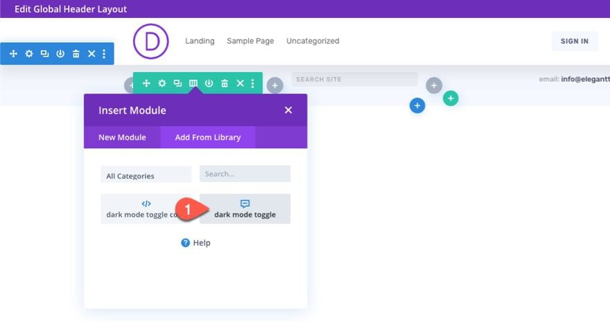
Under the dark mode toggle/blurb module, add the code module you have saved to the library directly under the dark mode toggle.
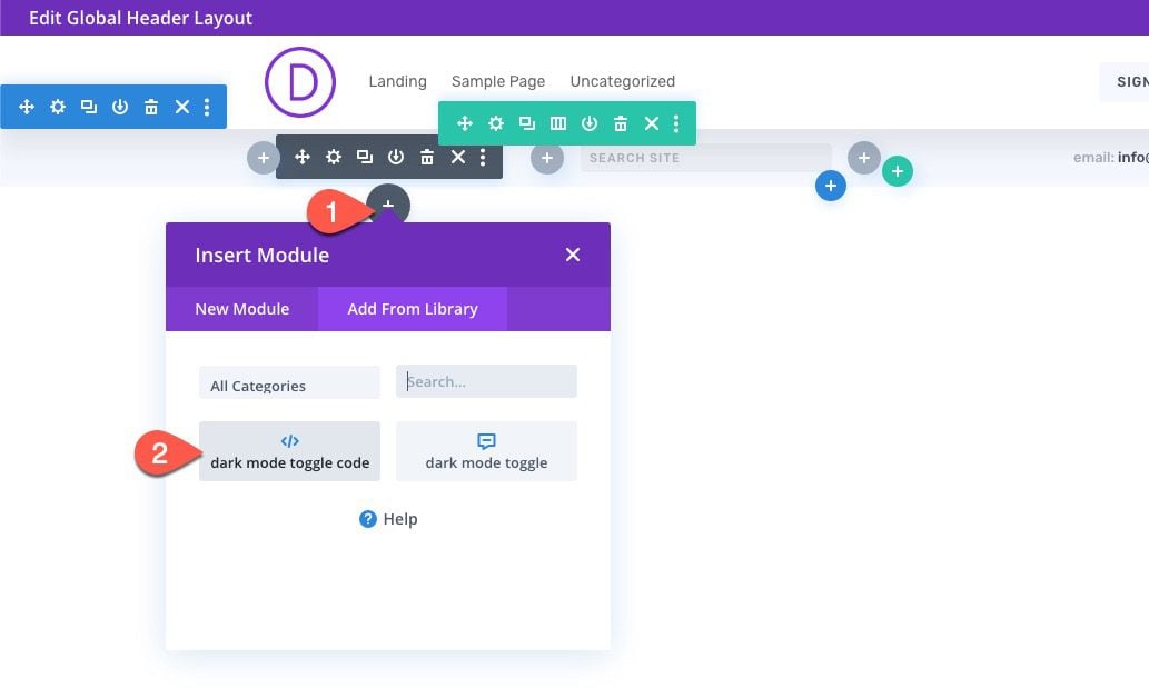
Since we have the “et-dark-mode-capable” CSS Class as the default for all sections, the sections inside the header will also have it by default. To disable this, simply give it an overriding CSS Class.
Final Results
Here are the final results of our dark mode toggle page.
And here is the dark mode toggle on the header. The selected mode (dark or light) will remain as you navigate to other pages on the site.
Adjusting the Custom CSS Dark Mode Styles
If you want to adjust the dark mode style of the toggle or Divi elements, you will need to do so inside the code within the code module.
The code currently has only a basic dark mode style applied to each of the elements once in dark mode. This consists of a dark background color and a light text color.
Final Thoughts
Equipping your Divi site with a custom Dark Mode toggle can be a great way to boost the UX and create a whole new design that both pleases and eases the eye. Hopefully, it comes in handy for you.
I look forward to hearing from you in the comments.
Cheers!


This is all well and good but WHY is this not standard feature in DIVI? The theme has been around for so many years now and has been evolving and growing. Seems obvious as a user and long time subscriber of ET for over 10 year now!!
This is quite a lot of work for something that should be available as Standard Feature these days. NICK – pls add this!!
Hi, I have tried this tutorial and looks amazing in my website, but I have some problem with blog module : No change in post meta and post content. Any solution for this prolem?
Hi Jason,
This is a really great tuto, many thanks ! It works fine on my site. With very little customization I had replaced “light” and “dark” words with fontawesome icons, and it’s cool 🙂
When the site is switched to dark mode, if I click a link to another page, the other page is displayed less than a quarter of a second in light mode before been displayed in dark mode. Could you please tell me where I could identified what’s happening ?
I would like to try to solve that behavior that I can see in this configuration :
– WordPress Version 6.3.1
– Divi Version : 4.22.2
with these browsers :
– Firefox 115.3
– Chromium 117.0
– Google Chrome 116.0
– Safari 13.2
This is fantastic. I’m only intermediate at css selectors and toggling css classes and your example provided a template of everything I’ve needed to send my divi post into dark mode.
It seems that this code doesn’t work with the recent versions of Divi and WordPress. When clicking the dark mode switch the colors are replaced, but when navigating to an other page all changes are reset.
you have to install the code on every page, not just in one page.
Hi,
ist there a way top replace a Image in darkmode?
My Logo is made for a white Background (Grey Colored) and should be switched when darkmode is on.
I’m having issues with the toggle element not being “clickable” I’ve triple checked the code and module. Everything shows as correct but after hovering over the button and clicking, nothing “switches”. The button doesn’t respond and none of the sections or content changes from light to dark. I’ve set et-dark-mode-capable as well. Any thoughts or suggestions?
Same
Hello,
I’m having issues getting the toggle to display itself properly in the dark mode state. The whole rest of the site switches to dark mode, but then the toggle still reads ‘light’.
Any help would be appreciated. (It is currently live on my site)
Regards,
Paige
Dark Mode is the next design update that we plan for our website. More an more iPhone and overall smartphone readers are asking for this feature. We are considering seriously to switch for Divi. However, we haven’t changed our template in years and recently we made it PWA and AMP. How difficult is to switch? Can you assist with the change?
This is a very great tutorial. For some reason its not working when i use it on my footer? Does this only work on a header? My intention is to impement it on the whole website. Hope you can help me 🙂
Hi,
Importing the file into the library throws the error: “This file should not be imported in this context”.
Can you please advise what the solution is?
This is a great tutorial. I’m hoping dark-mode capabilities will be added to Divi in the future, but this works great in the meantime.
I do have one small issue, though (and yes, it’s probably some sort of mistake on my part): everything works great, but the “switch” (the square icon we picked in the blurb module) doesn’t move, it stays in its original position.
What am I missing?
How would I change the background image when I switch to dark mode? Is that in the CSS or do I have to do it in the actual section ?
I am seriously considering opting divi above any other on my site. This is lovely!
That’s great!
This is very Nice tutorial and very timely but I have a question if you don’t mind, what if my website is designed the other way around? My website is black/dark. And what if I want the toggle to only show in tablets or mobiles? But i think this last question i can figure out, just disa le the toogle in visibility under advanced for mobile and tablets?
If you want to toggle light mode instead of dark, try the following:
1. Flip the label text on the toggle/blurb module so that dark shows first and then goes to light.
2. Go through the custom CSS in the code module and replace the background color with white (or a light color) and the text color with a dark color.
Everything else should follow the same process.
And yes… you can disable the toggle/blurb on desktop to only show on tablet and phone.
Hi, I’m getting an error message, “This file should not be imported in this context.”
please let me know what can i do?
Try importing it directly to the page using the portability option within the Divi Builder.
Hi Jason
Thanks for your tutorial
I have a question how to add prefers-color-scheme media query to autoenable if user has dark mode enabled on his device??
Hope you can help me
Kind regards
Lukas
Not sure if this is what you are looking for, but this should work…
@media (prefers-color-scheme: dark) {
body {
  background-color: #23282d !important;
  }
.et_pb_section.et-dark-mode-capable {
  background-color: #23282d !important;
  background-blend-mode: overlay;
  color: #dddddd !important;
  }
}
This would detect it automatically and apply the css to the body and any section with the class “et-dark-mode-capable”.
not exactly what i wanted but close. Is there a way to add this to your script and not to the css to enable the toggle when browser has dark mode on ( prefers-color-scheme: dark; because then all the previous css will be concidered..
I would really like if there was a way to do that. That Query restarts the site and changes the theme, which is fantastic, but there are some things, at least in my site, that aren’t changing as they would by flipping the switch.
I need this tanks ..
how do i integrate the prefers-color-scheme media query to autoenable if user has dark mode enabled on his device
How can i autoenable darkmode when darkmode is active on the device
Hi Jason,
Thank you very much for a great stuff.
Would you be so kind to exlain, in theory is it possible with same solution change color for all website’s images? For example make them black and white? Than with a different toggle make them color again?
Thanks
Igor
sure! All would need to do is add the “et-dark-mode-capable” class to an image module (or add it to the global default settings for all image modules). Then add the following custom css to the code module…
.et_pb_module.et_pb_image.et-dark-mode-capable.et-dark-mode { filter: saturate(0%); }Great stuff. Thank you!
Great idea! Great solution! I’m impressed. It’s always amazing what is possible with divi.
Thank you Jason!!!
Awesome!
Hi, thank you. It could be very usefull for a language switch on page or single section/row/module. I’m not expert and would like to know if it is easy to modify this tutorial to become an “on demand” language switch. Thanks
That’s a good idea. Didn’t think of that. I’ll keep it in mind. Thanks.
Very nice explanation. Thanks for this
Nice article good information
I’m getting an error message, “This file should not be imported in this context.”
Try importing it directly in the Divi Builder. I think you can just drag the json file into the builder. Sorry about that.
I’ve tried both, but it didn’t work… Any other suggestion? Maybe there’s something wrong with the json file?
Sorry, I’m not sure what you mean.
Instead of importing to the Divi Library, use the portability option to import the file using the Divi Builder when editing a page.
Yeah. I think Marie Ann is right.
This seems like something needed for an accessibility plugin.
A dark mode or alt-styles is something I’ve so wished were baked into Divi/Extra by now. Sure I’m not alone in that.
Converting an existing, fully populated site can be quite the cumbersome, time-consuming undertaking.
A toggle is a really clunky solution. Why not build in the option for auto-switching based on the device state into Divi itself? It would be a fair amount of work as you’d need to make a lot of changes to the Customizer, but that’s the way to create a professional-looking solution.
Yes, I really like this blog post. Thanks for that!
But how can I make it work with my section dividers? They doesn’t change the color.
Dividers are a bit tricky to change the color because it is an svg image. But you can easily change the opacity of the divider to darken it. Add the following to the custom CSS :
.et_pb_section.et-dark-mode-capable.et-dark-mode .et_pb_top_inside_divider, .et_pb_section.et-dark-mode-capable.et-dark-mode .et_pb_bottom_inside_divider { opacity: 0.5; }Ok, thanks for the answer.
Have a nice weekend.
No, in this way it is stylized only with an opacity, it must be implemented differently
You could style the divider like you want it to look in dark mode, inspect and copy the background-image css so that you can paste it in the dark mode css. Does that make sense?
That’s great!!! a tutorial that was going out for a while, and above all and most importantly, is that you don’t need a plugin. That if I have a doubt, can you apply the black mode to the header?
Awesome! Yes you can apply it to the header. I cover that in the blog post.
Wow, this is really helpful. Thanks so much. I really like these more in-depth / technical tutorials you’ve been putting out lately.
I’ve been hoping to build this out with a tiny lightbulb as the toggle, looks like this is exactly what I need.
Cheers!
Great Idea!
Great job, Jason 🙂
Thanks! 🙂
Is it possible to convert your already built site? Or do you have to start from scratch?
Once the toggle and the code are in place, all you need to do is assign the et-dark-mode-capable class to any existing Divi element (section, row, module, etc…)
wow so cool!! im gonna try this out for sure!
Great to hear!