
Full Screen page layouts can really come in handy in the world of web design. One main benefit of a full screen page layout is visibility. With full screen pages, all your page content remains within the browser window. In a world where users are quick to scroll, having all of your content contained within the browser viewport from the start can be refreshing for the viewer and could also help with conversions.
If you are familiar with Divi, you should already know about the fullwidth header module that has full screen functionality built in. This is a wonderful solution for creating full screen pages with minimal content. But if you want to take advantage of building a full screen page layout using a regular section with multiple rows and modules, this is the post for you. I’ll show you a few simple tricks to make sure your page content (even the header and footer bar) fit within your browser window and then scale nicely on different browser sizes.
Let’s get started.
Sneak Peek
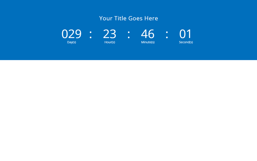
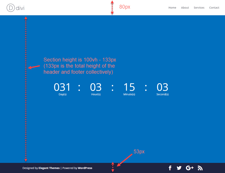
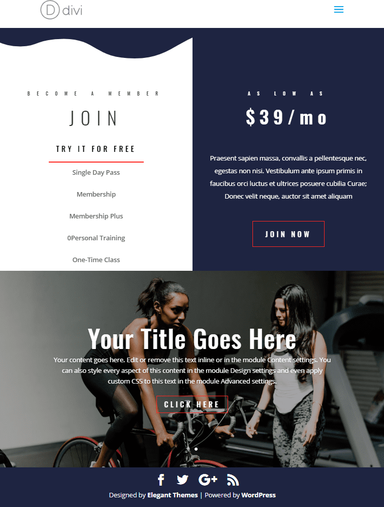
Here is a sneak peek of the final full screen page layout we will be creating in this tutorial.
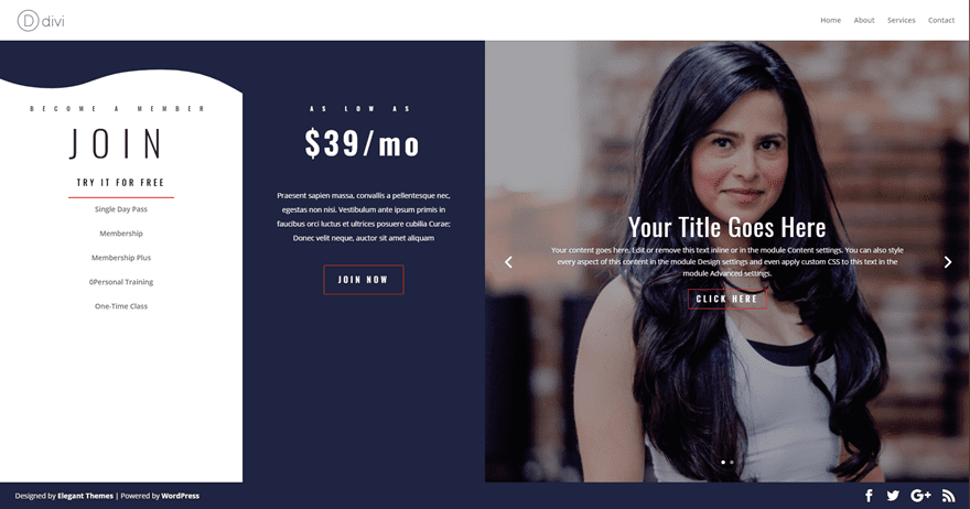
Notice how the page height adjusts to the height of the browser window so that everything stays in place.
What you Need
For this tutorial, all you really need is Divi. I will also be using the Fitness Gym Layout pack which is accessible from the Divi Builder.
Subscribe To Our Youtube Channel
How to make a Custom Full Screen Page in Divi
Before I jump into the main design of this tutorial, I thought I would show you the basic idea behind creating a full screen page in Divi. After all, you may be surprised at just how simple it can be.
The basic idea explained
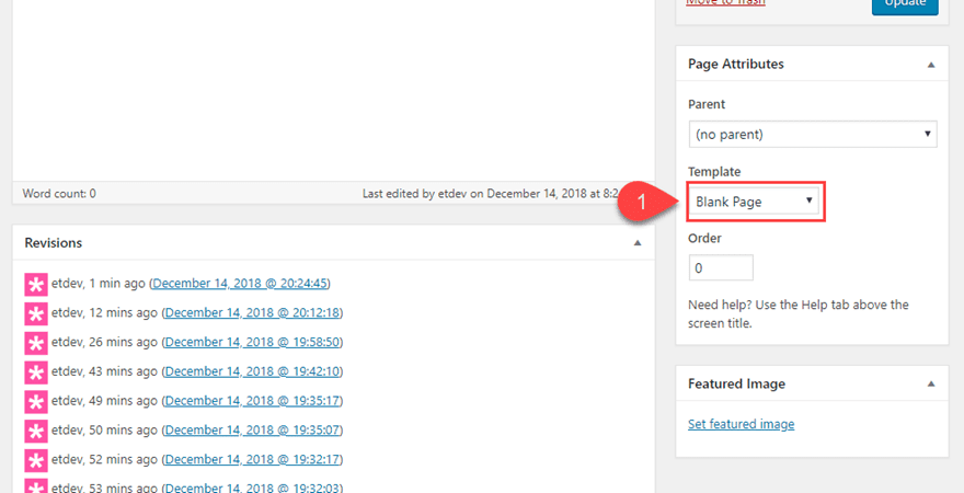
In a new page, choose the blank page template. This will stop the main header and bottom footer bar from showing on the page (I’ll show you how to include those later).
Now deploy the Divi Builder on the front end to build your page from scratch. Then add one regular section with a one column row.
Next, add a countdown timer module (or any module) to the one column row.
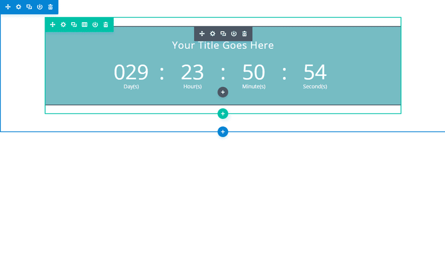
To make things easier on the eyes, take out the background color in the countdown timer and add a background color to the section so we can better recognize the height of the section on the page. Currently the height of the section is relative to the height of the content it contains. In this case the only content we have is a single row with a sing module.
Now open the section settings and go to the advanced tab and add the following custom CSS to the Main Element:
min-height: 100vh;
display: flex;
flex-direction: column;
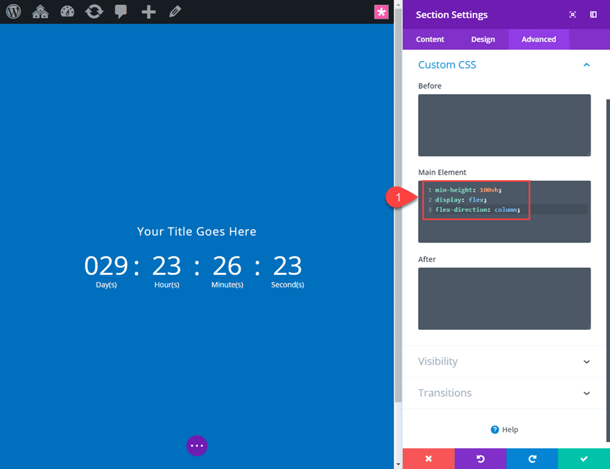
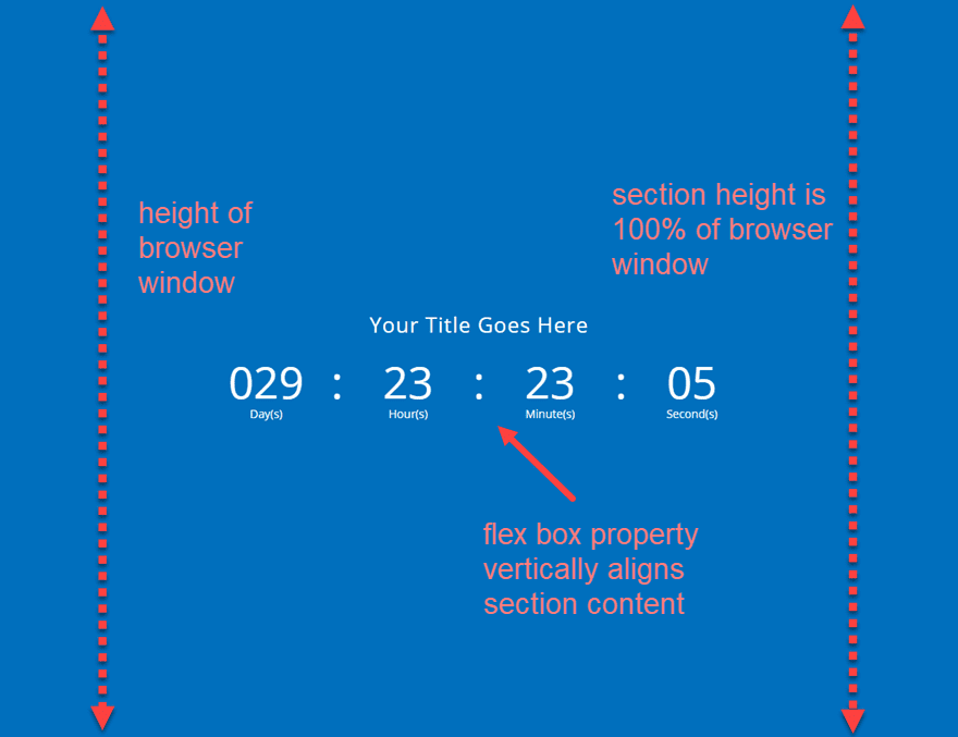
Setting the minimum height of your section to 100vh (100% of the for viewport height) will ensure that your section spans the full browser window (or viewport). The “display:flex” property is a quick and easy way to vertically center the content of your section.
Check out this helpful guide for more info on the vh length unit.
View your live page in an incognito browser to see the result because if you are logged in to WordPress, the top admin bar will throw off the browser height slightly.
Well there you go. That’s the basic idea of how to create a custom full screen page layout in Divi.
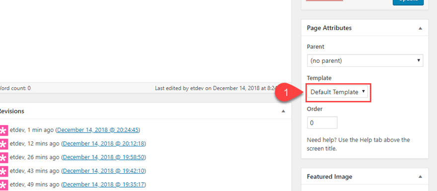
If you want to have the header and bottom footer bar included in the full screen page, you will need to make one small adjustment. First, change your page template back to the default template on the backend of your page editor.
Including the header and bottom footer will add additional height to your browser viewport so the section will no longer fit perfectly as it once did. This is because your page is now made up of a section height that is 100% of the viewport height PLUS the height of your header and bottom footer bar. That’s too much. To fix this we need to adjust the custom CSS in our section to the following:
min-height: calc(100vh - 133px);
display: flex;
flex-direction: column;
The only difference is the min-height value. Now there is a calculation that accounts for the additional height (in pixels) of the header and bottom footer bar collectively.
The 132px is based on the total of the default height of the header (80px) and the default height of the bottom footer bar (53px).
Now that we have a basic understanding of how to create a custom full screen page in Divi, let’s dive into a more complex design.
Building a Complete Full Screen Page Design
To get things started for this design, create a new page, give your page a title, and deploy the Divi Builder. Select the option to Choose a Premade Layout and from the Load from Library Popup, select the Fitness Gym Layout page. Then click to use the Pricing Page.
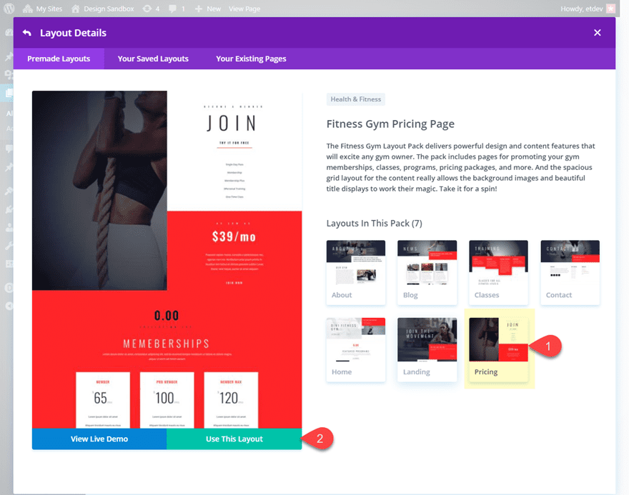
Once the layout loads into the builder, click to the button to build on the front end (The Visual Builder) and you are ready to start.
Creating a New Section
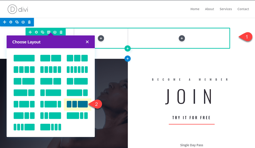
The premade layout is there to help kickstart the design. We will be using these layout design elements along the way and deleting the rest of the layout after we are finished. To create the main section for our full screen layout, go ahead and create a new regular section and drag it to the very top of the page. Then add a one-fourth one-fourth one-half column structure to the row. This will be the foundation of our full screen page.
Adding Modules to your Columns
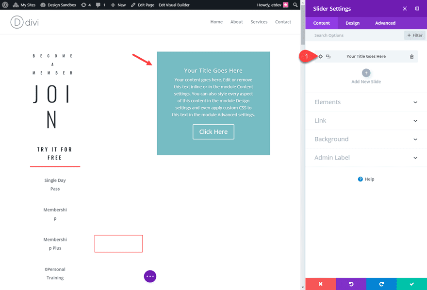
Using Multiselect (hold ctrl/cmd and click), select all the modules in the first two rows in the first section of the layout and drag them into the first column of the new section at the top of the page.
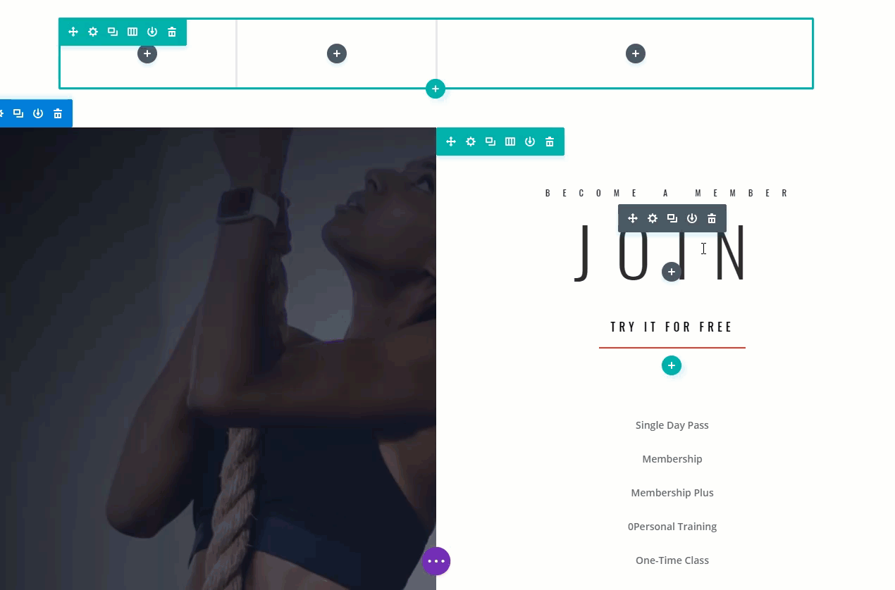
Next, use multiselect to copy all of the modules in the third row of that same first section of the layout and paste them into the second column of the the new section at the top of the page.
The text will be hidden because of the white background but we will be changing the background color later.
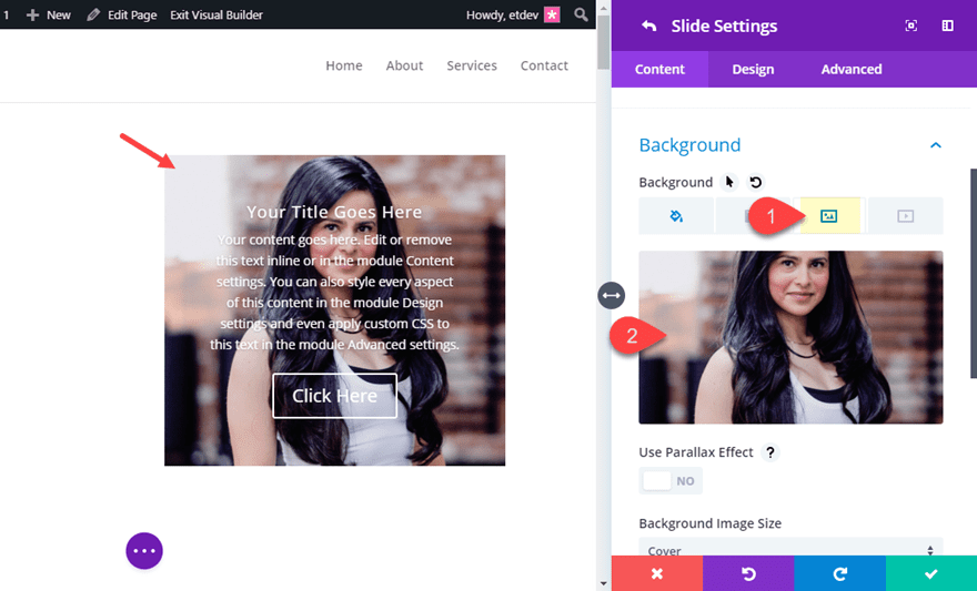
In the third column, add a slider module. This slider will eventually span the full height of the screen, but for now let’s just set up the content. In the slider settings, delete one of the two default slides that are there by default and then click to open the settings of the single slide.
In the slide settings, add a background image making sure it is big enough to span the full height of the browser.
That takes care of all of our modules that we need for now. We will revisit the design settings later but for now, let’s customize our row.
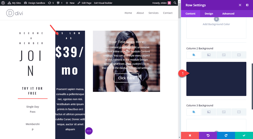
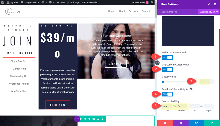
Customizing the Row Settings
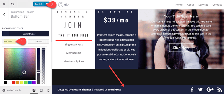
Open the row settings and start by adding background color to column 2:
Column 2 Background Color: #2a2e40
Jump over to the design tab and update the following:
Make This Row Fullwidth: YES
Gutter Width: 1
Equalize Column Heights: YES
Custom Padding: 0px Top, 0px Bottom
Customizing the Section Settings
The only thing necessary at this point for our section settings is to take out any default padding, but I thought it would be nice to add a section divider that frames the top of the first column. Open the section settings and update the following:
Top Divider Style: see screenshot
Top Divider Color: #2a2e40
Top Divider Height: 8vw
Top Divider Horizontal Repeat: 0.8x
Top Divider Flip: vertical and horizontal
Custom Padding: 0px top, 0px bottom
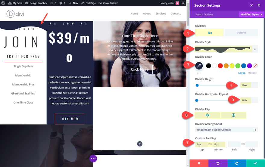
Since the divider is set to show underneath section content it will hide behind the slider in column 3 and it will not show on column 2 because it matches the color of the columns background. This creates a nice framing design element for column 1.
Delete the rest of the premade layout
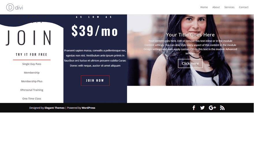
At this point our top section has everything in place for our full screen page layout so we can delete all of the remaining sections that came with the premade layout. This is what your page should look like so far.
Now we are ready to start customizing our page to become full screen.
Adding Custom CSS to Make the Page Full Screen
In the basic example at the beginning of this article, I added the custom css directly to the section. However, to make sure our full screen functionality only applies to desktop (and resorts to default styling on mobile), I will be adding it to the CSS under page settings. This will allow me to add external CSS that applies only to this page but also gives me the option of adding a media query that limits the styling to desktop only.
From the settings menu at the bottom of the front end builder, open the page settings. Under the advanced tab, enter the following custom CSS:
@media (min-width: 980px){

/*If CSS IDs are added, this makes the element the same height as the browser window taking into account the header and the bottom footer bar*/
  #fullsection, #fullslide .et_pb_slide {
    height: calc(100vh - 133px);
  }
/*This centers the content of the section when the CSS ID is applied*/
  #fullsection {
    display: flex;
    flex-direction:column;
    overflow: hidden;
  }
/*This makes the bottom footer bar fullwidth to match the fullwidth header if applied*/
  #footer-bottom .container {
    width: 100%;
    max-width: 100%;
    padding-right: 30px;
    padding-left: 30px;
  }
}
For those of you not familiar with CSS, notice that the code is wrapped by a media query that applies the styling when the browser is a minimum of 980px in width. With the brackets, the first snippet includes a CSS ID named “fullsection” followed by a CSS ID named “fullslide”. These two CSS IDs are important to remember because we will need to add them to our section and our slider. Once we do, the css “height: calce(100vh – 133px)” will be applied making them both full screen (spanning the full height of the browser window).
The second snippet will apply the display flex property to the section, making all the section content vertically centered. For more info on this, check out our post on how to vertically align content in Divi.
The third snippet is completely optional. This simply makes the bottom footer bar fullwidth to fit the design a bit better and also to match the fullwidth header style we will be adding.
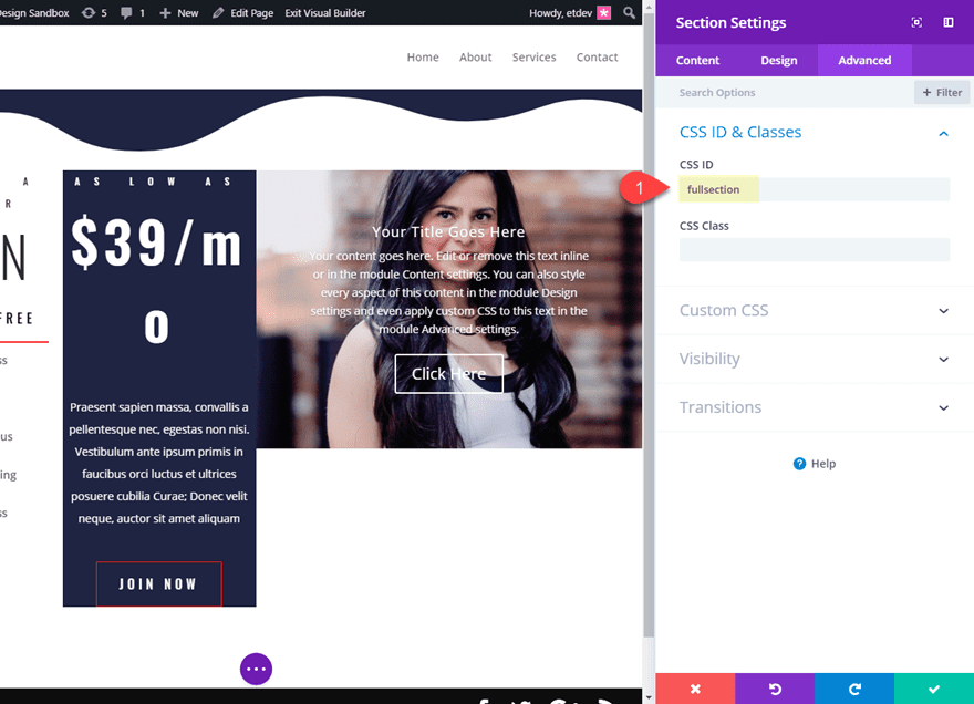
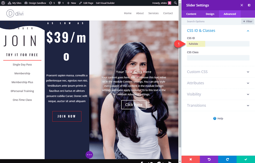
Now that you have the external CSS in place, we can add our CSS ID’s to our section and our slider. Go to the section settings and add the following CSS ID:
CSS ID: fullsection
Now open the Slider Module settings for the slider in column 3 and add the following CSS ID:
CSS ID: fullslide
Final Touches
At this point, the full screen page functionality is in place and should be working. You can check it in an incognito browser to be sure. All that is left is a few final touches.
Add spacing to our columns
Open your row settings to add some padding to the top of column 1 and column 2 as follows:
Column 1 Custom Padding: 12vh Top, 1vw Left, 1vw Right
Column 2 Custom Padding: 12vh Top, 1vw Left, 1vw Right
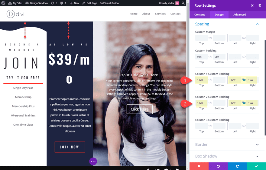
Notice that I used the vh length unit for my top padding values. This will allow the padding to scale with the height of the viewport, creating more padding as the browser window gets taller and creating less padding as the browser gets shorter. I used the vw (viewport width) length unit for my left and right padding values so that the padding will scale according to the width of the browser.
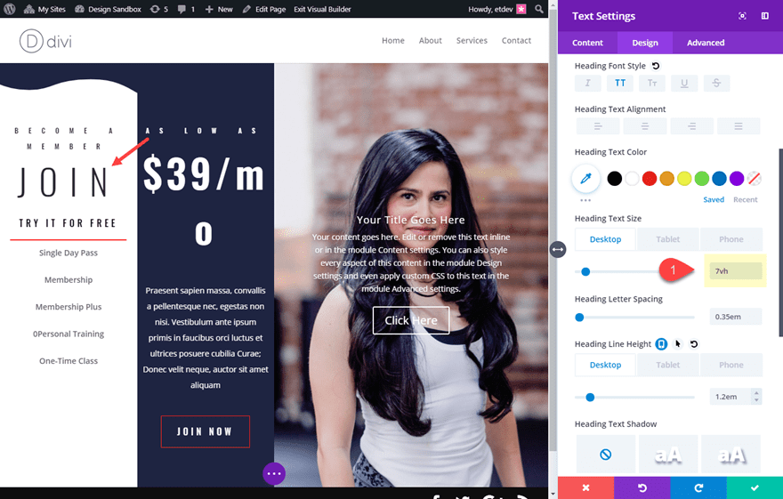
Add vh Length Units to Large Text to Maximize Viewing Space
As you can see, there are a few modules with really large text that don’t really scale with the browser window at all. To fix this, we can set the text size to a vh length unit. This will allow the text to scale down on shorter browser screens.
Open the settings of the text module at the top of column 1 and update the h1 header text size to 7vh (not vw).
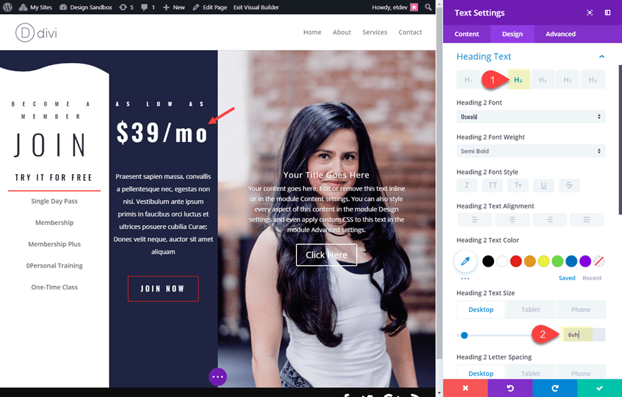
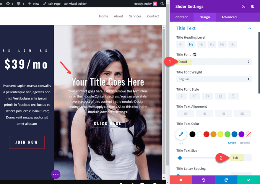
Next, open the settings of the text module at the top of column 2 and update the Heading 2 Text size to 6vh.
Update Slider Design
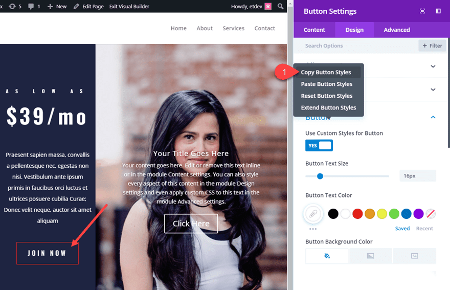
To finish off the design, you can copy the button design of the button in column 2 and paste it into the button styles of the slider. To do this, open the button settings for the button in column 2 and right click on the button option category and click “copy button styles”.
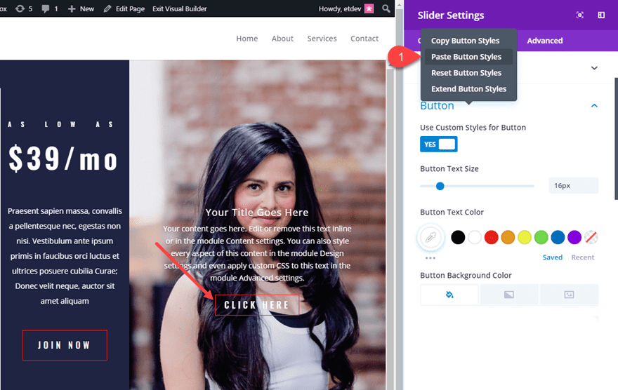
After that, open the slider settings and paste the button styles into the button options category of the slider.
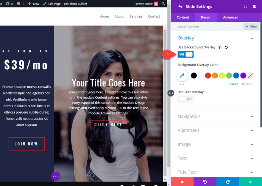
You can also add a background overlay to the individual slides.
Header and Bottom Footer Bar Adjustments
You may remember that we already added a small snippet of custom CSS that expanded our footer to fullwidth. This was in anticipation of making our primary menu bar full width as well. To make your primary menu bar full width, go to the WordPress dashboard and navigate to Divi > Theme Customizer > Header & Navigation > Primary Menu Bar. Then check the Make Full Width option.
Since we are displaying our bottom footer bar on our full screen page, we can update the Bottom Bar background color to match the design. Stay in the Theme Customizer and navigate to Footer > Bottom Bar. Then set the background color to #2a2e40.
Then publish your changes.
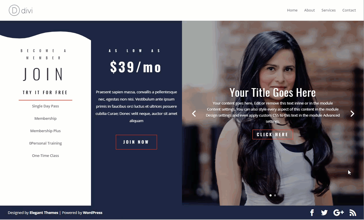
The Final Result
Here is the final design. Notice how everything fits nicely within the browser window.
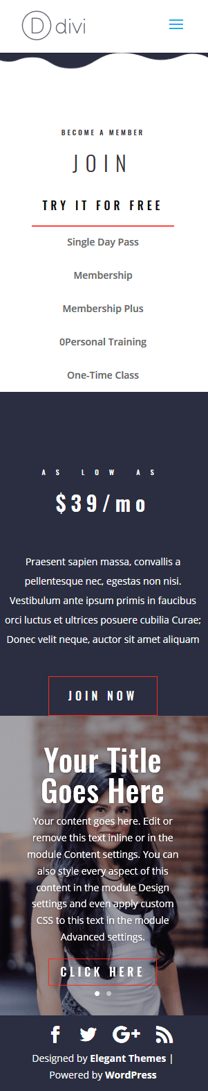
And check out what it looks like when adjusting the browser to different sizes.
And don’t forget, since we only applied our custom CSS to browser widths greater than 980px, the design will fall back to normal on mobile devices.
Here it is on tablet and smartphone.
Final Thoughts
Creating a custom full screen page layout in Divi isn’t that overwhelming once you understand how to properly adjust the height of your section to a height of your browser with a few snippets of CSS. But once you have that down, you can create countless full screen page designs within the Divi Builder. Just be careful to keep the content to a minimum if you plan on keeping everything visible within the browser window.
This type of design works well for personal sites, promotional offers, and all sorts of landing pages. It is also a great solution for pages that have little content and you want to avoid having the bottom footer bar displaying halfway down the page.
And don’t forget about the option to use Divi’s Fullwidth Header Module. Although you won’t have the same flexibility as the method used in this post, it is perfect for pages with minimal content.
Here are a couple more posts that you may enjoy on the subject of full screen pages.
- How to Create Full Screen Sections with Top and Bottom Scroll Links with Divi
- Design a Unique Full Screen Divi Layout with an Animated Scroll Button
- and more
I look forward to hearing from you in the comments below.
Cheers!


Really Really Awesome Theme, I love Divi Theme since it launched. Used for my many clients, personally used for own blog.
100% recommended.
Great read, easily simple way to customize and helpful for noobs like me. Thanks.
I Like this blog. This blog is very informational for us.
Nice! Thanks for the great tips.
Great – give us the shit to download..
smile 🙂
Very good brief and this post helped me a lot. Say thank you I’m searching for your facts. Continuous it…
One of the considerations when making a move from one place to another is to keep all your items properly secured. Getting the right storage and warehousing service is essential to ensure you get exactly that. This is where Mr Move comes into the picture. With extensive experience in providing both storage and moving service for the people of UAE, we are the best in Dubai when it comes to this.
Divi is heart of WordPress and I must say no matter how difficult to setup this but results make it first choice of developers. Thanks for the detailed explanation. However I followed the same Visual Builder issue but now it is working perfect. A worth read.
I have been having a problem using “vh” in the newest Divi. If I use 100vh it will create a section that is about 100 screens deep rather than 100% of viewport.
Thanks Jason,
So simple and straight forward. I love these little tutorial posts that show the ease of applying changes to Divi. Thanks and keep them coming.
Thanks, Greg. Glad you liked it!
Hey, guys, this is Trivanks I appreciated you have guide step by step to design custom full-screen page layouts in (Divi) have some more questions to also in WordPress ..in amp version issue. can please share the valuable info about that.. some category page is showing in amp when I install the plugin.
Thanks
Trivanks Vinks
Hi Jason,
Watch out if you are using vh values for height with the new backend visual builder. A known bug, which has not been fixed yet, triggers an infinite zoom/growth of the element/s it is applied to. Very disconcerting when trying to build a page live. On the live page this doesn’t manifest itself. I am guessing that the browser is struggling to calculate what should constrain what the actual height of the element, when it is the builder wireframe that should set the constraint.
If you want to work in the backend visual builder you need to adjust your styling to something like:
height: 100vh;
max-height: 1080px;
Obviously there are screens with higher and lesser resolutions so reverting to min-height: 100vh is an option once the layout is complete is and option.
It doesn’t effect the front end builder so much, just sometimes the tablet and mobile viewports.
Hopefully this is something Elegant Themes will fix soon!
+1
Wow. I wasn’t aware of that. Thanks for the heads up. I’m sure we will get that fixed asap.
Yes, same issue experienced here with the Visual Builder.
Sounds like an issue in the render engine via javascript. I don’t use the newly designed backend builder so I haven’t experienced it. Just a guess, but I’m not changing my way of workflow just because they release this new experience. I played with it for a few minutes and noticed how much it was slowing down my workflow, time is money and there isn’t anything that the new backend can do to speed up my steps so it’s just useless fluff for the time being.