
A lot of websites need to display before and after images for a variety of reasons. For example, web design firms can show before and after images of websites they’ve built, and fitness sites can show before and after portraits of their successful (and fit) customers. Usually, websites settle for a simple design that displays each photo adjacent to one another. In this tutorial, we are going to enhance this traditional design with interactive animation.
In this tutorial, we are going to show how to create scroll animated before and after images in Divi. With this design, the user will see the transition of the before and after images as they scroll down the page. This is a great way to engage users to scroll down your site and see the transformation in a unique way. Plus, we can build this using only Divi’s built-in options. No custom code or plugin needed!
Let’s get started.
Sneak Peek
Here is a quick look at the design we’ll build in this tutorial.
Download the Layout for FREE
To lay your hands on the designs from this tutorial, you will first need to download it using the button below. To gain access to the download you will need to subscribe to our newsletter by using the form below. As a new subscriber, you will receive even more Divi goodness and a free Divi Layout pack every Monday! If you’re already on the list, simply enter your email address below and click download. You will not be “resubscribed” or receive extra emails.

To import the section layout to your Divi Library, navigate to the Divi Library.
Click the Import button.
In the portability popup, select the import tab and choose the download file from your computer.
Then click the import button.

Once done, the section layout will be available in the Divi Builder.
Let’s get to the tutorial, shall we?
What You Need to Get Started

To get started, you will need to do the following:
- If you haven’t yet, install and activate the Divi Theme.
- Create a new page in WordPress and use the Divi Builder to edit the page on the front end (visual builder).
- Choose the option “Build From Scratch”.
After that, you will have a blank canvas to start designing in Divi.
Creating Scroll Animated Before and After Images in Divi
Now we are ready to begin creating our scroll animated before and after images in Divi. To do this we will first need to create a two-column row that will not wrap (or break) on mobile. Each of the columns will also need to have the overflow hidden so that the before and after images will slide out and in to view within each column on scroll. Once the columns are in place, we will add our images to each column and add the styling and horizontal scroll animation to each one. Once that is in place, we will add the before and after heading text above the images.
Part 1: Creating the Two-Column Row
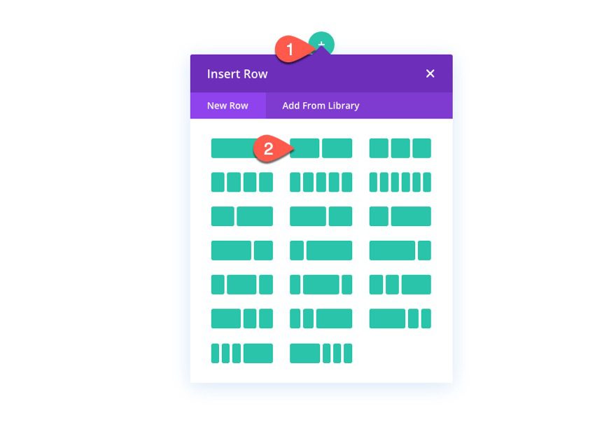
To begin, add a two-column row to the default regular section using the Divi Builder on the front end.
Row Settings
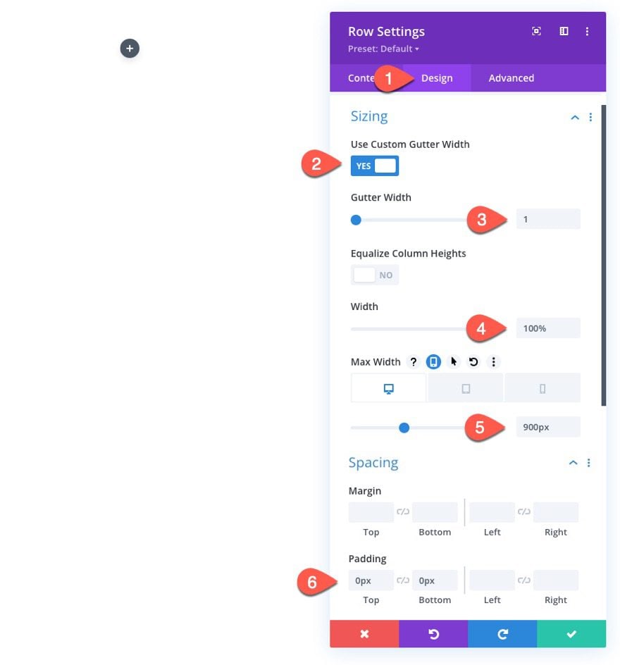
Open the row settings and update the following:
- Gutter Width: 1
- Width: 100%
- Max Width: 900px (desktop), 700px (tablet), 300px (phone)
- Padding: 0px top, 0px bottom
NOTE: Setting the max-width of the row using pixel length units is crucial for this design to work. Keep these values in mind because the width of each image and the horizontal scroll animation we will add later will depend on the max-width of the row.
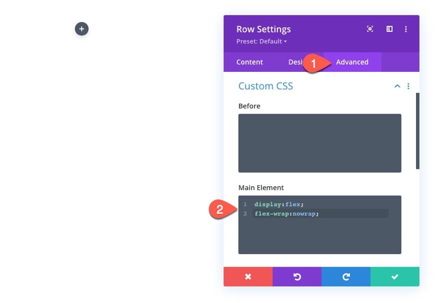
To make sure the columns don’t wrap or break into a one-column layout on mobile, open the advanced tab and add the following custom CSS to the Main Element:
display:flex;
flex-wrap:nowrap;
Column Settings
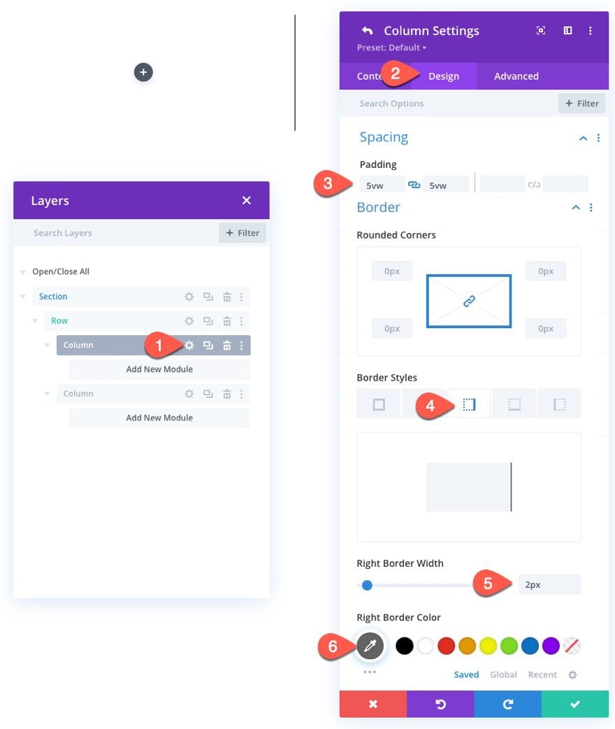
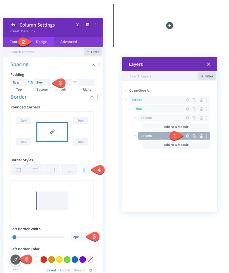
Next, open the settings for column 1 and update the design settings as follows:
- Padding: 5vw top, 5vw bottom
- Right Border Width: 2px
- Right Border Color: #666666
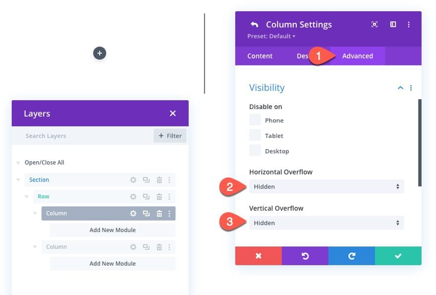
Under the Advanced tab, update the overflow as follows:
- Horizontal Overflow: Hidden
- Vertical Overflow: Hidden
Remember, each of the columns will need to have the overflow hidden so that the before and after images will slide out and in to view within each column on scroll
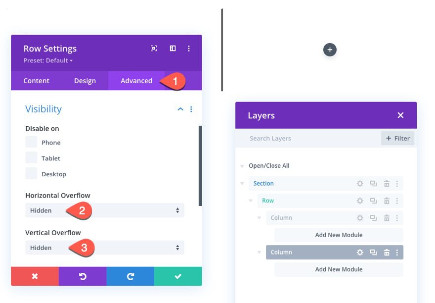
Next, open the settings for column 2 and update the design settings as follows:
- Padding: 5vw top, 5vw bottom
- Left Border Width: 2px
- Left Border Color: #666666
NOTE: The right and left border on each column create the middle line that will be the center point of the before and after image transition.
Then update the overflow to hidden for this column as well.
- Horizontal Overflow: Hidden
- Vertical Overflow: Hidden
Part 2: Creating the Before and After Images
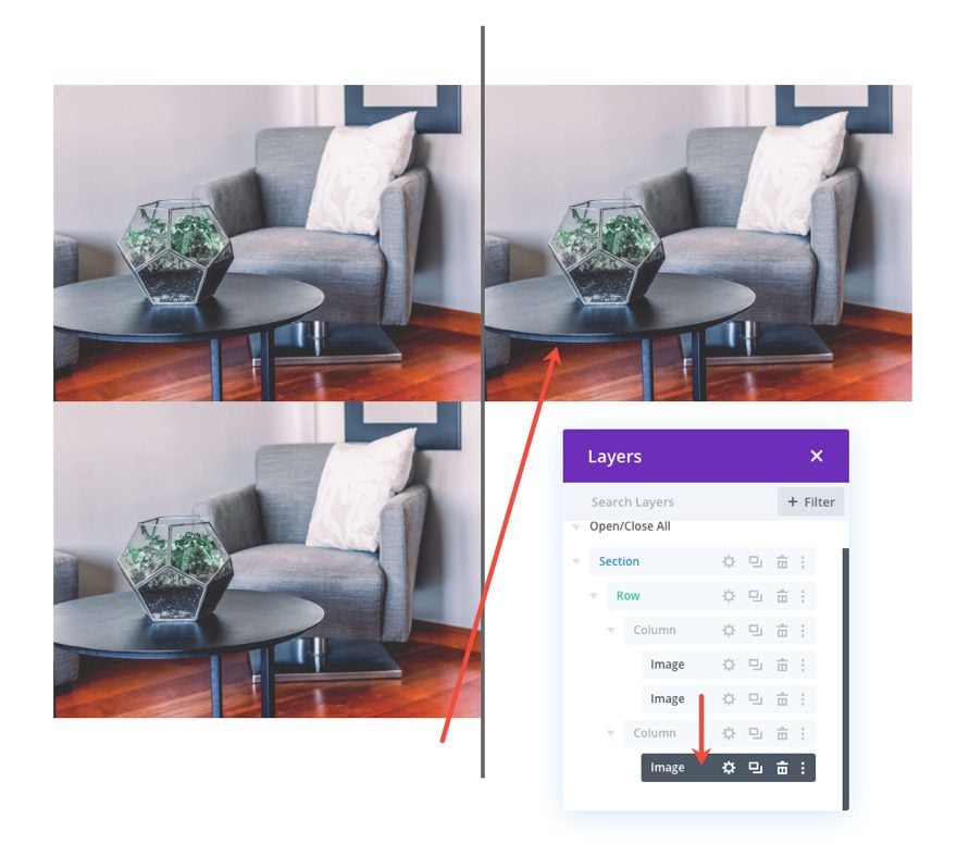
With our two-column layout in place, we can now add the images we will use for the before and after animation. We will actually have three images total. In column 1, we will have a “shadow” version of the before image that stays behind (doesn’t animate) and we will have the before image (in black and white) that will eventually move to the right on scroll. In column 2 we will have the after image that will scroll into view from the left on scroll.
Adding the Three Images
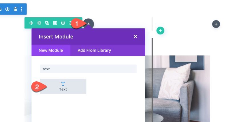
To create the first image, add a new image module in column 1.
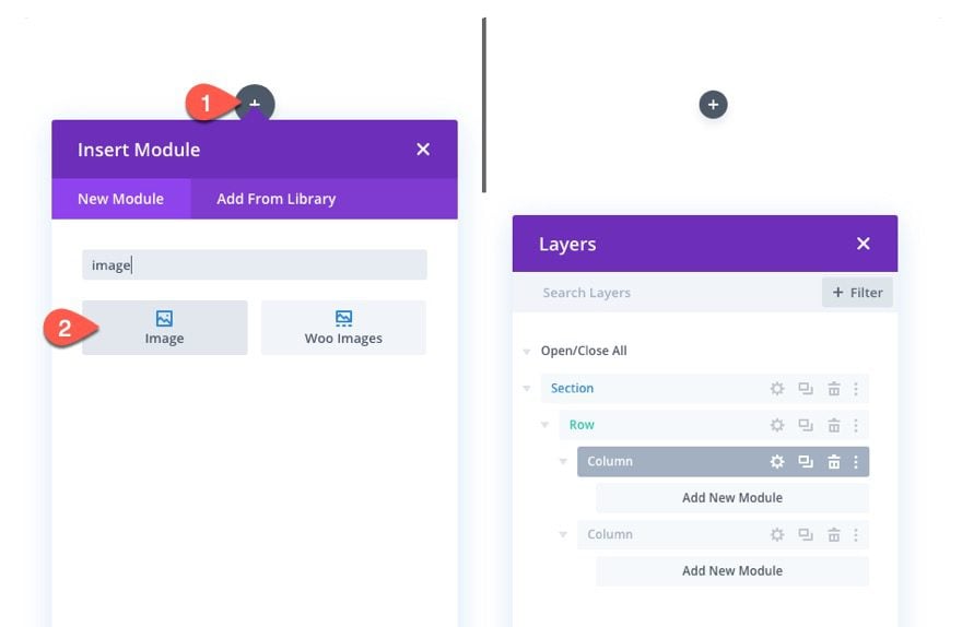
Then upload an image to the module.
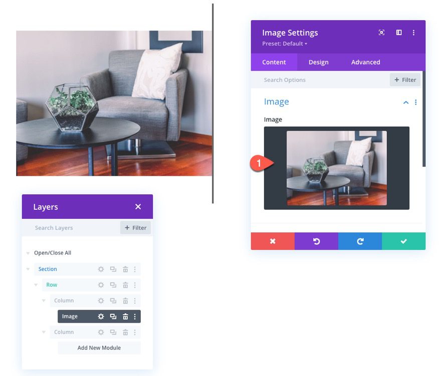
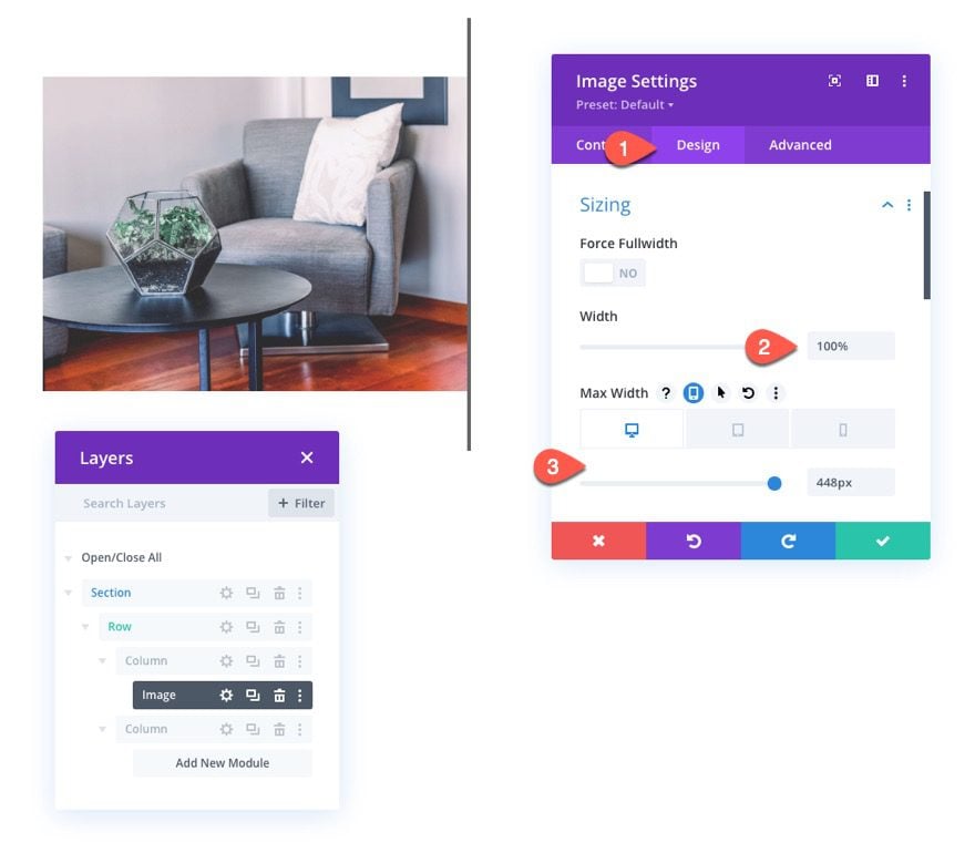
Under the design tab, update the following width options:
- Width: 100%
- Max Width: 448px (desktop), 348px (tablet), 148px (phone)
NOTE: Each of the max-width dimensions are determined by exactly half of the row minus the 2px border. So for desktop, the row has a max-width of 900px. Half of the row is 450px. Then take away the 2px added by the border and you get 448px.
To create the next two images, duplicate the image module three times.
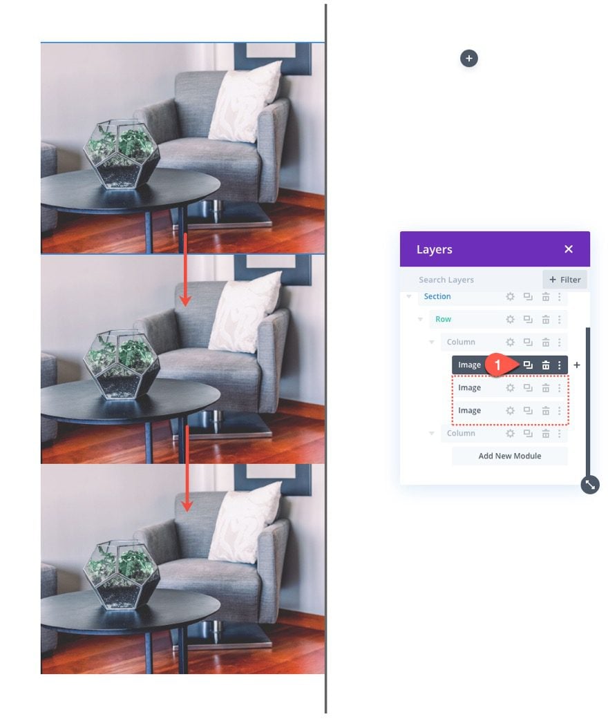
Then move one of the images into column 2.
Part 3: Adding Custom Style and Scroll Animation to Images
Before Image “Shadow” Styling
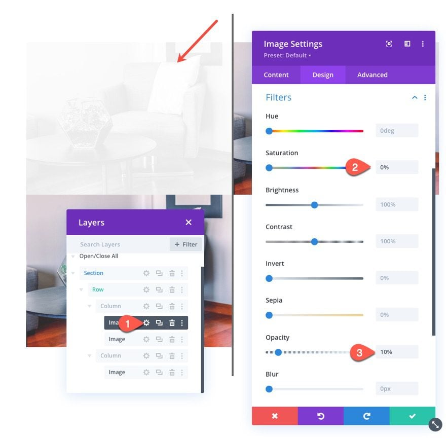
To style the before image “shadow”, open the settings for the first (or top) image in column 1 and update the filter option as follows:
- Saturation: 0%
- Opacity: 10%
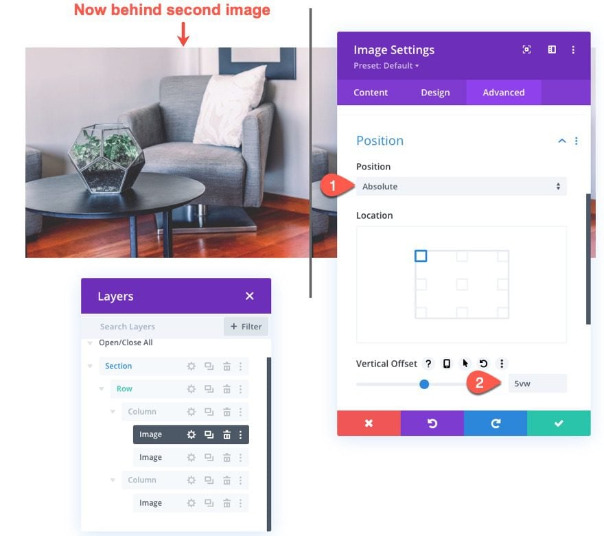
To make sure the shadow image is positioned directly behind the before image, update the position of the image as follows:
- Position: Absolute
- Vertical Offset: 5vw
NOTE: The vertical offset should be equal to the top padding of the column so that the images stay vertically aligned.
Before Image Styling and Scroll Settings
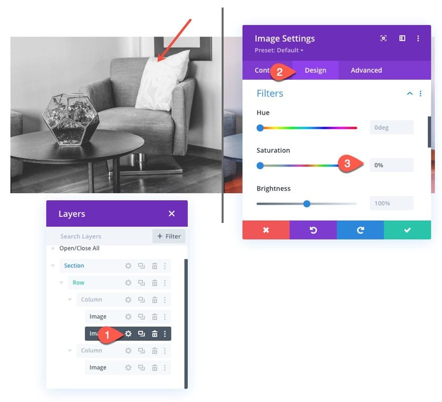
Next, open the settings for the second image in column 1 (now sitting above the shadow image) and update the saturation filter to make it a black and white version of the image as follows:
- Saturation: 0%
Under the advanced tab, select the horizontal motion tab under Scroll Transform Effects and enable the Horizontal Motion. Then update the following:
Set Horizontal Motion for Desktop…
- Starting Offset: 0 (at 30%)
- Mid Offset: 2.26 (at 45%)
- Ending Offset: 4.52 (at 60%)
Set Horizontal Motion for Tablet…
- Starting Offset: 0 (at 30%)
- Mid Offset: 1.76 (at 45%)
- Ending Offset: 3.52 (at 60%)
Set Horizontal Motion for Phone…
- Starting Offset: 0 (at 30%)
- Mid Offset: 0.76 (at 45%)
- Ending Offset: 1.52 (at 60%)
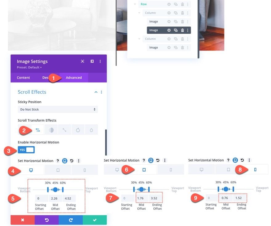
NOTE: Keep in mind that the offset values are set in pixels. A value of 1 is equal to 100px. So a value of 4.52 is actually 452px. So at the end of the horizontal animation on desktop, the image will have moved 452px to the right. The 452px is determined by half of the row (450px) plus the 2px border.
After Image Scroll Settings
Finally, update the final image in column 2 with the following horizontal motion scroll effects:
Set Horizontal Motion for Desktop…
- Starting Offset: -4.52 (at 30%)
- Mid Offset: -2.26 (at 45%)
- Ending Offset: 0 (at 60%)
Set Horizontal Motion for Tablet…
- Starting Offset: -3.52 (at 30%)
- Mid Offset: -1.76 (at 45%)
- Ending Offset: 0 (at 60%)
Set Horizontal Motion for Phone…
- Starting Offset: -1.52 (at 30%)
- Mid Offset: -0.76 (at 45%)
- Ending Offset: 0 (at 60%)

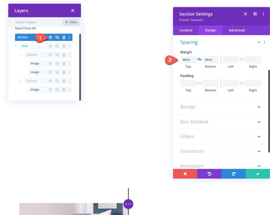
Adding Section Margin for Scroll Testing
Before taking a look at our scroll animation so far, we need to add some temporary top and bottom margin to the section so that we will have some room to scroll on the live page.
Open the section settings and update the following:
- Margin: 80vh top, 80vh bottom
Now check out the result on a live page.
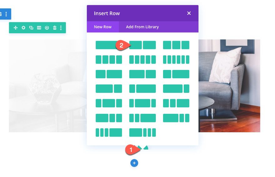
Part 4: Creating the Before and After Heading Text
To finish off the design, we need to create the before and after heading text above each image.
New Row
To do this, create a new two-column row.
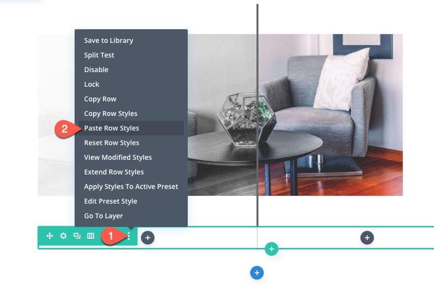
Copy the row styles from the previous row containing our images.
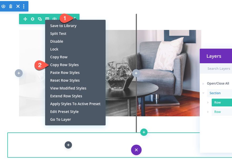
Then paste the row styles to the new row.
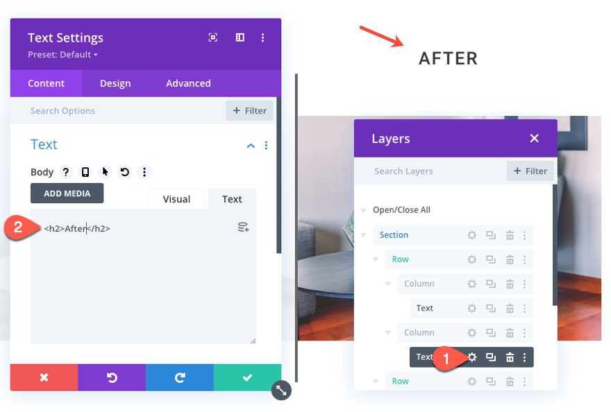
Adding the Text Modules
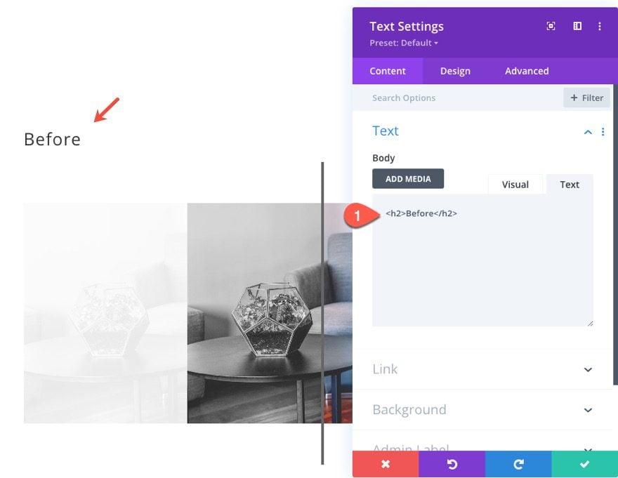
Once the row is done, drag in on top of the row containing the images. Then add a new text module to column 1 of the new row.
Then replace the body text with the following:
<h2>Before</h2>
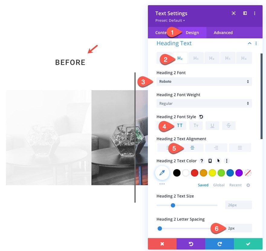
Under the design tab, update the following H2 heading styles:
- Heading 2 Font: Roboto
- Heading 2 Font Style: TT
- Heading 2 Text Alignment: center
- Heading 2 Letter Spacing: 2px
To create the heading for the after image, copy the text module and paste it into column 2 of the same row.
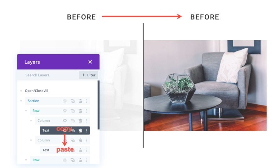
Then update the H2 text to “after” instead of “before”.
That’s it!
Final Result
Here is the final result.
And here is what it looks like on tablet and phone display:
And here are a few more examples of what you can do simply by replacing the images used.
Final Thoughts
In this tutorial, we showed you how easy it is to build your own custom scroll animated before and after images using Divi. What is great about this design is that it is easy to replicate for more before and after image examples. All you need to do is duplicate the section and update the images! Keep in mind that for best results, you will want to keep those images the same size so that they keep themselves aligned during the animation.
Hopefully, this will give you an extra design boost for your next project that may need to showcase before and after images.
I look forward to hearing from you in the comments.
Cheers!


Thank you for the data and the tutorial. Unfortunatly it only works when I reload the page. On the first view at the homepage there are only the pictures left and right without scroll-effects. What could cause these problems?
Great idea and solution without the need of additional plug-ins. Thank you.
Great to hear. Thanks, Sabine!
Very briefly share the important points here. Very informative. This will help me definately.