
Creating floating corner designs is a simple and easy way to add a little creative style to Divi Modules that you may not have thought was possible without custom code. Good news! With Divi, you can use dividers and blurbs to style the four corners of your module using Divi’s built-in options. And, it can be pretty fun to try out the different possibilities.
In this tutorial, I’m going to show you how to create floating corner designs for your content in Divi. Once you have the elements in place, you can style those corners with countless shapes, icons, and colors!
Let’s get started!
- 1 Sneak Peek
- 2 Download the Floating Border Design Examples Layout for FREE
- 3 Download For Free
- 4 Getting Started
- 5 Creating the Floating Corner Design Layout Template
- 6 Exploring New Floating Corner Designs
- 7 Creating Floating Corners with Blurb Icons
- 8 Works in Multiple Column Layouts
- 9 Wrapping Up
Sneak Peek
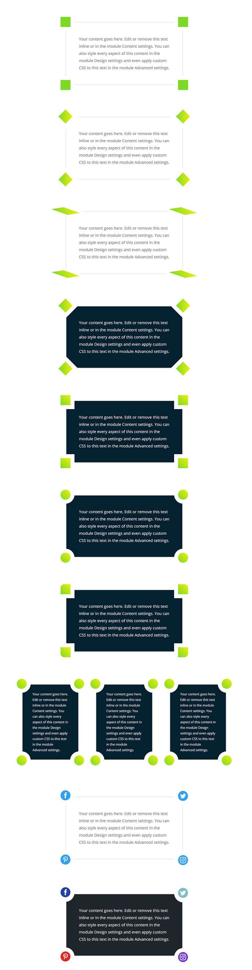
Here is a sneak peek of the floating corner designs possible from this tutorial.
Download the Floating Border Design Examples Layout for FREE
To lay your hands on the floating border designs layout, you will first need to download it using the button below. To gain access to the download you will need to subscribe to our newsletter by using the form below. As a new subscriber, you will receive even more Divi goodness and a free Divi Layout pack every Monday! If you’re already on the list, simply enter your email address below and click download. You will not be “resubscribed” or receive extra emails.

To import the layout to your page, simply extract the zip file and drag the json file into the Divi Builder.
Now let’s get to the tutorial shall we?
Getting Started
The only thing you need for this tutorial is Divi. We will be building these examples from scratch on the front end of the Divi Builder.
To get started, create a new page and give your page a title. Click to use the Divi Builder on the front-end and choose the option “Build from Scratch”.
Now you are ready to go!
Creating the Floating Corner Design Layout Template
Since there are going to be countless design possibilities with this design, it makes sense to create the basic layout (or template) to work from.
For this template, we are going to add four dividers to each corner of a text module. Then once the layout is in place, you will be able to explore new ways to customize those dividers for unique designs.
First, create a new regular section with a one column row.
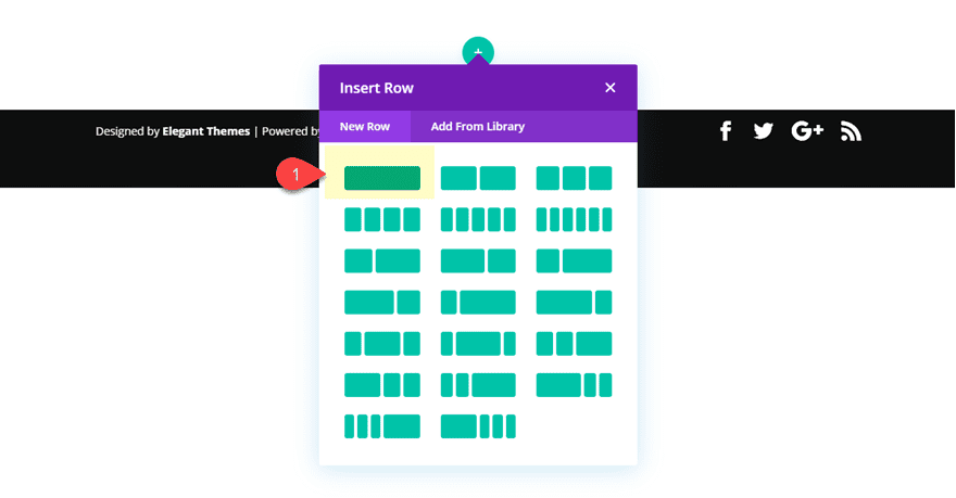
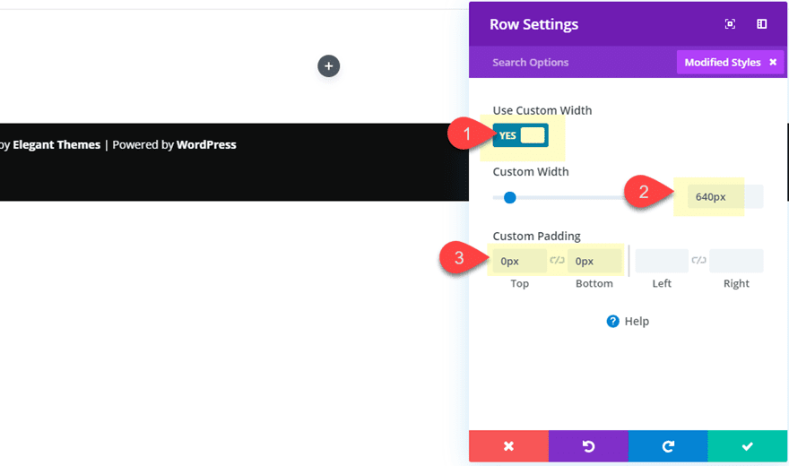
Before we add the text module, update the row settings as follows:
Custom Width: 640px
Custom Padding: 0px top, 0px bottom
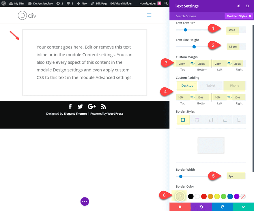
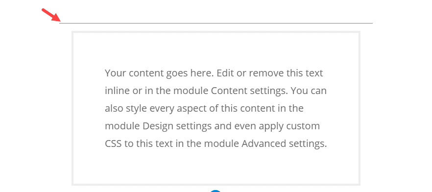
Then add a text module to the row and update the following:
Text Text Size: 20px
Text Line Height: 1.8em
Custom Margin: -25px top, -25px bottom, 25px left, 25px right
Custom Padding (desktop): 10% top, 10% bottom, 10% left, 10% right
Custom Padding (phone): 20% top, 20% bottom
Border Width: 4px
Border Color: #eeeeee
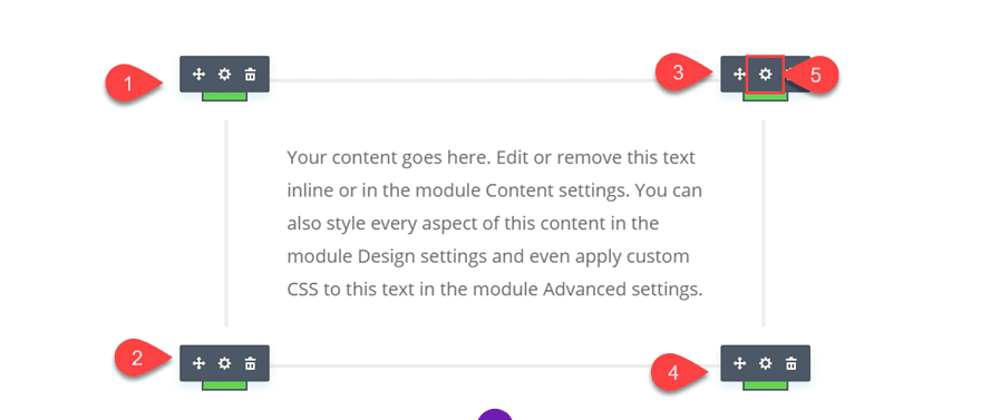
The custom margin and padding is going to help align our divider modules we will be adding shortly. Since the dividers will have a height and width of 50px, the -25px top and bottom margin will pull those dividers halfway into the text module for a nice symmetrical design (you’ll see).
Adding the top two Floating Corner Dividers
With the text module in place, we can start adding the top two floating corner designs using divider modules.
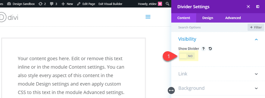
Create a new divider module and drag it to the top of the text module.
Then and update the divider settings as follows:
Show Divider: NO
Background Color: #7cda24 (or whatever color you want)
Height: 50px
Width: 50px
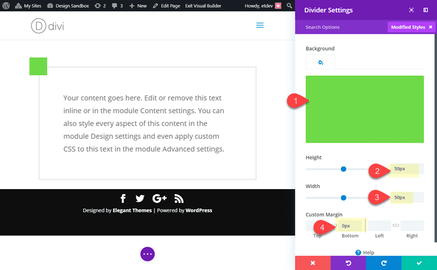
The 50px height and width gives us the perfect square we can use for our floating border.
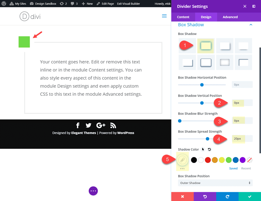
Now, add a box shadow to the divider to create the floating effect as follows:
Box Shadow: see screenshot
Box Shadow Vertical Position: 0px
Box Shadow Blur Strength: 0px
Box Shadow Spread Strength: 20px
Shadow Color: #ffffff
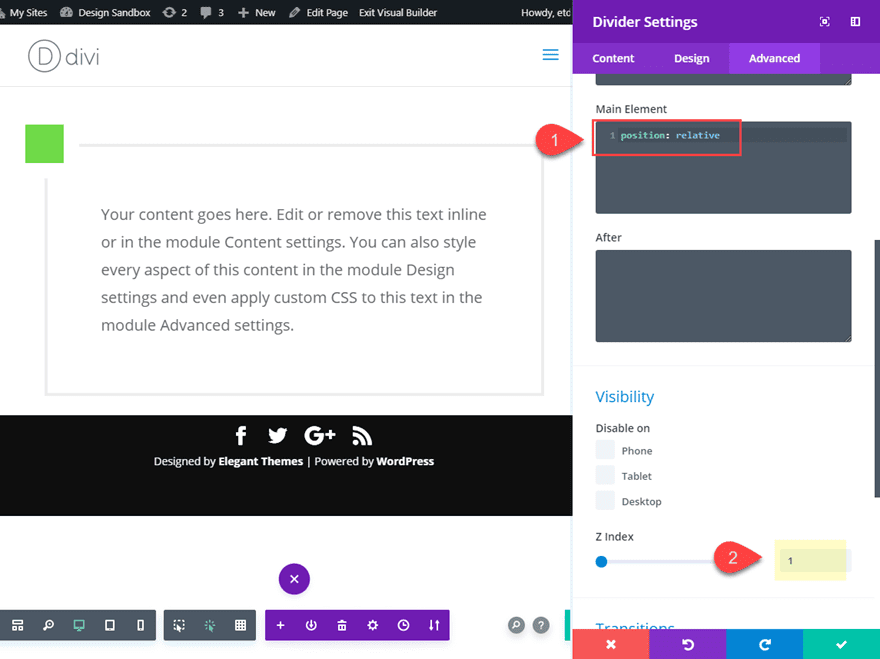
To make sure the divider module stays above the text module (and doesn’t get hidden behind it), we need to add a snippet of CSS to the main element as follows:
Main Element CSS:
position: relative
Then update the Z Index to 1.
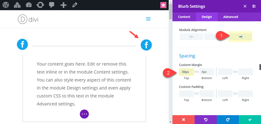
Next duplicate the divider module and update the duplicated divider settings as follows:
Module Alignment: right
Custom Margin: -50px top
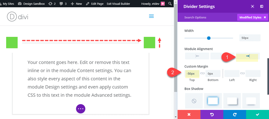
This aligns the divider to the right and pulls it up the exact height of the divider module sitting above it. This creates the exact corner placement we are looking for.
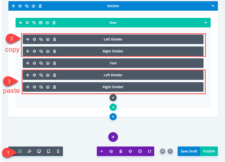
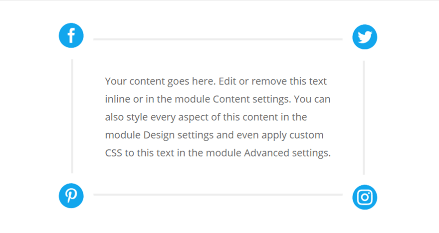
Adding the bottom Corner Dividers
To add the two bottom corner dividers, deploy the wireframe view mode and copy the left and right dividers you just created and paste them below the text module (making sure the left divider stays stays stacked on top of the right divider as shown in the image below).
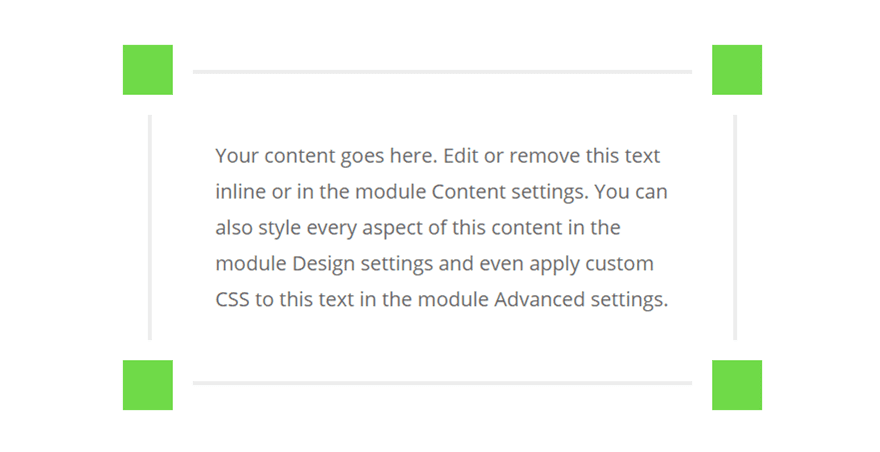
That’s it! Let’s check out the final design of our basic layout.
Exploring New Floating Corner Designs
With this template in place, we can explore some different designs that are possible. You can save this entire section to the Divi library so that you can keep it as a template going forward. But for now, let’s just duplicate the section and explore a new design.
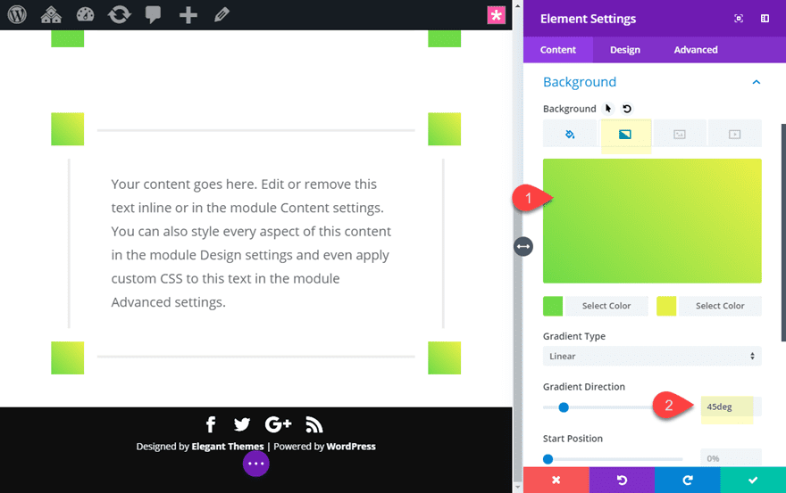
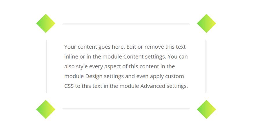
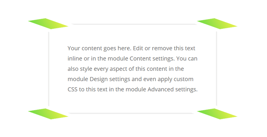
Diamond Shapes with gradient backgrounds
With a duplicate of our template in place, use the multiselect feature to select all four of the divider modules. Then click the settings gear icon on one of the selected dividers to deploy the element settings modal. It might help to use click mode for this step.
In the element settings, update the following:
Gradient Background Left Color: #7cda24
Gradient Background Right Color: #edf000
Gradient Direction: 45deg
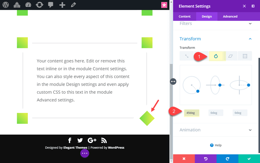
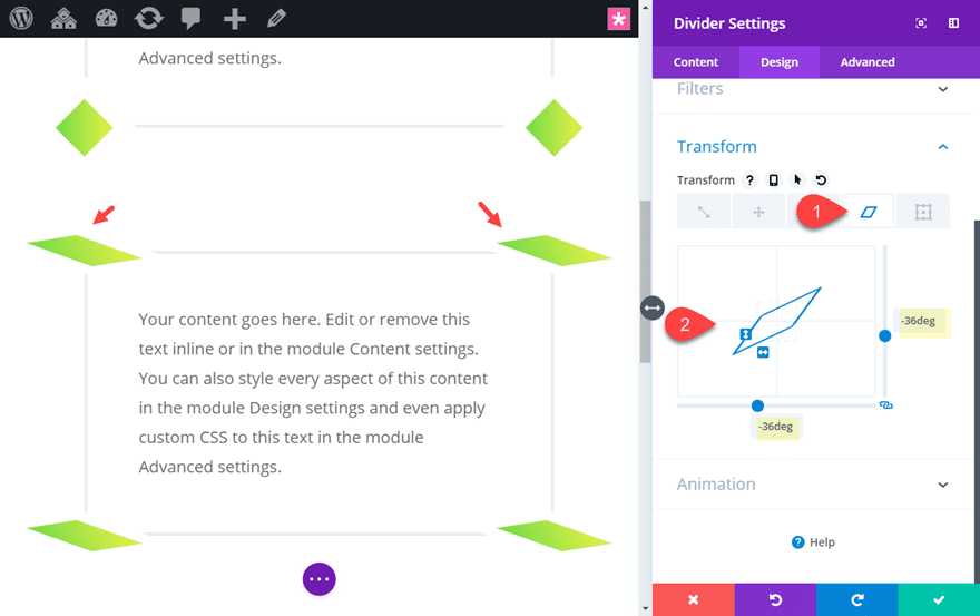
Then use the transform options to rotate the divider into a diamond shape.
Transform Rotate Z-axis: 45deg
Here is the final design.
Skewed Dividers
You can also use the transform skew option to skew the dividers for an even more unique design. You can either add a separate skew design for each divider, or use multiselect to update the transform skew for all four at the same time by -37deg on the X and Y axis.
Here is what that would look like.
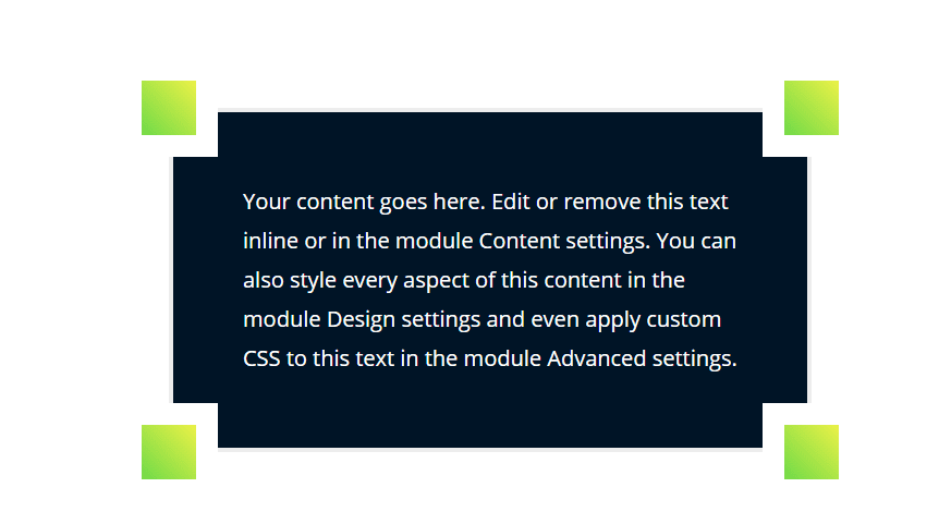
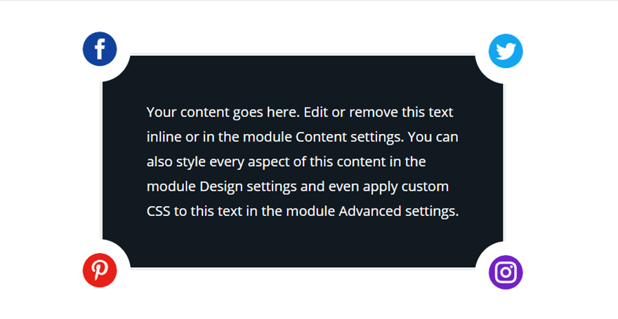
Dark Background Designs
You can even experiment with adding a dark background color to the text module for a unique floating corner design. Here is an example of the text module with a background color of #002130 using the without an transform rotate or skew.
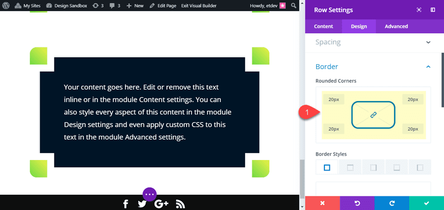
Rounded Edge Corners
To put some rounded corners on the design, you can simply add rounded corners to the row as follows:
Rounded Corners: 20px
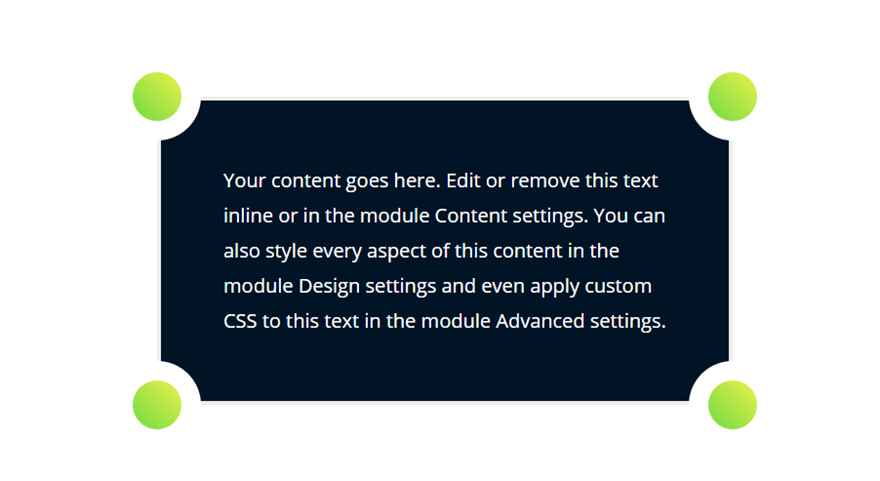
Circle Floating Corners
To turn those square corners into circles, you can add the following snippet of custom CSS to each divider’s main element:
border-radius: 50%;
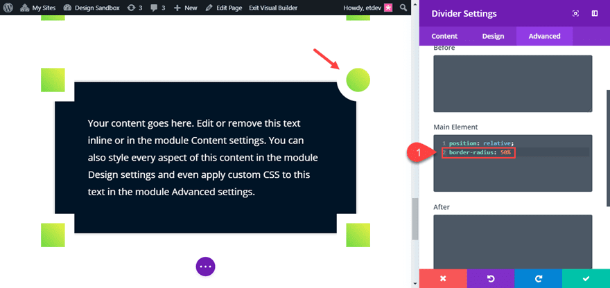
Since the dividers are 50px by 50px, this will create a perfect circle design.
As you can see there are a ton of different ways you can tweak these elements for countless new corner designs.
Now, let’s explore using blurb icons for floating corners instead of divider modules.
Creating Floating Corners with Blurb Icons
Adding Blurb icons to each corner of the text module can give you even more unique designs. You can use the same layout template we built at the beginning of the tutorial. The only difference will be using blurb modules instead of divider modules for the four corners.
Go ahead and get a duplicate of section layout template deployed.
Then delete the divider modules above and below the text module.
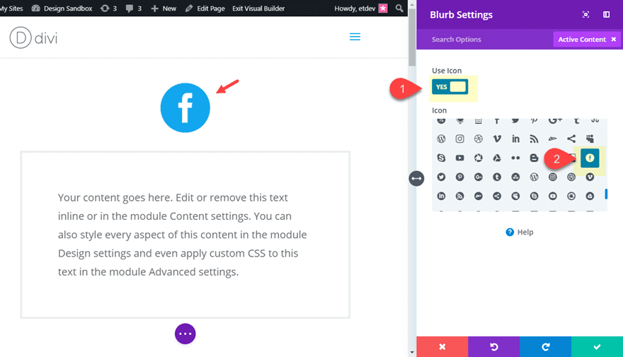
Adding the top two blurb icon corners
Since we are only going to want to use the blurb module to display a single icon, we need to make sure and get the size and spacing correct.
Add a blurb module above the text module and take out the title and body text. Then click to use an icon instead of an image and select the circle facebook icon.
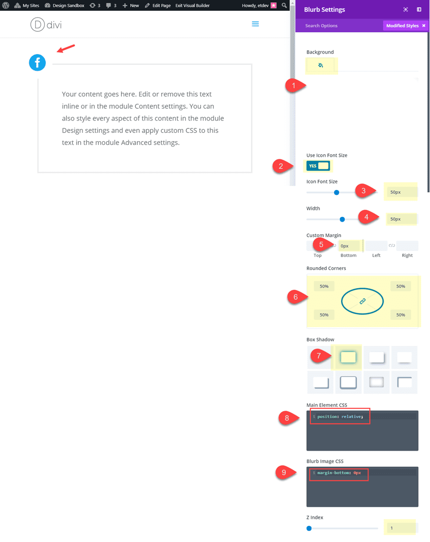
Then update the following blurb settings (these settings are very similar to the settings we added to the divider module in the first example):
Background Color: #ffffff
Icon Font Size: 50px
Width: 50px
Custom Margin: 0px bottom
Rounded Corners: 50%
Box Shadow: see screenshot
Box Shadow Vertical Position: 0px
Box Shadow Blur Strength: 0px
Box Shadow Spread Strength: 20px
Shadow Color: #ffffff
Main Element CSS:
position: relative;
Blurb Image CSS:
margin-bottom: 0px
Z Index: 1
Next, duplicate the blurb module to create another one just below the current blurb and update the following:
Module alignment: right
Custom Margin: -50px top
Then copy the top two blurb modules and paste them under the text module (making sure the left blurb stays stacked above the right blurb).
Then you can update the icons for each blurb to whatever you want.
Here is the final design.
Explore More Designs with Blurb Icon Floating Corners
With this setup you can explore many unique designs. You can change up the icons, use different color combos, and even scale or rotate them with transform options.
Here is an example of the design using a dark background color for the text module and different icon colors.
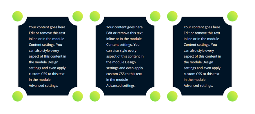
Works in Multiple Column Layouts
As long as you keep the elements together, you can add these floating corner layouts in multiple columns.
Wrapping Up
Creating floating corner designs for your content in Divi really does showcase the power of Divi builder. With all of the built-in options available, you can create countless design variations from one basic layout template. I hope this will inspire you to have some fun exploring new designs of your own.
I look forward to hearing from you in the comments.
Cheers!


There is some awesome creativity that makes this section look great.
Thanks
This is really cool!
Slightly related – can blurb icons be placed next to each other in a column, or would they need to be in separate columns? I guess if not, they could be placed next to each other using negative margins?
Hi Jason,
This article really helped me to learn new things, I hope that it will also help others. thank you for sharing the awesome information.
have a good day ahead.
Hello,
really interesting and thanks for the
file sharing
+1 Thanks for very detailed Instructions!
I am unable to find “Use Custom Width” in Row Settings
This I have to try out!
Nicely done. As I scrolled down through the tutorial I was thinking it was one from Jason and, yep. it was… thanks…
Suprise! haha… Thanks, Chris.
Thanks for detailed Instructions will try it out for my new website..
awesome information
This is so smart! How did you even come to this idea? Pretty amazing…. Thanks for sharing this.
I did this one and appreciate the download.
Thanks for the excellent instructions. That looks great. I Love DIVI
You’re welcome, Frank. Thanks for the comment.
Wow, that’s splendid! 🙂 I will try it tomorrow! 🙂 Thanks for your work!
Thanks Betty. Let me know how it goes!
This is really clever, and a design I like!