")
For many businesses, testimonials are one of the key arguments to get new clients. That means paying a bit of extra attention to testimonials on your website will never go to waste. Within Divi, there are many different ways to share testimonials, using the Divi Testimonial Module for instance. But if you’re looking for a more interactive approach, you’re going to love this tutorial. We’re going to show you how to create custom testimonial tabs inside Divi. Once someone hovers the Blurb Module at the left, a corresponding testimonial will appear on the right. The transition effects in this design are seamless too, which helps you give that extra feel of customization to your website. You’ll be able to download the JSON file for free as well!
Let’s get to it.
- 1 Preview
- 2 Download The Custom Testimonial Tabs Layout for FREE
- 3 Download For Free
-
4
Let’s Start Recreating!
- 4.1 Add New Section
- 4.2 Add Row #1
- 4.3 Add Text Module to Column
- 4.4 Add Divider Module to Column
- 4.5 Add Row #2
- 4.6 Column 2 Settings
- 4.7 Add Blurb Module #1 to Column 1
- 4.8 Clone Blurb Module Three Times
- 4.9 Add Quote Text Module to Column 2
- 4.10 Add Testimonial Text Module to Column 2
- 4.11 Clone Text Module Three Times
- 4.12 Add CSS Class to First Testimonial Text Module
- 4.13 Add Code Module Below Divider Module (Row #1)
- 5 Preview
- 6 Final Thoughts
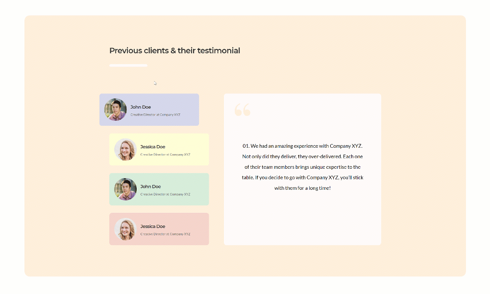
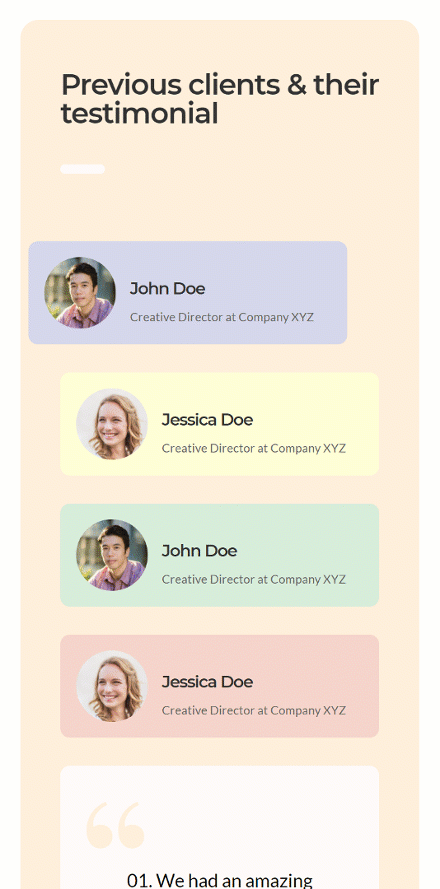
Preview
Before we dive into the tutorial, let’s take a quick look at the outcome across different screen sizes.
Desktop
Mobile
Download The Custom Testimonial Tabs Layout for FREE
To lay your hands on the free custom testimonial tabs layout, you will first need to download it using the button below. To gain access to the download you will need to subscribe to our newsletter by using the form below. As a new subscriber, you will receive even more Divi goodness and a free Divi Layout pack every Monday! If you’re already on the list, simply enter your email address below and click download. You will not be “resubscribed” or receive extra emails.

Let’s Start Recreating!
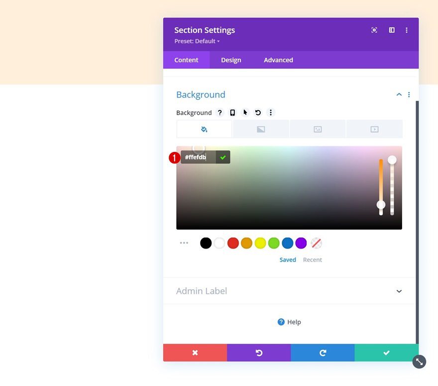
Add New Section
Background Color
Start by adding a new section to the page you’re working on. Open the section settings and add a background color.
- Background Color: #ffefdb
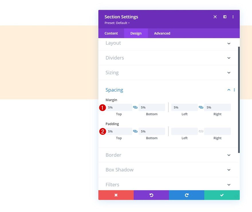
Spacing
Move on to the section’s design tab and add some custom margin and padding values.
- Top Margin: 5%
- Bottom Margin: 5%
- Left Margin: 5%
- Right Margin: 5%
- Left Padding: 5%
- Right Padding: 5%
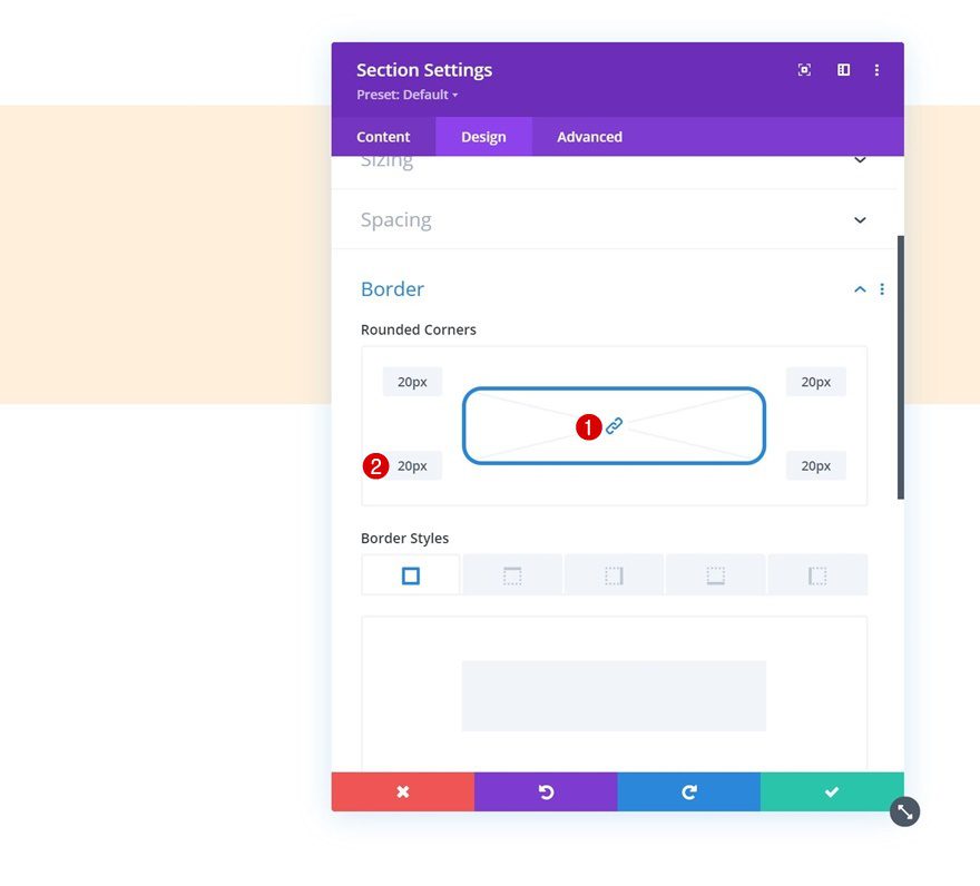
Border
Include some rounded corners as well.
- All Corners: 20px
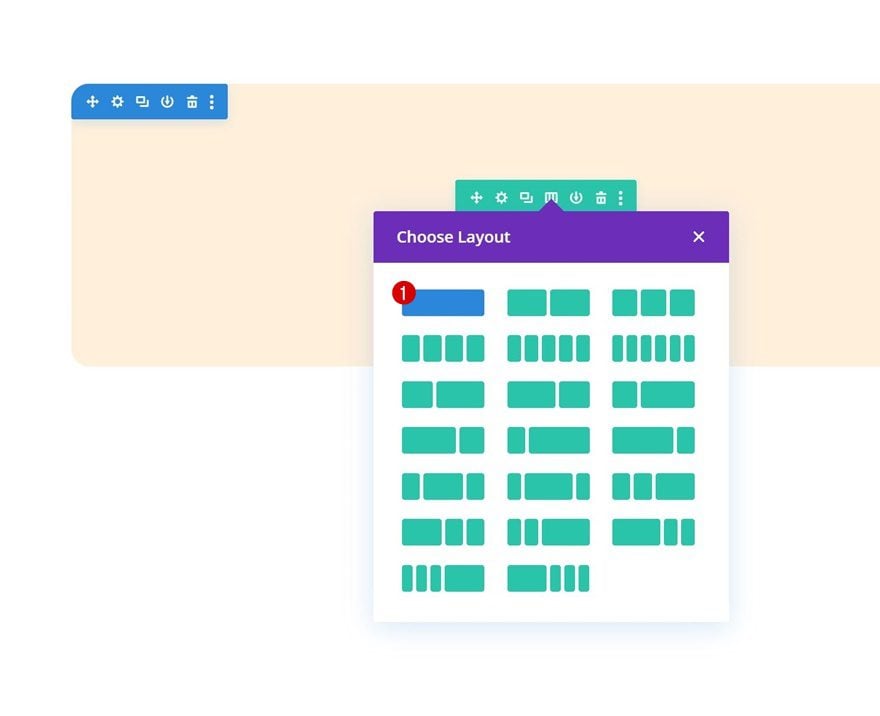
Add Row #1
Column Structure
Continue by adding the first row to the section using the following column structure:
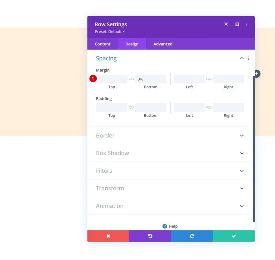
Spacing
Without adding any modules yet, open the row settings and add some bottom margin.
- Bottom Margin: 3%
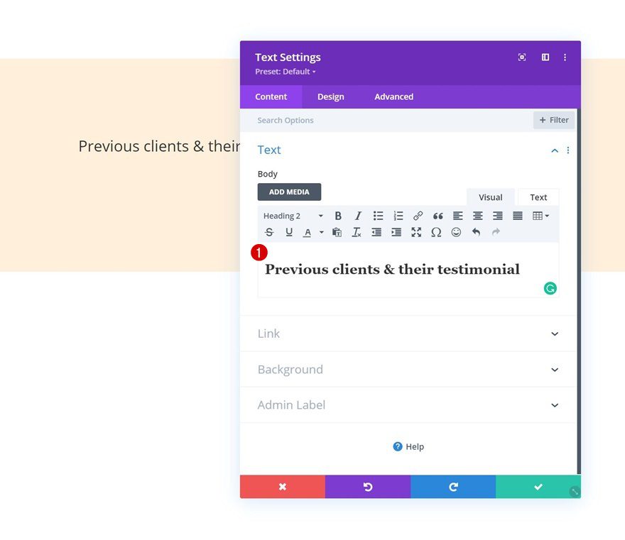
Add Text Module to Column
Add H2 Content
Time to add modules, starting with a Text Module containing some H2 content.
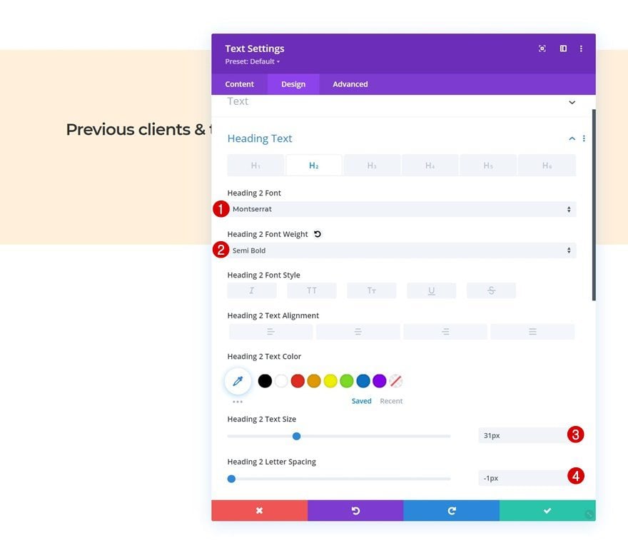
H2 Text Settings
Move on to the module’s design tab and change the H2 text settings accordingly:
- Heading 2 Font: Montserrat
- Heading 2 Font Weight: Semi Bold
- Heading 2 Text Size: 31px
- Heading 2 Letter Spacing: -1px
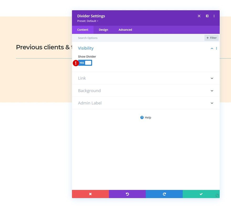
Add Divider Module to Column
Visibility
Right below the Text Module, we’re adding a Divider Module. Make Sure the “Show Divider” option is enabled.
- Show Divider: Yes
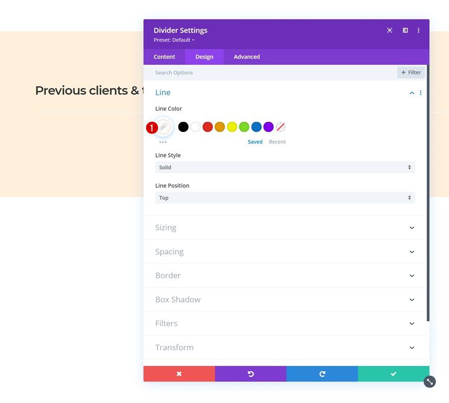
Line
Move on to the module’s design tab and change the line color to white.
- Line Color: #ffffff
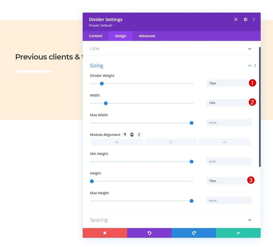
Sizing
Modify the sizing settings too.
- Divider Weight: 10px
- Width: 14%
- Height: 10px
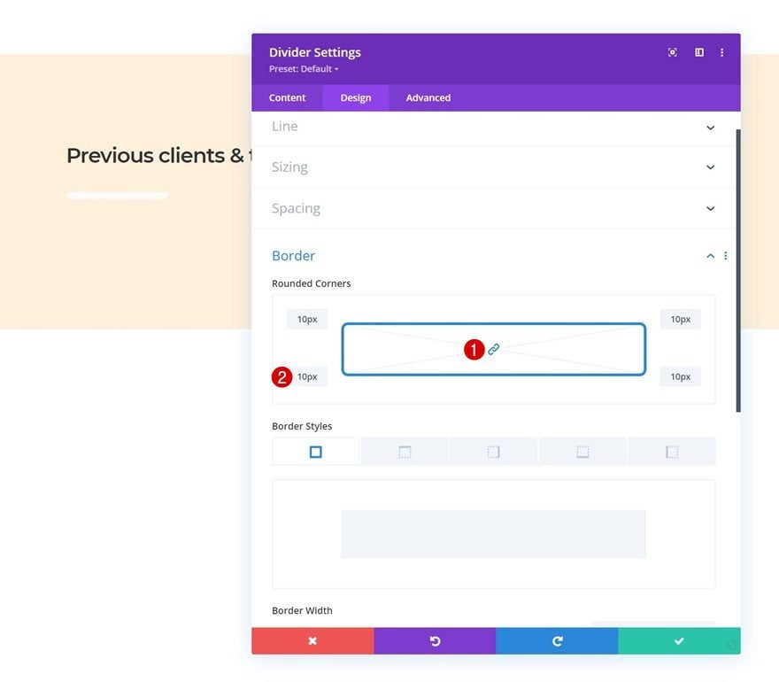
Border
And complete the module settings by adding some rounded corners to the border settings.
- All Corners: 10px
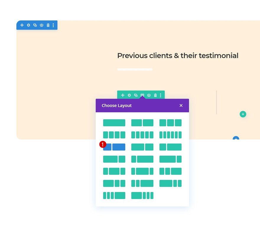
Add Row #2
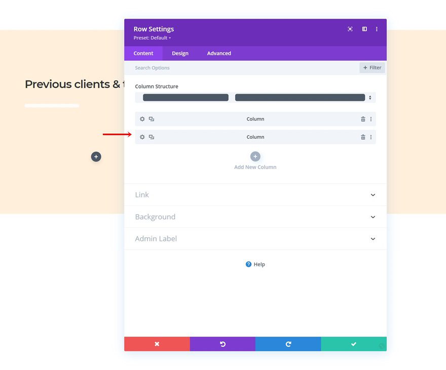
Column Structure
On to the next row. Use the following column structure:
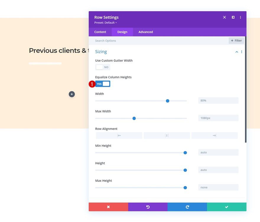
Sizing
Without adding any modules yet, open the row settings and equalize the column heights in the sizing settings.
- Equalize Column Heights: Yes
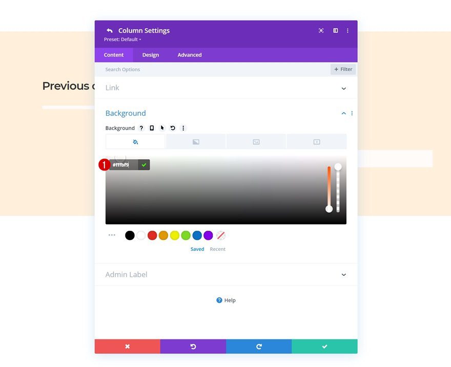
Column 2 Settings
Background Color
Then, open the column 2 settings and apply a background color.
- Background Color: #fffbf9
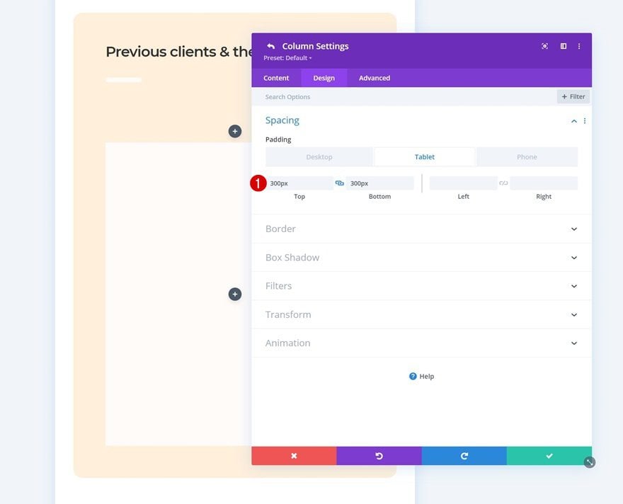
Spacing
Move on to the column’s design tab and apply some top and bottom padding on smaller screen sizes.
- Top Padding:
- Desktop: None
- Tablet & Phone: 300px
- Bottom Padding
- Desktop: None
- Tablet & Phone: 300px
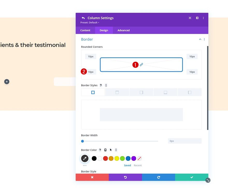
Border
Include some rounded corners too.
- All Corners: 10px
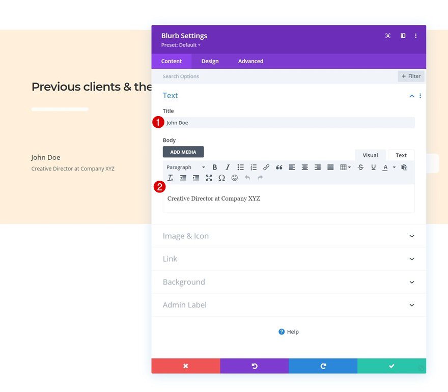
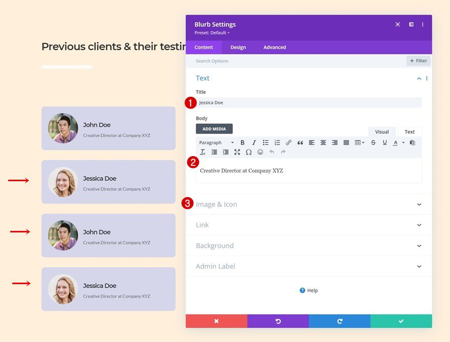
Add Blurb Module #1 to Column 1
Add Content
Time to add modules, starting with a first Blurb Module in column 1. Add some content of your choice.
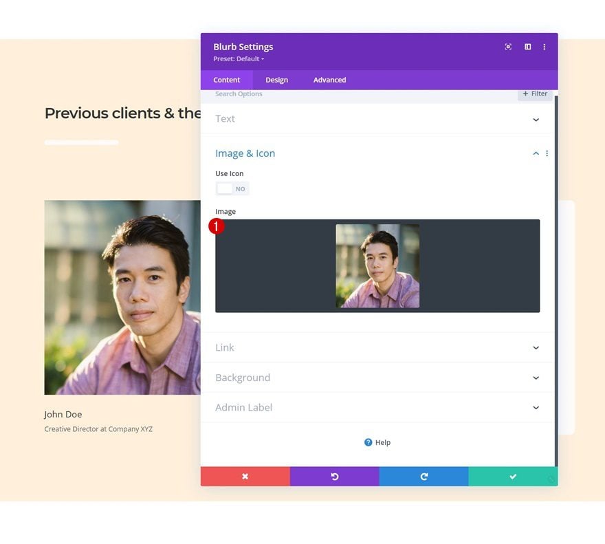
Upload 1:1 Ratio Image
Upload an image with a 1:1 ratio next.
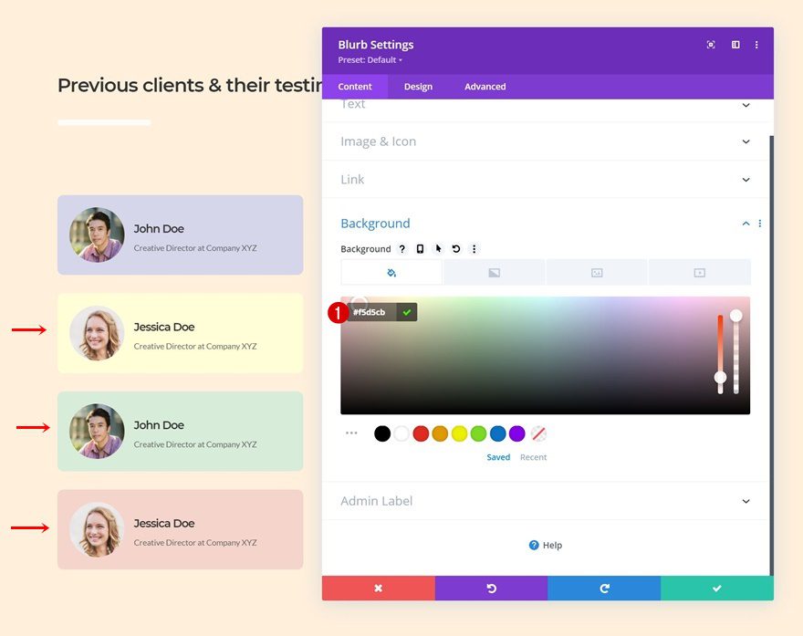
Background Color
Then, apply the following background color:
- Background Color: #d5d6ea
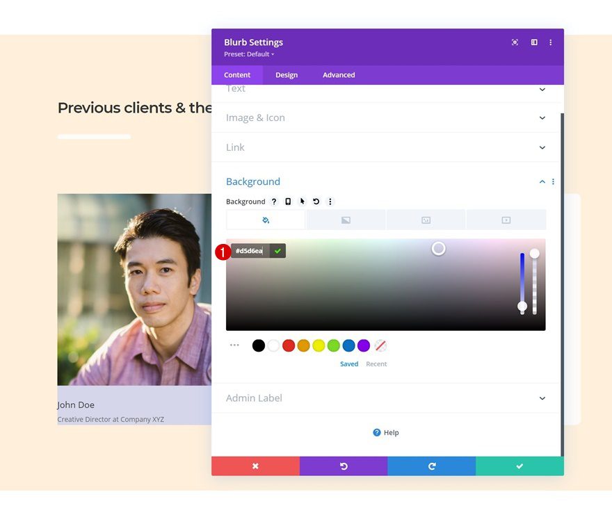
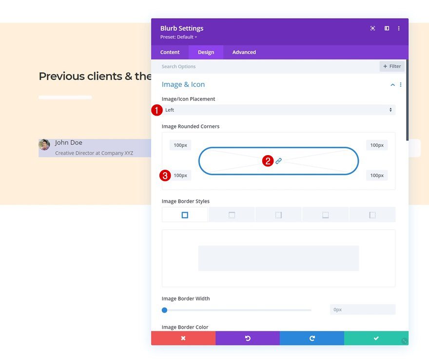
Image Settings
Make changes to the image settings too.
- Image/Icon Placement: Left
- Image Rounded Corners: 100px
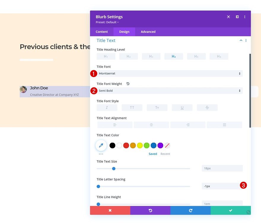
Title Text Settings
Then, modify the title text settings accordingly:
- Title Font: Montserrat
- Title Font Weight: Semi Bold
- Title Letter Spacing: -1px
Body Text Settings
We’re changing the body text settings as well.
- Body Font: Lato
- Body Text Size: 13px

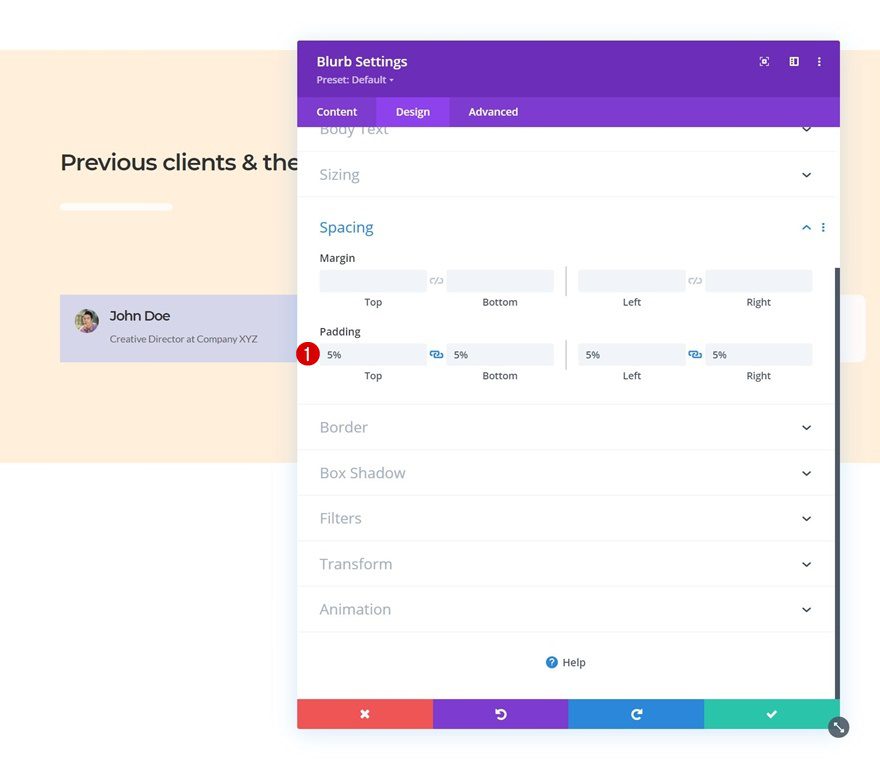
Spacing
Next, we’ll add some space around our module’s content by applying the following padding values:
- Top Padding: 5%
- Bottom Padding: 5%
- Left Padding: 5%
- Right Padding: 5%
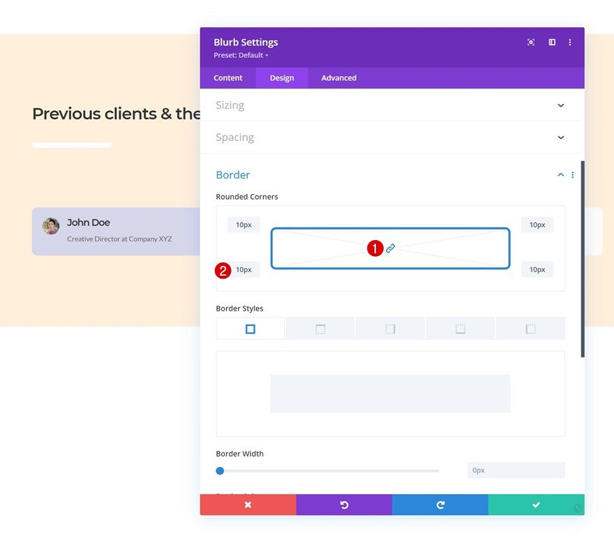
Border
Add some rounded corners too.
- All Corners: 10px
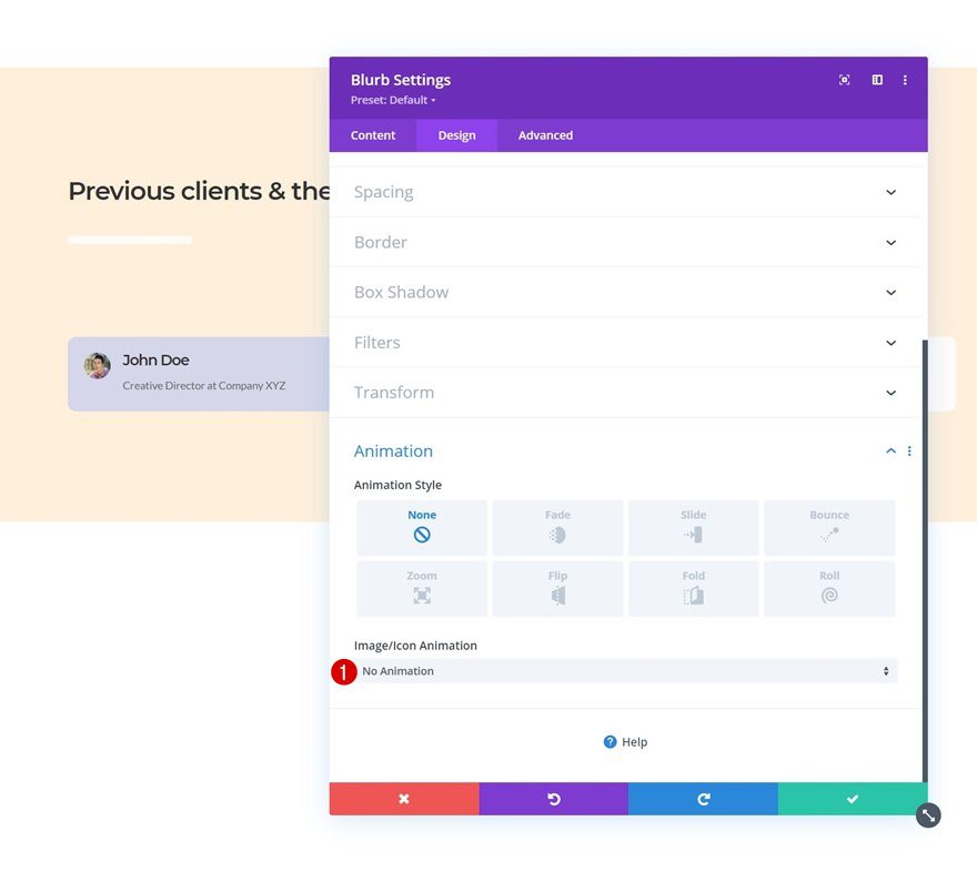
Animation
By default, there’s an animation effect applied to the Blurb Module’s image. We’re removing this animation in the animation settings.
- Image/Icon Animation: No Animation
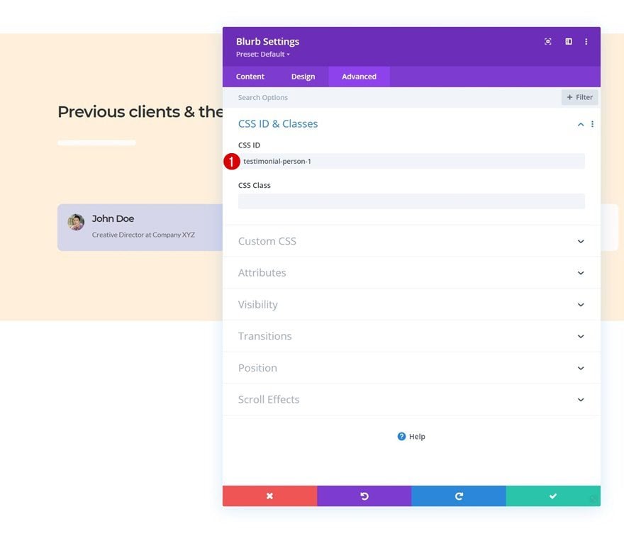
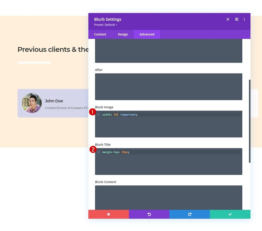
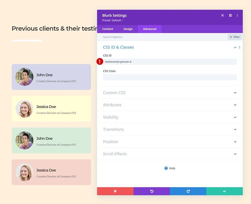
CSS ID
To create the testimonial tab design, we’re going to need to add some code at the end of this tutorial. To prepare for that, we’ll add a CSS ID to the Blurb Module’s advanced tab.
- CSS ID: testimonial-person-1
Blurb Image & Title CSS
We’re using two lines of CSS code in the advanced tab as well. One for the blurb image and the other for the blurb title.
width: 25% !important;
margin-top: 25px;
Clone Blurb Module Three Times
Once you’ve completed the first Blurb Module, you can clone it three times.
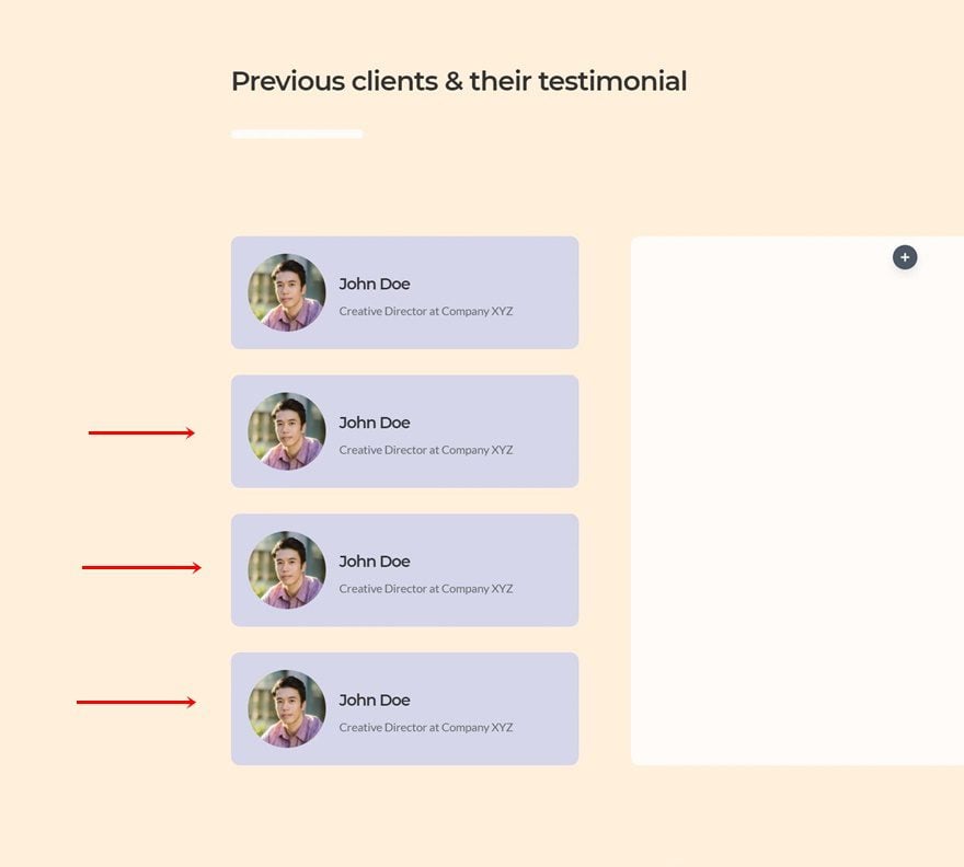
Change Content & Images
Make sure you change the content and images for each duplicate Blurb Module.
Change Background Colors
Along with the background colors.
- Duplicate 1: #fffed6
- Duplicate 2: #d7ecd9
- Duplicate 3: #f5d5cb
Change CSS IDs
And, of course, the CSS IDs. Use consecutive numbering.
- Duplicate 1: testimonial-person-2
- Duplicate 2: testimonial-person-3
- Duplicate 3: testimonial-person-4
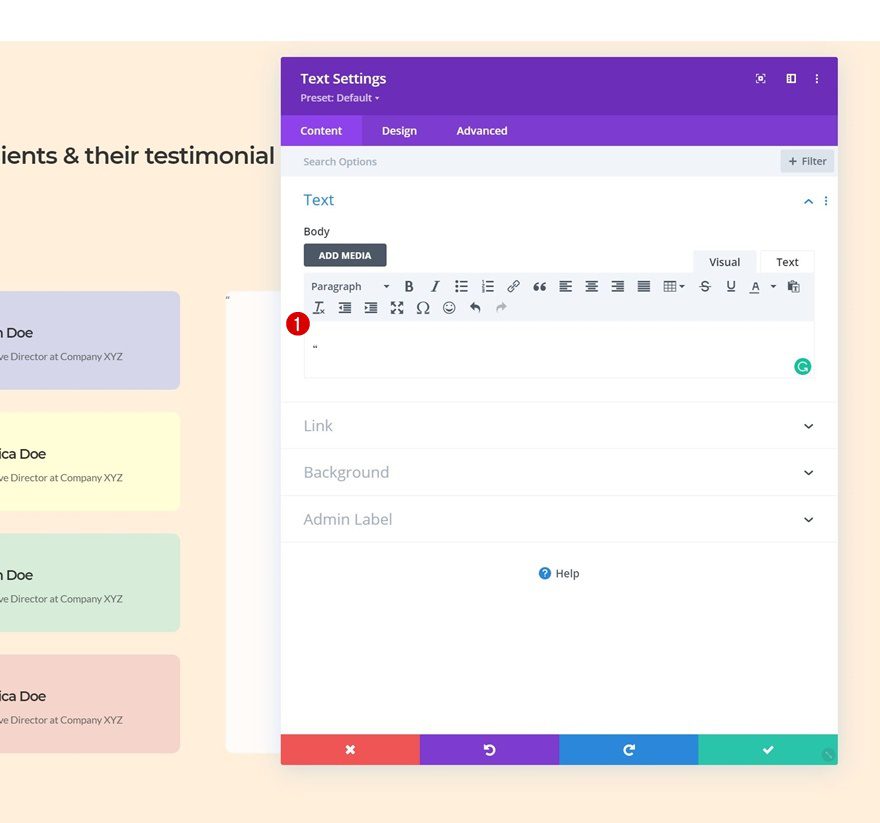
Add Quote Text Module to Column 2
Add Quote to Content Box
On to the second column. There, the first module we need is a Text Module with a quote character.
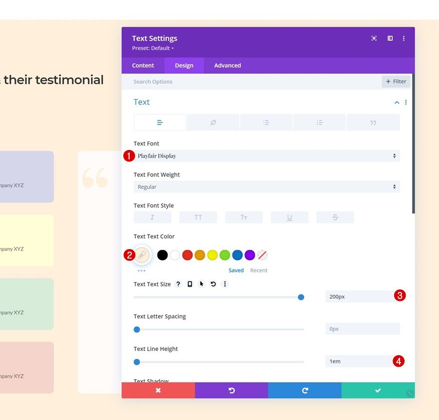
Text Settings
Move on to the module’s design tab and change the text settings as follows:
- Text Font: Playfair Display
- Text Color: #ffefdb
- Text Size: 200px
- Text Line Height: 1em
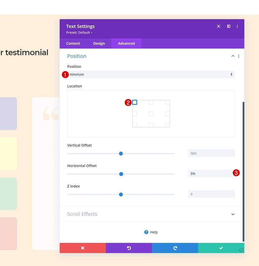
Position
Reposition the module too.
- Position: Absolute
- Location: Top Left
- Horizontal Offset: 5%
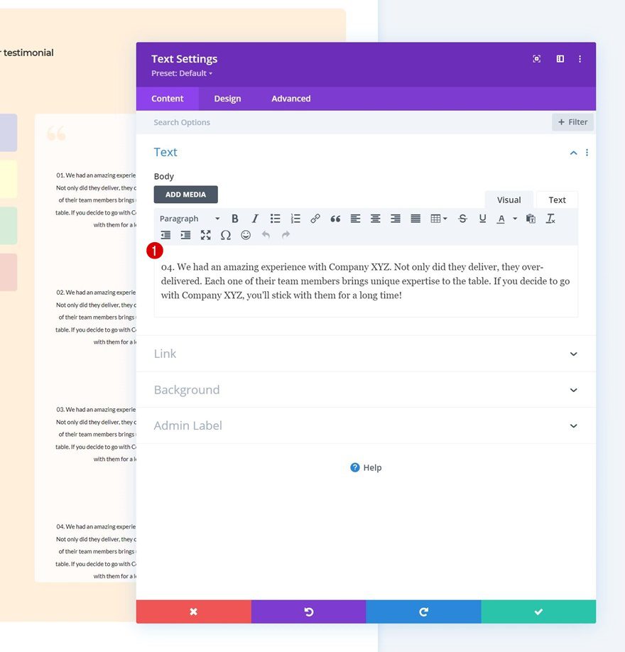
Add Testimonial Text Module to Column 2
Add Testimonial Content
On to the next Text Module. This one will be dedicated to our first testimonial. The testimonial you place in the content box has to match the first Blurb Module in column 1.
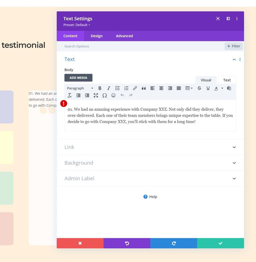
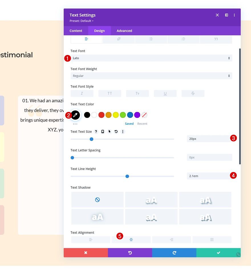
Text Settings
Change the module’s text settings accordingly:
- Text Font: Lato
- Text color: #000000
- Text Size: 20px
- Text Line Height: 2.1em
- Text Alignment: Center
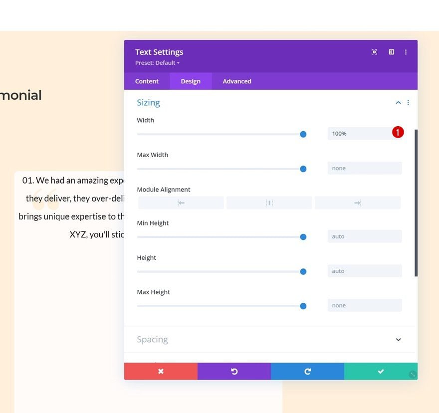
Sizing
Make sure the width is set to “100%” too.
- Width: 100%
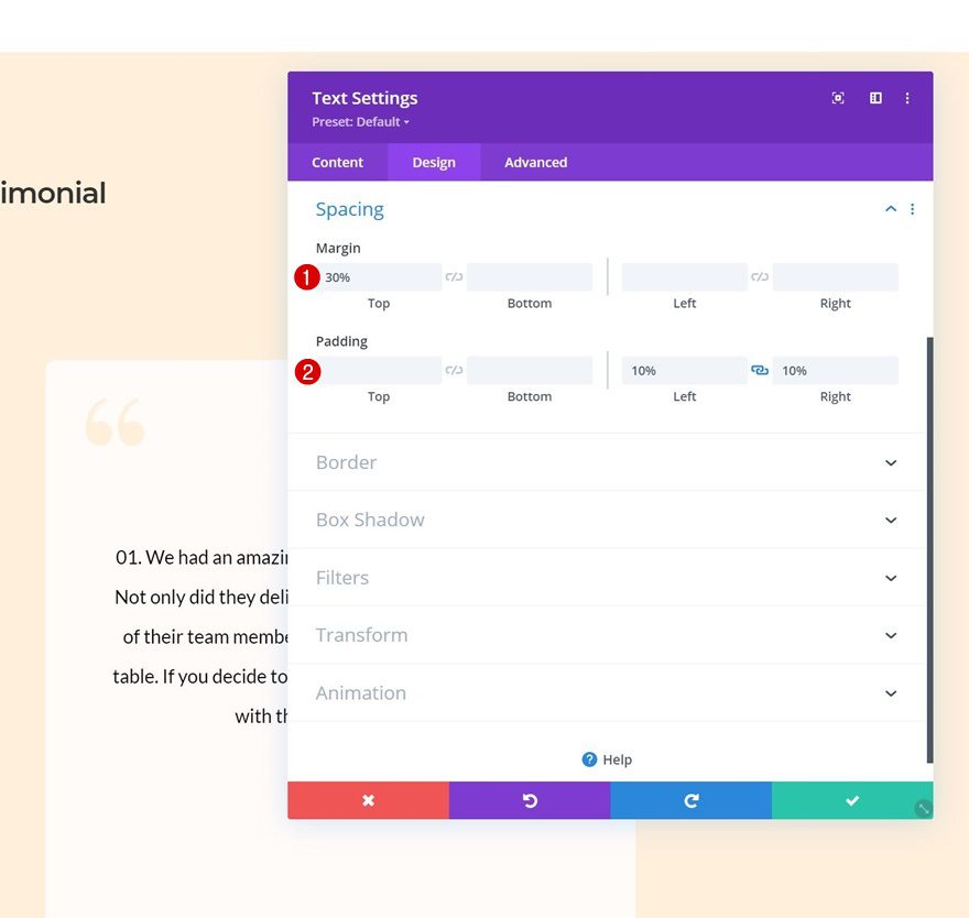
Spacing
Then, add some custom margin and padding values to the spacing settings.
- Top Margin: 30%
- Left Padding: 10%
- Right Padding: 10%
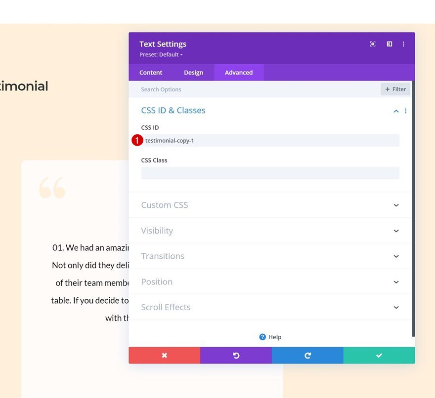
CSS ID
And add a CSS ID to the advanced tab. The number at the end of this CSS ID needs to match the number at the end of the corresponding Blurb Module’s CSS ID.
- CSS ID: testimonial-copy-1
Clone Text Module Three Times
Once you’ve completed the first testimonial Text Module, you can clone it three times.
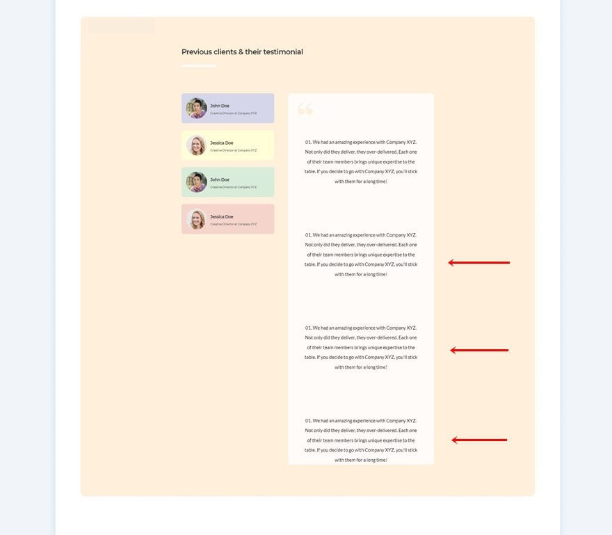
Change Testimonial Content
Make sure you change the testimonial content in the duplicate modules.
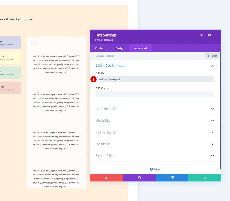
Change CSS IDs
Along with the CSS IDs. Make sure you follow a consecutive order.
- Duplicate 1: testimonial-copy-2
- Duplicate 2: testimonial-copy-3
- Duplicate 3: testimonial-copy-4
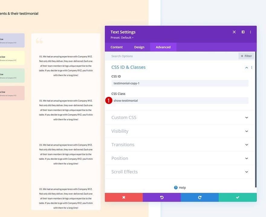
Add CSS Class to First Testimonial Text Module
And we’ll need to add a CSS class to the testimonial that we want to be enabled at the beginning. In this case, that’s the first one.
- CSS Class: show-testimonial
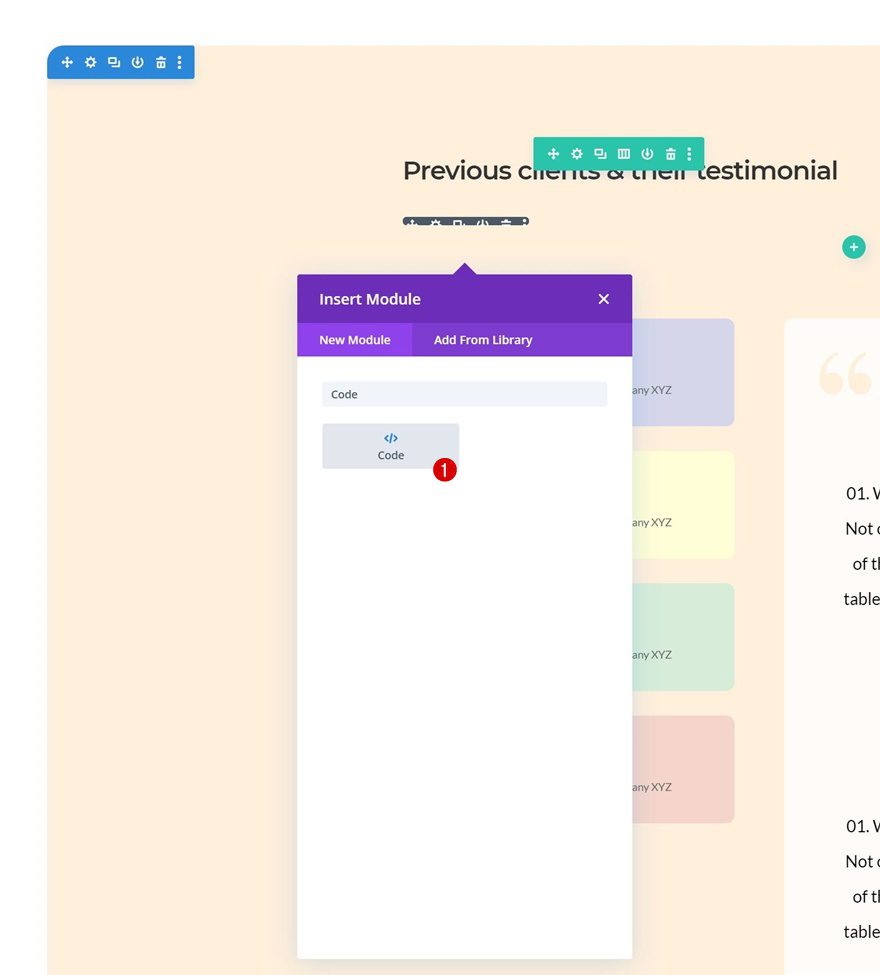
Add Code Module Below Divider Module (Row #1)
Now that we have all elements in place, it’s time to make the magic happen. Add a new Code Module right below the Divider Module in the section’s first row.
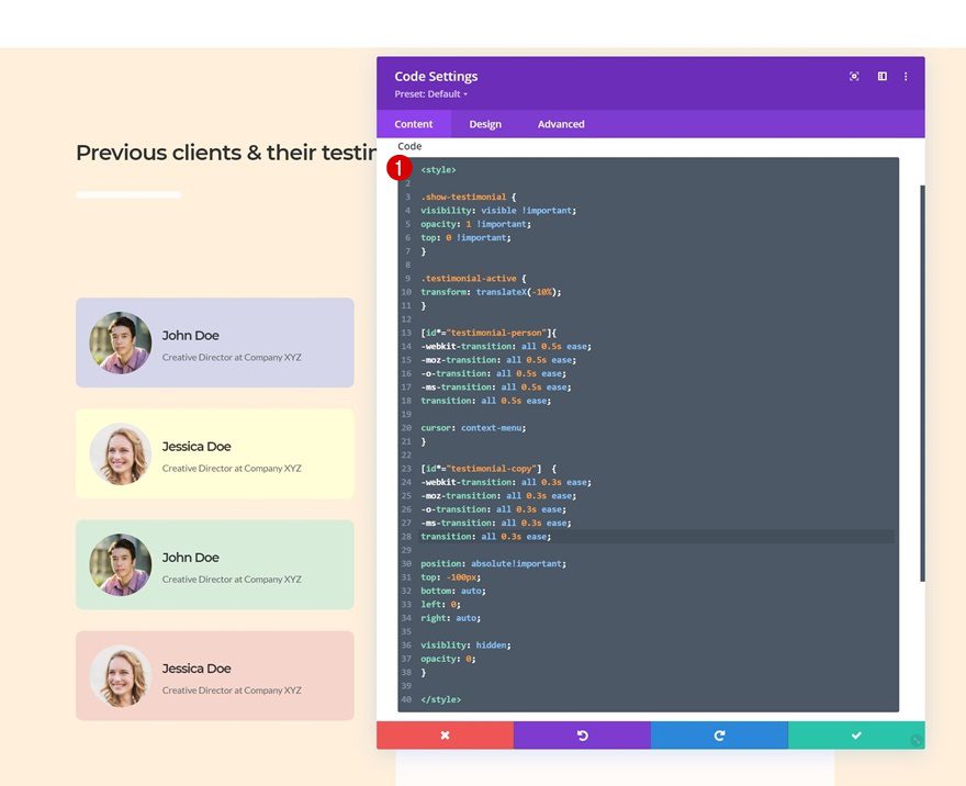
Add CSS Code
Insert the following lines of CSS code between style tags as you can see in the print screen below.
.show-testimonial {
visibility: visible !important;
opacity: 1 !important;
top: 0 !important;
}

.testimonial-active {
transform: translateX(-10%);
}

[id*="testimonial-person"]{
-webkit-transition: all 0.5s ease;
-moz-transition: all 0.5s ease;
-o-transition: all 0.5s ease;
-ms-transition: all 0.5s ease;
transition: all 0.5s ease;

cursor: context-menu;
}

[id*="testimonial-copy"] {
-webkit-transition: all 0.3s ease;
-moz-transition: all 0.3s ease;
-o-transition: all 0.3s ease;
-ms-transition: all 0.3s ease;
transition: all 0.3s ease;

position: absolute!important;
top: -100px;
bottom: auto;
left: 0;
right: auto;

visibility: hidden;
opacity: 0;
}
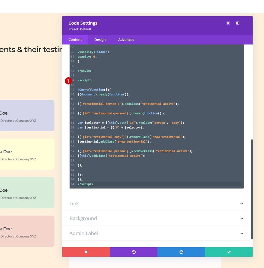
Add JQuery Code
Next, place the following lines of JQuery code between script tags as you can see in the print screen below and you’re done!
jQuery(function($){
$(document).ready(function(){

$('#testimonial-person-1').addClass('testimonial-active');

$('[id*="testimonial-person"]').hover(function() {

var $selector = $(this).attr('id').replace('person', 'copy');
var $testimonial = $('#' + $selector);

$('[id*="testimonial-copy"]').removeClass('show-testimonial');
$testimonial.addClass('show-testimonial');

$('[id*="testimonial-person"]').removeClass('testimonial-active');
$(this).addClass('testimonial-active');

});

});
});
Preview
Now that we’ve gone through all the steps, let’s take a final look at the outcome across different screen sizes.
Desktop
Mobile
Final Thoughts
In this post, we’ve shown you how to create an interactive testimonial design for any kind of website you build. More specifically, we’ve shown you how to create custom testimonial tabs that are triggered once someone hovers one of the Blurb Modules on the left. You were able to download the JSON file fore free as well! If you have any questions or suggestions, feel free to leave a comment in the comment section below.
If you’re eager to learn more about Divi and get more Divi freebies, make sure you subscribe to our email newsletter and YouTube channel so you’ll always be one of the first people to know and get benefits from this free content.


Thank you for creating this guide. I will definitely use this on one of my sites!
This is awesome. Step by step guidelines helped me a lot to understand it. As expected, best designing ideas from best Theme & Pagebuilder!!
It’s cool, on desktop. But on mobile, it is extremely unhandy 😉 as the text box is below all the tabs. So if you press the top button, ‘nothing seems to happen’. you will have to scroll down to see the text. Then you will have to scroll up, to press the secondbutton , you have to scroll down etc.
I had this problem with a client with 12 tabs. No way anyone can use this on a mobile.
It would be so handy, that the text that pops up, pops up below the relevant tab on mobile.
Is there any way, a script, to get this done on mobile? This would be so, so useful!
+1 😉
Wow! Love it! Amazing work, Donjete. Thanks for sharing!