
If you’re looking for a way to add a CTA that follows your visitors while they’re navigating through your website, you might consider going for a sticky footer bar. A sticky footer bar is used at the bottom of your browser and you can include any call to action of your choice, whether it’s a button or contact information. As soon as visitors scroll to the footer area of your page, the footer bar and footer design will merge while changing the styles of your sticky footer bar. This beautiful aesthetic might help you increase conversion rates on your pages! You’ll be able to download the template JSON file for free as well.
Let’s get to it.
- 1 Preview
- 2 Download The Global Footer Template for FREE
- 3 Download For Free
- 4 1. Create New Footer Template
-
5
2. Build Footer Design
- 5.1 Section Settings
- 5.2 Add Row #1
- 5.3 Add Blurb Module to Column 1
- 5.4 Clone Blurb Module & Place Duplicate in Column 3
- 5.5 Add Blurb Module to Column 2
- 5.6 Add Text Module to Column 2
- 5.7 Add Row #2
- 5.8 Add Image Module to Column 1
- 5.9 Add Text Module to Column 2
- 5.10 Clone Text Module 3x & Spread Across Column 3 & 4
- 5.11 Add Text Module to Column 2
- 5.12 Clone Text Module As Needed
- 5.13 Add Text Module to Column 3
- 5.14 Clone Text Module as Needed
- 5.15 Add Text Module to Column 4
- 5.16 Add Social Media Follow to Column 4
- 5.17 Add Row #3
- 5.18 Add Text Module to Column 1
- 5.19 Clone Text Module Twice & Place Duplicates in Remaining Columns
- 6 3. Apply Sticky Effects to Footer Bar
- 7 4. Save All Template & Theme Builder Changes
- 8 Preview
- 9 Final Thoughts
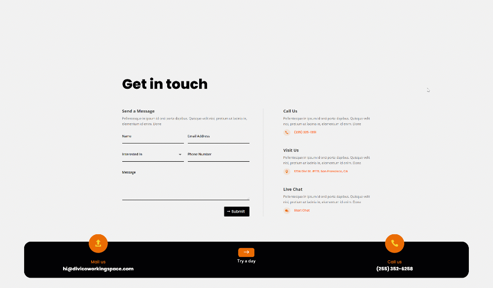
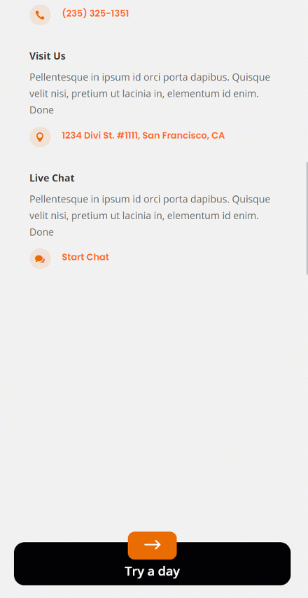
Preview
Before we dive into the tutorial, let’s take a quick look at the outcome across different screen sizes.
Desktop
Mobile
To lay your hands on the free global footer template, you will first need to download it using the button below. To gain access to the download you will need to subscribe to our newsletter by using the form below. As a new subscriber, you will receive even more Divi goodness and a free Divi Layout pack every Monday! If you’re already on the list, simply enter your email address below and click download. You will not be “resubscribed” or receive extra emails.

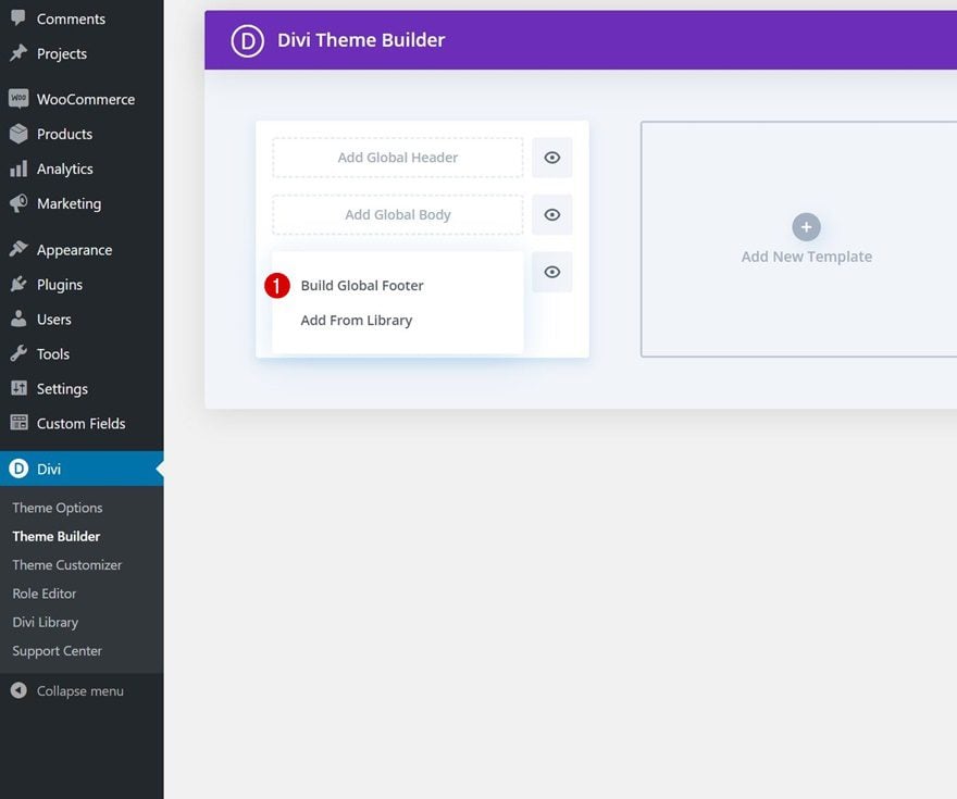
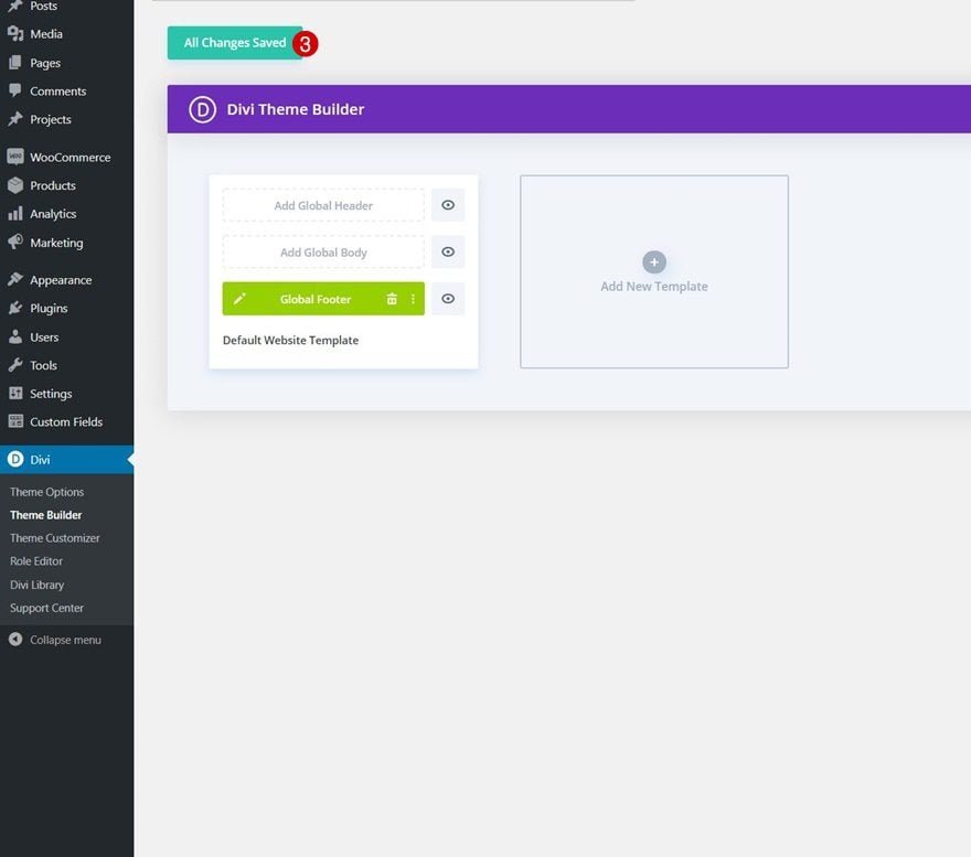
Start by going to the Divi Theme Builder in the backend of your WordPress website. There, add a new global or custom footer.
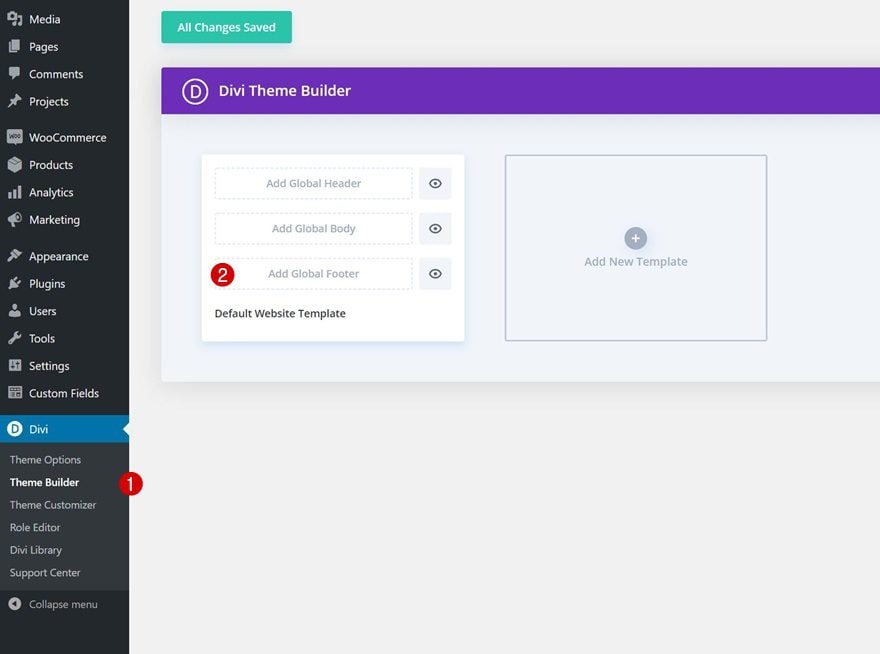
Start Building From Scratch
Start building the footer template from scratch.
Section Settings
Background Color
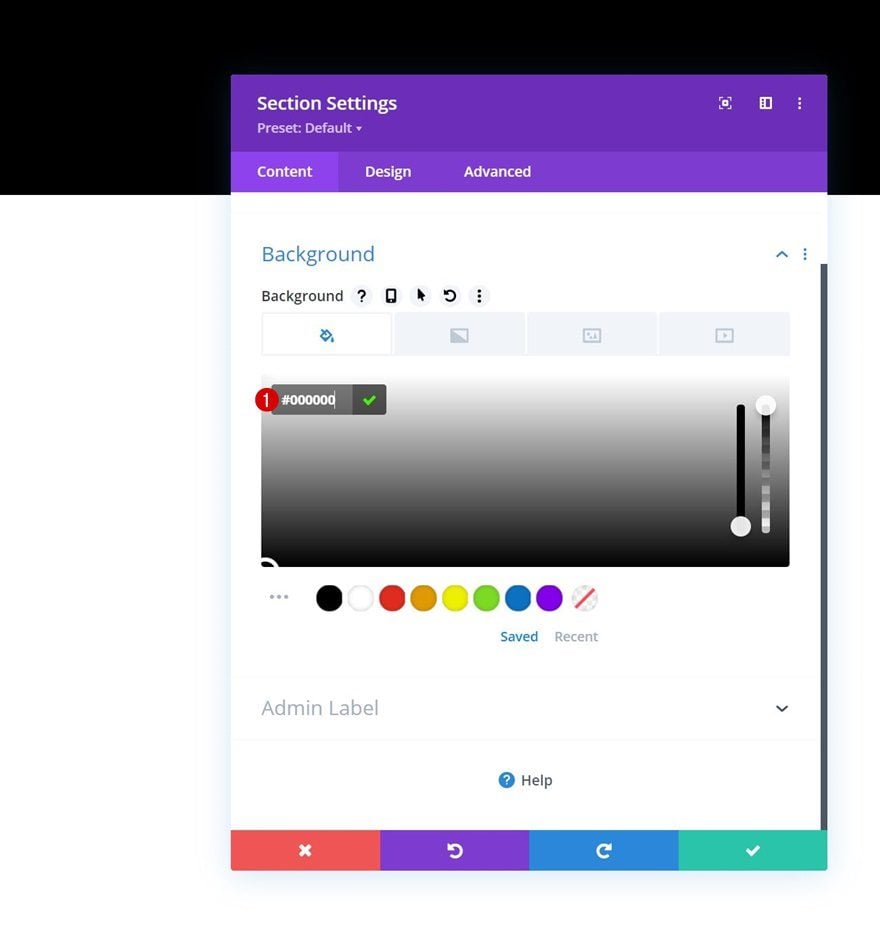
Once inside the template editor, you’ll notice a section. Open that section and apply a black background color.
- Background Color: #000000
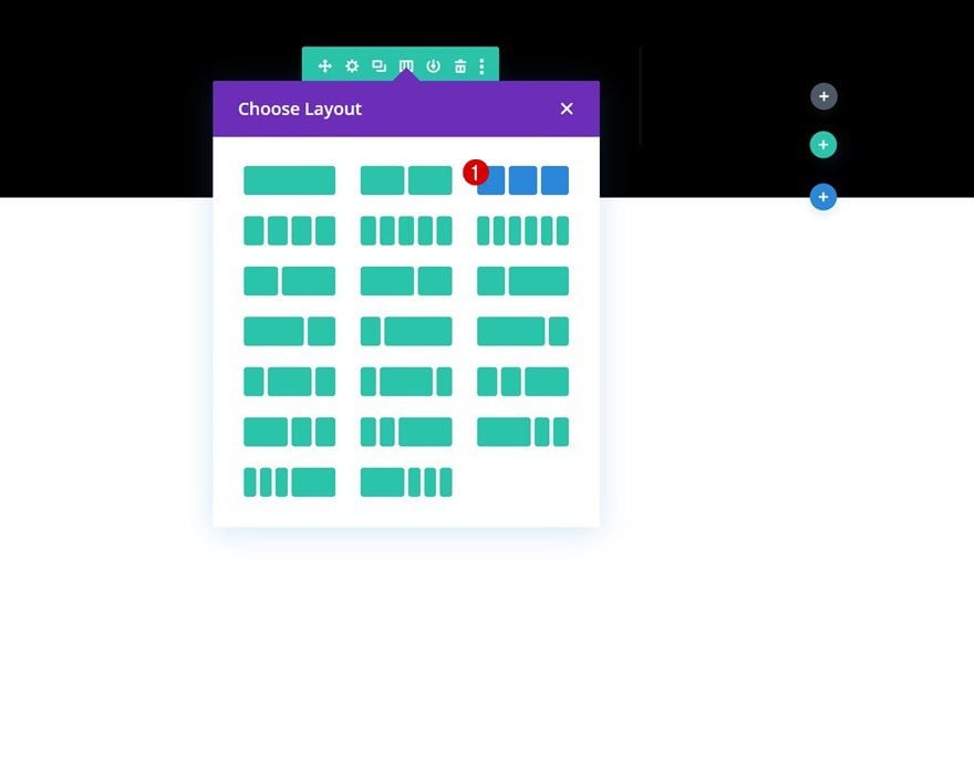
Add Row #1
Column Structure
Continue by adding a new row using the following column structure:
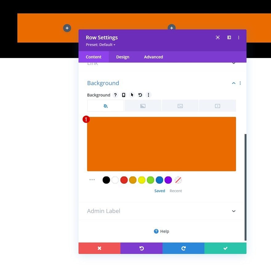
Background Color
Without adding modules yet, open the row settings and change the background color.
- Background Color: #ea6c01
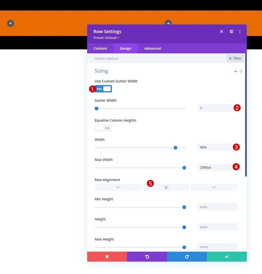
Sizing
Move on to the row’s design tab and change the sizing settings next.
- Use Custom Gutter Width: Yes
- Gutter Width: 1
- Width: 90%
- Max Width: 2580px
- Row Alignment: Center
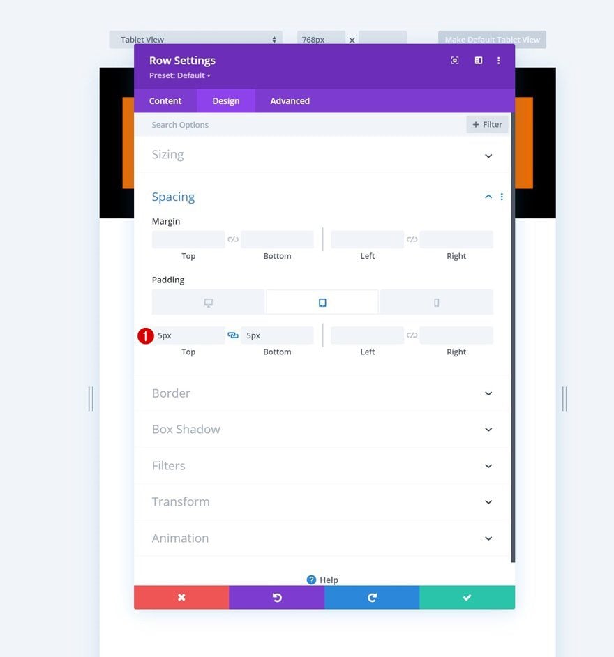
Spacing
Add some custom top and bottom padding on smaller screen sizes as well.
- Top Padding: 5px (Tablet & Phone Only)
- Bottom Padding: 5px (Tablet & Phone Only)
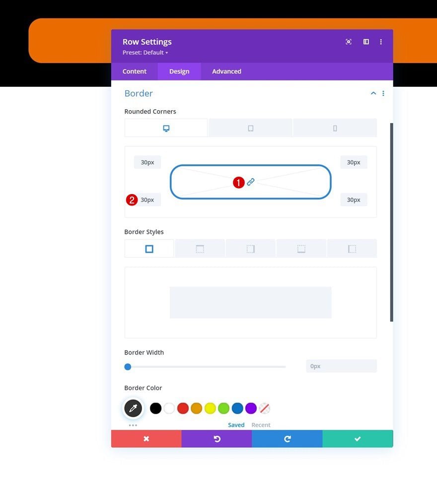
Border
Next, add some responsive rounded corners to the border settings.
- All Corners:
- Desktop: 30px
- Tablet & Phone: 15px
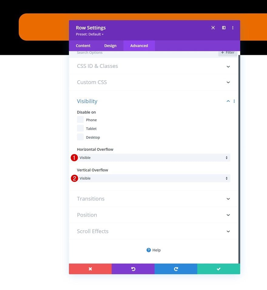
Overflows
And to make sure we can create overlaps later on the tutorial, we’ll set the row overflows to visible.
- Horizontal Overflow: Visibile
- Vertical Overflow: Visible
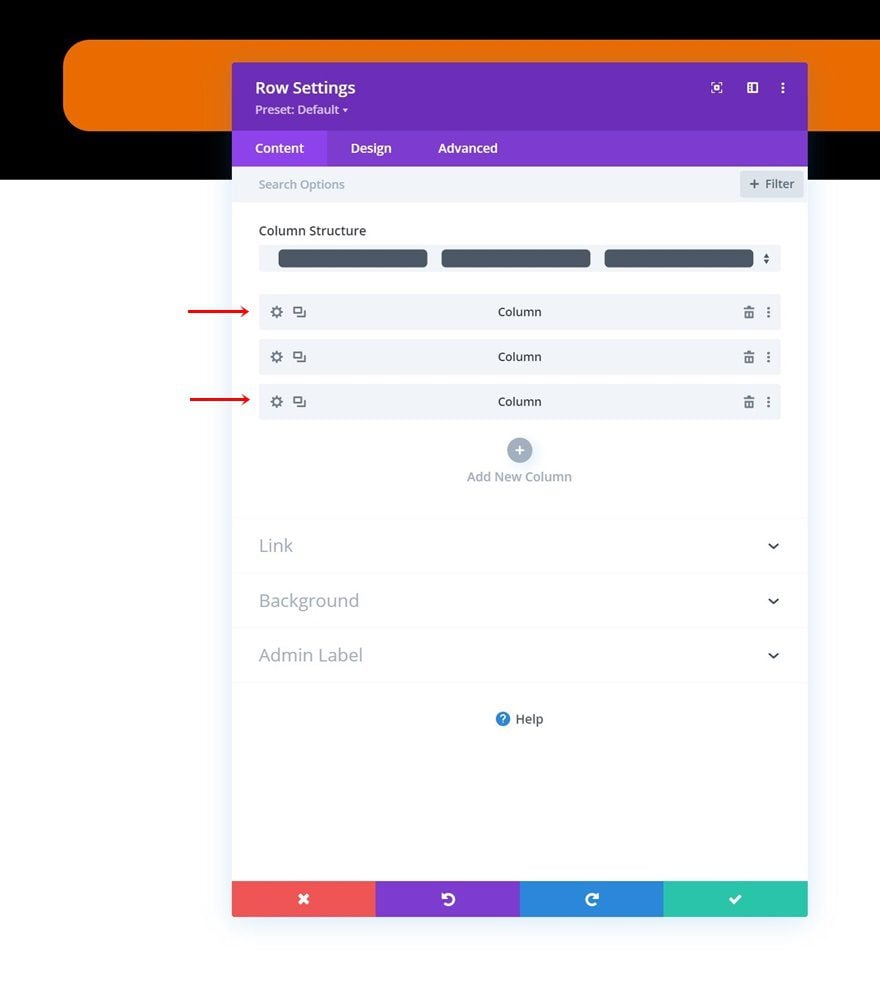
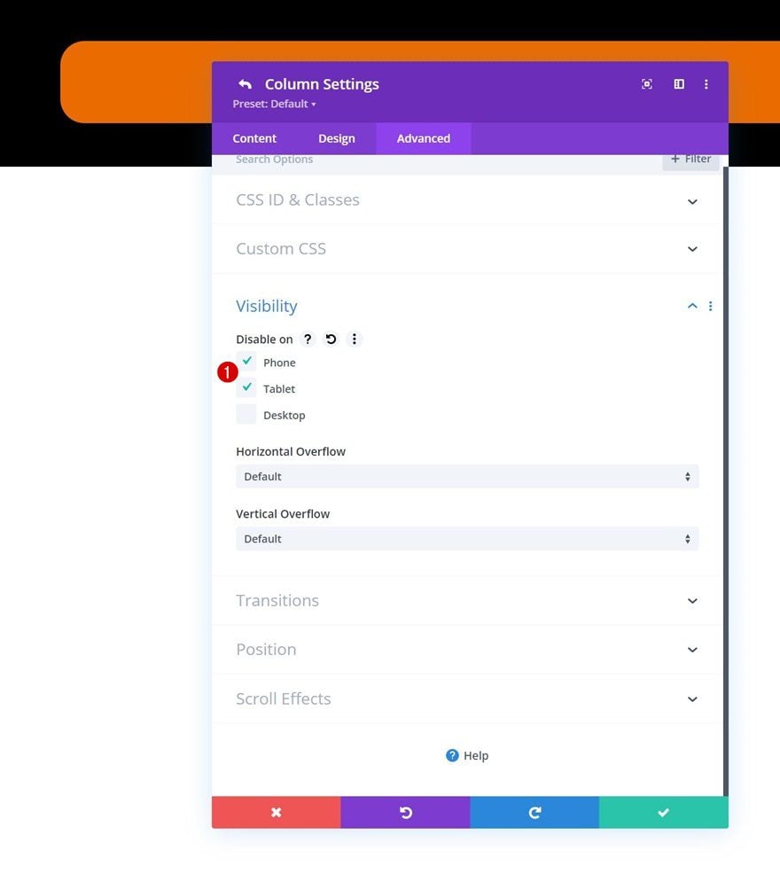
Column 1 & 3 Visibility
To prevent too many footer bar items from showing up on smaller screen sizes, we’ll hide the first and last column in our row on both tablet and phone.
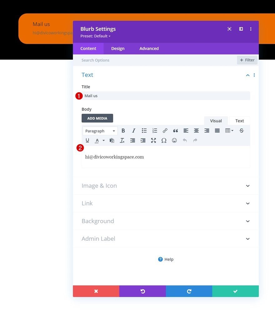
Add Blurb Module to Column 1
Add Content
Time to add modules, starting with a Blurb Module in column 1. Add some content of your choice.
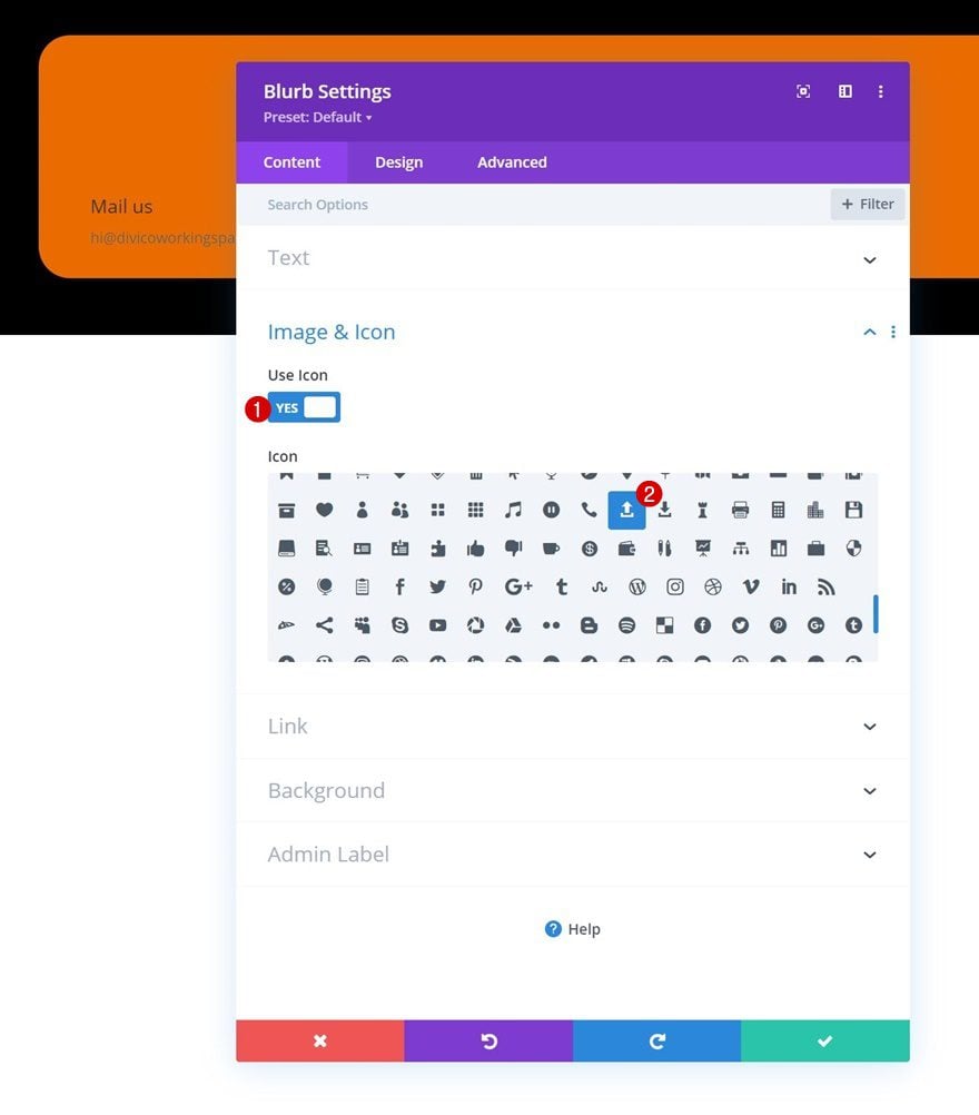
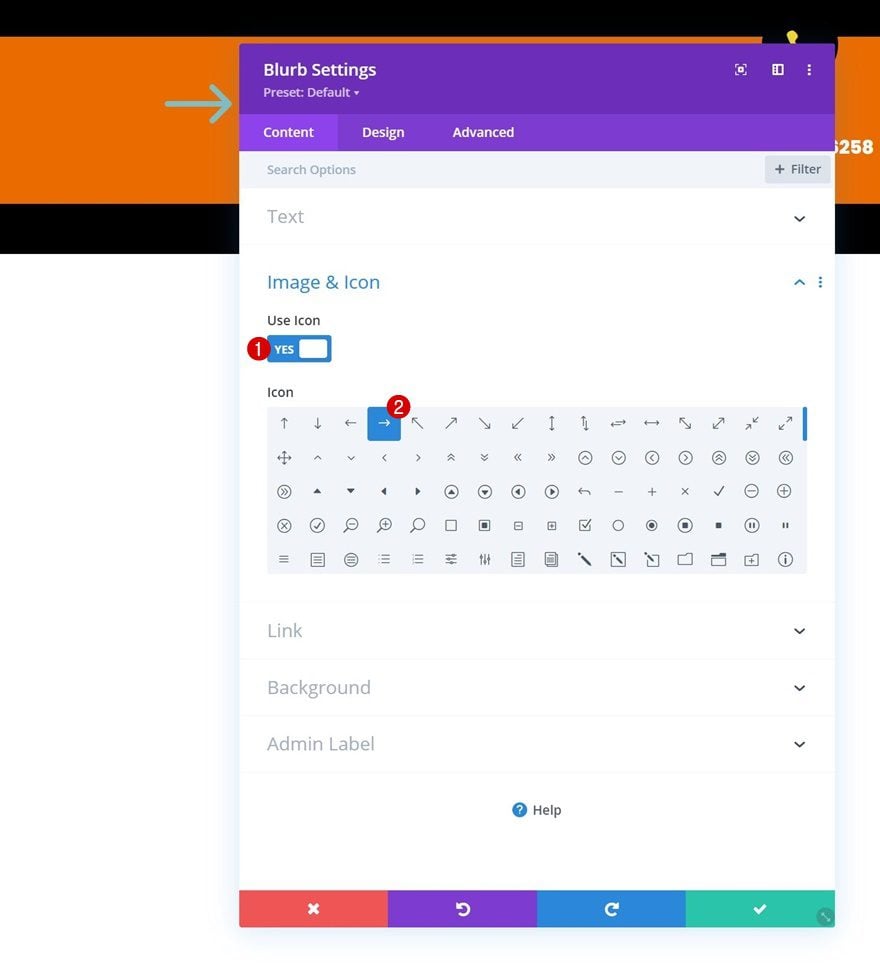
Select Icon
Select an icon next.
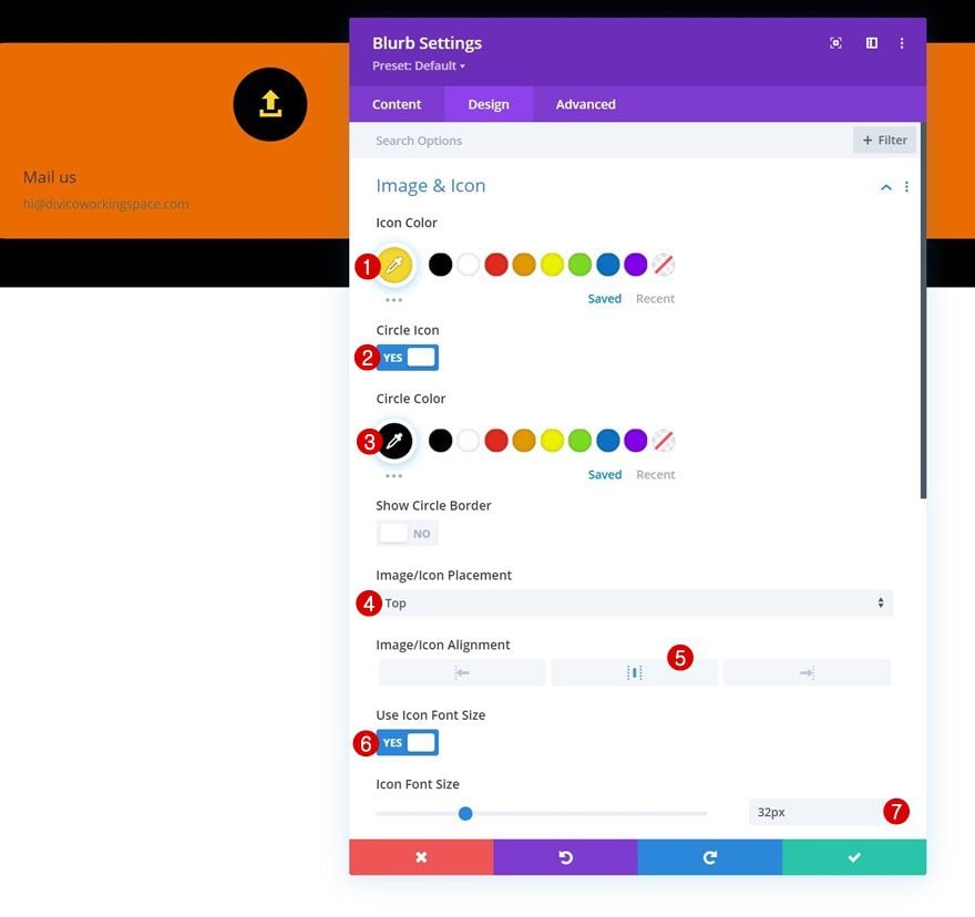
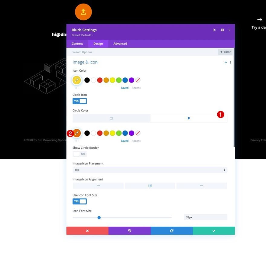
Icon Settings
Move on to the module’s design tab and style the icon accordingly:
- Icon Color: #f5d72e
- Circle Icon: Yes
- Circle Color: #000000
- Image/Icon Placement: Top
- Image/Icon Alignment: Center
- Use Icon Font Size: Yes
- Icon Font Size: 32px
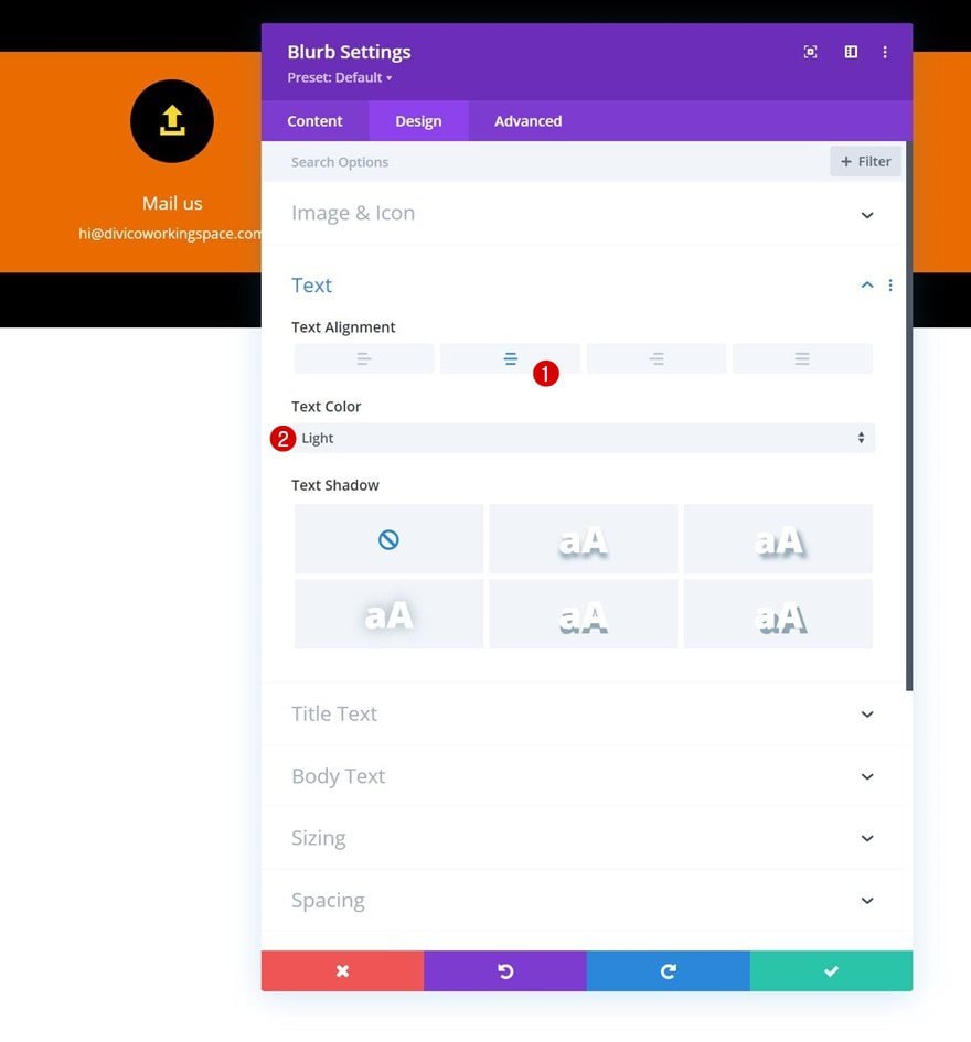
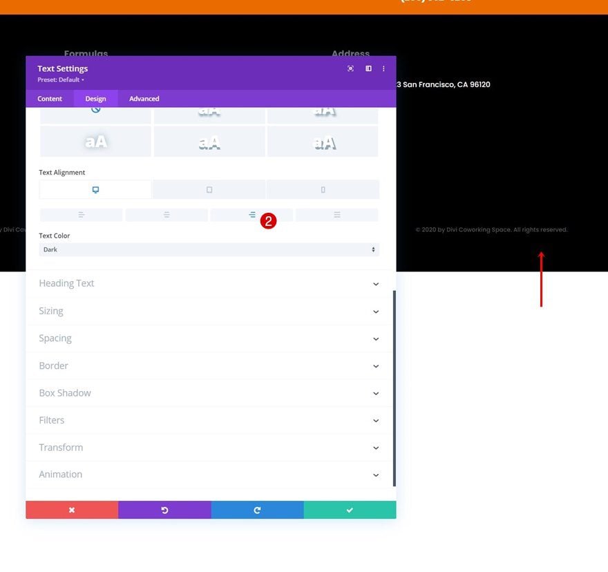
Text Settings
Next, change the text settings.
- Text Alignment: Center
- Text Color: Light
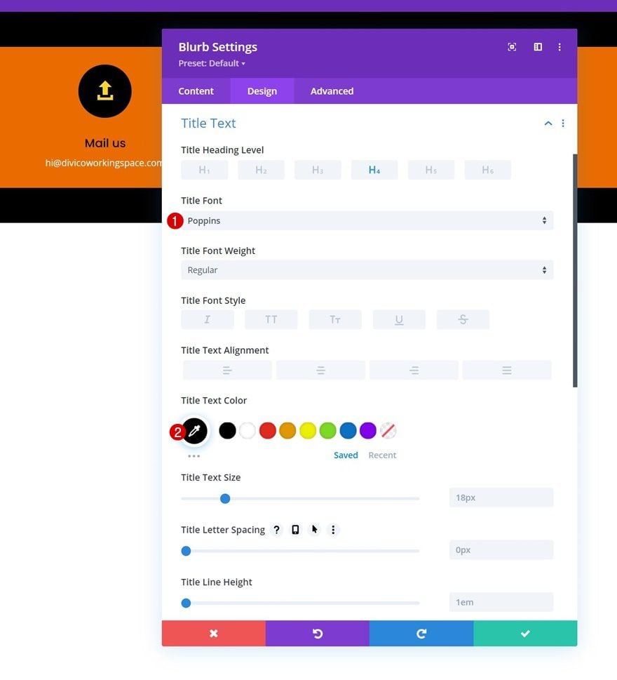
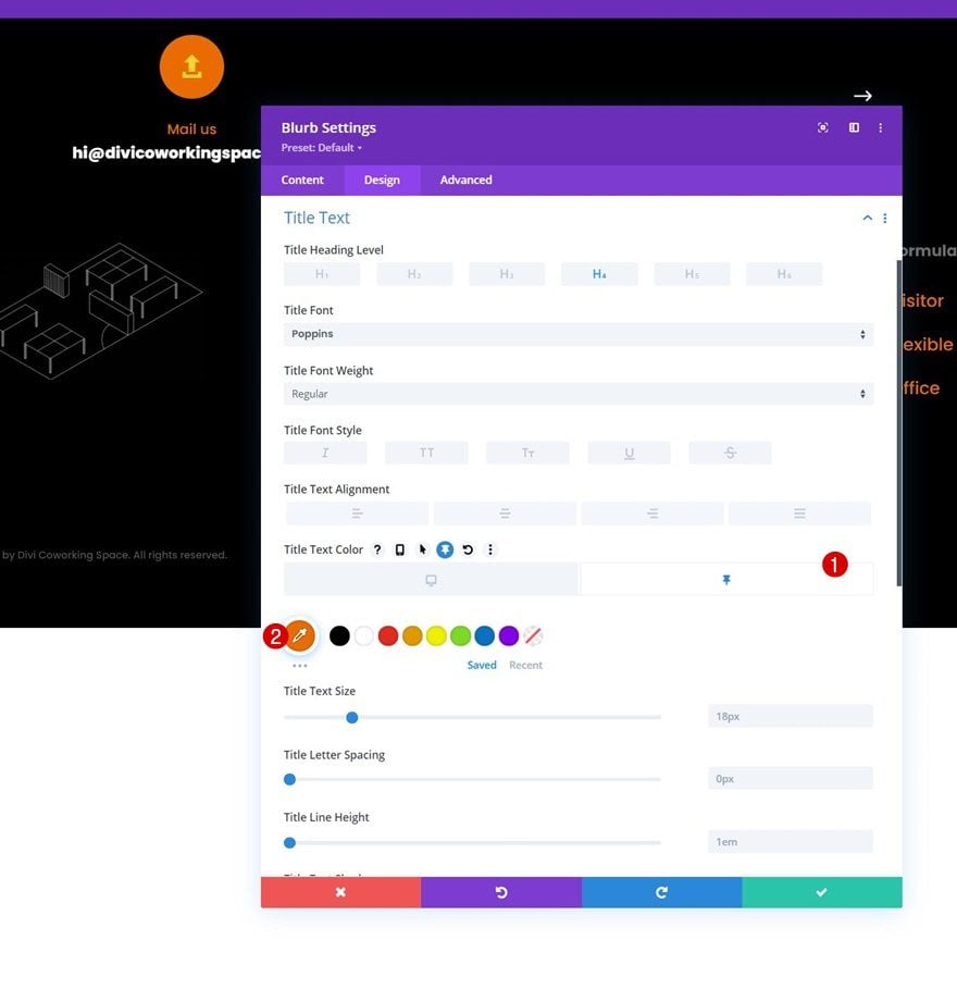
Title Text Settings
Make some changes to the title text settings too.
- Title Font: Poppins
- Title Text Color: #000000
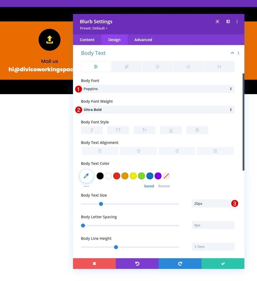
Body Text Settings
Modify the body text settings as well.
- Body Font: Poppins
- Body Font Weight: Ultra Bold
- Body Text Size: 20px
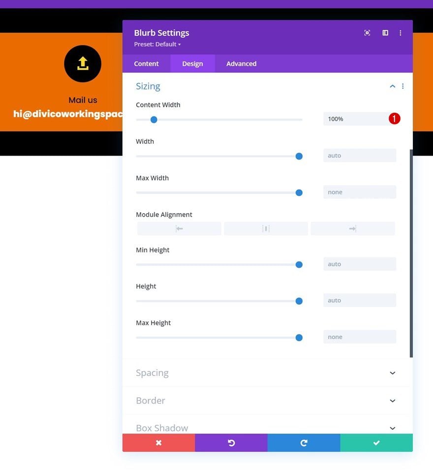
Sizing
Put the content width to “100%” in the sizing settings next.
- Content Width: 100%
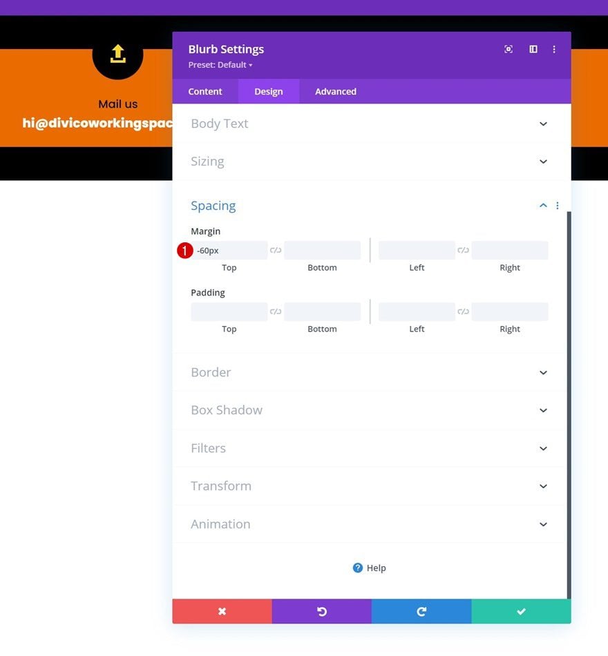
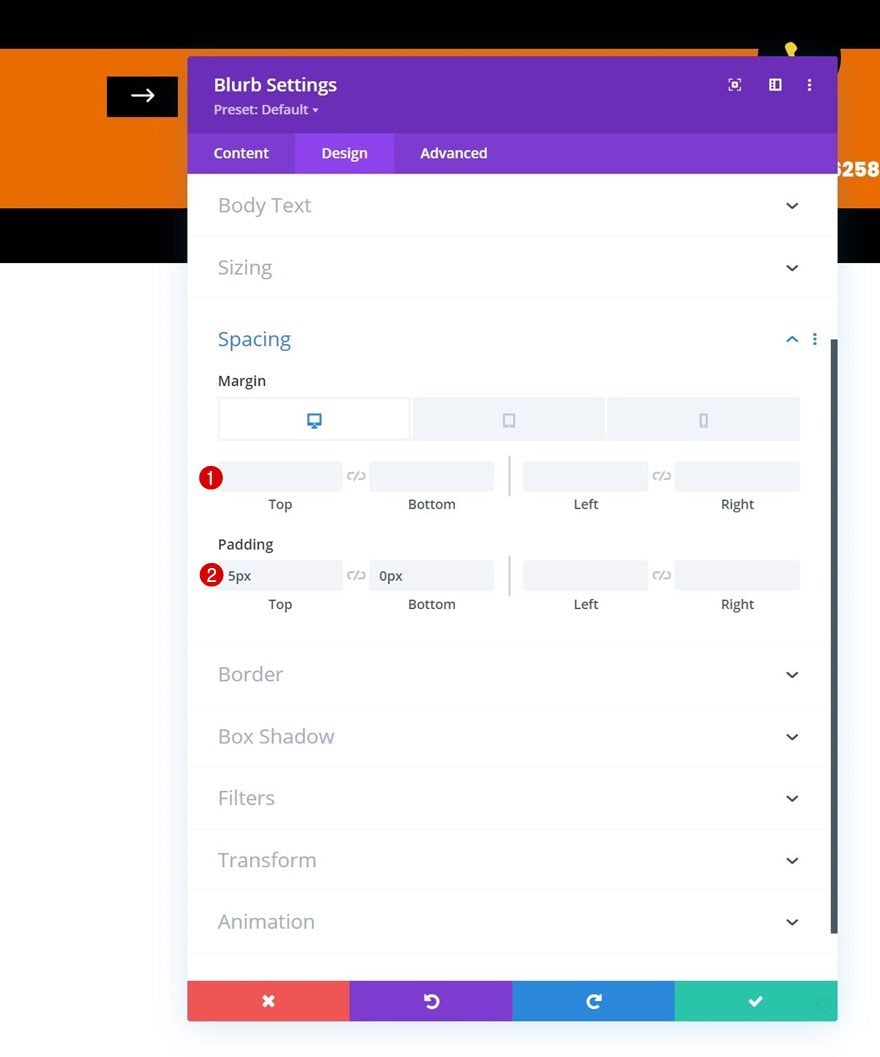
Spacing
To create an overlap, add some negative top margin to the spacing settings.
- Top Margin: -60px
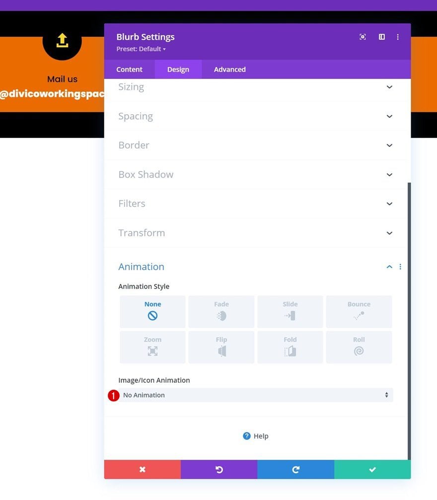
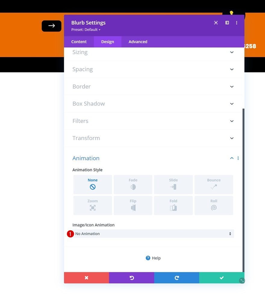
Animation
And complete the module settings by removing the icon animation in the animation settings.
- Image/Icon Animation: No Animation
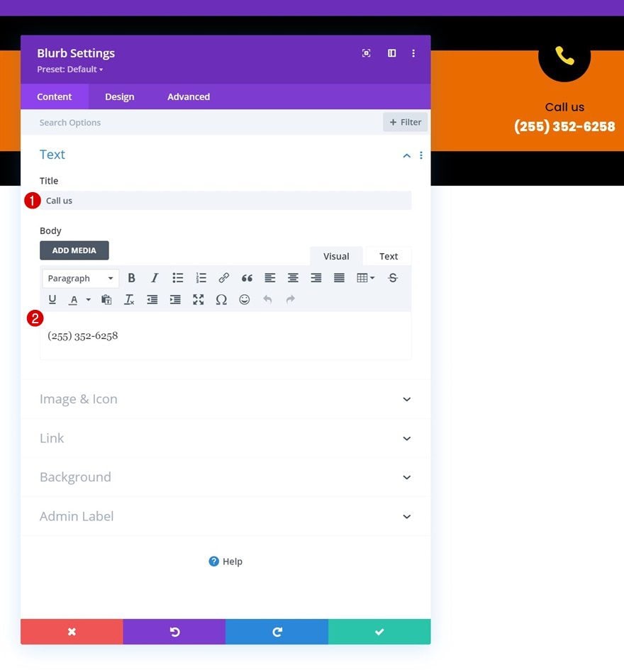
Clone Blurb Module & Place Duplicate in Column 3
Once you’ve completed the first Blurb Module in column 1, clone it once and place the duplicate in column 3.
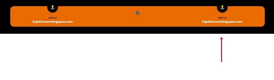
Change Content & Icon
Change the content and icon for the duplicate.
Add Blurb Module to Column 2
Select Icon
Next, add a new Blurb Module to column 2. Leave the content box empty and select an icon of your choice.
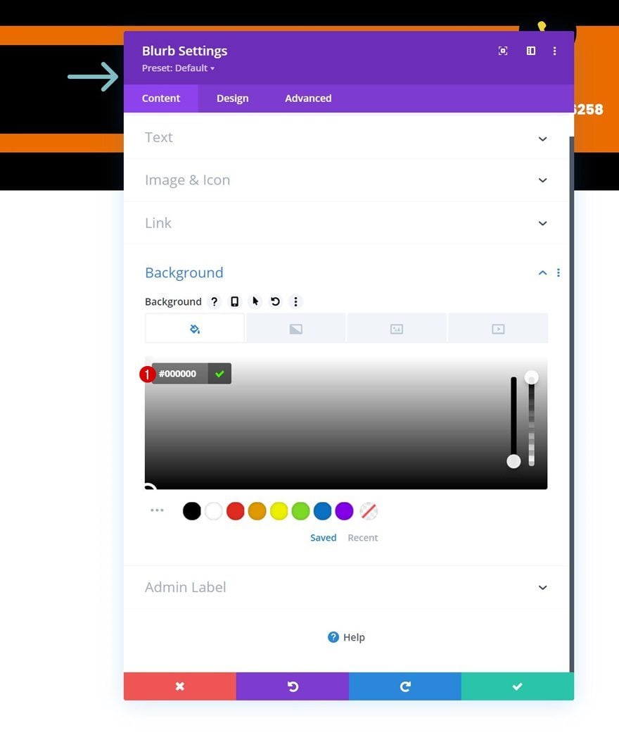
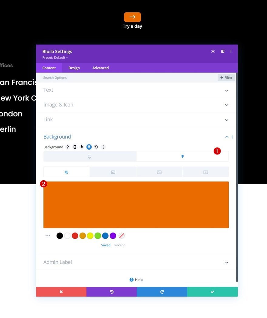
Background Color
Add a background color next.
- Background Color: #000000
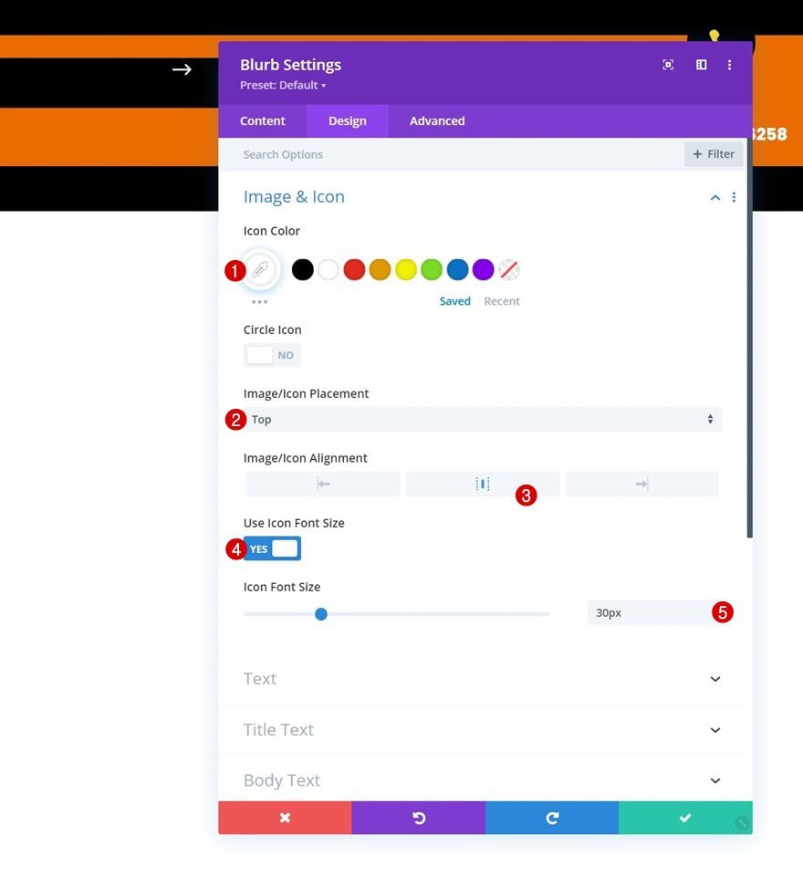
Icon Settings
Move on to the module’s design tab and change the icon settings accordingly:
- Icon Color: #ffffff
- Image/Icon Placement: Top
- Image/Icon Alignment: Center
- Use Icon Font Size: Yes
- Icon Font Size: 30px
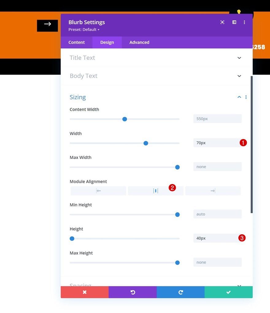
Sizing
Make some changes to the sizing settings next.
- Width: 70px
- Module Alignment: Center
- Height: 40px
Spacing
Then, apply custom margin and padding values across different screen sizes.
- Top Margin: -20px (Tablet & Phone Only)
- Top Padding: 5px
- Bottom Padding: 0px
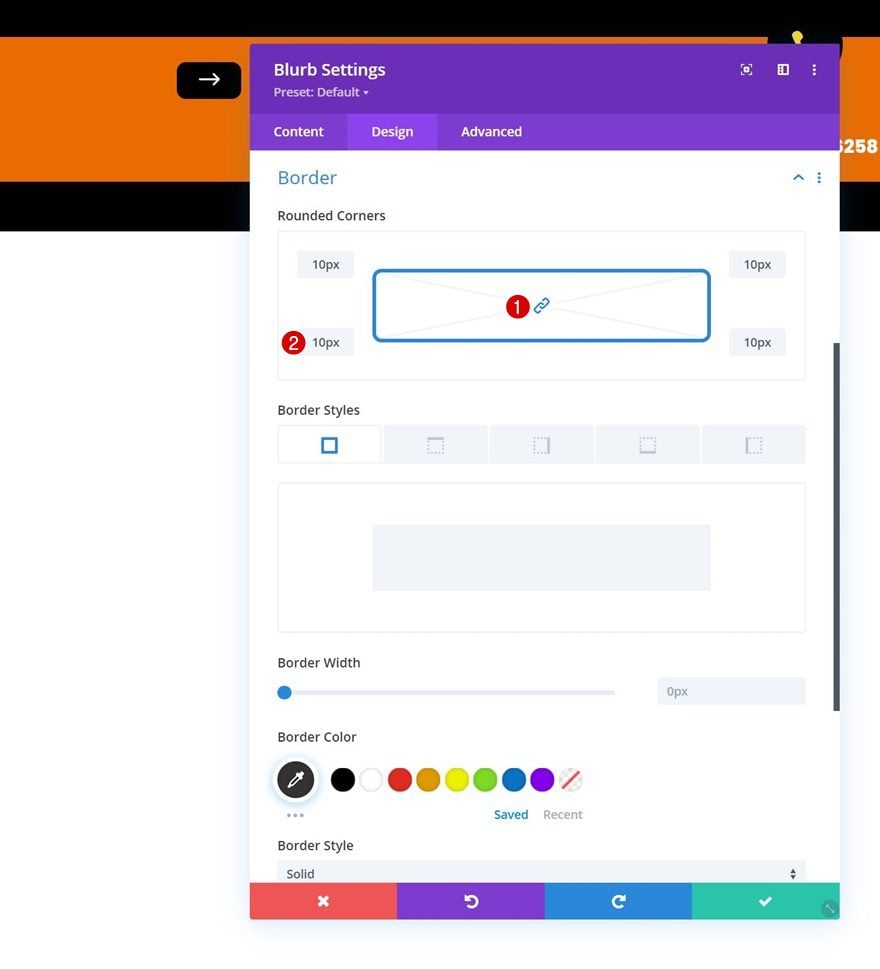
Border
Next, add some rounded corners to the border settings.
- All Corners: 10px
Animation
And remove the default animation in the animation settings.
- Image/Icon Animation: No Animation
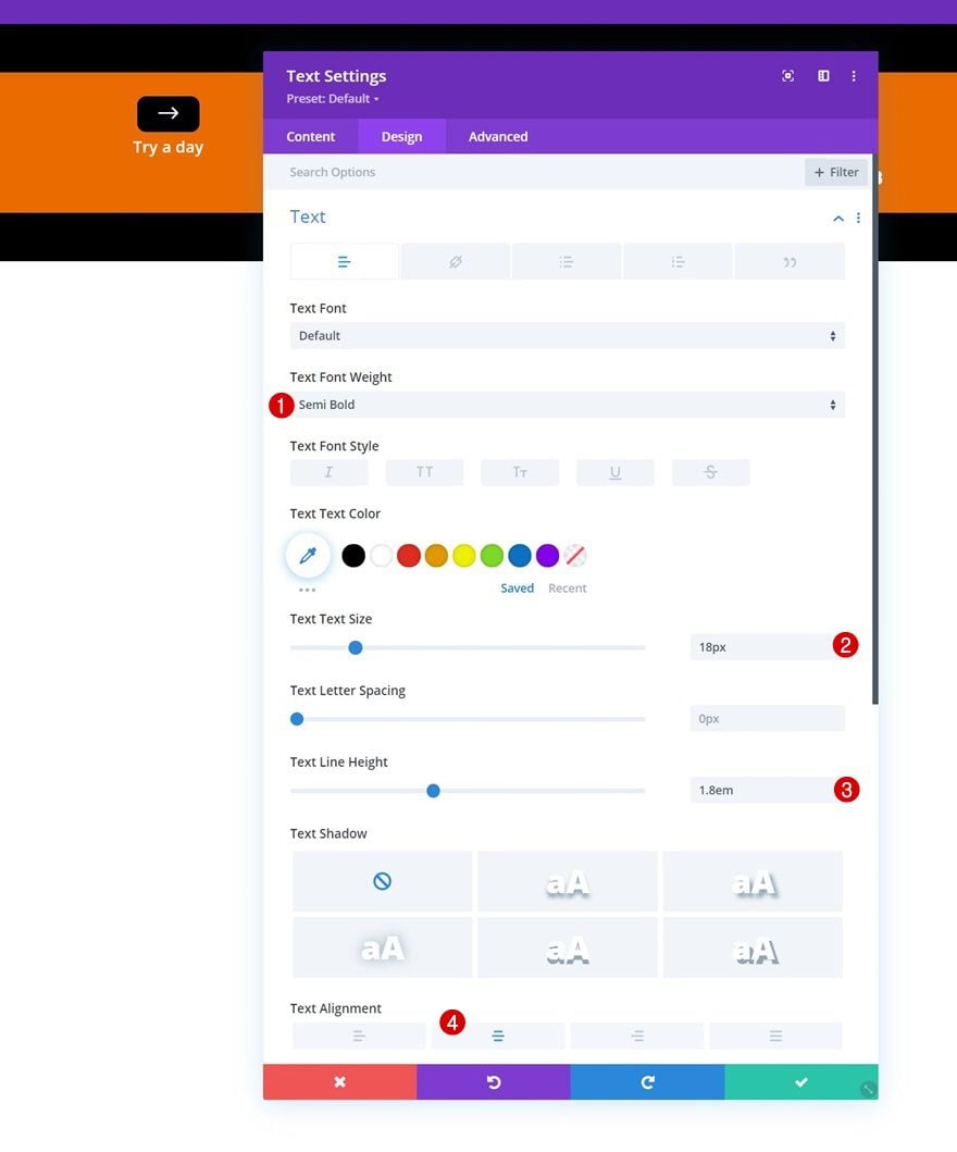
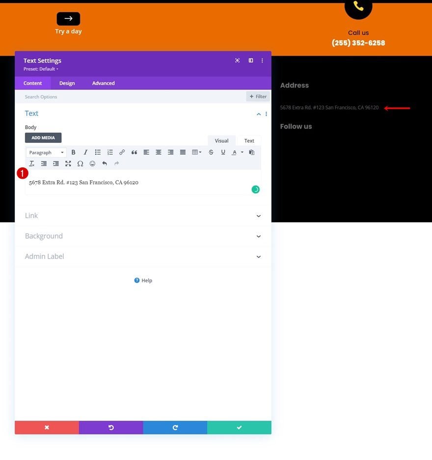
Add Text Module to Column 2
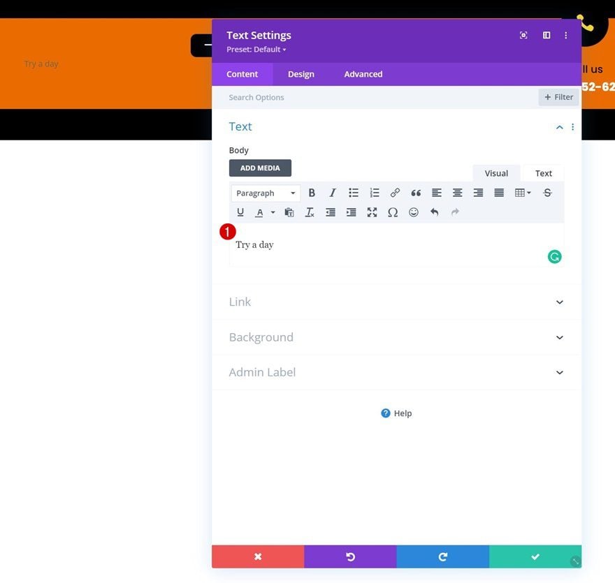
Add Content
The next and last module we need in this row is a Text Module in column 2. Add some content of your choice.
Text Settings
Move on to the module’s design tab and change the text settings as follows:
- Text Font Weight: Semi Bold
- Text Size: 18px
- Text Line Height: 1.8em
- Text Alignment: Center
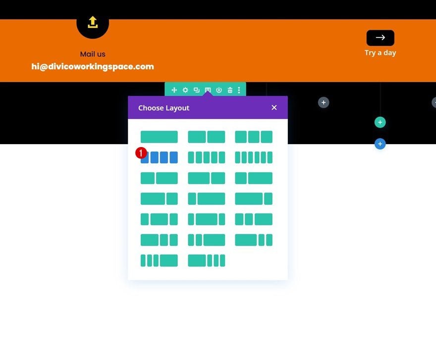
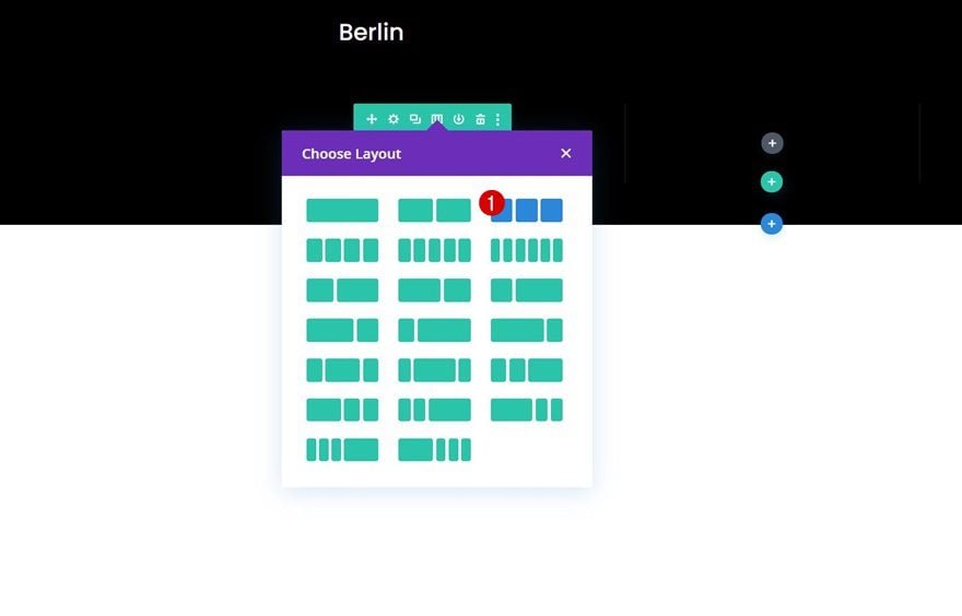
Add Row #2
Column Structure
Continue by adding a new row using the following column structure:
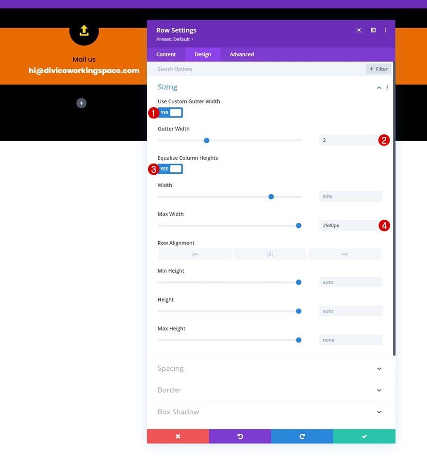
Sizing
Without adding modules, open the row settings, go to the design tab and change the sizing settings as follows:
- Use Custom Gutter Width: Yes
- Gutter Width: 2
- Max Width: 2580px
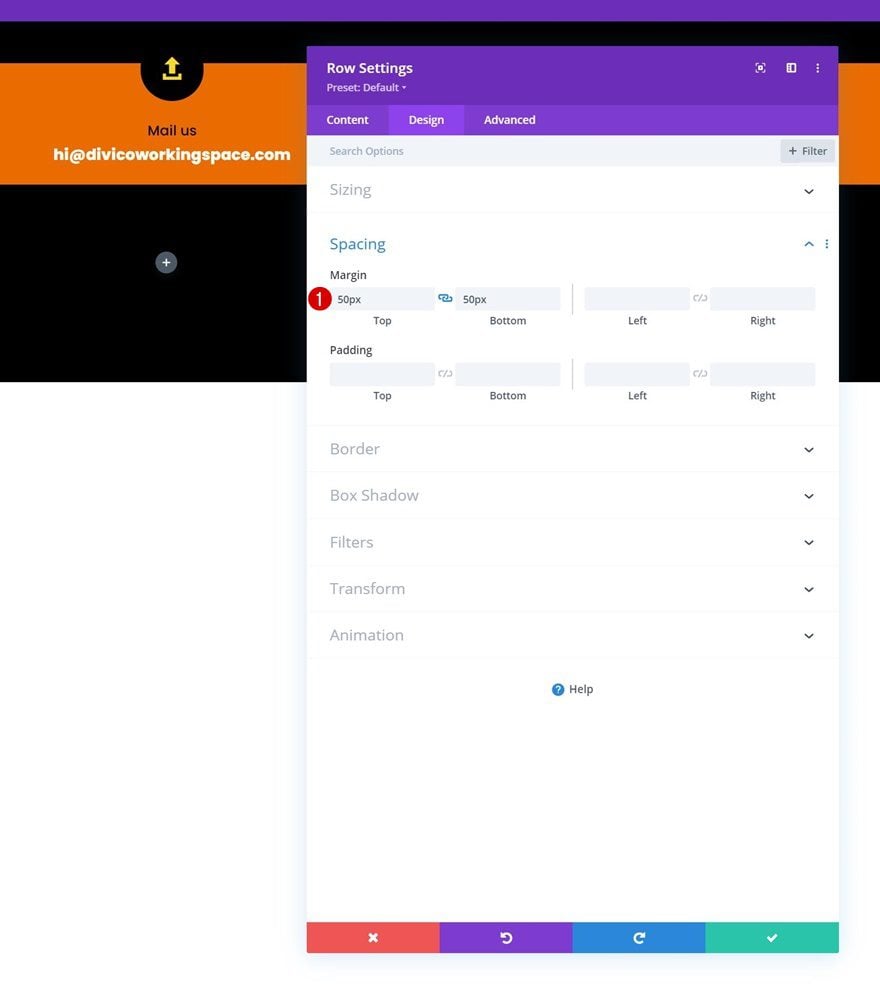
Spacing
Add some top and bottom margin next.
- Top Margin: 50px
- Bottom Margin: 50px
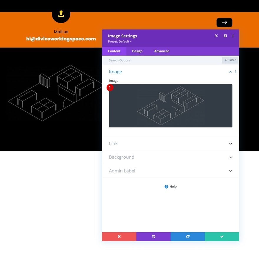
Add Image Module to Column 1
Upload Image
Add an Image Module to column 1 and upload your logo or any kind of image of your choice.
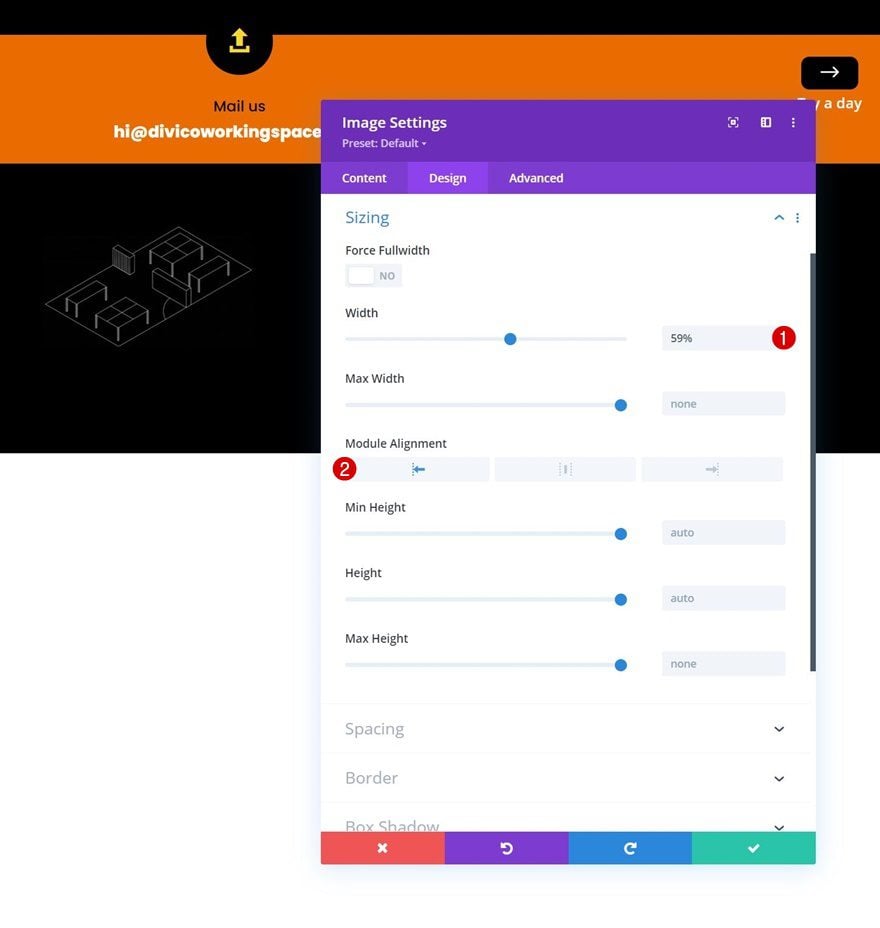
Sizing
Move on to the module’s design tab and change the sizing settings as follows:
- Width: 59%
- Module Alignment: Left
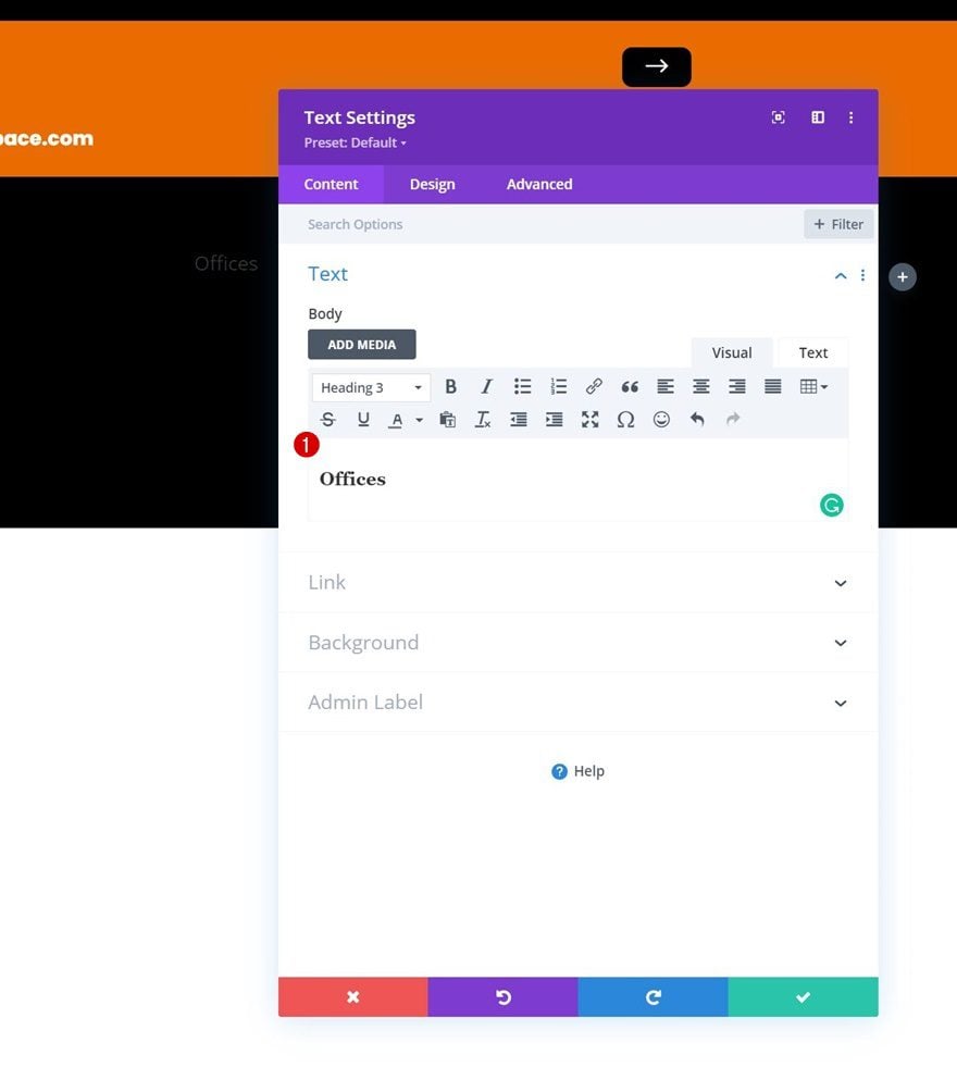
Add Text Module to Column 2
Add H3 Content
Next, add a Text Module to column 2 with some H3 content of your choice.
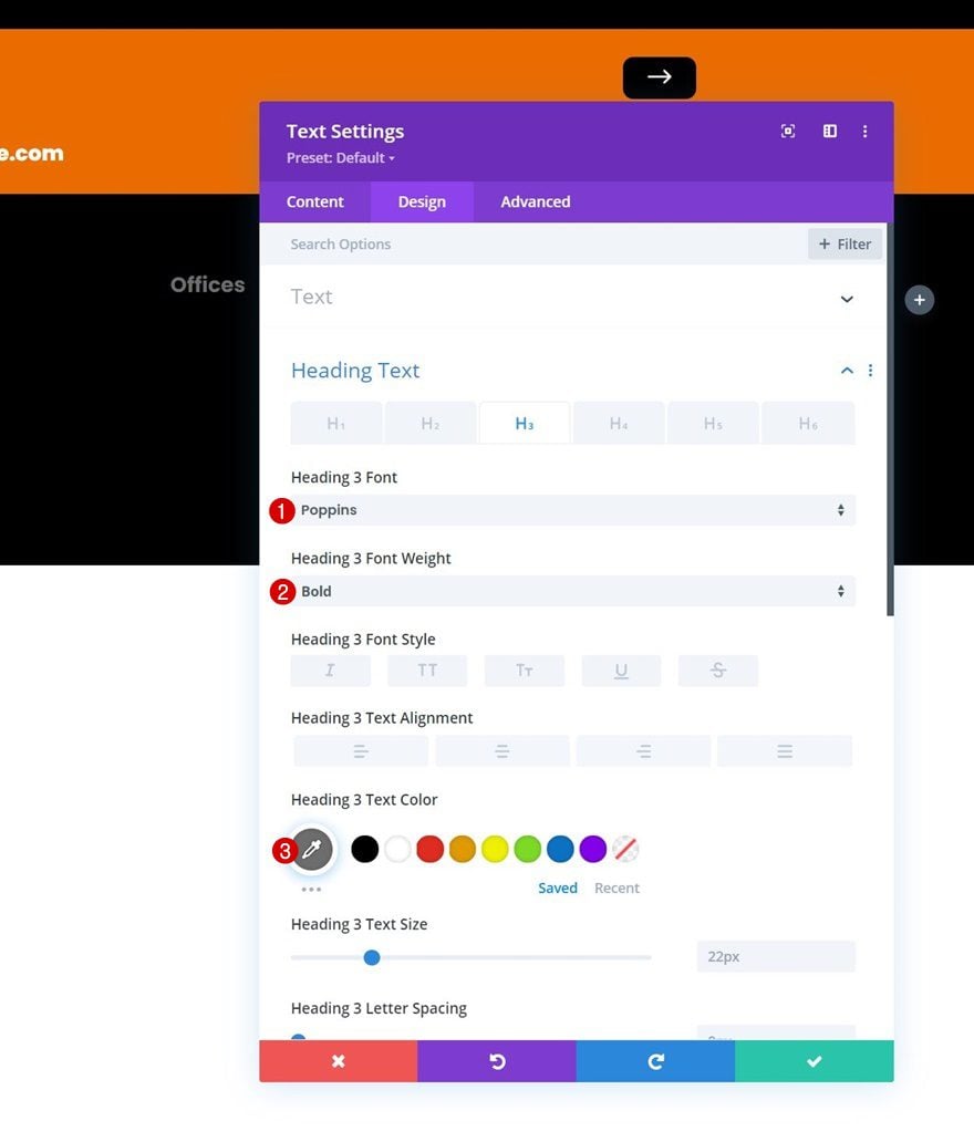
H3 Text Settings
Change the module’s H3 text settings as follows:
- Heading 3 Font: Poppins
- Heading 3 Font Weight: Bold
- Heading 3 Text Color: #6d6d6d
Clone Text Module 3x & Spread Across Column 3 & 4
Once you’ve completed this Text Module, you can clone three times and spread the duplicates across the two remaining columns of the row.
Change Content
Make sure you change the content in each duplicate Text Module.
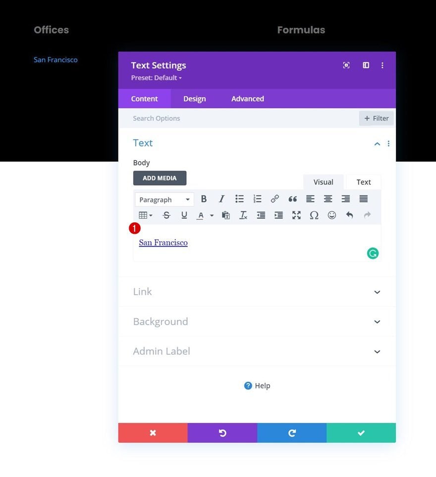
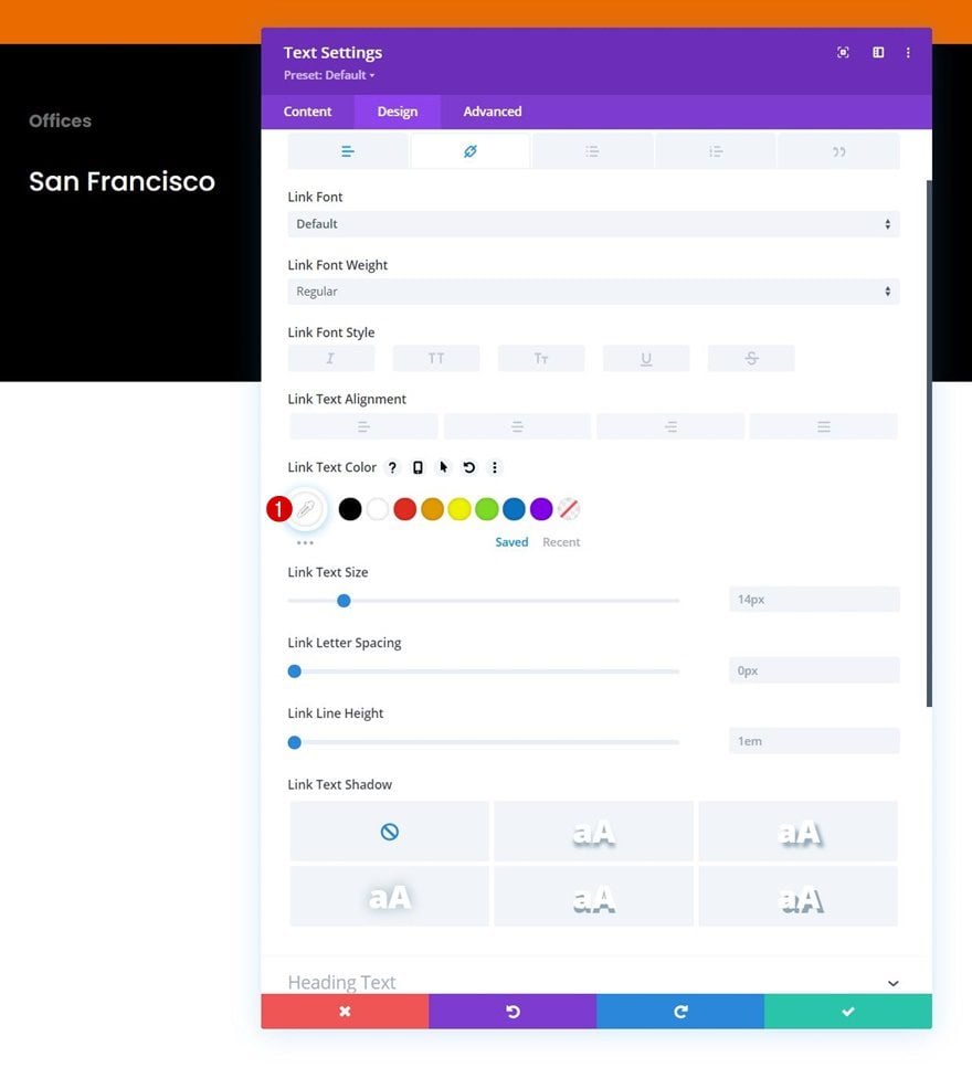
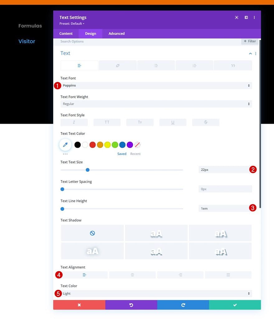
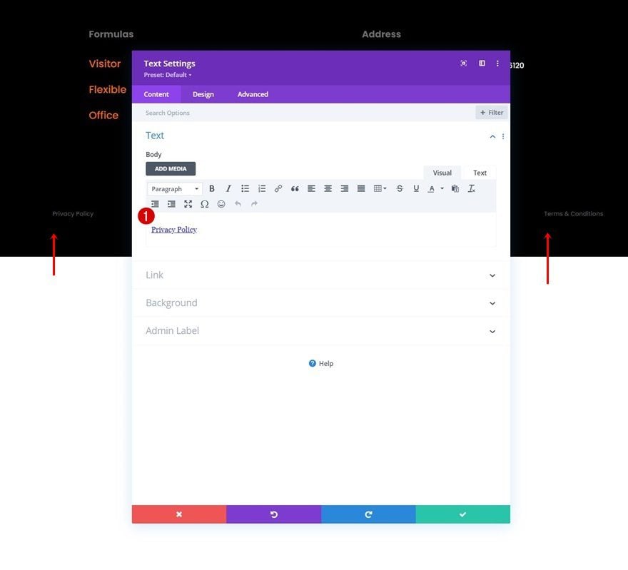
Add Text Module to Column 2
Add Content
Add another Text Module right below the previous Text Module in column 2 and add some linked content of your choice.
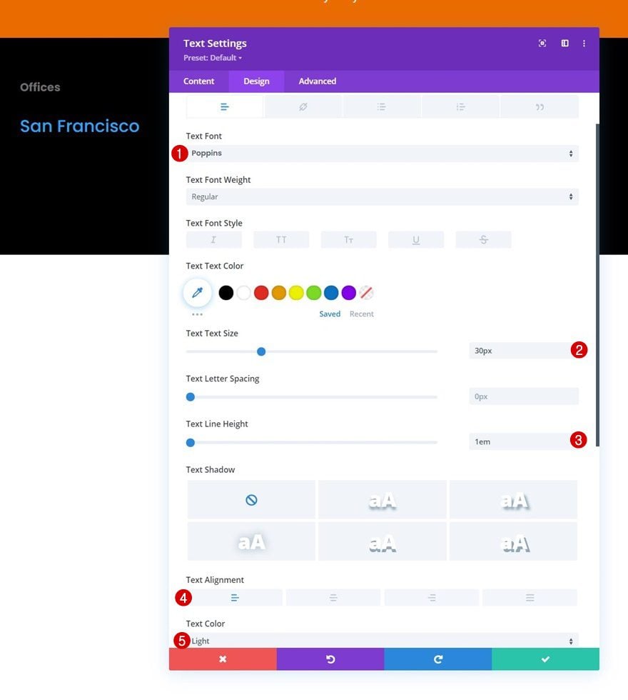
Text Settings
Move on to the module’s design tab and change the text settings as follows:
- Text Font: Poppins
- Text Size: 30px
- Text Line Height: 1em
- Text Alignment: Left
- Text Color: Light
Link Text Settings
Change the link text color too.
- Link Text Color: #ffffff
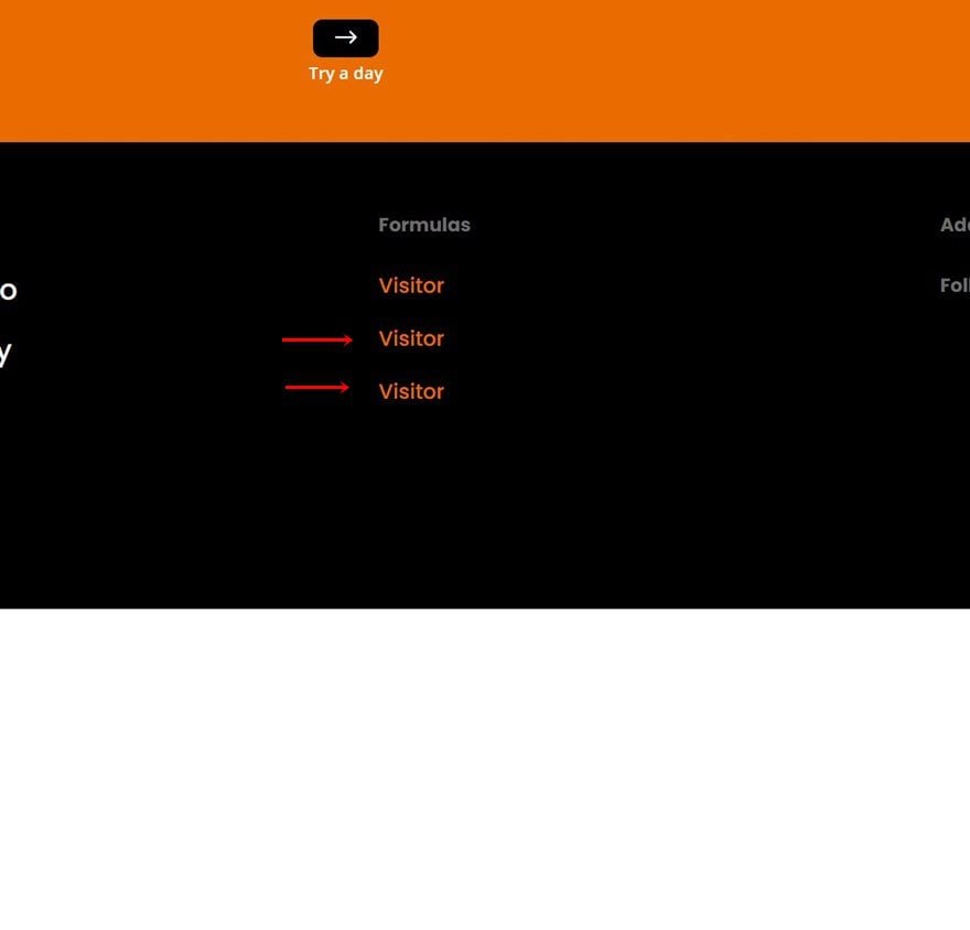
Clone Text Module As Needed
Once you’ve completed the Text Module, clone it up to as many times as you want.
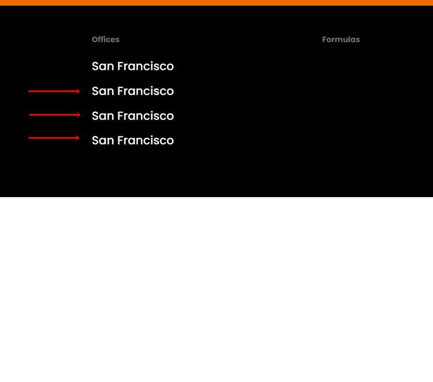
Change Content
Make sure you change the content and links in each duplicate module.
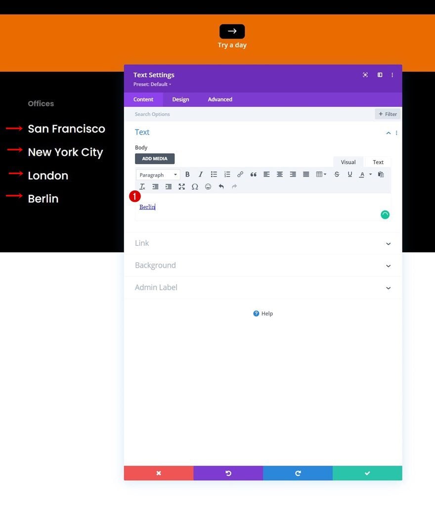
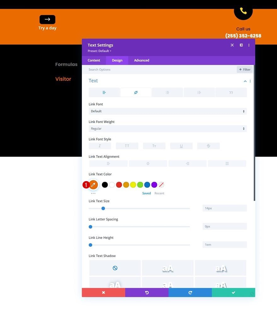
Add Text Module to Column 3
Add Content
Then, add another Text Module to column 3. Add some linked content of your choice.
Text Settings
Move on to the module’s design tab and change the text settings as follows:
- Text Font: Poppins
- Text Size: 22px
- Text Line Height: 1em
- Text Alignment: Left
- Text Color: Light
Link Text Settings
Modify the link text color too.
- Link Text Color: #ea6c01
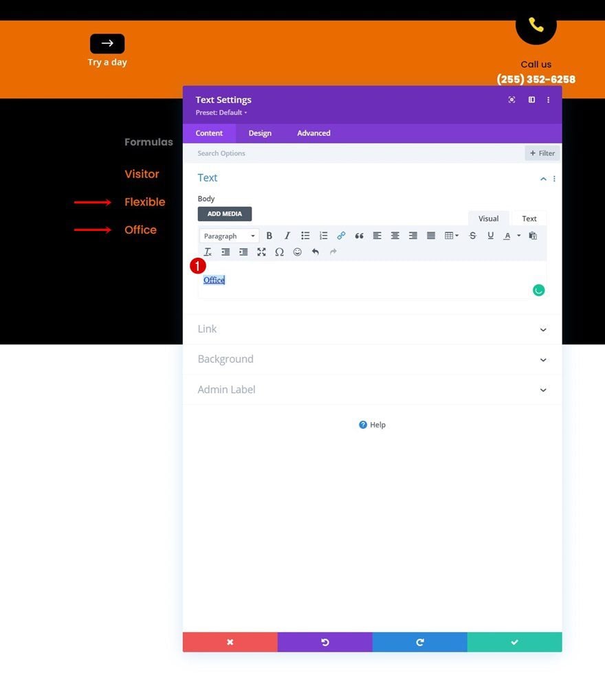
Clone Text Module as Needed
Clone this module as many times as you need.
Change Content
And, of course, change the content and links as needed.
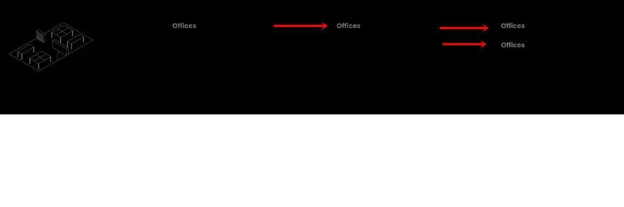
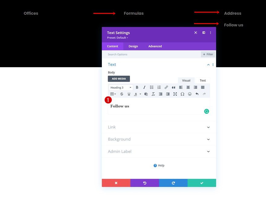
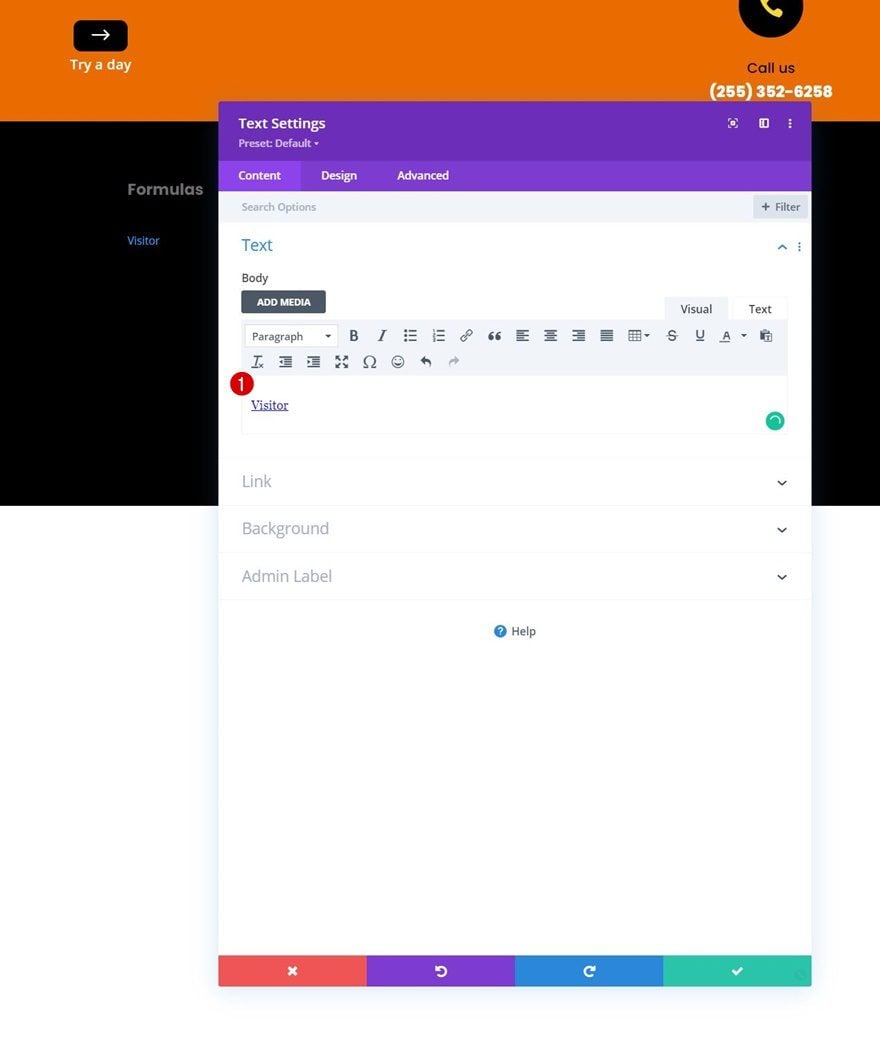
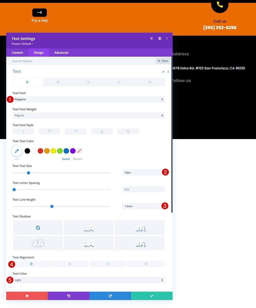
Add Text Module to Column 4
Add Content
In column 4, We’ll add another Text Module below the first Text Module. Add some content of your choice.
Text Settings
Move on to the module’s design tab and change the text settings as follows:
- Text Font: Poppins
- Text Size: 16px
- Text Line Height: 1.8em
- Text Alignment: Left
- Text Color: Light
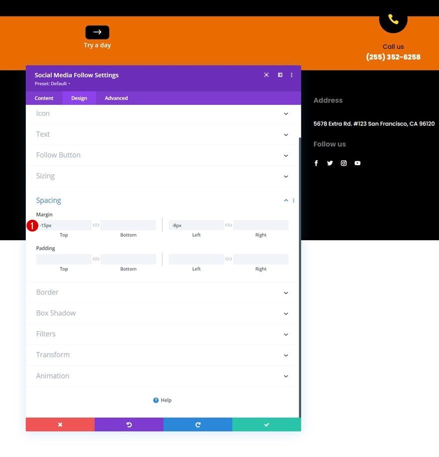
Add Social Networks of Choice
Then, add a Social Media Follow Module to the end of the column. Add the social networks of your choice.
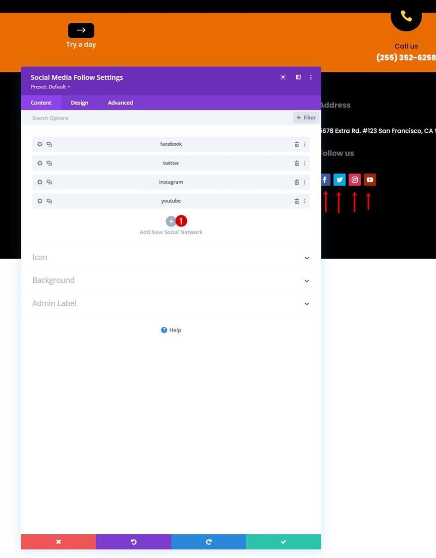
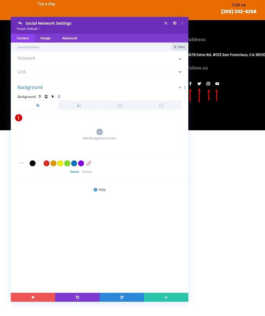
Remove Each Social Network’s Background Color Individually
Remove the background color of each social network individually.
Spacing
Go back to the regular module settings, go to the spacing settings and add some custom margin values.
- Top Margin: -15px
- Left Margin: -8px
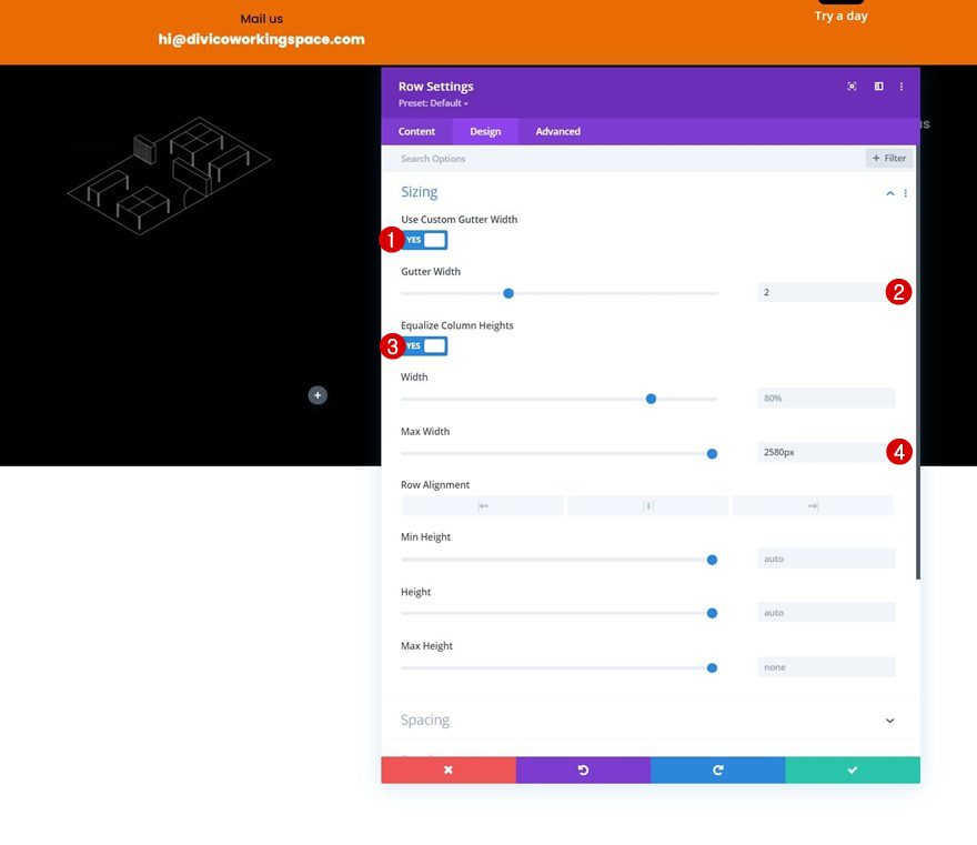
Add Row #3
Column Structure
Continue by adding a new row using the following column structure:
Sizing
Without adding modules yet, open the row settings, move on to the design tab and change the sizing settings as follows:
- Use Custom Gutter Width: Yes
- Gutter Width: 2
- Equalize Column Heights: Yes
- Max Width: 2580px
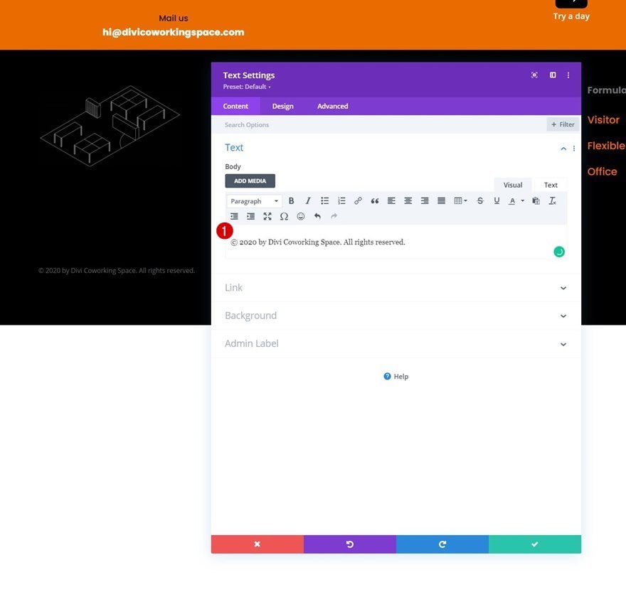
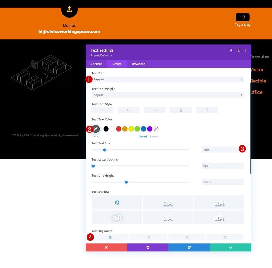
Add Text Module to Column 1
Add Content
Then, add a Text Module to column 1. Insert some content of your choice.
Text Settings
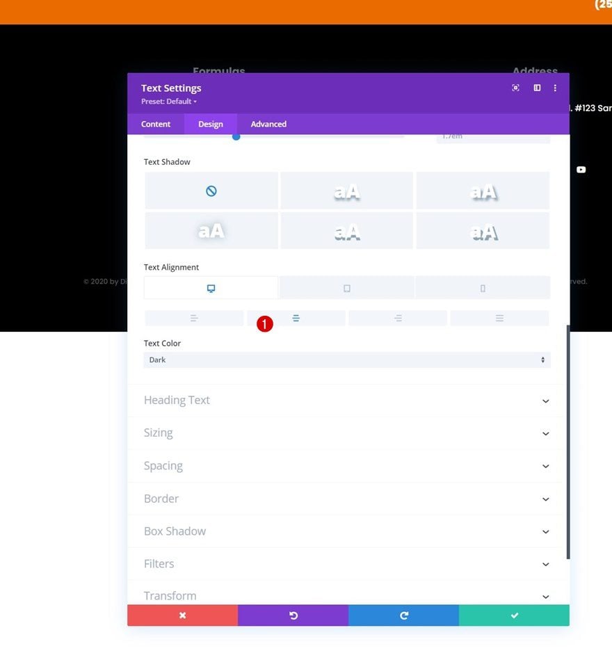
Move on to the module’s design tab and change the text settings as follows:
- Text Font: Poppins
- Text Color: #595959
- Text Size: 13px
- Text Alignment: Center
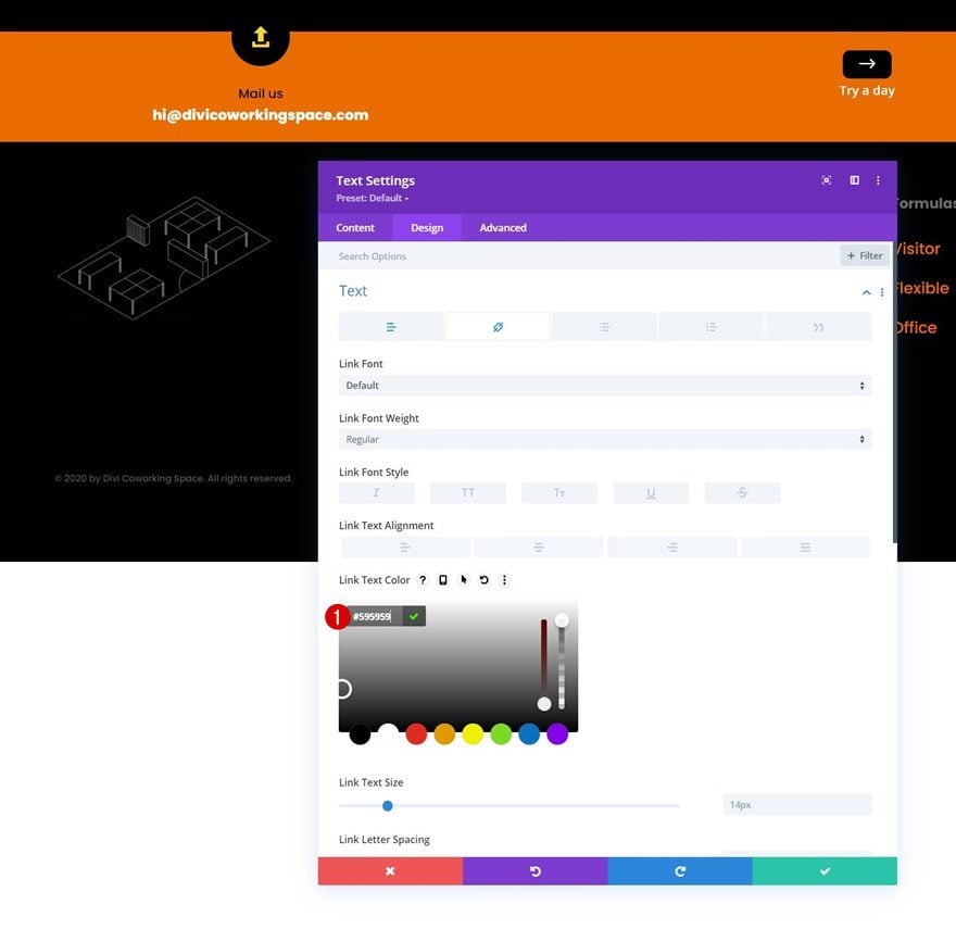
Link Text Settings
Modify the link text color too.
- Link Text Color: #595959
Clone Text Module Twice & Place Duplicates in Remaining Columns
Once you’ve completed the module in column 1, you can clone it twice and place the duplicates in the two remaining columns of the row.
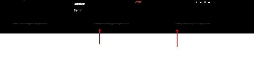
Change Text Alignments
Change the text alignments for each duplicate Text Module accordingly:
- Text Module in Column 2:
- Desktop: Center
- Tablet & Phone: Left
- Text Module in Column 3:
- Desktop: Right
- Tablet & Phone: Left
Change Content
And change the content in both duplicate modules as well.
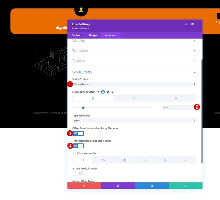
Open Row #1 & Apply Sticky Settings
Now that our design foundation is in place, it’s time to apply the sticky effect. Open the first row in the section, go to the advanced tab and apply the following sticky settings:
- Sticky Position: Stick to Bottom
- Sticky Bottom Offset:
- Desktop: 50px
- Tablet & Phone: 20px
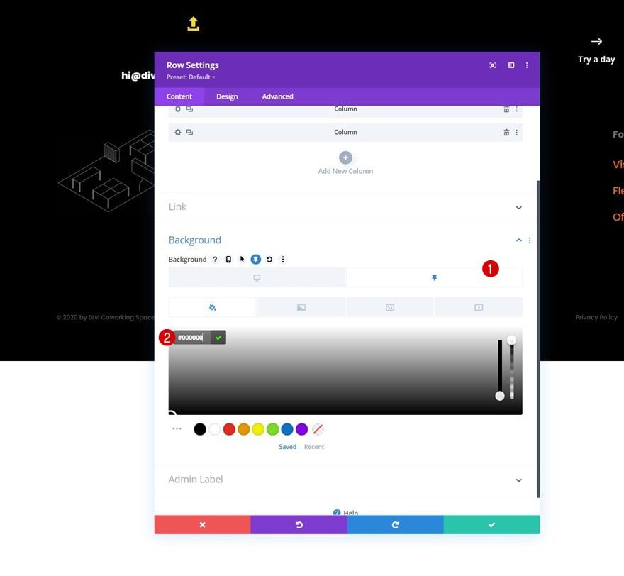
Row Sticky Styles
Background Color
Now that we’ve turned our row sticky, we can apply sticky styles to the row and all its child elements. Start by adding a sticky background color to row #1.
- Sticky Background Color: #000000
Apply Sticky Styles to Blurb Modules in Column 1 & 3
Icon Settings
Next, open the Blurb Modules in columns 1 and 3 and add a sticky circle color.
- Sticky Circle Color: #ea6c01
Title Text Settings
Add a sticky title text color too.
- Sticky Title Text Color: #ea6c01
Apply Sticky Styles to Blurb Module in Column 2
Background Color
Then, open the Blurb Module in column 2 and apply a sticky background color.
- Sticky Background Color: #ea6c01
4. Save All Template & Theme Builder Changes
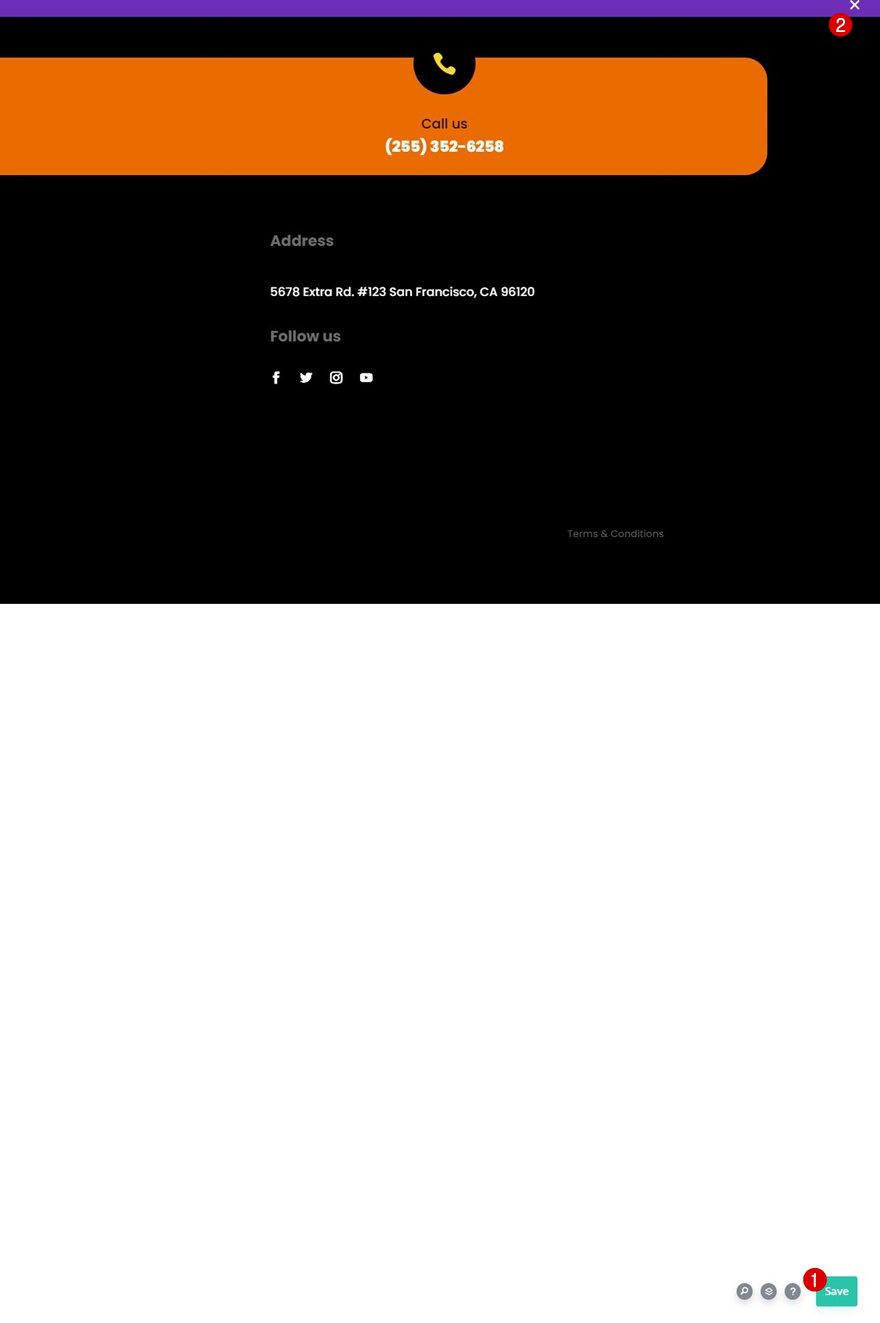
Once you’ve completed the sticky steps, make sure you save your template and theme builder changes before viewing the outcome on your website!
Preview
Now that we’ve gone through all the steps, let’s take a final look at the outcome across different screen sizes.
Desktop
Mobile
Final Thoughts
In this post, we’ve shown you how to get creative with Divi’s sticky options. More specifically, we’ve shown you how to build a sticky footer bar that merges with the main footer area once people scroll down the page they’re on. You were able to download the template JSON file for free as well! If you have any questions or suggestions, feel free to leave a comment in the comment section below.
If you’re eager to learn more about Divi and get more Divi freebies, make sure you subscribe to our email newsletter and YouTube channel so you’ll always be one of the first people to know and get benefits from this free content.


I have been thinking about adding something similar to my website. Are there any analytics or data behind how successful adding something like this is to the site?