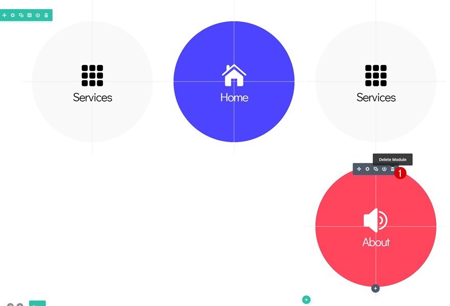
When you’re building a website with WordPress, you can always choose which page comes first when people visit your website directly. Most website creators send visitors immediately to their homepage. But you can also choose another approach that allows visitors to choose which page on your website they go to first by adding an icon navigation page as your homepage. Once people click through to their page of choice, they’ll have the normal website experience again with a menu bar at the top of the page that allows them to navigate to other pages. This means that they won’t have to go back to this icon navigation page once they’ve passed it after first interaction.
In this tutorial, we’ll show you how to create a modern and 100% responsive icon navigation homepage that will look good across all screen sizes. We’ll also help you make this the homepage of your website and remove the primary menu bar and footer at first interaction.
Let’s get to it!
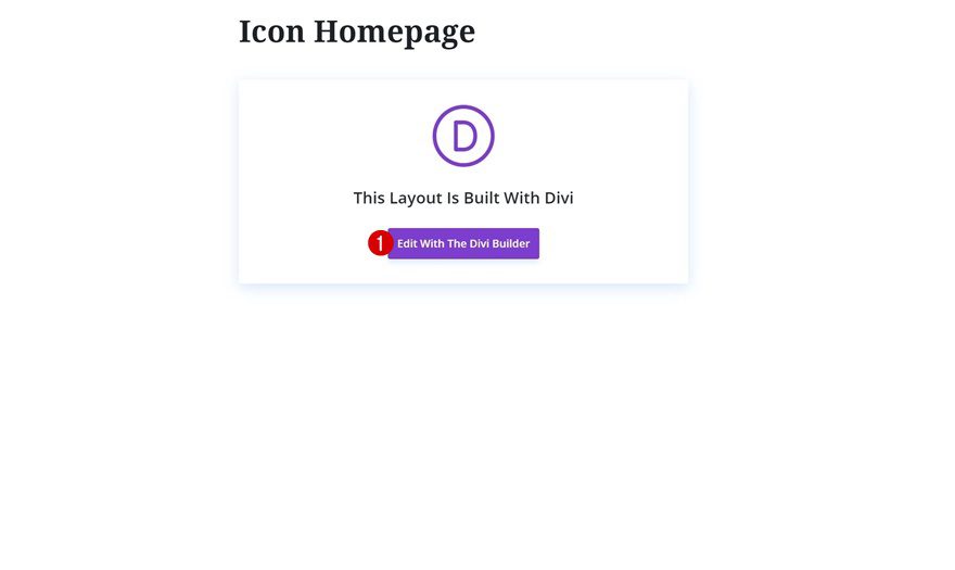
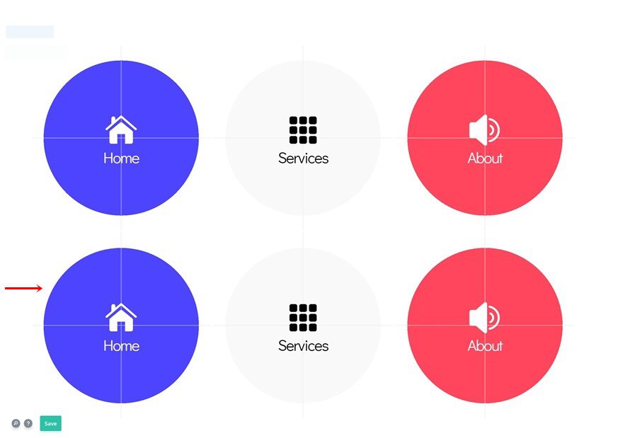
Preview
Before we dive into the tutorial, let’s take a quick look at the outcome on different screen sizes.
Create New Page
Subscribe To Our Youtube Channel
Add New Page
Start by adding a new page to your WordPress website.
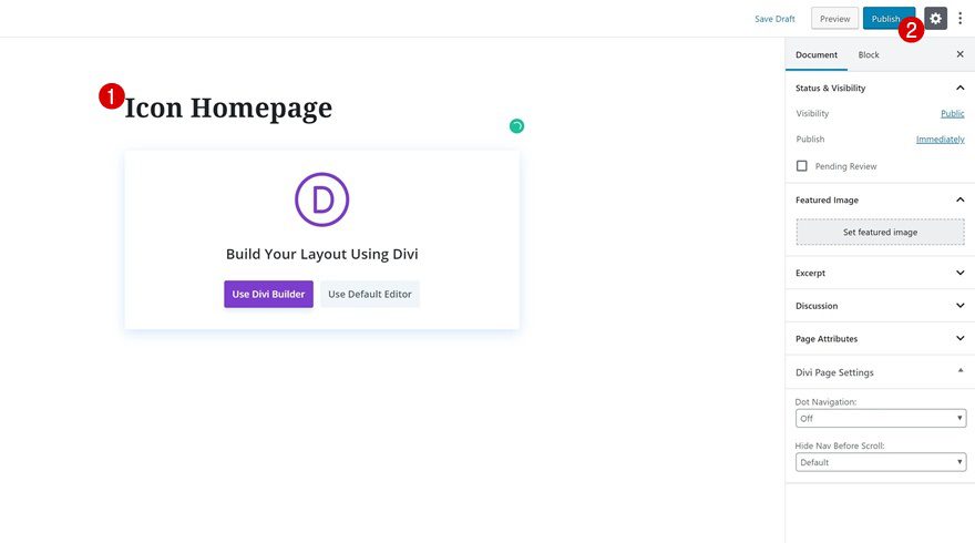
Give Your Page a Title & Publish
Give your page a title and publish the page right away.
Set Page as Homepage
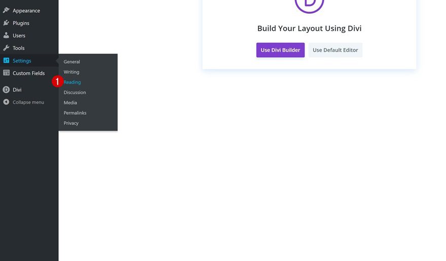
Go to Website Reading Settings
Then, go to the reading settings of your website.
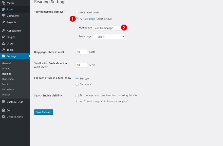
Set New Page as Homepage
Here, we’re going to select the new icon navigation page as the homepage of our website.
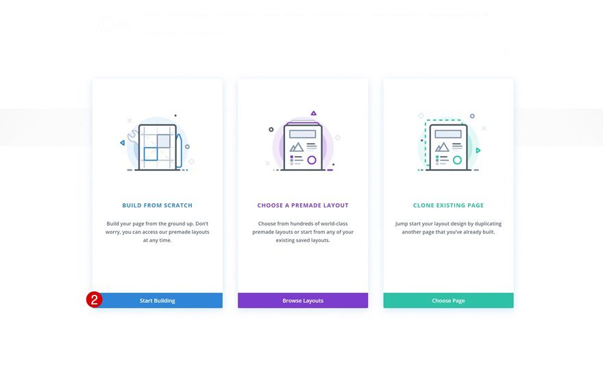
Now that we’ve selected the homepage, we can start building our icon navigation page. Go back to the page you’ve created and switch over to Divi and its Visual Builder.
Once you do so, you’ll get three possibilities. You can start building from scratch, choose a premade layout or clone an existing page. Choose the first option.
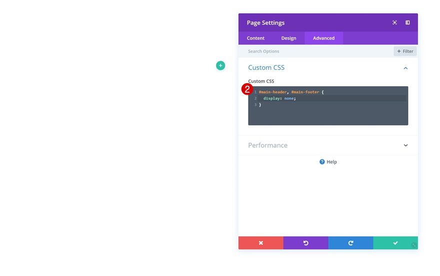
Because this is a navigation page, we want the focus to be on the menu items that we create manually. That’s why we’ll hide the primary menu bar and footer on this page. Once people continue to the website, they’ll get the primary menu bar and footer back.
#main-header, #main-footer {
display: none;}
Let’s Start Designing!
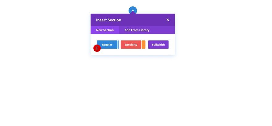
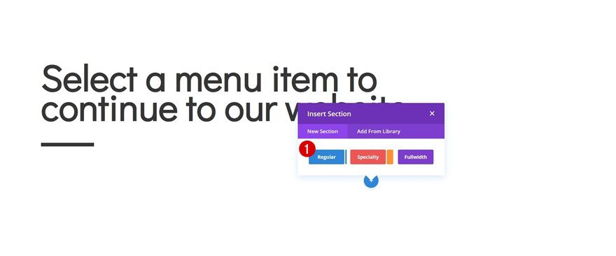
Add Section #1
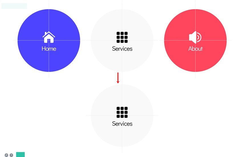
Let’s start creating our responsive design with Divi! Add the first regular section.
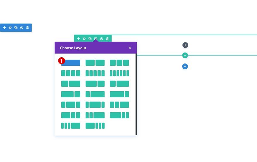
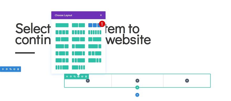
Add Row
Column Structure
Continue by adding a new row using the following column structure:
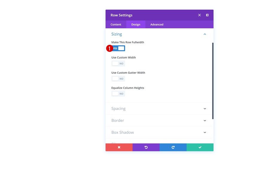
Sizing
Without adding any modules yet, open the row settings and enable the ‘Make This Row Fullwidth’ option in the sizing settings.
- Make This Row Fullwidth: Yes
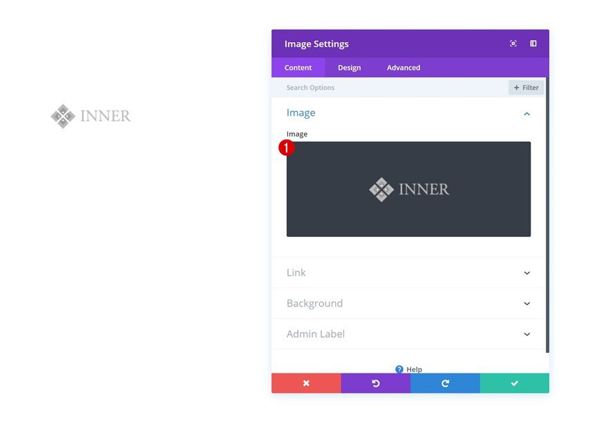
Add Image Module
Upload Company Logo
The first module we need in this row is an Image Module. Upload your company logo so people know they’ve landed on the correct website.
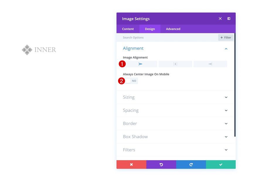
Alignment
Then, change the image alignment in the design tab. Make sure you disable the ‘Always Center Image On Mobile’ option.
- Image Alignment: Left
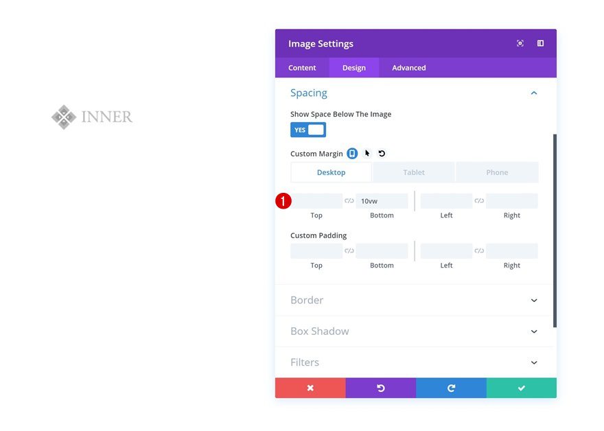
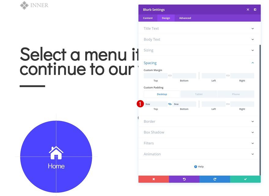
Spacing
Add some custom bottom margin next.
- Bottom: 10vw (Desktop), 20vw (Tablet & Phone)
Add Text Module
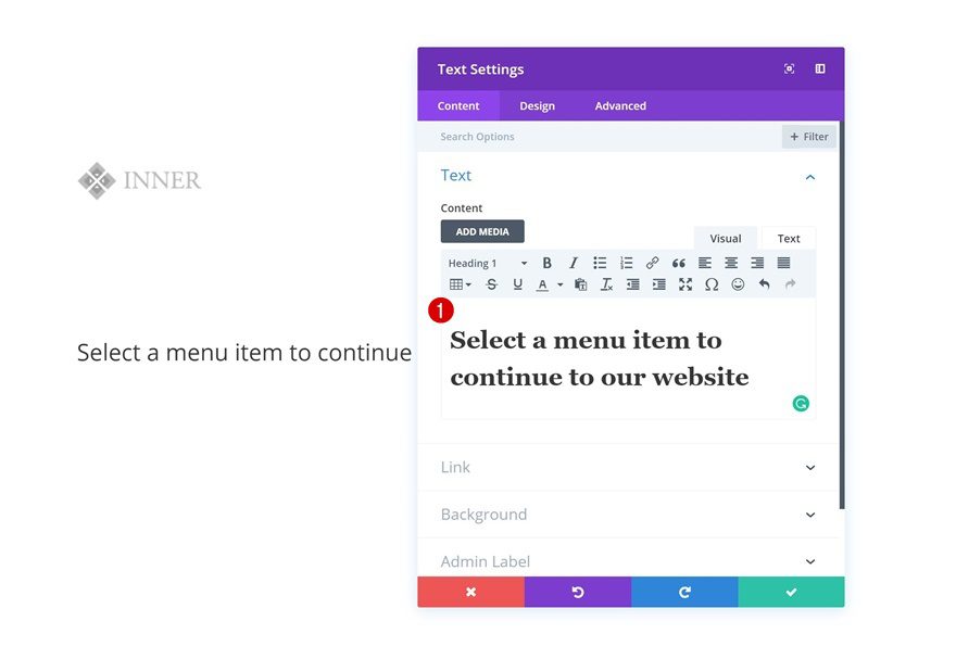
Add H1 Content
The next module we need is a Text Module. Add some H1 content of your choice.
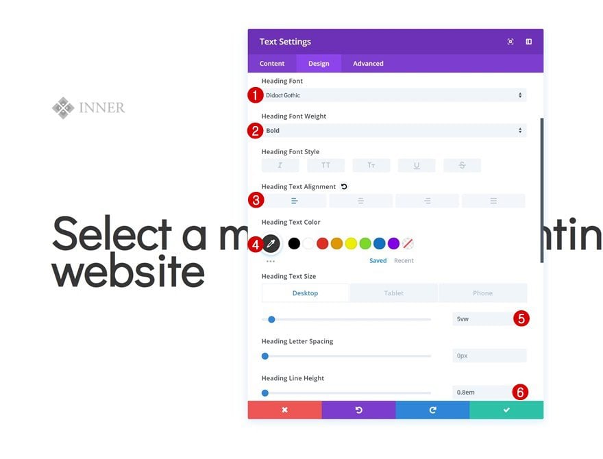
H1 Text Settings
Continue by modifying the H1 text settings in the design tab.
- Heading Font: Didact Gothic
- Heading Font Weight: Bold
- Heading Text Alignment: Left
- Heading Text Color: #333333
- Heading Text Size: 5vw (Desktop), 6vw (Tablet), 7vw (Phone)
- Heading Line Height: 0.8em
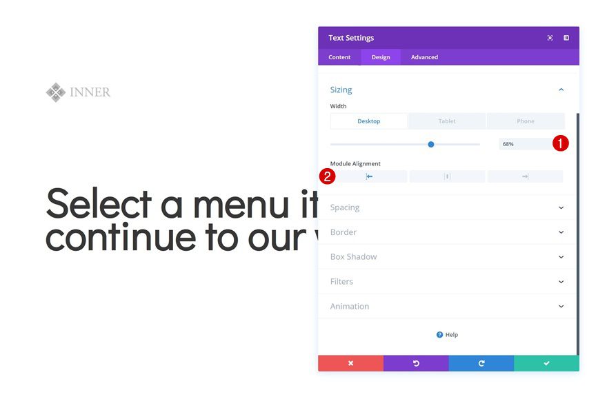
Sizing
Modify the sizing settings next.
- Width: 68% (Desktop), 80% (Tablet), 88% (Phone)
- Module Alignment: Left
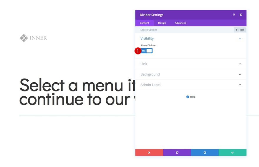
Add Divider Module
Visibility
The next and last module we need in this row is a Divider Module. Make sure the ‘Show Divider’ option is enabled.
- Show Divider: Yes
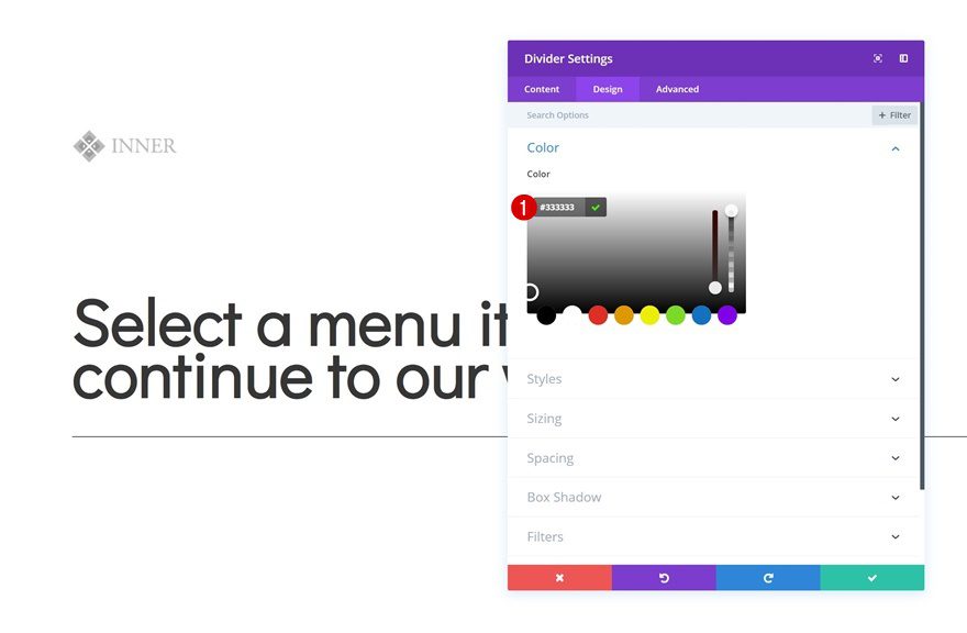
Color
Then, go to the design tab and change the icon color.
- Color: #333333
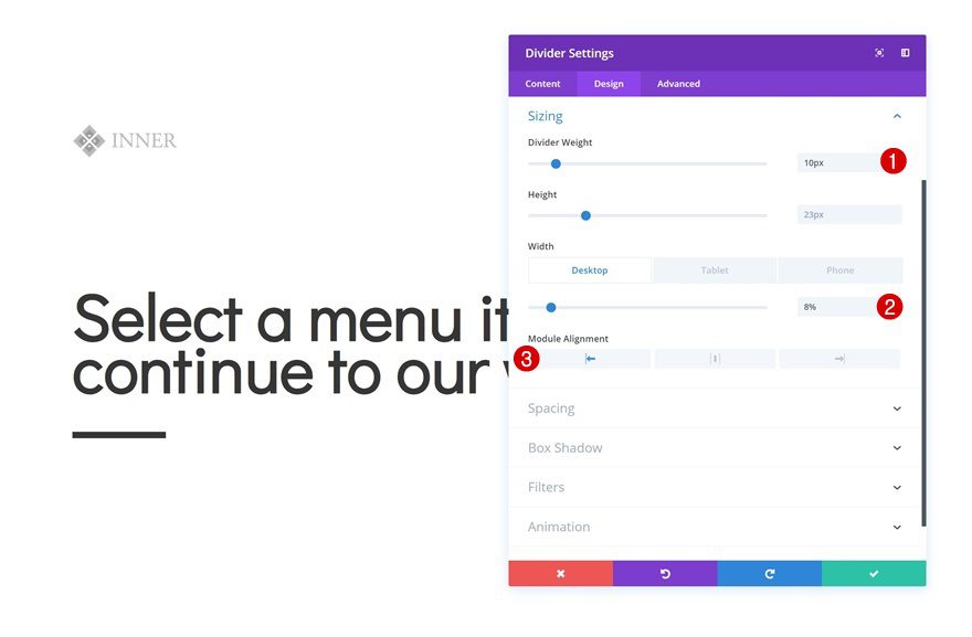
Sizing
Modify the module’s sizing settings too.
- Divider Weight: 10px
- Width: 8% (Desktop), 20% (Tablet), 25% (Phone)
- Module Alignment: Left
Add Section #1
On to the next section! Add a regular section below the previous one.
Add Row
Column Structure
Continue by adding a new row to the section.
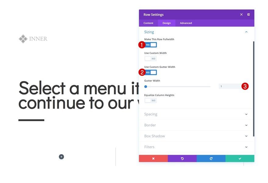
Sizing
Without adding any modules yet, open the row settings and modify the sizing settings.
- Make This Row Fullwidth: Yes
- Use Custom Gutter Width: Yes
- Gutter Width: 1
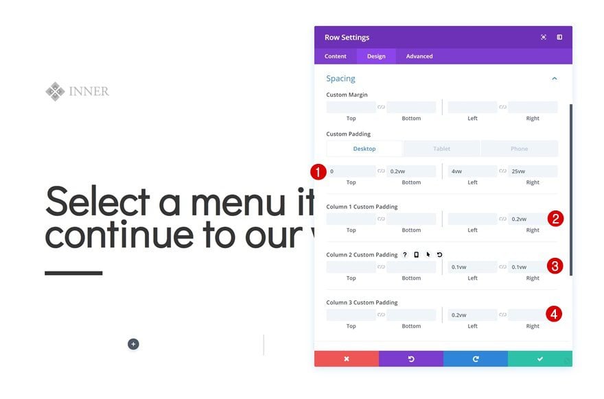
Spacing
Then, go to the spacing settings and make some changes across different screen sizes.
- Bottom Padding: 0.2vw
- Left Padding: 4vw (Desktop), 2vw (Tablet), 1vw (Phone)
- Right Padding: 25vw (Desktop), 2vw (Tablet), 1vw (Phone)
- Column 1 Right Padding: 0.2vw
- Column 2 Left Padding: 0.1vw
- Column 2 Right Padding: 0.1vw
- Column 3 Left Padding: 0.2vw
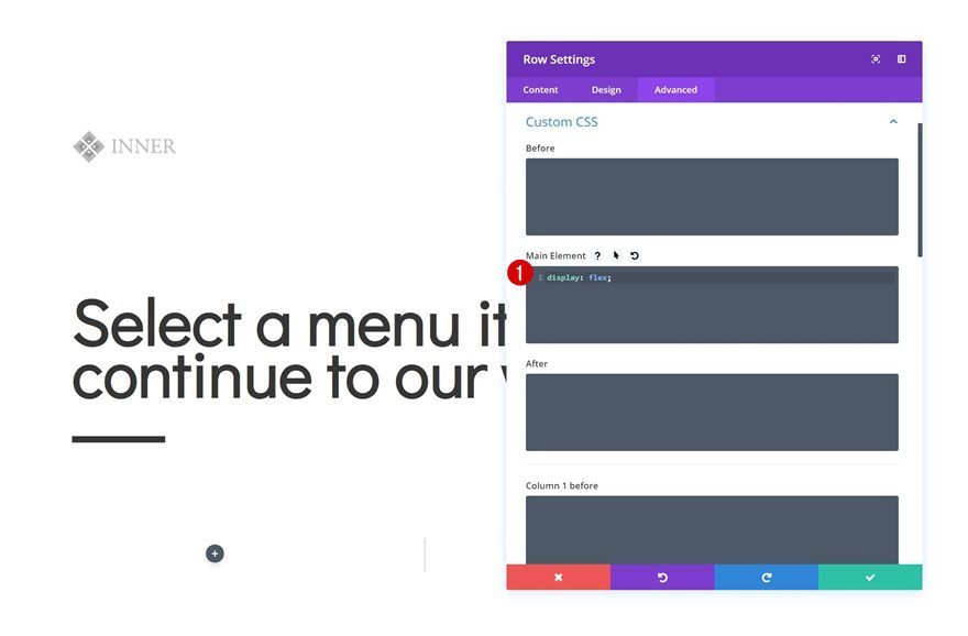
Custom CSS
We’re making sure all the columns appear next to each other, even on tablet and phone, by adding a single line of CSS code to the main element in the advanced tab.
display: flex;
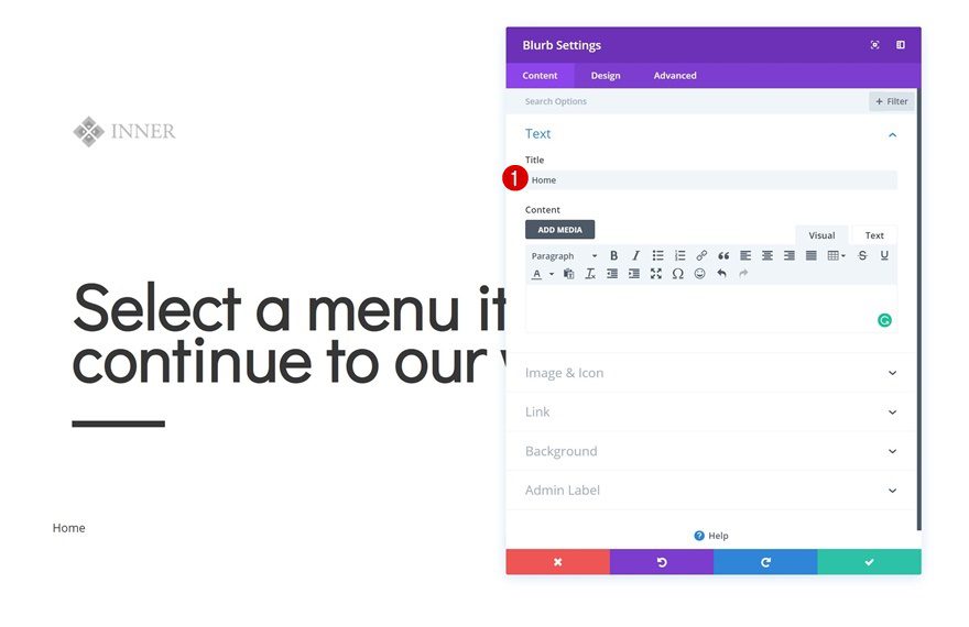
Add Blurb Module to Column 1
Add Title
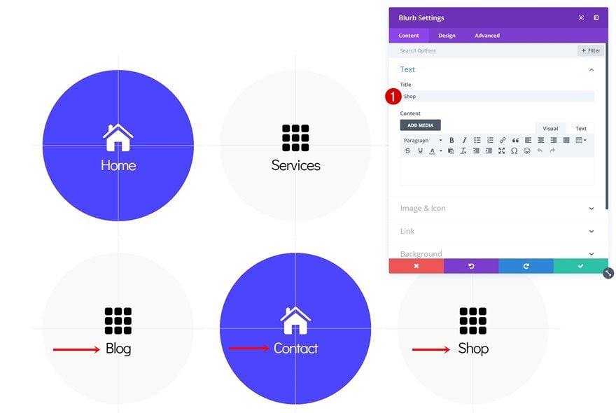
Now we can start adding our modules! Add a new Blurb Module to the first column and enter a title.
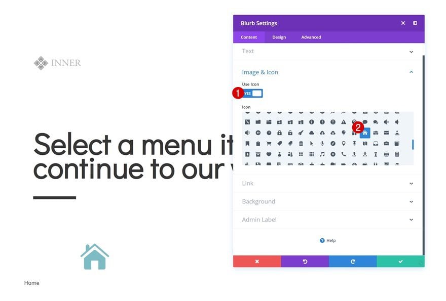
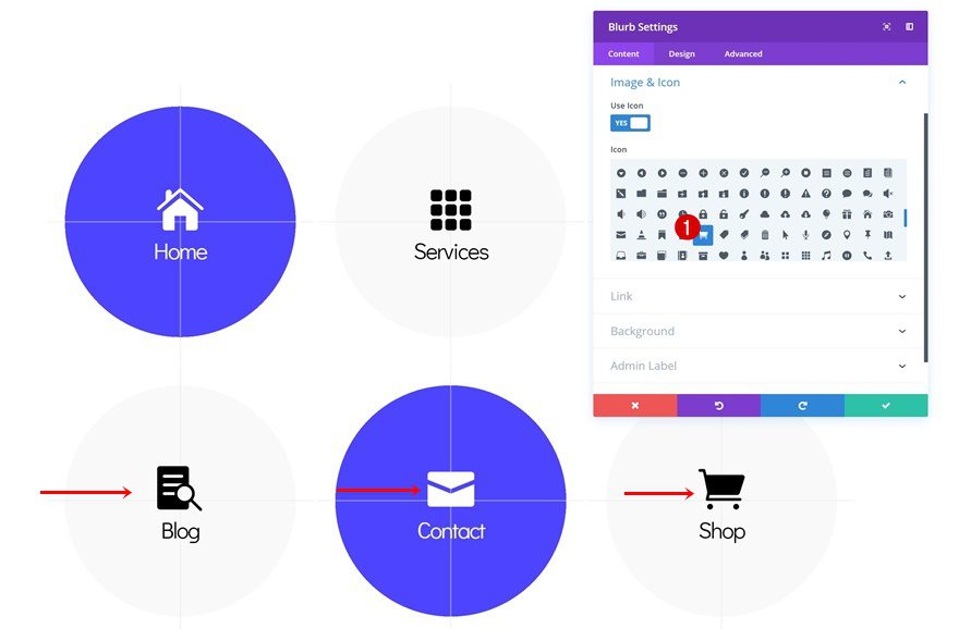
Select Icon
Then, select an icon of your choice.
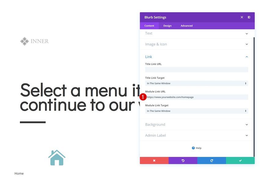
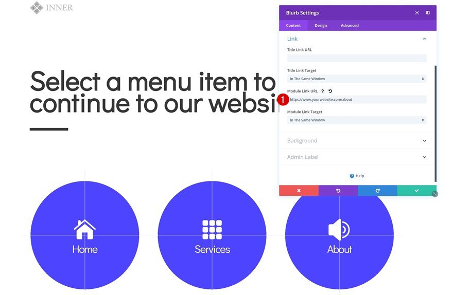
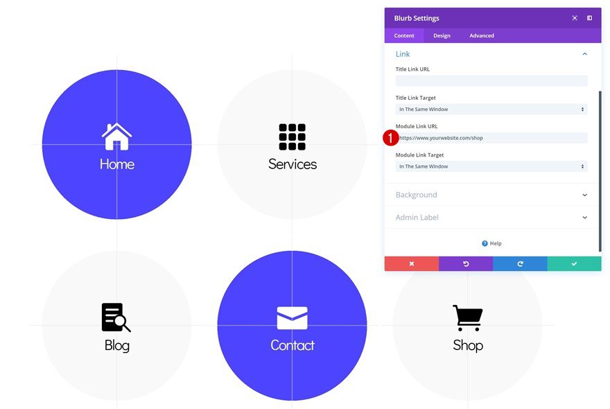
Link
Add a link to the module as well. Make sure you use the correct URL that’ll refer the visitors to the page they want to visit.
- Module Link URL: https://www.yourwebsite.com/homepage
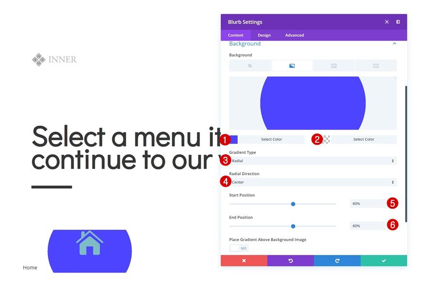
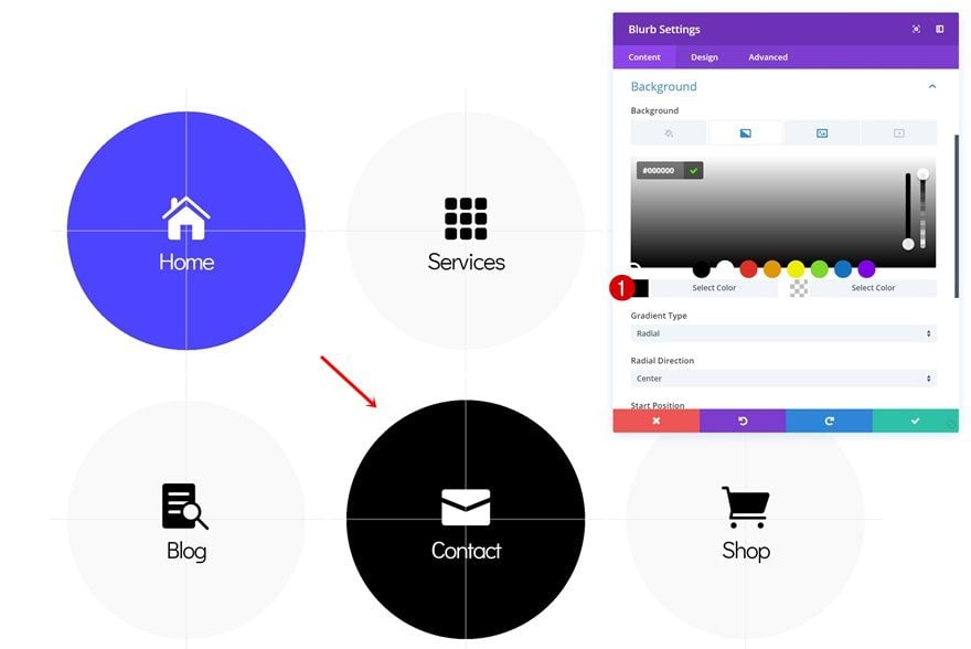
Gradient Background
Add a gradient background next.
- Color 1: #4b42ff
- Color 2: rgba(255,255,255,0)
- Gradient Type: Radial
- Radial Direction: Center
- Start Position: 60%
- End Position: 60%
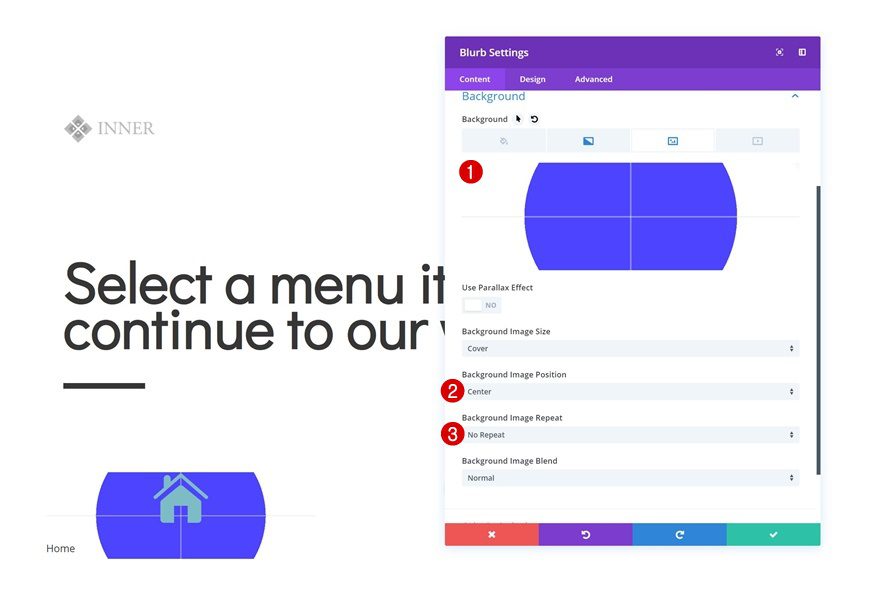
Background Image
Along with a background image. Save the following image to your desktop:

And use it in combination with the following background settings:
- Background Image Position: Center
- Background Image Repeat: No Repeat
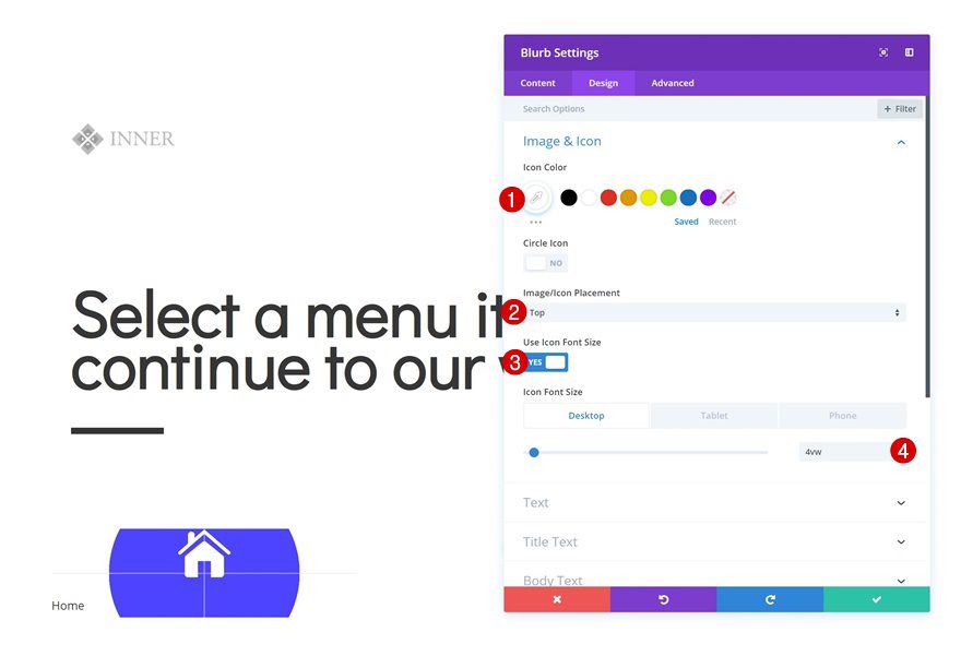
Icon Settings
Continue by modifying the icon settings in the design tab.
- Icon Color: #ffffff
- Icon Placement: Top
- Use Icon Font Size: Yes
- Icon Font Size: 4vw (Desktop), 6vw (Tablet), 8vw (Phone)
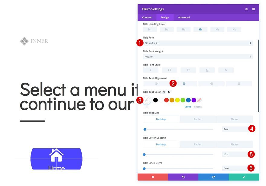
Title Text Settings
Change the title text settings too.
- Title Font: Didact Gothic
- Title Text Alignment: Center
- Title Text Color: #ffffff
- Title Text Size: 2vw (Desktop), 3vw (Tablet), 4vw (Phone)
- Title Letter Spacing: -2px
- Title Line Height: 0em
Spacing
And add some custom top and bottom padding values for the different screen sizes.
- Top Padding: 9vw (Desktop & Tablet), 12vw (Phone)
- Bottom Padding: 9vw (Desktop & Tablet), 12vw (Phone)
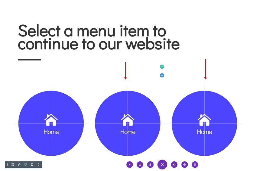
Clone Blurb Module Twice & Place Duplicates in Remaining Columns
Once you’re done modifying the Blurb Module in column 1, you can go ahead and clone the module twice. Place the duplicates in the remaining columns of the row.
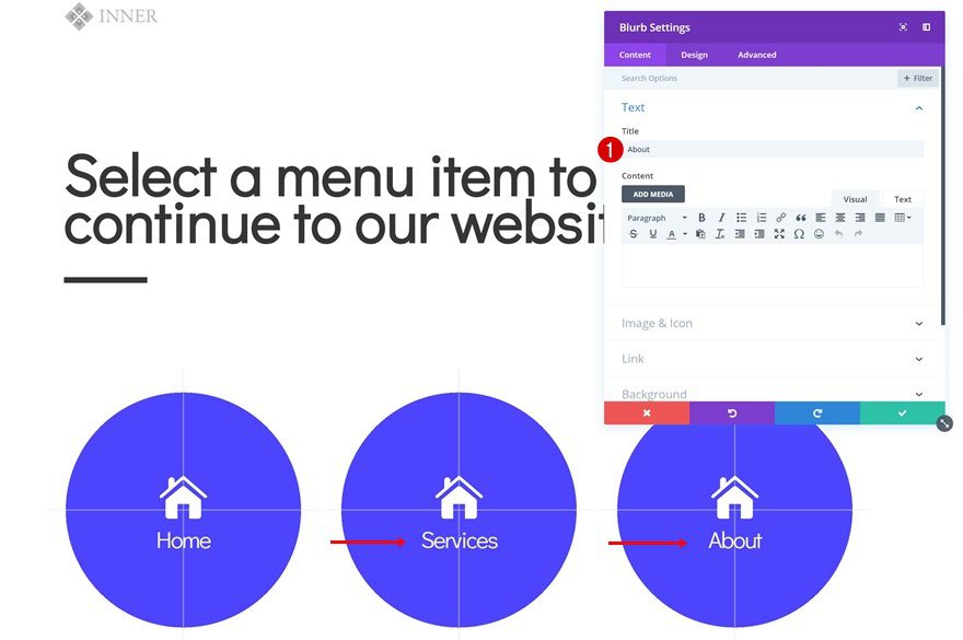
Change Blurb Content
Of course, you’ll need to change the titles of each duplicate.
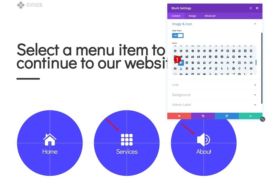
Change Blurb Icons
Along with the icons.
Change Blurb Links
Match the new Blurb Modules with a unique URL that leads to the correct page.
- Module Link URL: https://www.yourwebsite.com/about
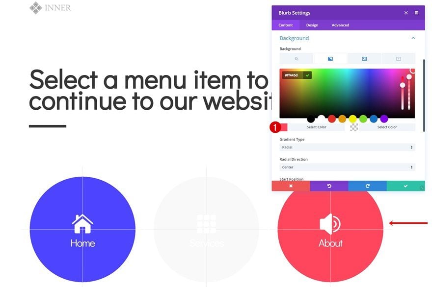
Change Blurb Gradient Backgrounds
Then, change the first colors of the gradient backgrounds of both duplicates.
- Color 1: #f9f9f9
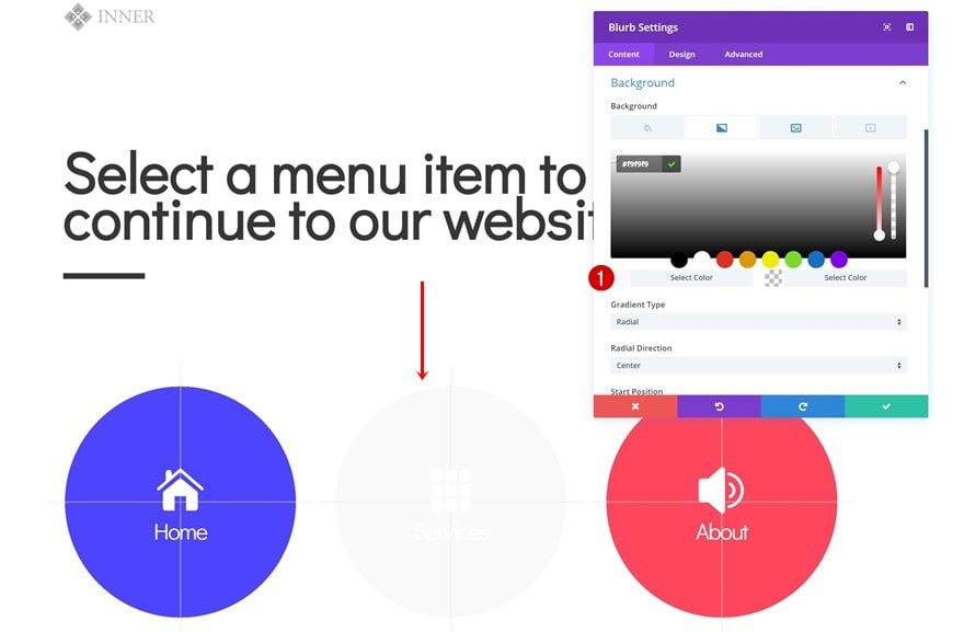
- Color 1: #ff445d
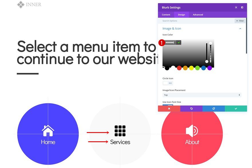
Change Icon & Text Colors of Blurb Module in Column 2
And match the Blurb Module’s icon and text colors with the new gradient background color.
- Icon Color: #000000
- Title Text color: #000000
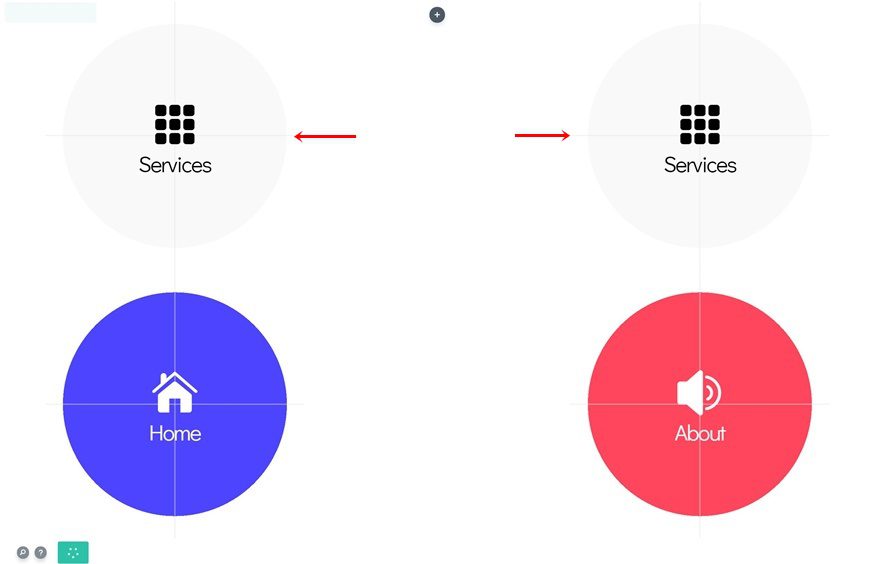
Clone Entire Row
Once you’ve completed the row, you can clone it entirely.
Clone Blurb Module in Column 2
Clone the Blurb Module in column 2.
Place Light-Background Blurb Modules in Column 1 & Column 3
And place the light-background Blurb Modules in column 1 and 3.
Place Color-Background Blurb Module in Column 2
Move one of the color-background Blurb Modules to the second column.
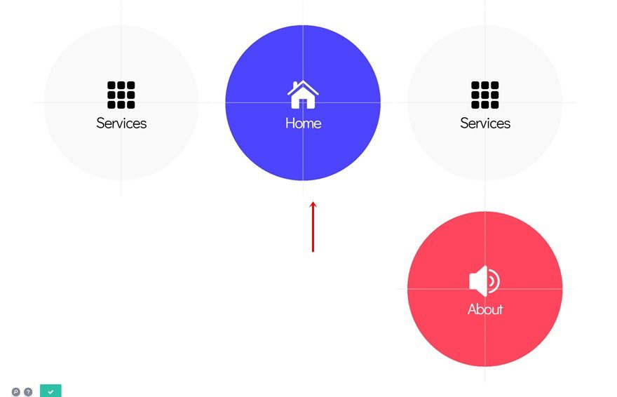
Remove Remaining Blurb Module
And delete the remaining Blurb Module.
Change Blurb Content
Again, you’ll need to change the titles of each Blurb Module.
Change Blurb Icons
Along with the icons.
Change Blurb Links
And the links too.
- Module Link URL: https://www.yourwebsite.com/shop
Change Gradient Background of Blurb Module in Column 2
Last but not least, change the first color of the gradient background of the Blurb Module in column 2.
- Color 1: #000000
Preview
Now that we’ve gone through all the steps, let’s take a final look at the outcome across different screen sizes.
Final Thoughts
In this post, we’ve shown you how to create an icon navigation page and use it as your homepage. This approach allows your visitors to choose which page they navigate to before they get to see the website’s content. Once someone’s clicked through a menu item, they’ll experience the normal navigation through the primary menu bar again. If you have any questions or suggestions, make sure you leave a comment in the comment section below!


Thanks for this Tutorial: A responsive Icon Navigation Home Page. It stands out the best among the versions I have read.
I could not find the CSS Links you mentioned would be left at the end of the tutorial
Would you direct me to where to find them.
Thanks.
Informative post. Video is missing and we keep 80% in mind what they watch. Rest it is best.
Please also confirm the name of the social share plugin you use. I am just seeing the left side of the screen. I tried to find the via inspect source of this page but fail
Nice article with great knowledge detailed , Thanks ?
nice article..
but why didn’t you choose “Blank page” template instead of writing a CSS?
“Add Custom CSS to Hide Primary Menu Bar & Footer”
very informative article step by step guide with screen shots. thanks for writing and sharing this knowledgeable post
It is a very easy and detailed post by you. Detailing in the screenshots with step by step. Thank you!
best article with great knowledge
Best CA coaching center in kerala
Studium ,one of the best ca coaching center in kochi ,kerala provides excellent training in ca foundation,ca intermediate,ca final .
Interesting ideas
However, I do not think that the homepage of a site is the most important. All pages are important. I manage sites where the homepages do not appear in the search results, because this is not necessary. On the other hand internal pages of its sites are on the front page of Google and Bing. It only depends on how you design the architecture of your site and the purpose. Do not let search engines dictate their law, play with the possibilities.
I had some customers with a „blank“ homepage. Immediately after I added content to this homepage, the ranking in google went much better…
And yes, you can ignore the law of search engines – your competitors will be happy about this 😉
Hi,
Your way of writing a blog is really different and unique. It was really interesting.
Impress by your work.
keep Up the good work.
Looks very nice! Are you shooting a video to show how it works? I think this would be easier to understand.
And is it possible to save it as a global element?
Thank you very much. DIVI is really amazing and gets better and better.
I fear Oliver is spot on in his response. I wonder if, Divi, you have a suggestion for how to make the actual home page menu behave this way??? In other words, is there a way to make a responsive header menu that, when someone loads the site, they are presented with the header menu already open as as a responsive full-page overlay that, when a selection from the menu is made, causes the menu to retreat to its typical presentation as designed into the site (sidebar, header, hamburger…depending on the responsive design). I’ve seen this done but have no idea how to do it. Any thoughts on that?
Now I would a tutorial on how to achieve that as well 🙂
Nice trick ! Thanks 🙂
Don’t do this. Your homepage is the most important page of your web. If you don’t have content on your homepage google may think nothing is the most important thing you have. This may result in a not so good ranking….
This design may look good – for people – but not for google…
Agreed – A homepage with no content; it will negatively impact your SEO – Yikes, don’t do this (as well as human traffic) 😉 And as for “good looking for people”, that may be, but I know from my own experience, large numbers will close the page and go to another website, up goes the bounce rate!
Yes, I believe, Oliver is right. The design looks sleeks but the cost in terms of ranking could be great.