

With Divi and its new position options, turning your header into a fixed one is easier than ever. With just a few clicks, you can turn your static custom-built header into a fixed one that follows your visitors throughout their stay on your website. In this tutorial, we’ll show you the general steps you need to follow to create your fixed Divi header. This is the order we’ll follow:
- Go to the Divi Theme Builder & start building the global header
- Once inside the global header template, use one single section with multiple rows to create the header with all needed elements
- Use Divi’s built-in section position options to make the entire section stay fixed to the top
- Create a custom body template and add some top margin to create container space for the fixed Divi header
- Save all Divi Theme Builder changes and view the outcome on your website
You’ll able to download the default website template’s JSON file for free as well! Let’s get to it.
- 1 Preview
- 2 Download The Global Website Template for FREE
- 3 Download For Free
- 4 You have successfully subscribed. Please check your email address to confirm your subscription and get access to free weekly Divi layout packs!
- 5 1. Go to Divi Theme Builder & Start Building Global Header
- 6 2. Use Regular Section to Build Fullwidth Header
- 7 3. Use Divi’s Position Options to Stick Section to Top
- 8 4. Add Top White Space for Header
- 9 4. Save Theme Builder Changes
- 10 Preview
- 11 Final Thoughts
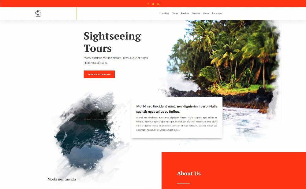
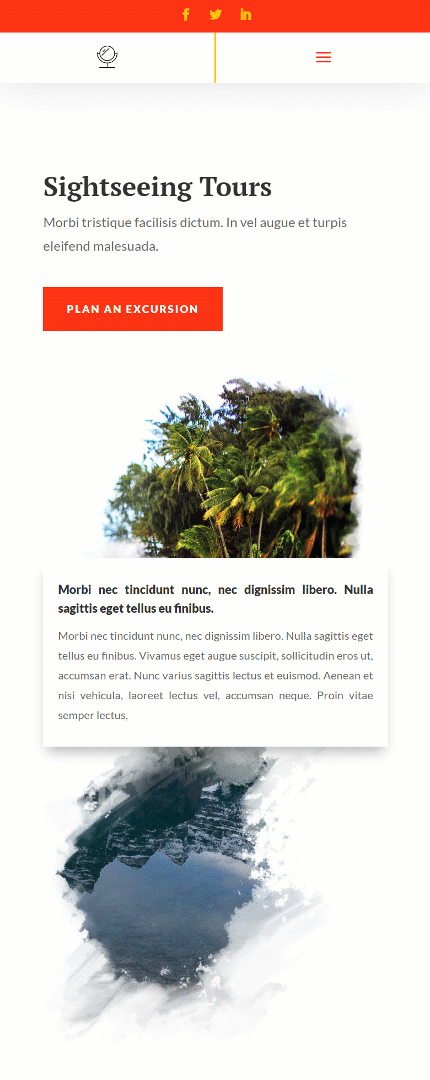
Preview
Before we dive into the tutorial, let’s take a quick look at the outcome across different screen sizes.
Desktop
Mobile
Download The Global Website Template for FREE
To lay your hands on the free global website template, you will first need to download it using the button below. To gain access to the download you will need to subscribe to our newsletter by using the form below. As a new subscriber, you will receive even more Divi goodness and a free Divi Layout pack every Monday! If you’re already on the list, simply enter your email address below and click download. You will not be “resubscribed” or receive extra emails.

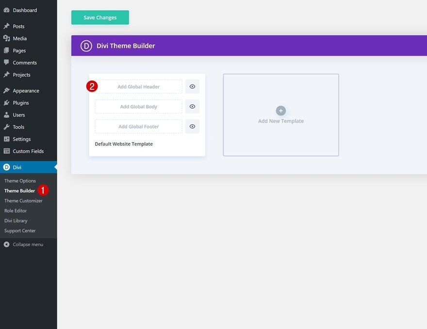
1. Go to Divi Theme Builder & Start Building Global Header
Go to Divi Theme Builder
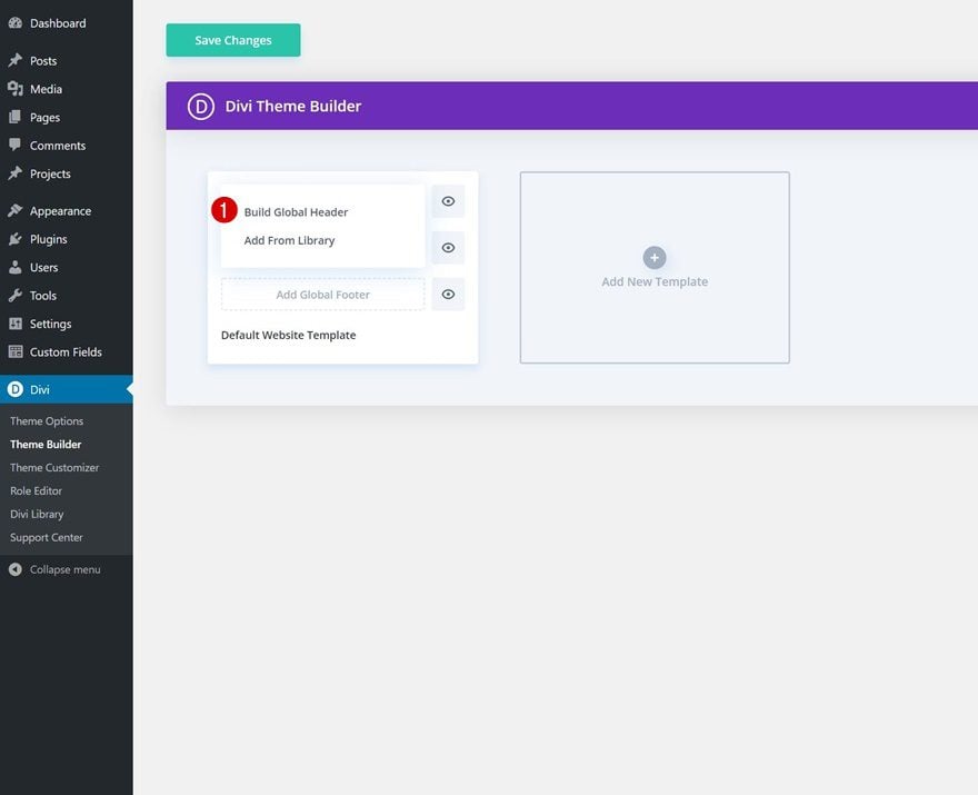
Start by going to the Divi Theme Builder. Once there, click on ‘Add Global Header’.
Build Global Header
And start building the header from scratch by selecting ‘Build Global Header’.
2. Use Regular Section to Build Fullwidth Header
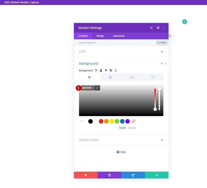
Section Settings
Background Color
Once inside the template editor, you’ll notice a section. Open that section and use a white background color for it.
- Background Color: #FFFFFF
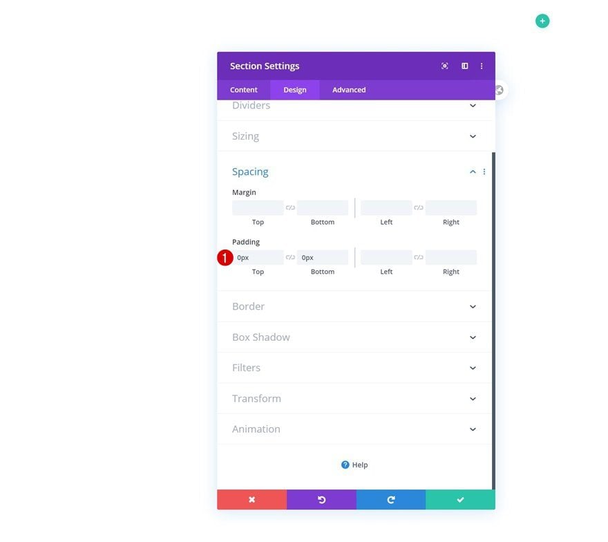
Spacing
Then, move on to the design tab and remove all default top and bottom padding.
- Top Padding: 0px
- Bottom Padding: 0px
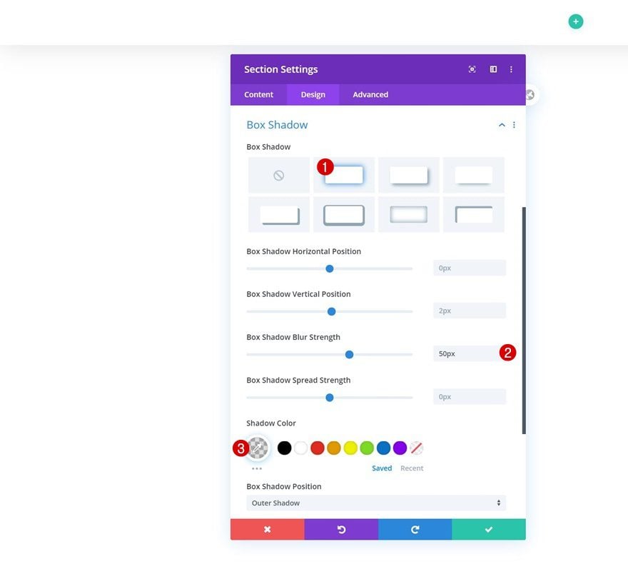
Box Shadow
Add a box shadow too.
- Box Shadow Blur Strength: 50px
- Shadow Color: rgba(0,0,0,0.12)
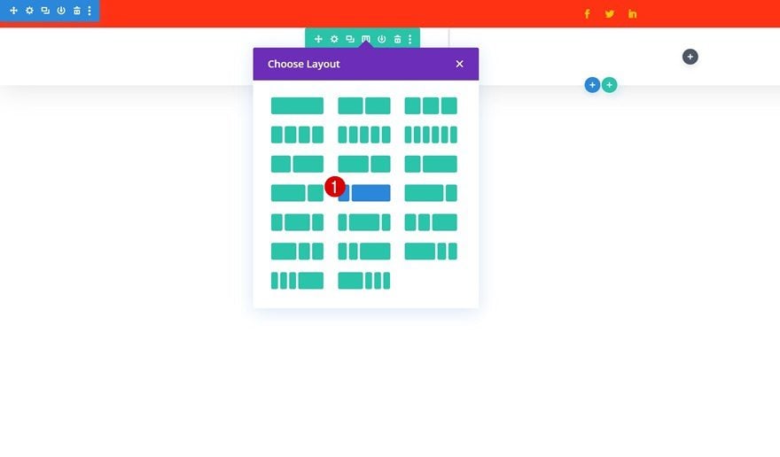
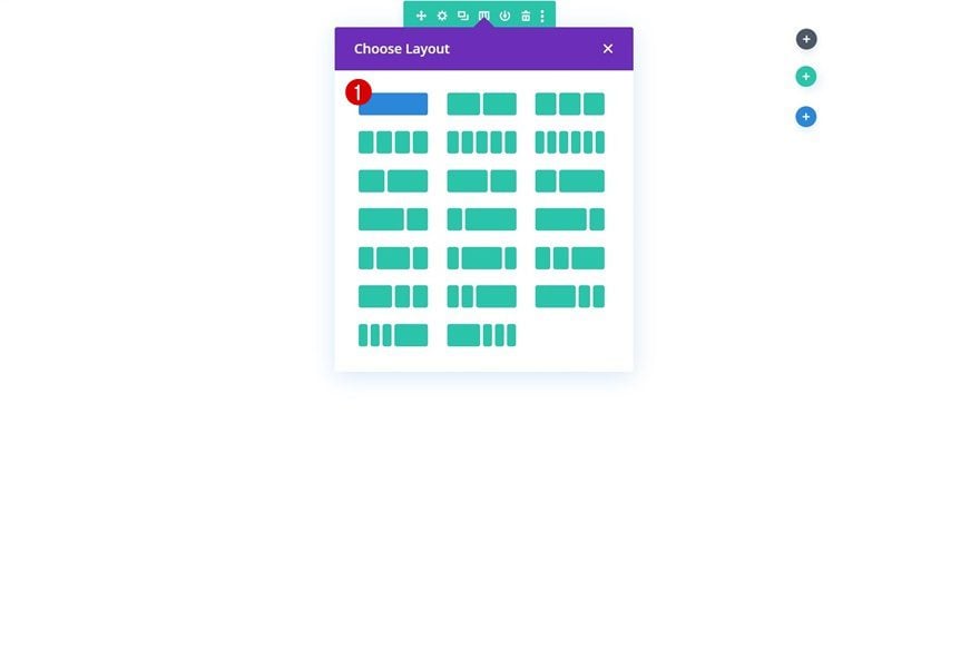
Add Row #1
Column Structure
Continue by adding a new row to the section using the following column structure:
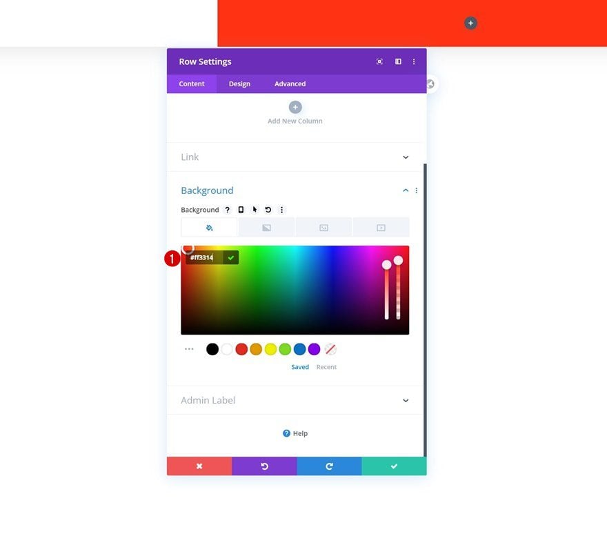
Background Color
Without adding any modules yet, open the row settings and change the background color.
- Background Color: #ff3314
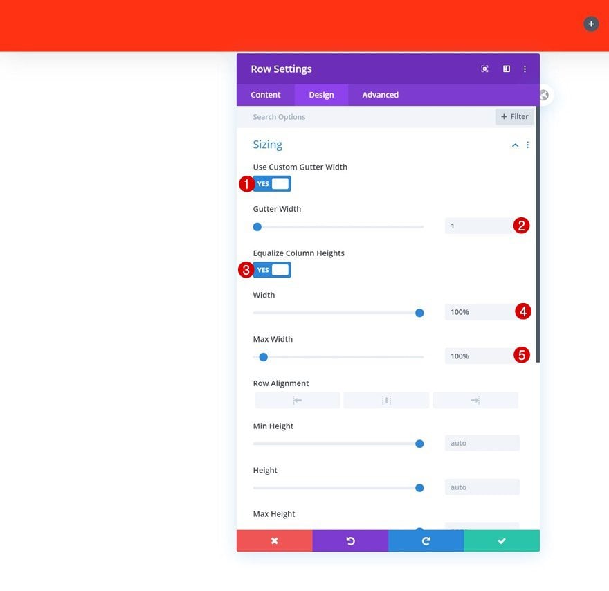
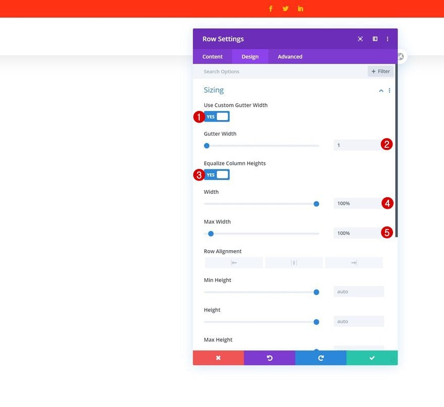
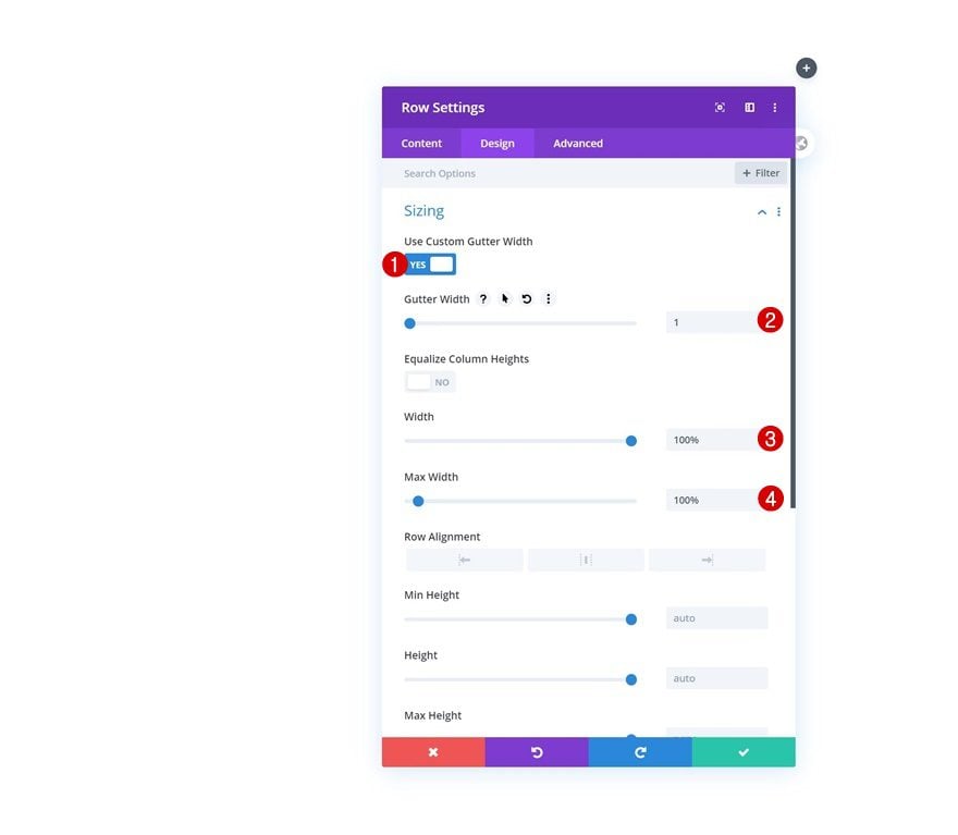
Sizing
Then, move on to the row’s design tab and modify the sizing settings as follows:
- Use Custom Gutter Width: Yes
- Gutter Width: 1
- Equalize Column Heights: Yes
- Width: 100%
- Max Width: 100%
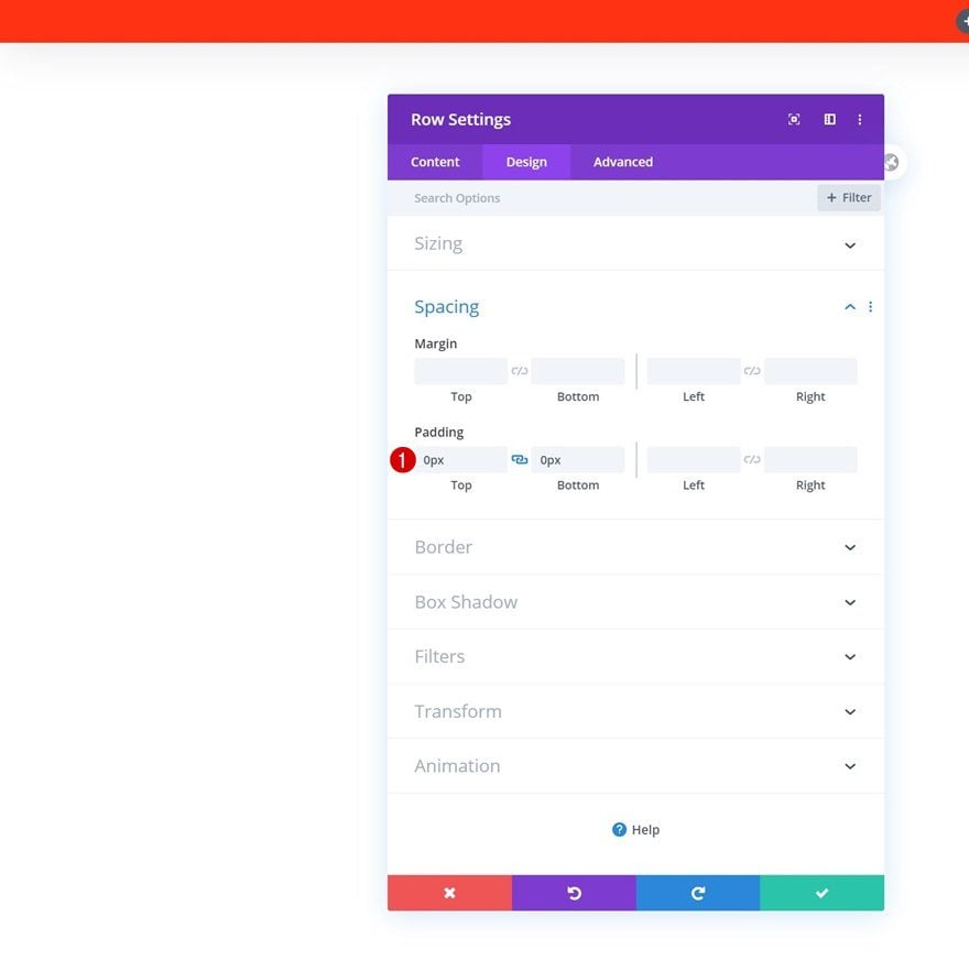
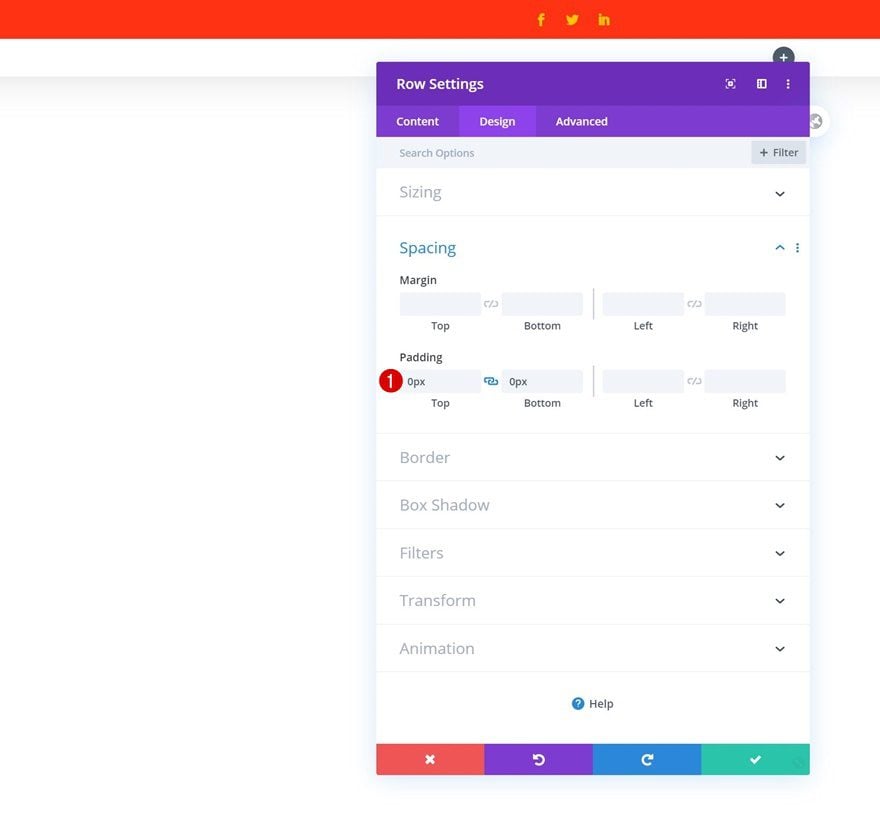
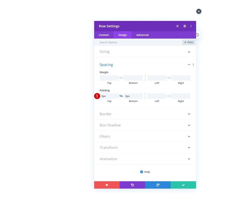
Spacing
Remove all default top and bottom padding too.
- Top Padding: 0px
- Bottom Padding: 0px
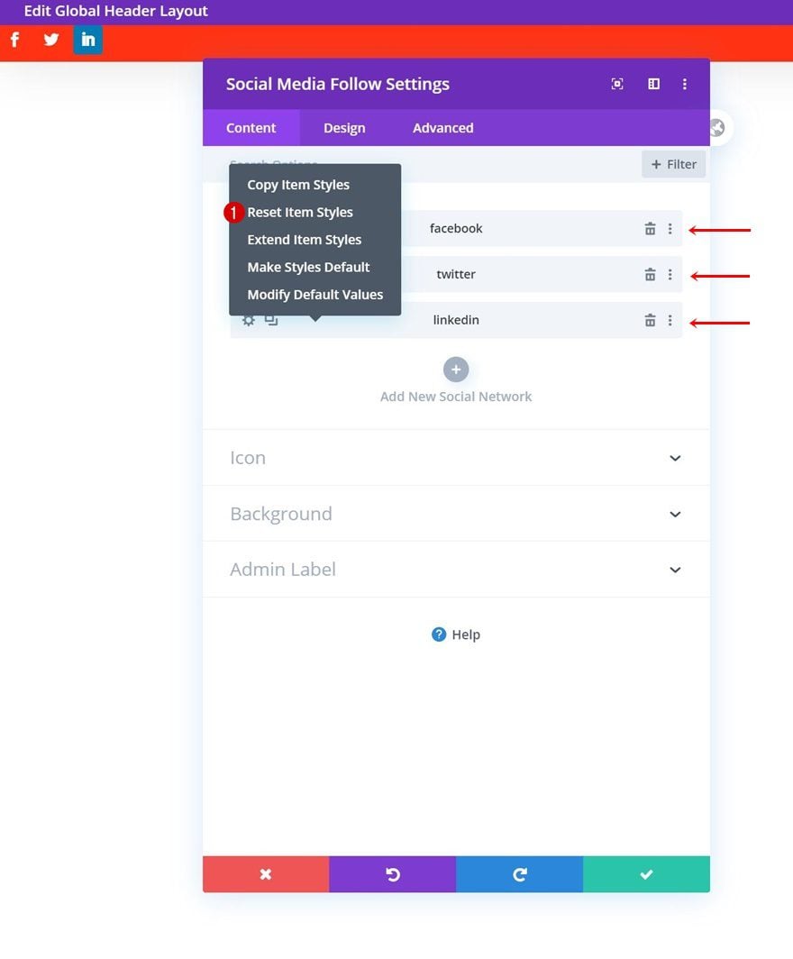
Add Social Networks of Choice
The only module we need in the row is a Social Media Follow Module. Add the social networks of your choice.
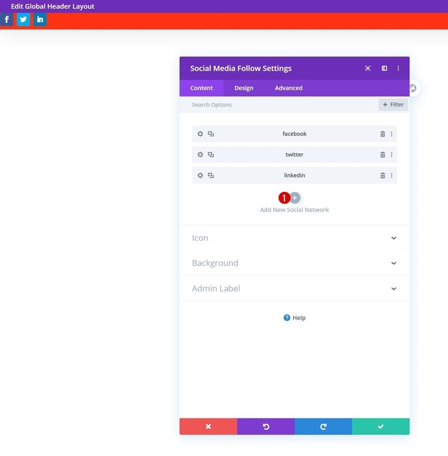
Reset Item Styles for Each Social Network Individually
Continue by resetting the item styles for each social network individually.
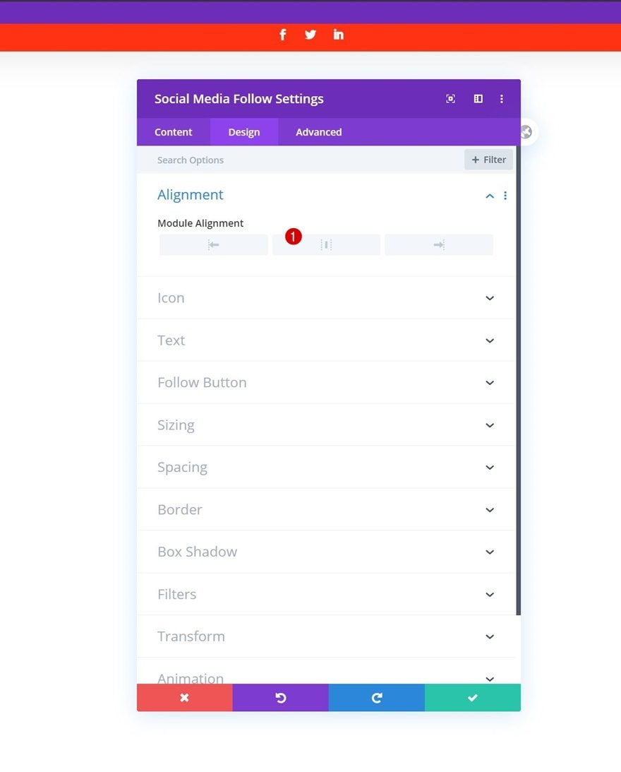
Alignment
Then, go the module’s design tab and change the module alignment.
- Module Alignment: Center
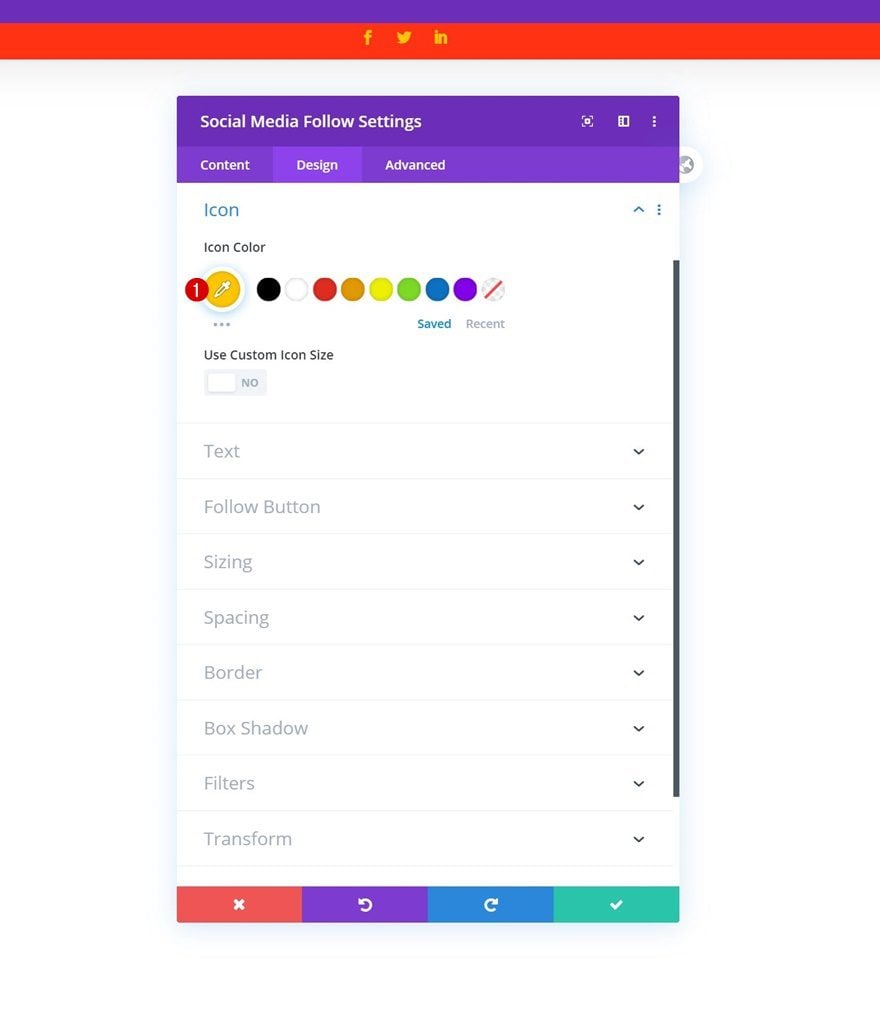
Icon Settings
Modify the icon color next.
- Icon Color: #ffc600
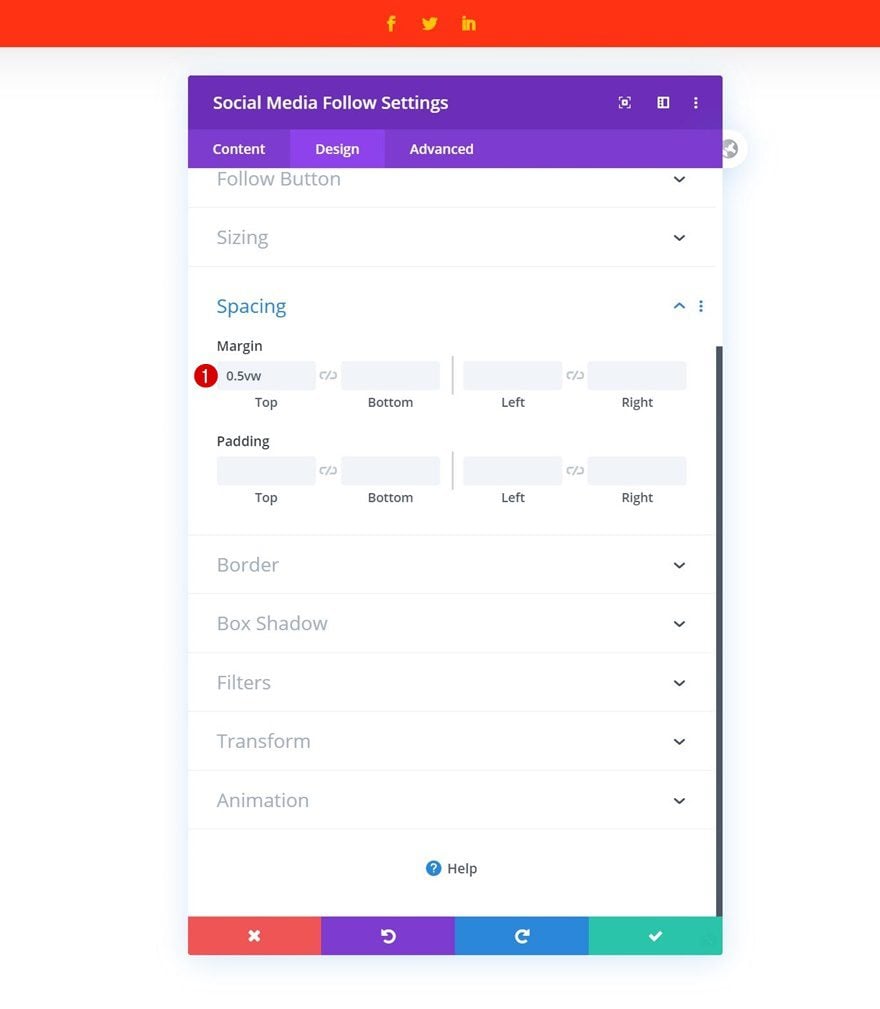
Spacing
And complete the module’s settings by adding some top margin.
- Top Margin: 0.5vw
Add Row #2
Column Structure
On to the next row! Use the following column structure:
Sizing
Without adding any modules yet, open the row settings and allow the row to take up the entire section’s width.
- Use Custom Gutter Width: Yes
- Gutter Width: 1
- Equalize Column Heights: Yes
- Width: 100%
- Max Width: 100%
Spacing
Remove all default top and bottom padding too.
- Top Padding: 0px
- Bottom Padding: 0px
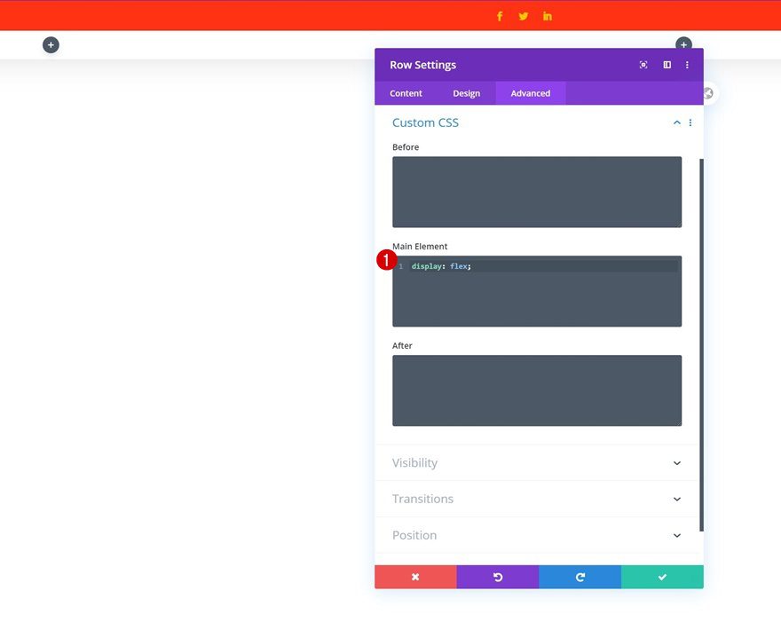
Main Element
And to make sure all column content appears next to each other on smaller screen sizes, we’ll add one line of CSS code to the row’s main element.
display: flex;
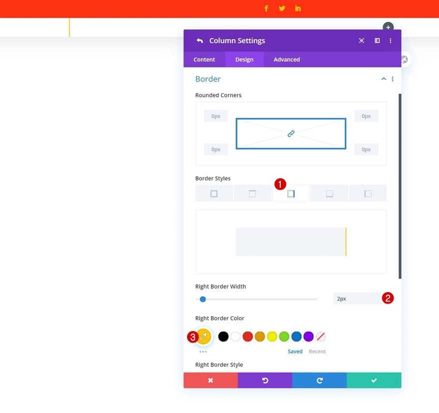
Column 1 Border
And complete the row settings by opening the column 1 settings and adding a right border.
- Right Border Width: 2px
- Right Border Color: #ffc600
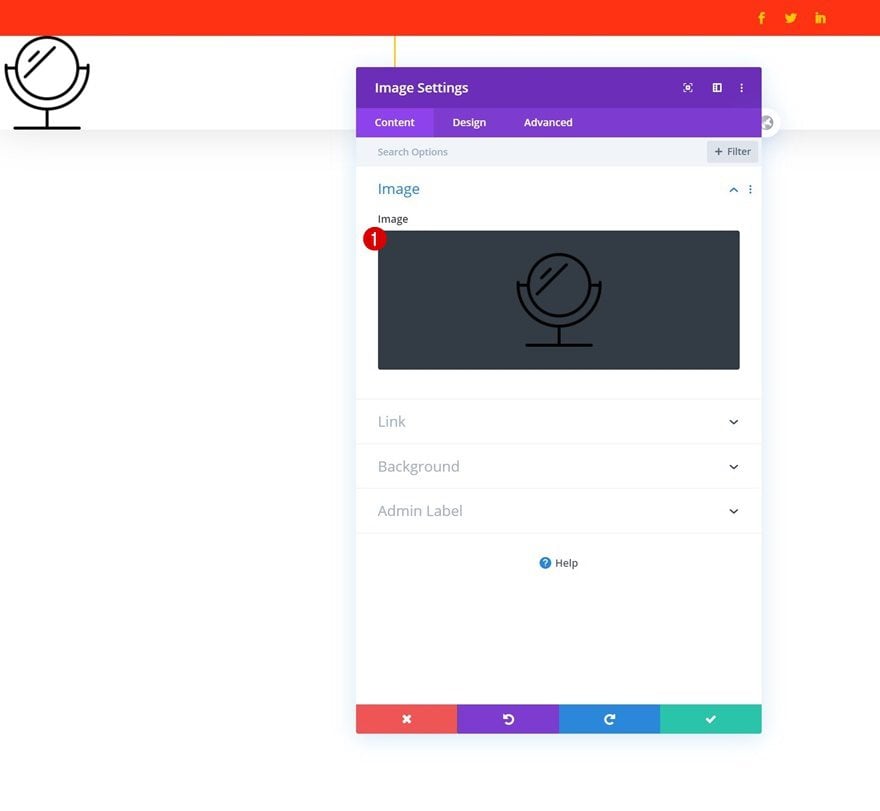
Add Image Module to Column 1
Upload Logo
Time to start adding modules. In column 1, the only module we need is an Image Module. Upload your logo.
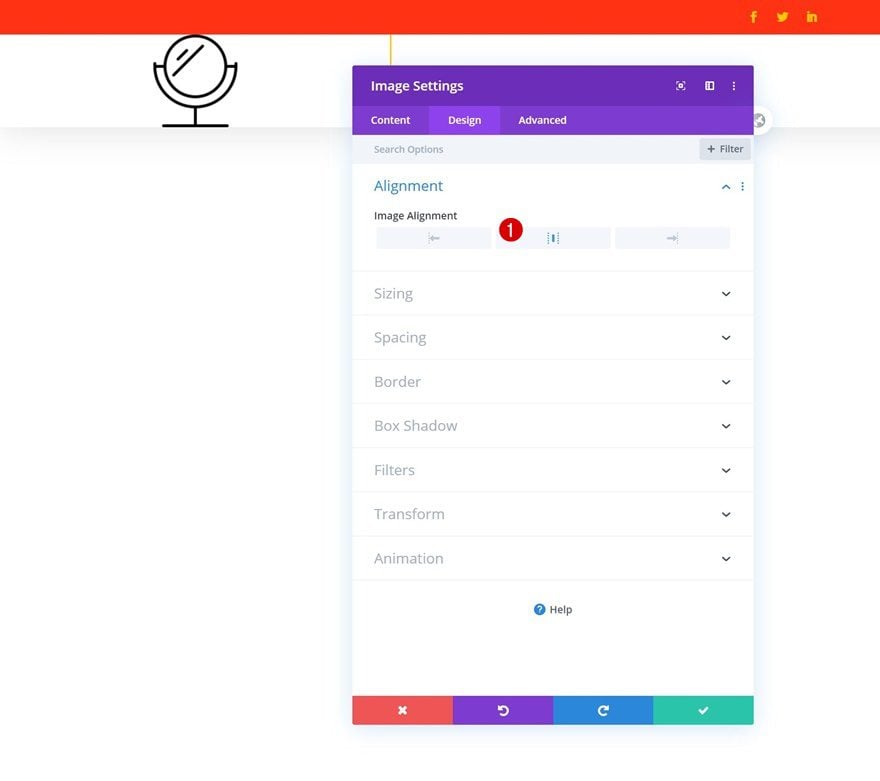
Alignment
Then, go to the module’s design tab and change the image alignment.
- Image Alignment: Center
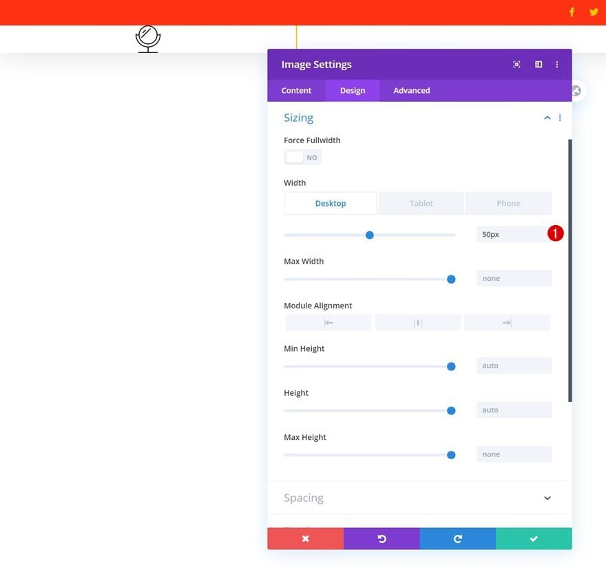
Sizing
Modify the width across different screen sizes next.
- Width: 50px (Desktop), 30px (Tablet & Phone)
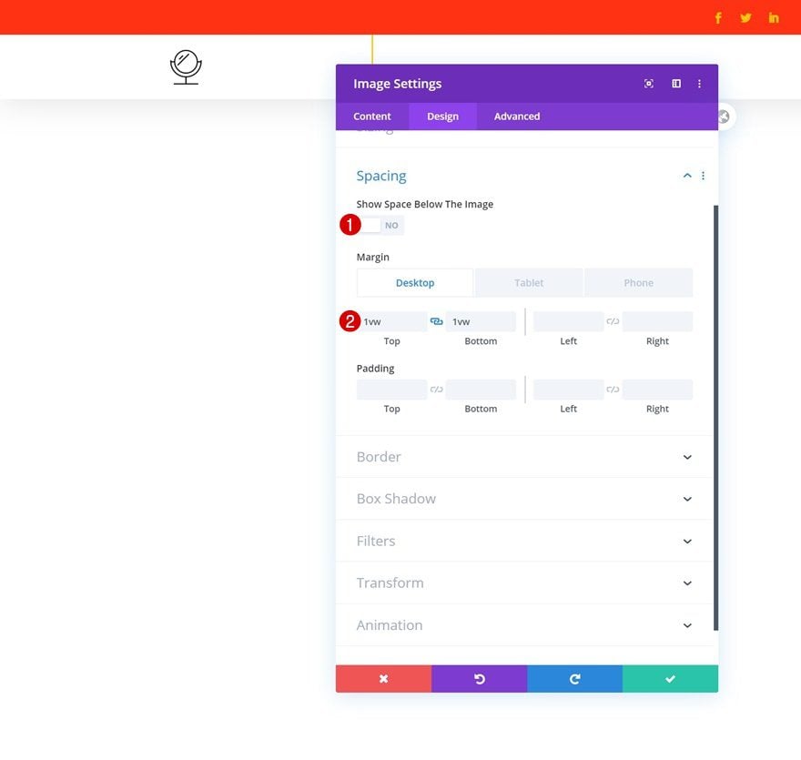
Spacing
And complete the module’s settings by adding some custom top and bottom margin across different screen sizes.
- Show Space Below The Image: No
- Top Margin: 1vw (Desktop), 2vw (Tablet), 3vw (Phone)
- Bottom Margin: 1vw (Desktop), 2vw (Tablet), 3vw (Phone)
Select Menu
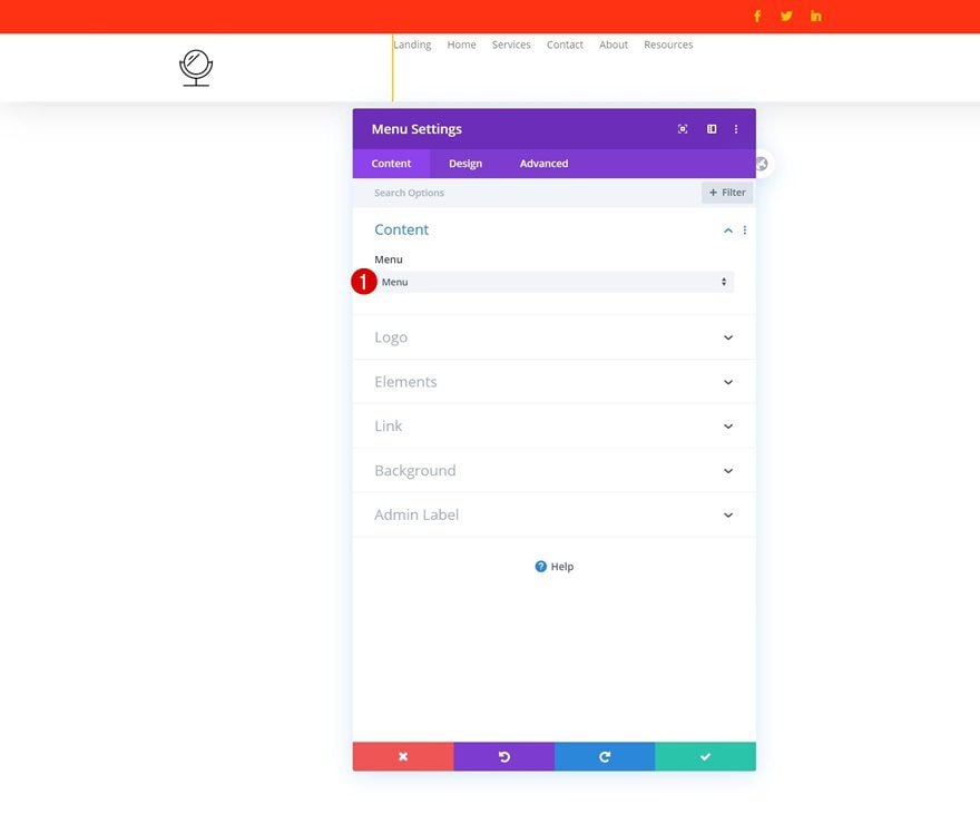
In the second column, the only module we need is a Menu Module. Select a menu of your choice.
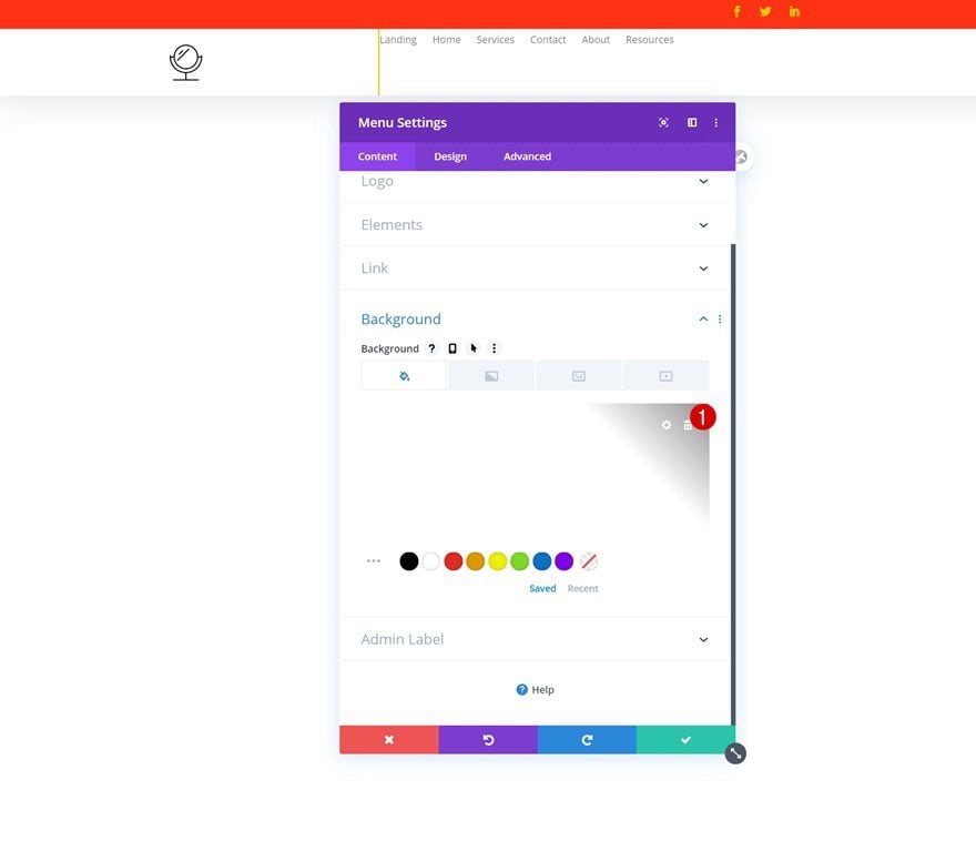
Remove Background Color
Then, remove the module’s background color.
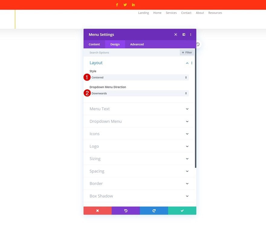
Layout
Move on to the module’s design tab and change the layout settings.
- Style: Centered
- Dropdown Menu Direction: Downwards
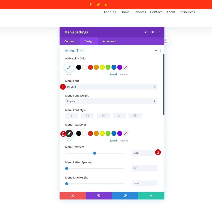
Menu Text Settings
Modify the menu text settings too.
- Menu Font: PT Serif
- Menu Text Color: #333333
- Menu Text Size: 18px
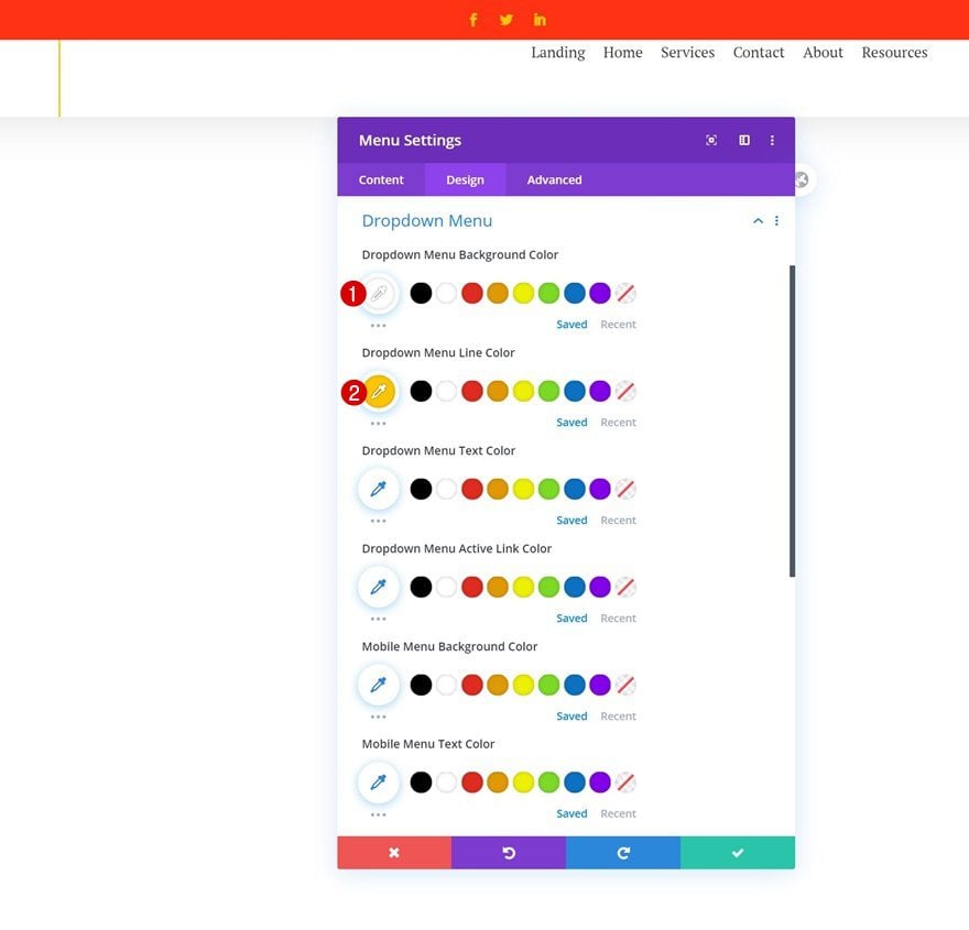
Dropdown Menu Text Settings
Along with the dropdown menu text settings.
- Dropdown Menu Background Color: #ffffff
- Dropdown Menu Line Color: #ffc600
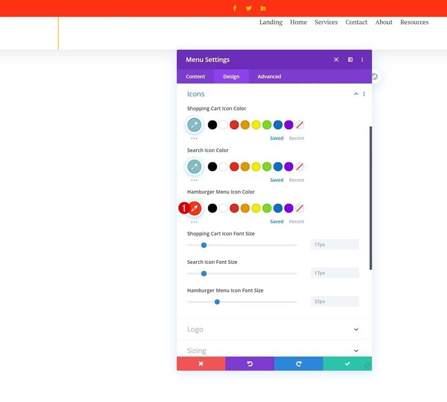
Icons
We’re changing the hamburger menu icon color in the icons settings next.
- Hamburger Menu Icon Color: #ff3314
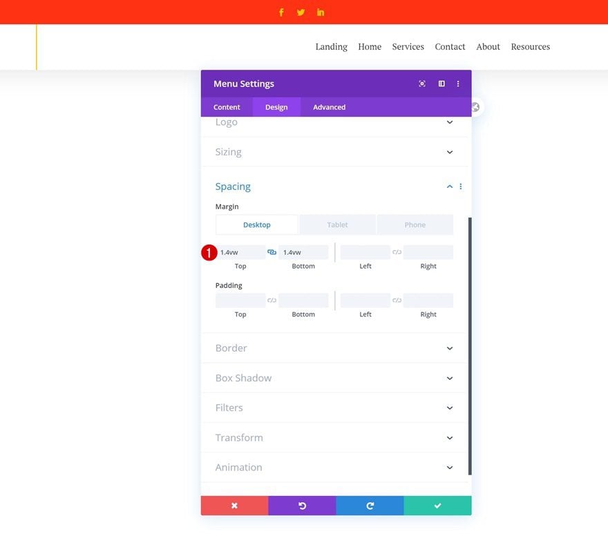
Spacing
And we’ll complete the module’s settings by adding some custom margin values across different screen sizes.
- Top Margin: 1.4vw (Desktop), 2.5vw (Tablet), 3vw (Phone)
- Bottom Margin: 1.4vw (Desktop), 2.5vw (Tablet), 3vw (Phone)
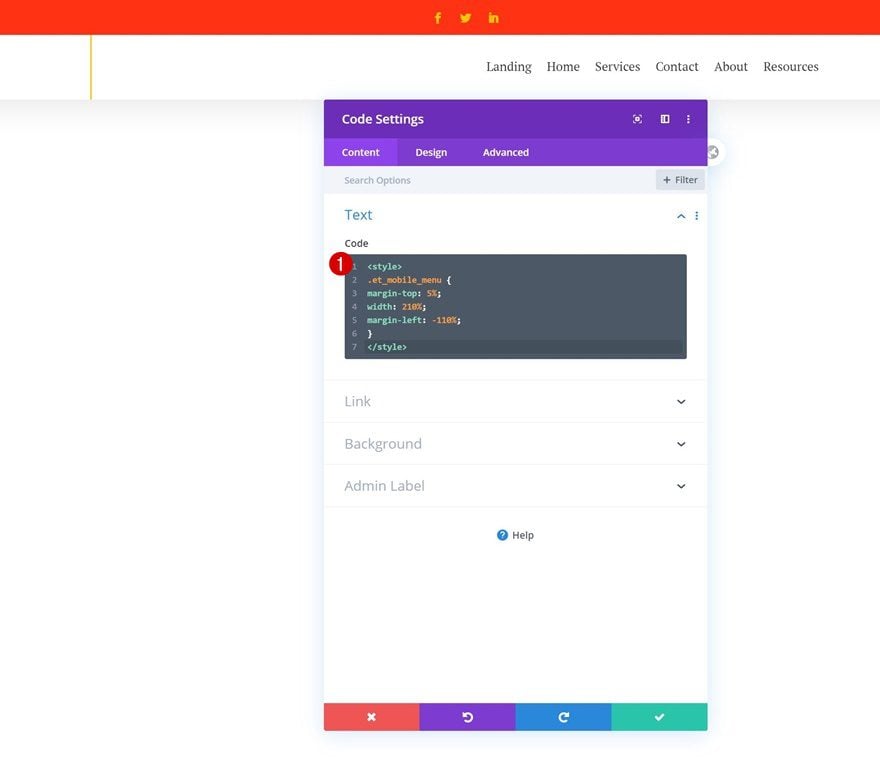
Add Code Module to Column 2
Insert Mobile CSS Code
To modify the dropdown menu on mobile (allow it to take up the entire width of the screen), we’ll need a few lines of CSS code. We’ll add this CSS code to a new Code Module right below the Menu Module.
<style>
.et_mobile_menu {
margin-top: 5%;
width: 210%;
margin-left: -110%;
}
</style>
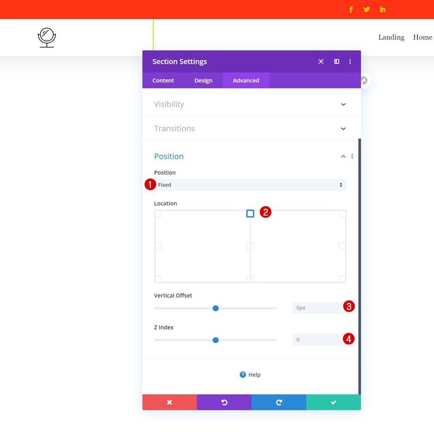
3. Use Divi’s Position Options to Stick Section to Top
Change Section Position Settings
Once you’ve completed the overall look and feel of your custom header, it’s time to turn it into a fixed one! To do that, open the section settings and change the position settings as follows:
- Position: Fixed
- Location: Top Center
If you want to have some space between the section and the top of your page, you can use the vertical offset option. Or, if your header isn’t appearing on top of all page content across your website, you can increase the z index.
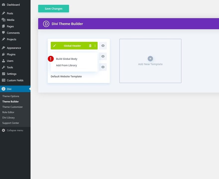
4. Add Top White Space for Header
Build Global Body
The next step to this tutorial will allow you to add some top ‘container space’ for your header. As soon as you turn an element fixed, the element’s container floats on your page without taking up any additional space. If you, however, don’t want it to overlap some existing page or post content, you can add some space for the container at the top. To do that, start building the global body of your default website’s template.
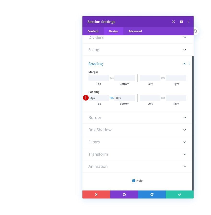
Section Settings
Spacing
Once inside the template editor, you’ll notice a section. Open that section and remove all default top and bottom padding.
- Top Padding: 0px
- Bottom Padding: 0px
Add New Row
Column Structure
Continue by adding a new row using the following column structure:
Sizing
Open the row settings and allow the row to take up the entire section’s width.
- Use Custom Gutter Width: Yes
- Gutter Width: 1
- Width: 100%
- Max Width: 100%
Spacing
Remove the default top and bottom padding next.
- Top Padding: 0px
- Bottom Padding: 0px
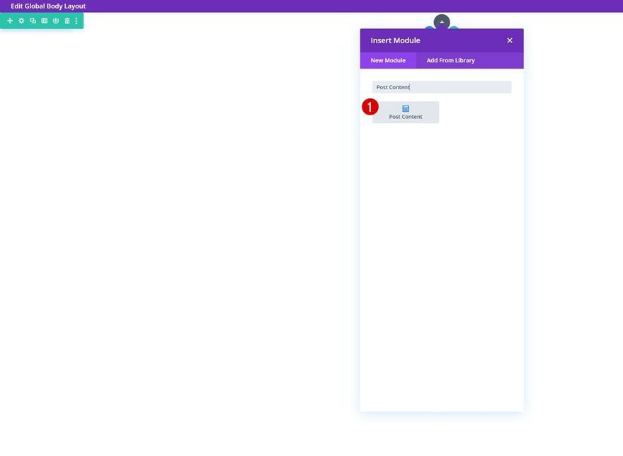
Add Post Content Module to Column
And to allow all dynamic content to show up, depending on the post or page visitors are on, we’ll use the Post Content Module.
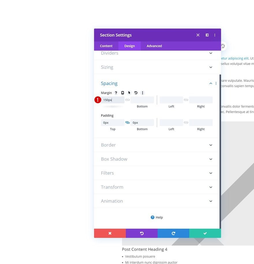
Add Top Margin to Section to Make Place for Header
Last but not least, to create that top space for the fixed Divi header, we’ll open the section settings again and add some top margin. You can adjust this value as you please.
- Top Margin: 150px
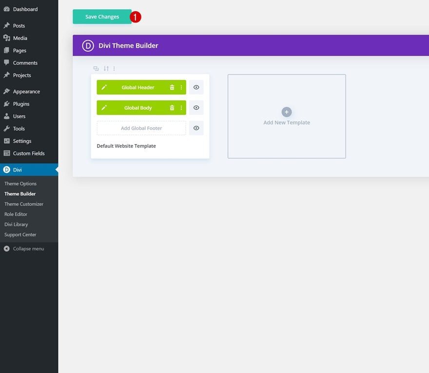
4. Save Theme Builder Changes
Once you’ve completed both the global header and global body, you can save all Theme Builder changes and view the outcome on your website!
Preview
Now that we’ve gone through all the steps, let’s take a final look at the outcome across different screen sizes.
Desktop
Mobile
Final Thoughts
In this post, we’ve shown you how to create a fixed Divi header with the new position options that you get inside the Divi Builder itself. We’ve covered the necessary steps to accomplish a top fixed header and you can apply this technique to any kind of website you’re building. You were able to download the default website’s template for free as well! If you have any questions or suggestions, feel free to leave a comment in the comment section below.
If you’re eager to learn more about Divi and get more Divi freebies, make sure you subscribe to our email newsletter and YouTube channel so you’ll always be one of the first people to know and get benefits from this free content.


Thank you for such a great walk through… I’ve got it all to work except for the mobile menu… I’ve added the code module right under my menu, and it’s copied exactly from the page, but it doesn’t force the full width menu on the mobile??
I downloaded and tried to import into the template builder but there is no option to is there?
Is there a solution for the fixed header and scroll-to sections? If you have a fixed header and scroll to a section below, the fixed header is overlapping the section. Is there an easy fix?
Doesn’t work as expected. Downloaded the layout on a brand new divi website and white blank space shows between actual page content and the fixed header (the space varies as per device, less on macbook air but a lot on a mobile device). For this to work we’d need to somehow make this white space between post content and header go away completely
This is super helpful for beginners! Thanks for the great walk through!
Thanks for explaining how to create a fixed header with the theme builder. It’s a shame that a manual addition of a bit of top margin for the content is necessary to make this work. The ‘old’ fixed header is much more useful in that sense, as it takes care of the relationship between the header and the body automatically.
Has it been considered to simply add a setting for fixed headers in the theme builder that does it all completely automatically?
I have to agree, it’s a bit disappointing. Loading this body messes up my entire website because it’s using the custom gutter width of 1. Are there any other solutions to fix it?
Yes, it would be fine, if there is an easyer way to make the header fixed and also shrink on scrolling.
Hope such a setting will follow soon.
I have to agree and I am seeing mixed results once you start to work with custom post types combined with the rolling updates and the breaking changes those bring to the previous tests with tutorials I have done. I am not sure I would be confident using these on live sites.
Hi Donjete, good night.
Excellent example to create a fixed header, it is quite simple even for me … but my doubt begins with my problems when trying to also create a fixed footer, is that possible? or you do not advise me, because I have organized a general problem on my website. Where can I check the resolution of this problem or maybe you will develop an example for the footers. Thanks for your attention. Greetings from Spain.