
Creating a dynamic 3D mousemove animation is a fun and exciting way for users to engage with web content on your Divi site. The design is dynamic in that the animation will move with your cursor. Normally, we animate objects on hover or click. But in this tutorial, we are going to introduce a creative way to animate objects on mousemove (moving your cursor at various locations on browser window). But that’s not all. We’ll also show you how to combine mousemove animation with a hover effect that makes elements popout into a 3D design that will bring your content to life in a whole new way.
To build it, we’ll use the Divi builder for the bulk of the design. Then we’ll use some custom CSS and JQuery to create the animation functionality.
Once done, you’ll have an impressive design to feature new products or services on your next project!
Let’s get started.
Sneak Peek
Here is a quick look at the design we’ll build in this tutorial.
You can also check out this codepen to see a live demo of the effect.
Download the Layout for FREE
To lay your hands on the designs from this tutorial, you will first need to download it using the button below. To gain access to the download you will need to subscribe to our newsletter by using the form below. As a new subscriber, you will receive even more Divi goodness and a free Divi Layout pack every Monday! If you’re already on the list, simply enter your email address below and click download. You will not be “resubscribed” or receive extra emails.

To import the section layout to your Divi Library, navigate to the Divi Library.
Click the Import button.
In the portability popup, select the import tab and choose the download file from your computer.
Then click the import button.

Once done, the section layout will be available in the Divi Builder.
Let’s get to the tutorial, shall we?
What You Need to Get Started

To get started, you will need to do the following:
- If you haven’t yet, install and activate the Divi Theme.
- Create a new page in WordPress and use the Divi Builder to edit the page on the front end (visual builder).
- Choose the option “Build From Scratch”.
After that, you will have a blank canvas to start designing in Divi.
Creating a Dynamic 3D Mousemove Animation Effect in Divi
Part 1: Creating the Hover Container and Card with a Row and a Column
For this animation effect, the row will be the target that activates the 3d animation on hover. We can call this the hover container. The column will serve as our card that will animate along with its child elements when hovering over the row.
But before we create the row and column, let’s style the section.
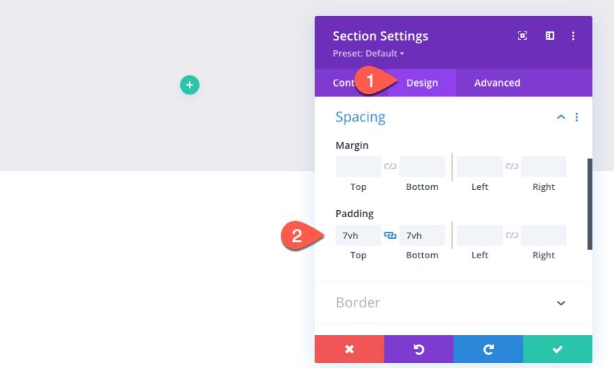
The Section
To start, open the settings for the default regular section and update the following:
- Background Color: rgba(68,55,99,0.1)
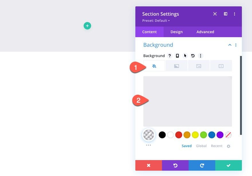
- Padding: 7vh top, 7vh bottom
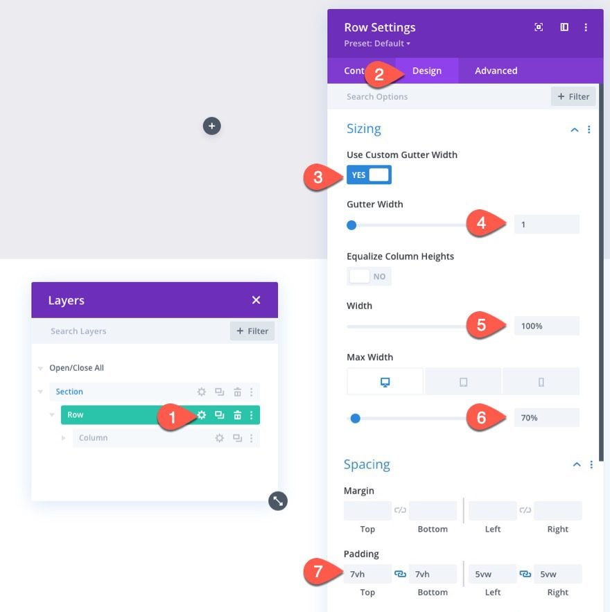
The Row (Hover Container)
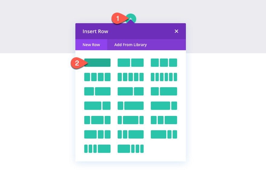
Add a one-column row to the section.
Row Settings
Under the row settings, update the following:
- Gutter Width: 1
- Width: 100%
- Max Width: 70% (desktop), 60% (tablet), 50% (phone)
- Padding: 7vh, top, 7vh bottom, 5vw left, 5vw right
NOTE: The trick here is to create a row with enough space surrounding the column so that you can engage the mousemove animation of the card by moving the cursor around the entire row area (not the column). This way you can have more room to move the card around. You also want to leave enough space around the row so that you can move the cursor outside of the row (into the section space surrounding the row) to disengage the animation and allow the card elements to snap back into place.
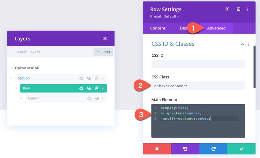
Under the advanced tab, give the row a custom class:
- CSS Class: et-hover-container
Then add the following CSS to the Main Element:
display:flex;
align-items:center;
justify-content:center;
This little snippet keeps the column centered vertically and horizontally within the row (necessary because we are going to give our column a set max-width).
The Column (or Card)
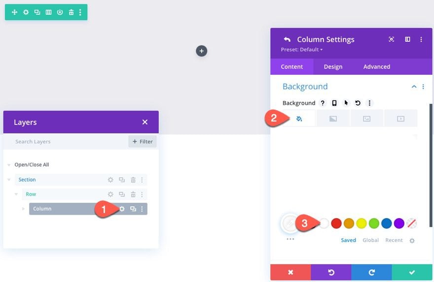
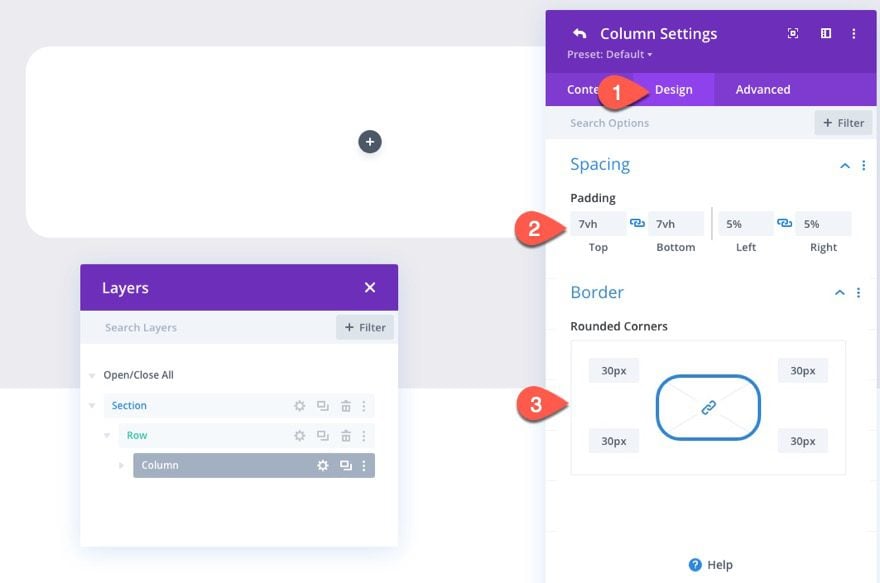
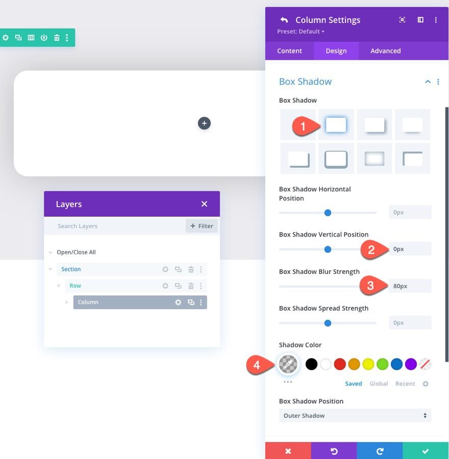
After updating the row, open the settings for the column to create the style for our card as follows:
- Background Color: #ffffff
- Padding: 7vh top, 7vh bottom, 5% left, 5% right
- Rounded Corners: 30px
- Box Shadow: see screenshot
- Box Shadow Vertical Position: 0px
- Box Shadow Blur Strength: 80px
- Shadow Color: rgba(0,0,0,0.2)
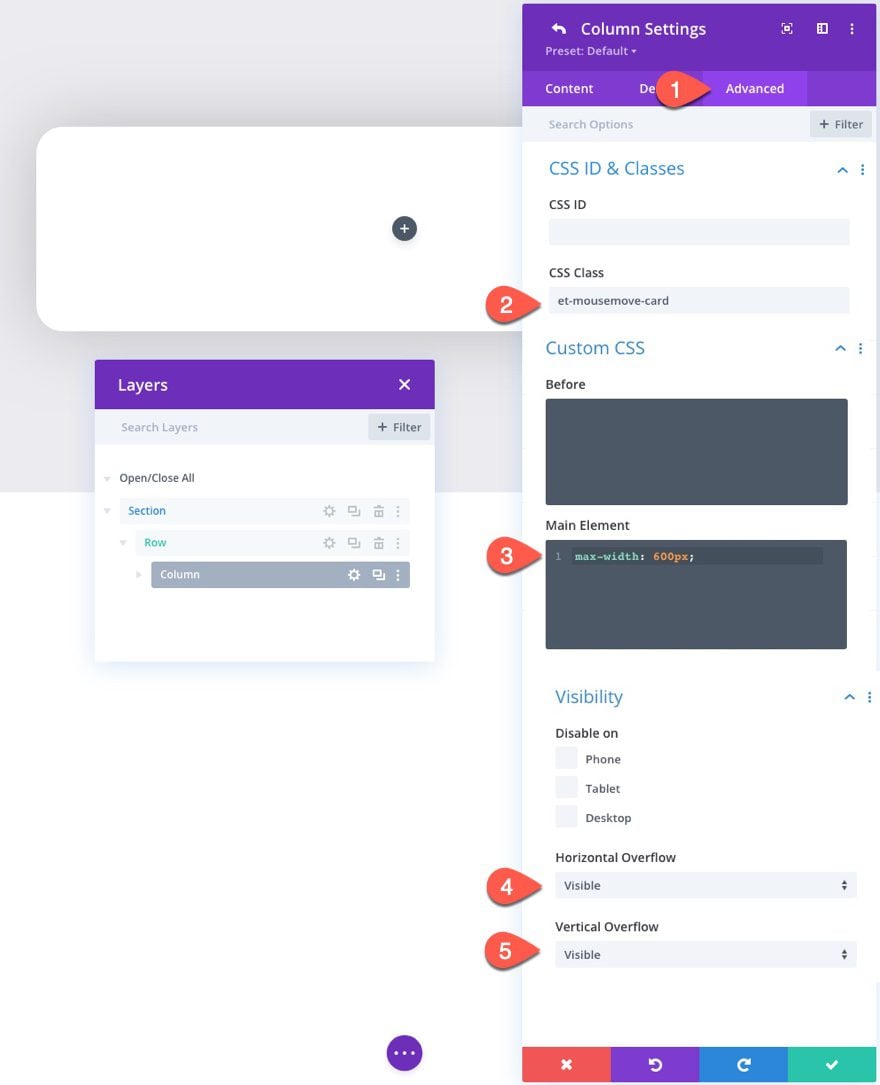
Under the Advanced tab, give the column a custom class:
- CSS Class: et-mousemove-card
Then add this custom CSS to the Main Element:
max-width: 600px;
Then make sure to set the overflow properties to “visible”.
- Horizontal Overflow: visible
- Vertical Overflow: visible
NOTE: Giving the column a max-width of 600px keeps the design more consistent on different browser sizes and also increases the amount of hover space around the column for the hover container (or row). The border radius (rounded corners) we added will hide the overflow so we need to set the overflow to visible. If we don’t do this, the animation will not work as expected.
Part 2: Creating the Card Elements
#1 The Circle Background with Logo
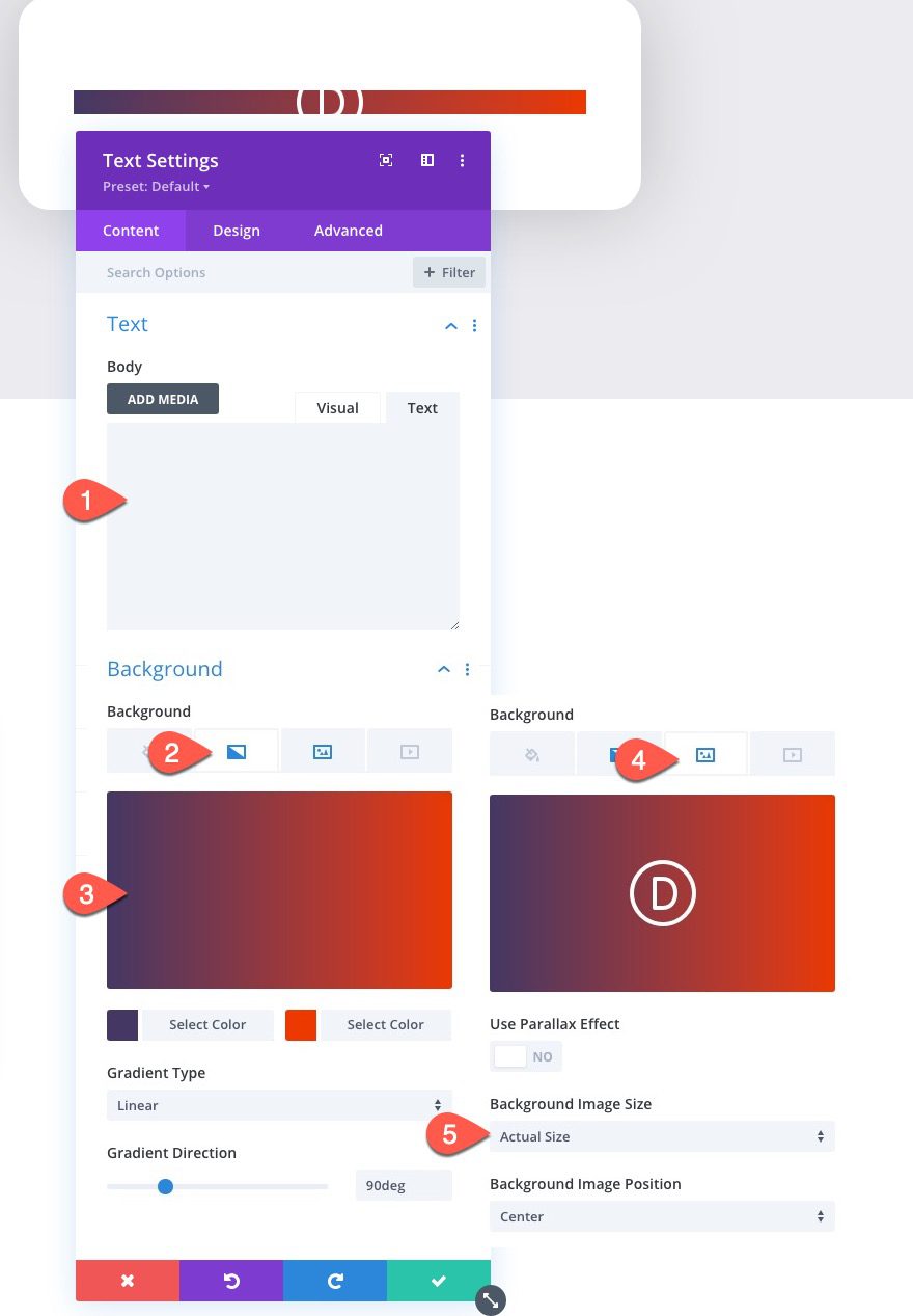
For the first element inside our card, we are going to add a circle background that includes a logo that will sit behind our bike image.
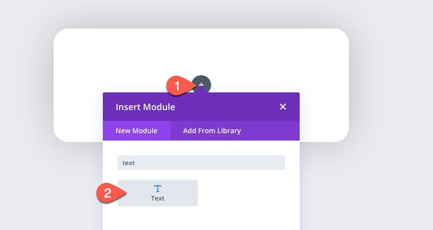
Add a new text module to the column.
Take out the default text so that the body content is empty.
Then add a gradient background:
- Gradient Background Left Color: #443763
- Gradient Background Right Color: #ea3900
In addition to the gradient background, add a logo for the background image.
- Background Image: [add any png logo image that is about 60px by 60px]
- Background Image Size: Actual Size
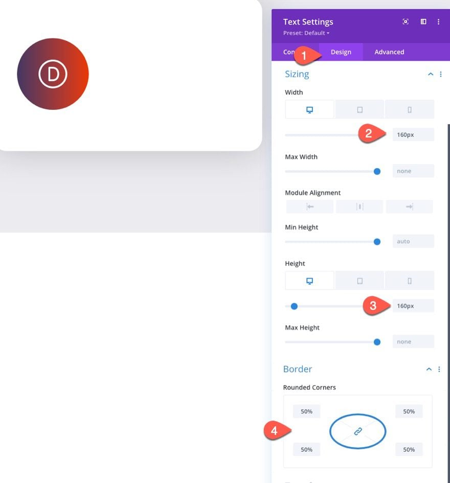
Under the design tab, update the following:
- Width: 160px (desktop), 150px (tablet), 80px (phone)
- Height: 160px (desktop), 150px (tablet), 80px (phone)
- Rounded Corners: 50%
The matching width and height values and the 50% border radius give us the circle shape we are looking for.
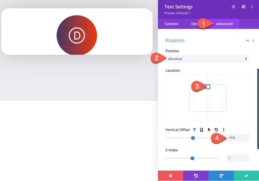
Under the Advanced tab, update the position as follows:
- Position: Absolute
- Location: Top Center
- Vertical Offset: 15%
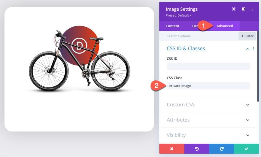
#2 The Card Image
To create the product (in this case a bike) image, add a new image module under the previous text module.
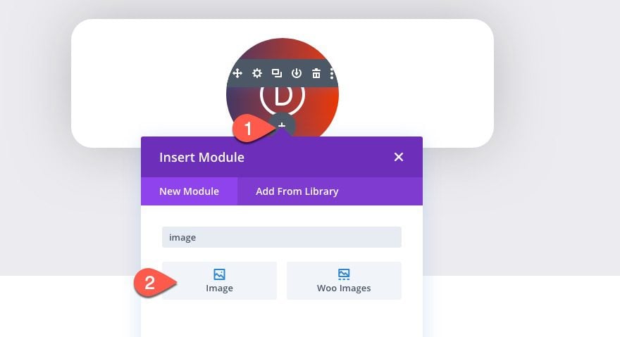
Then upload the image to the module. Make sure it is an image in png format with a transparent background. I’m using the bike image from our bike repair layout pack.
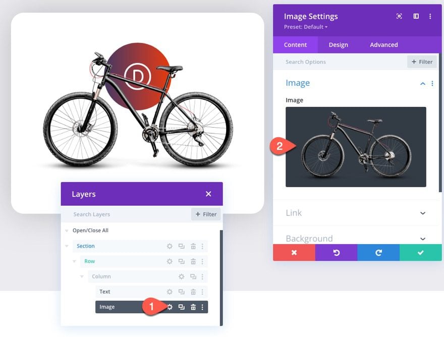
Under the design tab, update the following:
- Image Alignment: Center
- Width: 90%
- Margin: 4vh bottom
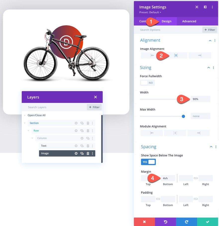
Under the Advanced tab, give the image a custom class:
- CSS Class: et-card-image
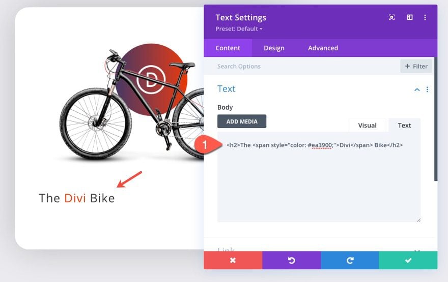
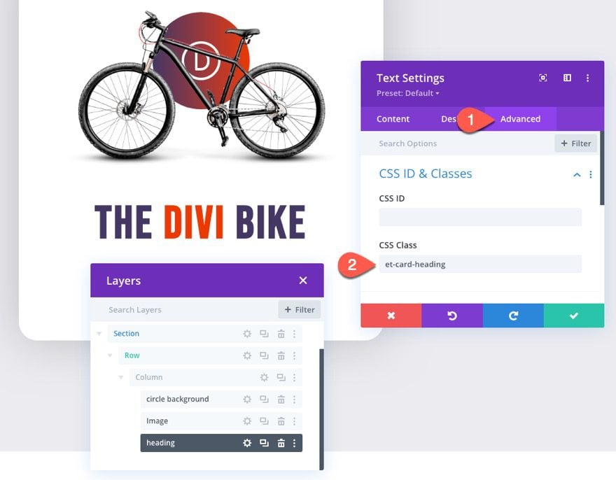
#3 The Card Heading
With our image in place, add a new text module under it to create our card heading.
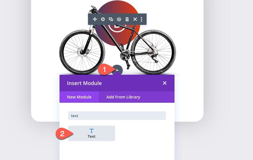
In the body content of the new text module, paste in the following H2 heading HTML:
<h2>The <span style="color: #ea3900;">Divi</span> Bike</h2>
Under the design tab, update the following:
- Heading 2 Font: Bebas Neue
- Heading 2 Text Alignment: center
- Heading 2 Text Color: #443763
- Heading 2 Text Size: 75px (desktop), 60px (tablet), 45px (phone)
- Heading 2 Letter Spacing: 0.05em
- Margin: 4vh bottom
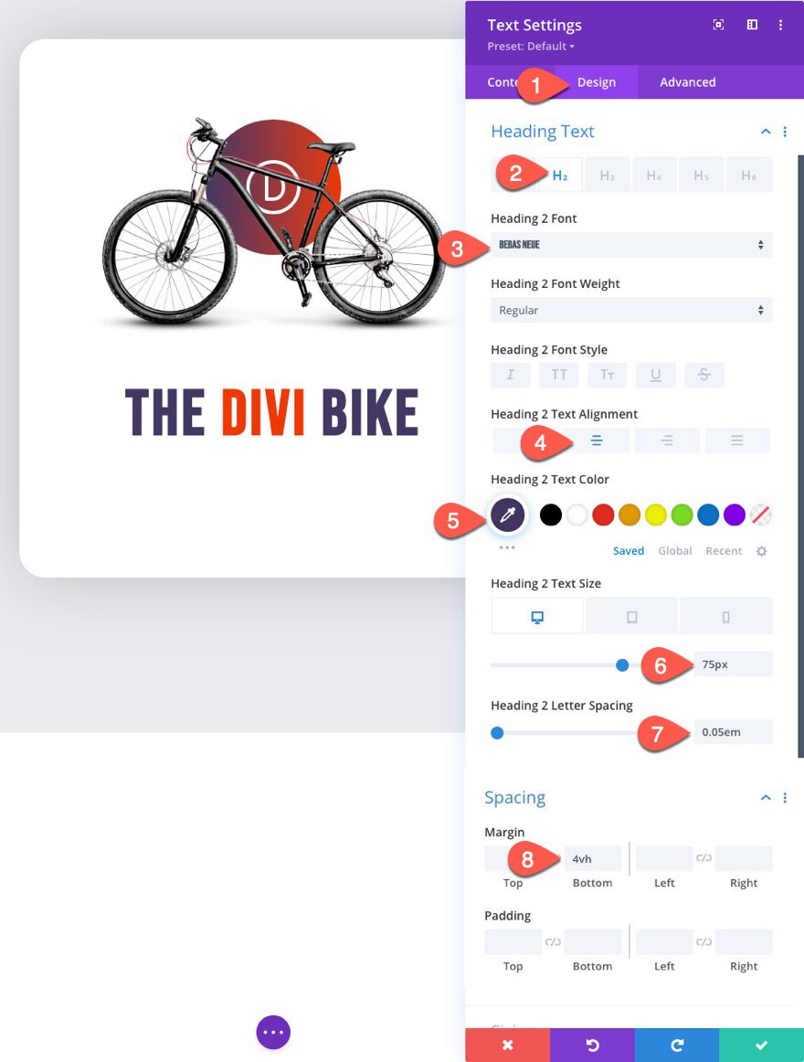
Under the Advanced tab, add a custom class:
- CSS Class: et-card-heading
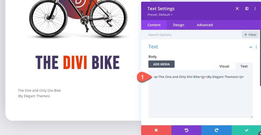
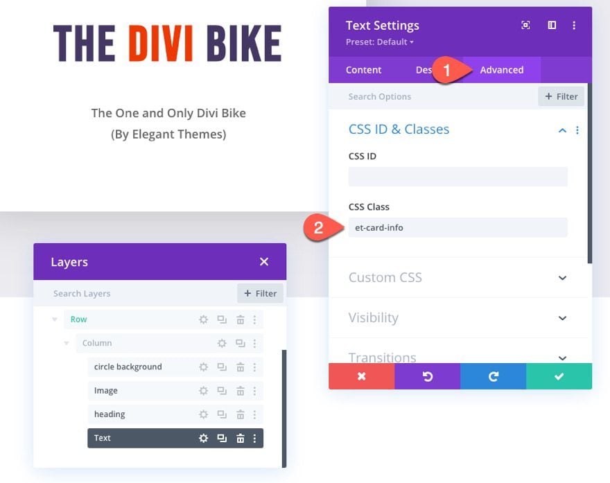
#4 The Card Info Text
Using separate text modules for the heading and info text will allow us to add different 3d animation effects to each of them. To create the info text under the heading, add a new text module under the heading text module.
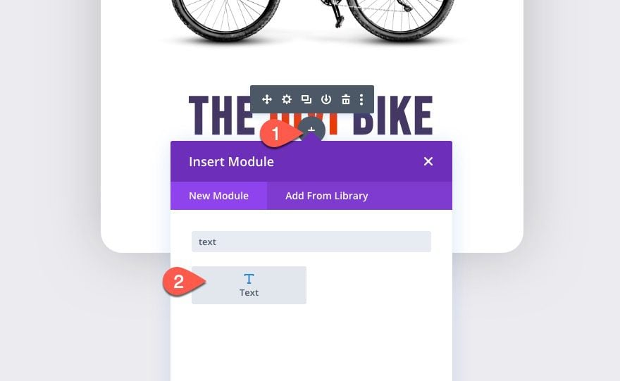
Then add the following content to the body:
<p>The One and Only Divi Bike<br>(By Elegant Themes)</p>
Under the design tab, update the following:
- Text Font Weight: Semi Bold
- Text Text Size: 18px (desktop), 16px (tablet and phone)
- Text Line Height: 1.8em
- Text Alignment: center
- Margin: 4vh
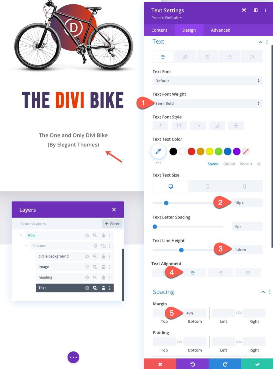
Then give the text module a custom class:
- CSS Class: et-card-info
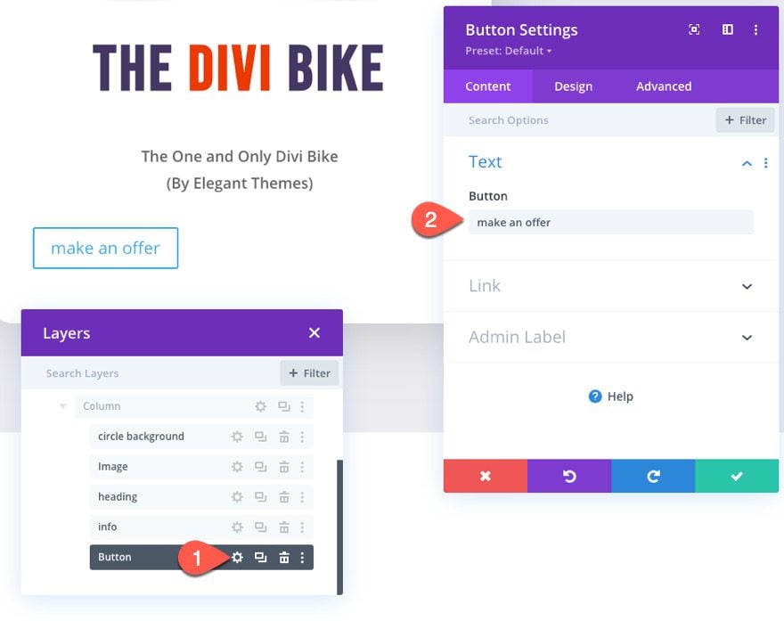
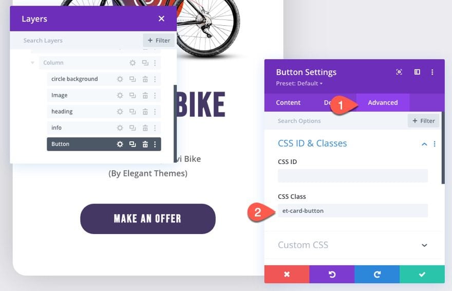
#5 The Card Button
To create the button for the card, add a new button module under the info text module.
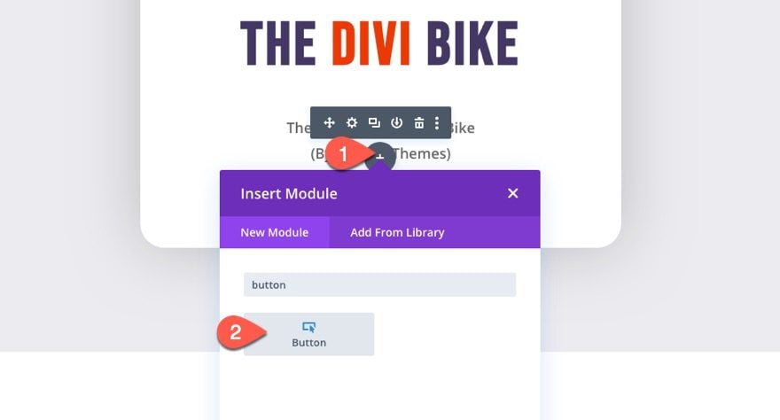
In the button settings modal, update the button text.
- Button Text: make an offer
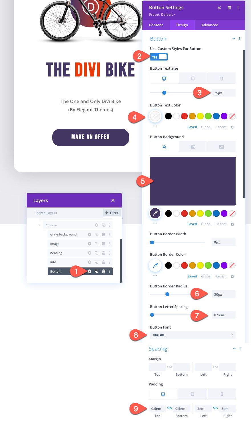
Under the design tab, style the button as follows:
- Use Custom Styles for Button: YES
- Button Text Size: 25px (desktop), 20px (tablet), 16px (phone)
- Button Text Color: #ffffff
- Button Background Color: #443763
- Button Border Width: 0px
- Button border Radius: 30px
- Button Letter Spacing: 0.1em
- Button Font: Bebas Neue
- Padding (desktop): 0.5em top, 0.5em bottom, 3em left, 3em right
- Padding (phone): 0.5em top, 0.5em bottom, 2em left, 2em right
Then give the button a custom class:
- et-card-button
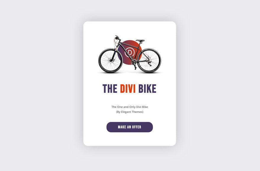
Result So Far
Here is the result of the design so far.
Now, all we need is some custom Code.
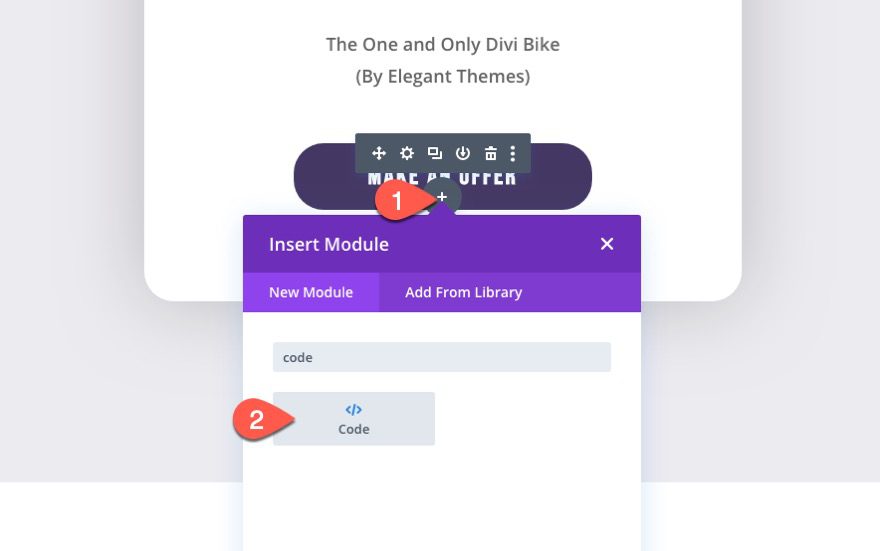
Part 3: Adding the Custom Code (CSS and JQuery)
Now that our design is complete, we can add the CSS and JQuery code needed to create the dynamic 3d mousemove animation effect to the card/column and the card elements.
To do this, add a code module under the button module.
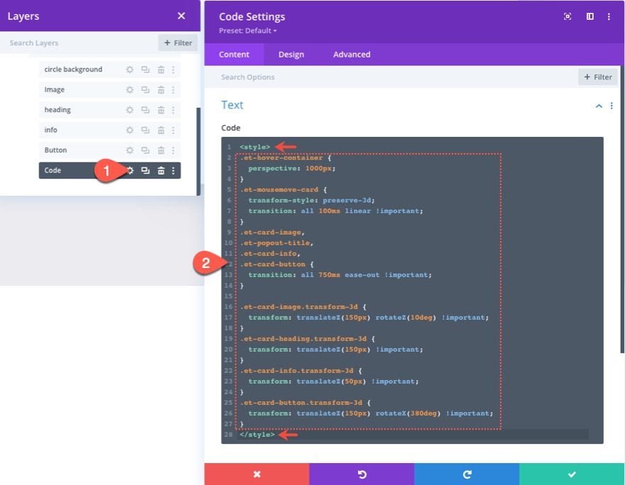
Then paste the following custom CSS to the code box making sure to wrap the CSS in the style tags.
/*add perspective to row for 3d perspective of child elements*/
.et-hover-container {
perspective: 1000px;
}

/*preserve-3d needed for 3d effect on card elements*/
.et-mousemove-card {
transform-style: preserve-3d;
transition: all 100ms linear !important;
}

/*transition timing function and duration for card elements*/
.et-card-image,
.et-popout-title,
.et-card-info,
.et-mousemove-card .et_pb_button_module_wrapper {
transition: all 750ms ease-out !important;
}

/*transform styles for card elements*/
.et-card-image.transform-3d {
transform: translateZ(150px) rotateZ(10deg) !important;
}
.et-card-heading.transform-3d {
transform: translateZ(150px) !important;
}
.et-card-info.transform-3d {
transform: translateZ(50px) !important;
}
.et-mousemove-card .et_pb_button_module_wrapper.transform-3d {
transform: translateZ(150px) rotateX(20deg) !important;
}
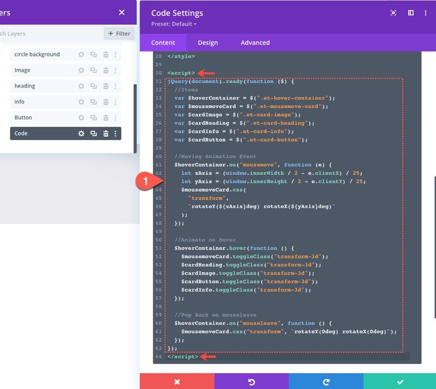
Under the CSS, paste the following JQuery making sure to wrap the code in the script tags.
jQuery(document).ready(function ($) {
//Items
var $hoverContainer = $(".et-hover-container");
var $mousemoveCard = $(".et-mousemove-card");
var $cardImage = $(".et-card-image");
var $cardHeading = $(".et-card-heading");
var $cardInfo = $(".et-card-info");
var $cardButton = $(".et-mousemove-card .et_pb_button_module_wrapper");

//Moving Animation Event
$hoverContainer.on("mousemove", function (e) {
let xAxis = (window.innerWidth / 2 - e.clientX) / 25;
let yAxis = (window.innerHeight / 2 - e.clientY) / 25;
$mousemoveCard.css(
"transform",
`rotateY(${xAxis}deg) rotateX(${yAxis}deg)`
);
});

//Animate on Hover
$hoverContainer.hover(function () {
$mousemoveCard.toggleClass("transform-3d");
$cardHeading.toggleClass("transform-3d");
$cardImage.toggleClass("transform-3d");
$cardButton.toggleClass("transform-3d");
$cardInfo.toggleClass("transform-3d");
});

//Pop Back on mouseleave
$hoverContainer.on("mouseleave", function () {
$mousemoveCard.css("transform", `rotateY(0deg) rotateX(0deg)`);
});
});
About the Code
CSS
To give our 3D positioned elements (the column and modules), we need to use the perspective CSS property on the row (or hover container).
.et-hover-container {
perspective: 1000px;
}
Then we need to make sure those card elements are positioned in 3D space using the transform-style property with the preserve-3d value.
.et-mousemove-card {
transform-style: preserve-3d;
transition: all 100ms linear !important;
}
Then we set the transition timing function and duration when the card elements are animated.
.et-card-image,
.et-popout-title,
.et-card-info,
.et-mousemove-card .et_pb_button_module_wrapper {
transition: all 750ms ease-out !important;
}
Lastly, we use the transform property with a translateZ function to move the elements on the z-axis creating the popout effect whenever we hover over the row and the transform-3d class is added to each element.
.et-card-image.transform-3d {
transform: translateZ(150px) rotateZ(10deg) !important;
}
.et-card-heading.transform-3d {
transform: translateZ(150px) !important;
}
.et-card-info.transform-3d {
transform: translateZ(50px) !important;
}
.et-mousemove-card .et_pb_button_module_wrapper.transform-3d {
transform: translateZ(150px) rotateX(20deg) !important;
}
The JQuery
First, we declare all the variables needed to target the elements according to their custom class.
//Items
var $hoverContainer = $(".et-hover-container");
var $mousemoveCard = $(".et-mousemove-card");
var $cardImage = $(".et-card-image");
var $cardHeading = $(".et-card-heading");
var $cardInfo = $(".et-card-info");
var $cardButton = $(".et-mousemove-card .et_pb_button_module_wrapper");
Then we attach the mousemove event to the row (or hover container) with a function that calculates the position of the cursor for both the X and Y axis of the browser window and then rotates the mousemove card (or column) as the X and Y values change dynamically.
//Moving Animation Event
$hoverContainer.on("mousemove", function (e) {
let xAxis = (window.innerWidth / 2 - e.clientX) / 25;
let yAxis = (window.innerHeight / 2 - e.clientY) / 25;
$mousemoveCard.css(
"transform",
`rotateY(${xAxis}deg) rotateX(${yAxis}deg)`
);
});
To activate the transform CSS (with translateZ) that moves the card elements out in Z space, we toggle the class transform-3d to each element when hovering over the row (or hover container).
//Animate on Hover
$hoverContainer.hover(function () {
$mousemoveCard.toggleClass("transform-3d");
$cardHeading.toggleClass("transform-3d");
$cardImage.toggleClass("transform-3d");
$cardButton.toggleClass("transform-3d");
$cardInfo.toggleClass("transform-3d");
});
Then we need to attach the mouseleave event to the row with a function that adds a CSS transform property with the rotateY and rotateX functions to 0 degrees. This will snap the column (or card) back into place when the cursor moves out of the row.
//Pop Back on mouseleave
$hoverContainer.on("mouseleave", function () {
$mousemoveCard.css("transform", `rotateY(0deg) rotateX(0deg)`);
});
Final Result
Check out the final result!
You can also check out this codepen to see a live demo of the effect.
Final Thoughts
The dynamic 3d mousemove animation effect we built in this tutorial includes unique and advanced animation effects that can be easily learned and exciting to explore. The mousemove animation that allows users to interact with the design can be done with a few lines of JQuery. And the 3D hover effects rely on a few CSS properties that can easily be learned. All in all, there are so many possibilities that can come from combining a powerful page builder like Divi with the magic of JQuery. Hopefully, this one will come in handy for you.
I look forward to hearing from you in the comments.
Cheers!


Hi, Jason! very nice example. Can you adapt the code for a 3 column row? I want to use it to display company benefits or company services and i want to put them 3 on a row.
I would love to know how to do this in an image carousel! I keep trying to out and it does work, but not on the individual images, just on the module as a whole.
Hello,
Really great !
In addition, it is easy to change the parameters.
Thank you
Interesting.. will try it
Hi there! Thanks for the great post!
That’s a really awesome and detailed article, well, the most unusual is the mouseover animation that permits customers to work together with the design which will be performed with a couple of strains of JQuery. And 3D hover results depend on some CSS properties that may be simply realized.
Hello, I am adapting this tutorial to my website, I have added an image where the logo appears. I wanted to apply the same 3D style to it by adding the corresponding code. It doesn’t work well because the image is locked with an “absolute”. Could you help me with the code?
Demo: https://simbolo-ic.es/presentacion/pruebas-de-campo/
The added code:
/*add perspective to row for 3d perspective of child elements*/
.et-hover-container {
perspective: 1000px;
}
/*preserve-3d needed for 3d effect on card elements*/
.et-mousemove-card {
transform-style: preserve-3d;
transition: all 100ms linear !important;
}
/*transition timing function and duration for card elements*/
.et-card-image,
.et-card-imagetwo,
.et-card-heading,
.et-card-info,
.et-mousemove-card .et_pb_button_module_wrapper {
transition: all 750ms ease-out !important;
}
/*transform styles for card elements*/
.et-card-image.transform-3d {
transform: translateZ(150px) rotateZ(10deg) !important;
}
.et-card-imagetwo.transform-3d {
transform: translateY(-1px) translateY(-1px) !important;
}
.et-card-heading.transform-3d {
transform: translateZ(150px) !important;
}
.et-card-info.transform-3d {
transform: translateZ(50px) !important;
}
.et-mousemove-card .et_pb_button_module_wrapper.transform-3d {
transform: translateZ(50px) rotateY(5deg) !important;
}
jQuery(document).ready(function ($) {
//Items
var $hoverContainer = $(“.et-hover-container”);
var $mousemoveCard = $(“.et-mousemove-card”);
var $cardImage = $(“.et-card-image”);
var $cardImagetwo = $(“.et-card-imagetwo”);
var $cardHeading = $(“.et-card-heading”);
var $cardInfo = $(“.et-card-info”);
var $cardButton = $(“.et-mousemove-card .et_pb_button_module_wrapper”);
//Moving Animation Event
$hoverContainer.on(“mousemove”, function (e) {
let xAxis = (window.innerWidth / 2 – e.clientX) / 25;
let yAxis = (window.innerHeight / 2 – e.clientY) / 25;
$mousemoveCard.css(
“transform”,
`rotateY(${xAxis}deg) rotateX(${yAxis}deg)`
);
});
//Animate on Hover
$hoverContainer.hover(function () {
$mousemoveCard.toggleClass(“transform-3d”);
$cardHeading.toggleClass(“transform-3d”);
$cardImage.toggleClass(“transform-3d”);
$cardImagetwo.toggleClass(“transform-3d”);
$cardButton.toggleClass(“transform-3d”);
$cardInfo.toggleClass(“transform-3d”);
});
//Pop Back on mouseleave
$hoverContainer.on(“mouseleave”, function () {
$mousemoveCard.css(“transform”, `rotateY(0deg) rotateX(0deg)`);
});
});
Cool stuff, Jason! 🙂 More of this kind appreciated
I tried 3 different browsers and most of the image are now missing.
Sorry, John. Are you referring to the json download that you imported? Or did you build it from scratch? If the former, try replacing the images with new ones. Hope that helps.
Very good article, love it!!
Just one error at “The Column (orCard)”: The CSS Class in the text says: “et-mouseover-card” but in the picture it is et-mousemove-card.
It doesnt work until you change et-mouseover-card to et-mousemove-card.
Enjoy it and try it out, its very good.
Good catch! sorry about that. I’ll update the article now. Thanks, justfabio.
Amazing write-up, looking forward to more blogs.
Thanks, sonal!
Hi Jason,
Very interesting! Thank you for the explanation!
You’re welcome!
It was nice reading this. Thankyou
Incredible result ! I’d like to use this effect on blog post blurbs somehow…
This article is unique. I am impress to read your post, really good quality.