
Now that the Theme Builder is here, we can’t wait to dive into new tutorials that’ll help you set up your website from A to Z. This includes creating custom headers using Divi and its built-in option. In this tutorial, we’ll focus on creating a global header using Divi’s Theme Builder. A global header will show up everywhere on your website unless you’ve assigned a different header to that page or post.
Let’s get to it!
- 1 Preview
- 2 Download The Custom Header Design for FREE
- 3 Download For Free
- 4 1. Setup Your Primary Menu
- 5 2. Go to the Theme Builder Options
- 6 3. Add & Build Global Header
- 7 4. Dedicate New Row to Header
- 8 5. Dedicate New Row to Menu Bar
- 9 6. Make Header & Menu Bar Stick to Top
- 10 7. Save Global Header & Theme Builder Options
- 11 Preview
- 12 Final Thoughts
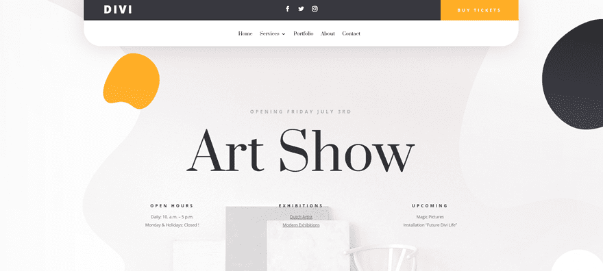
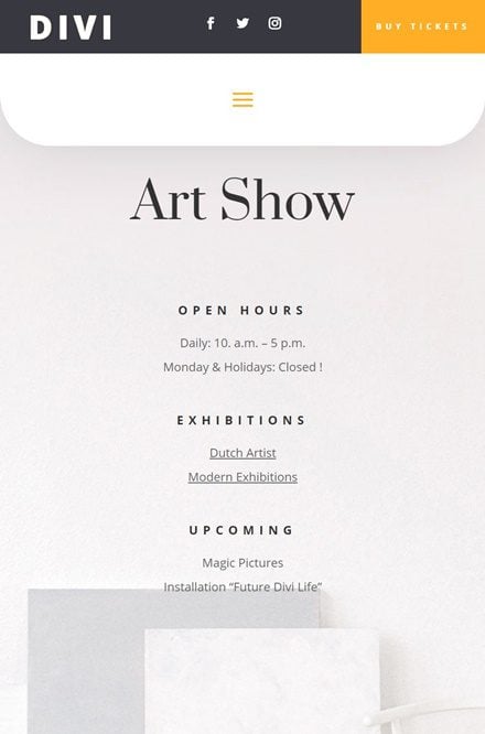
Preview
Before we dive into the tutorial, let’s take a quick look at the outcome across different screen sizes.
Desktop
Mobile
Download The Custom Header Design for FREE
To lay your hands on the free custom global header design, you will first need to download it using the button below. To gain access to the download you will need to subscribe to our newsletter by using the form below. As a new subscriber, you will receive even more Divi goodness and a free Divi Layout pack every Monday! If you’re already on the list, simply enter your email address below and click download. You will not be “resubscribed” or receive extra emails.

Subscribe To Our Youtube Channel
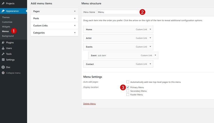
Start by creating your menu in the appearance settings of your WordPress website.
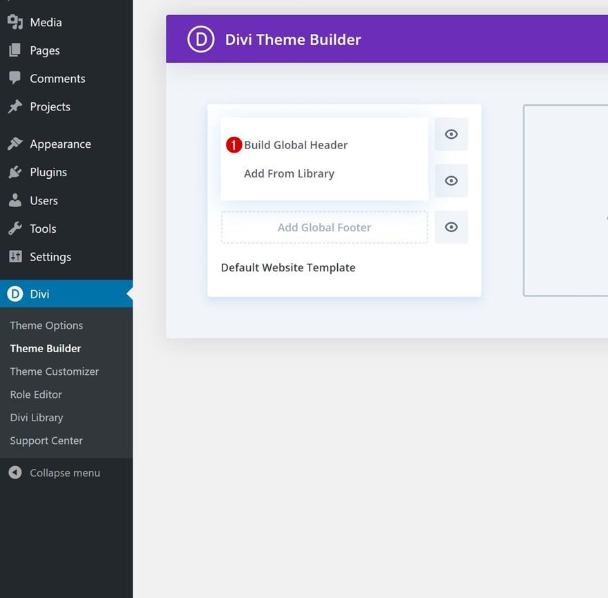
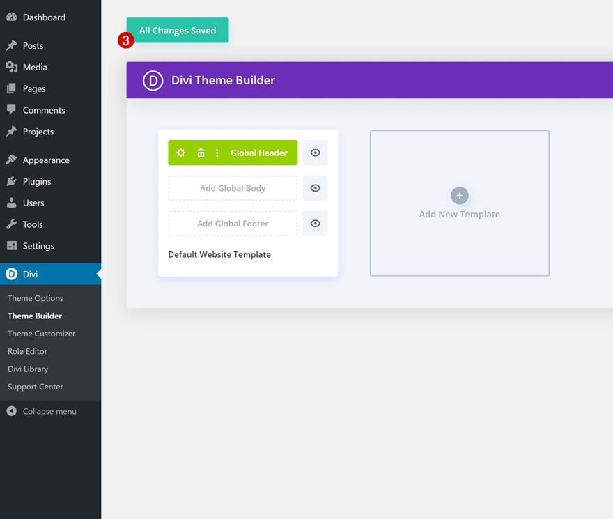
2. Go to the Theme Builder Options
Then, navigate to the Theme Builder in Divi’s Theme Options. Once there, you’ll notice an empty default website template.
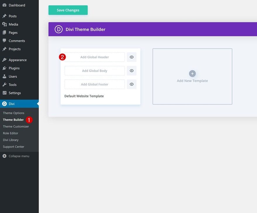
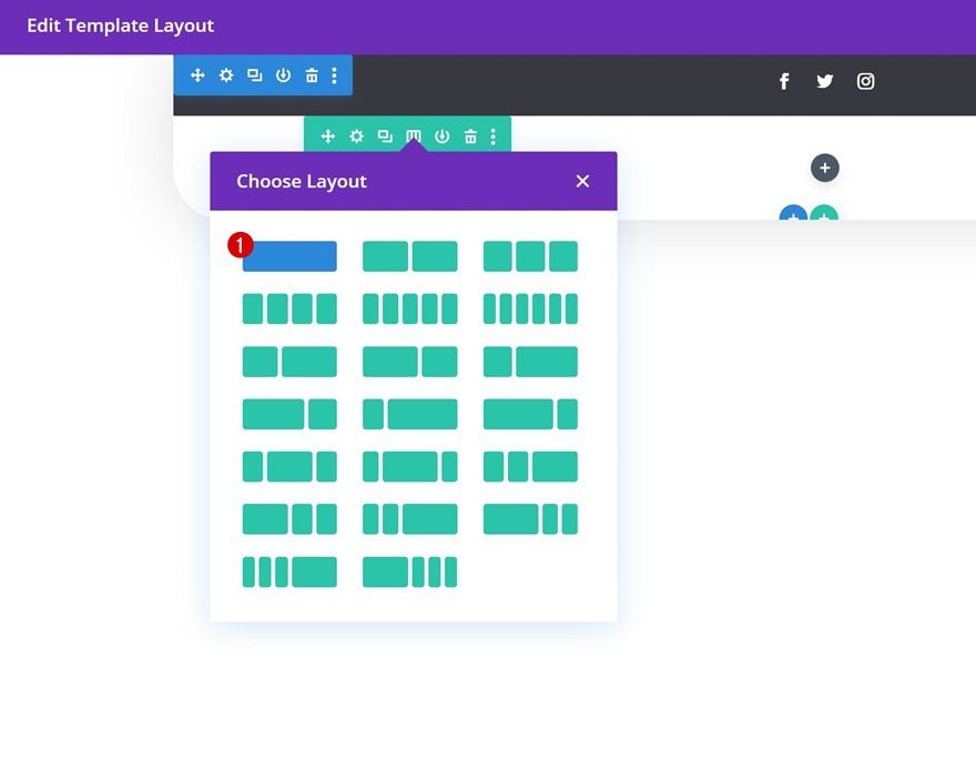
3. Add & Build Global Header
The default website template is where you can start creating your custom global header, global body and global footer. Click on ‘Add Global Header’ and continue by clicking on ‘Build Global Header’ to get started with the process.
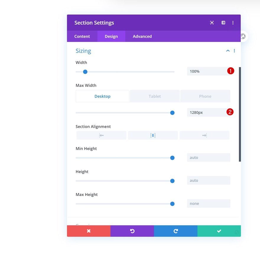
Section Settings
Sizing
Open the section you can notice on the page, move on to the design tab and change the width across different screen sizes.
- Width: 100%
- Max Width: 1280px (Desktop), 100% (Tablet & Phone)
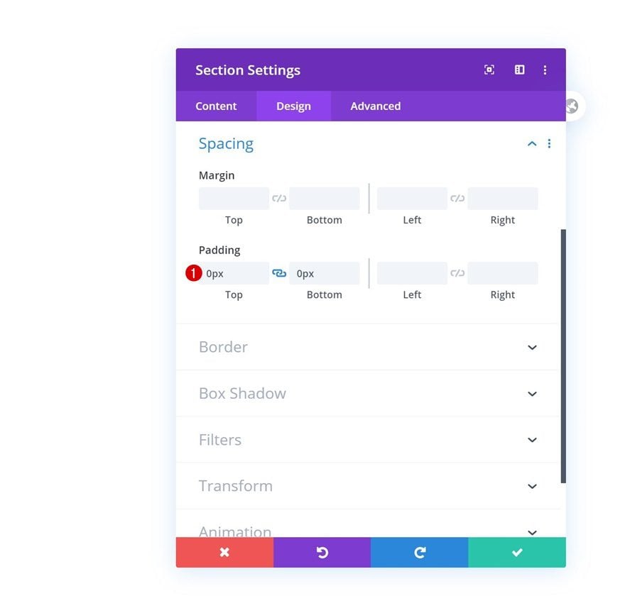
Spacing
Remove all default top and bottom padding next.
- Top Padding: 0px
- Bottom Padding: 0px
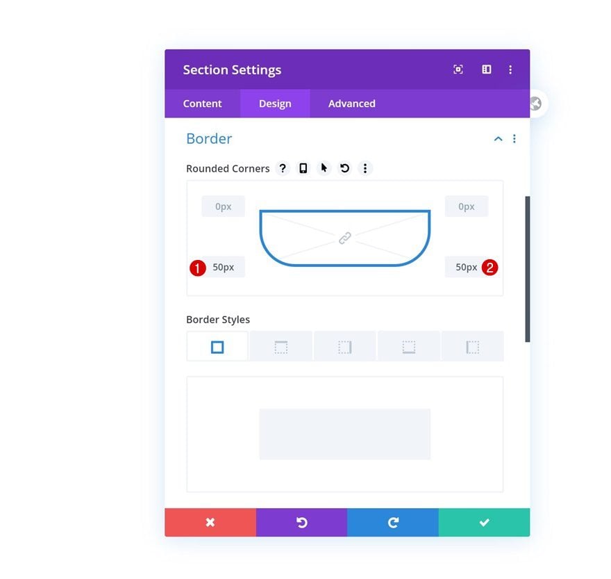
Border
Add some border radius to the bottom left and right corners of the section next.
- Bottom Left: 50px
- Bottom Right: 50px
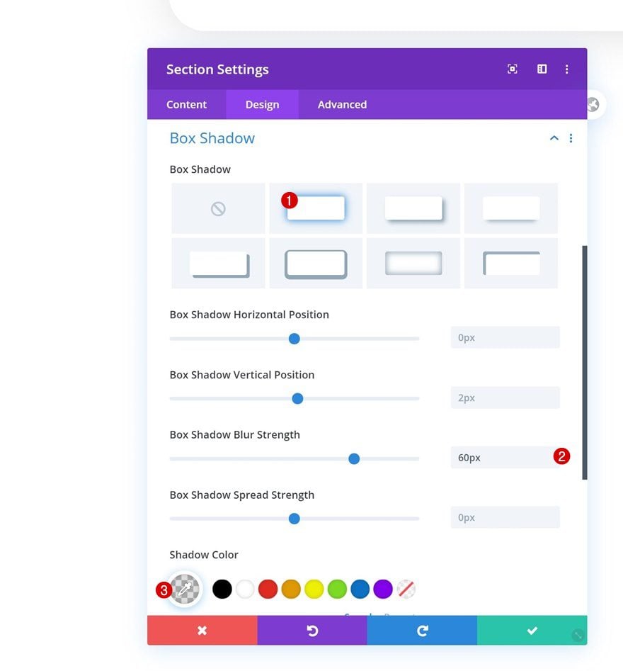
Box Shadow
We’re also adding a subtle box shadow.
- Box Shadow Blur Strength: 60px
- Shadow Color: rgba(0,0,0,0.13)
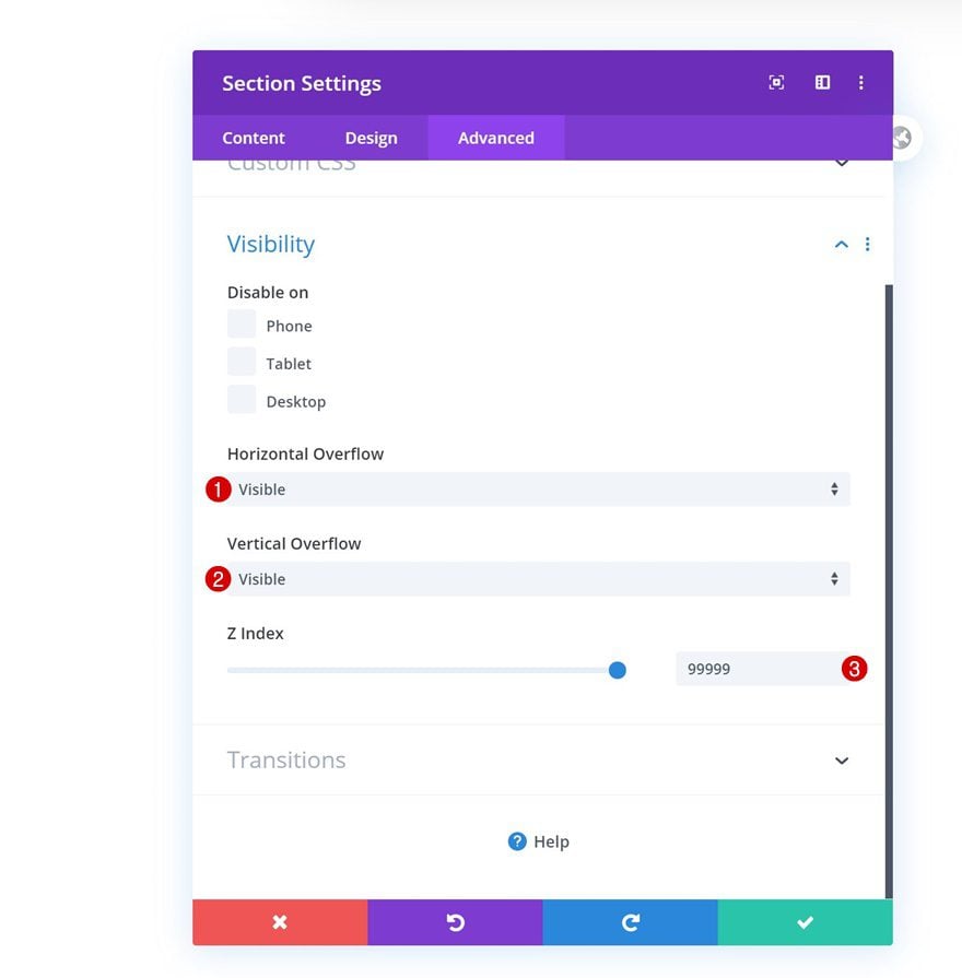
Visibility
Then, go to the advanced tab and hide the overflows. Increase the z index too, this will help ensure that the section remains on top of all page content.
- Horizontal Overflow: Visible
- Vertical Overflow: Visible
- Z Index: 99999
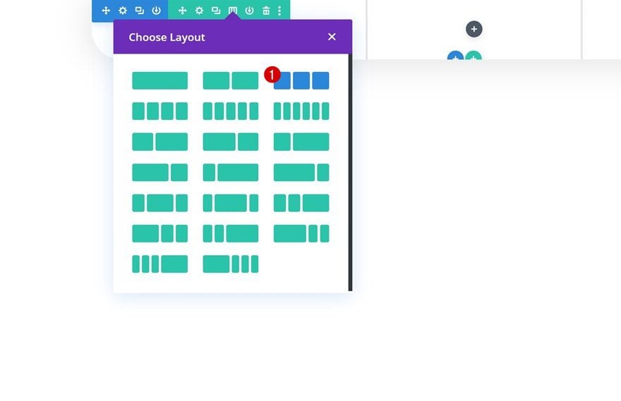
4. Dedicate New Row to Header
Now that we’ve completed the general section settings, we can start adding rows. In total, we’ll need two rows; one that’s dedicated to the header, and one that allows the menu items to show up. We’ll start with the header by adding a new row using the following column structure:
Row Settings
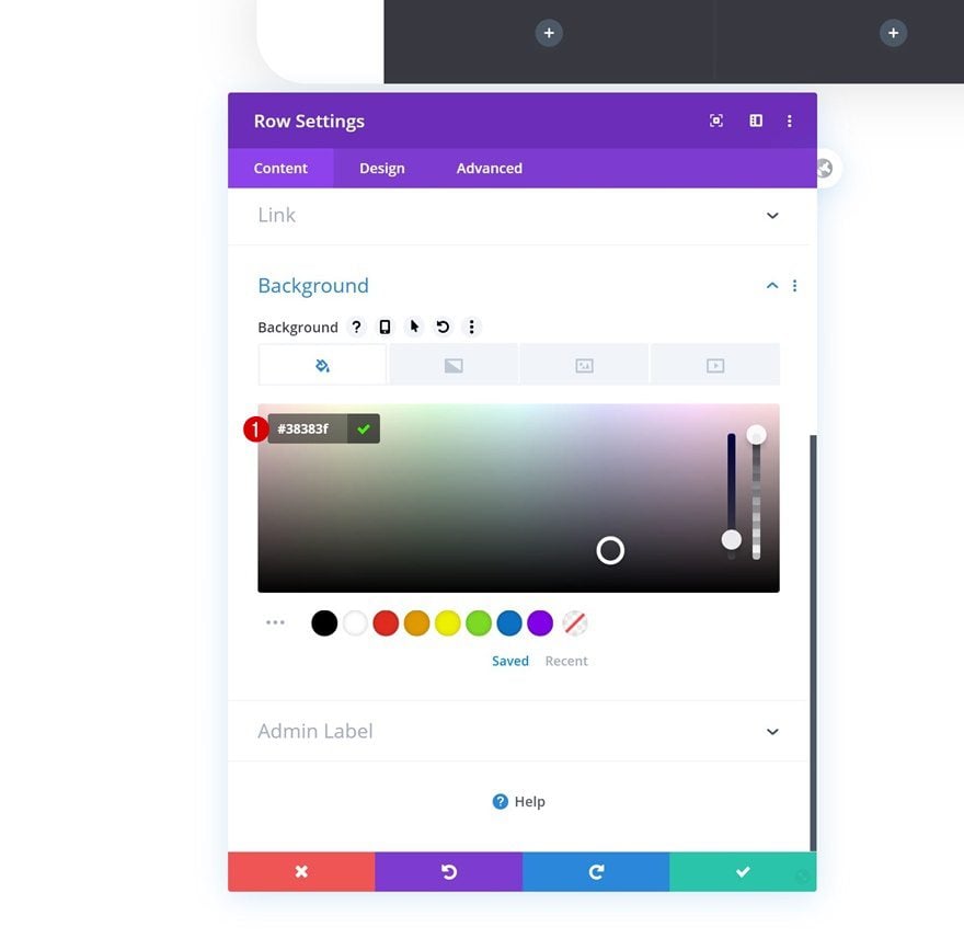
Background Color
Without adding any modules to the row, open the row settings and change the background color.
- Background Color: #38383f
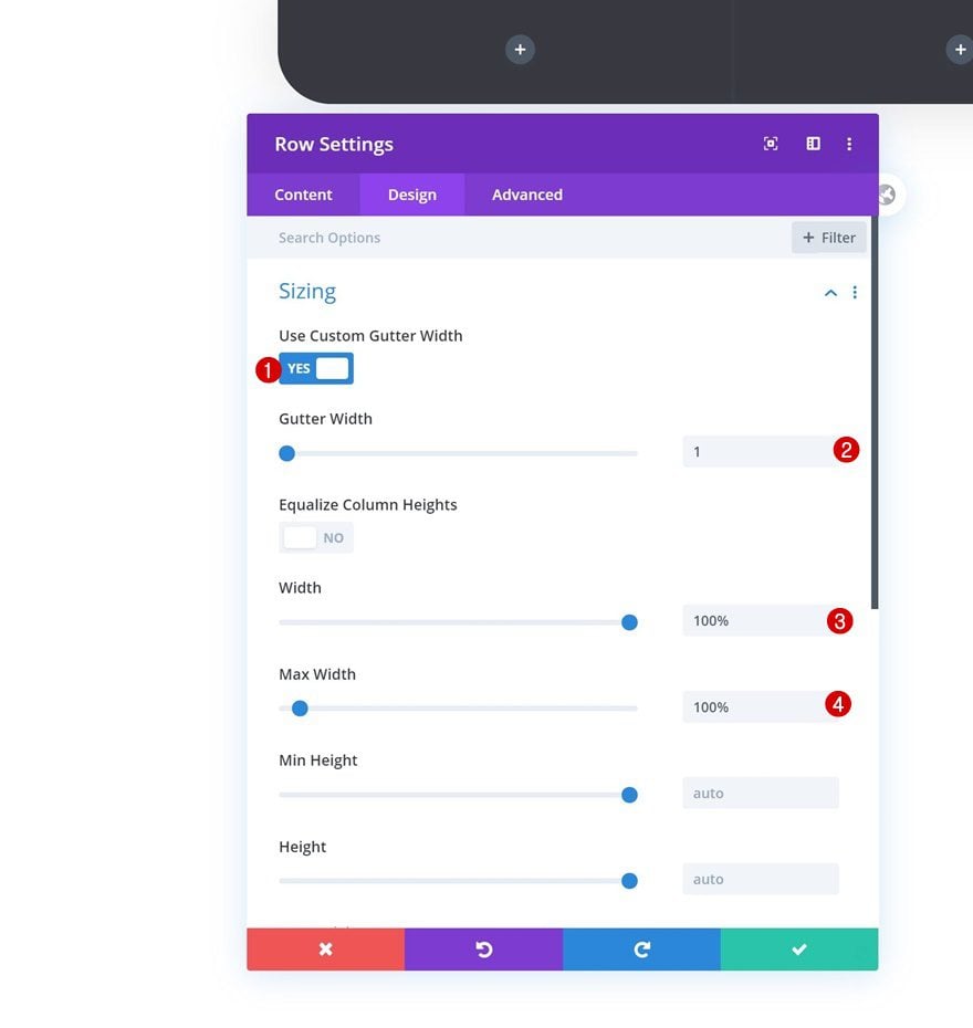
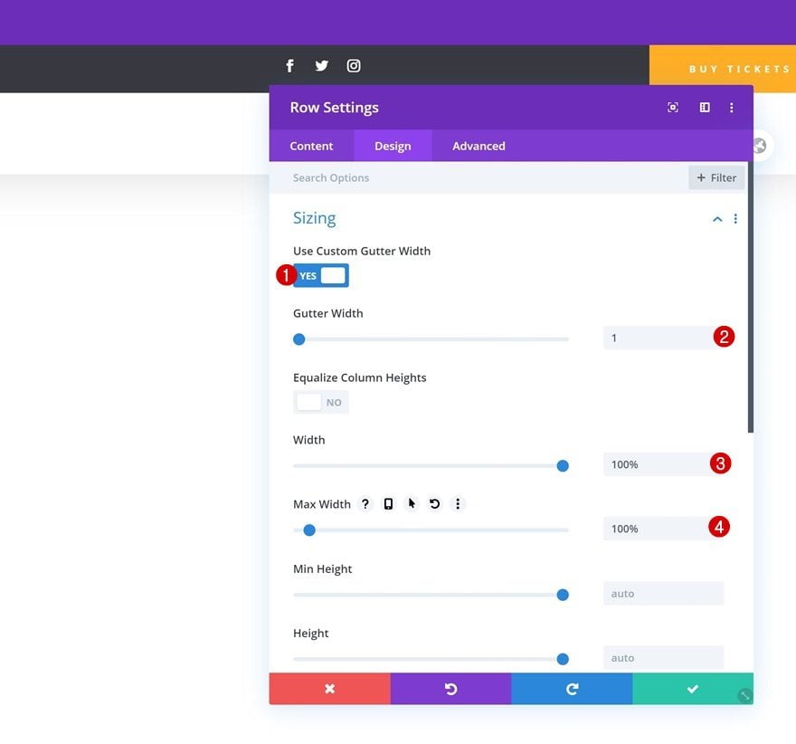
Sizing
Modify the row’s sizing settings next.
- Use Custom Gutter Width: Yes
- Gutter Width: 1
- Width: 100%
- Max Width: 100%
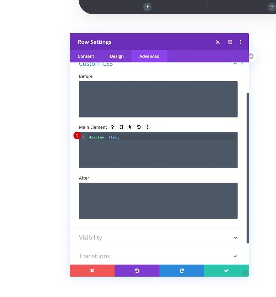
Display
And make sure the columns appear next to each other on smaller screen sizes as well by adding one single line of CSS code to the row’s main element.
display: flex;
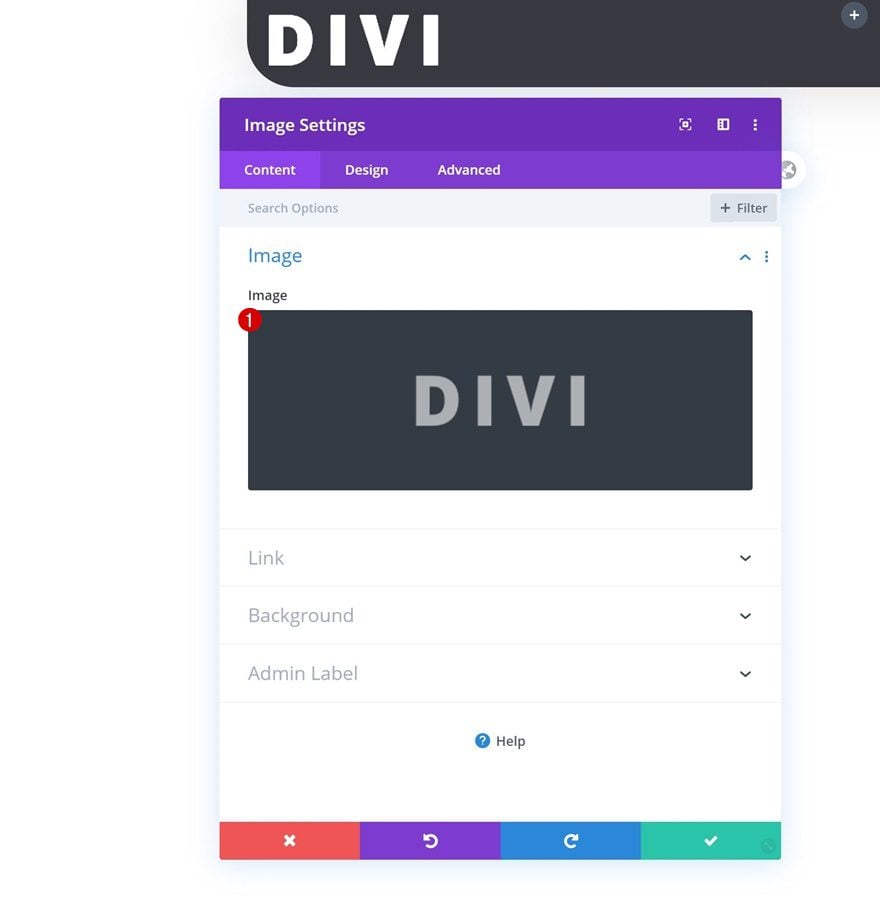
Add Image Module to Column 1
Upload Logo
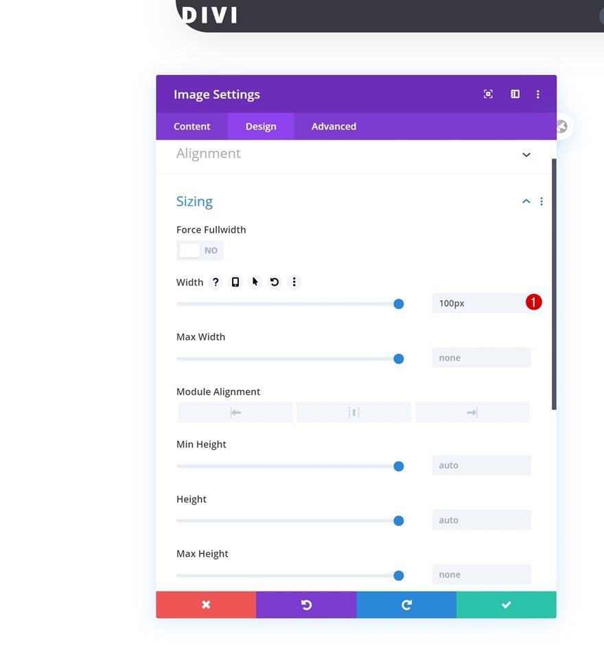
Once you’ve completed the row settings, it’s time to start adding modules. Add an Image Module to column 1 and upload your logo.
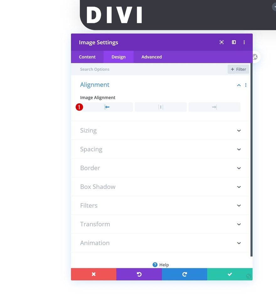
Alignment
Move on to the design tab and make sure you’re using left image alignment.
- Image Alignment: Left
Sizing
Modify the module’s width too.
- Width: 100px
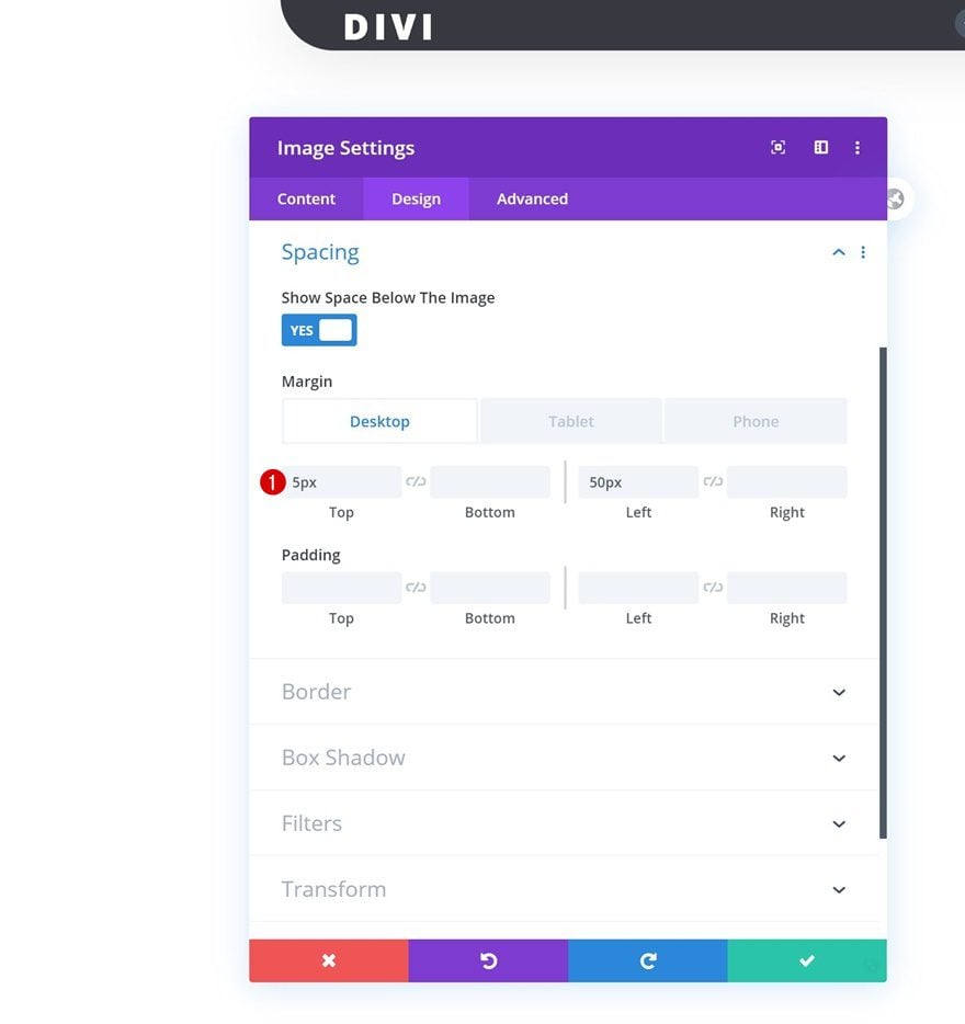
Spacing
And add some custom margin values across different screen sizes.
- Top Margin: 5px
- Left Margin: 50px (Desktop), 20px (Tablet & Phone)
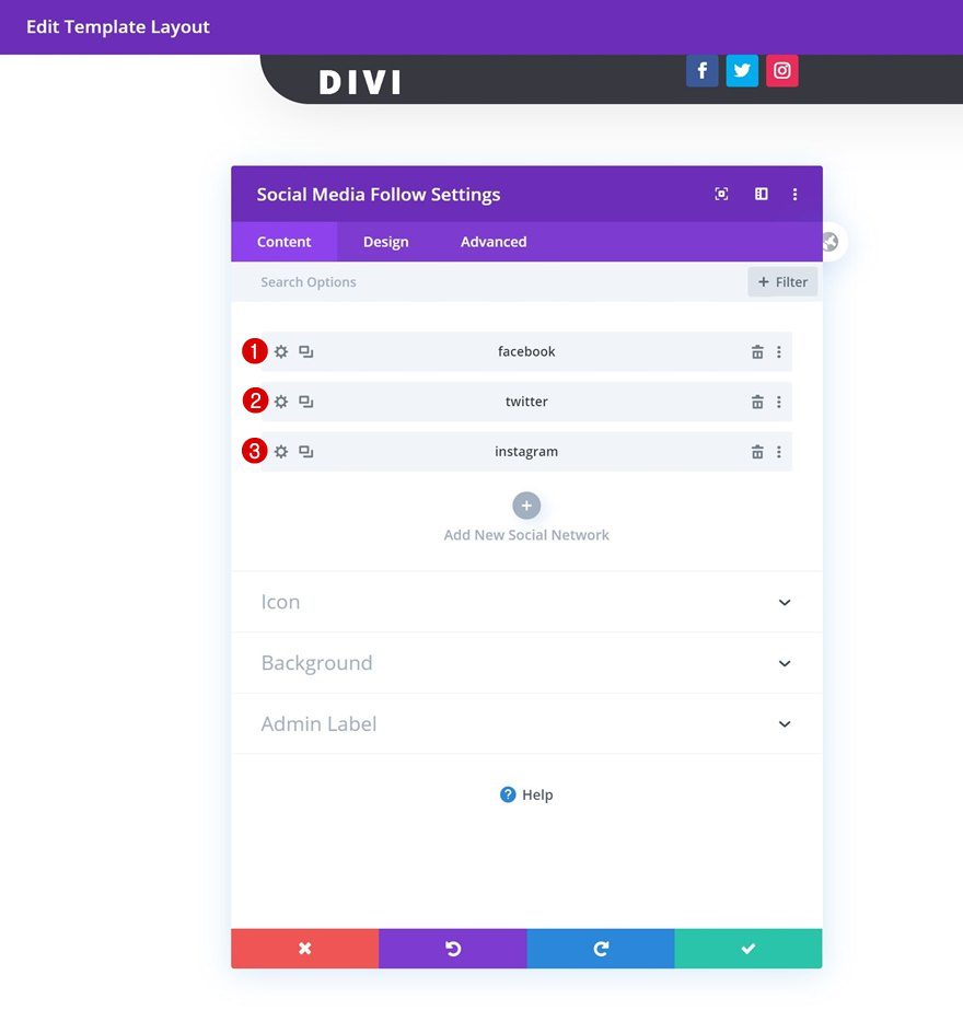
Add Social Networks
On to the second column. There, we’ll need a Social Media Follow Module. Add the social networks of your choice.
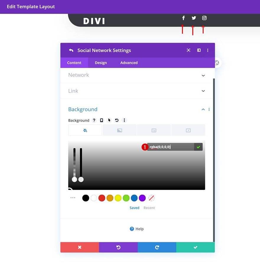
Social Network Background Color
Then, open each social network individually and change the background color into a completely transparent one.
- Background Color: rgba(0,0,0,0)
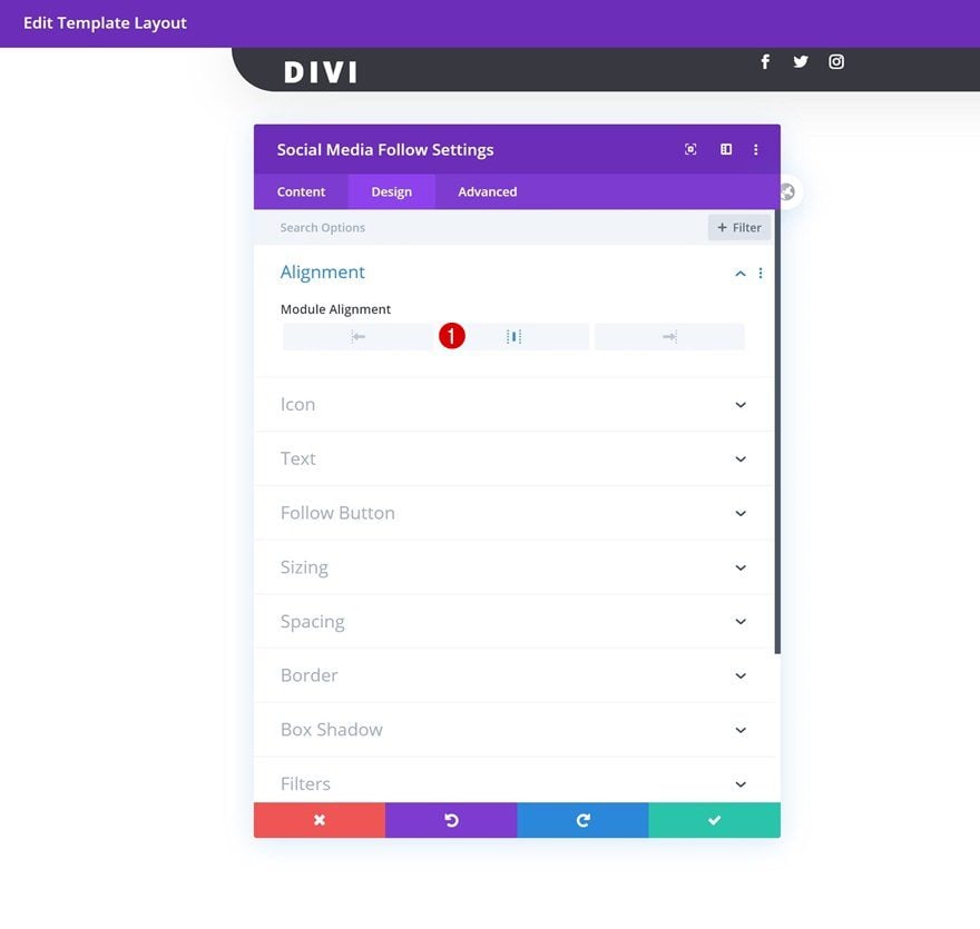
Alignment
Go back to the module’s normal settings and change the entire module alignment next.
- Module Alignment: Center
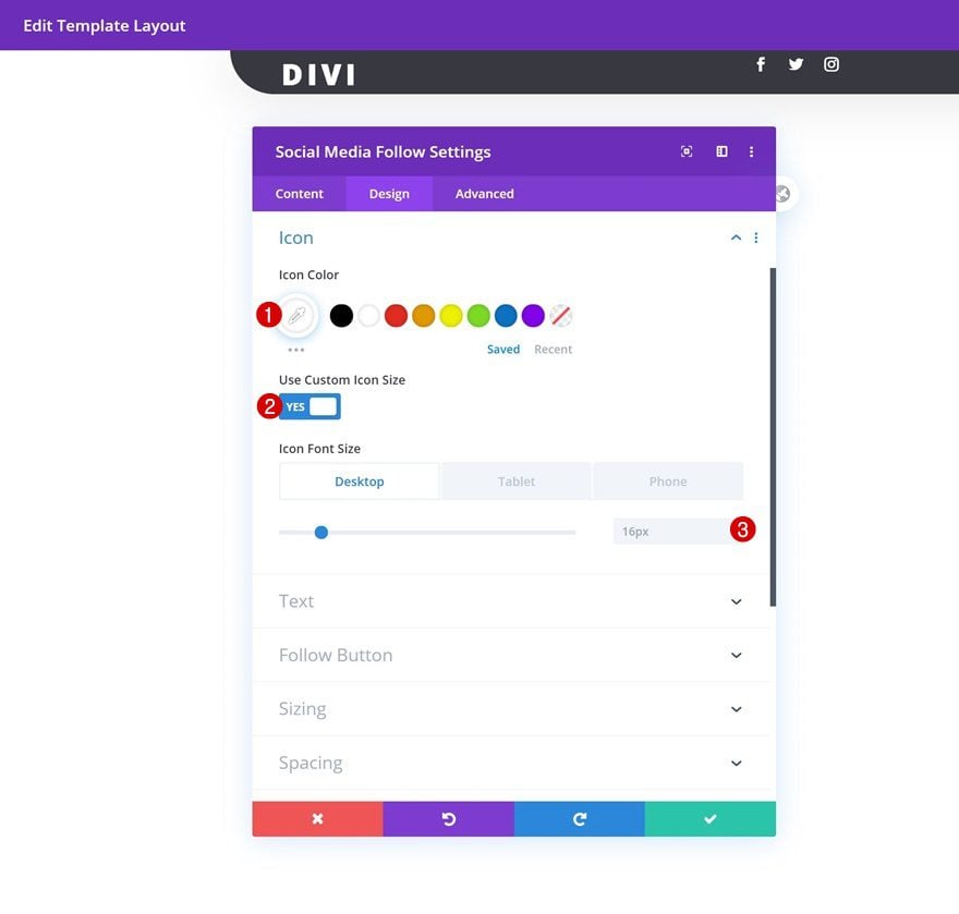
Icon
Modify the icon settings too.
- Icon Color: #ffffff
- Use Custom Icon Size: Yes
- Icon Font Size: 16px (Desktop & Tablet), 12px (Phone)
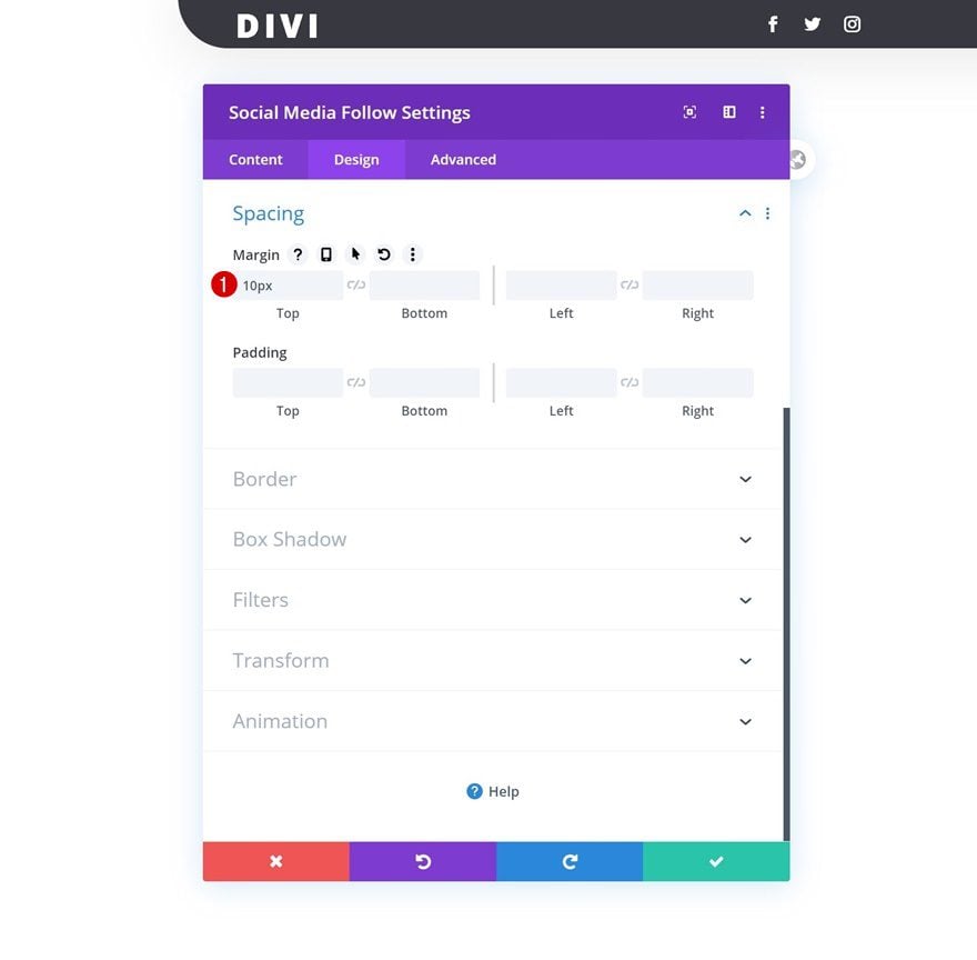
Spacing
And add some top margin.
- Top Margin: 10px
Add Copy
Move on to the third column and add a Button Module with some copy of your choice.
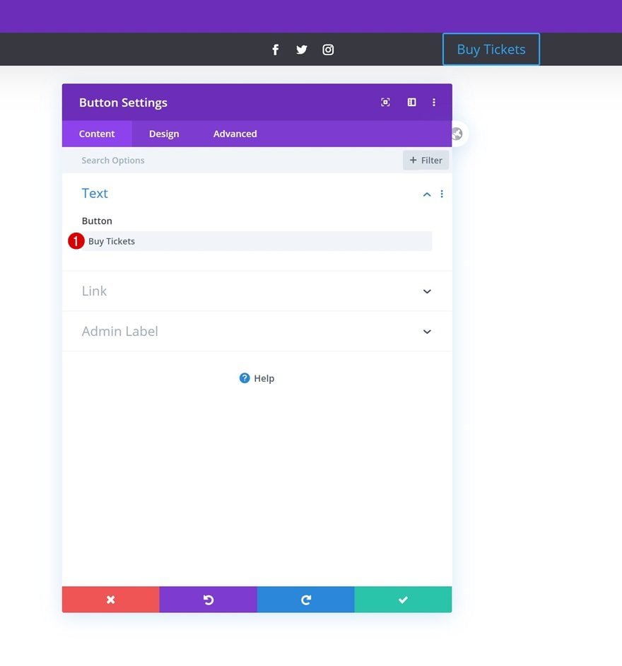
Alignment
Change the button alignment in the design tab.
- Button Alignment: Right
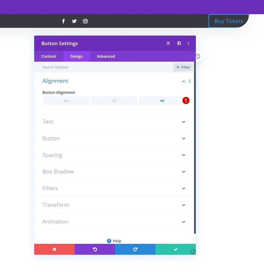
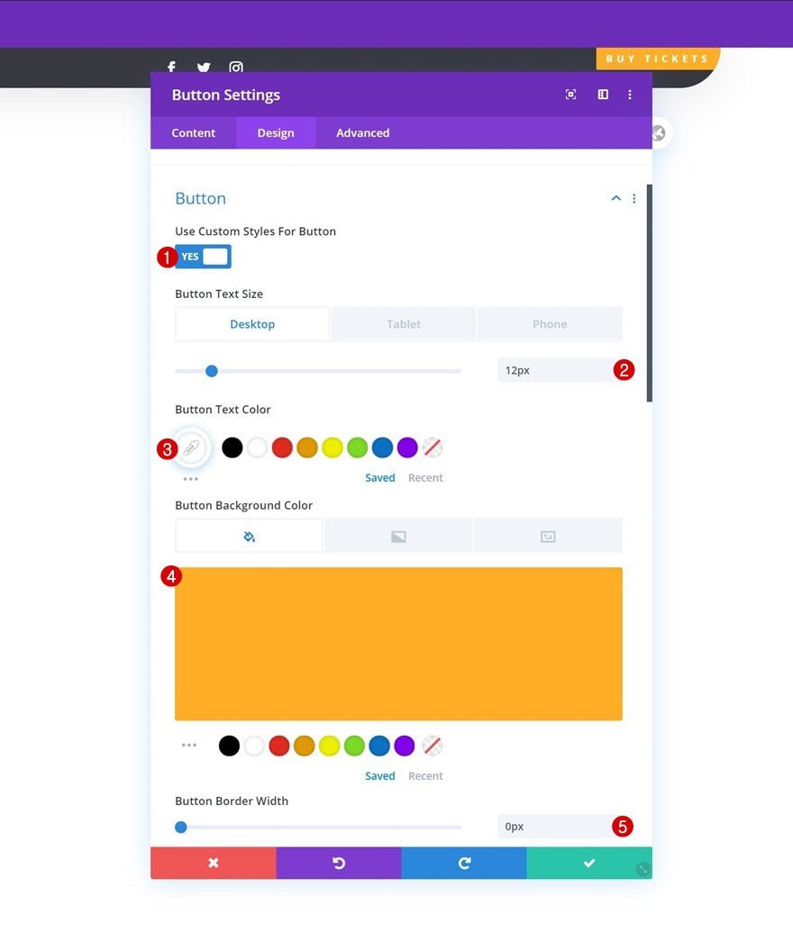
Button Settings
Style the button settings accordingly:
- Use Custom Styles For Button: Yes
- Button Text Size: 12px (Desktop), 10px (Tablet), 8px (Phone)
- Button Text Color: #ffffff
- Button Background Color: #ffae25
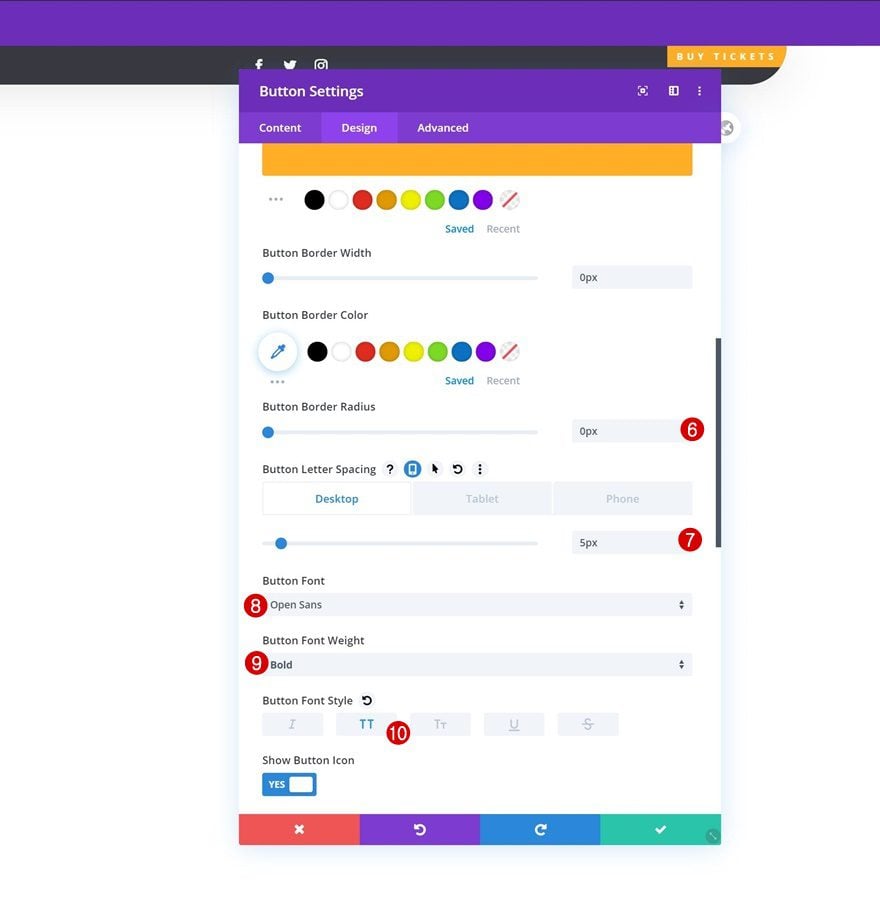
- Button Border Width: 0px
- Button Border Radius: 0px
- Button Letter Spacing: 5px (Desktop), 3px (Tablet & Phone)
- Button Font: Open Sans
- Button Font Weight: Bold
- Button Font Style: Uppercase
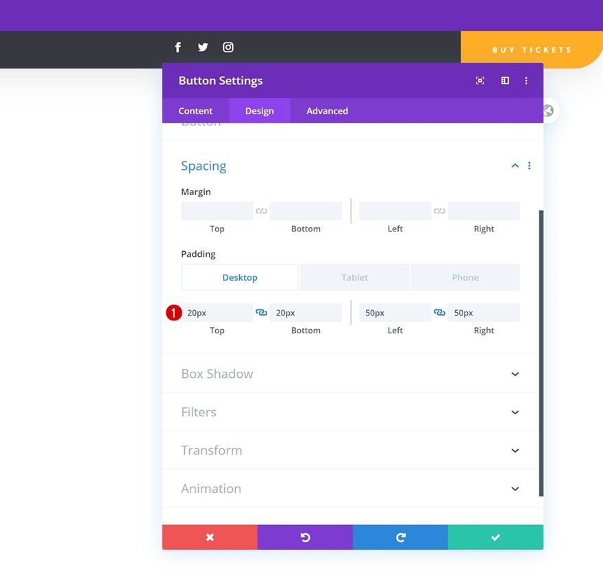
Spacing
And add some custom padding values across different screen sizes.
- Top Padding: 20px
- Bottom Padding: 20px
- Left Padding: 50px (Desktop & Tablet), 15px (Phone)
- Right Padding: 50px (Desktop & Tablet), 15px (Phone)
Once you’ve completed the row that’s dedicated to the global header, you can add another row right below it using the following column structure:
Row Settings
Sizing
Without adding any modules yet, open the row settings and change the sizing settings in the design tab.
- Use Custom Gutter Width: Yes
- Gutter Width: 1
- Width: 100%
- Max Width: 100%
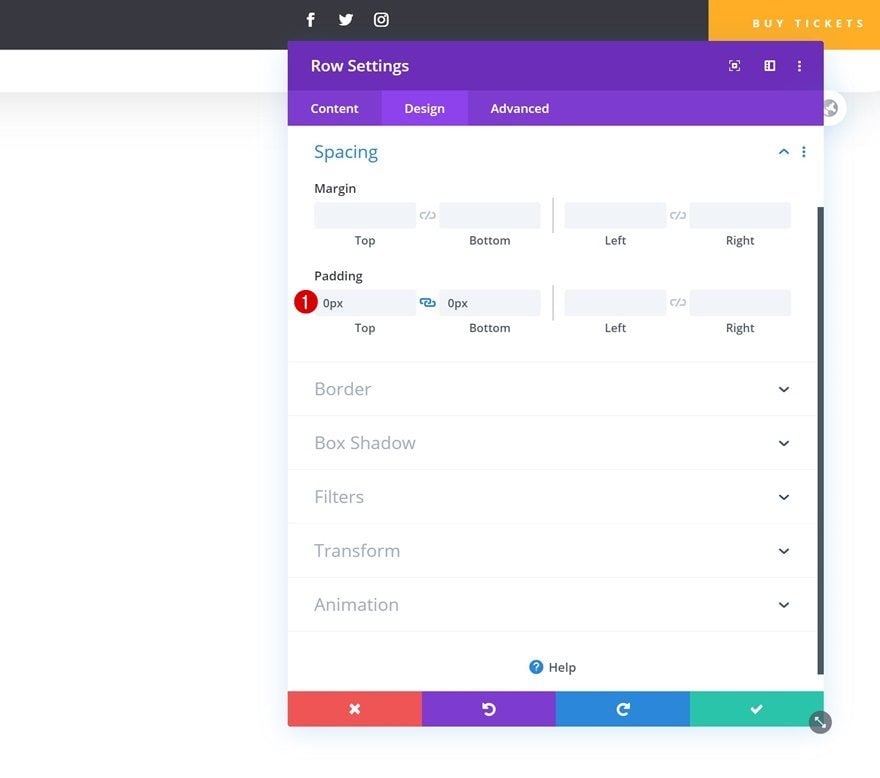
Spacing
Remove all default top and bottom padding next.
- Top Padding: 0px
- Bottom Padding: 0px
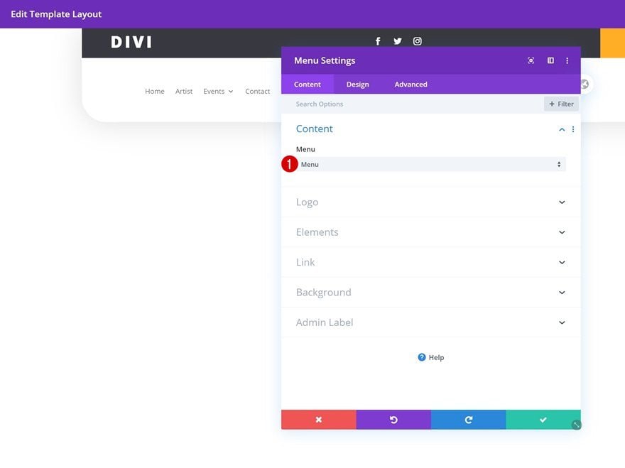
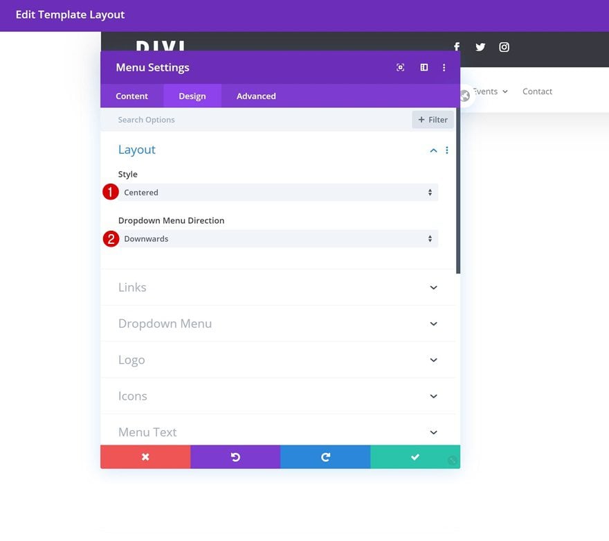
Select Menu
Then, add a Menu Module to the column and select the menu you’ve created in the first part of this tutorial.
Layout
Move on to the design tab and change the layout settings as follows:
- Style: Centered
- Dropdown Menu Direction: Downwards
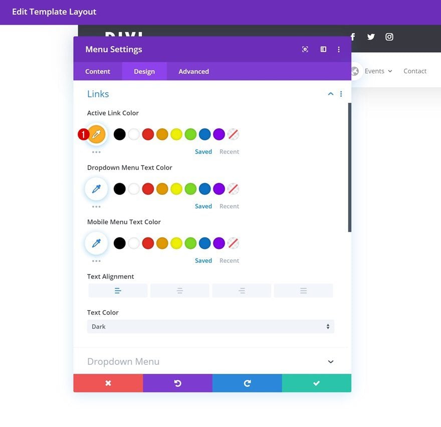
Links
Modify the active link color in the design tab too.
- Active Link Color: #ffae25
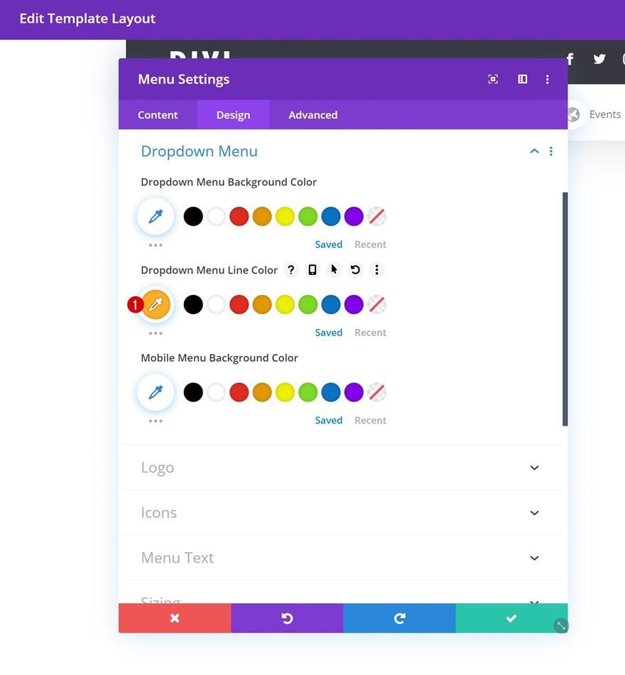
Dropdown Menu
Do the same for the dropdown menu line color in the dropdown menu settings.
- Dropdown Menu Line Color: #ffae25
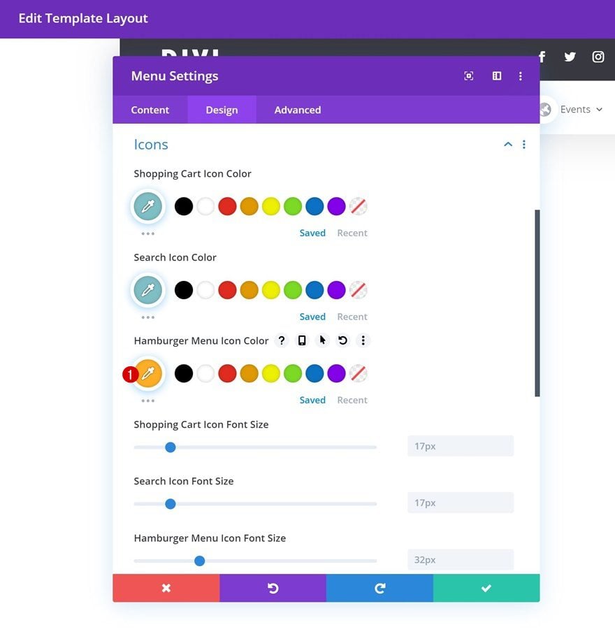
Icons
Modify the hamburger menu icon color next.
- Hamburger Menu Icon Color: #ffae25
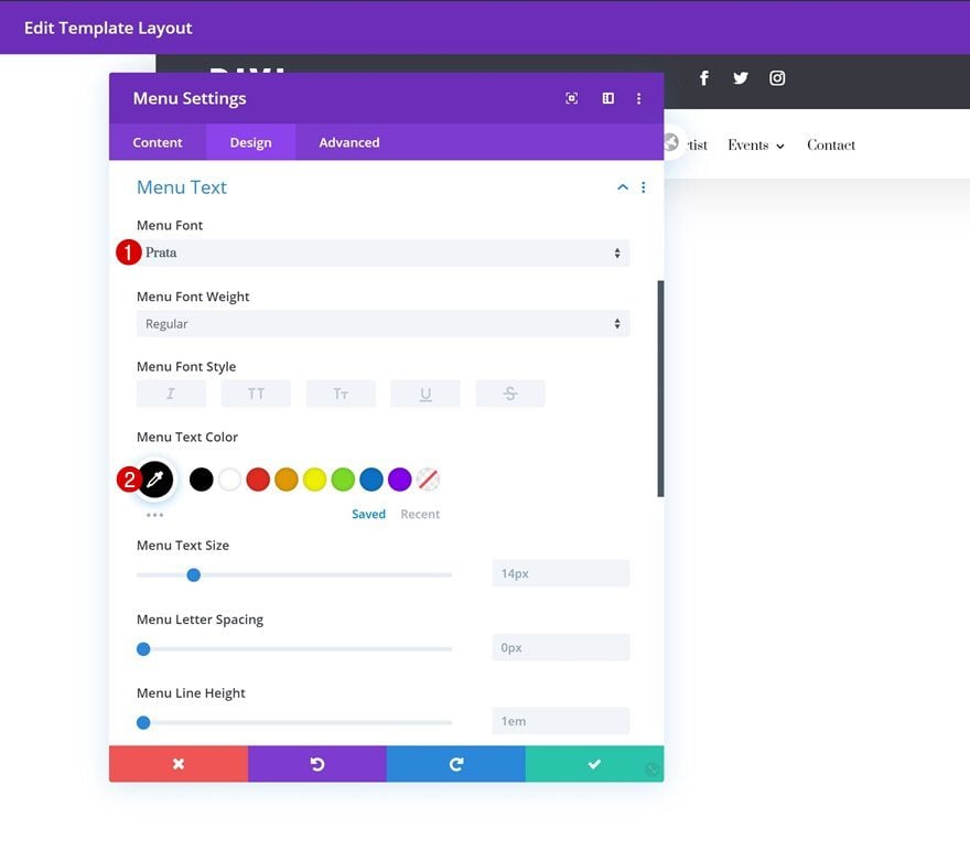
Menu Text
Along with the menu text settings.
- Menu Font: Prata
- Menu Text Color: #000000
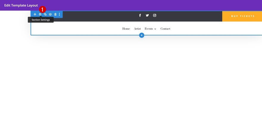
Open Section Settings
Once you’ve completed the second row, the only thing left to do is make the section stick to the top of our pages and posts. To do that, we’ll open the section settings again.
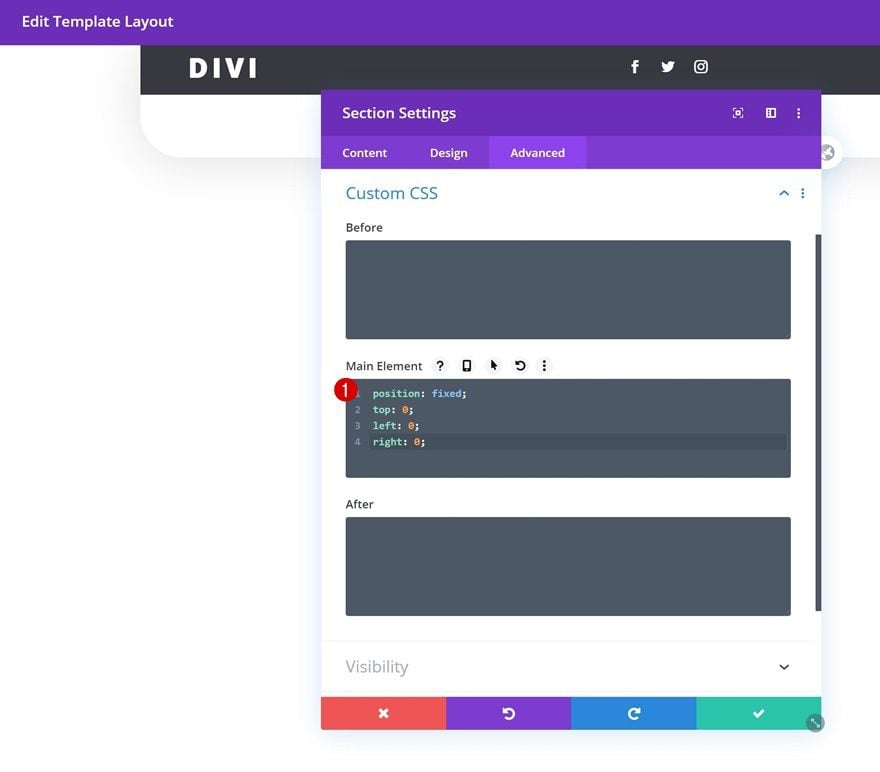
Add Custom CSS to Main Element
Then, we’ll go to the advanced tab and we’ll add a few lines of CSS code to the section’s main element.
position: fixed;
top: 0;
left: 0;
right: 0;
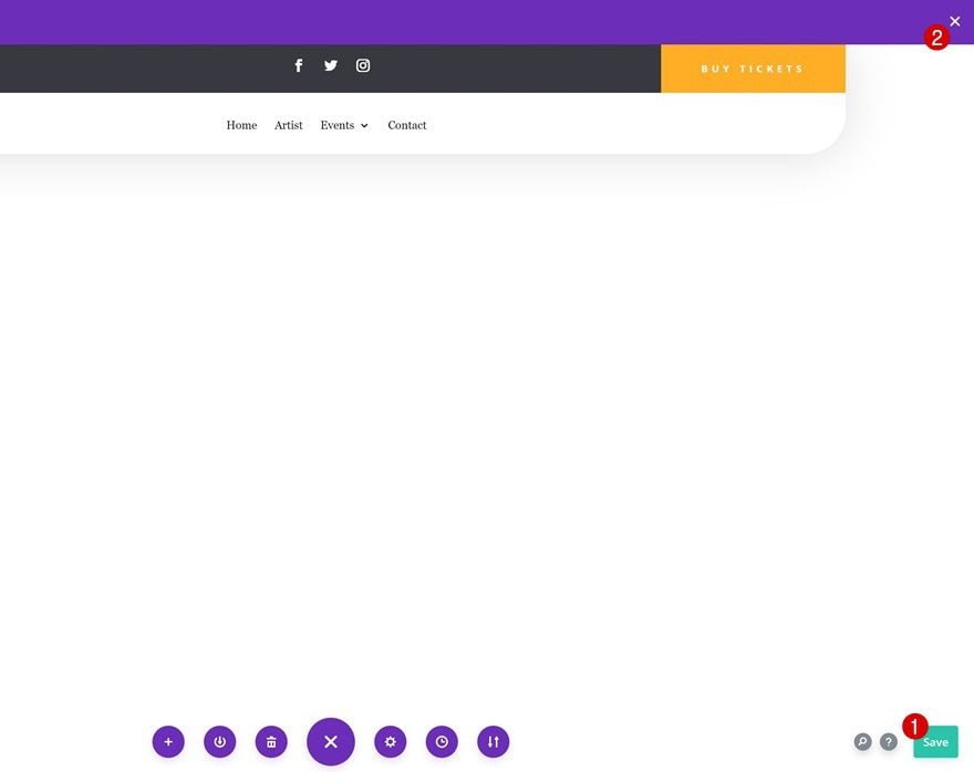
7. Save Global Header & Theme Builder Options
Once you’ve completed the entire global header design, make sure you save the design before exiting the template layout. Once you’re outside of the template layout, save the changes of your entire theme builder and you’re done!
Preview
Now that we’ve gone through all the steps, let’s take a final look at the outcome across different screen sizes.
Desktop
Mobile
Final Thoughts
In this post, we’ve shown you how to create a custom global header with Divi’s new Theme Builder. This tutorial goes to show how easy it is to create beautiful headers and apply them to your entire website or specific custom post types. We hope this tutorial inspires you to get started with the Theme Builder right away! If you have any question or suggestions, make sure you leave a comment in the comment section below.
If you’re eager to learn more about Divi and get more Divi freebies, make sure you subscribe to our email newsletter and YouTube channel so you’ll always be one of the first people to know and get benefits from this free content.


Is there a matching footer layout to this as well?
Unfortunately, there’s no matching Footer Layout to that Header Template at the moment. But you can see matching Header and Footer Templates in our Blogs which are available for download:
https://www.elegantthemes.com/blog/?s=header+and+footer&submit.x=0&submit.y=0
I am a total tech dinosaur and this tutorial was so fun to do. Fun serendipitous fact – the color scheme in the tutorial is in line with my exact brand colors for my website!! I had a few issues with the menu as it was coming up vertical instead of horizontal, but Elegant Themes chat support was awesome and did the coding for me. I am really enjoying this global header and already receiving compliments. Thank you!
hi. I just did this tutorial last week, and now I’ve lost the global header with no history ! How does it just get lost. Divi chat support unfortunately said it is lost. How do I make sure it stays (forever and ever)? Annoyed.
I love working with the Divi builder for most things, main issue with Divi Builder for making a custom header is that when navigating from one page to another or when refreshing the current page all the custom header module have visible shifting of css styles and is very distracting. It’s as if (on every page load) it first displays the default style of all the modules and then tries to apply your custom styles afterward as fast as it can. So you can never get a header to load without everything shifting around. I would love to hear if there is a solution for this.
I tried making a header and then it didn’t work out the way I planned. I turned it off and even tried deleting it but the original wordpress header is not coming back. Is there some button I need to hit to bring back the pre-Divi 4.0 header-WordPress header?
Thanks,
Line
Hello and thanks for this tutorial. I have a problem with the hamburger menu. The menu don’t works. when I click on it the menu don´t dropdown. How can I resolve this problem?
Thanks
Hi, I also had this problem with the hamburger menu. My friend gave me this CSS and now it works on mobile. Maybe you’ve already solved this.
I wordpress menu:
Appearance -> customize -> Extra CSS
.et_mobile_menu {
position: relative !important;
width: 100px !important;
}
Totally useless tutorial. I’m asked to download a design. But I’m not told what to do with it then. As a result, having gone through all the steps, I get nothing. That is: the preview shows the menu I’ve created, but it does not show up when I look at the real thing. First suspicion arose when I was unable, unlike the tutor, to get to “edit layout template” – instead I got something like “edit global header layout”.
I have tried to upload the .json file in every conceivable way, but I just keep getting the “this can not be loaded in this context error. I have tried to import it to the Library, the page on standard builder, the page on visual builder and also the theme builder. Where am I going wrong?
same here
Tried doing this with Divi Extra. Madea great header but the content from the Extra category builder pages dont display properly beneath this header ( top items in any content layout and sidebar widget are lost beneath header. Have tried adding some top / bottom margin space, on header and Category layout section setings but doesn’t solve problem. Has anyone else tried this, and if so have a solution?
So I tried out the new header, but it is pretty buggy. When I disable it/delete it though, the old divi header doesn’t show up anymore, so at this point I’m pretty much trapped.
Any way to bring back the old divi header?
Just had the same issue when testing it out, to solve it go to the theme builder menu in the DIVI section and where you added the new header click the EYE icon so it doesnt show anymore, your old menu settings will now return …… hope this helps
another problem : with my custom header, the side point navigation bar has disappeard… But it’s checked on the pages…
What can I do ? I love this point navigation ! 🙂
Thank you for your very helpfull tutorials !
Many nice ideas – but too much missing. No good solutions for sticky header. The menu now aligned left and no right align. Why?
Its great how you are working to make it more adjustable and comfortable, but don´t just skip the functions which already worked well.
Hi everyone,
very nice tutorial !
is it possible to hide the custom header when no scrolling, like in basics divi settings ?
Thanks
This is my solution to the menu appearing at the top normally, but leaving room for the wp admin bar at the top when logged into WordPress.
Add a code module somewhere in the first section of the template header. In that code module, add the following code:
Put a script tag here (seem to not be able to do this directly as it invokes an Elegant Themes security protection
jQuery(function($){
if ($(‘#wpadminbar’).length > 0) {
$(‘.et_pb_section_0_tb_header’).css(‘top’, ’32px’);
}
});
Put a closing script tag here
With this, the header will take the setting (presumably top: 0px) if the user is not logged in and the admin bar is not present. If there is an admin bar, top is changed to 32px to leave room at the very top for the wp admin bar.
Exciting!! Not able to figure out how can we do a fixed header at the top with a transparent background. Any thoughts?
Working on a tutorial that’ll handle this, keep an eye on the blog! 🙂
Hi, beautiful layout but could I with some simple css say that should only work on mobile? And for desk top the standard one kicks in? Love your work! Thank you.
Happy to hear you like the design! 🙂
You can use Divi’s built-in responsive content to modify the modules across different screen sizes. Or you can use different sections for the headers you build and hide them in the visibility settings. We’ll definitely handle this in upcoming tutorials!
I followed the instructions and built header, but now I can’t get it off the site. I deleted the template it was on, where I had added it to all the pages. I then deleted the global header template and it is still on the site. The header is the only thing I have on the site so far. Do I need to reset all templates?
When you’re using a global header in different templates and you delete the global header in your default website template, the global header will transform into a custom header. You’ll need to delete the custom header in each template if that’s the case.
This is getting really frustrating . . .
I’ve been TRYING to build a custom header using the Theme Builder and every time I try to insert/use the “Social Media Follow” module within one of the columns in the row, it disappears – GONE. I’ve tried several times – clearing cache – same result.
Any idea WHY this is happening? Is this a glitch? I didn’t change any particular settings. And it’s ONLY the “Social Media Follow” module that’s doing this.
I’m using polylang to make my website multilanguage. how can I change logo and tagline when I change the language?
Is it possible to build a custom header without losing my menus? I have a mega menu that does not look right when added to a custom header.
Thanks
As soon as you start building a custom header, you’re entirely getting rid of the old one. But we’ll soon create a tutorial on how to build a mega menu with Divi’s theme builder so keep an eye on the blog! 🙂
There seems to be a common problem, first of all is the position of the main body starts below the header and the most irritating is that when in mobile, clicking the “hamburger” the drop down menu goes below the main body.
For the disappearing “hamburger” drop down menu problem, from this tutorial. In the section settings>advanced>visibility change both vert and horiz overflow to visible for tablet and mobile.
I did that, still not displaying the menu correctly. Did anyone find another fix?
Hi, if you haven’t got the hamburger menu worked on mobile you can try this:
I wordpress menu:
Appearance -> customize -> Extra CSS
.et_mobile_menu {
position: relative !important;
width: 100px !important;
}
In the section “Hover Visibility” you have a Hover setting. Even though I have the latest version of Divi and builder there is no hover setting box.
Is this why the drop down menu doesn’t show on tablet and mobile?
Link to screen shot of No Hover setting
https://drive.google.com/open?id=1ZxXtH2bpf-sbWmuRmwJb2yEApRdTE17r
Anyone knows how to prevent in mobile view the layout from overlapping with the main home image? Otherwise it looks great
I hope more footers will be available soon, such as how we can download site templates.
Why are Divi custom template .json files difficult to import?
Is there a way Divi can sort out the problem of importing custom template .json file into Divi Builder, especially when you introduce a new feature?
Typical examples: Custom Global Header, Custom Footer.
Error message: “This file should not be imported in this context”
It’s annoying to keep seeing this error message in spite of using several different options or approaches in one’s attempt to import either at backstage or front end, e.g.: Import & Export, Portability, etc.; and even if you create a blank new page.
Is there something we are missing or doing wrong?
What’s the use, after all the lengthy explanations one can’t simply import a custom template .json file into Divi Builder and use it.
Please simplify the process or function to import the .jason files!
Any plans on adding the ability to have menus right-aligned? Surprised this isn’t an option out the box, especially when the default header menu in divi itself is right aligned.
If you right align the menu text under the design tab that should get you the default menu look.
I can’t find an option to right align the menu text under the design tab. I see “centered” “left aligned” or “inline centered logo”
I built a Global Header under the Default Website Template, but it’s not showing up on any pages, even though it’s visible. Is there a setting to ‘enable’ this? I thought just by adding it I would see it on my pages.
Not sure if this is what you’re struggling with but f you’re building a fixed header, you’ll have to make sure your global header section’s z index is high enough so it overlaps the page content. I usually assign a ‘99999’ z index.
The same thing is happening to me. Did you ever get this figured out?
When I apply the fixed element
position: fixed;
top: 0;
left: 0;
right: 0;
the main content goes up and hide behind the menu, any idea how to fix that?
Thank you
My workaround:
Divi>Theme Options>General>CSS personalizado
#et-main-area {
margin-top: 83px !important; /* Put here whatever your header height is */
}
Theme Options > Integration > Add code to the
jQuery(function($){
if ($(‘#wpadminbar’).length > 0) {
$(‘.et_pb_section_0_tb_header’).css(‘top’, ’32px’);
}
});
Hi There,
Just had the same issue I think. You are talking about the WP admin bar yes? A quick fix would be to add the class custom-sticky-header to the section you’ve just built. Then add the following into the Divi custom CSS section or child theme stylesheet (not the header section you’ve just built)
.admin-bar .custom-sticky-header {
top: 32px;
}
Thanks but that helps only if you are edditing the page. After going live my header is hiding the the top of my content on the page.
I see, that sounds like a different issue as this code is designed to work whilst editing, hence the admin-bar selector. Try adding some padding to the main section you’ve built the header in?
I’m having the same issue. When you apply the fixed position and adjust the visibility settings, the section that contains the global header covers up the beginning portion of my main page content (mainly because of the 999 setting for z-index, I think).
Elegant Themes team, how can this be corrected so all main content can be viewed and not covered up by the global header? Thanks for the help!
Very nice. Thank you.
Seems like this works only for fresh and empty theme builder. When I try to import I get a bunch of questions – but either way, after import nothing happens. The theme builder concept works only with empty content?
”
This import contains references to the global Header, Body, and/or Footer from the website they were exported from. How would you like to import these references?
Relink them to this website’s global Header, Body, and/or Footer.
Import them as static layouts from the website they were exported from. This may take several minutes depending on the number of references being imported.
”
Right now I do not get it how the whole concept works besides the missing features for header menu….
I did ask for clarification to the support, but seems they do not know either or just keep asking for removing plugins..
As David says,… this glitching is in almost every builder template you guys bring out these days. You use a photo of a guy, that is round. But it starts as a square and the you see it building up the round edges. This i really annoying, and not so professional looking. It seems elements are first build and, after a while, styled. It should be element > styled > build.
CAN YOU PLEASE FIX THAT?
It’s also in this menu, as David says.
I’m not used to this happening at Divi updates.
Furthermore, I see a lot of people requesting like Slawek, to have the ability to use ‘standard’ Divi features of headers that shrink when scrolling down, or other features we are used to of Divi prior to 4.0…
Thanks for the step by step tutorial. Glad to be a family of Divi.
How to change height and background-color of sticky menu when user scrolling down. This is standard function in normal header of divi (also on this page)
Yes, I am also looking for an answer to this. I like the idea of customising a new global header, because the core ones are too basic. But many sites would benefit from a smaller, more compact menu on scroll
I noticed at the end your header was glitching when ever you hovered over the white end of the menu, the radius corners would revert back to squares instead of rounded. I tested this on my testing site and confirmed it does it to mine as well. Is there a solution so that it does not glitch when the mouse hovers over the menu?
In the directions above they have it listed under Hover Visibility. To change the section’s overflows on hover to visible. Just change that to hidden and you’re all set.
I built mine according to the directions and have the same problem as David. I’ve tried setting Hover visibility to hidden, but it still does not work properly. Also I have one drop-down menu, and if the setting is “hidden”, the drop-down menu items are behind the main content.
Same issue here…
Thats not a glitch, It is how it is designed. To change it you can got Sections Settings->Advanced Tab->Horizontal Overflow-> Hover->Select “Hidden” (you might have selected visible during design)
Do the same for Vertical Overflow. I was facing the same issue and this is how I corrected.
In the native Divi header “et-fixed-header” is dynamically added to #main-header when you scroll down the page. How do you duplicate these on scroll styles when you are using a global header?
Exactly!
I think it should exist an option to import core menu to theme builder on-the-fly, because is a pain in the a** the need to create another menu, or even better, just an option to use core menu on those new templates.
Cheers
+1!
I was advised to use the theme builder to create archive and search results pages to match my theme. I was really relieved to find this solution, until I discovered that I have to create a header/menu to match the core theme menu. It’s impossible to match the existing styles – I’ve got custom code for mobile break points and all sorts. I just want to use this menu in the theme builder!
How can the site’s title and/ or tagline (by default configured here: /wp-admin/options-general.php) be added to a custom (global) header withOUT having to code PHP (in a child theme e.g.)? I would expect with some (?) shortcode and Divi’s code module: https://www.elegantthemes.com/documentation/divi/code/
Is it possible to collapse the menu items again with Divi 4.0 and the Theme Builder? This tutorial doesn’t work anymore: https://www.elegantthemes.com/blog/community/divi-mobile-menu-hack-collapsing-nested-sub-menu-items.
I would also like to know ?
Use the dynamic content button. For instance, when selecting a text module, hover over the input area and you’ll see the “server/3 disk” icon (not sure what it’s actually called…) appear in the top right. Click it and you have a bunch of options including Site Title and Site Tagline.
?
I failed to import the custom template .json file into divi builder.
I’ve tried added in via Divi Library, as well as Theme Builder > Global header > Build Global Header > Start from scratch > Portbility > import .json file.
The error pops out :
This file should not be imported in this context.
Any help is appreciated!
..just try Theme Builder – Portability (on the right side upper corner) – Import. That’s it.
I get the same problem.
Tried the Divi Library and the Theme Builder, but keep getting the same error:
This file should not be imported in this context.
Other layout (.json) files import fine but this one dose not.
Any ideas?