
A while back, we shared a mobile menu hack that helps you create a collapsing nested menu. We know many of you have used it, but with the new Divi Theme Builder, the approach becomes slightly different. In today’s tutorial, we’ll show you how to apply a mobile collapsing effect to the Menu Module inside the Divi Theme Builder. There are three main parts to this tutorial:
- Setting up your menu and assigning the correct classes to your menu items
- Building your menu using the Theme Builder and Menu Module
- Adding the custom code inside the Theme Builder
You’ll be able to download the template JSON file for free as well! Let’s get to it.
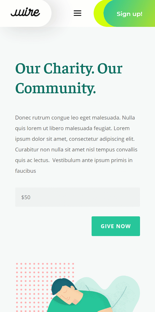
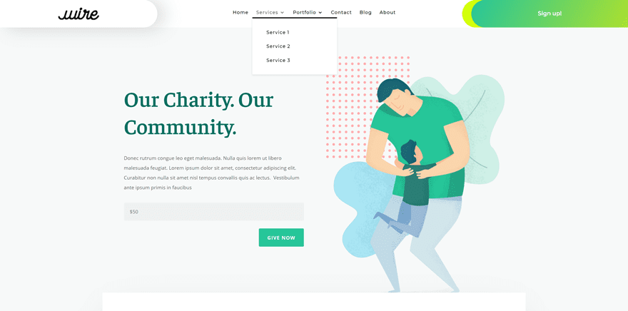
Preview
Before we dive into the tutorial, let’s take a quick look at the outcome across different screen sizes.
Mobile
Desktop
Download The Global Header Design for FREE
Important: after downloading and uploading the JSON file to your theme builder, you’ll still need to manually set up your menu with the correct CSS classes + add the Code Module with the CSS and JQuery code (step 1 and 3 of this post).
To lay your hands on the free collapsing nested menu, you will first need to download it using the button below. To gain access to the download you will need to subscribe to our newsletter by using the form below. As a new subscriber, you will receive even more Divi goodness and a free Divi Layout pack every Monday! If you’re already on the list, simply enter your email address below and click download. You will not be “resubscribed” or receive extra emails.

Subscribe To Our Youtube Channel
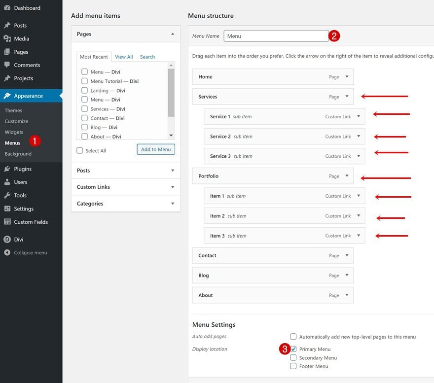
The first thing you need to do is create your menu. Add the sub items of your choice.
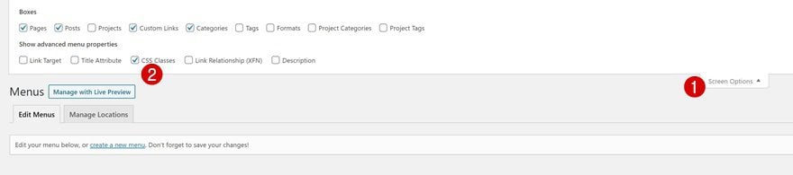
Add CSS Class Option
Once you’ve added the menu items, you can enable the CSS classes option by clicking on ‘Screen Options’ and enabling ‘CSS Classes’.
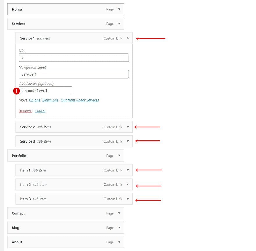
Continue by adding a CSS class to the first level menu items that contain sub menu items. In this example, that means adding the CSS class to the ‘Service’ and ‘Portfolio’ menu items.
- CSS Classes: first-level
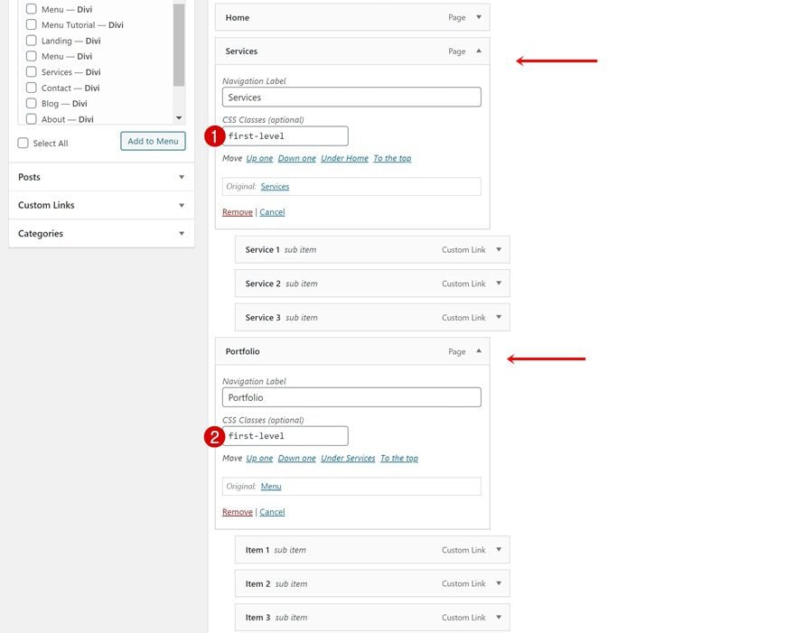
Then, assign a different CSS class to the second-level menu items in your menu. Make sure you add this CSS class to the second-level menu items only (in case you’re adding more levels). Later on this tutorial, we’ll use this CSS class and the one we’ve assigned to the first level menu items to create the collapsing nested menu.
- CSS Classes: second-level
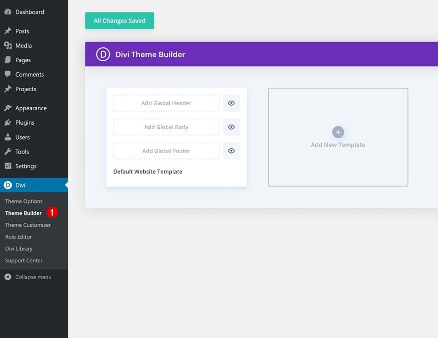
2. Go to Divi Theme Builder & Start Building Global Header
Go to Divi Theme Builder
The next part of this tutorial focuses on creating the header design. If you want to make the nested technique apply to a header that you’ve already built (using the Menu Module), you can skip this step and go to the tutorial’s last part. If you want to recreate the design, keep following the steps. Go to the Divi Theme Builder.
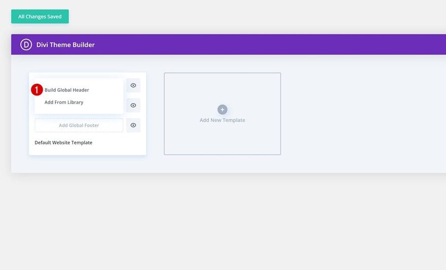
Start Building Global Header
Start building your global header next.
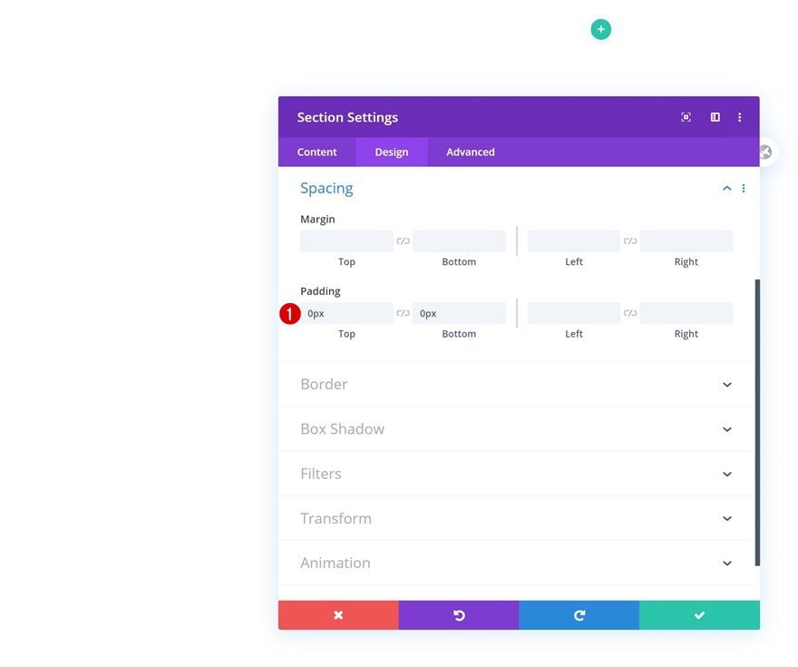
Section Settings
Spacing
Inside the template editor, you’ll notice a section. Open that section and remove all default top and bottom padding.
- Top Padding: 0px
- Bottom Padding: 0px
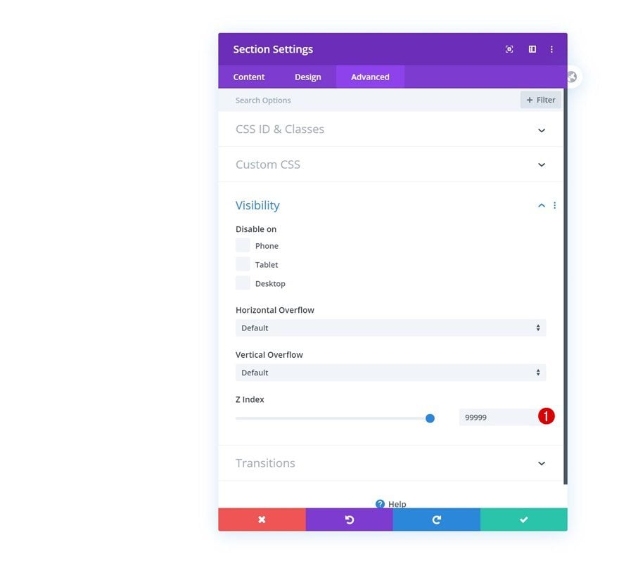
Z Index
Increase the section’s z index as well.
- Z Index: 99999
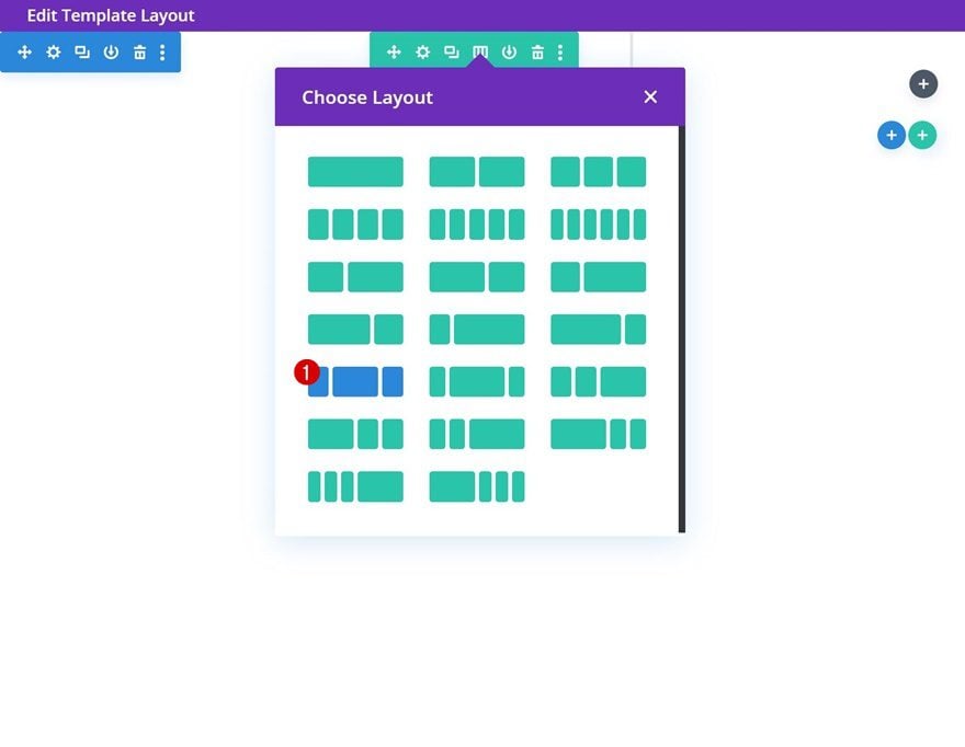
Add New Row
Column Structure
Continue by adding a new row to the section using the following column structure:
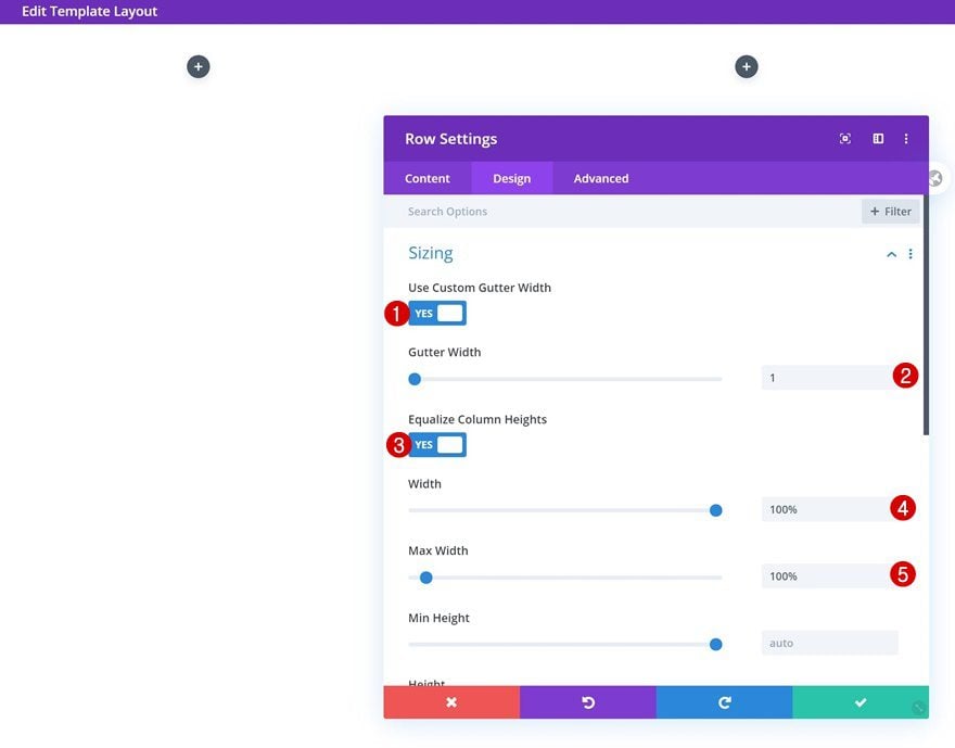
Sizing
Without adding any modules yet, open the row settings and allow the row to take up the screen’s entire width.
- Use Custom Gutter Width: Yes
- Gutter Width: 1
- Equalize Column Heights: Yes
- Width: 100%
- Max Width: 100%
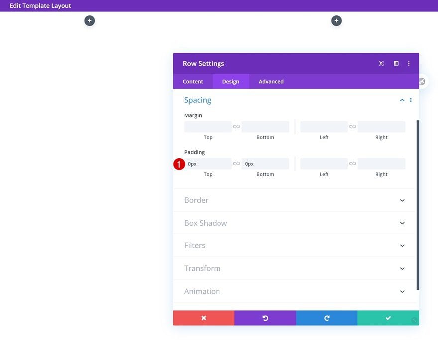
Spacing
Remove all default top and bottom padding next.
- Top Padding: 0px
- Bottom Padding: 0px
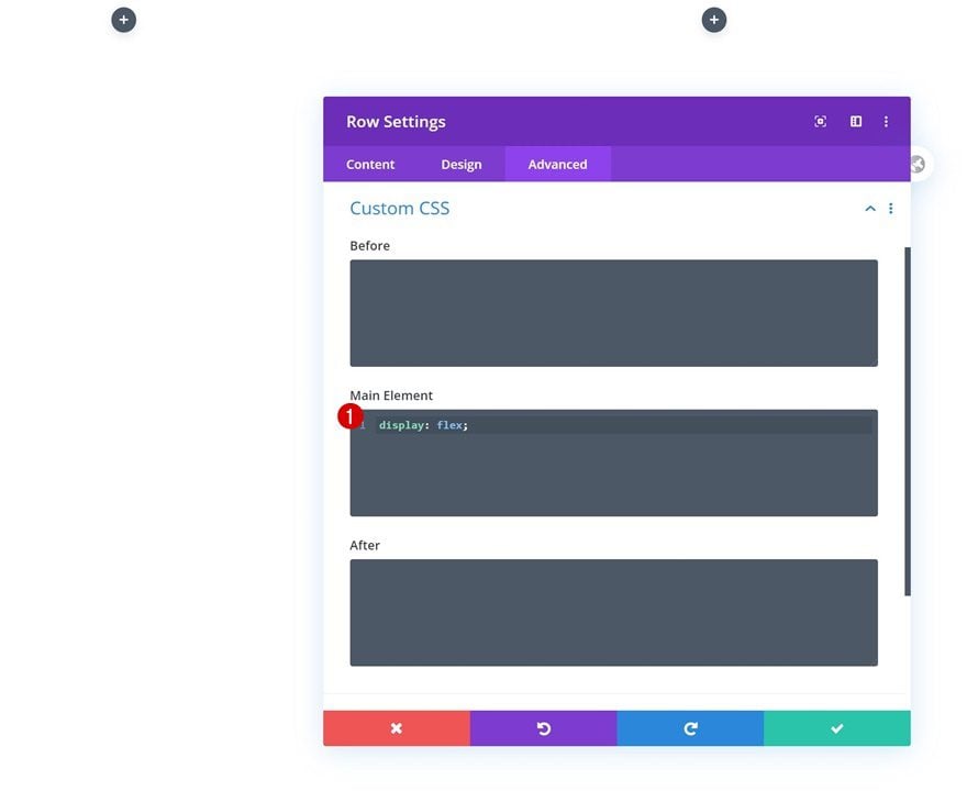
Main Element
Make sure all modules appear next to each other on smaller screen sizes by adding one single line of CSS code to the row’s main element too.
display: flex;
Column 1
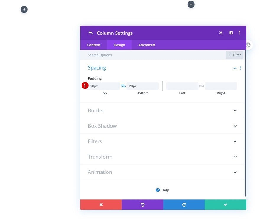
Spacing
Then, open the column 1 settings and add some custom top and bottom padding.
- Top Padding: 20px
- Bottom Padding: 20px
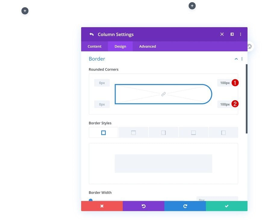
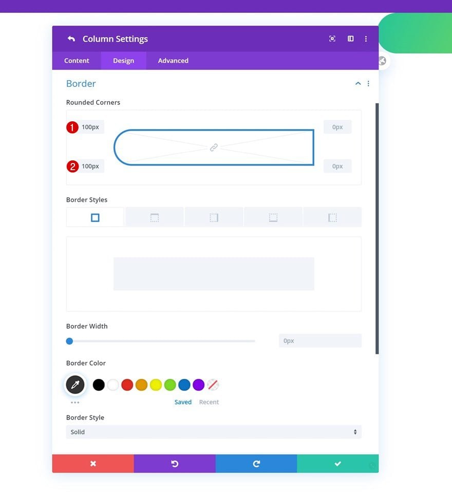
Border
Add some border radius too.
- Top Right: 100px
- Bottom Right: 100px
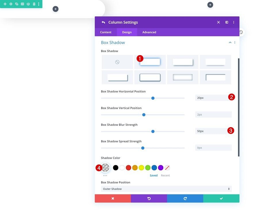
Box Shadow
And complete the column 1 settings by adding a subtle box shadow.
- Box Shadow Horizontal Position: 20px
- Box Shadow Blur Strength: 50px
- Shadow Color: rgba(0,0,0,0.15)
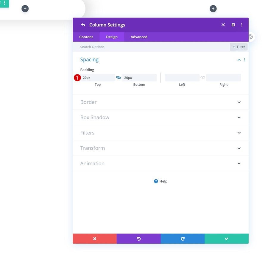
Column 2
Spacing
Open the second column’s settings next and add some top and bottom padding.
- Top Padding: 20px
- Bottom Padding: 20px
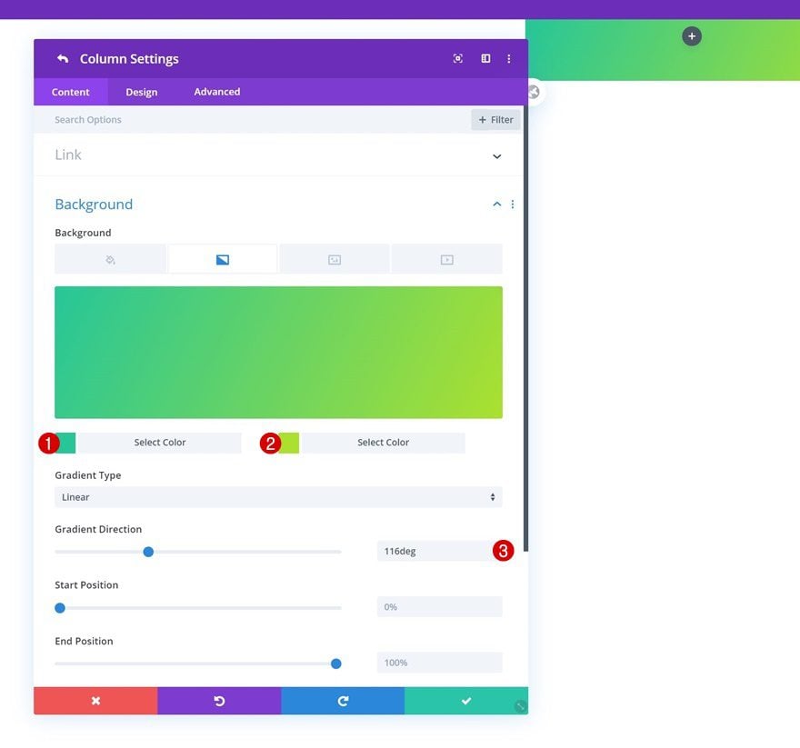
Column 3
Gradient Background
On to the next and last column. Add a gradient background.
- Color 1: #26c699
- Color 2: #abe02f
- Gradient Direction: 116deg
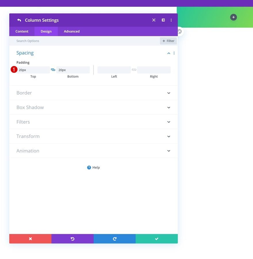
Spacing
Add some custom top and bottom padding next.
- Top Padding: 20px
- Bottom Padding: 20px
Border
Then, go to the border settings and make the following changes:
- Top Left: 100px
- Bottom Left: 100px
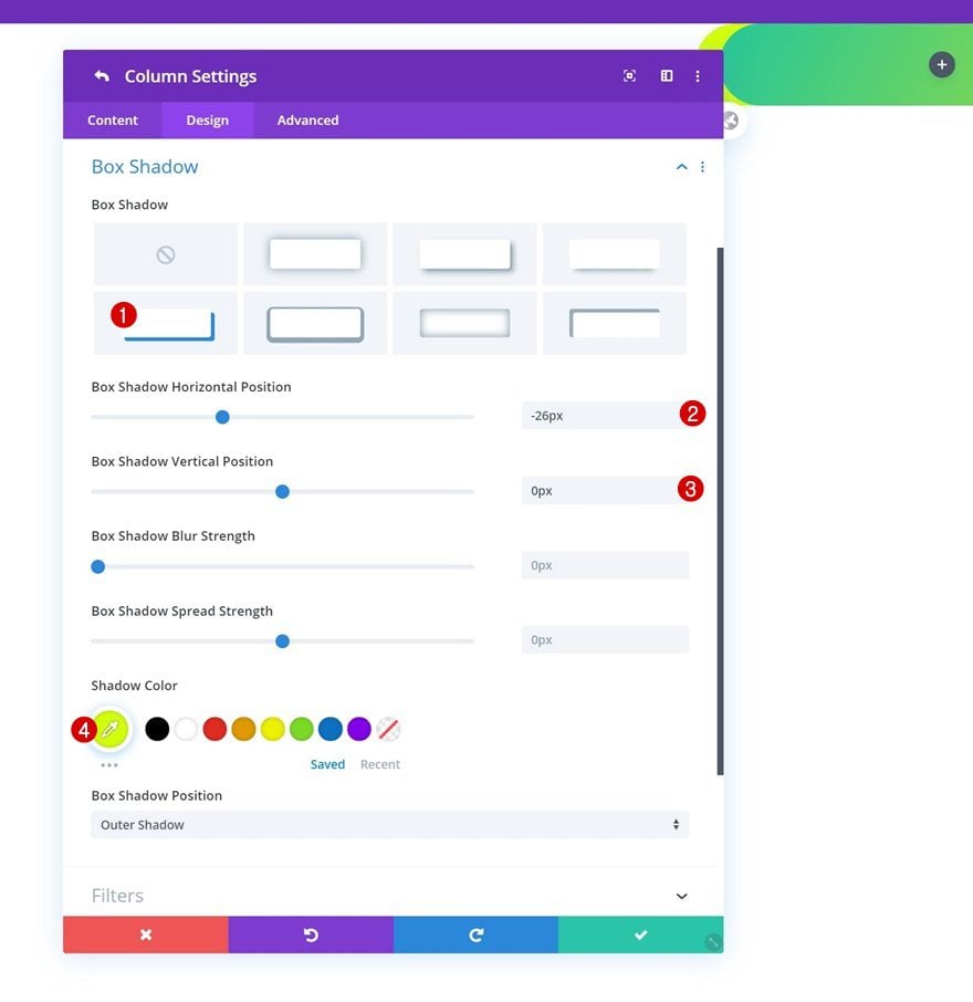
Box Shadow
Complete the column settings by adding a box shadow.
- Box Shadow Horizontal Position: -26px
- Box Shadow Vertical Position: 0px
- Shadow Color: #d2ff0c
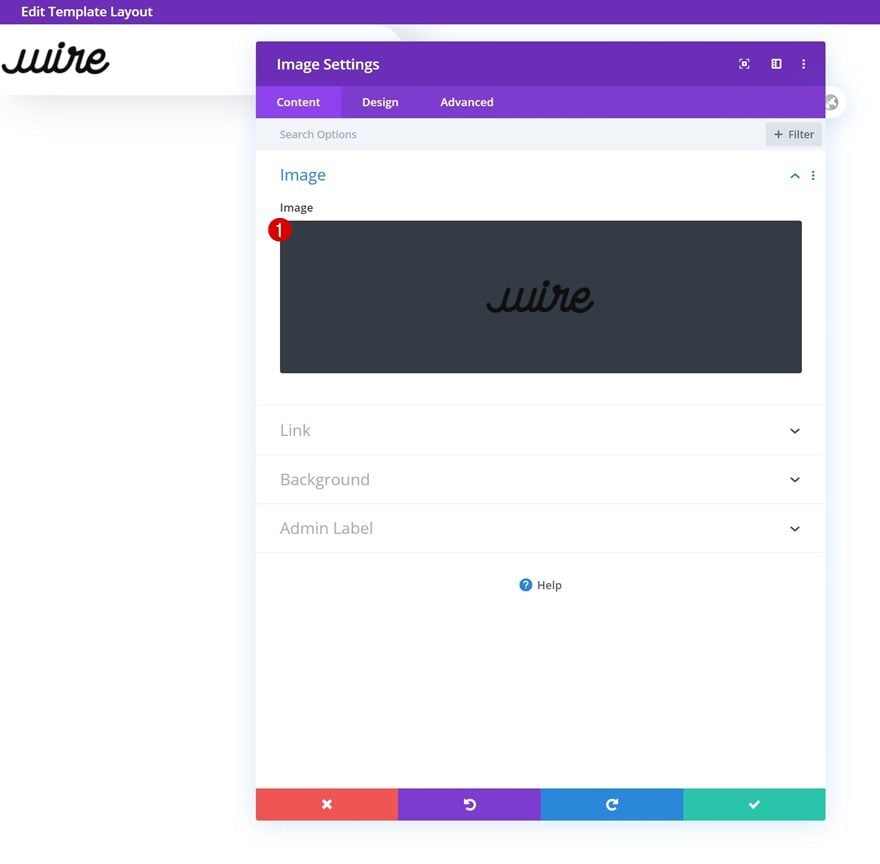
Add Image Module to Column 1
Upload Logo
Time to add modules, starting with an Image Module in column 1. Upload your logo.
Alignment
Change the module’s image alignment next.
- Image Alignment: Center
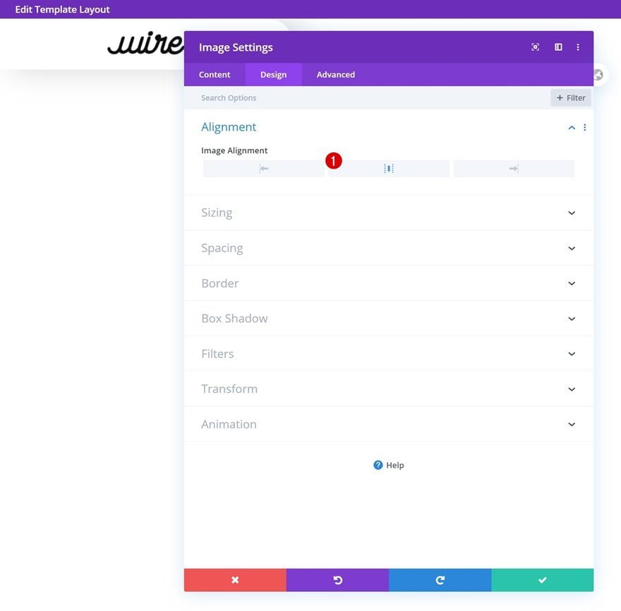
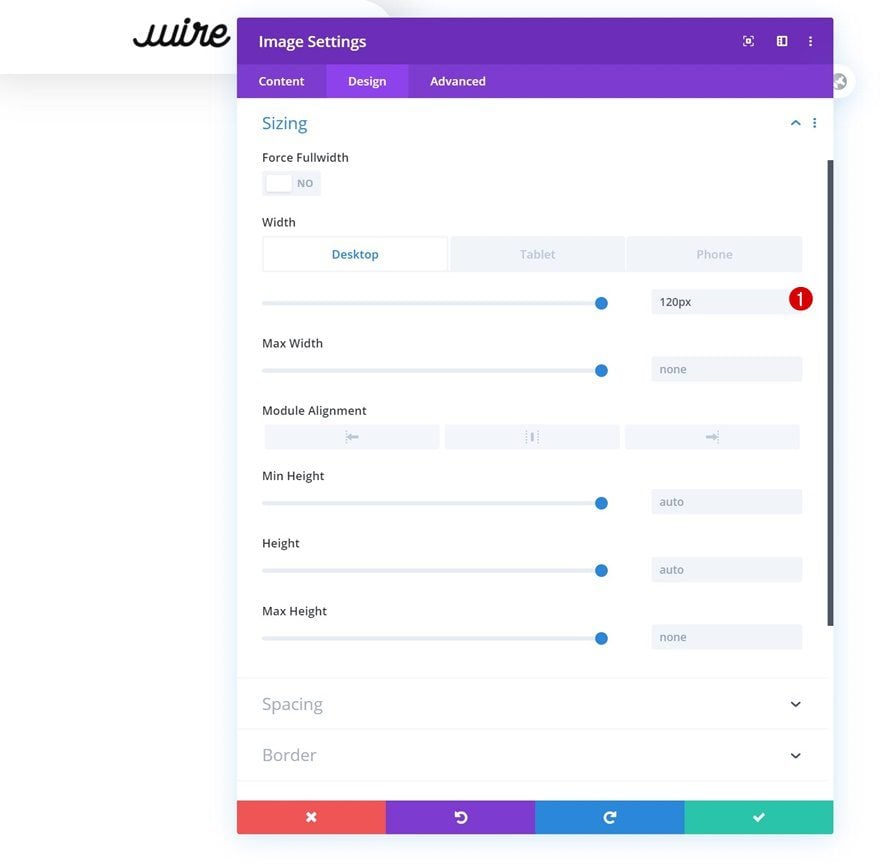
Sizing
Complete the module’s settings by changing the width across different screen sizes.
- Width: 120px (Desktop), 80px (Tablet & Phone)
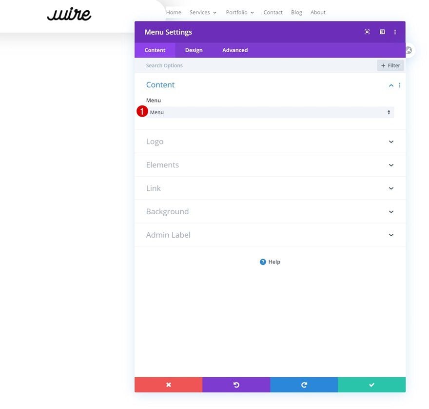
Select Menu
In column 2, the only module we need is a Menu Module. Select the menu you’ve created in the first part of this tutorial.
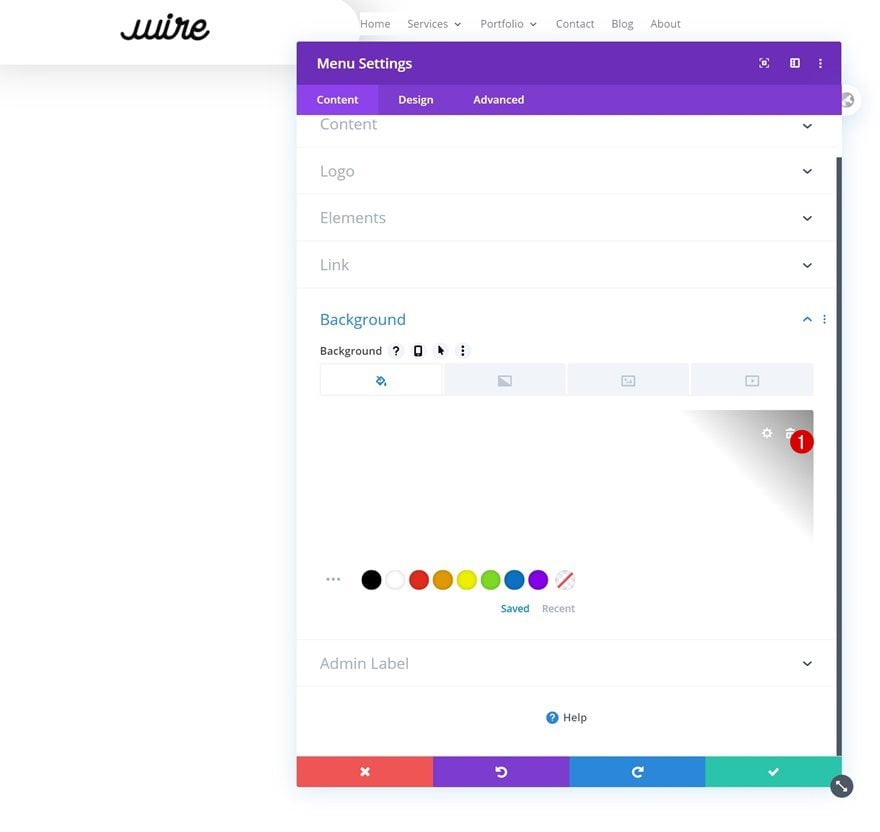
Remove Background Color
Remove the module’s background color next.
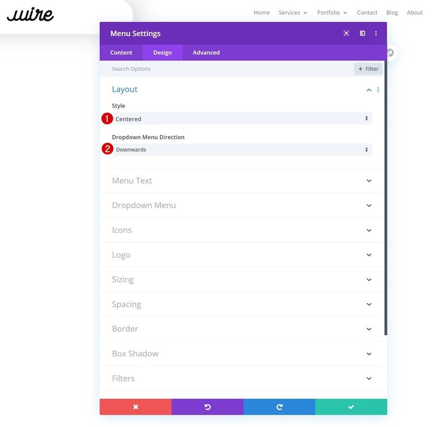
Layout
Then, change the layout settings.
- Style: Centered
- Dropdown Menu Direction: Downwards
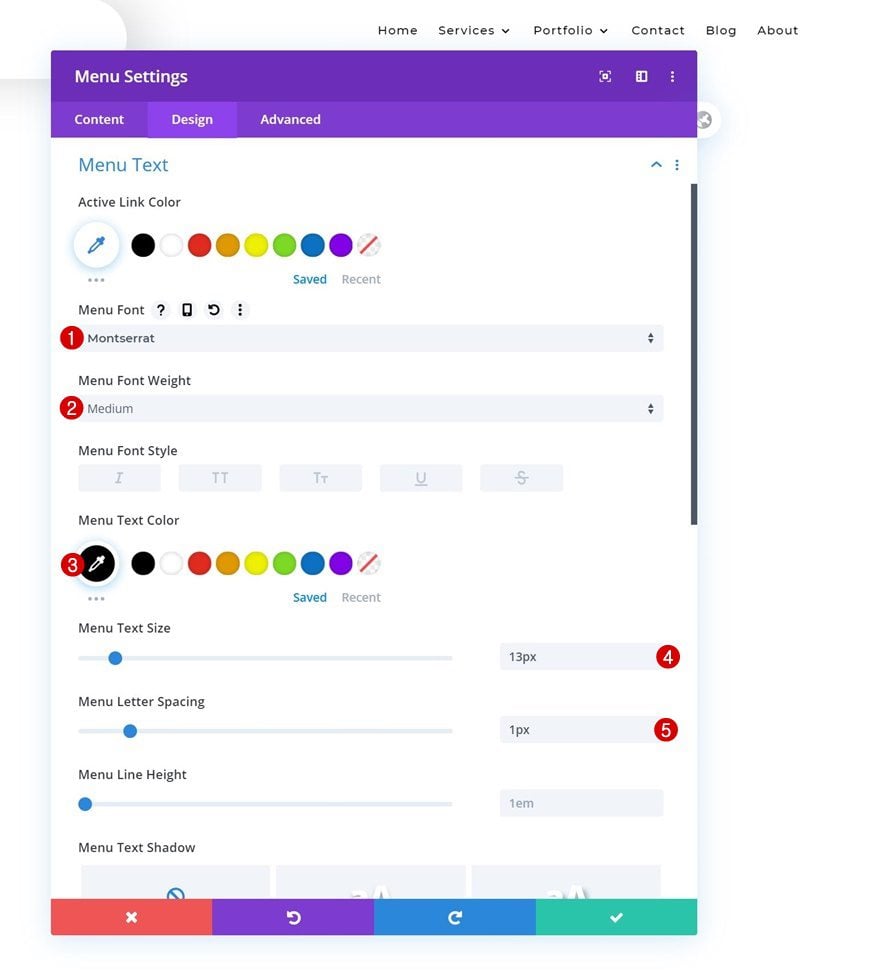
Menu Text
Style the menu text as well.
- Menu Font: Montserrat
- Menu Font Weight: Medium
- Menu Text Color: #000000
- Menu Text Size: 13px
- Menu Letter Spacing: 1px
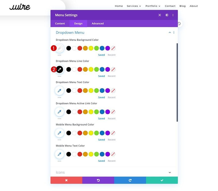
Dropdown Menu
Continue by changing some colors in the dropdown menu settings.
- Dropdown Menu Background Color: #ffffff
- Dropdown Menu Line Color: #000000
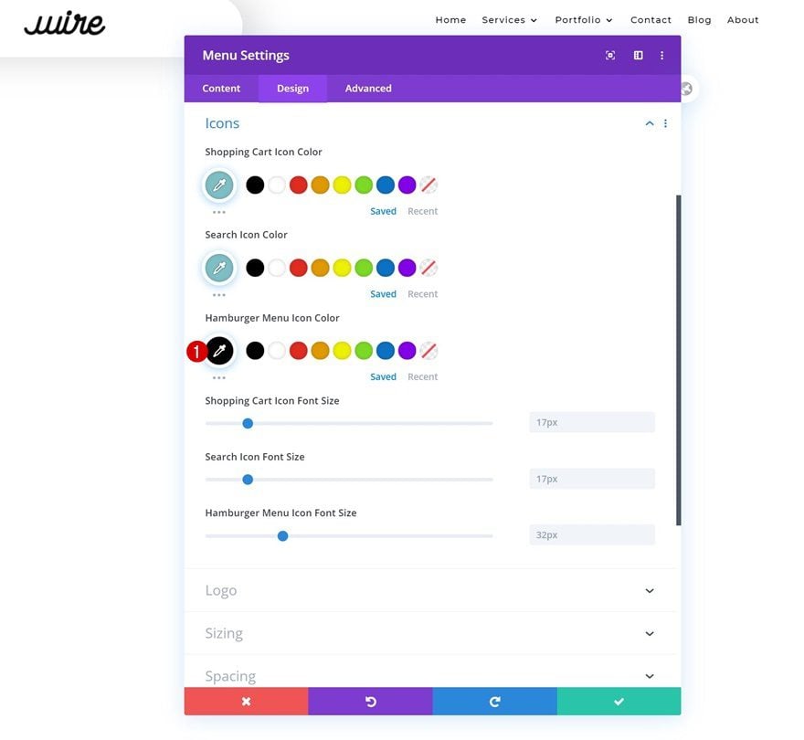
Icons
And complete the module’s settings by changing the hamburger menu icon color in the icons settings.
- Hamburger Menu Icon Color: #000000
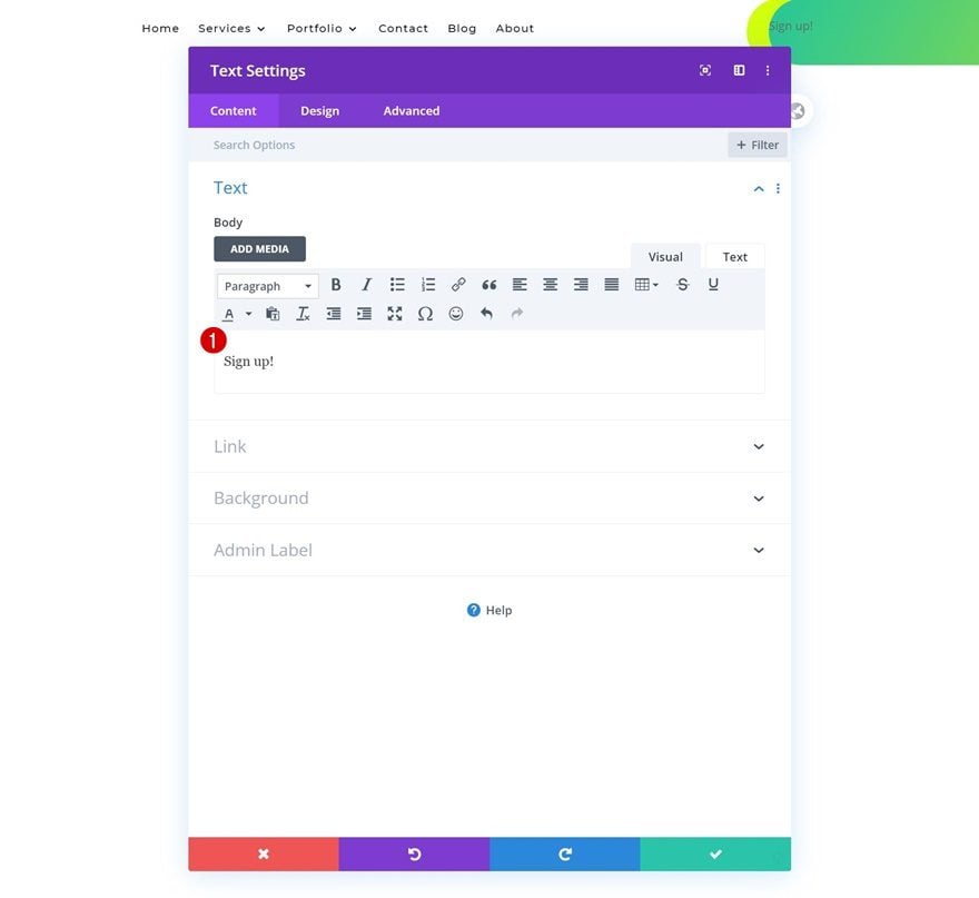
Add Text Module to Column 3
Add Content
On to the next and last module, which is a Text Module in column 3. Add some copy of your choice.
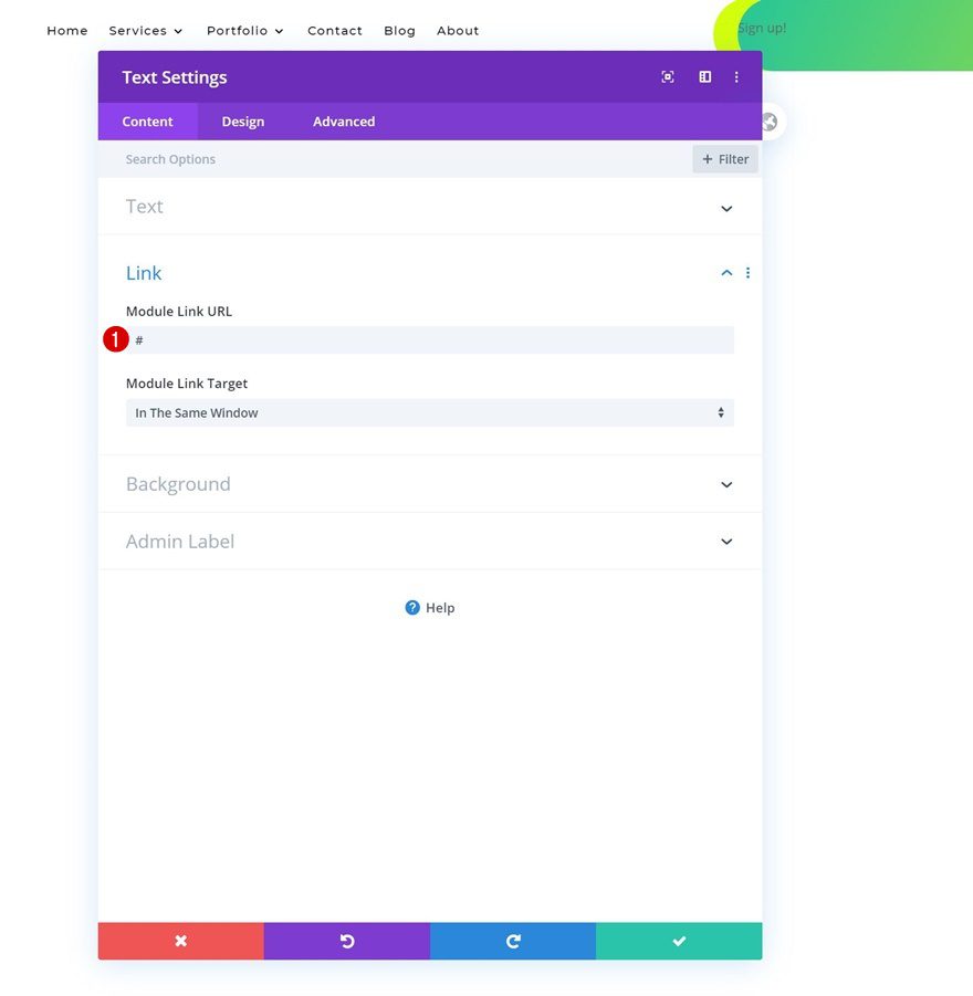
Add Link
Add a link to the module next.
- Module Link URL: #
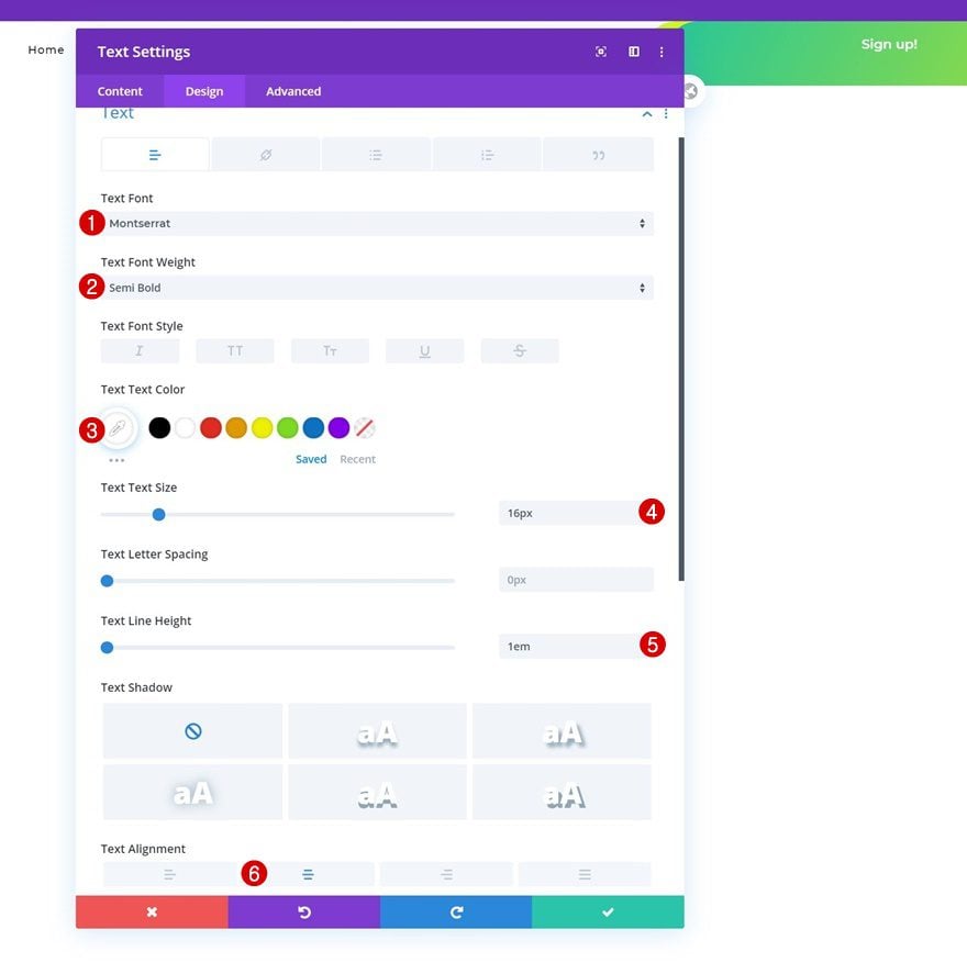
Text Settings
Move on to the design tab and change the text settings accordingly:
- Text Font: Montserrat
- Text Font Weight: Semi Bold
- Text Color: #ffffff
- Text Size: 16px
- Text Line Height: 1em
- Text Alignment: Center
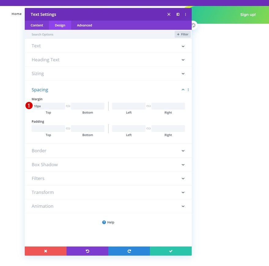
Spacing
Complete the module’s settings by adding some topmargin.
- Top Margin: 10px
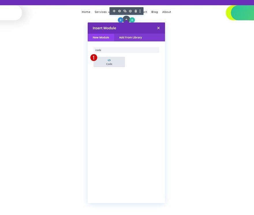
Add Code Module to Column 2
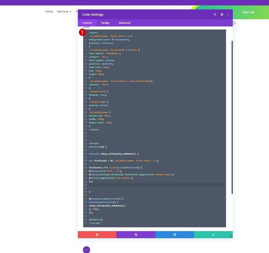
Once you’ve completed the design of your header, it’s time to add the custom code that’ll transform the mobile menu into a collapsing nested menu. Add a Code Module to the second column (or anywhere else).
Insert CSS & JQuery Code
Then, add the CSS and JQuery code. Make sure you place the CSS code between style tags and the JQuery code between script tags.
.et_mobile_menu .first-level > a {
background-color: transparent;
position: relative;
}
.et_mobile_menu .first-level > a:after {
font-family: 'ETmodules';
content: '\4c';
font-weight: normal;
position: absolute;
font-size: 16px;
top: 13px;
right: 10px;
}
.et_mobile_menu .first-level > .icon-switch:after{
content: '\4d';
}
.second-level {
display: none;
}
.reveal-items {
display: block;
}
.et_mobile_menu {
margin-top: 20px;
width: 230%;
margin-left: -65%;
}
(function($) {

function setup_collapsible_submenus() {

var FirstLevel = $('.et_mobile_menu .first-level > a');

FirstLevel.off('click').click(function() {
$(this).attr('href', '#');
$(this).parent().children().children().toggleClass('reveal-items');
$(this).toggleClass('icon-switch');
});


}

$(window).load(function() {
setTimeout(function() {
setup_collapsible_submenus();
}, 700);
});

})(jQuery);
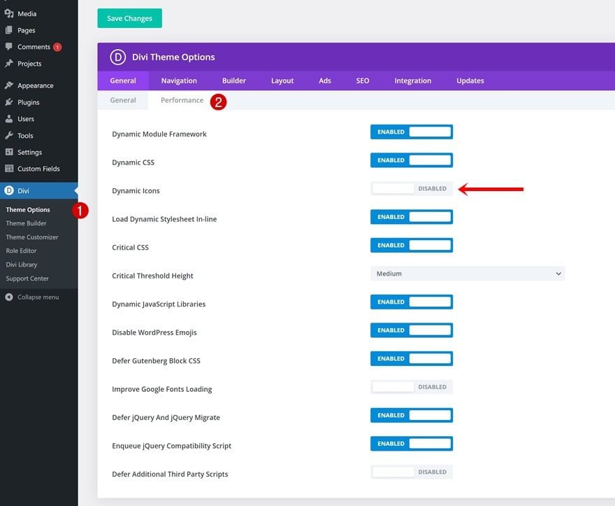
4. Turn Off Dynamic Icons in the Divi Settings
To make sure the icons appear inside your menu, you’ll have to turn off Dynamic Icons by navigating to Divi > Theme Options > Performance and toggling the Dynamic Icons option.
Preview
Now that we’ve gone through all the steps, let’s take a final look at the outcome across different screen sizes.
Mobile
Desktop
Final Thoughts
In this post, we showed you how to make a collapsing nested menu apply to your global header inside the Theme Builder. We started by creating the primary menu bar, continued by designing our header inside the Theme Builder using the Menu Module and completed the tutorial by adding the custom code that makes the effect work. We hope you’ve enjoyed this tutorial and if you have any questions, feel free to leave a comment in the comment section below!
If you’re eager to learn more about Divi and get more Divi freebies, make sure you subscribe to our email newsletter and YouTube channel so you’ll always be one of the first people to know and get benefits from this free content.


Hi there.
I followed this code through as shown and it works to a point.
BUT I need to make the “first-level” menu items clickable too.
(As they are main pages.)
Using the code above, on click the first-level items simply open the submenu to reveal the clickable second-level items.
So … how can I make ONLY the icon open the submenu – while allowing the NAME of the first-level items to remain clickable through to their own pages too ???
Thanks heaps for any help.
The code from the article will remove the links on the first level menu items. To fix it, I will suggest finding this code you added: https://codefile.io/f/B8odMaihly
Remove it and replace it with this: https://codefile.io/f/vVWU16bn89
If it doesn’t help, feel free to reach out to our Support Team by creating a conversation on our website.
nice video, but I am stucked with the same issue, mobile menu is not being collapsed and even making the menu way too wider after implementing the css and jquery? any idea?
To avoid making the Mobile Menu larger, i will suggest removing this code from the code you copied from the article:
.et_mobile_menu {
margin-top: 20px;
width: 230%;
margin-left: -65%;
}
After that, you will need to add classes to your Menu Item by going to the Appearnace > Menus, add a class first-level to the top tier level in the Menu and add a second-level class to all the menu items under the first-level menu, you can see the steps under this instruction: https://prnt.sc/2Y3Fv2HEWS8v
After setting up the classes, it will work like this: https://go.screenpal.com/watch/cZ631ZVWRrk
If it still doesn’t work for you, feel free to reach out to our support Support Team by starting a conversation on our website, and they can help you with your requests 👍
Hello everybody,
thank you, this work well for me!
… with this little class adjustement : .et_mobile_menu to .et_mobile_nav_menu
Stop creating articles from the very beggining. it’s tiring because we already have the menu and we just need to implement the coppalsing nested menu feature. not the full header
Followed the steps and the mobile menu is still displaying all nested items. Appears the script code isn’t working properly Any suggestions?
I have the same problem. It’s not collapsing, everything is visible.
can anyone help us? I have the same problem, the whole menu is immediately visible to me on my mobile phone
Can I use this approach to ONLY add collapsible sub-menus on the mobile menu, without having to make any changes to the regular (non-mobile) menu?
I just put in a lot of time and custom code to get my main menu to display a mega menu the way I like. I’d hate to have to scrap all of that and create an entirely new menu! (Thanks for the code and the time!)
Hello guys!
how it would work in a menu with 3 items in the menu.
I’ll try to explain.
1 Menu: Service
2 Sub-menu: Cleaning
3 Sub-sub-menu: Clothes
In other words, the menu would have 3 levels.
First-level:
Service
Second-level
Cleaning
Third-level: Clothing
What would have to change in CSS and Script?
I would probably have to put
Third-level in the clothing menu css too.
Help me please, thanks
Try adding “first-level” class to “Service”, “second-level first-level” class to “Cleaning”, and “second-level” class to Clothing
This didn’t work at all.
Hello guys!
how it would work in a menu with 3 items in the menu.
I’ll try to explain.
1 Menu: Service
2 Sub-menu: Cleaning
3 Sub-sub-menu: Clothes
In other words, the menu would have 3 levels.
First-level:
Service
Second-level
Cleaning
Third-level: Clothing
What would have to change in CSS and Script?
I would probably have to put
Third-level in the clothing menu css too.
Help me please, thanks
I have a different scenario; I have two menus in the header. 1 that show a CTA button and is hidden on mobile/tablet. The 2nd has a link to the same CTA results. and is hidden on desktop.
Also I don’t want to create a new menu with the Free Header. I tried to apply the CSS and J Query to my header following the info for this post and it did not work.
Does anyone have any suggestions?
Easily the best web builder!
Thanks Divi
Yea this needs to have “first level” links clickable.
Ivan & Jon: I’ve tried other methods, but the problem I’m running into is that the other code snippets that you add to the child theme files and divi options doesn’t seem to affect the menu module in the theme builder, just the native divi menu that doesn’t use the theme builder.
Jon: have you confirmed your snippet will work on theme builder header using menu module?
This is great, thank you!
However, in this example Services and Portfolio are now only triggers for the expanded menu (unless I’m mistaken), you cannot link to the Services or Portfolio landing pages. It would be good if only the + triggered the expand and the text remained a link to the page.
Take a look at my reply above. It works as expected. I’m not sure why Divi doesn’t fix this issue. Instead, they force us to hack their archaic menu with silly code.
There is an alternative solution for that which allows to keep the parent items clickable, just google it. I posted a link to that article but my comment did not pass moderation, apperantly links are not allowed here.
This is should really be baked into the theme at this point. 🙁 I’ve had to use my own version of this for a couple years now: https://gist.github.com/Garconis/a3855dbd7bfb7eeaebe1601d11b33979
In includes some simple CSS and JS to add to your child theme. No extra “classes” necessary.
Jon, your solution is exactly what I’m looking for. Unfortunately since the navigations are now built in the theme builder some classes and IDs how now changed from your original code – i.e. #main-header and #top-menu. Any solution for the theme builder, pretty please with a cherry on top ?🙏
Nice wow very light and open fast..
Thanks for sharing
Nice, but I wonder why this is not standard behavior. Or at least a setting in the menu module.
Hey Donjete Vuniqi,
Great post. Thanks for sharing all these valuable information with us. I really enjoyed reading your tutorial on features of divi . It was written very well and step-by-step. All your hardwork is much appreciated. Keep up the goodwork.
Hi,
Does anyone have any information on where to download this Divi’s Theme Builder, please?
Thanks!
Thank you very much Donjete, your method for creating a collapsing nested menu is really cool if you have a lot of submenus.
Just one question: Is there a workaround to make your method work with megamenus too, as the CSS class “mega-menu” has already been added to the first-level menu? I have built megamenus on big sites (with the “Divi” method, no plugins) and it would be very helpful to turn those into collapsed nested menus on mobile displays. Greetings, Fabienne
Hey,
We have a blog on our website we are trying to change the theme . The Tutorial about mobile collapsing is amazing thanks for sharing. I hope you Make a video tutorial to get better understand looking forward for your video tutorial too.
Should be basic Divi feature, just pull the switch!
I like. It’s nice and slick. I must study the styling added to get the menu placed nicely.
Looking in the styles added to the code module I see the font family ETModules. Looks like it can be used for info graphic like icons? Where can we find out more about this?
awesome thanks!
and when will this be a basic native menu feature in Divi???
Following…
I concur. It looks like an obvious one to have as default.