
Random color choices rarely lead to a cohesive design. If you’re building websites professionally, you need an intentional system. You can build a real color system inside Divi 5 using Color Management and Design Variables. These are colors you set directly in the Visual Editor, can access in any color field, and come with plenty of other conveniences (which we’ll show you below).
This post will show you how to set up a flexible, scalable color system in Divi 5.
What Is A Color System?
A color system is basically a pre-planned palette of colors used consistently across your site. It helps everything look intentionally styled rather than randomly thrown together. For a good system, you usually need:
- Primary color: Main branded color.
- Secondary color: Supports and contrasts with the primary.
- Text color: Clear and readable for headings and paragraphs.
- Accent: Other colors for alerts, notices, and other important stuff (optional).
- Background colors: Typically neutrals or subtle tints.
The 60-30-10 rule applies to color in web design. Generally, neutral colors (like section backgrounds and negative space) would be used for 60% of the design, a primary color for 30%, and secondary/accent colors for the remaining 10%.
How To Choose Website Colors
Brand colors and the colors used on your website are not decisions to be taken lightly. Creating a purposeful color palette depends on your designer’s skill, color psychology, industry, and brand differentiation. But once you have your base colors and brand assets (like logo variations), you can start creating a design system.
You can do a few quick tasks to prepare for your website build if you have limited design resources. First, do a cursory read of color psychology. Look for what brand values you want to convey (trust, youthfulness, innovation, etc.) and try to match colors based on those values. Then, look at some household-recognizable brands that you think fit your brand values. What colors do they use? How do they use them across their website, commercials, and social posts?
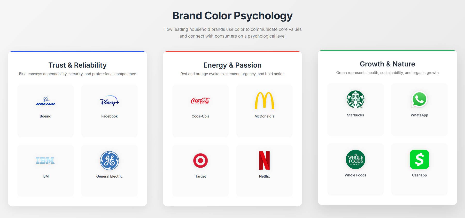
Your company values might even be determined by the type of work you do. Locksmiths and plumbers must be dependable, so blue is a great way to convey that. Financial planners and landscapers deal in growth and sustainability (in their respective fields), so green is a good anchor there. Flower farmers, childcare centers, and restaurants can lean on reds and yellows to connect energy and vitality to their brands. Once you have a general idea, use something like Coolors to create a simple palette.
Building Your Color System In Divi 5
Divi 5 comes with the Design Variable Manager, which is the easiest way to handle Global Colors. In it, you have four pre‑assigned global colors for you to work with out of the box. They are:
- Primary color
- Secondary color
- Heading text color
- Body text color
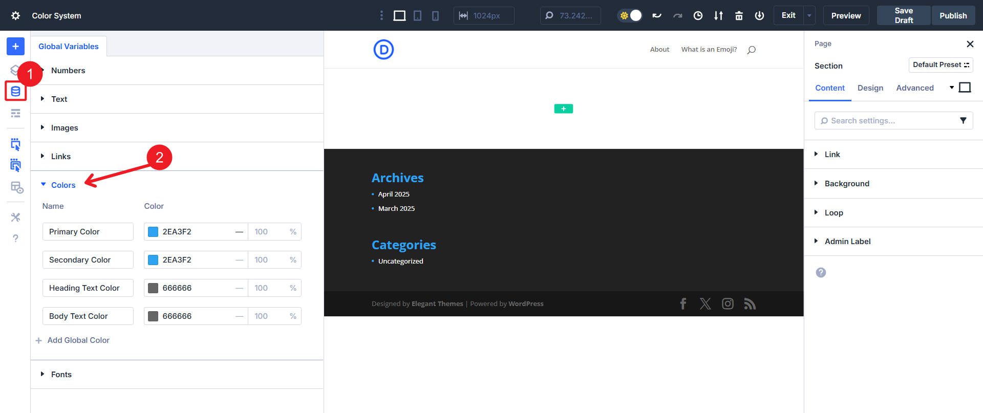
Step 1: Define Your Base Colors As Variables
In Divi’s left-hand sidebar, open the Design Variable Manager. Find the Colors section, and you should see these four different defaults.
These four labels cannot be deleted, but you can choose what color to set each. In addition to these four, you can add as many colors as you want by clicking the Add Global Color button. Go ahead and enter the HEX values of the colors from the color generator.
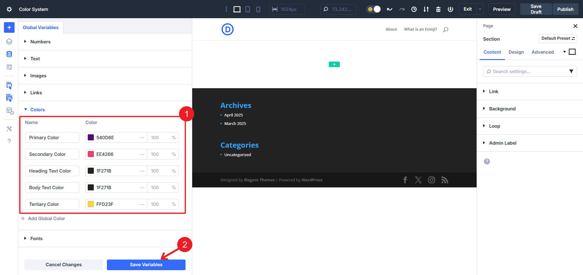
These variables instantly become available everywhere in Divi’s Visual Builder, which is super handy. But make sure to save them!
Step 2: Create Shades & Tints With HSL Colors
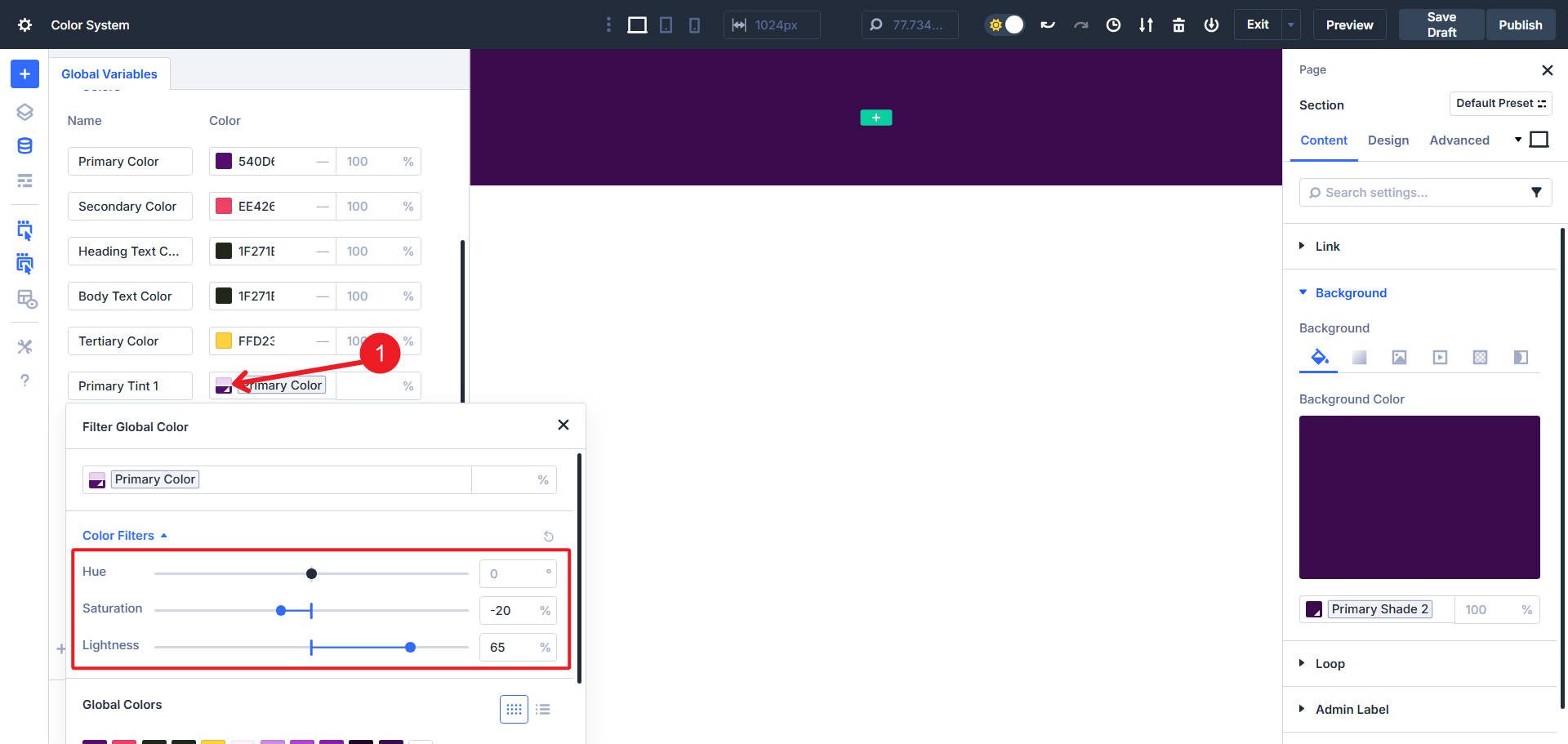
Using Divi’s HSL filters, we can create tints (lighter versions of our colors) and shades (darker versions of our colors). For this project, we will only make variations for the primary and secondary colors. You can use a color palette generator to create these color variations.
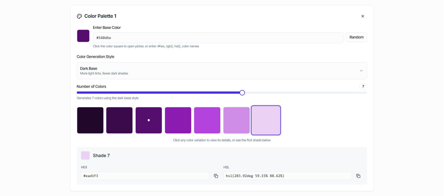
The first step here is to create another Global Color. However, instead of pasting a HEX value, select an existing color to create variations (shades and tints).
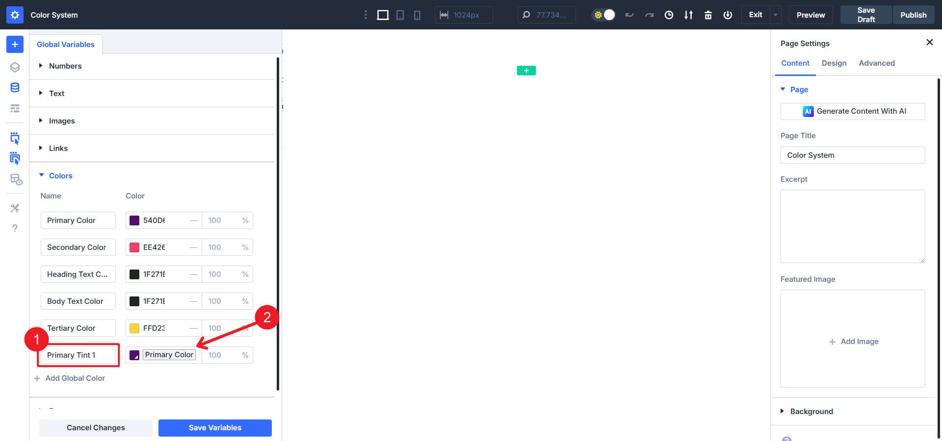
Now, we need to apply a filter to that base color to create a variation. Click on the color chip and then select “Filter Color,” or click the color swatch for your new relative color variable.
Do this for each of your color variations. Make sure to give your Color Variations recognizable names and save.
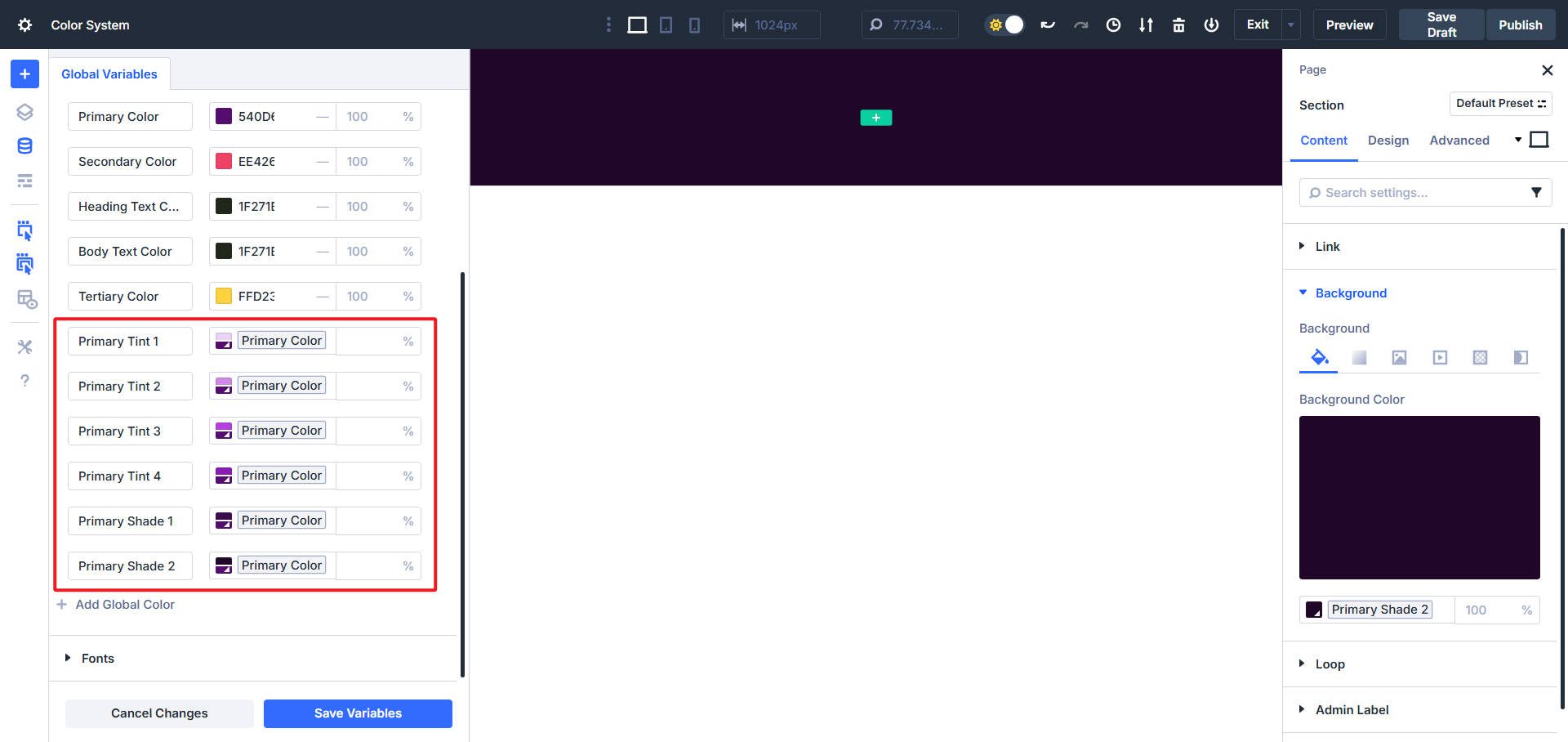
For example, since the Primary Color is fairly dark, we can add a few lighter tints and a couple of darker shades. That should give me plenty of options when we apply my color system to a page design.
Repeat the above steps for your Secondary and/or Accent colors. When creating these variations, always select a base color and then apply filters on top of it. That way, if you ever change your primary color, these variations will follow suit.
Applying Your Colors In Designs With Divi
Your variables exist now. Time to use them. We’ll start with a blank Divi page and work sequentially toward a nicely designed layout.
Step 1. Create A Wireframe Of Your Page
You can start from a wireframe instead of a blank page, which can help you better understand your color system. Once you understand a page’s general structure and flow, you can start making your design choices. You can also use one of Divi’s many Premade Layout Packs or Starter Sites. It doesn’t matter if they already have colors defined; we can easily change these.

For this example, we chose to modify the Consulting Layout Pack and use its Homepage Layout. If you do something similar, you can import the Presets. However, you will want to edit the colors in those Presets. For the sake of simplicity, we’ll modify styles directly at the module/element level.
Step 2. Typography And Color
By default, Divi uses your global Heading and Body Text colors, making your text clean and readable. You can always override these predetermined color choices by changing text color on modules or presets, but you shouldn’t have to do that too often.
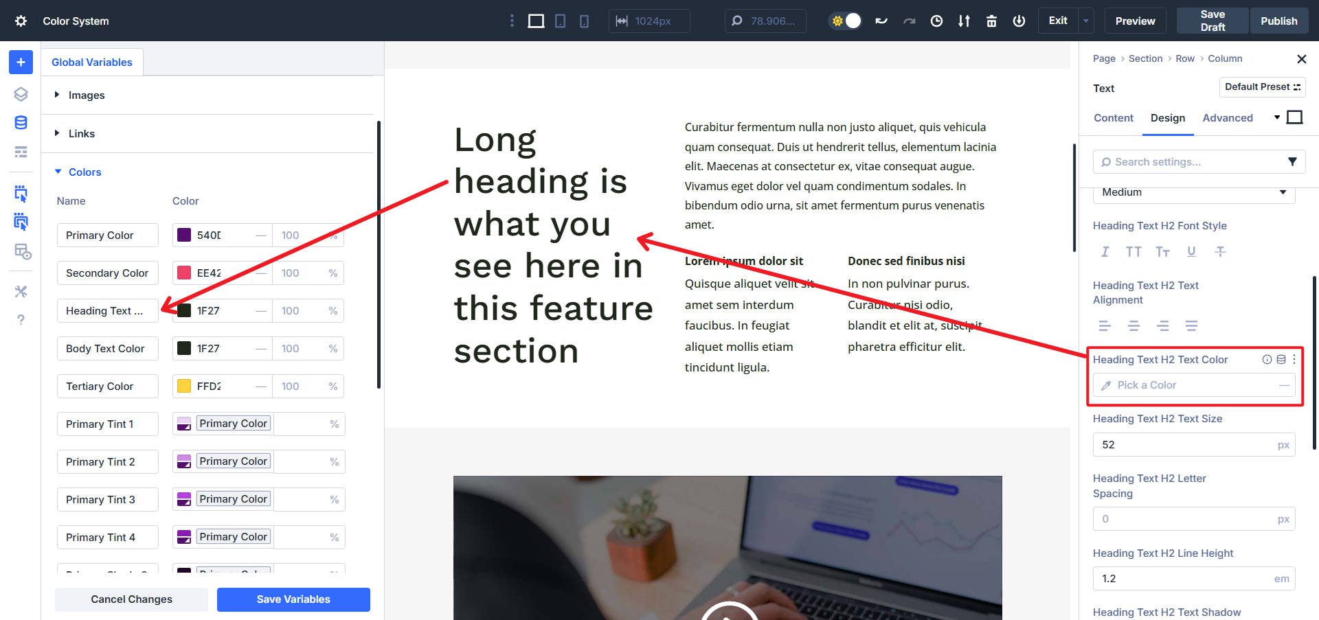
Notice how the heading color is unset in the module. Divi automatically assigns the global color to headings and body text for you. Of course, you can override it by selecting a different color.
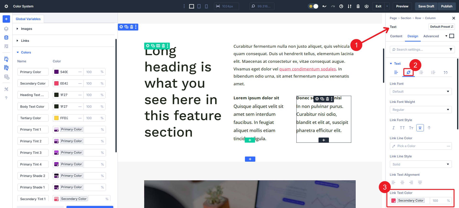
You can customize the color that links get to make them more noticeable and attract clicks.
There may be other modules (besides the Heading and Text Modules) with text you want to style. Modules like the Contact Form, Countdown Timer, and the Blog Module may all require colors to be applied uniquely.
Divi’s buttons are simple by default and take on your Primary color. But you aren’t forced into this decision if you want something different. Open the module’s settings panel, navigate to the Design tab, and select Button. Under Button settings, enable “Use Custom Styles for Button.” Set your background to your Global Color of choice and your button text to a readable color, like white.
If you have two buttons side by side or multiple buttons on the page, you can create a separate Button Preset for a secondary button style using your secondary color or another accent.
Create Hover States With Tints And/Or Shades
Hover states add interaction and a sense of purpose. Use your earlier tints and shades with the hover styles. It’s obvious to implement on buttons, but it can be used subtly elsewhere as well.
Click the Cursor Icon next to the background color option to enable hover states. Set your hover background color. When users hover over the button, it visually responds, guiding interaction naturally.
Step 4. Creating Sections With Color Presets And Gradients
Sections in Divi have transparent backgrounds by default. This means that if left unset, they will usually show as white. You can add some intrigue by creating Neutral color variations based on the hue of one of your main colors.
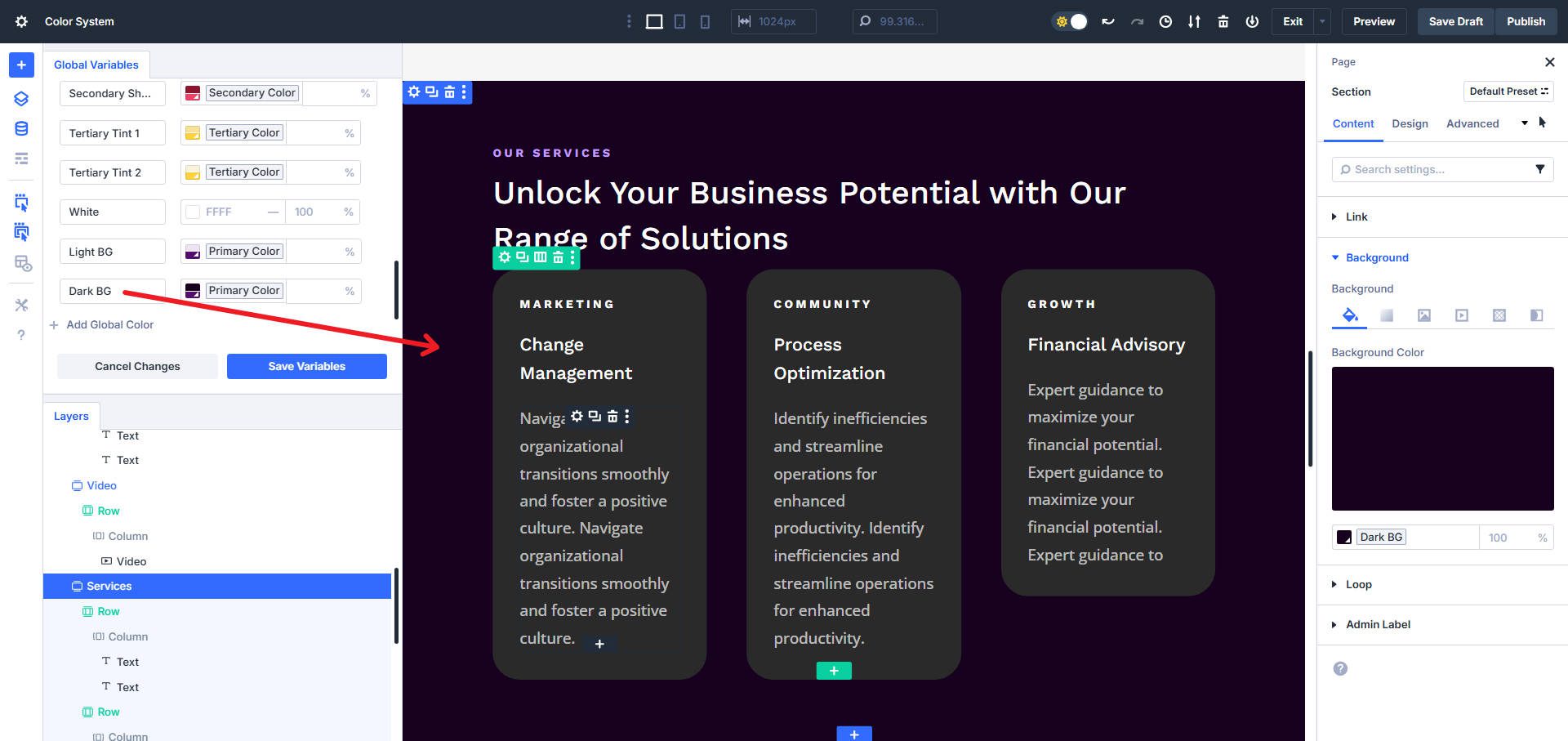
This Background color is close to black, but shares the same base hue as the primary color to give it subtle ‘on theme’ cohesion.
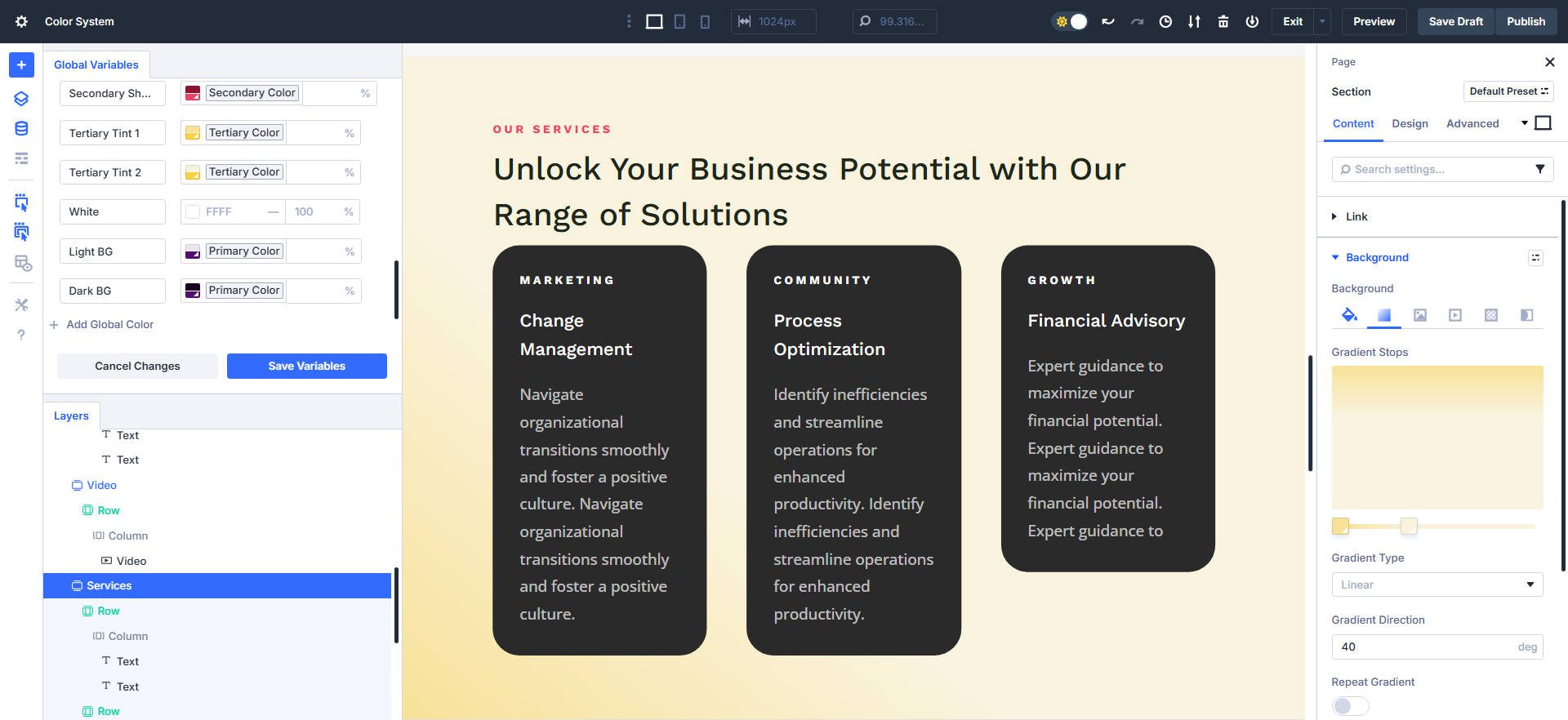
You can also experiment with gradients using your color variants. The trick here is not to use too many combinations of colors. You want a disciplined, cohesive design based on color pairings and hierarchy.
A reminder is in order at this point. You want to save most of these color pairings and decisions into Presets (either Option Group or Element Presets). Once you have created and implemented your Design Variables in your design via Presets, you can use your design system to create subsequent pages much quicker. This also ensures that you work with consistent design patterns throughout your site.
And if you later determine that a color is slightly off, you can adjust the HSL values of the base color, and all instances of that color (and all colors relatively created based on that color) will change for you.
Wrapping Up Your Divi 5 Color System
A thoughtful color system is one of the easiest wins in web design, and Divi 5 gives you the tools to make it work for you. With just a few steps, you can:
- Define your core brand colors as reusable Design Variables
- Extend them into useful shades and tints with HSL filters
- Apply them consistently across text, buttons, forms, and sections
- Save your choices as Presets so that every new page follows the same rules
The payoff is bigger than aesthetics. A solid color system creates clarity, directs visitors toward action, and makes your brand feel cohesive across every corner of your site. And because everything in Divi is variable-driven, one adjustment to a base color can instantly ripple through an entire site. That means less tinkering and more confidence that your design will hold together as you scale.


Leave A Reply