
Divi is built on a responsive grid that stacks (or orders) your columns in a certain way when going from desktop to mobile displays. The columns are stacked in order from left to right. So if you have three columns on desktop, the left (first) column will be stacked first on mobile followed by columns 2 and 3 underneath. This makes sense and is usually what is needed for most websites. But sometimes certain designs that look great on desktop create an inconsistent ordering of content on mobile. In this case, you will need to change the order of columns to create a more consistent user experience on mobile.
Today I am going to show you two ways you can change Divi’s column stacking order on mobile Devices. The first involves creating an alternate version of the content specifically for mobile devices using the “Disable On” feature within Divi. The second way is to use custom CSS to add classes to your columns which designate their order on Mobile.
Let’s get started!
Creating the Content
Subscribe To Our Youtube Channel
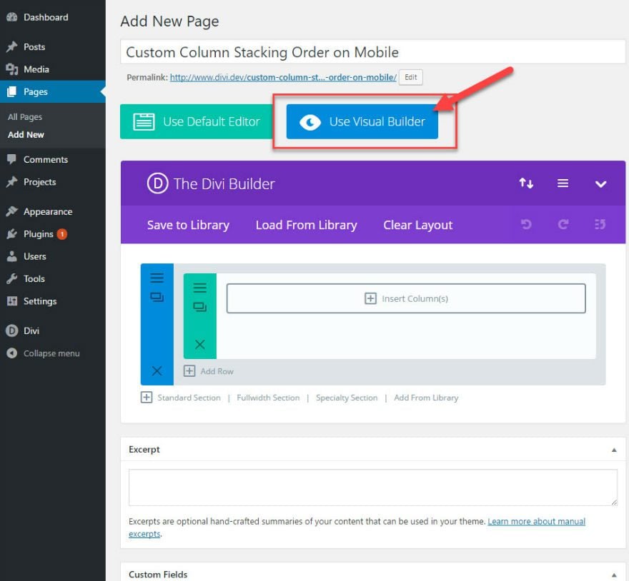
On a new page, click to use the Divi Builder and launch the Visual Builder.
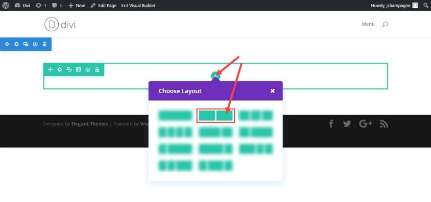
From the visual builder, choose a 2 column (½ – ½) layout.
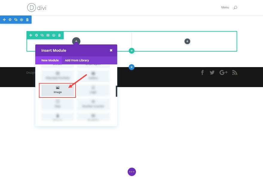
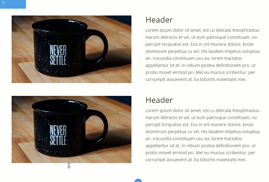
Add an image module to the first column inside your row.
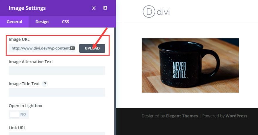
Under Image Settings, upload and insert an image. (I’m using a 770 x 433 image from unsplash.com)
Next, insert a text module in the second column of your row.
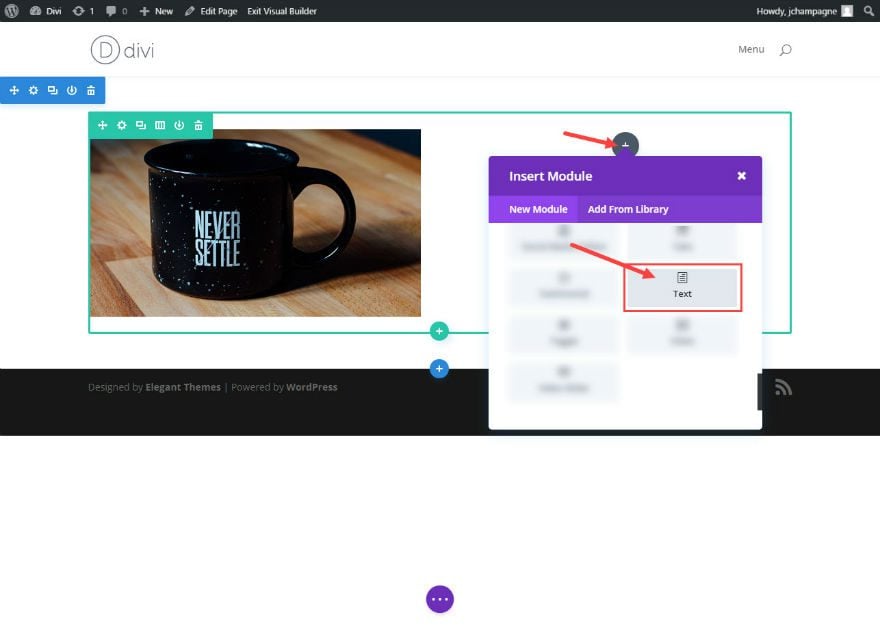
Under the General Text Settings, add your text to the Content text box.
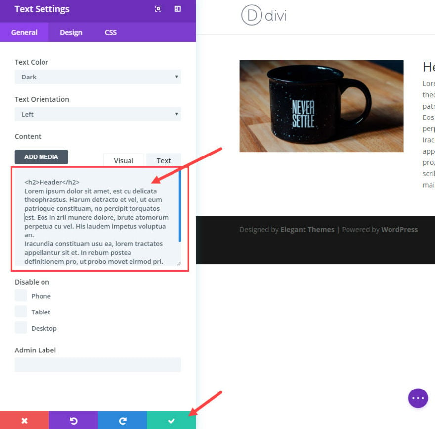
Save
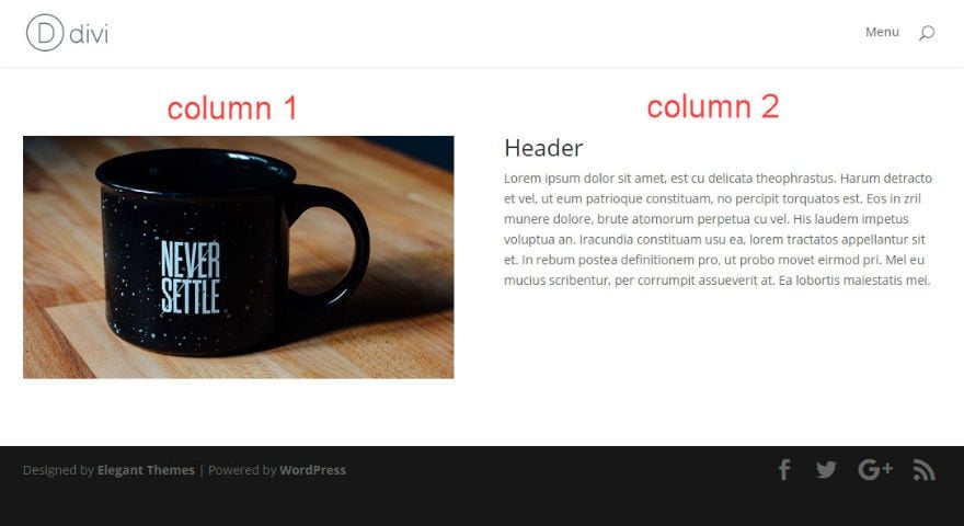
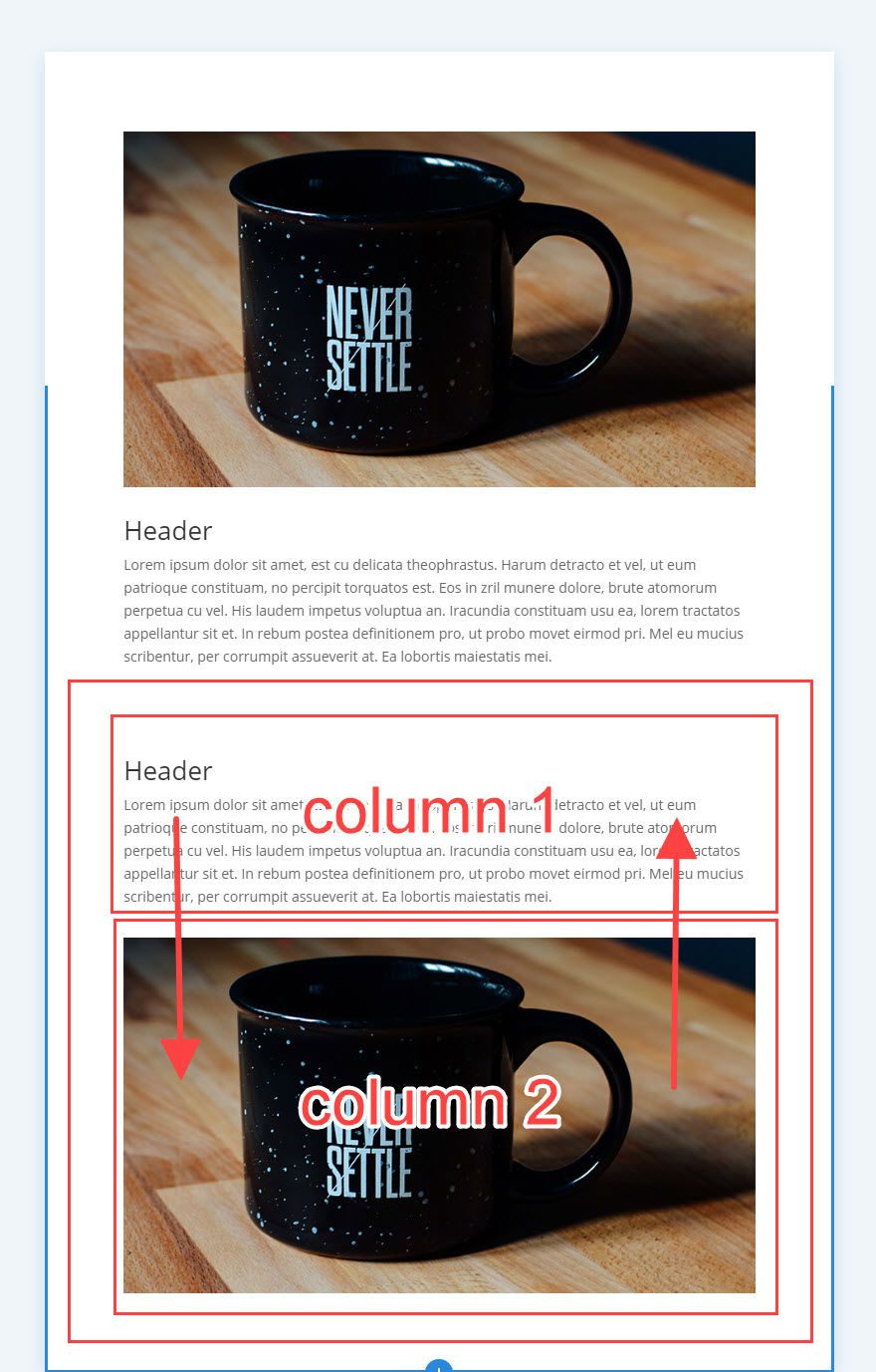
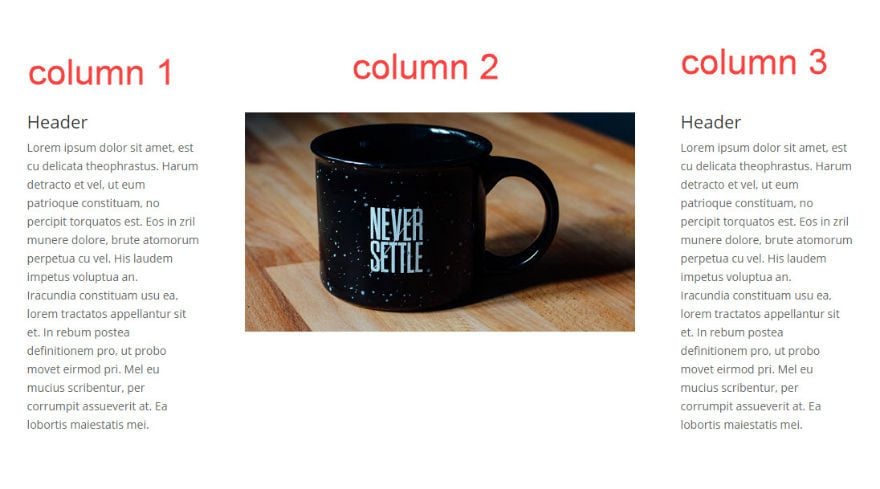
Now you should have one row with 2 columns with the first row containing an image and the second row containing text. I’ve labeled the columns for you in the following image.
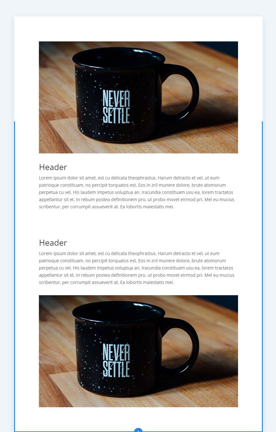
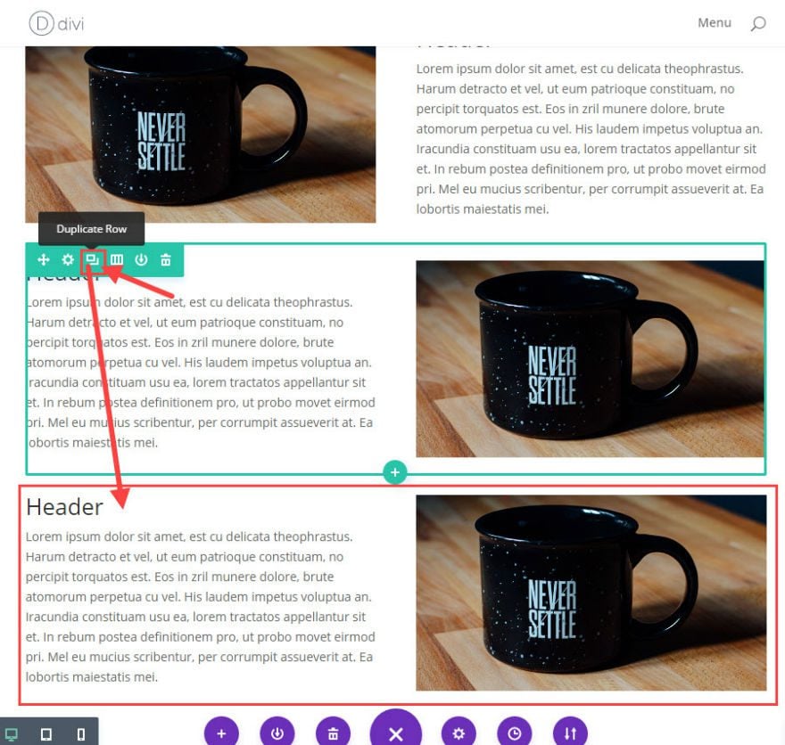
From the visual builder, duplicate the row with the same 2 columns by clicking the duplicate row icon.
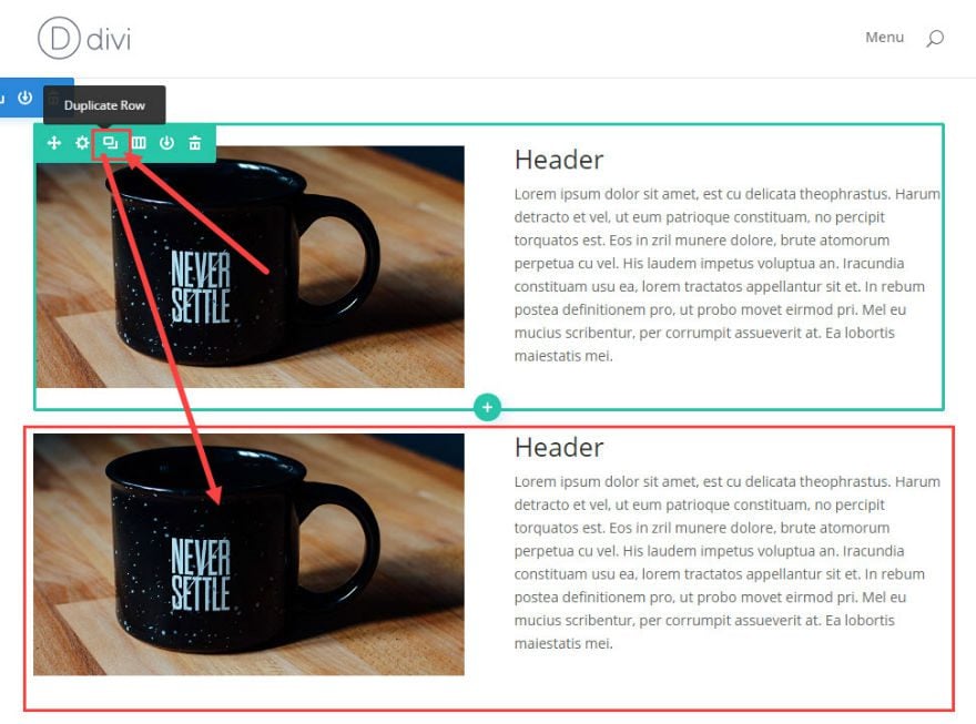
On your second row (the duplicate row you just created), drag the image module over to the second column and drag the text module over to the first column.
Alternating the image and text positions on each row like this may be a creative and effective way to display your content on your webpage. But it also creates a problem when the columns stack on mobile. When shrinking the width of your browser to less than 980px wide (the breakpoint for mobile devices), the content of each row stacks from left to right. This means that the first column of your row will stack on top of the second column. This can cause a problem if you want to keep the flow of content consistent on mobile devices. With the current layout, the flow of content on mobile will stack in the following order:
Column 1 (Image)
Column 2 (Text)
Column 1 (Text)
Column 2 (Image)
A better layout for mobile will be to change the stacking order of the columns in one of your rows so that you get a more consistent layout of content.
Two Ways to Change The Column Stacking Order on Mobile
1: Changing The Column Stacking Order on Mobile Using Divi’s “Disable On” Feature
Divi’s “Disable On” feature allows you to create different versions of your content on phone, tablet, and desktop displays. With a few clicks you can hide or show sections of content on any device.
For this example, we need to keep the second row visible on desktop but hide it on mobile devices. Then we need to create a different version of the second row to be visible only on mobile.
Using the Visual Builder, duplicate the second row.
Before we edit the new duplicated row, open the Row Settings in the second row.
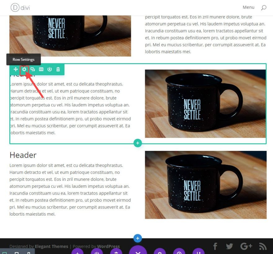
Under General Row Settings, check to disable the row on phone and tablet.
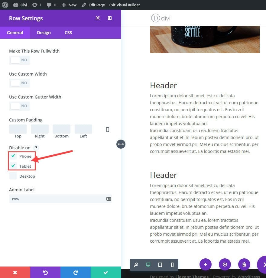
Save
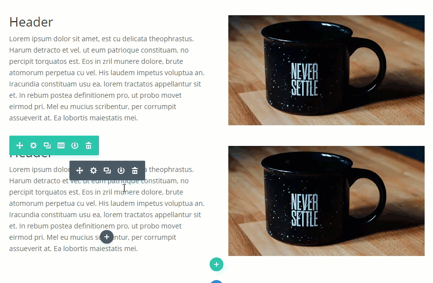
Now the second row will be hidden on mobile devices. Next, we need to change the layout of our new third row to how we want the order of the columns to be on mobile.
Drag the text module content over to the second column and drag the image module over to the first column.
Now go into the General Row Settings for the third row and check the box to disable the row on desktop.
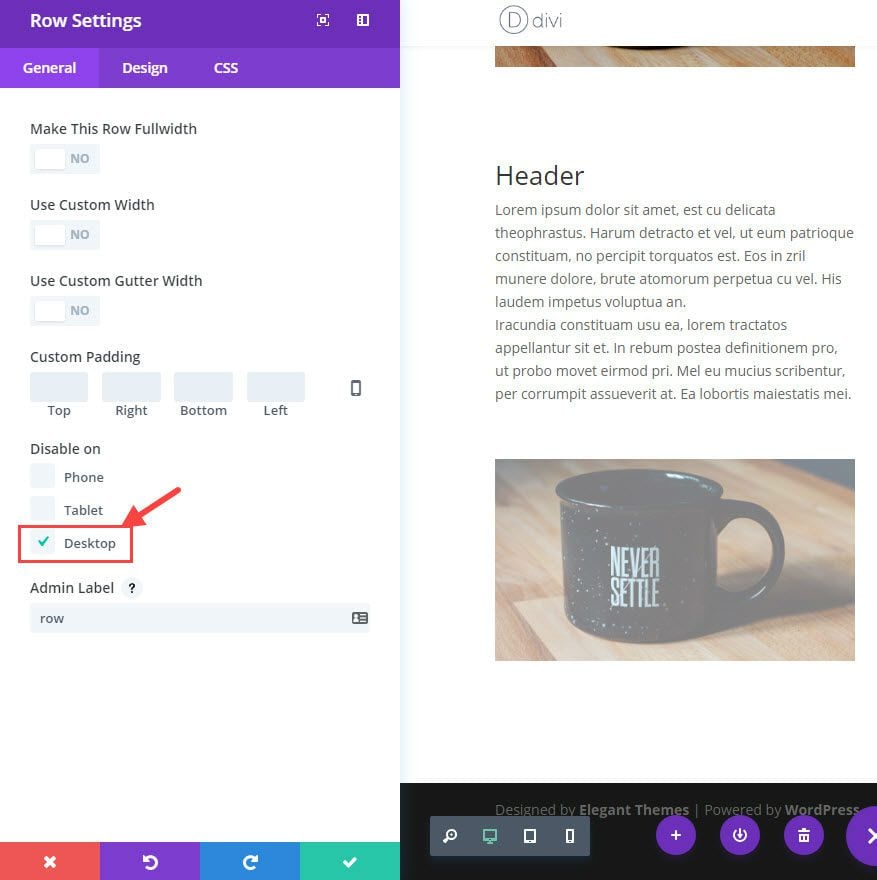
Save
Now check out your results. You will notice that the third column is disabled on desktop and then enabled on mobile devices. This creates a more consistent layout on mobile.
That’s it!
With this ability to disable and enable certain sections of content, you can change/reorder any type of layout easily.
Also, when viewing your page from the Visual Builder, Divi conveniently fades the content that is hidden on the page so you can identify which content is disabled.
Using the “Disabled On” feature to hide columns and rows is a safe bet. However, if you do this too much and/or have a lot of content, editing the page can get confusing. And, when making updates to content, you must update the content on all versions, not just one.
If disabling and enabling content is not the right solution for you, there is another way to order your content on mobile using CSS classes.
2. Changing the Column Stacking Order On Mobile Using CSS Classes
To do this we are going to use some custom CSS so that we can add a class to our columns that will order them however you want on mobile display.
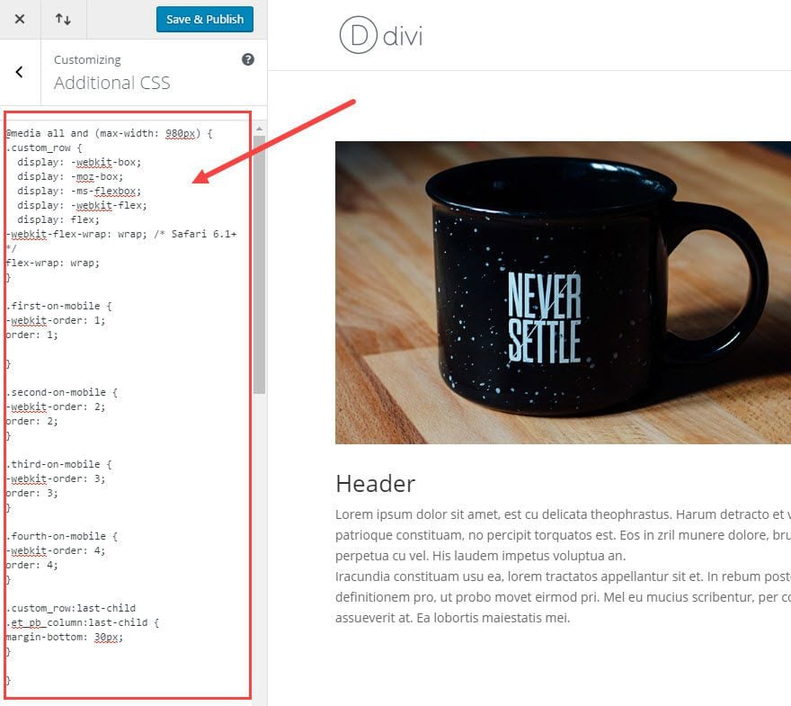
Then from your wordpress Dashboard, go to Divi → Theme Customizer → Additional CSS and add the following CSS:
@media all and (max-width: 980px) {
/*** wrap row in a flex box ***/
.custom_row {
  display: -webkit-box;
  display: -moz-box;
  display: -ms-flexbox;
  display: -webkit-flex;
  display: flex;
-webkit-flex-wrap: wrap; /* Safari 6.1+ */
flex-wrap: wrap;
}

/*** custom classes that will designate the order of columns in the flex box row ***/
.first-on-mobile {
-webkit-order: 1;
order: 1;
}

.second-on-mobile {
-webkit-order: 2;
order: 2;
}

.third-on-mobile {
-webkit-order: 3;
order: 3;
}

.fourth-on-mobile {
-webkit-order: 4;
order: 4;
}
/*** add margin to last column ***/
.custom_row:last-child .et_pb_column:last-child {
margin-bottom: 30px;
}

}
Save and Publish
Looking at the CSS you just added, notice all of the CSS is contained with a media query that will only use the css for mobile devices (on screen sizes less than 980px wide).
You will also notice the first class called “custom row”. This class will be added to the row you would like to change the column stacking order on mobile.
The next 4 classes (“first-on-mobile”, “second-on-mobile”, “third-on-mobile”, and “fourth-on-mobile”) have an order property and a number value assigned to it. These classes will be added to the columns within your “custom” row to designate the order you want them displayed on mobile.
Now that we have our CSS in place, let’s apply these classes to our page.
Make sure you have your two rows created by following the directions. Also, make sure you don’t have any of the rows disabled on mobile or desktop.
For this example, we are going to change the order of the columns in second row on mobile. Here is an illustration of what we want to accomplish.
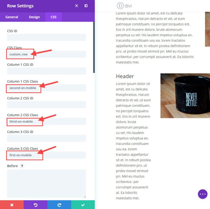
Using the Visual Builder, open the row settings for the second row.
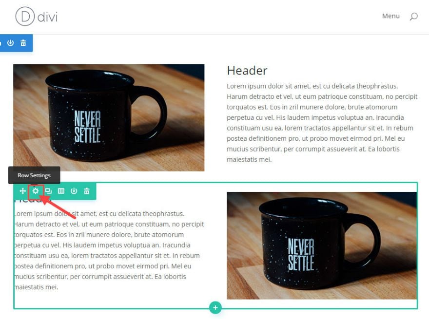
In Row Setting, under the CSS tab, add the following:
Add “custom_row” to the CSS Class text box. (the wraps your row in a flex box)
Add “second-on-mobile” to the Column 1 CSS Class textbox (This changes the order of column 1 to display second on mobile. The class name should make this easy to remember. )
Add “first-on-mobile” to the Column 2 CSS Class textbox (This changes the order of column 2 to display first on mobile.)
Note: It is important to add an ordering class to each column.
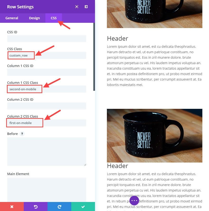
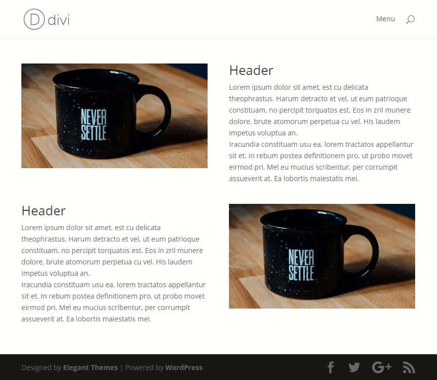
Now Let’s check out the results. Notice on mobile how the second row columns have been changed to display the same as the first row. This creates a consistent flow of image → text → image → text.
Changing the Column Stacking Order of Any Layout Using CSS Classes
You can change the order of any column layout using this same method. Remember that the custom CSS enables you to add first, second, third, and fourth placement values. For example, if you want to change the order of a one-fourth one-half one-fourth layout like this:
Just follow the same steps you did before. In your row settings, under the CSS tab, add a the class “custom_row” to the row and add your ordering class (“first-on-mobile”, “second-on-mobile”, “third-on-mobile”) to each of your columns. Remember to make sure you add a class to each of your columns so they all have a designated order value.
That’s it!
Preferred Method
If you need to create distinct layouts for each device and/or plan on changing the content in addition to the column order on mobile, then you would need to use Divi’s “Disabled On” feature to customize your layouts.
If you only need to reorder columns on mobile without changing content and you don’t want to bother with juggling multiple disabled/enabled versions of content, then you may benefit from the CSS method.
SEO Considerations
There has been much debate over the years about how search engines handle content that is disabled or hidden on a page. Even though you may hide content for certain devices, the content is still crawl-able by Google. This could be considered duplicate content and might suggest that using the “Disable On” feature would negatively effect your page ranking. However, search engines like Google are pretty good at identifying if content is hidden for responsive layout reasons. In short, Google knows if you are duplicating content for different devices and will not penalize you for it. As long as you don’t hide content for malicious reasons, it is safe to use.
Final Thoughts
Being able to change stacking order of columns is extremely useful and sometimes necessary. We all need the ability to create a unique design layout for desktop display without compromising the consistency of content flow on mobile. Using Divi’s “Disable On” feature, you can create completely different layouts for each device. Also, with a few lines of custom CSS, you can easily add classes to your rows and columns to order them however your want for mobile devices.
I hope this post will help you gain more control over your mobile displays.
I look forward to hearing from you in the comments.
Cheers!


I was hoping there was a bit more elegant option than this. This is how I have done it for years but it confuses people who look at the duplicate content and are perplexed. I was hoping that by now there was an option to just switch things based upon mobile vs desktop mode.
There’s no default option in Divi to switch Columns on different screen sizes, another workaround for it is to use flex-direction property of display: flex;, for example you have 2 column stacking and you want the 2nd column to go first on mobile, it can be done by adding the properties in the Row Settings > Advanced > Custom CSS > Module Element > Main Element > Responsive Option > Mobile: https://prnt.sc/UCwZeLTsAtFw
Hi all
How can I make 3 row appear as 5 column for mobile and table?
This was such a life saver. I knew about the first method, but that wasn’t helpful to me this time around because I am using the auto scroll feature with CSS ID to take the user down to the relevant section (I don’t know what this feature is called). And I did not want to change the names because the URL changes when a button is clicked before the user is taken down the page. I wanted to keep everything consistent. I don’t know if I’ve made any sense, but I just want to say that I really needed that second method.
Ideally, however, there should really be an easy column changer for mobile. The same way we can just drag our columns to a different position for desktop, we should be able to do so for mobile.
When will you make this functionality just part of the Divi Builder rather than requiring CSS. In Elementor you can simply toggle a switch to reverse column order. This should be a standard option and not require CSS. I would request adding this as a feature.
I want to achieve this with just modules, not columns. Is this possible?
Me too, I’d like to know if you can do it with modules, or if that needs a slightly different code with the same method, please?
thanks
On Elementor or Avada I can click a single button and it will swap the columns for mobile/tablet. Divi requires me to add custom css or duplicate the row and swap the columns over, then hide respective rows on desktop or mobile.
There are much better solutions for this problem, pretty disappointing that Divi hasn’t come up with something better yet.
Doesn’t work any more. There are no column css
The Column CSS Class & ID fields can now be found in the Column Settings. Go to Row Settings first and look for the column settings. Here’s a GIF for visual reference: https://i.imgur.com/kGgTf7Z.gif
It’s been almost 2 years since I used your technique to switch the order. I literally forgot how I did it. Fortunately I found your animated gif, and it is still the proper solution as of today, 1-17-25. In fact I am going to be using this on other pages today. Thank you for that animated gif! I was trying to find where I put the code, I was pulling my hair out lol. Thanks!
Does this code still work? I placed the code where you showed above but it doesn’t work??
It still works. I suggest that you reach out to the Support Team and have them check your set up.
Hi ,
I have a question : how can i adjust manually the column with eg. i would like to have 3 columns
1st column : 50% width
2nd column : 35% width
3nd coule : 15% width
How can i do that ?
Many thanks for your response
Best regard
Phil
A very useful article, and the timing couldn’t have been better. Oh, and the code works perfectly. Thanks so much!
EXCELLENT INFO, Exactly what I need. Thank You Jason!
Very nice! Solved an issue I was having just today. I had been using the “disabled on” feature to create different layouts for mobile vs. desktop, but this just solved that problem. Now I can use CSS and it is much cleaner! Much appreciated. 🙂
I’ve been looking for a way to do this. Thank you!
I prefer the CSS version for my needs though, as the first solution means bloating the page with hidden content.
Great tip using CSS classes instead of duplicating rows. Less mess. Thank you Jason for this one and all the thorough guides you put together. They really come in handy.
Ps. I feel that this post deserves more attention and positive feedback. Far to many sites are built without paying attention to this kind of ‘mobile display design ugliness’, including ETs own homepage as Tim mentioned. 😉 (I know, of course it’s a matter of taste..)
wah .. thank you
bookmark this article
Really useful, sometimes it´s necessary change the order to mobile. Thanks!
Hi Jason,
This problem has always been a pet peeve of mine but I didn’t know a good solution until this contribution of yours. So this article and your copious explanations are really, really useful! Thanks a bunch!
Flexbox becomes more and more popular for these type of things. CSS Grid also brings super power to the web.
video for this lesson please
Super handy, I like the flexbox ordering because it doesn’t bloat the code on the page. Thanks for sharing.
This is a great solution to a common problem. This is especially needed when you have a layout with alternating 50-50 columns with paragraph text in one column and an image in the other (just like the new ET homepage). The default result of this layout on mobile ends up being: paragraph > image >image > paragraph, instead of what would make sense: paragraph > image > paragraph > image. Previously I would create a duplicate section that only shows up on mobile with the correct stacking order. But the solution in this article is definitely better! 🙂