
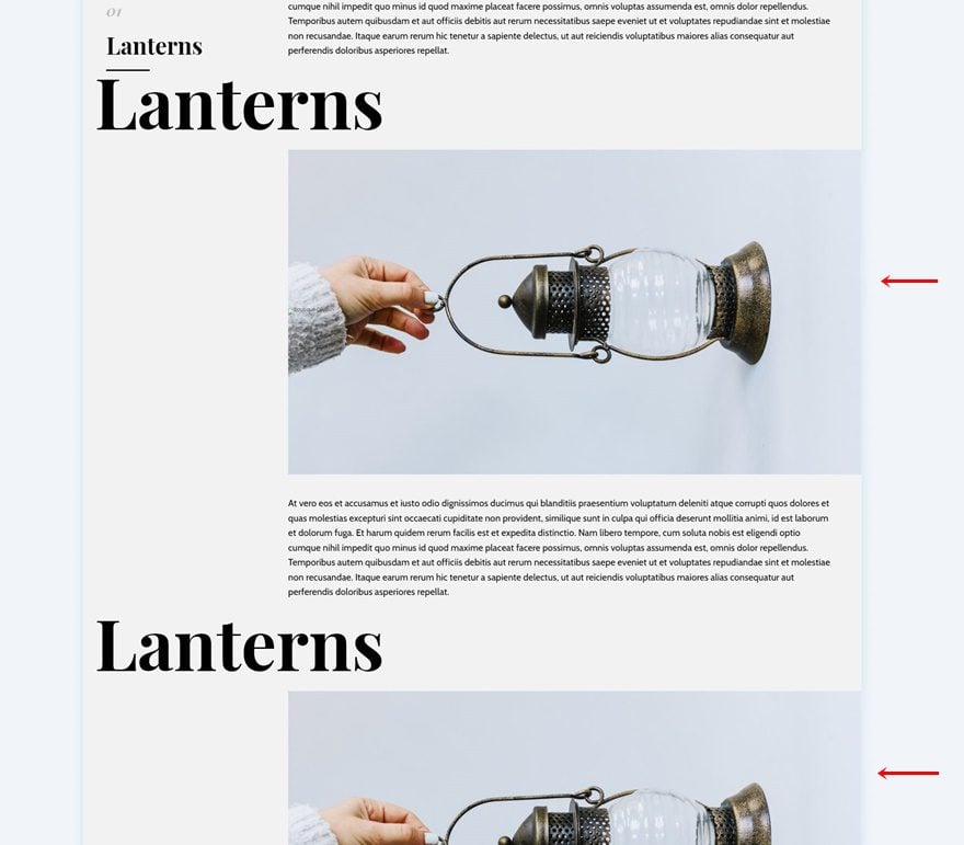
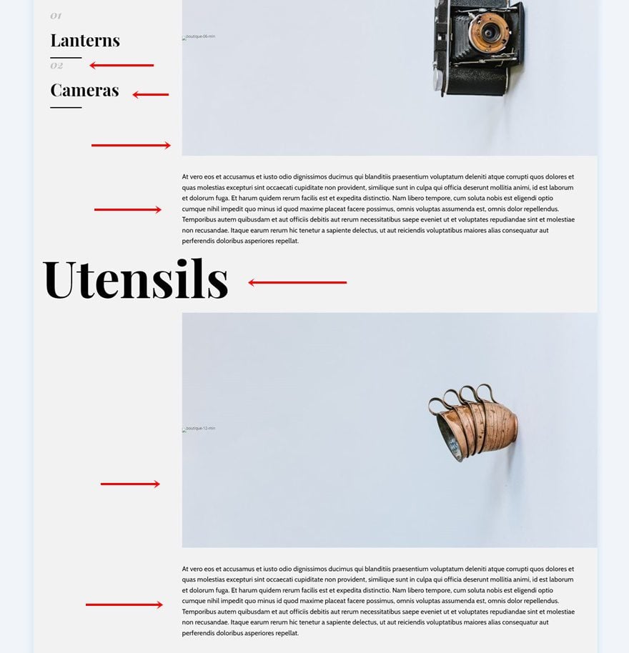
Divi and its sticky options allow you to effortlessly add interaction to the pages you create and design. If you’re looking for a way to mention multiple items without just creating a static list, you’ll enjoy this tutorial. Today, we’re showing you how to build an interactive list on scroll using Divi’s sticky options. As people are scrolling down the section, different items are added to the list on the left. This helps keep an overview. You’ll be able to download the free JSON file as well!
Let’s get to it.
Preview
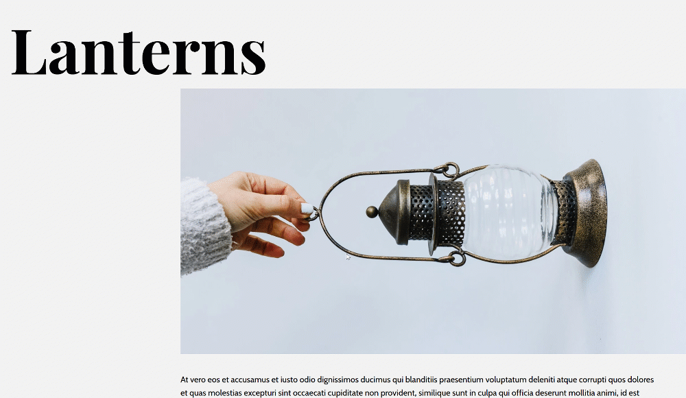
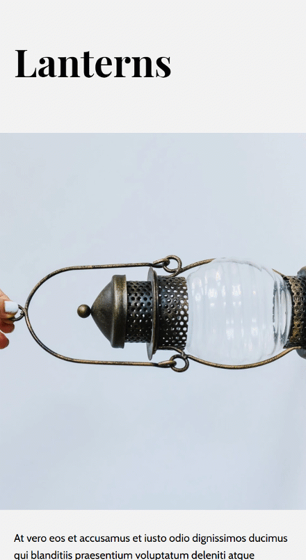
Before we dive into the tutorial, let’s take a quick look at the outcome across different screen sizes.
Desktop
Mobile
Download The Layout for FREE
To lay your hands on the free layout, you will first need to download it using the button below. To gain access to the download you will need to subscribe to our newsletter by using the form below. As a new subscriber, you will receive even more Divi goodness and a free Divi Layout pack every Monday! If you’re already on the list, simply enter your email address below and click download. You will not be “resubscribed” or receive extra emails.

https://youtu.be/vSZyvv1nAsE
Subscribe To Our Youtube Channel
Create Element Structure
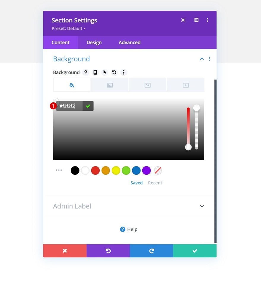
Add New Section
Background Color
Start by adding a new section to the page you’re working on. Add a background color to the section.
- Background Color: #f2f2f2
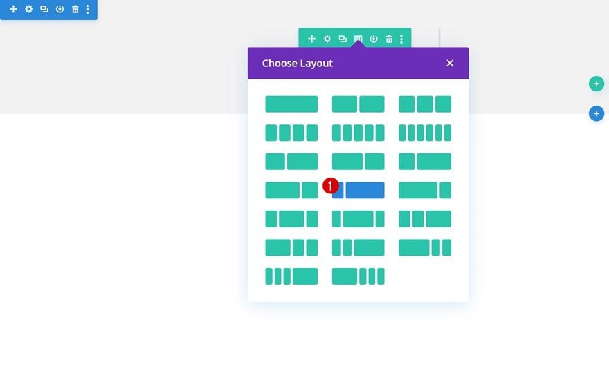
Add Row
Column Structure
Continue by adding a new row using the following column structure:
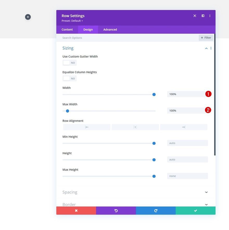
Sizing
Without adding modules yet, open the row settings and change the sizing settings as follows:
- Width: 100%
- Max Width: 100%
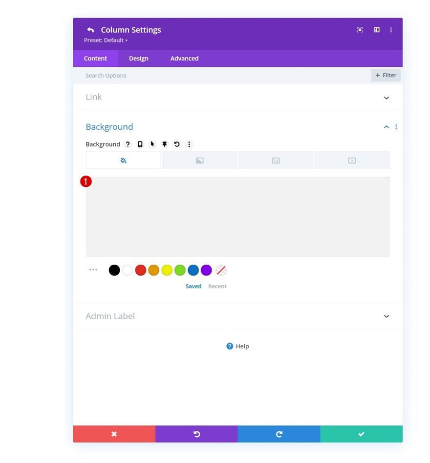
Column 1 Background Color
Then, open the column 1 settings and add a background color.
- Background Color: #f2f2f2
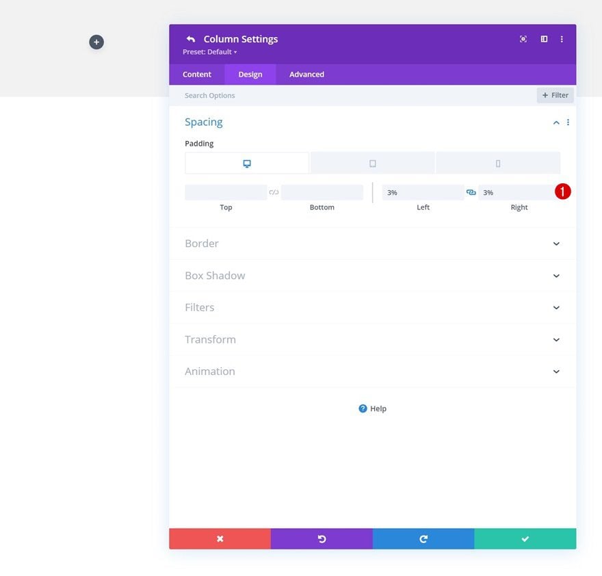
Column 1 Spacing
Modify the column’s spacing settings next.
- Top Padding:
- Tablet: 20px
- Phone: 20px
- Bottom Padding:
- Tablet: 20px
- Phone: 20px
- Left Padding: 3%
- Right Padding: 3%
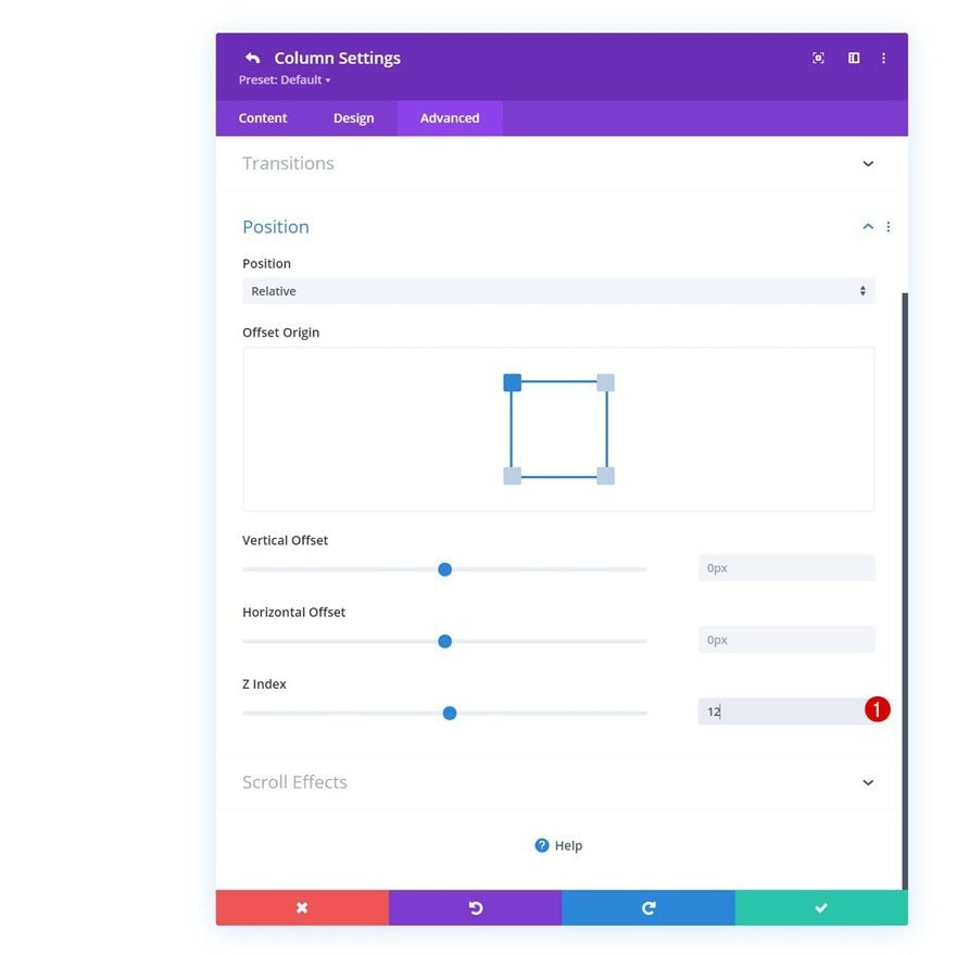
Column 1 Z Index
And increase the column’s z index in the advanced tab.
- Z Index: 12
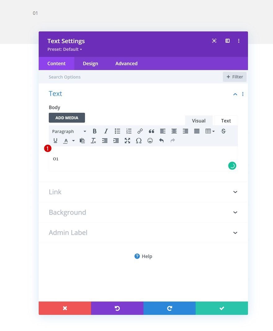
Add Text Module #1 to Column 1
Add Content
Time to add modules, starting with a first Text Module in column 1. Add some content of your choice.
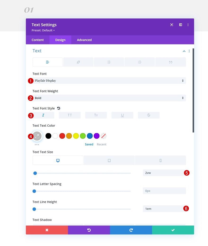
Text Settings
Move on to the module’s design tab and change the text settings as follows:
- Text Font: Playfair Display
- Text Font Weight: Bold
- Text Font Style: Italic
- Text Color: #bfbfbf
- Text Size:
- Desktop: 2vw
- Tablet: 5vw
- Phone: 8vw
- Text Line Height: 1em
Add Text Module #2 to Column 2
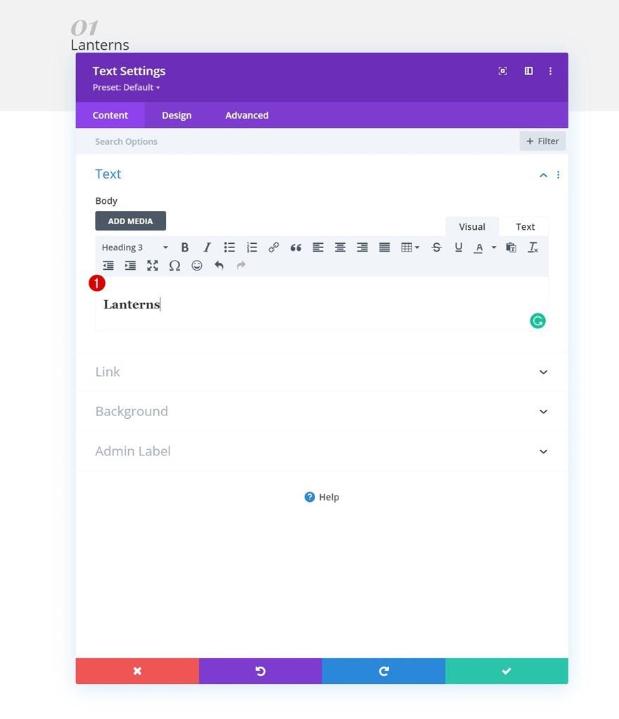
Add H3 Content
Add another Text Module to the column with some H3 content of your choice.
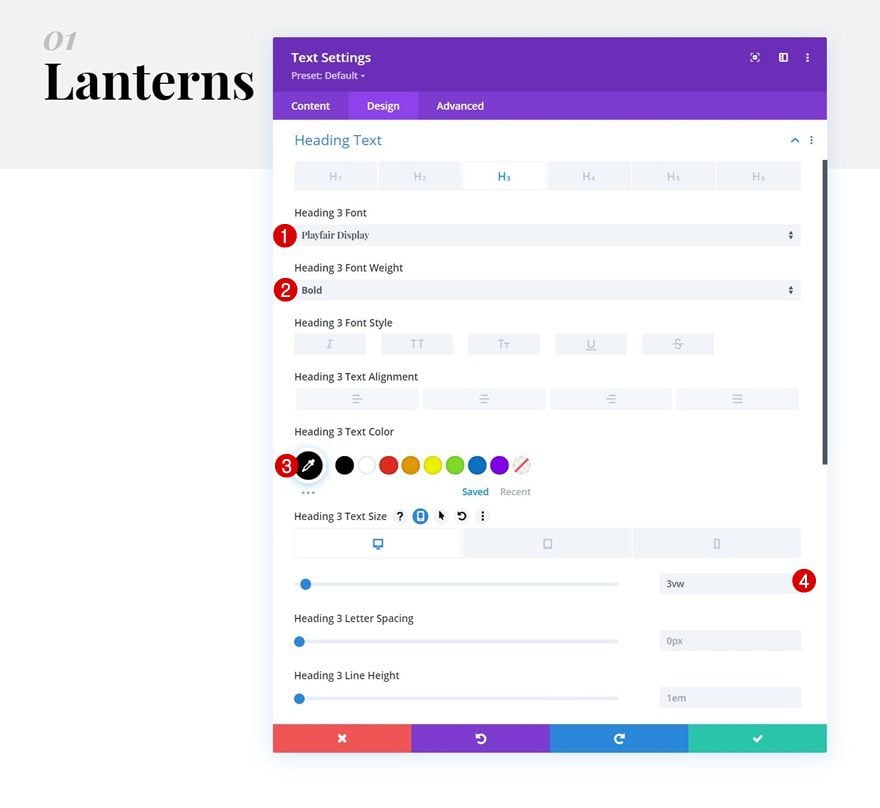
H3 Text Settings
Move on to the module’s design tab and change the H3 text settings as follows:
- Heading 3 Font: Playfair Display
- Heading 3 Font Weight: Bold
- Heading 3 Text Color: #000000
- Heading 3 Text Size:
- Desktop: 3vw
- Tablet: 10vw
- Phone: 12vw
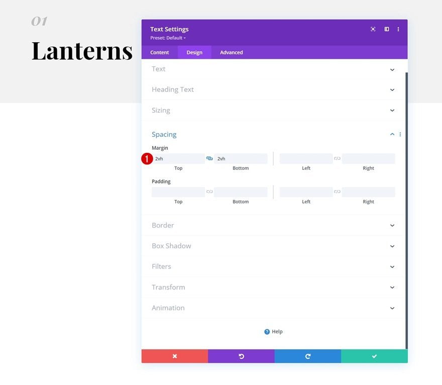
Spacing
Add some custom top and bottom margin next.
- Top Margin: 2vh
- Bottom Margin: 2vh
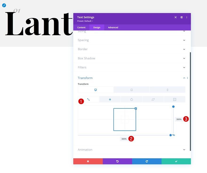
Transform Scale
Then, apply some custom transform scale settings.
- Both: 300%
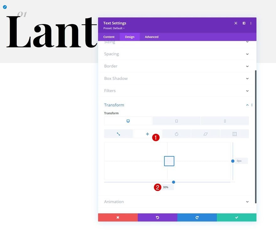
Transform Translate
And complete the module settings by applying the following transform translate settings:
- Bottom: 30%
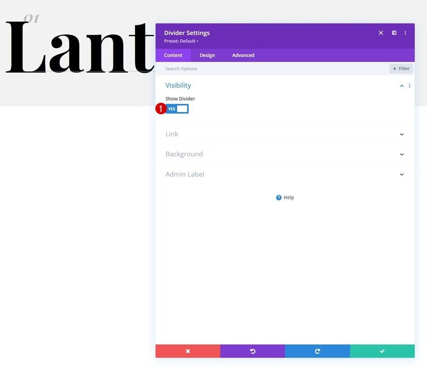
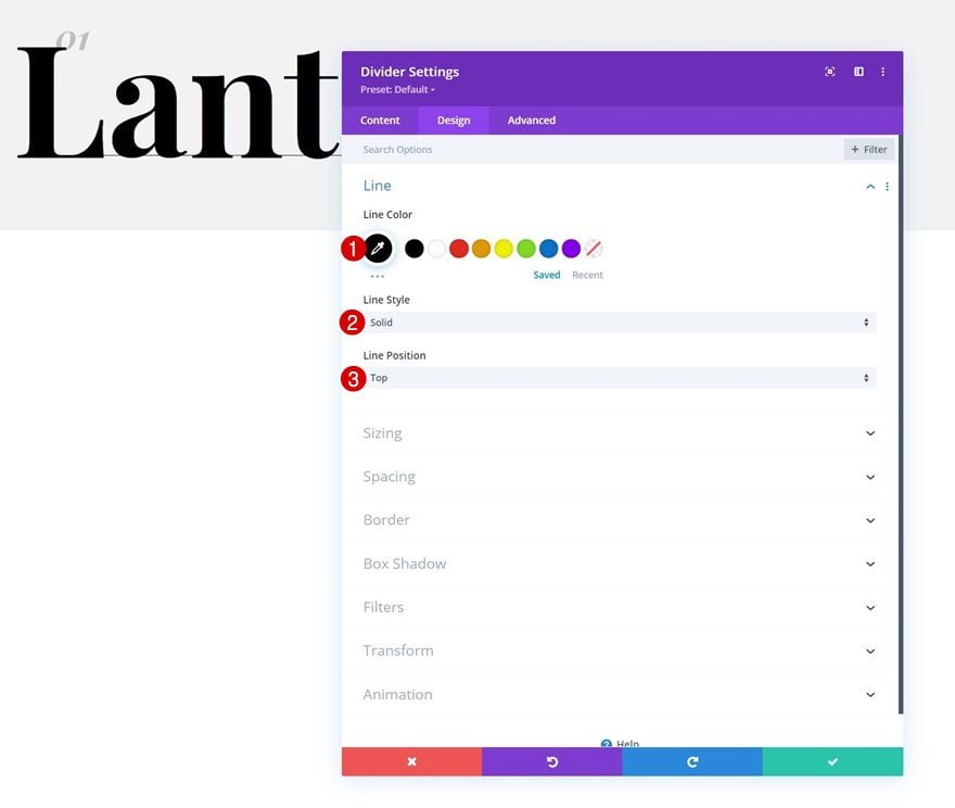
Add Divider Module to Column 1
Visibility
The last module we need in column 1 is a Divider Module. Make sure the “Show Divider” option is enabled.
- Show Divider: Yes
Line
Move on to the module’s design tab and change the line settings accordingly:
- Line Color: #000000
- Line Style: Solid
- Line Position: Top
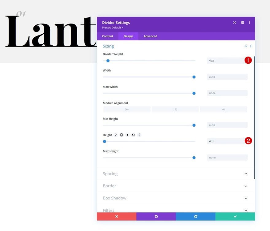
Sizing
Modify the module’s sizing settings too.
- Divider Weight: 4px
- Divider Height: 4px
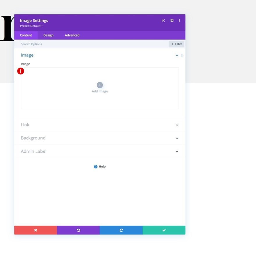
Add Image Module to Column 2
Leave Image Box Empty
In column 2, the first module we’ll add is an Image Module. Leave the image box empty.
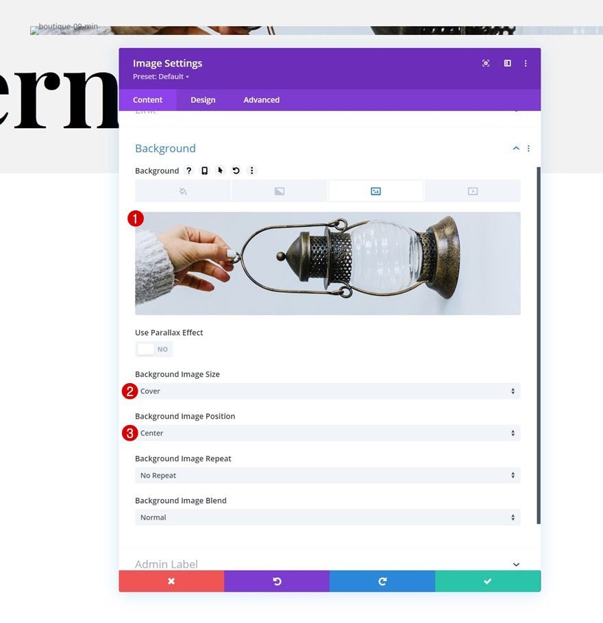
Background Image
Use a background image instead.
- Background Image Size: Cover
- Background Image Position: Center
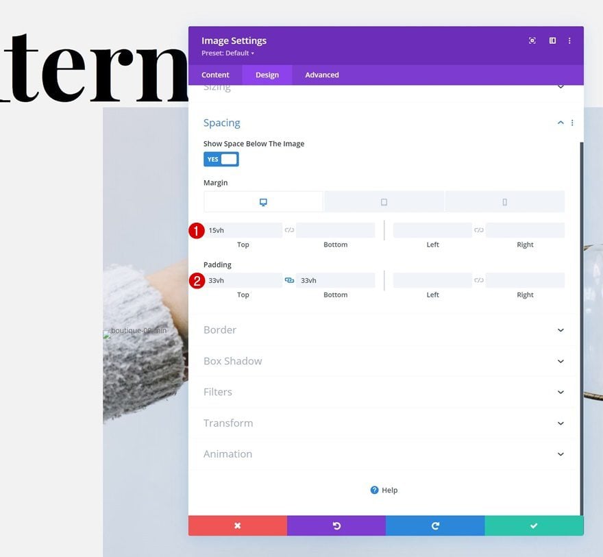
Spacing
And to allow the background image to show up, we’ll modify the spacing settings as follows:
- Top Margin:
- Desktop: 15vh
- Tablet & Phone: 0vh
- Top Padding: 33vh
- Bottom Padding: 33vh
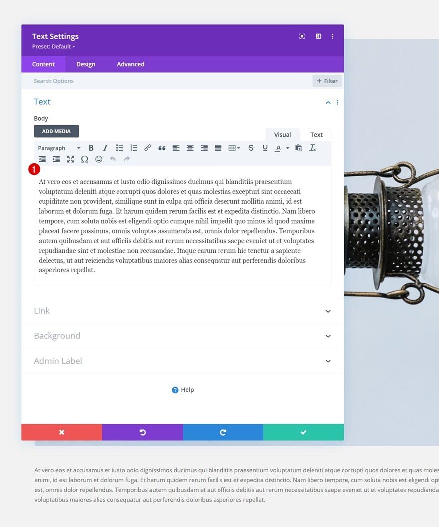
Add Text Module to Column 2
Add Content
The next and last module we need is a Text Module below the Image Module. Add some description content of your choice.
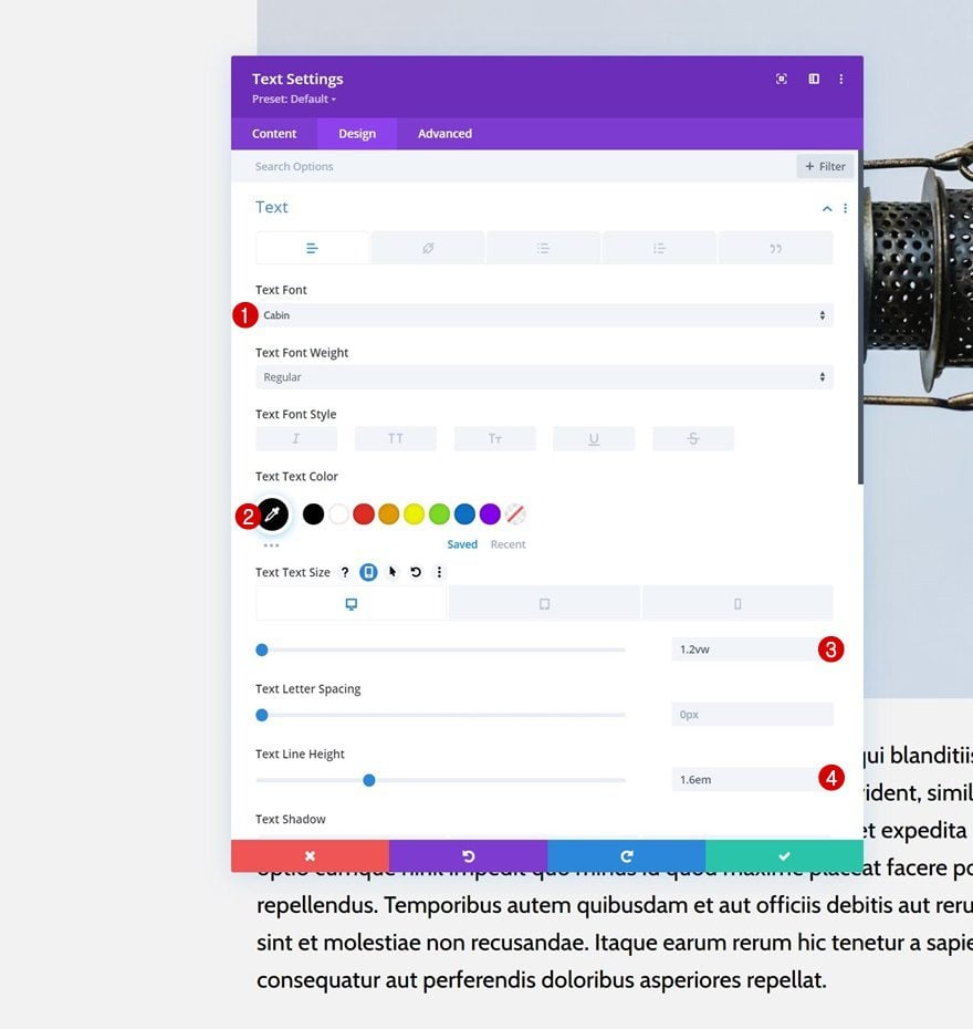
Text Settings
Move on to the module’s design tab and change the text settings as follows:
- Text Font: Cabin
- Text Color: #000000
- Text Size:
- Desktop: 1.2vw
- Tablet: 2.3vw
- Phone: 3.4vw
- Text Line Height: 1.6em
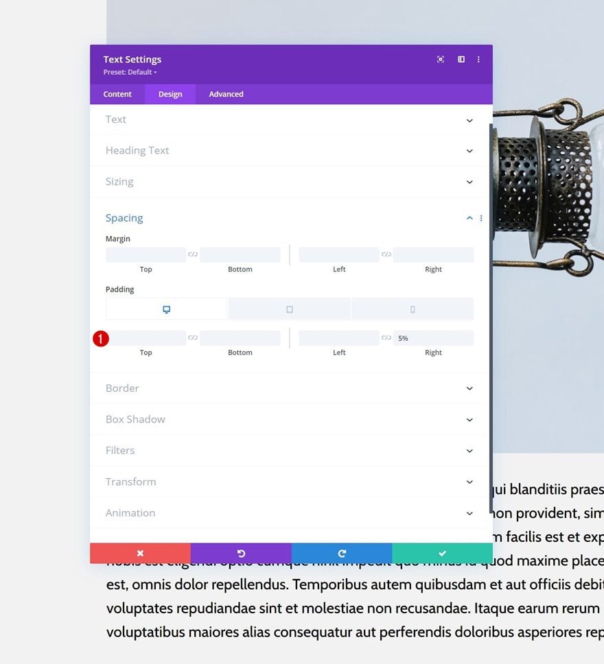
Spacing
Complete the module settings by changing the module’s spacing settings accordingly:
- Left Padding:
- Tablet & Phone: 5%
- Right Padding: 5%
Apply Sticky Effects
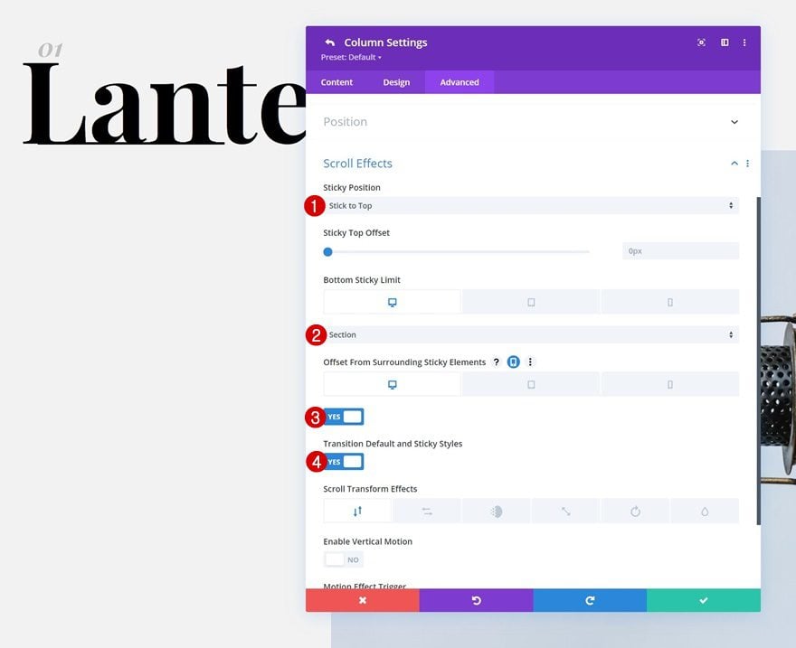
Turn Column #1 Sticky
Now that all elements are in place, we can start applying the sticky settings. Open the column 1 settings and use the following responsive sticky settings in the advanced tab:
- Sticky Position: Stick to Top
- Bottom Sticky Limit
- Desktop: Section
- Tablet & Phone: Row
- Offset From Surrounding Sticky Elements:
- Desktop: Yes
- Tablet & Phone: No
- Transition Default and Sticky Styles: Yes
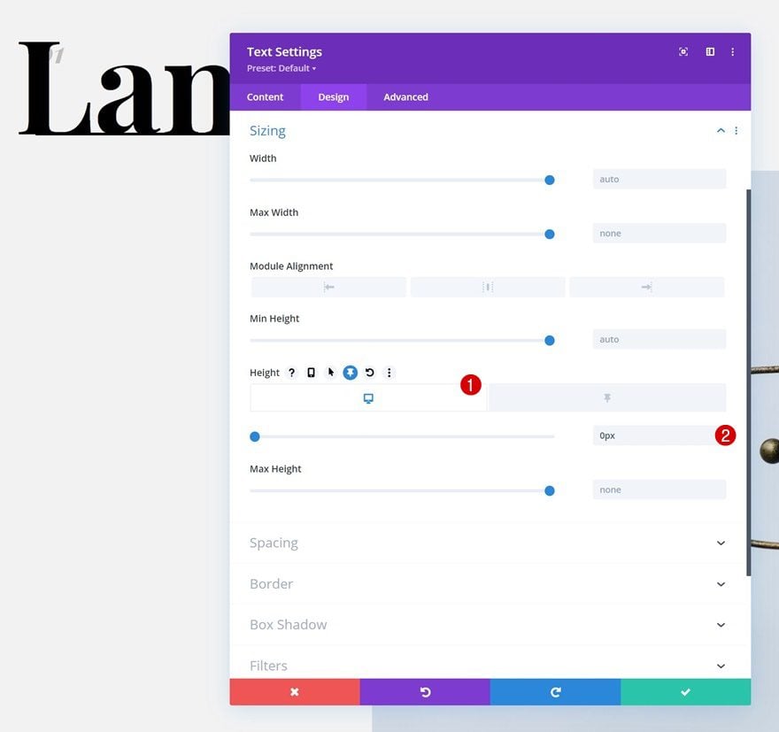
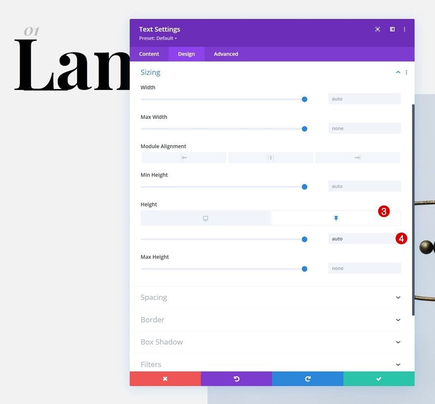
Text Module #1 in Column #1: Sticky Settings
Height
Now that column 1 has been turned sticky, we can start applying some sticky settings to the elements inside this column. We’ll start with the first Text Module’s height.
- Height: 0px
- Sticky Height: Auto
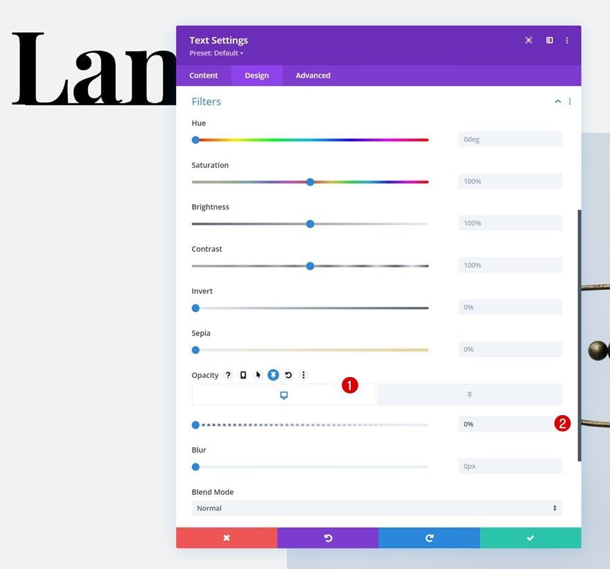
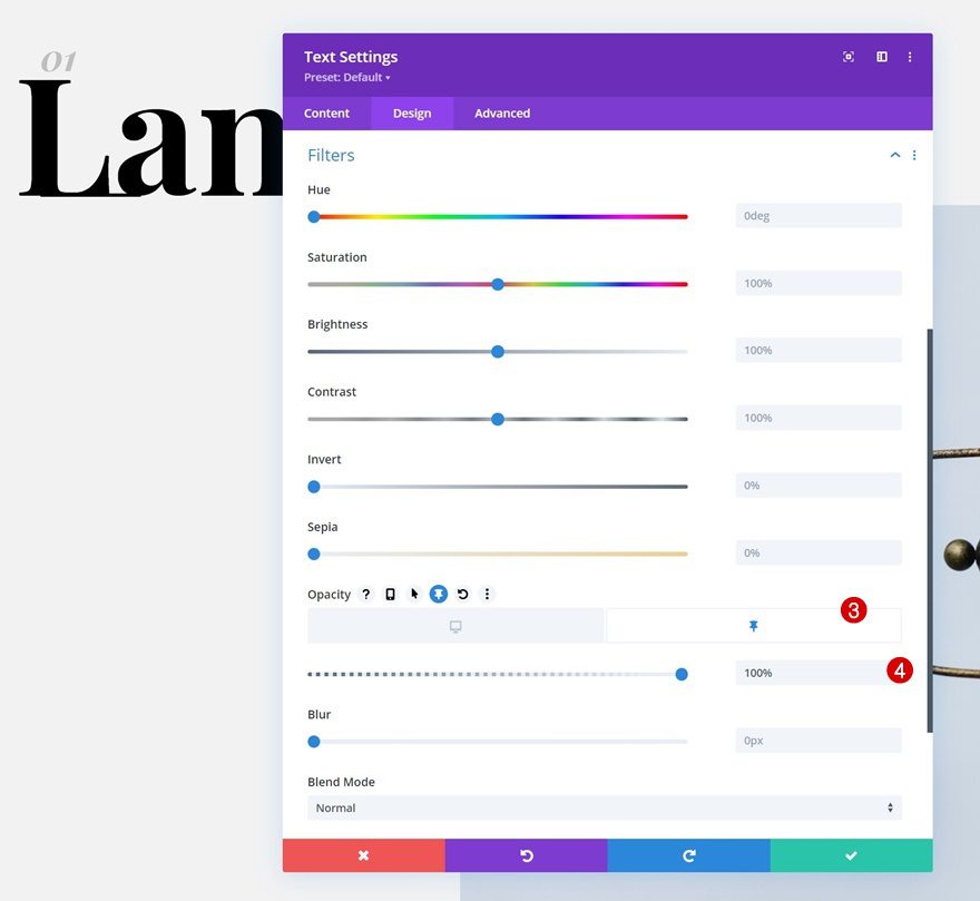
Opacity
We’re modifying the opacity too.
- Opacity: 0%
- Sticky Opacity: 100%
Text Module #2 in Column #1: Sticky Settings
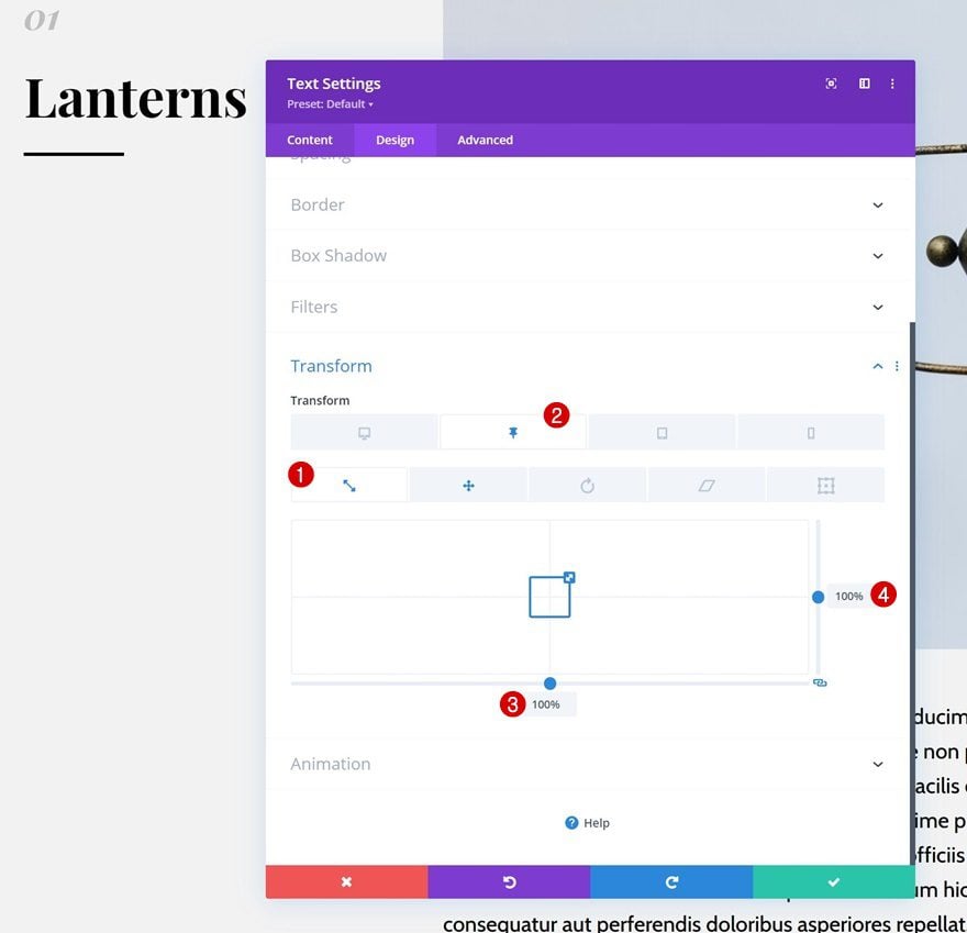
Transform Scale
Next, we’ll open the second Text Module in column 1. Bring back the transform scale values to “100%” in a sticky state.
- Sticky Both: 100%
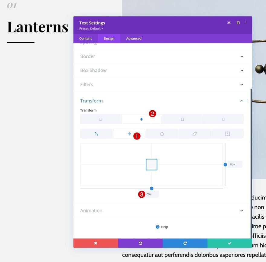
Transform Translate
Change the sticky transform translate settings too.
- Sticky Bottom: 0%
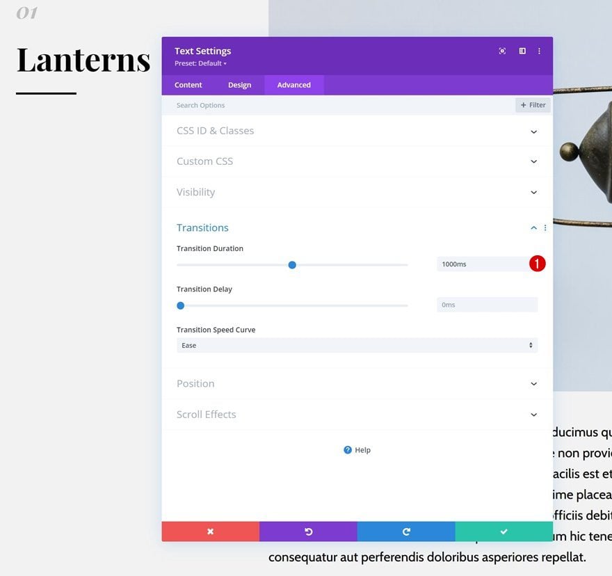
Transition
And complete the module settings by increasing the transition duration in the advanced tab.
- Transition: 1000ms
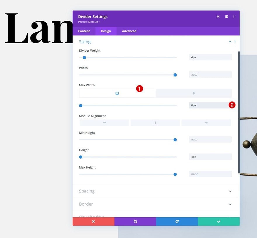
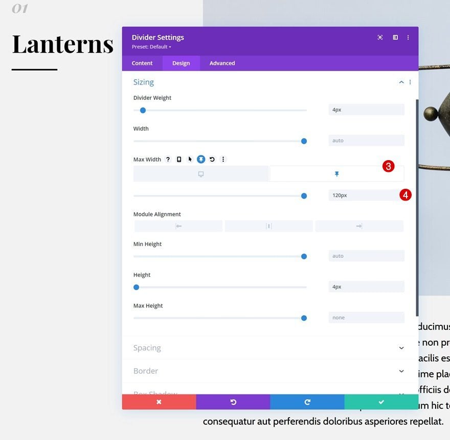
Divider Module: Sticky Settings
Max Width
Last but not least, we’ll also modify the Divider Module’s max width.
- Max Width: 0px
- Sticky Max Width: 120px
Clone Row Twice
Once your first row has been completed, you can clone it twice.
Change All Content & Images
Make sure you change all content and images and you’re done!
Preview
Now that we’ve gone through all the steps, let’s take a final look at the outcome across different screen sizes.
Desktop
Mobile
Final Thoughts
In this post, we’ve shown you how to get creative with Divi’s sticky options. More specifically, we’ve shown you how to build an interactive list on scroll. As people are scrolling down the section design, different items of your list are collected on the left side. This gives a structured overview and helps you create an interactive design. You can use this approach for any type of list you want to share on your pages! You were able to download the JSON file for free as well. If you have any questions or suggestions, feel free to leave a comment in the comment section below.
If you’re eager to learn more about Divi and get more Divi freebies, make sure you subscribe to our email newsletter and YouTube channel so you’ll always be one of the first people to know and get benefits from this free content.


It does not work on divi 5. Is there a way to fix it.
Thank you for your feedback! The issue with the interactive list on scroll not working properly in Divi 5 has been reported to our content team. We appreciate your patience as they investigate.
I got an issue with this cool feature, interacting with slide-in menu, I wonder if I can find some help
Hey, David!
Feel free to reach out to our friendly support team. A support rep will investigate and advise on how to resolve the issue. 👍
Works great on desktop but as I scroll down on my mobile, it doesn’t stick or animate. Strangely it works fine as I scroll up.
Any ideas?
why the left list is stuckk to 6, any more heading over 6 & the number after 6 are hidden.
How do you import this into the divi site?
That looks nice.
I would like to know:
This could be use for a blog, right?
Going to the Theme Builder, changing the blog section adding this and boom.
So all the Headings would be the list on the left side and it would be AMAZING