
In the past, we’ve shared different types of headers you can create with Divi and the Divi Theme Builder. As a matter of fact, you can find all of those tutorials listed in this navigation post. In that post, you’ll notice we’ve shown you how to create a fullscreen header, but to help you take your header design even further, we’ll show you how to create a custom-animated hamburger menu as well. There are a few notable things about the hamburger menu we’ll create:
- As soon as visitors click on the hamburger icon, a fullscreen header will transition in, and each menu item will reveal one by one, giving it a custom-animated look and feel
- The custom animations are triggered each time the menu is opened
- You’ll be able to add dropdown items to the main menu items as well, these open on click and close automatically as soon as someone closes the menu or clicks a navigation item
In other words, this is definitely a header tutorial that’ll help you add that advanced look and feel to your website. You’re able to style the items however you want as well and you’ll be able to download the JSON template file for free!
Let’s get to it.
- 1 Preview
- 2 Download The Global Header Template for FREE
- 3 Download For Free
- 4 1. Create New Header Template
- 5 2. Build Logo & Hamburger Icon
-
6
3. Build Hamburger Menu
- 6.1 Add New Section
- 6.2 Add New Row
- 6.3 Column 1 Settings
- 6.4 Column 2 Settings
- 6.5 Add Text Module #1 to Column 1
- 6.6 Clone Text Module & Place Duplicate in Column 2
- 6.7 Add Text Module #2 to Column 2
- 6.8 Clone Text Module to Create Variation Without Submenu
- 6.9 Reuse Both Types of Menu Items
- 6.10 Add Text Module #2 to Column 2
- 6.11 Clone Text Module #2
- 6.12 Add Social Media Follow Module to Column 2
-
7
4. Add Functionality
- 7.1 Add CSS Class to Hamburger Icon Text Module
- 7.2 Add CSS Class to Section #2
- 7.3 Add CSS Class to Each Module in Fullwidth Menu
- 7.4 Add Extra CSS Class to Menu Items
- 7.5 Add Code Module to Section #1
- 7.6 Insert CSS Code
- 7.7 Insert Anime.js Library
- 7.8 Insert JQuery Code
- 7.9 Activate CSS Class as Soon as You’ve Completed Your Fullscreen Header Design
- 8 5. Save Header & Theme Builder Changes
- 9 Preview
- 10 Final Thoughts
Preview
Before we dive into the tutorial, let’s take a quick look at the outcome across different screen sizes.
Desktop

Mobile

Download The Global Header Template for FREE
To lay your hands on the free global header template, you will first need to download them using the button below. To gain access to the download you will need to subscribe to our newsletter by using the form below. As a new subscriber, you will receive even more Divi goodness and a free Divi Layout pack every Monday! If you’re already on the list, simply enter your email address below and click download. You will not be “resubscribed” or receive extra emails.

1. Create New Header Template
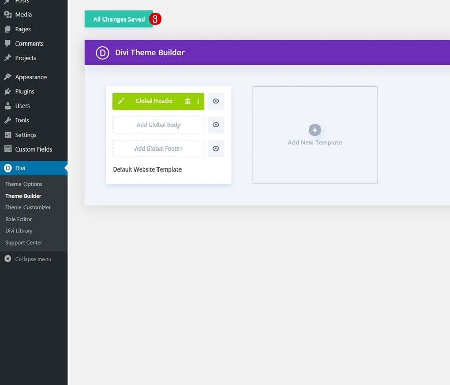
Go to Divi Theme Builder & Add New Global Header Template
Start by going to the Divi Theme Builder. One there, add a new global header.
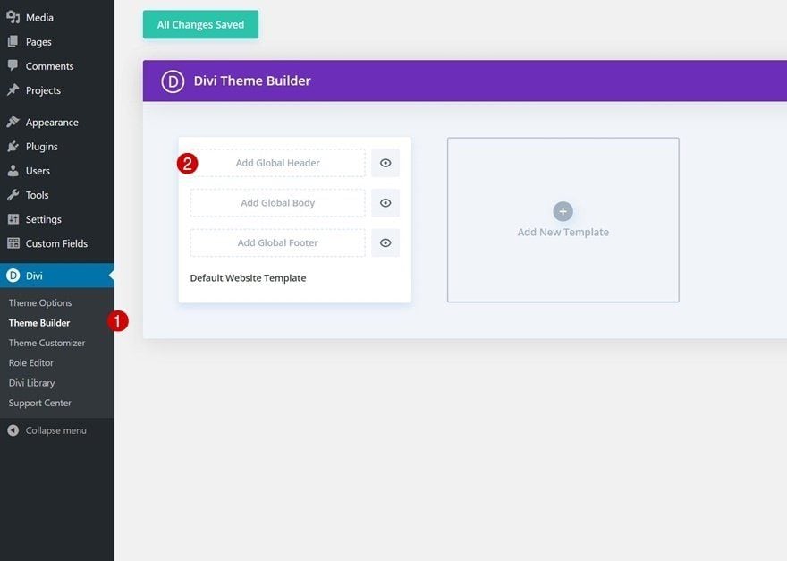
Start Building From Scratch
And start building the header design from scratch.
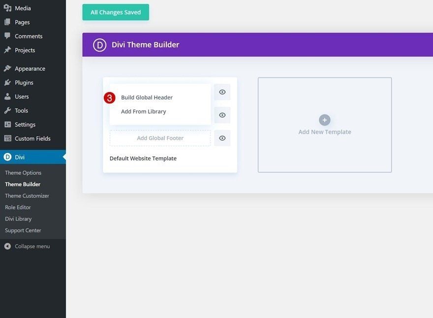
2. Build Logo & Hamburger Icon
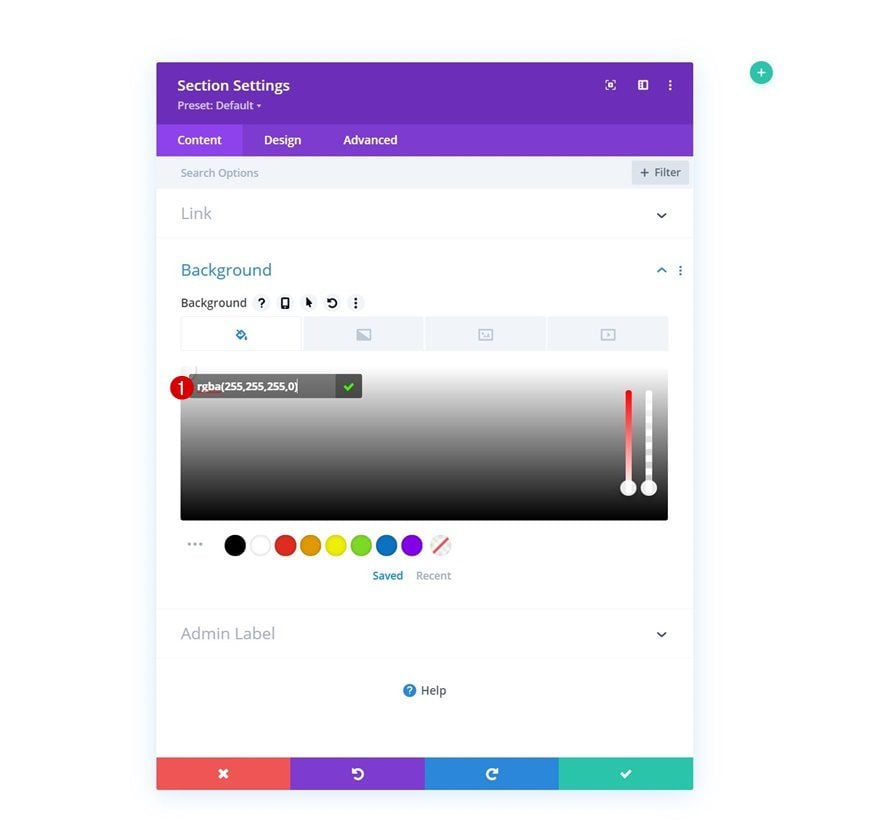
Section Settings
Background Color
Once inside the template editor, we’ll start by building the logo and hamburger icon. You’ll notice there’s already a section there. Open the section settings and apply a transparent background color.
- Background Color: rgba(255,255,255,0)
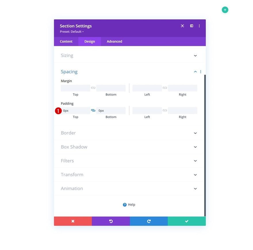
Spacing
Move on to the section’s design tab and remove all default top and bottom padding next.
- Top Padding: 0px
- Bottom Padding: 0px
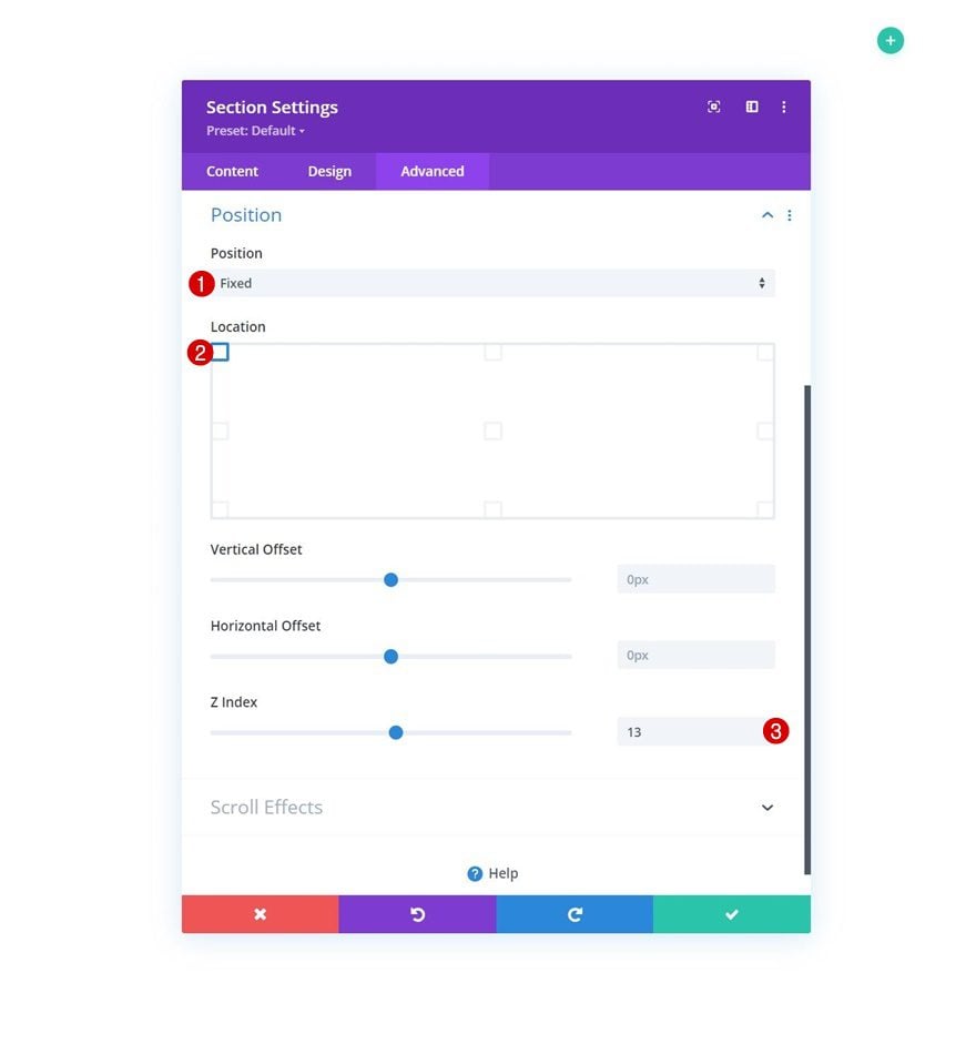
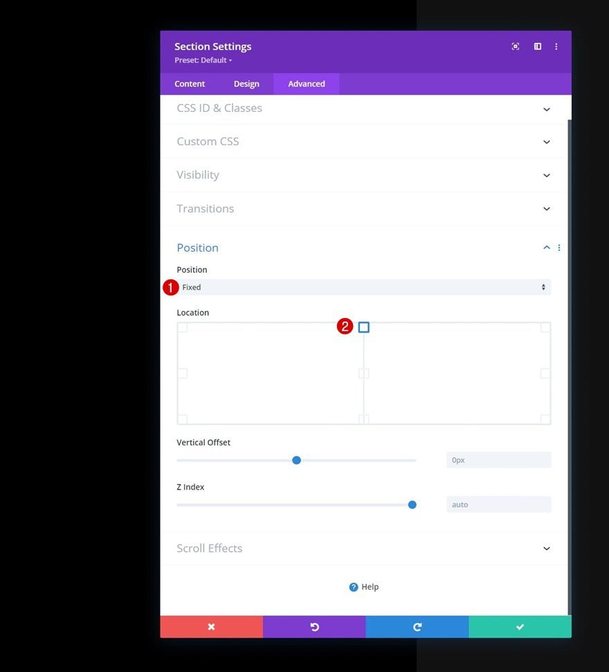
Position
Then, go to the advanced and turn the section fixed.
- Position: Fixed
- Location: Top Left
- Z Index: 13
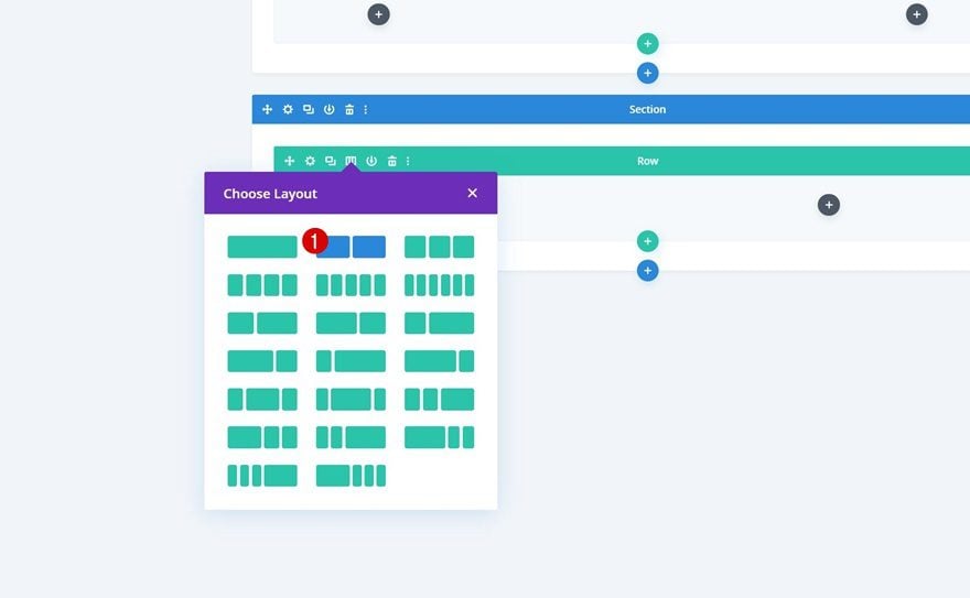
Add New Row
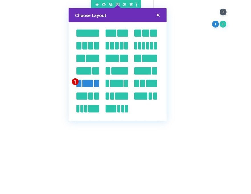
Column Structure
Continue by adding a new row to the section using the following column structure:
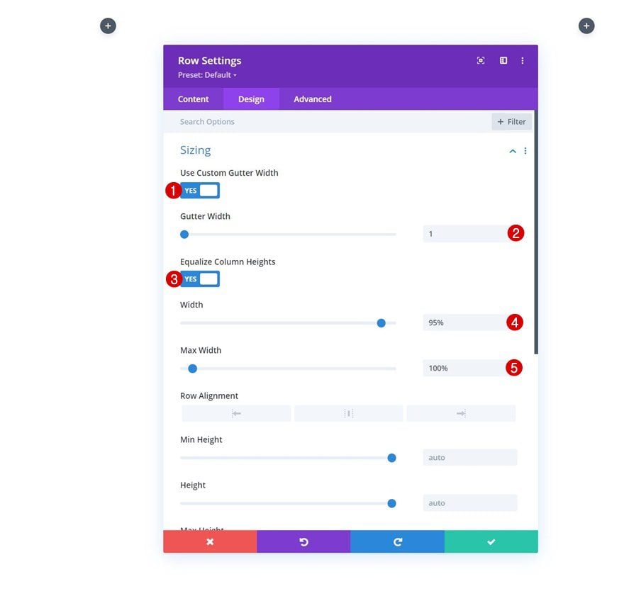
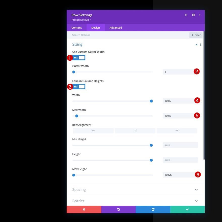
Sizing
Without adding modules yet, open the row settings, move on to the design tab and change the sizing settings accordingly:
- Use Custom Gutter Width: Yes
- Gutter Width: 1
- Equalize Column Heights: Yes
- Width: 95%
- Max Width: 100%
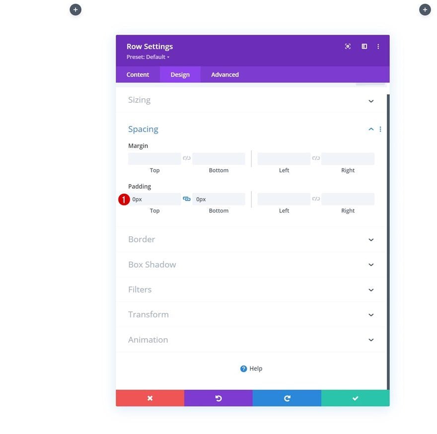
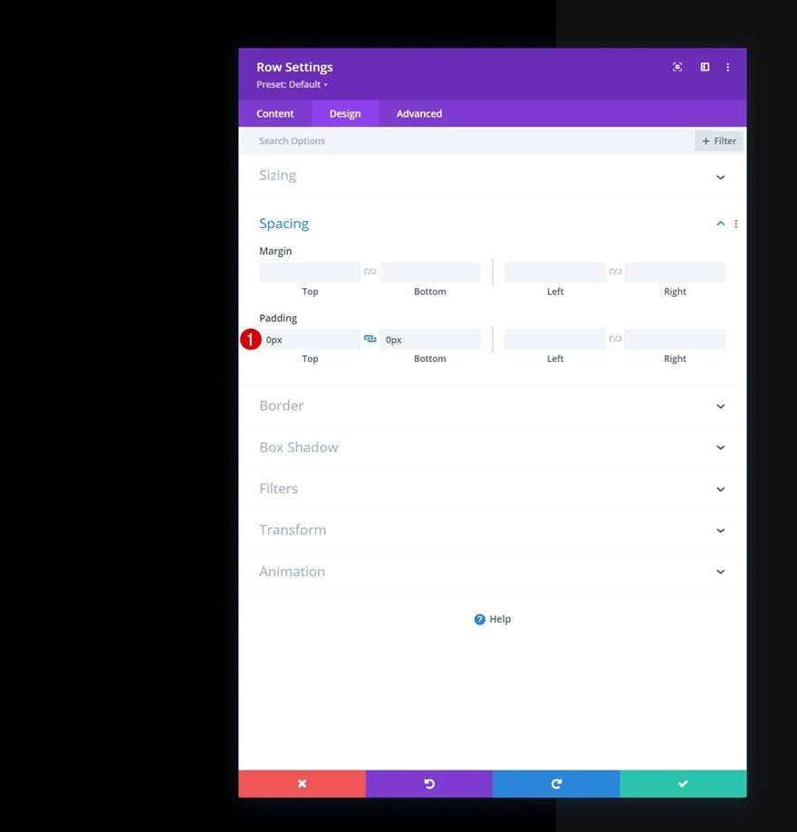
Spacing
Remove all default top and bottom padding next.
- Top Padding: 0px
- Bottom Padding: 0px
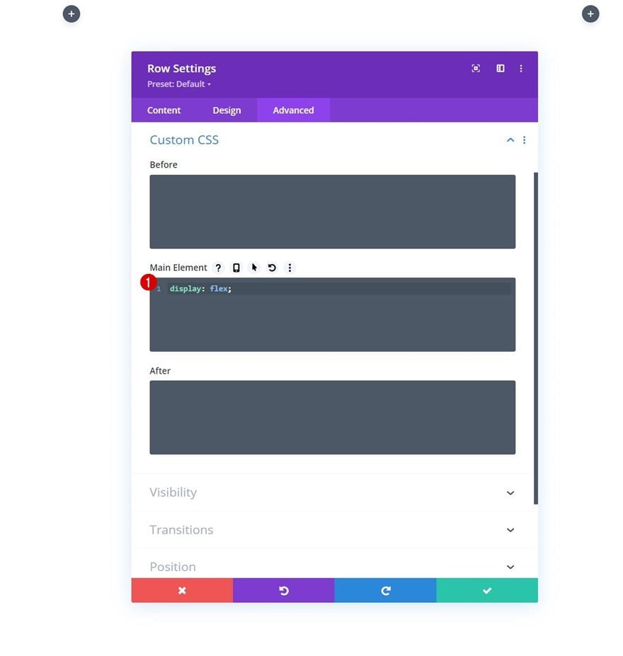
Main Element CSS
And to make sure both the logo and hamburger icon appear next to each other on smaller screen sizes, we’ll insert one line of CSS code in the row’s main element.
display: flex;
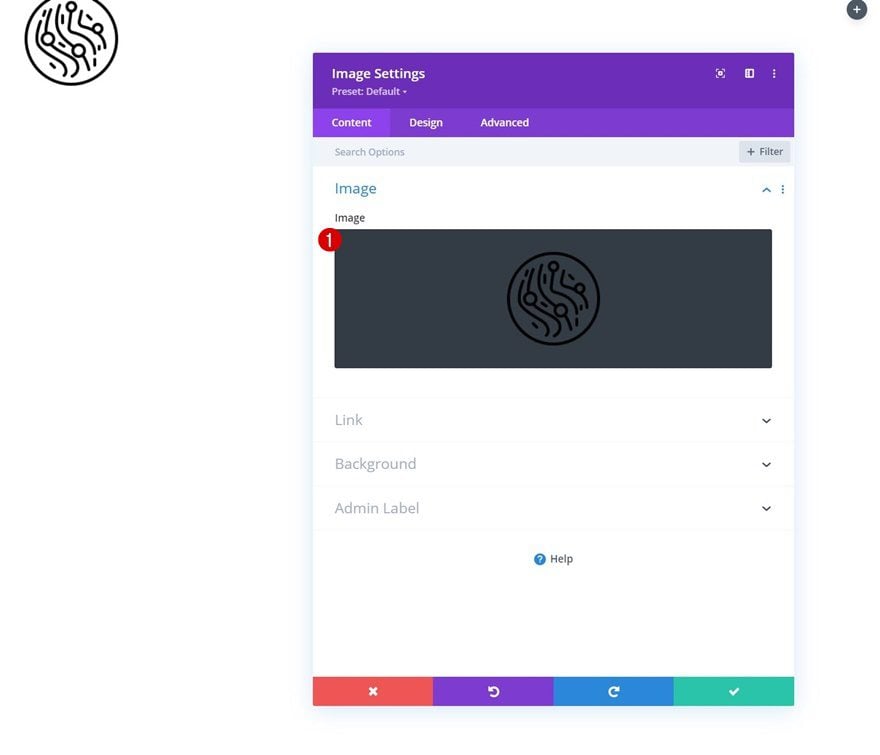
Add Image Module to Column 1
Upload Logo
Time to add modules, starting with an Image Module in column 1. Upload a logo of your choice.
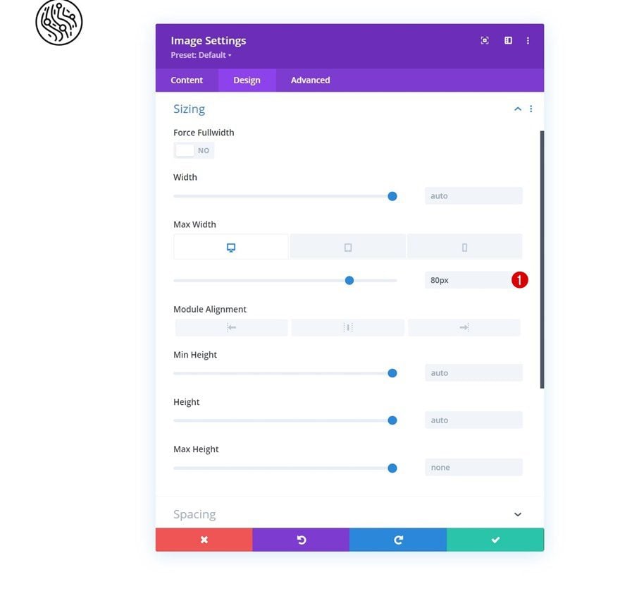
Sizing
Move on to the design tab and change the sizing settings next.
- Max Width:
- Desktop: 80px
- Tablet & Phone: 50px
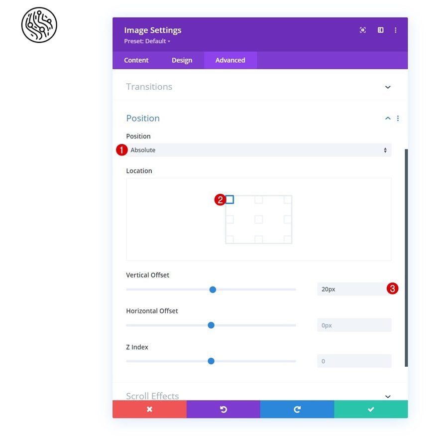
Position
Then, reposition the entire module.
- Position: Absolute
- Location: Top Left
- Vertical Offset: 20px
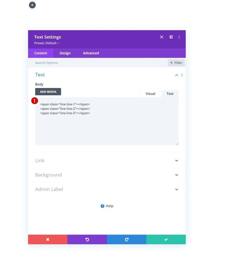
Add Text Module to Column 3
HTML Structure in Content Box
In the third column, we’ll add a Text Module. We’ll use this Text Module to create our hamburger icon. Start by switching over to the text tab in the content box and insert the following HTML tags:
<span class="line line-1"></span>
<span class="line line-2"></span>
<span class="line line-3"></span>
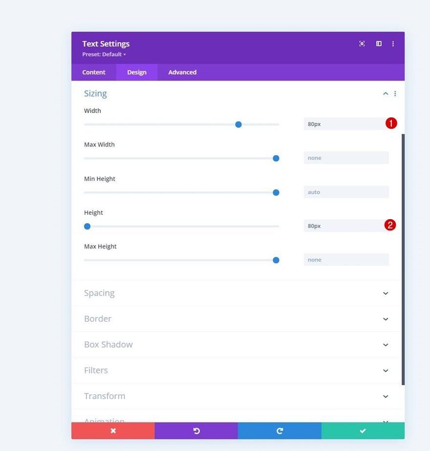
Sizing
Modify the module’s sizing settings next.
- Width: 80px
- Height: 80px
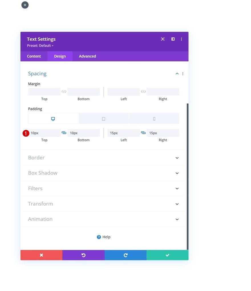
Spacing
Then, apply custom padding values across different screen sizes.
- Top Padding:
- Desktop: 10px
- Tablet & Phone: 17px
- Bottom Padding:
- Desktop: 10px
- Tablet & Phone: 17px
- Left Padding:
- Desktop: 15px
- Tablet & Phone: 30px
- Right Padding:
- Desktop: 15px
- Tablet & Phone: 10px
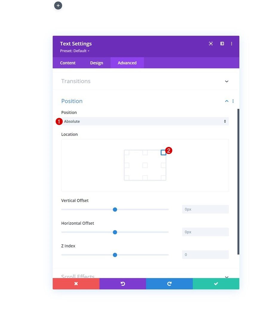
Position
Reposition this module as well.
- Position: Absolute
- Location: Top Left Corner
Add New Section
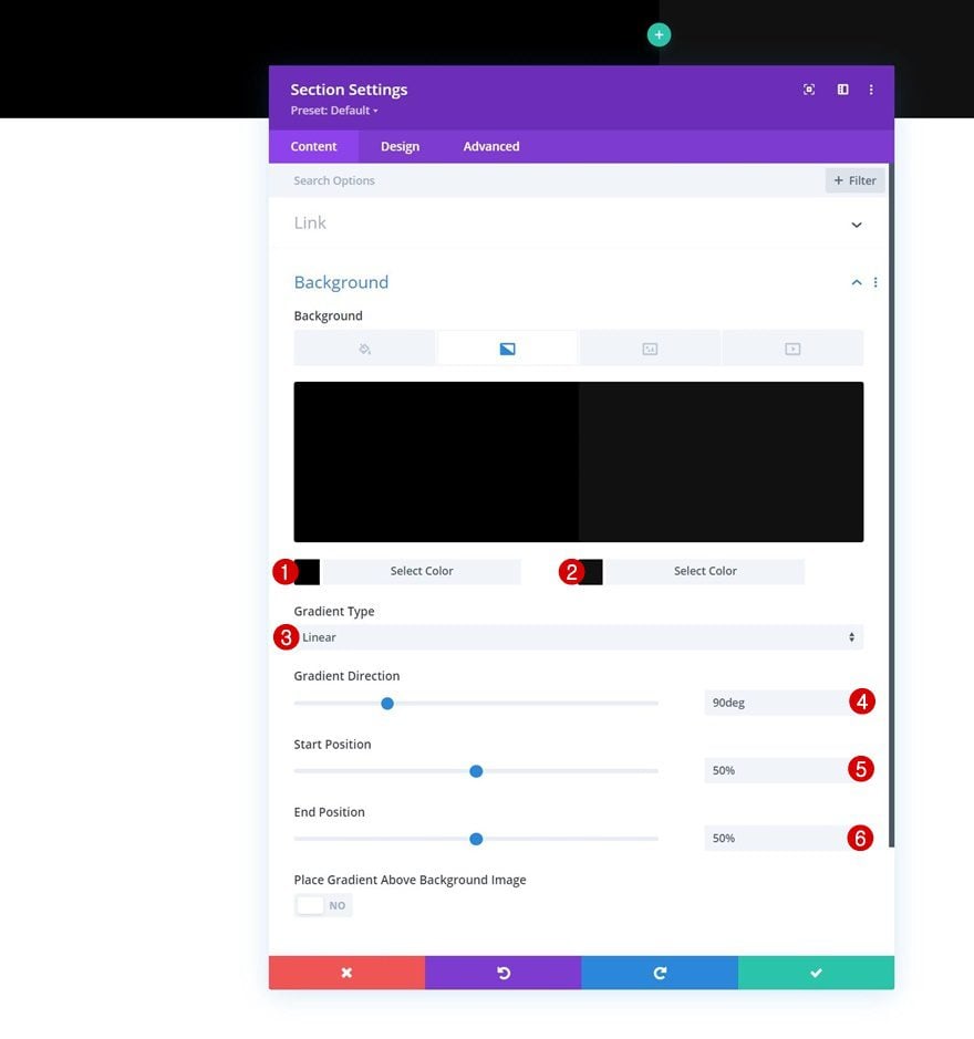
Gradient Background
Now that we have the logo and hamburger icon in place, we can move on to the next part which is dedicated to building the hamburger menu and all its items. Start by adding a new section, open the section settings and apply a gradient background.
- Color 1: #000000
- Color 2: #111111
- Gradient Type: Linear
- Gradient Direction: 90deg
- Start Position: 50%
- End Position: 50%
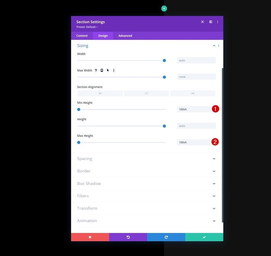
Sizing
Apply a min height and max height to the sizing settings next.
- Min Height: 100vh
- Max Height: 100vh
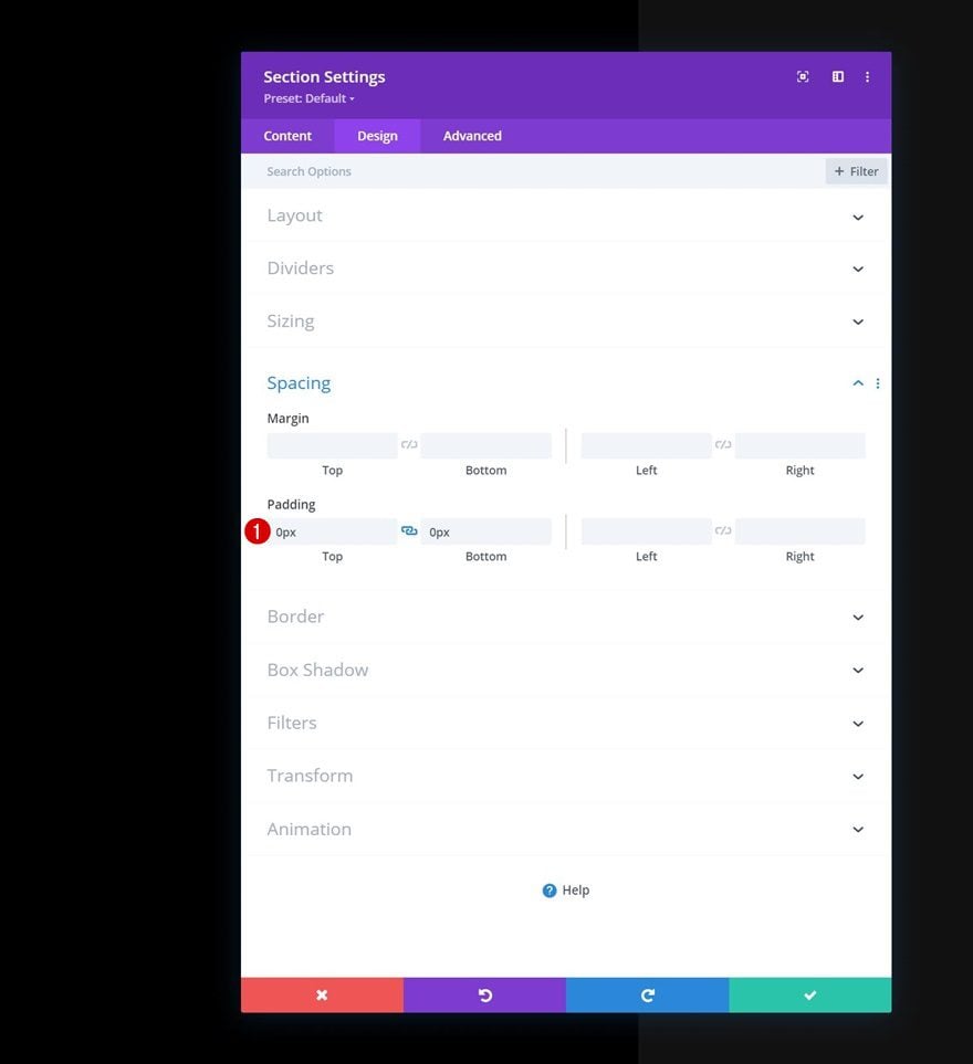
Spacing
Then, remove all default section top and bottom padding.
- Top Padding: 0px
- Bottom Padding: 0px
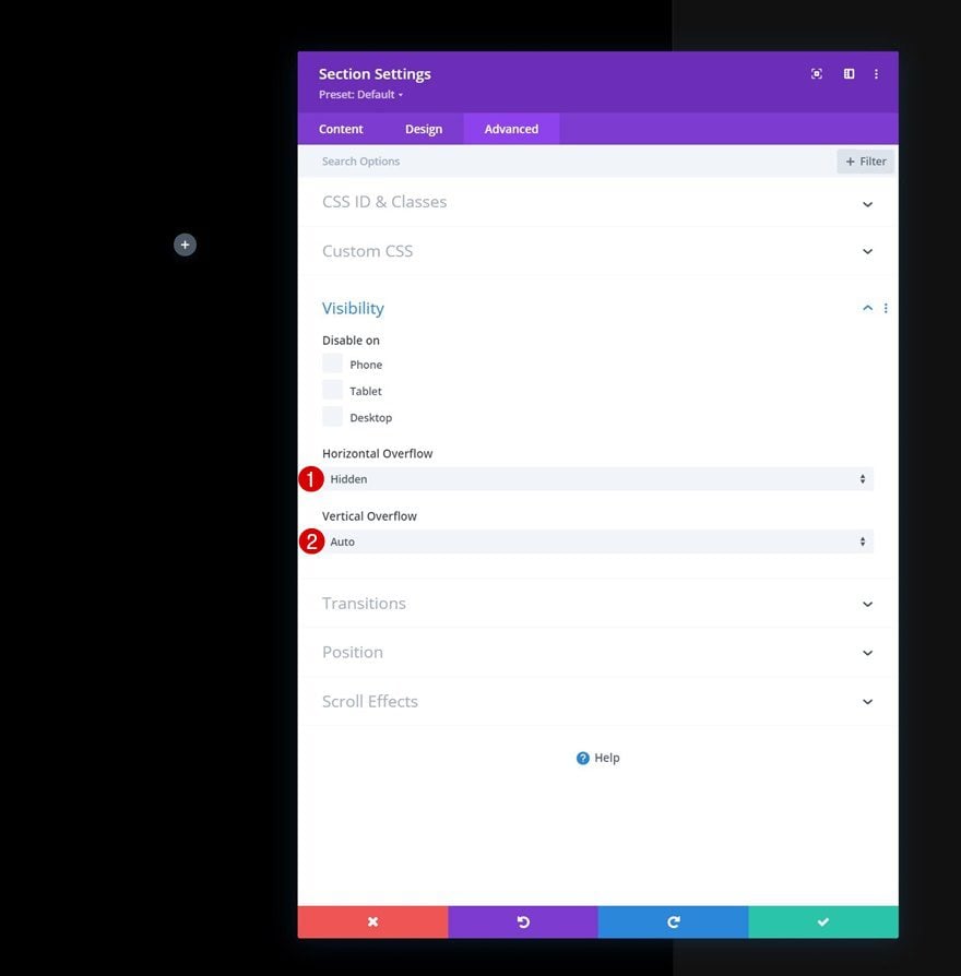
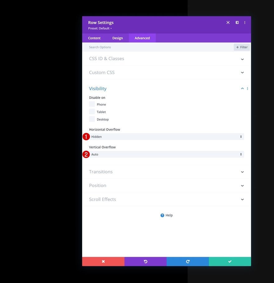
Overflows
Modify the overflows as well.
- Horizontal Overflow: Hidden
- Vertical Overflow: Auto
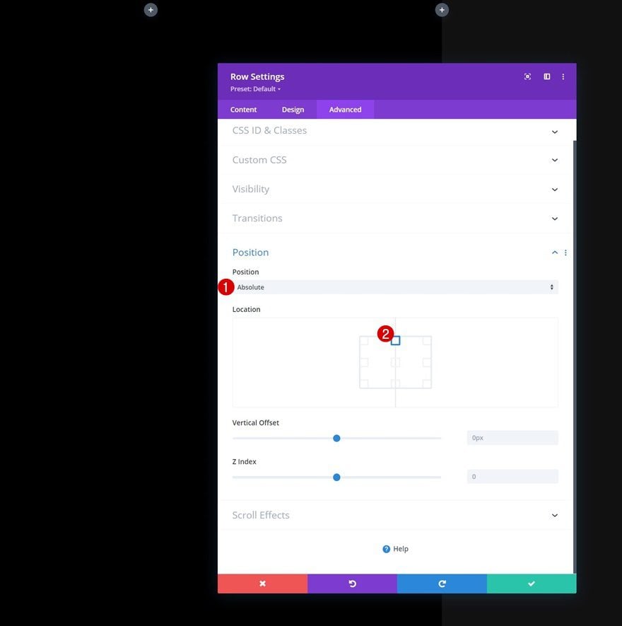
Position
To make sure the menu can be opened at all times, we’ll reposition the section in the advanced tab.
- Position: Fixed
- Location Top Center
Add New Row
Column Structure
Continue by adding a new row to the section using the following column structure:
Sizing
Without adding modules yet, open the row settings, move on to the design tab and change the sizing settings as follows:
- Use Custom Gutter Width: Yes
- Gutter Width: 1
- Equalize Column Heights: Yes
- Width: 100%
- Max Width: 100%
Spacing
Remove all default top and bottom padding next.
- Top Padding: 0px
- Bottom Padding: 0px
Overflows
Then, go to the advanced tab and change the overflows.
- Horizontal Overflow: Hidden
- Vertical Overflow: Auto
Position
Reposition the row as well.
- Position: Absolute
- Location Top Center
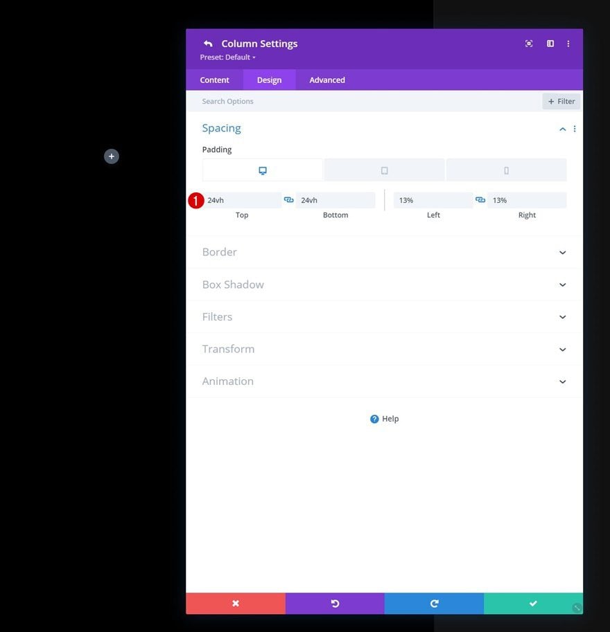
Column 1 Settings
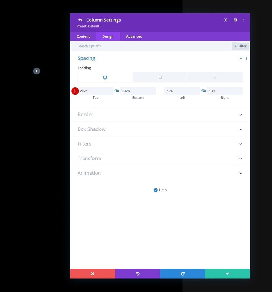
Spacing
Next, we’ll open the column 1 settings of our row and apply some custom responsive padding values.
- Top Padding:
- Desktop: 24vh
- Tablet & Phone: 10vh
- Bottom Padding:
- Desktop: 24vh
- Tablet & Phone: 5vh
- Left Padding: 13%
- Right Padding: 13%
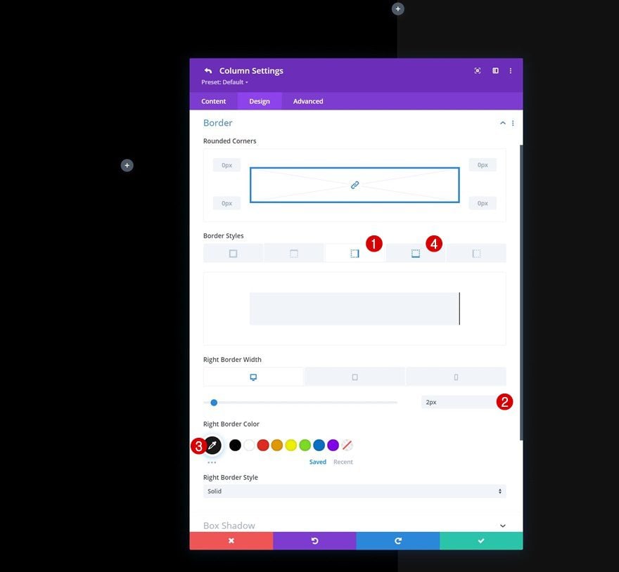
Border
We’ll apply some border settings too:
- Right Border Width:
- Desktop: 2px
- Tablet & Phone: 0px\
- Right Border Color: #191919
- Bottm Border Width:
- Desktop: 0px
- Tablet & Phone: 2px
- Right Border Color: #191919
Column 2 Settings
Spacing
Then, we’ll move on to column 2 and apply some custom padding values there too.
- Top Padding:
- Desktop: 24vh
- Tablet & Phone: 5vh
- Bottom Padding:
- Desktop: 24vh
- Tablet & Phone: 5vh
- Left Padding: 13%
- Right Padding: 13%
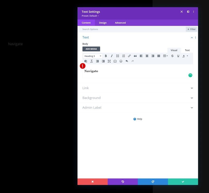
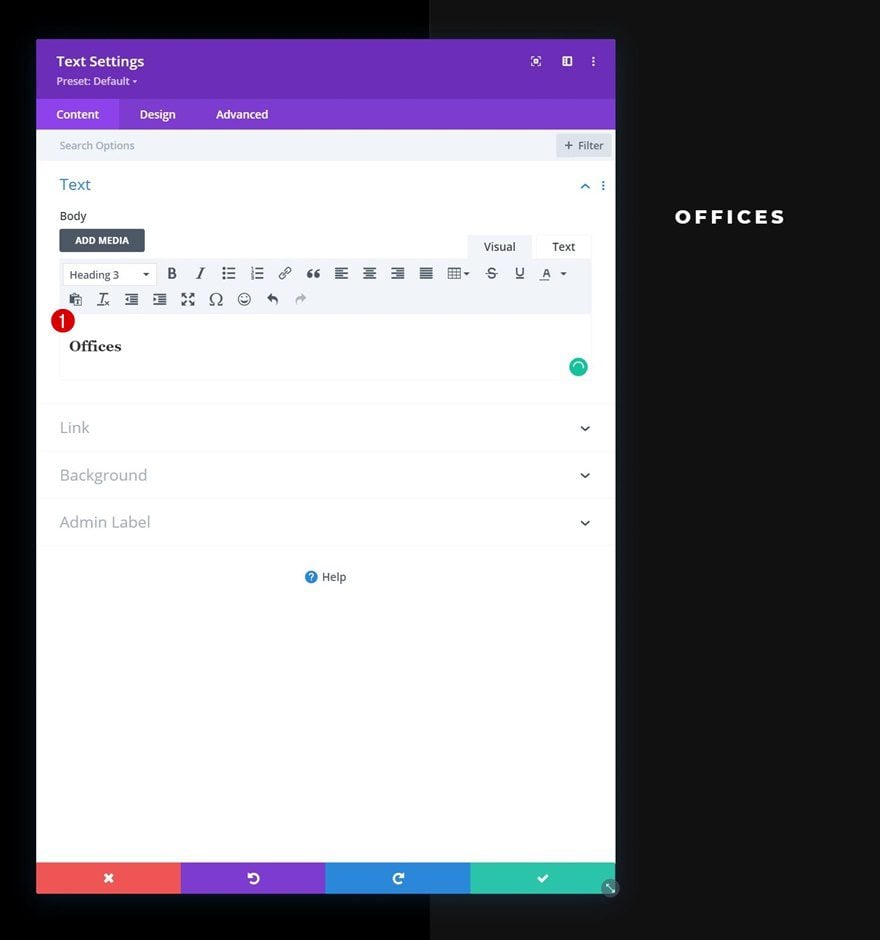
Add Text Module #1 to Column 1
Add H3 Content
Time to add modules, starting with a first Text Module in column 1. Add some H3 content of your choice.
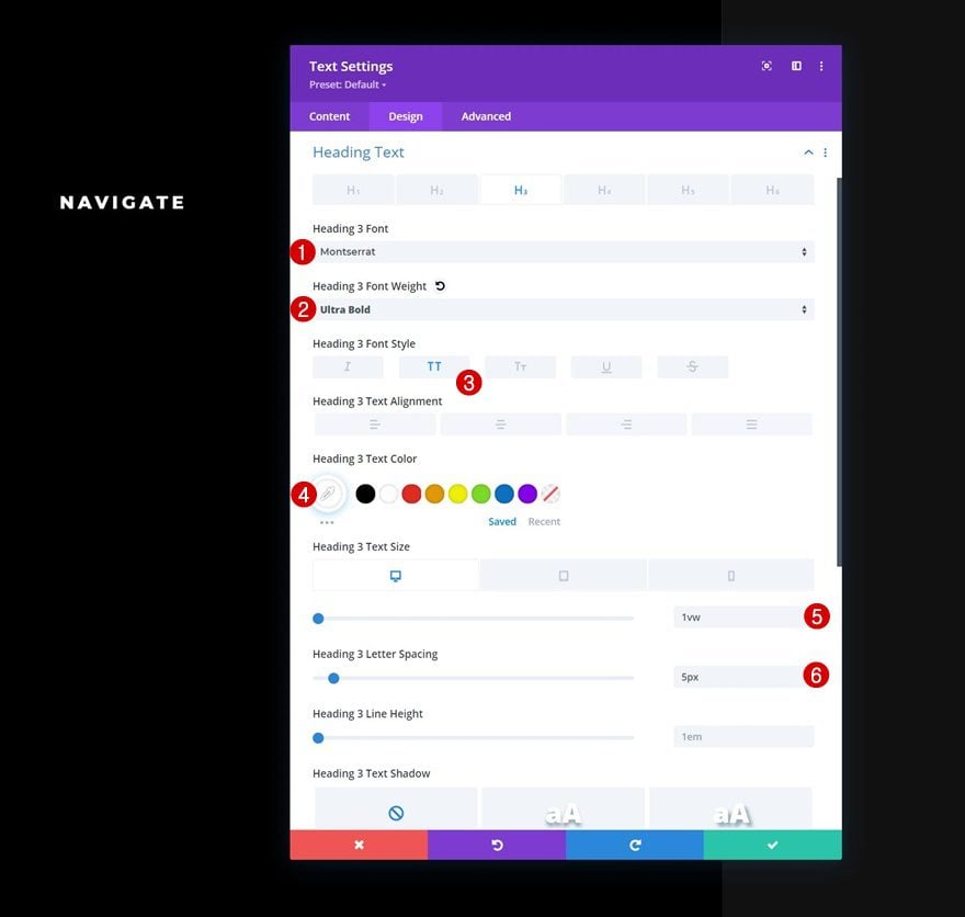
H3 Text Settings
Move on to the design tab and change the H3 text settings as follows:
- Heading 3 Font: Montserrat
- Heading 3 Font Weight: Ultra Bold
- Heading 3 Font Style: Uppercase
- Heading 3 Text Color: #ffffff
- Heading 3 Text Size
- Desktop: 1vw
- Tablet: 2.5vw
- Phone: 3.5vw
- Heading 3 Letter Spacing: 5px
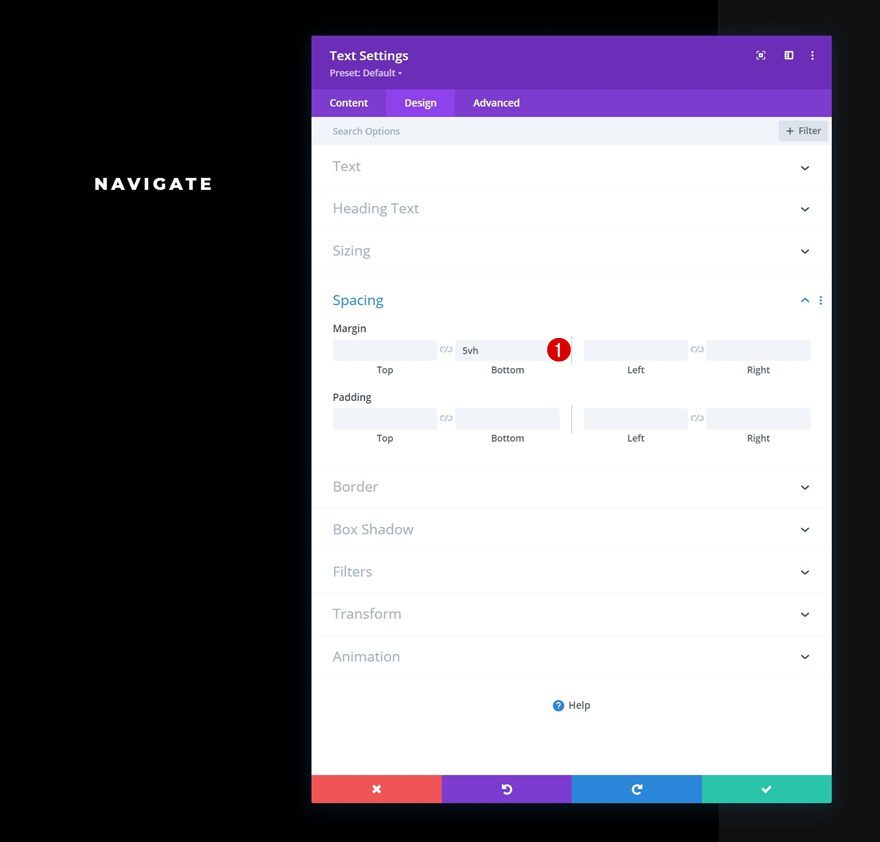
Spacing
Add some bottom margin next.
- Bottom Margin: 5vh
Clone Text Module & Place Duplicate in Column 2
Once you’ve completed this first module, you can clone it once and place the duplicate in column 2.

Change Content
Make sure to change the content in this duplicate module.
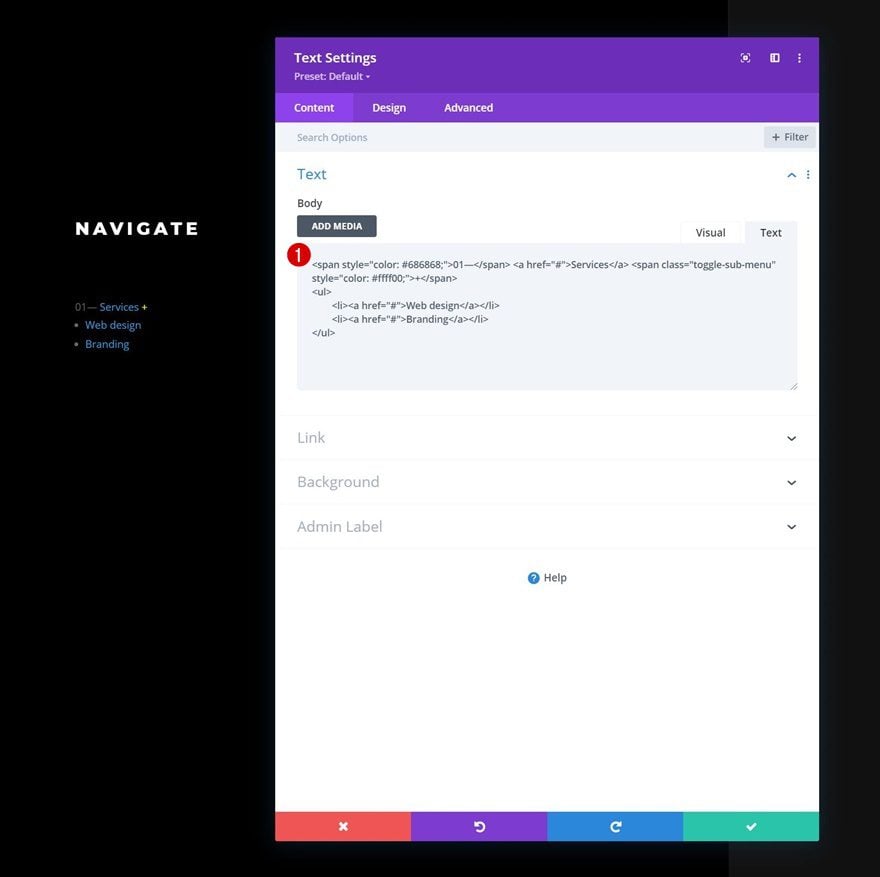
Add Text Module #2 to Column 2
HTML Structure in Content Box
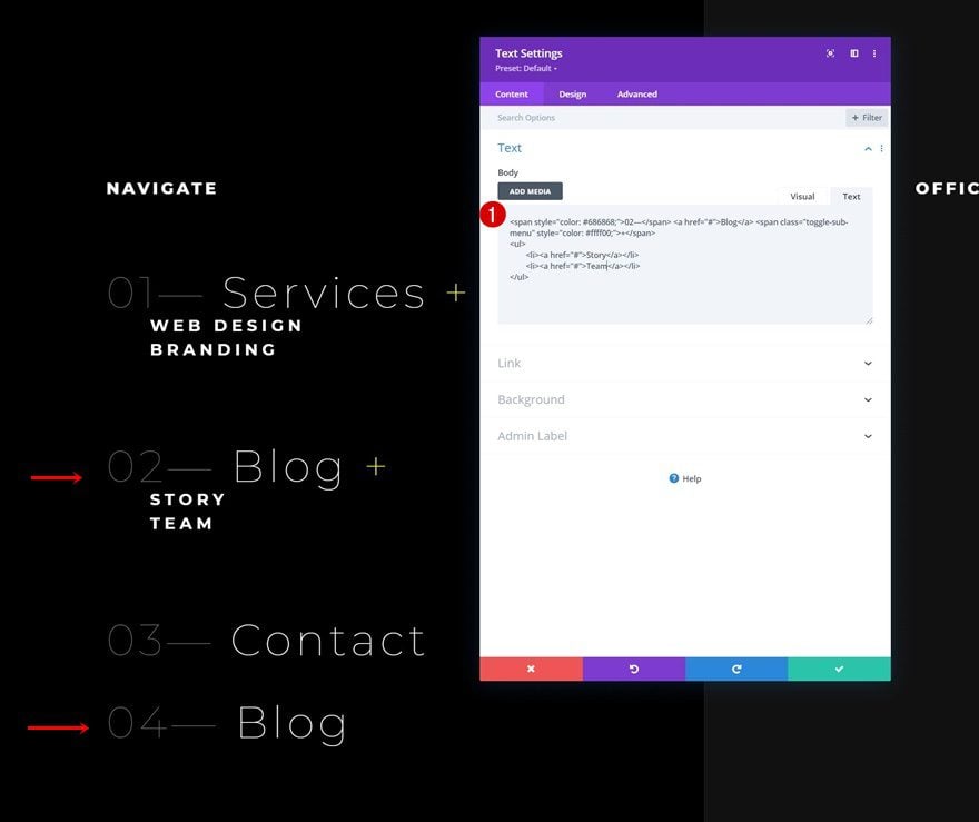
To showcase our menu items, including sub menu items, we’ll use the text tab of a new Text Module. Go ahead and add a new Text Module to column 1 and insert the following HTML:
<span style="color: #686868;">01—</span> <a href="#">Services</a> <span class="toggle-sub-menu" style="color: #ffff00;">+</span>
<ul>
	<li><a href="#">Web design</a></li>
	<li><a href="#">Branding</a></li>
</ul>
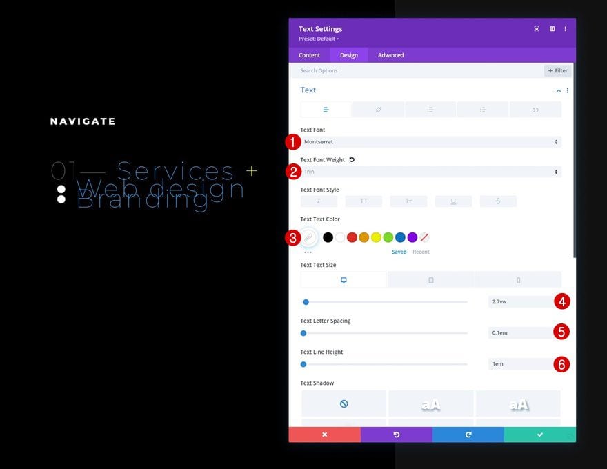
Text Settings
Move on to the module’s design tab and change the text settings as follows:
- Text Font: Montserrat
- Text Font Weight: Thin
- Text Color: #ffffff
- Text Size:
- Desktop: 2.7vw
- Tablet: 4vw
- Phone: 6vw
- Text Letter Spacing: 0.1em
- Text Line Height: 1em
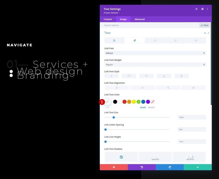
Link Text Settings
Change the link text color too.
- Lin Text Color: #ffffff
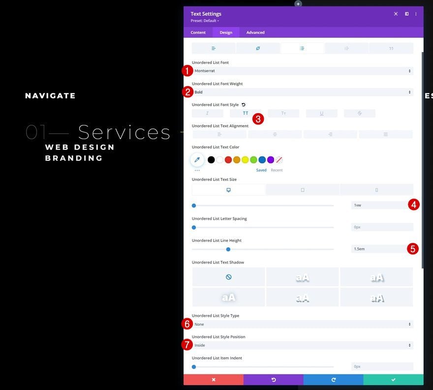
Unordered List Text Settings
Then, modify the unordered list text settings.
- Unordered List Font: Montserrat
- Unordered List Font Weight: Bold
- Unordered List Font Style: Uppercase
- Unordered Text Size:
- Desktop: 1vw
- Tablet: 2.5vw
- Phone: 3.5vw
- Unordered List Line Height: 1.5em
- Unordered List Style Type: None
- Unordered List Style Position: Inside
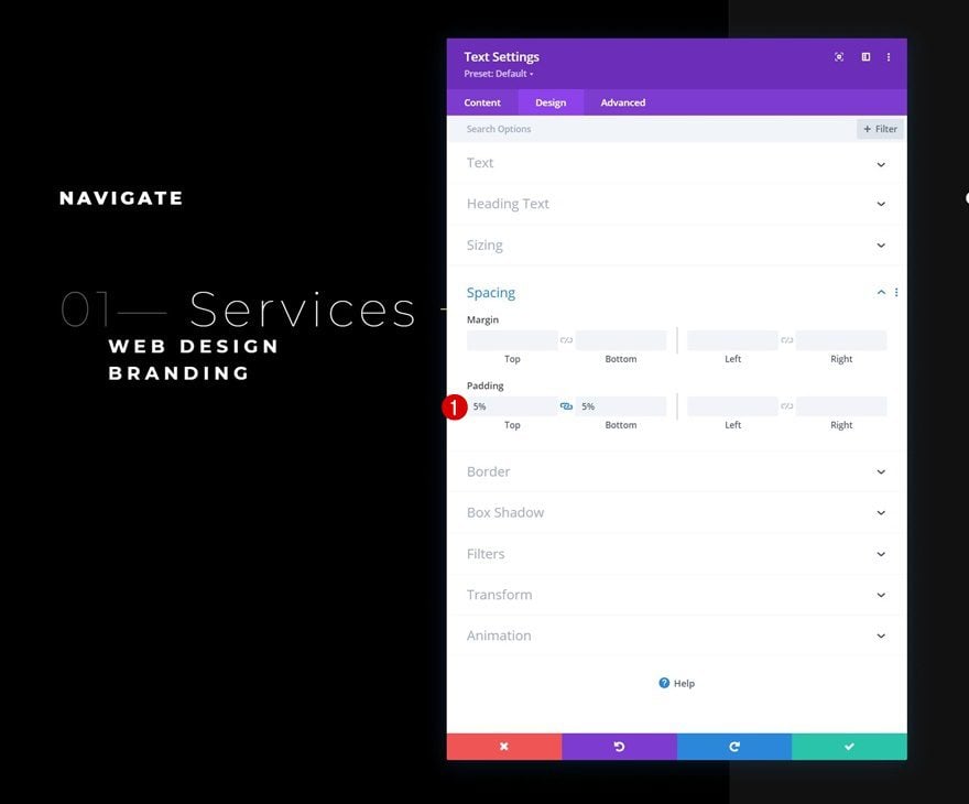
Spacing
And complete the module settings by adding some custom top and bottom padding.
- Top Padding: 5%
- Bottom Padding: 5%
Once you’ve completed the first module, you can clone it once. We’ll use this duplication to create a variation of the menu item without sub menu items.
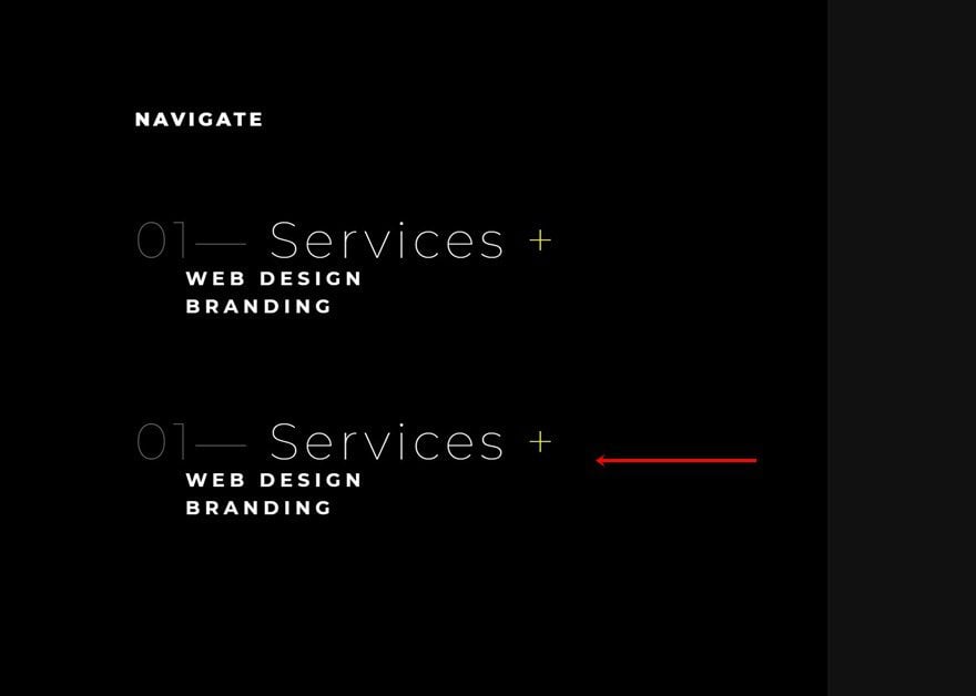
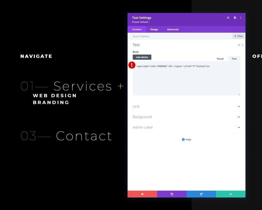
Leave Out Submenu & Toggle Icon
To turn this duplicate module into a regular menu item without submenu items, use this HTML structure instead:
<span style="color: #686868;">03—</span> <a href="#">Contact</a>
Once you have both variations of the menu items in place, you can reuse both of them accordingly by cloning them and changing the content.
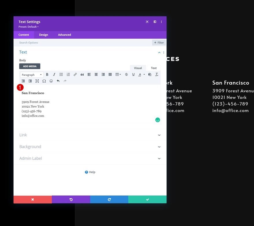
Add Text Module #2 to Column 2
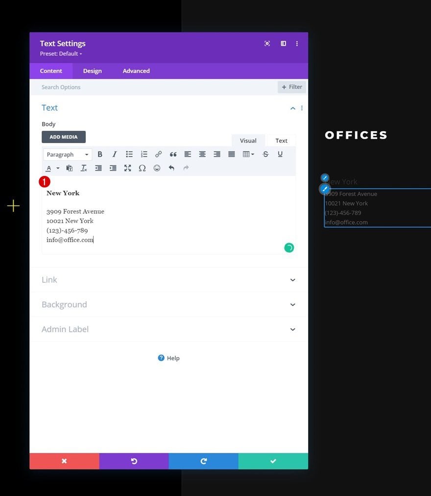
Add H4 & Paragraph Content to Content Box
In column 2, we’ll add another Text Module with some H4 and paragraph content of our choice.
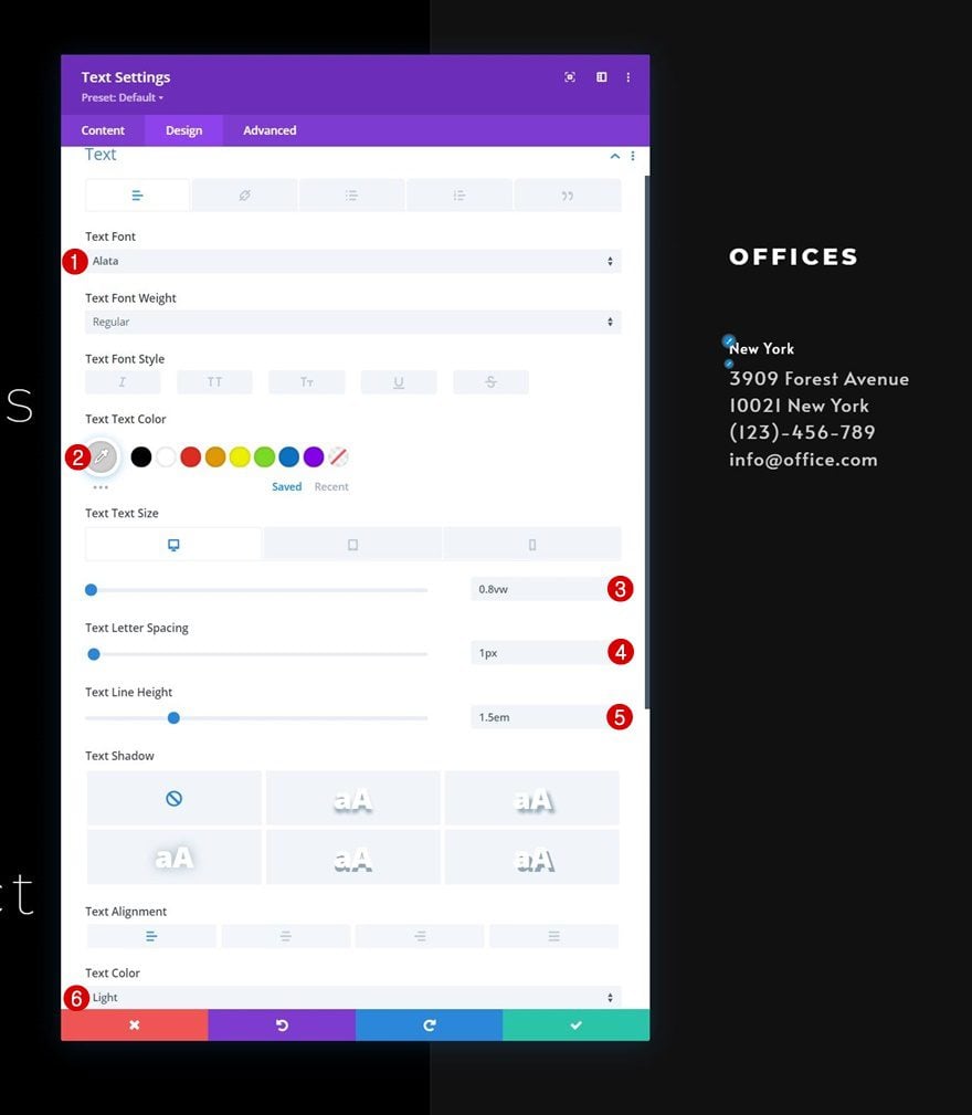
Text Settings
Move on to the design tab and change the text settings accordingly:
- Text Font: Alata
- Text Color: #cecece
- Text Size:
- Desktop: 0.8vw
- Tablet: 2.4vw
- Phone: 3.4vw
- Text Letter Spacing: 1px
- Text Line Height: 1.5em
- Text Color: Light
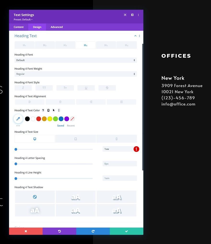
H4 Text Settings
Make some changes to the H4 text settings too.
- Heading 4 Text Size:
- Desktop: 1vw
- Tablet: 3vw
- Phone: 4vw
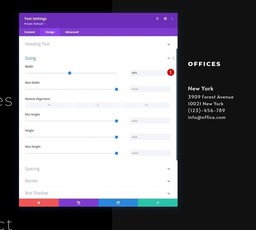
Sizing
Then, modify the module’s width in the sizing settings.
- Width: 48%
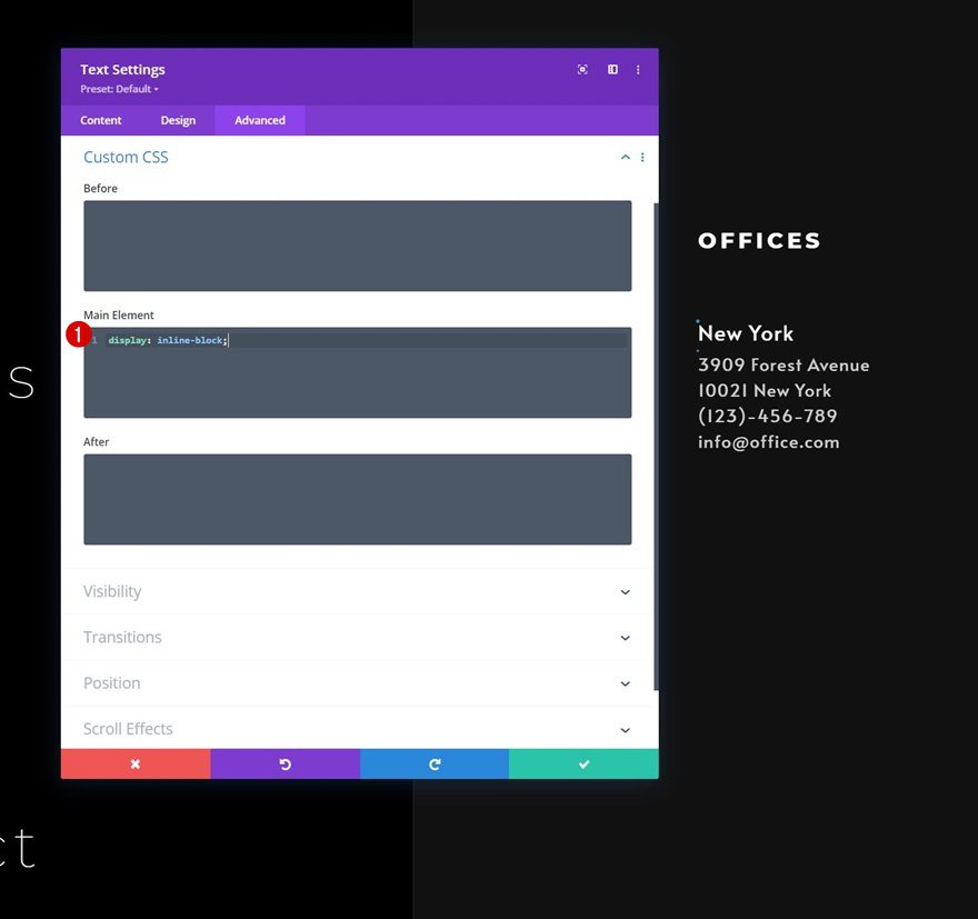
Main Element CSS
And add one line of CSS code to the module’s main element. This line of CSS code will help us place two Text Modules next to each other.
display: inline-block;
Clone Text Module #2
Change Copy
Once you’ve completed the Text Module, you can clone it once and change the content accordingly.
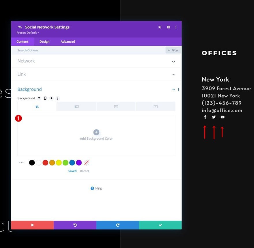
Add Social Networks of Choice
The last module we need in this design is a Social Media Follow Module in column 2. Add the social networks of your choice.
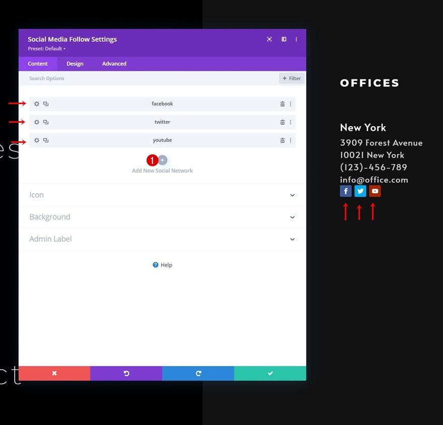
Remove Each Social Network’s Background Color Individually
Remove the background color of each social network individually.
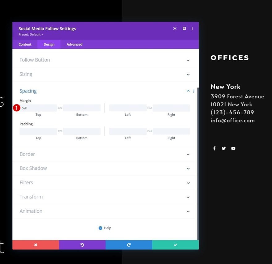
Spacing
Then, go back to the general module settings and apply some top margin.
- Top Margin: 5vh
4. Add Functionality
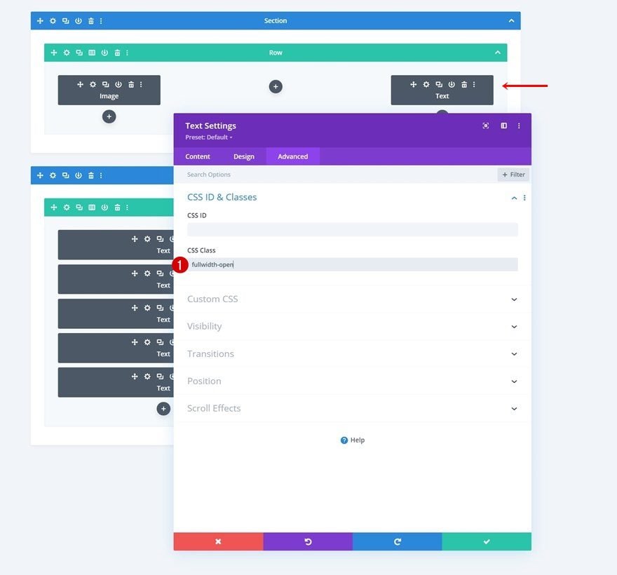
Add CSS Class to Hamburger Icon Text Module
Now that the foundation of our hamburger menu design has been built, we can now focus on adding functionality! The first thing you’ll need to do is open the Text Module containing the hamburger icon and add the following CSS class:
- CSS Class: fullwidth-open
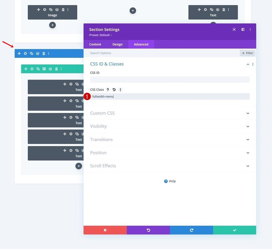
Add CSS Class to Section #2
Then, open the hamburger menu section, section #2, and add the following CSS class:
- CSS Class: fullwidth-menu
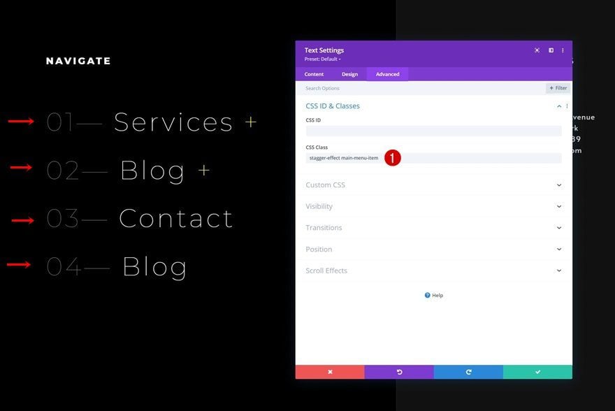
To create the custom stagger animation effect, we’ll need to apply the following CSS class to each module in section #2.
- CSS Class: stagger-effect
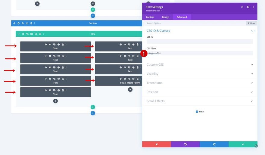
Add an extra CSS class, called “main-menu-item”, to each one of the menu items in column 1 as well.
- CSS Class: stagger-effect main-menu-item
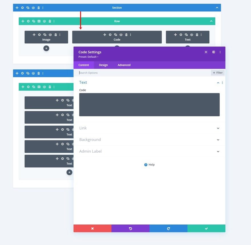
Add Code Module to Section #1
To apply the functionality, we’ll use custom CSS and JQuery code. We’ll place this code in a new Code Module in the second column of our row in section #1.
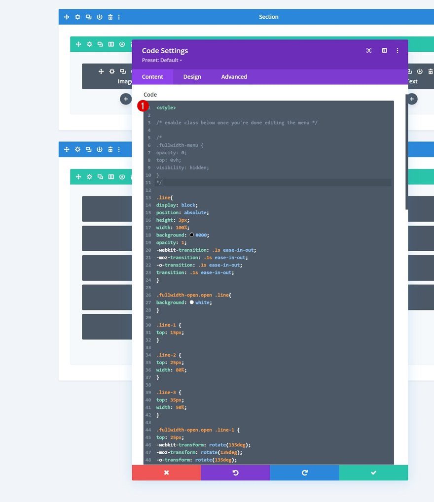
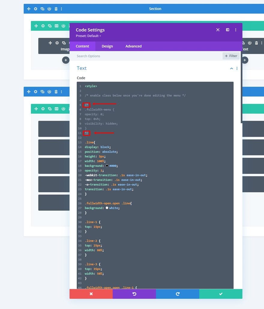
Insert CSS Code
Add the following CSS code to the Code Module in between style tags as you can notice in the print screen below.
/* enable class below once you're done editing the menu */

/*
.fullwidth-menu {
opacity: 0;
top: 0vh;
visibility: hidden;
}
*/

.line{
display: block;
position: absolute;
height: 3px;
width: 100%;
background: #000;
opacity: 1;
-webkit-transition: .1s ease-in-out;
-moz-transition: .1s ease-in-out;
-o-transition: .1s ease-in-out;
transition: .1s ease-in-out;
}

.fullwidth-open.open .line{
background: white;
}

.line-1 {
top: 15px;
}

.line-2 {
top: 25px;
width: 80%;
}

.line-3 {
top: 35px;
width: 50%;
}

.fullwidth-open.open .line-1 {
top: 25px;
-webkit-transform: rotate(135deg);
-moz-transform: rotate(135deg);
-o-transform: rotate(135deg);
transform: rotate(135deg);
}

.fullwidth-open.open .line-2 {
display: none;
}

.fullwidth-open.open .line-3 {
top: 25px;
width: 100%;
-webkit-transform: rotate(-135deg);
-moz-transform: rotate(-135deg);
-o-transform: rotate(-135deg);
transform: rotate(-135deg);
}

.fullwidth-menu-open {
opacity: 1 !important;
top: 0 !important;
visibility: visible !important;
}

.fullwidth-menu {
-webkit-transition: all 0.5s ease !important;
-moz-transition: all 0.5s ease !important;
-o-transition: all 0.5s ease !important;
-ms-transition: all 0.5s ease !important;
transition: all 0.5s ease !important;
}

.main-menu-item ul {
display: none;
padding: 0;
margin-top: 50px;
}

.toggle-sub-menu {
cursor: pointer;
}
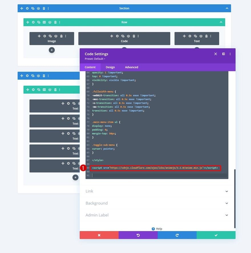
Insert Anime.js Library
Continue by adding the Anime JavaScript library using script tags as you can see in the print screen below. We’ll use this awesome library to create the stagger effect in the next step of the tutorial.
- src=”https://cdnjs.cloudflare.com/ajax/libs/animejs/3.2.0/anime.min.js”
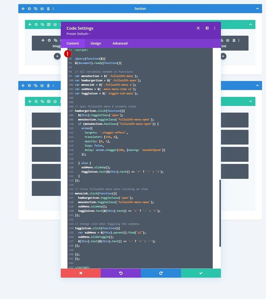
Insert JQuery Code
The click functionalities in our hamburger menu are powered by the following JQuery code. Make sure you place this code in between script tags as you can see in the print screen below.
jQuery(function($){
$(document).ready(function(){

// All variables needed in functions
var menuSection = $('.fullwidth-menu');
var hamburgerIcon = $('.fullwidth-open');
var menuLink = $('.fullwidth-menu a');
var subMenu = $('.main-menu-item ul');
var toggleIcon = $('.toggle-sub-menu');


// Open fullwidth menu & animate items
hamburgerIcon.click(function(){
	$(this).toggleClass('open');
	menuSection.toggleClass('fullwidth-menu-open');
	if (menuSection.hasClass("fullwidth-menu-open")) {
		anime({
  		targets: '.stagger-effect',
  		translateY: [150, 0],
  		opacity: [0, 1],
  		loop: false,
  		delay: anime.stagger(100, {easing: 'easeOutQuad'})
		});

	} else {
		subMenu.slideUp();
		toggleIcon.text($(this).text() == '+' ? '-' : '+');
	}
});

// Close fullwidth menu when clicking an item
menuLink.click(function(){
	hamburgerIcon.toggleClass('open');
	menuSection.toggleClass('fullwidth-menu-open');
  subMenu.slideUp();
	toggleIcon.text($(this).text() == '+' ? '-' : '+');
});

// Change icon when toggling the submenu
toggleIcon.click(function(){
	var subMenu = $(this).parent().find("ul");
	subMenu.slideToggle();
	$(this).text($(this).text() == '-' ? '+' : '-');
});

});
});
Activate CSS Class as Soon as You’ve Completed Your Fullscreen Header Design
Last but not least, we’ll enable a CSS class in the Code Module which you can find in the first section. Open the Code Module and remove the “/* */” at the beginning and end of the class. Enabling this class (in combination with some JQuery code that’s already enabled) will make sure the section containing the menu items doesn’t load right away when someone visits one of your pages. Once you enable this class, the second section on your page will disappear from the Visual Builder, but you can still access it in the Wireframe Mode or turn off the CSS class if you want to make additional changes.
5. Save Header & Theme Builder Changes
That’s it! The only thing left to do is save the template and Divi Theme Builder and view the outcome on your website!
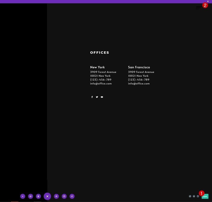
Preview
Now that we’ve gone through all the steps, let’s take a final look at the outcome across different screen sizes.
Desktop
Mobile
Final Thoughts
In this post, we’ve shown you how to get creative with your Divi header. More specifically, we’ve shown you how to create a custom-animated hamburger menu. As soon as a visitor clicks on the hamburger icon, a fullscreen menu transitions in and reveals the menu items one by one, which results in a beautiful user experience. You were able to download the template JSON file for free as well! If you have any questions, feel free to leave a comment in the comment section below.
If you’re eager to learn more about Divi and get more Divi freebies, make sure you subscribe to our email newsletter and YouTube channel so you’ll always be one of the first people to know and get benefits from this free content.


its not work its stacked on opened menu if i remove the \* the comment form *
.fullwidth-menu {
opacity: 0;
top: 0vh;
visibility: hidden;
}
*/
its stacked in closed menu and not open
Good day!
In our testing it appears to be behaving correctly, so it may be something to do with your implementation. We advise reaching to our freindly support team here: https://www.elegantthemes.com/members-area/help/
Our support reps will investigate and advise. 👍
I recreated the header step by step, but nothing is working. The burger menu is either visible or not – now it’s not showing up at all. When I go to the homepage, I don’t actually land on the homepage but just on a page where only the logo is visible and nothing else. What can I do? I urgently need help.
I followed everything step by step from the video and the blog.
And when the burger menu was visible, I couldn’t open it.
I Need really help 😩😩😩😩
Hey, Melanie!
Please, reach out to our friendly support team, here: https://www.elegantthemes.com/members-area/help/
We’ll invetigate the issue and advise on the best course of action.
I’m struggling with anchor links using this menu, it seems like some browsers isn’t (chrome on phone..) calculating the height property of a certain web page correctly due to the visibility:hidden and/or display:none css properties. Anyone else had a similar problem?
Yes same problem. The anchor not working and also the scroll effects.
Same here.
Hello, for some reason the “+” for the sub menu goes underneath the number instead of to the right of the menu item once I enable the menu. I can’t find a reason for this in the code, is there perhaps a solution?
Sorry to hear that. I suggest that you have a chat with our Support Team so they can help you with this. They’ll be happy to assist.
Hi
I’ve implemented the layout and everything was working fine, love the layout!
Last week the hamburger icon is not working anymore. I followed all the step above, I’ve tried to just import the lauout, but it still don’t work.
Sorry to hear that. I recommend that you contact the Support Team so that they can check into this for you. Just start a chat and they’ll be pleased to help.
Hello thank you for the useful tutorial, is there any code I can add to make the page non scrollable while menu is open? thanks in advance
Hi.. great header but it stopped all the anchor links across my whole site from working. The menu sub-links in one of the menu sections were pointing to anchor links. I contacted Divi tech support and they said this was down to a bug on their platform (on the fix list but they couldn’t tell me when it would be done – I think they said something to do with animations in headers). Do you know if there is a way around this (as we’d like to use it if possible)? Thank you
Nice tutorial! I woud like to see the fixed menu bar get a background colour on scroll (instead of being transparent)?
is that possibele? Many thanks!
How do I get the header to sit at the top of the page as a global header? At the moment it is covering the content in the row below.
1. The stagger animation isn’t working.
2. When I click on the + sign to reveal the submenu items, nothing happens.
Please advise.
Hello,
I am wondering how you make it so when the full screen menu opens, it opens over top of the logo, potentially another navigation or other elements?
Something happened to DIVI or other updates that the hamburger script isn’t working anymore. I can’t click the hamburger to make it work and I don’t know how to fix this code. If there is any way to update this for current DIVI, much oblidged.
Same here, did you get any idea?
I suggest that you contact the Support Team by opening a chat so they can investigate that for you.
Everything works for me except the animation and can’t hide the logo when opening the full-width menu? we can see the logo slightly in transparency but it’s not really nice.
Thank you for help 🙂
Hi, is it possible to hide the logo when opening the full-width menu? My logo is not completely black, so it’s showing up and messing up the design.
Same for the logo ! And no animation on mine.
For anyone having issues with “anime is not defined” when they check their console, Instead of calling the anime.js within the section html of the header, I added it in Divi -> Integrations -> Add code to the of your blog and the stagger effect began to work.
Hello,
I like the menu, but my anchor links don’t work very well with this menu. Anchors don’t land on the section that they need to land on. How do I fix this?
Kind regards
Did you find a solution for this? Please share
Hi,
I seem to be having the same issue as others. Once I have saved all changes the menu does not open and I’m unable to get into the menu page to edit anything?
Hello, i like to open the sub menu for clicking on the sub menu items instead of the menu item but it always open the linked site directly when i click on the menu item. where should i place the link than?
same here.. Any advice from divi team?
I’d like the main items to open clicking not just on the “+”, but on the entire line of text. Is it possible?
Same! Ive been playing with the code for about 2 hours trying to figure it out!
same! Has anyone found a solution?
Hi, I love the design. These tutorials expand possibilities for divi.
As you mentioned in the video there is a lot of code.
This menu adds 1 sec extra load time on my website.
It would be nice if there was a lighter version of this.
please ignore the load time. When I used the JSON file and Global Header it had no negative effect on the load time.
Thank atgain.
Hi!, somehow the stagger effect is not working, why could it be? Also, how to make the bar sticky?
Hi,
Is there a quick way to change the fixed menu bar background colour on scroll? It’s currently transparent, but I would like to add colour on scroll.
Many thanks
Hi,
This is a great menu, however, I’ve just updated the json file to the latest version and now the menu appears on page load and there’s no way of closing the menu, so I can’t view the content of my website. Any solutions?
The previous version worked better, but the menu would always load first on page load and then disappear.
Hi Joy, make sure you enable the CSS class once you’re done modifying your menu (see last step in this tutorial).
Perfect Donjete, that works great now.
Thank you.
I am having a similar issue to everyone else, when I click the hamburger icon it will respond but the fullscreen menu will not appear. Would love to hear some insight as to why that is
I downloaded “divi-custom-animated-hamburger-menu-global-header-template” in the code there is “/ * enable class below once you’re done editing the menu * /
/ *
.fullwidth-menu {
display: none;
}
* / but after enabling it something seems not to work. Also I found // Prevent fullscreenn menu from showing up when loading
$ (window) .load (function () {
$ (“. fullwidth-menu”). fadeIn (1000);
}); but it doesn’t seem to work because every time the web pages are loaded, the navigation menu always appears: how can this be solved? Thank you
Hi Stefano, the code and JSON file inside this post have been updated so there’s no need for a load function! Hope that helps 🙂
Good day, I’m having the same problem
Hello, thank you very much for this tutorial! I have a problem, when I enable the CSS class, the menu no longer works 🙁 Do you have a solution to this problem? Sorry for my English, I’m French 🙂
Did you fire out why the sub-menu items are not opening?
Hi Nuno, make sure there are no
tags inside the HTML box of your Text Module, sometimes these are automatically added.
Every time I clear the SiteGround cache it works but after a few page reloads it stops working! I don’t see any errors while inspecting the page… it’s simply has if the hidden section didn’t exit.
Thanks in advance!
just what i needed!! thanks – i can’t wait to try this out.
Nice menu Donjete.
The problem with such solution is that the top level items (Services, About, Contact, Blog) are usually act as links in desktop.
In this solution and when moving to tablet/mobile those top level menu links are not able to act as links anymore.
This creates a UI problem that needs to be address.
Hi guys,
I’ve downloaded the json file but am receiving the error “This file should not be imported in this context” error.
Can you please give me a point in the right direction?
Thank you
Hi Robin, the template is meant to be imported in the Divi Theme Builder area, hope that helps!
I am getting same error”This file should not be imported in this context” while importing in Global Header in Divi Theme Builder area.
Please advise
Im still getting the error This file should not be imported in this context- please advise asap
I know it’s a little late but I had this problem, too. If you go to the Theme Builder, take a right on the purple bar and click on the both arrows which are right to next other (down and up / which stands for export and import).
I tried to import the JSON file everywhere — even the import/export inside the builder — as mentioned by Jay, but I still get the same error ”This file should not be imported in this context” — anyone fix this?
Hey, Chris! Please, reach out to our Support Team: my friendly collegues will be happy to investigate!
Awesome Tutorial and a very cool Menu. However, I tried importing the JSON file but could not be added to my DIVI Library for use. I tried all the options to import it but it’s not working given an error, “the file should not be imported in this context”.
Hi Augustine, happy to hear that, thank you! The template’s meant to be used inside the Divi Theme Builder area, hope that helps!
Hi Donjete,
I’m confused by this. Where are we supposed to import the json file? Does the json file create everything shown in the tutorial?
Hi,
once I enable the CSS class in the final step, then the menu no longer opens on load, but the hamburger is also no longer clickable
Any ideas?
The code and JSON file have been updated, should work fine now! 🙂
I have the same problem 🙁
Hello,
As always your menu and mega-menu creations are really awesome! Thank you
It’s not work for me. I followed all the steps but I can’t click the hamburger menu.
This animation is very nice !! Definitely adds some good ideas for future designs…thank you!
YDefinitely adds some smart thoughts for future plans… bless your heart!
One note… The heap() technique you have utilized was deplored in jQuery rendition 1.8, and was totally eliminated in variant 3.0 (which is presently utilized in exceptional WordPress establishments). It will keep this element from working appropriately except if utilizing certain migrate.js contents or more established variant of WP. I’d recommend refreshing to the .on(‘load’) strategy.
Definitely adds some good ideas for future designs…thank you!
One note…The load() method you have used was deprecated in jQuery version 1.8, and was completely removed in version 3.0 (which is now used in up-to-date WordPress installations). It will prevent this feature from working properly unless using certain migrate.js scripts or older version of WP. I’d suggest updating to the .on(‘load’) method.
You’re right, thanks for the comment. I’ve changed the approach in the post so there’s no need for an on load function at all! 🙂
The menu and animation works for me but the submenu does not. Can you help me? I have seen that the scrip has "e; which leads to errors.
I’m having this same issue.
The post has been updated as well as the JSON file! Should work fine now 🙂
Did you find out why the sub-menu items are not opening?
In my case I had to set this line in the javascript
var subMenu = $(this).parent().parent().find(“ul”); // Find the corresponding sub menu
instead of
var subMenu = $(this).parent().find(“ul”); // Find the corresponding sub menu
And it works 🙂
Make sure there are no
tags inside the content HTML box, sometimes these automatically get generated.
Nice animation!!
This. Is. Amazing.
I’ve been looking to add some more interactivity to my site’s menu. I feel like it overwhelms people at first. Do you think that it would be easy to turn this in to a four-column format? I’m also intrigued about this menu on my phone. Right now, I only show a simplified menu but this would be really neat.