
Floating images are elements that appear to hover and drift above the page, creating depth and organic motion without any user interaction. You’ve seen them on agency sites, SaaS landing pages, and portfolio headers—images that gently bob and sway as if suspended in space. The effect transforms static layouts into something that feels alive.
Divi has offered built-in animation controls for years, but Divi 5 makes this workflow cleaner thanks to its rebuilt Visual Builder, improved attribute management, and flexible design controls. Combined with a single CSS property, Divi’s built-in Animation options can produce smooth, continuous floating motion directly inside the builder. No plugins. No JavaScript. Just Divi’s native tools and one line of Custom CSS.
This tutorial walks through the full build: layout, card styling, animation, staggered timing, and a frosted-glass text treatment that ties the composition together. By the end, you’ll have a reusable section that looks polished and works well across devices.
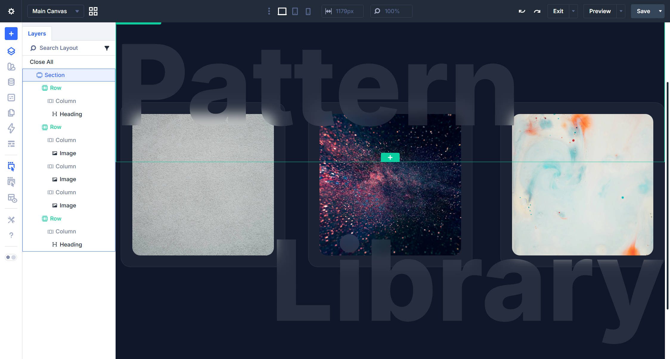
What We’re Building
Our target is a three-column section with image cards on a dark background. Each card has a subtle glass-like treatment—a semi-transparent background, a thin border, and a generous border radius. Inside each card, an image drifts vertically in a slow, continuous loop. The key detail: each image moves on a different timeline, preventing the rigid, synchronized bobbing that can make animations look mechanical.
To finish the composition, we’ll add oversized heading text above and below the cards using a frosted-glass CSS technique that lets the images show through the letterforms as they float.
Building The Section
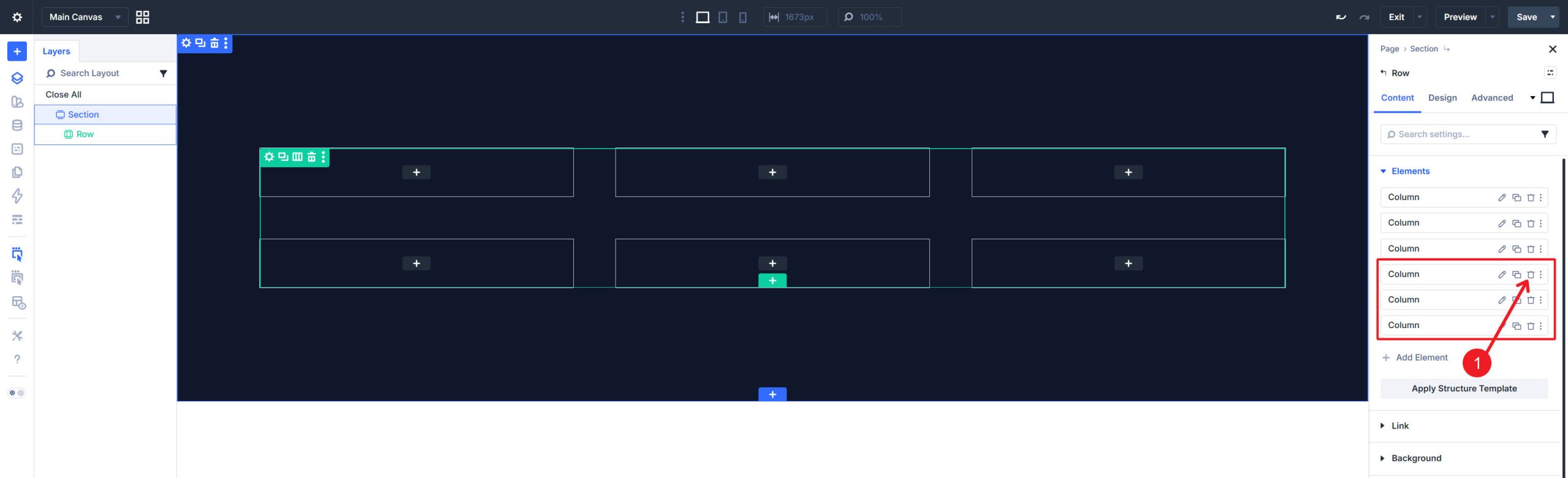
Start with a new Regular Section. Inside the Section, add a Row using a three-column structure.
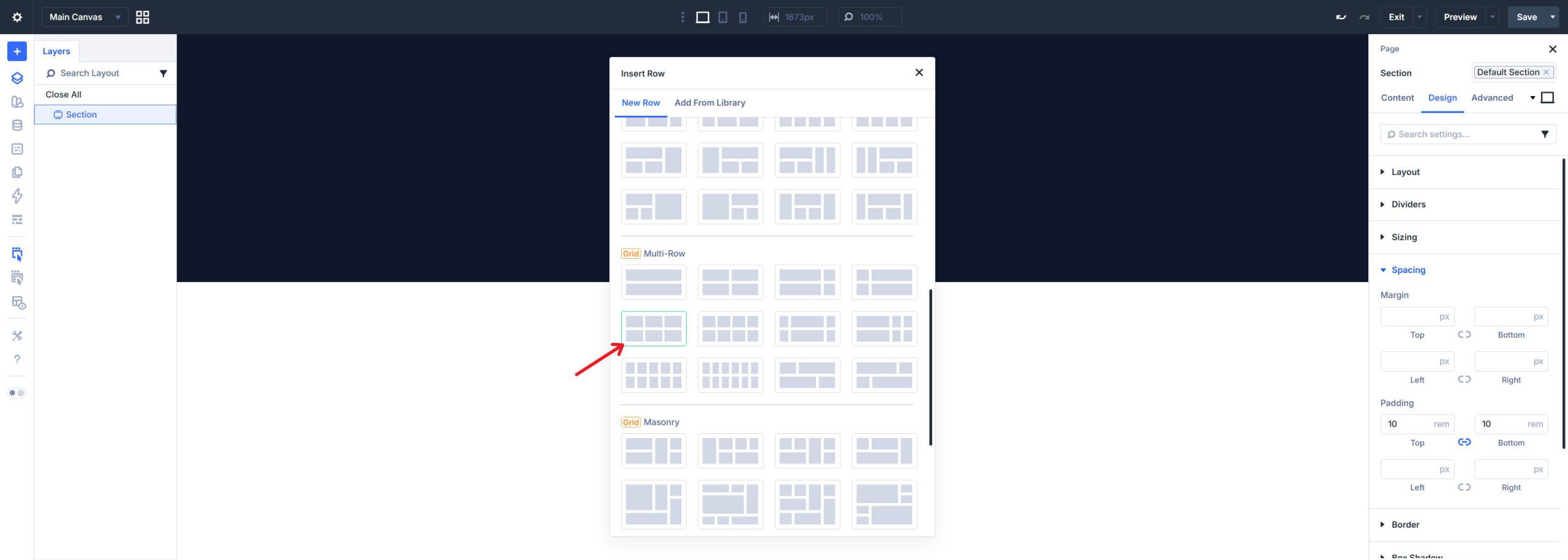
If you started from a larger grid preset, keep only the three columns you need for the image cards.
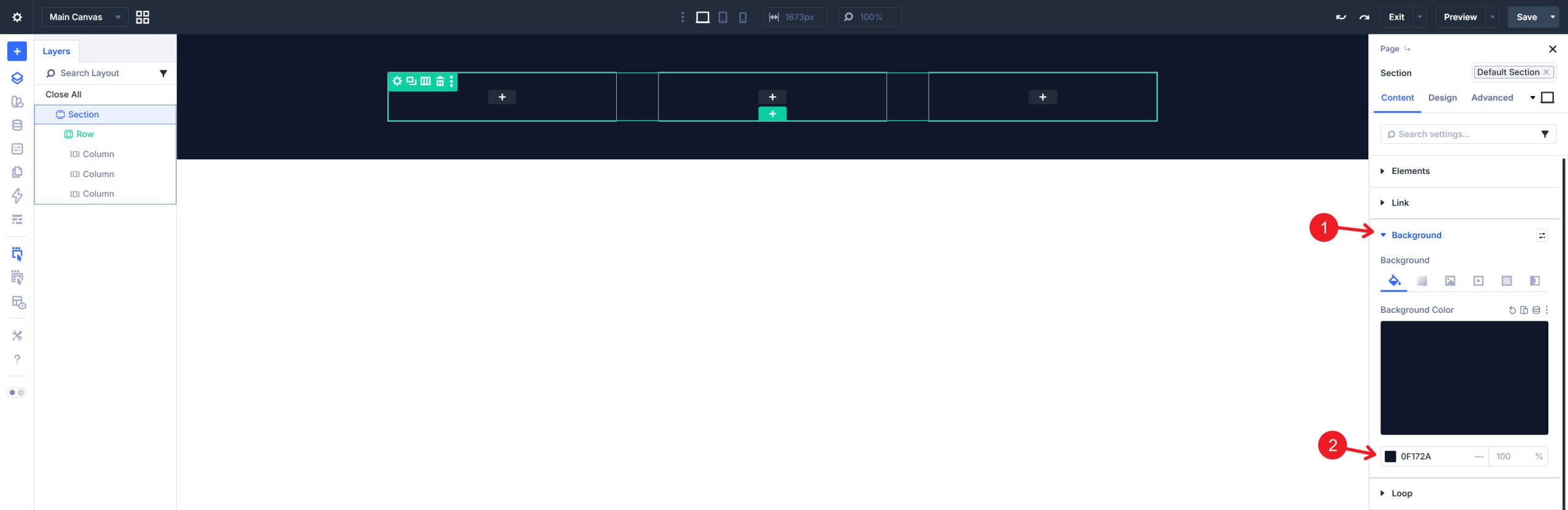
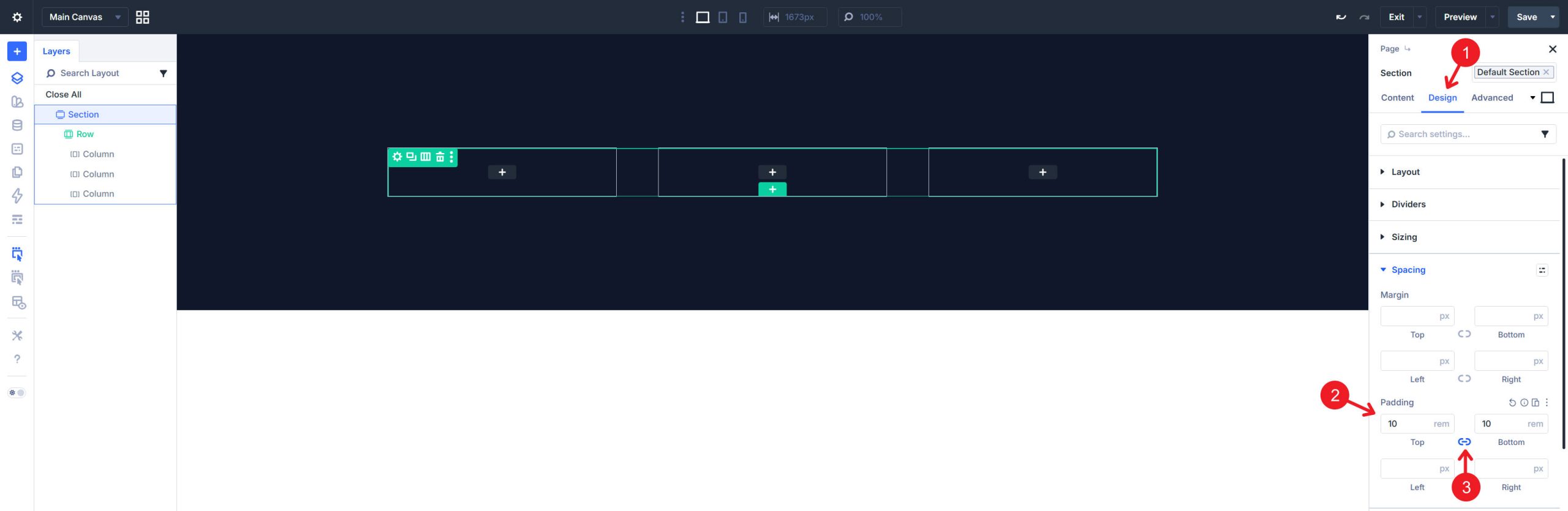
Open the Section settings and set a dark background color. The dark treatment makes the floating cards pop and gives the section a modern, dimensional feel. A deep navy color (#0f172a) works well, though any dark tone can suit this layout.
Give the Section generous top and bottom padding (10rem) to isolate it visually from surrounding content. This extra space helps the floating motion breathe so the images do not appear cramped against the section edges.
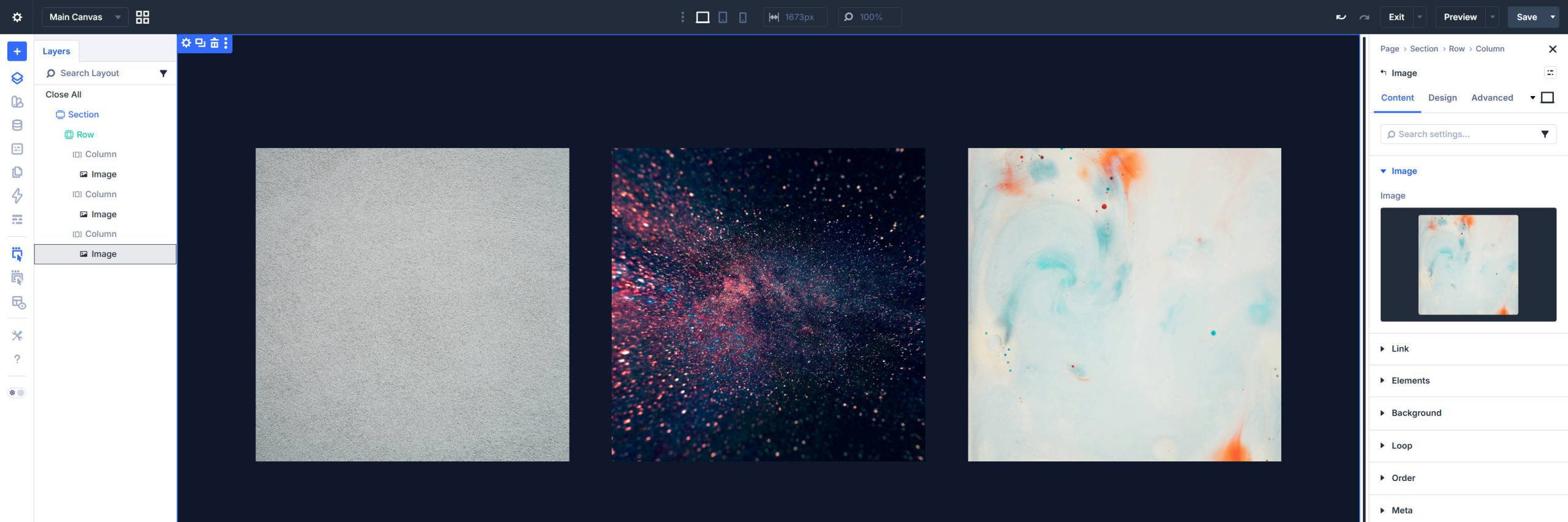
Adding The Image Modules
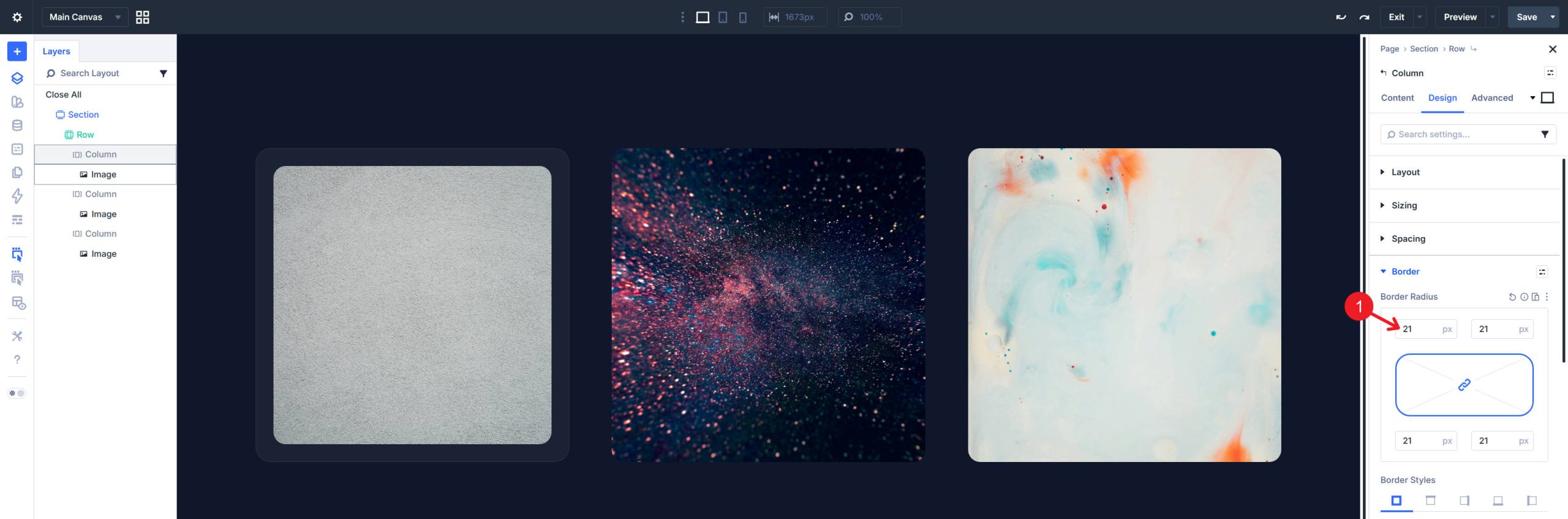
Drop an Image module into each column. Upload or select the images you want to use. The images should share a consistent aspect ratio—it’s easiest to crop and size them before uploading them to your site. A vertical or square ratio (roughly 4:5 or 1:1) works best for this card layout because it gives the floating motion room to breathe vertically.
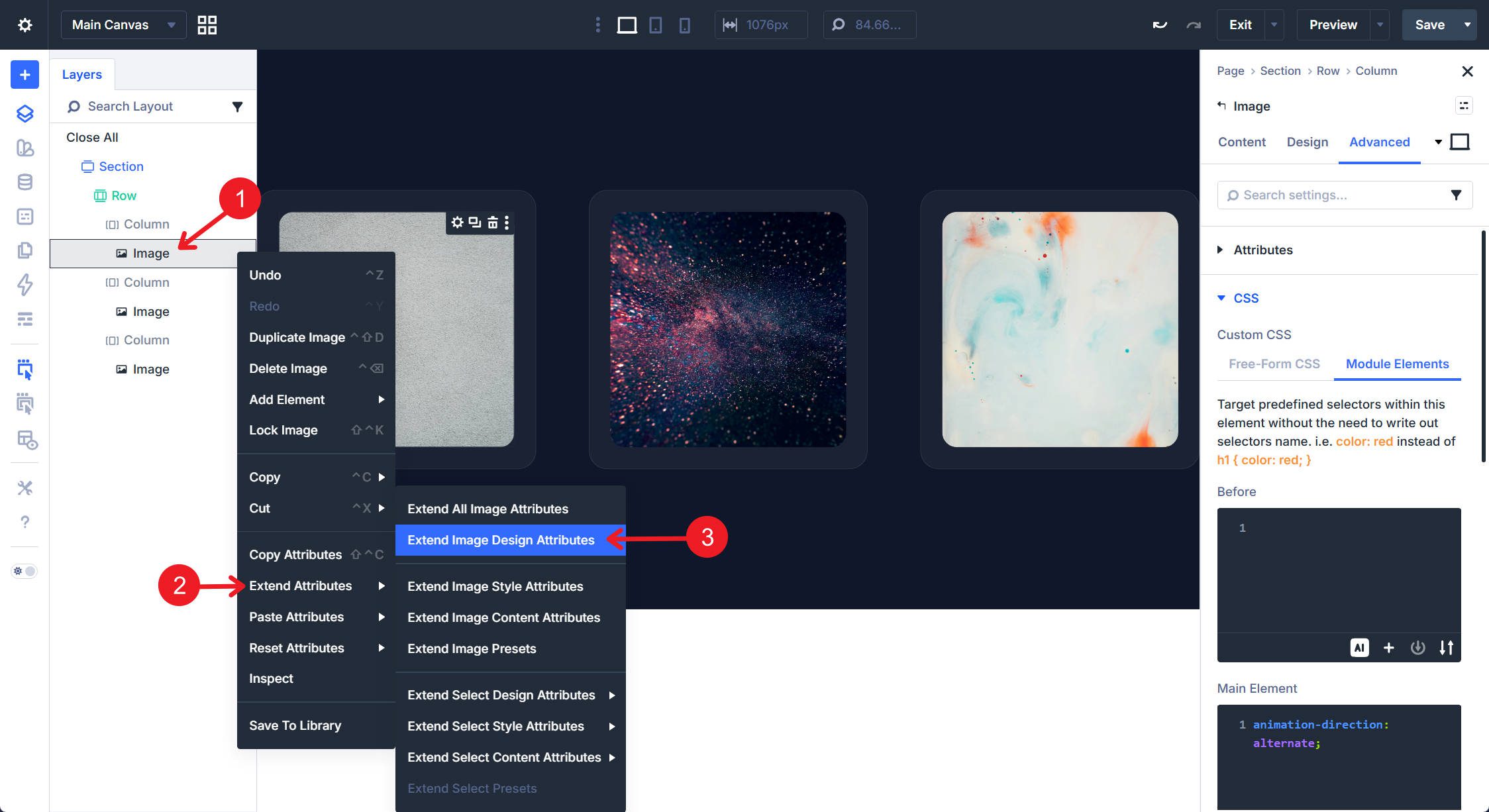
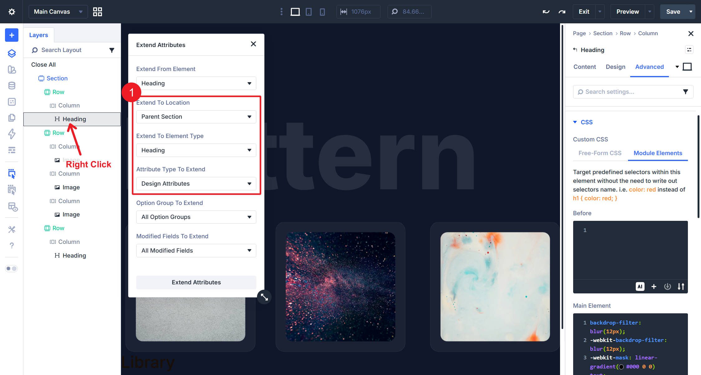
For each Image module, in Design > Border, set a border radius to round the corners (17px works well). Extend Attributes makes it easy to apply this across all image modules.
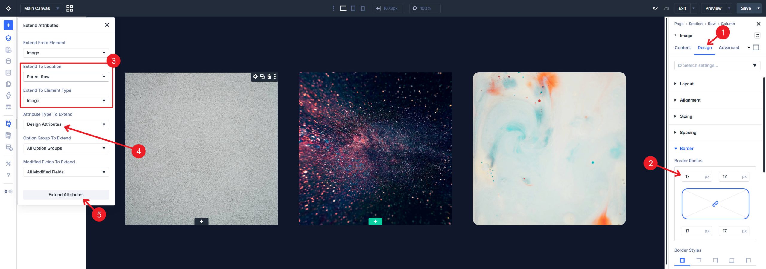
Right-click the Image from the Layers Panel or in the Visual Builder to select Extend Attributes
Styling The Cards
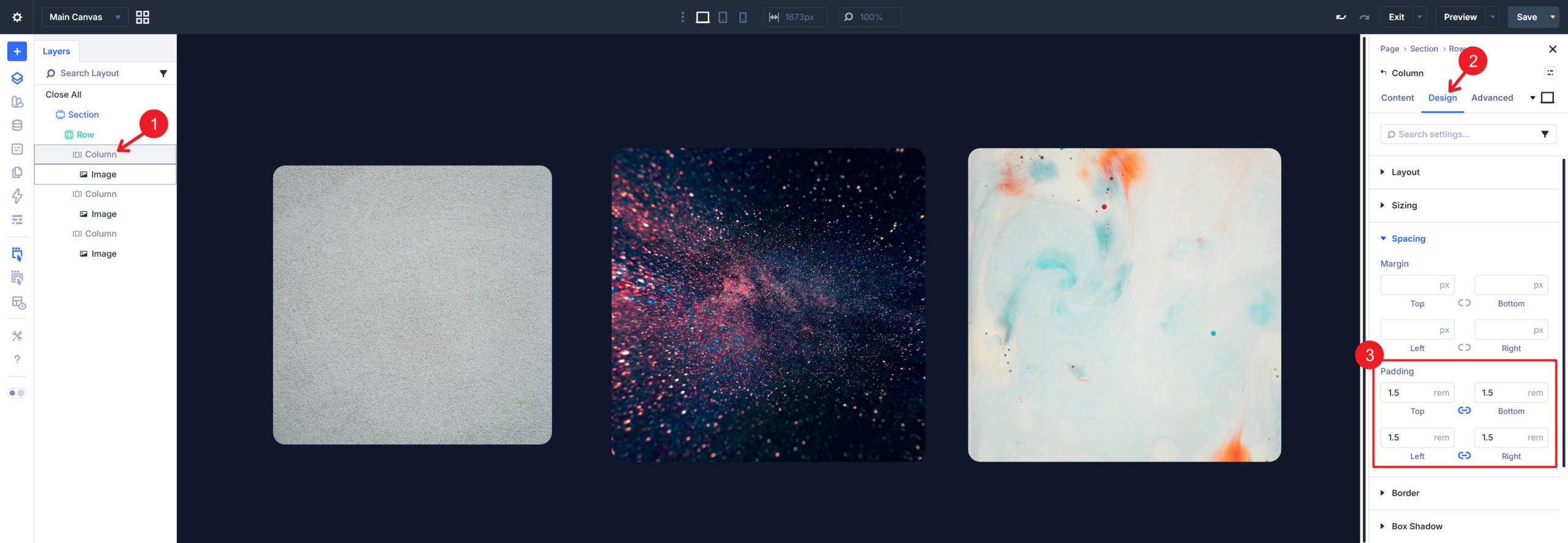
The card effect lives on each Column, not the Image module. Open the Column settings and configure the following:
Under Design > Spacing, add equal padding on all sides so the image floats inside the card with some breathing room.
Under Design > Background, set a semi-transparent background color. White at very low opacity (3–5%) creates the glass-panel effect against the dark section background.
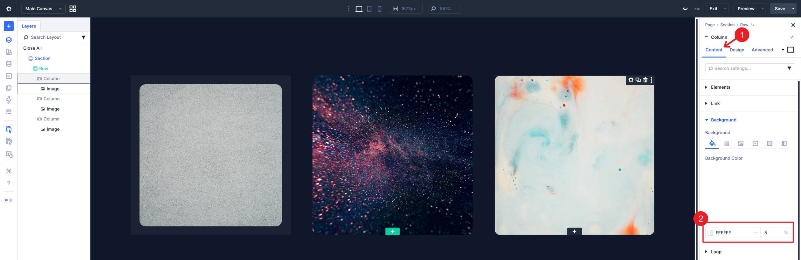
Under Design > Border, add a thin border (1px) using white at low opacity (8–10%). This subtle edge helps define the card boundary. Set the border radius to a value larger than the Image module’s radius to create the inset-frame look, where the image sits inside a larger rounded container.
Once you finish one column, apply those design settings to the other columns using Extend Attributes or Extend Styles. The result is three glass-like cards sitting side by side on a dark field. Even before animation, the layout should already look clean and intentional.
Adding The Float Effect
Apply The Base Animation
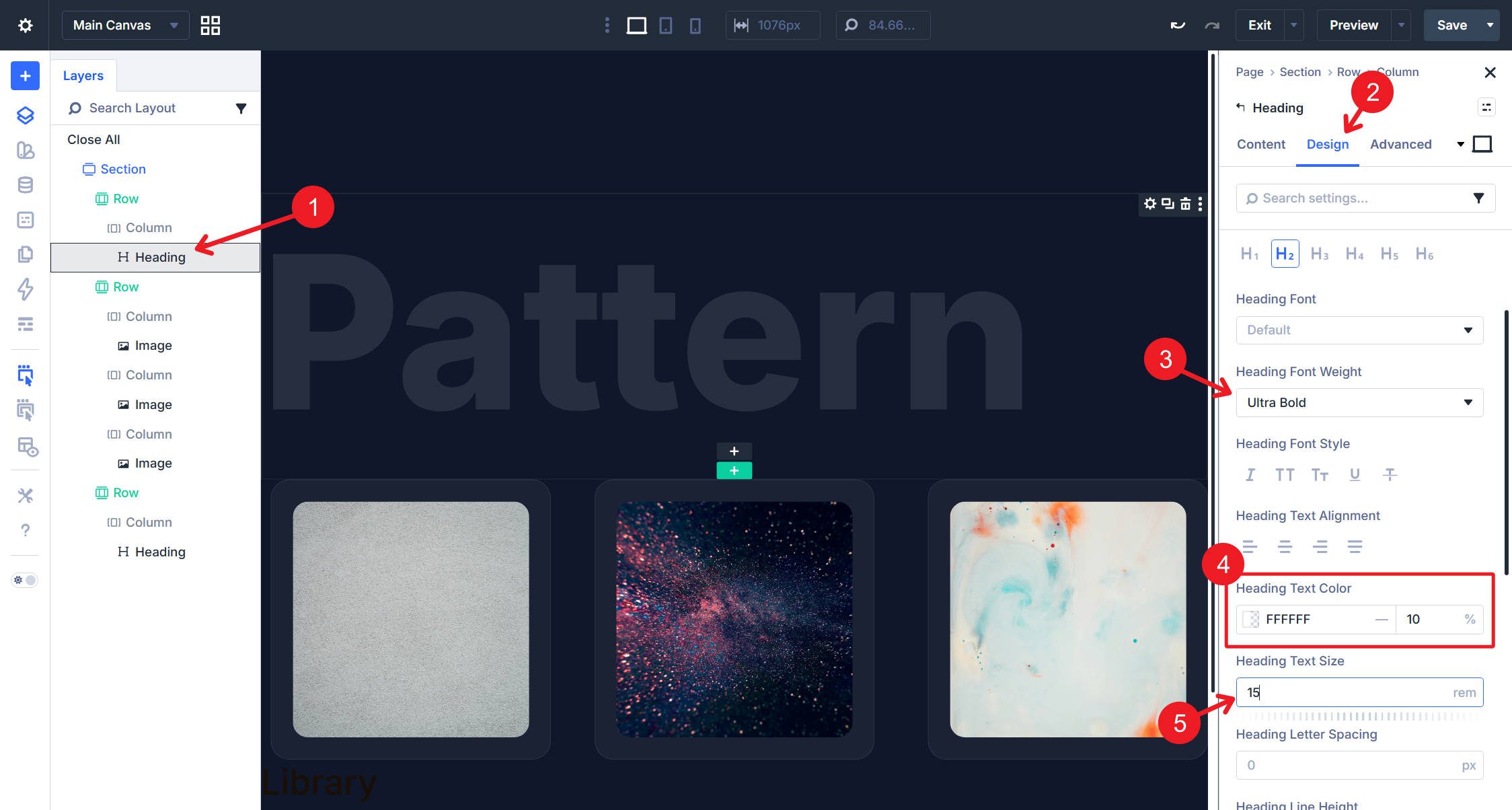
Select the first Image module and open its settings. Navigate to Design > Animation and configure the following:
- Animation Style: Slide
- Animation Direction: Bottom
- Animation Duration: Around 4000ms
- Animation Intensity: Low, around 3–5%
- Animation Starting Opacity: 100%
- Animation Repeat: Loop
These settings create the basic vertical motion. A longer duration keeps the effect calm and intentional, while a low intensity prevents the image from traveling too far inside the card.
Create A Smooth Loop
Now switch to the Advanced tab. Open the Custom CSS option group and add the following to the Main Element field:
animation-direction: alternate;
That single line makes the animation play forward and then backward on each loop, creating a smoother back-and-forth drift instead of a noticeable reset at the start of every cycle.
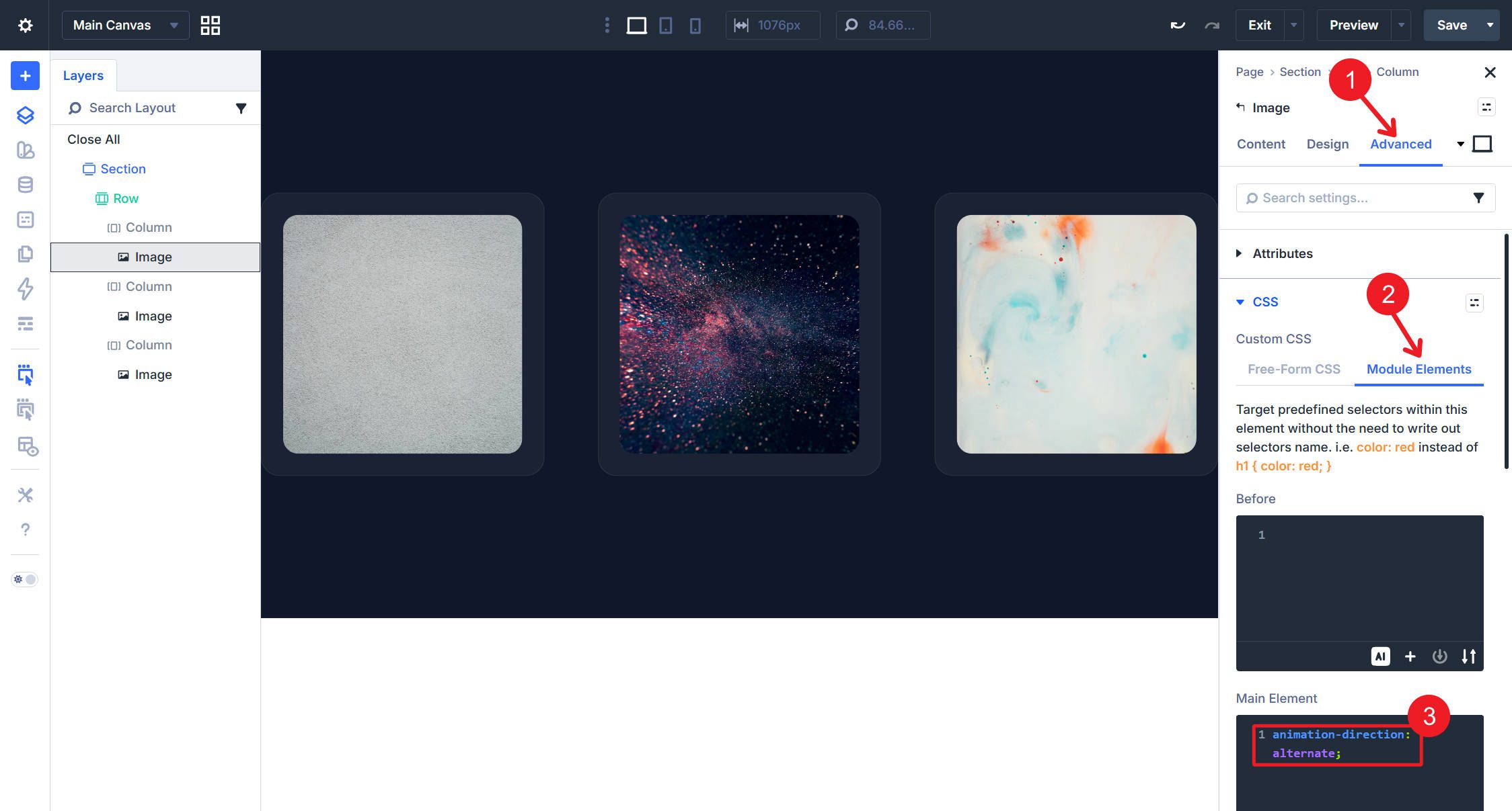
Extend these Image Design Attributes to the other images so you can fine-tune each one in the next step.
Staggering The Motion
Applying identical animation settings to all three images creates synchronized movement, which usually looks too uniform. The fix is to give each image a different combination of duration and delay.
On the second Image module, increase the Animation Duration by 500–1000ms relative to the first and set an Animation Delay of 1000–2000ms. On the third Image module, use a different Duration and Delay so all three modules stay offset from one another.
For reference, here’s one combination that works well:
- Image 1: Duration 4000ms, Delay 0ms, Intensity 3%
- Image 2: Duration 5500ms, Delay 1500ms, Intensity 2%
- Image 3: Duration 3500ms, Delay 800ms, Intensity 3%
You can adjust these values to taste, but keep enough variation between the modules to avoid a mirrored rhythm.
Going Further With Text
Add Overlapping Headings
The floating images work better when they are anchored by text.
Add two Rows—one above and one below the image row—using a single-column structure.
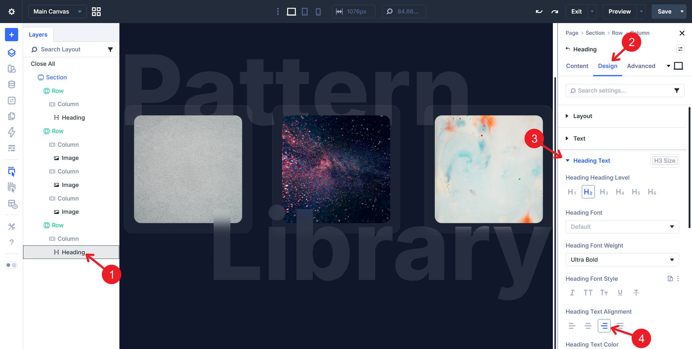
In each of those rows, add a Heading Module. Style the first heading with a color of White (#ffffff) at 10% opacity, a text size of 15rem, and a font weight of Ultra Bold.
Create A Frosted-Glass Text Effect
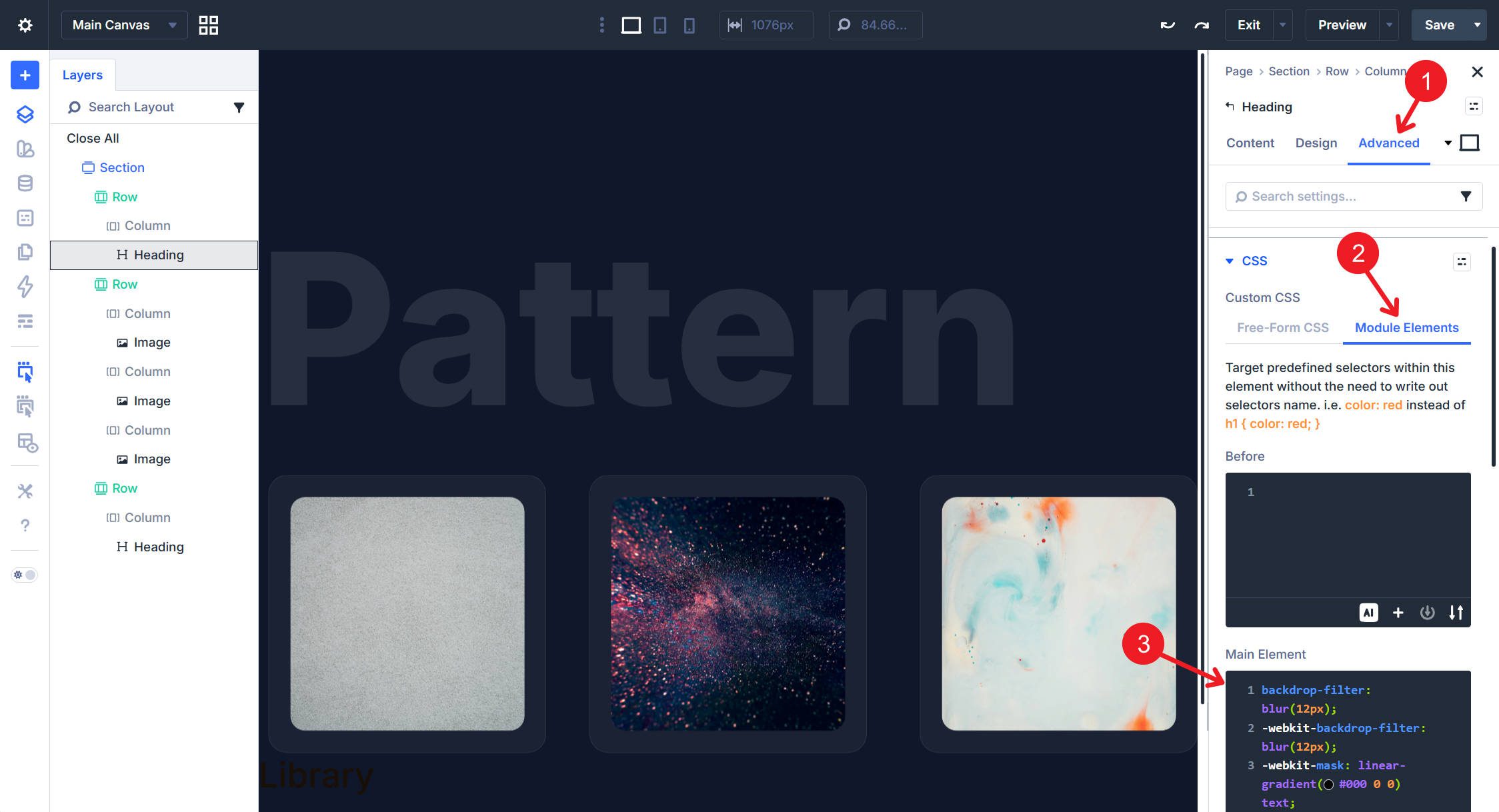
Go to the Advanced tab and open the CSS option group. In Module Elements > Main Element, paste in this custom CSS:
backdrop-filter: blur(12px);
-webkit-backdrop-filter: blur(12px);
-webkit-mask: linear-gradient(#000 0 0) text;
mask: linear-gradient(#000 0 0) text;
color: rgba(255, 255, 255, 0.1);
This creates a frosted-glass knockout effect—the text becomes a translucent window that blurs whatever sits behind it, including the floating images as they drift through the letterforms.
Extend the design attributes of the first Heading Module to all Heading Modules in the parent Section so the same settings apply to the heading below.
Position Headings Around The Cards
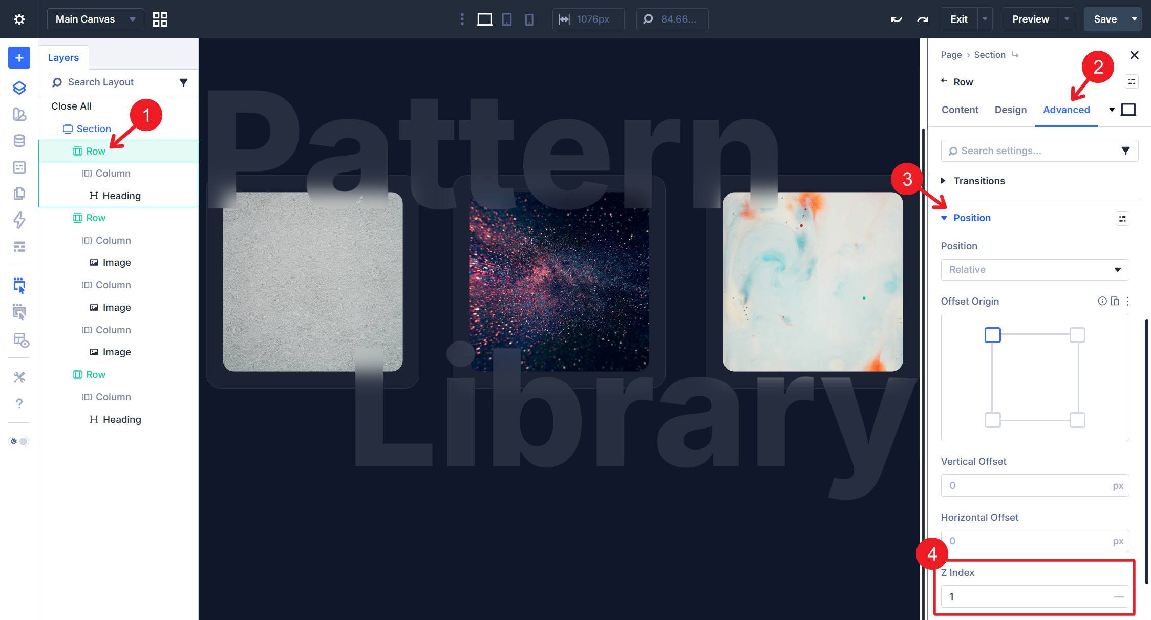
On the top row, in Design > Spacing, set the bottom margin to -8rem. On the bottom row, set the top margin to -8rem.
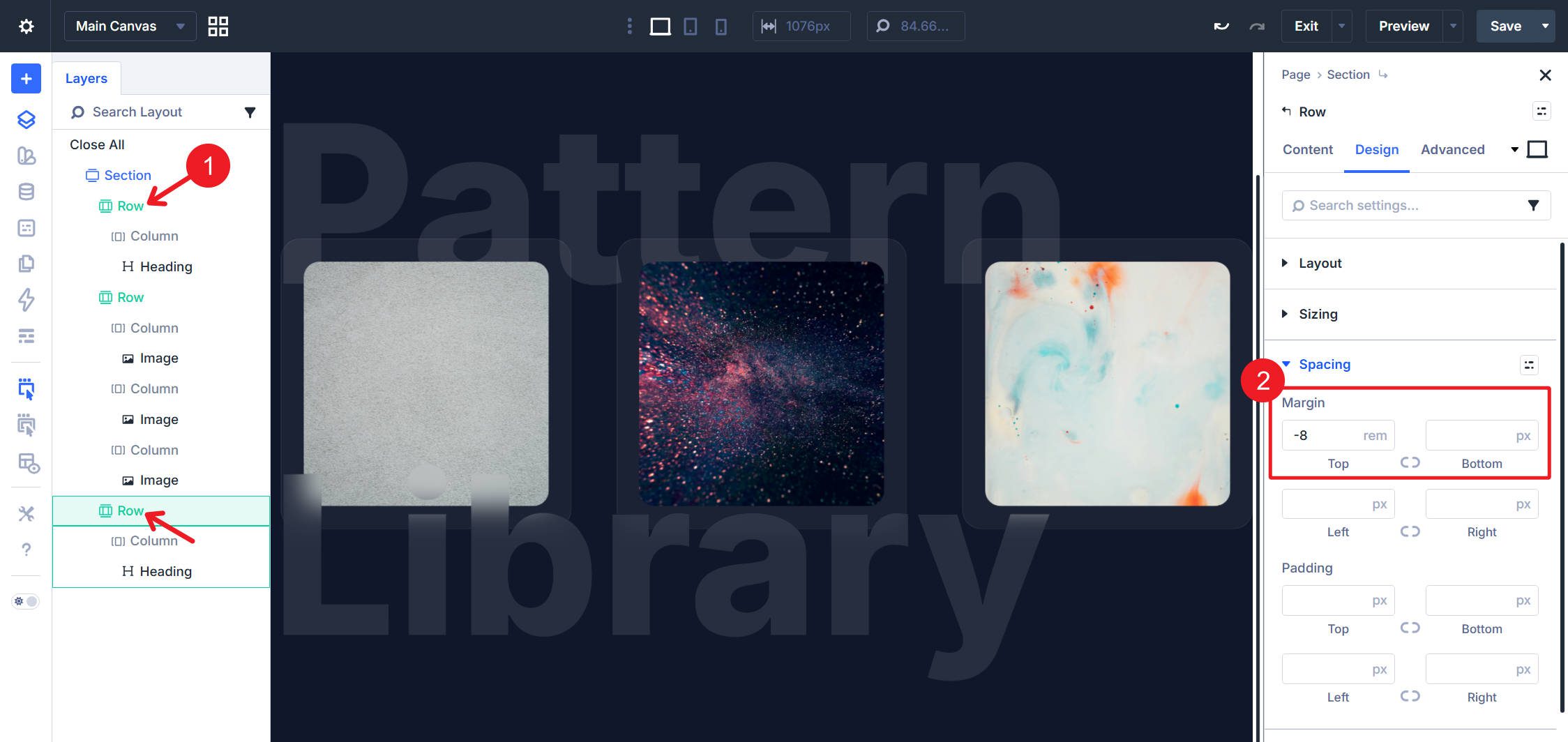
Then set the bottom Heading Module’s alignment to Left.
Finally, set the top Row’s z-index to 1. This brings the row and its Heading Module above the images it overlaps.
Performance Notes
This effect is relatively lightweight because Divi’s animation settings rely on CSS animation, and movement-based effects are generally efficient in modern browsers. Still, performance depends on the number of animated elements, image sizes, device capability, and any additional visual effects layered on top.
The floating motion here should perform well in most cases, but it’s still smart to keep image file sizes optimized, test the section on mobile, and avoid overusing continuous animations throughout the same page. The blur-based text effect can also be more demanding on some devices and browsers than the image movement itself, so test that carefully if you plan to use it prominently.
Start Building Website With Divi 5 Today!
Floating images are a great example of how Divi 5’s design controls, Animation options, and Custom CSS fields can work together without third-party dependencies. The built-in Slide animation plus animation-direction: alternate; handles the drifting motion, while Custom CSS adds the frosted-glass text treatment. Everything stays inside the builder, which makes the effect easy to reuse and refine.


Leave A Reply