
By now, we’ve all gotten used to Divi and its built-in section divider. They help add that extra touch to the websites we build. They also serve as a smooth transition between two different sections, but with Divi’s Theme Builder, the approach to creating that transition is slightly different. In this post, we’ll guide you through the steps you have to take to get there. You’ll be able to download the template JSON file for free as well!
Let’s get to it.
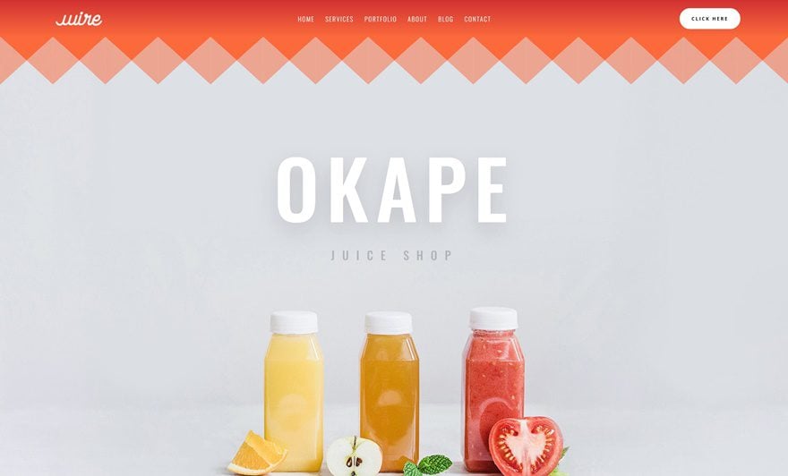
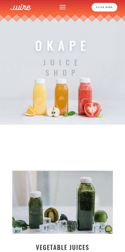
Preview
Before we dive into the tutorial, let’s take a quick look at the outcome across different screen sizes.
Desktop
Mobile
Download The Section Divider Page Template for FREE
To lay your hands on the free section divider page template, you will first need to download it using the button below. To gain access to the download you will need to subscribe to our newsletter by using the form below. As a new subscriber, you will receive even more Divi goodness and a free Divi Layout pack every Monday! If you’re already on the list, simply enter your email address below and click download. You will not be “resubscribed” or receive extra emails.

Subscribe To Our Youtube Channel
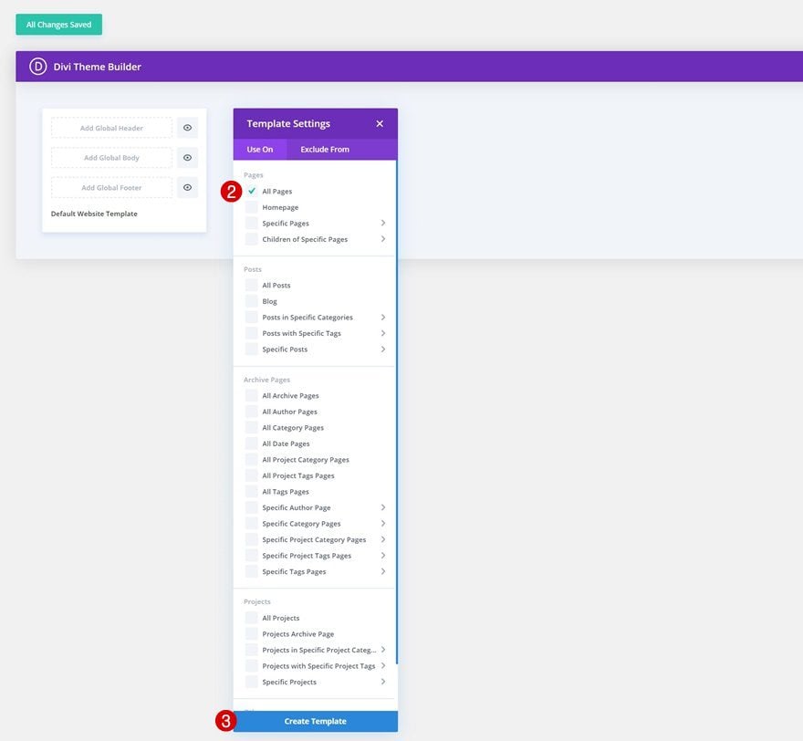
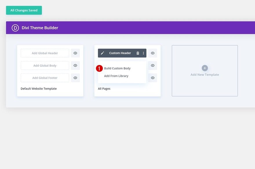
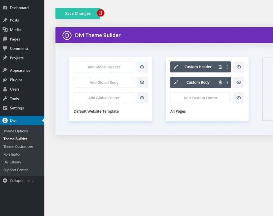
1. Go to Divi Theme Builder & Add New Template
Go to Divi Theme Builder
Start by going to the Divi Theme Builder.
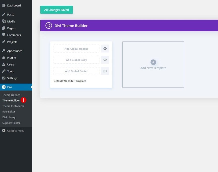
Add New Template for Pages
There, create a new template by clicking on the plus icon.
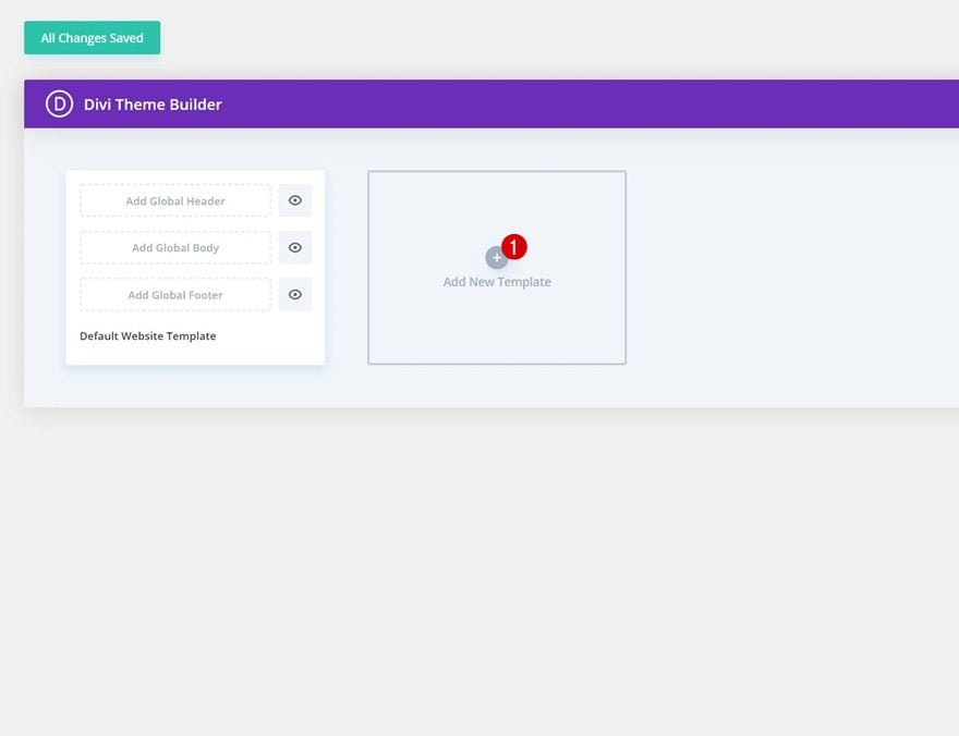
Select ‘All Pages’ if you want the blending effect to apply on all your pages. You can make the same effect work on other types of templates too, but you’ll have to separately include the top section divider in each one of your templates. Once you’ve created a new template, start building the custom header.
2. Build Custom Header
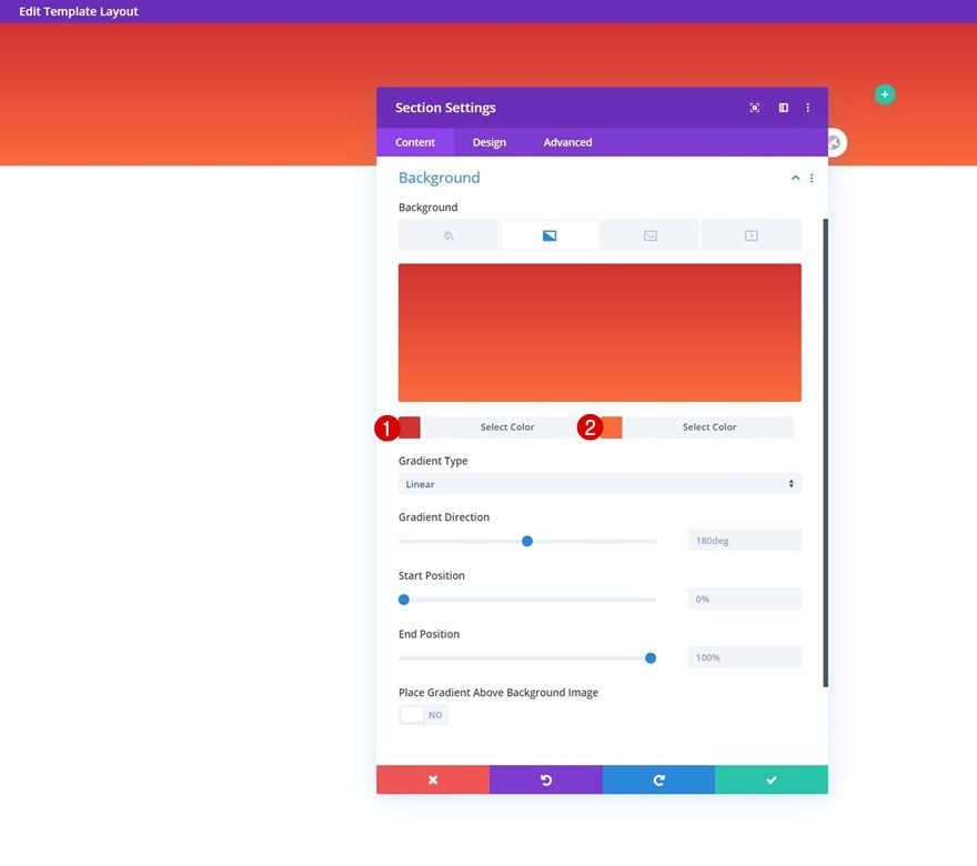
Section Settings
Gradient Background
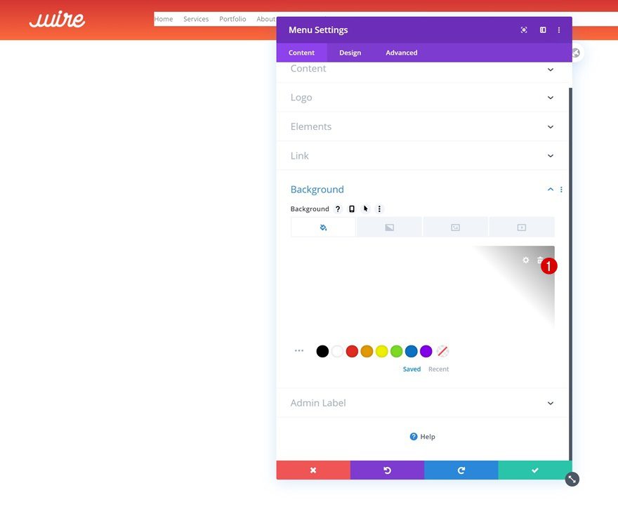
Inside the template editor, you’ll notice a section. Open that section and add a gradient background to it.
- Color 1: #d13232
- Color 2: #fc6a3c
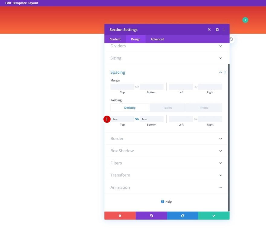
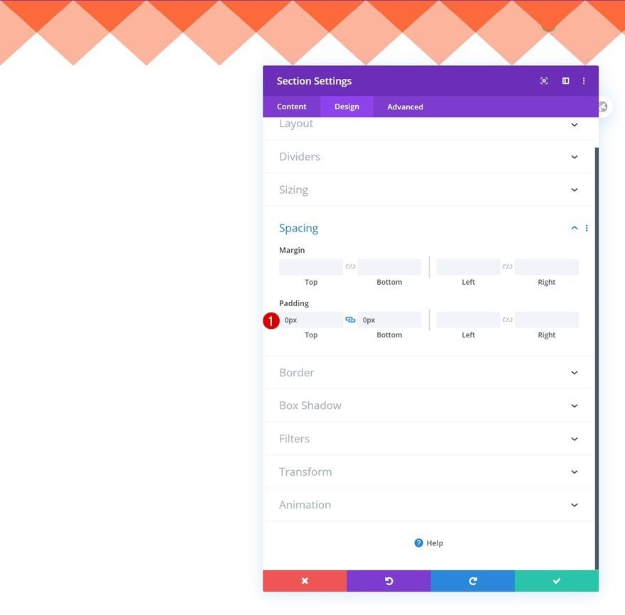
Spacing
Add some custom top and bottom padding to the section as well.
- Top Padding: 1vw (Desktop), 2vw (Tablet & Phone)
- Bottom Padding: 1vw (Desktop), 2vw (Tablet & Phone)
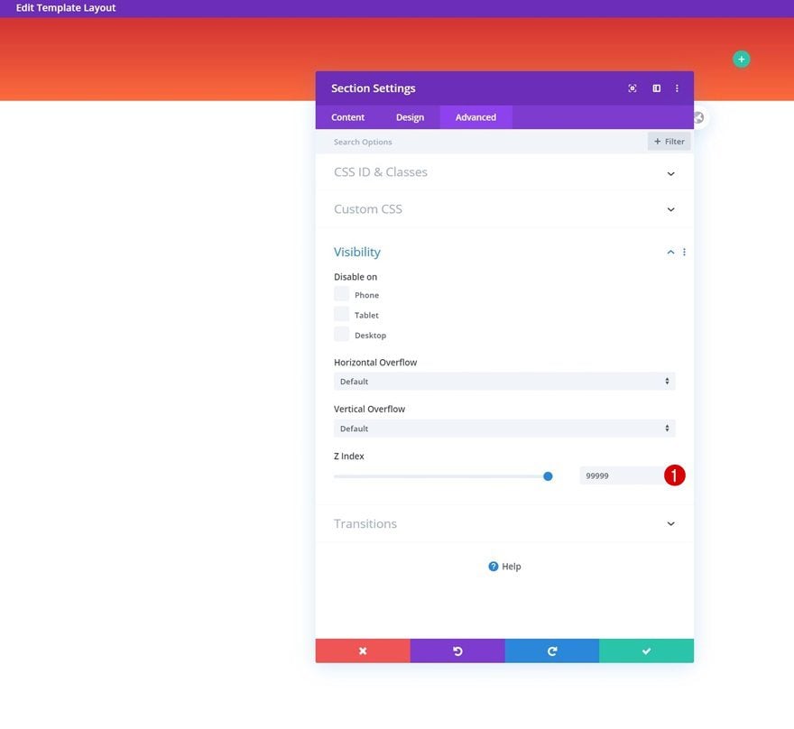
Z Index
And to make sure your header stays on top of all content, we’ll increase the z index in the visibility settings.
- Z Index: 99999
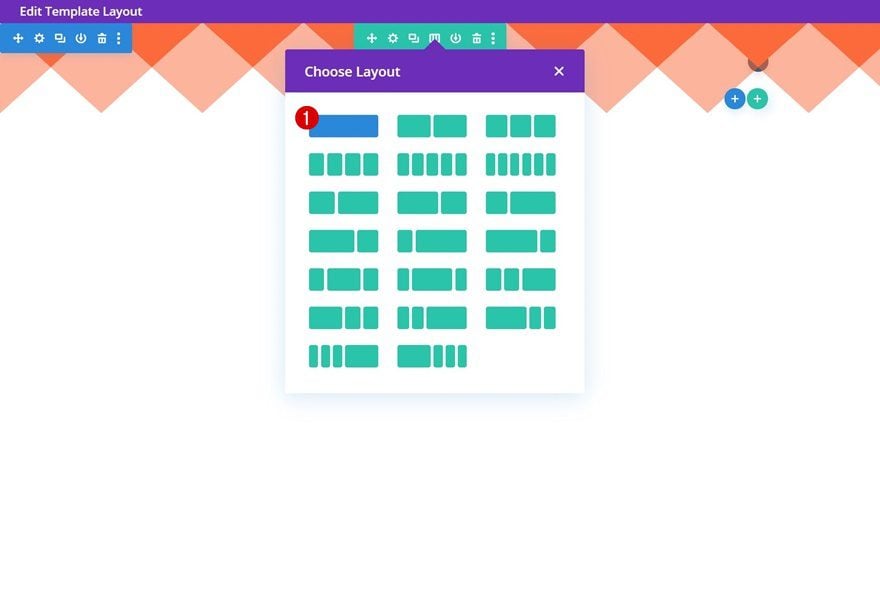
Add New Row
Column Structure
Continue by adding a new row to your section using the following column structure:
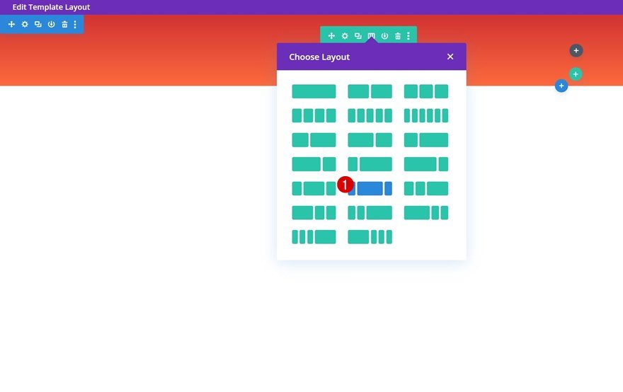
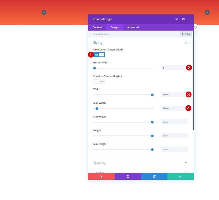
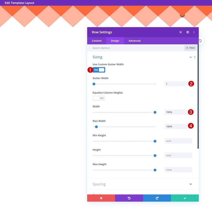
Sizing
Without adding any modules yet, open the row settings and modify the sizing settings as follows:
- Use Custom Gutter Width: Yes
- Gutter Width: 1
- Width: 100%
- Max Width: 100%
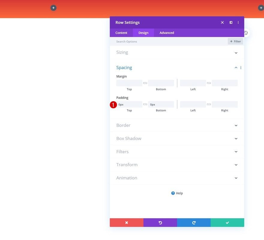
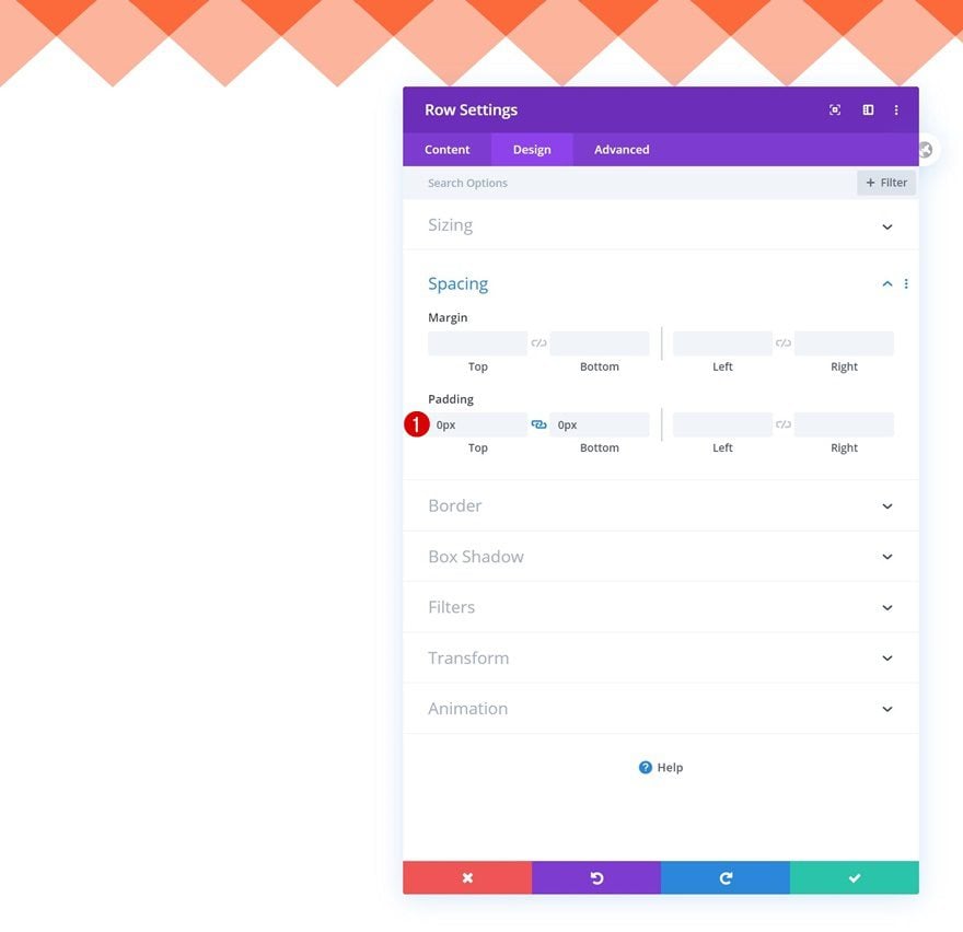
Spacing
Remove all top and bottom padding too.
- Top Padding: 0px
- Bottom Padding: 0px
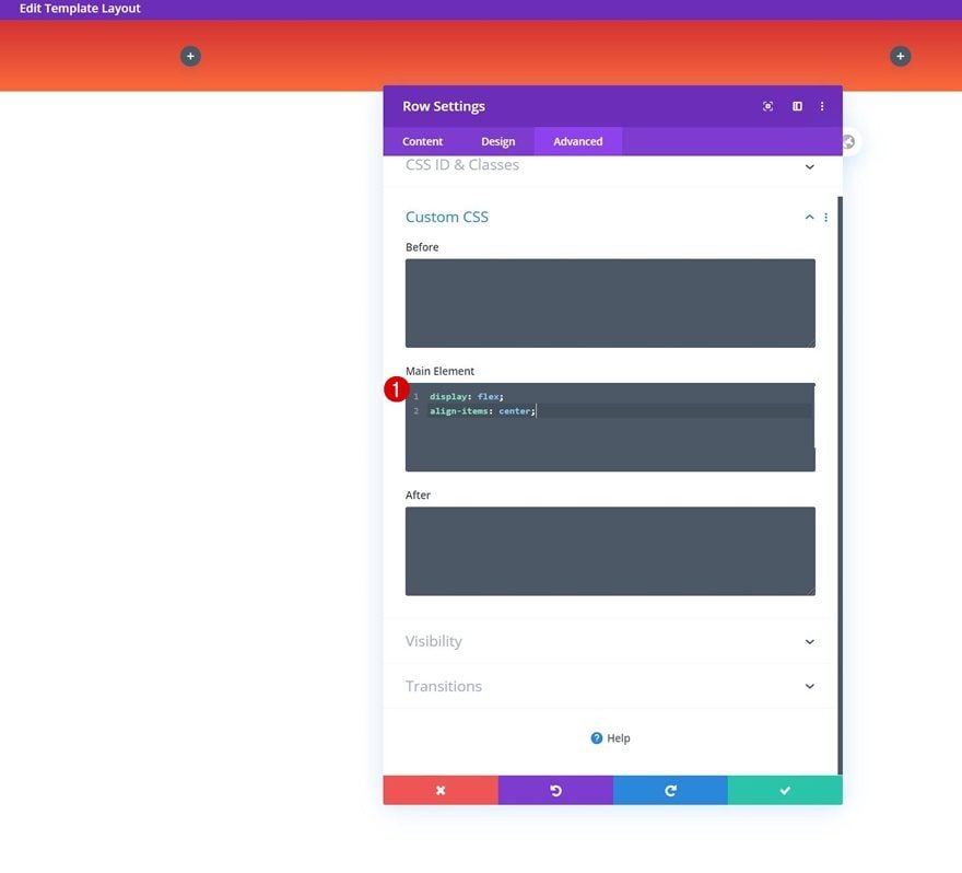
Main Element
Last but not least, center your column content and allow the columns to remain next to each other on smaller screen sizes by adding two single lines of CSS code to your row’s main element.
display: flex;
align-items: center;
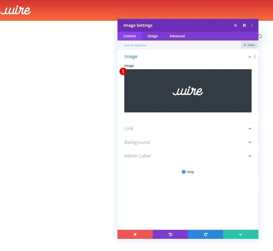
Add Image Module to Column 1
Upload Logo
Once you’ve completed all section and row settings, it’s time to add modules, starting with an Image Module in column 1. Upload a logo with a transparent background.
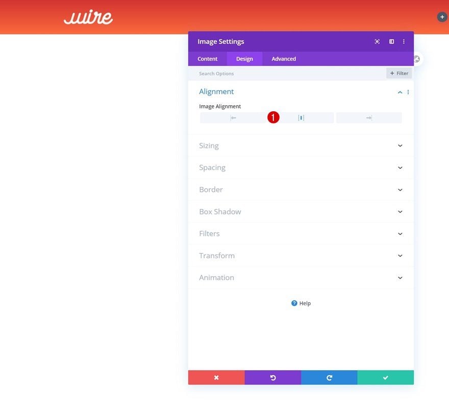
Alignment
Then, go to the module’s design tab and change the image alignment.
- Image Alignment: Center
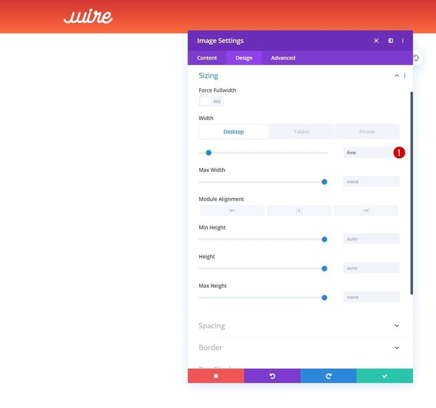
Sizing
Modify the module’s width across different screen sizes too.
- Width: 6vw (Desktop), 13vw (Tablet), 17vw (Phone)
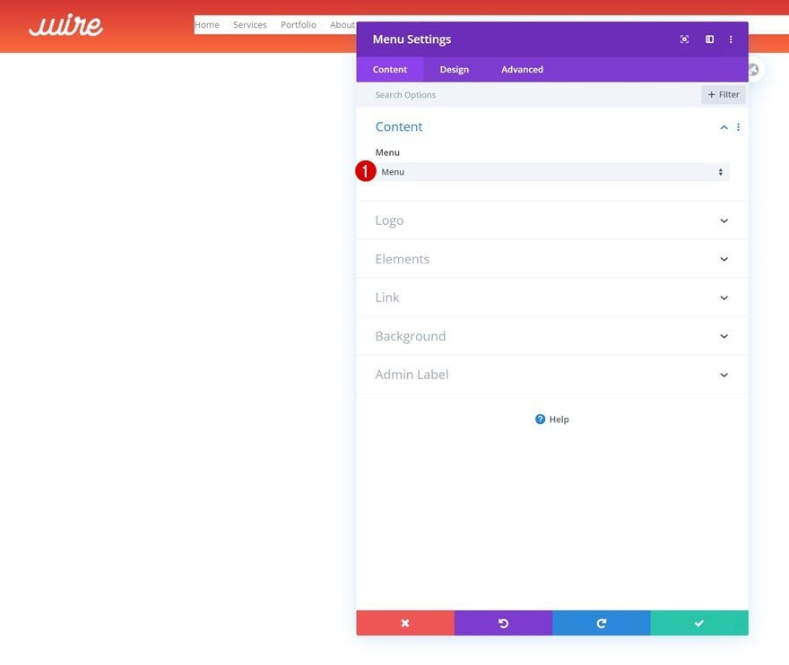
Select Menu
In the second column, we’ll need a Menu Module. Select a menu of your choice.
Remove Background Color
Continue by removing the module’s background color.
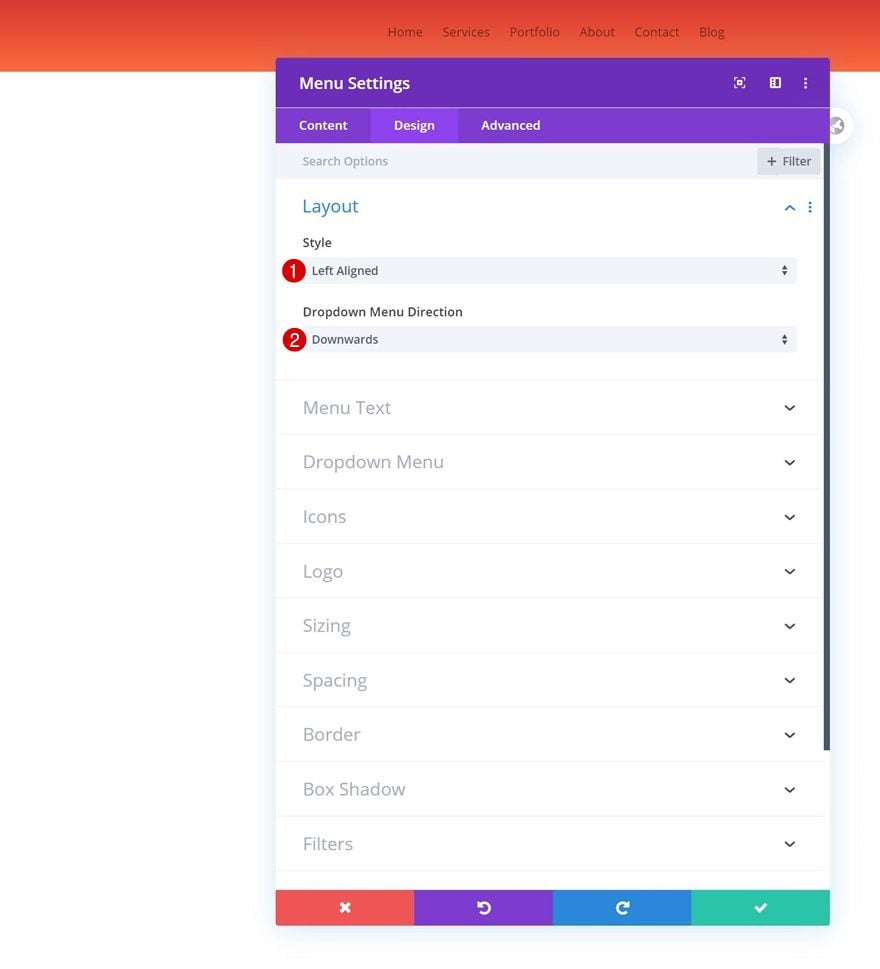
Layout
Move on to the design tab and change the layout.
- Style: Left Aligned
- Dropdown Menu Direction: Downwards
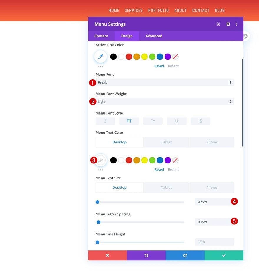
Menu Text
Next, style the menu text accordingly:
- Menu Font: Oswald
- Menu Font Weight: Light
- Menu Font Style: Uppercase
- Menu Text Color: #ffffff (Desktop), #202332 (Tablet & Phone)
- Menu Text Size: 0.8vw (Desktop), 2vw (Tablet), 2.5vw (Phone)
- Menu Letter Spacing: 0.1vw
Dropdown Menu
Change the dropdown menu line color in the dropdown menu settings too.
- Dropdown Menu Line Color: #ffffff
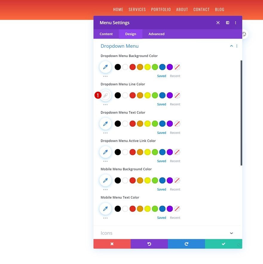
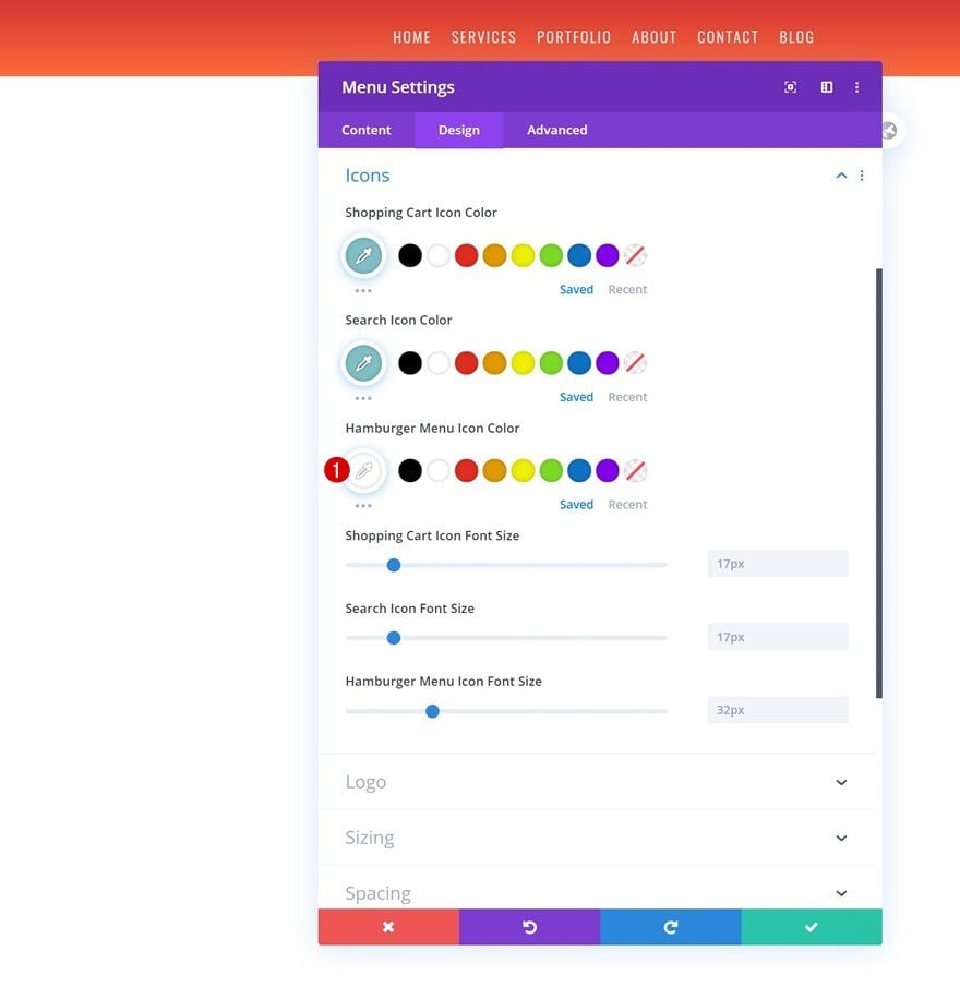
Icons
And complete the module’s settings by using a white hamburger menu icon color.
- Hamburger Menu Icon Color: #ffffff
Add Copy
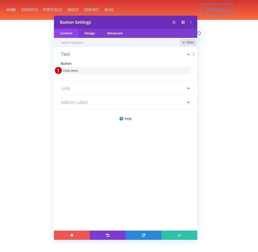
On to the last column! There, the only module we’ll need is a Button Module. Add some copy of your choice.
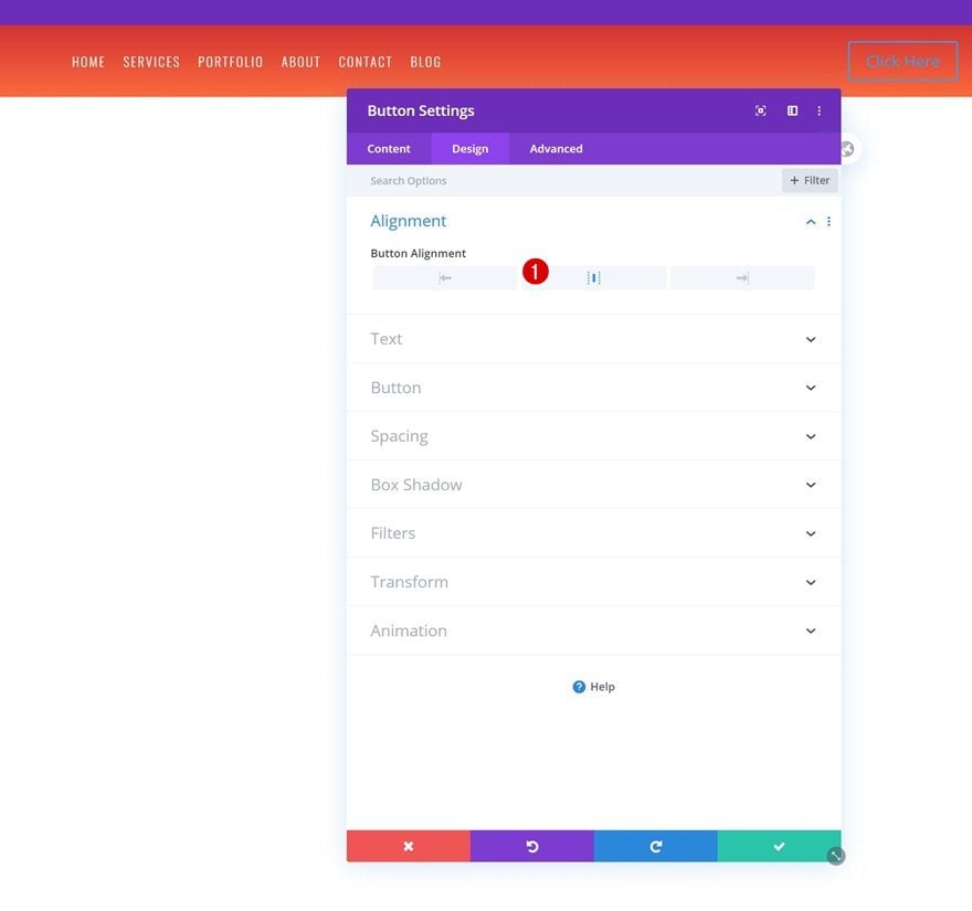
Alignment
Move on to the module’s design tab and change the button alignment.
- Button Alignment: Center
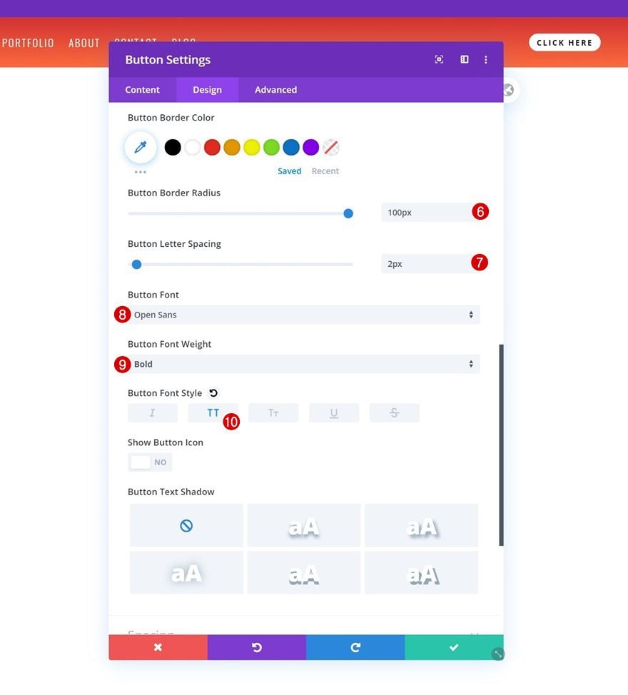
Button Settings
Continue by styling the button in the button settings.
- Use Custom Styles For Button: Yes
- Button Text Size: 0.6vw (Desktop), 1vw (Tablet), 1.5vw (Phone)
- Button Text Color: #000000
- Button Background Color: #FFFFFF
- Button Border Width: 0px
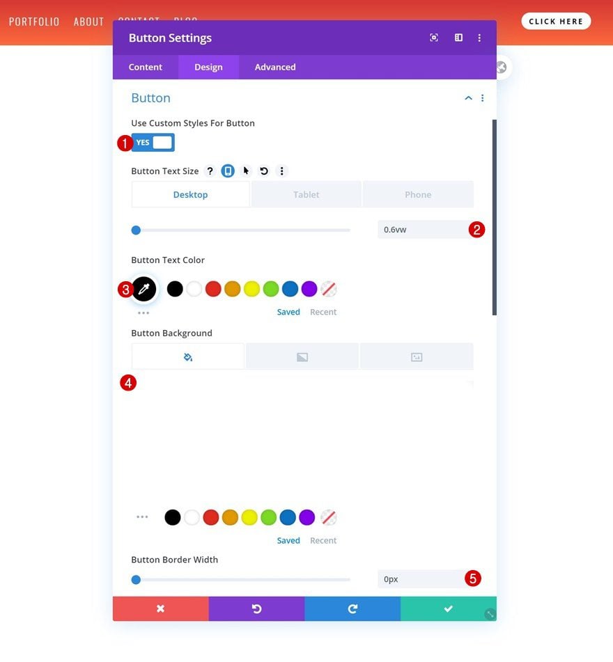
- Button Border Radius: 100px
- Button Letter Spacing: 2px
- Button Font: Open Sans
- Button Font Weight: Bold
- Button Font Style: Uppercase
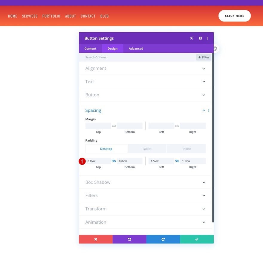
Spacing
And complete the module’s settings by adding some custom padding across different screen sizes.
- Top Padding: 0.8vw (Desktop), 1.6vw (Tablet), 2.2vw (Phone)
- Bottom Padding: 0.8vw (Desktop), 1.6vw (Tablet), 2.2vw (Phone)
- Left Padding: 1.5vw (Desktop), 2.5vw (Tablet), 3.5vw (Phone)
- Right Padding: 1.5vw (Desktop), 2.5vw (Tablet), 3.5vw (Phone)
3. Build Custom Body & Add Top Divider
Once you’ve completed the custom header of your template, go ahead and start building the custom body.
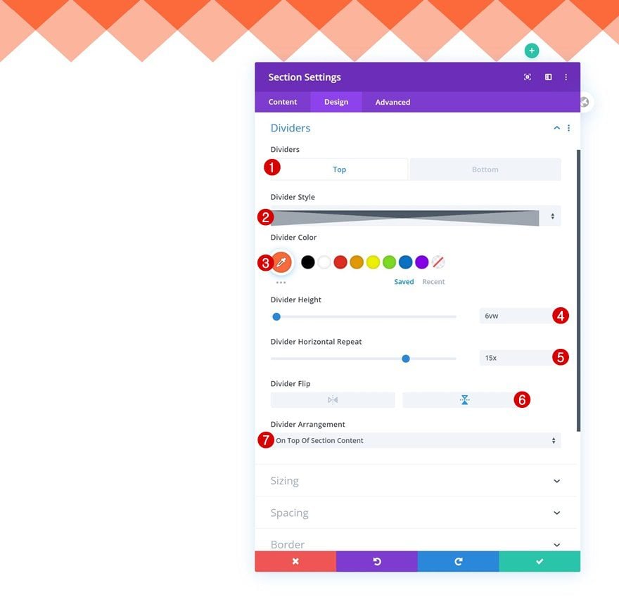
Section Settings
Top Divider
You’ll, again, notice a section on the page. Open that section and add a top divider to it.
- Divider Style: Find in List
- Divider Color: #fc6a3c
- Divider Height: 6vw
- Divider Horizontal Repeat: 15x
- Divider Flip: Vertical
- Divider Arrangement: On Top Of Section Content
Spacing
Move on to the section’s design tab and remove all default top and bottom padding.
- Top Padding: 0px
- Bottom Padding: 0px
Add New Row
Column Structure
Continue by adding a new row to your section using the following column structure:
Sizing
Open the row settings and change the sizing settings as follows:
- Use Custom Gutter Width: Yes
- Gutter Width: 1
- Width: 100%
- Max Width: 100%
Spacing
Remove all default top and bottom padding too.
- Top Padding: 0px
- Bottom Padding: 0px
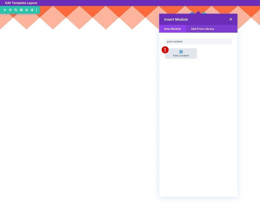
Add Post Content Module to Column
Now, to make all your page content show up, you’ll need to add a Post Content Module to your row. This module represents the layout you’ve built inside the page itself using Divi. If you’re adding this transition to a product page, for instance, a template where dynamic content is involved, a different approach takes place. The only important thing to remember is that you’ll have to add a top divider to the first section of your template’s body. Make sure the color of your divider is the same as the color used for your global header background.
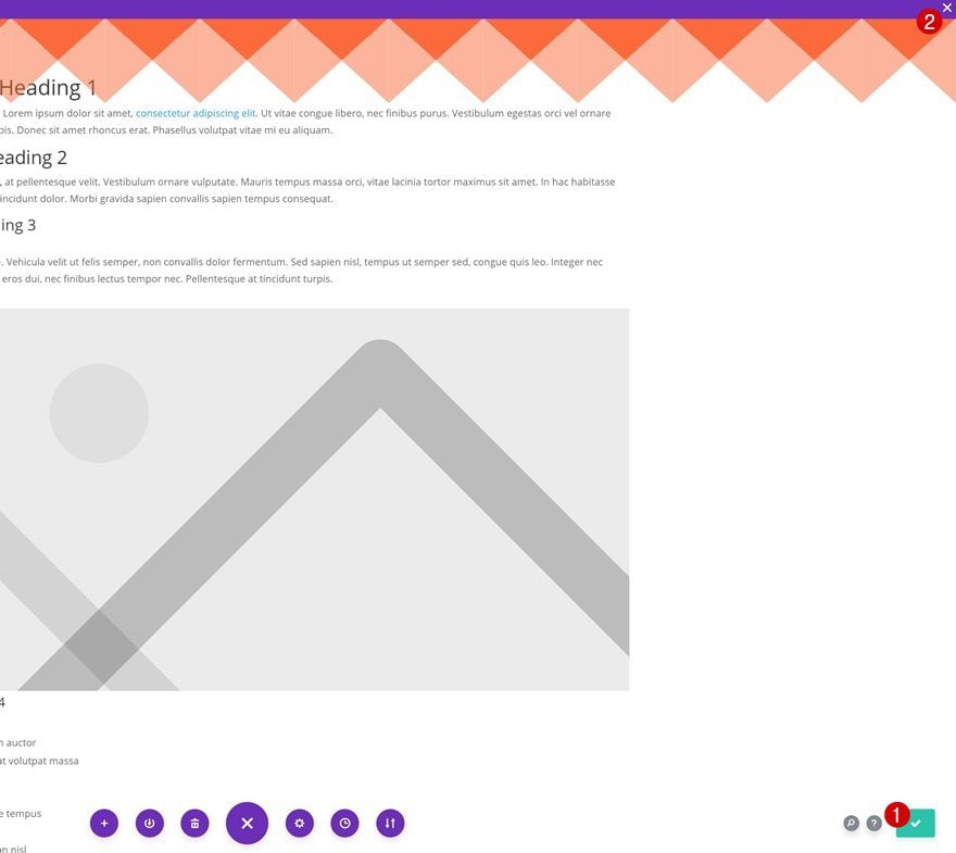
3. Save Builder Changes & View Result
Once you’ve completed the body of your template, you can save the changes and view the outcome on your website!
Preview
Now that we’ve gone through all the steps, let’s take a final look at the outcome across different screen sizes.
Desktop
Mobile
Final Thoughts
In this post, we’ve shown you how to blend your template’s header and body using Divi’s section dividers and the Post Content Module. The divider transition immediately applies to all your pages. You were able to download the JSON file for free as well! If you have any questions or suggestions, feel free to leave a comment in the comment section below.
If you’re eager to learn more about Divi and get more Divi freebies, make sure you subscribe to our email newsletter and YouTube channel so you’ll always be one of the first people to know and get benefits from this free content.


Nice, DIVI 4.0 is best theme ever. Thanks for the awesome tutorial.
Well thats great tutorial, BUT, i think everyone would want to se live DEMO.
And i think lot of us would like to now are the cut out parts acting as PNG images, so that for example picture could be put under it?
If not its just interesting image in header. OR SVG path.
So is the cut out part transparent on other pages?
Amazing ! thank you from France Donjete 😉