")
When opting for a fixed header on your website, you’ll automatically find yourself using Divi and its built-in position options. The fixed position option inside Divi allows you to stick any element to a specific location on your page. When using a fixed position, however, the container space of your element is removed. The fixed header floats on top of your page content creating an overlap that you don’t necessarily want. To avoid this, you can generate container space for your section using a placeholder.
In this tutorial, we’ll show you exactly how to do that using some JQuery code. The code we’ll add at the end of this tutorial automatically calculates the container space of your custom-built header section and assigns that height to a new div around your header. You can use this JQuery code for any kind of header you built using one section. You’ll be able to download the JSON file for free as well!
Let’s get to it.
- 1 Preview
- 2 Download The Global Header Template for FREE
- 3 Download For Free
- 4 1. Start Building Global Header Template
- 5 2. Use One Section to Build The Entire Hero Section
- 6 3. Use JQuery Code to Create a Header Placeholder & Automatically Generate Container Space
- 7 4. Save All Theme Builder Changes and View Outcome on Website
- 8 Preview
- 9 Final Thoughts
Preview
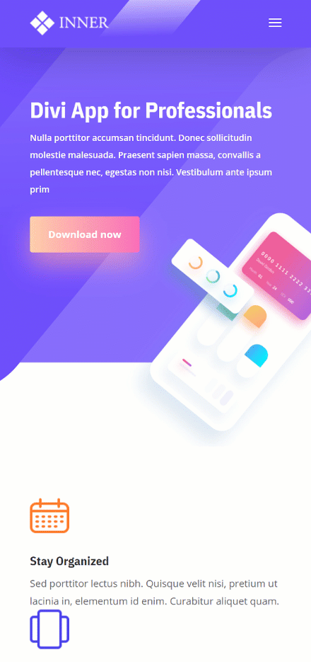
Before we dive into the tutorial, let’s take a quick look at the outcome across different screen sizes.
Desktop

Mobile
Download The Global Header Template for FREE
To lay your hands on the free global header template, you will first need to download it using the button below. To gain access to the download you will need to subscribe to our newsletter by using the form below. As a new subscriber, you will receive even more Divi goodness and a free Divi Layout pack every Monday! If you’re already on the list, simply enter your email address below and click download. You will not be “resubscribed” or receive extra emails.

1. Start Building Global Header Template
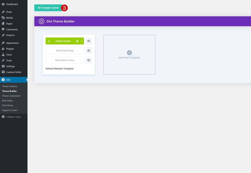
Go to Divi Theme Builder
Start by going to the Divi Theme Builder in the backend of your WordPress website and click on ‘Add Global Header’.
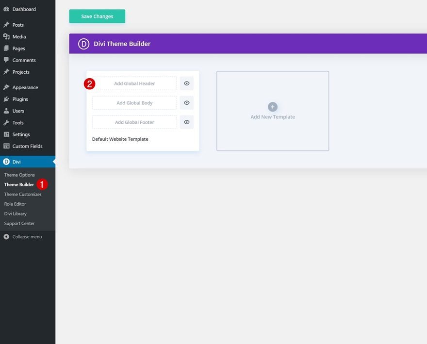
Start Building Global Header
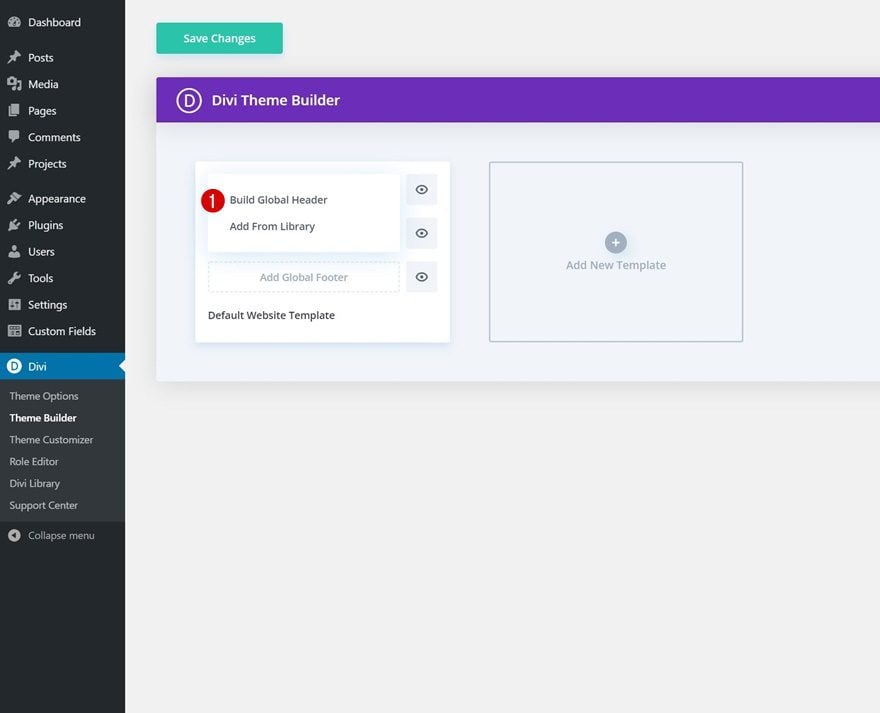
Continue by selecting the ‘Build Global Header’ option.
2. Use One Section to Build The Entire Hero Section
Section Settings
Background Color
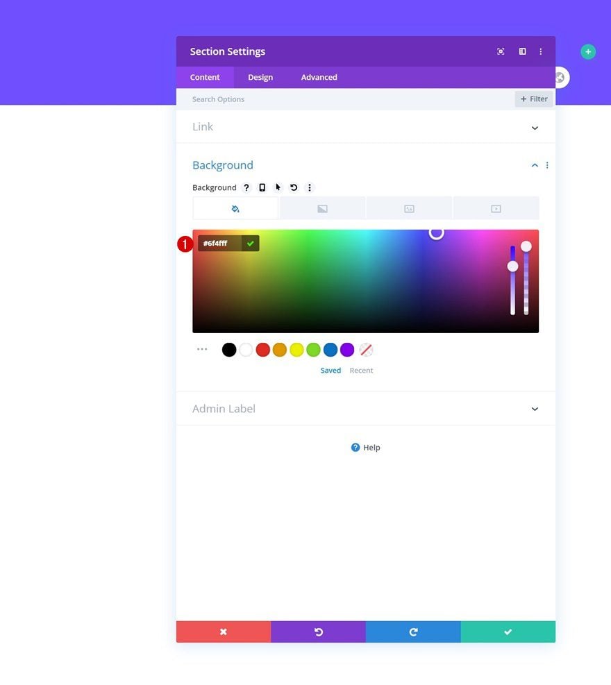
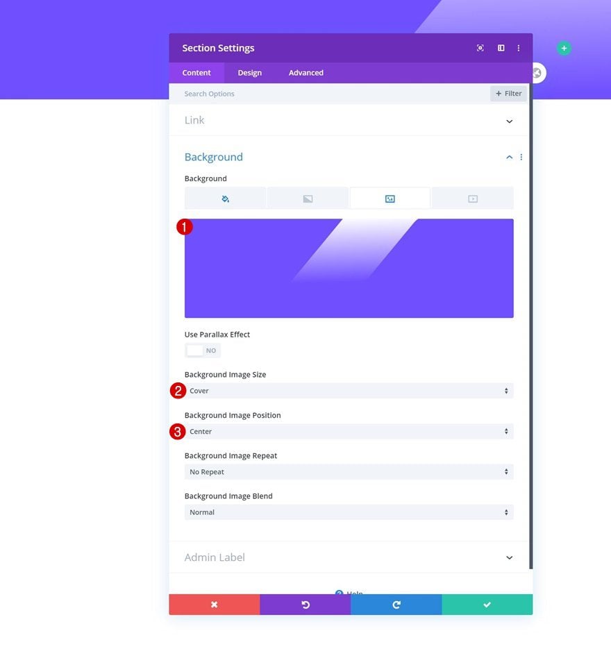
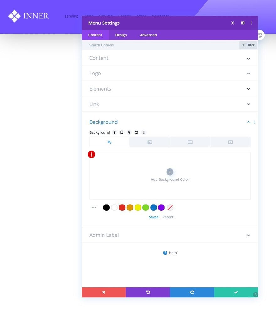
Now, in the next part of this tutorial, we’ll recreate the exact header design that was shown in the preview of this post. If you want, you can skip this part and go to the third part of this tutorial that shows you how to generate container space for your header section. If you, however, want to recreate the header section design as well, open the section settings of the section you can notice inside the template editor and add a background color.
- Background Color: #6f4fff
Background Image
Then, upload the background image you can find in the download folder that you were able to download at the beginning of this tutorial.
- Background Image Size: Cover
- Background Image Position: Center
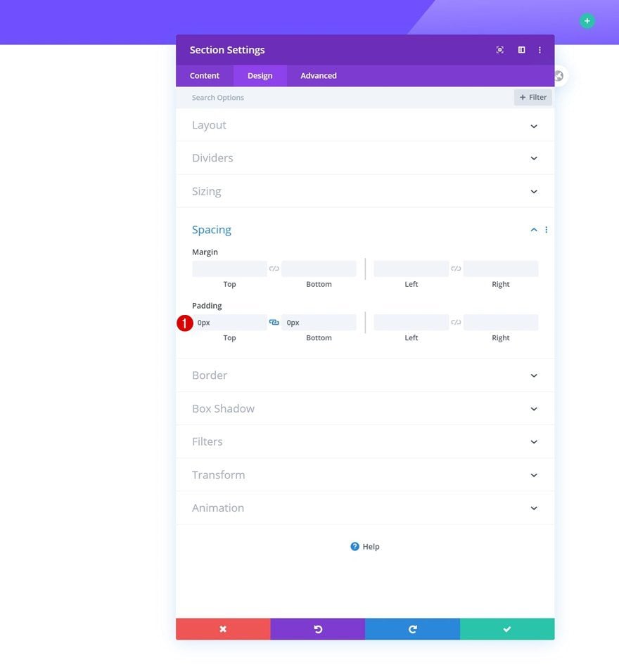
Spacing
Remove the section’s default top and bottom padding next.
- Top Padding: 0px
- Bottom Padding: 0px
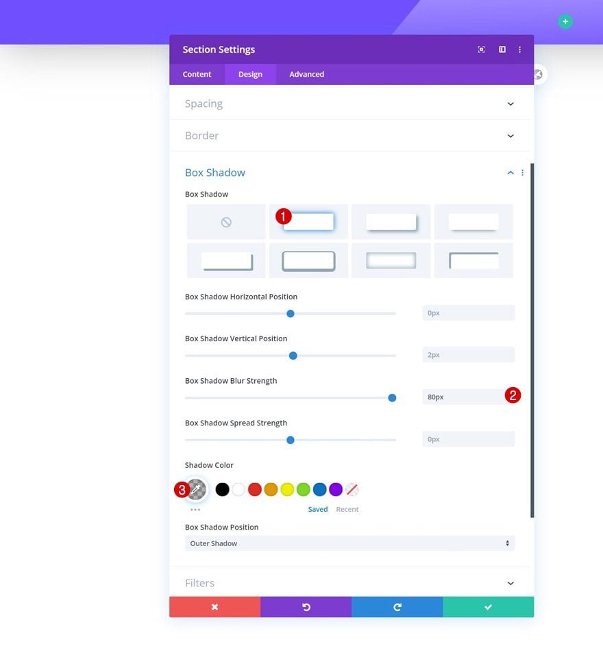
Box Shadow
We’re using a subtle box shadow too.
- Box Shadow Blur Strength: 80px
- Shadow Color: rgba(0,0,0,0.3)
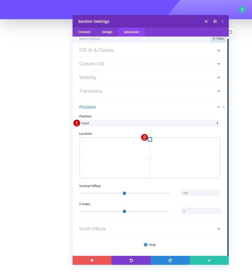
Position
And complete the settings by making the section fixed in the position settings.
- Position: Fixed
- Location: Top Center
Add New Row
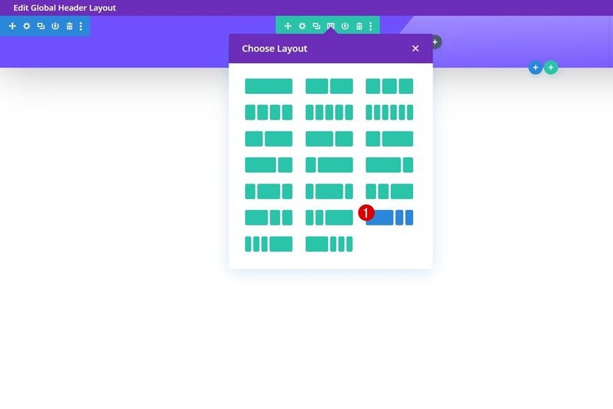
Column Structure
Once you’ve completed the section settings, continue by adding a new row using the following column structure:
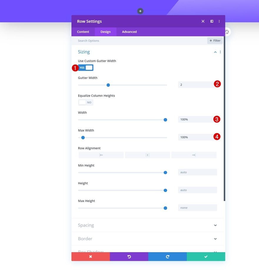
Sizing
Without adding any modules yet, open the row settings and modify the sizing settings as follows:
- Use Custom Gutter Width: Yes
- Gutter Width: 2
- Width: 100%
- Max Width: 100%
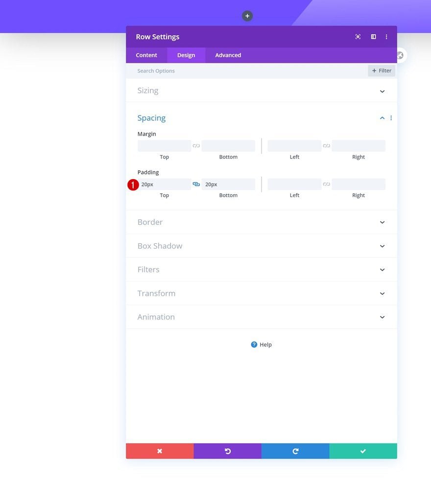
Spacing
Modify the top and bottom padding across different screen sizes next.
- Top Padding: 20px (Desktop), 0px (Tablet & Phone)
- Bottom Padding: 20px (Desktop), 0px (Tablet & Phone)
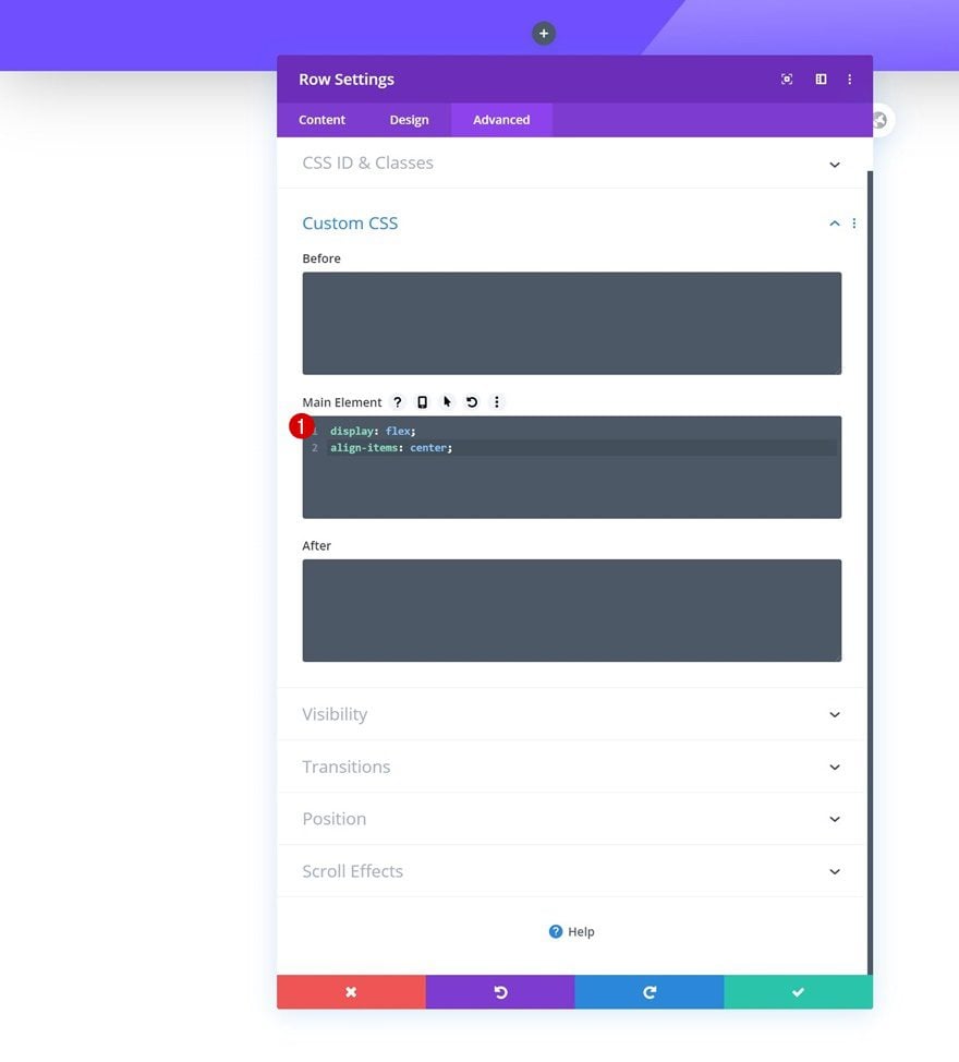
Main Element
And to align all column content, we’ll add two lines of CSS code to the row’s main element.
display: flex;
align-items: center;
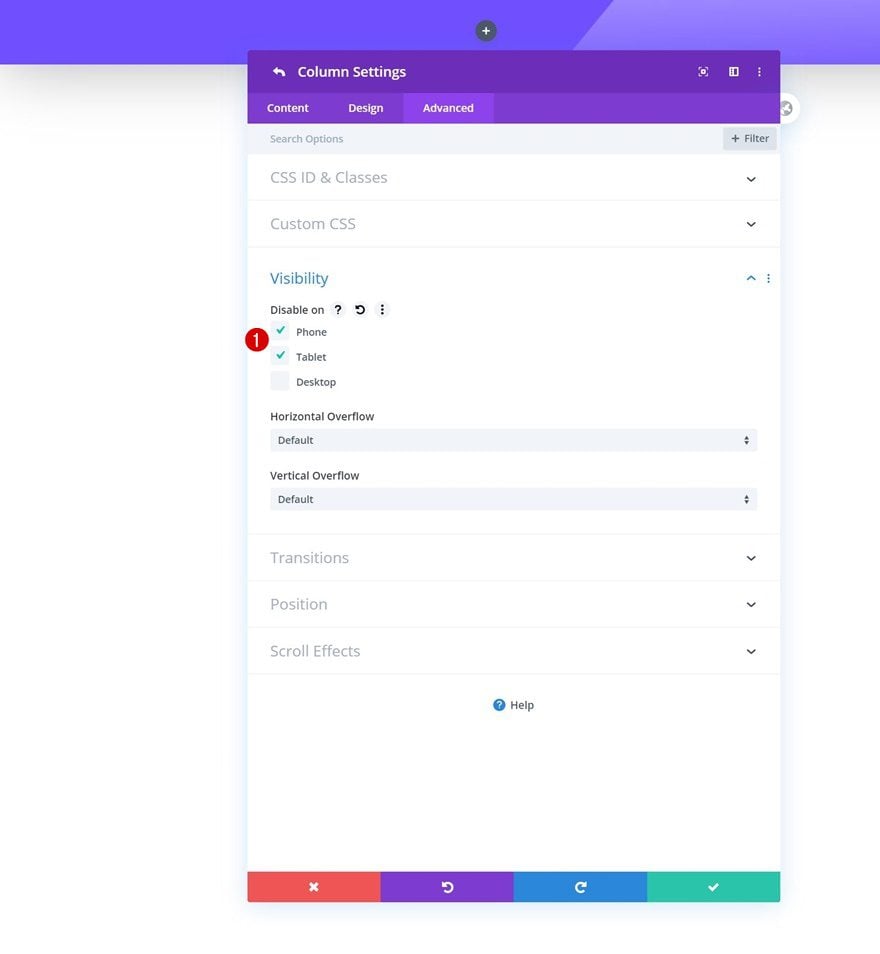
Hide Column 2 & 3 on Tablet & Phone
Last but not least, we’ll hide the second and third column on smaller screen sizes to limit the height of our header.
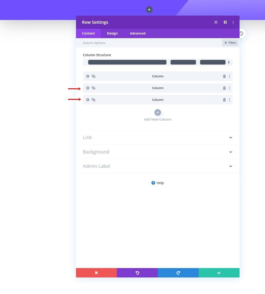
- Disable on: Phone & Tablet
Select Menu
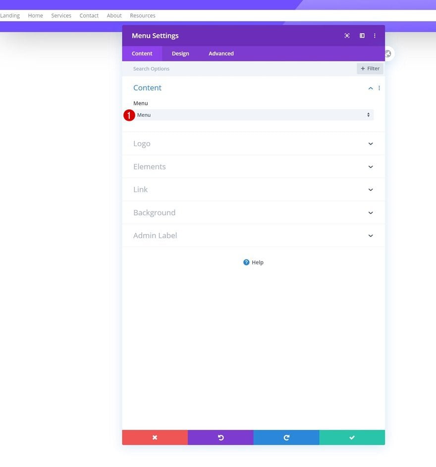
Time to add modules, starting with a Menu Module in column 1. Select a menu of your choice.
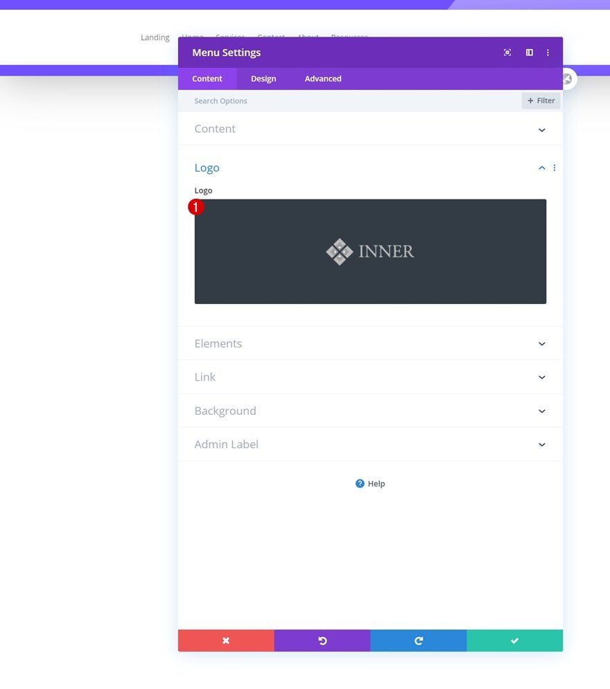
Upload Logo
Then, upload a logo.
Remove Background Color
Remove the background color next.
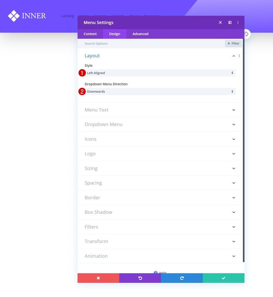
Layout
Move on to the design tab and make sure the following layout settings apply:
- Style: Left Aligned
- Dropdown Menu Direction: Downwards
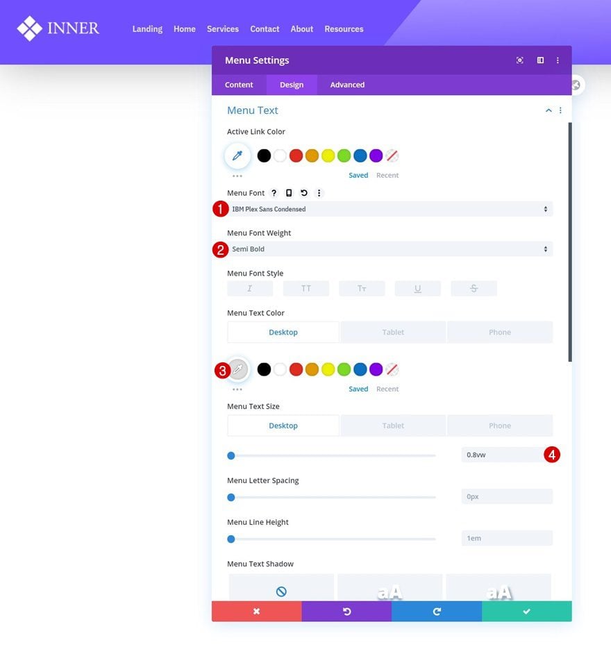
Menu Text Settings
Continue by modifying the menu text settings accordingly:
- Menu Font: IBM Plex Sans Condensed
- Menu Font Weight: Semil Bold
- Menu Text Color: #dddddd (Desktop), #6f4fff (Tablet & Phone)
- Menu Text Size: 0.8vw (Desktop), 2.5vw (Tablet), 3vw (Phone)
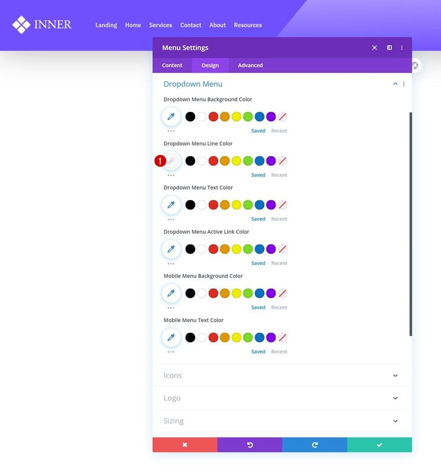
Dropdown Menu Settings
Change the dropdown menu line color next.
- Dropdown Menu Line Color: #ffffff
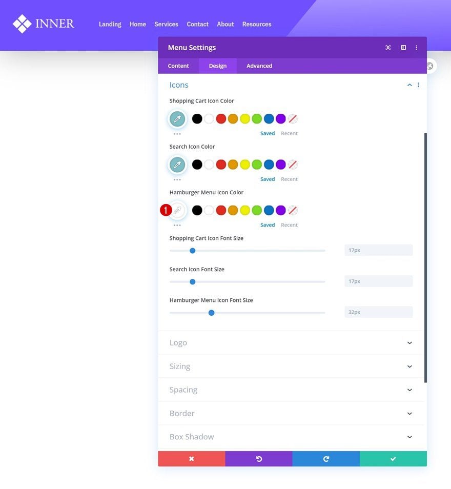
Icons Settings
And change the hamburger menu icon color too.
- Hamburger Menu Icon Color: #ffffff
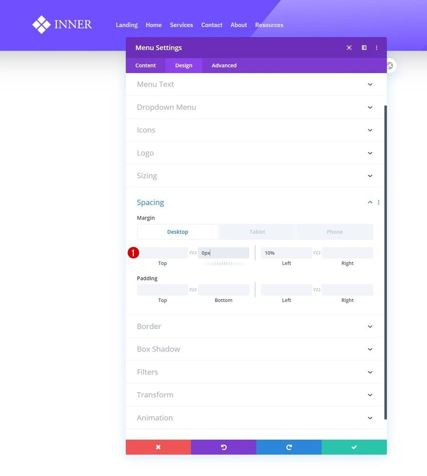
Spacing
Then, navigate to the module’s spacing settings and add some custom margin values.
- Bottom Margin: 0px
- Left Margin: 10%
- Right Margin: 10% (Tablet & Phone Only)
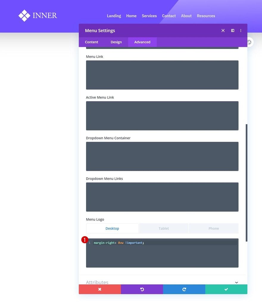
Menu Logo CSS
Complete the Menu Module settings by adding some custom right margin to the menu logo CSS settings.
Desktop:
margin-right: 8vw !important;
Tablet & Phone:
margin-right: 0px !important;
Add Text Module to Column 2
Add Content
In the second column, the only module we need is a Text Module. Add some copy of your choice.
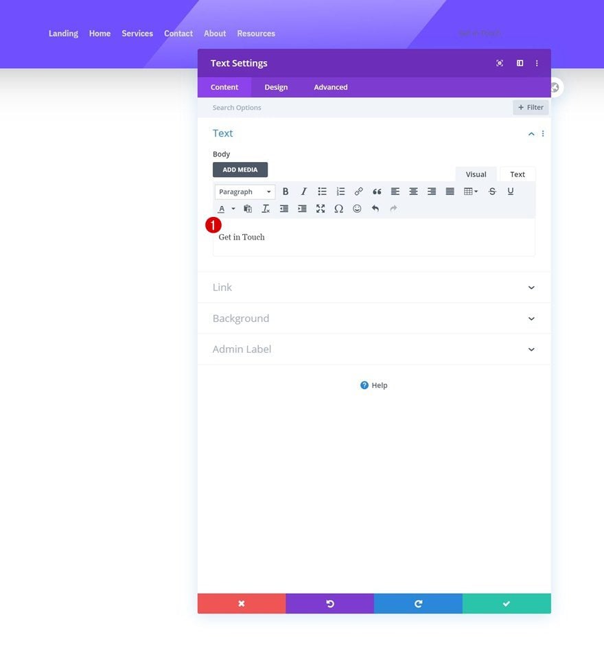
Add Link
Then, add a link.
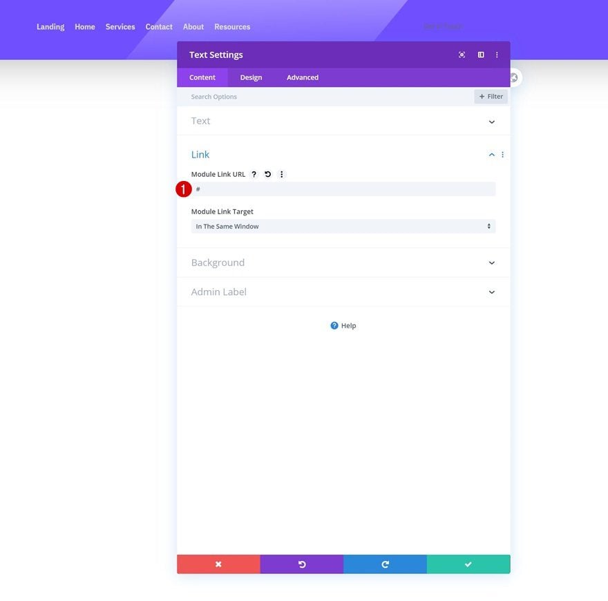
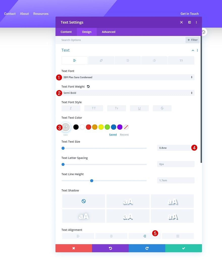
Text Settings
Move on to the module’s design tab and change the text settings as follows:
- Text Font: IBM Plex Sans Condensed
- Text Font Weight: Semi Bold
- Text Color: #dddddd
- Text Size: 0.8vw
- Text Alignment: Right
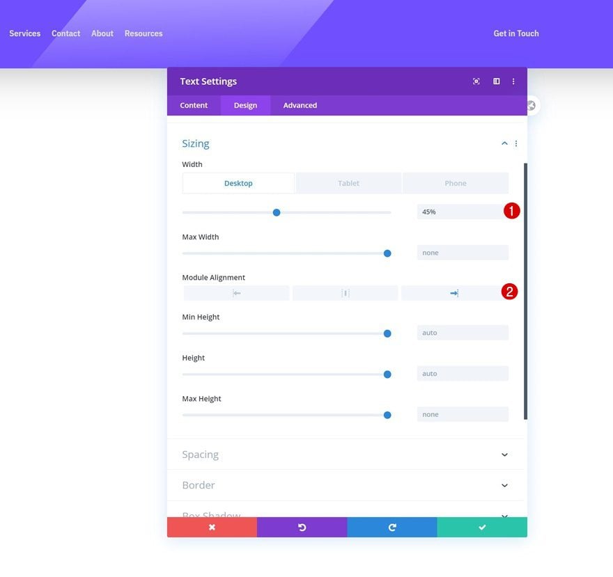
Sizing
Modify the module’s sizing settings next.
- Width: 45%
- Module Alignment: Right
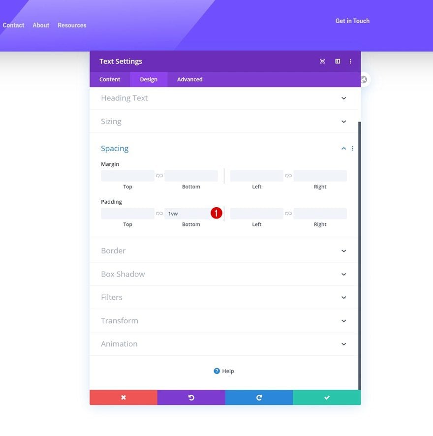
Spacing
Add some bottom padding too.
- Bottom Padding: 1vw
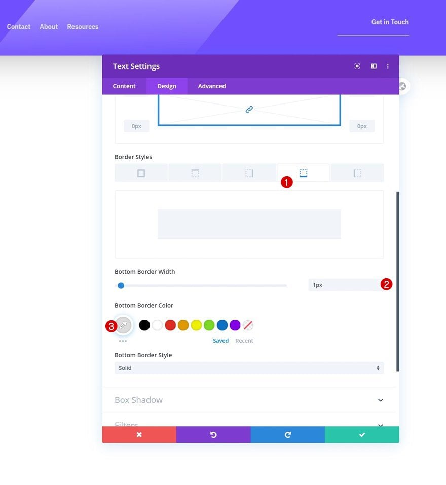
Border
Along with a bottom border.
- Bottom Border Width: 1px
- Bottom Border Color: #dddddd
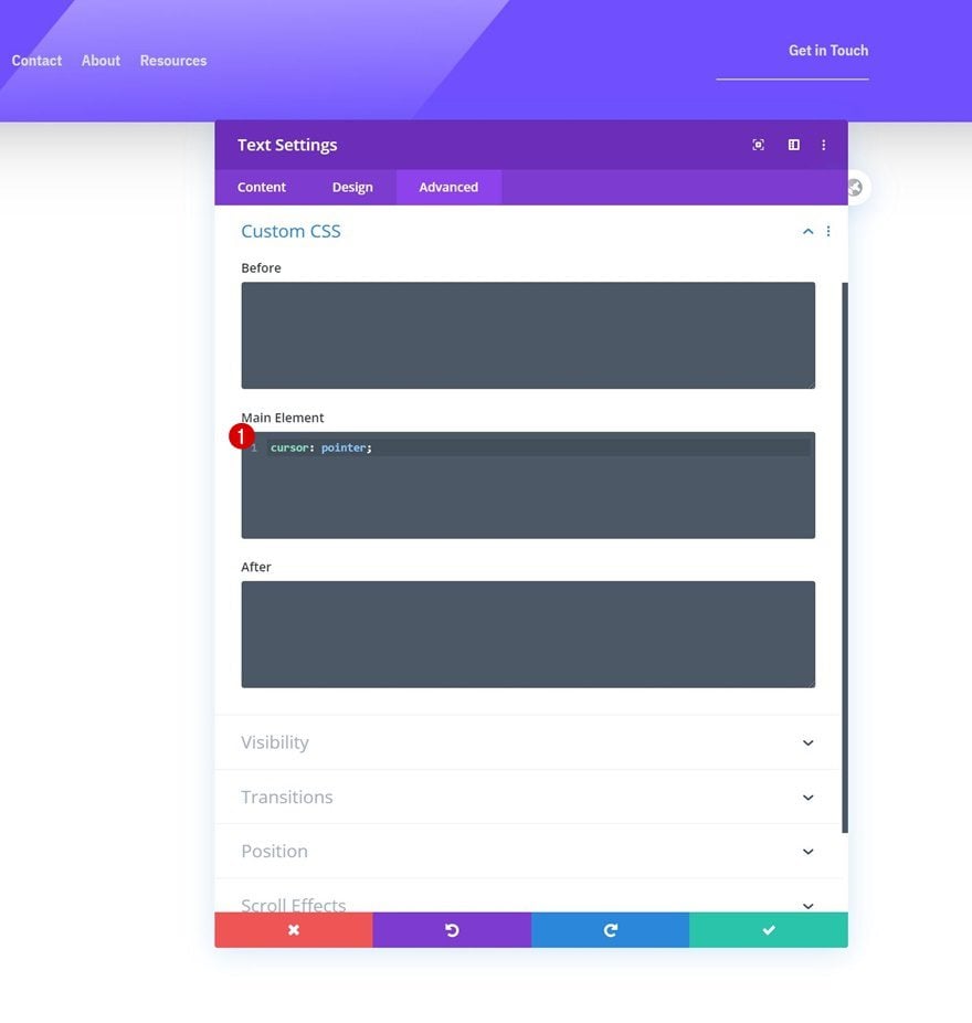
Main Element
Complete the module settings by modifying the cursor using a single line of CSS code in the module’s main element.
cursor: pointer;
Add Copy
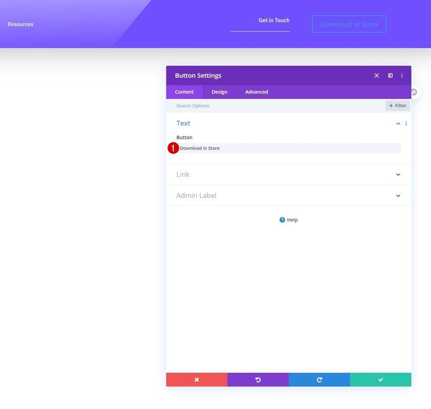
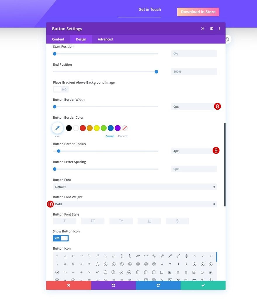
In the third module, the only module we need is a Button Module. Add some copy of your choice.
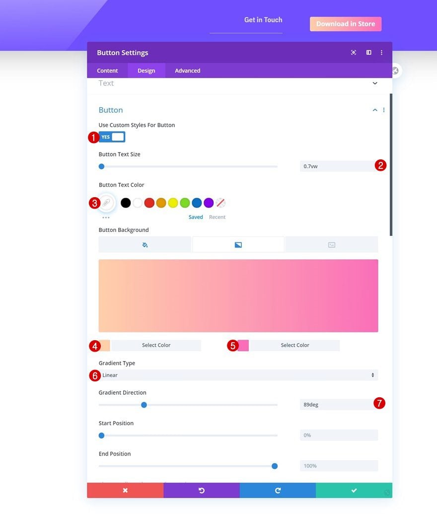
Button Settings
Move on to the module’s design tab and style the button accordingly:
- Use Custom Styles For Button: Yes
- Button Text Size: 0.7vw
- Button Text Color: #ffffff
- Gradient Color 1: #ffcfaa
- Gradient Color 2: #fa6eb9
- Gradient Type: Linear
- Gradient Direction: 89deg
- Button Border Width: 0px
- Button Border Radius: 4px
- Button Font Weight: Bold
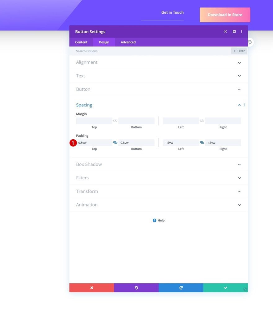
Spacing
Add some custom padding values next.
- Top Padding: 0.8vw
- Bottom Padding: 0.8vw
- Left Padding: 1.5vw
- Right Padding: 1.5vw
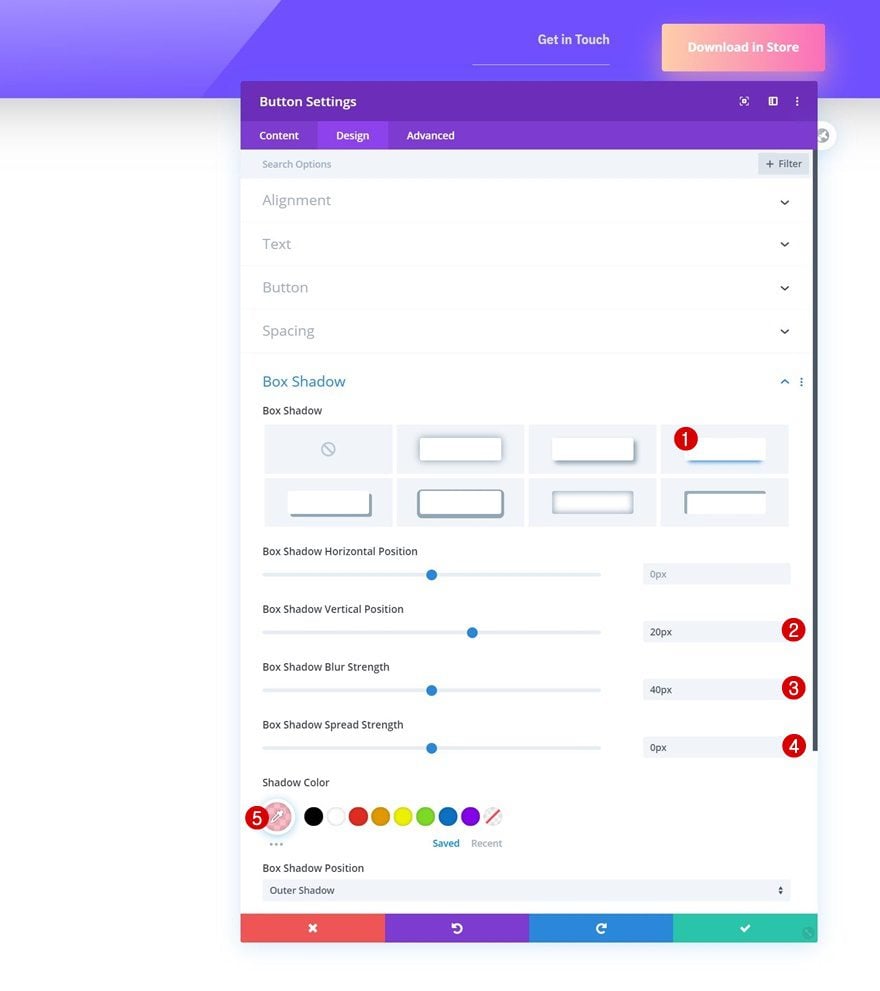
Box Shadow
And complete the module settings by adding a box shadow.
- Box Shadow Vertical Position: 20px
- Box Shadow Blur Strength: 40px
- Box Shadow Spread Strength: 0px
- Shadow Color: rgba(252,160,177,0.7)
3. Use JQuery Code to Create a Header Placeholder & Automatically Generate Container Space
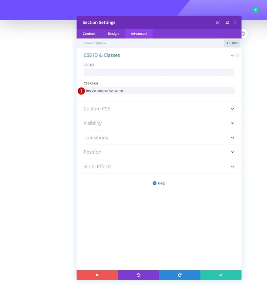
Add CSS Class to Header Section
Now that we have all our modules in place, it’s time to generate container space for the header section. To do that, we’ll need to reopen the section settings and assign a CSS class to it. We’ll use this CSS class in our JQuery code to create a placeholder around the section and calculate the section’s height.
- CSS Class: header-section-container
Add Code Module to Column 1
Time to make the magic happen! Add a Code Module to the row’s first column.
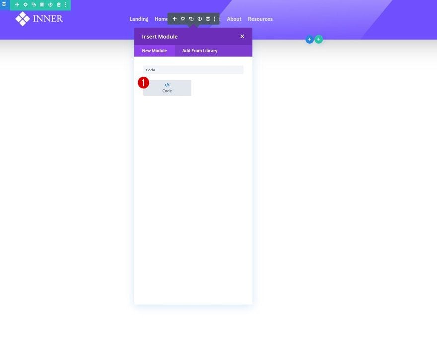
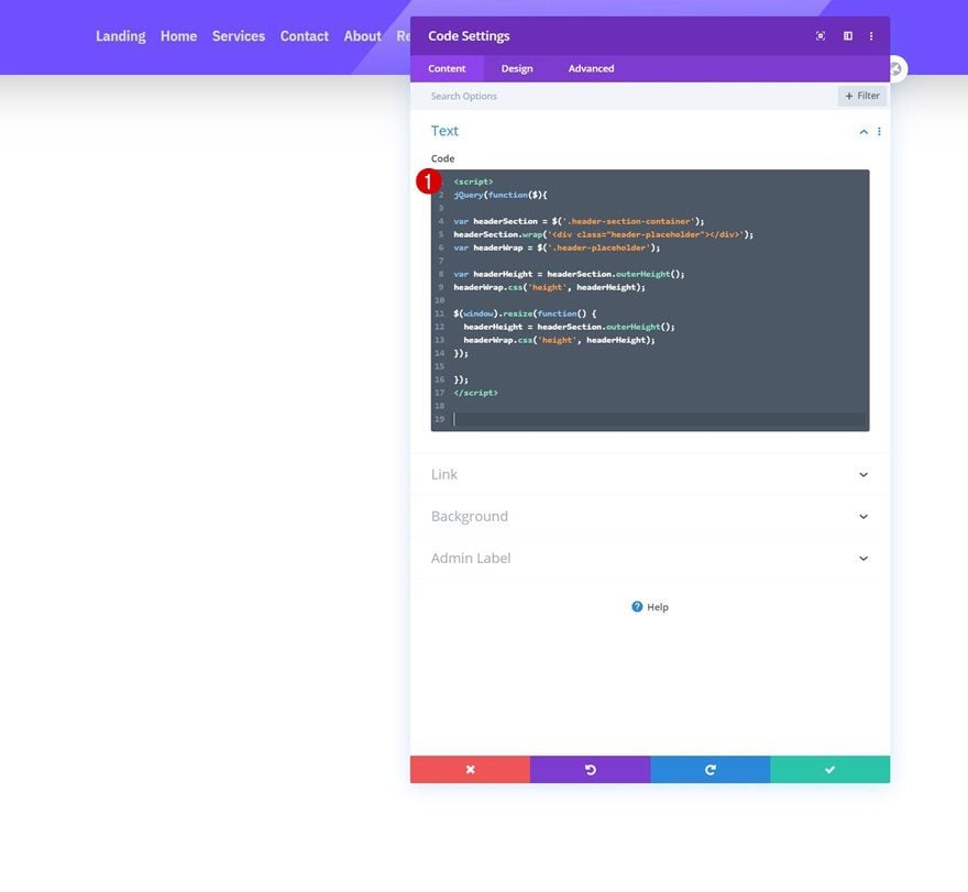
Insert JQuery Code
Place the JQuery code inside the Code Module and make sure you use script tags as you can notice in the print screen of the post.
jQuery(function($){

var headerSection = $('.header-section-container');
headerSection.wrap('<div class="header-placeholder"></div>');
var headerWrap = $('.header-placeholder');

var headerHeight = headerSection.outerHeight();
headerWrap.css('height', headerHeight);

$(window).resize(function() {
  headerHeight = headerSection.outerHeight();
  headerWrap.css('height', headerHeight);
});

});
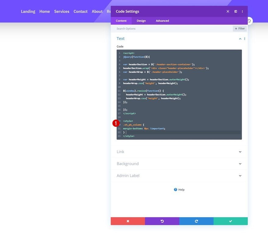
Insert CSS Code
We’ll make one additional tweak on smaller screen sizes by adding some CSS code in between style tags as well.
.et_pb_column {
margin-bottom: 0px !important;
}
4. Save All Theme Builder Changes and View Outcome on Website
The only thing left to do is save all theme builder changes and view the outcome on your website!
Preview
Now that we’ve gone through all the steps, let’s take a final look at the outcome across different screen sizes.
Desktop
Mobile
Final Thoughts
In this post, we’ve shown you how to automatically generate container space for your custom-built global header. By default, as soon as you turn an element fixed, the container space is removed and the element floats on top of your pages. This leads to an overlap with existing content at the top of your page, something which you might want to avoid. In this tutorial, we’ve used some JQuery code to automatically generate container space for your header. This code works for any kind of section header you build, as long as you add the CSS class to the section settings. You were able to download the JSON file for free as well! If you have any questions or suggestions, feel free to leave a comment in the comment section below.
If you’re eager to learn more about Divi and get more Divi freebies, make sure you subscribe to our email newsletter and YouTube channel so you’ll always be one of the first people to know and get benefits from this free content.


Is there a way to disable the jquery function on mobile view? Or change it to footer section instead of header section? I’m asking this because of the rising demand of mobile navigations at the bottom of websites.
Regardless of where I try to import the json file, it either rejects it with “This file should not be imported in this context.” or it hangs and just sits there. In the Support Centre, everything appears to be correct.
Same.
Can you explain the JQuery?
Wow, I released an oddly similar tutorial a few days ago. But my code is simpler and works automatically without adding any CSS classes, if anyone wants that you can go to my Divi blog at Pee-Aye Creative.
This worked while on my local environment. Soon as I tried to implement it on a live site (several) it wasn’t working. There is a bug in the Builder regarding the z-index an the positioning setting. Even though I tried this jQuery method, it did not work, the navigation header did not stay on top of the content of the page. Putting a z-index on the section as 999999…did not work. This is in the Builder global heading. I ended up copying the layout of the section with my rows and modules for the layout into the Divi Library. Then deleting the Global Heading in the Builder. Display none the #main-header. On each page, I added the saved navigation section to the top of the page adding the z-index, deleted out the jQuery code from this post. This works. Found the same problem with the Global Footer in the Builder, if the layout of your footer is high enough, the navigation falls under the footer content, not staying above the footer content. Like I said, there is a bug in the Builder regarding the Global Header and Footer…z-index/positioning issues.
The author expects everyone using Divi to understand what Container Space means. There is NOT even an explanation or illustration as to how the Header will look like without the Container Space. To me, the demo looks exactly what Divi can do even without all the codes that the author suggested. Of course I know I’m mistaken. It’s because as a layman I can’t see the difference between Container and No Container simply by words.
So without this tutorial, the top of your page will go behind the header menu. Example, if your menu is 100px high, 100px of your first section will be cut off by the menu. This is the case if you’re using the Divi Theme Builder for your menu. If you’re not using the Theme Builder for this this generally isn’t an issue.
This should be a feature built into Divi’s Theme Builder already. Hopefully they’re working on that.
I agree. There was never an example of what the problem looked like, only what it looked like after the rigmarole. Which, as you said, looks exactly like what we’ve come to expect Divi always does.
I find often that terms are not explained under the assumption that all of us should know certain things. Which, obviously, we don’t.
Shouldn’t this be a simple option in the theme builder? To switch on or off? I
Wow, I didn’t know all of that. Cool! I love WP but sometimes it’s hard to imagine how big sites can be run with it. Your post shows that it’s really possible
Does this still work if I have two or more sections in the header? If so, should all sections in the header have the class .header-section-container?
Same Problem =)