
Your header is one of the most important parts of your website. It connects your pages, posts and calls to action. It’s also one of the things your visitors automatically go looking for, so they don’t waste any time finding what they’re looking for. If you’re looking for a way to emphasize your header, you’ll enjoy this post. We’ll show you how to animate your custom-built global header using Divi’s Theme Builder. The possibilities are endless, but we’ll show you two animation examples that you can get started with right away. You’ll be able to download the JSON files for free as well!
Let’s get to it.
Preview
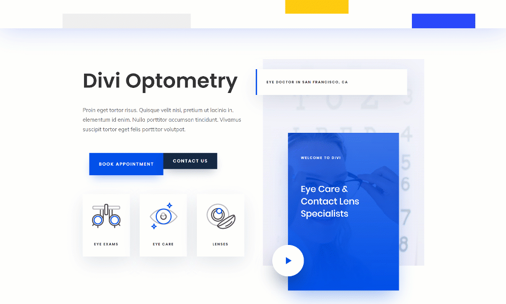
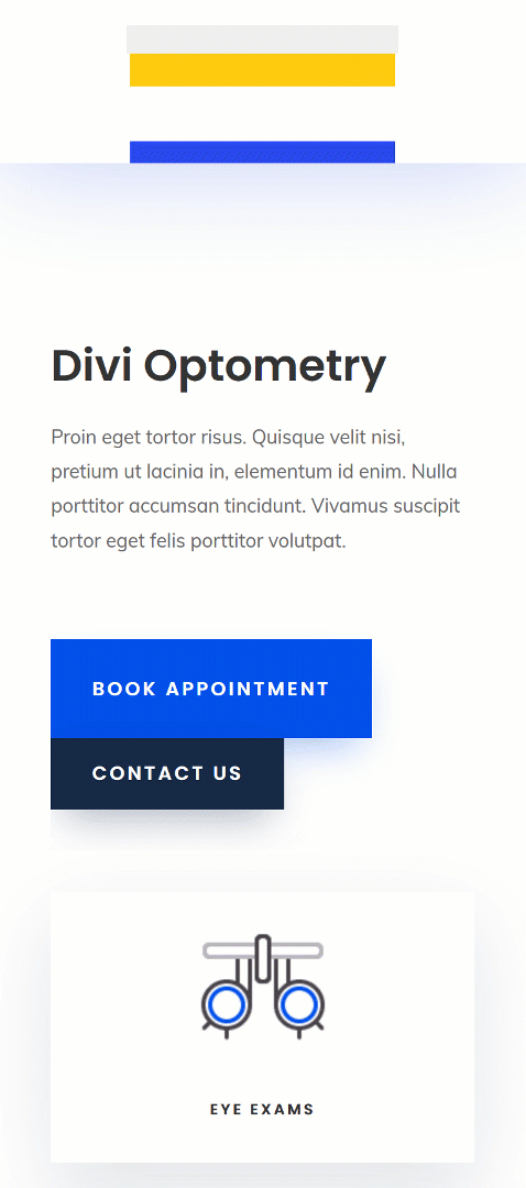
Before we dive into the tutorial, le’ts take a quick look at the two examples across different screen sizes.
Example #1
Desktop
Mobile
Example #2
Desktop
Mobile
Download The Animated Global Header for FREE
To lay your hands on the free animated global header, you will first need to download it using the button below. To gain access to the download you will need to subscribe to our newsletter by using the form below. As a new subscriber, you will receive even more Divi goodness and a free Divi Layout pack every Monday! If you’re already on the list, simply enter your email address below and click download. You will not be “resubscribed” or receive extra emails.

Subscribe To Our Youtube Channel
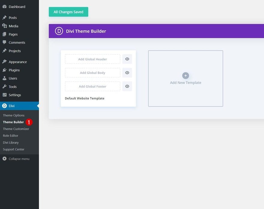
1. Go to Divi Theme Builder & Start Building Global Header
Go to Divi Theme Builder
Start by going to the Divi Theme Builder in your WordPress backend.
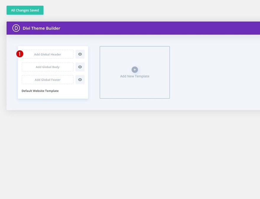
Build Global Header From Scratch
Click on ‘Add Global Header’ and continue by selecting ‘Build Global Header’.
2. Build Global Header Block Design
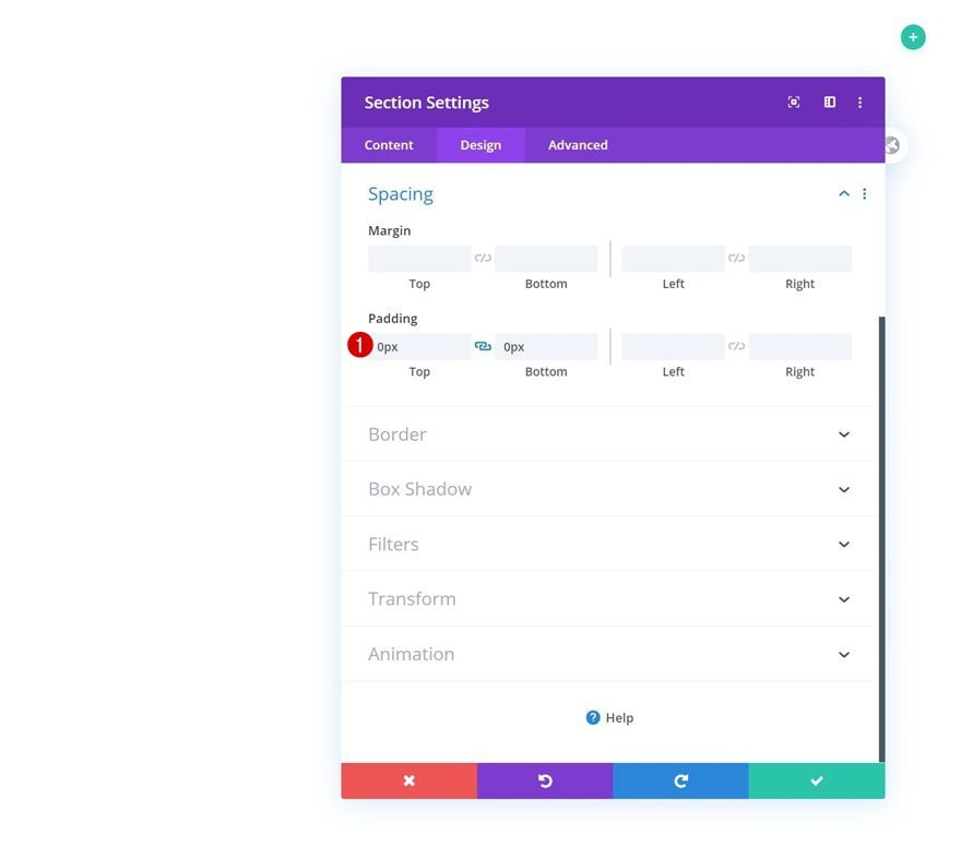
Section Settings
Spacing
Once you’re inside the template editor, you can start building the global header. We’re making sure we have a ‘block’ design going on so that we can, later on, add animations to two different containers; column + module. Open the section you can notice inside the template editor and remove all default top and bottom padding.
- Top Padding: 0px
- Bottom Padding: 0px
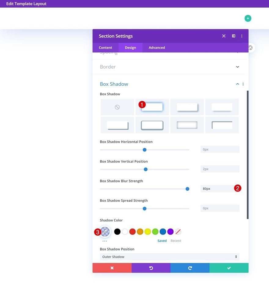
Box Shadow
Add a box shadow next.
- Box Shadow Blur Strength: 80px
- Shadow Color: rgba(13,60,216,0.24)
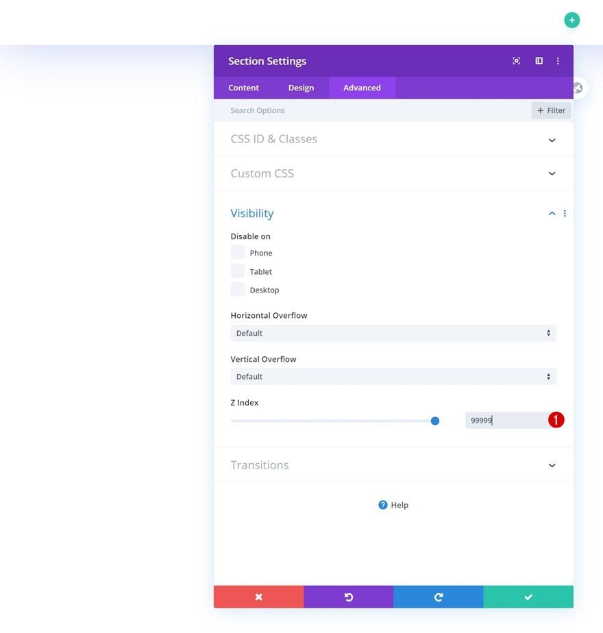
Z Index
And make sure you increase the section’s z index in the advanced tab too. This will make sure the global header content will appear on top of all page/post content.
- Z Index: 99999
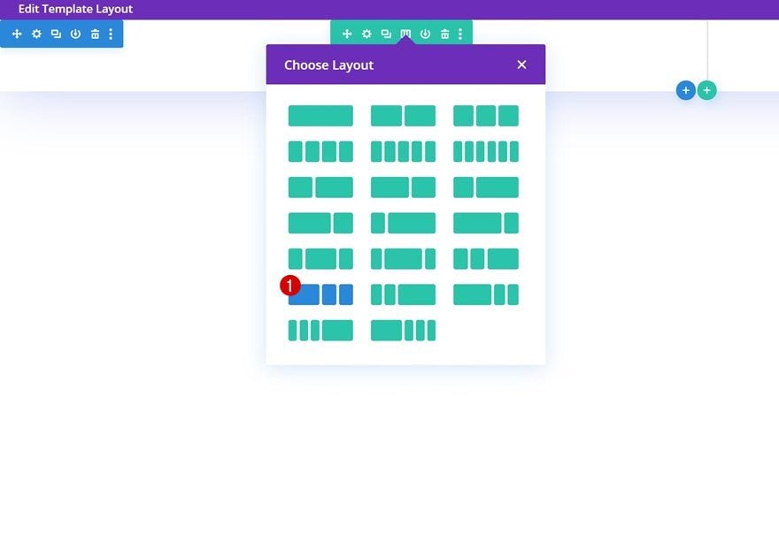
Add New Row
Column Structure
Continue by adding a new row to the section using the following column structure:
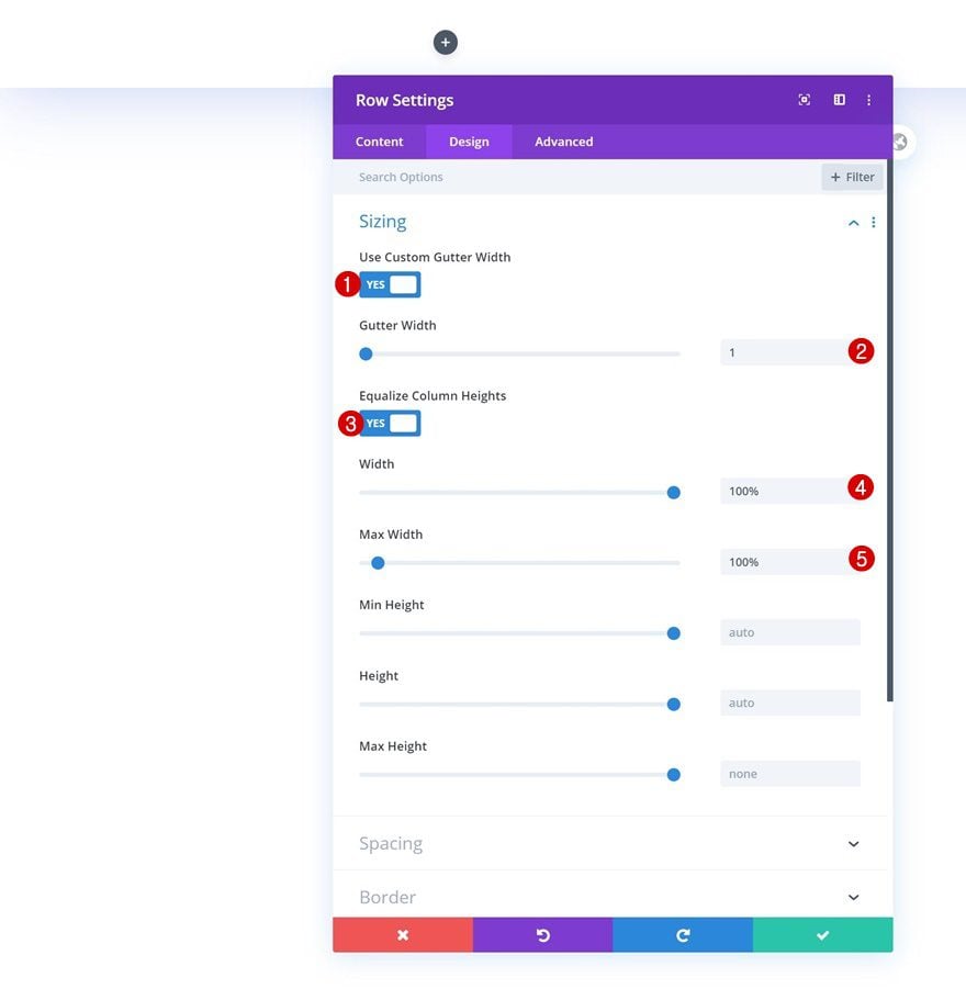
Sizing
Without adding any modules yet, open the row settings and allow the row to take up the screen’s entire width.
- Use Custom Gutter Width: Yes
- Gutter Width: 1
- Equalize Column Heights: Yes
- Width: 100%
- Max Width: 100%
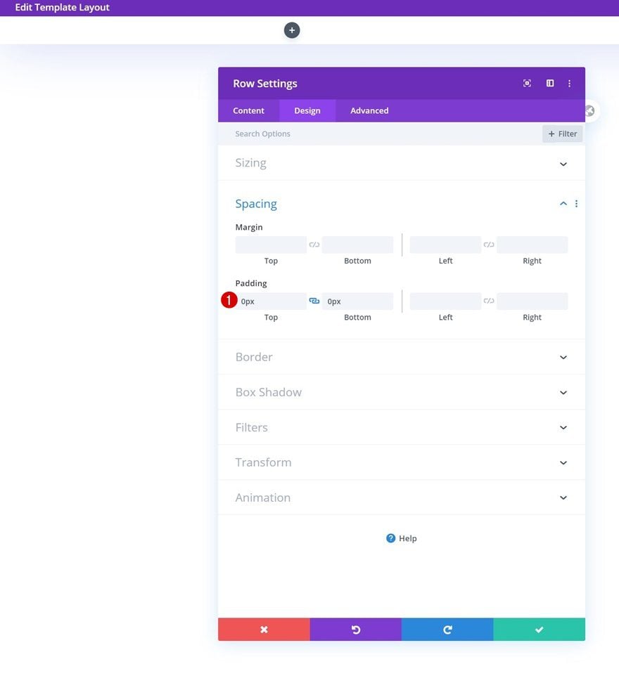
Spacing
Remove all default top and bottom padding next.
- Top Padding: 0px
- Bottom Padding: 0px
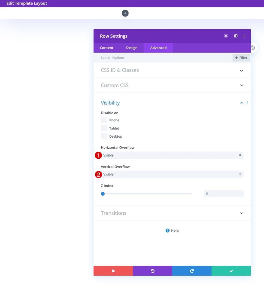
Visibility
Make sure you set the row’s overflows to ‘visible’ too.
- Horizontal Overflow: Visible
- Vertical Overflow: Visible
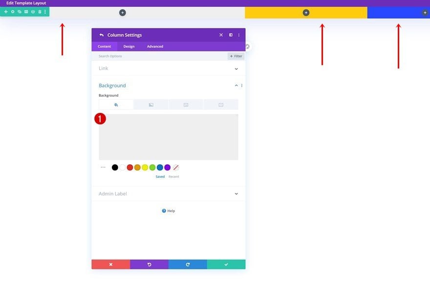
Column Settings (All Three)
Background Color
Once you’ve completed the row settings, you’ll need to style the columns as well. Open each one of the columns and change their background color accordingly:
- Column 1 Background Color: #efefef
- Column 2 Background Color: #ffcb0f
- Column 3 Background Color: #2848ff
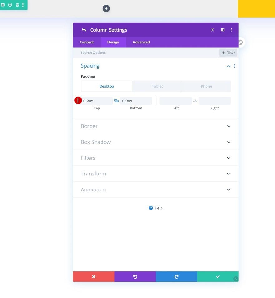
Spacing
Add some custom top and bottom padding to each column as well.
- Top Padding: 0.5vw (Desktop), 1vw (Tablet & Phone)
- Bottom Padding: 0.5vw (Desktop), 1vw (Tablet & Phone)
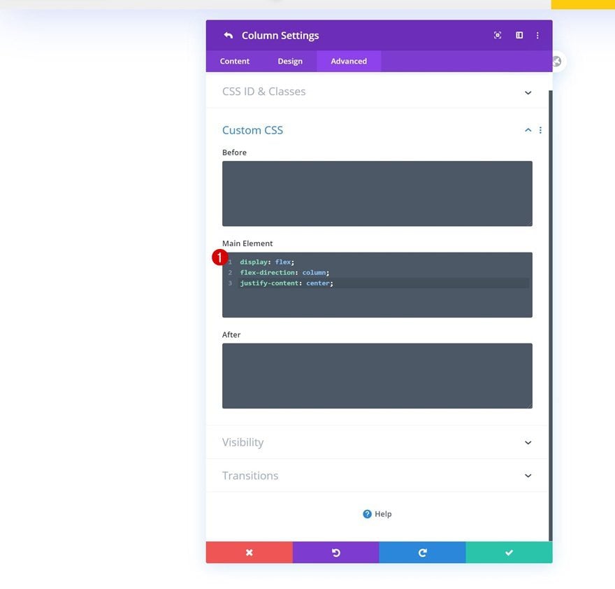
Main Element
And to make sure all column content is centered vertically, we’ll add three lines of CSS code to each column’s main element.
display: flex;
flex-direction: column;
justify-content: center;
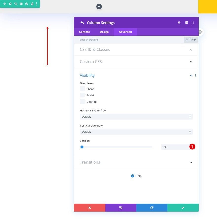
Column 1 Z Index
Last but not least, open the column 1 settings and increase the z index in the visibility settings.
- Z Index: 10
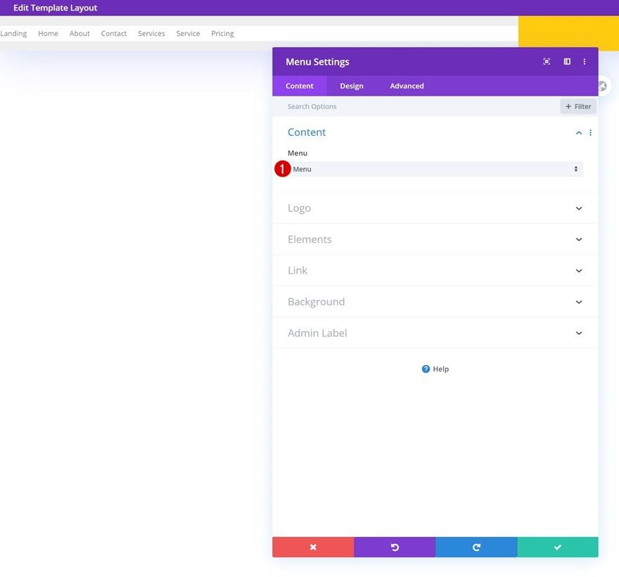
Select Menu
Time to add modules, starting with a Menu Module in column 1. Select a menu of your choice.
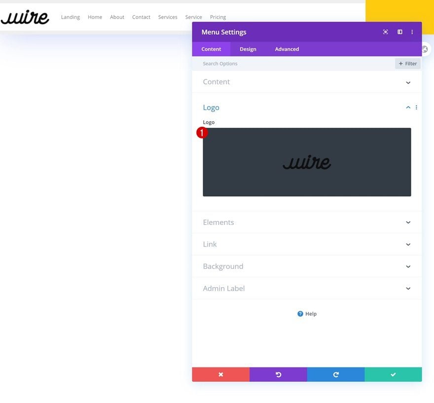
Upload Logo
Upload your logo next.
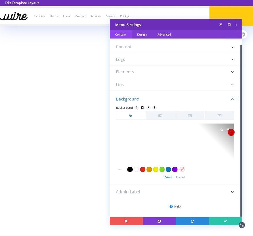
Remove Background
Continue by removing the module’s background color.
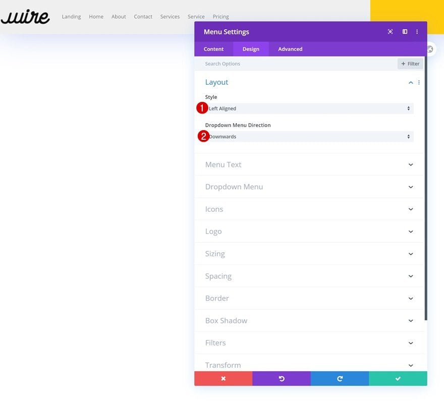
Layout
Move on to the design tab and make sure the following settings apply to the layout:
- Style: Left Aligned
- Dropdown Menu Direction: Downwards
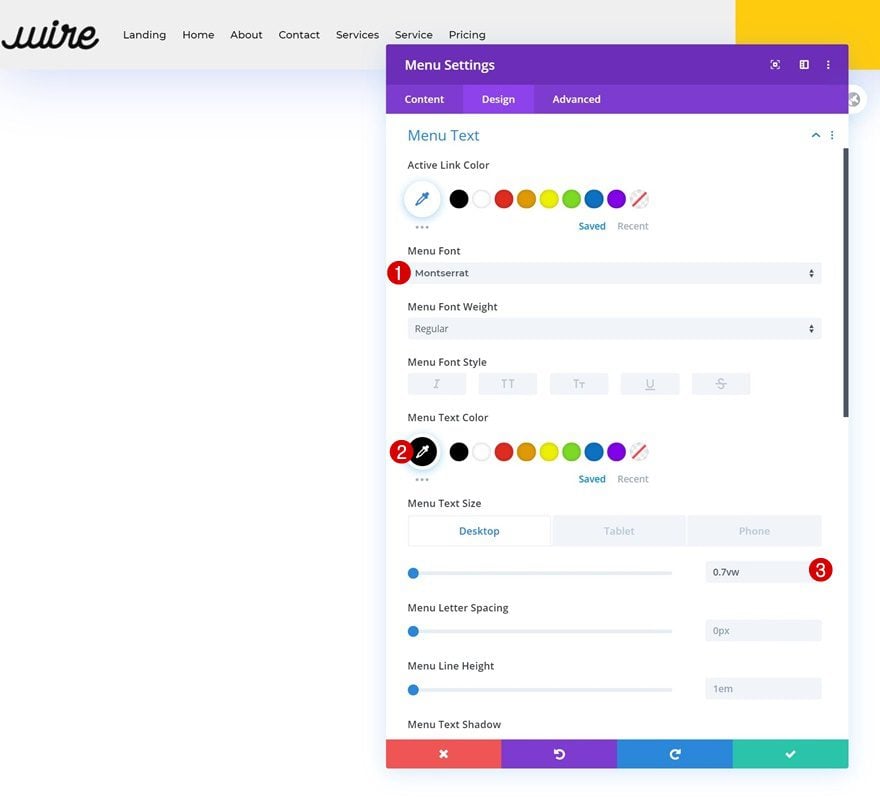
Menu Text Settings
Style the text settings next:
- Menu Font: Montserrat
- Menu Text Color: #000000
- Menu Text Size: 0.7vw (Desktop), 2vw (Tablet), 3vw (Phone)
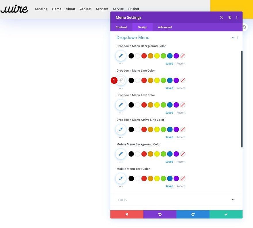
Dropdown Menu Settings
Along with the dropdown menu settings.
- Dropdown Menu Line Color: #ffffff
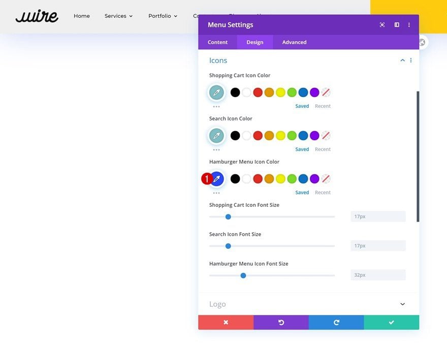
Icons Settings
And change the hamburger menu icon color too.
- Hamburger Menu Icon Color: #2848ff
Sizing
Continue by changing the logo max width across different screen sizes.
- Logo Max Width: 6vw (Desktop), 9vw (Tablet), 13vw (Phone)
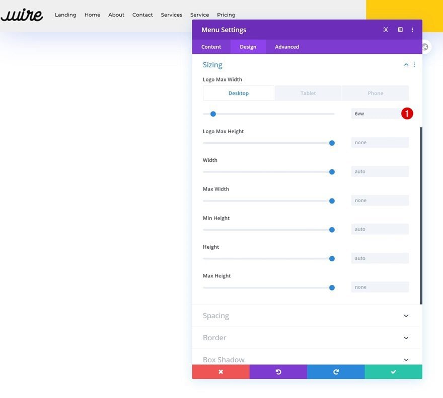
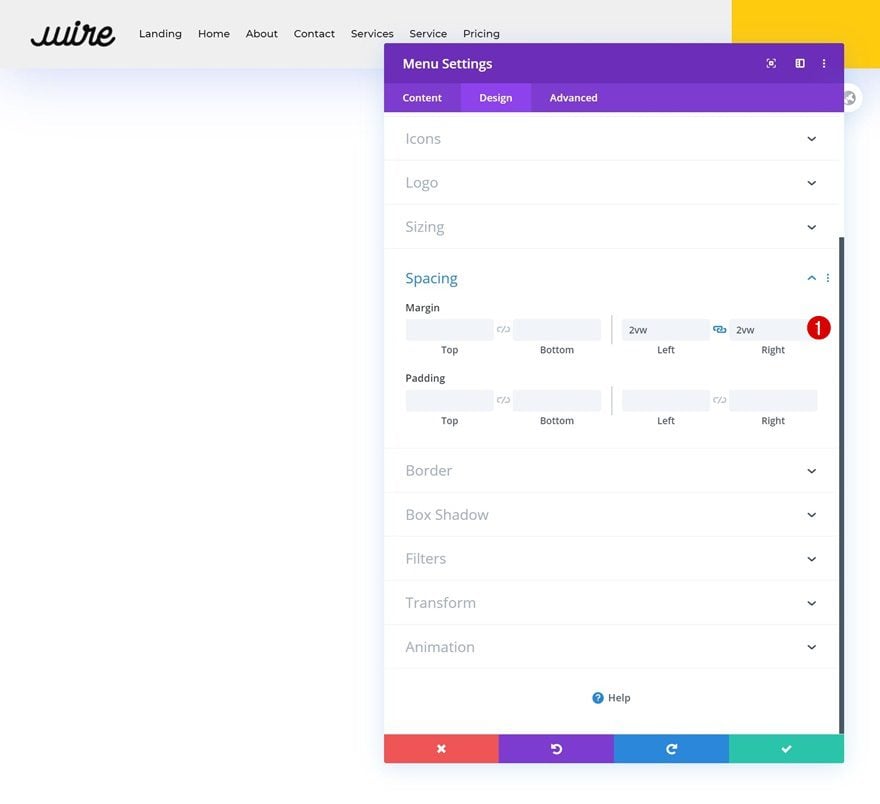
Spacing
And complete the module’s settings by adding some left and right margin.
- Left Margin: 2vw
- Right Margin: 2vw
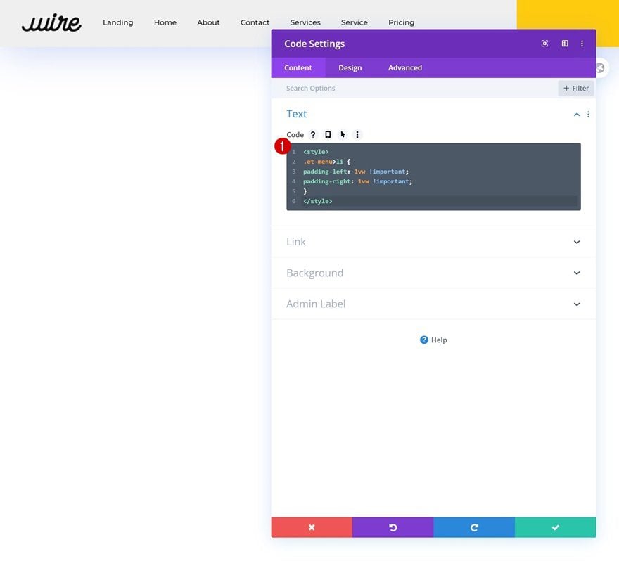
Add Code Module to Column 1
Insert CSS Code for VW Responsiveness
Now, in the menu module, we’ve used the viewport width unit for our text size and spacing values. We did this to make sure you can place up to 8 menu items across different desktop screen sizes, without it splitting up into two lines. We’ll need to make sure the space between the menu items is created with the vw unit as well. To do that, we’ll add a Code Module to column 1 and insert the following lines of CSS code:
<style>
.et-menu>li {
padding-left: 1vw !important;
padding-right: 1vw !important;
}
</style>
Add Social Networks
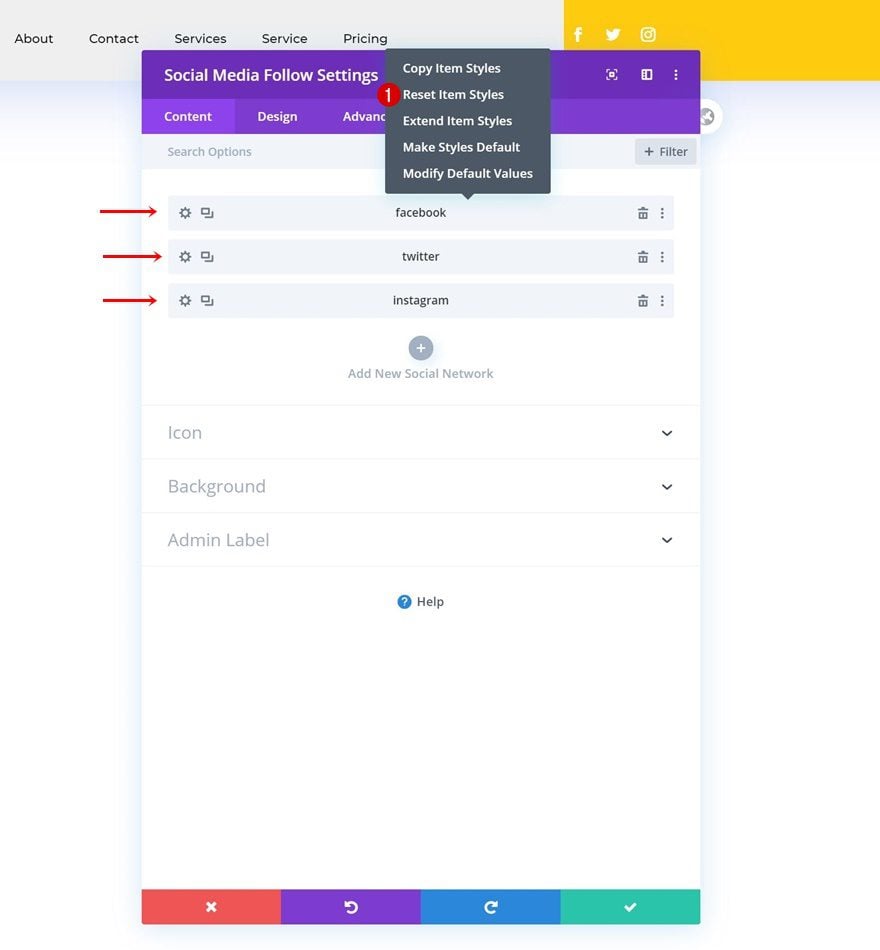
On to the next column, there, we’ll need a Social Media Follow Module. Add the social networks of your choice.
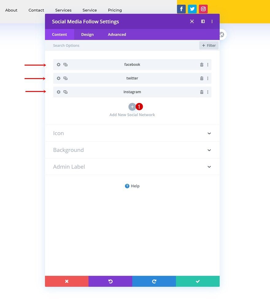
Reset Social Network Styles Individually
Continue by resetting each network’s settings.
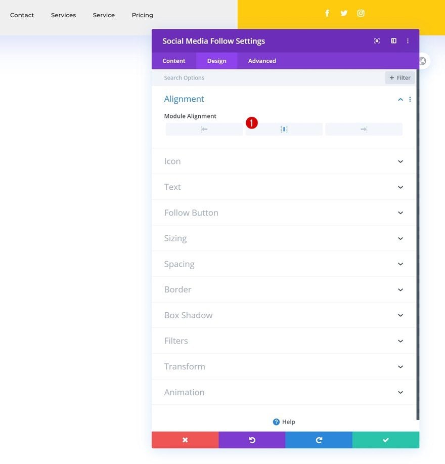
Alignment
Complete the module’s settings by changing the module alignment.
- Module Alignment: Center
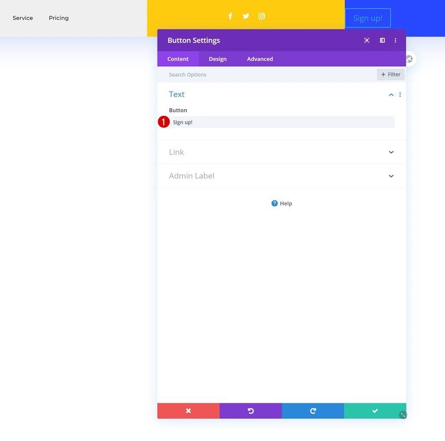
Add Copy
On to the next and last column. There, we’ll only need a Button Module. Add some copy of your choice.
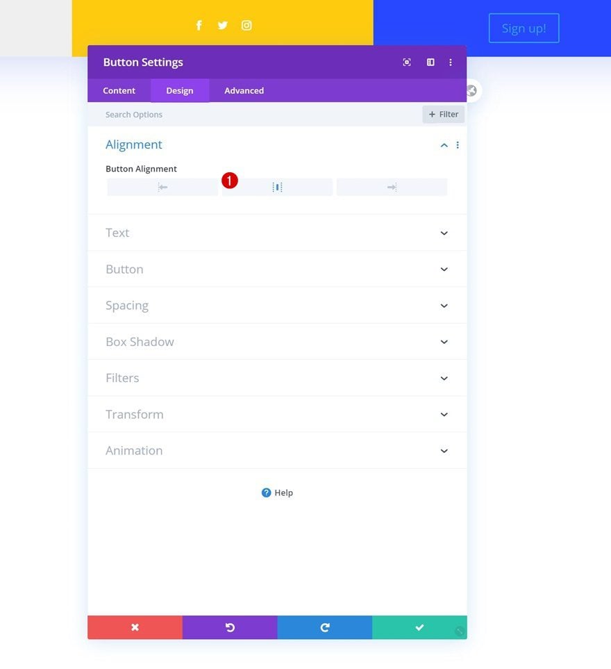
Alignment
Move on to the design tab and change the button alignment.
- Button Alignment: Center
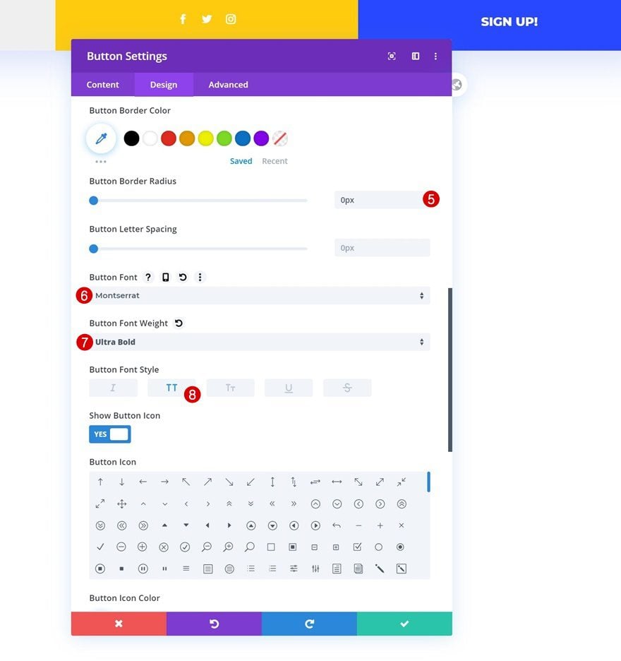
Button Settings
Complete the module’s settings by styling the button.
- Use Custom Styles For Button: Yes
- Button Text Size: 1vw (Desktop), 1.2vw (Tablet), 2vw (Phone)
- Button Text Color: #ffffff
- Button Border Width: 0px
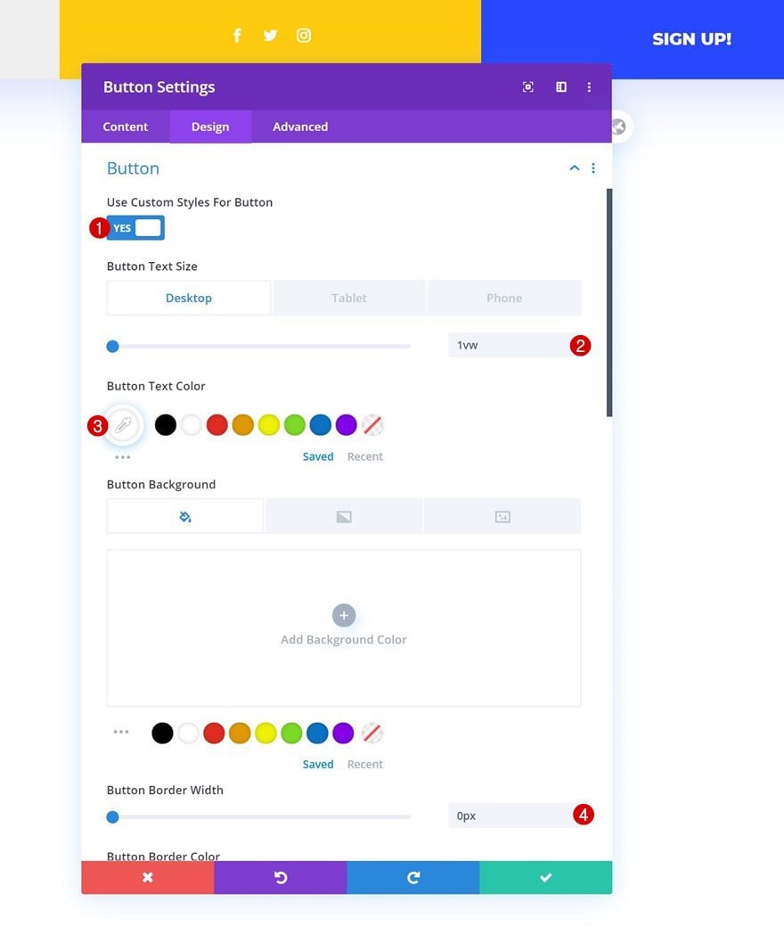
- Button Border Radius: 0px
- Button Font: Montserrat
- Button Font Weight: Ultra Bold
- Button Font Style: Uppercase
3. Add Matching Animation to Elements
Global Header Animation Combo #1
Column 1 Animation
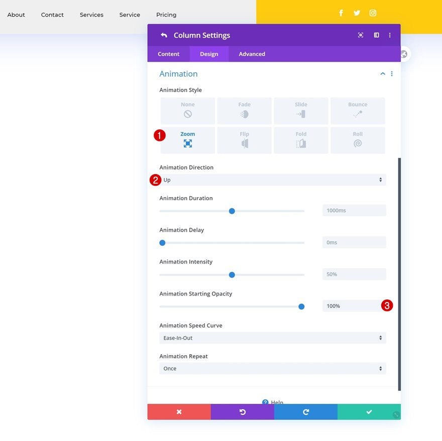
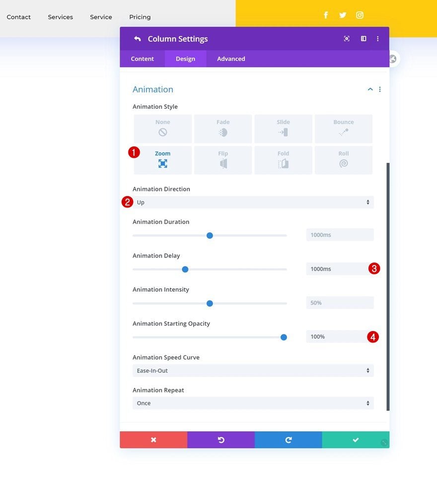
Now that we’ve built the global header, it’s time to add the animations! To recreate the first animation, open the column 1 settings and add the following animation:
- Animation Style: Zoom
- Animation Direction: Up
- Animation Starting Opacity: 100%
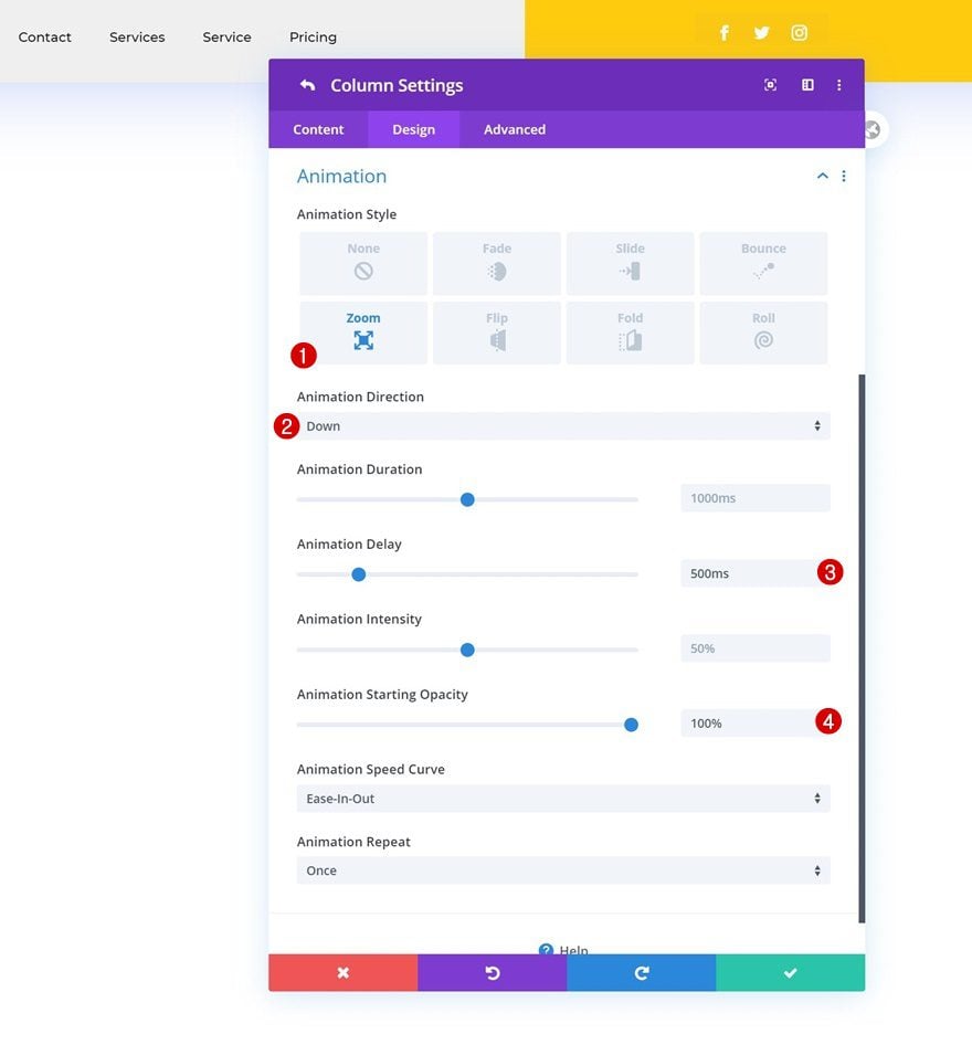
Column 2 Animation
Add the following animation settings to column 2 next:
- Animation Style: Zoom
- Animation Direction: Down
- Animation Delay: 500ms
- Animation Starting Opacity: 100%
Column 3 Animation
Complete the column settings by assigning the following animation to column 3:
- Animation Style: Zoom
- Animation Direction: Up
- Animation Delay: 1000ms
- Animation Starting Opacity: 100%
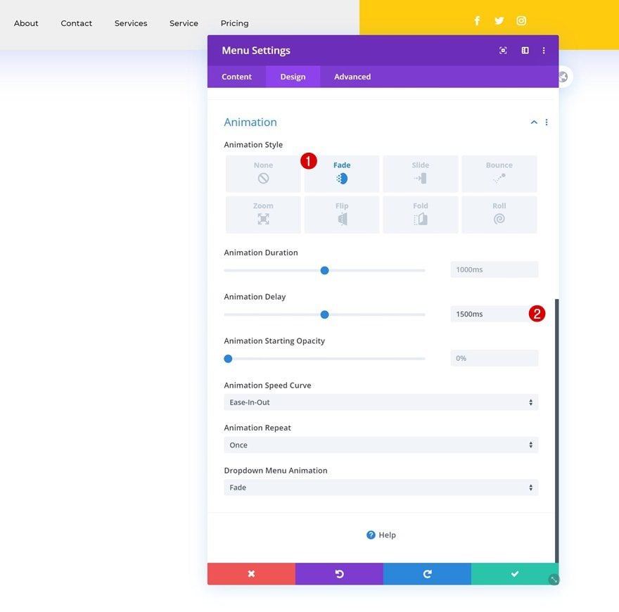
Module Animations (All Three Modules)
Once you’ve completed the column settings, open each one of the modules individually and use the following animation for them:
- Animation Style: Fade
- Animation Delay: 1500ms
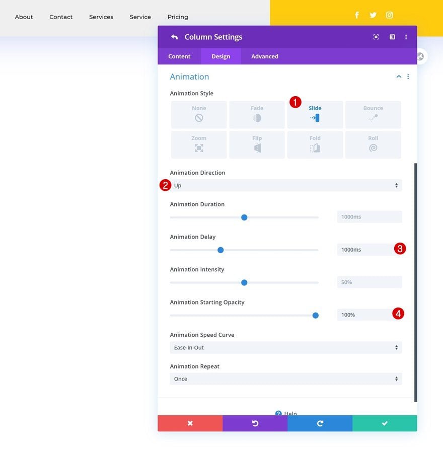
Global Header Animation Combo #2
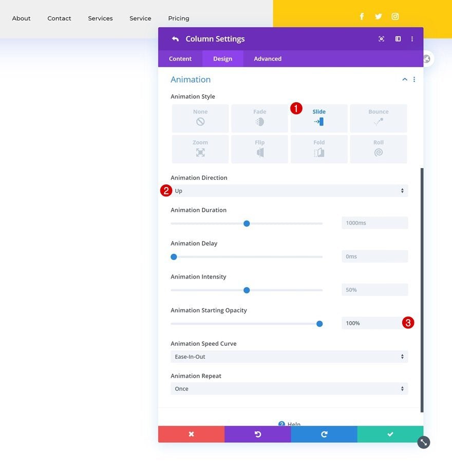
Column 1 Animation
Want to recreate the second animation set instead? Open the column 1 settings and add the following animation:
- Animation Style: Slide
- Animation Direction: Up
- Animation Starting Opacity: 100%
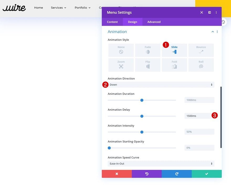
Column 2 Animation
Use the following animation settings for column 2 next:
- Animation Style: Slide
- Animation Direction: Up
- Animation Delay: 500ms
- Animation Starting Opacity: 100%
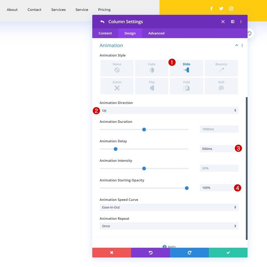
Column 3 Animation
And complete the column settings by applying the following animation settings to column 3:
- Animation Style: Slide
- Animation Direction: Up
- Animation Delay: 1000ms
- Animation Starting Opacity: 100%
Module Animations (All Three Modules)
Then, open each module individually and add the following animation:
- Animation Style: Slide
- Animation Direction: Down
- Animation Delay: 1500ms
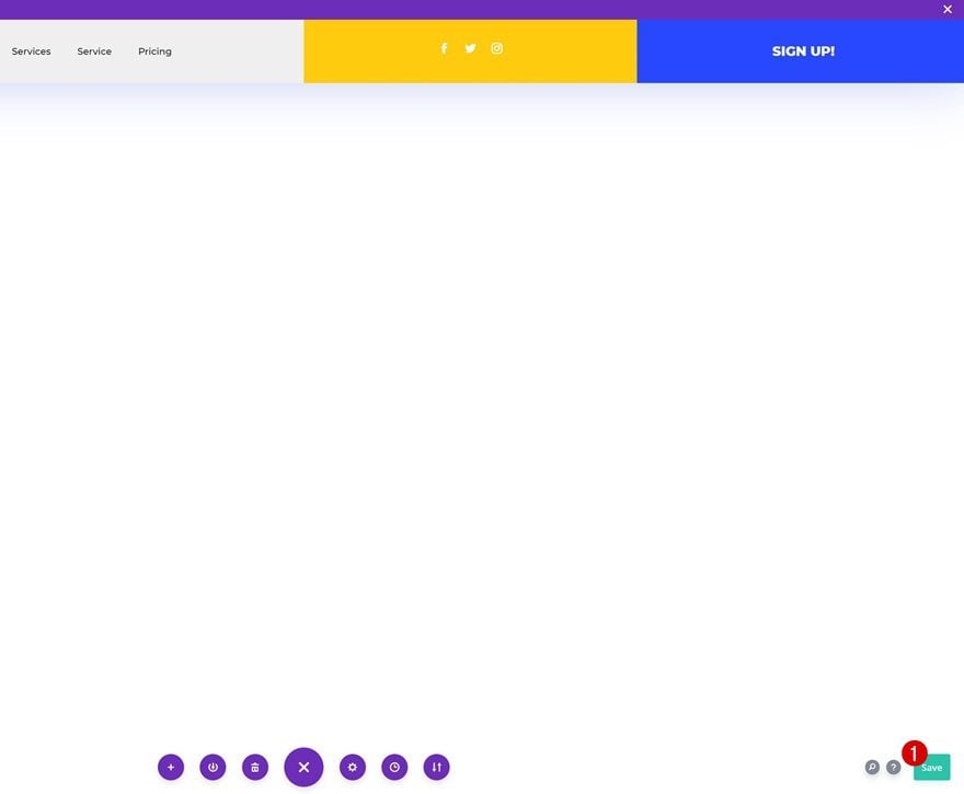
4. Save Builder Changes & View Result
Once you’ve completed the animation settings, you can save the global header, exit the Theme Builder and view the outcome on your website!
Preview
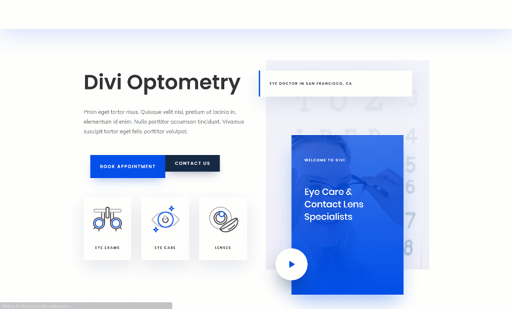
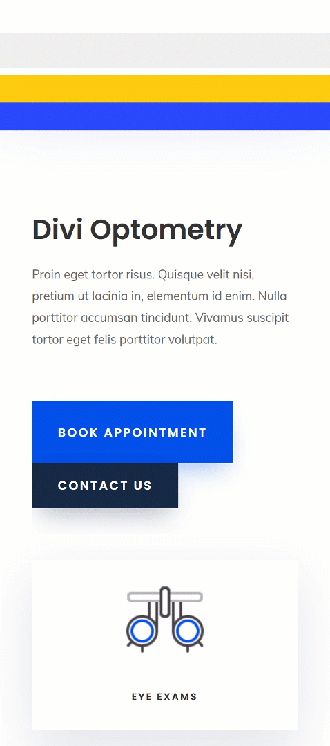
Now that we’ve gone through all the steps, let’s take a final look at the examples across different screen sizes.
Example #1
Desktop
Mobile
Example #2
Desktop
Mobile
Final Thoughts
In this tutorial, we’ve shown you how to animate your global header using Divi’s built-in options and the Theme Builder. This is a great way to draw attention to your website’s header. With Divi’s built-in animation options, the possibilities are endless. To help you get started, we’ve shown you two different examples. You were able to download the JSON files for free as well!
If you’re eager to learn more about Divi and get more Divi freebies, make sure you subscribe to our email newsletter and YouTube channel so you’ll always be one of the first people to know and get benefits from this free content.


Really cool!!! But there is a way to keep the menu fixed when u scroll?
Looks really nice, although I’m unable to import the JSON file in Divi Library as well as by directly dropping in in the editor. Could you help me out with this?
Looks nice, thanks!
My only tip would be to make the animations fast, since it needs to load and animate every time on every page. Users might get frustrated with that experience after awhile, especially on functioning items. People don’t want to wait for a menu to load when they’re ready to click. I feel I’m removing most of my animations to improve performance and saving them for where they make the most impact: content.
On a side note, I say this as my screen glitches from this post. And my system fan is going haywire. Am I the only one experiencing this?
Haven’t totally read through this tut, but there’s no way to change the animation speed?
I quickly skimmed and then did a double-take. You call both examples “Example #1” 🙂 But, this is a slick design. I like it. Keep these header designs coming. I love all the flexibility and options the Theme Builder is providing.
Woops! Thanks for pointing that out, changed it. Happy you’re enjoying all Theme Builder tutorials, Kevin, we’ll keep them coming! 🙂
Thanks! I will use this example in future projects.
You’re welcome, happy to hear that, Viktor! 🙂