
Having clear calls to action on your pages is a necessity for most websites. And what better way to draw attention to some of your most important CTAs than by placing them in your header? In today’s tutorial, we’ll show you how to add two side-by-side buttons to your global header using Divi’s Theme Builder. One of the buttons is primary, the other one’s secondary. You’ll be able to download the global header’s JSON file for free as well!
Let’s get to it.
Preview
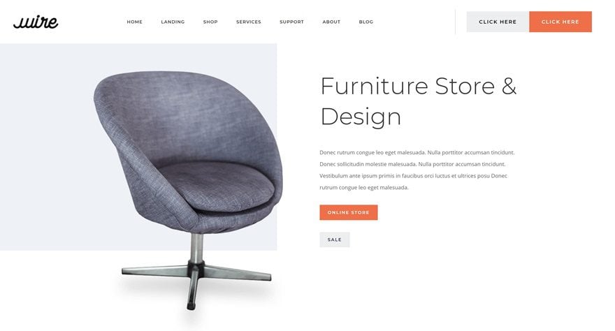
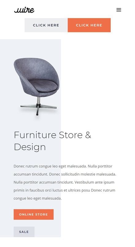
Before we dive into the tutorial, let’s take a quick look at the outcome across different screen sizes.
Desktop
Mobile
Download The Global Header Template for FREE
To lay your hands on the free global header template, you will first need to download it using the button below. To gain access to the download you will need to subscribe to our newsletter by using the form below. As a new subscriber, you will receive even more Divi goodness and a free Divi Layout pack every Monday! If you’re already on the list, simply enter your email address below and click download. You will not be “resubscribed” or receive extra emails.

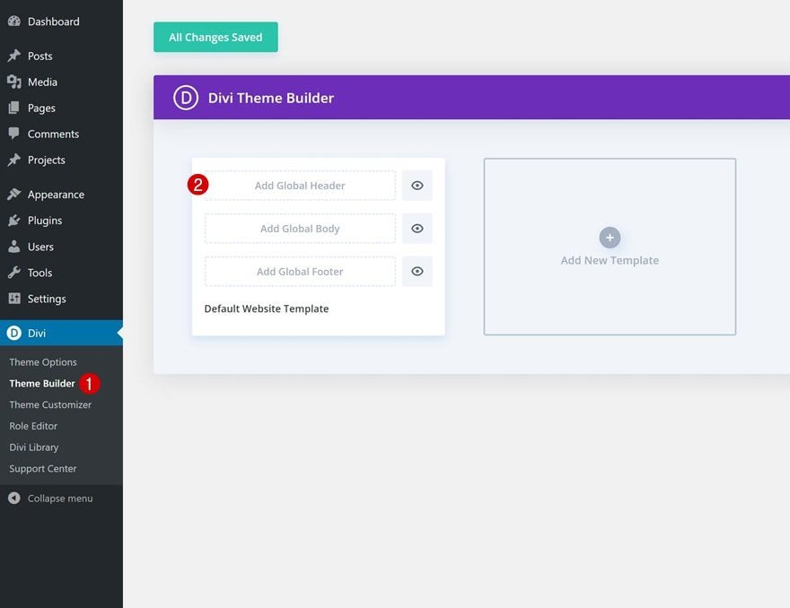
1. Go to Divi Theme Builder & Create Global Header
Go to Divi Theme Builder
Start by going to the Divi Theme Builder and click on ‘Add Global Header’.
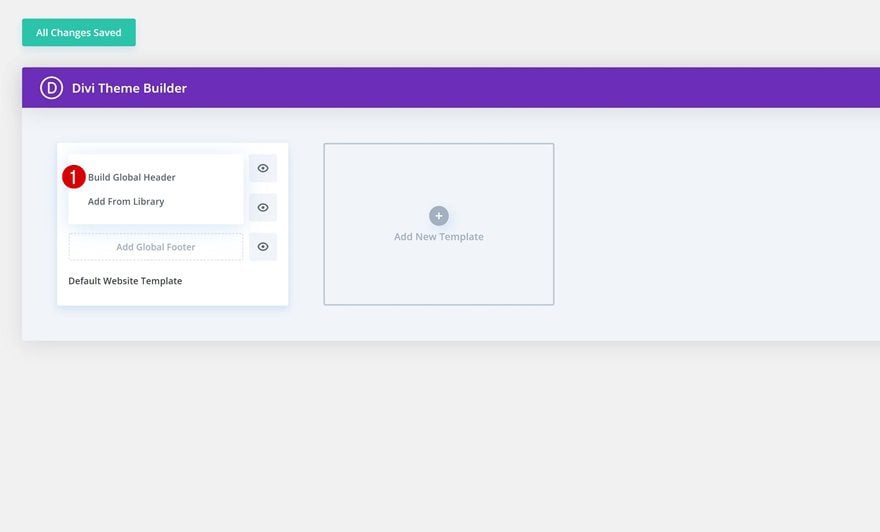
Build Global Header
Continue by clicking on ‘Build Global Header’.
2. Build Global Header Design
Add New Section
Spacing
Once inside the template editor, you’ll notice a section. Open the section settings and remove all default top and bottom padding.
- Top Padding: 0px
- Bottom Padding: 0px
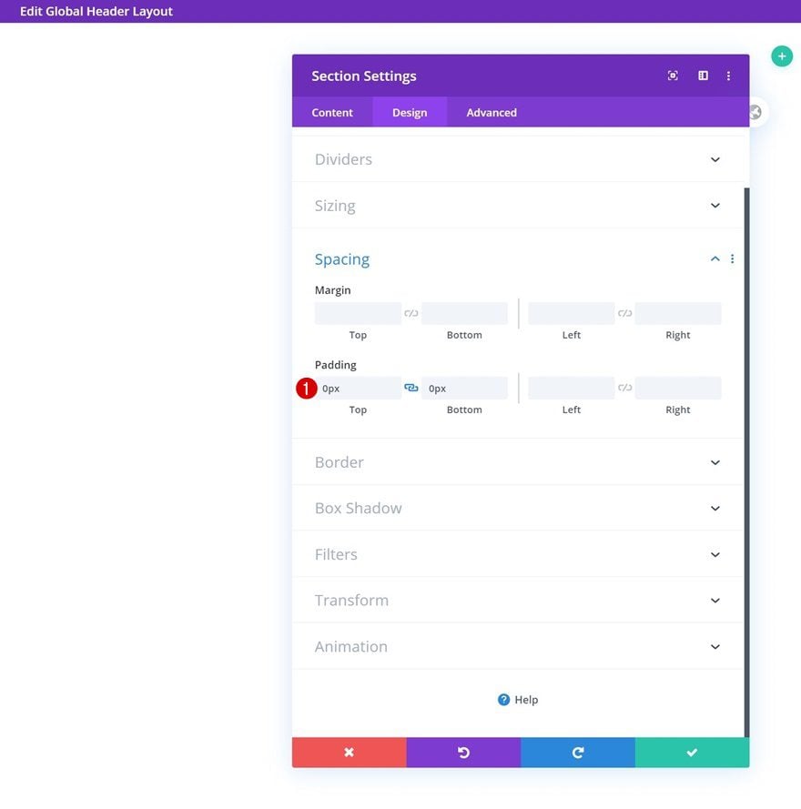
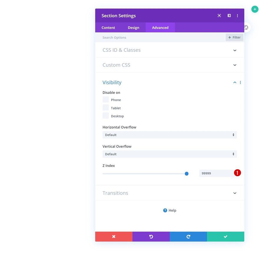
Z Index
Make sure you increase the section’s z index in the visibility settings as well. This will make sure the global header content will appear on top of all page and post content.
- Z Index: 99999
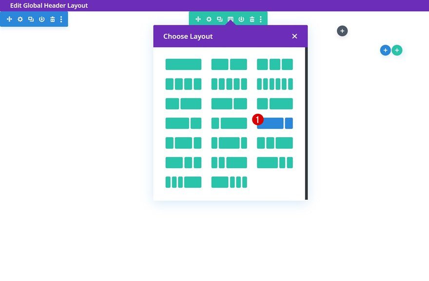
Add New Row
Column Structure
Once you’ve completed the section settings, add a new row to the section using the following column structure:
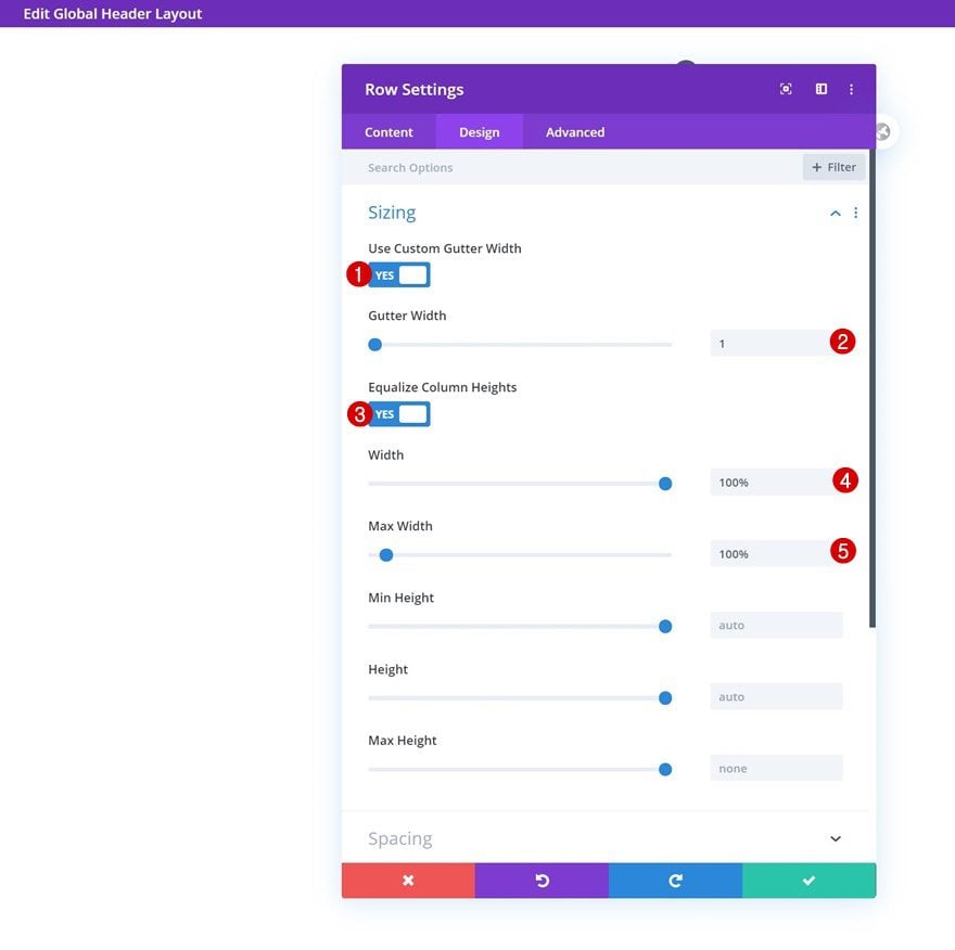
Sizing
Without adding any modules, open the row settings and allow the row to take up the entire width of the section container.
- Use Custom Gutter Width: Yes
- Gutter Width: 1
- Equalize Column Heights: Yes
- Width: 100%
- Max Width: 100%
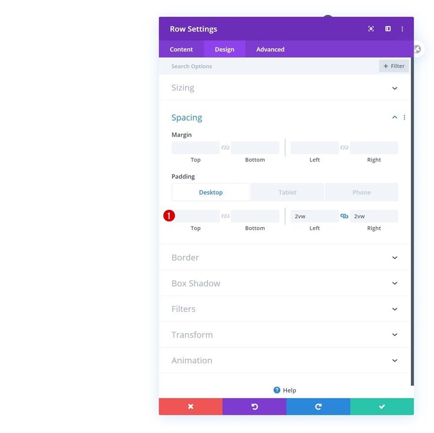
Spacing
Modify the row’s left and right padding values as well.
- Left Padding: 2vw (Desktop), 10vw (Tablet & Phone)
- Right Padding: 2vw (Desktop), 10vw (Tablet & Phone)
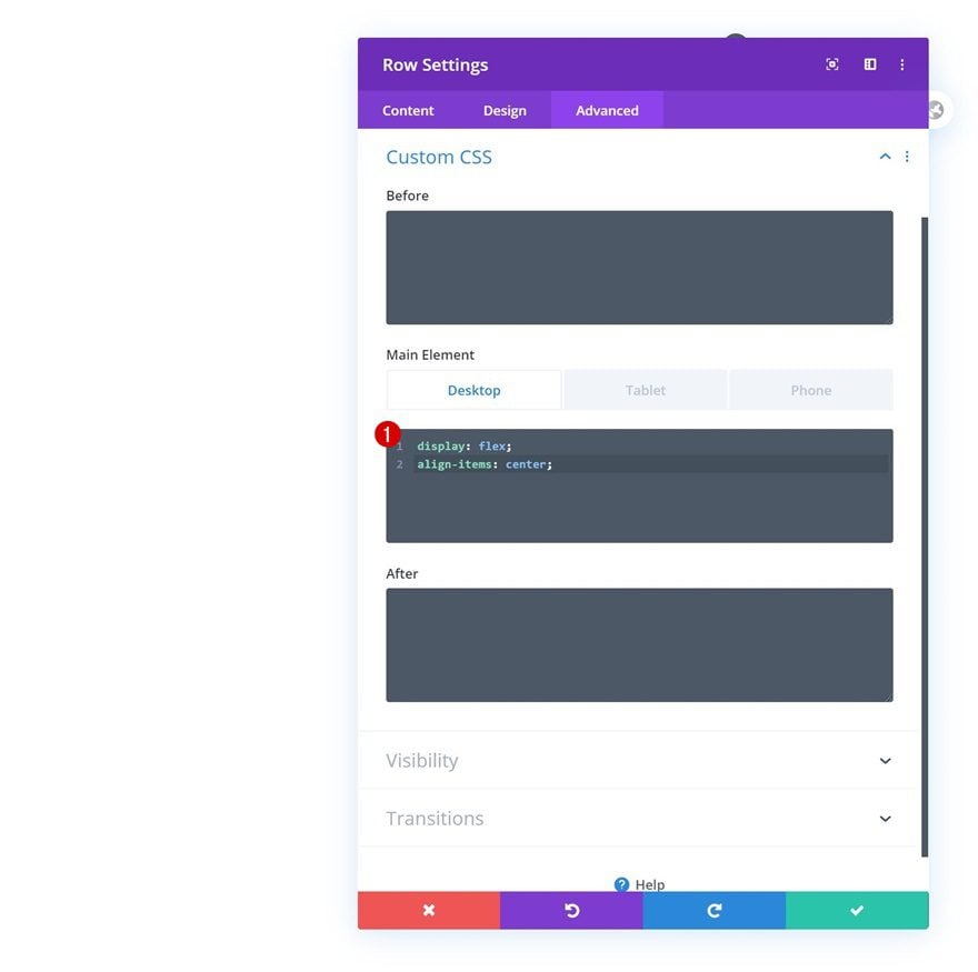
Main Element
To center all column content, we’ll add these two lines of CSS code to the row’s main element.
display: flex;
align-items: center;
Remove the desktop display property on tablet and mobile.
display: block;
Column 1
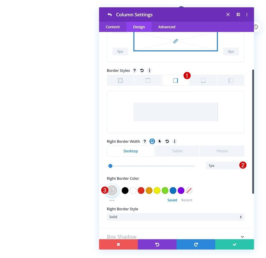
Border
Continue by opening the column 1 settings and add a right border on desktop only.
- Right Border Width: 1px (Desktop), 0px (Tablet & Phone)
- Right Border Color: #d8d8d8
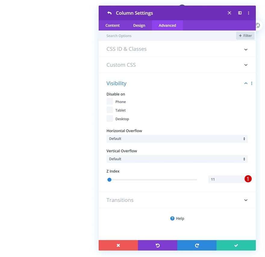
Z Index
Increase the column’s z index as well.
- Z Index: 11
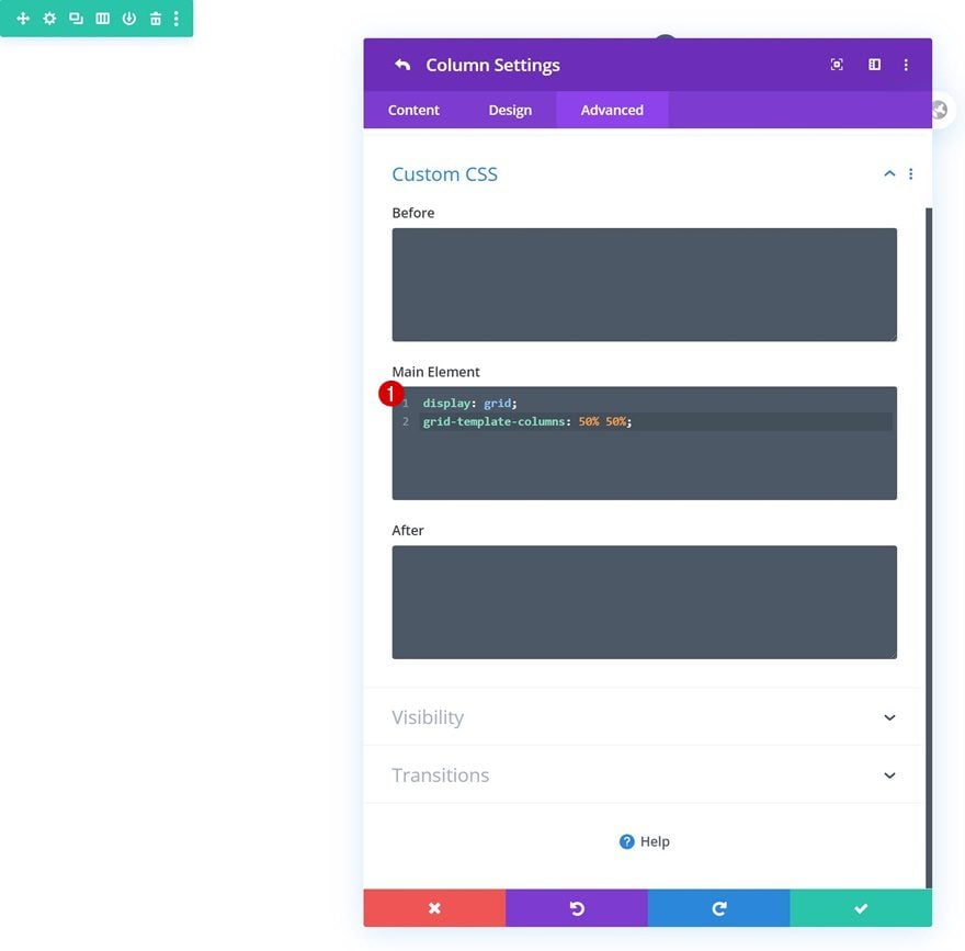
Column 2
Main Element
Then, open the column 2 settings and add the following lines of CSS code to the column’s main element to turn it into two columns.
display: grid;
grid-template-columns: 50% 50%;
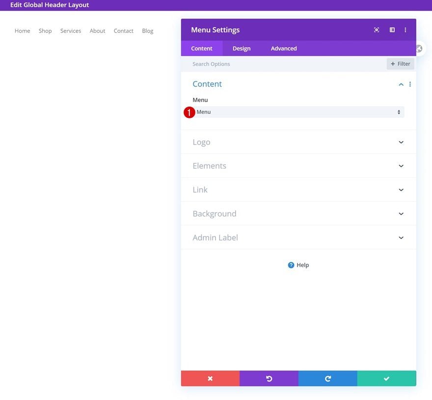
Select Menu
Time to start adding modules! Add a Menu Module to column 1 and select a menu of your choice.
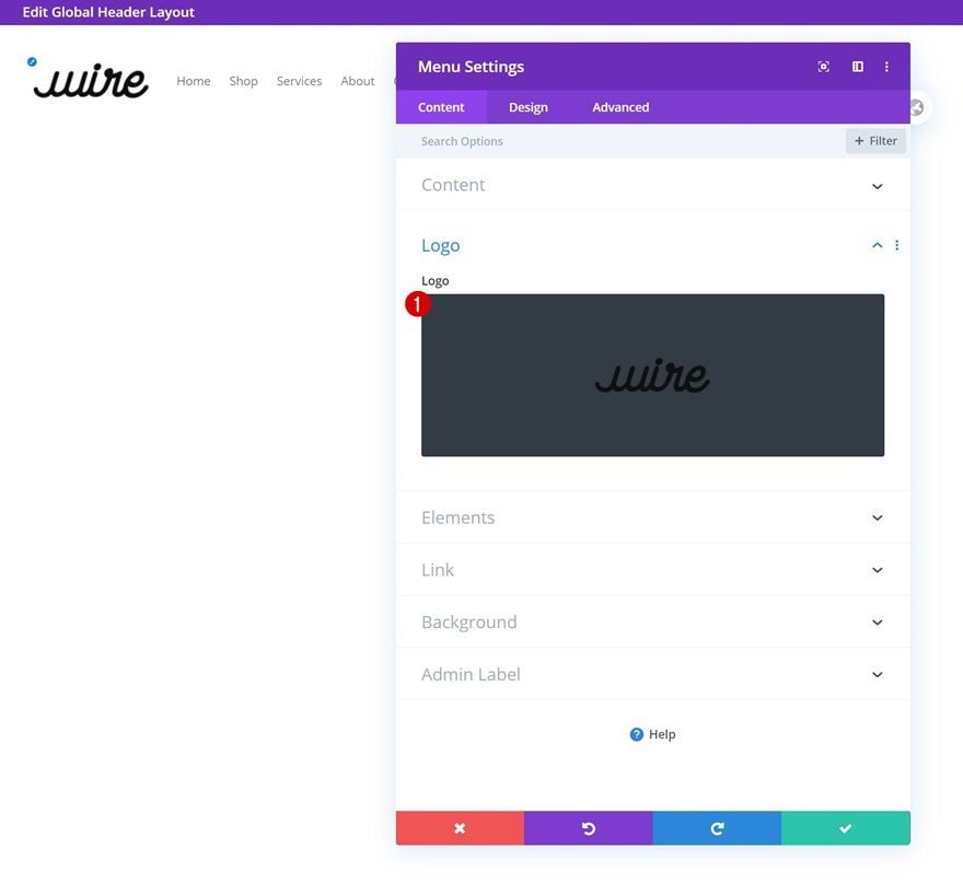
Upload Logo
Upload a logo next.
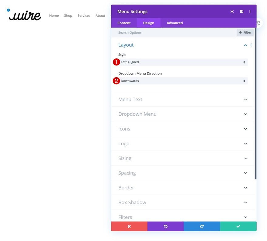
Layout
Move on to the module’s design tab and make sure the following layout settings apply:
- Style: Left Aligned
- Dropdown Menu Direction: Downwards
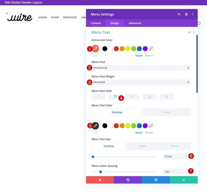
Menu Text
Modify the menu text settings next.
- Active Link Color: #ef6f49
- Menu Font: Montserrat
- Menu Font Weight: Semi Bold
- Menu Font Style: Uppercase
- Menu Text Color: #333333 (Default), #ef6f49 (Hover)
- Menu Text Size: 0.7vw (Desktop), 1.8vw (Tablet), 2.5vw (Phone)
- Menu Letter Spacing: 1px
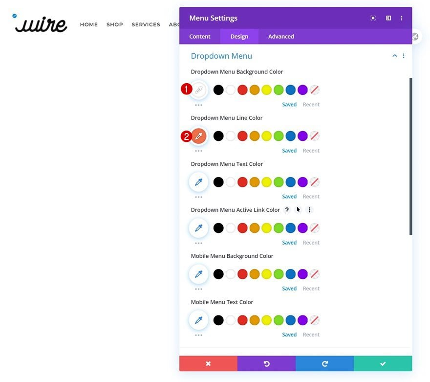
Dropdown Menu Text
Make some changes to the dropdown menu text settings too.
- Dropdown Menu Background Color: #ffffff
- Dropdown Menu Line Color: #ef6f49
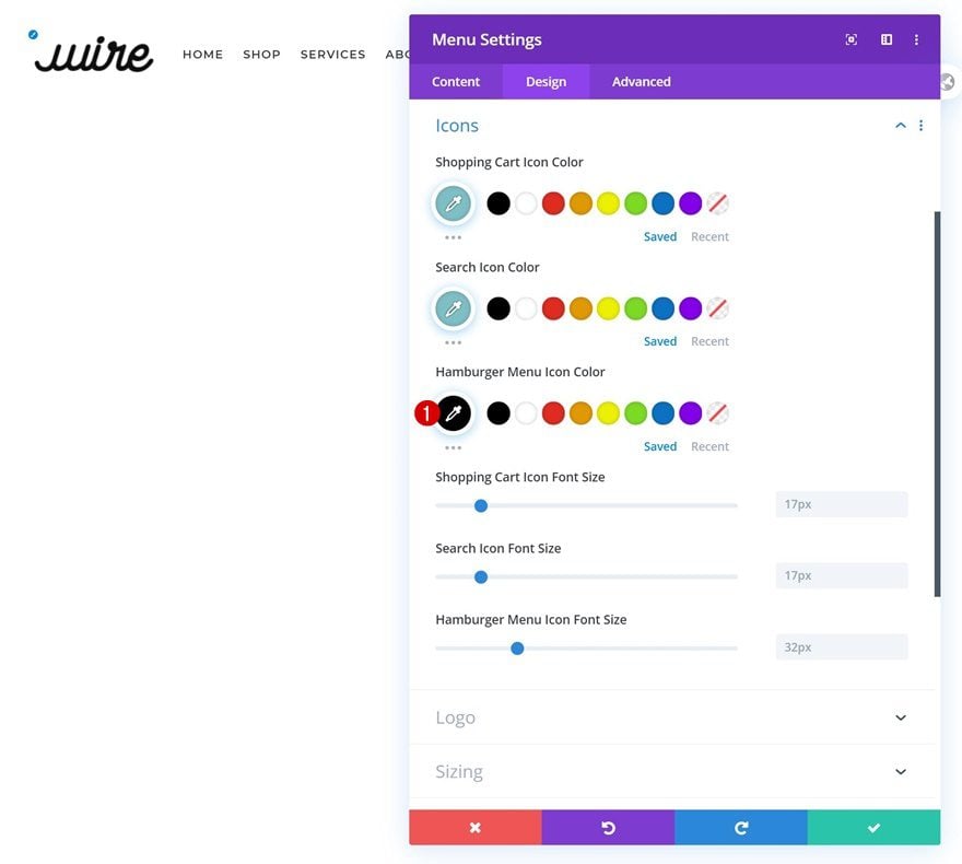
Icons
Then, change the hamburger menu icon color.
- Hamburger Menu Icon Color: #000000
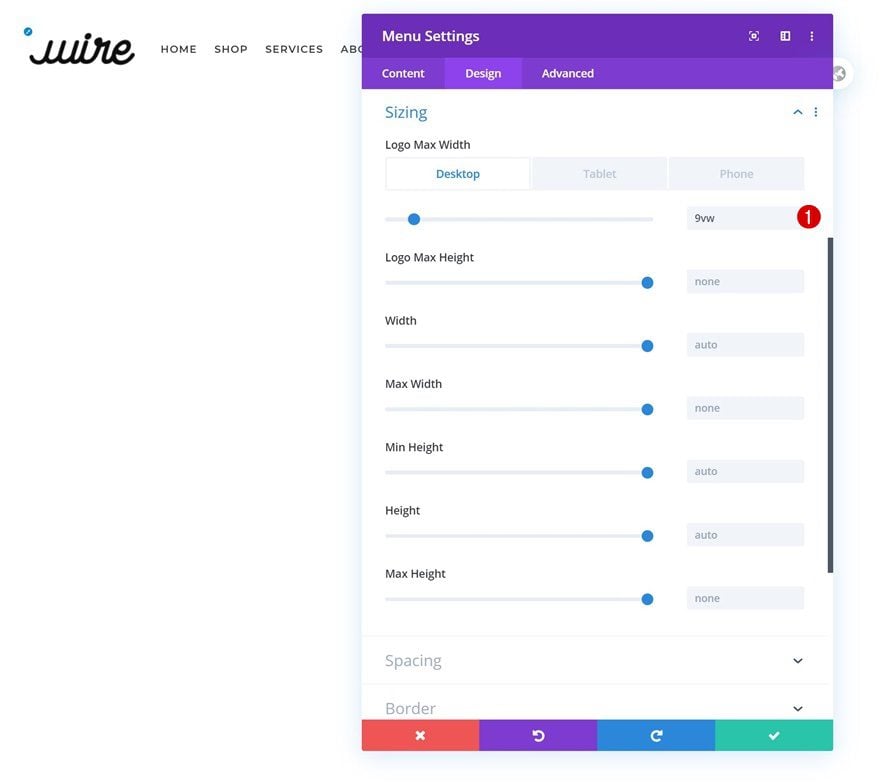
Sizing
Add a logo max width to the sizing settings as well.
- Logo Max Width: 9vw (Desktop), 12vw (Tablet), 15vw (Phone)
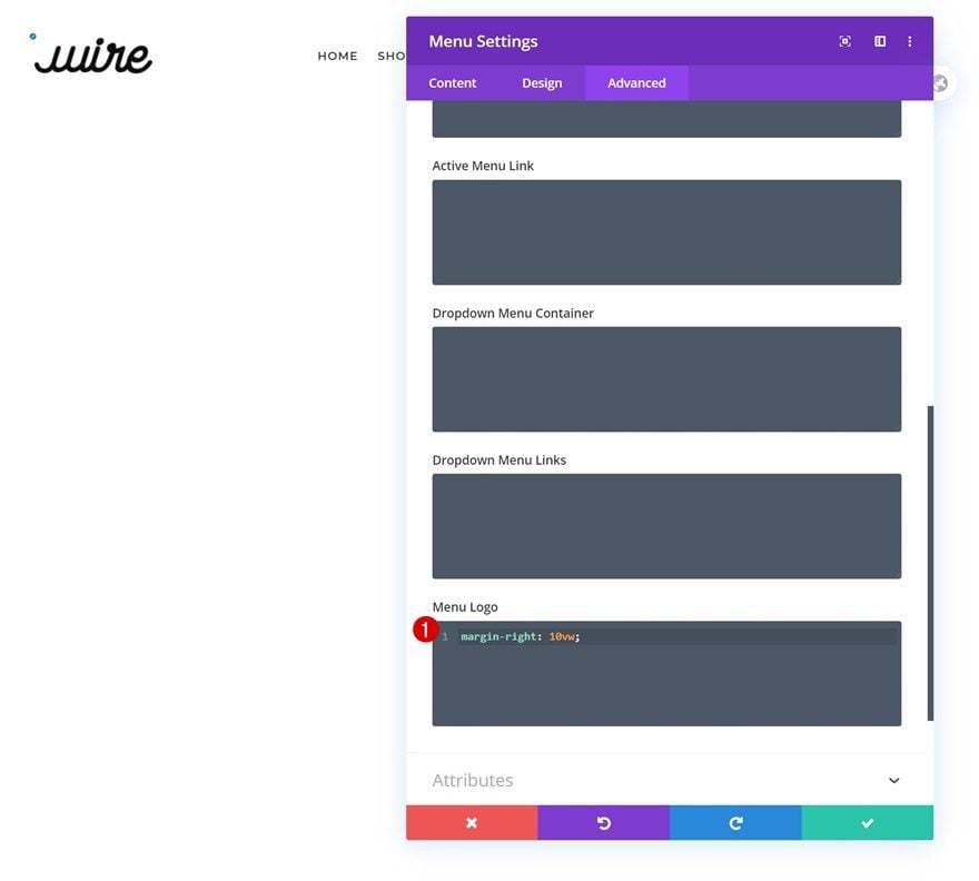
Menu Logo CSS
And complete the module’s settings by adding one line of CSS code to the menu logo in the advanced tab.
margin-right: 10vw;
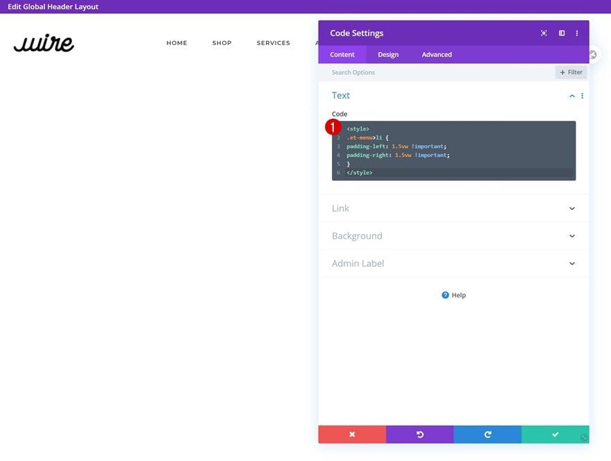
Add Code Module to Column 1
Add Custom CSS Code to Module
The next and last module we need in column 1 is a Code Module. Add the following lines of CSS code to customize the space between menu items:
<style>
.et-menu>li {
padding-left: 1.5vw !important;
padding-right: 1.5vw !important;
}
</style>
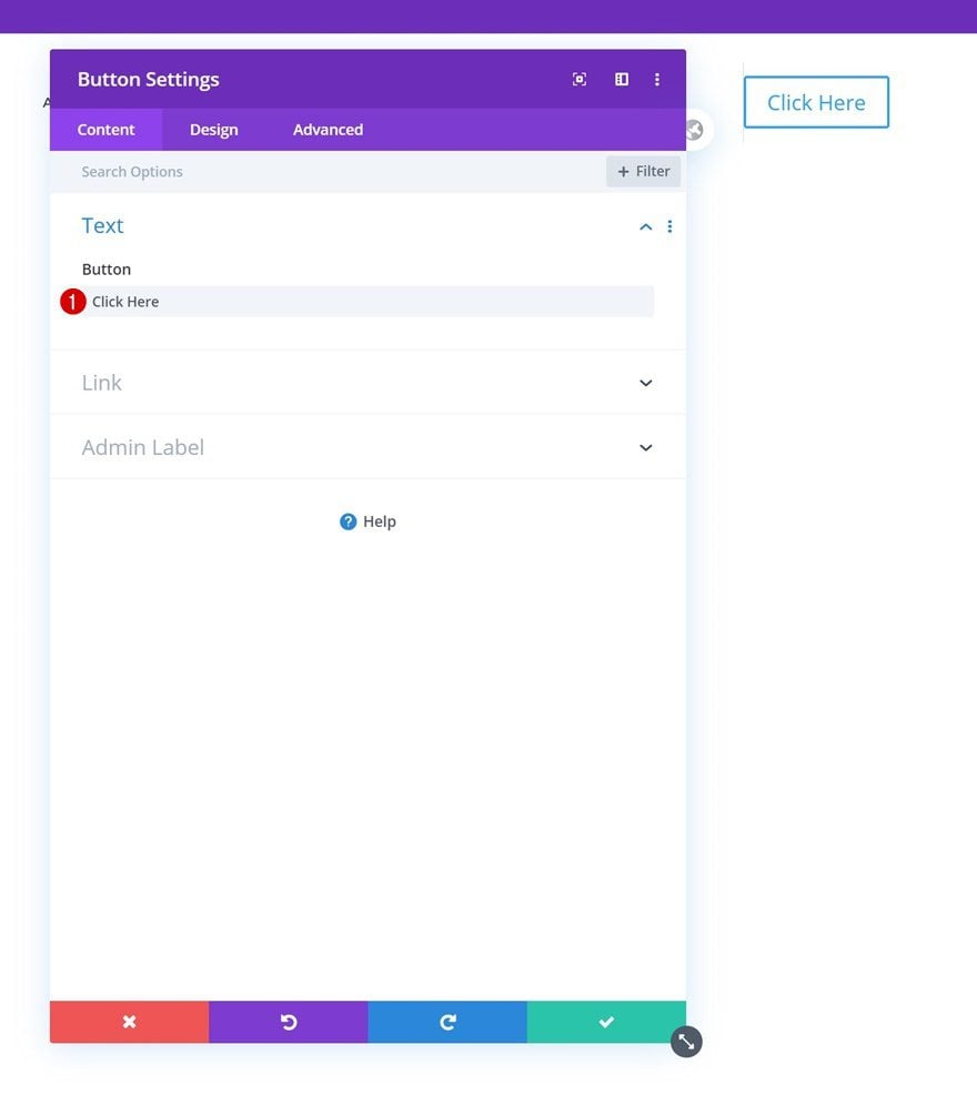
Add Copy
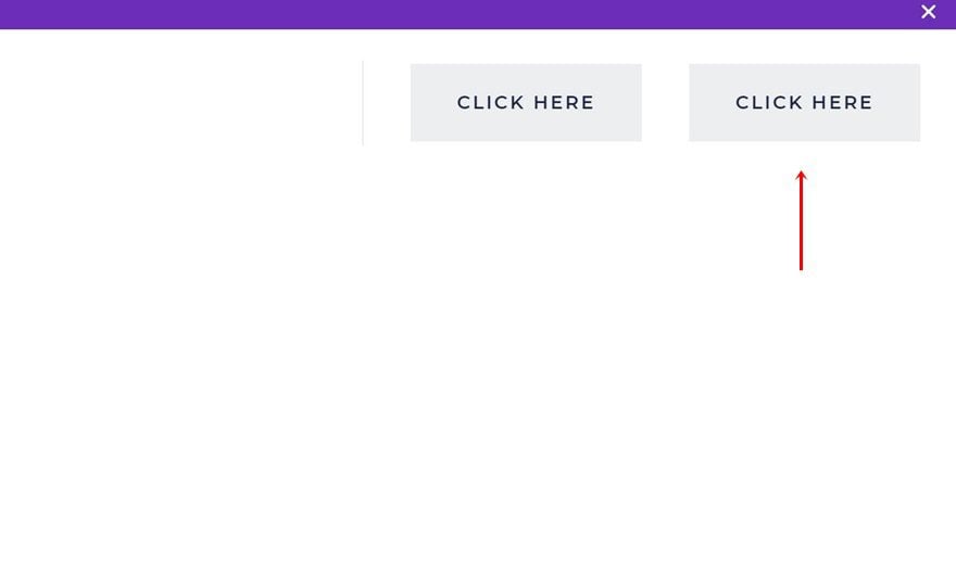
On to the next module! Add the first Button Module and enter some copy of your choice.
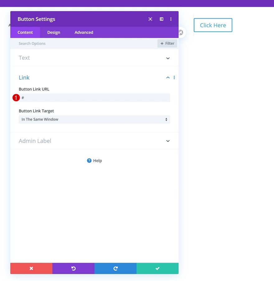
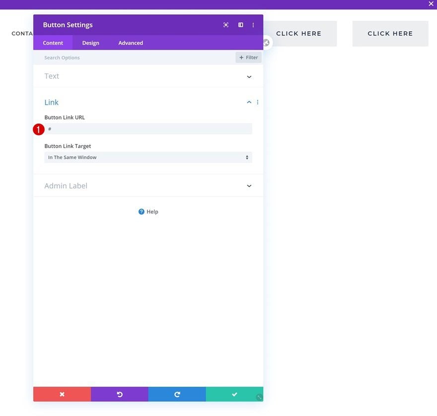
Add Link
Add a link to the Button Module next.
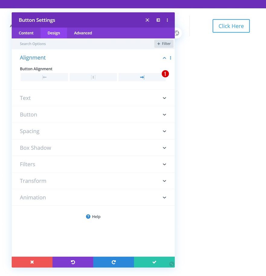
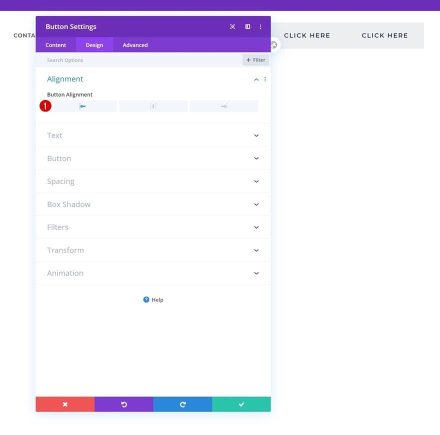
Alignment
Move on to the module’s design tab and change the button alignment.
- Button Alignment: Right
Button Settings
Style the button as well.
- Use Custom Styles For Button: Yes
- Button Text Size: 0.8vw (Desktop), 1.7vw (Tablet), 2.5vw (Phone)
- Button Text Color: #000000
- Button Background Color: #edeef0 (Default), #d6d7d8 (Hover)
- Button Border Width: 0px
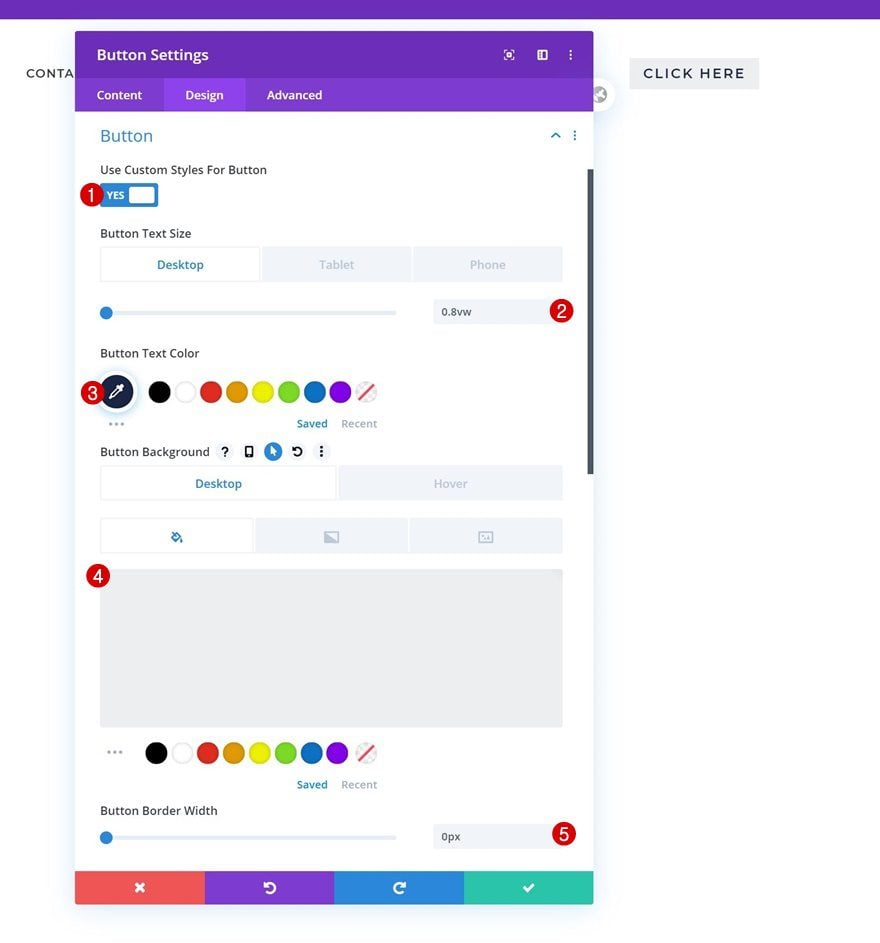
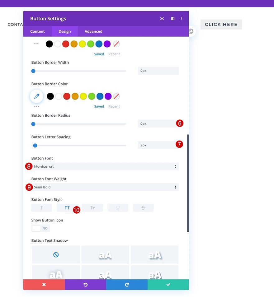
- Button Border Radius: 0px
- Button Letter Spacing: 2px
- Button Font: Montserrat
- Button Font Weight: Semi Bold
- Button Font Style: Uppercase
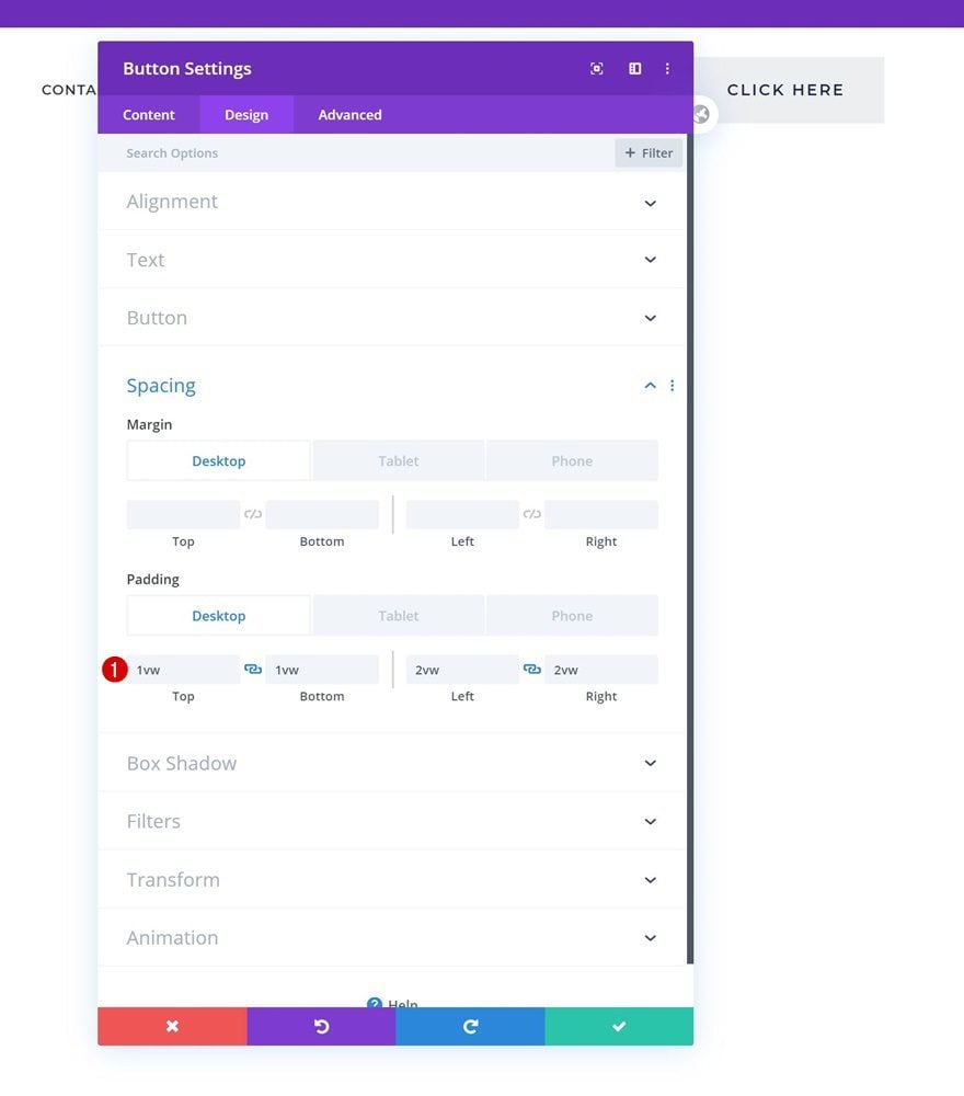
Spacing
Complete the module’s settings by adding some custom padding values across different screen sizes.
- Top Padding: 1vw (Desktop), 2vw (Tablet), 3vw (Phone)
- Bottom Padding: 1vw (Desktop), 2vw (Tablet), 3vw (Phone)
- Left Padding: 2vw (Desktop), 4vw (Tablet), 6vw (Phone)
- Right Padding: 2vw (Desktop), 4vw (Tablet), 6vw (Phone)
Once you’ve completed the first Button Module, clone it.
Change Link
Open the duplicate Button Module and change the URL.
Change Alignment
Change the module’s alignment as well.
- Button Alignment: Left
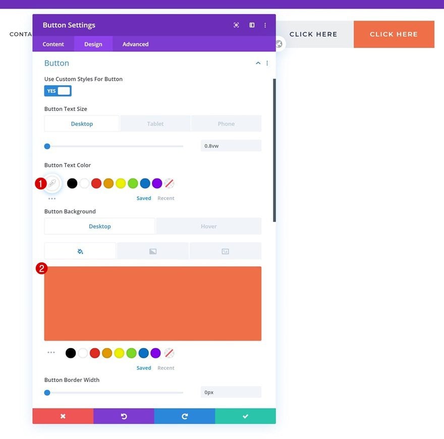
Change Button Settings
Make some changes to the button settings too.
- Button Text Color: #ffffff
- Button Background Color: #ef6f49 (Default), #e06945 (Hover)
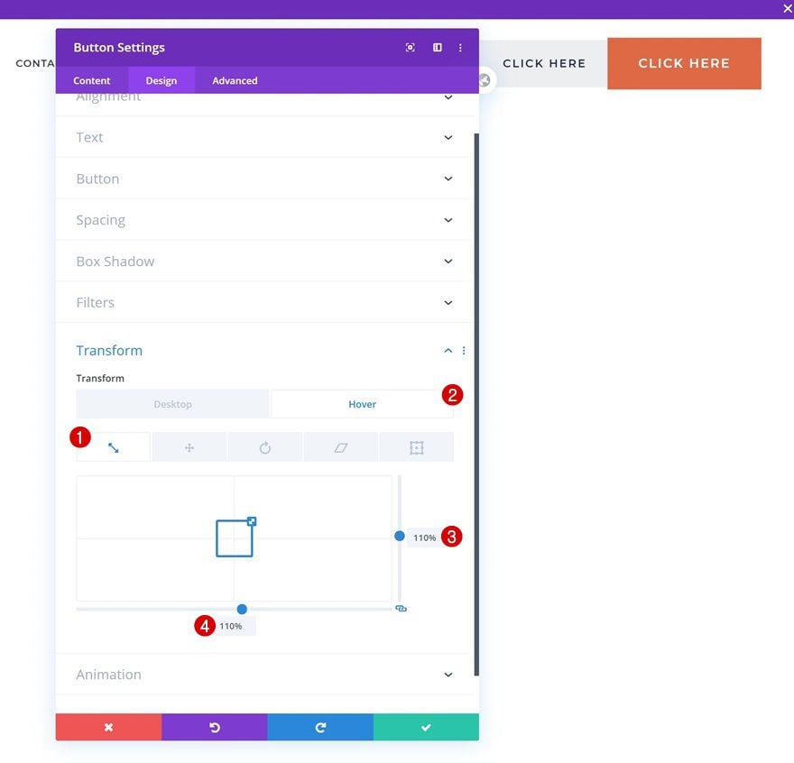
Hover Transform Scale
Complete the button settings by adding a transform scale hover effect.
- Right: 110%
- Bottom: 110%
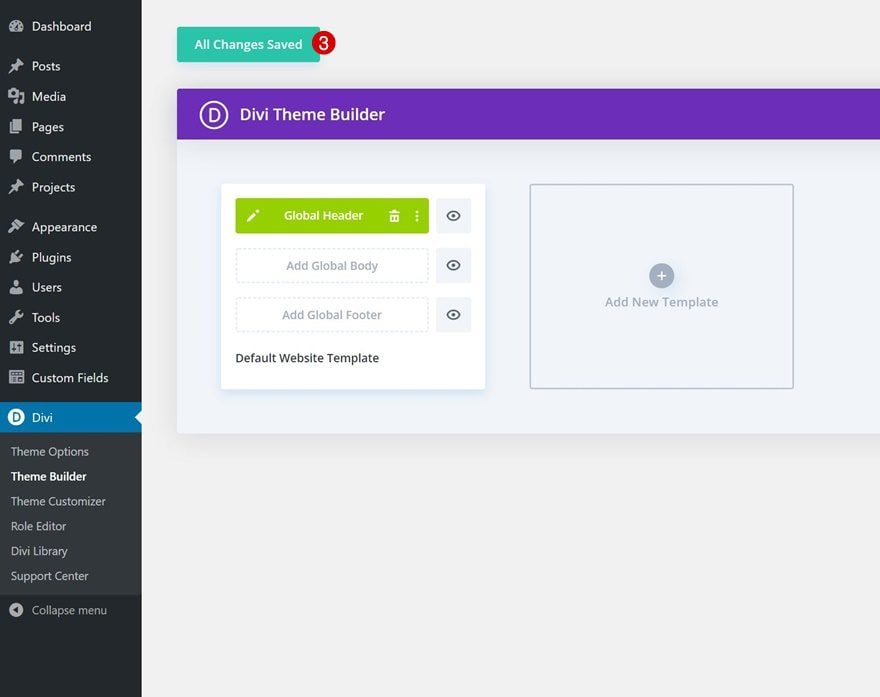
3. Save Theme Builder Changes & Preview Result
Once your global header is completed, save all theme builder changes and view the outcome on your website!
Preview
Now that we’ve gone through all the steps, let’s take a final look at the outcome across different screen sizes.
Desktop
Mobile
Final Thoughts
In this tutorial, we’ve shown you how to add two side-by-side buttons to your global header using Divi’s theme builder. One of the buttons we’ve added is the primary one, the other is secondary. Adding buttons to your global header helps you emphasize some of your website’s most important CTAs. You were able to download the JSON file for free as well! If you have any questions, feel free to leave a comment in the comment section below.
If you’re eager to learn more about Divi and get more Divi freebies, make sure you subscribe to our email newsletter and YouTube channel so you’ll always be one of the first people to know and get benefits from this free content.


thare is no Z index option in divi under visibilty.
Instead of this code:
.et-menu>li {
padding-left: 1.5vw !important;
padding-right: 1.5vw !important;
}
What should I add if was doing it on a blank page option and not the default website template?
That’s a very nice design! Thank you. I didn’t know it was possible to subdivise a column with grid-template-columns: 50% 50%; That’s a great tip.
Thanks Donjete Vuniqi. It was a Comprehensive article and you have given all useful details. Waiting for the next one. I have used this technique and have got amazing results. Enhanced my knowledge. Thanks again.