
When we discuss responsive options, we usually think of content that changes shape to fit different screen sizes. With Divi, we can take responsive content much further. We can use Divi’s settings to reduce the length of the content or replace the content or styling entirely based on the screen size. In this post, we’ll see how to add responsive content to Divi’s testimonial module. We’ll cover two different scenarios and show the details of both.
Let’s get started.
Responsive Testimonial Scenario One
Let’s say you want to display a long-form testimonial. This can work great on desktops where you have a lot of space to work with, but this can cause too much scrolling on mobile devices. To solve this problem, we can create two versions of the content- a long version to display on desktops and a short version to display on mobile. We can use Divi’s settings to display the content based on the screen size.
Responsive Testimonial Scenario One Desktop Version
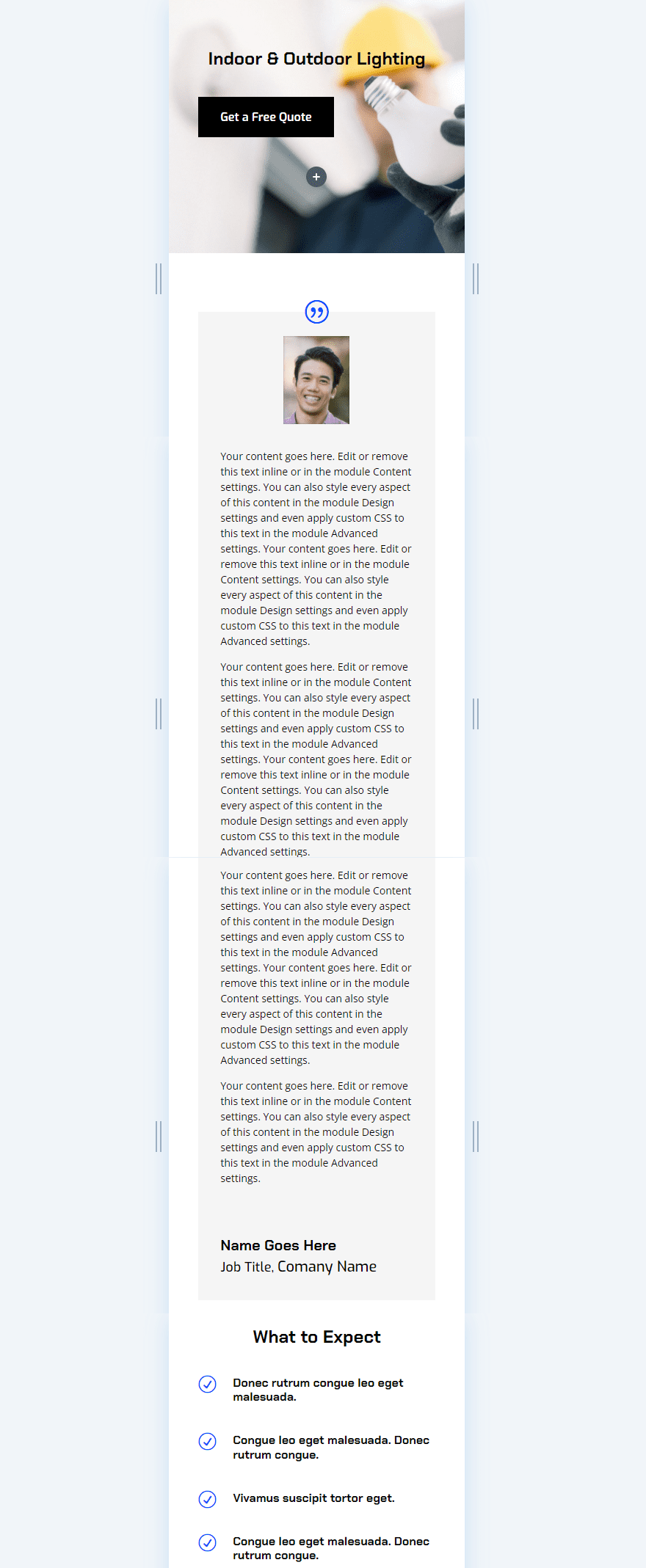
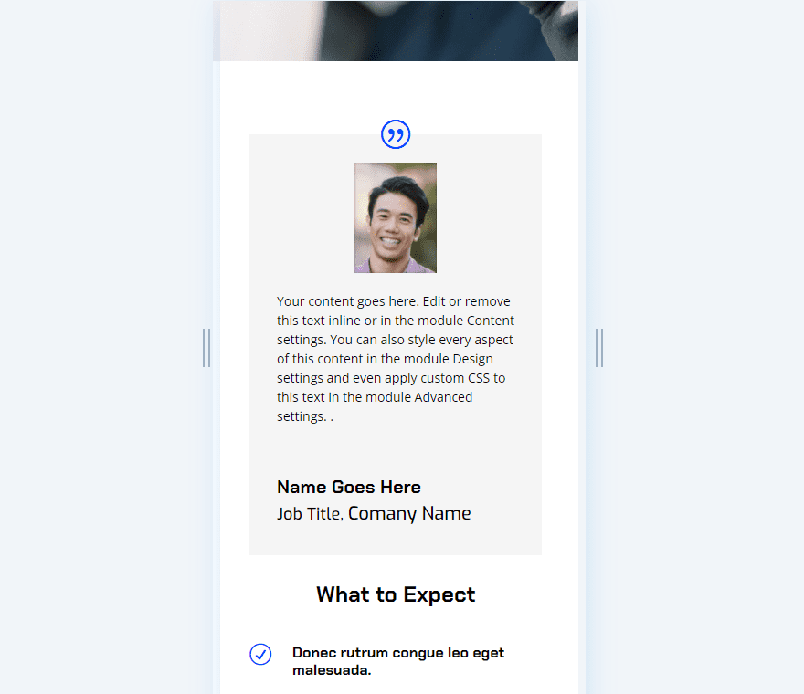
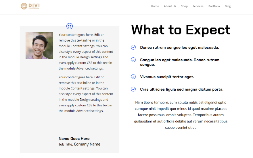
For the desktop version, create the testimonial as normal. The default settings of the Divi testimonial module display the desktop settings, so we don’t have to change any settings. For my testimonial, I’ve used the dummy content from the testimonial module and pasted it multiple times to create a large testimonial. I’ve also made all the fonts black.
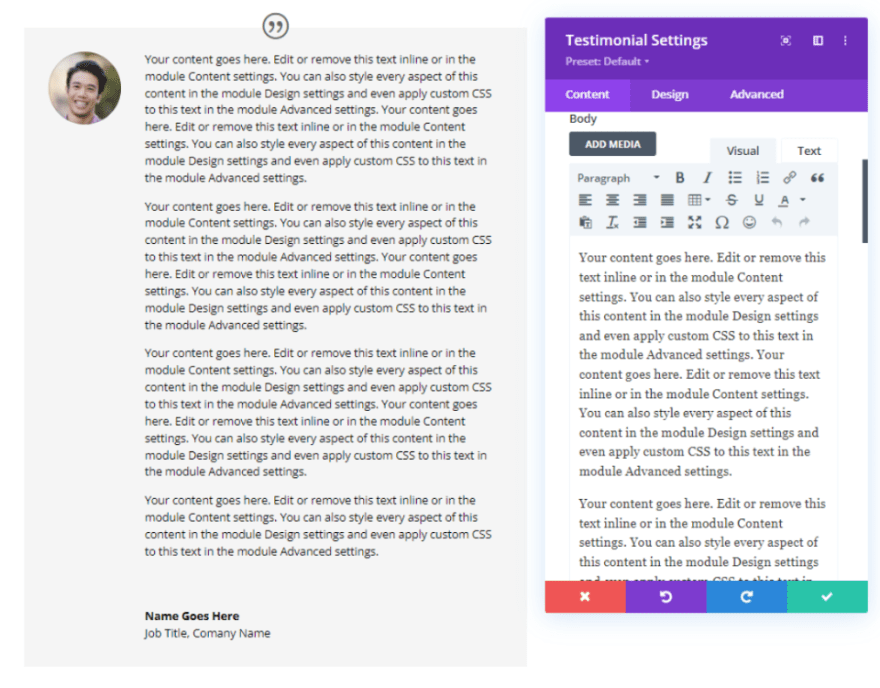
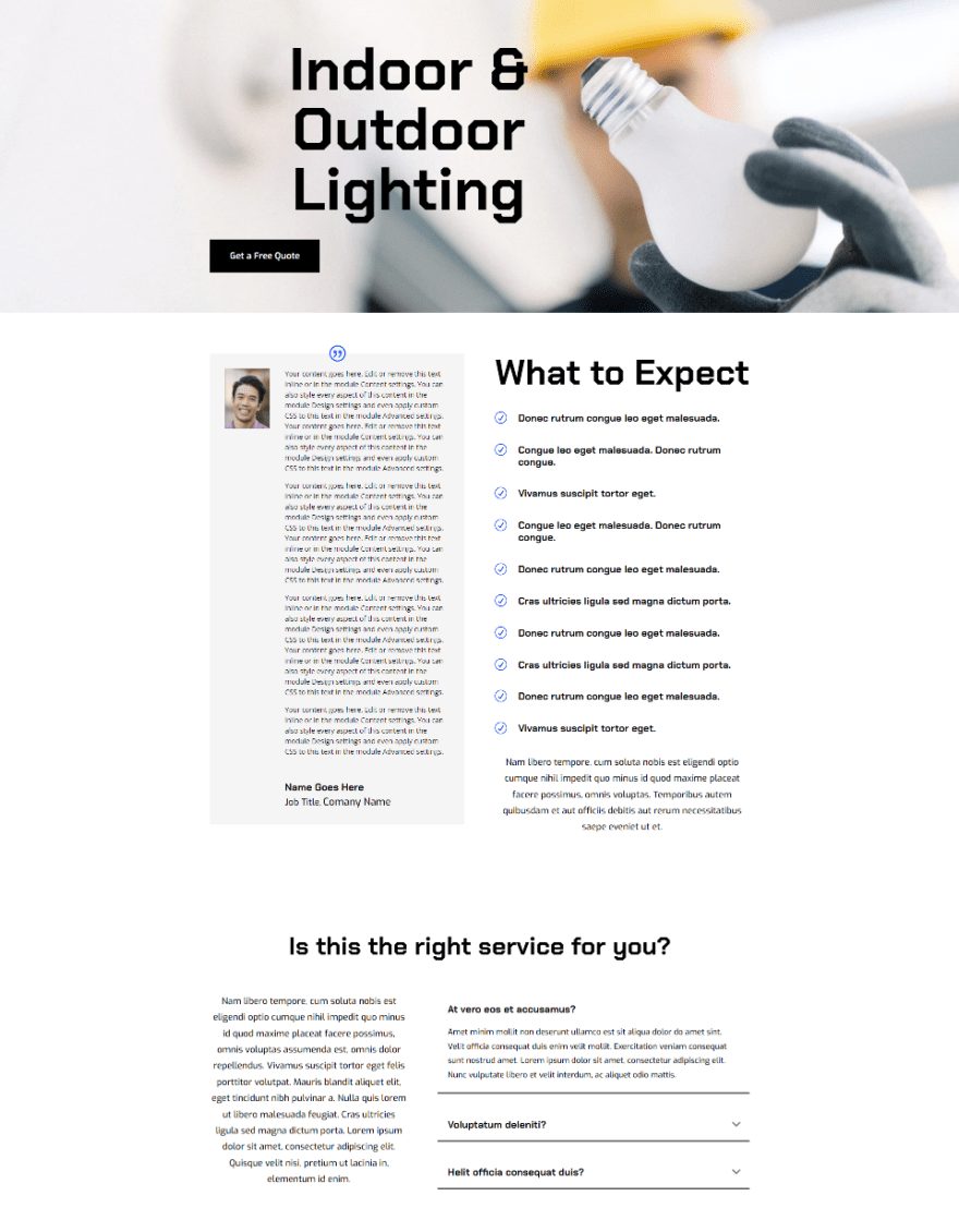
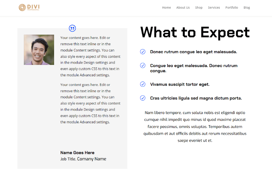
This might work well for the desktop version of a website. Clients sometimes go into great detail about a project and that detail can be invaluable to potential clients. The example below shows the testimonial placed within the Service Page of the free Electrical Services Layout Pack that’s available within Divi. We’ll expand on this design.
Scenario One Styling
For reference, here are the styling options I’ve used from the layout pack.
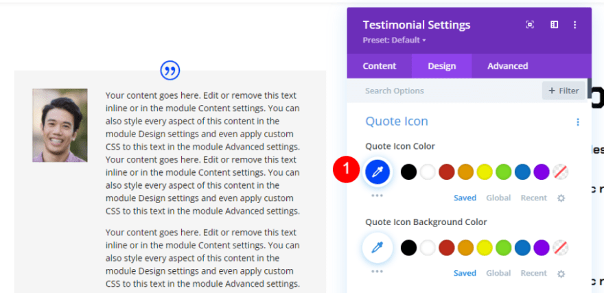
Quote Icon
First, go to the design tab and set the Quote Icon Color to #0047ff.
- Quote Icon Color: #0047ff
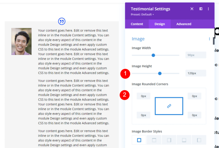
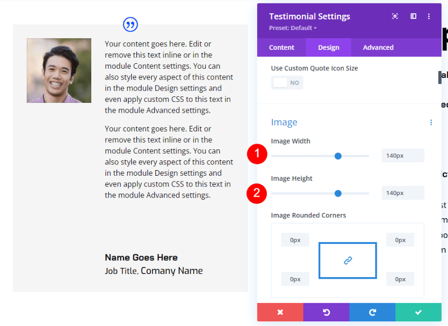
Image
Scroll down to Image and change the Width to 120px and the Rounded Corners to 0px.
- Image Width: 120px
- Image Rounded Corners: 0px
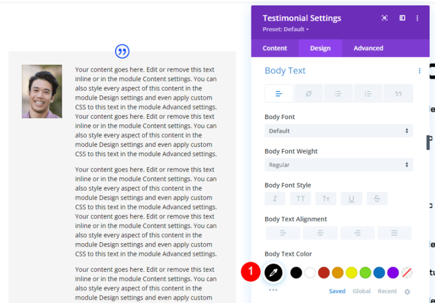
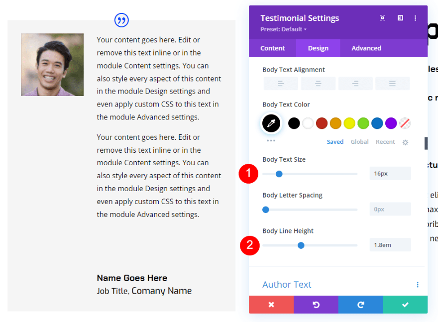
Body Text
Next, scroll to Body Text and change the Color to black.
- Body Text Color: #000000
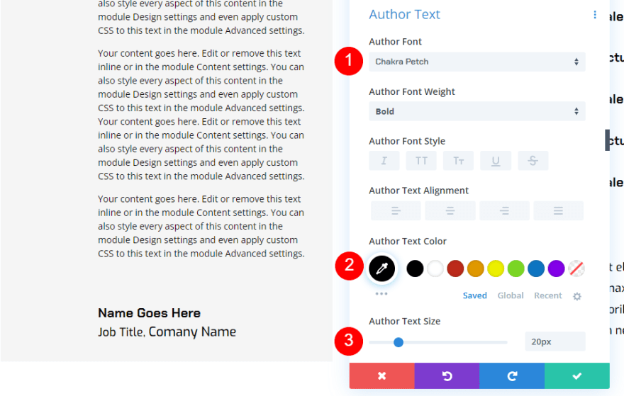
Author Text
Scroll to Author Text and change the Font to Chakra Petch, the Color to black, and the Size to 20px.
- Author Text Font: Chakra Petch
- Color: #000000
- Size: 20px
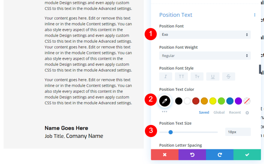
Position Text
Change the Position Text to Exo, set it to black, and change the Size to 18px.
- Position Text Font: Exo
- Color: #000000
- Size: 18px
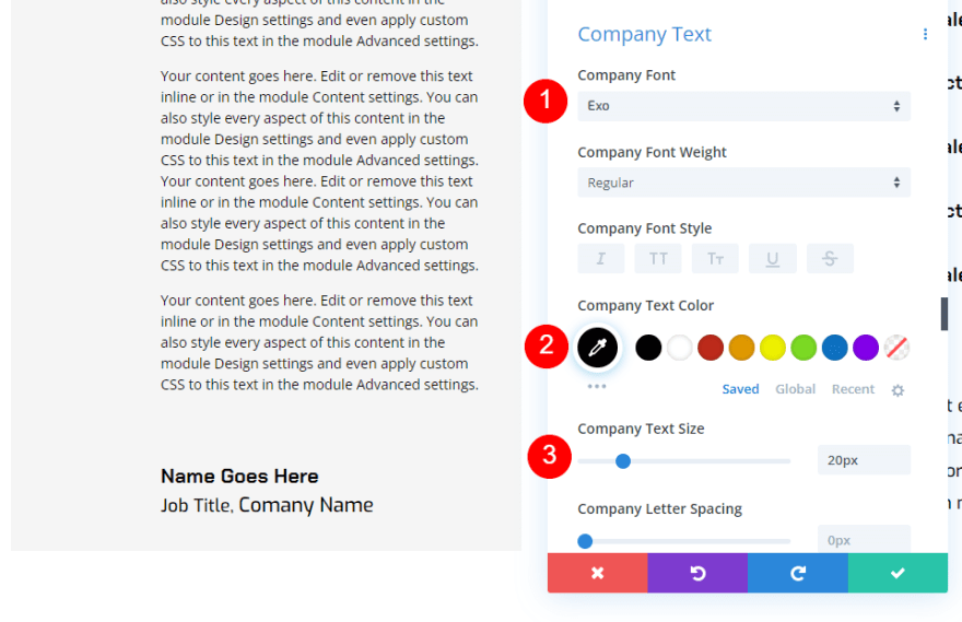
Company Text
Finally, change the Company Text to Exo, set it to black, and change the Size to 18px.
- Company Text Font: Exo
- Color: #000000
- Size: 18px
Scenario One Desktop Version vs Mobile
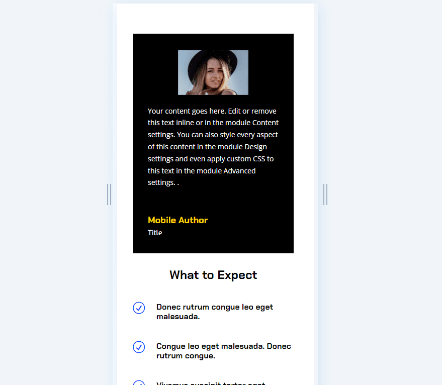
Our desktop version of the testimonial might work for a detailed testimonial, but it’s too large for mobile devices.
Here’s the design on mobile. It looks like a long-form article and requires a lot of scrolling to get past it. Chances are good they won’t read all of this content on mobile, and they might not scroll far enough to see the next portion of content which tells them what to expect. The solution is to create a mobile version of this body content that gives the user the main information they need.
Responsive Testimonial Scenario One Mobile Version
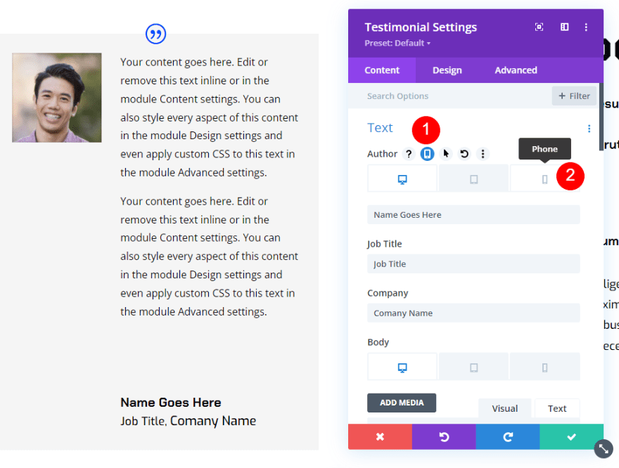
To create a mobile version of the testimonial content, hover over the Body options in the content tab of the testimonial module. This reveals a set of icons. Click the one that looks like a tablet to show the device tabs. You’ll see icons for a desktop, tablet, and phone.
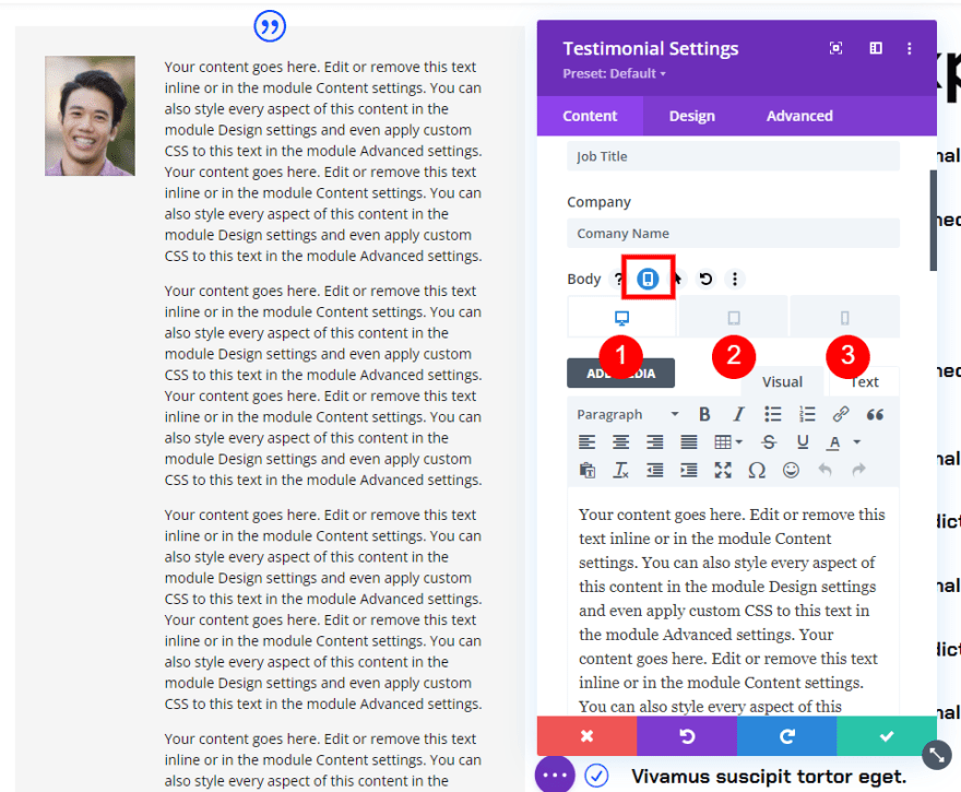
Select the Phone icon. This shows the phone version of the content and allows you to edit for this screen size. The desktop and tablet versions will not be affected by the changes made to the phone version.
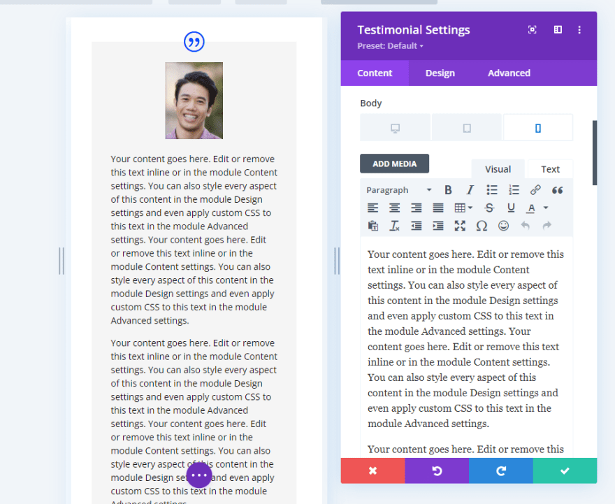
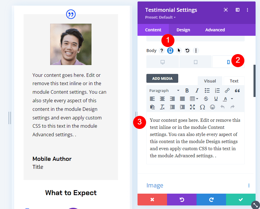
Next, create the content specifically for the mobile version and close the module.
We now have a mobile version of the testimonial that only displays on phones. The user can read the larger testimonial on a desktop and see a shorter version that’s much easier to use on a phone.
Responsive Testimonial Scenario Two
It’s also possible to change the testimonial entirely. Rather than just changing the body content, we can change the module’s settings to show a different person’s testimonial. The responsive settings would change the content to show a different person and display their testimonial based on the screen size.
The process is the same as our first scenario, but it’s a little more complex. We’d need to change not only the body content, but also the name, job title, company, and image. We could even change the styling if we wanted.
Scenario Two Desktop Version
For the desktop version, I’ve made a few changes to the desktop version from the previous example. We’ll restyle this module for the mobile version.
Scenario Two Desktop Version Styling
First, let’s look at the desktop styling changes that I’ve made from the last example.
Image
Change the Image Width and Height to 140px.
- Image Width: 140px
- Image Height: 140px
Body Text
Next, change the Body Text Size to 16px and the Line Height to 1.8em.
- Text Size: 16px
- Line Height: 1.8em
Scenario Two Desktop Testimonial
Here’s our new testimonial module.
Scenario Two Mobile Version
Now, let’s customize the testimonial so that it changes to a completely different testimonial for mobile devices.
To create the mobile version, you’ll need to hover over the element you want to adjust and select the Tablet icon. Then, choose the Phone icon from the three devices. Any changes you make to that element with the Phone icon selected will only affect the phone version of that element. You’ll need to choose the Phone icon for every element.
I’ve selected the Phone icon for every element in the following steps.
Scenario Two Mobile Version Content
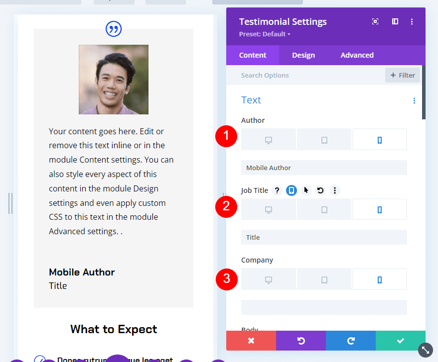
Select the Phone icon for each element under the Text options and add the new content. I’ve left the Company field blank for mobile.
- Name: new author-name
- Job Title: new title
- Company: blank
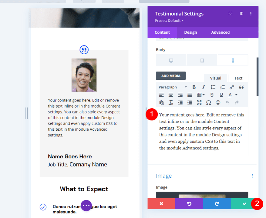
Next, select the Phone icon for the Body content and add the new testimonial.
- Body Content: new testimonial
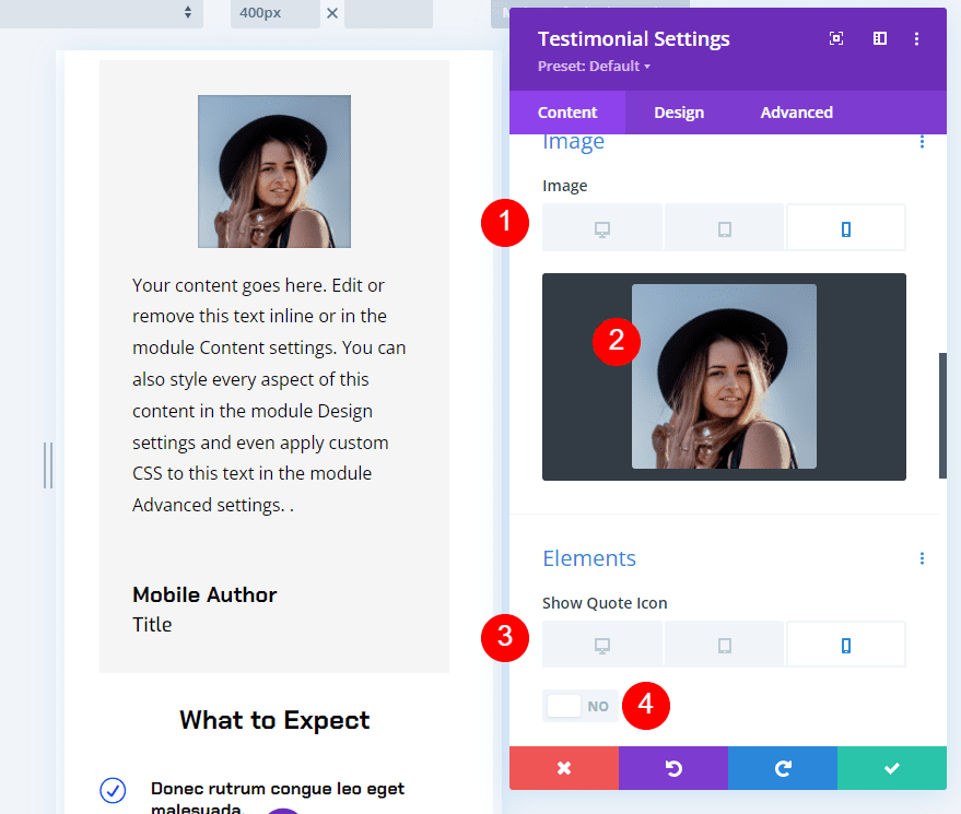
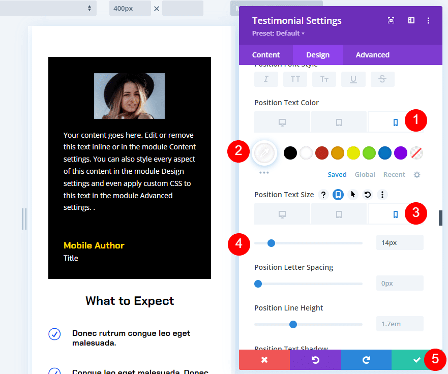
Next, scroll down to Image and change the image to match the new testimonial. Under Elements, select the Phone settings for the Quote Icon and disable it. For this one, we’ll not use the quote icon for phones.
- Image: photo for the new testimonial
- Show Quote Icon: No
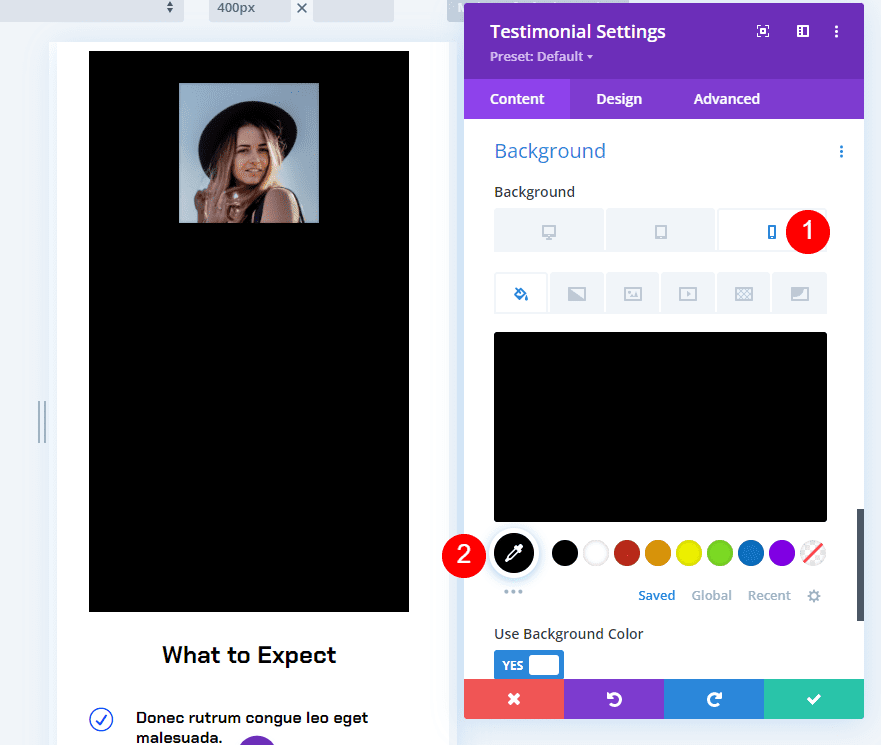
Next, scroll down to Background. With the Phone settings selected, change the background to black.
- Background: #000000
Scenario Two Mobile Version Design
Next, select the Design tab and make the following changes.
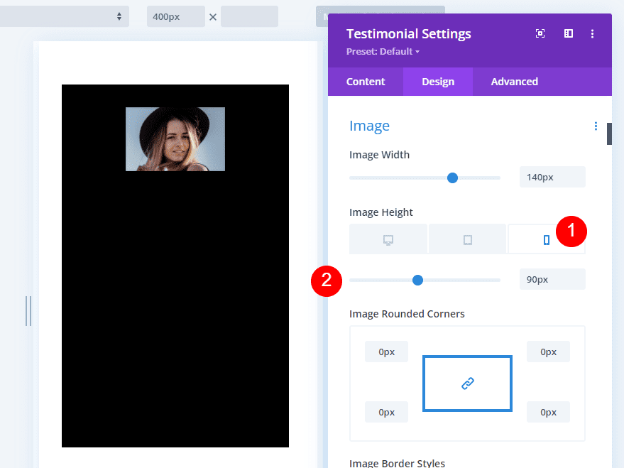
Image
Go to the Image settings and change the Height to 90px. We’ll leave the width the same.
- Image Height: 90px
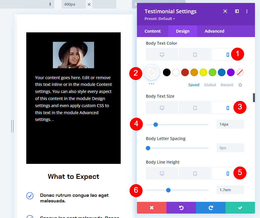
Body Text
Scroll down to Body Text. Change the Phone Color to black, the Size to 14px, and the Line Height to 1.7em.
- Color: #ffffff
- Size: 14px
- Line Height: 1.7em
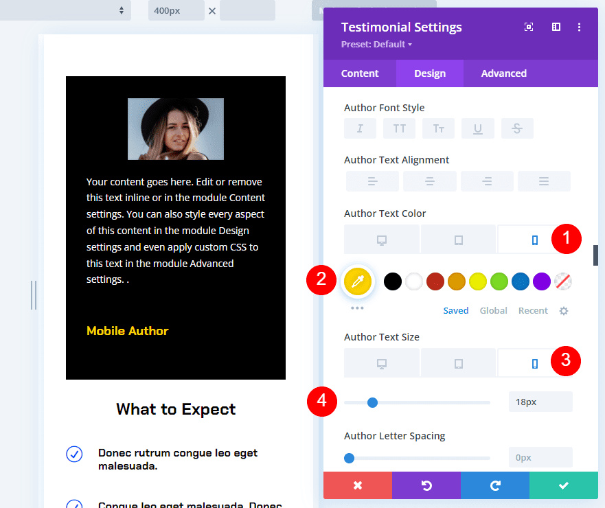
Author Text
Scroll to Author Text. Change the Phone Color to #ffd600 and the Size to 16px.
- Color: #ffd600
- Size: 18px
Position Text
Finally, scroll to Position Text. Change the Phone Color to white and the Size to 14px. If you use Company Text, make its settings match the Position Text. Close the settings and save your page.
- Color: #ffffff
- Size: 14px
Scenario Two Desktop Version Result
Here’s our testimonial module when viewed on a desktop. Anyone viewing the page on a phone will not see this testimonial.
Scenario Two Mobile Version Result
Here’s the same page when viewed on a mobile device. Anyone viewing the page on a desktop will not see this testimonial.
Ending Thoughts
That’s our look at how to add responsive content to Divi’s testimonial module. Divi’s desktop and mobile settings make it easy to show different content based on the screen size. Change anything from the body content to styling to a completely different testimonial. This is a great way to create responsive content for your Divi testimonial modules.
Divi continues to prove itself as a versatile solution. Here, it replaces the need for testimonial plugins.
We want to hear from you. Do you use any of these methods to make your testimonial module’s content responsive? Let us know about your experience in the comments.


Hey there,
Thank you so much Team DIVI for sharing a such wonderful information about how we add responsive content using DIVI. Great work you have explained all the things easily. I really appreciate your effort