
Image markers are a great way to showcase a product’s special features. In this post, we’ll show you how to create image markers using a text module and a vertical divider. Thanks to the transform settings inside the columns, an image marker can be placed anywhere you need it. To show you how versatile this technique is, we will show you two different design examples. You’ll be able to download the JSON file for free as well!
Let’s get to it!
Preview
Before we dive into the tutorial, let’s take a quick look at the outcome across different screen sizes.
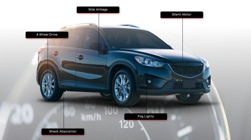
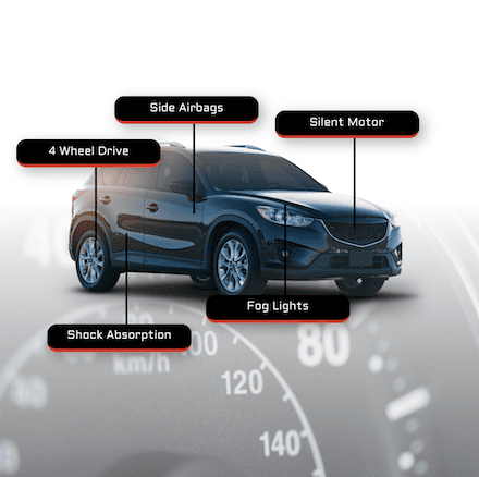
Example #1
Desktop
Mobile
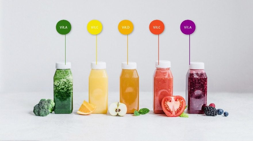
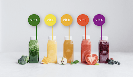
Example #2
Desktop
Mobile
Download The Image Markers Layout for FREE
To lay your hands on the free image markers layout, you will first need to download it using the button below. To gain access to the download you will need to subscribe to our newsletter by using the form below. As a new subscriber, you will receive even more Divi goodness and a free Divi Layout pack every Monday! If you’re already on the list, simply enter your email address below and click download. You will not be “resubscribed” or receive extra emails.

Subscribe To Our Youtube Channel
Recreate Example #1
Let’s start recreating the first design example!
Add New Section
Add a new section to the page you’re working on. Before adding a row, adjust the section settings first.
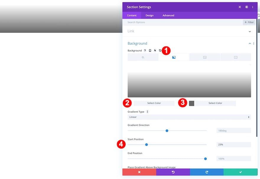
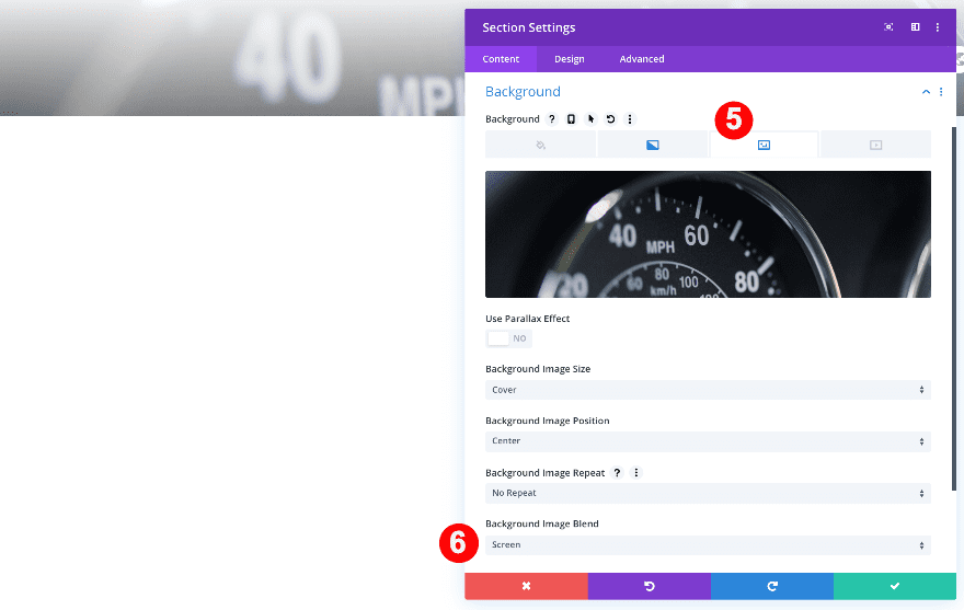
Background
Add a gradient and then an image with a screen blend mode.
- Background: Gradient + Image
- Gradient Color 1: White #ffffff
- Gradient Color 2: Medium Grey #666666
- Gradient Start Position: 22%
- Background Image Blend: Screen
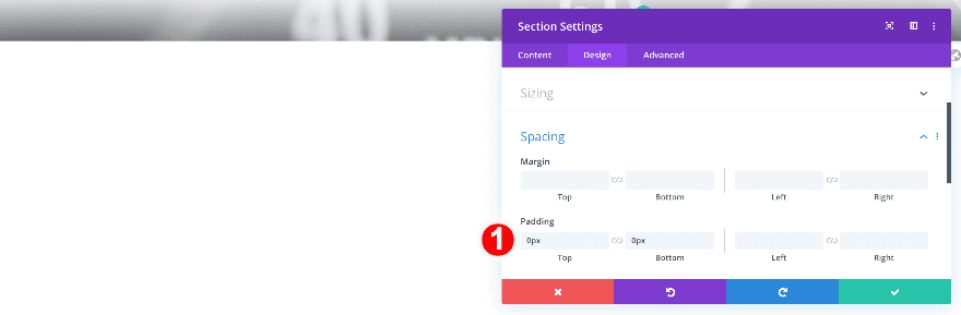
Spacing
Remove the default top and bottom padding of the section next.
- Top and Bottom Padding: 0vw
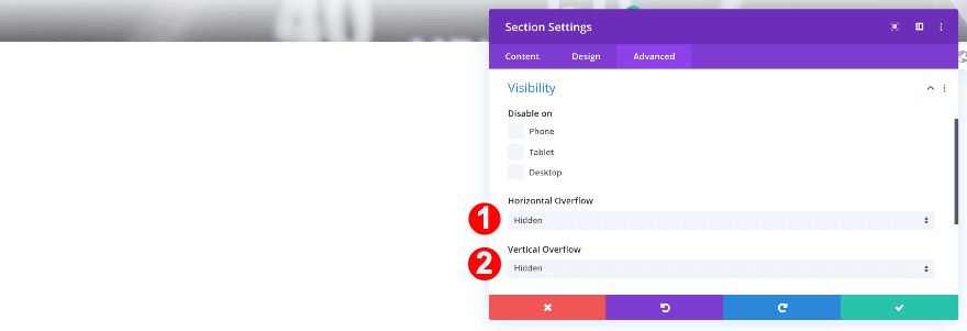
Visibility
Complete the section settings by hiding the section’s overflows.
- Vertical and Horizontal Overflow: Hidden
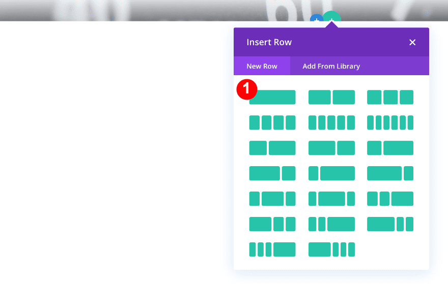
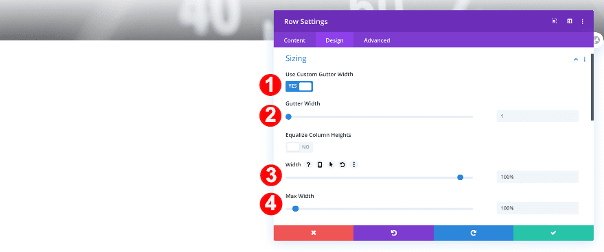
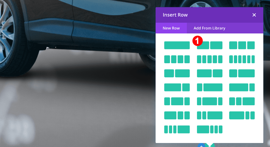
Add Row #1
Now, add a new row with three columns.
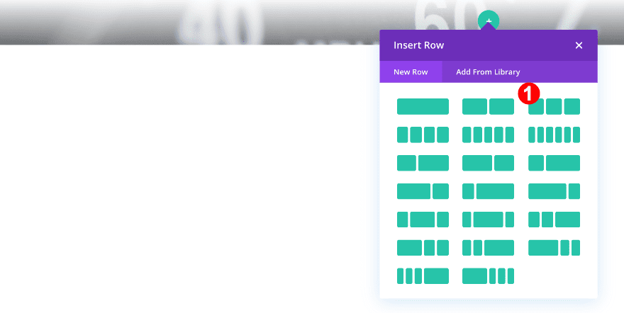
Before adding any modules adjust the row settings.
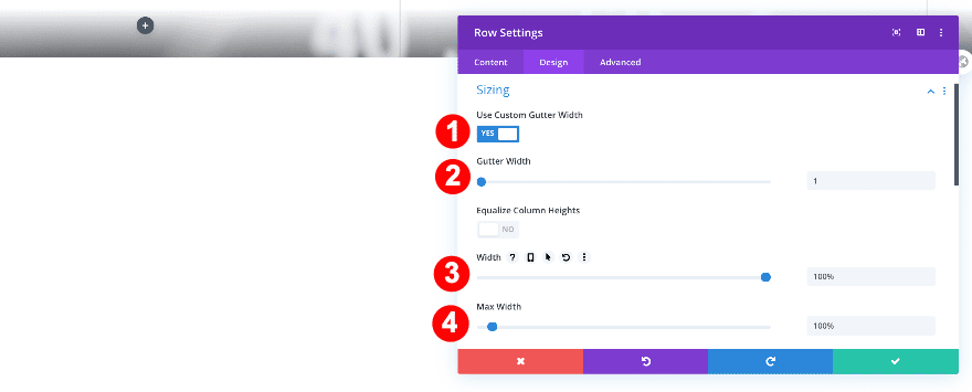
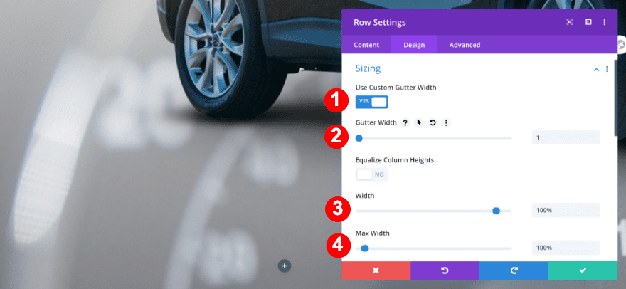
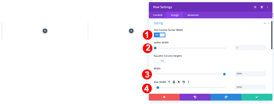
Sizing
First, adjust the sizing of the row.
- Use Custom Gutter Width: Yes
- Gutter Width: 1
- WIdth: 100%
- Max Width: 100%
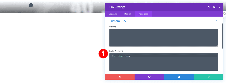
Custom CSS
Next, add one single line of CSS code to the main element of the row. This will allow the columns to appear next to each other on smaller screen sizes as well.
- Main Element CSS: display: flex;
display: flex;
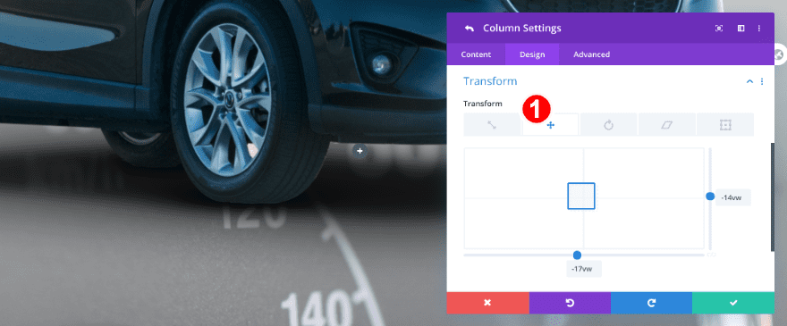
Column 1
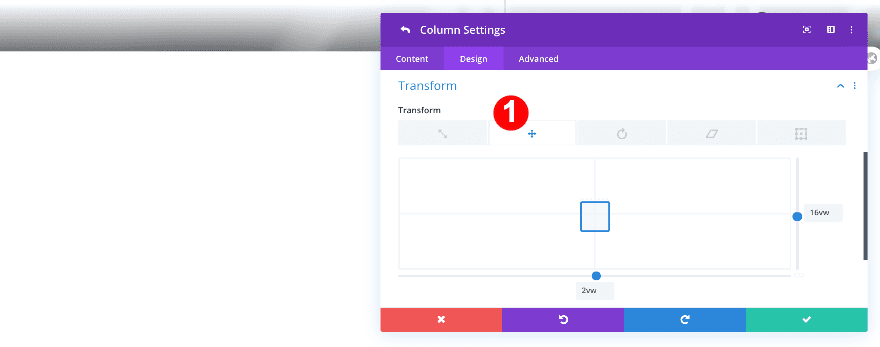
Transform Translate
Apply a custom transform translate effect to the first column to reposition the column. This step will make sense once you add the image marker modules later on the post. If you’re using this technique on another design, you’ll need to change these values accordingly.
- Transform Translate: x-axis 2vw, y-axis 16vw
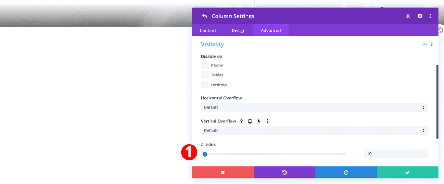
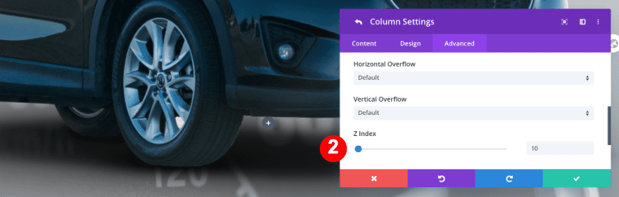
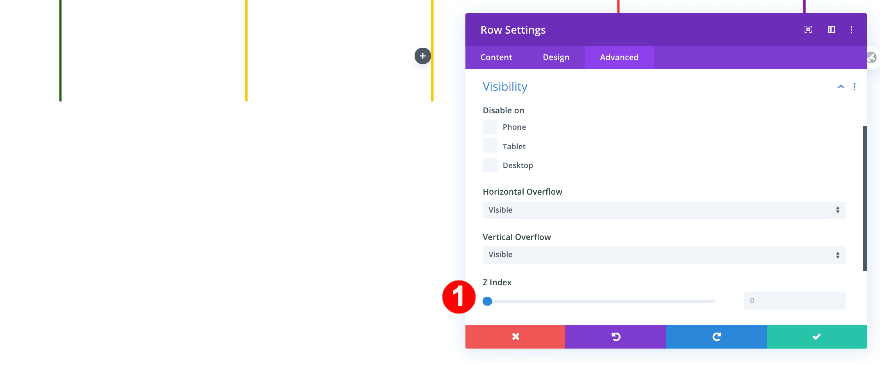
Z Index
Add a higher z index value to the visibility tab.
- Z Index: 10
Column 2
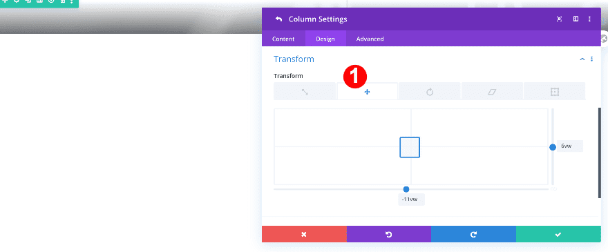
Transform Translate
Apply a transform translate effect to the second column.
- Transform Translate: x-axis -11vw, y-axis 6vw
Z Index
Increase the z index value.
- Z Index: 10
Column 3
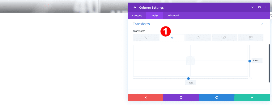
Transform Translate
Modify the transform translate values of the third column.
- Transform Translate: x-axis -11vw, y-axis 8vw
Z Index
And change the z index value.
- Z Index: 10
Add Row #2
Before adding any modules to the first row, add a new one-column row. Do this before adding the image markers so you can see what is happening on the screen while designing.
Sizing
Change the sizing settings of the row.
- Use Custom Gutter Width: Yes
- Gutter Width: 1
- WIdth: 100%
- Max Width: 100%
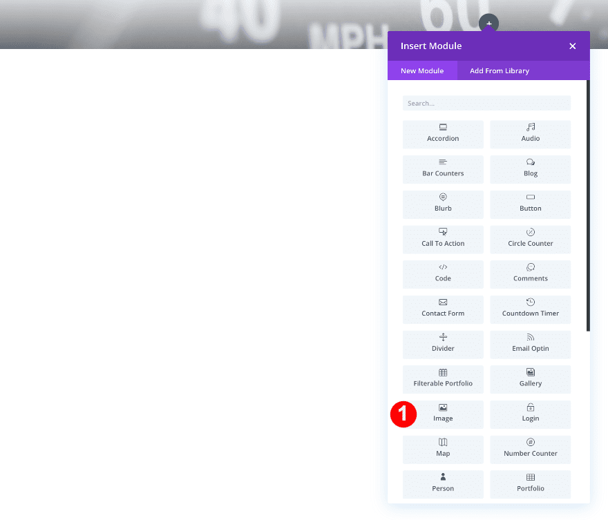
Add Image Module
Add an image module next.
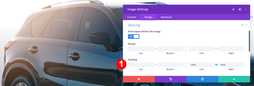
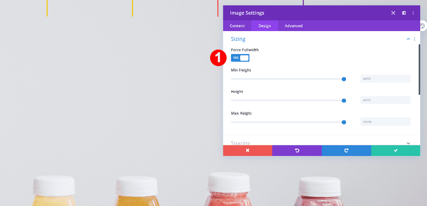
Sizing
Force fullwidth on the image module to make sure the design remains responsive across all screen sizes.
- Force Fullwidth: Yes

Spacing
Then, add some left and right padding to make the image smaller.
- Left and Right Padding: 10vw
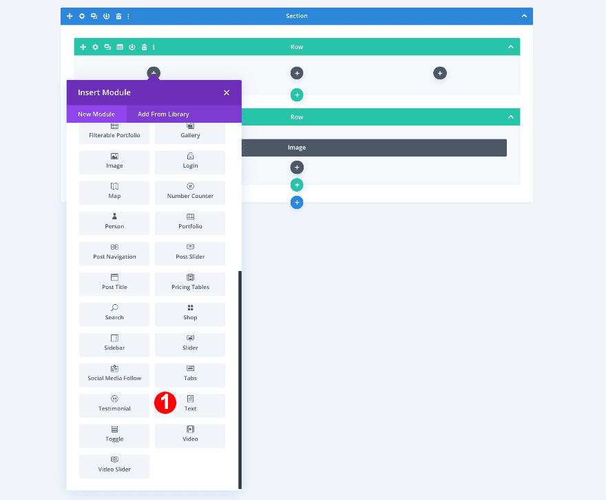
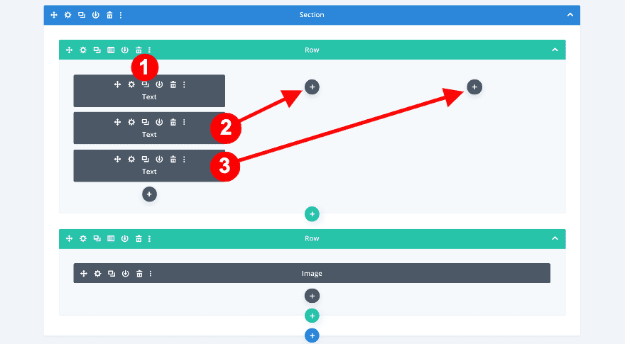
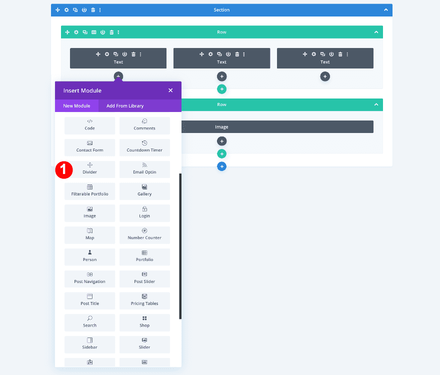
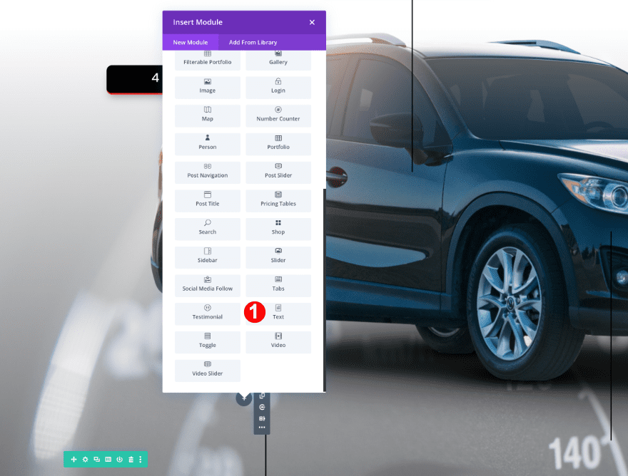
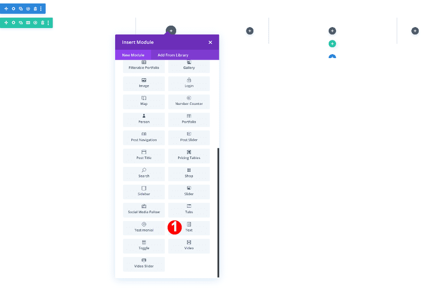
Add 3 Text Modules
Now, return to the first 3-column row and add 3 text modules.
Use the wireframe view for easier access.
Add a text module to the first column, clone it twice and drag the duplicates to the other columns.
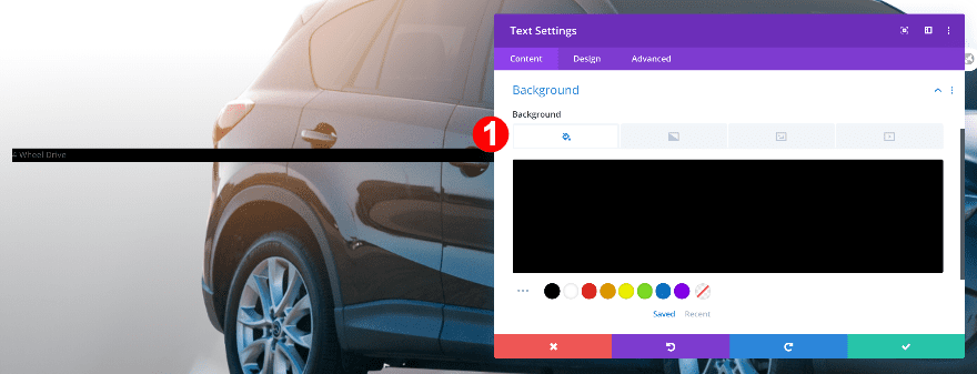
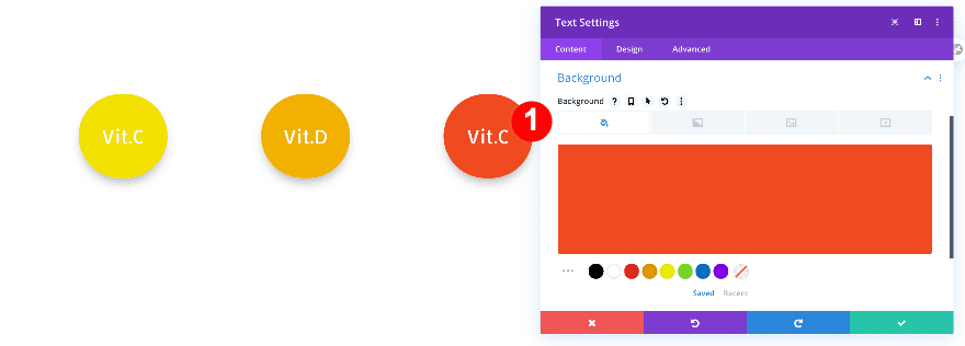
Start modifying the text module in column 1. Enter some content of your choice and change the settings as follows.
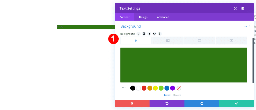
Background
Add a black background.
- Background Color: Black #000000
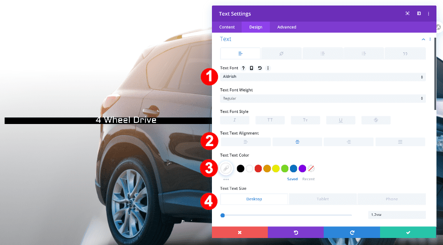
Text
Style the text.
- Text Font: Aldrich
- Text Color: White #ffffff
- Text Alignment: Centered
- Text Size:
- Desktop: 1.2vw
- Tablet: 2vw
- Phone: 2.4vw
- Heading Font Weight: Bold
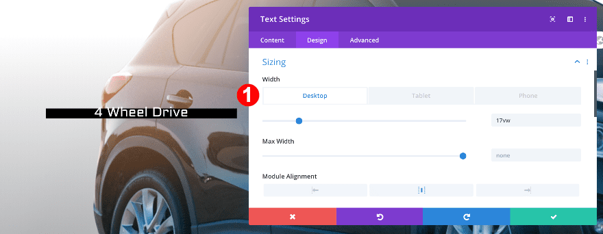
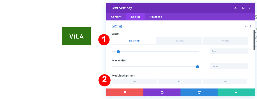
Sizing
Adjust the size of the text module.
- Width:
- Desktop: 17vw
- Tablet: 23vw
- Phone: 30vw
- Module Alignment: Center
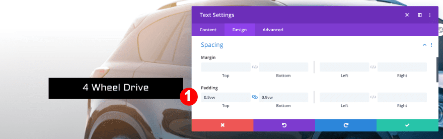
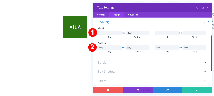
Spacing
Add top and bottom padding.
- Top and Bottom Padding: 0.9vw
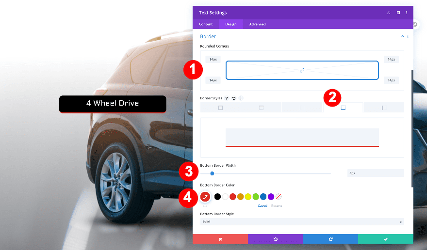
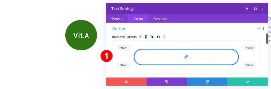
Border
Change the border settings.
- Rounded Corners: 14px on all corners
- Bottom Styles: Bottom Border
- Bottom Border Width: 4px
- Bottom Border Color: Red #E02B20
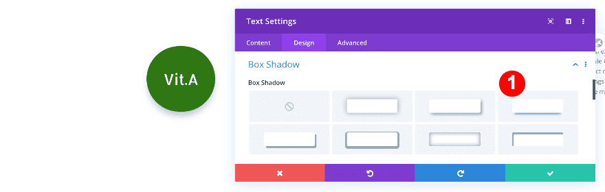
Box Shadow
Apply a box shadow.
- Box Shadow: Third Option

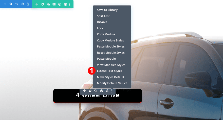
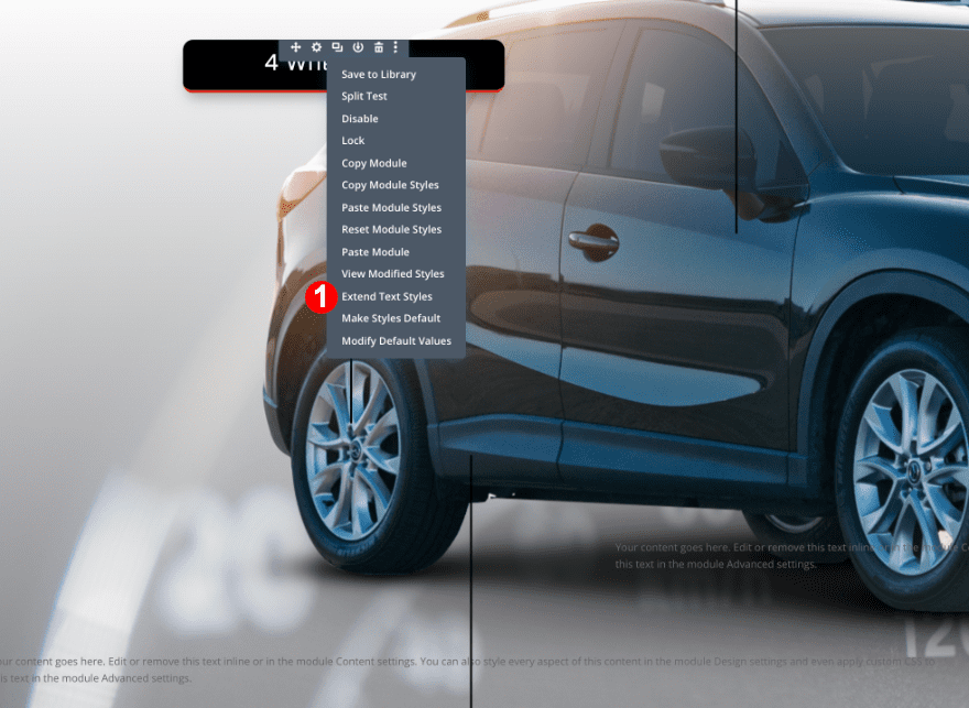
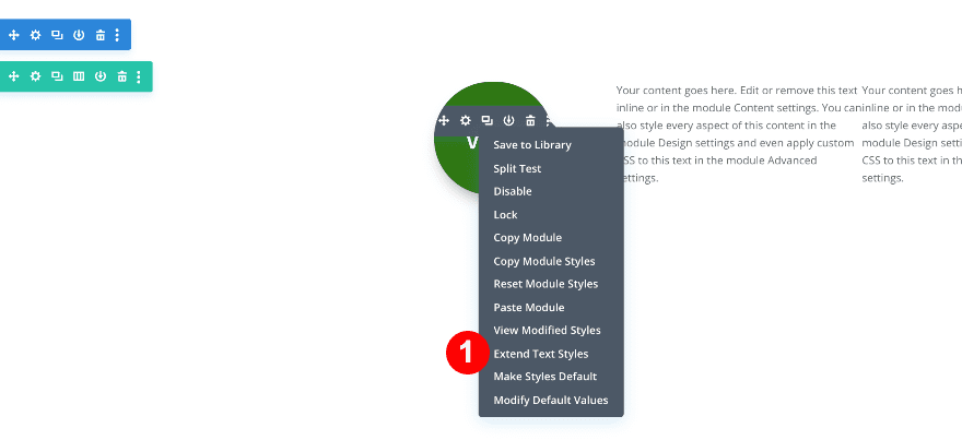
Expand Text Styles
To save time, use the extend style option to style the other text modules in the section.
- First, click on the three dots on the right edge of the text module and select “Extend Text Styles.”
- Then, in the pop-up box, click on “Throughout” and select “This Section” when the menu drops down.
- Change the content in each text module.

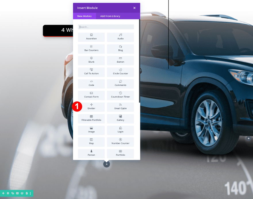
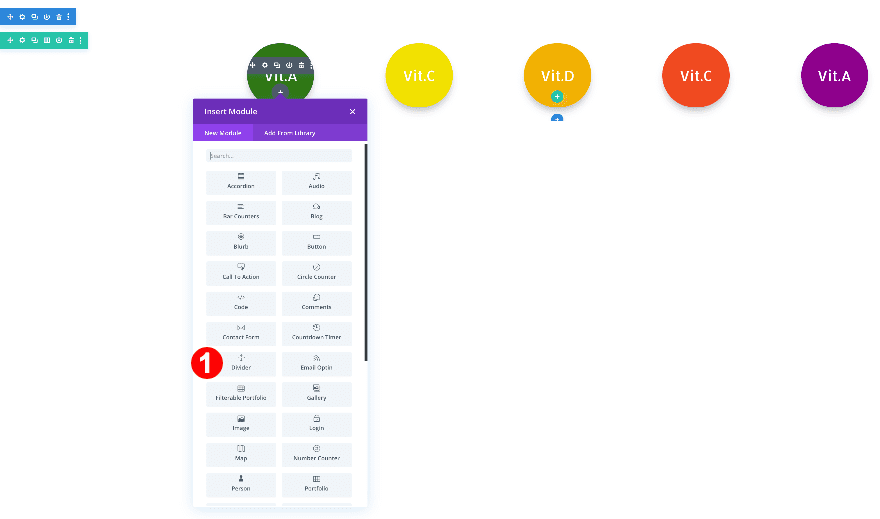
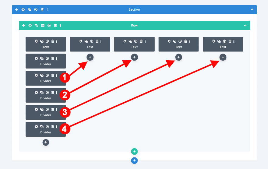
Add 3 Divider Modules
Add a divider below the text module in column 1. Then clone it twice and drag the duplicates to the other columns.
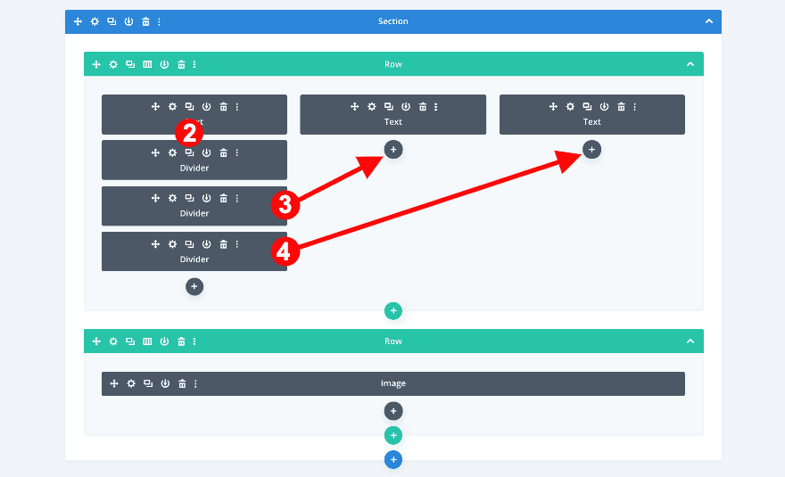
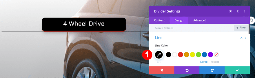
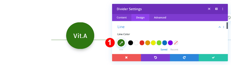
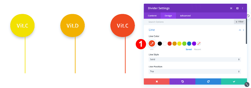
Open the divider module in column 1 and make some changes.
Line
Make the divider black.
- Line Color: Black #000000
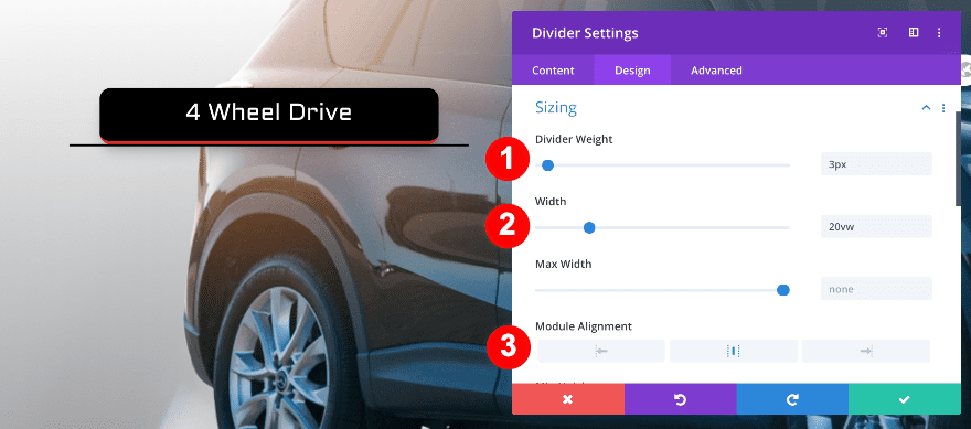
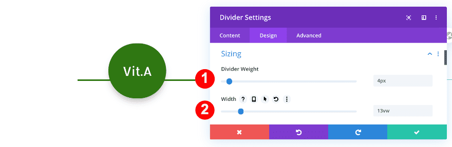
Sizing
Adjust the thickness of the divider.
- Divider Weight: 3px
- Width: 20vw
- Module Alignment: Center
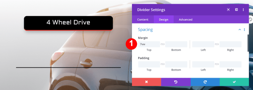
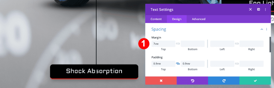
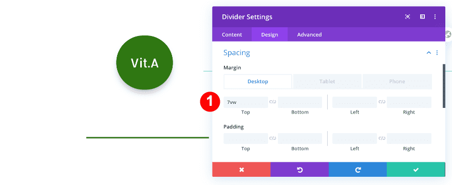
Spacing
Adjust the top margin.
- Top Margin: 7vw
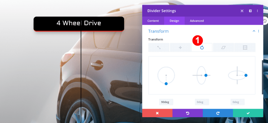
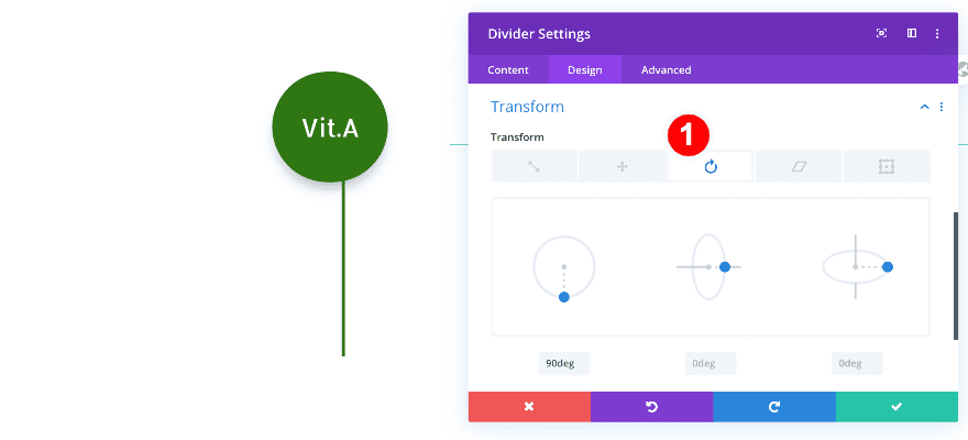
Transform
Add a transform rotate effect to make the divider vertical.
- Transform Rotate: First Option at 90deg
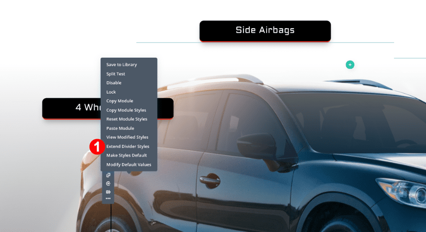
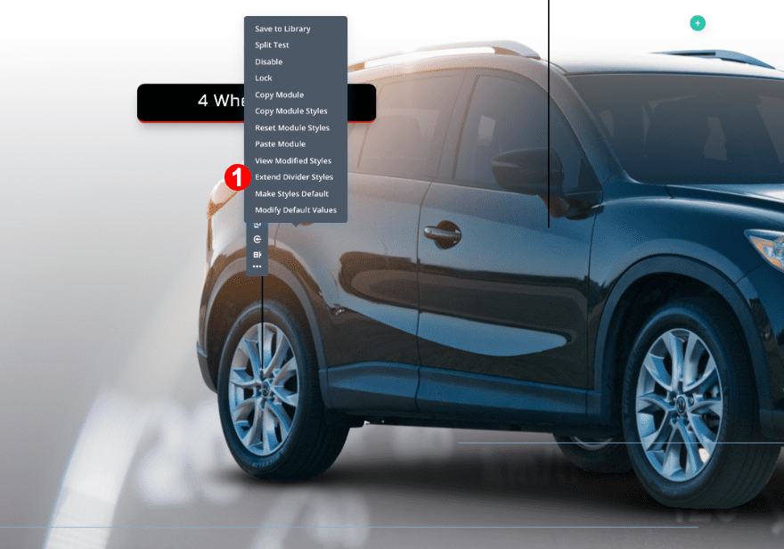
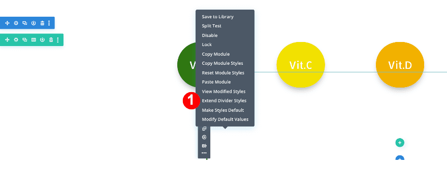
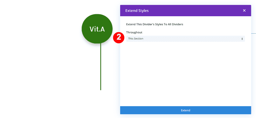
Expand Divider Settings
Save time and use the extend styles option.
- First, click on the three dots on the right side of the divider module and select “Extend Divider Styles.”
- Then, in the popup box, click on “Throughout” and select “This Section” in the dropdown menu.
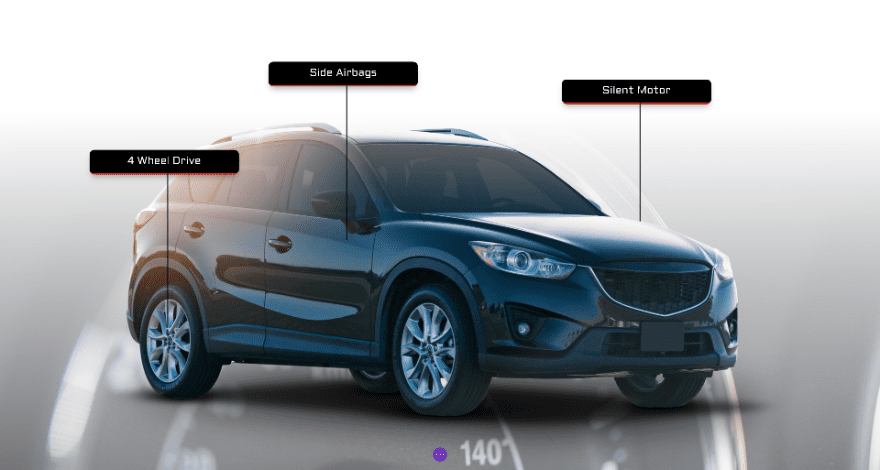
The design should now look like this:
Add Row #3
Add a third row to the section using the following column structure:
Now, before adding any modules, adjust the row settings accordingly.
Sizing
Change the sizing settings.
- Use Custom Gutter Width: Yes
- Gutter Width: 1
- WIdth: 100%
- Max Width: 100%
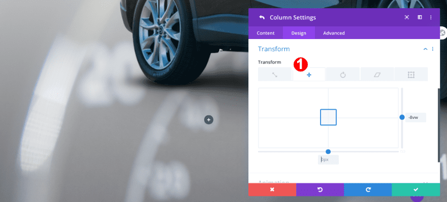
Column 1
Transform
Apply a transform translate effect to the first column.
- Transform Translate: y-axis -8vw
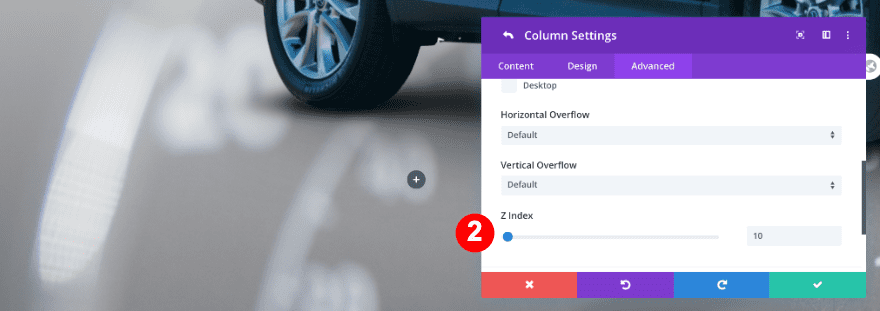
Z Index
Adjust the z index value too.
- Z Index: 10
Column 2
Transform
Reposition the second column using some custom transform translate settings.
- Transform Translate: x-axis -17vw, y-axis -14vw
Z Index
Adjust the z index value.
- Z Index: 10
Add 2 Dividers
Add two dividers, one in each column.
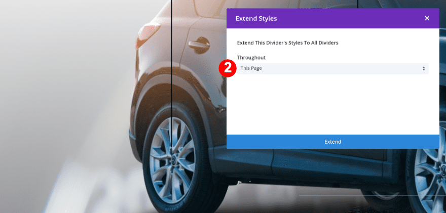
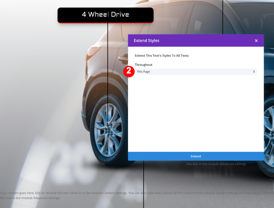
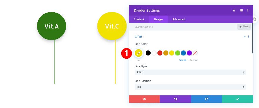
Extend Divider Styles
After adding the dividers, use the previous dividers to extend the styles to the new ones.
- First, click on the three dots in the divider module in the first row above and select “Extend Divider Styles.”
- Then, in the popup, select “Throughout This Page.”
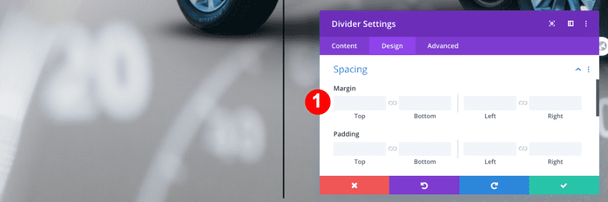
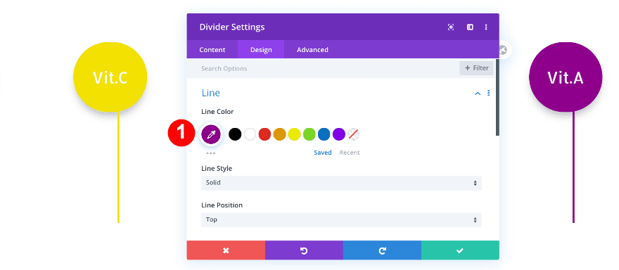
Now, we’re going to make some changes to the divider in the first column of our third row.
Sizing
Remove the margin.
- Top Margin: default
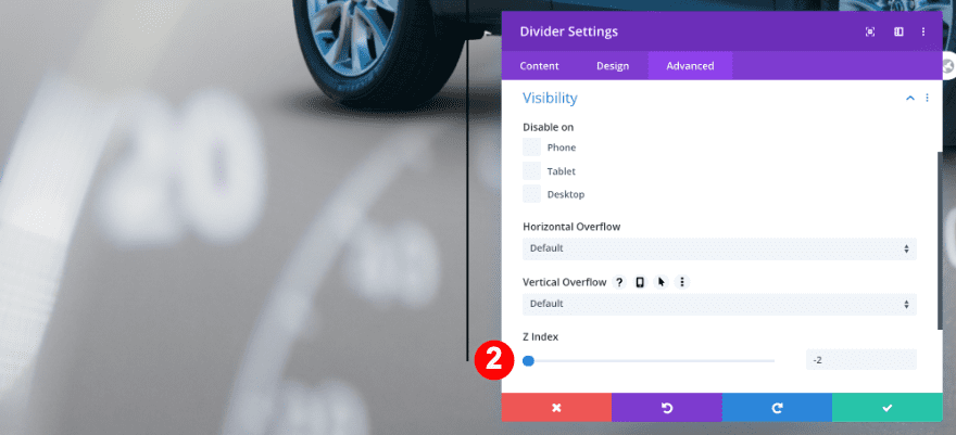
Z Index
Change the z index too.
- Z Index: -2
Add 2 Text Modules
Add a text module to each column.
Extend Text Styles
After adding the new text modules, extend the text styles from the text module in the first row.
- First, click on the three dots in the first text module in the top row and select “Extend Text Styles.”
- Then, in the popup, select “Throughout This Page.”
Now, change the text to match the design. Furthermore, add some top margin to both text modules in the third row.
Spacing
- Top Margin: 7vw
Recreate Example #2
On to the next example!
Add New Section
Add a new section to the page you’re working on. Before adding a row, adjust the section settings.
Visibility
Hide the section’s overflows in the visibility settings.
- Horizontal and Vertical Overflow: Hidden

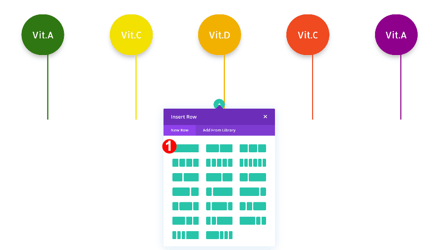
Add Row #1
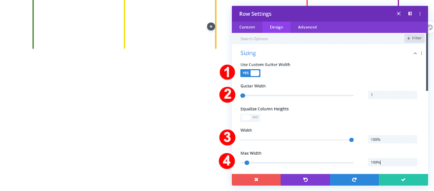
Now, add a row with five columns. Before adding any modules, adjust the row settings as follows.
Sizing
First, modify the sizing settings.
- Use Custom Gutter Width: Yes
- Gutter Width: 1
- WIdth: 100%
- Max Width: 100%
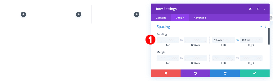
Spacing
Then adjust the spacing.
- Left and Right Padding: 19.5vw
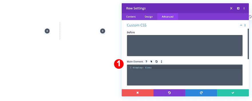
Custom CSS
Allow the columns to appear next to each other by adding one line of CSS code to the main element of the row.
- Main Element CSS: display: flex;
display: flex;
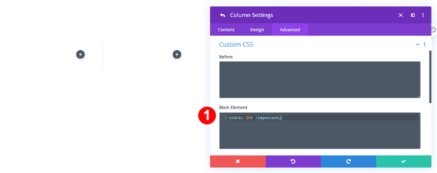
All Column Settings
Then, make some changes to each one of the columns.
Custom CSS
- Main Element: width: 20% !important;
width: 20% !important;
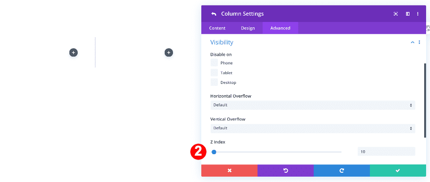
Z Index
Adjust the z index value too.
- Z Index: 10
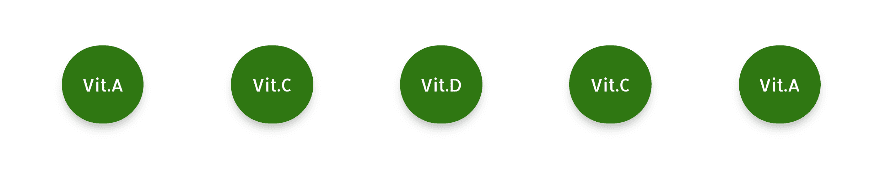
Add 5 Text Modules
Add a text module to each column.
Add some relevant content to the content box and continue by modifying the text module settings of the text module in column 1.
Background
Add a background color.
- Background Color: Green #2f7713
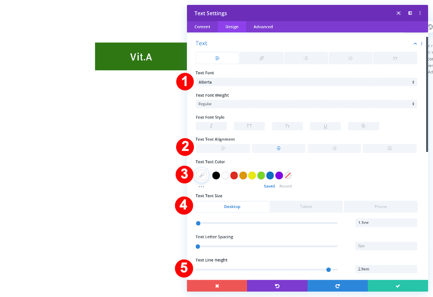
Text
Style the content as follows.
- Text Font: Allerta
- Text Alignment: Center
- Text Color: White #ffffff
- Text Size:
- Desktop: 1.3vw
- Tablet: 2vw
- Phone: 2.4vw
- Text Line Height: 2.9em
Sizing
Adjust the sizing.
- Width:
- Desktop: 6vw
- Tablet: 8vw
- Phone: 9vw
- Module Alignment: Center
Spacing
Adjust the spacing to turn the module into a square.
- Bottom Margin: -2vw
- Top and Bottom Padding: 1vw
- Left and Right Padding: 1vw
Border
Turn the text module into a circle in the border settings.
- Rounded Corners: 50vw all four sides
Box Shadow
Select a box shadow too.
- Box Shadow: Third Option
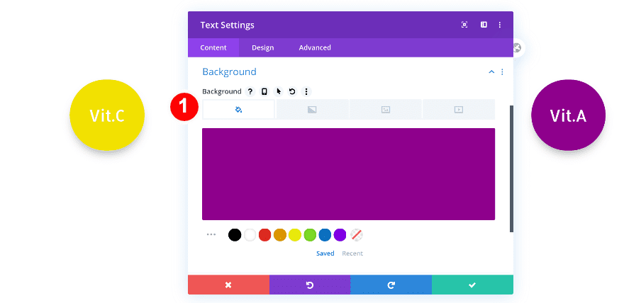
Extend Text Styles
Use the extend styles option to adjust the settings of all the text modules in the row.
- First, click on the dots on the right of the text module and choose “Extend Text Styles.”
- Then, in the pop-up, click “Throughout” and choose “This Page.”
- Finally, change the text in each module’s content box.

The design should now look like this.
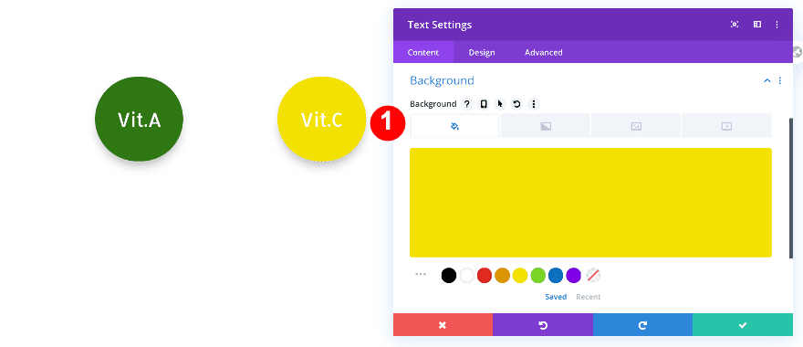
Text Module 2
Make the second circle yellow.
- Background Color: Yellow #f2e200
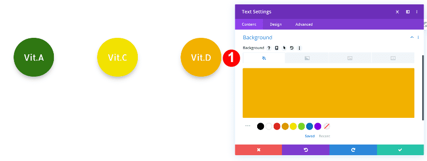
Text Module 3
Make the third circle orange.
- Background Color: Orange #f2b100
Text Module 4
Make the fourth circle orange-red.
- Background Color: Orange Red
Text Module 5
Make the fifth module purple.
- Background Color: Purple #8e008c
Add 5 Divider Modules
Now, below each text module, add a divider module.
Adjust the settings to the first divider accordingly.
Line
Give the divider a color.
- Line Color: Green #2f7713
Sizing
Adjust the width.
- Divider Width: 4px
- Width: 13vw
Spacing
Add a top margin value.
- Top Margin:
- Desktop: 7vw
- Tablet + Phone: 5vw
Transform
Rotate the divider to make it vertical.
- Transform Rotate: 90 deg in The First Option
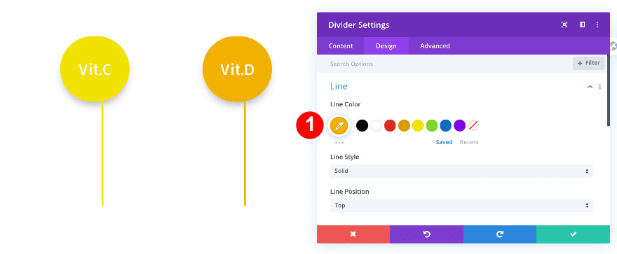
Extend Divider Settings
Use the extend styles option to style the other dividers.
- First, click on the dots in the right of the divider module and choose “Extend Divider Styles.”
- Then, in the popup, click on “Throughout” and choose “This Section.”
Match the colors
Divider 2
Make the second divider yellow.
- Line Color: Yellow #f2e200
Divider 3
Make the third divider orange.
- Line Color: Orange #f2b100
Divider 4
Make the fourth divider orange red.
- Line Color: Orange Red #ef4a21
Divider 5
Make the fifth divider purple.
- Line Color: Purple #8e008c
Add Row #2
Add a new one-column row.
Before adding the image module, adjust the row settings.
Sizing
First, adjust the sizing.
- Use Custom Gutter Width: Yes
- Gutter Width: 1
- WIdth: 100%
- Max Width: 100%
Visibility
Then, the visibility.
- Horizontal and Vertical Overflow: Visible
Add Image Module
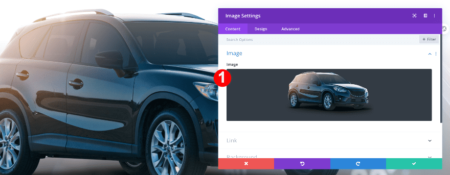
Add an image module and upload the juices image.
Sizing
Force fullwidth on the image.
- Force Fullwidth: Yes
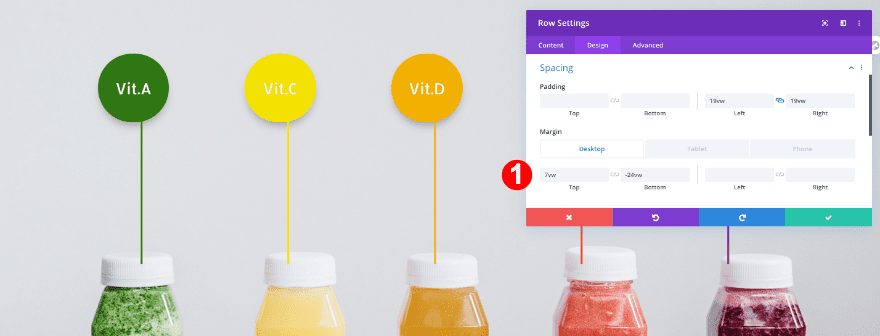
Row Spacing
It’s time for the final touch. Open the row #1 settings again and add some top and bottom margin.
- Top Margin: 7vw
- Bottom Margin:
- Desktop: -24vw
- Tablet: -31vw
- Phone: -35vw
Preview
Now that we’ve gone through all the steps, let’s take a final look at the outcome across different screen sizes.
Example #1
Desktop
Mobile
Example #2
Desktop
Mobile
That’s a Wrap!
In this post, we’ve shown you how to create two different image marker designs. We used the column options to keep the text columns and dividers together. We hope these designs will inspire you to create your own image marker designs. Remember to use the transform translate options inside the columns for better control of each image marker. If you have any questions, feel free to leave a comment in the comment section below!


It’s interesting to know that this can be done natively with Divi because it shows how powerful this page builder is. But for a customer project, I would probably get a plugin to add image markers.
Yes very good,
but way too much work by any means. The good thing is, you can make it – but who will do such specific solutions`without json files?
In everyday work this is much to complicated as the usability is not for normal user, it takes abstract layers and time consuming work.
The 2nd example, the juice bottles, is a bit off-putting because the image markers aren’t consistently aligned with respect to the images. I haven’t the time to dive into it right now, but would ask if this is the best alignment that can be achieved?
Thanks!
Thanks for the ready to download file 🙂
great article
Great work but not really center for divider
Is there a demo of this that we can check out like you guys usually have up?
Very cool!