
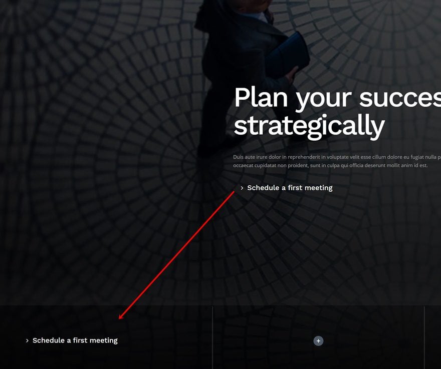
The way you structure elements inside your hero section can get tricky sometimes. You want to have a good balance, without having to drastically reduce the amount of content you want to share. Luckily, some streamlined approaches have proven their worth across the web. One of those approaches is adding an absolute-positioned bottom bar to your hero section. Not only does it look good, design-wise, it also helps you add multiple calls to action without unbalancing the design.
In this tutorial, we’ll show you how to add an absolute-positioned bottom bar to your hero section inside Divi. The bottom bar we’ll add will contain four parts; three buttons and one contact form. You’ll be able to download the JSON file for free as well!
Let’s get to it.
- 1 Preview
- 2 Download The Absolute-Positioned Bottom Bar Hero Section Layout for FREE
- 3 Download For Free
-
4
Let’s Start Recreating!
- 4.1 Add New Section
- 4.2 Add Row #1
- 4.3 Add Text Module #1 to Column
- 4.4 Add Text Module #2 to Column
- 4.5 Add Button Module to Column
- 4.6 Add Row #2
- 4.7 Column 1 Settings
- 4.8 Column 2 Settings
- 4.9 Column 3 Settings
- 4.10 Column 4 Settings
- 4.11 Clone Button Module in Previous Row & Place Duplicate in Column 1 of New Row
- 4.12 Clone Button in Column 1 Twice & Place Duplicates in Column 2 & 3
- 4.13 Add Text Module to Column 4
- 4.14 Add Contact Form Module to Column 4
- 5 Preview
- 6 Final Thoughts
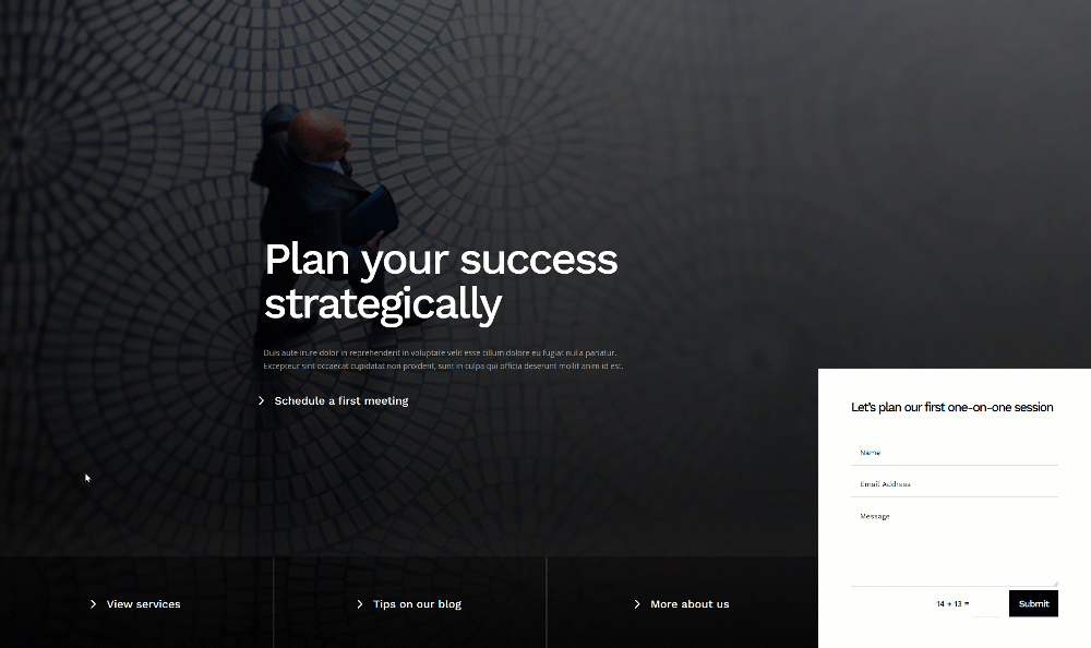
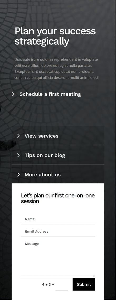
Preview
Before we dive into the tutorial, let’s take a quick look at the outcome across different screen sizes.
Desktop
Mobile
Download The Absolute-Positioned Bottom Bar Hero Section Layout for FREE
To lay your hands on the free hero section layout, you will first need to download it using the button below. To gain access to the download you will need to subscribe to our newsletter by using the form below. As a new subscriber, you will receive even more Divi goodness and a free Divi Layout pack every Monday! If you’re already on the list, simply enter your email address below and click download. You will not be “resubscribed” or receive extra emails.

Subscribe To Our Youtube Channel
Let’s Start Recreating!
Add New Section
Gradient Background
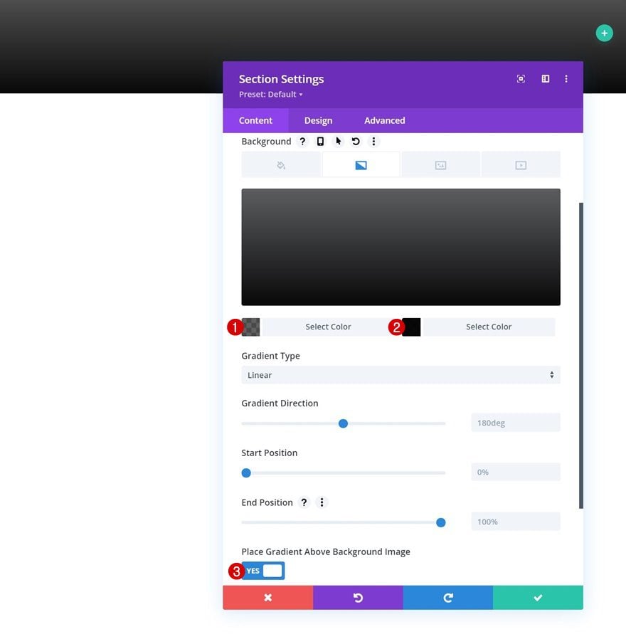
Start by adding a new section to the page you’re working on. Open the section settings and apply a gradient background.
- Color 1: rgba(0,0,0,0.62)
- Color 2: rgba(0,0,0,0.97)
- Place Gradient Above Background Image: Yes
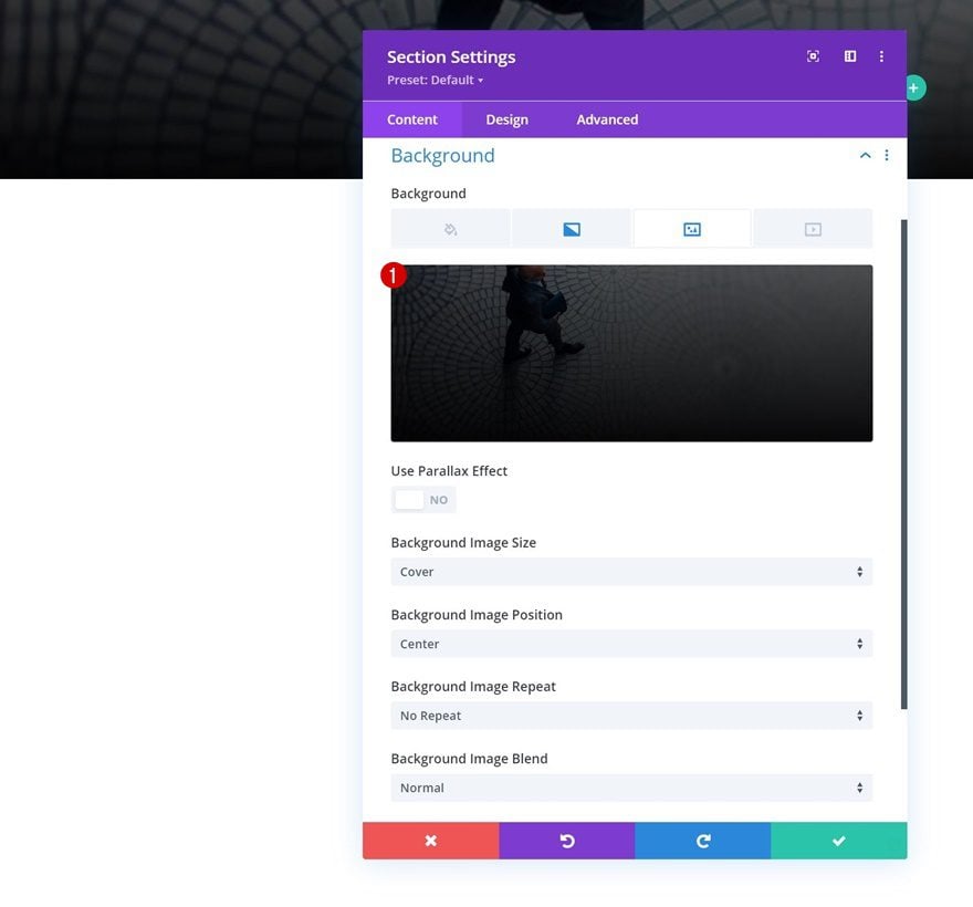
Background Image
Upload a background image of your choice next.
Spacing
Move on to the section’s design tab and remove all default top and bottom padding.
- Top Padding: 0px
- Bottom Padding: 0px
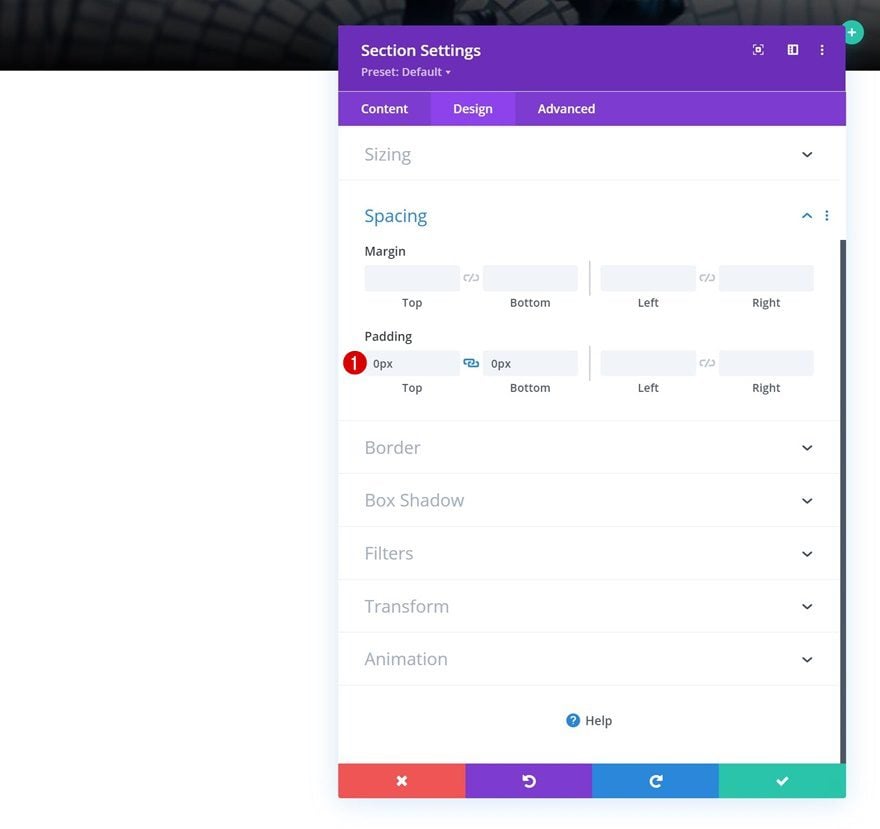
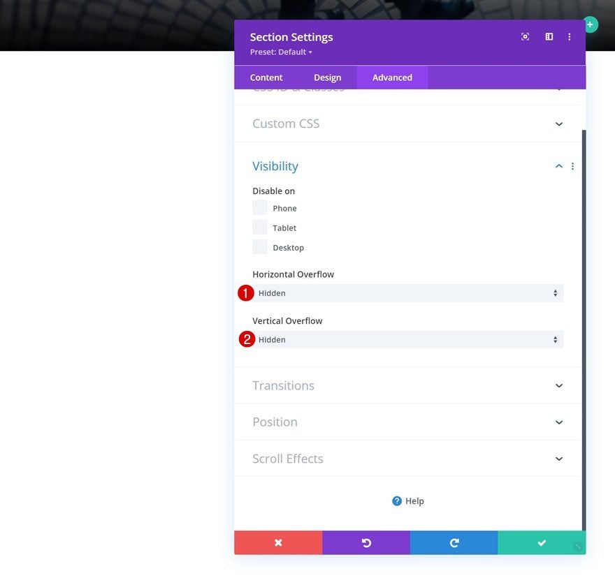
Overflows
We’re hiding the section’s overflows as well.
- Horizontal Overflow: Hidden
- Vertical Overflow: Hidden
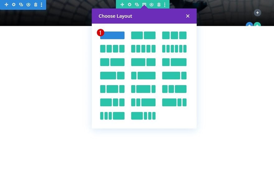
Add Row #1
Column Structure
Continue by adding a new row to the section using the following column structure:
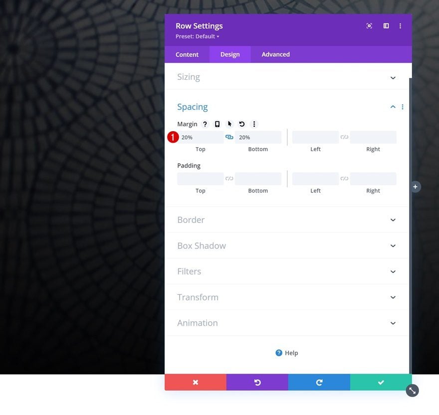
Spacing
Without adding any modules yet, open the row settings and apply some top and bottom margin.
- Top Margin: 20%
- Bottom Margin: 20%
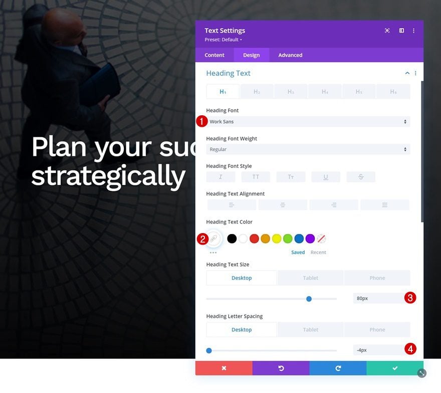
Add Text Module #1 to Column
Add H1 Content
Time to add modules, starting with a first Text Module containing some H1 content of your choice.
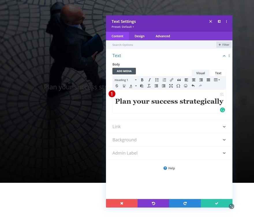
H1 Text Settings
Move on to the module’s design tab and style the H1 text as follows:
- Heading Font: Work Sans
- Heading Text Color: #ffffff
- Heading Text Size:
- Desktop: 80px
- Tablet: 50px
- Phone: 40px
- Heading Letter Spacing:
- Desktop: -4px
- Tablet & Phone: -2px
Add Text Module #2 to Column
Add Content
Add another Text Module right below the previous one and include some description content of your choice.
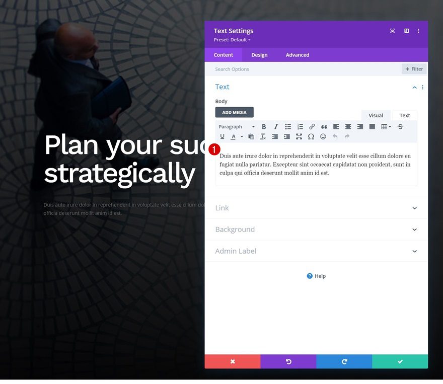
Text Settings
Modify the module’s text settings accordingly:
- Text Font: Open Sans
- Text Color: #a0a0a0
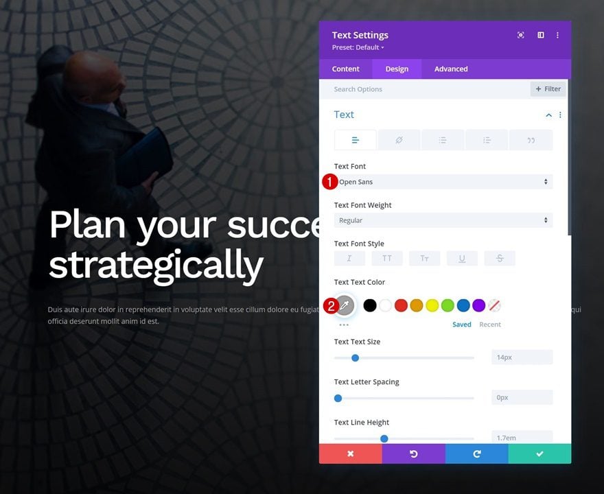
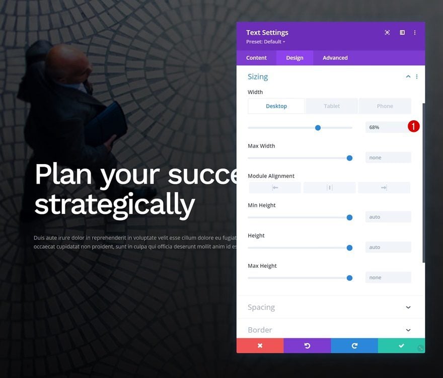
Sizing
Modify the sizing settings as well.
- Width:
- Desktop: 68%
- Tablet & Phone: 100%
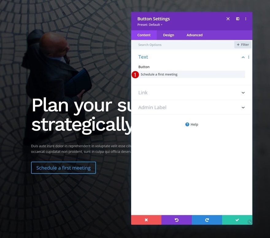
Add Copy
The last module we need in this row is a Button Module. Include some copy of your choice.
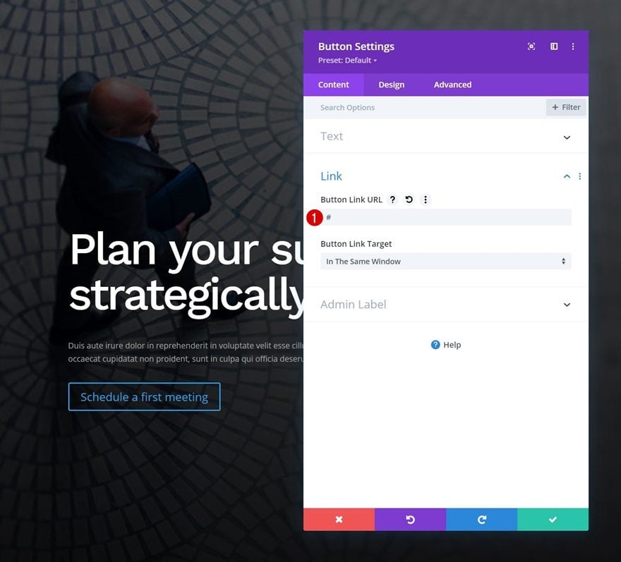
Add Link
Add a button link.
- Button Link URL: #
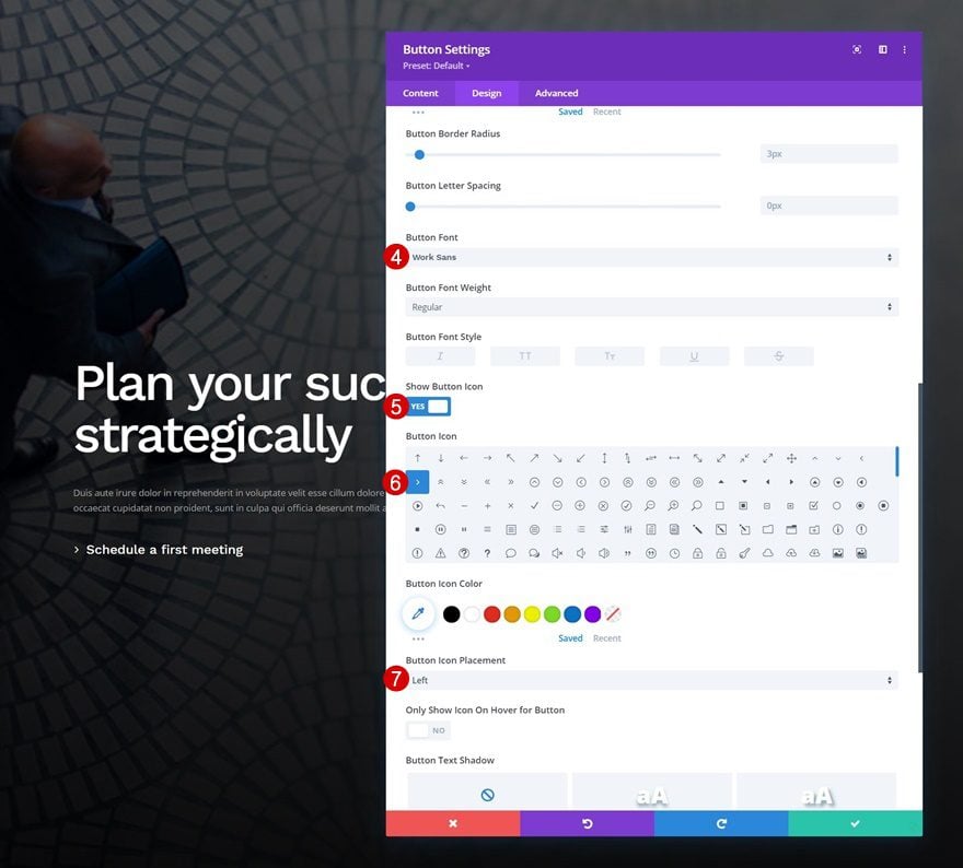
Button Settings
Move on to the module’s design tab and style the button as follows:
- Use Custom Styles For Button: Yes
- Button Text Color: #ffffff
- Button Border Width: 0px
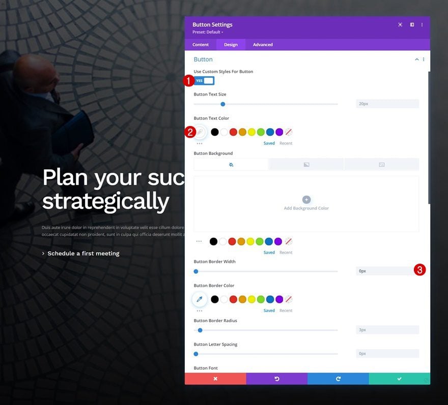
- Button Font: Work Sans
- Show Button Icon: Yes
- Button Icon Placement: Left
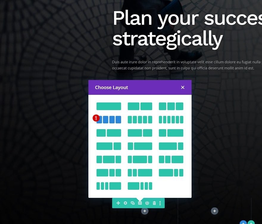
Add Row #2
Column Structure
Time to create our bottom hero section bar! To do that, we’ll add a new row using the following column structure:
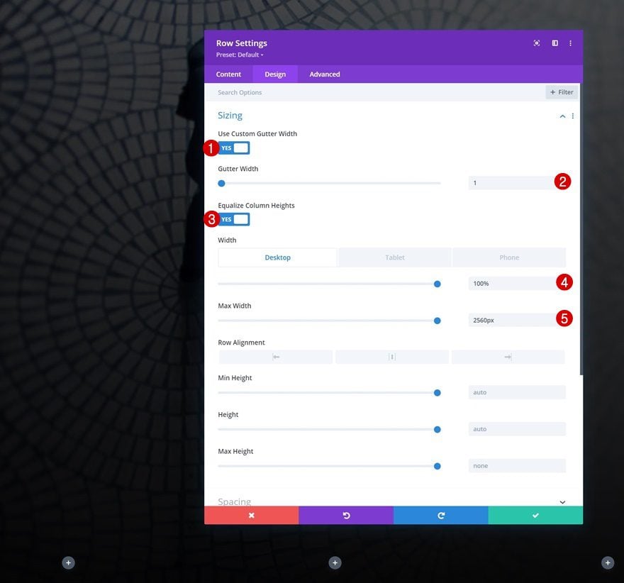
Sizing
Without adding modules yet, open the row settings and modify the sizing settings.
- Use Custom Gutter Width: Yes
- Gutter Width: 1
- Equalize Column Heights: Yes
- Width:
- Desktop: 100%
- Tablet & Phone: 80%
- Max Width: 2560px
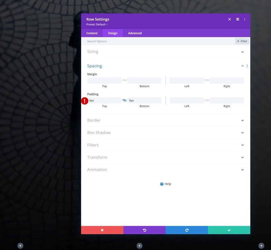
Spacing
Remove all default top and bottom padding next.
- Top Padding: 0px
- Bottom Padding: 0px
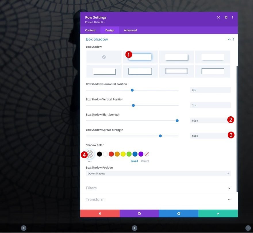
Box Shadow
Include a box shadow as well.
- Box Shadow Blur Strength: 80px
- Box Shadow Spread Strength: 50px
- Shadow Color: rgba(135,135,135,0.08)
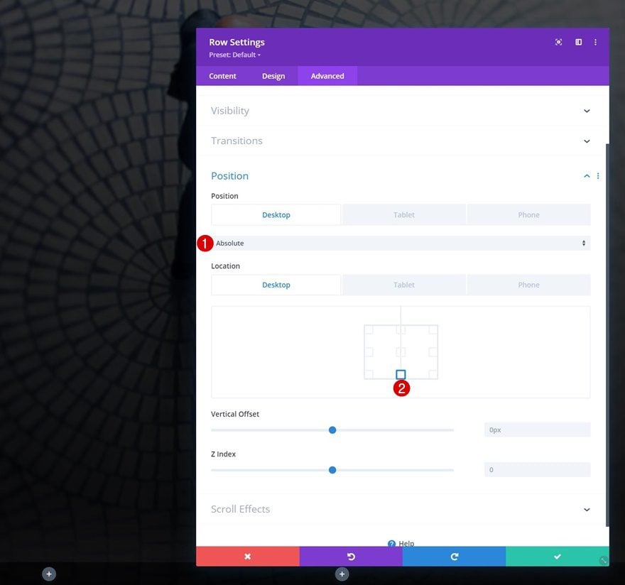
Position
Then, move on to the advanced tab and reposition the entire row on desktop. Bring it back to default on smaller screen sizes. The position settings of this row will make sure the row sticks to the bottom of the section container.
- Position:
- Desktop: Absolute
- Tablet & Phone: Default
- Location: Bottom Center
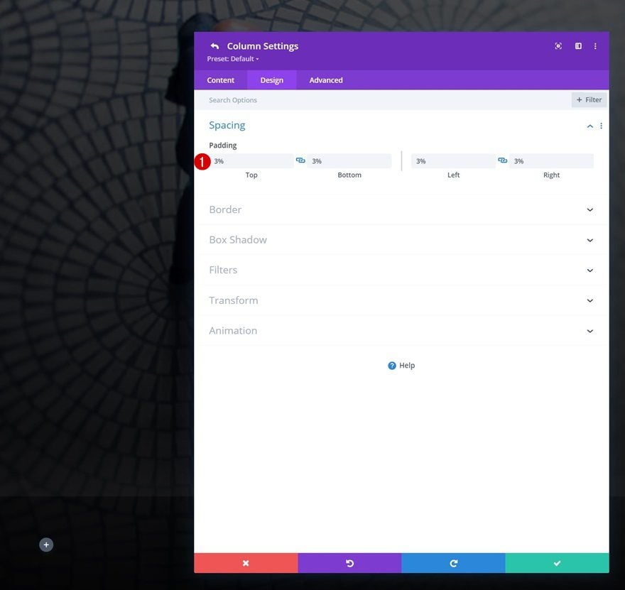
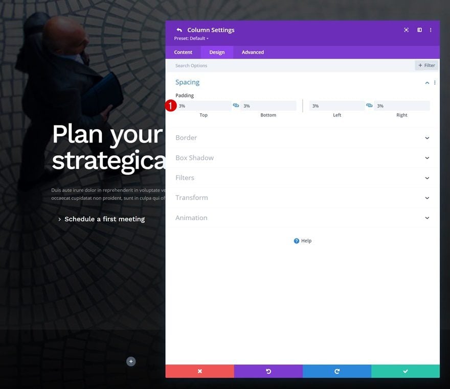
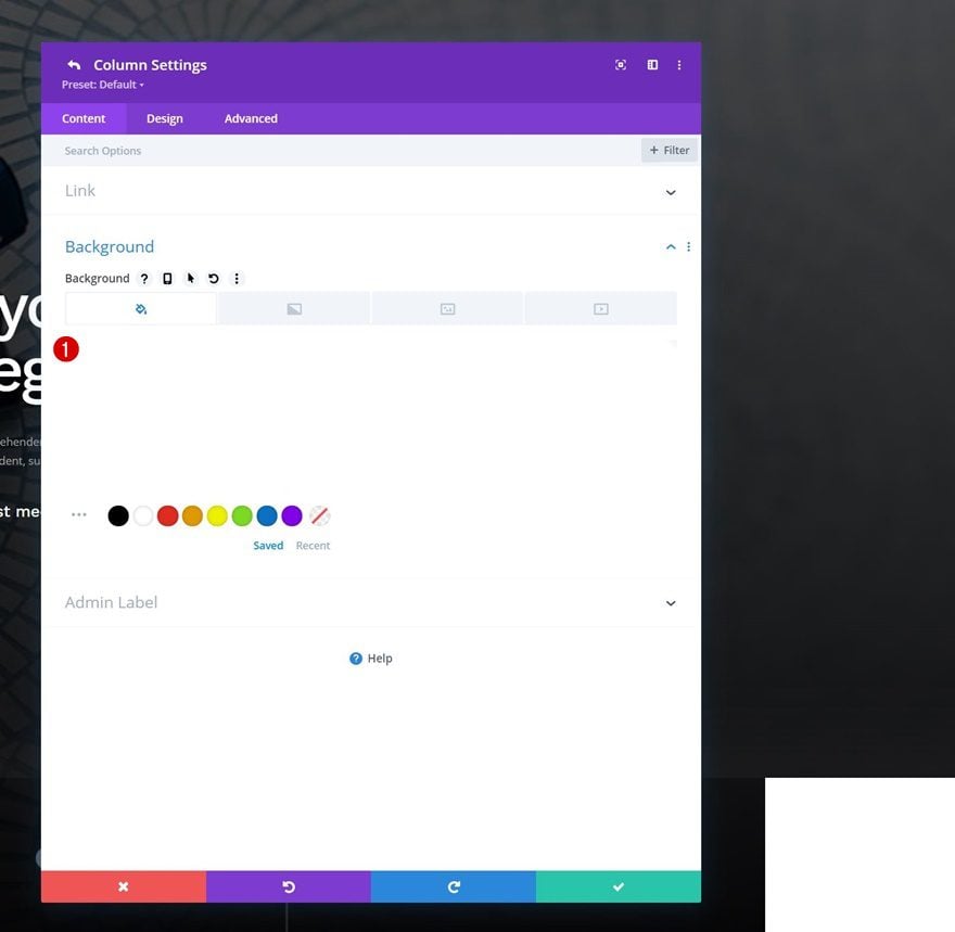
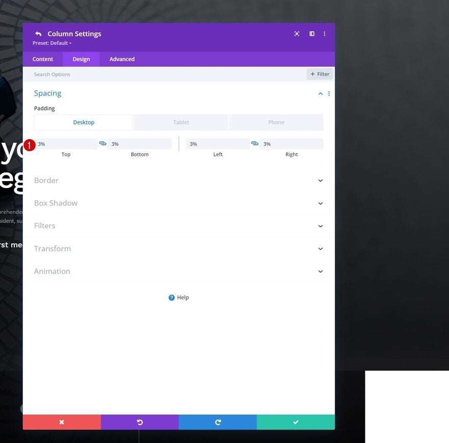
Column 1 Settings
Spacing
Continue by opening the column 1 settings and apply some custom padding values.
- Top Padding: 3%
- Bottom Padding: 3%
- Left Padding: 3%
- Right Padding: 3%
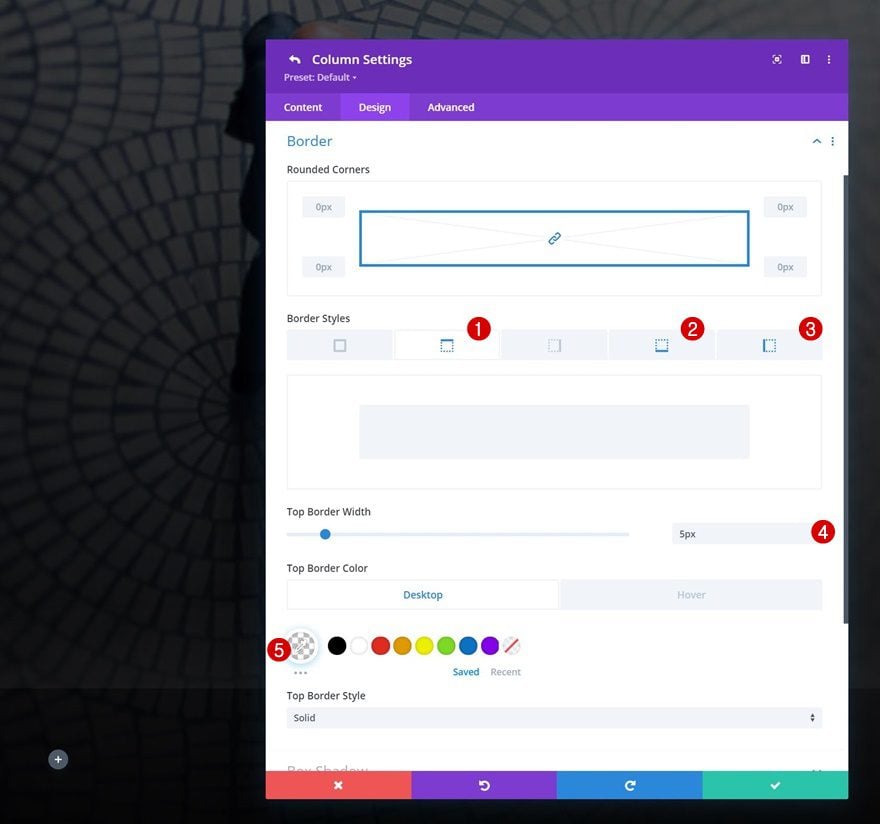
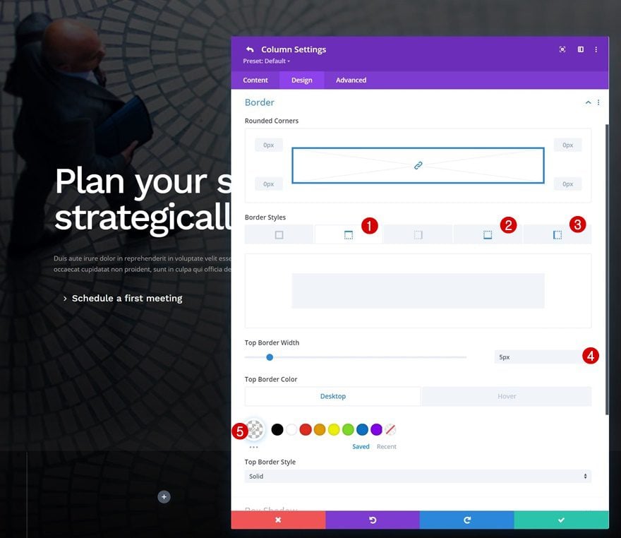
Border
We’re using some responsive border settings for this column too.
- Top Border:
- Top Border Width: 5px
- Top Border Color:
- Default: rgba(255,255,255,0)
- Hover: #ffffff
- Bottom Border:
- Bottom Border Width:
- Desktop & Tablet: 0px
- Phone: 3px
- Bottom Border Color: rgba(255,255,255,0.11)
- Bottom Border Width:
- Left Border:
- Left Border Width:
- Desktop: 0px
- Tablet: 3px
- Phone: 0px
- Left Border Color: rgba(255,255,255,0.11)
- Left Border Width:
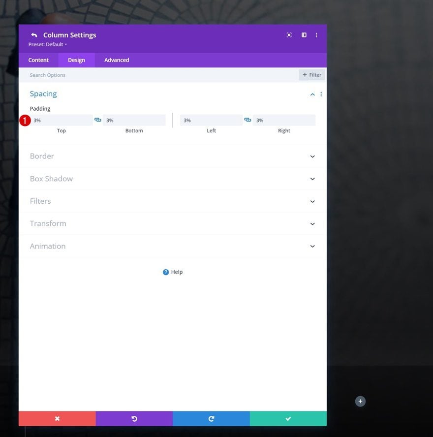
Column 2 Settings
Spacing
On to the second column’s settings. Add some padding values to the spacing settings.
- Top Padding: 3%
- Bottom Padding: 3%
- Left Padding: 3%
- Right Padding: 3%
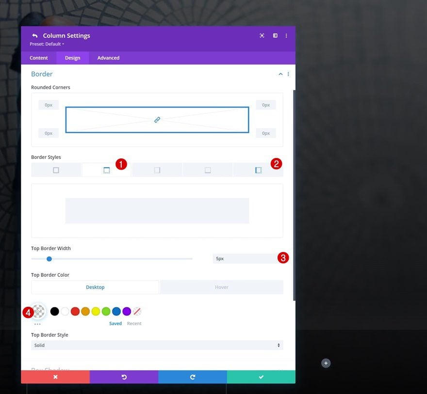
Border
And include the following responsive borders:
- Top Border:
- Top Border Width: 5px
- Top Border Color:
- Default: rgba(255,255,255,0)
- Hover: #ffffff
- Bottom Border:
- Bottom Border Width:
- Desktop & Tablet: 0px
- Phone: 3px
- Bottom Border Color: rgba(255,255,255,0.11)
- Bottom Border Width:
- Left Border:
- Left Border Width:
- Desktop: 3px
- Tablet: 3px
- Phone: 0px
- Left Border Color: rgba(255,255,255,0.11)
- Left Border Width:
Column 3 Settings
Spacing
The third column needs custom padding values too.
- Top Padding: 3%
- Bottom Padding: 3%
- Left Padding: 3%
- Right Padding: 3%
Border
Along with the following border settings:
- Top Border:
- Top Border Width: 5px
- Top Border Color:
- Default: rgba(255,255,255,0)
- Hover: #ffffff
- Left Border:
- Left Border Width:
- Desktop: 3px
- Tablet: 3px
- Phone: 0px
- Left Border Color: rgba(255,255,255,0.11)
- Left Border Width:
Column 4 Settings
Background Color
On to the last column. Add a white background color.
- Background Color: #ffffff
Spacing
Apply some custom responsive padding values.
- Top Padding
- Desktop: 3%
- Tablet: 3%
- Phone: 10%
- Bottom Padding:
- Desktop: 3%
- Tablet: 3%
- Phone: 10%
- Left Padding:
- Desktop: 3%
- Tablet: 5%
- Phone: 10%
- Right Padding:
- Desktop: 3%
- Tablet: 5%
- Phone: 10%
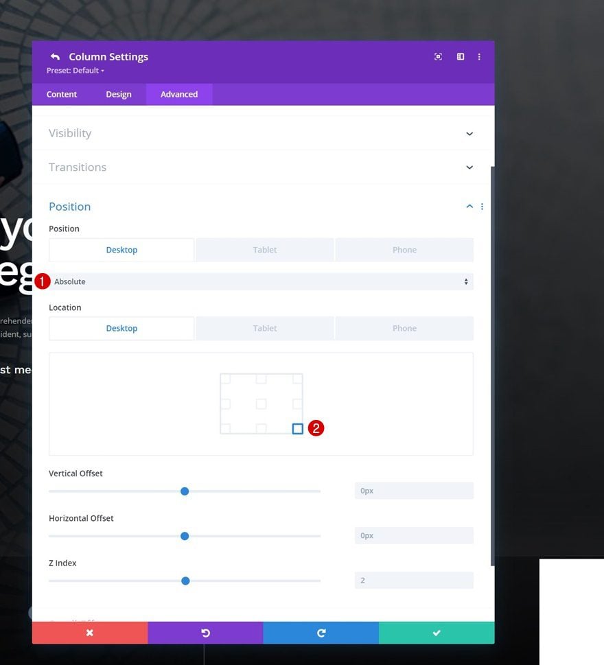
Position
And reposition the entire column on desktop. This will make the column’s size absolute and will let it stick to the bottom of the row.
- Position:
- Desktop: Absolute
- Tablet & Phone: Default
- Location: Bottom Right
Once you’ve completed the row and column settings, it’s time to start adding modules. We’re reusing the Button Module that’s part of the previous row. Clone the module and place its duplicate in the new row’s first column.
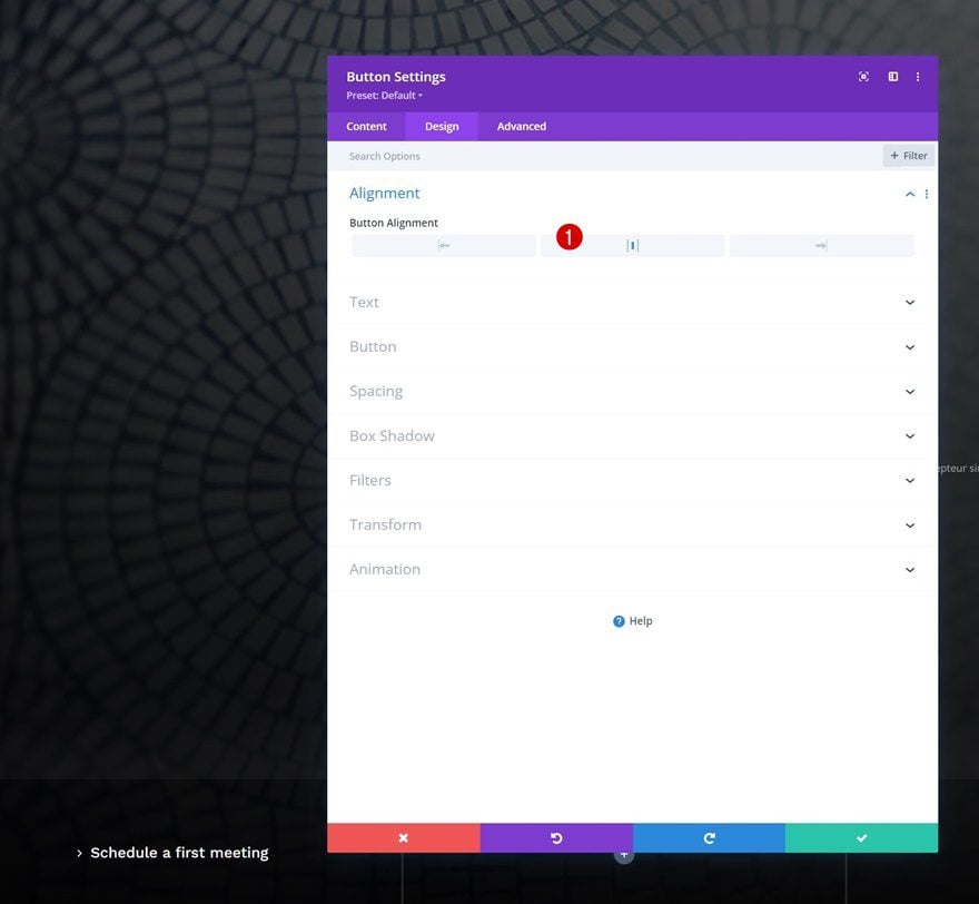
Change Button Alignment
Open the Button Module duplicate and change the alignment.
- Button Alignment: Center
Change Copy & Links
Modify the module’s copy and link next.
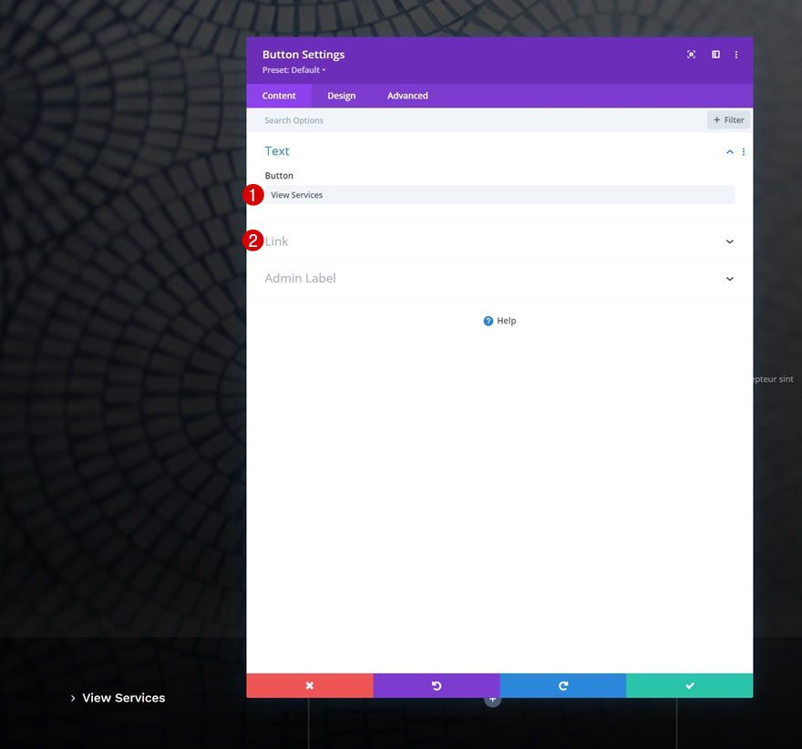
Once you’ve modified the Button Module’s settings in column 1, you can clone the entire module twice and place the duplicates in column 2 and 3.
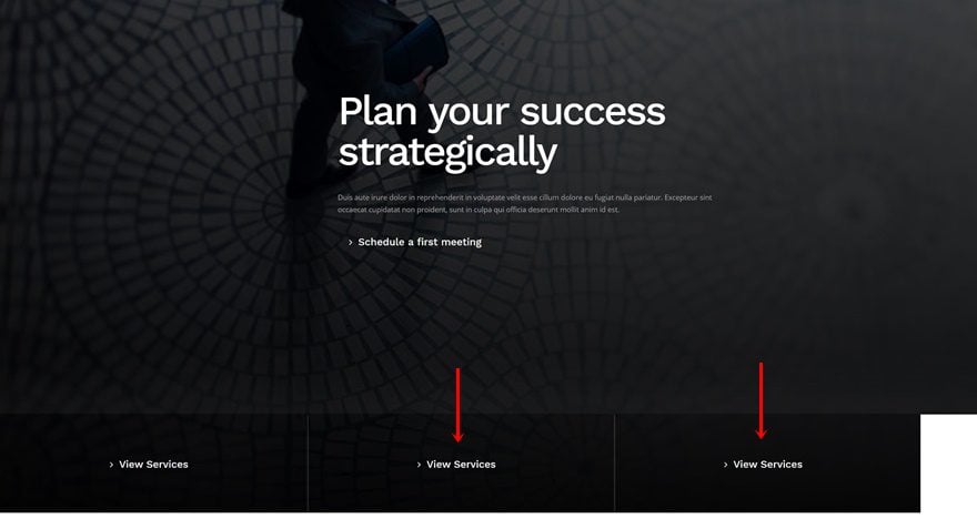
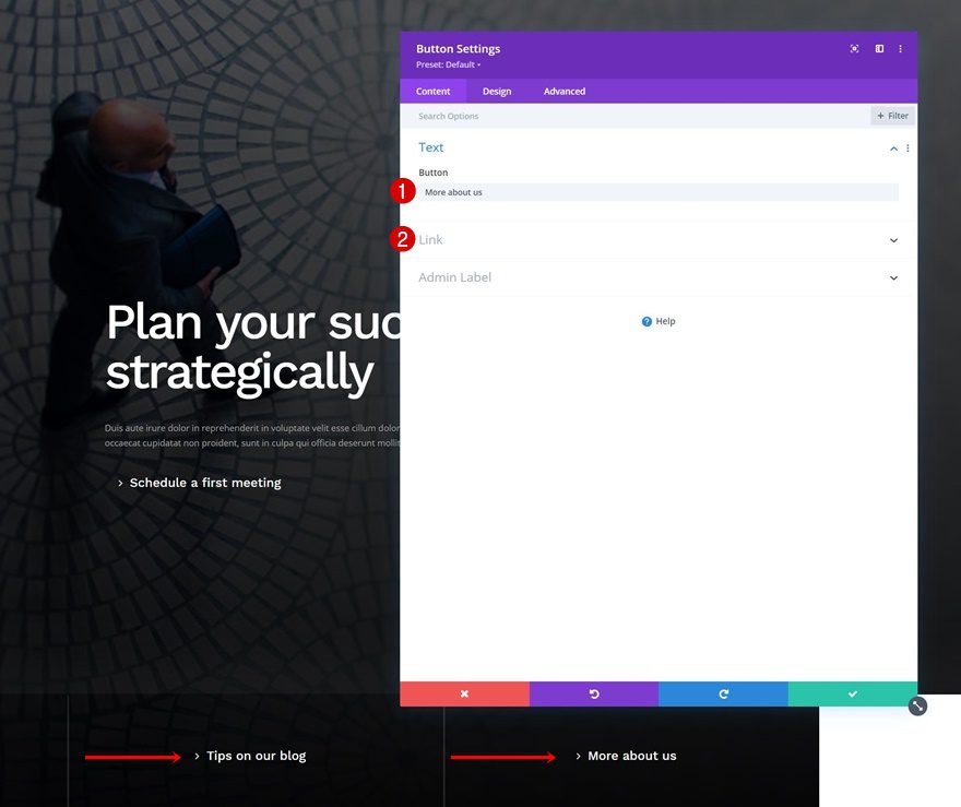
Change Copy & Links
Change the copy and links for each duplicate.
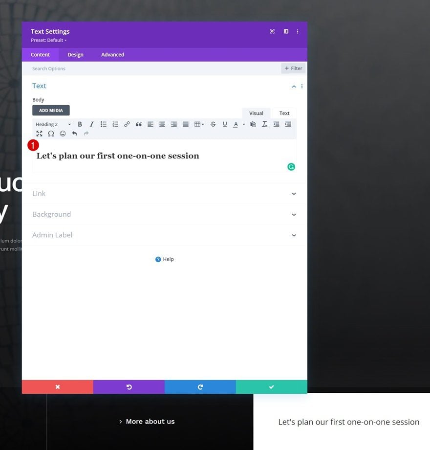
Add Text Module to Column 4
Add H2 Content
On to the last column of the row. There, the first module we’ll need is a Text Module with some H2 content.
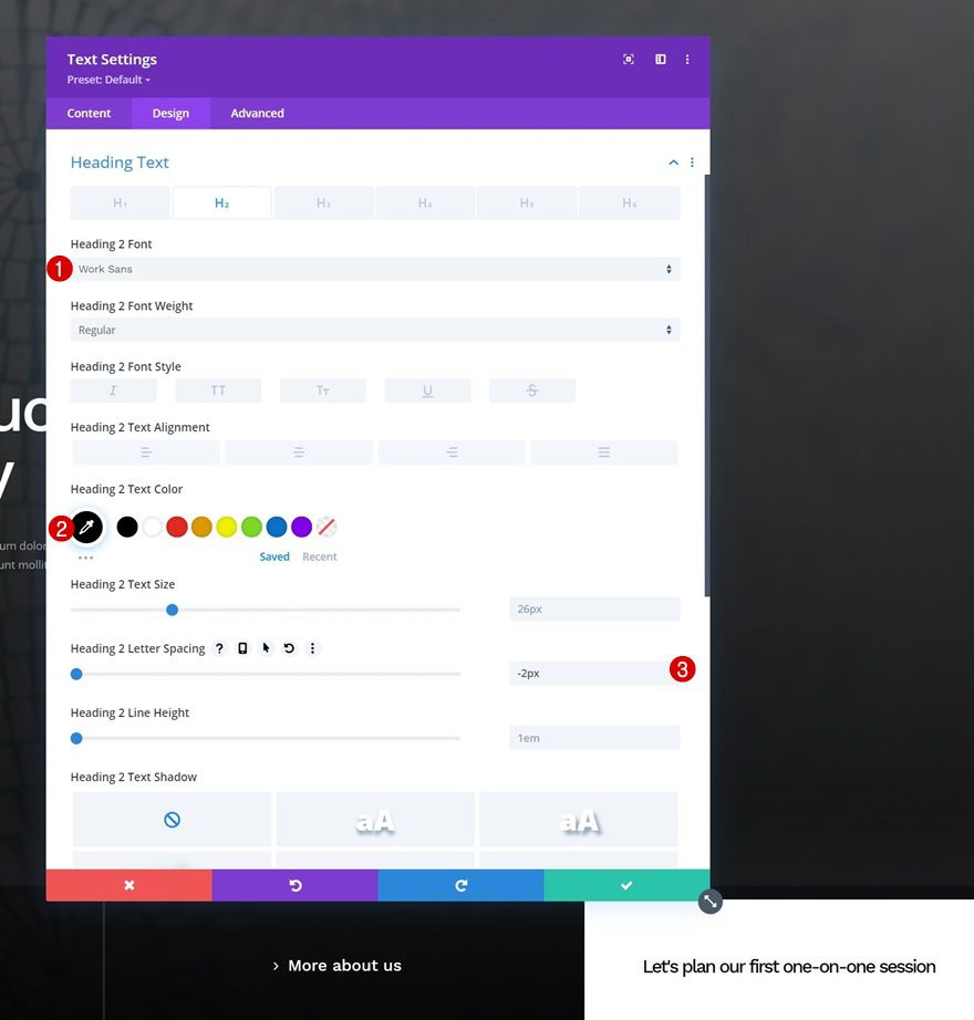
H2 Text Settings
Move on to the module’s design tab and change the H2 text settings accordingly:
- Heading 2 Font: Work Sans
- Heading 2 Text Color: #000000
- Heading 2 Letter Spacing: -2px
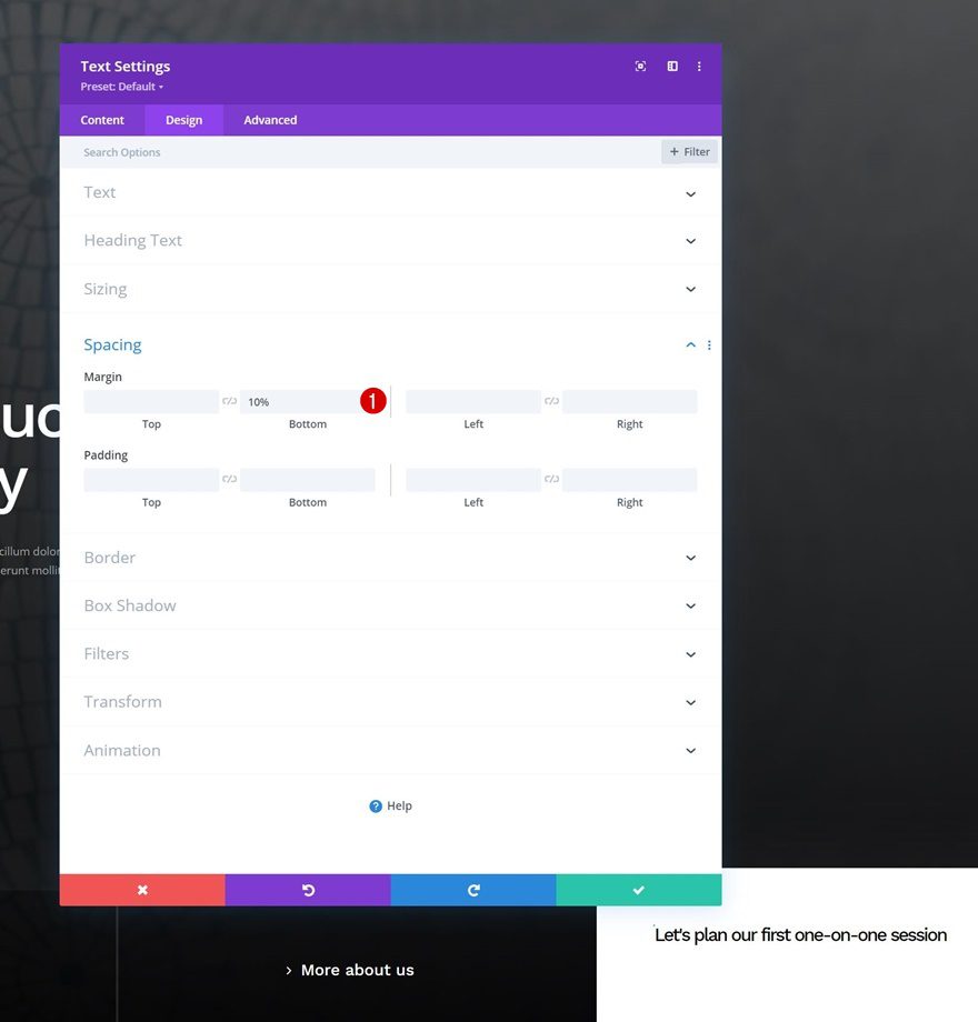
Spacing
Add some bottom margin too.
- Bottom Margin: 10%
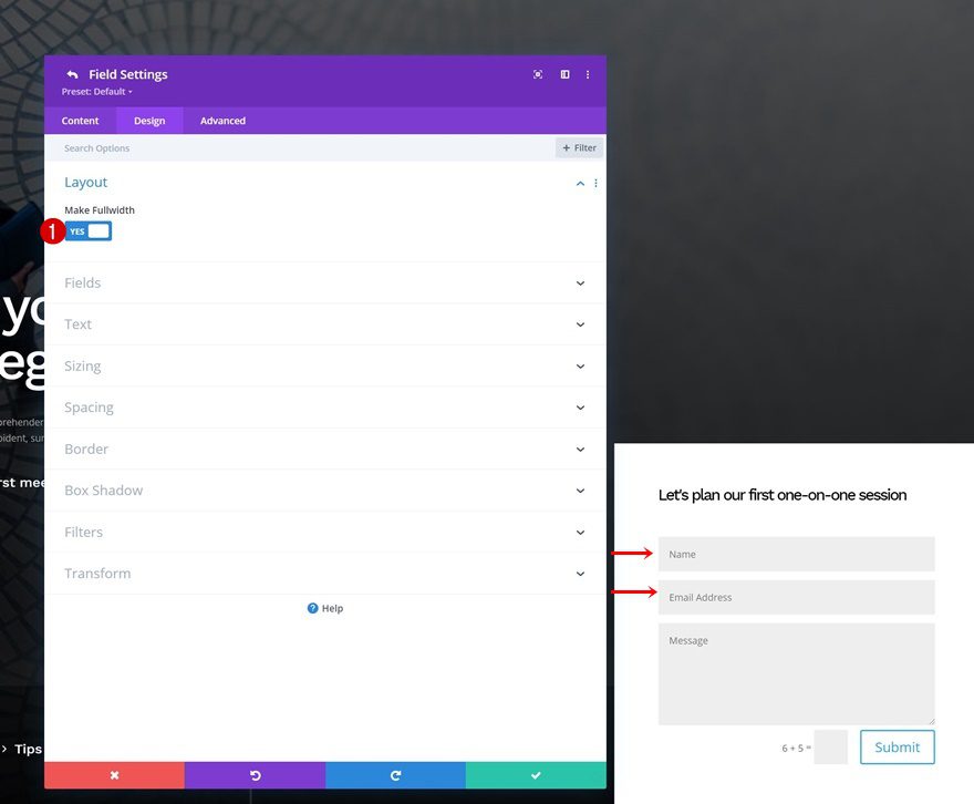
Add Contact Form Module to Column 4
Make Fields Fullwidth
Next, add a Contact Form Module right below the Text Module. Open the name and email address fields individually and enable the “Make Fullwidth” option for both.
- Make Fullwidth: Yes
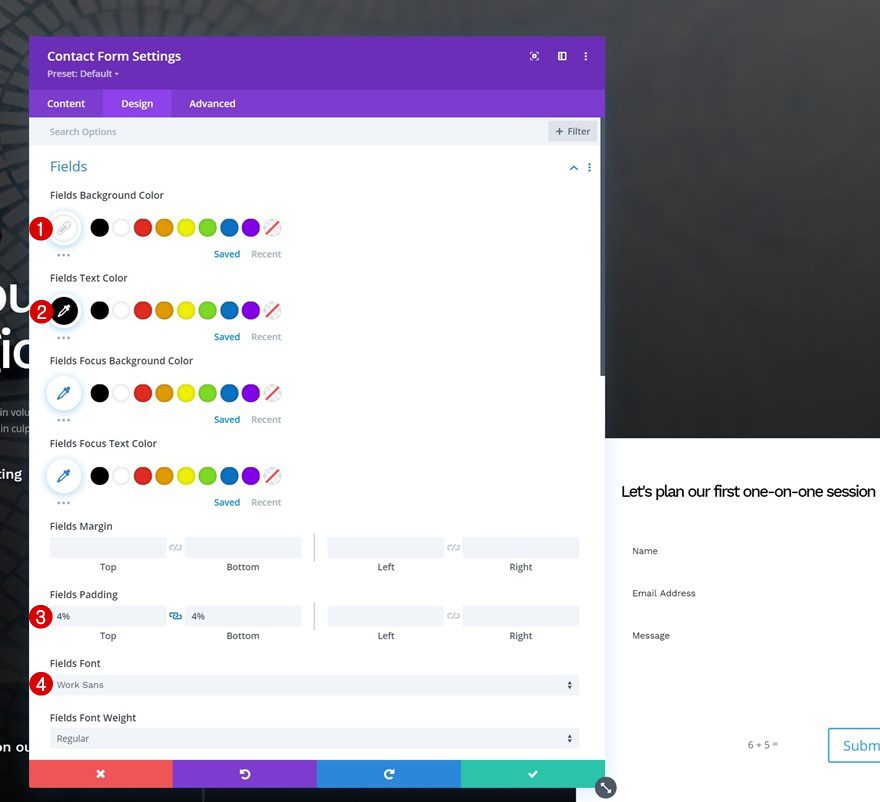
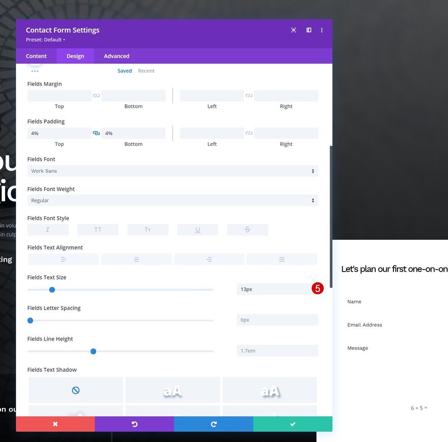
Fields Settings
Move on to the module’s design tab and modify the fields settings as follows:
- Fields Background Color: #ffffff
- Fields Text Color: #000000
- Fields Top Padding: 4%
- Fields Bottom Padding: 4%
- Fields Font: Work Sans
- Fields Text Size: 13px
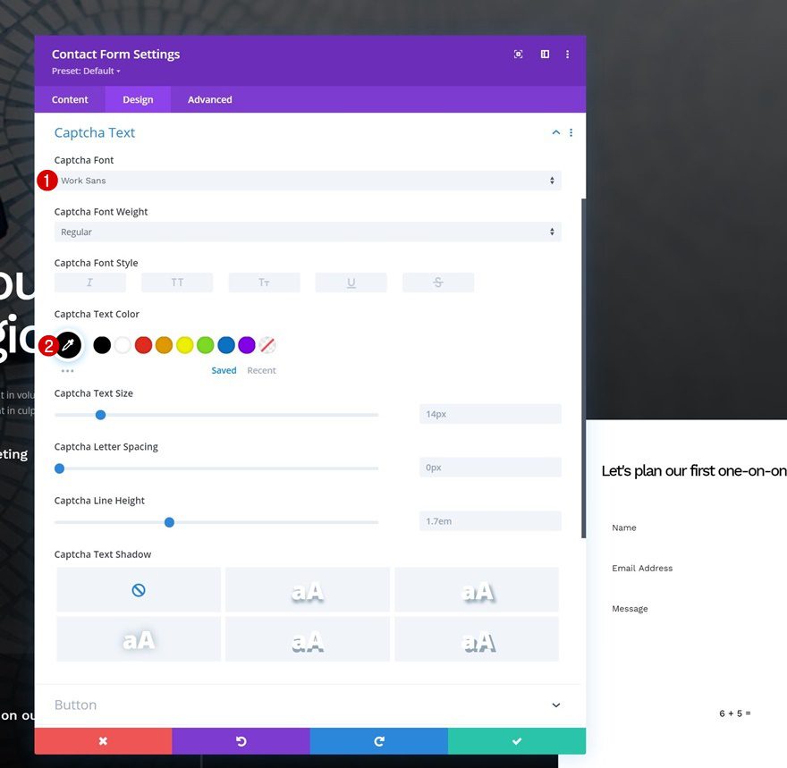
Captcha Text Settings
Then, make some changes to the captcha text settings.
- Captcha Font: Work Sans
- Captcha Text Color: #000000
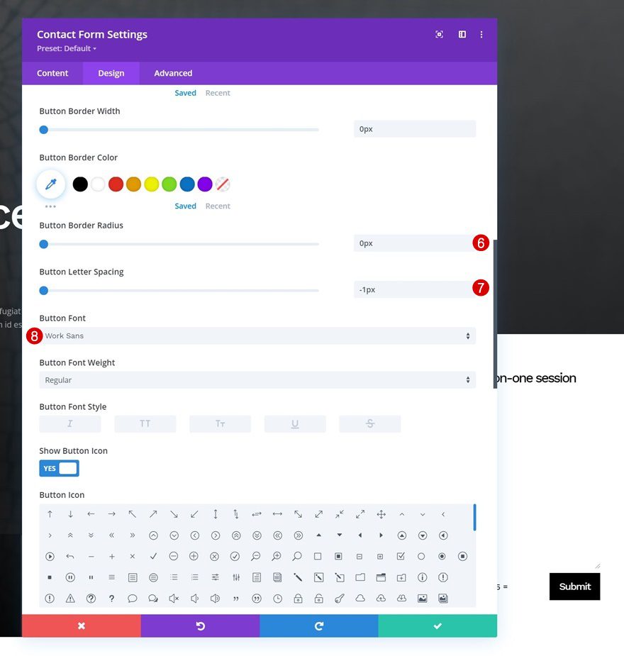
Button Settings
We’re styling the button too.
- Use Custom Styles For Button: Yes
- Button Text Size: 17px
- Button Text Color: #ffffff
- Button Background Color: #000000
- Button Border Width: 0px
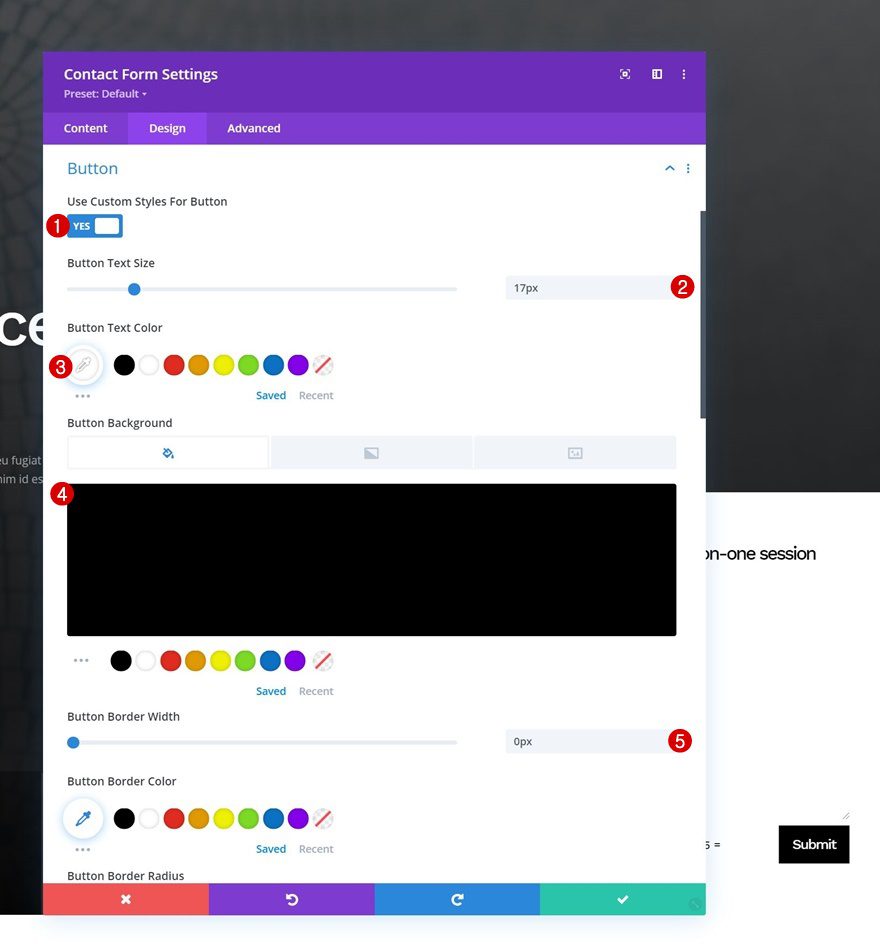
- Button Border Radius: 0px
- Button Letter Spacing: -1px
- Button Font: Work Sans
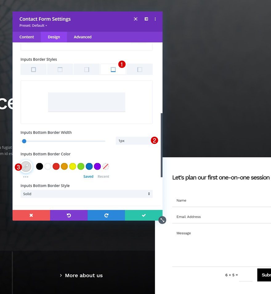
Border
And last but not least, we’ll include a bottom border width. That’s it!
- Inputs Bottom Border Width: 1px
- Inputs Bottom Border Color: #dddddd
Preview
Now that we’ve gone through all the steps, let’s take a final look at the outcome across different screen sizes.
Desktop
Mobile
Final Thoughts
In this post, we’ve shown you how to get creative with your hero section inside Divi. More specifically, we’ve shown you how to include and design an absolute-positioned bottom bar. Using a bottom bar will help you share more content inside your hero section, without it becoming too overwhelming. Using this technique, you can create any kind of design and have multiple CTAs going on! If you have any questions or suggestions, feel free to leave a comment in the comment section below.
If you’re eager to learn more about Divi and get more Divi freebies, make sure you subscribe to our email newsletter and YouTube channel so you’ll always be one of the first people to know and get benefits from this free content.


Thank you very much Donjete Vuniqi. I was looking to adjusting the Hero section with an absolute position. And I got the deal. Thanks, again.
This is exactly what I am looking for! Thank you. Just one thing, do you have a guide where I can add images in my navigation item dropdown? Like when I hover the dropdown, a panel with an image positioned in the left, and the links are positioned in the right. I tried using containers but it seems to not work. Little help would be appreciated 🙂
This is great. 🙂