
One of the fastest ways to interact with visitors on your website is through their cursor. That’s where it usually all begins. User interaction on desktop is almost entirely based on the way visitors use their cursor to navigate through your pages. It’s also the one thing that allows them to trigger events, whether that’s a hover effect or a click. That’s why you’ll come across a ton of websites that customize the cursor with a specific goal in mind. Styling your cursor is helpful if you want to highlight a call to action, for instance. Today, we’ll show you how to do that within Divi. You’ll be able to download the JSON file for free as well!
Let’s get to it.
Preview
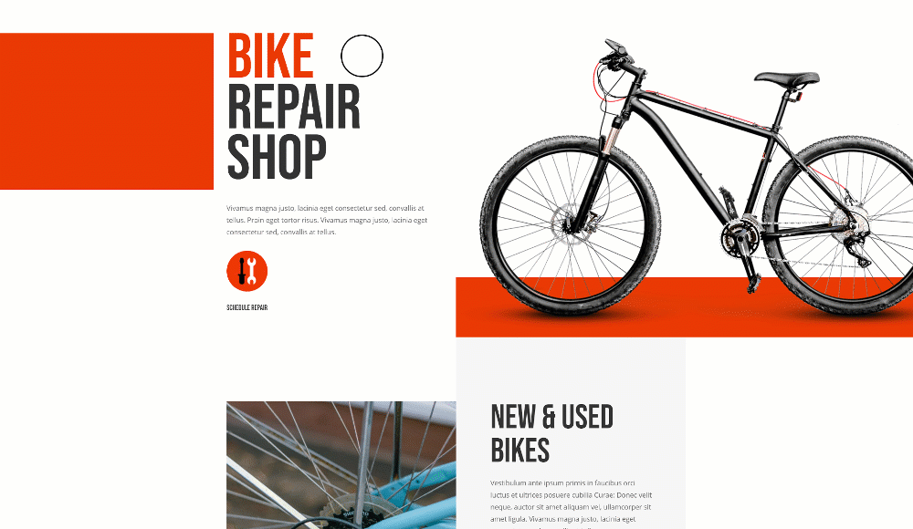
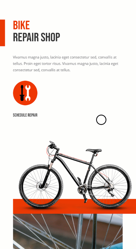
Before we dive into the tutorial, let’s take a quick look at the outcome across different screen sizes.
Desktop
Mobile
Download The Layout for FREE
To lay your hands on the free layout, you will first need to download it using the button below. To gain access to the download you will need to subscribe to our newsletter by using the form below. As a new subscriber, you will receive even more Divi goodness and a free Divi Layout pack every Monday! If you’re already on the list, simply enter your email address below and click download. You will not be “resubscribed” or receive extra emails.

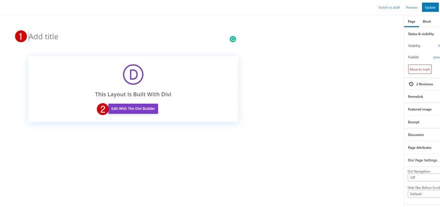
1. Create New Page/Open Existing One
Create New Page or Open Existing One
Start by creating a new page or opening an existing one.
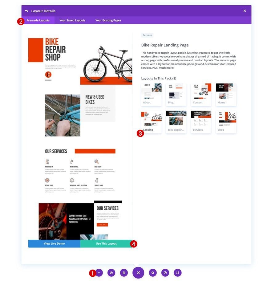
Upload Layout of Your Choice
To focus on the essence of this tutorial, we’re going to use the Bike Repair Layout Pack but feel free to use any other layout of your choice.
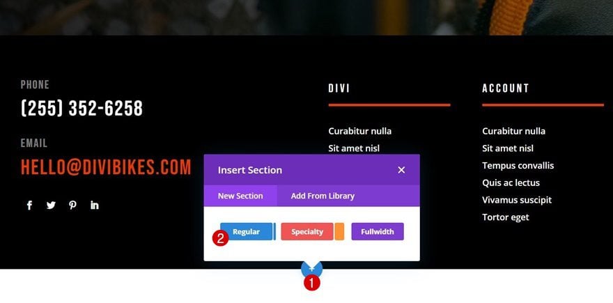
Add New Section to Bottom of Page
Once your layout has been uploaded, navigate to the bottom of your page and add a new section. We’re going to use this section to build our cursor.
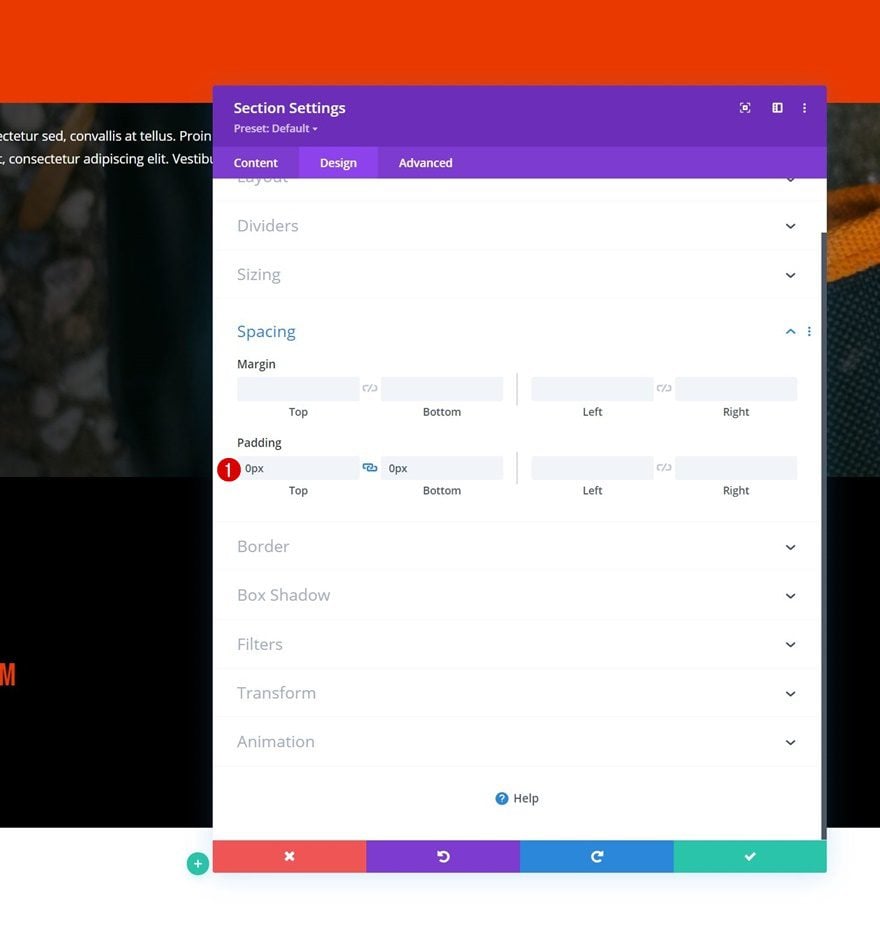
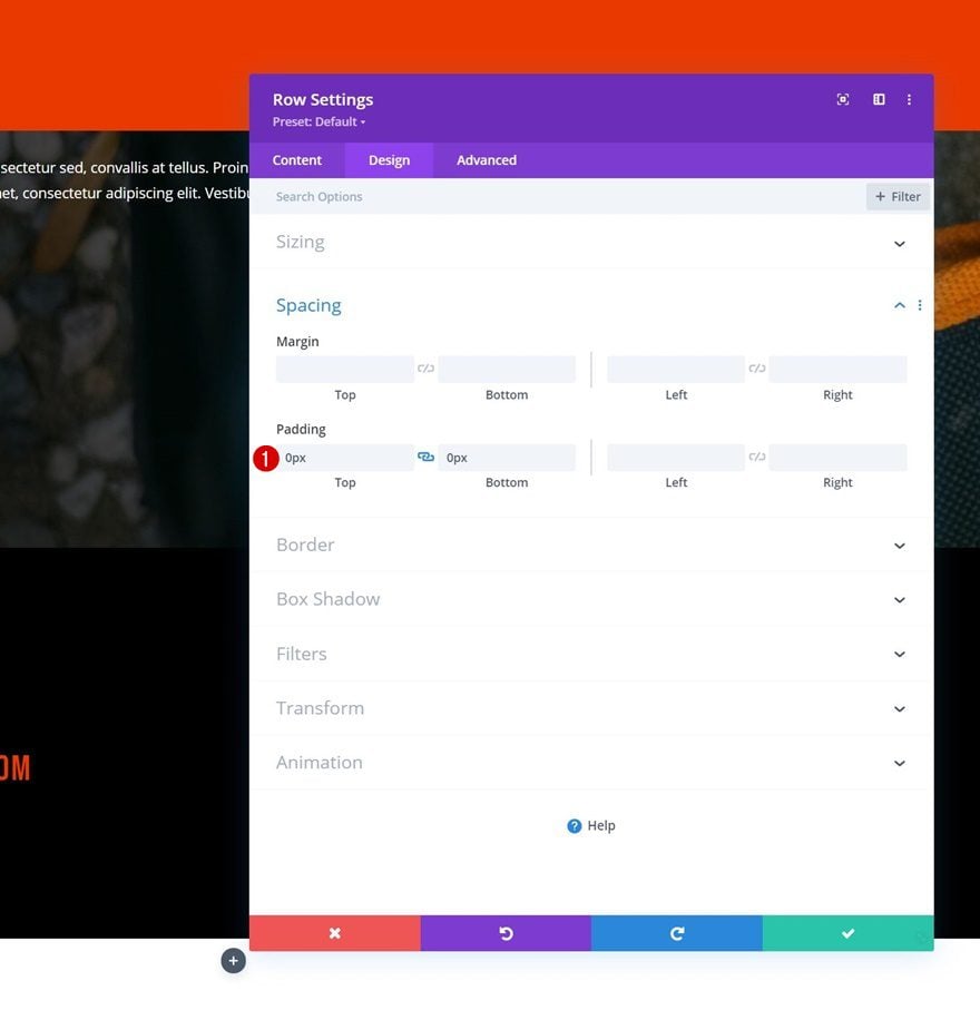
Spacing
To create a custom cursor, we’ll add a Text Module later down the tutorial. This module will be placed inside the section, but we don’t want the actual section container to show up in our design. To avoid the section from showing up, we’ll remove the default top and bottom padding in the spacing settings.
- Top Padding: 0px
- Bottom Padding: 0px
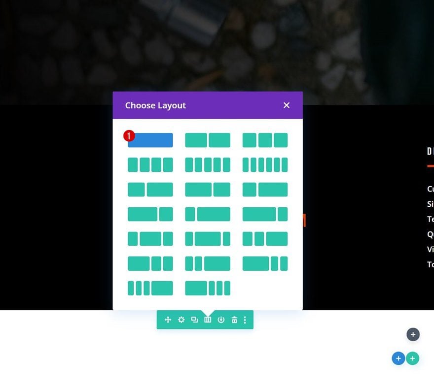
Add New Row
Column Structure
Continue by adding a row to the section using the following column structure:
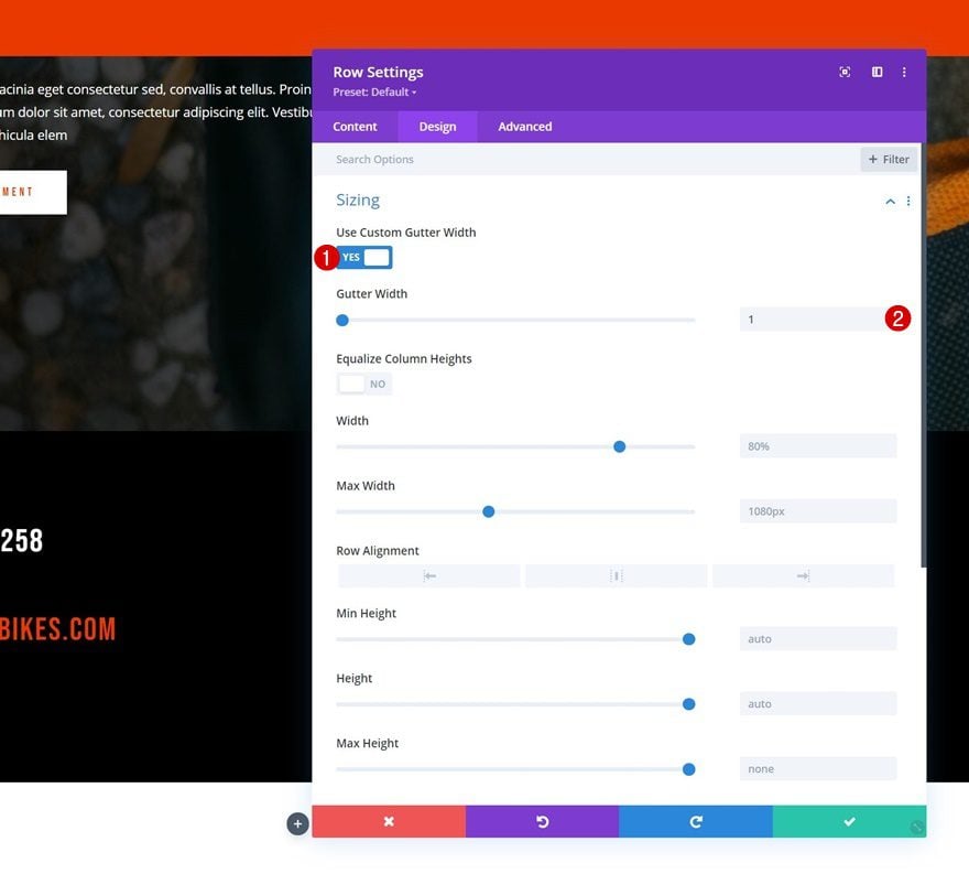
Sizing
Without adding modules yet, open the row settings and remove all custom gutter width in the sizing settings.
- Use Custom Gutter Width: Yes
- Gutter Width: 1
Spacing
Remove all default top and bottom padding too.
- Top Padding: 0px
- Bottom Padding: 0px
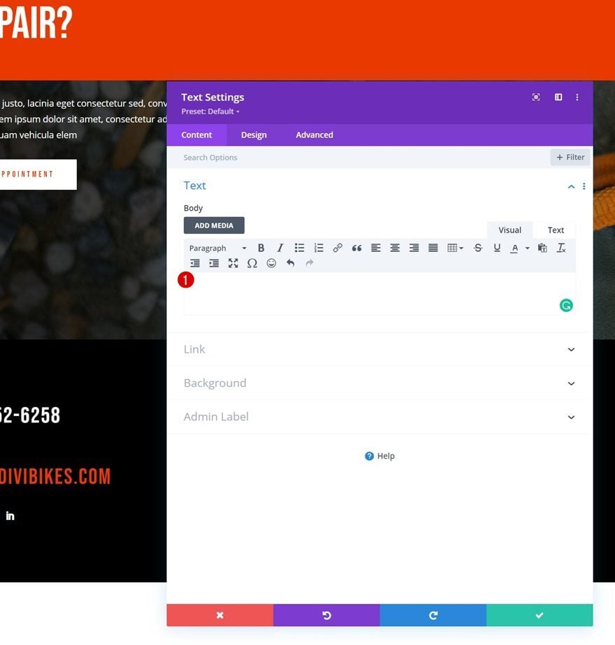
Add Text Module (Cursor)
Leave Content Box Empty
Time to add a Text Module, which we’ll, later on, use as a cursor! Leave the content box empty.
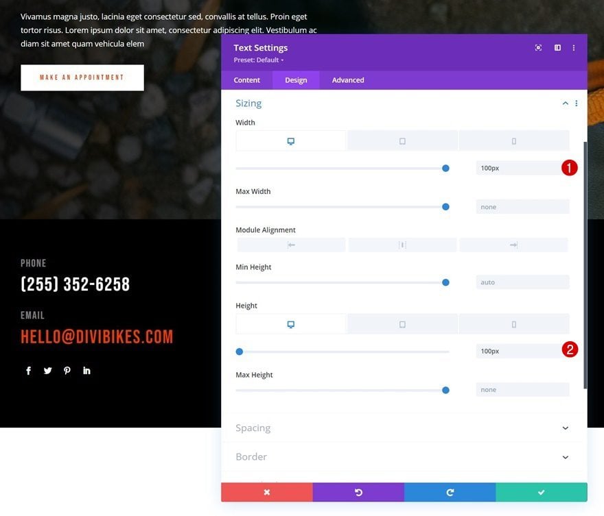
Sizing
Move on to the design tab and shape the module using a custom width and height across different screen sizes:
- Width:
- Desktop: 100px
- Tablet: 60px
- Phone: 40px
- Height:
- Desktop: 100px
- Tablet: 60px
- Phone: 40px
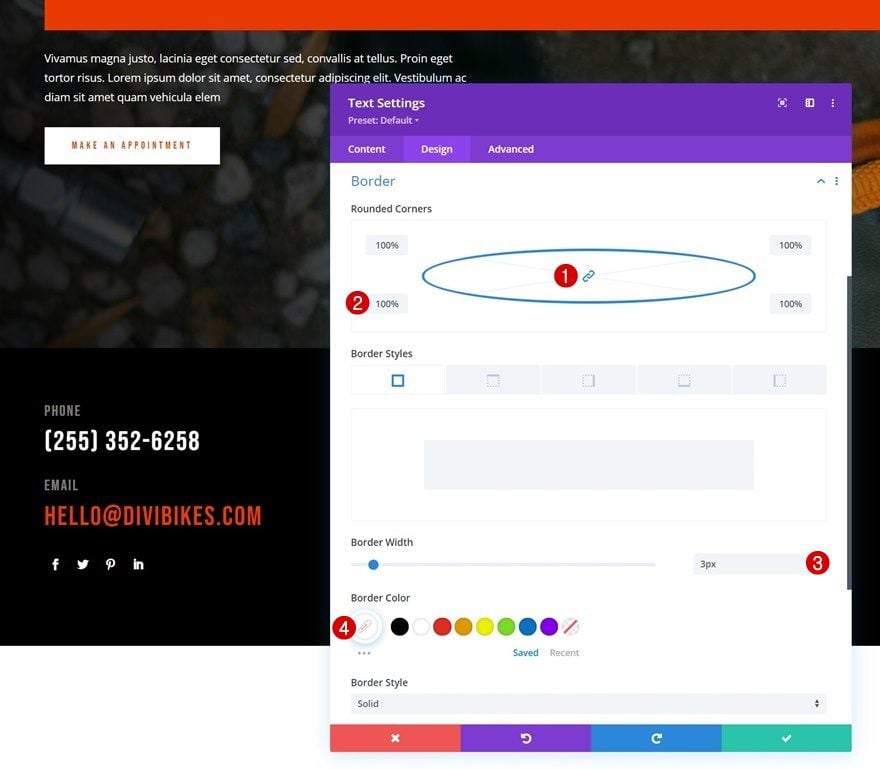
Border
To turn the cursor into a circle, as you could notice in the preview of this post, we’ll use rounded corners and a border.
- All Corners: 100%
- Border Width: 3px
- Border Color: #ffffff
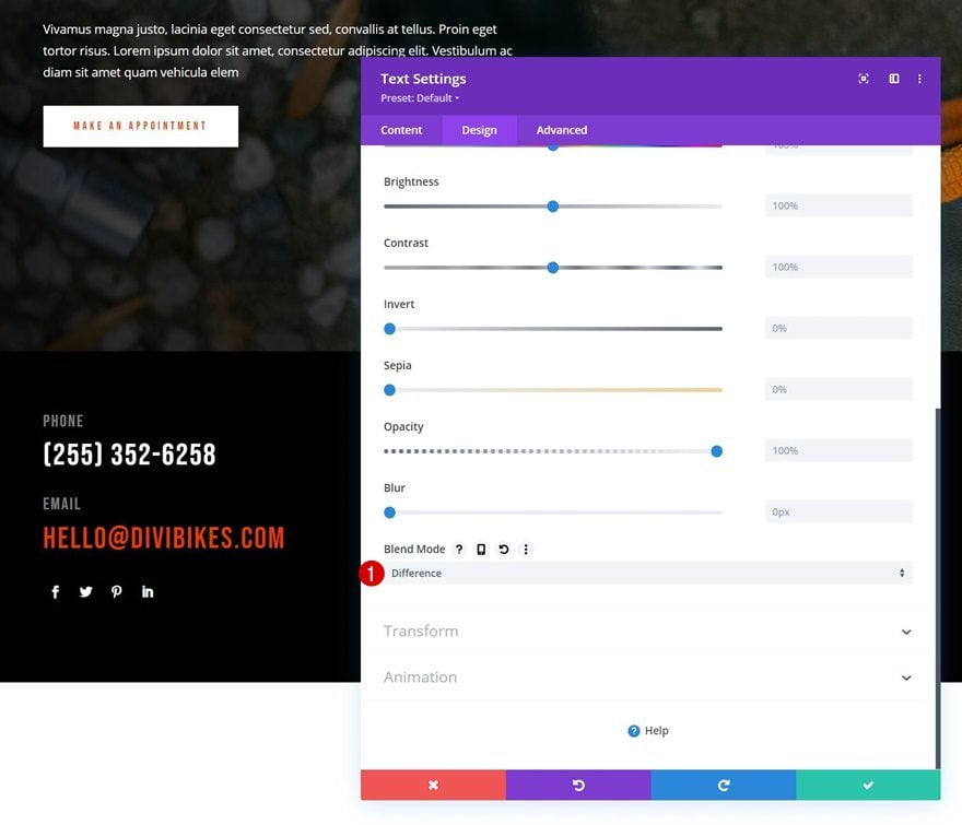
Blend Mode
In the preview of this post, you could notice an inverted effect on the cursor, especially when hovering a Button Module. To achieve this effect, we’ll use a blend mode for our Text Module.
- Blend Mode: Difference
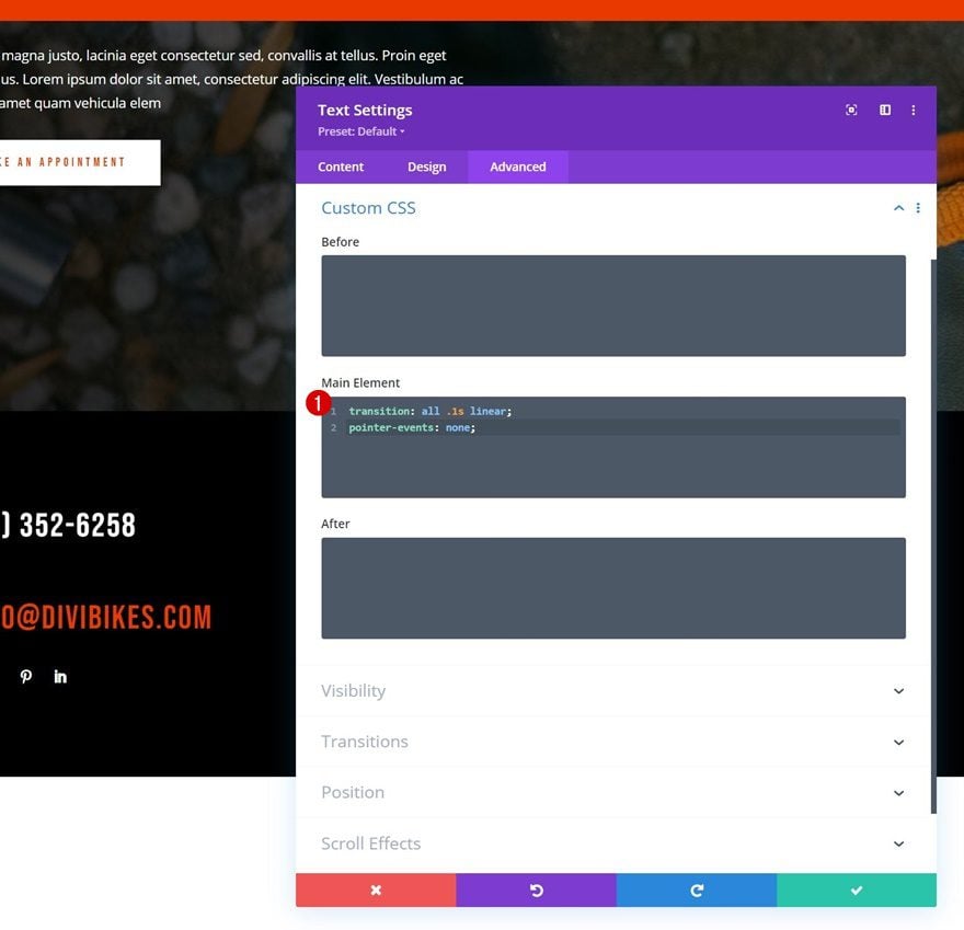
Main Element CSS
By adding these following lines of CSS code to the module’s main element, we’ll help prep the module for future use as a cursor:
transition: all .1s linear;
pointer-events: none;
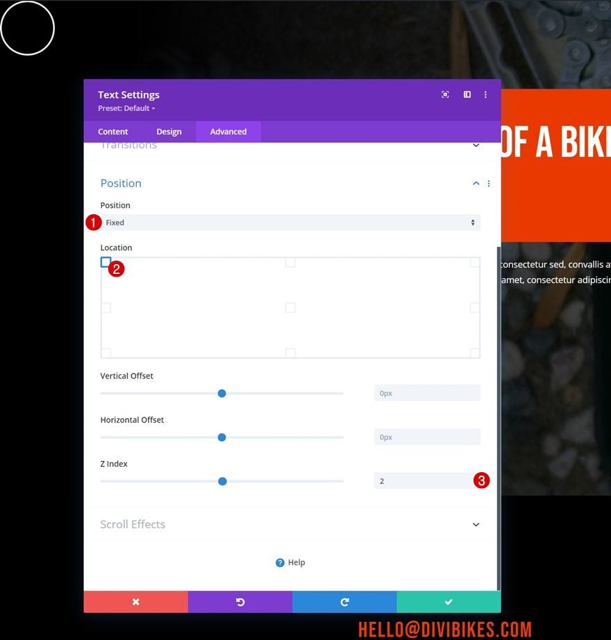
Position
We’ll use a fixed position for the module as well.
- Position: Fixed
- Location: Top Left
- Z Index: 2
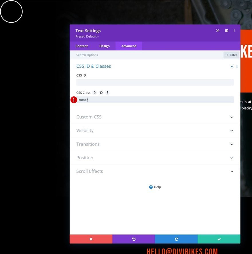
CSS Class
And we’ll complete the module settings by assigning a custom CSS class in the advanced tab.
- CSS Class: cursor
2. Add Functionality
Add Code Module Below Cursor Text Module
Now that we have the cursor Text Module in place, it’s time to focus on functionality! Add a Code Module right below the cursor Text Module of your new section.
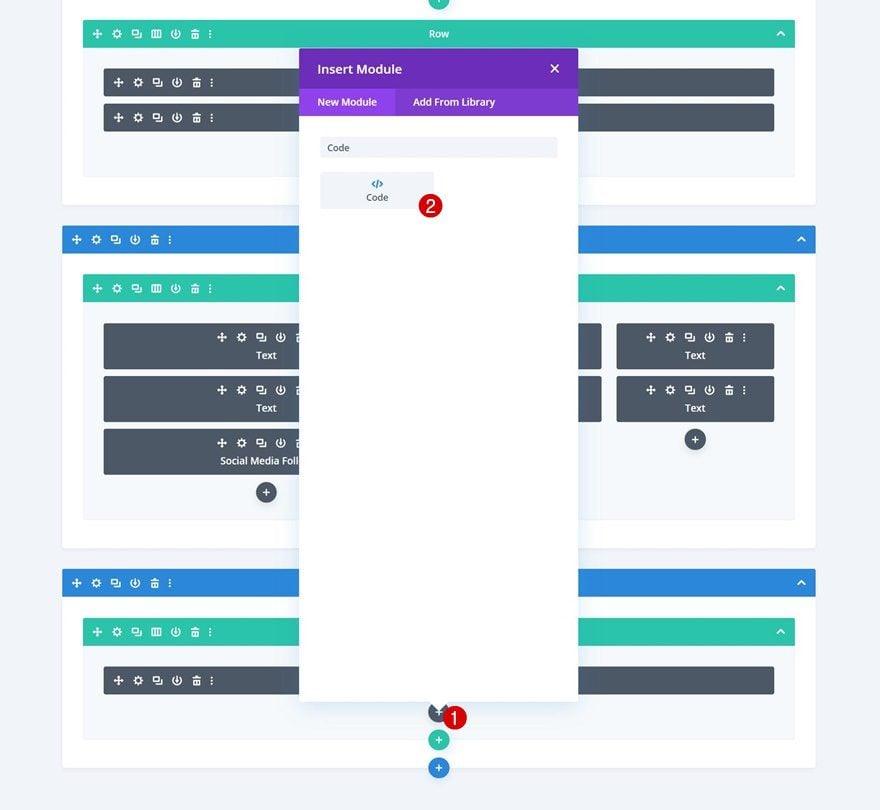
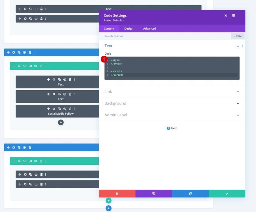
We’ll combine a bit of CSS and JQuery Code, so go ahead and add style and script tags to your Code Module.
JQuery Code Opening
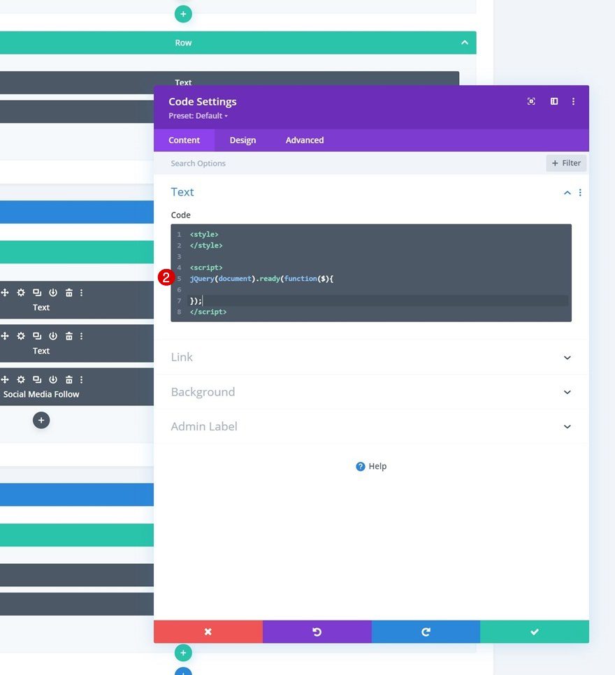
Next, copy paste the following JQuery code opening lines between the script tags:
jQuery(document).ready(function($){
});
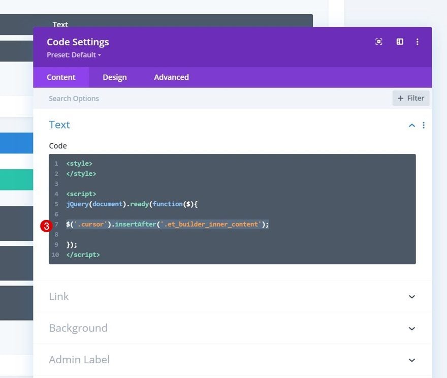
Reposition Cursor Text Module
Now that the foundation inside our Code Module has been created, we’ll go step by step. The first thing we’ll do is place the Text Module we’ve created after the builder’s inner content. This will allow us to use the cursor page-wide.
$('.cursor').insertAfter('.entry-content .et_builder_inner_content');
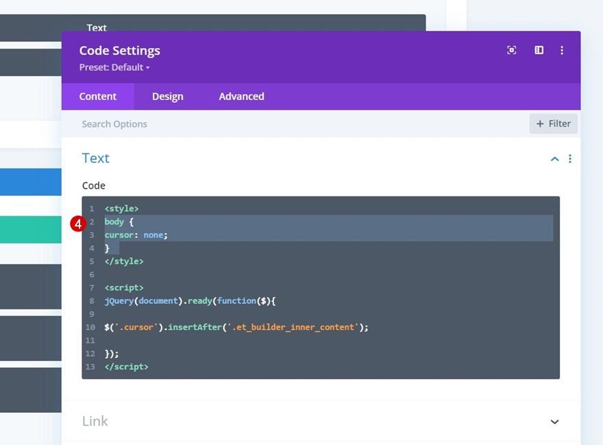
Remove Page’s Default Cursor
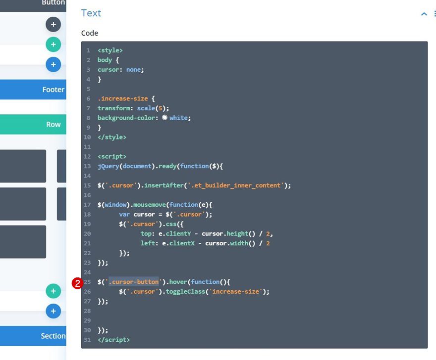
Next, we’ll remove the page’s default cursor using some custom CSS code which we’ll place between the style tags.
body {
cursor: none;
}
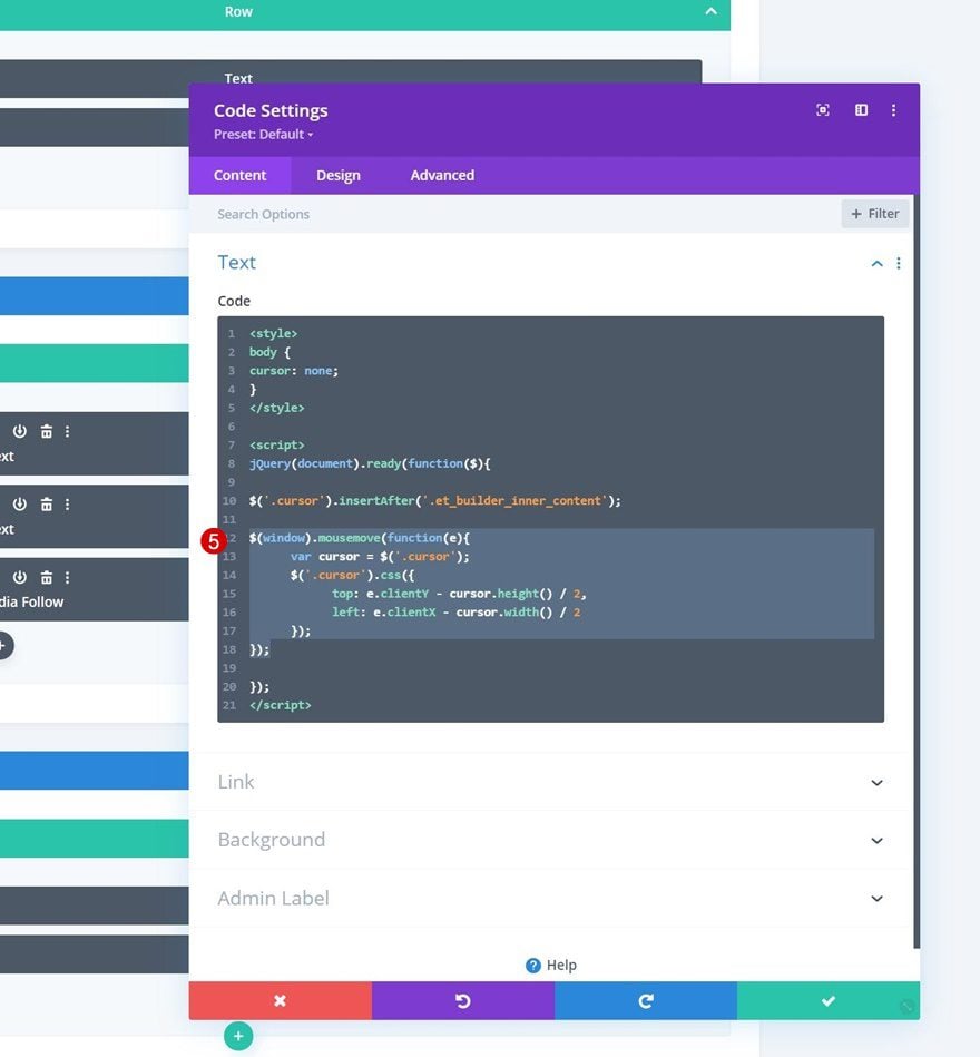
Set Cursor Text Module as Cursor
Next, we’re going to allow the cursor to follow the visitors movements using the following lines of JQuery code:
$(window).mousemove(function(e){
var cursor = $('.cursor');
$('.cursor').css({
top: e.clientY - cursor.height() / 2,
left: e.clientX - cursor.width() / 2
});
});
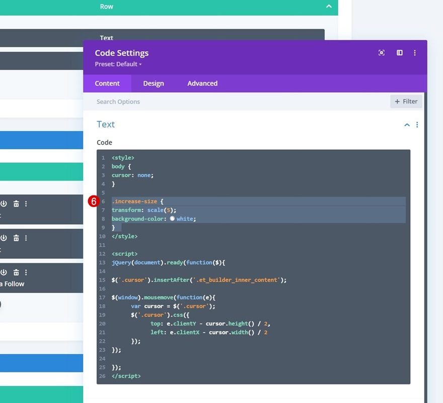
Toggle Effect When Hovering a Particular Module
Add Increase CSS Class
As you could notice in the preview of this post, as soon as a Button Module is hovered, the cursor styles change. To achieve this, we’re going to add a new CSS Class between our style tags.
.increase-size {
transform: scale(5);
background-color: white;
}
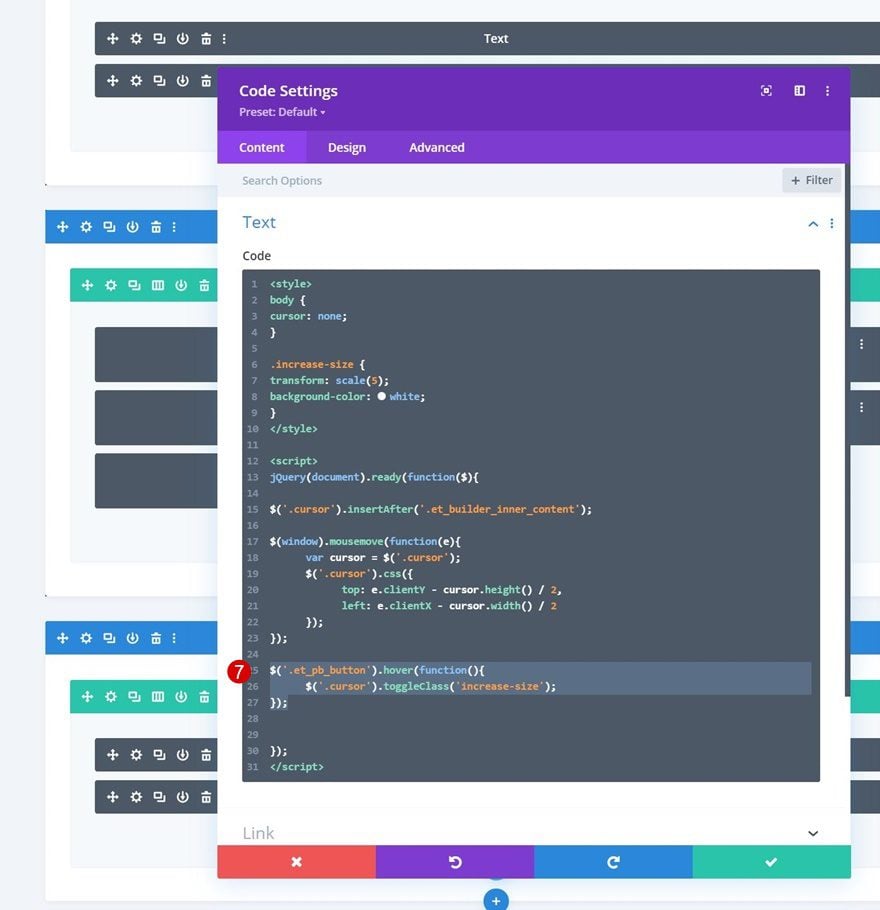
All Button Modules
We’ll toggle this CSS class using some JQuery code. The code below targets all Button Modules inside your Divi page one by one.
$('.et_pb_button').hover(function(){
$('.cursor').toggleClass('increase-size');
});
A Specific Button Module
If you want the effect to apply to one module in particular, a different approach is needed. First, open the Button Module you want to apply the effect to and include a custom CSS class.
- CSS Class: cursor-button
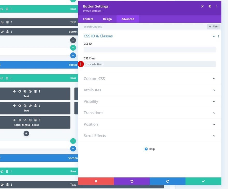
Then, replace the CSS class in the code you used in the previous step. That’s it!
$('.cursor-button').hover(function(){
$('.cursor').toggleClass('increase-size');
});
Preview
Now that we’ve gone through all the steps, let’s take a final look at the outcome across different screen sizes.
Desktop
Mobile
Final Thoughts
In this post, we’ve shown you how to create a custom cursor for your Divi page. We’ve also shown you how to use this custom cursor to trigger a hover effect when someone hovers a call to action on your page. Once you get the approach of creating a custom cursor, you’ll be able to create any kind of design or effect! You were able to download the JSON file for free as well. If you have any questions or suggestions, feel free to leave a comment in the comment section below.
If you’re eager to learn more about Divi and get more Divi freebies, make sure you subscribe to our email newsletter and YouTube channel so you’ll always be one of the first people to know and get benefits from this free content.


“You’ll be able to download the JSON file for free as well!”
Where can I do that?
I love this one! Will use it surely for some project or even for my own website 🙂
Thanks Donjete Vuniqi, you are so creative!
Hey, Nice to see and know to create!
Thank you very much!