If you’re building your header inside Divi, there are quite a few ways to go about it. As a matter of fact, you can get an overview on header types and tutorials here. Now, in today’s tutorial, we’re adding another option to your list. We’ll show you how to add a hamburger icon toggle to DIvi’s Menu Module. This hamburger icon appears, by default, on smaller screen sizes already, but in this tutorial, we’ll make sure a hamburger icon appears on desktop as well. When clicking the hamburger icon, all menu items will appear in a horizontal order next to the icon. This gives a minimal look and feel to your header while adding interaction as well. You will be able to download the template JSON file for free as well!
Let’s get to it.
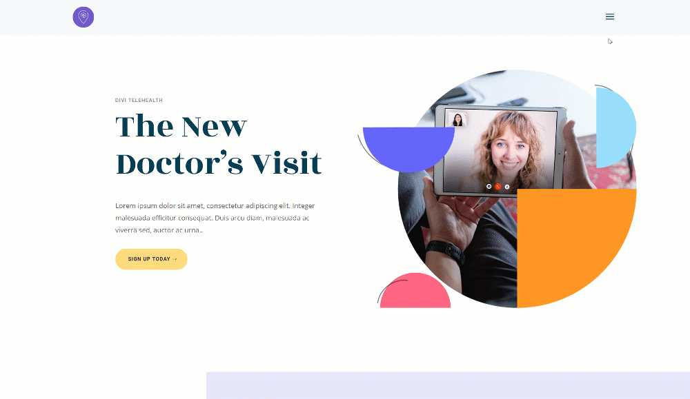
Preview
Before we dive into the tutorial, let’s take a quick look at the outcome across different screen sizes.
Download The Global Header Template for FREE
To lay your hands on the free global header template, you will first need to download it using the button below. To gain access to the download you will need to subscribe to our newsletter by using the form below. As a new subscriber, you will receive even more Divi goodness and a free Divi Layout pack every Monday! If you’re already on the list, simply enter your email address below and click download. You will not be “resubscribed” or receive extra emails.

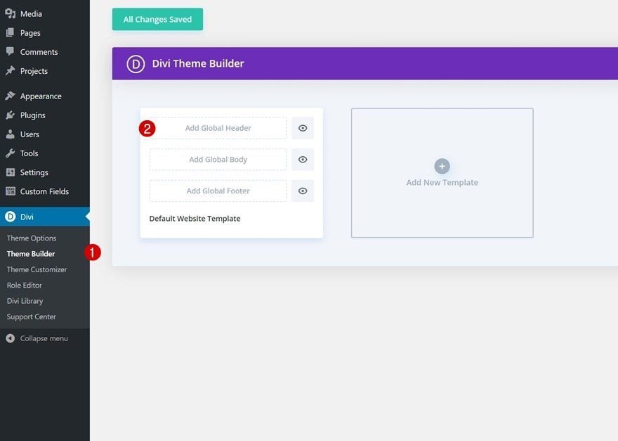
1. Create New Global Header Template
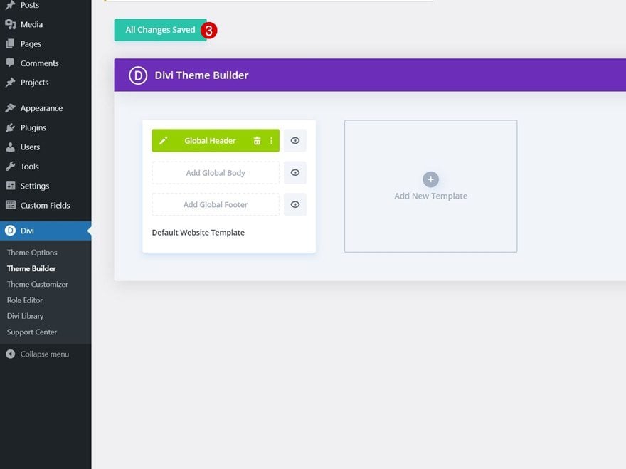
Go to Divi Theme Builder
Start by going to the Divi Theme Builder in the backend of your WordPress website. Once there, click on “Add Global Header”.
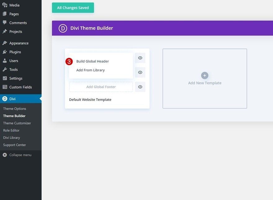
Add New Global Header
A dropdown menu will appear. To start building from scratch, continue by selecting “Build Global Header”.
2. Create Global Header Design
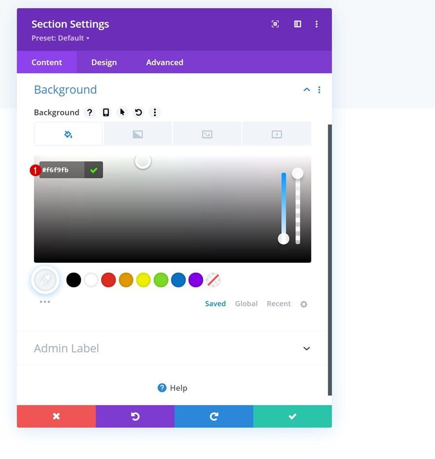
Section Settings
Background Color
Once inside the template editor, it’s time to start building the header design. You’ll notice there’s a section there already. Open the section’s settings and add a background color.
- Background Color: #f6f9fb
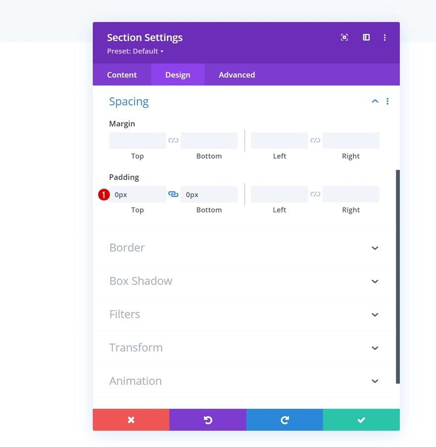
Spacing
Move on to the section’s design tab and remove all default top and bottom padding.
- Top Padding: 0px
- Bottom Padding: 0px
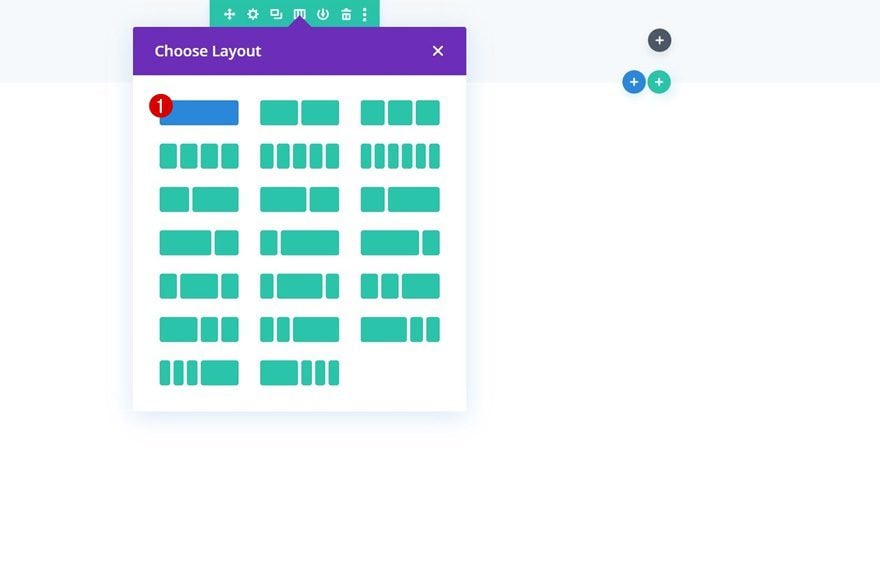
Add New Row
Column Structure
Continue by adding a new row using the following column structure:
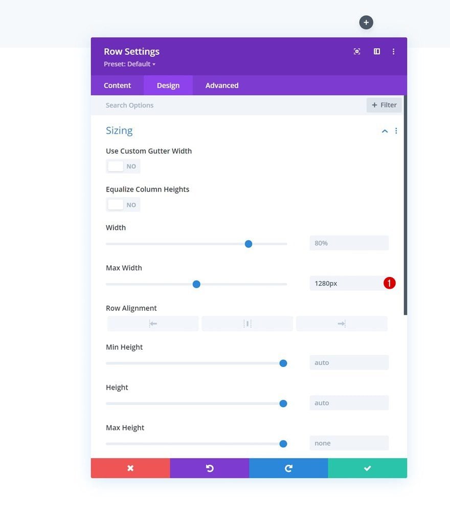
Sizing
Without adding modules yet, open the row settings, go to the design tab and modify the max width in the sizing settings.
- Max Width: 1280px
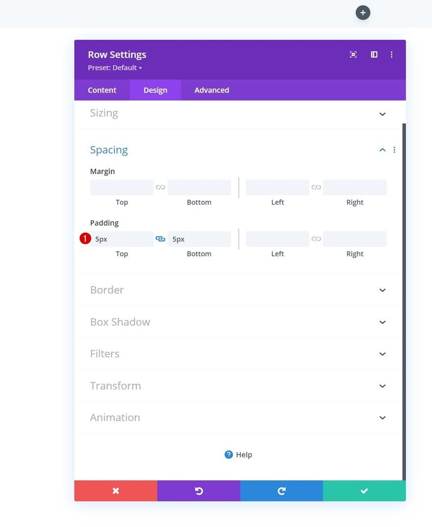
Spacing
Modify the top and bottom padding in the spacing settings next.
- Top Padding: 5px
- Bottom Padding: 5px
Select Menu
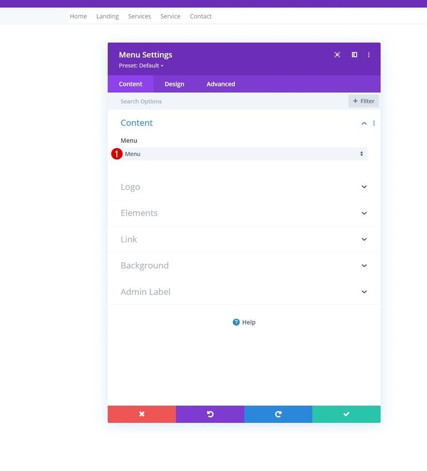
Next, add a Menu Module to the row’s column and select a dynamic menu of your choice.
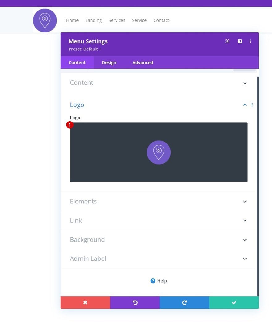
Upload Logo
Upload a logo.
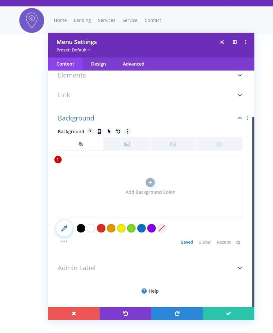
Remove Background Color
Then, remove the module’s default white background color.
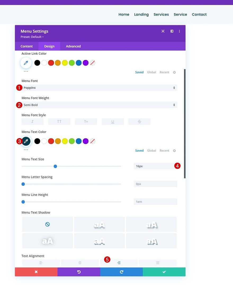
Menu Text Settings
Move on to the module’s design tab and change the menu text settings accordingly:
- Menu Font: Poppins
- Menu Font Weight: Semi Bold
- Menu Text Color: #003e51
- Menu Text Size: 16px
- Text Alignment: Right
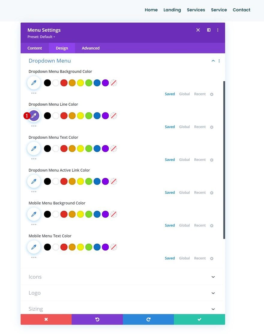
Dropdown Menu Settings
Change the dropdown menu settings next.
- Dropdown Menu Line Color: #7159c8
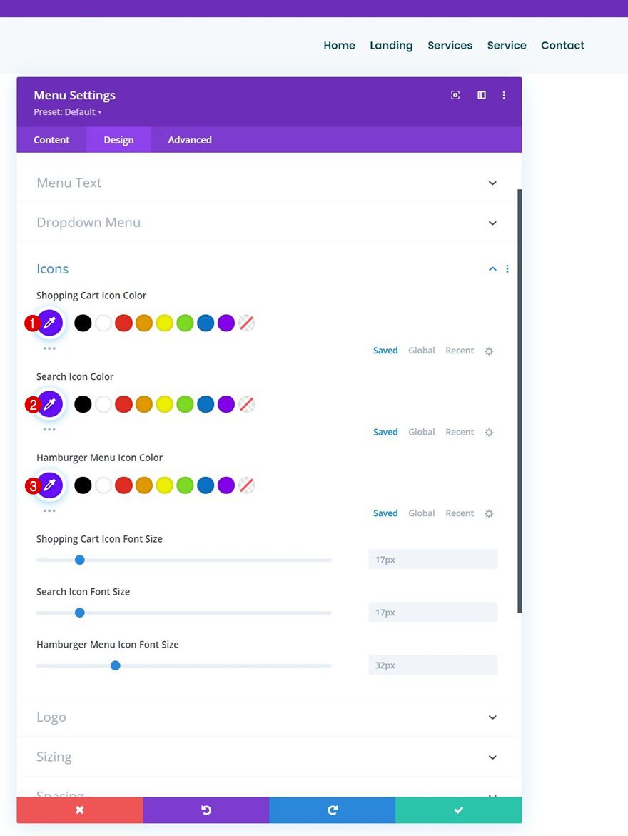
Icons Settings
Modify the icons settings too.
- Shopping Cart Icon Color: #670fff
- Search Icon Color: #670fff
- Hamburger Menu Icon Color: #670fff
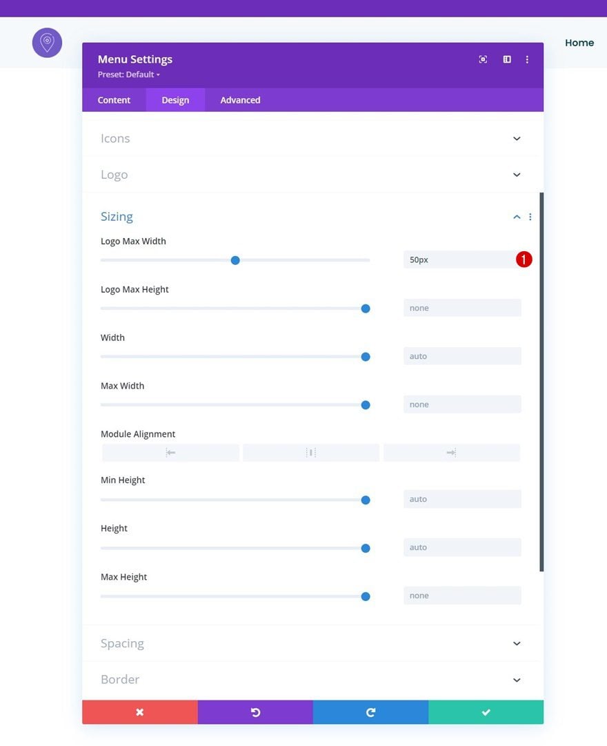
Sizing
Then, go to the sizing settings and assign a logo max width.
- Logo Max Width: 50px
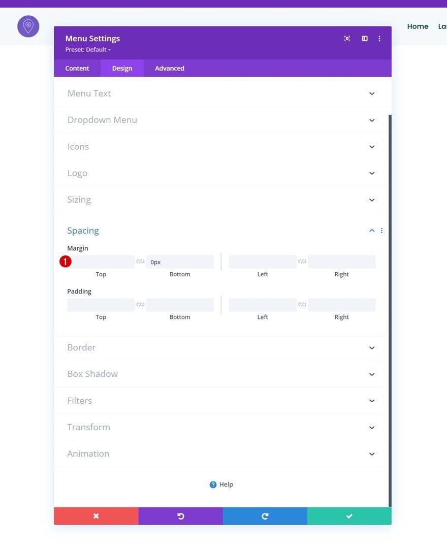
Spacing
Remove the module’s default bottom margin too.
- Bottom Margin: 0px
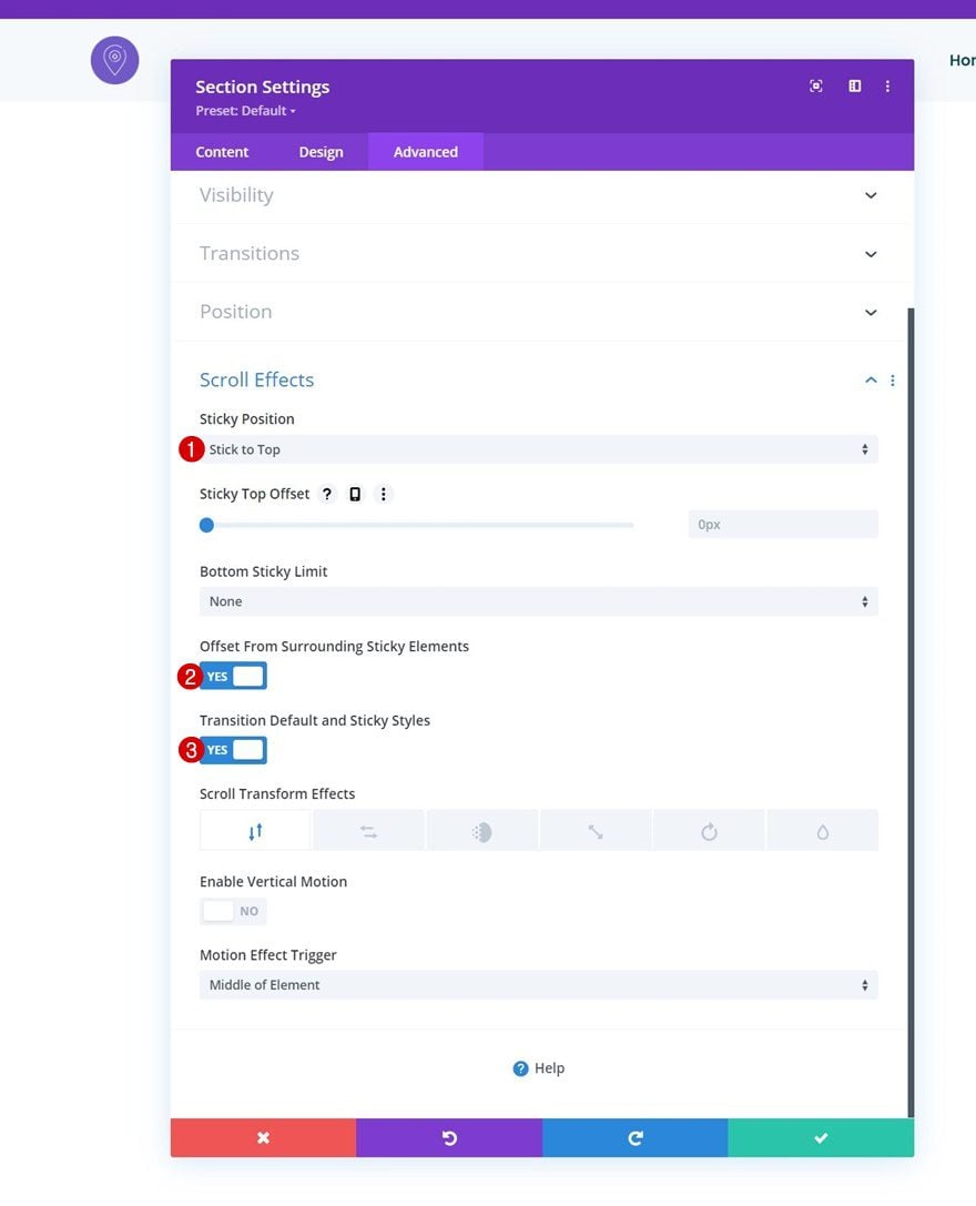
Turn Section Sticky
Now that our menu is in place, we’ll turn the section sticky as well. Open the section settings, go to the advanced tab and apply the following sticky settings:
- Sticky Position: Stick to Top
- Offset From Surrounding Sticky Elements: Yes
- Transition Default and Sticky Styles: Yes
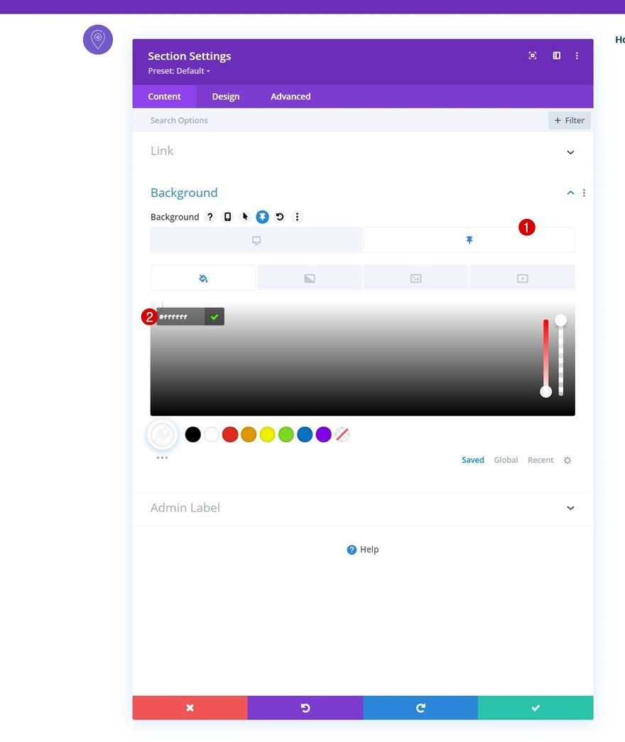
Sticky Background Color
Modify the section’s background color in a sticky state next.
- Background Color: #ffffff
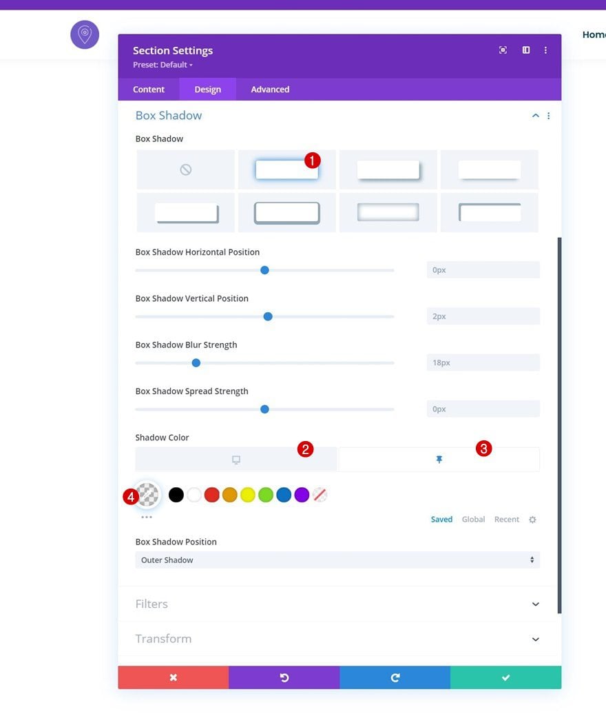
Sticky Box Shadow
Apply a box shadow to the section as well.
- Default Shadow Color: rgba(0,0,0,0)
- Sticky Shadow Color: rgba(0,0,0,0.04)
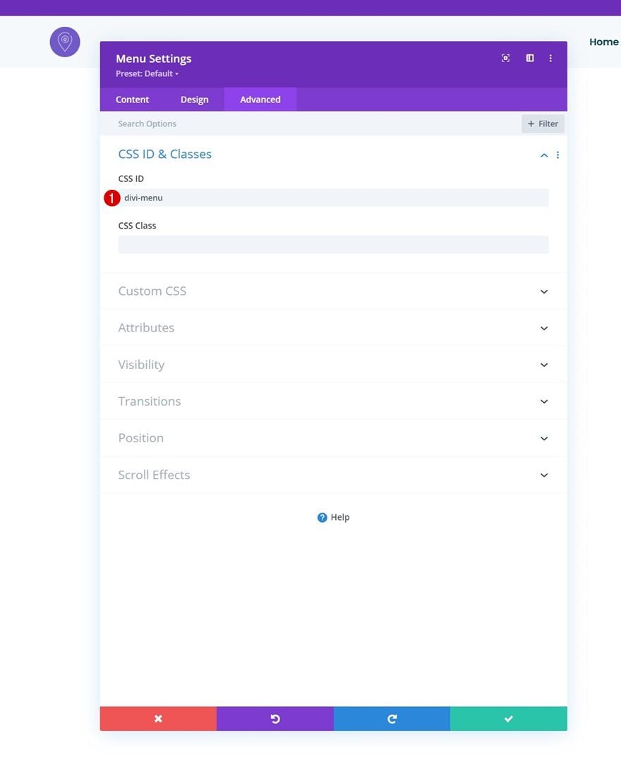
In the next part of the tutorial, we’ll focus on creating the desktop hamburger icon toggle icon. First, open the Menu Module’s settings, go to the advanced tab and assign a CSS ID.
- CSS ID: divi-menu
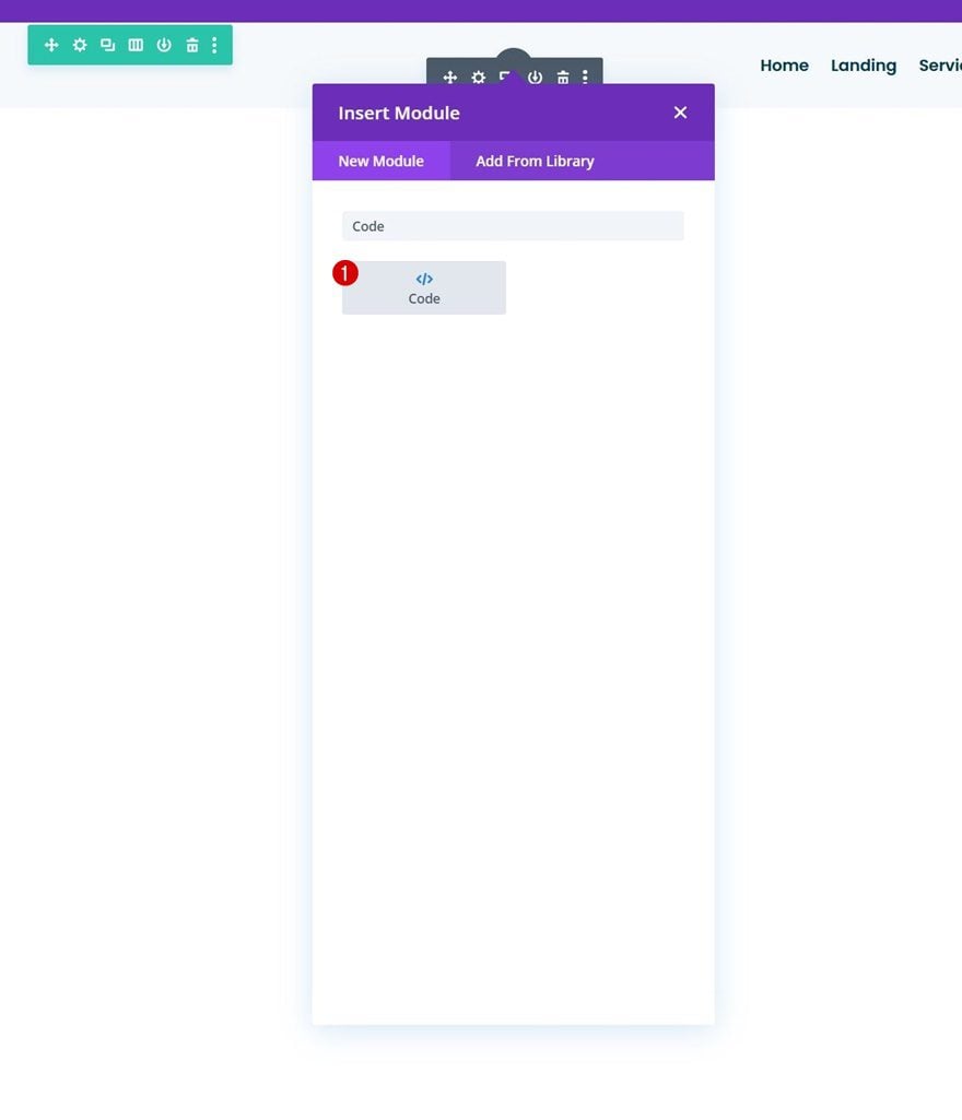
Then, add a Code Module below the Menu Module.
We’ll be using some CSS and JQuery code. To prepare for that, we’ll add some style and script tags.
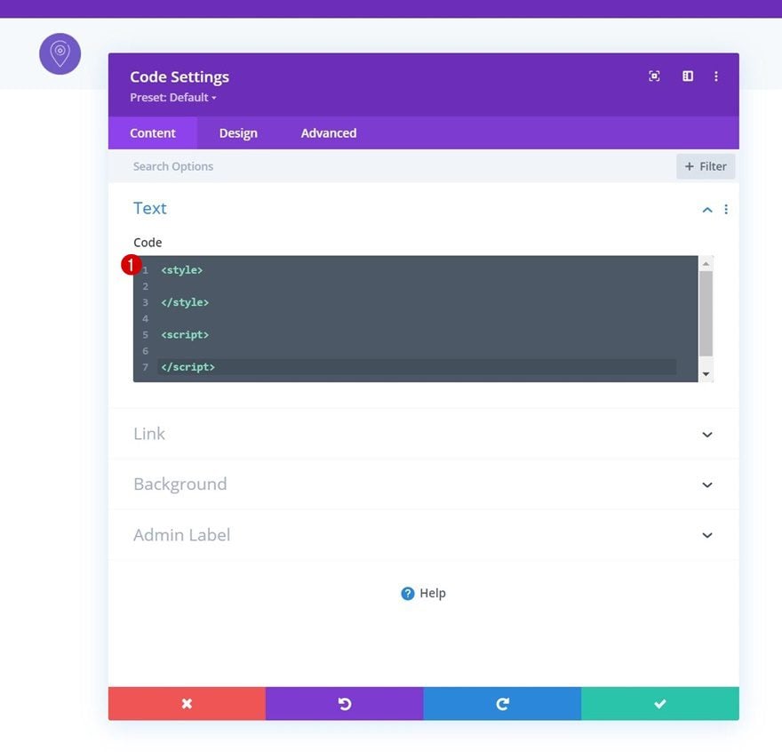
Add CSS Code
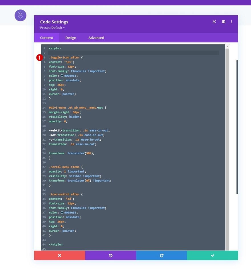
We’ll paste the following lines of CSS code between the style tags:
.toggle-icon:after {
content: "\61";
font-size: 32px;
font-family: ETmodules !important;
color: #003e51;
position: absolute;
top: 26px;
right: 0;
cursor: pointer;
}

#divi-menu .et_pb_menu__menu>nav {
margin-right: 38px;
visibility: hidden;
opacity: 0;

-webkit-transition: .1s ease-in-out;
-moz-transition: .1s ease-in-out;
-o-transition: .1s ease-in-out;
transition: .1s ease-in-out;

transform: translateY(50%);
}

.reveal-menu-items {
opacity: 1 !important;
visibility: visible !important;
transform: translateY(0%) !important;
}

.icon-switch:after {
content: '\4d';
font-size: 32px;
font-family: ETmodules !important;
color: #003e51;
position: absolute;
top: 26px;
right: 0;
cursor: pointer;
}
Add JQuery
Add JQuery Opening Code Lines
Up next, we’ll have the JQuery code. Add the following lines of JQuery code between the script tags:
jQuery(function($){
$(document).ready(function(){

});
});
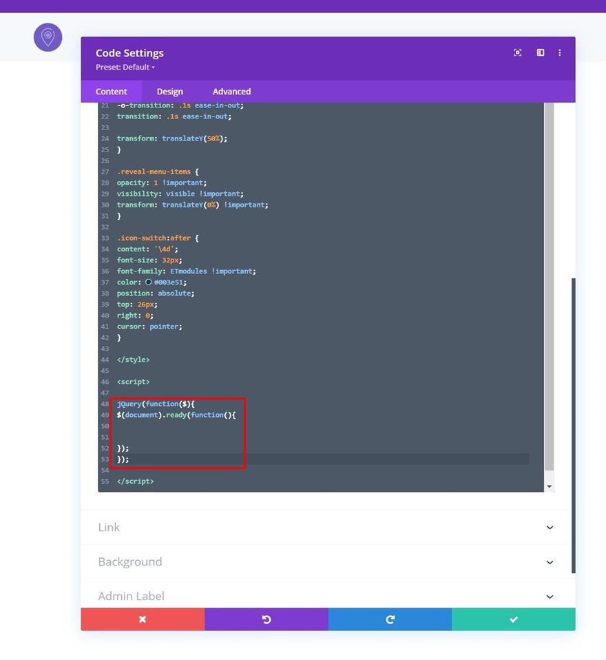
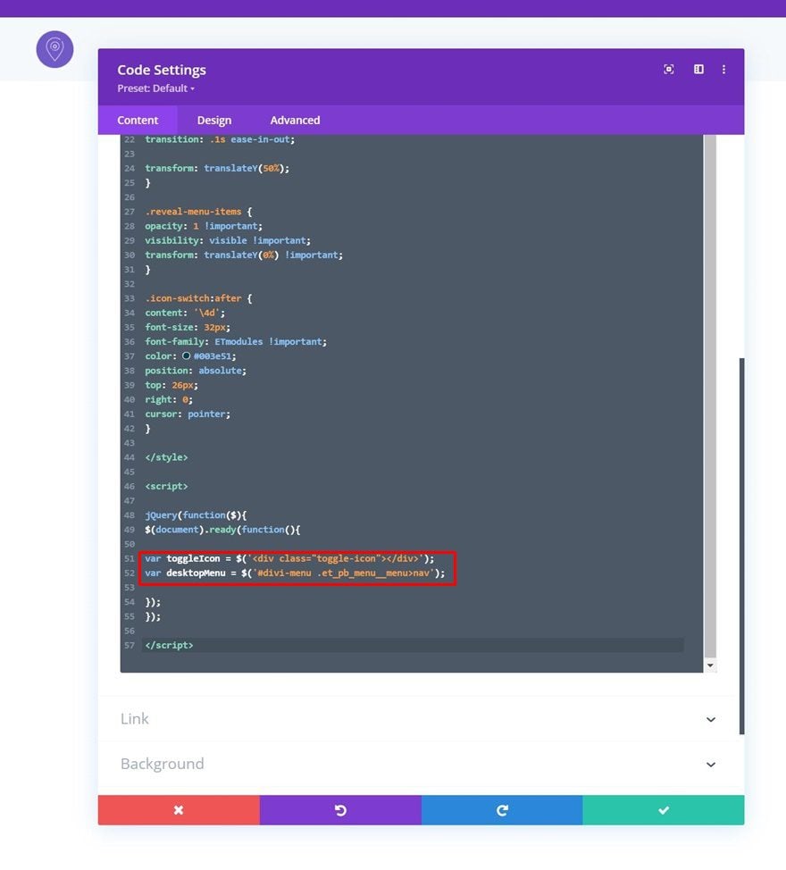
Create Variables
Create some variables next.
var toggleIcon = $('<div class="toggle-icon"></div>');
var desktopMenu = $('#divi-menu .et_pb_menu__menu>nav');
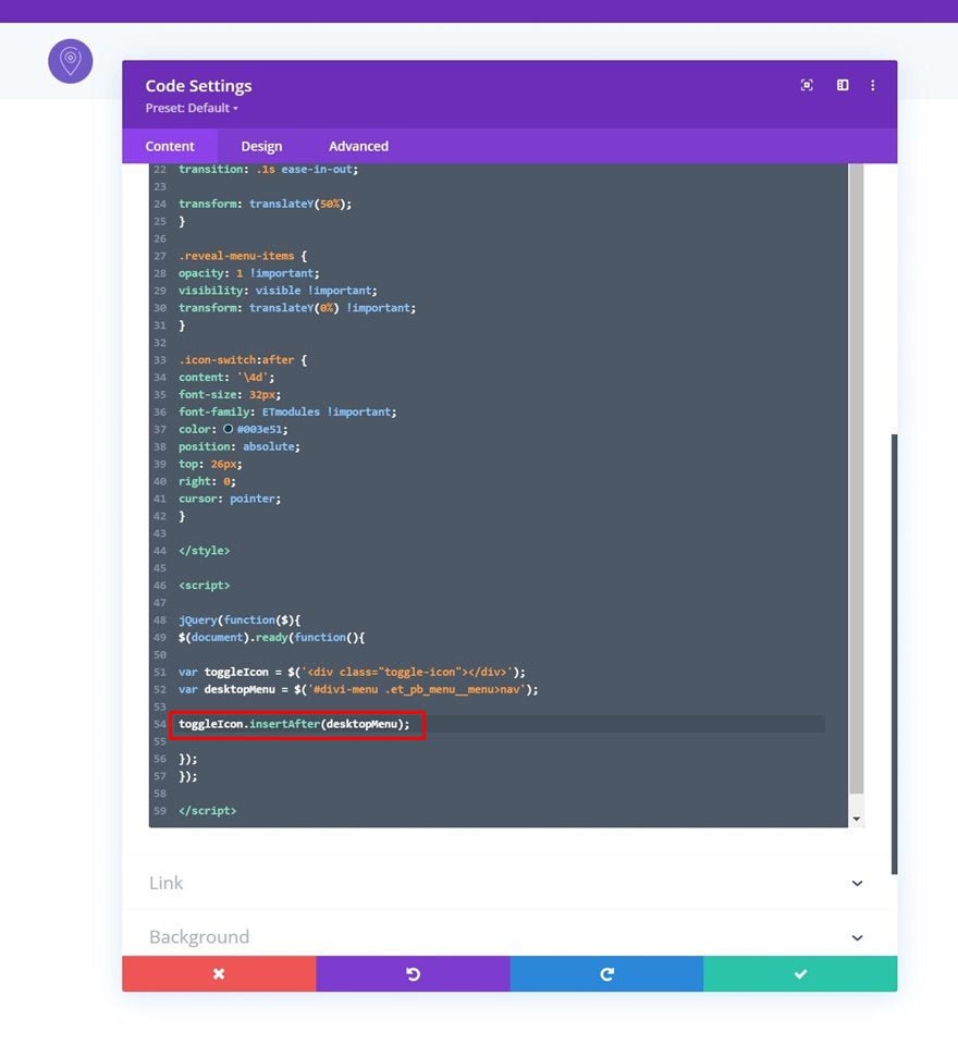
Place Toggle Icon Inside Menu Module
Then, place the toggle icon variable inside the Menu Module using this following code line:
toggleIcon.insertAfter(desktopMenu);
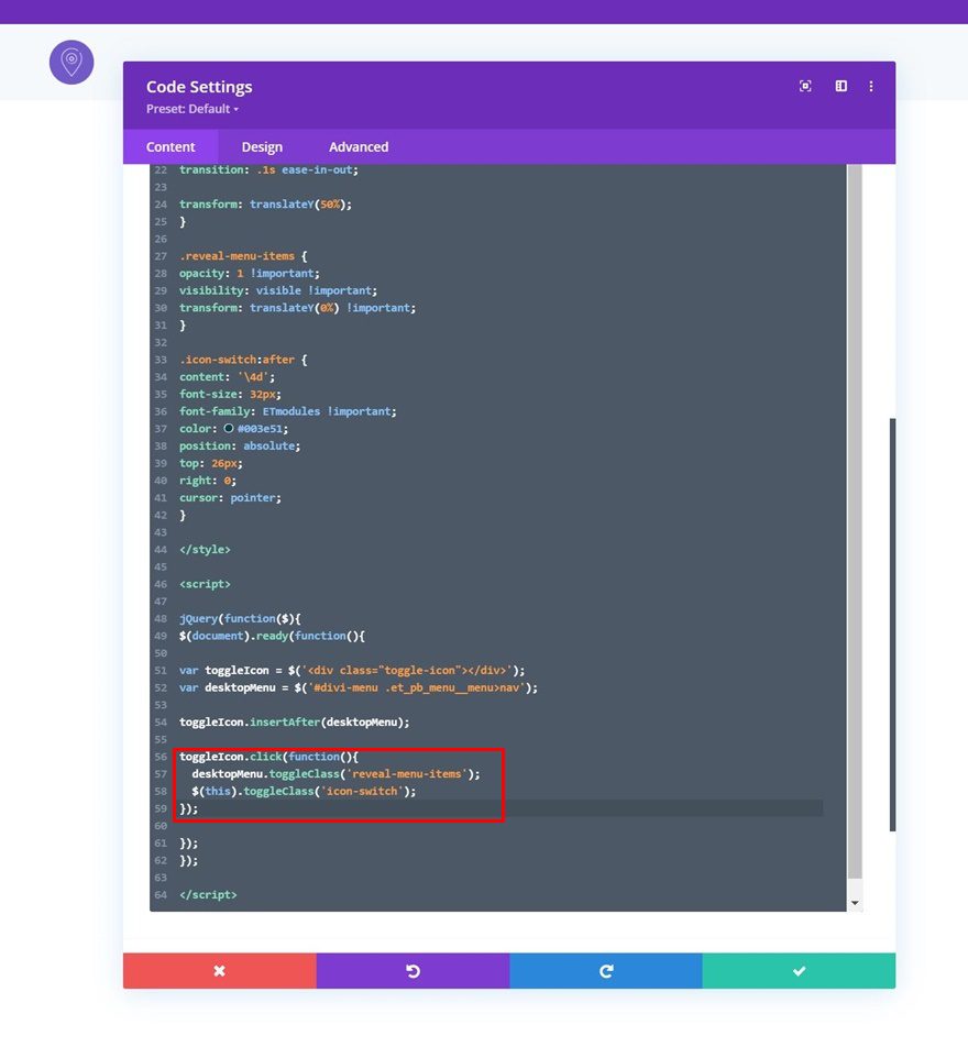
Add Click Function
We’re adding a click function as well.
toggleIcon.click(function(){
	desktopMenu.toggleClass('reveal-menu-items');
  $(this).toggleClass('icon-switch');
});
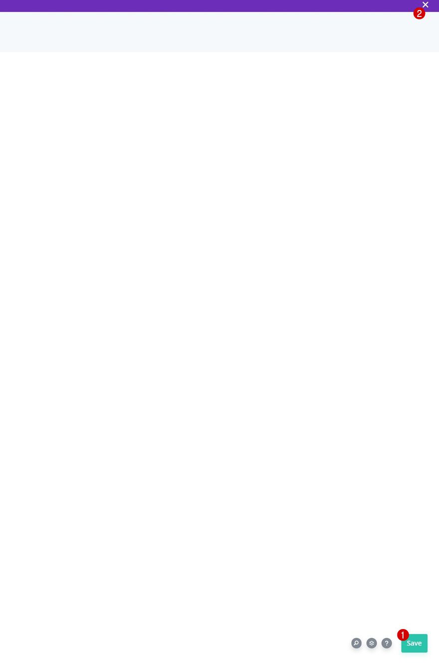
4. Save Divi Theme Builder Changes
Now that everything is in place, the only thing left to do is save all Divi Theme Builder changes and view the outcome!
Preview
Now that we’ve gone through all the steps, let’s take a final look at the outcome across different screen sizes.
Final Thoughts
In this post, we’ve shown you how to get creative with your Divi header inside the Divi Theme Builder. More specifically, we’ve shown you how to add a hamburger menu icon toggle on desktop as well. By default, a hamburger icon is part of the tablet and mobile experience, but we’re extending this to desktop as well. When clicking the toggle icon, the menu items will appear in a horizontal order, which gives this a minimal look and feel. You were able to download the template JSON file for free as well! If you have any questions or suggestions, make sure to leave a comment in the comment section below.
If you’re eager to learn more about Divi and get more Divi freebies, make sure you subscribe to our email newsletter and YouTube channel so you’ll always be one of the first people to know and get benefits from this free content.


Thank you for this great tutorial. I want my menu to be transparent before scroll. I set the section background color to transparent, but it just shows up as white. Can you help?
To do that kindly go to your Section Settings > Advanced > Scroll Effects and setting the Scroll Position the “Stick to Top”: https://prnt.sc/eeQDrWlMuWdO
Then go to the Section Settings > Advanced > Custom CSS > Module Element and adding this in the Main Element panel:
position: absolute;
width: 100%;
https://prnt.sc/QFn_Cb8kXLlc
Hi,
This is what i’ve got when i try to import the template:
“This file should not be imported in this context.”
It will be more useful to provide the FULL code, instead of peace meals.
In what place is the JSON file uploaded? I’ve tried to import into Divi Library and it says “This file should not be imported in this context.”
It’s a layout for a custom header in the Theme Builder so the JSON file should be uploaded using the import/export tool in Theme Builder. Check this screenshot: https://prnt.sc/Q3TT_hf755nV
Useful tutorial… but can we please take a serious look at improving the way you write and present these tutorials?
I know it’s nice to know how you got the EXACT result you had but we came here for the CSS / JS snippets that were the last little segment of the tutorial. Skip over all the idle fluff about what margins, box shadows, font sizes etc that you’ve arbitrarily included – that’s all totally irrelevent to the tutorial itself and will also be irrelevant to the website’s we, the audience, are building. All it actually achieves is wasting both the reader’s and the author’s time.
I’ve got to say, I added a Hamburger Menu to a desktop site, but what I did seemed a lot simpler than this. I seem to recall I just messed with the CSS around the various viewport triggers (pixel breakpoints) to get this set up, so if you’re so inclined, you might want to try that instead of all of this extra code/steps.
Hi Steve, i agree with you but I don’t play as well as you with the CSS… Could you help me ? Emmanuel
Really great! Question: would it be possible to also use different menu types for this, e.g. fullscreen menu, and then also have the hamburger icon on the left and logo on the right?
Nice One! Please make these headers (and footers) available from within the Visual Builder/Theme Builder. It’s a hassle to browse around years of blog posts to get an overview of the different templates.
Great ! That’s all I was missing!