Fullscreen hero sections look great on any web page, but they’re especially interesting on blog posts. Even though the featured image is fullscreen, there are lots of design options for placing the title and meta text. This is easy to do with the Divi Theme Builder. In this article, we’ll see several ways to add a fullscreen hero to your Divi blog post template.
Let’s get started.
-
1
Preview
- 1.1 Fullscreen Post Title Module Desktop
- 1.2 Fullscreen Post Title Module Phone
- 1.3 Alternate Fullscreen Post Title Module with Title Over Background Desktop
- 1.4 Alternate Fullscreen Post Title Module with Title Over Background Phone
- 1.5 Fullscreen Hero with Metadata Desktop
- 1.6 Fullscreen Hero with Metadata Phone
- 2 Blog Post Templates for Your Fullscreen Hero
- 3 Upload or Create Your Blog Post Template for Your Fullscreen Hero
- 4 Method 1: Fullscreen Post Title Module
- 5 Method 2: Fullscreen Hero with Metadata
-
6
Results
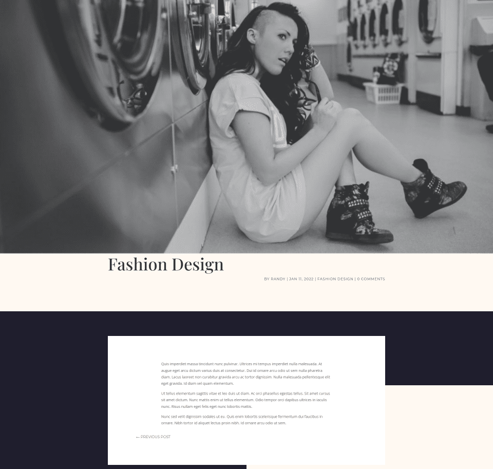
- 6.1 Fullscreen Post Title Module Desktop
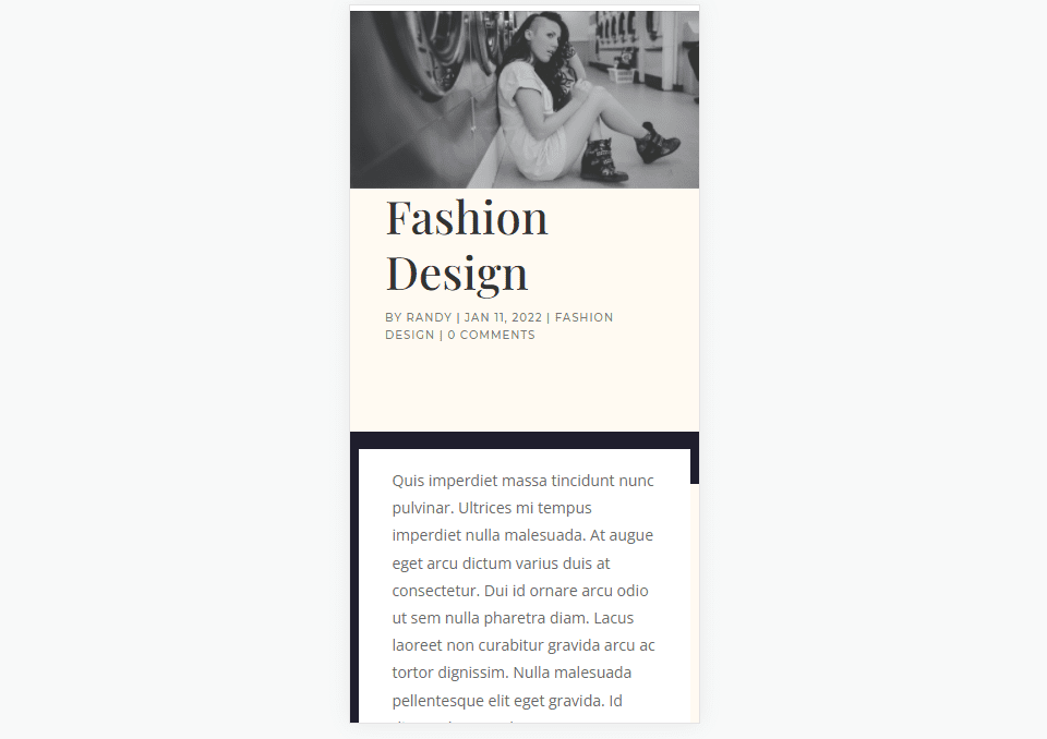
- 6.2 Fullscreen Post Title Module Phone
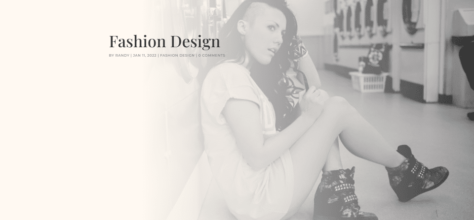
- 6.3 Alternate Fullscreen Post Title Module with Title Over Background Desktop
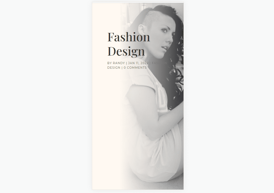
- 6.4 Alternate Fullscreen Post Title Module with Title Over Background Phone
- 6.5 Fullscreen Hero with Metadata Desktop
- 6.6 Fullscreen Hero with Metadata Phone
- 7 Ending Thoughts
Preview
Here’s a look at what we’ll make.
Fullscreen Post Title Module Desktop
Fullscreen Post Title Module Phone
Alternate Fullscreen Post Title Module with Title Over Background Desktop
Alternate Fullscreen Post Title Module with Title Over Background Phone
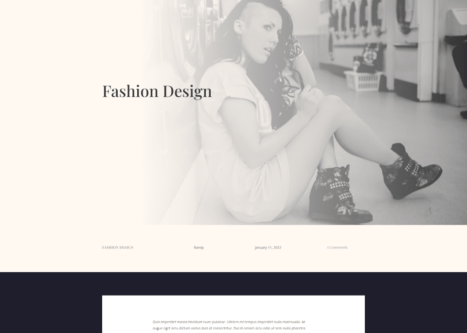
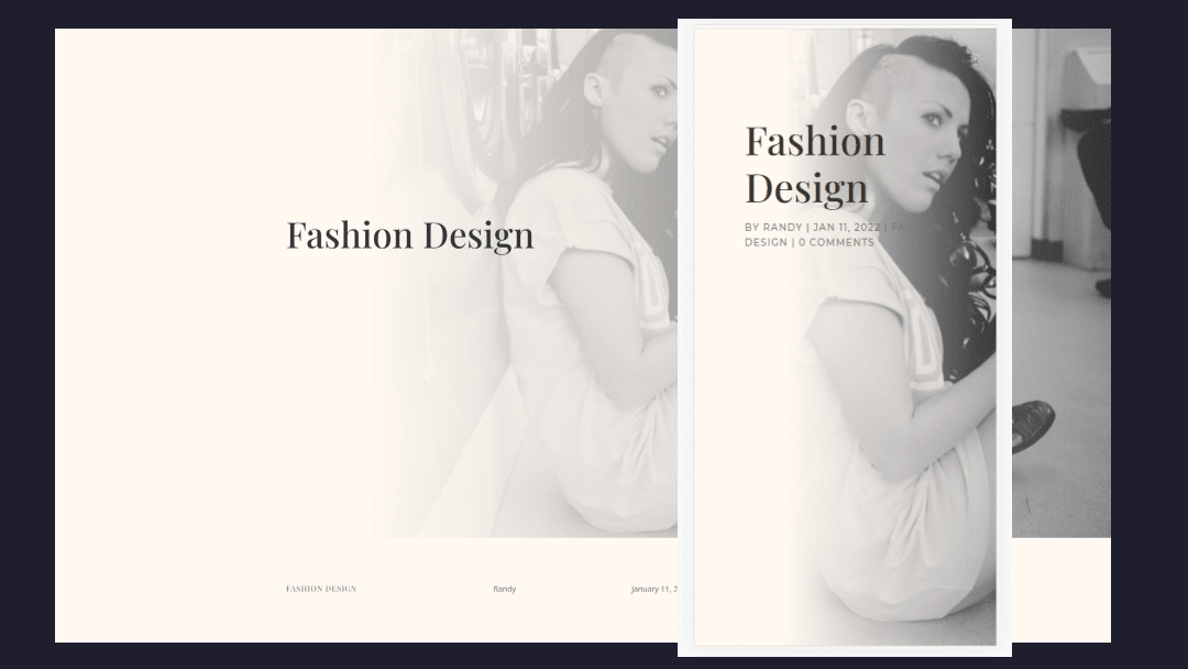
Fullscreen Hero with Metadata Desktop
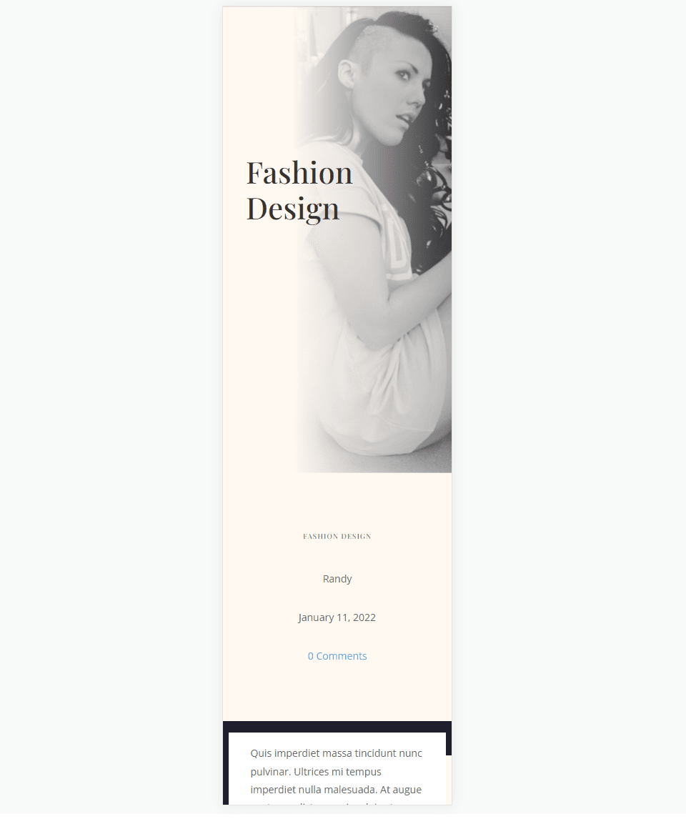
Fullscreen Hero with Metadata Phone
Blog Post Templates for Your Fullscreen Hero
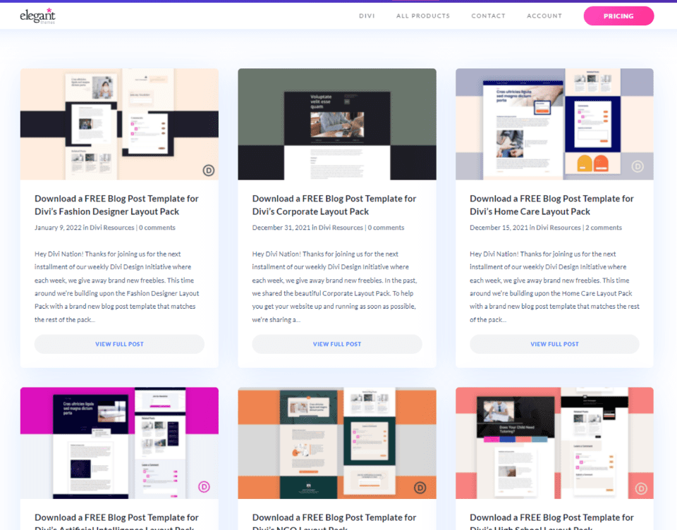
You can create the blog post template in the Divi Theme Builder from scratch or upload a template from the Elegant Themes blog. To find them, search the blog for “free blog post template”. If you download a template, be sure to unzip it.
For my examples, I’m using the free Blog Post Template for Divi’s Fashion Designer Layout Pack. I’m also using the free Header and Footer fashion Designer Layout Pack to match.
Upload or Create Your Blog Post Template for Your Fullscreen Hero
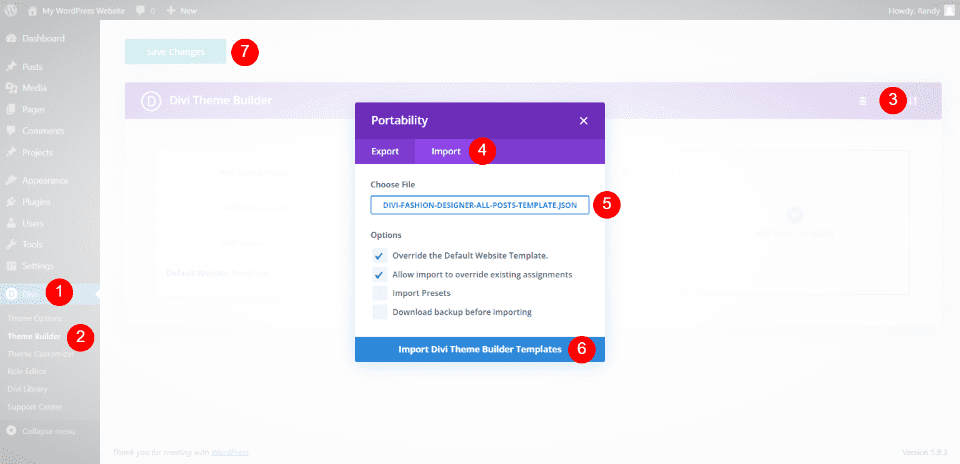
You can upload your blog post template or create one from scratch. We’ll upload one, but the process of creating the fullscreen hero is the same.
To upload a template, go to Divi > Theme Builder in the WordPress dashboard. Select Portability and click Import within the modal that opens. Navigate to your JSON file and select it. Click Import Divi Theme Builder Templates and wait for the upload to complete. Save your settings.
- Go to Divi in the WordPress dashboard
- Select Theme Builder
- Click on Portability
- Select Import
- Choose your JSON file
- Click to Import
- Save your settings
Method 1: Fullscreen Post Title Module
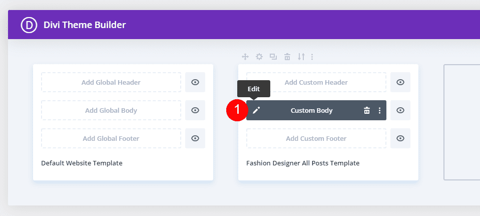
This method will use the Post Title Module. This is a good choice if you want to show all of the information together. Once you have your template, select the edit icon to open it.
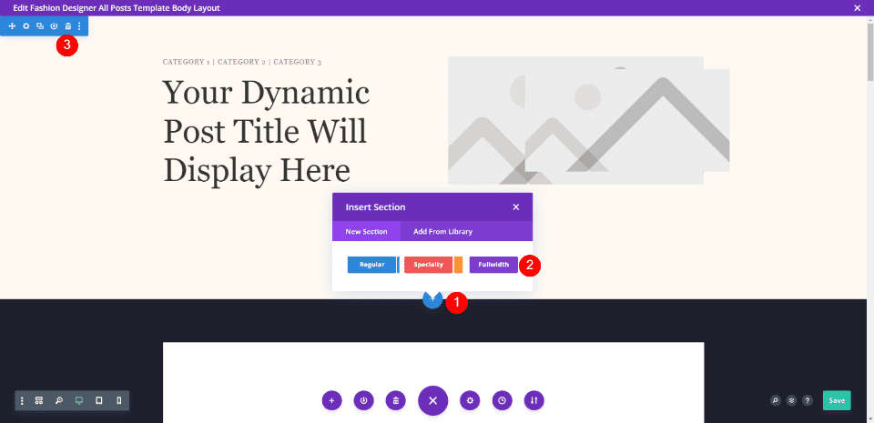
The template I uploaded has a section with the featured image. We will delete this section and add a Fullwidth section in its place.
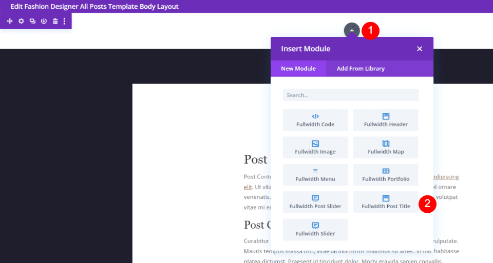
Select Fullwidth Post Title from the list of fullwidth modules.
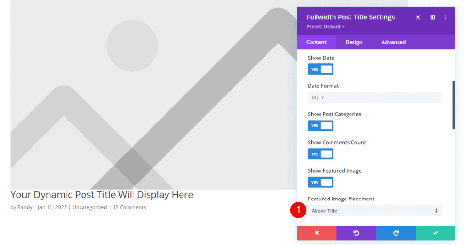
All the elements are selected by default. Leave them enabled. Scroll down to Featured Image Placement and select Above Title.
- Featured Image Placement: Above Title
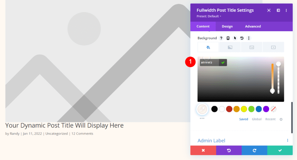
Scroll down to Background and set the color to #fff9f2
- Color: #fff9f2
Title Text
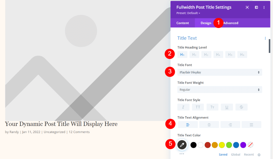
Select the Design tab. For the Title Text, keep H1 and choose Playfair Display. Set it to Left Justified and choose #34332e for the color.
- Font: Playfair Display
- Alignment: Left Justified
- Color: #34332e
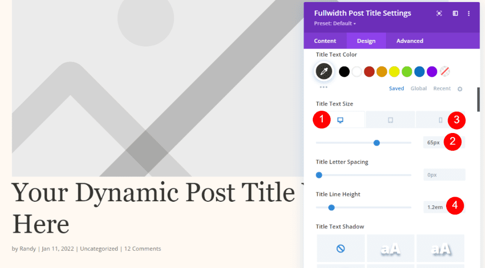
For the Text Size, set the desktop to 65px, the phone to 42px, and the Line Height to 1.2em.
- Desktop Size: 65px
- Phone Size: 42px
- Line Height: 1.2em
Meta Text
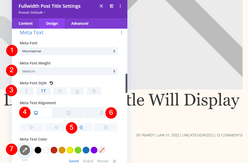
Scroll down to Meta. Select Montserrat for the font and set it to medium weight, uppercase, Right Alignment for Desktop, and Left Alignment for Phone. Choose #7b7975 for the color.
- Font: Montserrat
- Weight: Medium
- Style: Uppercase
- Desktop Alignment: Right
- Phone Alignment: Left
- Color: #7b7975
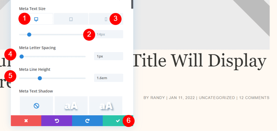
Set the Desktop Font Size to 14px, the phone size to 10px, the Letter Spacing to 1px, and the Line Height to 1.6em. Close your settings and save your template.
- Desktop Size: 14px
- Phone Size: 10px
- Letter Spacing: 1px
- Line Height: 1.6em
Title Over Background Image
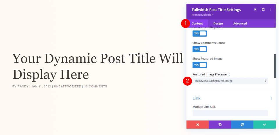
If you decide you want the title to appear over the featured image, use the same Design settings and go back to the Content tab. Select Title/Meta Background Image for Featured Image Placement.
- Featured Image Placement: Title/Meta Background Image
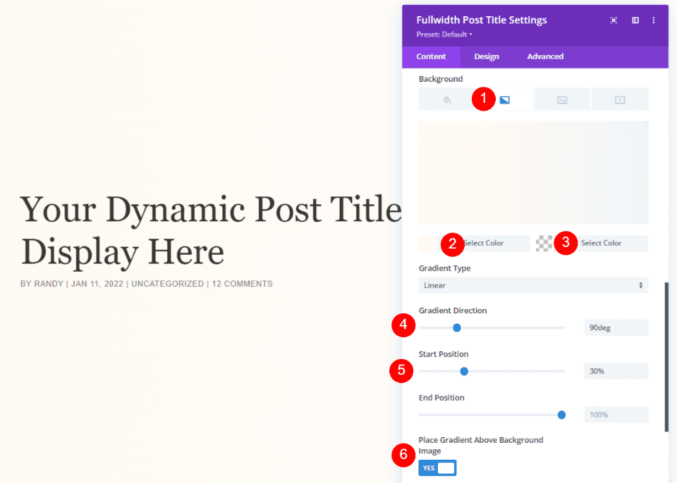
Scroll down to Background and select Gradient. Set the left color to #fff9f2, the right color to rgba(255,255,255,0), the direction to 90deg, the start position to 30%, and choose Yes to Place Gradient Above Background Image. Close and save your settings.
- Left Gradient Color: #fff9f2
- Right Gradient Color: rgba(255,255,255,0)
- Gradient Direction: 90deg
- Start Position: 30%
- Place Gradient Above Background Image: YES
Method 2: Fullscreen Hero with Metadata
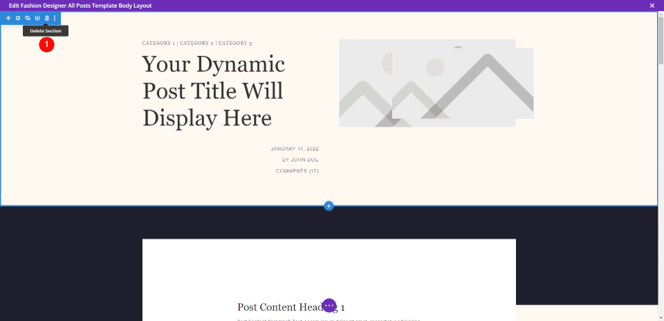
This method will use Text modules with Dynamic Content for the information. This is a good option if you want to show all the elements in different places. First, upload the template and delete the first section. We’ll recreate the modules and their settings in the left column, but we’ll go through them so you can set them up.
Fullscreen Hero with Metadata Section Settings
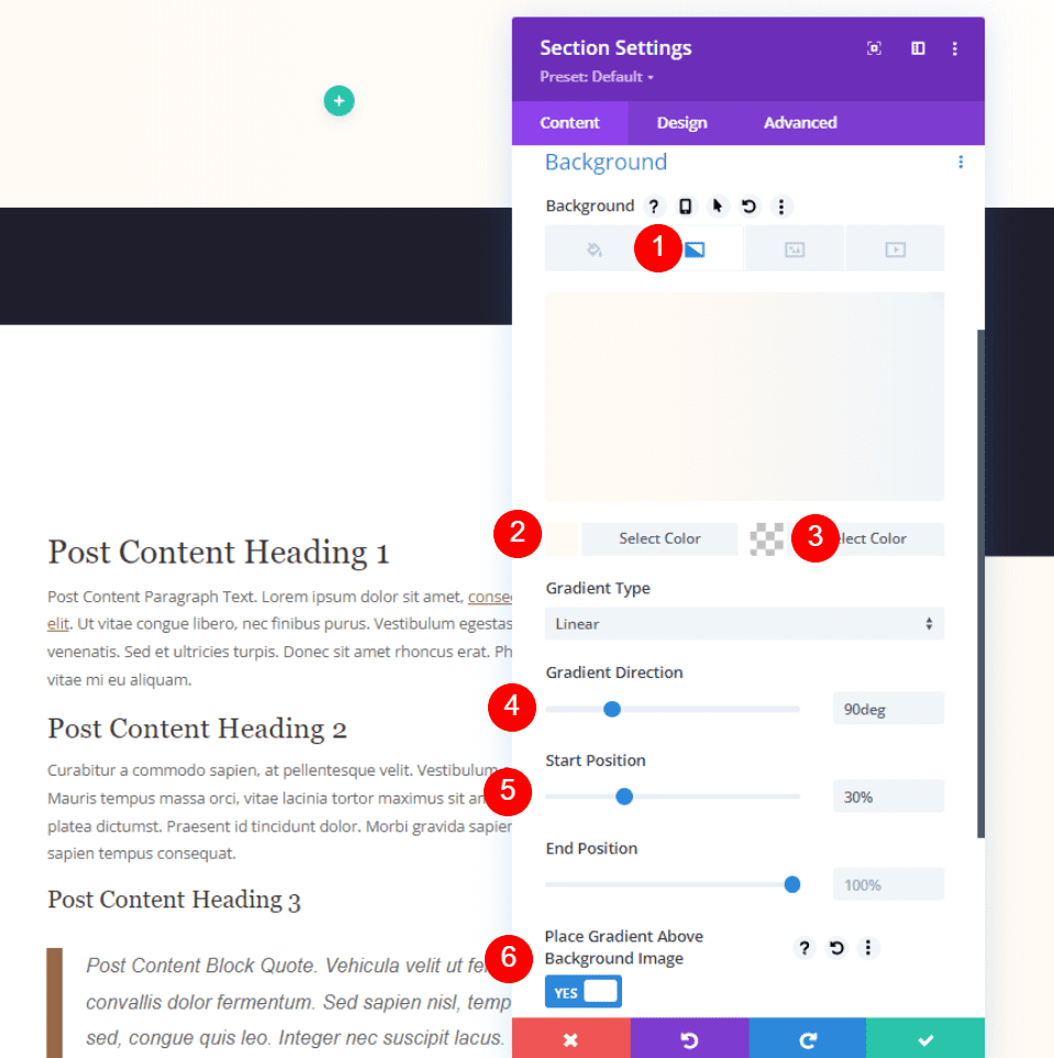
Open the Section settings and scroll down to the Background Color. Select Gradient and set the left color to #fff9f2, the right color to rgba(255,255,255,0), Gradient Direction to 90deg, Start Position to 30%, and Place Gradient Above Background Image to YES.
- Left Gradient Color: #fff9f2
- Right Gradient Color: rgba(255,255,255,0)
- Gradient Direction: 90deg
- Start Position: 30%
- Place Gradient Above Background Image: YES
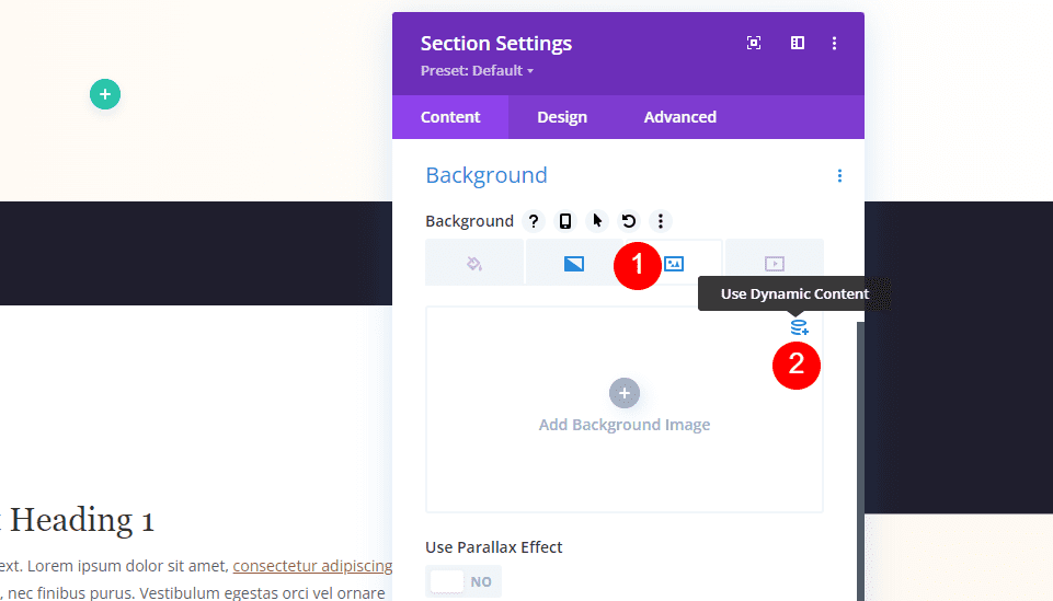
Select Image and choose the Dynamic Content option.

Choose Featured Image in the options.
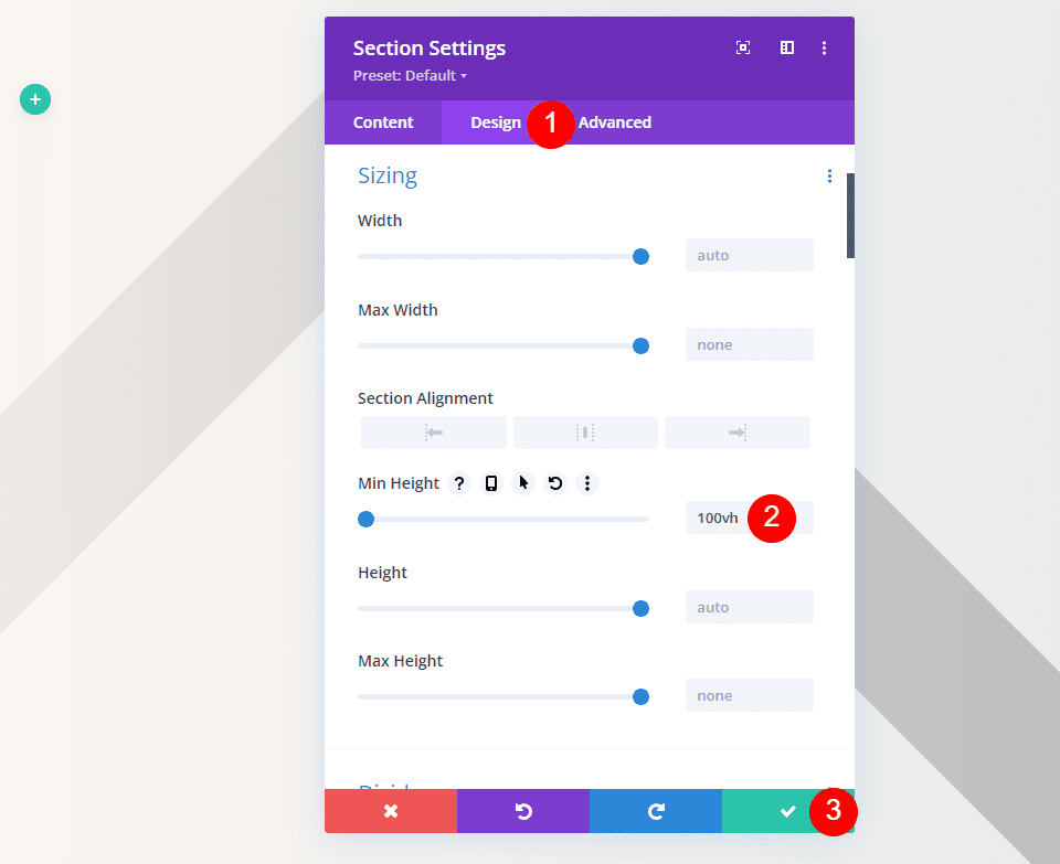
Select the Design tab and scroll to Settings. Add 100vh to the Min Height. Close the section settings.
- Min Height: 100vh
Fullscreen Hero with Metadata Title Text
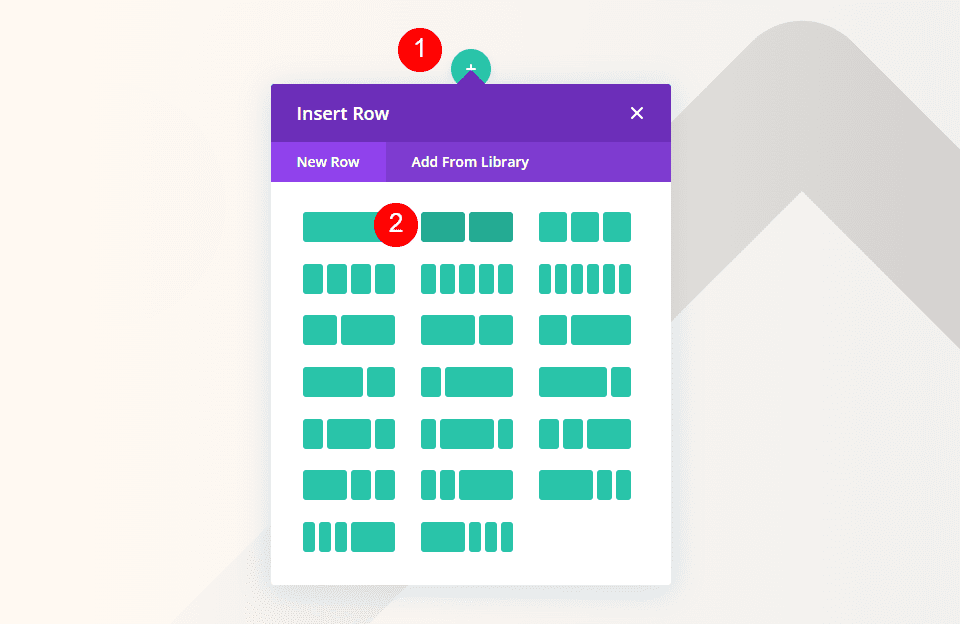
Next, add a double-column row to the section.
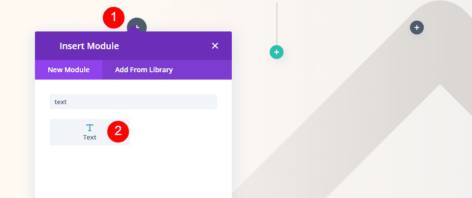
Add a Text module to the right column.
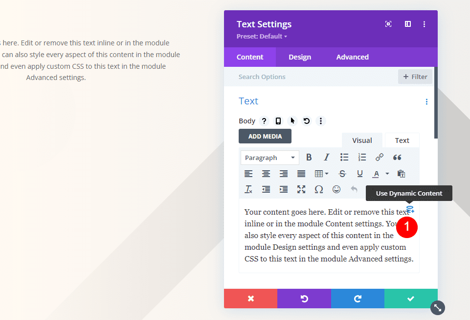
For its content, select Use Dynamic Content.
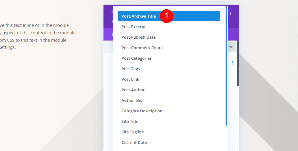
Choose Post/Archive Title from the list of options.
- Dynamic Content: Post/Archive Title
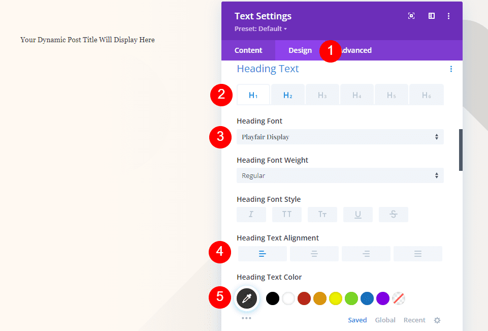
Select the Design tab. For the Heading Text, keep H1 and choose Playfair Display. Set it to Left Justified and choose #34332e for the color.
- Font: Playfair Display
- Alignment: Left Justified
- Color: #34332e
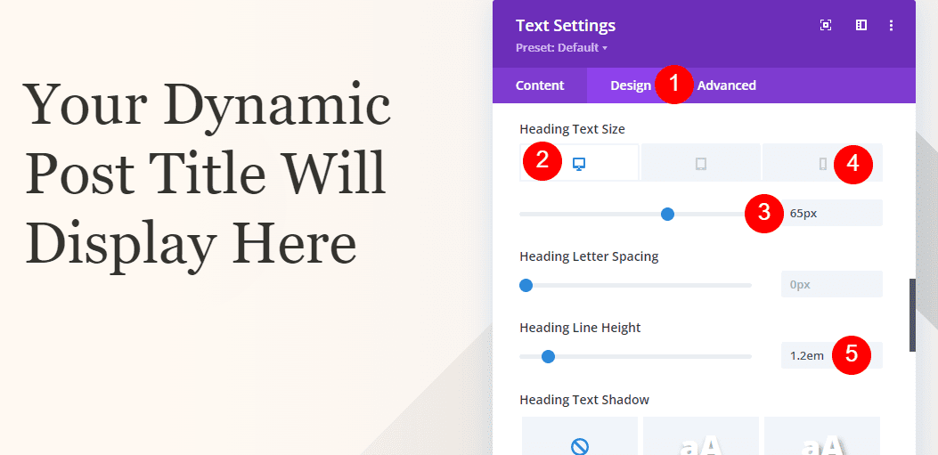
For the Text size, set the desktop to 65px, the phone to 42px, and the Line Height to 1.2em.
- Desktop Size: 65px
- Phone Size: 42px
- Line Height: 1.2em
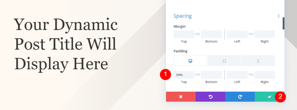
Scroll down to Spacing and enter 50% for the Top Padding. Close the settings.
- Top Padding: 50%
Fullscreen Hero with Metadata Category Section
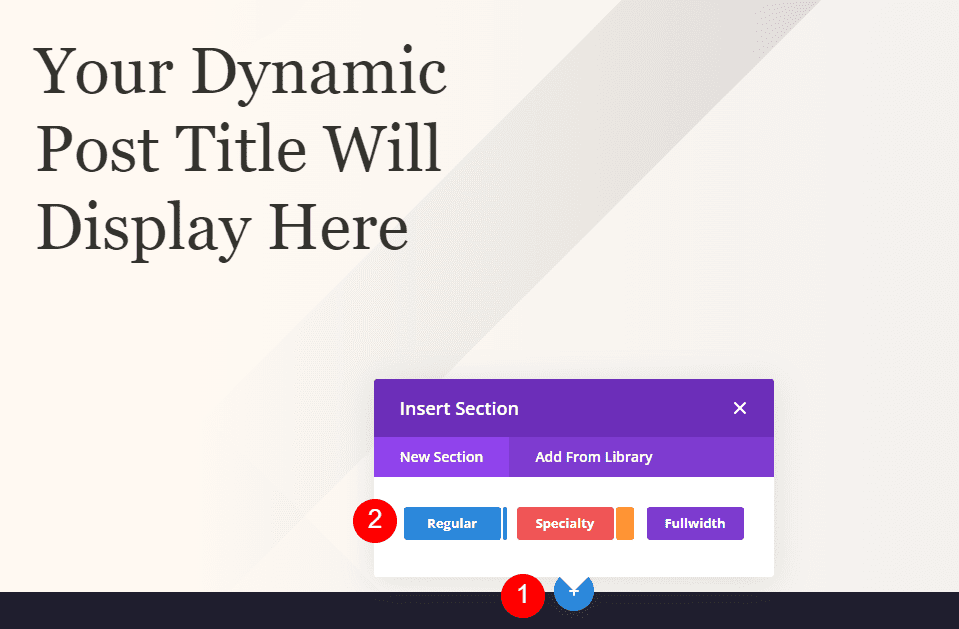
Add a new regular section under the hero section.
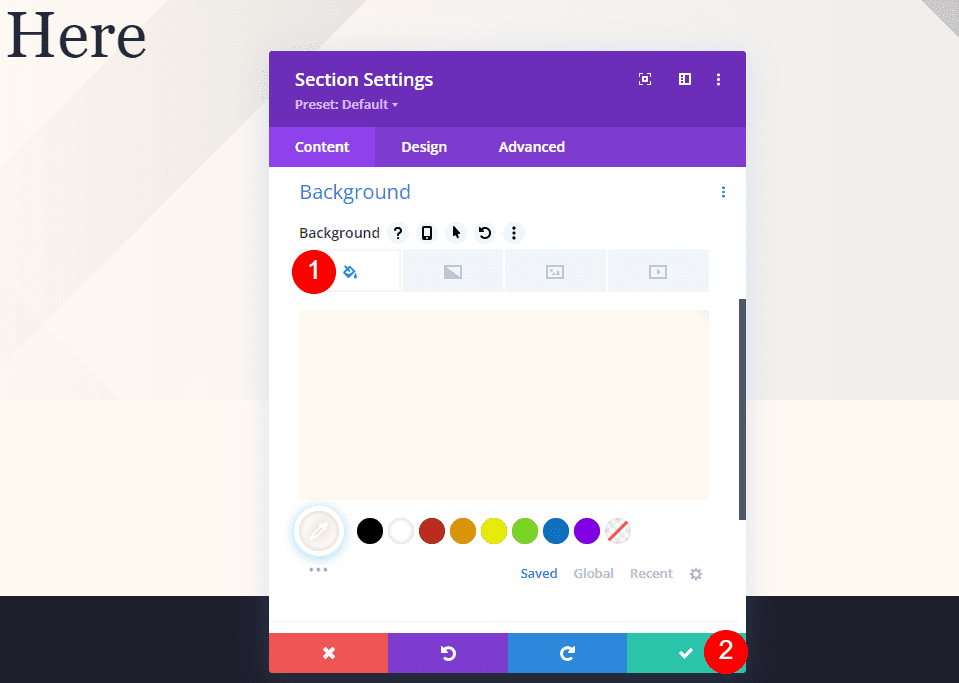
Open its settings and set the Background Color to #fff9f2. Close the settings.
- Background Color: #fff9f2
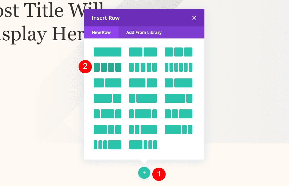
Next, add a 4-column row to the new section.
Fullscreen Hero with Metadata Category Text
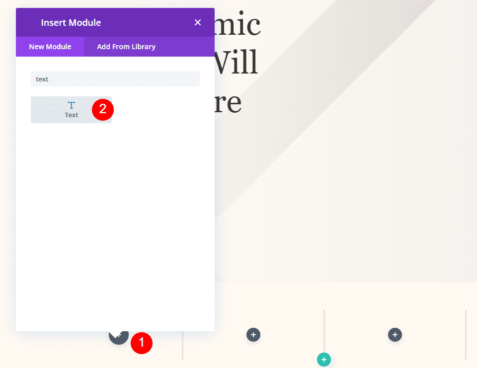
Add a Text module to the left column.
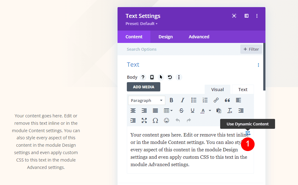
Open the module’s settings and select Use Dynamic Content for the body of the text.
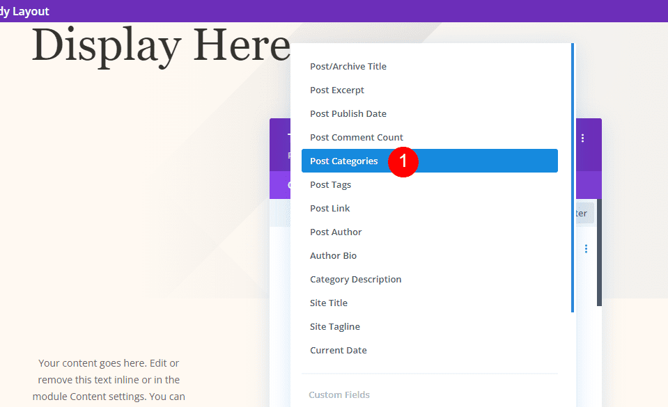
Select Post Categories from the list.
- Dynamic Content: Post Categories
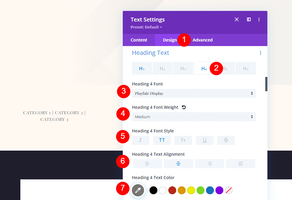
Select the Design tab and scroll down to Heading Text. Select H4. Choose Playfair Display for the font and set it to medium weight, uppercase, Right Alignment for Desktop, and Left Alignment for Phone. Choose #7b7975 for the color.
- Heading Text: H4
- Font: Playfair Display
- Weight: Medium
- Style: Uppercase
- Alignment: Center
- Color: #7b7975
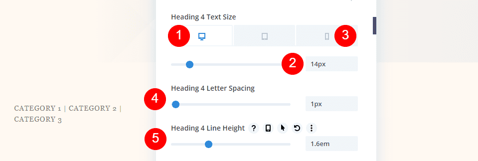
Set the Desktop Font Size to 14px, the phone size to 10px, the Letter Spacing to 1px, and the Line Height to 1.6em. Close your settings and save your template.
- Desktop Size: 14px
- Phone Size: 10px
- Letter Spacing: 1px
- Line Height: 1.6em
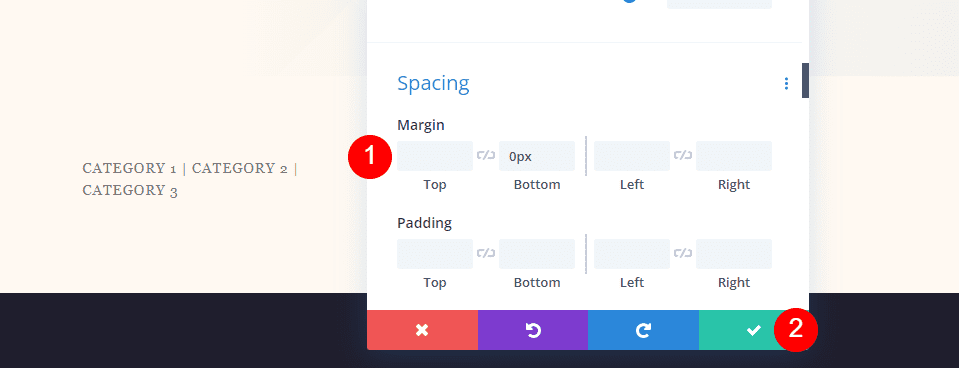
Scroll down to Spacing and add 0px to the Bottom Margin. Close the settings.
- Bottom Margin: 0px
Fullscreen Hero with Metadata Meta Text

Next, copy the category module and drag it to the next column. Each of the Meta modules has the same settings. We’ll show how to create the first module and then copy it twice to create the other modules.
Author
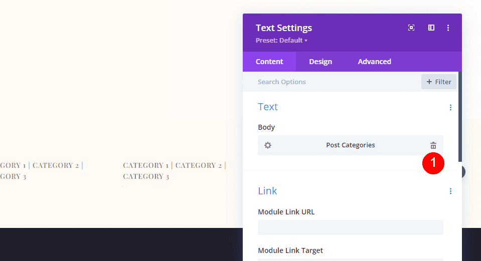
Open the settings and delete the Post Categories dynamic content.
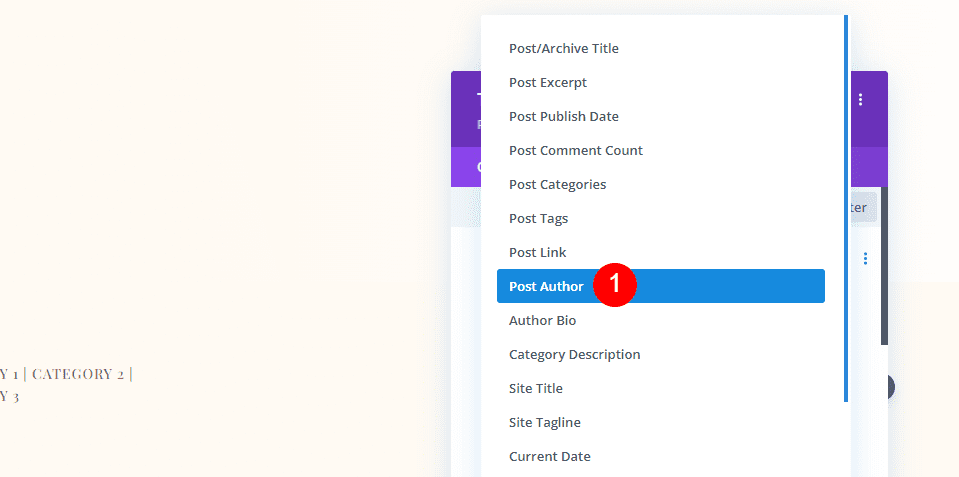
Click Use Dynamic Content and choose Post Author.
- Dynamic Content: Post Author
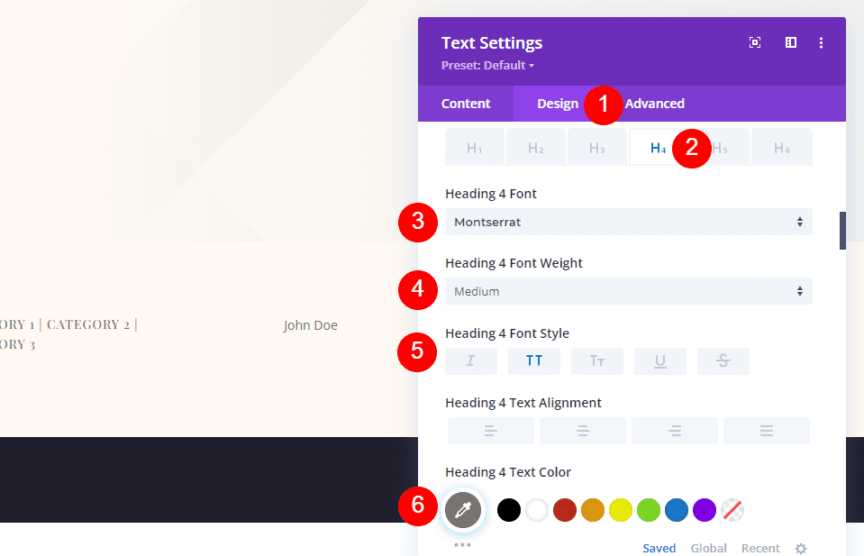
In the Design tab, go to the Heading 4 Font and select Montserrat for the font. The rest of the settings have been copied from the previous module. They include medium weight, uppercase, right alignment for desktop, left alignment for phone, and #7b7975 for the color.
- Font: Montserrat
- Weight: Medium
- Style: Uppercase
- Desktop Alignment: Center
- Phone Alignment: Left
- Color: #7b7975
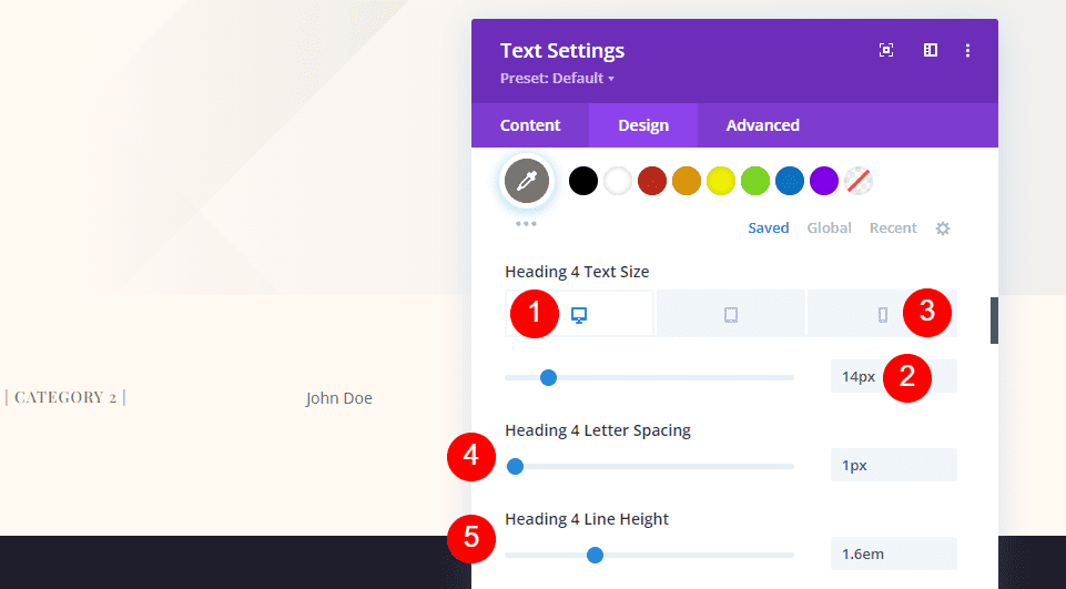
The Font Size settings include the desktop size at 14px, the phone size at 10px, the Letter Spacing at 1px, and the Line Height at 1.6em.
- Desktop Size: 14px
- Phone Size: 10px
- Letter Spacing: 1px
- Line Height: 1.6em

The Bottom Margin should have 0px.
- Bottom Margin: 0px
Date

Copy the Author module and drag it to the next column.
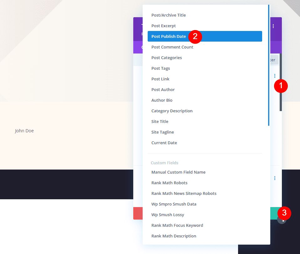
Delete the Dynamic Content, choose Use Dynamic Content, and select Post Publish Date. Close the settings.
- Dynamic Content: Post Publish Date
Comments
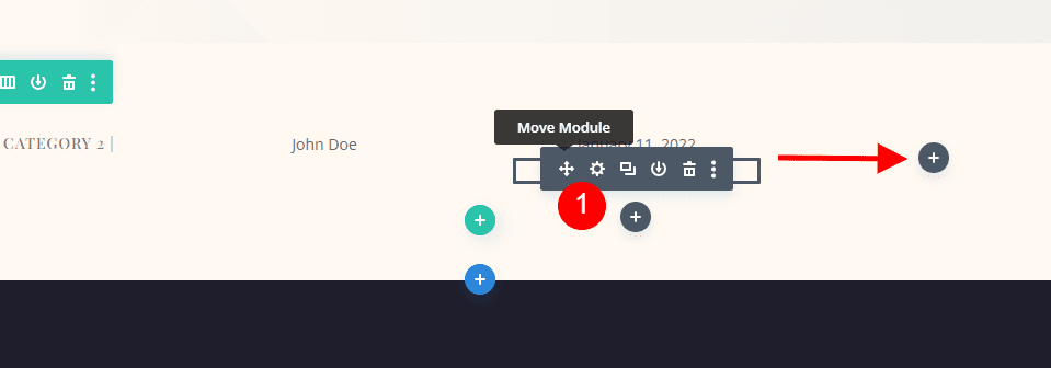
Finally, copy the Publish Date module and drag it to the last column.
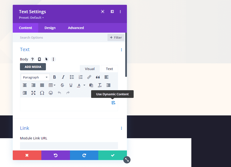
As with the other modules, delete the dynamic content and select Use Dynamic Content.
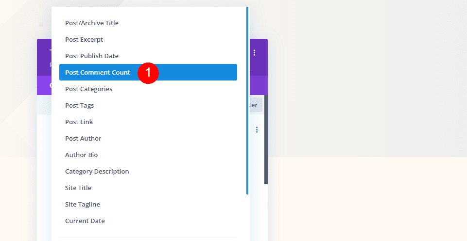
Choose Post Comment Count from your choices.
- Dynamic Content: Post Comment Count
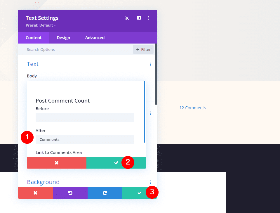
This time, add a space and the word Comments in the After field. Close the small modal and then close the settings. Save your work.
- After: Comments
Results
Fullscreen Post Title Module Desktop

Fullscreen Post Title Module Phone

Alternate Fullscreen Post Title Module with Title Over Background Desktop

Alternate Fullscreen Post Title Module with Title Over Background Phone

Fullscreen Hero with Metadata Desktop

Fullscreen Hero with Metadata Phone

Ending Thoughts
That’s our look at how to add a fullscreen hero to your Divi blog post template. The Divi modules and Theme Builder provide several options for building fullscreen hero sections. Any of the methods work great and all have their advantages. Using these methods, you can build add a fullscreen hero to any Divi blog post template.
We want to hear from you. Have you added a fullscreen hero to your blog post templates? Let us know about it in the comments.



They look really great, and really give another vibe to the blog. Really cool, thanks! I will be using this for sure on some project.