
A fullscreen slider can work really well as the header of your website’s homepage. The fullscreen aspect consistently keeps important content above the fold. And the slider functionality allows users to see additional content (or CTAs) without having to scroll down the page.
Creating a fullscreen slider with Divi is surprisingly easy to do. The key is to give your slider a height that is relative to the browser height and then get rid of any extra padding and width restrictions on the parent row or section. In just a few minutes, you can create a fullscreen slider that expands to fill the entire screen on page load and look great on all devices.
Let’s get started.
Sneak Peek
Here is a quick look at the design we’ll build in this tutorial.
Download the Fullscreen Slider Layout for FREE
To lay your hands on the designs from this tutorial, you will first need to download it using the button below. To gain access to the download you will need to subscribe to our newsletter by using the form below. As a new subscriber, you will receive even more Divi goodness and a free Divi Layout pack every Monday! If you’re already on the list, simply enter your email address below and click download. You will not be “resubscribed” or receive extra emails.

To import the section layout to your Divi Library, navigate to the Divi Library.
Click the Import button.
In the portability popup, select the import tab and choose the download file from your computer.
Then click the import button.

Once done, the section layout will be available in the Divi Builder.
Let’s get to the tutorial, shall we?
What You Need to Get Started

To get started, you will need to do the following:
- If you haven’t yet, install and activate the Divi Theme.
- Create a new page in WordPress and use the Divi Builder to edit the page on the front end (visual builder).
- Choose the option “Build From Scratch”.
After that, you will have a blank canvas to start designing in Divi.
Creating a Fullscreen Slider in Divi
Part 1: Setting up the Section and Row
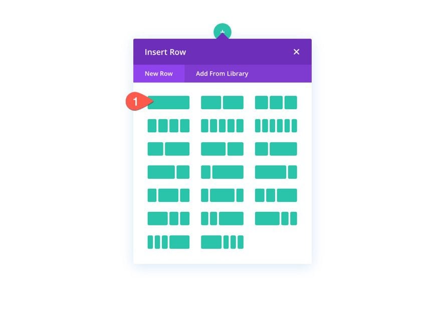
To start, add a one-column row to the section.
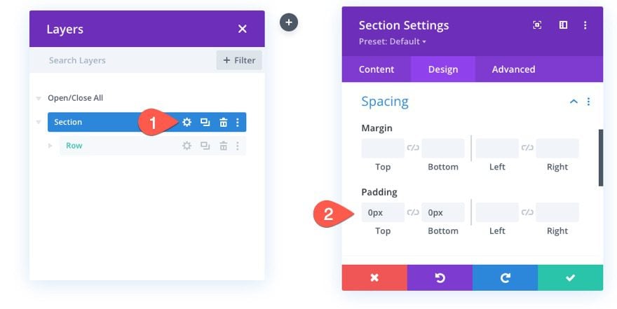
Section Padding
Before adding a module, open the section settings and take out the top and bottom padding as follows:
- Padding: 0px top, 0px bottom
Row Settings
Next, open the settings for the row and update the following:
- Width: 100%
- Max Width: 100%
- Padding: 0px top, 0px bottom
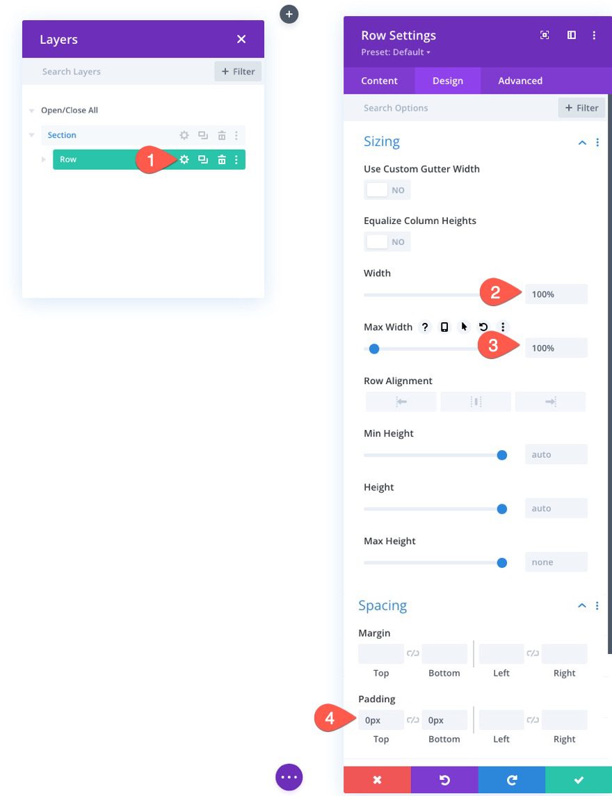
Now that our section and row padding has been removed and our row width is 100%, the slider we will add to the row will be able to span the full width and height of the row/section without any gaps.
Part 2: Creating the Fullscreen Slider
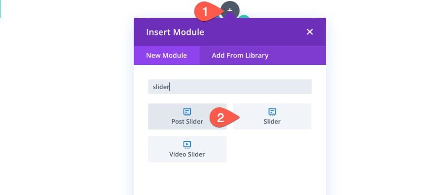
To create the fullscreen slider, add a new slider module to the row.
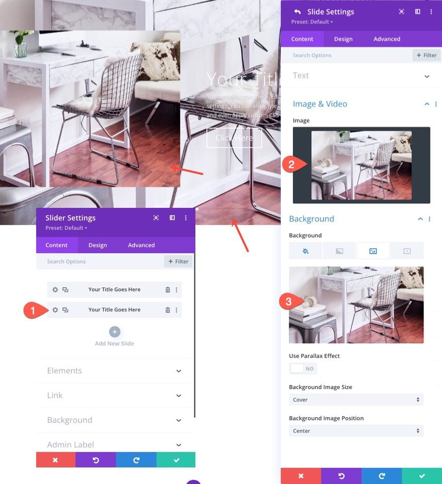
Add Images to Each Slide
Before updating the general slide settings, open the settings for the first default slide and add an image and background image to the slide. For this example, I’m using the same image for the slide image and background image (around 1920px by 1500px).
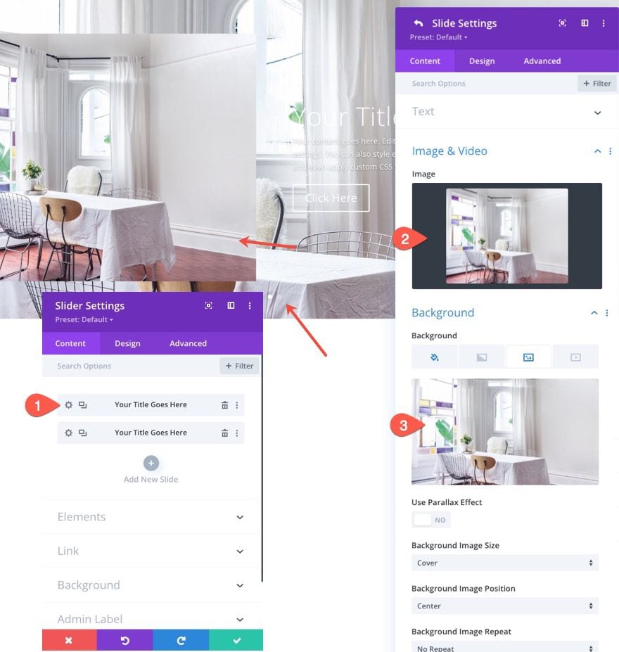
Then open the settings for the second slide and add different image and background image to the slide.
Update Slider Settings
Now that each individual slide has a unique image and background image, we are ready to update the settings for the slider in general.
Go back to the slider settings and update the following under the design tab:
Background Overlay
- Use Background Overlay: YES
- Background Overlay Color: rgba(27,18,38,0.74)
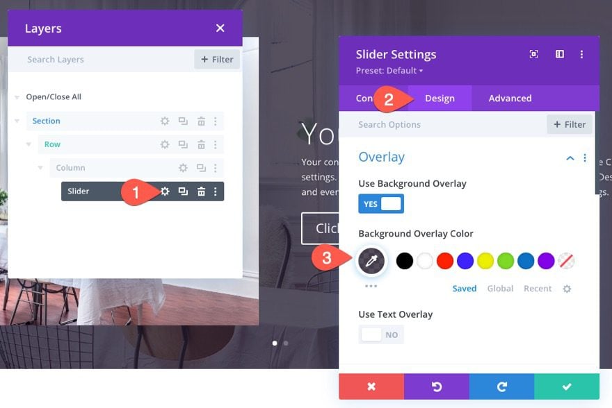
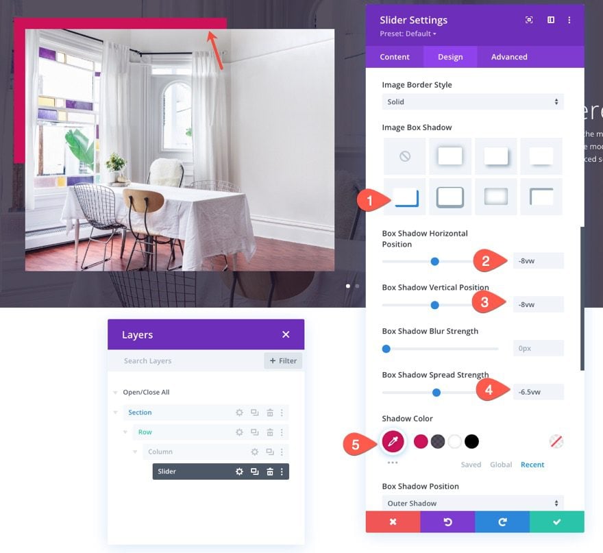
Image Box Shadow
- Image Box Shadow: see screenshot
- Box Shadow Horizontal Position: -8vw
- Box Shadow Vertical Position: -8vw
- Box Shadow Spread Strength: -6.5vw
- Shadow Color: #cf1259
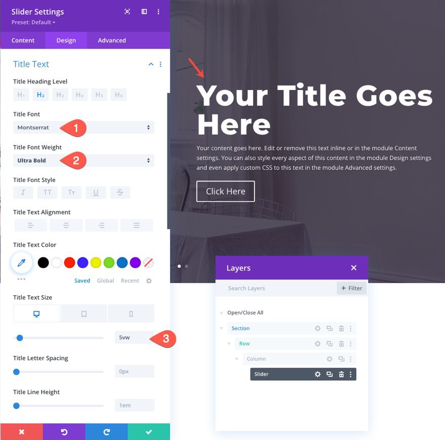
Title Text
- Title Font: Montserrat
- Title Font Weight: Ultra Bold
- Title Text Size: 5vw (desktop), 40px (tablet and phone)
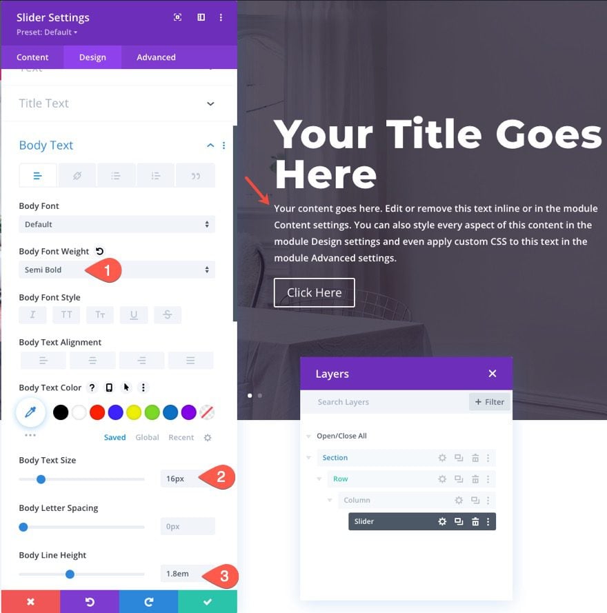
Body Text
- Body Font Weight: Semi Bold
- Body Text Size: 16px
- Body Line Height: 1.8em
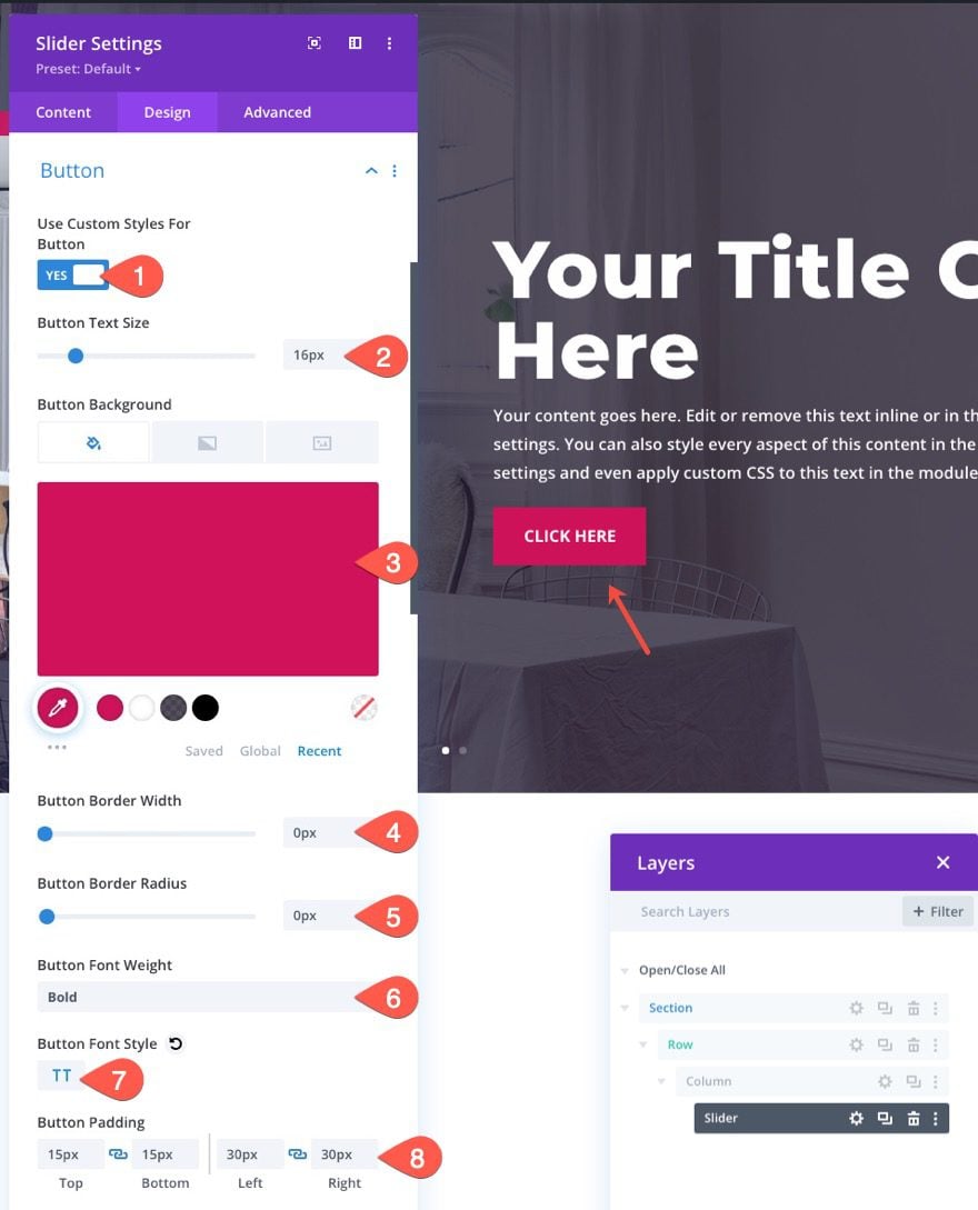
Button Styles
- Use Custom Styles for Button: YES
- Button Text Size: 16px
- Button Background Color: #cf1259
- Button Border Width: 0px
- Button Border Radius: 0px
- Button Font Weight: Bold
- Button Font Style: TT
- Button Padding: 15px top, 15px bottom, 30px left, 30px right
Slider Height and Content Width
- Content Max Width: 90%
- Min Height: 100vh
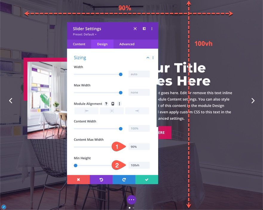
Giving the slider a min-height of 100vh will make sure the slider spans the full height of the browser window. This is the key to making a fullscreen slider. The slider will already span the full width of the browser window because the row width is 100%.
Slider Arrows
Under the Advanced tab, update the size and position of the slider arrows by adding the following custom CSS to the Slide Arrows CSS box:
font-size: 8vw !important;
margin-top: -4vw;
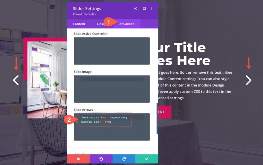
This will make the slider arrows larger on large screen sizes as well as scale them down to a smaller size on mobile.
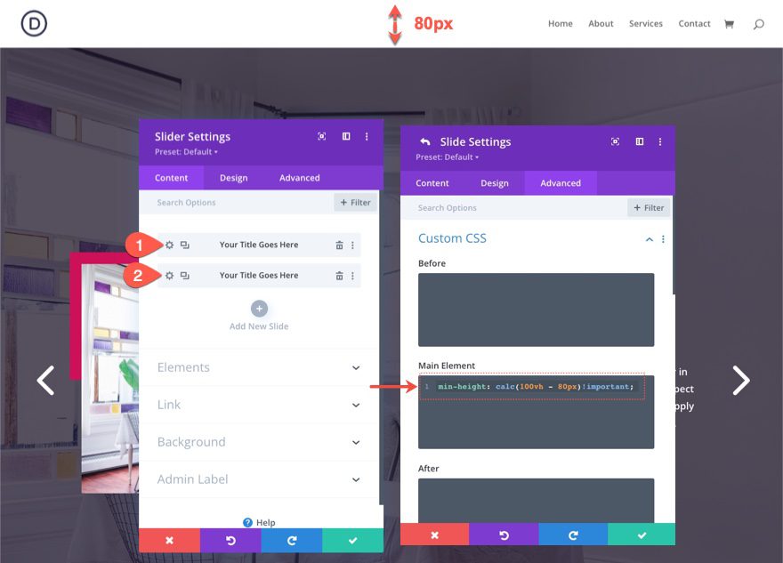
Part 3: Subtracting Header Height from Slider Height
If you have a header on the page, the fullscreen slider will actually extend a bit below the browser window. This is because the height of the header pushes down the slider which currently has a height of 100vh (100% of the viewport/browser height). To keep the slider from being pushed below the browser’s viewport, you can add a CSS calc() function to subtract the height of the header from the height of the slider.
You will need to know the height of the header (on desktop and mobile) for this to work. If you’re using the default Divi header, the height of the header will be 80px. So the height of the slider should be 100vh – 80px.
To add the custom height, open the settings for the slider and add the following custom CSS to the Main Element of the slider and also for each individual slide:
min-height: calc(100vh - 80px)!important;
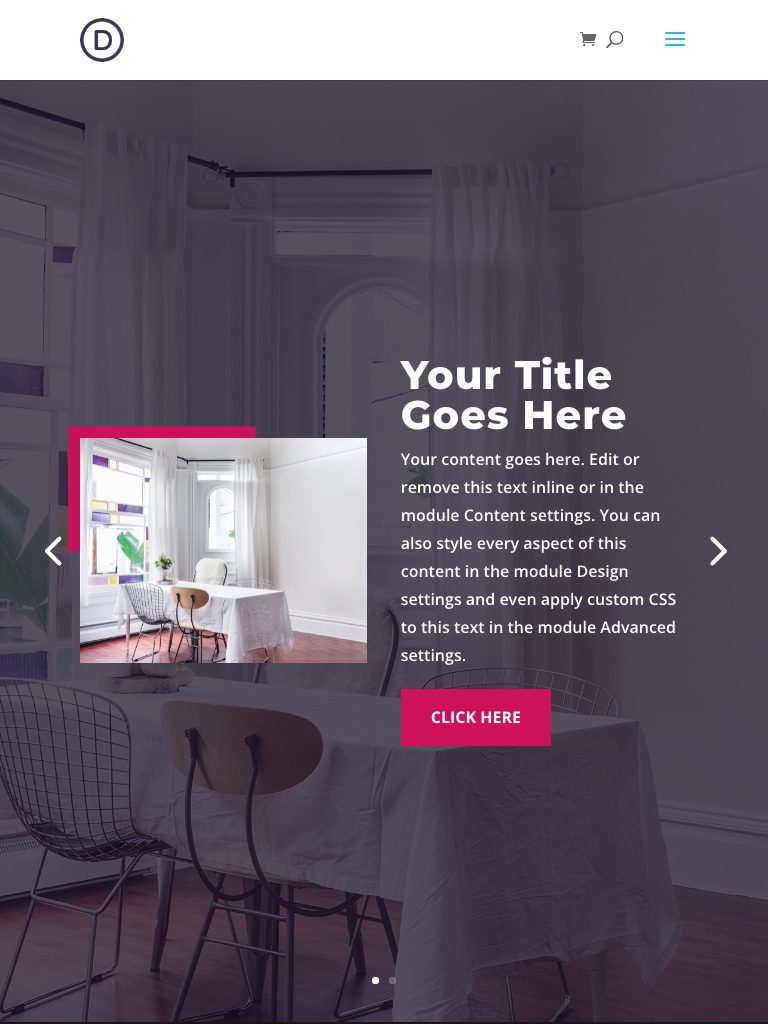
Final Result
Here is the final result.
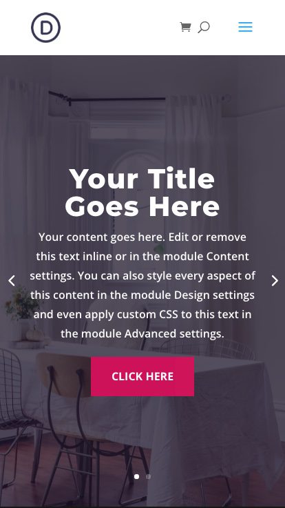
And here is how the design looks on tablet and phone.
Final Thoughts
The key steps to creating a fullscreen slider in Divi are to set up the section and row to span the full width of the browser and then give the slider a min-height of 100vh. If you are using a header, you can add a custom CSS snippet that will subtract the height of the header to make sure the fullscreen slider doesn’t extend beyond the bottom of the browser. With those key steps in place, you can further customize the slider (and slides) any way you want using all of the powerful design features included in the Divi Builder.
Use it to create beautiful and effective sliders for your hero section that fills any screen on any device.
I hope you enjoy this useful addition to your Divi site. I look forward to hearing from you in the comments.
Cheers!


Jason, what are your thoughts on the SEO aspects of using the slider? I have user fullwidth sliders previously but stopped using them due to multiple H1 tags when running an on-page audit. There are different opinions on how important this is to SEO.
great blog i like this
Hi ET Team,
How I can customize the Full-width layout, I downloaded some templates for this? By the way, Thank you so much for this guide as well really helpful.
Roshan,
Can you give an example of how you want to customize the full-width layout? Not sure what you mean. Thanks.
Just a thought I’ve had lately about a lot of the how to posts you make. It would be great if there was a way more advanced divi users could jump right to the “secret sauce”. A lot of times the “trick” to making these fun ideas come to life is buried amongst all the step by step instructions.
William,
Thanks for this feedback. I completely agree. I do give a “Basic Idea” example at the beginning of some of my tutorials for this very reason, but I don’t do it nearly enough. I’ll try and work this in more frequently. Maybe I’ll name the segment “Secret Sauce” :).
Thanks a lot. Exactly what i needed.
Awesome! You are welcome.
Great! This would open up more possibilities
Great to hear, Dimson.
Freakin awesome Jason. TY.
You’re welcome. Glad you like it, Jade.
Perfect post for creating fullscreen slider with DIVI
Thank you!