

Creating shapes using CSS in web design is not a new concept by any means. In fact, the classic method of creating CSS shapes has been largely overshadowed by other HTML graphic solutions like Canvas and SVG. However, CSS shapes (at least the basic ones) are much easier to create and can still play a significant role in web design. Plus, when you add scroll animation to these shapes, a whole new design element can emerge.
In this tutorial, we are going to explore how to create and animate CSS shapes in Divi. Once you understand the basic concept of how to create a few shapes using Divi’s built-in options, you can animate these shapes to create unique scroll animation designs for your website. You will be surprised how much you can do!
Let’s get started.
- 1 Sneak Peek
- 2 Download the Layout for FREE
- 3 Download For Free
- 4 You have successfully subscribed. Please check your email address to confirm your subscription and get access to free weekly Divi layout packs!
- 5 What You Need to Get Started
-
6
Exploring How to Create CSS Shapes with Animation in Divi
- 6.1 The Row and Column Structure
- 6.2 Adding the Divider Module Spacer
- 6.3 Creating the First CSS Shape Using Border Options
- 6.4 Creating Shape 2 with Scroll Animation
- 6.5 Creating Shape 3 with Scroll Animation
- 6.6 Testing the Scroll Animation
- 6.7 Adding a Mock Title to the Right Column (Optional)
- 6.8 Exploring Top Right Triangle Shape Animations
- 6.9 Exploring the Upward Triangle CSS Shape Design Animations
- 6.10 Exploring the Teardrop CSS Shape Design Animations
- 6.11 Exploring the Sector (or Pizza Slice) CSS Shape Design Animations
- 6.12 Exploring the Trapezoid CSS Shape Design Animations
- 7 Final Results
- 8 Final Thoughts
Sneak Peek
Here is a quick look at the design we’ll build in this tutorial.
Download the Layout for FREE
To lay your hands on the designs from this tutorial, you will first need to download it using the button below. To gain access to the download you will need to subscribe to our newsletter by using the form below. As a new subscriber, you will receive even more Divi goodness and a free Divi Layout pack every Monday! If you’re already on the list, simply enter your email address below and click download. You will not be “resubscribed” or receive extra emails.

To import the section layout to your Divi Library, navigate to the Divi Library.
Click the Import button.
In the portability popup, select the import tab and choose the download file from your computer.
Then click the import button.

Once done, the section layout will be available in the Divi Builder.
Let’s get to the tutorial, shall we?
What You Need to Get Started

To get started, you will need to do the following:
- If you haven’t yet, install and activate the Divi Theme.
- Create a new page in WordPress and use the Divi Builder to edit the page on the front end (visual builder).
- Choose the option “Build From Scratch”.
After that, you will have a blank canvas to start designing in Divi.
Exploring How to Create CSS Shapes with Animation in Divi
The Row and Column Structure
First, add a one-third two-thirds column row to the section.
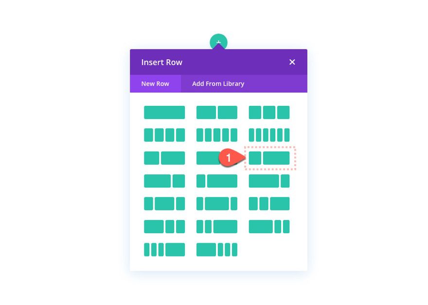
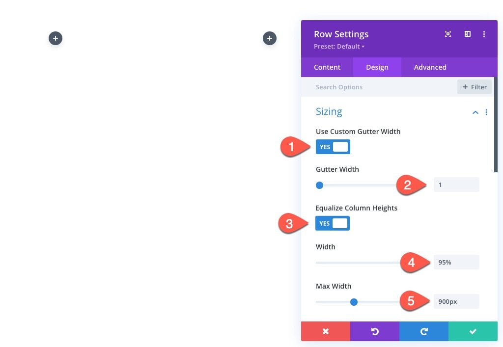
Before we do anything else, open the row settings and update the following:
- Gutter Width: 1
- Equalize Column Heights: YES
- Width: 95%
- Max Width: 900px
NOTE: These settings are crucial to the setup of our design. For example, the one-third two-thirds column structure combined with a row that has a max-width of 900px without any margins (gutter width 1), let’s us know that the left column will be exactly 300px wide. Furthermore, if I keep my design contained within this 300px width column, I can also be assured it will look good on tablet and mobile devices as well.
Adding the Divider Module Spacer
Next, add a divider to create the spacing needed for the column that will contain our CSS shapes.
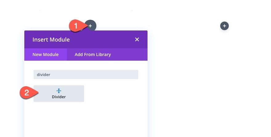
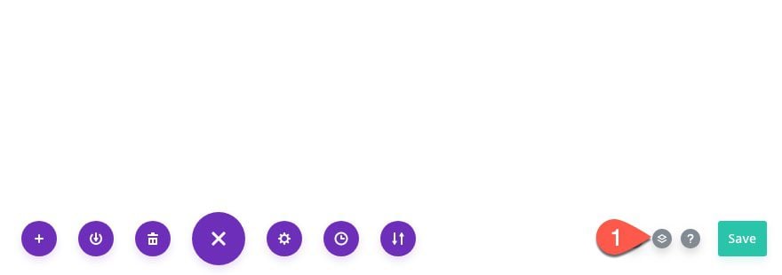
At this point, you should open the layers view modal to manage the layers/modules going forward which can be found in the settings menu of the Divi Builder.
Open the divider settings and update the height of the divider as follows:
- Show Divider: NO
- Height: 150px
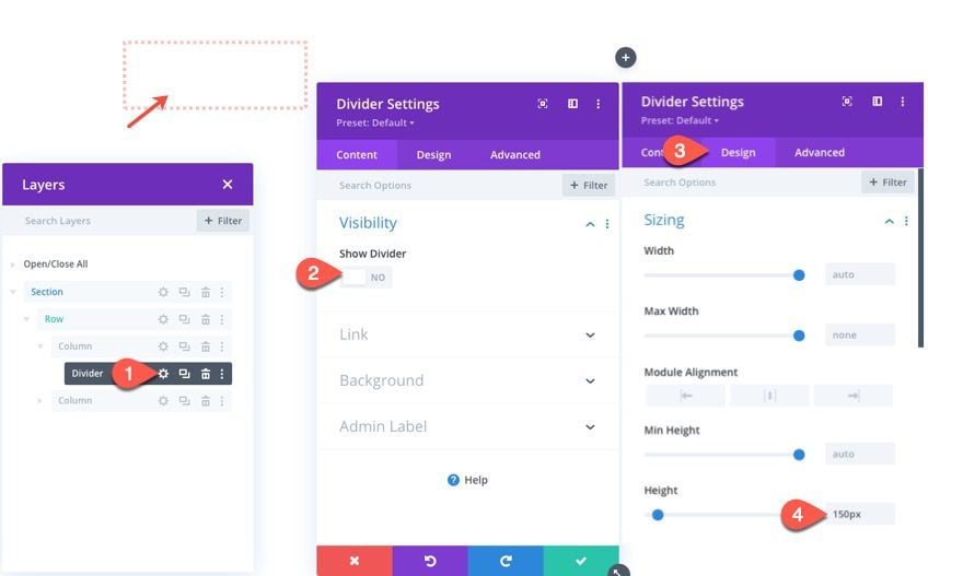
Since our CSS Shapes will be positioned absolutely, the actual spacing of the column area can easily be adjusted by adjusting the height of the divider. Personally, I found this easier than trying to manipulate the height or spacing of the column. Plus it gives you the added bonus of styling the divider as an additional design element (or shape). For right now, you can think of it as a canvas for your future CSS Shape designs.
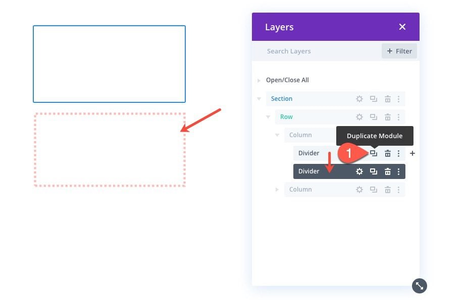
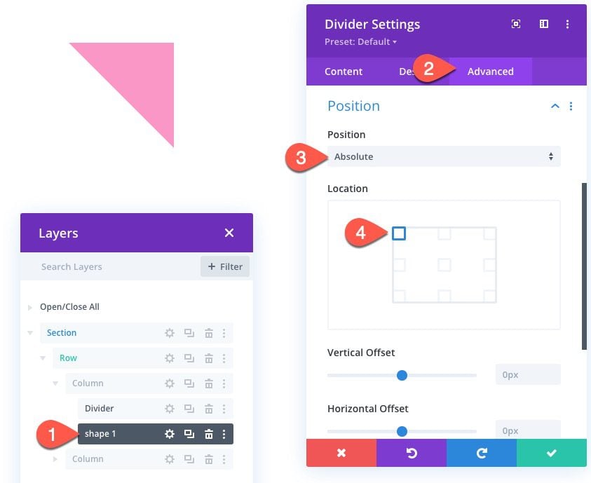
Creating the First CSS Shape Using Border Options
To create our CSS Shape, we are going to use a divider module. Technically, we are only using the borders that surround the module, not the module area. (So you could use other modules, like text modules, or code modules as well).
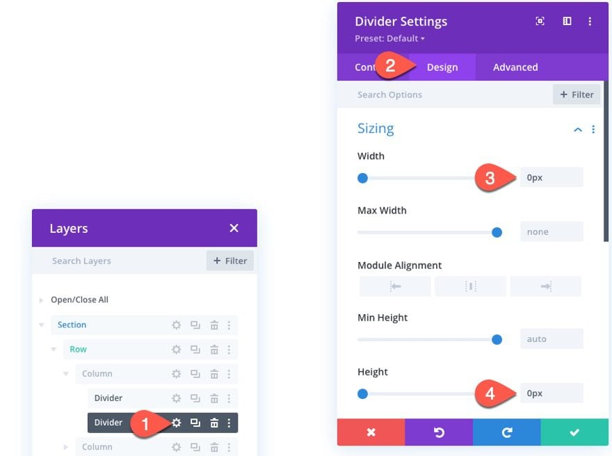
To create the CSS Shape, duplicate the divider module already created previously.
Then take out the height and width of the divider module by setting each to 0px as follows:
- Width: 0px
- Height: 0px
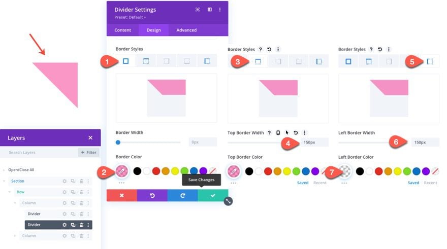
For the first shape, we are going to create a right triangle that points to the top right. To do this, update the divider border styles as follows:
- Border Color: rgba(245,44,143,0.5)
- Top Border Width: 150px
- Left Border Width: 150px
- Left Border Color: transparent
Note: Giving the border color a semi-transparency will help to reveal overlapping shapes for an additional design element.
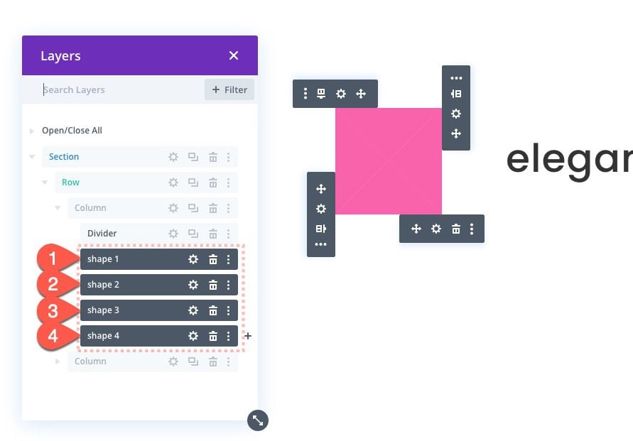
It is also a good idea to label this new divider as “shape 1” for easy identification later on.
Because we are going to be adding scroll animation to the additional shapes we’ll create, it is important to give this shape (and additional shapes in this column) an absolute position so that they stack on top of each other, therefore, have the same starting point for animation.
Under the advanced tab, change the position to absolute and keep the default position location set to top right:
- Position: Absolute
- Postion Location: Top Right (default)
NOTE: It is important to keep the position location to top right because any other locations that adds a centered locating (like top center, or centered) will conflict with the transform options we will be adding to the CSS Shapes later on.
Congrats on creating a CSS Triangle! Although this isn’t that impressive in and of itself, it gets better. We can duplicate this triangle to create all kinds of new designs once we move them around with animation.
Creating Shape 2 with Scroll Animation
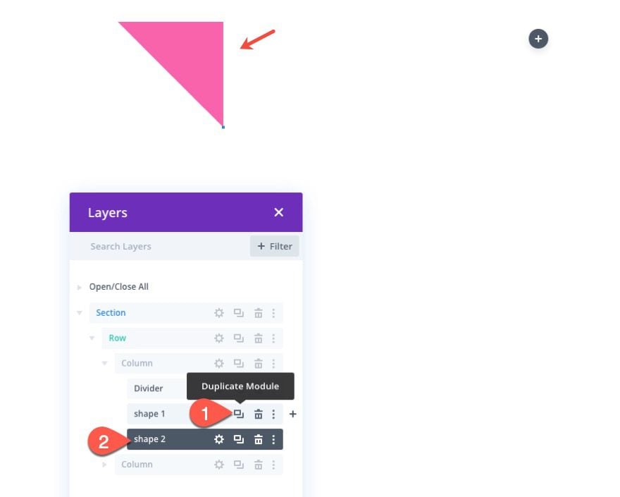
To create the next shape (or triangle in this case), duplicate the previous divider module (shape 1) to add an identical top right triangle that sits directly over the previous triangle shape.
Then label it “shape 2”.
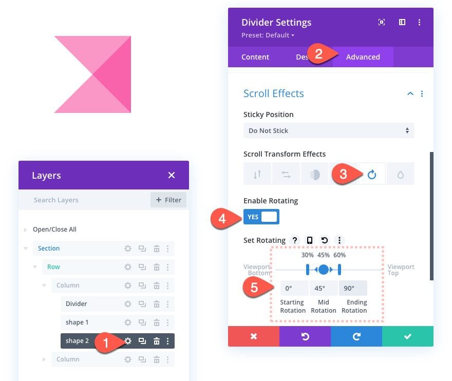
Open the settings for the “shape 2” divider and add the following rotating transform effect:
- Scroll Transform Effects: Rotating
- Enable Rotating: YES
- Starting Rotation: 0° (at 30%)
- Mid Rotation: 45° (at 45%)
- Ending Rotation: 90° (at 60%)
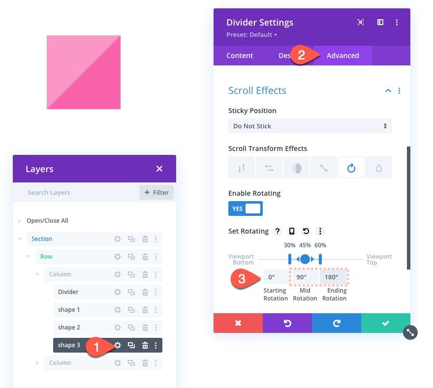
Creating Shape 3 with Scroll Animation
Duplicate the “shape 2” divider module and label the duplicate “shape 3”.
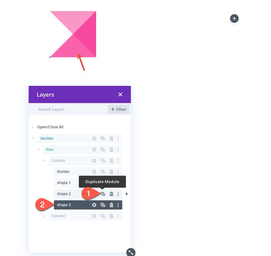
Then update the transform rotation settings as follows:
- Mid Rotation: 90°
- Ending Rotation: 180°
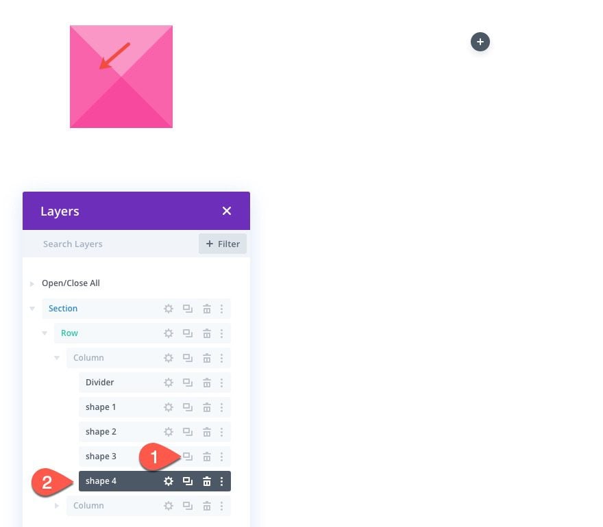
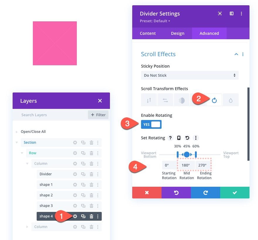
To create the final (fourth) shape, duplicate the shape 3 divider module and label it “shape 4”.
Then update the transform rotation settings as follows:
- Mid Rotation: 180°
- Ending Rotation: 270°
At this point, you should see a square shape created by the overlapping and now rotated triangles.
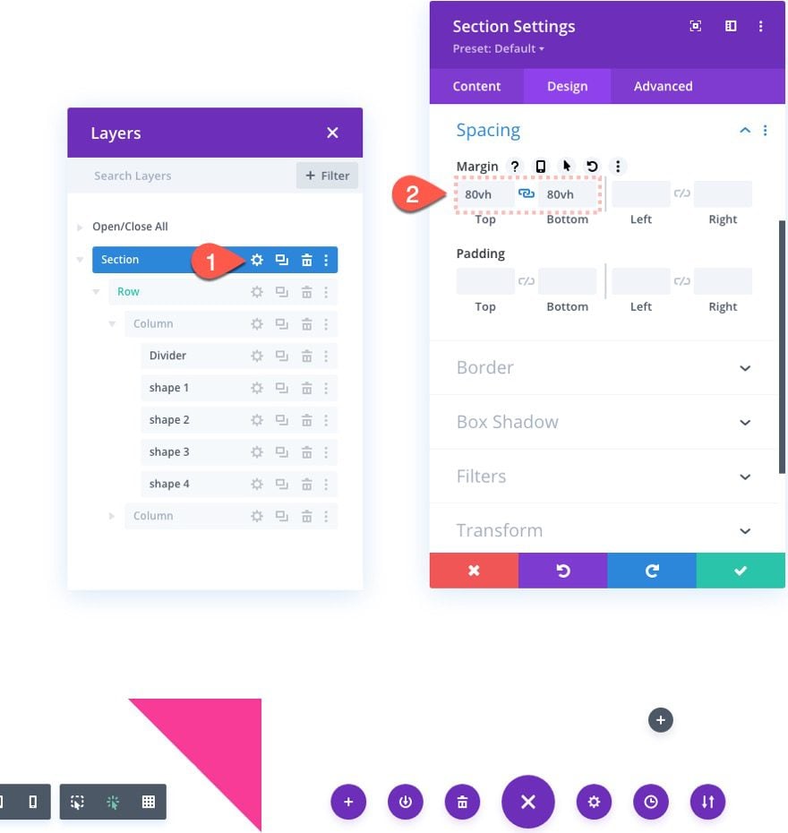
Testing the Scroll Animation
To test out the scroll animation of these shapes, let’s add some temporary margins to the top and bottom of the section. Open the section settings and update the following:
- Margin: 80vh top, 80vh bottom
Here is what it should look like as you scroll up and down the page.
Before we go exploring new ways to customize these shape animations, we are going to supplement our design with a mock title in the right column. Feel free to skip this step if you want to continue with the shape designs.
Adding a Mock Title to the Right Column (Optional)
To help give you an idea of how you can use these animated shape designs on a page, I thought it would be a good idea to add a mock title to the right column. This would be a great example of how to compliment your page section titles with a stunning design animation using CSS shapes.
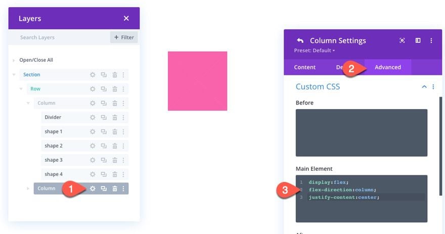
Column Custom CSS
Before we add the title, we can make sure the text is vertically centered within the column by using the display flex property. Open the settings for column 2 and add the following custom CSS to the Main Element:
display:flex;
flex-direction:column;
align-items:center;
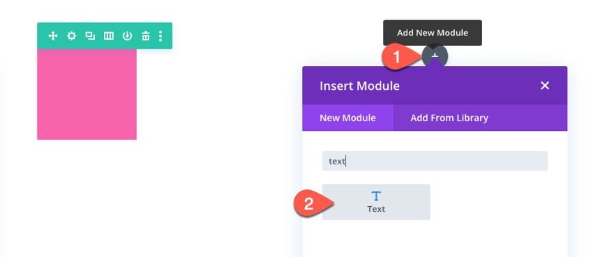
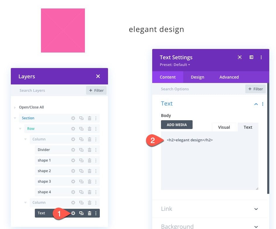
Once the column CSS is in place, add a new text module to column 2.
Then open the text settings and update the body content with an h2 heading as follows:
<h2>elegant design</h2>
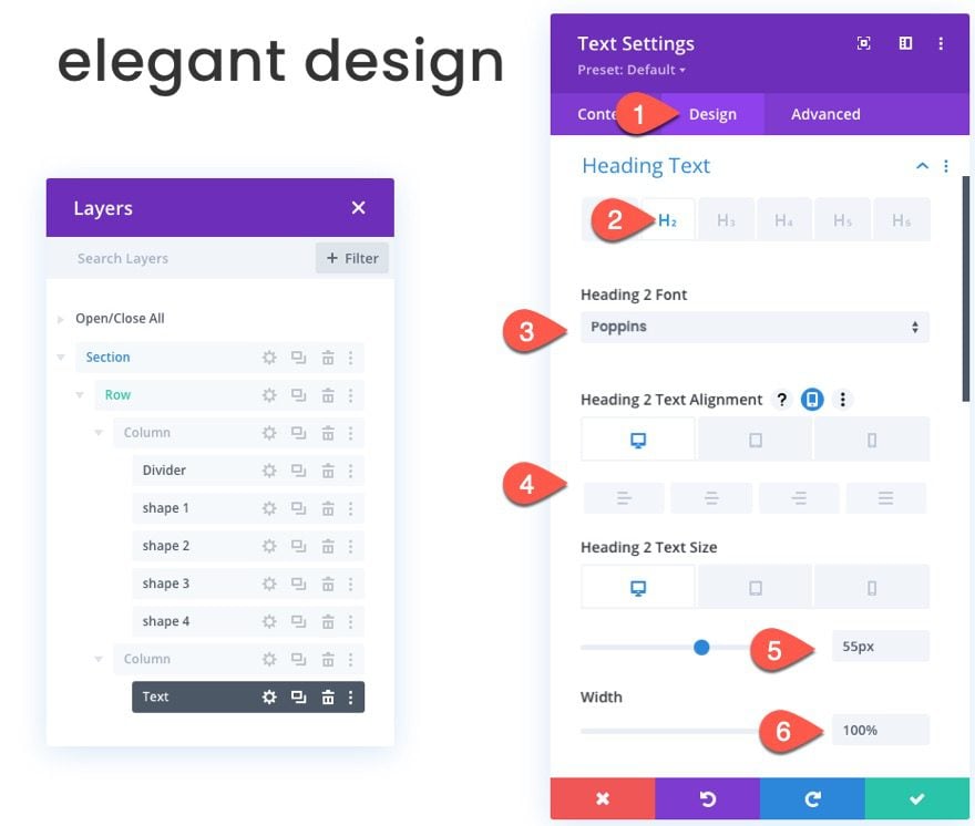
Under the design tab, update the following:
- Heading 2 Font: Poppins
- Heading 2 Text Alignment: default (desktop), center (tablet and phone)
- Heading 2 Text Size: 55px (desktop), 45px (tablet), 35px (phone)
- Width: 100%
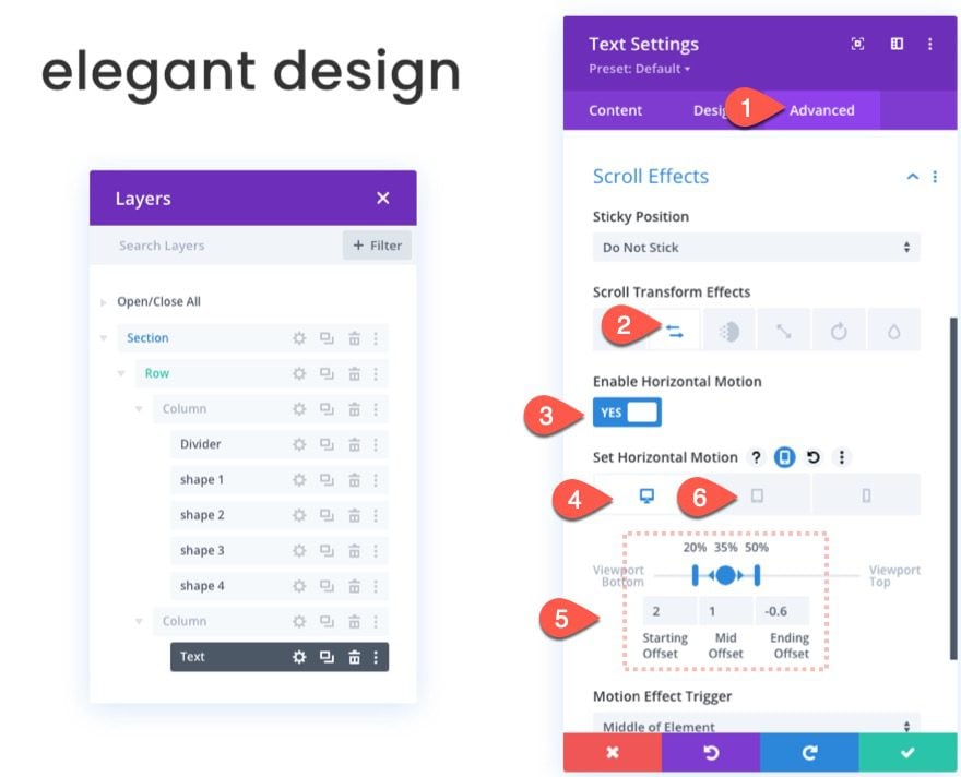
While we are at it, go ahead and add the following scroll transform “horizontal motion” effect to the text as follows:
- Scroll Transform Effects: Horizontal Motion
- Enable Horizontal Motion: YES
- Starting Offset: 2 (at 20%)
- Mid Offset: 1 (at 35%)
- Ending Offset: -0.6
Then open the responsive tabs and update the ending offset as follows:
- Ending Offset (tablet and phone): 0
Exploring Top Right Triangle Shape Animations
Continuing where we left off before adding our title text, we can now explore the design/animation possibilities for the current Top Right Triangle shape.
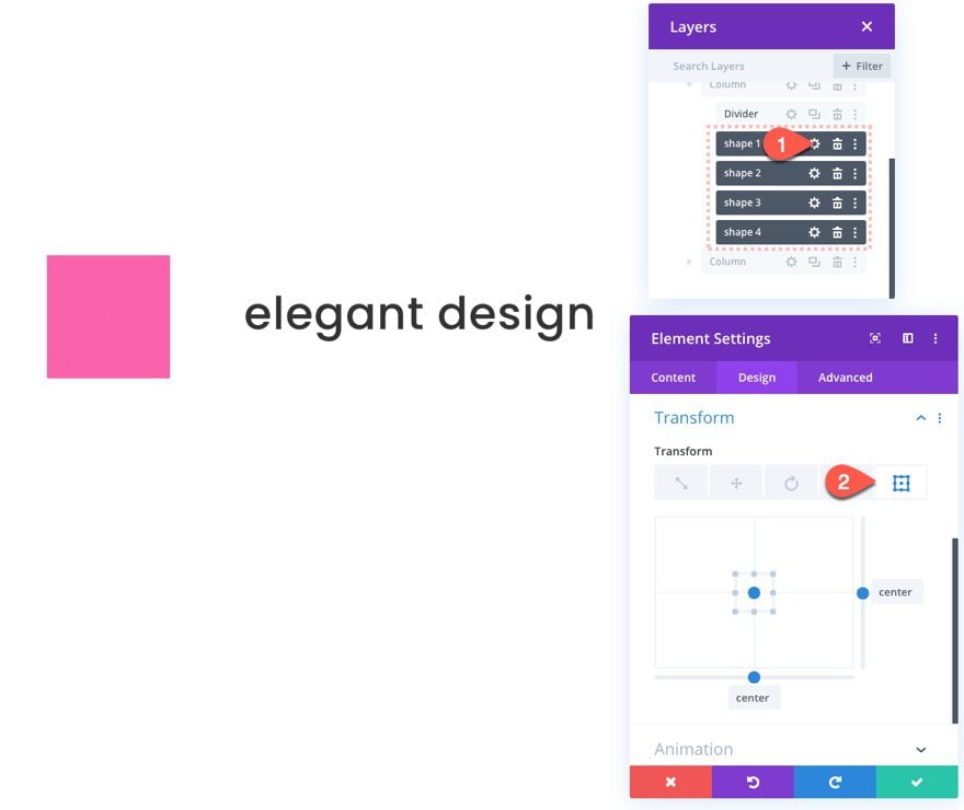
One easy way to do this is to use multiselect to select all four CSS shapes (built with divider modules).
Then open the settings for one of the shapes to bring up the element settings modal that will update the design of all four modules at once so you can see the results visually.
Then select the design tab and open the transform origin tab. Position the layers view modal and the element settings modal to the left so that you can see the changes visually in the Divi Builder.
Exploring the Upward Triangle CSS Shape Design Animations
Now that you have the setup in place, you can explore creating new shapes and see how they look with the current scroll animations in place.
For this next example, we are going to create an Upward Triangle (technically an Isosceles Triangle) CSS shape.
To do this, make sure to multi-select all the shapes and update the border styles for each as follows:
- Right Border Width: 100px
- Right Border Color: transparent
- Bottom Border Width: 100px
- Bottom Border Color: rgba(245,44,143,0.5)
- Left Border Width: 100px
- Left Border Color: transparent
Update Transform Origin to Explore New Scroll Animation Designs
Now that we have a slightly new shape/triangle in place, the rotation animation that results will also be different. To explore the different scroll animation design possibilities, make sure you keep all four shapes selecting using multiselect and then adjust the transform origin to view the results.
Exploring the Teardrop CSS Shape Design Animations
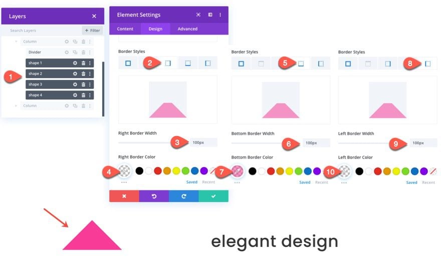
By now, you should be getting a handle on how this process works. For this next design, we are going to create a teardrop shape that can be done by creating a bottom right triangle with a border radius.
To do this, make sure to multi-select all the shapes and update the border styles for each as follows:
- Rounded Corners: 0px top right, 50% top right, 50% bottom right, 50% bottom left
- Bottom Border Width: 150px
- Bottom Border Color: rgba(245,44,143,0.5)
- Left Border Width: 150px
- Left Border Color: transparent
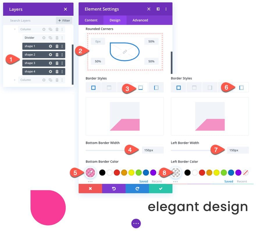
Then adjust the transform origin value to explore the scroll animation designs for the teardrop.
Exploring the Sector (or Pizza Slice) CSS Shape Design Animations
By now, you should be getting a handle on how this process works. For this next design, we are going to create a sector shape that can be done by creating a bottom right triangle with a border radius.
To do this, make sure to multi-select all the shapes and update the border styles for each as follows:
- Rounded Corners: 0px top right, 0px top right, 50% bottom right, 50% bottom left
- Right Border Width: 75px
- Right Border Color: transparent
- Bottom Border Width: 75px
- Bottom Border Color: rgba(245,44,143,0.5)
- Left Border Width: 75px
- Left Border Color: transparent
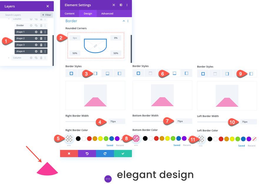
Then adjust the transform origin to explore the different scroll animation designs.
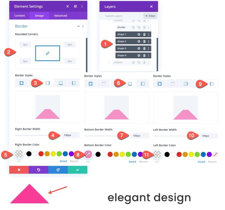
Exploring the Trapezoid CSS Shape Design Animations
For our final CSS shape design, we are going to create a trapezoid CSS shape that can be adding some additional width to an upward (or Isosceles) triangle.
To do this, make sure to multi-select all the shapes and update the border styles for each as follows:
- Rounded Corners: 0px
- Right Border Width: 100px
- Right Border Color: transparent
- Bottom Border Width: 100px
- Bottom Border Color: rgba(245,44,143,0.5)
- Left Border Width: 100px
- Left Border Color: transparent
Then update the width of the shapes/modules as follows:
- Width: 100px
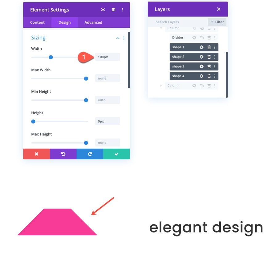
With the trapezoid shape in place, you can once again use update the transform origin for each to explore the new scroll animation designs.
Final Results
Let’s take a final look at a few of my favorite designs that are possible using this tutorial.
Final Thoughts
Exploring how to create and animate CSS shapes in Divi can be a great way to get those creative juices flowing as you broaden your perspective of the power of Divi’s built-in design capabilities. The trick is to understand how to use borders to create different shapes. Then, you can add scroll animation to those shapes. But don’t forget about the power of transform origin, which changes the way those animations position each shape. This is, of course, the tip of the iceberg when you think of all the different shapes and animations you can combine to create endless creative designs for your website.
Hopefully, this will give you a few ideas on how to add the perfect CSS Shape animation to your own site.
I look forward to hearing from you in the comments.
Cheers!


Do you have a live demo of this? Your Sneak Peek’s don’t show up in iPhone.
Thank you Jason for this “great way to get those creative juices flowing”.
I love elegant themes
Wowww Very informative blog. Keep Going 🙂
Will do! thanks
Great write-up here Jason. Since the first day I came to your blog, its been freebies worth hundreds of dollars from you and I’ve learnt another great deal in this post again. Subs means alot
Wow, that means a lot to us to hear that. Thanks for the support, Lisa.
Wow Jason, always breaking new ground… Thank you!
Thanks jason for this well detailed blog, Thankyou so much for sharing
Nice
You are very welcome, zayn!
Hey Jason,
Love the tutorial!
One question: at the step “Creating Shape 2 with Scroll Animation”, my triangles don’t line up with the numbers given. I have to change my numbers to this: Mid Rotation: 90° (at 45%). Can you tell me what’s wrong?
Make sure you check the scroll animation functionality first because you may be viewing the second triangle in its fully rotated state. They shapes should be lined up when the they are at the very bottom of the browser window. Hope that helps.
Innovative ideas and updates using CSS as always! Thanks Jason and team. 🙂
Awesome! Thanks , Moxie Brite.