
Divi has a built-in navigation feature, called Dot Navigation, which places a series of dots along the right side of the screen. Each dot represents a section of that page. Clicking the dots takes to that section. The dots are simple and blend in with most website designs. What if you wanted to style them? Even better, what if you wanted to show a label or animate them on load? You might be interested in a plugin called DotNav.
DotNav is a third-party plugin from Divicio.us. DotNav gives you the tools to change the color, size, and shape of the dots and backgrounds, add labels, disable specific dots, and control the loading animation. You can hide DotNav by device. In this plugin highlight we’ll take a look at DotNav.
In these examples I’m using a layout that comes with Divi called Product Features. Images are taken from Unsplash.com. First, let’s enable Divi’s Dot Navigation.
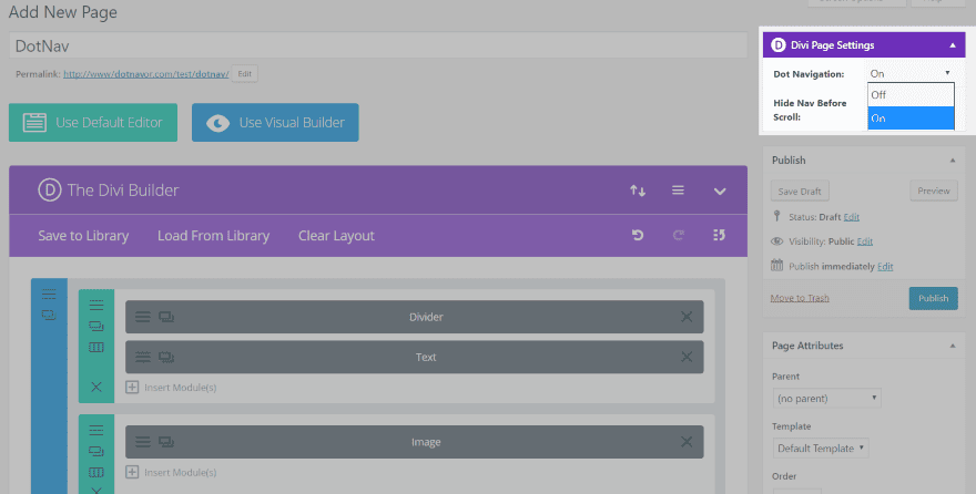
Dot navigation can be enabled or disabled on a per-page basis. You’ll find the settings in the visual editor for the page, in the upper right corner under Dot Page Settings.
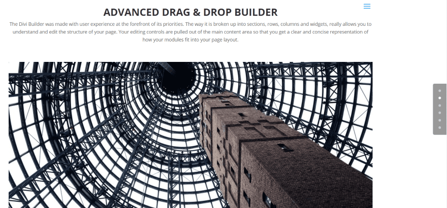
Dot navigation will appear on the right side of the page. The dots represent the sections. Clicking a dot takes you to that section. In this example I’ve navigated to the second section and the second dot is lit up.
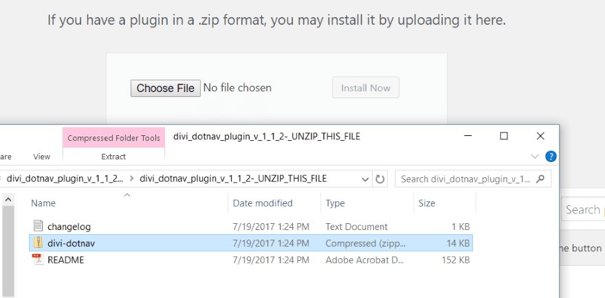
First, unzip the download file. There will be three files within the folder. Upload and activate the divi-dotnav file.
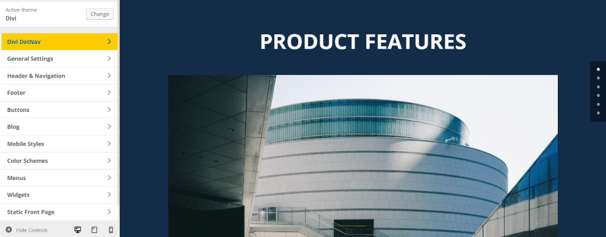
The settings for DotNav are found in the Theme Customizer. It includes three areas:
- General Settings
- Dot Settings
- Label Settings
Let’s look at each area.
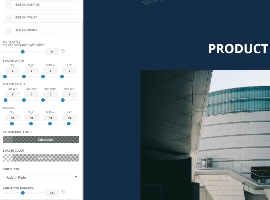
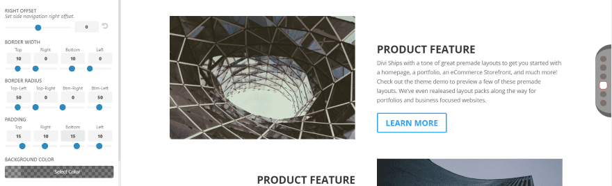
General settings allow you to hide DotNav by device, adjust the offset, border, padding, colors, and animation. There are 11 animations to choose from including moving in from a direction you choose, fading in from a direction, or flipping in on the x or y axis.
Examples
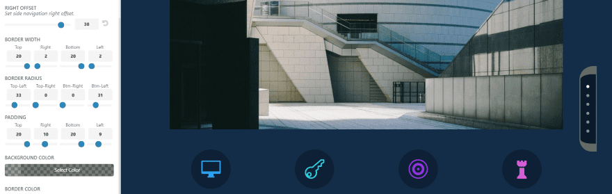
When you adjust the controls you see the changes in real time. In this example I’ve set the right offset to 38 and adjusted the border width, radius, and padding to create a rounded edge.
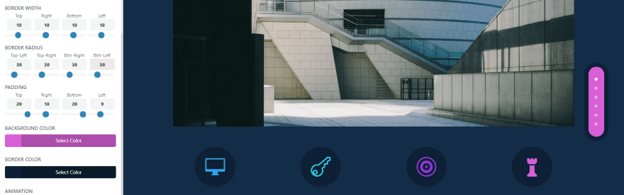
In this example I’ve set the border width to 10 and the border radius to 30 on all sides, and the top padding to 20, right to 10, bottom to 20, and left to 9. I’ve used background and border colors from the page itself so it will blend.
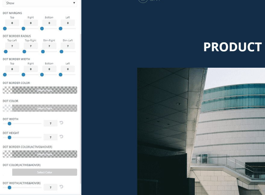
Dot Settings allow you to show or hide individual sections (requires CSS added to the section), adjust the margins, border radius, width, and color. Dot settings include color, width, and height, and hover color, width, and height.
Examples
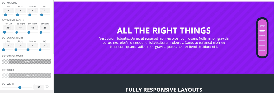
In this example I’ve set the dot border radius to 10 all around and adjusted the dot width to 30. This creates interesting horizontal lines instead of round dots.
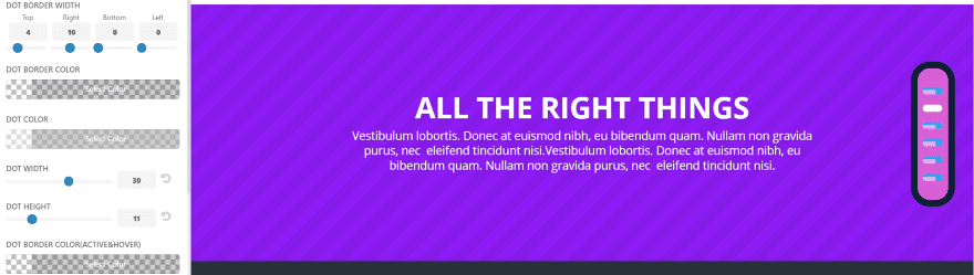
Adjusting the border width and dot height can create some interesting effects. Here I’ve set the dot border width to 4 for the top and 10 for the right.
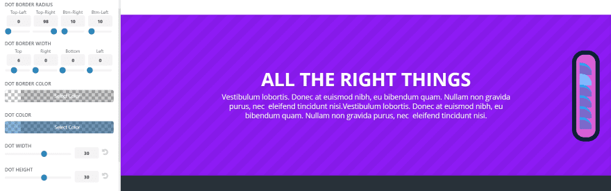
Here I’ve set the top left border radius to 0, the top right to 98, and left the others at 10. I’ve also set the dot border width to 6 and adjusted both the dot color and active dot color.
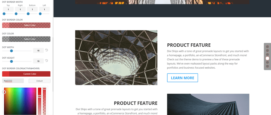
This one uses the default general settings and has a border width of 1, a dot width and height of 15, and active dot width and height of 20. The dots are dark gray with a red border. The active dot is white with a red border.
This is the same dot settings and adds a top and bottom border width, radius, and padding to create the rounded edge.
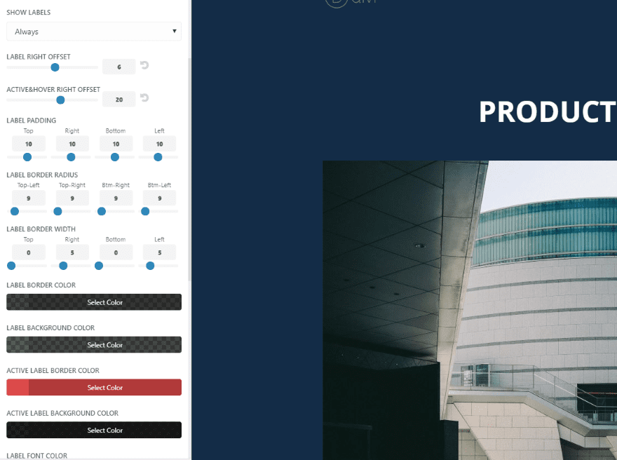
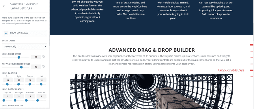
Label Settings allow you to show or hide the dot labels, adjust the font, background, width, apply a fixed width, etc. Fixed Width adds adjustments for the regular label width, active label width, and label text align. In order to show labels the sections must have an ID (which is used as the label).
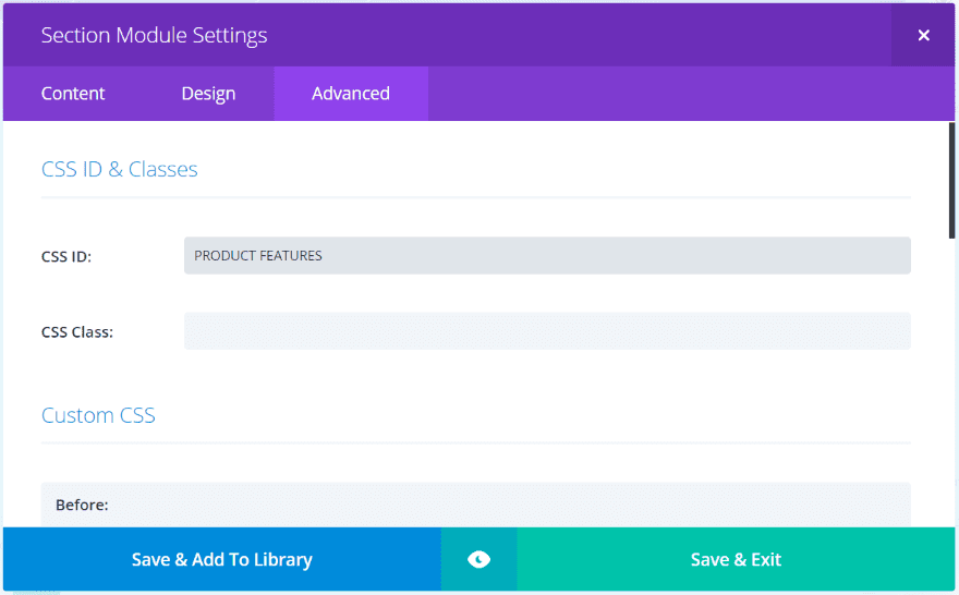
Add the label to the CSS ID field in the Advanced tab for each section.
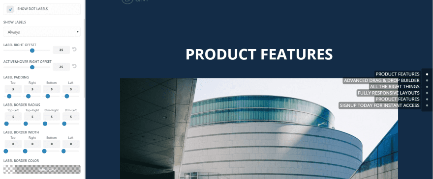
The labels will automatically display. The labels can be customized and you can choose not to display specific labels. This examples shows the default settings.
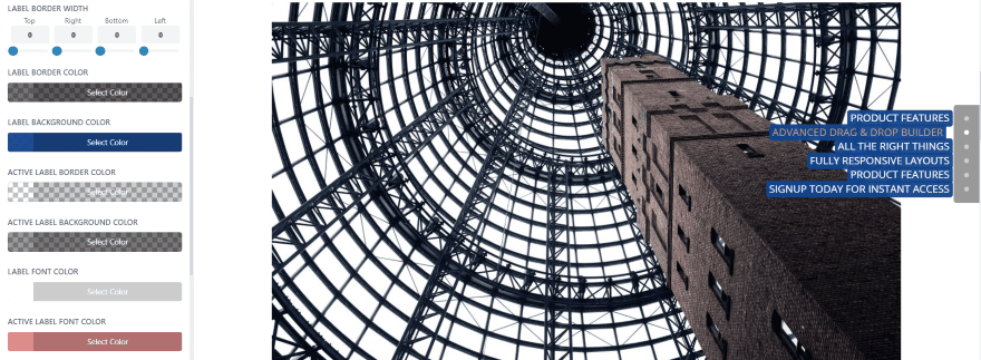
In this one I’ve changed the background and font colors and made the active section offset and a salmon color for its font. You can adjust the horizontal line spacing but for the vertical you have to adjust the dot margins in the Dot Settings. For me this was the only this confusing about the adjustments.
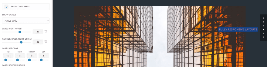
If you don’t want all of the labels to show you can set it to Active Only, Hover Only, or Active and Hover.
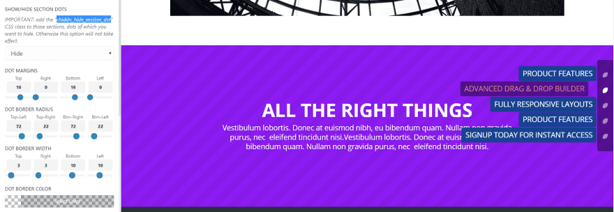
I’ve adjusted the dot settings to put some space between the labels. This will allow me to make the labels taller without having them overlap. In this one the dot margins are set to 16 for top and bottom. The top right and bottom left border radius is set to 72, and the top left and bottom right is set to 22.
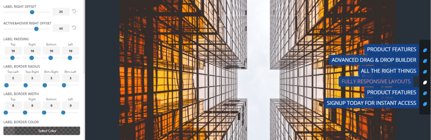
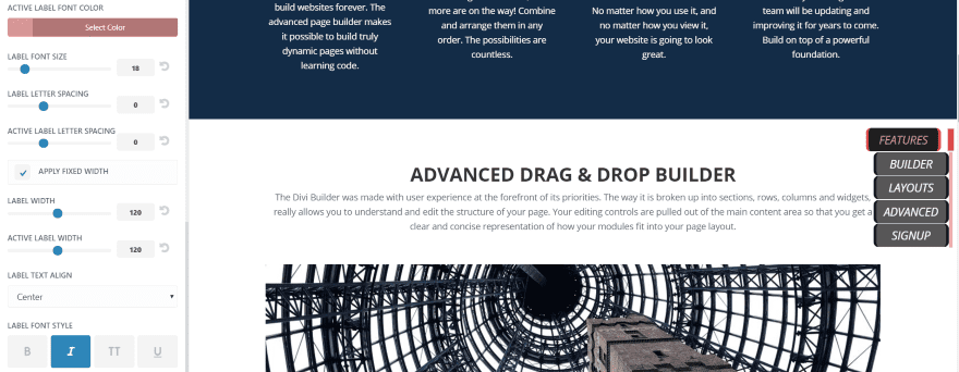
In the label settings I’ve adjusted the padding to 10 on all sides, set the active hover right offset to 45, and increased the font size to 18. The labels stand out quite a bit more.
Hiding Specific Dots
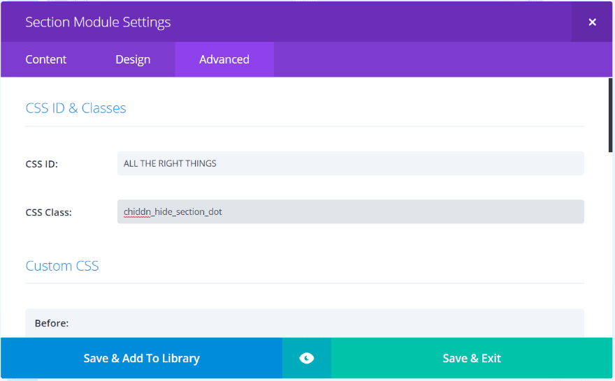
You can hide specific dots if you want. Add the CSS class to the section module’s Advanced settings tab. You’ll find the CSS in the Dot Settings in the Theme Customizer.
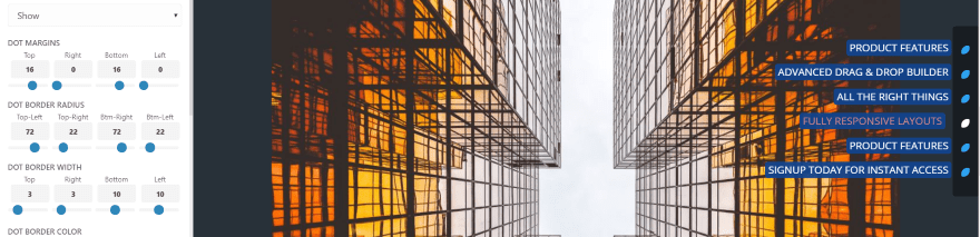
In the Dot Settings, the first setting is a dropdown box. It’s set to Show by default. Select Hide. This hides all of the sections that you’ve added the hide section CSS class to (the CSS class is found within the note above the dropdown box). The section labeled ALL THE RIGHT THINGS is no longer within the dot navigation structure.
This example only shows on hover. The font and active/hover dot color is set to red. Background and borders are transparent. The dot margin is set to 16 for top and bottom. The width is 15 and the height is 5, with the active dot set to 20 and 8.
This one uses a fixed width for the labels. I’m using black for the active label’s background with a red font and red border for left and right (which is set to 5). The border radius is set to 9 to give it a slight curve. I’ve centered the text within the labels. The right offset is 6 to make the labels hang onto the line. The active right offset is 20 to make it jump off the line.
I’ve also shortened the section names and hid the label for the section called All The Right Things. The fonts are italic.
For the dot settings I’ve set the width to 6 and the height to 38. The active dot is 10 and 35. This makes the dots look like a vertical line. I will use this example to show animations.
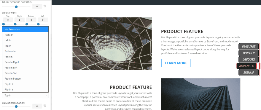
The animations show how the dots appear when the page loads. It includes 11 animations. The animation duration can be adjusted using the slider. Here’s a look at a few of them.
Right In

Right In is hard to see but it moves from the right as it appears.
Bottom In

Bottom In appears and slides upward.
Fade In

Fade In fades in already in place.
Fade In Left

Fade In Left fades in and then moves from left to right into place.
Fade In Top
Fade In Top fades in and then makes a large motion downward.
Flip In X

Flip In X flips in from the X axis and bounces as it gets into place.
Flip In Y

Flip In Y flips in from the Y axis and looks like a door.
License and Documentation
The plugin can be used with unlimited websites for you and your clients. Documentation is included in the download file. I found the controls to be intuitive enough that I didn’t need the documentation but I’m glad it’s included just in case.
Final Thoughts
I found DotNav easy to use. It provides a lot of customizations to the dots and backgrounds, and I like being able to add labels. The hover and active sections stand apart and can be customized separately. The animations are interesting but there aren’t many of them and they only animate on load. Adjusting the label width and height on two separate tabs (adjust the dot height for the label height) can be confusing at first but once I got the hang of it I had no trouble making the adjustments.
Like all settings in the Theme Customizer, the DotNav settings are site-wide. You’ll need to experiment with font and background colors to find a combination that works with every background on your website.
If you’re interested in customizing Divi’s dot navigation, Divicio.us’ DotNav might be the plugin you’re looking for.
We want to hear from you. Have you used DotNav for Divi? Let us know what you think about it in the comments.
Featured Image via newelle / shutterstock.com


Hi,
I’m having troubles with dot navigation on a new page. I have some pages set up already and want to add a page and use dot navigation. In the top right of my back-end builder I see page settings, but can only choose page layout. On the other pages I see page settings Dot navigation: on or off. Where is my dot navigation on this new page or why is it not showing? I have the same layout as on the other pages. Trying to copy just another page and change some text and image.
Great plugin it’s helpful for a lot of things. Life would not be the same without it :O
Thank you for your kind words Bica, so great to hear you like it, I really appreciate that (being the developer of this plugin) :).
Hi Ivan, Can you set the plugin so thatw when the user scrolls, the page jumps to the next dot nav? Thanks, Cathal
Hi Cathal.
Currently such a feature is not available, but that sounds interesting, need to experiment with it. Thanks for the suggestion.
I used it few times pretty nice stuff ^^
Very good information for those who have wordpress. Interesting post
Thank you for sharing, really interesting plugin at a very affordable price.