")
Microinteractions are a great way to enhance user experience as they interact with your site. Slight animations of icons, buttons, or images can cue the user to take action in a fun and purposeful way. There are countless microinteractions you can include on your site, but a good rule of thumb is to keep them “micro”. You don’t want to overdo it.
Today I’m going to show you some simple microinteractions you can add to your Divi website using the Divi Builder and Custom CSS (no jquery). I’ll be concentrating on those elements that users normally interact with – buttons, icons, images.
Let’s get started.
- 1 Sneak Peek
- 2 What You Need to Get Started
- 3 Download the Files for Easy Access
- 4 #1 Scaling Images on Hover
- 5 #2 Bouncing Scroll Down Icon
- 6 #3 Rotating Icons on Hover
- 7 #4 Sliding Button Icons to Show and Hide Button Text
- 8 #5 3D Image Perspective Rotation
- 9 #6 Button Slider Microinteraction
- 10 FREE Download: Get the Premade Layout and CSS file for This Tutorial
- 11 Download For Free
- 12 Final Thoughts
Sneak Peek
Here is a quick look at the microinteractions we will be building in this tutorial.
#1 Scaling Images on Hover
Start Building Microinteraction #1
#2 Bouncing Scroll Down Icon
Start Building Microinteraction #2
Start Building Microinteraction #3
Start Building Microinteraction #4
#5 3D Image Perspective Rotation
Start Building Microinteraction #5
Start Building Microinteraction #6
Subscribe To Our Youtube Channel
What You Need to Get Started
To get started, all you really need is Divi. We will be our examples from scratch using the Divi Builder on the front end.
Download the Files for Easy Access
I’ve included a download at the bottom of this article for those of you who want to have a working example of these microinteractions up a running on your website the quick and easy way. That way you can have a working example as you follow along with the tutorial.
#1 Scaling Images on Hover
Scaling refers to adjusting the size of an element. So if we wanted to make an image larger on hover (for example), all we need to do is add a little CSS snippet to scale our image by a certain percentage. This allows us to create a small but effective microinteraction when a user hovers over an image. Let me show you how you can apply this to three popular Divi modules that use images – the image module, the blurb module, and the person module.
Go ahead and create a new section with a three column row so we can add each of our examples to each column.
Scaling an Image on Hover using the Image Module
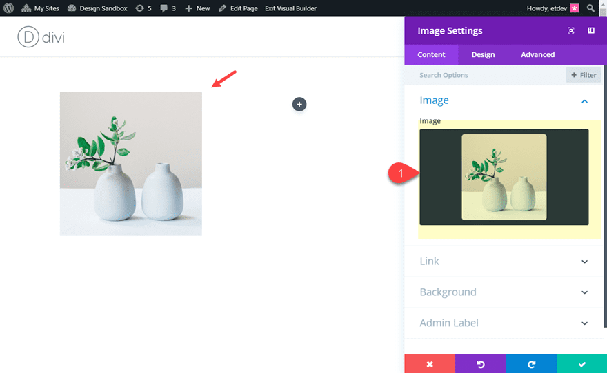
To add the scaling image microinteraction to an image using the image module, first add an image module to the first column.
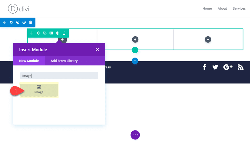
Then add an image to the module of your choice.
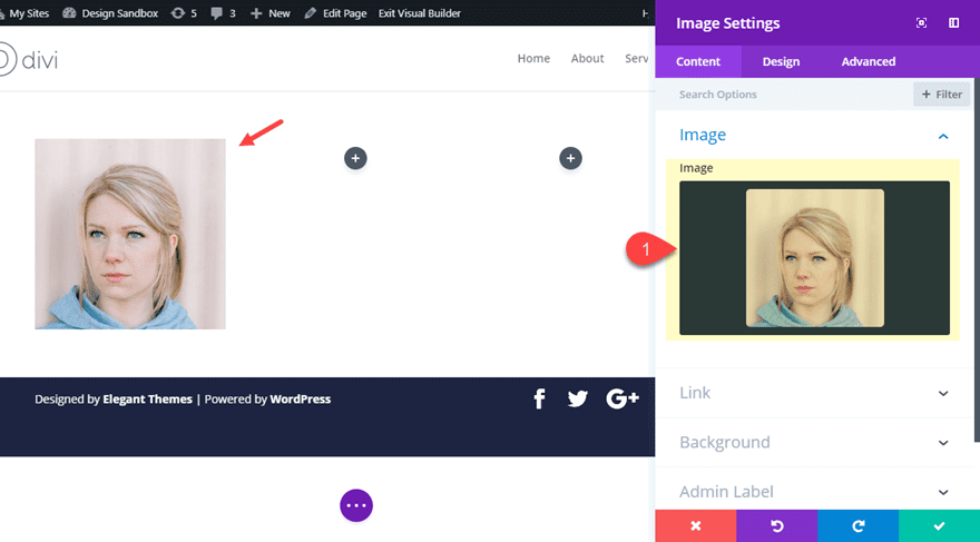
Next, add the following CSS class under the advanced tab in your image settings:
CSS class: scale-image
This allows us to target this specific module when adding our custom CSS to the page settings. To add the CSS needed to scale the image, open the page settings and add the following custom CSS:
/**This scales the image in the image module with the CSS class "scale-image" **/
.scale-image {
  overflow:hidden;
}
.scale-image img{
 transition: all 0.2s;
}
.scale-image:hover img {
  transform: scale(1.3)
}
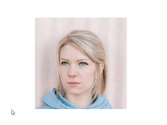
Now check out the result.
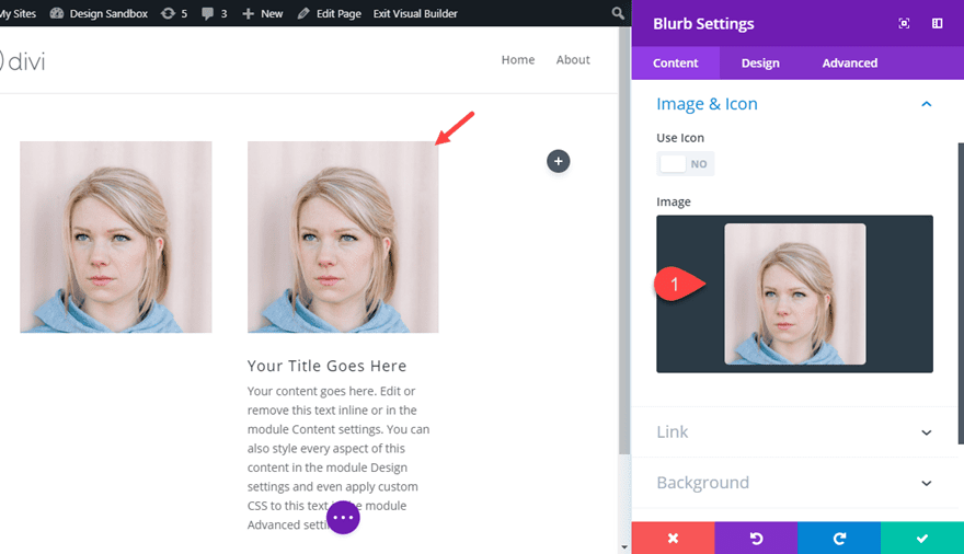
Scaling an Blurb Module Image on Hover
To add the same effect to an image in a blurb module, first add a blurb module to the second column.
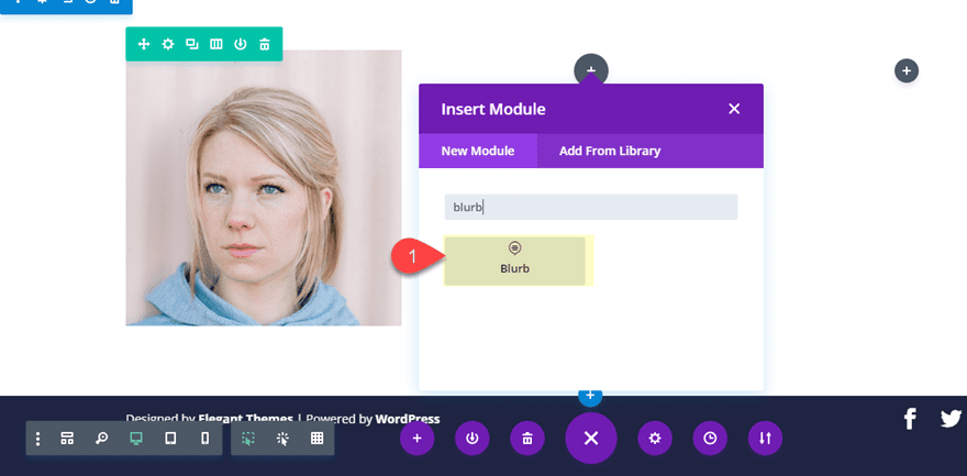
Then add an image of your choice to the blurb module.
Then add the following CSS class to the blurb module.
CSS Class: scale-blurb-image
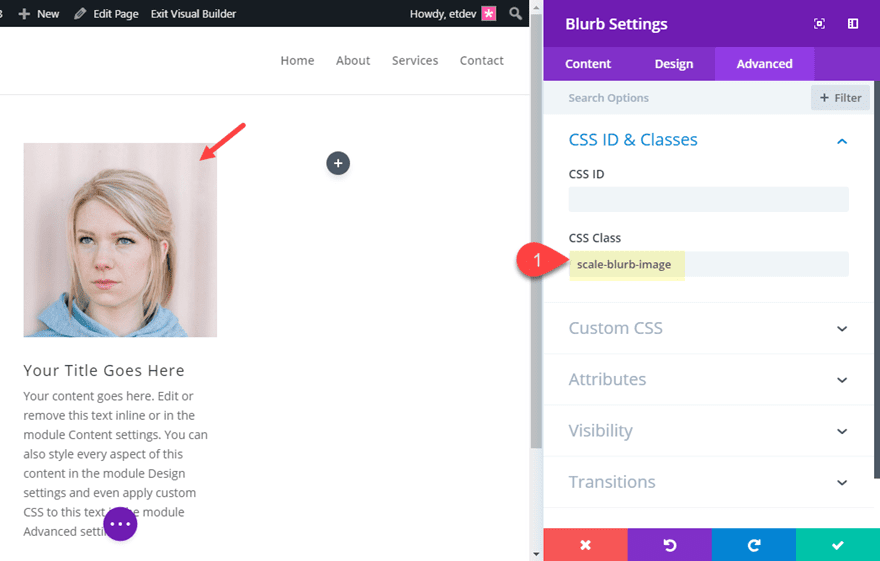
With this CSS class in place we can now add our custom CSS that targets the blurb image. Open the page settings and add the following Custom CSS:
/**This scales the image in the bl module with the CSS class "scale-blurb-image" **/

.scale-blurb-image .et_pb_main_blurb_image {
  overflow:hidden;
}
.scale-blurb-image .et_pb_main_blurb_image img {
  transition: all 0.2s;
}
.scale-blurb-image .et_pb_main_blurb_image:hover img {
  transform: scale(1.3);
}
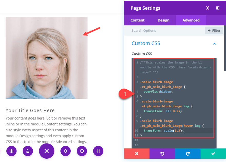
Here is the result.
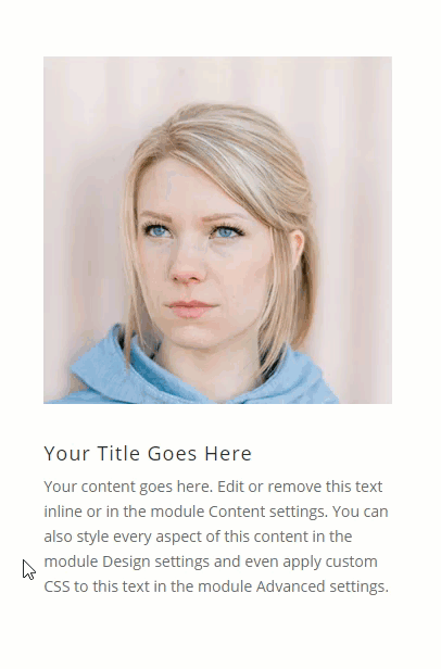
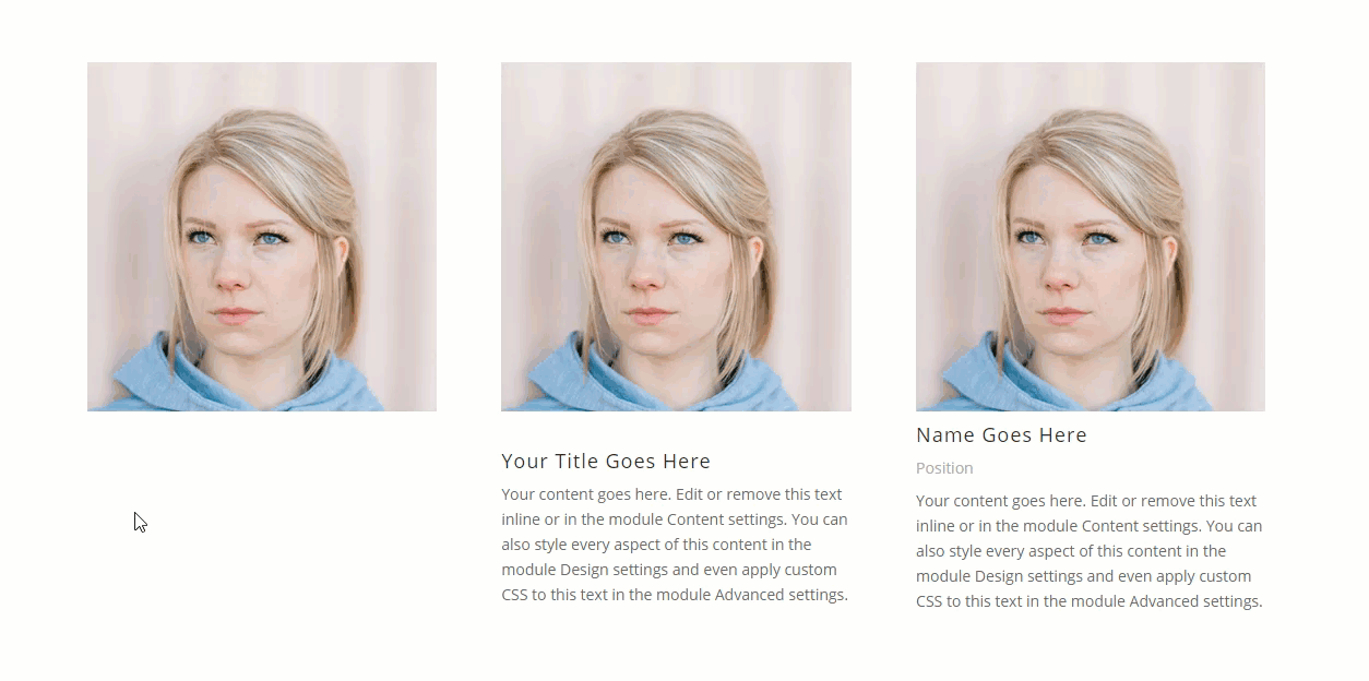
Scaling a Person Module Image on Hover
To scale an person module image on hover, add a person module to the third column and add an upload an image of your choice the module.
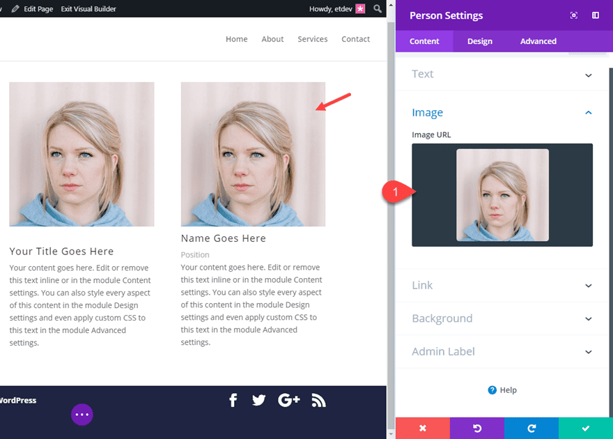
Then add the following CSS Class to the person module.
CSS Class: scale-person-image
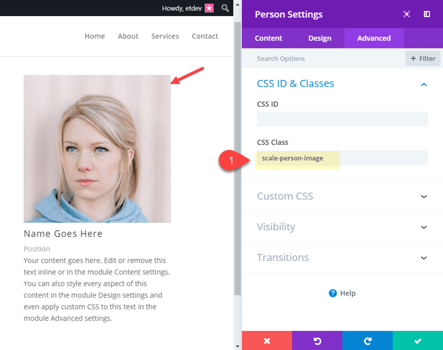
Now open page settings and add the following Custom CSS.
/**This scales the image in the person module with the CSS class "scale-person-image" **/

.scale-person-image .et_pb_team_member_image {
  overflow:hidden;
}
.scale-person-image img {
  transition: all 0.2s;
}
.scale-person-image img:hover {
  transform: scale(1.3);
}
Check out the result of all three modules with the scaling image microinteraction.
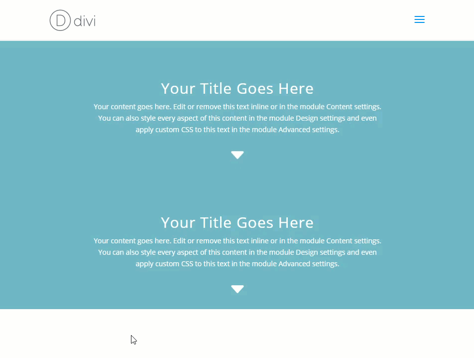
#2 Bouncing Scroll Down Icon
This next microinteraction adds a bouncing animation to the scroll down icon built in to the fullwidth header module. This a subtle way to further inform the visitor that there is more info further down the page. And you can choose to have this bouncing effect by default or on hover.
Here’s how to do it.
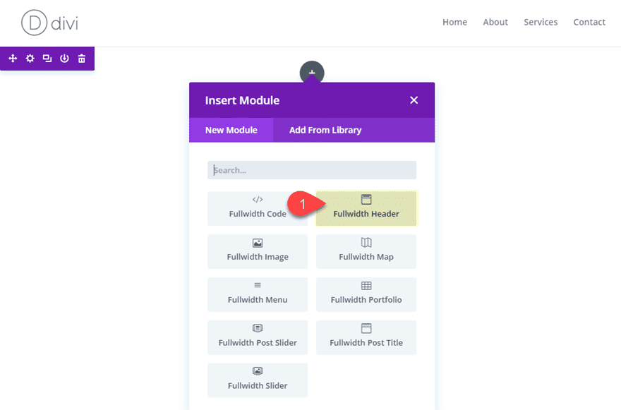
First add a new fullwidth section with a fullwidth header module.
Then update the following:
Text & Logo Orientation: Center
Show Scroll Down Button: YES
Icon: [select icon of choice]
Then add the following CSS Class:
CSS Class: bounce-scroll-icon
This class will allow us to target the scroll icon with css to animate the icon by default on page load.
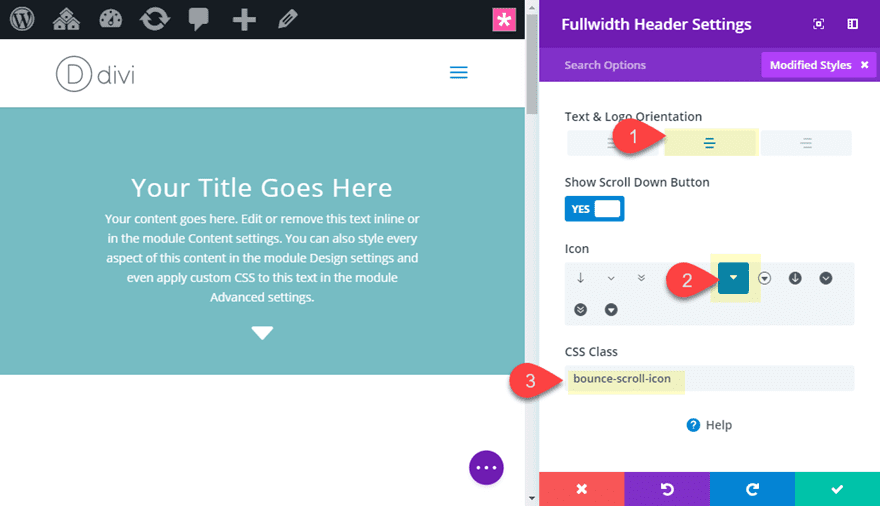
Then duplicate the fullwidth header module and update the CSS Class to the following:
CSS Class: bounce-scroll-icon-hover
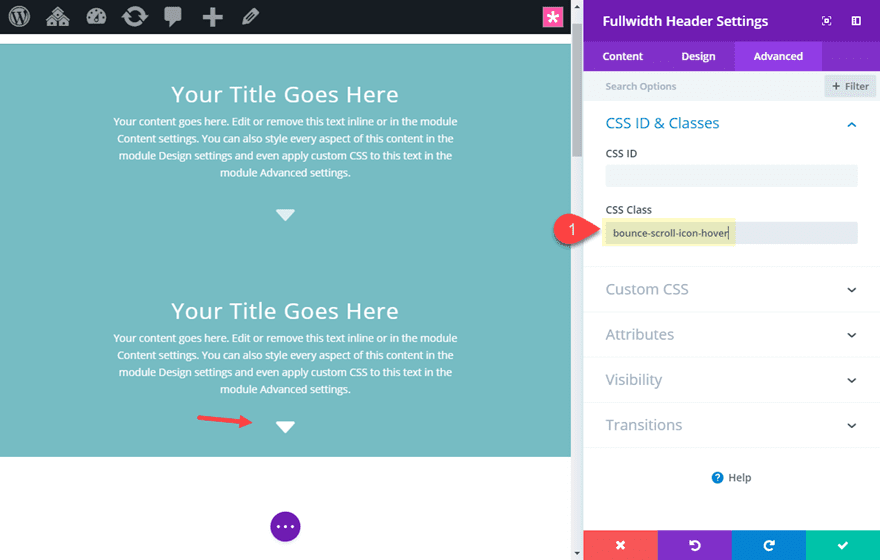
This class will allow us to target the scroll icon with css to animate the icon on hover.
Then open the page settings and add the following Custom CSS to activate the bouncing animation for our two examples.
.bounce-scroll-icon-hover .et-pb-icon {
  position: absolute;
  top:-10px;
  left:0;
  right:0;
}
.bounce-scroll-icon-hover .et-pb-icon:hover {
  animation-duration: 2s;
  animation-name: bounce;
  animation-iteration-count: infinite;
  animation-timing-function: linear;
  transition: all .2s;
}

.bounce-scroll-icon .et-pb-icon {
  position: absolute;
  top:-10px;
  left:0;
  right:0;
  animation-duration: 2s;
  animation-name: bounce;
  animation-iteration-count: infinite;
  animation-timing-function: linear;
  transition: all .2s;
}
.bounce-scroll-icon .et-pb-icon:hover {
  animation-name: none;
}

@keyframes bounce {
      0%   {top: -10px; opacity: 1;}
    50%  {top: 15px; opacity:0;}
    100% {top: -10px;opacity:1;}
}
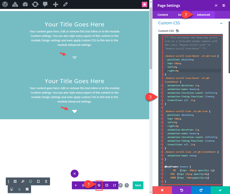
Check out the result of the two examples. The top header scroll icon will animate by default and the bottom header scroll icon will animate on hover.
#3 Rotating Icons on Hover
Adding a slight rotation to an icon can be an effective microinteraction to engage users to click an element. Since the two most popular Divi modules that have built-in icons are the button module and the blurb module, I thought I would show you how to add rotation to those icons on hover.
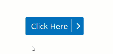
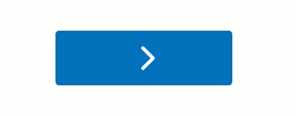
Divi already comes with a helpful microinteraction for button icons by default. When hovering over the button, the button icon appears and moves to the right indicating that by clicking the button you will be redirected to another page. But, if you wanted to get a bit more creative with it, you can rotate the icon for a completely new microinteraction.
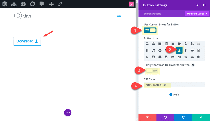
To rotate a button icon on hover, first add a new section with a one-column row. Then add a button module to the row.
Then update the button settings as follows:
Use Custom Styles for button: YES
Only Show Icon On Hover for Button: NO
Button Icon: [choose icon of choice]
Then add the following CSS Class:
CSS Class: rotate-button-icon
With our icon and CSS Class in place, all we need to do is add the following custom CSS to page settings:
/** This rotates the button icon on hover for the button module with the CSS class "rotate-button-icon" **/
.rotate-button-icon:after {
transform: rotate(-90deg);
}

.rotate-button-icon:hover:after {
transform: rotate(0deg);
}
This will rotate the icon counter-clockwise by 90 degrees initially and then back to 0 degrees on hover.
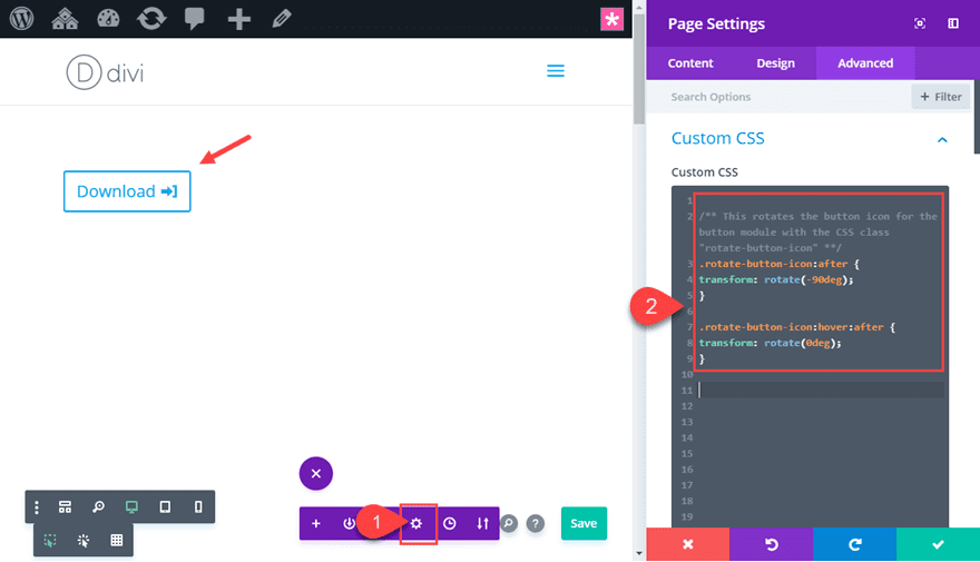
Here is the result.
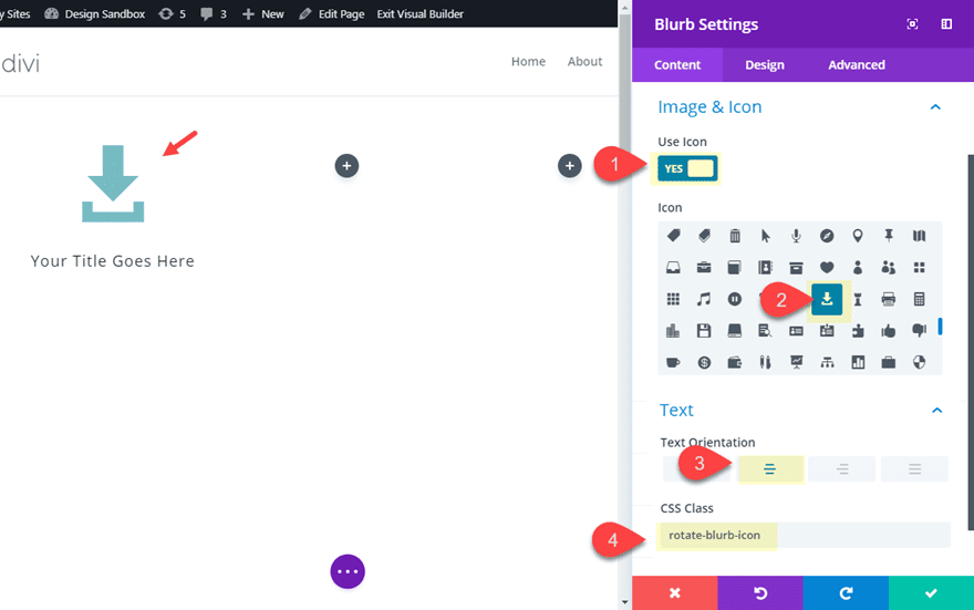
Rotating a Blurb Module Icon
To rotate a blurb module icon, let’s first create a new section with a three-column row. Then add a blurb module to the column 1 and update the following blurb settings.
Use Icon: YES
Icon: [add icon of choice]
Text Orientation: center
CSS Class: rotate-blurb-icon
Now add the following Custom CSS to page settings:
/** This rotates a blurb icon with the css class "rotate-blurb-icon" **/

.rotate-blurb-icon .et-pb-icon {
  transition:  0.2s ease-out;
  transform: rotateZ(-90deg);
}

.rotate-blurb-icon .et_pb_blurb_content:hover .et-pb-icon {
  transform: rotateZ(0deg);
}
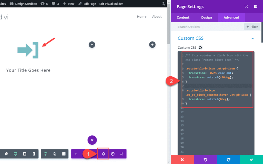
Here is the result.
This also works with the icon placed on the left of the title. All you need to do is update the blurb settings as follows:
Image/Icon Placement: Left
Title Line Height: 1.7em
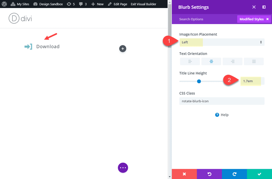
Check out the result.
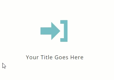
This microinteraction displays button text with an icon by default and then moves the icon to cover the text on hover.
Here’s how to do it.
Add a new section with a one-column row. Then add a button module to the row and update the following button settings:
Use Custom Styles for Button: YES
Button Background Color: #0c71c3
Button border width: 0px
Button Icon Color: #ffffff
CSS Class: button-text-to-icon
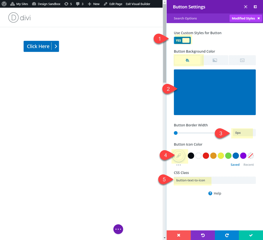
Now add the following custom CSS to page settings:
/** This styles button to cover button text with icon on hover when button has class "button-text-to-icon" **/

body #page-container .et_pb_button.button-text-to-icon:after {
  width: 1em;
  transition: all .3s !important;
  margin-left: 0;
  border-left: 1px solid #dddddd;
  left: calc(100% - 1em);
}

body #page-container .et_pb_button.button-text-to-icon:hover:after {
  border-left: 1px solid transparent;
  left: calc(50% - 0.5em);
  transform: scale(1.3);
}

body #page-container .et_pb_button:hover:after {
    color: #ffffff;
    margin-left: 0px;
    left: 0;
    width: 100%;
    text-align: center;
    transform: scale(1.5);
}
Now check out the result.
You can also create the opposite effect of showing the button Icon initially and then sliding the icon over to reveal the button text. To do this, duplicate the button module and update the following button settings:
Button Text Color(default): #0c71c3
Button Text Color(hover): #ffffff
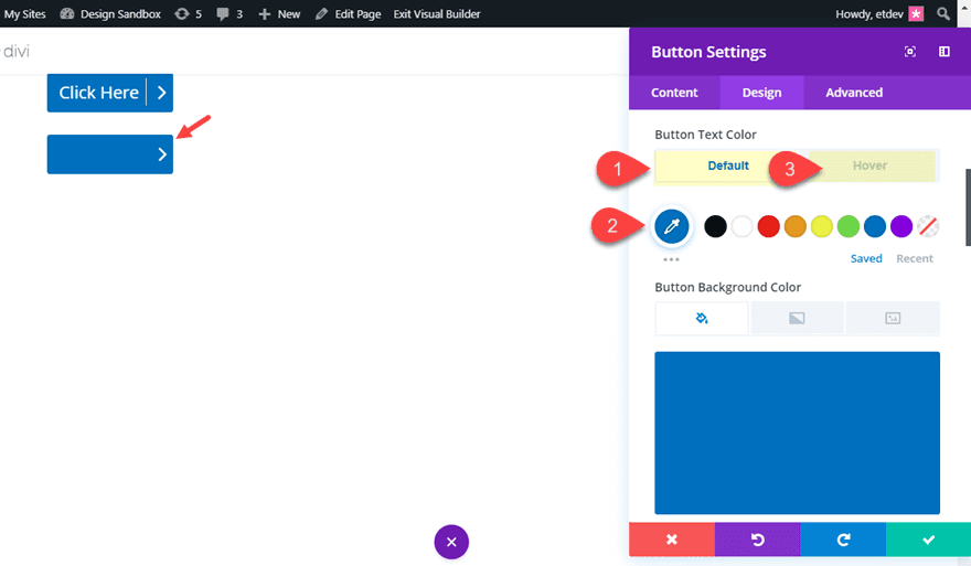
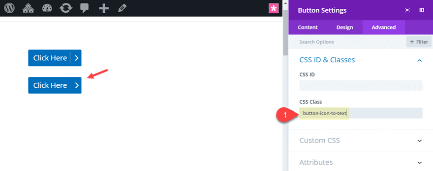
Then replace the CSS Class with the following:
CSS Class: button-icon-to-text
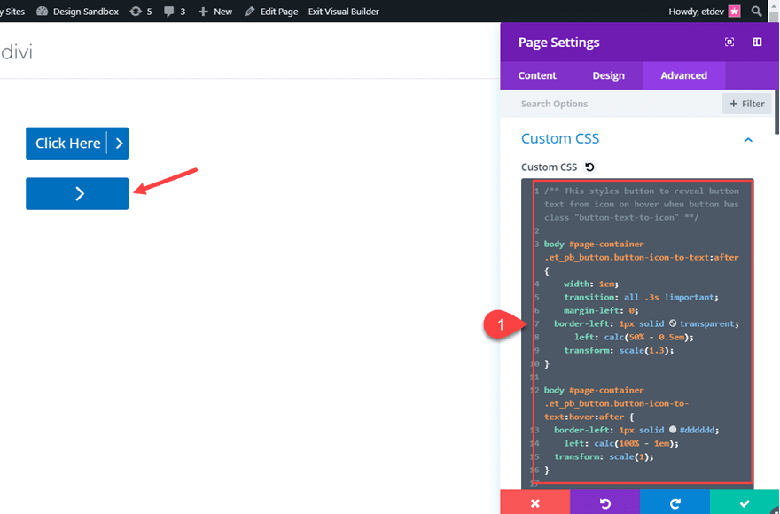
Then add the following custom CSS to page settings:
/** This styles button to reveal button text from icon on hover when button has class "button-text-to-icon" **/

body #page-container .et_pb_button.button-icon-to-text:after {
    width: 1em;
    transition: all .3s !important;
    margin-left: 0;
  border-left: 1px solid transparent;
      left: calc(50% - 0.5em);
    transform: scale(1.3);
}

body #page-container .et_pb_button.button-icon-to-text:hover:after {
  border-left: 1px solid #dddddd;
    left: calc(100% - 1em);
  transform: scale(1);
}
Now check out the result.
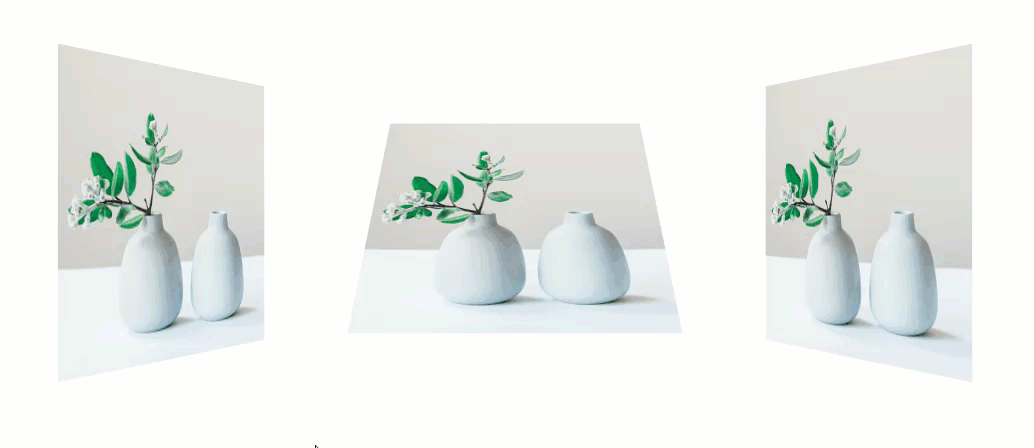
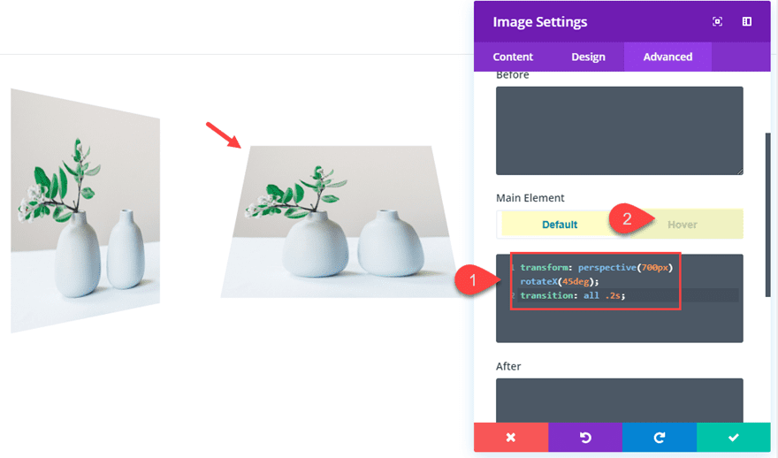
#5 3D Image Perspective Rotation
This microinteraction starts with an image module image styled with 3D image perspective and rotation by default. Then on hover, the image resorts to a normal display of the image.
Here’s how to do it.
First, create a new section with a three-column row. Then add an image module to column 1 and add an image to the image module of your choice.
For this effect, we can add our Custom CSS directly to the module. Go to the advanced tab and add the following Custom CSS under the Main Element:
Main Element CSS (default):
transform: perspective(700px) rotateY(45deg);
transition: all .2s;
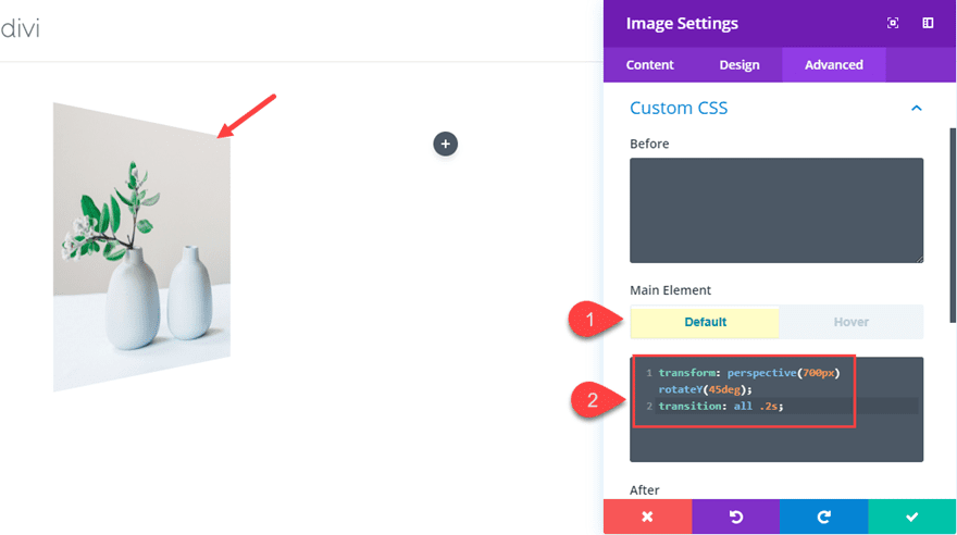
This css is doing two things to our image using the Transform CSS Property. First, it adds a perspective of 700px which is the amount of distance between the image and the perspective of the user when viewing the page. The CSS also adds rotation to the image. The rotateY(45deg) rotates the image on the Y axis 45 degrees (clockwise). And with perspective in place, the image now has a three-dimensional appearance.
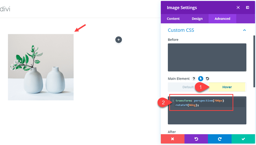
Main Element CSS (hover):
transform: perspective(700px) rotateY(0deg);
This takes out the rotation of the image on hover so that it looks normal so the users can get a better look at the image.
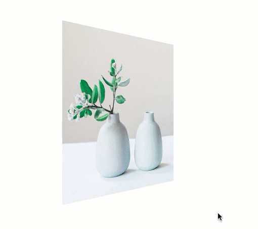
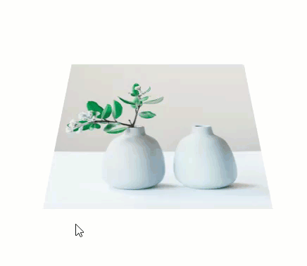
Now let’s check out the result.
Let’s do a couple of more examples of this microinteraction. Go ahead and copy the image module and paste it in column 2 and column 3. In the duplicate image module in column 2, update the custom CSS as follows:
Main Element CSS (default):
transform: perspective(700px) rotateX(45deg);
transition: all .2s;
Main Element CSS (hover):
transform: perspective(700px) rotateX(0deg);
Notice the only difference here is the letter “X” after “rotate”. This tells the image to rotate on the x axis at 45 degrees. Then we take set the degree value to 0 on hover to bring it back to normal.
Here is the result.
In the duplicate image module in column 3, update the Custom CSS as follows:
Main Element CSS (default):
transform: perspective(700px) rotateY(-45deg);
transition: all .2s;
Main Element CSS (hover):
transform: perspective(700px) rotateY(0deg);
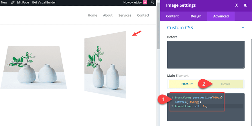
Notice the only difference between this CSS and the CSS used in the image in column 1 is the “-45deg” value. This rotates the image on the Y axis counter-clockwise.
Here is final result of all three image microinteractions using perspective and rotation.
Don’t forget to add even more built in hover effects and designs using the built-in setting of the image module. For example, this would be a great place to add box shadow effect as well.
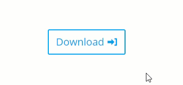
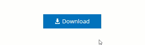
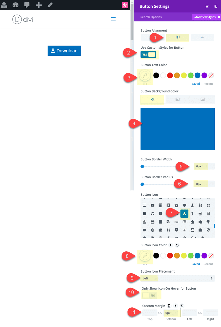
For this last microinteraction, we are going to create a button slider that shows additional information (actually a completely new button) on hover. The basic idea is to give your column a custom height and then stack two button modules inside the column. The top button will be what the user sees by default, but the second button will be the button with “additional info” that the user will see when hovering over the button.
Here’s how to create it.
This button will span the full width of the row column so it works best if you add your button to a row with a column that doesn’t get too wide. For this example, I’m going to use a one-column row and then set a max-width to my row so that the button doesn’t get too wide on large browsers.
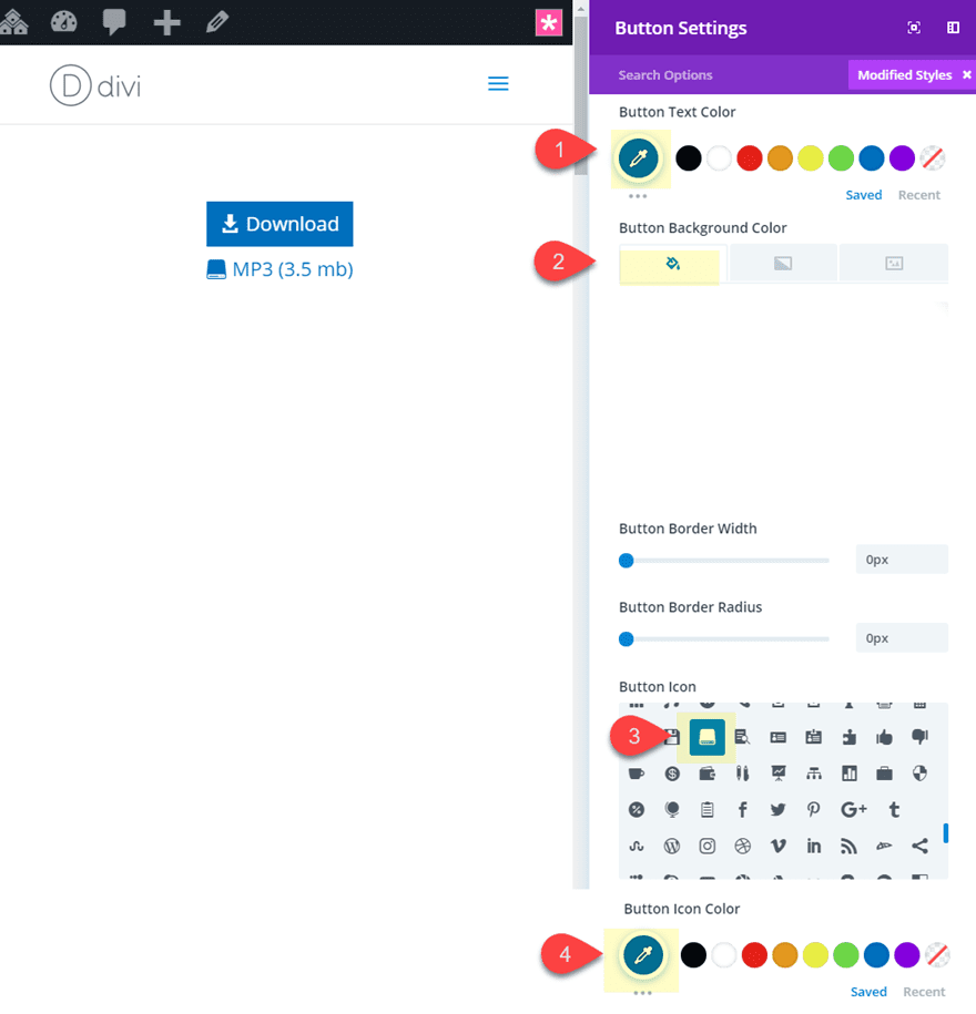
Create a new section with a one-column row. Then add a button module to the row and update the following button settings:
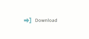
Button Text: “Download”
Button Alignment: center
Use Custom Styles for Button: YES
Button Text Color: #ffffff
Button Background Color: #0c71c3
Button Border Width: 0px
Button Border Radius: 0px
Button Icon: see screenshot
Button Icon Color: #ffffff
Button Icon Placement: Left
Only Show Icon On Hover for Button: NO
Custom Margin: 0px bottom
Next, duplicate the button you just created so that the duplicate stacks just below the button you just created. Then update the duplicate button settings as follows:
Button Text: MP3(3.5 mb)
Button Text Color: #0c71c3
Button Background Color: #ffffff
Button Icon: see screenshot
Button Icon Color: #0c71c3
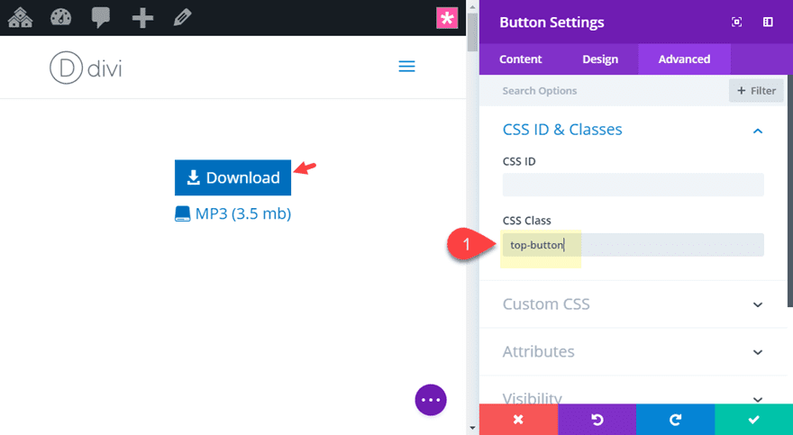
Before we go on to style our row, we need to add a CSS class to the top button. Open the top button settings and add the following CSS class:
CSS Class: top-button
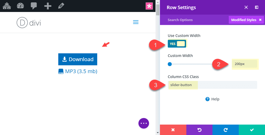
Now that both buttons are in place, let’s update the row settings with a custom width that will serve as the max-width of our buttons and a column CSS class for our Custom CSS we will be adding to page settings. Open the row settings and update the following:
Custom Width: 200px
Column CSS Class: slider-button
Make sure to add the CSS class to the column and not the row.
Now we are ready to add the custom CSS. Open the page settings and add the following CSS:
/** This styles the slider button **/

.slider-button {
  height: 50px;
  overflow:hidden;
  border:2px solid #0c71c3;
}

.slider-button .et_pb_button {
  display:block;
  margin: 0 !important;
}

.slider-button:hover .top-button {
  margin-top: -48px !important;
}
This CSS will only work with the button at the default size. This is because we have to give the column a fixed height in order to hide the second button until hover. Right now the column height (with the class “slider-button”) is given a height of 50px. This accounts for the 2px border given to the column as well. On hover, the top button (with the class “top-button” is moved up out of view with a top margin of -48px (the height of the button minus one of the 2px borders). But, if you change the font-size or padding of the buttons, you will need to adjust the height of the slider-button class along with the top button margin accordingly.
Here is the final result.
Don’t forget that you can style the buttons with different text/information and icons for your own use. It is a great way to educate users with additional information in a unique call to action.
FREE Download: Get the Premade Layout and CSS file for This Tutorial
If you want to get a jump start on what these microinteractions will look like on your website, you can download the zip file below. Once you download the zip file, locate the file on your hard drive. It will be called “microinteraction-examples.zip”. When you unzip the file, you will see two files. The file named “microinteraction-examples.json” is the Divi layout. It will need to be uploaded to your Divi Library. You can do this from your WordPress Dashboard by navigating to Divi > Divi Library and then clicking the import button at the top of the page. The file named “microinteractions.css” contains the Custom CSS used in the tutorial. This CSS will need to be copied into the page settings custom CSS or into the Theme Customizer Additional CSS box. You can also use Divi’s drag and drop feature to drag the microinteractions.css file directly into the Divi Builder once your layout has been loaded. This will automatically add the css to your page settings.

Final Thoughts
I hope you find these microinteractions useful. They are simple to use with Divi (using only CSS) throughout your site. For sake of time and simplicity, I used the basic default styles of modules, but feel free to adjust design options as needed for more creative styles. Also, don’t hesitate to adjust the CSS for these examples to fit your needs or come up with something completely new.
I look forward to hearing from you in the comments.
Cheers!


When I first used #5 the screen started off with flat images. Then after a second, they transformed and could be returned to square with hover.
Now, however, they start out transformed.
I have looked online to see how to add a transform-delay (so that all four of my image start out untransformed, then transform after 1 sec) but no one seems to have a solution.
Do you?
Thanks
Hey Jason,
wonderful tutorial, thanks for sharing! How would you go about zooming images contained in a gallery module?
Thanks & regards
Thomas
Loved the tutorial. Made it easy to evaluate before buying.
Awesome. Thanks, Jason ..for the nice stuff.
Great stuff. Thanks
Great Post about divi microinteractions
best information
great
Nice Guys! This is really awesome – Thank you
easy to follow tutorial with enough screenshot that i will not get lost during tries.
Glad it was helpful!
These are great, thanks!
I find myself relying less and less on hover effects, especially when they’re required to reveal information that could already be present on the page (for instance, a button that says download and then tells you file size on hover; this example, it looks great, but you might instead put file meta data in a designated area for details about the file you’re downloading.) But the bouncing down arrow to let others know there is more to scroll is a nice visual indicator. I appreciate these subtle animation effects more when when they add value to wayfinding yourself around the page and don’t need to rely on a hover state.
Thanks for the input, DAY.
@jason – nicely done. Thank you for taking the time to put this together and share…
Thanks Jason
Are you sure that these hover games are really worth it, in times of mobile surfing with a lesser percentage of mouse users?
Not a rhetorical question, I am really curious…
Ulf,
Thanks for this. It is a good question to consider. In my opinion, hover effects still have a prominate place in desktop in moderation. Users expect clickable items to have some sort of hover effect. I know I grow suspicious when they don’t. But, it may not be worth having a large portion of the UI be hover based even for desktop for many reasons (speed, UX, etc…). I guess my point is that while we concentrate on mobile first design, we shouldn’t ignore exploring ways to take desktop browsing to the next level.
I think the key is to admit that if the interaction has value, then we should strive for an implementation that considers both mouse-based (for desktop users) and scroll-based (for mobile users) triggers.
That has always been one of our design goals; and, Divi, right out of the box, allows for quite a few.
Thanks for the post!
Great tweaks! Thanks for that! I also found that the Divi supreme on wordpress plugin repo has this 3D Image Perspective out of the box without coding.
Thanks Ken.
Good article. These small little changes and tweaks definitely help with user interactions. I noticed that just adding a few buttons in different places I generated more leads.
Awesome. Glad you found it helpful.