
It’s that time again for our monthly Divi Showcase, where we take a look at ten amazing Divi websites made by our community members. Each month we showcase the best Divi websites that were submitted from our community and today we want to share with you the top ten websites for the month of September. Throughout the post, I’ll point out some of my favorite design features that draw me to each of the websites.
I hope you like them!
Divi Design Showcase: New Submissions from September 2020
1. Eitani
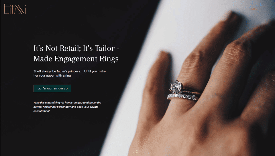
This site was submitted by Kelsey Specter. It includes lots of elegant photos, gold text, and gold highlights to appeal to the target audience. The gold text and graphics work great on light and dark backgrounds that include white, black, and tan. A set of blurbs that show their approach has animated icons (you can create a similar effect using Lordicon). That section has a styled border with corner graphics. The hamburger menu displays lines of various widths and thicknesses. The navigation menu opens to reveal a black background and gold highlights. A gallery displays product images that play video in a lightbox when clicked. I especially like the testimonial page with two columns in alternating layouts.
2. Speak Up with Debbie
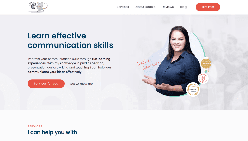
This site was submitted by Michal Teska. It has a clean layout with extra attention paid to font and color choices. The fonts stand out the right way and the red highlights give the site a balanced design. Information about courses is displayed within cards. They include hover effects and the most popular option is highlighted with a red border and text at the top. A request for information provides the form over a background image with a green overlay. I also like the section of reviews that displays a testimonial slider with red highlights. It’s simple but works perfectly with the site’s design.
3. The Wrinkly Writer
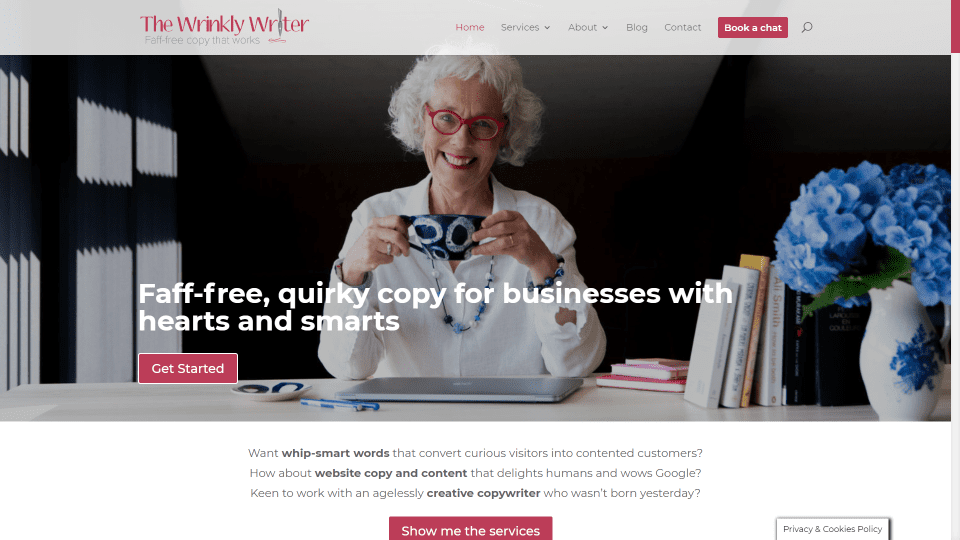
This site was submitted by Julie Rick. This one uses a clean design that alternates between tan and white backgrounds and includes red highlights throughout. The red highlights even extend to the call to action in the menu, the scroll bar, and the back-to-top button. A set of blurbs describe the needs of the visitor and change to the services provided on hover. Another section shows information about the site owner with a cartoon of the owner on one side and bullets and custom icons on the other side. A section of work displays client logos with a title and description. Featured projects are displayed within a slider. I also like the single-column blog layout with the featured images to one side.
4. DuoGeeks
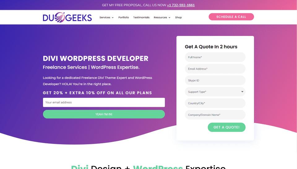
This site was submitted by Lovish Gulati. It uses a blue and purple gradient throughout with highlights in green or red to give the design a playful and exciting feel. The hero section displays both an email form and a form for a quote and still finds a way to keep them uncluttered and easy to understand. A call to action includes text on one side over a gradient and a set of blurbs on the other side with graphics that creates a mosaic. I like the section with samples that displays the work in a window that scrolls on hover. Testimonials are placed over a gradient background and include the gradient themselves. It has lots of CTA’s that are placed well throughout the layout. The shop page also stands out as well as the product pages which follows a similar design.
5. Mavericks
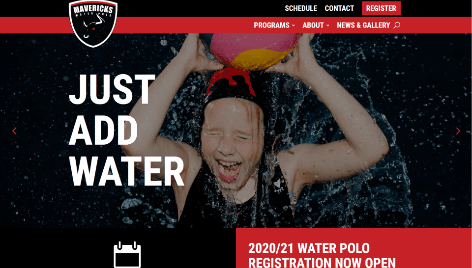
This site was submitted by Flavio Mester. It uses lots and black or red backgrounds with large white text to create a bold design that stands and with a professional look. The hero section displays a full-screen slider with a tagline that remains in place and a red and black menu with an overlapping logo. The dropdown menu follows the same design with a red background and black border. A section with the schedule uses black on one side and red on the other with buttons to see the schedule or register. The latest news is shown as text within a large box with a thick border. The gallery page brings in Instagram posts over a large background image. This site makes excellent use of color and fonts.
6. Vida Mountain
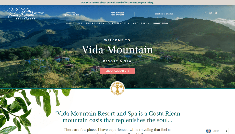
This site was submitted by Megan Dorien. The hero section displays a full-width image of the area and includes a CTA and contact information in the menu. Images of leaves are used as elements in the background throughout the layout. Suites are shown as cards in a multi-column layout and change to a different photo on hover. A card within the layout includes contact information. An interesting CTA displays a box with text and another CTA over that with rounded corners and red background to stand out. I love the information design with a gallery to one side and overlapping text on the other in an alternating layout. A gallery is created from an Instagram feed.
7. Dr. Evelyn Vinocur
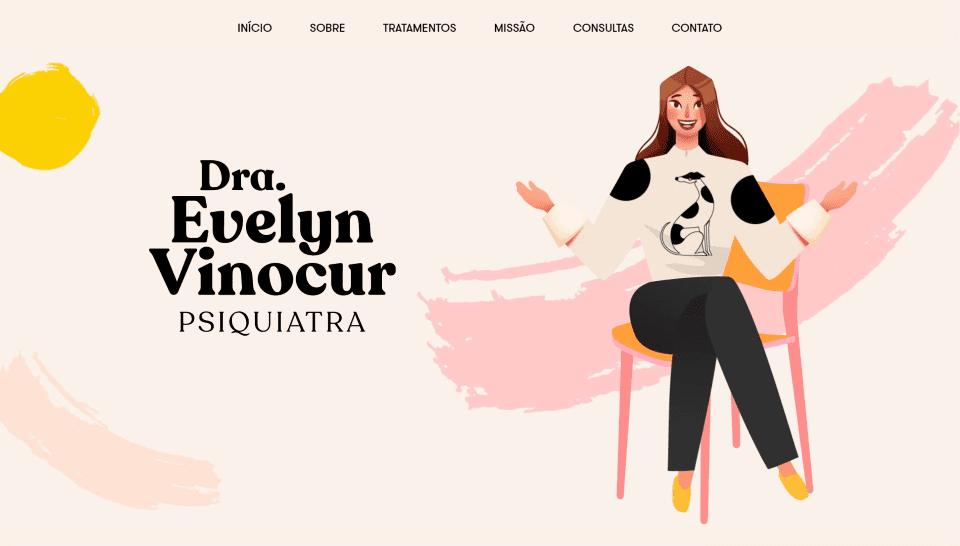
This site was submitted by Gui Vino. This one uses large text, a tan background, pink and yellow highlights, and mobile-first layout design. The hero section includes a drawing of the site owner over splotchy background graphics. Most of the elements display a pink highlight. The list of treatments is displayed with large text separated by a divider. Images display within wide picture frames. The section about the mission displays a graphic within a picture frame over a gradient with a simple message. I especially like the section about how it works. It displays information on both sides with a graphic in the center with contact information following that. This section is placed over a background gradient that includes a styled separator that changes the background to a new color.
8. The Village Spa
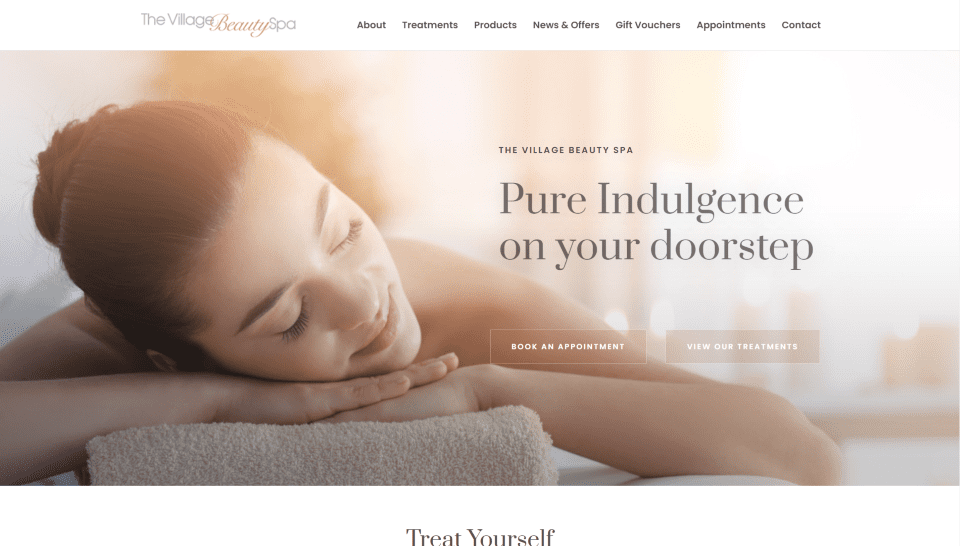
This site was submitted by Paulina Ritchie. It uses soft shades of gray and a tannish-orange, elegant fonts, and photography to attract the target audience. The hero section shows a full-screen image with booking CTAs. Several full-width CTAs display products on one side and the text on the other over a background image that blends into the products’ image. Other CTAs display large images to one side and the text on the other in an alternating layout. Treatments show information within styled tabs. Appointments are made through an embedded form. Gift vouchers are purchased through a styled form with graphic elements that match the site. This site makes elegant use of photography.
9. Createur2Site
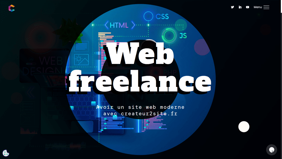
This site was submitted by Createur2Site. This site’s scroll effects are out of this world and it makes the most interesting use of a mouse cursor that I’ve seen. The mouse cursor is an extra-large dot that displays the opposite colors of the area (down to the pixel level) it’s hovering over. The hero section displays a black background with a circular graphic and tagline in the center. Scrolling zooms into the center and scrolls the next section upward. As you continue to scroll, the center zooms back in to become one of the graphic elements on the screen. Another scroll effect slices a word in two while other scroll effects animate section separators, scroll words on hover, open graphical elements, and lots more. The scroll effects never get in the way of the site’s usability.
10. We Are Web Design
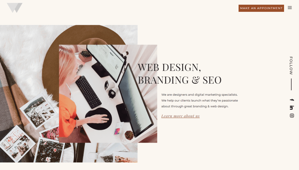
This site was submitted by Justine Carter. It uses a light tan background with dark orange highlights and darker tan backgrounds throughout. Bolder colors are added with images for the services, client logos, and images from the portfolio. The section for services places the title over an interesting background pattern. Images for the services overlap the pattern. Social links are placed vertically to the right side. The fonts used for the titles are large elegant lines that work perfectly with the site’s color give the site an elegant feel. I love the blog design. It includes the background pattern in the title and the blog posts display the featured image with their title under the image with a tan background.
In Closing
That’s our 10 best community Divi website submissions for the month of September. These sites look amazing and as always we want to thank everyone for your submissions!
If you’d like your own design considered please feel free to email our editor at nathan at elegant themes dot com. Be sure to make the subject of the email “DIVI SITE SUBMISSION”.
We’d also like to hear from you in the comments! Tell us what you like about these websites and if there is anything they’ve done you want us to teach on the blog.
Featured Image via Jemastock / shutterstock.com


does Createur2Site use addons to the mouse cursor and to the scroll effect slices a word in two?
can these be achieved using Divi Only?
Only one of these sites had a ‘Fully loaded time’ of ~3 seconds (water polo!!). I wish Divi would let me choose to turn off builder features I never use so the pages would load faster.
The website of createur2site is amazing !! Why is not numer one ?
Yep agree with you really well done by the owner .. !