
In this post we’ll take a look at some amazing Divi websites from our community members. Each month we enjoy viewing all of your Divi design submissions, and today we want to share with you the top ten websites for this month. Throughout the post I will point out some of my favorite features for each of the websites.
I hope you like it!
The Best Community Divi Site Submissions for September 2017
1. Klik Samuray
This website was submitted by Cem Cangir. It has some interesting animations throughout the site. I especially like the sliding animations in the header with the elements being animated individually, and the hover effects within the project grid that zooms the image and reveals the text.
2. Gavin Blake
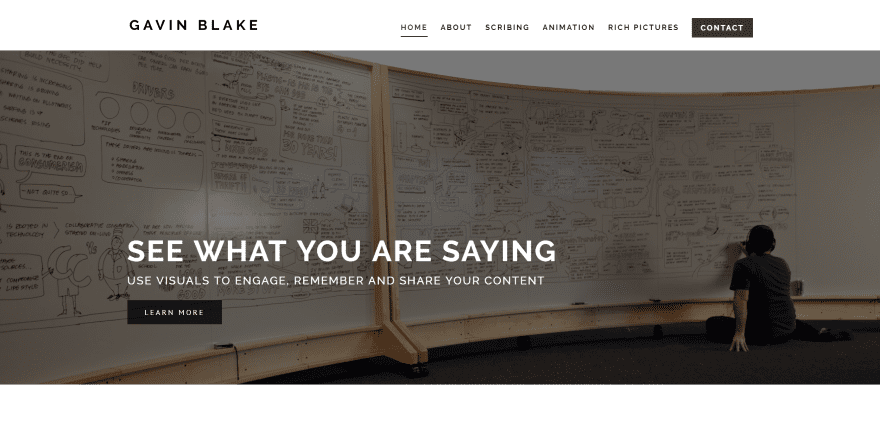
This website was submitted by Sarah Oates. The site is a great example of making a simple black and white design look elegant. It mostly uses a white background but one section darkens the background just enough to stand apart and make it visually appealing. Services are front and center without distractions.
3. Stroops
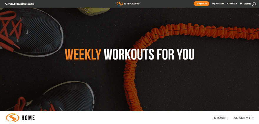
This website was submitted by Michael Langell. I love the colors and fonts used in this site. The design of the product and blog sections minimize the distractions around them with white-space followed by the video section that’s wall-to-wall video. The hover animations stand out. It also makes interesting use of menu design with a menu under the header until the visitor scrolls passed the header.
4. A Century of NHL Memories
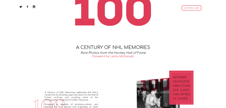
This website was submitted by Valerie Woods. I like the way the image in the header doesn’t have to be centered. This gives it a stylish look that, along with the interesting shade of red, makes the minimalistic design elements stand out. This site makes excellent use of white space to draw attention to the right areas. Also, I love this shade of red against the white background.
5. Styl’ evolution
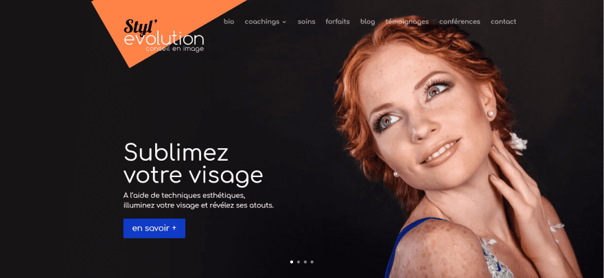
This website was submitted by Nicolas Ciarapica. The site makes good use of sliders with CTA’s by using them to introduce visitors to their services. It also gives a great example of using parallax effectively. Several other elements that stand out include drop caps for the about sections, how it blends the about sections with the person modules, and elegant use of embedded Instagram feeds.
6. Soren & Anders
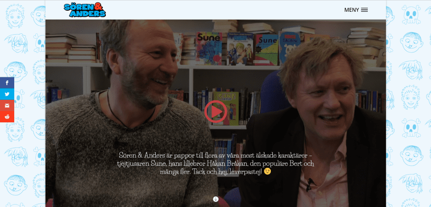
This website was submitted by Victor Duse. It displays a video background behind a play button that opens the video in a popup. The art within the background is enough for the visitor to understand what the site is about. The section separators and colors support the cartoonish design. I like the way the right-side menu moves the site over and nothing on the page is lost.
7. Intremode
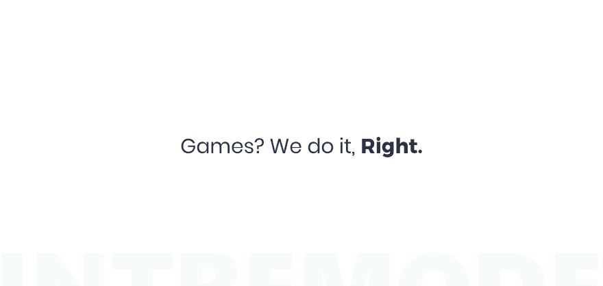
This website was submitted by Aayush J. Nair. This design proves that less is more. The opening screen is a simple tagline with a tease to scroll. On scroll you’ll see the scroll bar is also styled and the website uses the full width of the screen. The site uses interesting patterned backgrounds with short descriptions and CTA’s that take the full screen. It doesn’t use a menu on the homepage.
8. Dawn Martin Photography
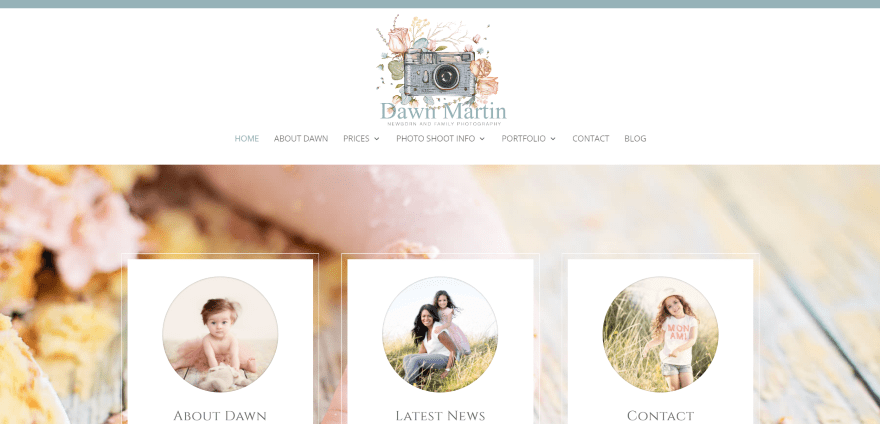
This website was submitted by Yvette Craig. The site uses soft colors with perfectly matched fonts and elegant design touches. Aside from the awesome photography I particularly like the graphics and borders around the images. The gorgeous logo disappears on scroll to give more room for the website.
9. Gothics.co
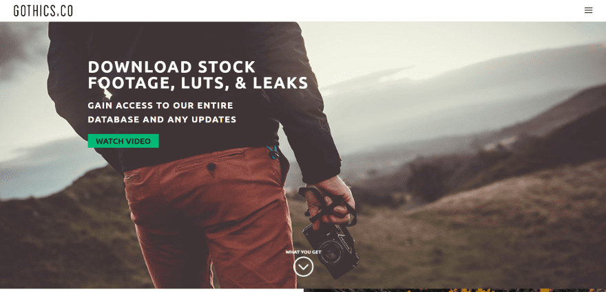
This website was submitted by Kurt Von. I’m a sucker for alternating layouts and this site does it to perfection. The fonts and green highlights make the design stand out with a professional feel. The site is a great example of how to use fonts, branded colors, white-space, parallax, and video.
10. Moku
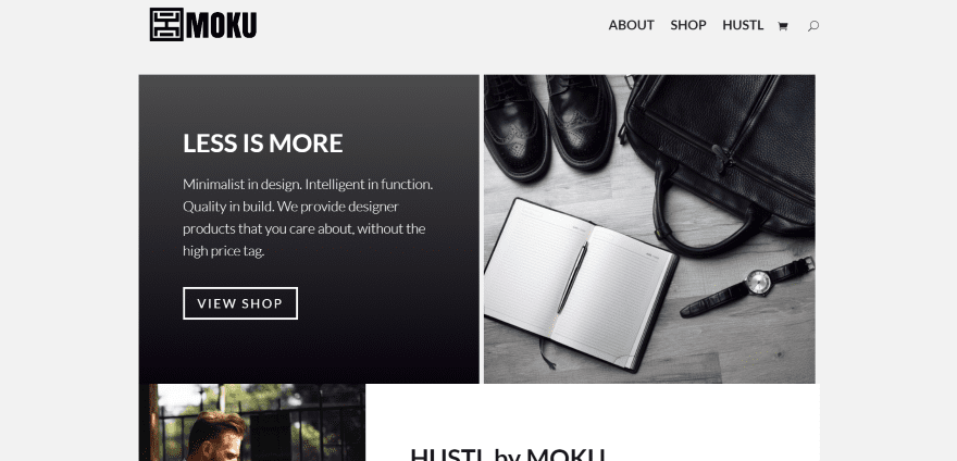
This website was submitted by Michael. The website sells products with a minimalistic design and the website’s design matches the theme perfectly. Using an off-white background with black typography and tan highlights, the products fit nicely within the page. I like the multi-layout header design.
In Closing
That’s all for this round of the Divi design showcase. Great job everyone! And thanks for your submissions.
If you’d like your own design considered please feel free to email our editor at nathan at elegant themes dot com. Be sure to make the subject of the email “DIVI SITE SUBMISSION”.
We’d also like to hear from you in the comments! Tell us what you like about these websites and if there is anything they’ve done you want us to teach on the blog.
Featured image via Leszek Glasner / shutterstock.com


Thank you Randy for including Klik Samuray in the design showcase and a big thank you to Nick and everyone at Elegant Themes for their great work and support. We use the Divi theme for many of our new clients. I think it’s obvious that our design and development team had fun creating our website as they pushed the limits of creativity while staying within the bounds of a professional website. Personally, I liked the use of the angled background throughout the site.
The Klik Samuray site is fun. I would be interested in a tutorial on the object animations.
Hi, I’m the Stroops Developer. I loaded the divi builder on the product post types. I then set the layout to full width and built as normal.
https://www.elegantthemes.com/blog/divi-resources/how-to-add-the-divi-builder-to-custom-post-types-divi-nation-short
For the reviews and related products section I just implemented CSS.
The instagram is a woocommerce plugin
Where, how and when can I submit my Divi site for the showcase. I’ve searched all over the blog and website but see no way to enter or post my website. Thanks in advance for your time and consideration.
“If you’d like your own design considered please feel free to email our editor at nathan at elegant themes dot com. Be sure to make the subject of the email “DIVI SITE SUBMISSION”.”
10 is awesome.
very nice! 4, 8 and 10 my favs…
Intremode is showing Account Suspended tho
I’m Extremely sorry for it. My project didn’t go well So i dubbed it under account suspended.
I just wondered if there is a cut off date for each month to be considered? Keep up the great work!
Cheers!
Rich
Man, some of these are so beautiful! This is inspiring! I really want to check out intremode.com as the simplicity intrigues me, but the site is suspended. Oops.
Hey! Thanks for liking my website. Intremode was my passionate project but it was didn’t go well. So I dubbed it under account suspended. I’m considering to re-launch it.
I am a bit disapointed by the possibilities of DIVI for woocommerce, in particular the product detail page. Stroops has made a nice effort, I am wondering if anybody knows which plugin has been used?
Hi, I’m the Stroops Developer. I loaded the divi builder on the product post types. I then set the layout to full width and built as normal.
https://www.elegantthemes.com/blog/divi-resources/how-to-add-the-divi-builder-to-custom-post-types-divi-nation-short
For the reviews and related products section I just implemented CSS.
The instagram is a woocommerce plugin
I agree it would be nice to have some styling options for the woo commerce templates. I trialed using completely custom pages for product pages and taking the woo commerce product link and adding it to a normal button. It worked well enough on the front end but became hard to manage as there was a product page and normal page for each product, making changes was a headache and it all felt like it became a mess. Not to mention I couldn’t use variations and a few other features this way.
Woocommerce template options is my number 1 request for a Divi update.
Although we have DIVI specific plugin for dealing with woocommerce pages I looked at the site and they must of had some custom Woocommerce pages created.
I would say the did use the Variation Swatches and Photos plugin though on the site though.
I’m impressed with the Stroops shopping cart. Being a Divi theme with Woocommerce: how did you manage the attributes to appear in squares and not as they usually appear in woocommerce?
I await your response, thank you!
Hey Exequiel,
I used this woocommerce plugin.
https://woocommerce.com/products/variation-swatches-and-photos/
Well I tried to view #7 and the link did not work for me.
Thanks for letting us know. Hopefully it will be back soon.
Hey. Thanks for Considering my website. I’m Glad you liked my website. Intremode didn’t go well so I had to shut the website. Extremely Sorry for it 🙂