
It’s that time again for our monthly Divi Showcase, where we take a look at some amazing Divi websites made by our community members. Each month we showcase the best Divi websites that were submitted from our community and today we want to share with you the top websites for the month of October. Throughout the post, I’ll point out some of my favorite design features that draw me to each of the websites.
I hope you like them!
Divi Design Showcase: New Submissions from October 2021
1. Male Health Scotland
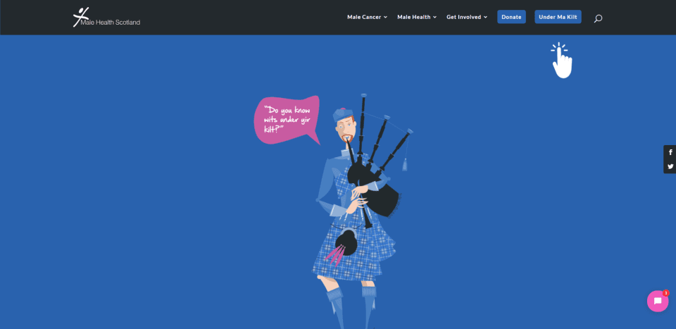
This site was submitted by: Michael Kavanagh. This one uses blue and red for the branded colors along with simplified hand-drawn graphics. Many of the backgrounds include angled dividers. Two backgrounds include graphics that stand out from the foreground. They include an overlay or parallax with CTAs that work well with the design. The blurbs are designed well. They’re in a different shade of blue to stand out and include red graphics. They spin around to reveal information on hover. I like the blog slider. It displays posts with the same blue background as the blurbs and displays the featured image with an angled border. I especially like the blog page design. It uses the design elements from the home page and adds breadcrumbs and quotes.
2. Cyber Routing
This site was submitted by: Samant Jaitli. This one uses orange and blue highlights throughout the site as the branded colors. Orange is the prominent color and appears within the graphics, text, blurbs, icons, buttons, and more. I especially like the pricing table that compares several plans and includes icons, buttons, and text with backgrounds. The pricing table overlaps three sections. A few of the sections include a styled pattern. The blue sections work well with the orange branded color and include the sticky menu and several backgrounds. The blog page is especially interesting with a magazine design and special styling for the featured images and blog posts.
3. Solar Studios
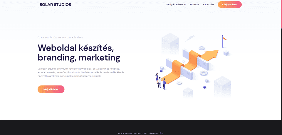
This site was submitted by: Gergő Fráter. This one makes interesting use of gradients for the buttons and icons. Some of the titles and text also include gradients. They stand out well from the backgrounds and draw attention. I especially like the blurbs. They include large cards with white backgrounds. Large icons sit in the upper left corner. Small text works as a tagline. They also include large titles, descriptions, and colored links. The icons are particularly interesting. They have two icons that overlap. A large icon appears in black and a smaller icon becomes part of the larger icon and includes the gradient. It also includes a styled navigation bar. This site also makes good use of a testimonial and logo sliders.
4. Health Fund 4 Children
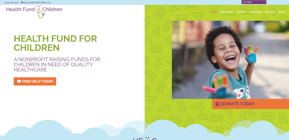
This site was submitted by: Bainie Brunson. This site displays colors and graphics that work perfectly with the target audience. Bright green and orange work as the branded colors with a mix of blue and purple in the backgrounds. The section dividers are large clouds. Many of the images have graphics over them that becomes part of the image. I like the large CTAs with alternating layouts. The hero section is interesting. It displays an image to one side with a CTA on the other without blending the two. I also like the blog design. It includes the same hero design and places posts in large cards. The posts themselves include full-width featured images with the clouds for dividers.
5. TimeSolv
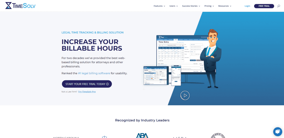
This site was submitted by: Naqash Saqib. This one uses a clean layout with graphics and several shades of blue for highlights to appeal to the target audience. The hero section displays a CTA on one side and a graphic on the other that includes an embedded video. A similar graphic is used between blurbs that create bullets. Testimonials are interesting. Rather than quotes, it has several embedded videos from users. I also like the mega menu design. It displays clean text in multiple columns. Many of the sections include sharply angled dividers.
6. Vector Ground
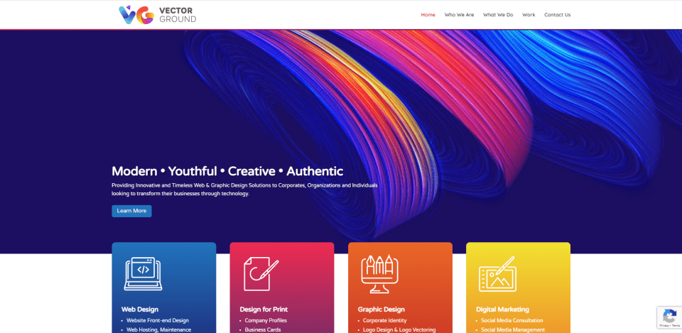
This site was submitted by: Savious Elton. This one makes excellent use of color. It also includes an interesting layout. The hero section displays a background with swirled colors. The foreground displays a tagline with a CTA. Large blurbs in the next section overlap the hero section at the bottom. These blurbs include bold gradients in their backgrounds. Their foregrounds include large icons, bullet points, and clickable icons to read more. Following this is a testimonial slider and a CTA, and then the footer. These two sections are overlapped with a CTA in a bright red that stands out. The menu also includes a gradient line to separate it from the page. I also like the page with examples of work. Images are displayed in cards with borders that appear on hover.
See you next month!
That’s our collection of the best Divi community website submissions for the month of October. These sites look amazing and as always we want to thank everyone for your submissions!
If you’d like your own design considered please feel free to email our editor at nathan at elegant themes dot com. Be sure to make the subject of the email “DIVI SITE SUBMISSION”.
We’d also like to hear from you in the comments! Tell us what you like about these websites and if there is anything they’ve done you want us to teach on the blog.
Featured Image via / shutterstock.com


Wow, I love design number 2! 🙄
https://www.elegantthemes.com/marketplace/molti/
All these sites, deservedly have there place in this hall of fame and I enjoyed reading about the authors reasons for putting them here but as a newbie to website creation, I would like a lot more information, fore instance what plugins were used to help create these techniques , I find it hard to believe that only Divi was used.
I understand that developers that have purchased the Developer Lifetime License of Divi are allowed to use the license to install Divi on client sites AND that they can generate keys for their clients.
However, I think that the riverasm site is basically crossing the line as he’s not selling the service of “I install Divi for you”, he is outright saying: “You get a lifetime Divi license if you book my gig” on Fiverr.
Even if that is allowed – and I think the wording is very poor – it seems an extremely odd choice to ADVERTISE his website in your showcase. It’s like you telling people: Hey, you’re better off going to this guy’s really nice looking website and purchasing Divi there instead of buying here.
Why would you do that?
Thanks for bringing this to our attention. It actually flew under the radar somehow and we’ve removed it now.
Nice idea (did you see this on blog series at elementor? 🤪).
Ithink it would be also very good to know, which plugins were used 🥳👍🏼