
It’s that time again for our monthly Divi Showcase, where we take a look at ten amazing Divi websites made by our community members. Each month we showcase the best Divi websites that were submitted from our community and today we want to share with you the top ten websites for the month of October. Throughout the post, I’ll point out some of my favorite design features that draw me to each of the websites.
I hope you like them!
Divi Design Showcase: New Submissions from October 2020
1. Epic Egg Restaurants
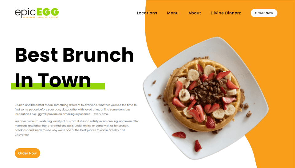
This site was submitted by Abel McBride. It uses orange throughout the site including blobs for background elements, icon backgrounds, buttons, block text, and the footer’s background. Green is used as a highlight behind text and within graphics. The food is displayed around the sides of the site with large photos that stand out. Menu items are shown within toggles that use a styled border with sharp corners on one side and rounded corners on the opposite sides. The food menu page uses the same toggles and adds prices to the corner. This site makes excellent use of white-space, photography, and color.
2. Pom Dental
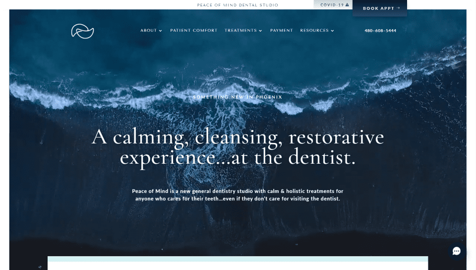
This site was submitted by Brittany Hurdle. The colors are matched perfectly to the genre. The hero section displays a background video with the tagline and description in the foreground. It includes a mega-menu with icons for the different categories. The secondary menu displays a quote and includes an overlapping CTA button. Blurbs, icons, text, and background elements use a light green or blue for the branding. Many of the elements include hover animations that reveal borders for the bottom of the text or buttons. I like the section for the services. It includes a large image with a background that matches the site and displays services as text to one side. The blog includes a simple design with a search feature. This site makes excellent use of text and borders.
3. Revolution De Palais
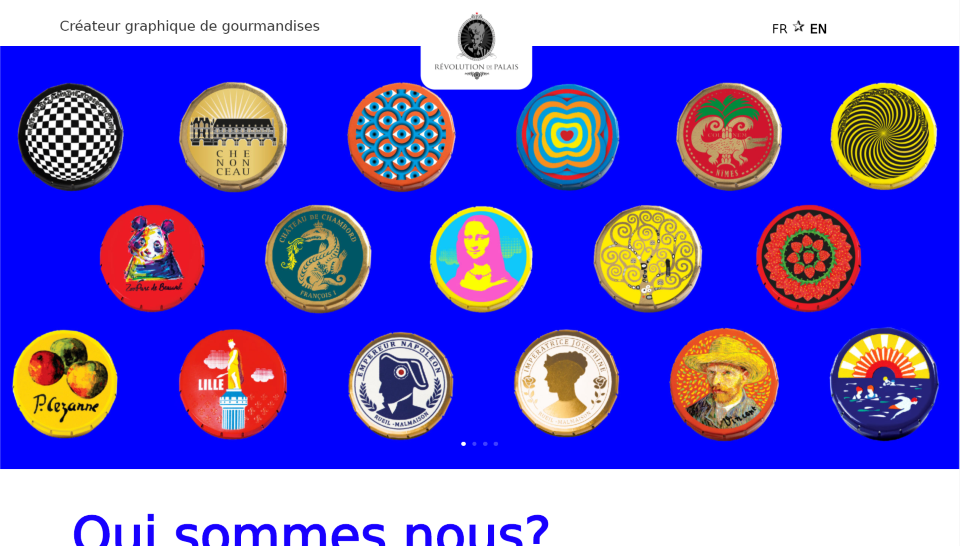
This site was submitted by Amal Vaesken. It uses lots of bold colors throughout the site. The hero section displays a full-screen slider with images that use the colors from the site. The company information is shown with large blue text that reveals the next section in parallax as you scroll. The section in parallax shows a message in the center of the screen with a blue background. As you scroll, this screen stays in place and replaces the message several times until you see the last message. I like the section with examples of work. It shows large images, animations, and sliders in two columns with colors from the website. I also like the large CTA at the bottom that changes graphics on hover and reveals the button to see more.
4. Mike’s Country Meats
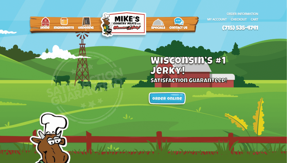
This site was submitted by Marcus Zeal. This site makes amazing use of cartoon graphics. From start to finish, all of the colors, fonts, and buttons perfectly match the cartoon scheme. The hero section shows a floating menu with a styled sub-menu that uses wooden planks. Clouds float across the sky of the background drawing. As you scroll you see cartoon characters as cutouts creating CTA’s or drawing attention to certain sections. Products are displayed within one of these sections and include styling that matches the site. Many of the elements are animated to match the mouse’s scroll. Even the contact information is placed over graphical elements that fit the design. This is a fun site to scroll through.
5. Dental Center Ostojic
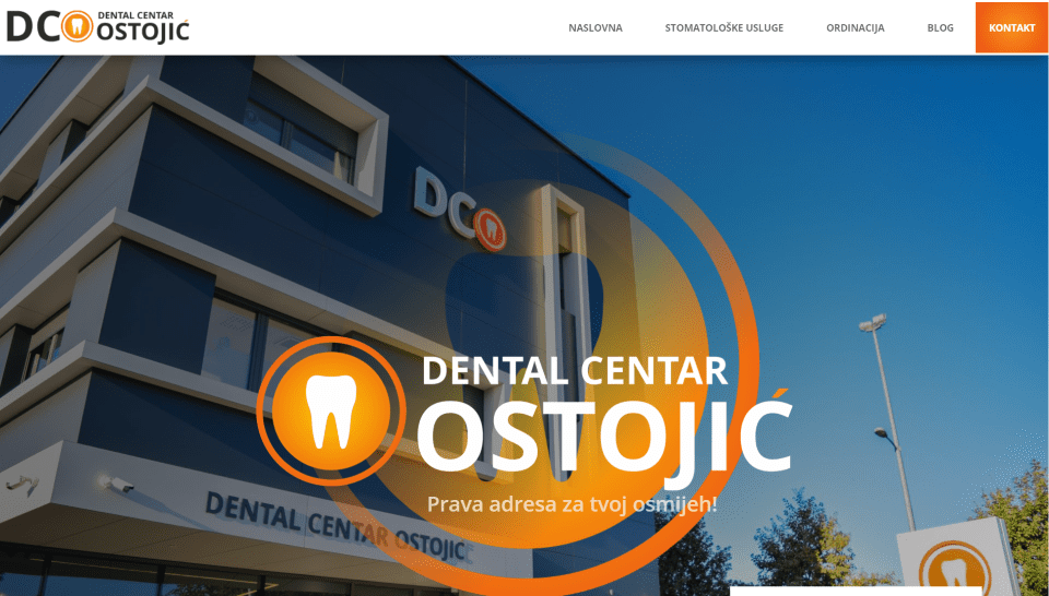
This site was submitted by Boris Žakula. This one uses lots of orange gradients as highlights throughout the site. The hero section shows a graphic in the center of the screen behind the title that shrinks as you scroll. The menu is a full-width mega-menu that displays links to one side with icons and an image on the other side. The site uses lots of photos of the location and workers for information, CTA’s, videos, blog posts, and more. I like the section on stories and testimonials. It displays images of clients with blocks of text over different colors on the other – both with box shadows. The blog, CTAs, and contact information also use box shadows to stand out.
6. Incrementl
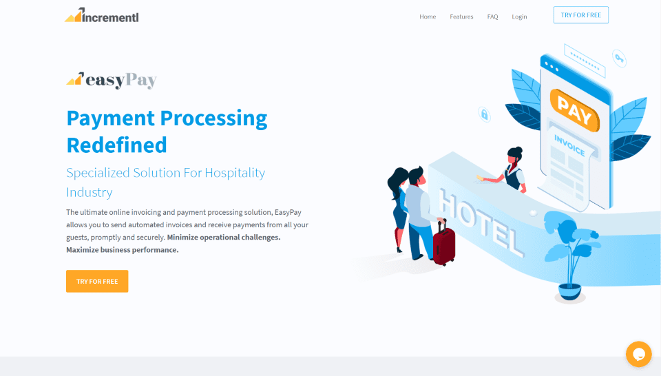
This site was submitted by Navmeet Singh. It uses lots of blue and orange throughout the site for highlights, backgrounds, and graphics. A section about how it works displays information within blurbs with two-color icons that lead through the steps. Another section displays a graphic of electrical cords plugging together as you scroll. This introduces another set of blurbs with two-color icons. A large section of information uses graphics on one side and text on the other in an alternating layout. I also like the features page which displays information within graphics that includes a screenshot and a circled graphic of a screen. This site makes great use of color, whitespace, and hand-drawn graphics.
7. Greene
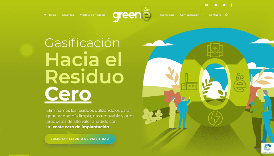
This site was submitted by Liberto López. This site uses lots of green and blue for the branded colors in the backgrounds, graphics, titles, buttons, contact form, back-to-top button, etc. The hero section displays a green background with a pattern. The foreground displays a message on one side and a graphic on the other. A styled section divider leads into the next section with blurbs that zoom on hover. Several sections display multiple graphics on one side and CTA’s on the other. I also like the section of blurbs that use large two-color icons in an off-set pattern and a blue and white gradient that appears on hover. An angled gradient appears in the background of the next section. The contact form also displays a gradient and a box shadow that stands out. This site makes excellent use of color and graphics.
8. HR Team
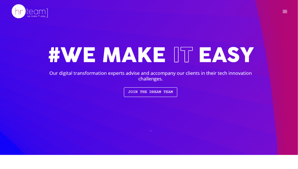
This site was submitted by Marwann Al Saadi. The hero section displays an animated background gradient with a hashtag and CTA in the foreground that zooms on hover. This background gradient appears throughout the site as the background of CTA’s, sections, blurbs, and more. Blurbs show images of the team members as a duo with their images meshed together and separated by a dividing line. I like the section about their method. It displays the background gradient with large circles to one side. The other side places information as bullets using large block titles and icons of an eye. The icons also appear in blurbs. The site also includes an interesting menu that stretches out when you click the hamburger icon. It also uses a background gradient and block text for the title.
9. No Stress Allowed
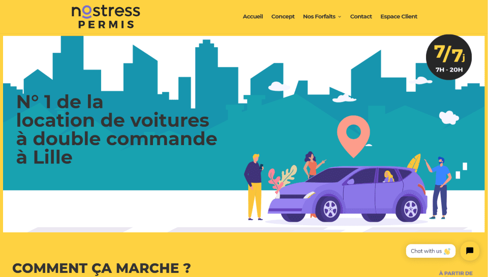
This site was submitted by Antreek. This site uses lots of graphics with bold colors throughout. The hero section displays a background graphic of a city-scape with a tagline in the foreground on one side and a graphic on the other. The background doesn’t go all the way to the edges, allowing a bold yellow to appear around all sides. The menu uses the bold yellow background for the header and sub-menus. The yellow blends into the next section and displays information on one side and a video on the other that mimics a smartphone graphic with rounded edges and a bold border. Pricing tables also use bold colors and include graphics on both sides of the page. The contact section includes the yellow background and includes large social icons. This site makes excellent use of color and graphics.
10. Lola Menthe
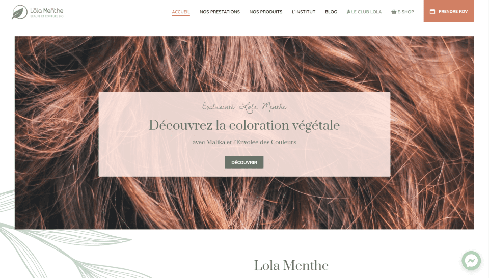
This site was submitted by Théo Salomoni. This site uses several soft colors to appeal to the target audience. Colors include a version of pale copper for highlights, overlays, background colors, and the back-to-top button. The header uses it to identify the active page and hover elements, and for the CTA. The header also uses a shade a green from the logo for certain links. This green is also used for the background near the footer. The footer itself uses the pale copper color, which is revealed like a curtain. A testimonial slides into place as you scroll to the second section. Another section displays images as links with the pale copper overlay. Blog posts are displayed within a slider and include the date in the upper corner and zoom on hover. The site makes excellent use of color.
In Closing
That’s our 10 best community Divi website submissions for the month of October. These sites look amazing and as always we want to thank everyone for your submissions!
If you’d like your own design considered please feel free to email our editor at nathan at elegant themes dot com. Be sure to make the subject of the email “DIVI SITE SUBMISSION”.
We’d also like to hear from you in the comments! Tell us what you like about these websites and if there is anything they’ve done you want us to teach on the blog.
Featured Image via Mascha Tace / shutterstock.com


4. Mike’s Country Meats certainly shows off what you can do with images for a menu.
I like the sticky Menu Navigation used forEpicEgg. I would like to know if this is realized with divi ‘inhouse functionality’ or was a lot of custom code necessary?
I also have the same question, but then at the site of Mike’s Country Meats… It looks great!