
It’s that time again for our monthly Divi Showcase, where we take a look at ten amazing Divi websites made by our community members. Each month we showcase the best Divi websites that were submitted from our community and today we want to share with you the top ten websites for the month of December. Throughout the post, I’ll point out some of my favorite design features that draw me to each of the websites.
I hope you like them!
Divi Design Showcase: New Submissions from December 2020
1. Studio Linetti
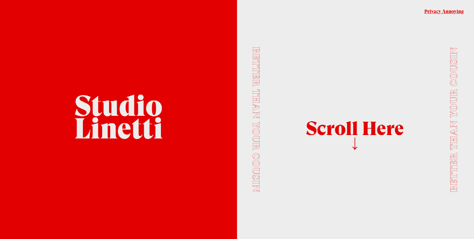
This site was submitted by Nicola Toffali. The site uses an interesting split-screen design. The left half of the hero section displays the site’s title in large text over a background that changes color when you scroll or move the cursor to the address bar. On the right side is red text over a white background. This column is scrollable within the section. When you read the end of the column, the section will scroll. The next two sections include columns that are almost full-screen with a black background on one side and a white background on the other in an alternating layout and fonts are in the opposite colors. The final section is a humorous full-screen message over a background that changes color. This design is simple and interesting at the same time.
2. Casa Roca Architecura
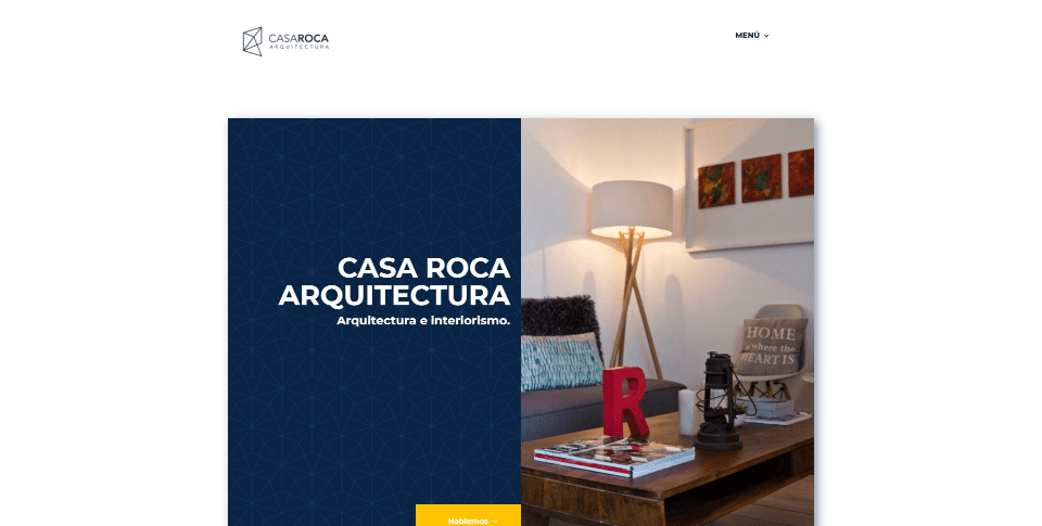
This site was submitted by Freddy Maldonado. This site includes lots of overlapping elements with box shadows, hover animations, and yellow highlights. Under the split-screen hero section is a block of color to one side with an image overlapping it and a CTA overlapping that. Blurbs provide information about the types of work. They have simple icons in yellow and the blurbs slightly change shape and get a thick yellow border on hover. This makes them stand out without becoming too flashy. My favorite section displays images that overlap an Instagram feed. The images slide up on hover to reveal a description with a blue overlay. The contact section is also interesting. It shows contact information in a yellow box that’s overlapped by a small contact form.
3. Customer Camp
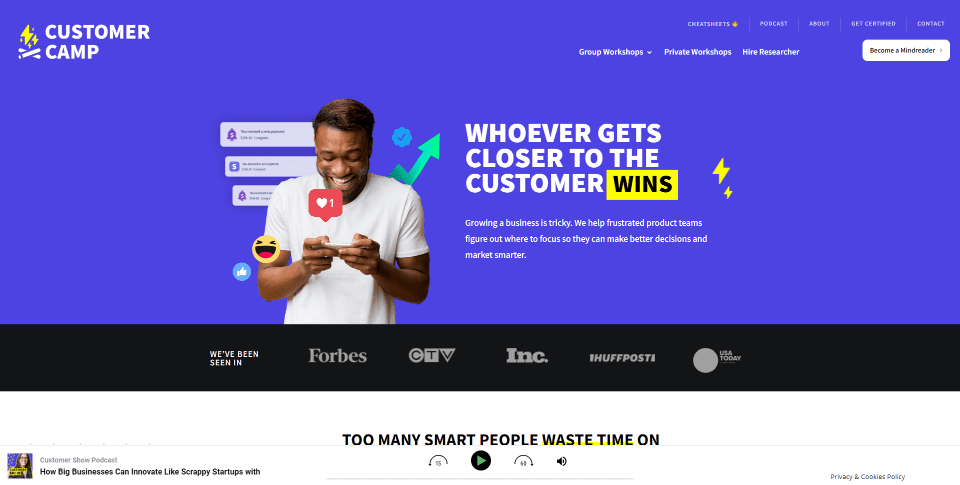
This site was submitted by Sarah Hart. A podcast player sticks to the bottom of the screen with the latest episode. Purple and yellow are used for the branded colors throughout the site for backgrounds, buttons, icons, and to highlight text. Lots of individual graphical elements scroll independently of the sections, making great use of scroll effects. Each section makes good use of the screen to display CTA’s and information. I especially like how testimonials are displayed around the images. This comes together at the bottom of the layout for the testimonial section. There are a few GIF’s, but not so many that it becomes distracting. This site makes great use of color, scroll effects, and overlapping elements.
4. Alive Service GmbH
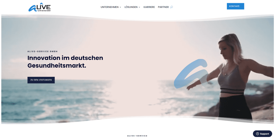
This site was submitted by Markus Behmann. This site uses lots of blue throughout as highlights for icons, buttons, backgrounds, and hover effects. The menu uses animated hover effects for the links. The hero section displays a video with a styled divider for both the top and the bottom. This especially gives it an elegant separation from the header and helps it stand out. My favorite section displays interesting blurbs for services. The blurbs include a button overlapping the image and content. The blurbs themselves overlap the row above them and they move horizontally as you scroll up or down. This section also includes a wavy divider to match the first section and tie it together. The layout is clean and elegant.
5. Architect & EMU Construction
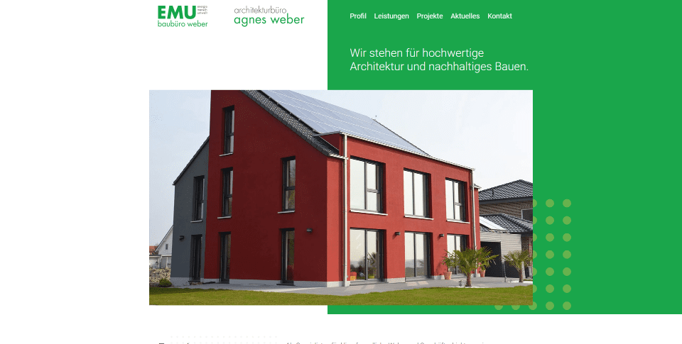
This site was submitted by Abdy Designbüro. It uses green as the branded color throughout the site including the logo, backgrounds, and borders for the buttons. The hero section uses a green background on one side with a circle pattern to give it style. The navigation menu has a transparent background, which lets the green show through on one side. As you scroll, the menu’s text and background change color. I like the CTA that places information with buttons over a light gray background that just stands apart from the white background and includes a circle pattern. An image overlaps this to stand out. The gray circle pattern is used in multiple places to give the background some texture.
6. Strides Digital
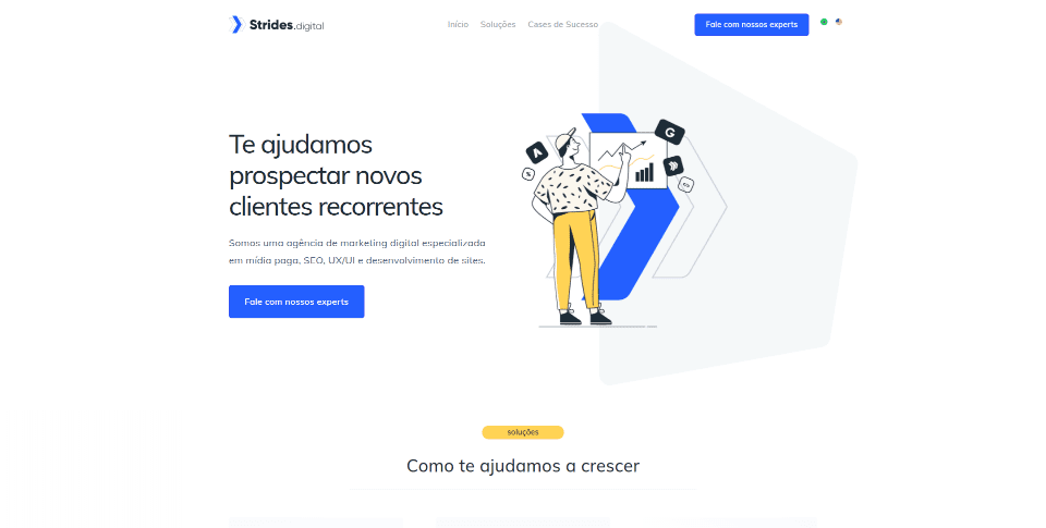
This site was submitted by Douglas Henrique. This one uses a clean layout with lots of whitespace throughout the site. Blue and yellow highlights are used for buttons, icons, fonts, backgrounds, and other graphical elements. The titles are small and look like buttons, but they stand out the right way. CTA’s display hand-drawn graphics on one side and text on the other. The graphics have a cartoonish design that works perfectly for the website. I especially like the success case that shows a blue background that includes the title and description with information and an image of the work overlapping the next section. The page for the success cases follows a similar design. The layout is simple but the color is well-balanced.
7. Green Peas for Breakfast
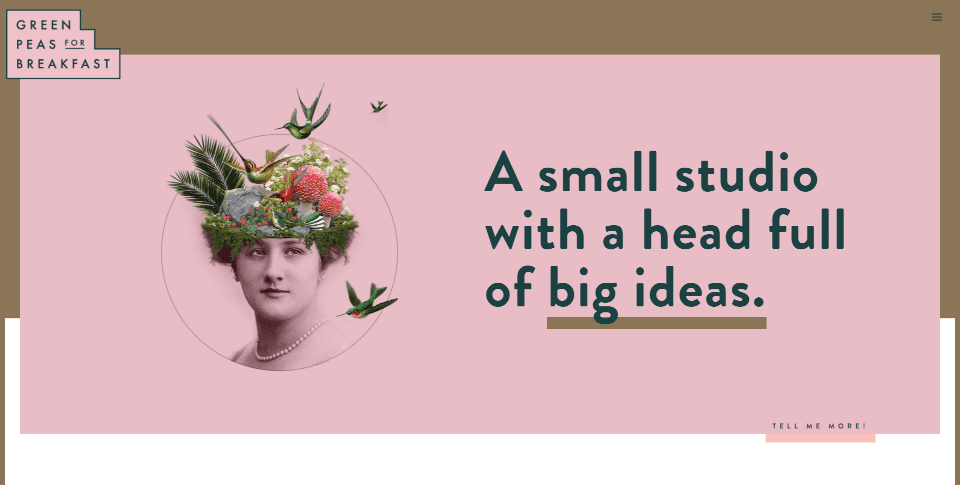
This site was submitted by Monica Higgins. This one uses lots of pink, dark green, and gold for backgrounds, text, and highlights, and lots of scrolling effects throughout the site. It changes your mouse cursor into a styled tip of a pen. The hero section displays a pink row that overlaps the next section. I love the images to show the services. Each image is old hardware with text on a screen or being printed. Their text scrolls as you scroll down the page. Examples of work are shown within a section with two columns that includes pink backgrounds with gold borders. Images of the work are placed within old TV screens, in web browsers, or as graphics. Each of the graphical elements uses scroll effects. This site makes great use of color and images.
8. Hey Fresto!
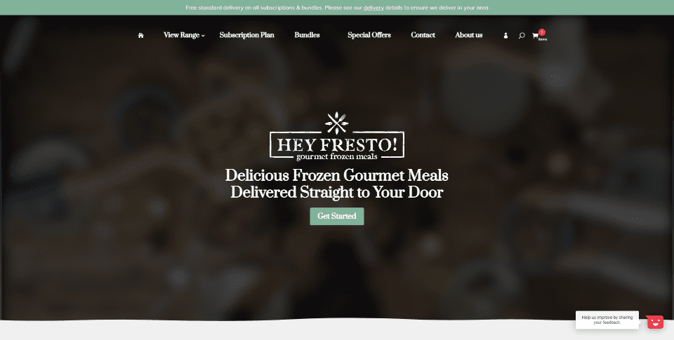
This site was submitted by James Middleditch. It uses an elegant green as the branded color with lots of photos and scroll effects throughout the site. The hero section plays a background video that’s blurred out, but enough can be seen to understand what the site is about. A title and tagline introduce the site. Images of food include overlays that fade out as you scroll. Tags for the images are in lots of different colors to match the Eastern theme. Blurbs that provide information move into place from the sides as you scroll followed by a similar section with CTA’s. Lots of drawings and images help frame the edges of the site. A section of bestsellers includes products with multiple options. This site also includes a styled scroll bar. I love the colors and images on this site.
9. MVMNT
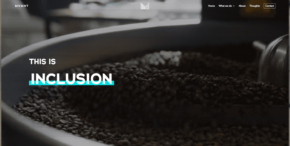
This site was submitted by Simon Frost. The hero section displays a full-screen video with a refresh rate and filter that, to my eye, looks like an older digital movie projector, while text in the foreground flips to change the message every few seconds. An interesting section with wide images in an alternating layout displays titles over the images that link to information about the company. The images include hover effects. Blog posts include multiple tags and overlays that reveal an excerpt. Light blue and pink are used for the branded colors and are often used to underline the titles. Each of the pages follows a similar design and includes black backgrounds behind some of the titles. This site makes stylish use of color and backgrounds.
10. Le Kombucha
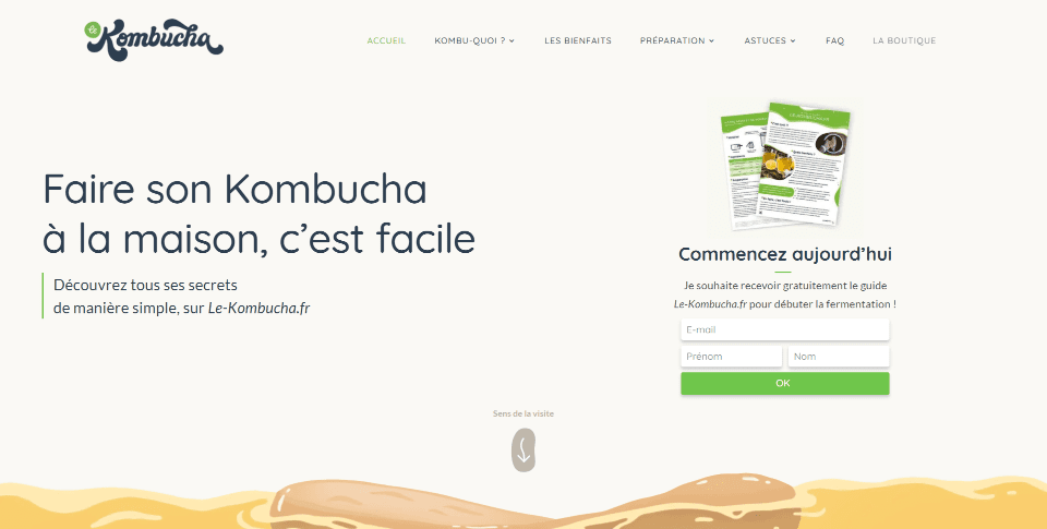
This site was submitted by Florent Noël. This one uses lots of interesting graphics and throughout the site. It mostly uses light yellow and light green for the branded colors that appear in the backgrounds, buttons, and back-to-top button. The background graphics create a drink with bubbles and include wavey edges to stand out from the surrounding sections. Other graphics and images throughout the site display the drink in glasses and pitchers. Those with graphics place the graphic on one side and text on the other to create CTA’s. These are placed in an alternating layout. Information is shown within blurbs with multi-colored icons. All of the images and graphics slide or flip into place as you scroll.
In Closing
That’s our 10 best community Divi website submissions for the month of December. These sites look amazing and as always we want to thank everyone for your submissions!
If you’d like your own design considered please feel free to email our editor at nathan at elegant themes dot com. Be sure to make the subject of the email “DIVI SITE SUBMISSION”.
We’d also like to hear from you in the comments! Tell us what you like about these websites and if there is anything they’ve done you want us to teach on the blog.
Featured Image via bellenixe / shutterstock.com


I love elegant themes. these themes are most user friendly and can be customized at any level.
How can we submit our web site to this selection ?
Thanks for the article Randy, lots of valuable ideas and talented designers delivering with Divi! Like Simplebutcreative Media I found extra value exploring Customer Camp, still listening to the podcasts in the background.
Thanks,
Matthew
Isn’t Katelyn’s podcast amazing Matthew? Im a huge customer research geek myself and use it all the time to grow my business!
Hi Dear Team
Can i get the layout from submission specially web customer camp.
Thx
BR
Halim Ivan
The best one is definitely Green Peas! I’ve seen her work before. Her stuff is always dope af! Her main website alone speaks different. If I had the budget I would love to hire her to work on my main project.
2nd favorite is Customer Camp. It’s very professional but with a hint of fun. I love the branding on this one. Great job Sarah!
3. Customer Camp really nice!
Thanks 🙂 Glad you like it!