
It’s that time again for our monthly Divi Showcase, where we take a look at ten amazing Divi websites made by our community members. Each month we showcase the best Divi websites that were submitted from our community and today we want to share with you the top ten websites for the month of April. Throughout the post, I’ll point out some of my favorite design features that draw me to each of the websites.
I hope you like them!
Divi Design Showcase: New Submissions from April 2020
1. Abel Villaverde
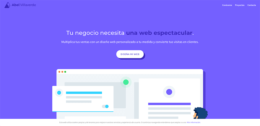
This site was submitted by Abel Villaverde Sellés. A blueish purple is used throughout the site for backgrounds, text, graphics, and other highlights. The hero section displays a tagline with a call to action followed by a large graphic. The next section uses a white background with an image of a website surrounded by graphics in the branded colors on one side and a CTA on the other. Projects are displayed as styled cards that reveal a purple bottom border on hover. A section with information about the site owner displays white and blue text over the purple background and includes two buttons; one in each color. Services are shown within blurbs that are offset and include the styled border on hover. A CTA with a while background displays a star icon that stands out. I like the way the sections use lots of wavy separators and the use of color on this site.
2. IYASHI
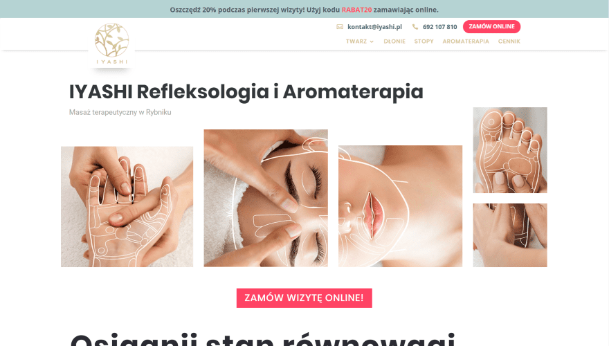
This site was submitted by Alex Hawro. It has a styled menu with an overlapping logo and two lines of links with icons and a CTA. The hero section displays a tagline followed by a set of images that link together. Services are shown with graphics that include overlapping titles and links to the services pages. A large post slider is one of the more interesting elements. Images are placed in the background with a portion of the previous and next images showing. A box with text and navigation sits over the left side of the image and an overlapping graphic sits on the right side. Slides are numbered at the bottom. The next section displays large images and information with tabs at the bottom. Information is displayed with custom icons using branded colors. The price list is another interesting element. Each price is displayed within separate elements. They zoom and display styled borders on the sides on hover. I like the red and green branded colors that are used within highlights and text throughout the site.
3. Piccadilly Whippy
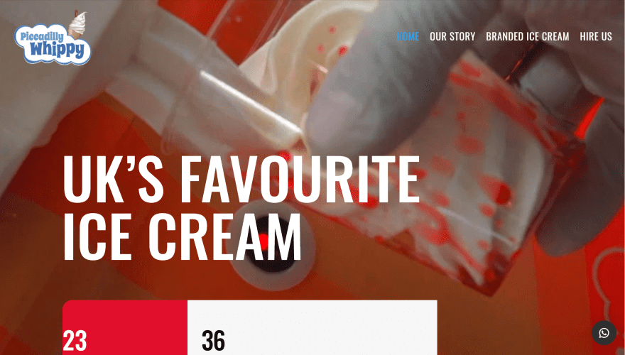
This site was submitted by Ron Studios. It places the title over a full-screen background video with a set of stats in large boxes at the bottom. The next section continues the design with a large box of information with a CTA to learn more. The next section displays an image on one side and large colorful text on the other over a dark blue background. Services are shown within circled images over a colorful background in parallax. Information about booking an event displays angled images over a bold yellow background. Testimonials are displayed over a dark blue background with white text and a large image. A section of CTAs displays images of different widths with text in colorful boxes. I like the use of bold colors on this website. The colors and fonts fit the company’s branding perfectly. Now I want ice cream.
4. Sentido Comunicacao
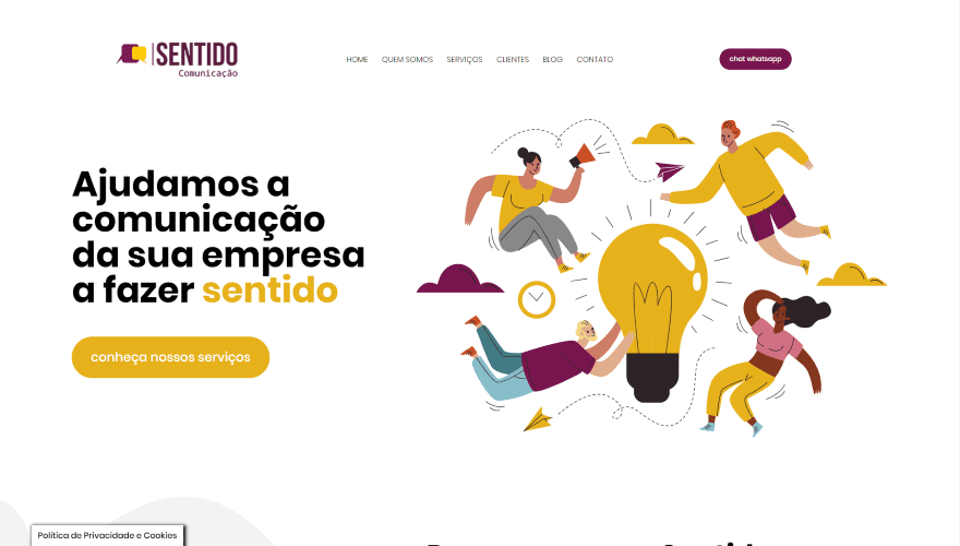
This site was submitted by Fernanda Prevedello. This site uses lots of gold and reddish plum (or wine, maybe?) throughout the site as branded colors. The hero section displays a call to action with large text on the left and graphics with the branded colors on the right. Information is provided in the next section with graphics that use a styled gray background pattern on one side and styled text on the other. The services section shows a CTA on one side with descriptions of the services on the other within accordions. A section for cases shows three cases as text over the gray background pattern. The blog section displays blog cards overlapping a branded background color. I especially this the contact form is interesting. The form is displayed over a block of color that includes a clickable call button. I like the use of branded color on this site.
5. Seen Brand Agency
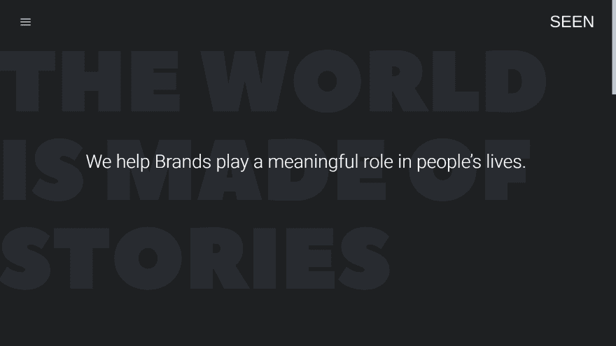
This site was submitted by George Paratsokis. It makes interesting use of text in true parallax with text. The header displays a hamburger menu on the left and a logo on the right. The menu displays a light gray box on hover. As you click the icon, the menu opens from that location and spans the screen, displaying large text and social buttons. The hero section displays a tagline as extra-large text in the background. Both the text and the background are dark gray. The foreground displays a large title in white that introduces the company. As you scroll, the text scrolls in parallax, revealing a set of links to the portfolio in large text that scrolls separately from the title. Other sections blend the background text to show dark text on one side and light text on the other with buttons that create CTAs. A curtain footer reveals the site’s title and large social follow buttons. Even the scroll bar is styled to match the site.
6. Carola Staudinger
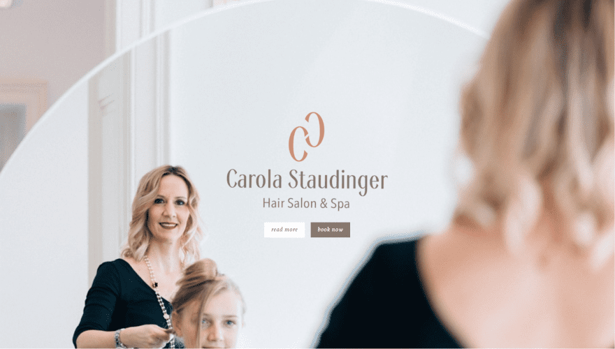
This site was submitted by Sibi Ha. This site makes excellent use of brown and pink branded colors. The hero section displays a full-screen background image in parallax with the logo, title, and a CTA in the overlay. A section about the company follows this and includes information with social follow buttons on one side and an image on the other. This section includes a message written in an elegant script font. A full-width booking CTA displays a background image using a gradient from the branded colors for the background and an image with pink highlights. A similar CTA appears later that uses a full-screen image with more information. Information about the services is shown within a section with images and text within a mosaic layout. A team section shows photos of the stylists and includes some biographical information. The contact section lists hours of operation on one side and places a styled contact form on the other, followed by a full-width map.
7. Stoked MTB
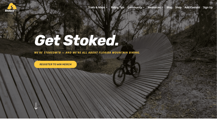
This site was submitted by John Hawley. This one uses lots of bold yellow for the branded color. The hero section plays a background video behind the menu and large CTA. An arrow showing you to scroll bounces on the left of the screen. Scrolling reveals a section with a clever title on one side and information on the other that includes a button styled with the branded colors. Blurbs display graphics in the branded colors and include links to read more information. A section for contact information displays a row of large blocks with a contribute CTA with graphics in one and social follow buttons in the other. Both use branded colors. This leads into a styled subscribe form includes a large background image and stands apart from the yellow background. The top of this section displays a styled section divider. The custom footer includes yellow for the highlights against a dark gray background.
8. Yooker
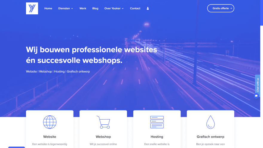
This site was submitted by Sander Goorman. This site uses blue for the branded color and includes a styled scrolling bar. The hero section displays a background video with a description and links to services in the foreground. The menu places the links on the left and a CTA on the right. Blurbs with icons and descriptions for services overlap the video with the next section and animate on hover. A section about the company shows a summary on one side with keywords highlighted in the branded color with the description on the other side. Several examples are shown within screens of various devices and include links to see the full website. A request form is placed over a full-width image and includes a dropdown box to specify when someone should call. The contact section includes a full-width CTA and lots of contact links. I like the clean design.
9. Ropemasters
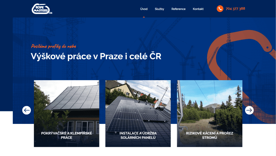
This site was submitted by Michal Teska. It uses lots of blue and orange for branded colors. The hero section displays three different layers. The background is solid blue and blends into the menu, which includes orange arrows to indicate the current page and for the call CTA. A background image is placed over the blue background and doesn’t completely cover the left side. This background uses a dark blue overlay with an orange design on the right, and it overlaps the next section. Overlapping this is a slider that shows the services with images and titles. Information is provided within blurbs with orange icons and includes titles and descriptions. An interesting contact CTA follows a similar design as the hero section. It provides a blue background with an image that overlaps at the top. The image doesn’t cover the right side and it has a deep orange overlay. The call to action uses large white text that stands out perfectly. I love the use of blue and orange.
10. Henrik Stenson Eyewear
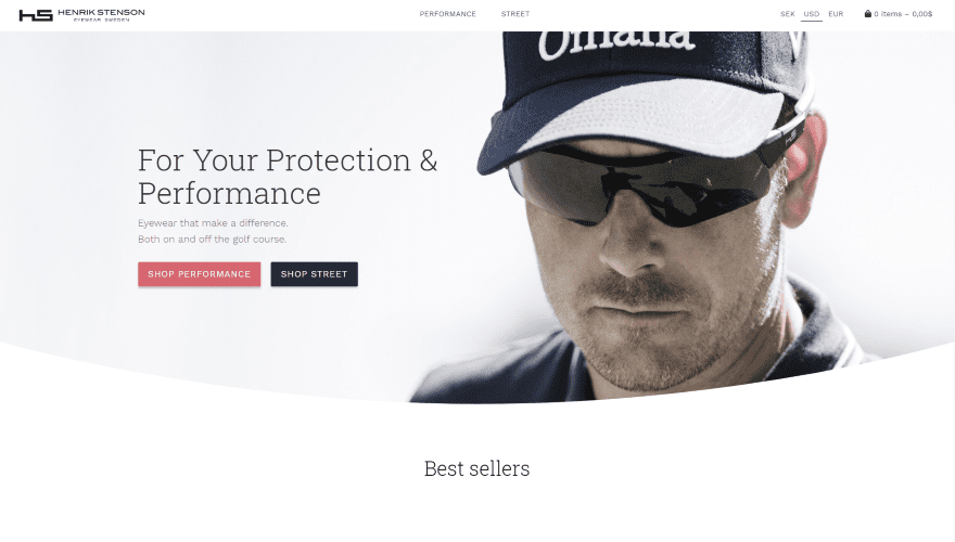
This site was submitted by Maximilian Leiding. It has a clean design to keep the focus on the products. The hero section shows a CTA on one side and an image of the product in use on the other side. A curved separator creates a rounded bottom design for the hero section. Scrolling shows the four best selling products. Their backgrounds blend into the background of the website. The next section shows two images of the products with links to their pages followed by another list of products for a specific category in two columns: a title on the left and the products on the right. A similar list appears closer to the footer and includes even more products. Information is provided in a two-column section with an image on one side and text on the other with a link to read the full story. A newsletter signup form leads into the footer and adds the colors used in the hero section. I like the simple clean design.
Conclusion
That’s our 10 best community Divi website submissions for the month of April. These sites look amazing and as always we want to thank everyone for your submissions!
If you’d like your own design considered please feel free to email our editor at nathan at elegant themes dot com. Be sure to make the subject of the email “DIVI SITE SUBMISSION”.
We’d also like to hear from you in the comments! Tell us what you like about these websites and if there is anything they’ve done you want us to teach on the blog.
Featured Image via naum / shutterstock.com


People are just amazing, such an inspiration it is to me just to see how well they know their design techniques (lets not forget that Divi makes it possible, but people need to have some design talent in order to create layouts/sites as these). If i like something on Elegant Themes blog, it is this kind of articles!
Nice work everyone! Big fan of #3 with the beautiful colors.
I also like that timeline styling 👍🏼.
Creative work. Incredible websites. And I love the theme of that websites. Keep it up.👌🏼
Seeing these sites brought me up-to-date in the website world. I’ve struggled with getting my Divi site built, but after seeing these sites and going back to the layouts, I see what I’ve been doing and thinking wrong. I’m of the old school where pages had to be many and short, not to force the client into scrolling. I had trouble understanding the layout packs and how to make them work for me. Now, I get it !
I’ll start fresh and look at everything through a different lens.
I’m definitely a fan of 4 & 9. Well designed and clean!
And there is definitely an image mixup with 1 for the image.
Number 1 has the wrong screenshot as not representative of the description.
Always amazed at the choices that make the best submissions.
Awesome work by everyone.
Just a quick note but the preview for 1 and 8 appear to be the same?
You beat me to it 😁
Yeah, it had a mixup there. Thanks!