
Ever since Divi’s Theme Builder has come out, the way we design headers and footers throughout our websites with Divi has become easier than ever. Everything can be customized and you can obtain the exact menu you have in mind without ever having to leave the intuitive Divi environment. Now, at a certain point, you might have come across the Elegant Themes dropdown menu on our website. This dropdown menu is a more advanced type of mega menu that creatively combines icons, text and CTAs. This allows visitors to visually navigate through the different products that are provided. It also translates into a beautiful nested menu on smaller screen sizes.
In this tutorial, we’re going to show you how to recreate this advanced Elegant Themes dropdown menu inside Divi’s Theme Builder. We’ll combine the best of both worlds; we’ll use the built-in Divi elements to create the foundation of our dropdowns and combine it with some code that places the dropdowns inside the WordPress menu. You’ll be able to download the JSON file for free as well!
Let’s get to it.
- 1 Preview
- 2 Download The Advanced Elegant Themes Dropdown Menu Header Layout for FREE
- 3 Download For Free
- 4 1. Add CSS Classes to Menu Items
- 5 2. Create Custom Header with Divi’s Theme Builder
- 6 3. Create Dropdown Elements
- 7 4. Add CSS & JQuery Code
- 8 5. Enable CSS Class Once You’re Done Customizing the Menu
- 9 6. Creating More Than 3 Dropdown Menus
- 10 Preview
- 11 Final Thoughts
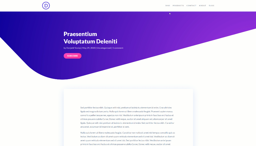
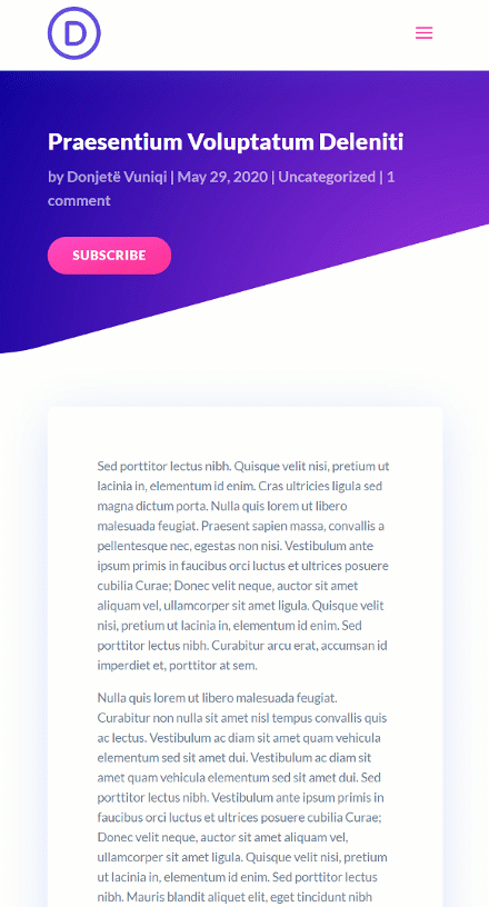
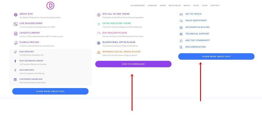
Preview
Before we dive into the tutorial, let’s take a quick look at the outcome across different screen sizes.
Desktop
Mobile
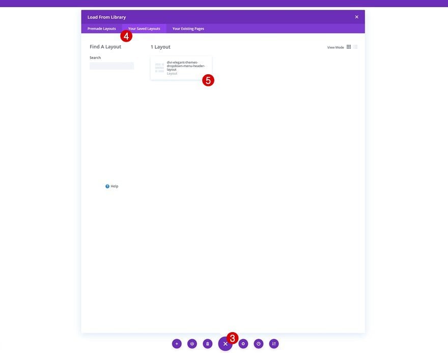
To lay your hands on the free header layout, you will first need to download it using the button below. To gain access to the download you will need to subscribe to our newsletter by using the form below. As a new subscriber, you will receive even more Divi goodness and a free Divi Layout pack every Monday! If you’re already on the list, simply enter your email address below and click download. You will not be “resubscribed” or receive extra emails.

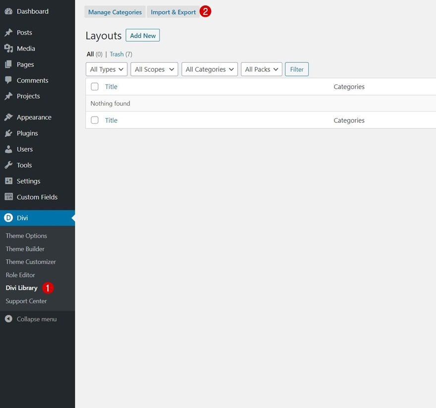
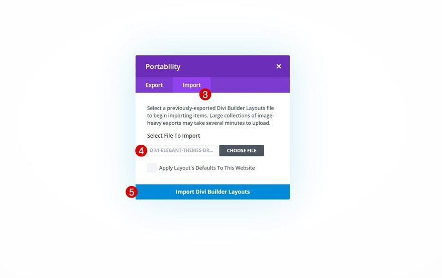
How to Upload the JSON File
Unzip the zipped folder you were able to download above. Then, navigate to your WordPress website > Divi > Divi Library and upload the JSON.
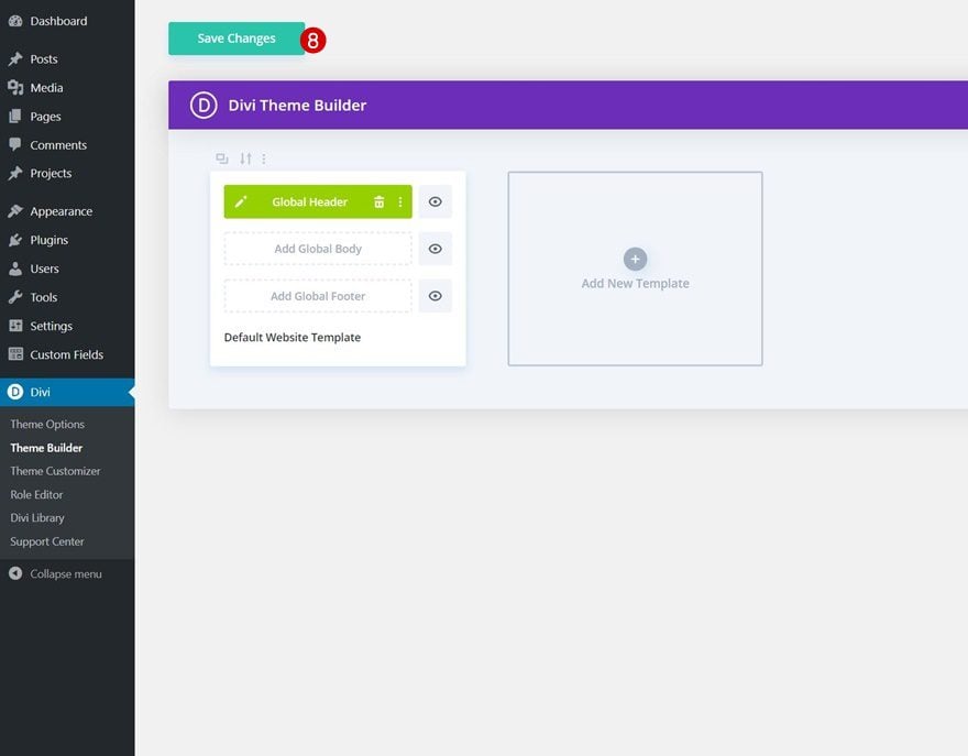
Once your layout is saved in the Divi Library, you can navigate to the Divi Theme Builder and import the saved layout by clicking on ‘Add Global Header’ or ‘Add Custom Header’ and selecting ‘Build Global/Custom Header’. Go to the ‘Your Saved Layouts’ tab in the Divi Library, select the layout you’ve uploaded in the previous step and save all Divi Theme Builder Changes.
To have a functioning menu right off the bat, you’ll be required to go through the first part of this tutorial below; adding the CSS classes to menu items on an individual level. You’ll also need to enable one of the CSS classes inside the Code Module as is shown in part 5 of this tutorial.
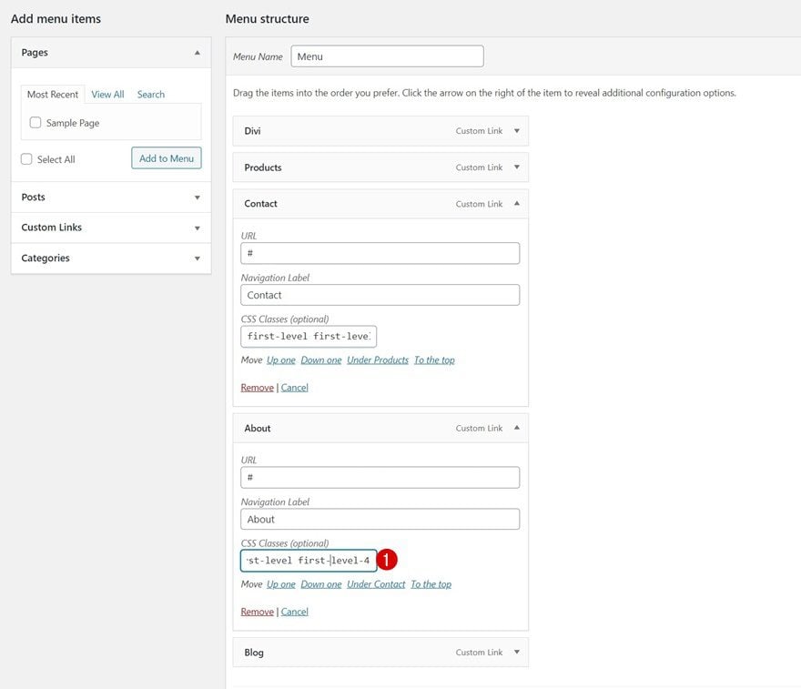
The first part of this tutorial focuses on setting up your WordPress menu items with the proper CSS classes. To do that, navigate to your WordPress dashboard > Menus > Create a new menu or open an existing one.
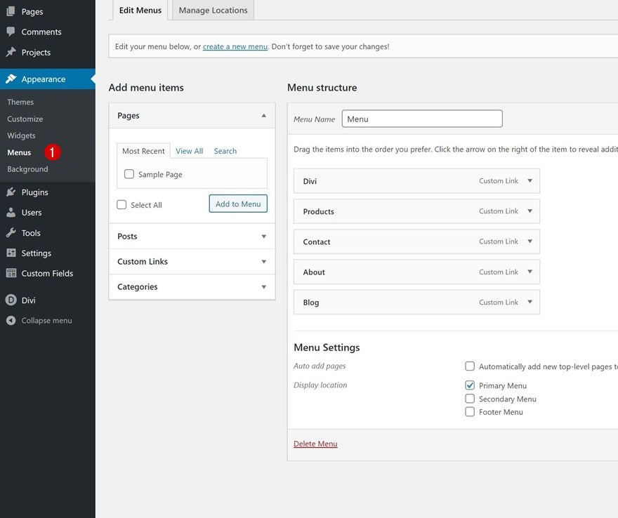
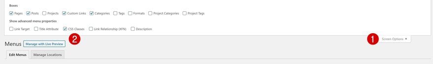
Enable CSS Class Option
Then, in the top right corner of your screen, you’ll notice the ‘Screen Options’. Toggle this option and enable ‘CSS Classes’ in the advanced menu properties. This will allow us to add CSS classes to specific menu items on an individual level.
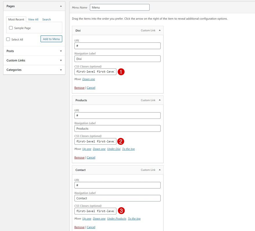
Throughout this tutorial, we’ll create three different dropdowns and assign each one of them to a specific menu item. To get that process going, we’ll need to assign two different CSS classes to the three menu items we want to contain a dropdown menu.
- First menu item you want to assign a dropdown to: first-level first-level-1
- Second menu item you want to assign a dropdown to: first-level first-level-2
- Third menu item you want to assign a dropdown to: first-level first-level-3
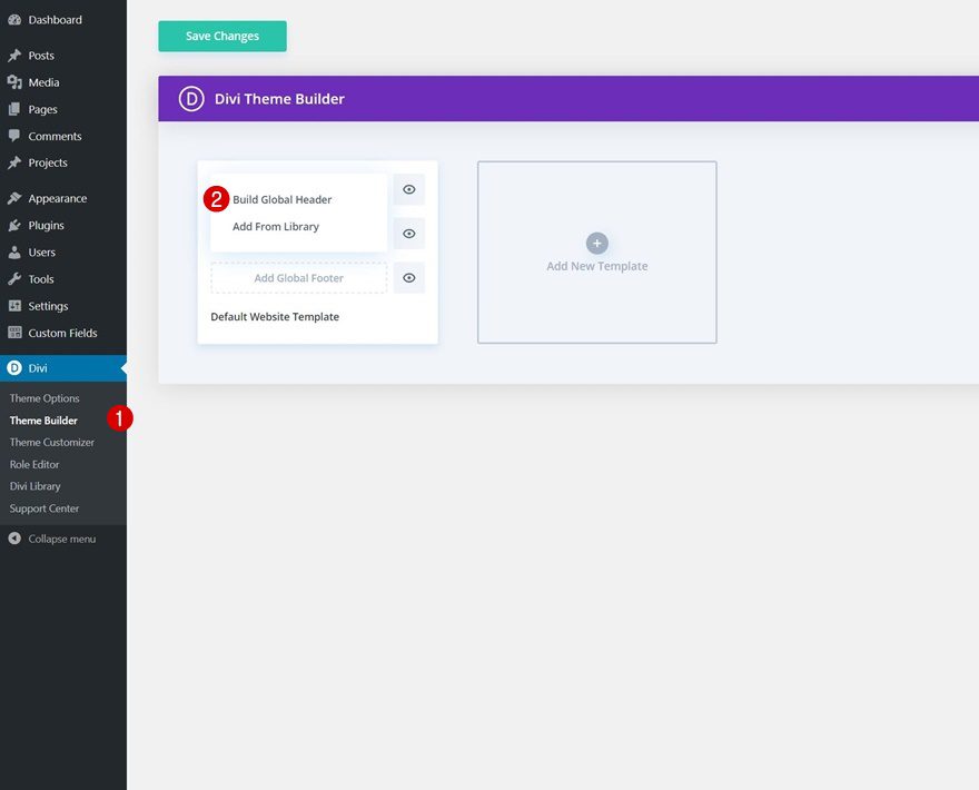
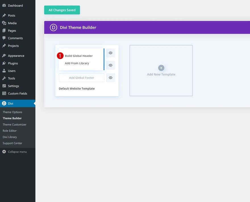
2. Create Custom Header with Divi’s Theme Builder
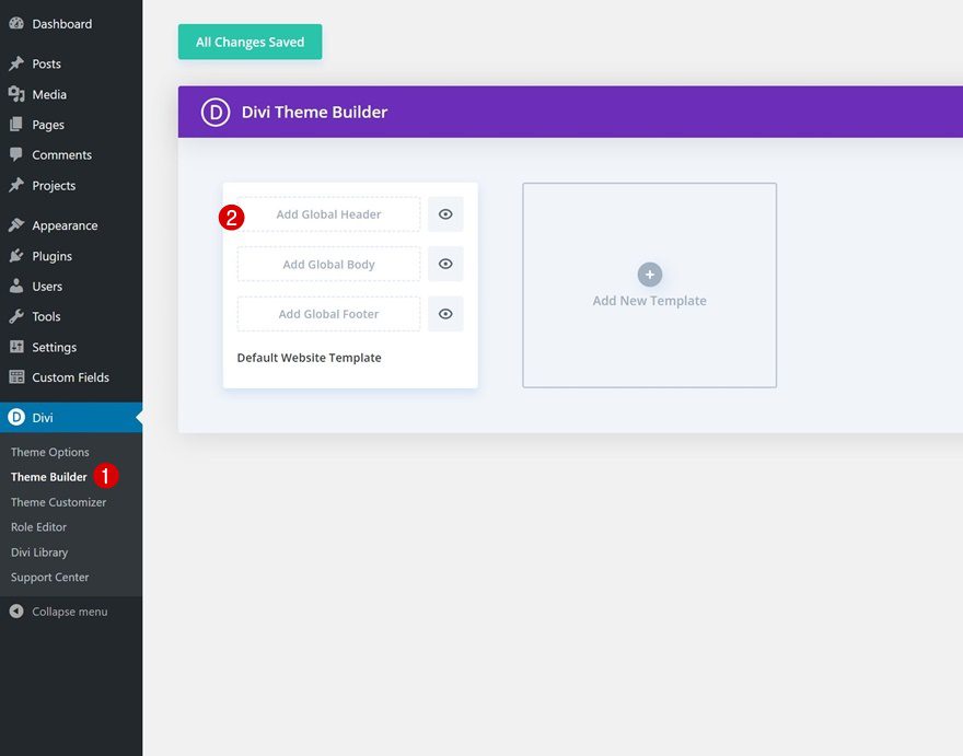
Go to Divi Theme Builder
Once the menu item CSS classes are in place, it’s time to switch over to Divi. Go to the Divi Theme Builder and select ‘Add Global/Custom Header’.
Start Building Global Header
Then, select ‘Build Global Header’ to be redirected to the template editor.
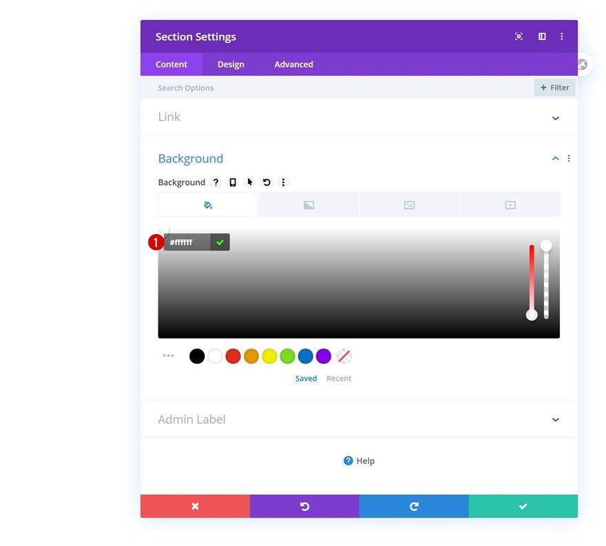
Section Settings
Background Color
Inside the template, you’ll notice a section. Open that section and change the background color.
- Background Color: #ffffff
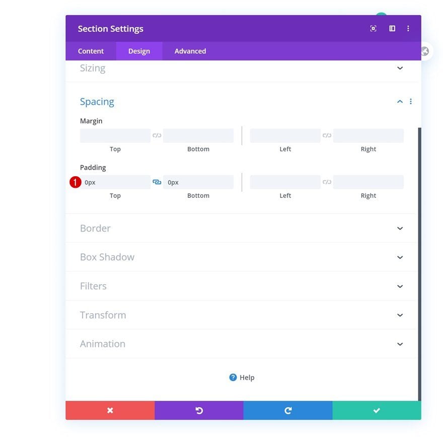
Spacing
Remove all default top and bottom section padding next.
- Top Padding: 0px
- Bottom Padding: 0px
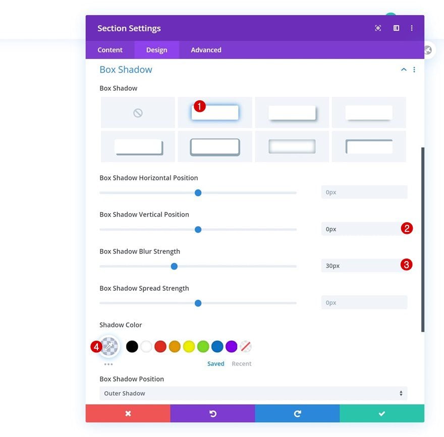
Box Shadow
And include a subtle box shadow as well.
- Box Shadow Vertical Position: 0px
- Box Shadow Blur Strength: 30px
- Shadow Color: rgba(103,151,255,0.17)
Add New Row
Column Structure
Continue by adding a first row to the section using the following column structure:
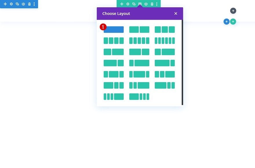
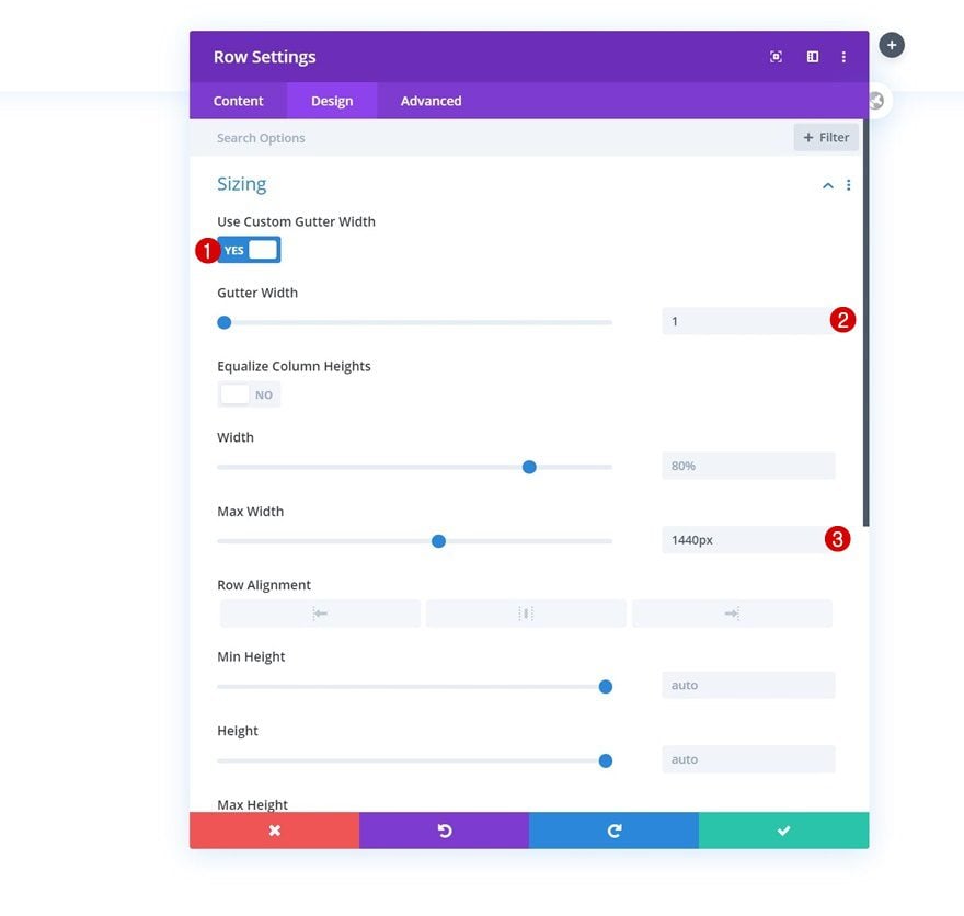
Sizing
Without adding any modules yet, open the row settings and modify the sizing settings as follows:
- Use Custom Gutter Width: Yes
- Gutter Width: 1
- Max Width: 1440px
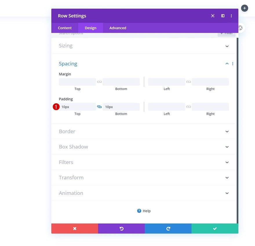
Spacing
Change the top and bottom padding values in the spacing settings next.
- Top Padding: 10px
- Bottom Padding: 10px
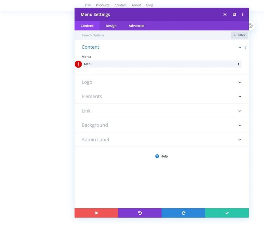
Select Menu
Then, add a Menu Module to your row’s column and select the WordPress menu you’ve modified in the first part of this tutorial.
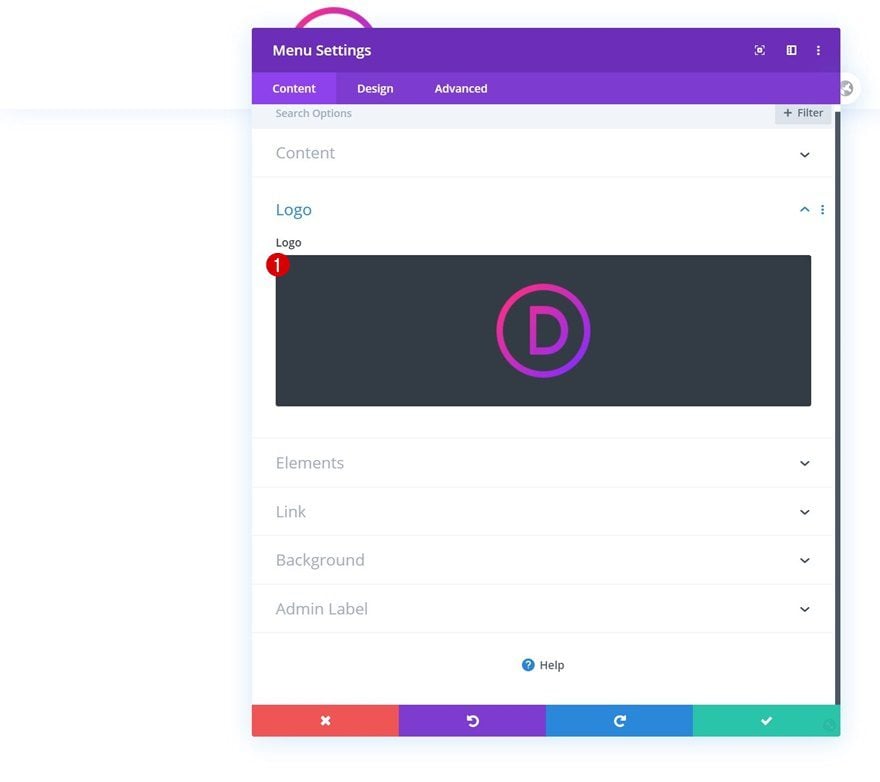
Upload Logo
Upload a logo next.
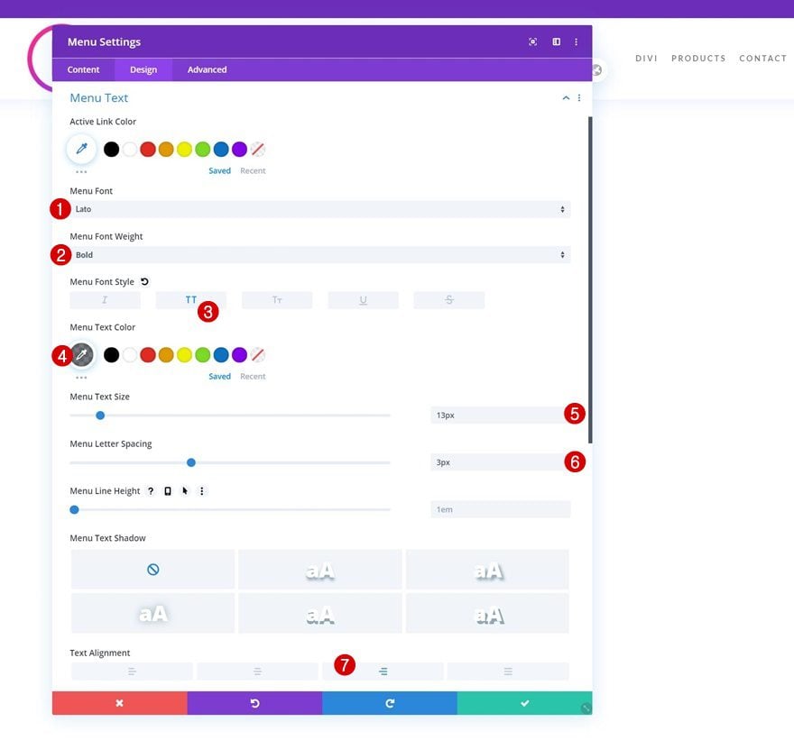
Menu Text Settings
Move on to the design tab and change the menu text settings accordingly:
- Menu Font: Lato
- Menu Font Weight: Bold
- Menu Font Style: Uppercase
- Menu Text Color: rgba(32,41,47,0.62)
- Menu Text Size: 13px
- Menu Letter Spacing: 3px
- Text Alignment: Right
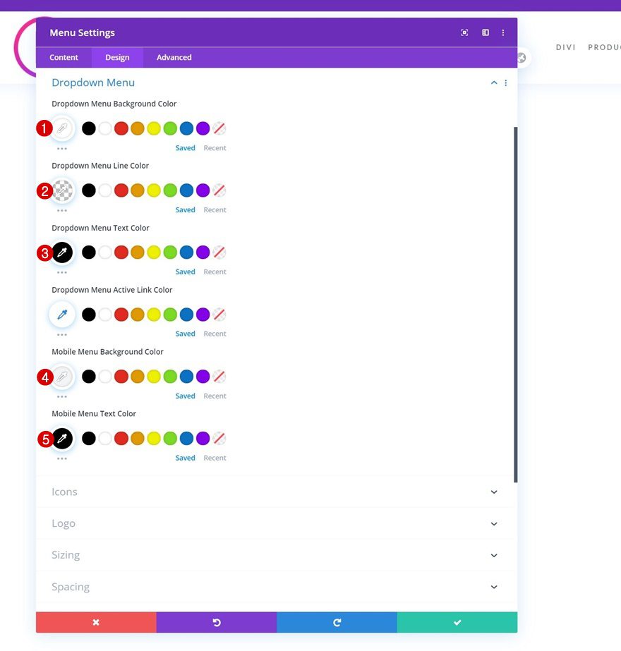
Dropdown Menu Settings
Make some changes to the dropdown menu settings next.
- Dropdown Menu Background Color: #ffffff
- Dropdown Menu Line Color: rgba(0,0,0,0)
- Dropdown Menu Text Color: #000000
- Mobile Menu Background Color: #f2f4f5
- Mobile Menu Text Color: #000000
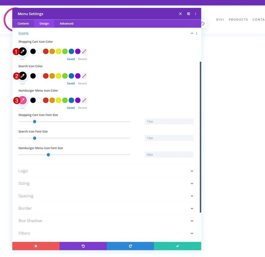
Icon Settings
As well as the icons settings.
- Shopping Cart Icon Color: #000000
- Search Icon Color: #000000
- Hamburger Menu Icon Color: #ff4a9e
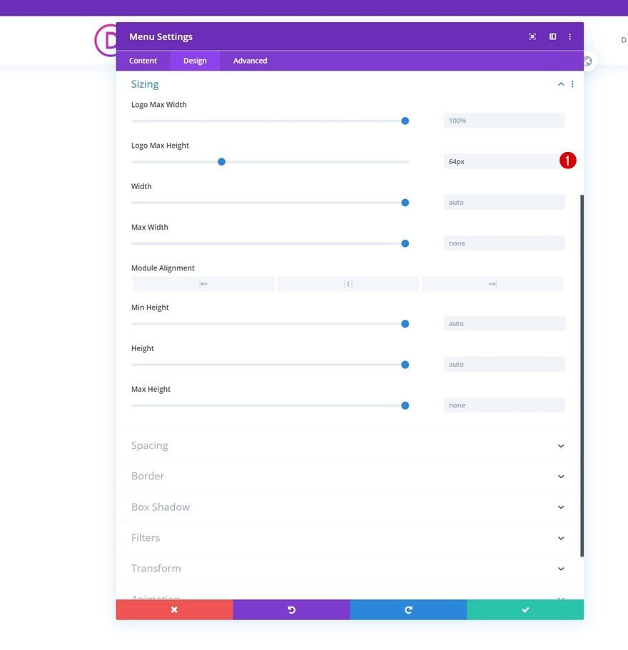
Sizing
And complete the module settings by assigning a logo max height to the sizing settings.
- Logo Max Height: 64px
3. Create Dropdown Elements
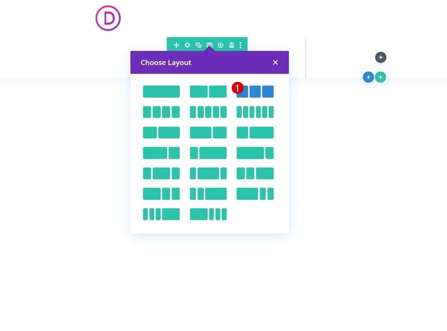
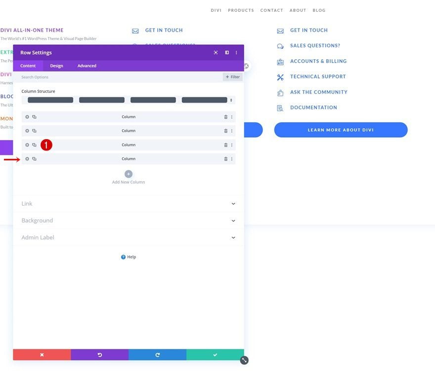
Add New Row to Section
Column Structure (Matching Number of Dropdown Menus Needed)
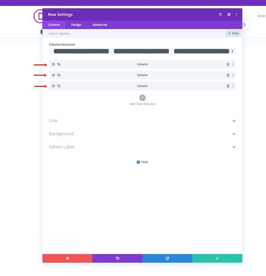
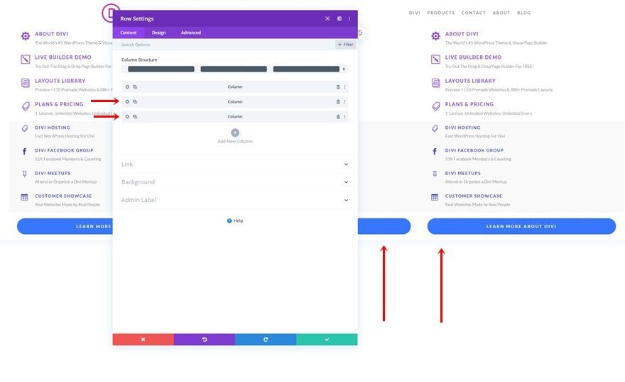
Once your default menu is in place, it’s time to create the dropdown menus. To do that, we’ll add a new row containing three equally-sized columns. The number of columns matches the number of dropdown menus we’ll create.
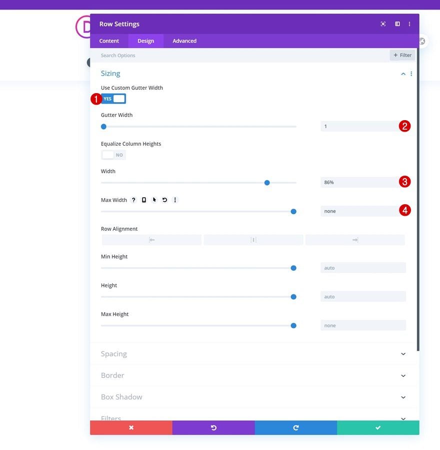
Sizing
Without adding any modules yet, open the row settings and modify the sizing settings accordingly:
- Use Custom Gutter Width: Yes
- Gutter Width: 1
- Width: 86%
- Max Width: None
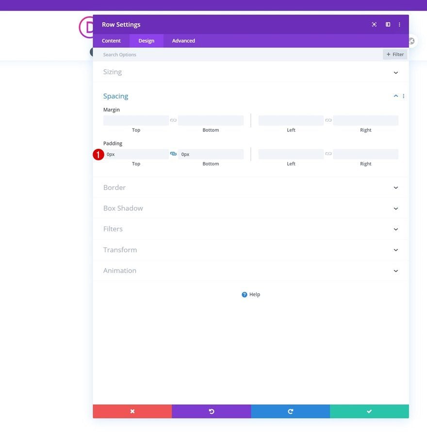
Spacing
Remove all default top and bottom padding next.
- Top Padding: 0px
- Bottom Padding: 0px
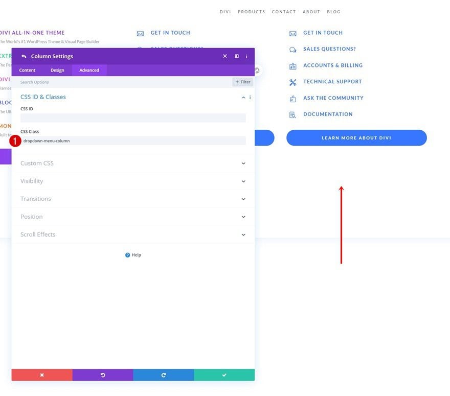
CSS Class
And assign a CSS class to the row.
- CSS Class: dropdown-menu-row

All Column CSS Classes
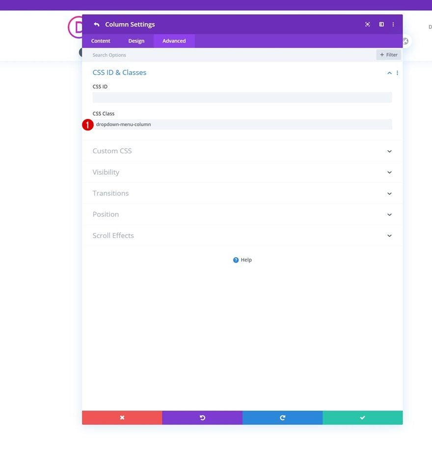
Once you’ve completed the general row settings, open each column individually and assign the following CSS class:
- CSS Class: dropdown-menu-column
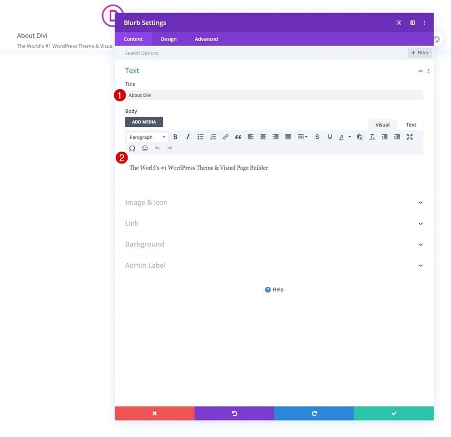
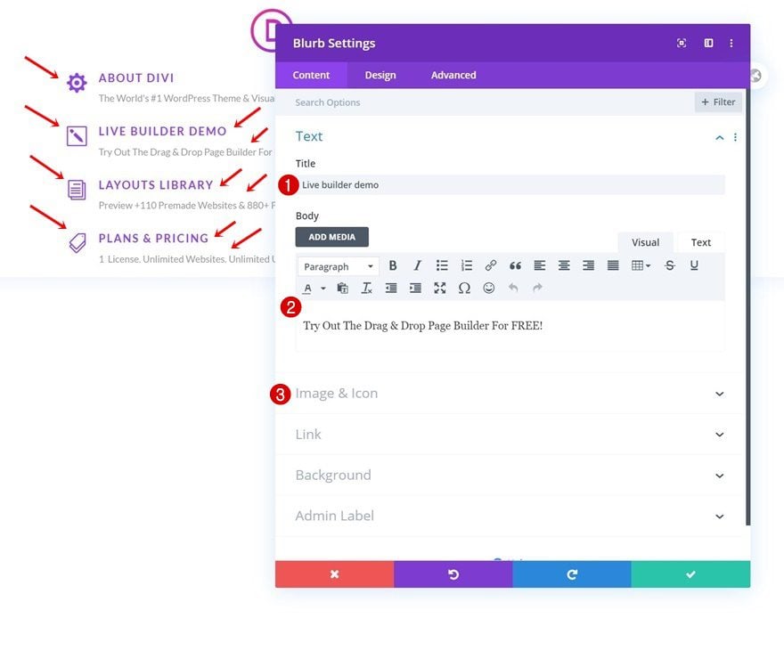
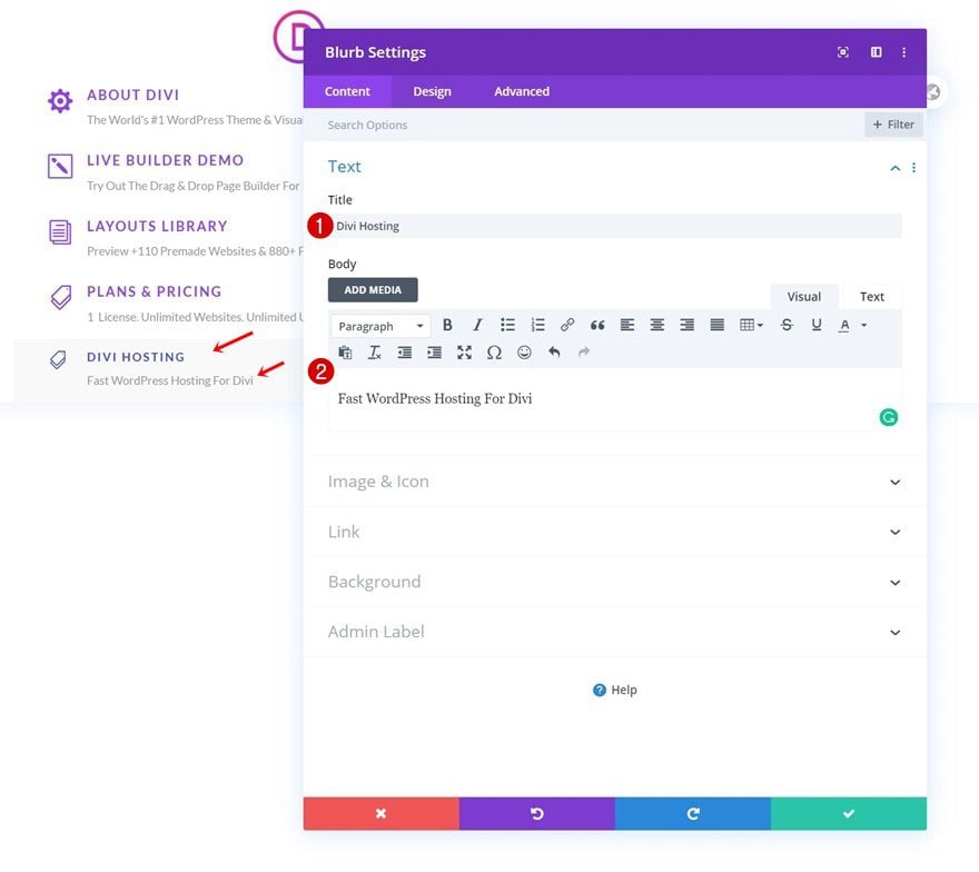
Add Blurb Module #1 to Column 1
Add Content
Time to add modules! We’ll start by creating the first dropdown menu in the first column. To display all different products, we’ll use Divi’s Blurb Module. Add some content of your choice.
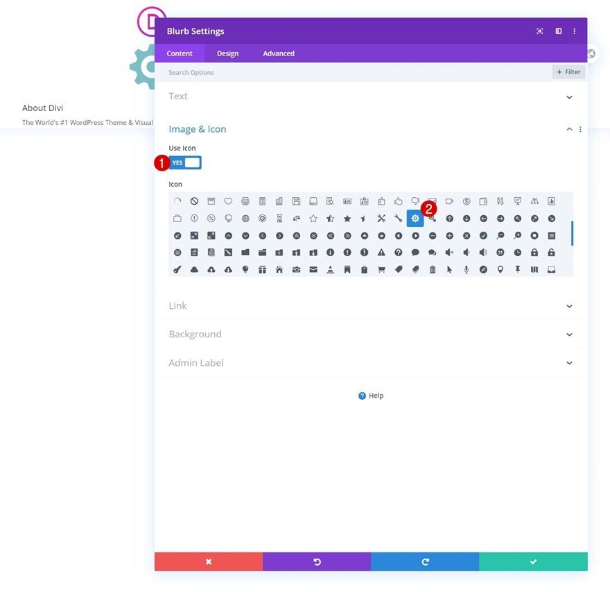
Select Icon
Then, select a matching icon.
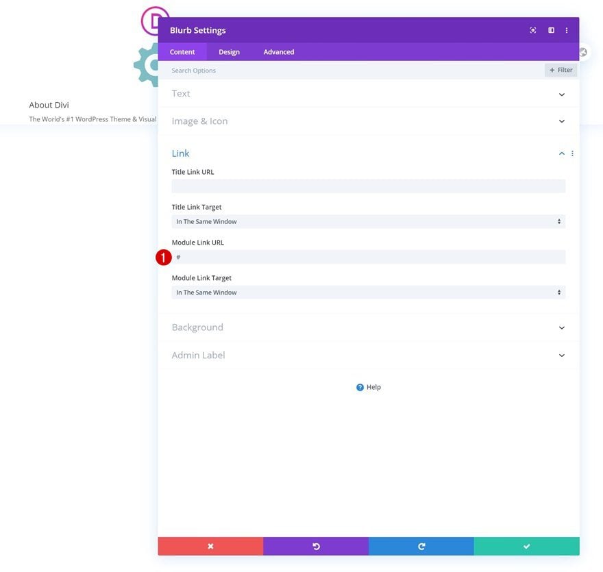
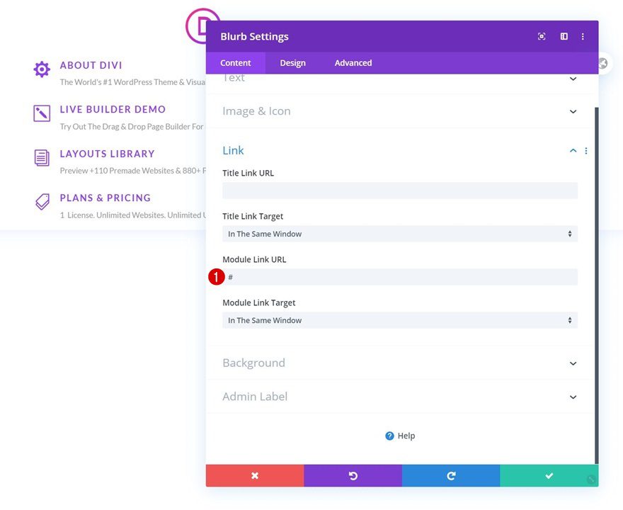
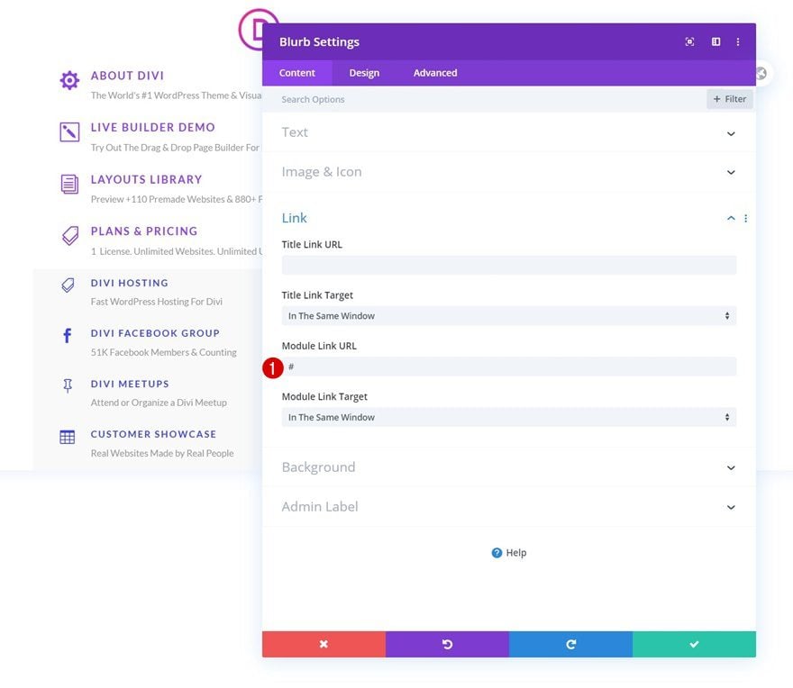
Add Link
Add a link to the module too.
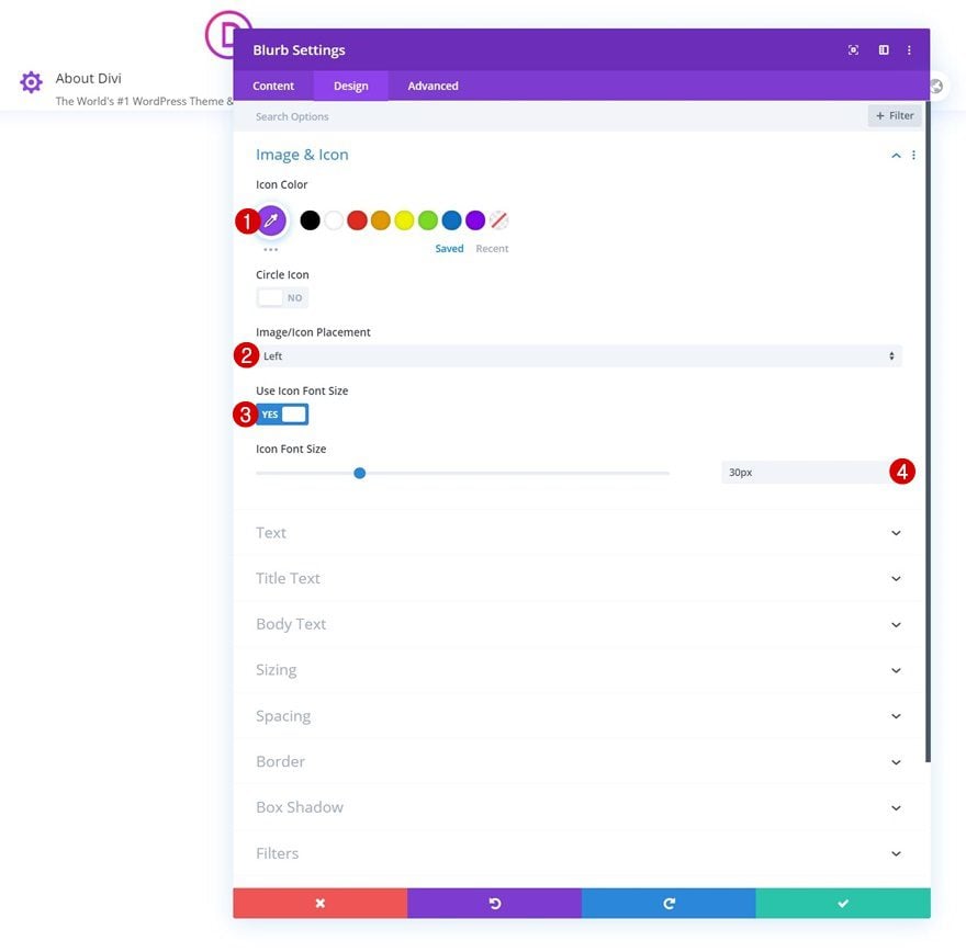
Icon Settings
Move on to the design tab and style the icon settings as follows:
- Icon Color: #8f42ec
- Image/Icon Placement: Left
- Use Icon Font Size: Yes
- Icon Font Size: 30px
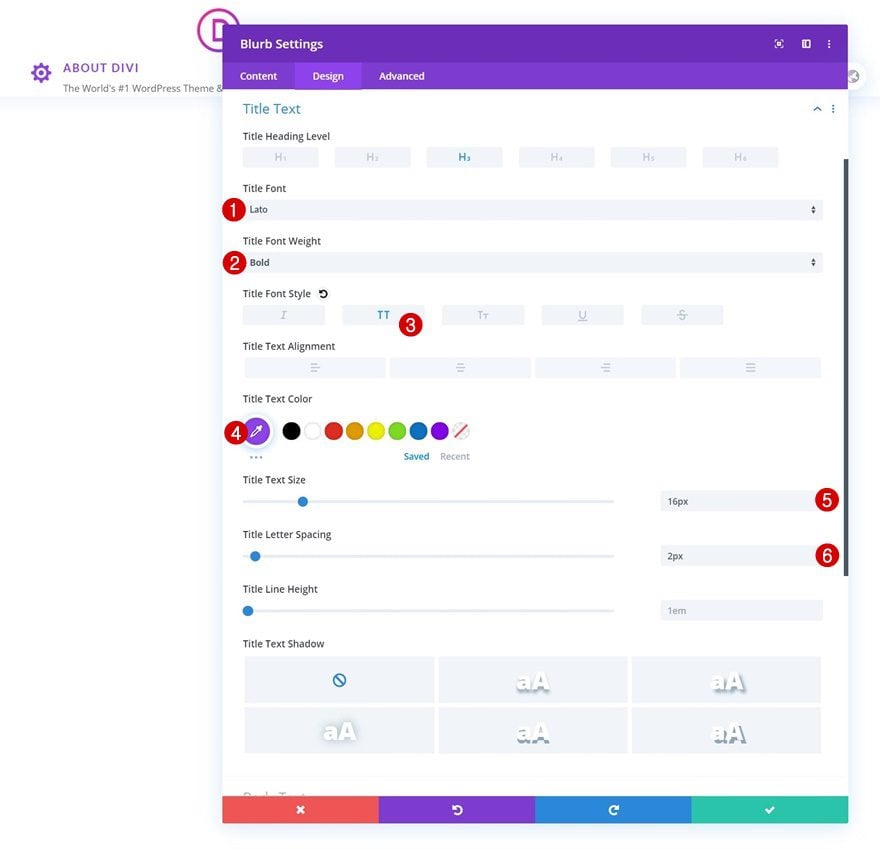
Title Text Settings
Then, style the title text.
- Title Font: Lato
- Title Font Weight: Bold
- Title Font Style: Uppercase
- Title Text Color: #8f42ec
- Title Text Size: 16px
- Title Letter Spacing: 2px
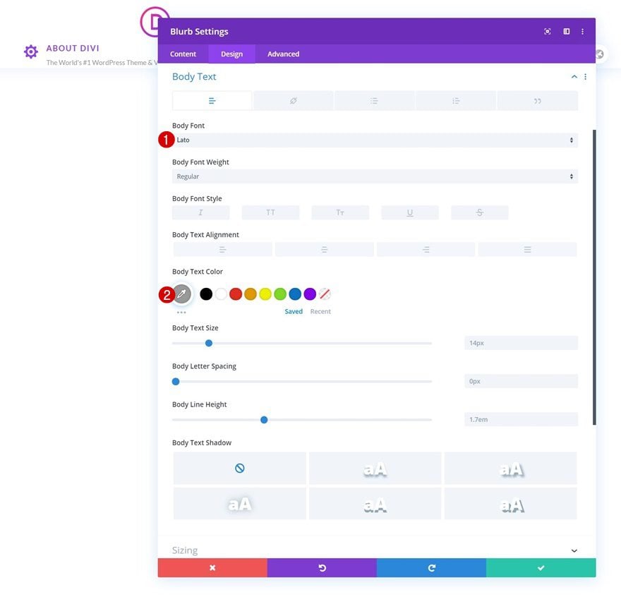
Body Text Settings
Along with the body text.
- Body Font: Lato
- Body Text Color: #999999
Sizing
We’re making sure the content width is ‘100%’ too.
- Content Width: 100%
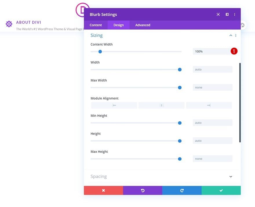
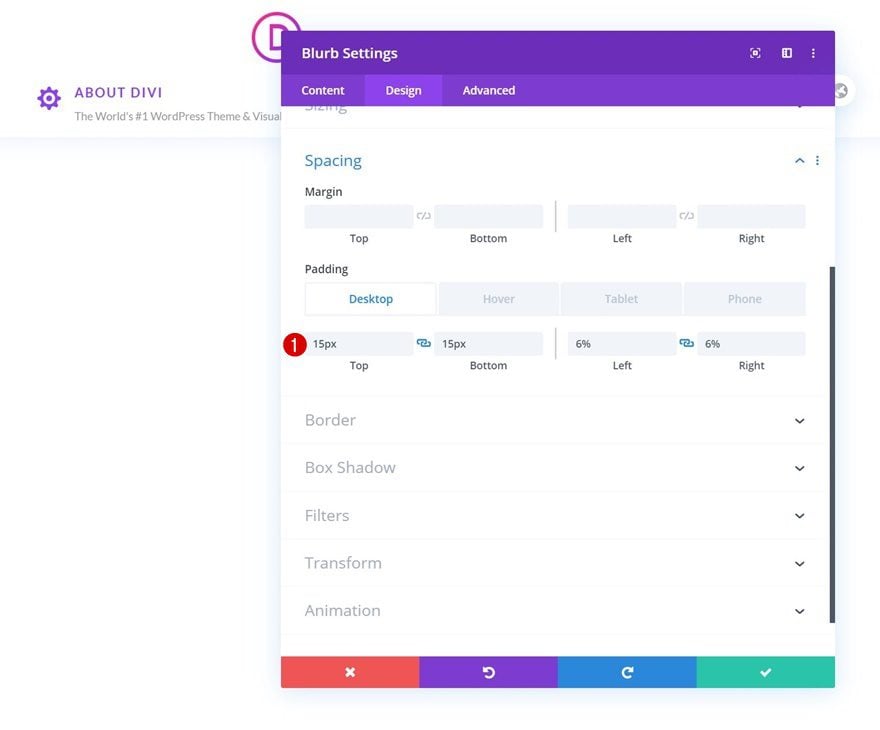
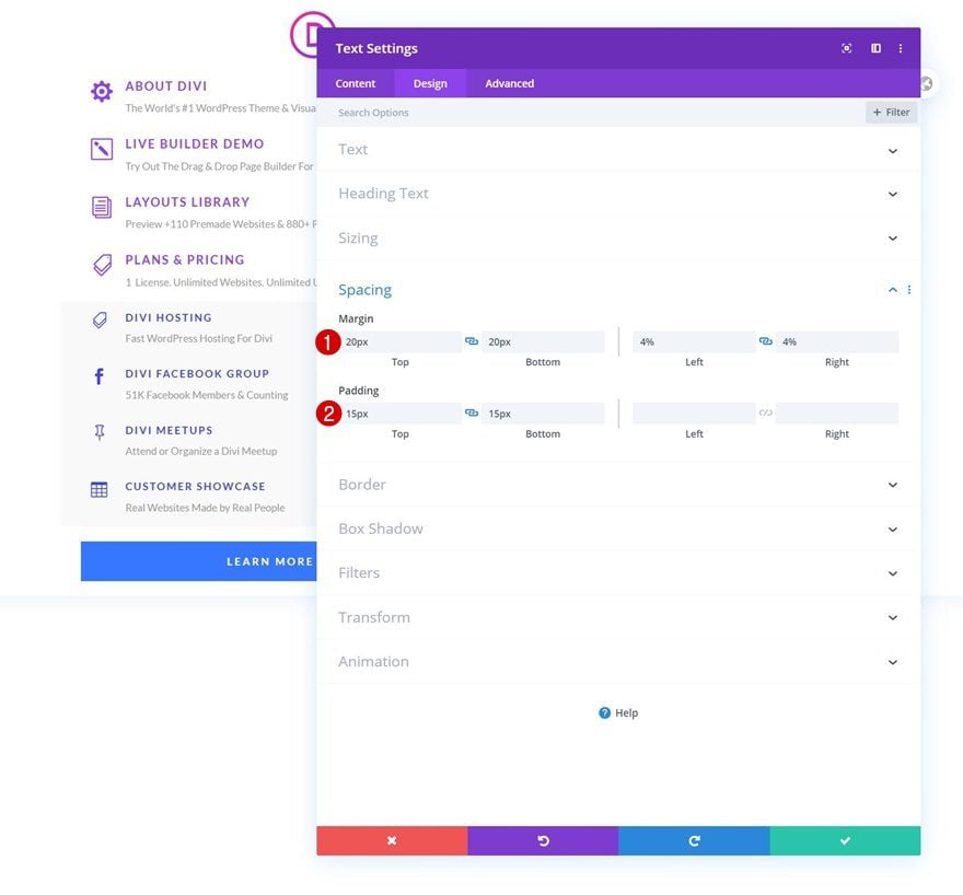
Spacing
Then, we’ll go to the spacing settings and use some different padding values across different screen sizes.
- Top Padding: 15px
- Bottom Padding: 15px
- Left Padding: 6% (Desktop), 2% (Tablet), 3% (Phone)
- Right Padding: 6% (Desktop), 2% (Tablet), 3% (Phone)
Hover:
- Top Padding: 15px
- Bottom Padding: 15px
- Left Padding: 8%
- Right Padding: 4%
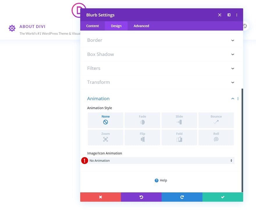
Animations
We’ll remove the default icon animation in the animation settings next.
- Image/Icon Animation: No Animation
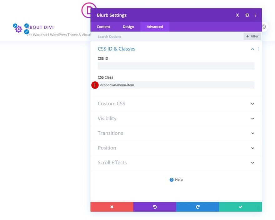
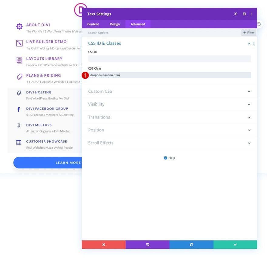
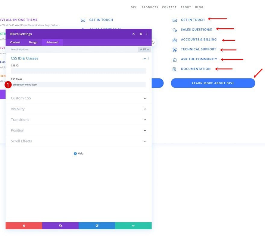
CSS Class
Then, we’ll move on to the advanced tab and assign a CSS class to our module. Each and every module in your dropdown menu needs the same CSS class assigned to it to be included in the dropdown.
- CSS Class: dropdown-menu-item
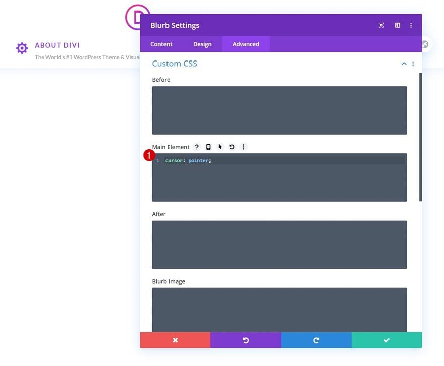
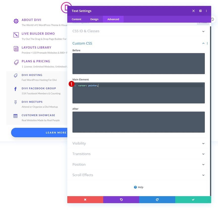
Main Element CSS
Last but not least, we’ll complete the module settings by changing the cursor using one line of CSS code in the main element.
cursor: pointer;
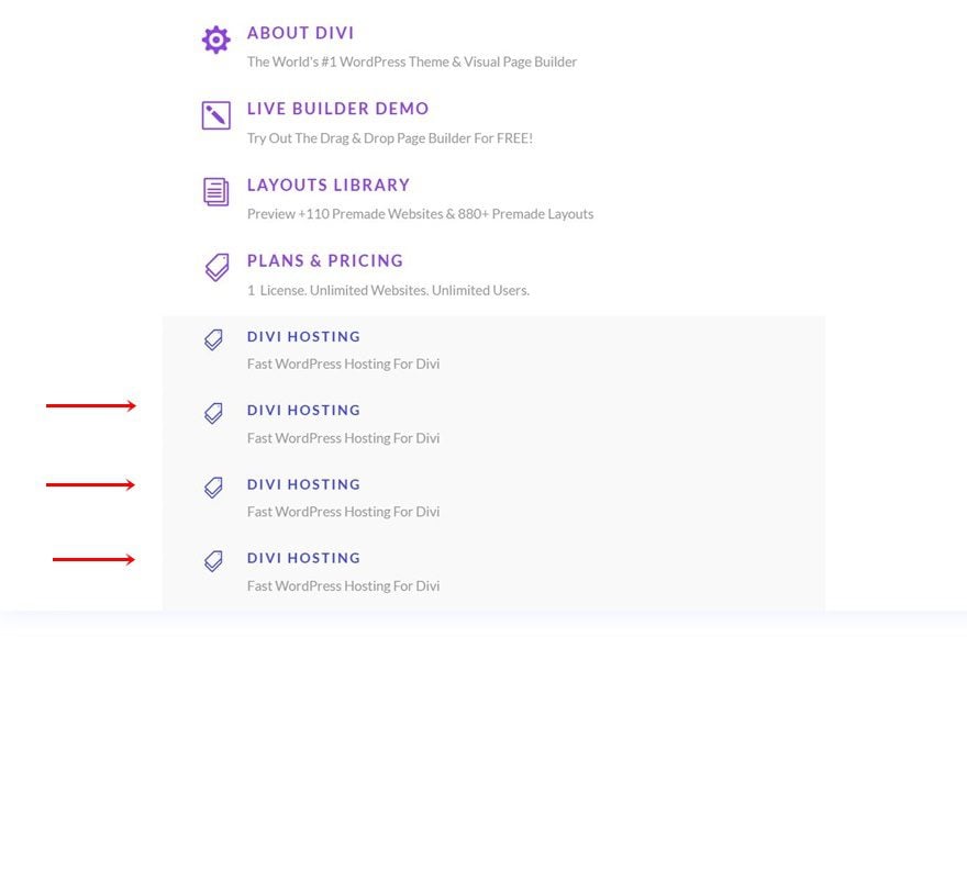
Clone Blurb Module x3
Once you’ve completed the first Blurb Module, clone it three times.
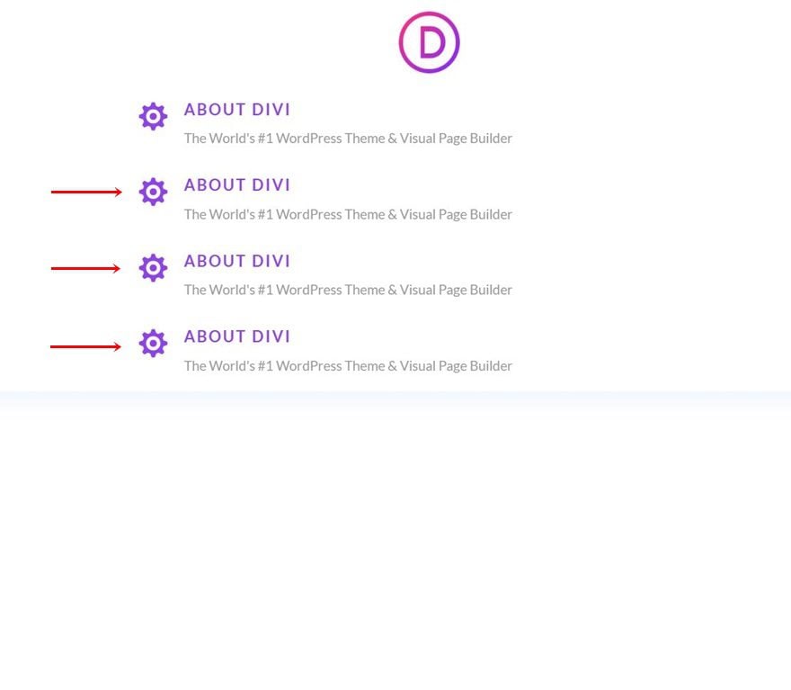
Change Content & Icons
Modify all content and icons for each duplicate.
Change Links
Along with the links.
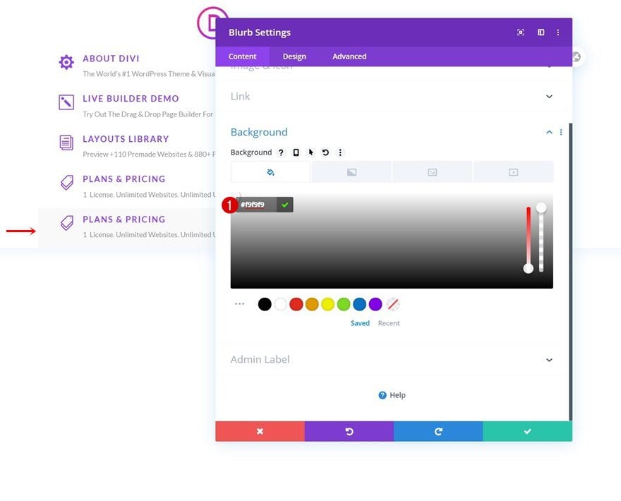
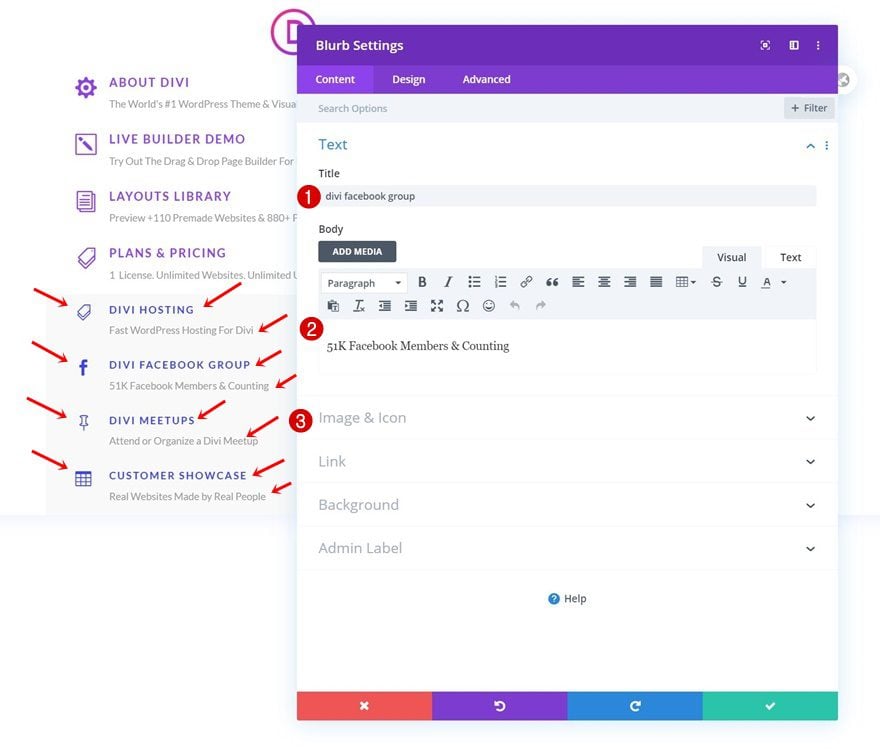
Clone Last Blurb Module Once
Continue by cloning the last Blurb Module in the column once.
Add Background Color
Open the duplicate Blurb Module’s settings and change the background color.
- Background Color: #f9f9f9
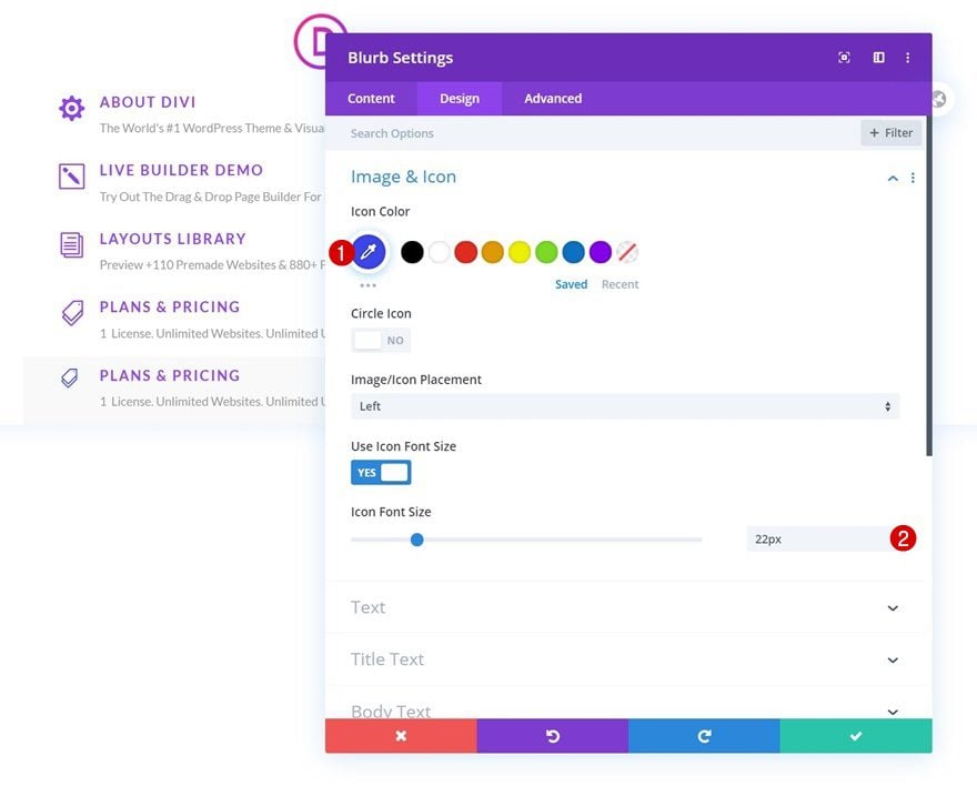
Change Icon Settings
Modify the icon settings too.
- Icon Color: #3b45eb
- Icon Font Size: 22px
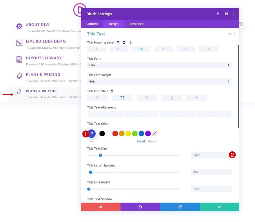
Change Title Text Settings
Along with the title text settings.
- Title Text Color: #3b45eb
- Title Text Size: 14px
Change Content & Link
And, of course, the content and link.
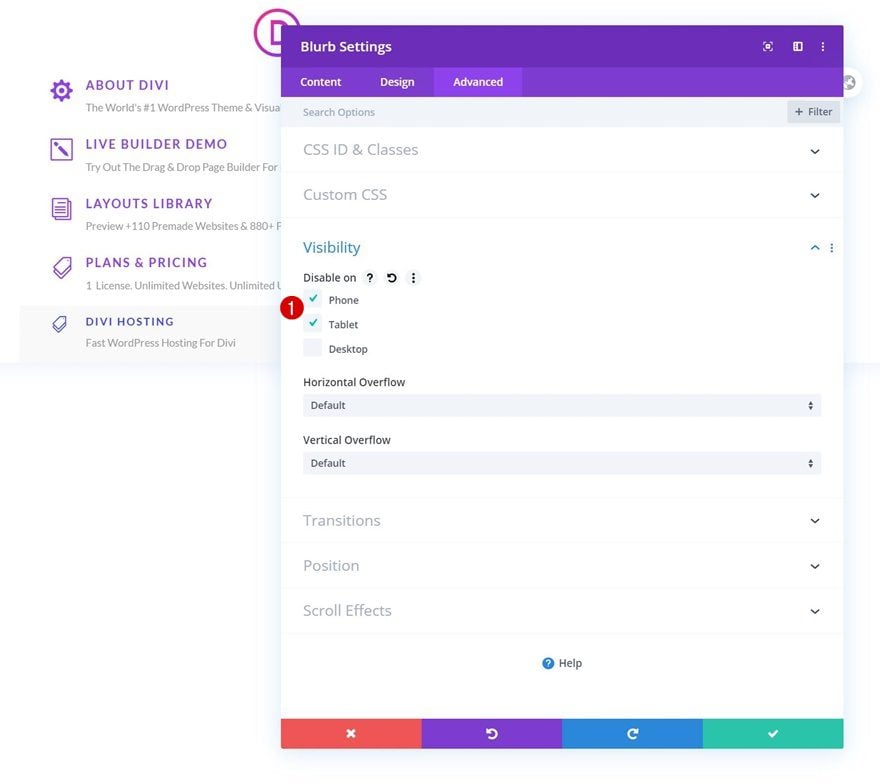
Disable on Tablet & Phone
The second type of Blurb Module we have in this dropdown will only be visible on larger screen sizes. This will help us ensure that the dropdown menu doesn’t get too overwhelming on smaller screen sizes. To do hide the module on smaller screen sizes, go to the advanced tab and disable the module on tablet and phone.
Clone Blurb Module x3
Once your second type of Blurb Module is completed, you can clone it three times.
Change Content & Icons
Make sure you change the content and icons for each duplicate.
Change Links
Along with the links.
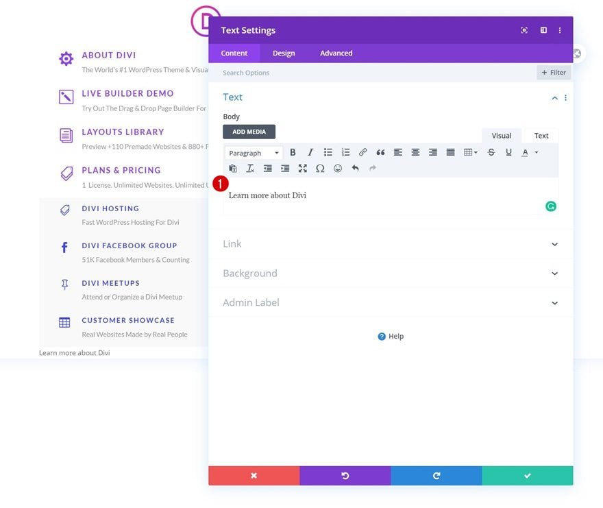
Add Text Module to Column 1
Add Content
The last module we need in our dropdown menu is a Text Module. We’re using a Text Module instead of a Button Module because the Text Module will more easily adapt to the dropdown environment. Add some copy of your choice.
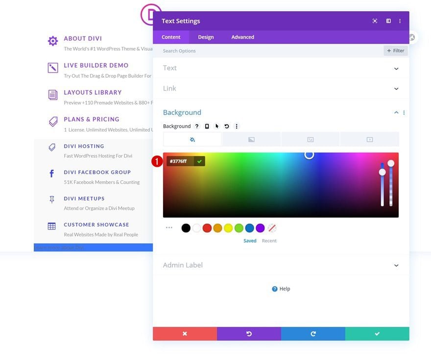
Background Color
Then, change the background color.
- Background Color: #3776ff
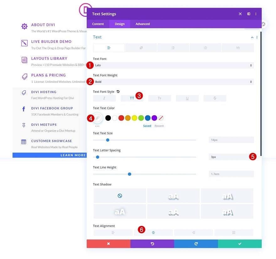
Text Settings
Move on to the design tab and modify the text settings accordingly:
- Text Font: Lato
- Text Font Weight: Bold
- Text Font Style: Uppercase
- Text Color: #ffffff
- Text Letter Spacing: 3px
- Text Alignment: Center
Spacing
Add some custom spacing values too.
- Top Margin: 20px
- Bottom Margin: 20px
- Left Margin: 4%
- Right Margin: 4%
- Top Padding: 15px
- Bottom Padding: 15px
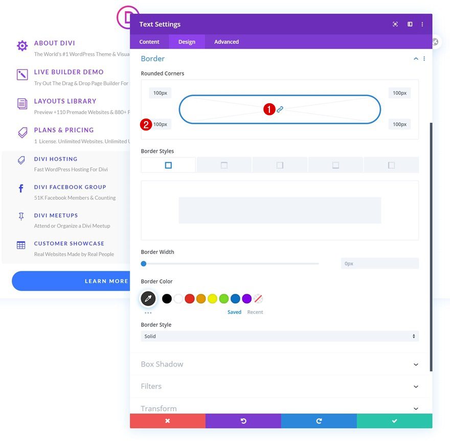
Border
Then, add rounded corners to the border settings.
- All Corners: 100px
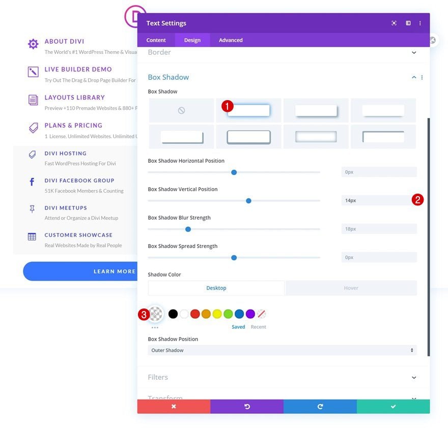
Box Shadow
Enable a subtle box shadow.
- Box Shadow Vertical Position: 14px
- Shadow Color: rgba(0,0,0,0) (Default), rgba(0,0,0,0.09) (Hover)
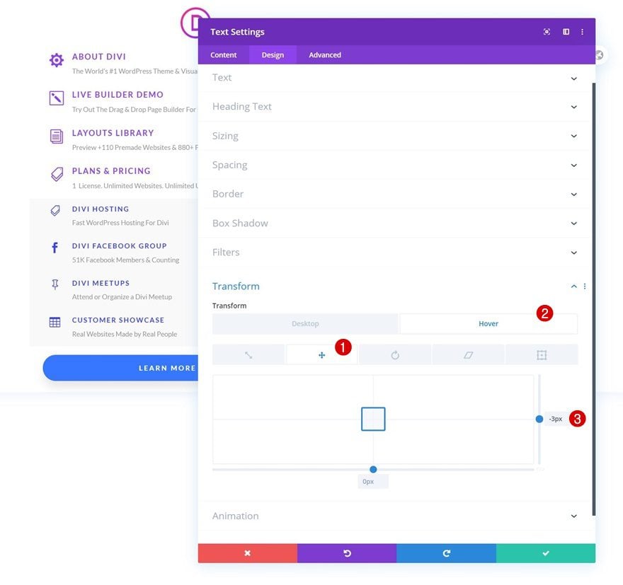
Transform Translate
On hover, we want the button to slightly go up. To add that effect, we’ll use some custom transform translate settings on hover.
- Right: -3px (Hover)
CSS Class
Like all other modules in our dropdown, this module needs the following CSS class:
- CSS Class: dropdown-menu-item
Main Element CSS
And we’ll complete the module settings by changing the cursor using one line of CSS code in the main element.
cursor: pointer;
Delete Column 2 & 3
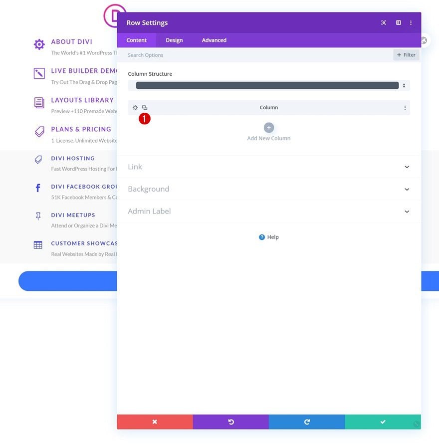
Once you’ve completed the first dropdown menu column, you can open the row settings and remove the two empty columns in the row.
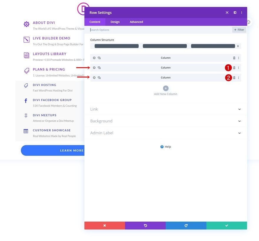
Clone First Column Twice
Clone the first column twice.
Customize Items
And customize all items in the two other dropdown menus however you like.
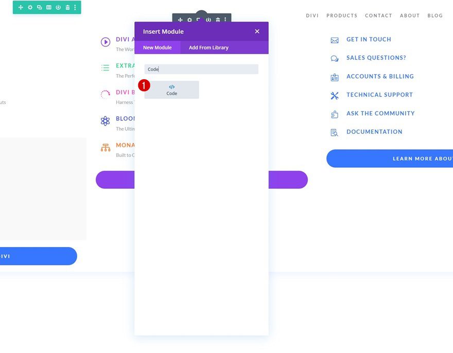
4. Add CSS & JQuery Code
Add New Code Module to Row #1 Column
Now that we have all the dropdown menu items in place, it’s time to turn them into a dropdown menu and place the dropdown menu inside a matching menu item. Add a Code Module to your first row, right below the Menu Module.
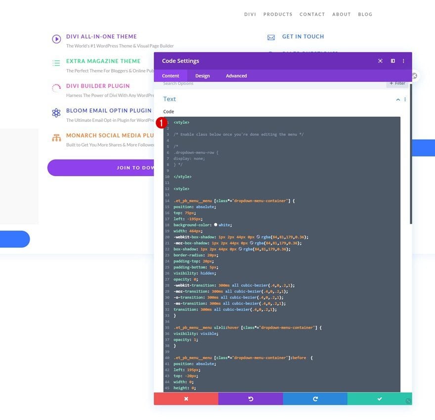
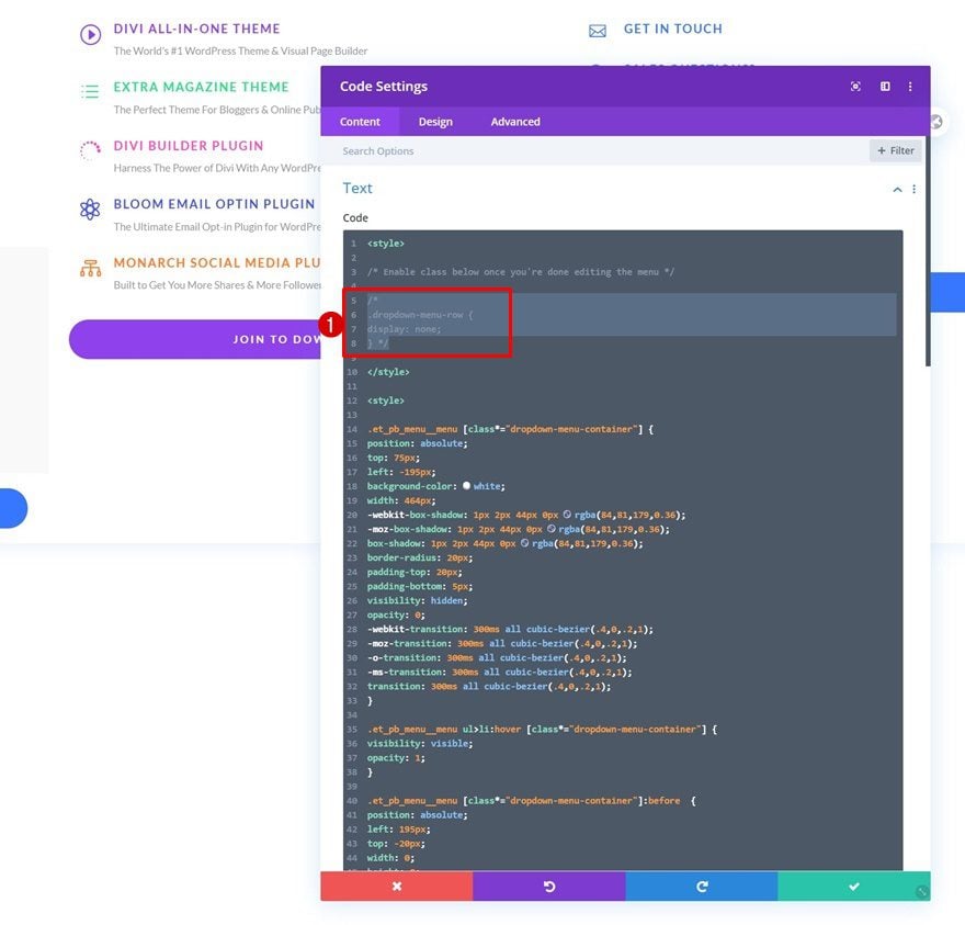
Insert CSS Code
And insert the following CSS code:
<style>

/* Enable class below once you're done editing the menu */

/*
.dropdown-menu-row {
display: none;
}*/

</style>
<style>

.et_pb_menu__menu [class*="dropdown-menu-container"] {
position: absolute;
top: 75px;
left: -195px;
background-color: white;
width: 464px;
-webkit-box-shadow: 1px 2px 44px 0px rgba(84,81,179,0.36);
-moz-box-shadow: 1px 2px 44px 0px rgba(84,81,179,0.36);
box-shadow: 1px 2px 44px 0px rgba(84,81,179,0.36);
border-radius: 20px;
padding-top: 20px;
padding-bottom: 5px;
visibility: hidden;
opacity: 0;
-webkit-transition: 300ms all cubic-bezier(.4,0,.2,1);
-moz-transition: 300ms all cubic-bezier(.4,0,.2,1);
-o-transition: 300ms all cubic-bezier(.4,0,.2,1);
-ms-transition: 300ms all cubic-bezier(.4,0,.2,1);
transition: 300ms all cubic-bezier(.4,0,.2,1);
}

.et_pb_menu__menu ul>li:hover [class*="dropdown-menu-container"] {
visibility: visible;
opacity: 1;
}

.et_pb_menu__menu [class*="dropdown-menu-container"]:before  {
position: absolute;
left: 195px;
top: -20px;
width: 0;
height: 0;
content: '';
border-left: 20px solid transparent;
border-right: 20px solid transparent;
border-bottom: 20px solid white;
}
.et_mobile_menu [class*="dropdown-menu-container"] {
background-color: white;
padding-top: 25px;
padding-bottom: 5px;
}
.et_mobile_menu li > a {
background-color: transparent;
position: relative;
}

.et_mobile_menu .first-level > a:after {
font-family: 'ETmodules';
content: '\4c';
color: #FF4A9E;
font-weight: normal;
position: absolute;
font-size: 16px;
top: 13px;
right: 10px;
}

.et_mobile_menu .first-level > .icon-switch:after{
content: '\21';
color: #c9c9c9;
}

.et_mobile_menu [class*="dropdown-menu-container"] {
display: none;
}

.et_mobile_menu [class*="dropdown-menu-container"].reveal-items {
display: block;
}

.et_mobile_menu {
width: 130%;
margin-left: -15% !important;
min-height: 100vh;
}
</style>
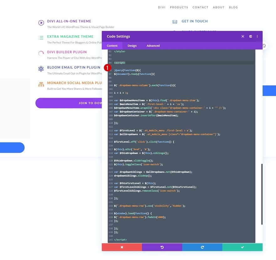
Insert JQuery Code
We’re using some JQuery code as well. Make sure you place this code between script tags as you can see in the print screen below.
jQuery(function($){
$(document).ready(function(){

$('.dropdown-menu-column').each(function(i){

i = i + 1;

var $dropdownMenuItems = $(this).find('.dropdown-menu-item');
var $mainMenuItem = $('.first-level-' + i + '>a');
$dropdownMenuItems.wrapAll('<div class="dropdown-menu-container-' + i + '" />');
var $dropdownContainer = $('.dropdown-menu-container-' + i);
$dropdownContainer.insertAfter($mainMenuItem);

});
var $firstLevel = $('.et_mobile_menu .first-level > a');
var $allDropdowns = $('.et_mobile_menu [class*="dropdown-menu-container"]');
$firstLevel.off('click').click(function() {
$(this).attr('href', '#');
var $thisDropdown = $(this).siblings();
$thisDropdown.slideToggle();
$(this).toggleClass('icon-switch');
var dropdownSiblings = $allDropdowns.not($thisDropdown);
dropdownSiblings.slideUp();
var $thisFirstLevel = $(this);
var $firstLevelSiblings = $firstLevel.not($thisFirstLevel);
$firstLevelSiblings.removeClass('icon-switch');
});

$(".dropdown-menu-row").css('visibility','hidden');

$(window).load(function() {
$(".dropdown-menu-row").fadeIn(1000);
});

});
});
As soon as you’re done customizing all the dropdown items, you’ll have one thing left to do: hiding the entire row containing the dropdown menu items. This, in combination with a load function inside our code, will prevent the dropdown menus from showing up when loading the page. Once you enable this CSS class, you won’t see the second row inside the Visual Builder anymore, but you’ll be able to access it in the wireframe mode and/or temporarily disable the CSS class when making changes to your dropdown menus. To enable the class, remove the ‘/* */’ brackets at the beginning and end of the CSS class.
- CSS Class: dropdown-menu-row
If you’re looking for a way to add more than 3 dropdown menus to your menu, you’ll need to navigate back to your menu and add consecutive CSS classes to the fourth menu item.
- Fourth menu item you want to assign a dropdown to: first-level first-level-4
Clone Column at End of Row
Then, go back to your header and clone the last column.
Make Sure Column & Module CSS Classes are in Place
Make sure the column and module CSS classes are in place for the new dropdown menu and you’re done! It’s important to always dedicate a new column to a new dropdown menu and to follow the column order of the row. This means that column 1 will be dropdown 1, column 2 will be dropdown 2, etc.
- Column CSS Class: dropdown-menu-column
- Module CSS Class: dropdown-menu-item
Preview
Now that we’ve gone through all the steps, let’s take a final look at the outcome across different screen sizes.
Desktop
Mobile
Final Thoughts
In this tutorial, we’ve shown you how to recreate the Elegant Themes dropdown menu using Divi’s Theme Builder. We’ve combined the best of both worlds and used Divi’s built-in elements to style all items in our dropdown menu, then used some code to place all dropdowns inside their matching menu item inside the WordPress menu. You were able to download the JSON file for free as well! If you have any questions or suggestions, feel free to leave a comment in the comment section below.
If you’re eager to learn more about Divi and get more Divi freebies, make sure you subscribe to our email newsletter and YouTube channel so you’ll always be one of the first people to know and get benefits from this free content.


Any chance of an updated guide that is compatible with Divi 5?
Thanks for the suggestion! That sounds like a fantastic idea. We’ll definitely pass this request along to our content team so they can look into creating an updated guide for Divi 5. Stay tuned!
Maybe this is not yet compatible with DIVI 5?
I see the message “Your Save Has Failed.”
Hey, Yeasir! The common reason for this can be a firewall block or a conflict with third-party plugins or code. We advise starting with Safe Mode, our theme’s diagnostic tool, to check if the issue comes from a third-party source. If nothing helps, feel free to reach out to our friendly support. 😊
Will You Provide and update to this to include you new menu system on Elegant themes
Right now it displaying the column, i want to display whole row, how do i do that?
The article displays the dropdown per column. You can display the whole Row by moving the entire dropdown Row to a different Section and then moving over the classes.
I’ve created a recording as a guide on how to achieve that:
https://go.screenpal.com/watch/cZQe17VRZYj
Here’s what I did in the recording 🔽
[1] Move the Dropdown Row to a different Section
[2] Move the class dropdown-menu-row from the Row to the Section
[3] Move the class dropdown-menu-column from the Column to the Row
[4] Move the class dropdown-menu-item from the Blurbs to the Columns. Then I removed all the classes added to the Blurbs and Text Modules.
[5] Made some adjustments to the CSS codes.
[6] You can duplicate the Row and modify the items, it will then automatically appear in the other First Level Menu Item.
Hi Charry, What’s the best approach for creating containers dropdowns of different sizes, like one taking up the full width, another 25%, one at 50%, and so on?
Hi all,
Firstly, what a great tutorial.
I have a problem where when I hover over the main menu item, the dropdown appears but it is behind the text of the main page. I can’t to see anywhere to change the layer order.
Could anybody kindly help please.
Thanks.
Symon.
Hi, first of all thank you for the amazing tutorial!
I have one question: when I open the website with this Header i see, for less than a second, the dropdown modules loading (appearing and disappearing)..
It’s a little bit annoying.
There is a way to disable that fast view of the modules before the website completely loaded? (with cache or something else).
Thanks!
I have this same issue, DIVI, please advise.
Hi,
I also have this issue. It comes in from top left to bottom right and then disappears and the proper menu loads.
Did any one have any ideas on this.
My dropdown menu opens to the left and hides the menu items, how can I get it to open right, also I would like the menu to look more professional with the fonts that I desire. I’ve used AI to write CSS code, but it doesn’t work, any suggestions would be greatly appreciated.
Please can someone explain where to change the 3 pink icons on the mobile drop down menu please. I’ve searched All the code and the divi menu for a way to edit these. even if i can only change the colour to suit my design would be a great help.
it is fine for menu and dropdown, but i am trying to make it to support sub menu. I wish it is also available here too.
Thanks very much for this but my drop-down menu is not scrollable. Please how to fix it
How can this be used if there is also a submenu?
I have follow the steps above but i am not able to see the menu edits. I am sure i did something wrong- help 🙂
I am curious if you have code to make this menu match the fixed settings I would have originally had? I want the menu to stick to the top of page as scroll on desktop and mobile. I also had the height of menu change on scroll. Thank you
Is it possible to have two or more columns in a dropdown? Right now only 1 column per dropdown seems possible.
Hi Donjete. Thanks for the tutorial!
I would like to ask you how I can make that in the mobile version the first level tabs (those with dropdown tabs) can also be clicked, as in the desktop version.
Regards 🙂
Hi, I was asking about being able to create accessible drop down menus and the chat lady sent me here. Very interesting demo that took a lot of work to put together, thanks! That’s the same way I currently write in php to achieve them.
But my question to the Chat Support was, are these drop down menus accessible by keyboard only? We do grant work and that’s a biggie when it comes to ADA and 508 compliance.
If not, is there a possibility that this function will be included in the core program in the future?
thanks for all the hard work on this, Kathy
how can I make the whole row dropdown when I hover on one menu button. what I’m asking is what CSS class should I use instead of: “first-level first-level-1” to drop the whole row on hover, not just one level, so it becomes a mega menu.
Finally the ever waiting elegant themes dropdown menu style tutorial.
Thank you Donjete for this…
Hi!
How i can putt the same drop down menu and with the same css class put on icon or image.
I mean i want make a basket icon on my woocommerce, so when you hower on basket icon it should come drop down menu like Apple store.
i tried to putt same css class first-level first-level-1 on image and icon but not working at all.
thanks for answer
For some raison (display: block) of the row is active. i disabled it ?
Sorry Sorry my mistake! dont worry
Hi Donjete,
Thanks a mill for writing this post. I love this type of menu.
How do you add the sticky nav part to the code as well?
Many thanks,
Arron
I am also curious about this and perhaps fixed as well?
Hi, thanks for the tutorial but I still have two questions about it:
1) How to change the width of the submenus
2) How to fix the navbar to the top while scrolling?
Kind regards
Please go to Section Settings > Advanced > Position
Change the Position to Fixed
PS: you may want to adjust your pages spacing to make them not overlapping with the menu.
Thanks for this tutorial it’s quite an uphill workflow, but the results are quite unique, the Download was a whopper header and footer preset designs, however, is there a preview of the designs in the download? once again thank you.
I just love DIVI
Very good tutorial, but once I have build it, there is a long white space below the header. Is there any way to fix it?
This is great info and will be using it in the future for sure.
I was wondering how is the blue background image I guess underneath the flyout menu.
In this example and like on eg home page.
Donjete, that is so cool great gift ! thank you .appreciate so much! will share more with other the power of divi!
Thanks for the this. People complaining that there is too much work to do can download the JSON file and everything is already done for them. I have one problem, my logo (SVG format) no longer appears on Google Chrome, Internet Explorer works fine though and for mobile and tablet, I have used a .png which works fine. Any ideas?
This is what I was terribly looking for. Bundle of thanks
Thank you so much!
I appreciate a lot of work you put in this tutorial 🙂 You have more work with this than the dev team (by the way quite long time no new feature – hope the silence before a storm) 😉
I wonder what is the easy way to put a custom icon in the menu (as it is in the original ET site). The ET icon set is quite poor 🙁
Could you suggest the easiest way?
What an amazing tutorial. I’ll be implementing this on my next website for sure!
Does ET have any plans to include a cloud based solution to easy access for layouts?
Hi how can I use a different icon that is not listed in the blurb module?
Use image 🙂
When I build it there is a ton of white space below the header. How can I fix this?
I experienced this too. For anyone else following this tutorial. You can fix this by setting the overflow on the visibility tab to hidden on the last row.
Hello,
I can’t find the JSON file?
I have a lifetime subscription.
Thank you
Nice. Thank you for sharing.
Is it possible for a main nav built in the Divi Theme Builder to duplicate the fixed header on scroll functionality of the native header navigation?
Far too much effort just to make a nice drop down menu. I’d rather just use a mega menu plugin, sorry 🙂
Of course! There are different ways to achieve the same outcome so whatever works best for you is the best option 🙂
Nice, but a lot of work! This should be native. Divi is weak at the header, footer and menu.
I understand, feel free to use the free JSON file that’s included in this tutorial too! There are way less steps to setting that up than creating it from scratch 🙂
Hmm. Divi is my go-to theme and I’ve used it for several years. However, Divi was a way to “easily” customize a website?
This solution is a lot of work.
Also, it would make sense if the sub-menus (on mobile) were collapse by default. Wouldn’t that be an easy fix?
The dev team is constantly working on new features, but I hope you’re enjoying this solution in the meantime. There’s a JSON file included with a few simple steps as well if you’re looking for something quicker 🙂
This does look like a lot of work for something that could be achieved with a simple menu plugin?
OMG! See what I found? In fact, you should have published this tutorial long ago, because we bought the DIVI theme because your website is very beautiful, but the actual theme can not make your website style, we will be very disappointed.
Finally!! thank you so much!!
would this be native some day??
The dev team is constantly working on new features, including additional header options. Happy to see you’re enjoying this solution in the meantime! 🙂
Finally! 🙂 Thank you!
You’re very welcome, João! 🙂
Finally, after a long term wait.
Thanks a lot Donjete.
Happy you’re enjoying this tutorial, Samar! 🙂