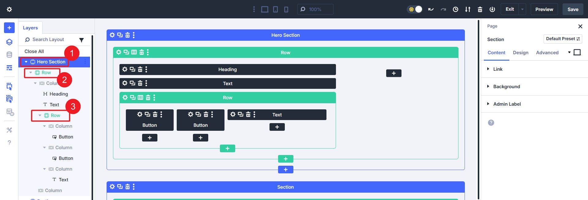

Divi 5 gives you a structured way to define, manage, and reuse sizing and spacing decisions across your entire site. Using Design Variables and Presets, you can create a scalable design system that’s easy to maintain, adjust, and replicate.
In this post, we’ll show you how to think in systems, and we’ll walk you through building a comprehensive sizing and spacing system.
Divi 5 is ready to be used on any new site you create, but it’s suggested that you hold off on migrating existing sites (for now).
Why Use A Sizing And Spacing System?
Most Divi users want consistency in layouts, margins, and typography. But few take the time to define these standards early on. Or if you do, you’ve likely done it via a heavily styled Child Theme. Now, you can:
Subscribe To Our Youtube Channel
- Define a number variable once (like 16px or clamp(16px, 4vw, 48px))
- Assign it to Module/Element Presets
- Or Option Group Presets (like spacing or sizing)
- Update the variable later and see changes reflected site-wide
- Use less CSS overall for slimmer pages
With other site builders, designers tend to lean heavily on CSS frameworks to apply consistent spacing and sizing while using a system they can take from project to project. With Divi 5, you can create your own “Design Framework” that works within the Divi UI using Divi’s Design Variables without needing to touch a single line of code.
Element Size, Padding, And Margins
Each web element has three components affecting overall spacing and size:
- Element Size: The core content size of an element, defined by width and height.
- Padding: Space added inside an element, increasing its clickable area and visual size.
- Margin: Space added outside an element, pushing it away from other elements.
Practical Examples For Divi Elements
In general, this is how you can expect to use padding and margin in Divi:
- Sections usually have top and bottom padding (not margin) to create vertical spacing within a page.
- Rows often benefit from vertical padding, but otherwise let content fill them.
- Columns mainly focus on the margin applied to create column gaps.
- Modules commonly use a bottom margin to clearly separate stacked elements, but the amount of margin depends on visual groupings.
Divi’s Default Spacing Values
Beginners to web design who use Divi probably don’t even realize that Divi makes some spacing decisions for you out of the box. More experienced designers often adjust these to match their goals, but these defaults let most people start their projects quickly.
| Default Spacing (Desktop) | Default Spacing (Tablet) | Default Spacing (Mobile) | |
|---|---|---|---|
| Section | Applies Top and Bottom Padding of 64px | Applies Top and Bottom Padding of 4% | Applies Top and Bottom Padding of 50px |
| Row & Inner Row | Applies Top and Bottom Padding of 32px | Applies Top and Bottom Padding of 2% | Applies Top and Bottom Padding of 30px |
| Row Width | Applies a relative Width of 80% (but not to Nested Rows) | ||
| Column Gap* | Applies a 5.5% Gap between Columns (using Margin Right on all except for the last Column in the row) | ||
| Module | Varies, some have Bottom Margin applied (% or px value) | ||
| H1-H6 tags | Each heading tag has a Bottom Padding of 10px that is applied on the stylesheet level with Divi. To change this, custom CSS is needed to override this. | ||
| *Flexbox and controls will work completely differently, so stay tuned for that | |||
These defaults can be helpful, but designers often prefer to set their own spacing standards. If you wanted to see what your page would look like without the default padding set up, you can do this:
- Go to any element and find the Spacing Option Group under the Design Tab.
- Open the Default Option Group and set the top and bottom padding to 0 (zero).
- Save the Default Spacing OG Preset to apply it site-wide to every element.
This will show you what your pages look like without Divi’s default settings. It won’t look as good, but you’ll start to see what you need to do to create your own design system (or you can use Divi’s defaults and make changes as you see fit).
Using An 8-Point Spacing Scale
The 8-point scale is a layout scheme where spacing values are built using increments of 8. So, instead of using arbitrary values like 13px or 27px, you stick to values like 8, 16, 24, 32, 40, 48, and so on.
This system helps:
- Keep vertical and horizontal rhythm using a consistent rubric of sizes
- Ensure spacing stacks cleanly across breakpoints
- Speed up decision-making (fewer choices = faster design)
You can use the scale in px or rem, depending on your preference or type of scale. For example, 16px becomes 1rem when the base font size is 16px.
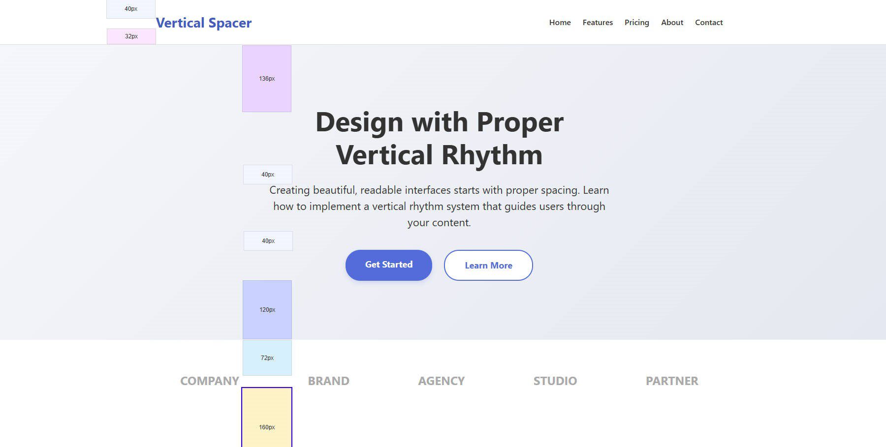
Mockup of a page that groups your attention to select areas and pushes visitors down the page with vertical spacing
Vertical spacing tells the reader where to focus. Items clustered together with tighter spacing are naturally seen as related to each other. Things separated by more space indicate a new idea.
How To Create A Sizing & Spacing System
A system for your sizes and spaces consists of two things: setting variables or tokens that will be used throughout a design and consistently using those variables throughout the site design. Here is how you can do that with Divi.
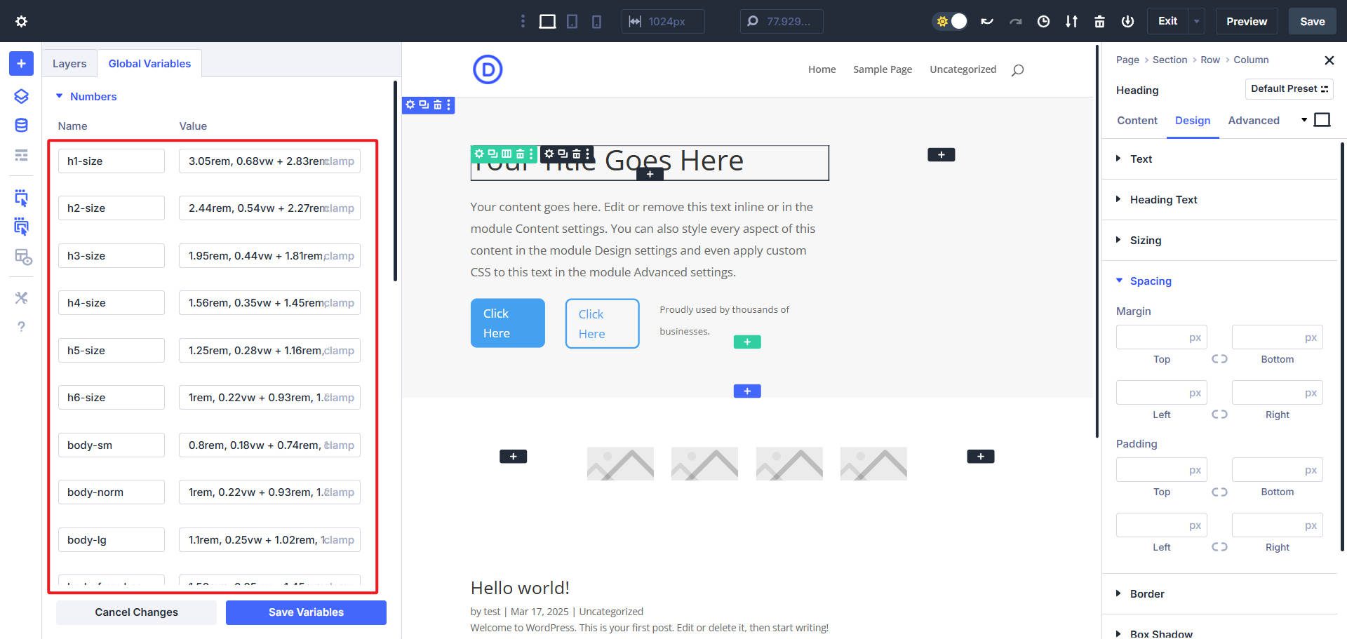
Step 1: Create Number Variables In The Design Variable Manager
Divi 5 introduces a visual interface for defining reusable numeric values. Each number variable includes:
- An easily recallable name (e.g., gap-sm, text-h1) that isn’t too long
- A numeric value or function calc() or clamp()
- A CSS unit (px, rem, %, vw, etc.)
Because of the Variable Manager, you don’t need to write CSS Variables in a separate stylesheet. You set all of these in the Design Variable Manager and then select them from the input fields in the Visual Builder.
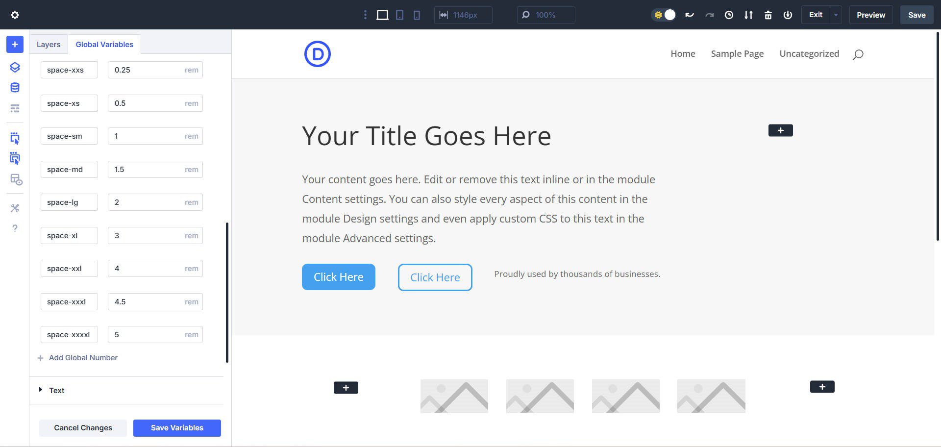
Below is a complete starting set of number variables to match an 8-point design system. You do not have to use this, but it gives you an idea of what’s possible.
| Name | px | rem |
|---|---|---|
| space-xxs | 4px | 0.25rem |
| space-xs | 8px | 0.5rem |
| space-sm | 16px | 1rem |
| space-md | 24px | 1.5rem |
| space-lg | 32px | 2rem |
| space-xl | 48px | 3rem |
| space-xxl | 64px | 4rem |
| space-xxxl | 72px | 4.5rem |
| space-xxxxl | 80px | 5rem |
And here’s what it looks like to have this filled out in the Variable Manager.
Note that these spacing values will be helpful in Divi 5’s upcoming Flexbox feature
Step 2: Planning Your 8-Point Spacing System
Your pages will typically contain repeating patterns of elements. Look for common groups or clusters such as:
- Heading, Paragraph, Button
- Small Heading, Large Heading, Paragraph
- Icon, Paragraph
- Cards containing multiple elements
With your initial wireframes (or placeholder designs), you’ll have the opportunity to create potential patterns. You’ll also create things that don’t fit into patterns that you’ll have to decide how to handle. But that is all part of designing.
You can do this in Figma or by directly creating a wireframe page with placeholder elements in Divi. Just get everything you can laid out on a page. You can use a Chrome Extension called Measure Everything to help you visualize the spacing (at first with Divi’s default spacing) as you start adjusting those.
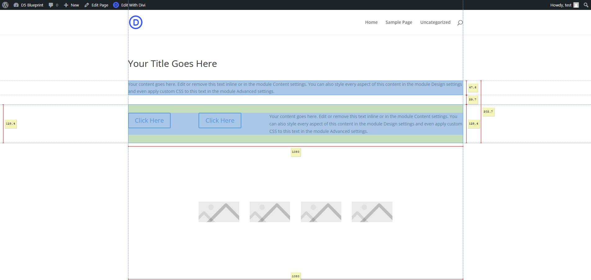
To use the extension, activate it from the Chrome Extension toolbar. Then click an element on the page you are interested in, focusing the tool on that element. From there, move your mouse to measure various aspects between the currently selected element and other elements as you hover over them.
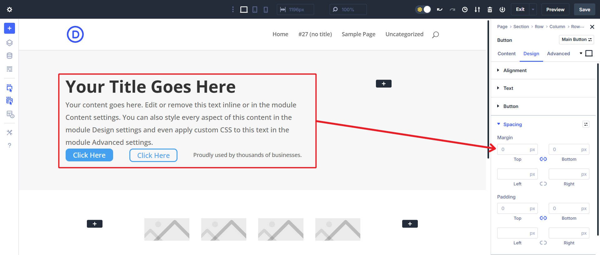
Step 3: Assign Number Variables To Option Group Presets
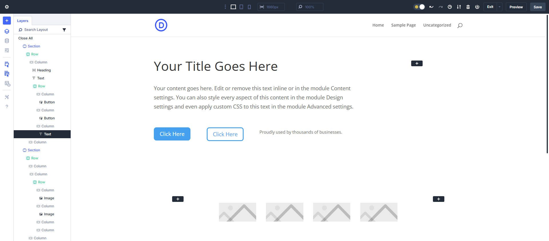
With a wireframe of a page set up and a Design Variable in place, you can start making spacing and sizing-related changes to your page. You can start with groups of content first. Let’s focus on the heading, paragraph, and button in the hero section.
Wireframe with placeholder content and font/font sizing in place
Note that at this point, you’ll want to have a first draft of your Typography set up already. This includes fonts, font sizing, and line height/letter spacing. Without this, you are very likely to rebalance all your sizing once you establish your typographic system.
Example of typography sizing options set up as number variables
Now, we want to assess what default spacing is being applied in the design. To do this, you can look at the chart earlier up in the post and compare it with what we have going on within the hero section. Obviously, there is a section (#1) and two rows (#2 and #3). For right now, we’ll set the Default Row Top/Bottom Padding to zero.
Next, we have two options for section spacing: we can set the padding to zero and figure it out later, or we can set some preliminary top and bottom padding in the Default Element Preset for Sections to look something like this:
- Desktop: Top & Bottom Padding set to space-xxxl
- Tablet: Top & Bottom Padding set to space-xxl
- Mobile: Top & Bottom Padding set to space-xl
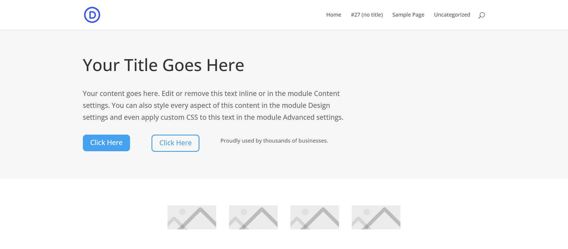
But what you do is entirely up to you and the spacing Design Variables you end up setting up (or using the defaults if you prefer to adopt them as your own). What we have right now (with Default Row padding set to zero and custom Section padding):
With the release of Flexbox, you’ll have more options to size your Hero and other Sections more concretely by applying something like:
- Section: Flex
- Section Top/Bottom Padding: 0px
- Row Top/Bottom Padding: 0px
- Section Height: min(450px, 90vh)
- Row > Align Items: Center
Step 4: Module Spacing
The next thing to do is work on the spacing between the modules within Sections/Rows. The key is to choose a consistent way of applying spacing to Modules.
You have options, you can split the spacing up in multiple ways:
- Apply spacing to Margin-Top
- Apply spacing to Margin-Bottom
- Apply spacing evenly between Margin-Top and Margin-Bottom
It’s important to remember that many Modules have a Margin-Bottom applied by default, so I recommend you go with that convention and start there when setting your spacing paradigm. For starters, you can set top/bottom Margins to zero to see how the spacing between modules looks with no defaults applied to them.
Within this section, we applied 0px to the Margin top and bottom to see all these Modules without default spacing
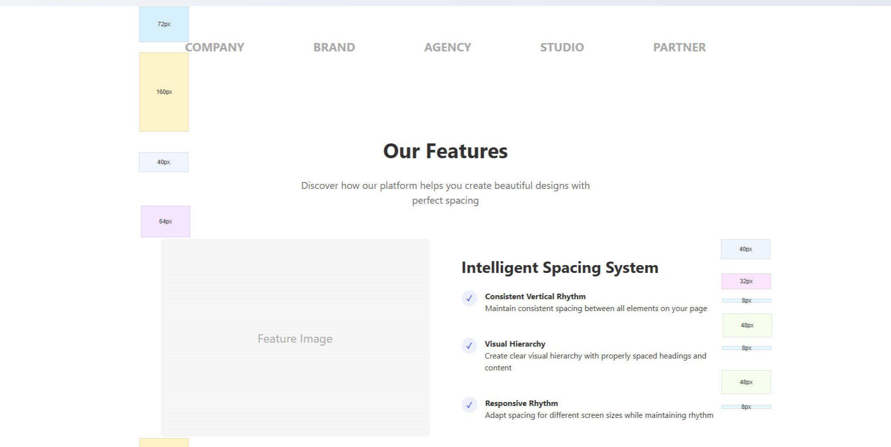
Now, we can start assigning spacing Design Variables to the Margin-Bottom of these Modules to create a spacing system. We’ll start with the heading and the body text.
As you start seeing patterns with your Module spacing, you may want to add these spacing choices to the Default Element Presets. And as you need to create spacing rules for elements that deviate, you can create Custom Element Presets. New elements will use the Default Preset from there, but you can quickly select a custom Element Preset for various situations.
How Will You Use Divi 5 For Sizing And Spacing?
Creating a spacing and sizing system you are happy with comes down to practicing the fundamentals and leaning into the tools at hand. Divi 5 is on its way to creating the de facto design system for WordPress websites. It hits the sweet spot of having a lot of flexibility, but it is easy to wrap your head around.
If you’ve never considered creating design systems, Divi allows you to think about it from a Design Variable and Preset level, not only on an individual module or element level. This helps you consistently apply base design decisions to elements quicker than ever.
Will you be trying out the 8-point system, or do you have other things planned? Also, is this your first time thinking about Divi’s Default spacing? It makes designing with Divi automatic, but for professional designers, you may want to change some of those defaults to achieve your pixel-perfect vision.
Divi 5 is ready to be used on any new site you create.


Leave A Reply