
Creating a web page with fullscreen sections is a great way to improve the user experience with smooth transitions and clean section layouts that span the full width and height of the browser. Typically, this works well for showcasing products or services one section at a time allowing the user to easily focus on each one while scrolling down the page. This type of design also works really well with background images that speak to the content and provide a beautiful design accent. And if you want to get a little creative, you can add some parallax functionality to your background images to create some pretty unique transitions when scrolling from one fullscreen section to another.
In this tutorial, I’m going to show you how to add some parallax background image transitions to a fullscreen page layout in Divi. The process is simple and with it you can create some powerful results.
- 1 Sneak Peek
- 2 Getting Started
- 3 The Basic Idea
- 4 Creating the Fullwidth Header Section
- 5 Adding the section background
- 6 Duplicating the Sections
- 7 Creating a Static background image by using the Same Section Background Image with CSS Parallax
- 8 Exploring Different Module Alignments
- 9 Final Thoughts
Sneak Peek
Take a look at some of the designs we will build together.
Getting Started
Subscribe To Our Youtube Channel
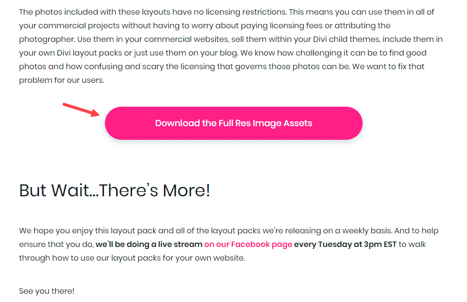
For this tutorial, all you need is Divi and a collection of images to use for the different product images and background images. I’m using the images the images from our Juice Shop Layout Pack. You can download the zip file with these images at the bottom of the blog post featuring this layout pack. Just click the “Download the Full Res Image Assets” button.
Preparing Your New Page
Once you have you images ready. Create a new page and give your page a title. Then deploy the Divi Builder and select “Build from Scratch”. Then click the button to build on the front end.
Now you are ready to roll!
The Basic Idea
The basic idea behind this concept involves stacking multiple fullwidth sections, each with a fullwidth header module. Each header module is given a custom width that can be aligned left, centered, or right while exposing the section background. Then each section is give a background image with a certain parallax method. This creates different background image transition effects as you scroll down the page.
Here’s how it to do it.
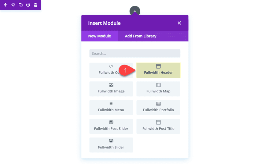
Creating the Fullwidth Header Section
First, you will need to create a new fullwidth section and then add a fullwidth header module to the section.
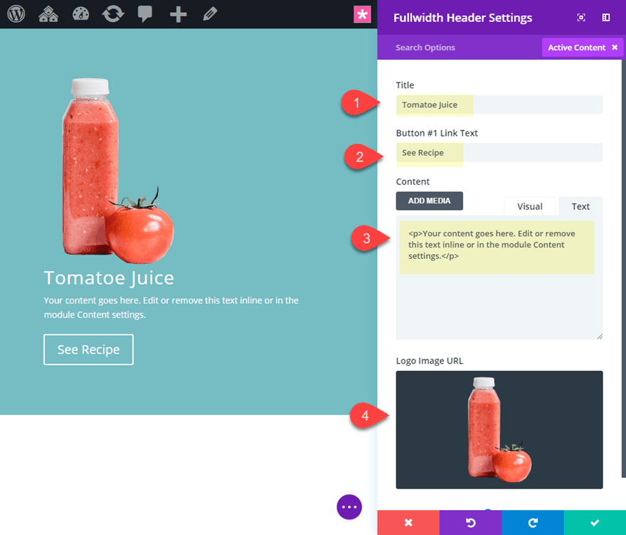
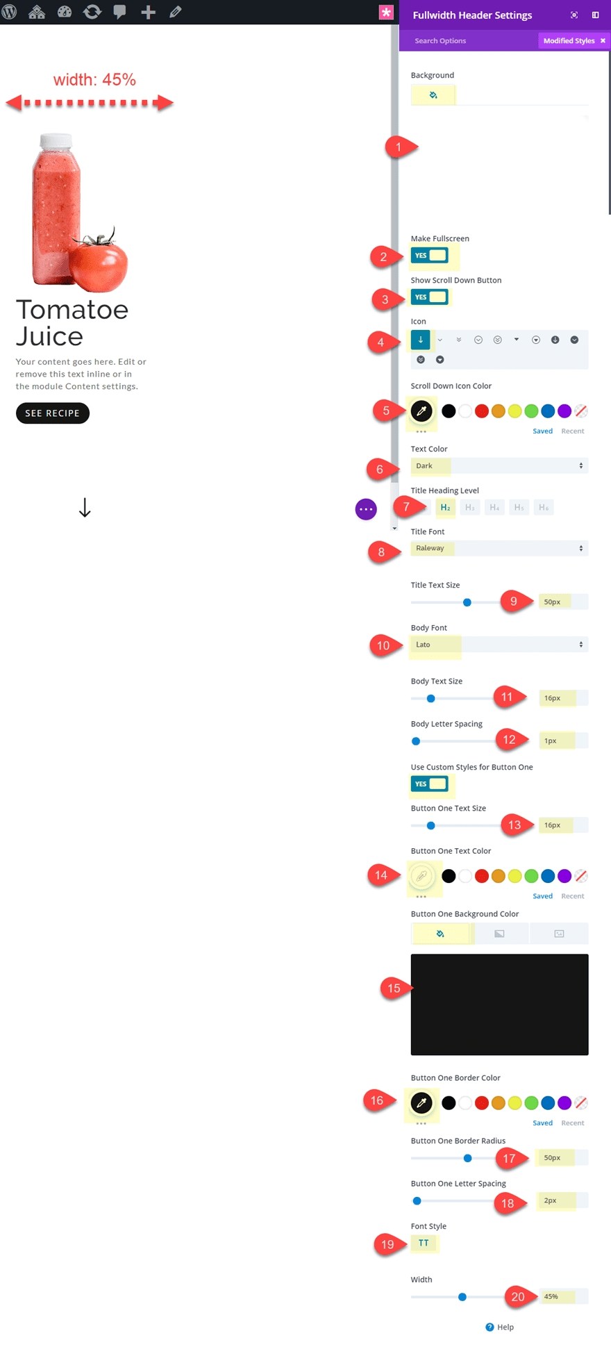
Update the fullwidth header settings with some content with the following:
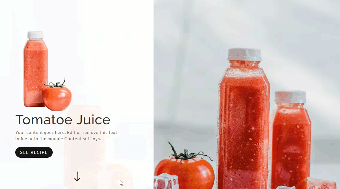
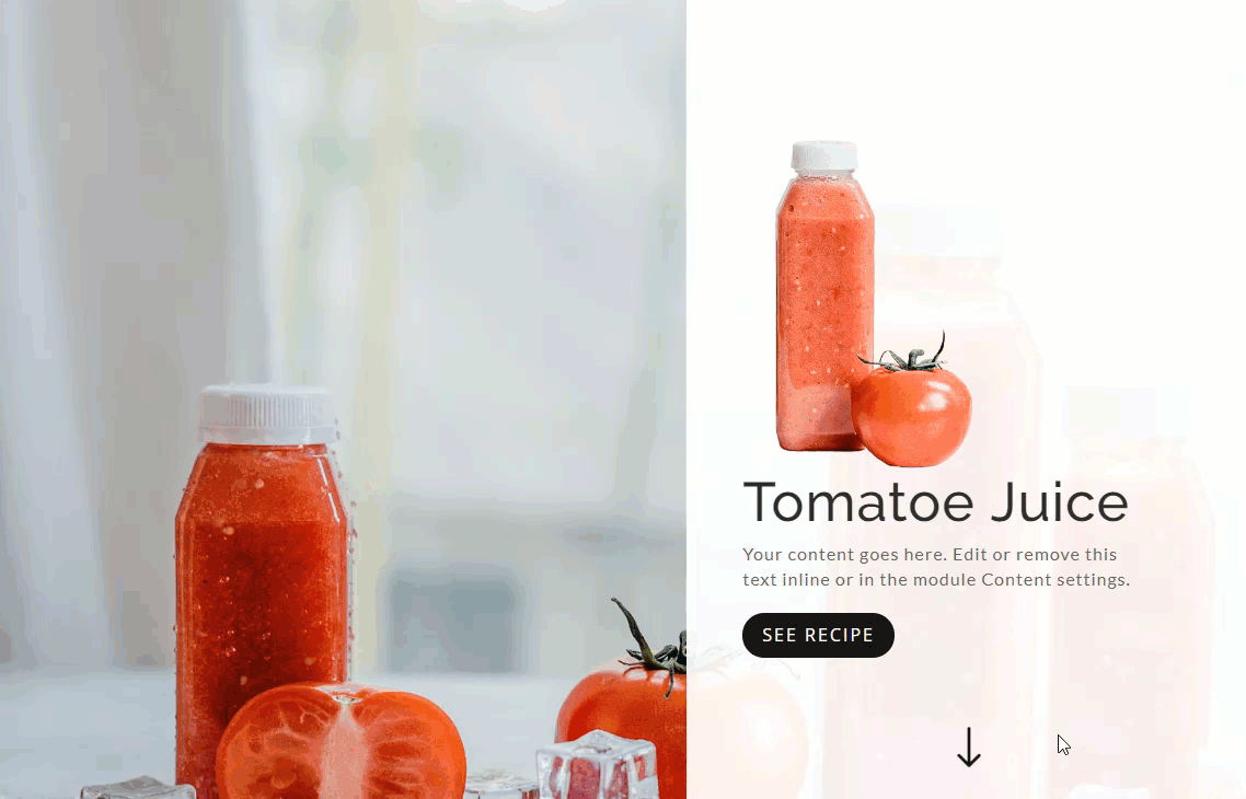
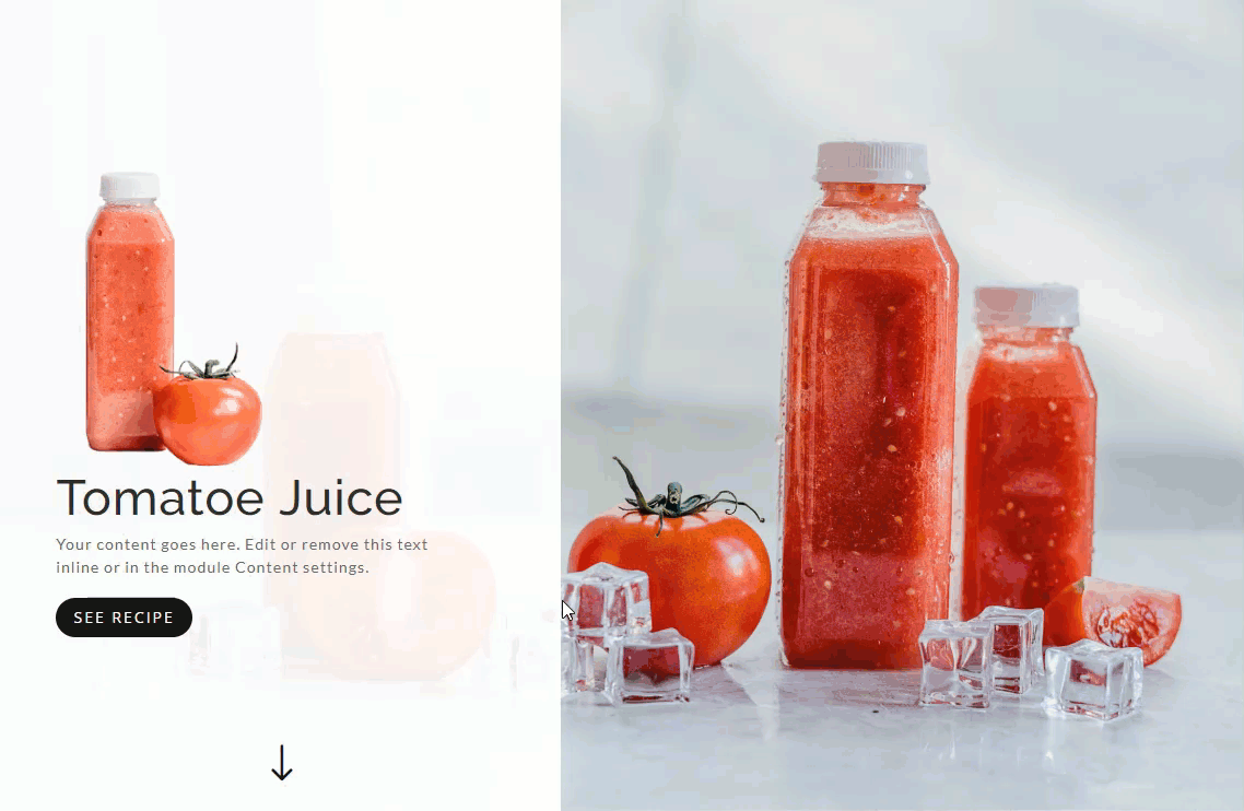
Title: “Tomato Juice”
Button #1 Link Text: “See Recipe”
Content: “Your content goes here. Edit or remove this text inline or in the module Content settings.”
Logo Image: [see screenshot] (Image is 240px by 300px)
Now continue to update your header design as follows:
Background Color: rgba(255,255,255,0.92)
Make Fullscreen: YES
Show Scroll Down Button: YES
Icon: see screenshot
Scroll Down Icon Color: #222222
Text Color: Dark
Title Heading Level: H2
Title Font: Raleway
Title Text Size: 50px
Body Font: Lato
Body Text Size: 16px
Body Letter Spacing: 1px
Button One Text Size: 16px
Button fOne Text Color: #ffffff
Button One Background Color: #222222
Button One Border Radius: 50px
Button One Letter Spacing: 2px
Button One Font Style: TT
Width: 45% (desktop), 60% (tablet), 100% (smartphone)
Save settings.
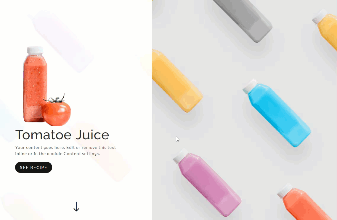
The main key design elements here are the “Make fullscreen” option and the “Width: 45%”. This will allow the section to span the full width and height of the browser window at all times. And the custom width shrinks the header module to expose the section background we will be adding next.
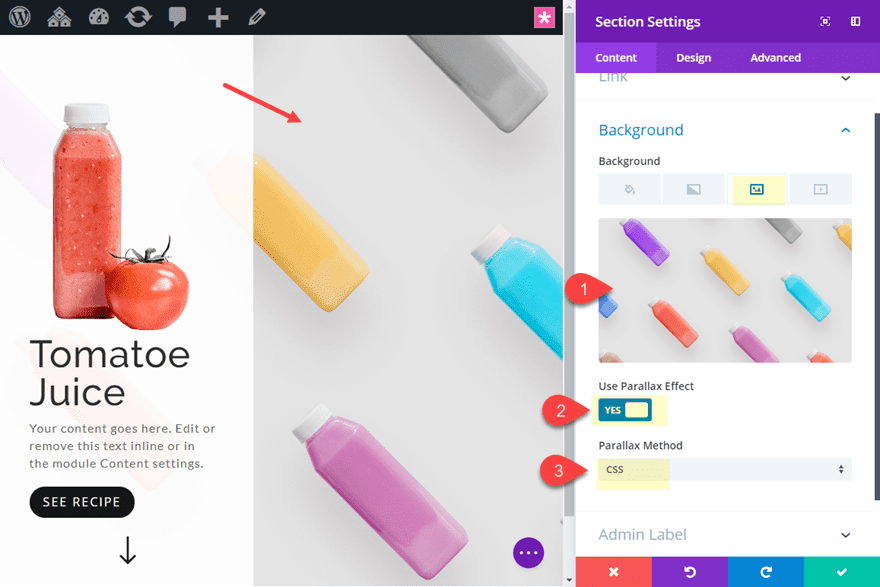
Adding the section background
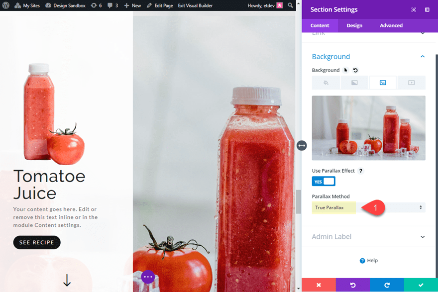
Now that we have our header module designed, we can add our section background image. Go to your fullwidth section settings and add a background image. Make sure it is large enough to span the full width and height of the browser window. Then select to use the CSS Parallax method.
Duplicating the Sections
Since each section will display new content, we need to duplicate our fullwidth section three times so that you have a total of four sections on your page each with a header module.
Creating a Static background image by using the Same Section Background Image with CSS Parallax
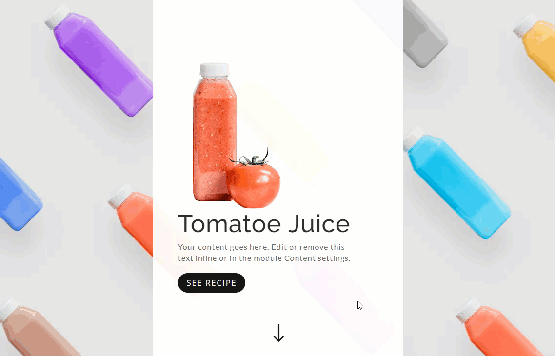
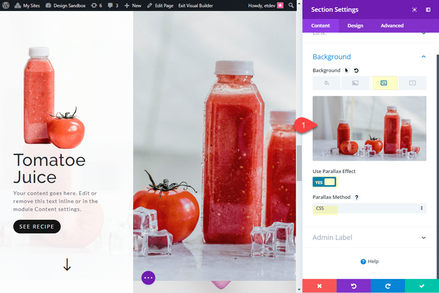
Now that we have four identical sections, we can update the fullwidth header content with new logo images and Titles in order to get a better sense of the design. However, if we keep the same background image using CSS parallax for all four sections, the result is a static background image that stays in place as you scroll to the different fullscreen sections. And since we are using a scroll down button on each header, users have the option of clicking the arrow to scroll cleanly to each new section.
Check out the result.
Using Different Background Images with CSS Parallax Transitions
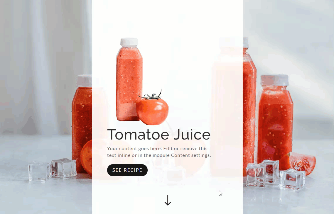
Using a different background Image (with CSS parallax) for each section will change up the feel of the design as you scroll. Since we already have CSS parallax enabled for our four section background images, all we need to do is change each of the images to something different. In this case, I’m simply adding a large version of the product as the background image for each section.
Once you have a different background image (with CSS Parallax) for each of the four sections, check out the result.
Using Different Background Images with True Parallax Transitions
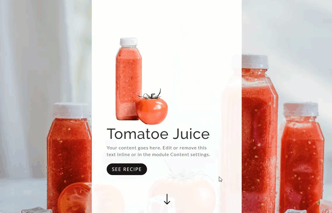
If you want to change up the background image transition effect, you can change the parallax method from CSS to True Parallax for all four section background images.
Open up one of the section settings and change the CSS method to “True Parallax”.
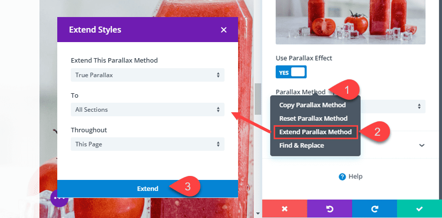
Then you will need to do the same for the remaining three sections. Or you can simply right click on the Parallax Method option and select “Extend Parallax Method” to all fullwidth header modules throughout the page.
Once done, check the background image transition effect.
Exploring Different Module Alignments
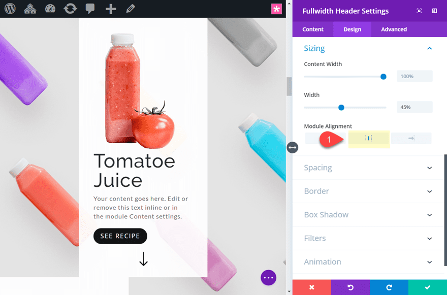
Changing the alignment of you fullwidth Header module is a breeze. Since our fullwidth header module has a custom width of 45%, you can easily adjust the module alignment to left, center, or right to get a different layout. I especially like the centered alignment with a static background.
To center the module, open the fullwidth header settings and update the Module Alignment to Centered.
To align the module to the right of the page, simply update the module alignment to right-aligned.
Once you have settle on an alignment, you can simply extend the “module alignment” style to the rest of the header modules throughout the page.
Here is an example of a centered alignment with a static background (same background image for each with CSS parallax).
Here is an example of a centered alignment with different background images using the CSS Parallax method.
Here is an example of the centered alignment with different background images using the True Parallax method.
Here is an example of a right alignment with different background images using a combination of css and true parallax.
Final Thoughts
These background image transitions really do look great when used in combination with fullscreen sections and customized header modules. The functionality is clean and the design is subtle and unique. If anything, it is a quick and easy way to create static backgrounds for your content. Feel free to explore more advanced designs using background gradients, fonts and images!
I look forward to hearing from you in the comments.
Cheers!


Hi there,
Very interesting tutorial, but it’s the first time I’m facing an issue with it. My logo image as well my text take way too much space and my duplicated sections even overlap each other. I noticed that instead of going downward just like in the video when I click “make fullwidth” in the design, my module goes upward. Any help would be much appreciated,
Thanks in advance,
Mathis
It looks stunning! Would be so nice with a live demo link to try it out (to see how it looks in different browsers and how it behaves if the user scrolls instead of clicking the arrow) + downloadable Jsons of course. Just a thought!
Hi Jason – thanks for taking the time to share…
Does it also run on mobile devices?
In the past, it didn’t.
Peter,
Yes. It does run on mobile? What issue are you referring to?
I guess Tomato is spelled differently in Europe.
Haha. Yeah. Sorry about that.
Awesome work Jason,
Thank you so much!.
Would you be so kind to create & publish json files?
Regards,
Igor
Great!
I would love to see it in another screens, and also the same efect for left and right.
Best regards,
Naise – Fabulous
I want to buy Divi theme, is it available on ThemeForest ?
No, Divi is only available here at Elegant Themes.
Looks great and I plan to use this in a website I am starting soon.
Awesome, Martin!
I love this. Is there a way to make it happen without clicking the “scroll down” button or actually scrolling to the next section? In other words, if the user even begins to scroll down, the page takes over and speeds to the next full page section for u?
That would be nice! a script that does the ‘scroll down to next section’ for you, if you scroll down yourself. Like, scrolling down 10% of a section with a certain ID > triggers the ‘go to next section’ script.
Those examples look REALLY NICE! Two questions.
1. In using the same background image in four sections, does the browser download that picture four times or does it just download the picture once and use it in those four instances?
2. I love how the sections snap into view when you click the down arrow. How could we make those sections snap into place while scrolling?
Jonathan,
If you are wanting the static image background effect, you can use one image as the section background and then create multiple fullwidth header modules (without a background image) within that section for the same effect.
Is this live somewhere that we might see a demo?
Love your tutorials – always insightful. Just thought you might want to know that it’s tomato, not tomatoe. You would use the e if using the plural form of tomatoes. Keep up the great work!
Dan,
I realized that after taking all of my screenshots. I was waiting to see who would be the first to comment about that. haha Thanks for the comment!
I have just recently done this but there is a bug in Divi that stops CSS Parallax working in Firefox. I found CSS in the support forum to fix it. Do you know when it will be fixed in Divi? Also does anyone know how to make the section to section scroll work using the mouse scroll instead of having to click a button?
Stuart,
Thanks for pointing that out. Would you mind letting us know what the bug is exactly?
And I’m not sure about the scroll-to functionality unfortunately.
Impressive. I’d love to see how it looks in other viewports!
Edie,
I guess I should have included a few screenshots on that. Since these are fullwidth headers, they respond nicely and keep the design on mobile. However, all you will need to do is adjust the width of the header module on tablet and mobile as needed.
Awesome tutorial. I am really going to try this out. Does this work well with mobile screens as well?
Joe,
Thanks. Yes it is responsive. You only need to adjust the width of the header module on mobile as you see fit. Easy adjustment.
Hi Jason, I experience problems on mobile, though. I created a page with three full page headers following your tutorial. When opening on an iphone (or even in the Google Chrome simulation) the first header shows too high somehow, so the scroll down button is either behind the bottom section of the browser (i. e. Safari or Google Chrome) or lower than the bottom of the screen. When scolling down, all the other ones look OK. You can see this on my test page https://www.praesenzmanufaktur.de/fulltest – any ideas why this is happening? Cheers Gerwin