")
We’re always looking for ways to expand the design possibilities you have with Divi. And since the transform options update came out, a lot of new techniques have become possible, without the need for custom coding knowledge.
In this post, we’re going to show you how to create a stunning diagonal design structure. The design we’ll recreate works great for hero section and matches any kind of website you want to set up. At the end of the tutorial, you’ll also be able to download the JSON file for free!
Let’s get to it!
- 1 Preview
-
2
Let’s Start Recreating!
- 2.1 Add New Section
- 2.2 Add Row #1
- 2.3 Add Blurb Module to Column 1
- 2.4 Clone Blurb Module Twice & Place Duplicates in Remaining Columns
- 2.5 Add Row #2
- 2.6 Add Divider Module
- 2.7 Apply Transform Options to Rows
- 2.8 Add Row #3
- 2.9 Add Text Module #1 to Column 1
- 2.10 Add Text Module #2 to Column 1
- 2.11 Add Button Module to Column 1
- 3 Download The Diagonal Design Section for FREE
- 4 Download For Free
- 5 Preview
- 6 Final Thoughts
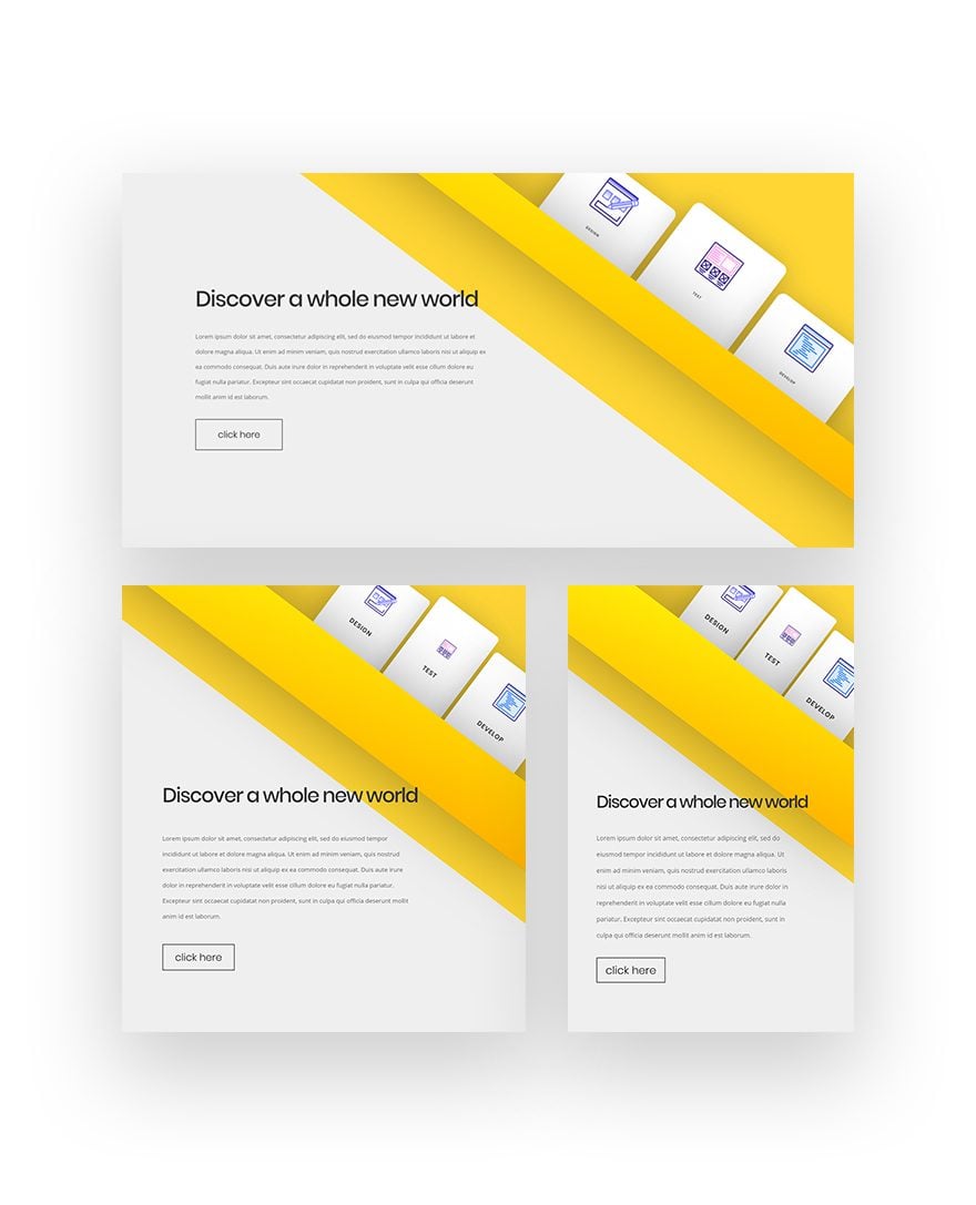
Preview
Before we dive into the tutorial, let’s take a quick look at the outcome across different screen sizes.
Let’s Start Recreating!
Add New Section
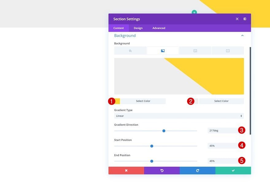
Gradient Background
Start by creating a new page or opening an existing one and add a regular section to it. Open the section settings and add a gradient background to it using the following settings:
- Color 1: #ffd633
- Color 2: #efefef
- Gradient Direction: 217deg
- Start Position: 45%
- End Position: 45%
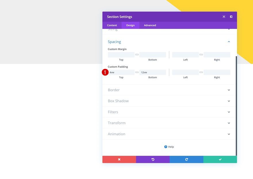
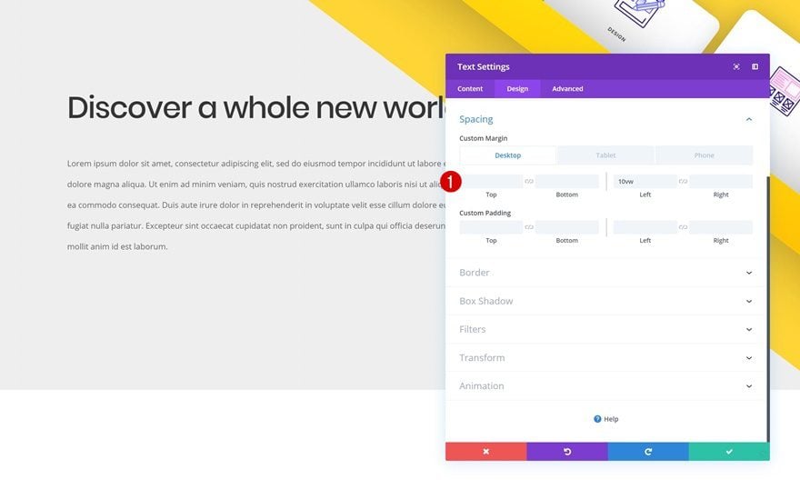
Spacing
Then, go to the design tab and add some custom top and bottom padding.
- Top Padding: 4vw
- Bottom Padding: 12vw
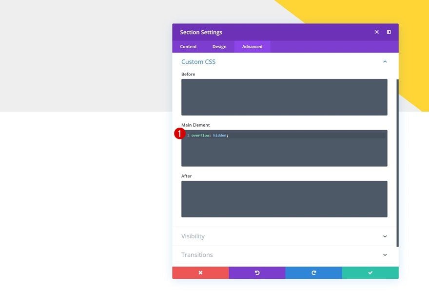
Overflow
We need to make sure that the transform options don’t surpass the section container. To accomplish that, we’ll add a single line of CSS code to the main element of the section.
overflow: hidden;
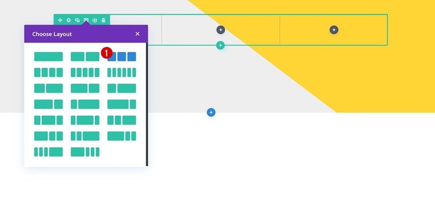
Add Row #1
Column Structure
Continue by adding the first row using the following column structure:
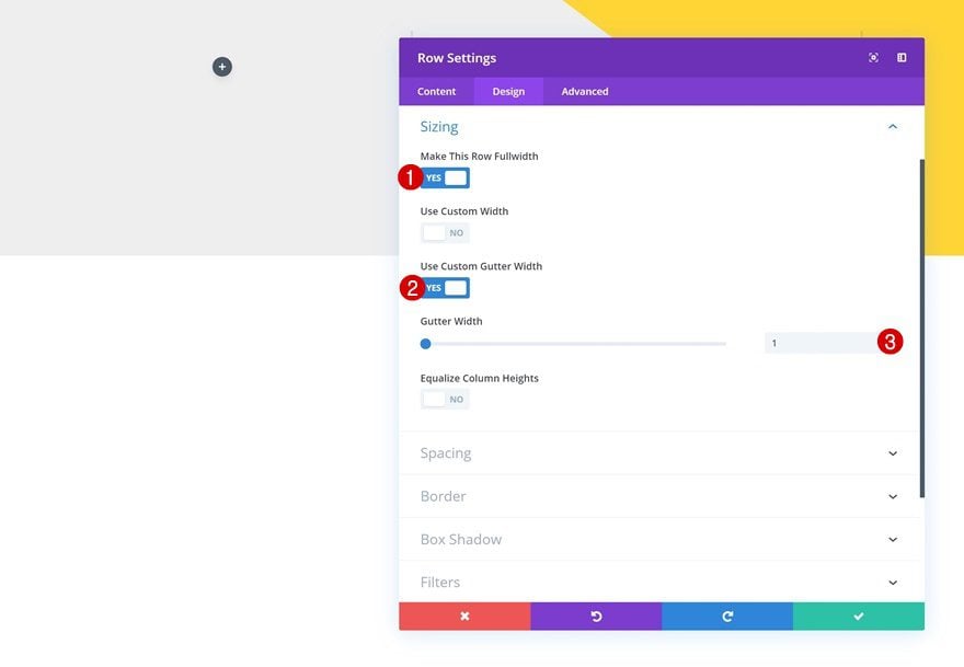
Sizing
Without adding any modules yet, open the row settings and allow the row to take up the entire width of the screen. In the next step of this post, we’ll replace the space we’ve just removed by adding some custom left and right padding values using a viewport unit. This will make sure the design remains responsive across all screen sizes.
- Make This Row Fullwidth: Yes
- Use Custom Gutter Width: Yes
- Gutter Width: 1
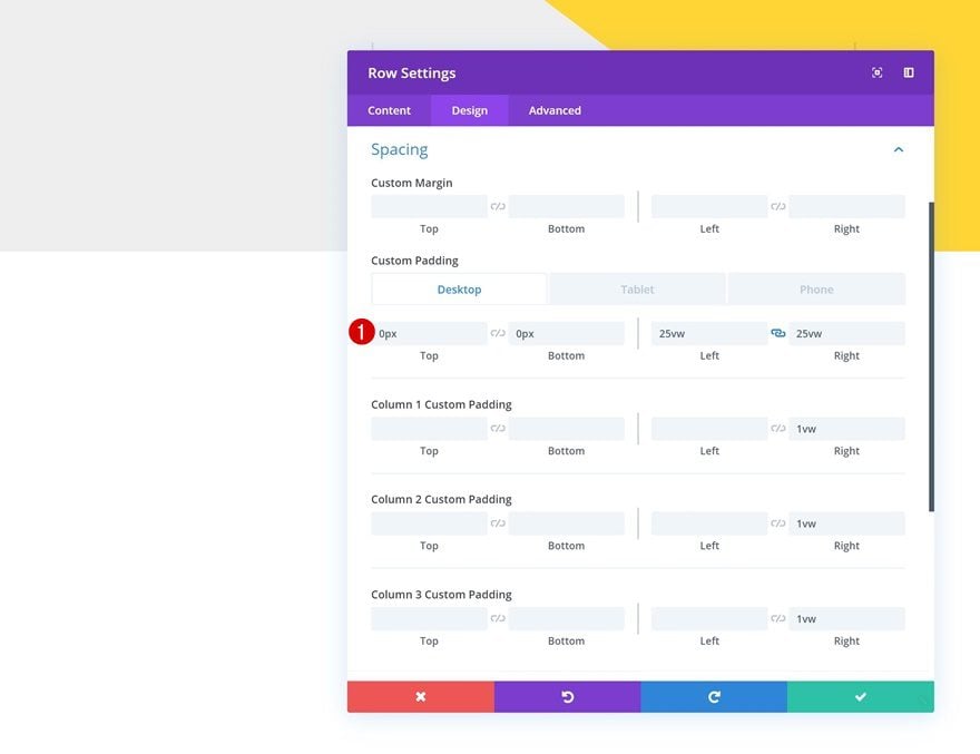
Spacing
Go ahead and add some custom padding values to the spacing settings next.
- Top Padding: 0px
- Bottom Padding: 0px
- Left Padding: 25vw (Desktop), 16vw (Tablet), 7vw (Phone)
- Right Padding: 25vw (Desktop & Tablet), 27vw (Phone)
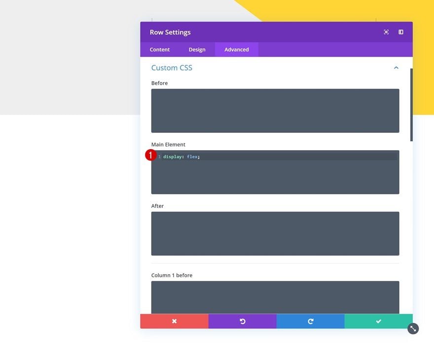
Display
We’re also making sure the columns appear next to each other on smaller screen sizes by adding one single line of CSS code to the main element of the row.
display: flex;
Add Blurb Module to Column 1
Add Title
Time to start adding modules! Add a Blurb Module to column 1 and enter a title of your choice.
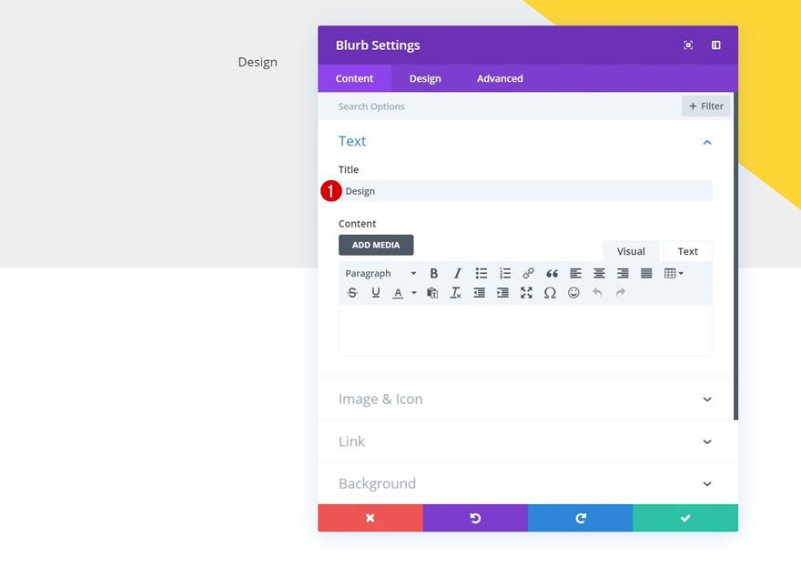
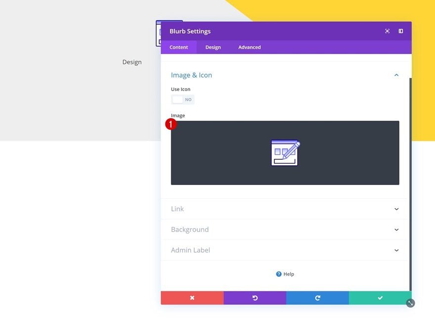
Upload Illustration
Continue by uploading an illustration of your choice. The ones we’ll be using throughout this tutorial are part of the App Developer Layout Pack. You can download the illustrations for free by going to the post and downloading them at the end.
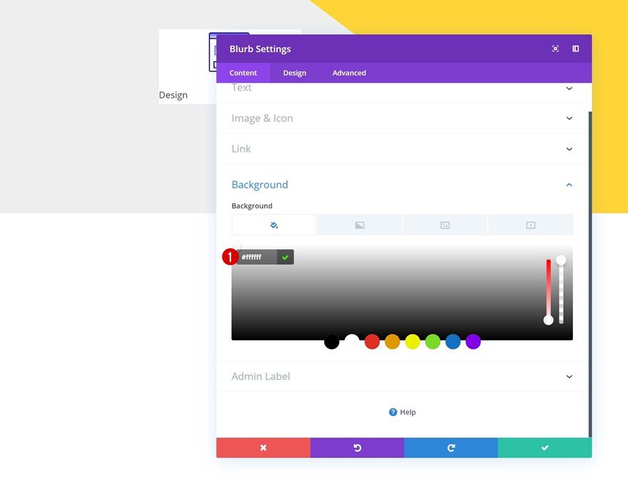
Background
Then, add an entirely white background color to the Blurb Module.
- Background Color: #ffffff
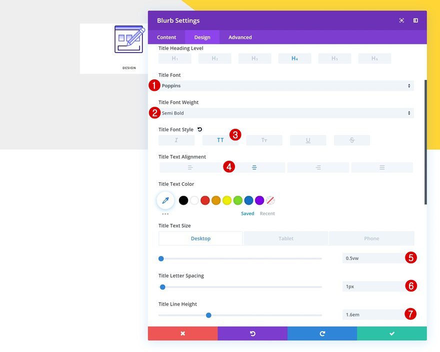
Title Text Settings
Move on to the design tab and modify the title text settings accordingly:
- Title Font: Poppins
- Title Font Weight: Semi Bold
- Title Font Style: Uppercase
- Title Text Alignment: Center
- Title Text Size: 0.5vw (Desktop), 1.6vw (Tablet), 2.4vw (Phone)
- Title Letter Spacing: 1px
- Title Line Height: 1.6em
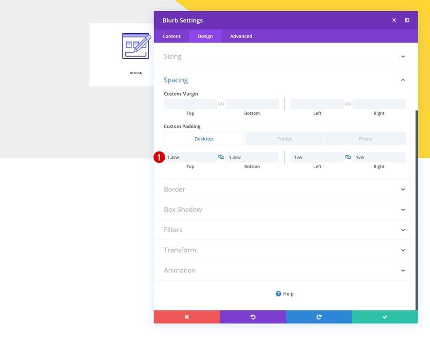
Spacing
Modify the spacing settings next.
- Top Padding: 1.3vw (Desktop), 4vw (Tablet), 6vw (Phone)
- Bottom Padding: 1.3vw (Desktop), 4vw (Tablet), 6vw (Phone)
- Left Padding: 1vw (Desktop), 7vw (Tablet & Phone)
- Right Padding: 1vw (Desktop), 7vw (Tablet & Phone)
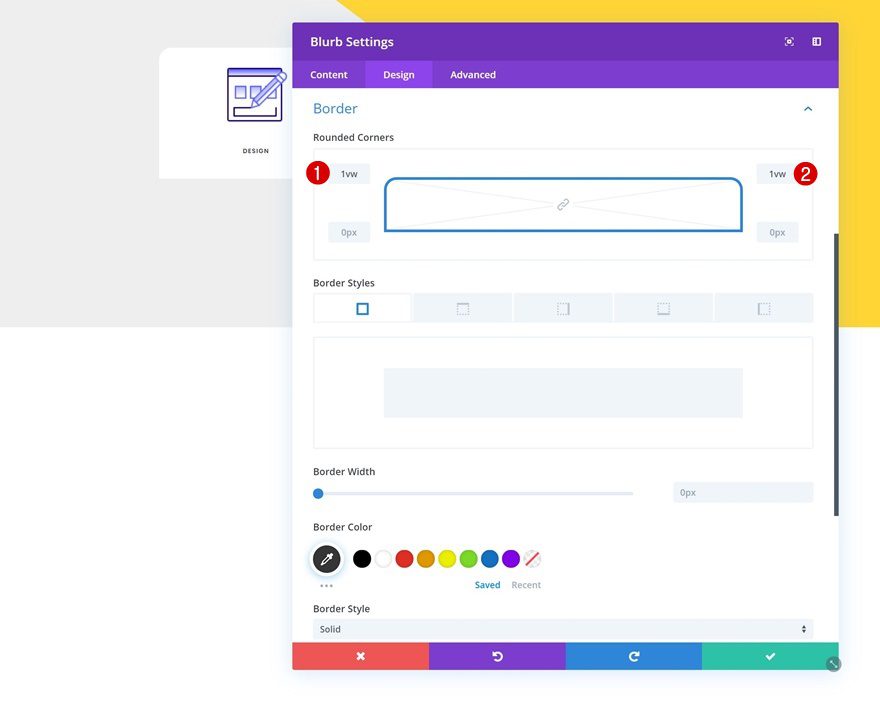
Border
Continue by adding ‘1vw’ to the top left and top right corners of the Blurb Module.
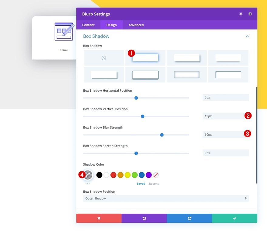
Box Shadow
Last but not least, add a box shadow to the module using the following settings:
- Box Shadow Vertical Position: 10px
- Box Shadow Blur Strength: 60px
- Shadow Color: rgba(39,39,52,0.37)
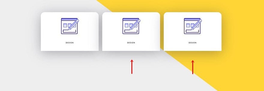
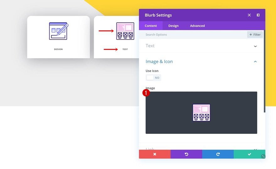
Clone Blurb Module Twice & Place Duplicates in Remaining Columns
Once you’ve customized the Blurb Module, you can go ahead and clone it twice. Place the duplicates in the two remaining columns of the row.
Change Duplicate #1
Change Copy & Illustration
Change the copy and illustration of the first duplicate.
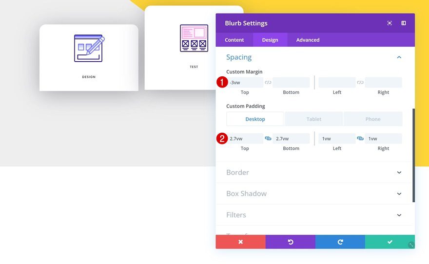
Change Spacing
Along with the spacing settings.
- Top Margin: -3vw
- Top Padding: 2.7vw (Desktop), 8vw (Tablet), 11vw (Phone)
- Bottom Padding: 2.7vw (Desktop), 8vw (Tablet), 11vw (Phone)
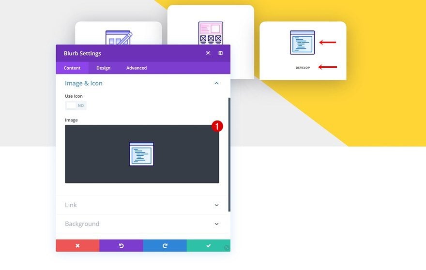
Change Duplicate #2
Change Copy & Illustration
Modify the copy and illustration of the second duplicate as well.
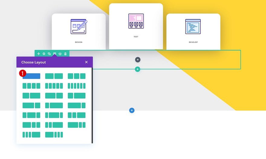
Add Row #2
Column Structure
On to the next row! Use the following column structure:
Gradient Background
Without adding any modules yet, open the row settings and add a gradient background to it.
- Color 1: #fff20a
- Color 2: #ffb200
- Gradient Direction: 165deg
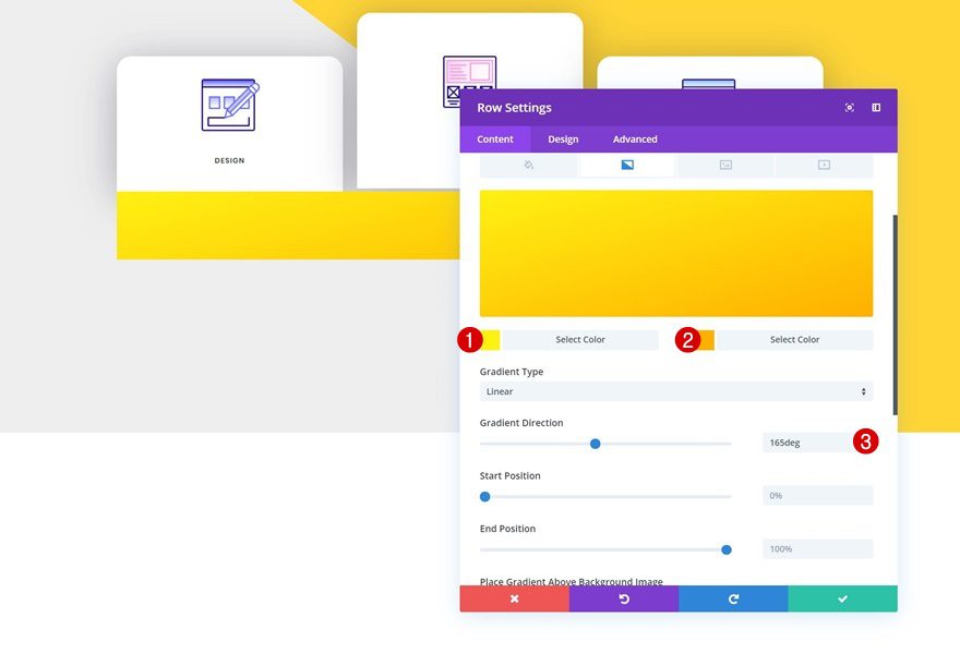
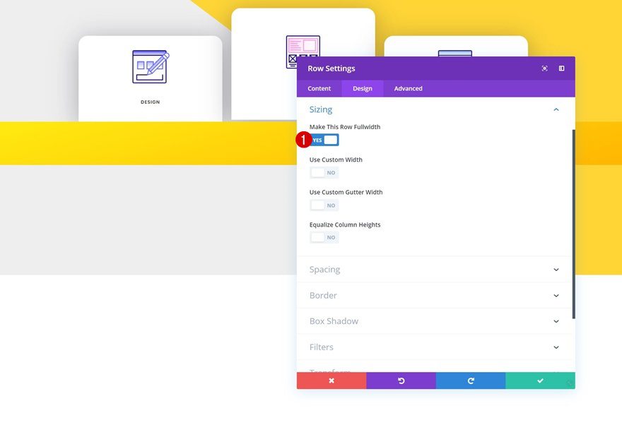
Sizing
Then, go to the design tab and enable the ‘Make This Row Fullwidth’ option.
- Make This Row Fullwidth: Yes
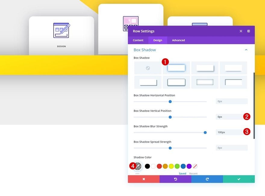
Box Shadow
Last but not least, add a box shadow to the row.
- Box Shadow Vertical Position: 0px
- Box Shadow Blur Strength: 100px
- Shadow Color: rgba(0,0,0,0.39)
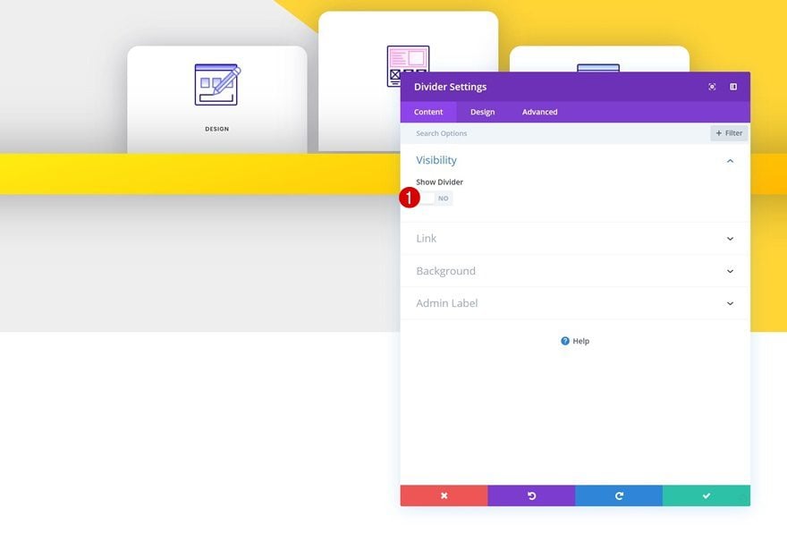
Add Divider Module
Visibility
We’re only using this row for design purposes, not to showcase any modules. But to make sure we know exactly how the row looks, we’ll need to add a Divider Module to it. We don’t want the module to show up, so make sure the ‘Show Divider’ option is disabled.
- Show Divider: No
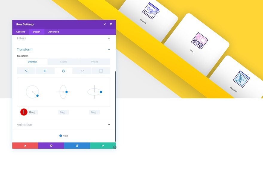
Apply Transform Options to Rows
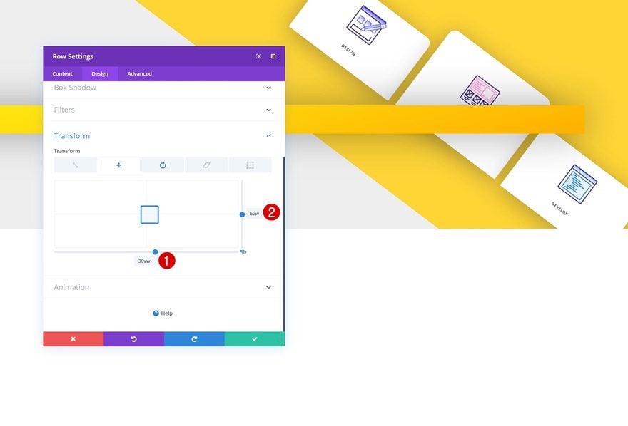
Row #1
Transform Translate
Now that we’ve completed the first two rows, we’re going to transform them to fit into the diagonal design structure we’re aiming to create. Start by opening the first row’s settings and modify the transform translate values.
- Bottom: 30vw
- Right: 6vw
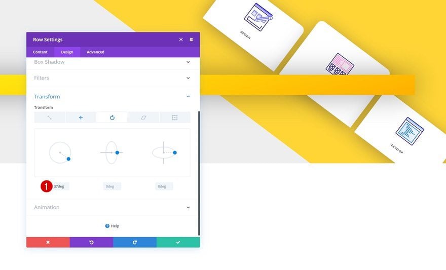
Transform Rotate
Then, change the left transform rotate value.
- Left: 37deg
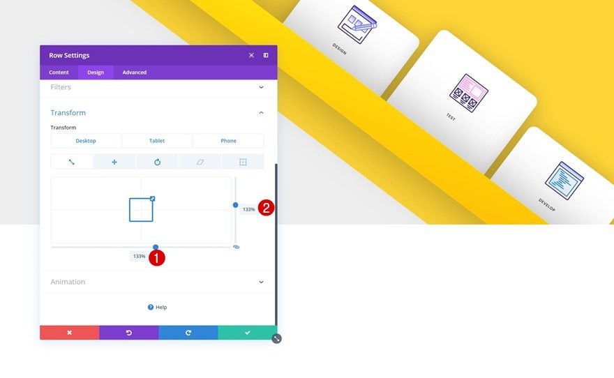
Row #2
Transform Scale
Continue by opening the second row’s setting and modify the transform scale values.
- Bottom: 133% (Desktop), 171% (Tablet), 176% (Phone)
- Right: 133% (Desktop), 171% (Tablet), 176% (Phone)
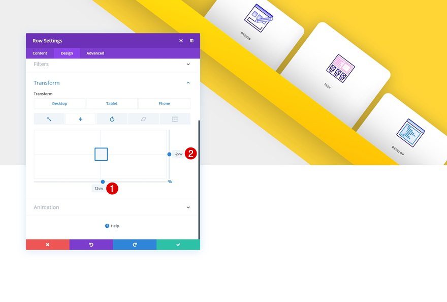
Transform Translate
Along with the transform translate values.
- Bottom: 12vw (Desktop), 1vw (Tablet), 3vw (Phone)
- Right: -2vw (Desktop), -6vw (Tablet), -4vw (Phone)
Transform Rotate
And rotate the row in the transform rotate settings too.
- Left: 37deg
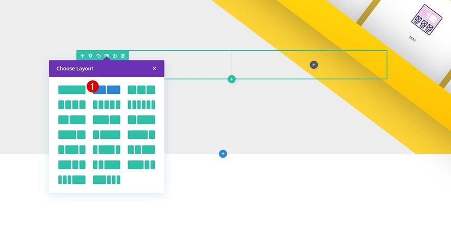
Add Row #3
Column Structure
On to the next and last row! You can use this row and its columns to share any kind of information you want. To recreate the exact design that you’ve seen in the preview of this post, select the following column structure:
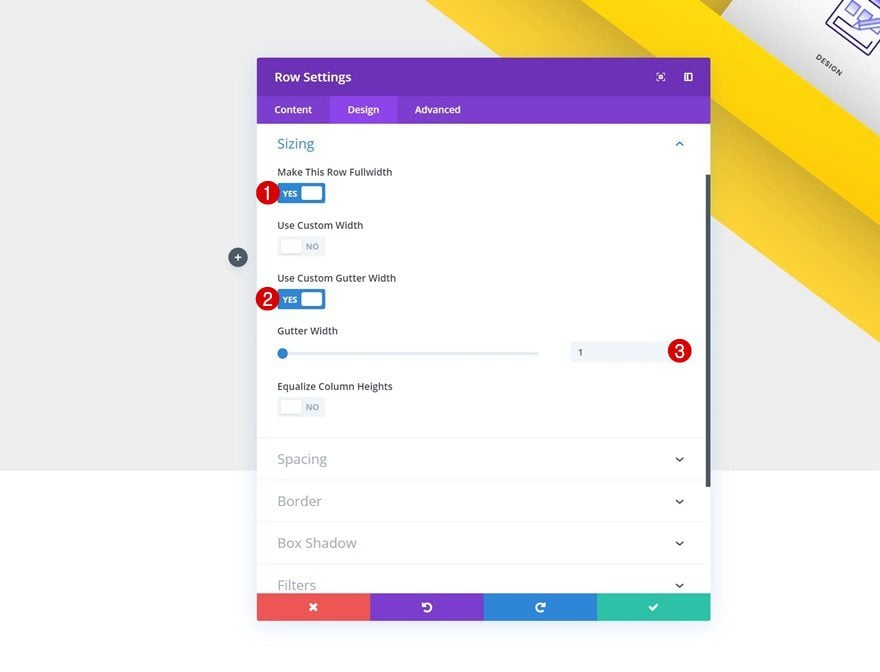
Sizing
Without adding any modules yet, open the row settings and allow the row to take up the entire width of the screen.
- Make This Row Fullwidth: Yes
- Use Custom Gutter Width: Yes
- Gutter Width: 1
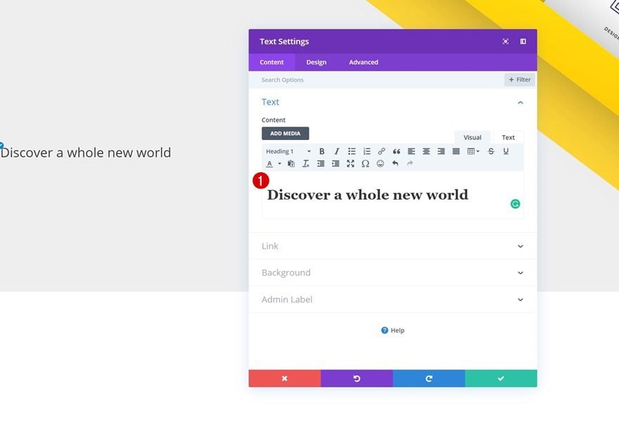
Add Text Module #1 to Column 1
Add H1 Content
Time to start adding modules! We’ll start with a title Text Module. Enter some H1 content of your choice.
H1 Text Settings
Then, go to the design tab and modify the H1 text settings.
- Heading Font: Poppins
- Heading Text Size: 3vw (Desktop), 5vw (Tablet), 6vw (Phone)
- Heading Letter Spacing: -2px
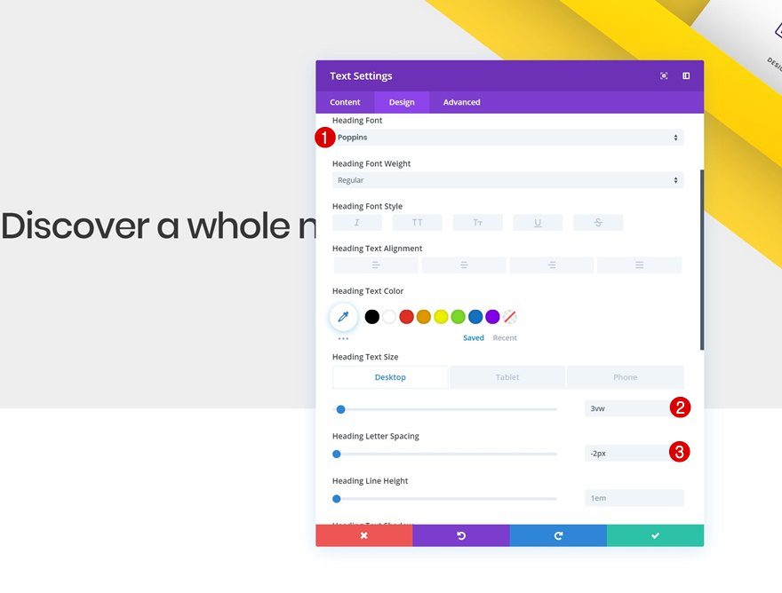
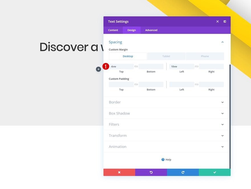
Spacing
Add some custom spacing values next.
- Top Margin: -6vw (Desktop & Tablet), 11vw (Phone)
- Left Margin: 10vw
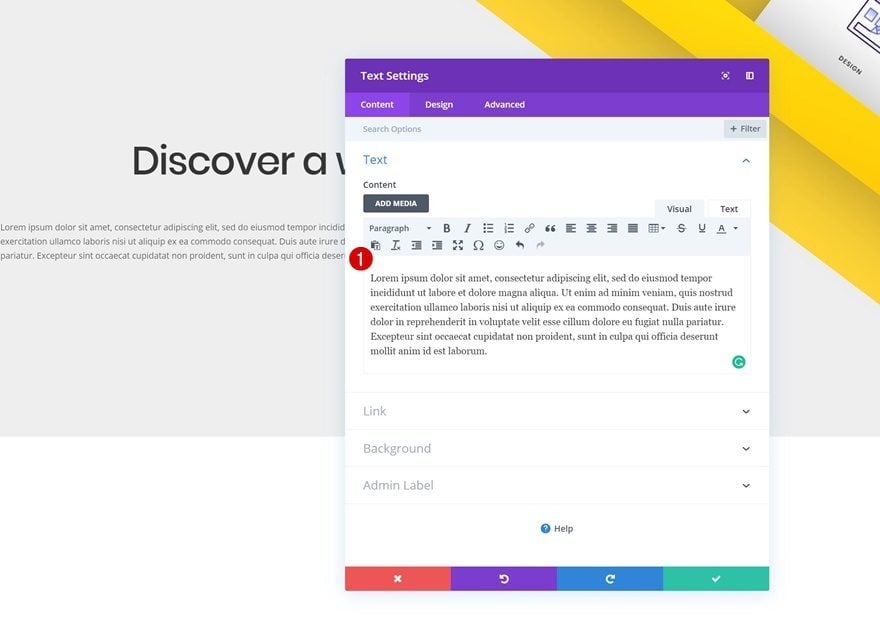
Add Text Module #2 to Column 1
Add Content
The second module we need is another Text Module. Add some content of your choice.
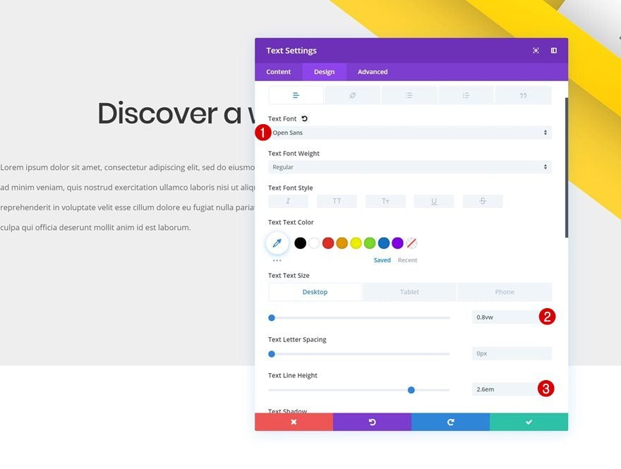
Text Settings
Then, go to the design tab and modify the text settings.
- Text Font: Open Sans
- Text Size: 0.8vw (Desktop), 1.5vw (Tablet), 2.2vw (Phone)
- Text Line Height: 2.6em
Spacing
Change the spacing values as well.
- Top Margin: 3vw (Phone), 5vw (Phone)
- Left Margin: 10vw
- Right Margin: 28vw (Tablet), 20vw (Phone)
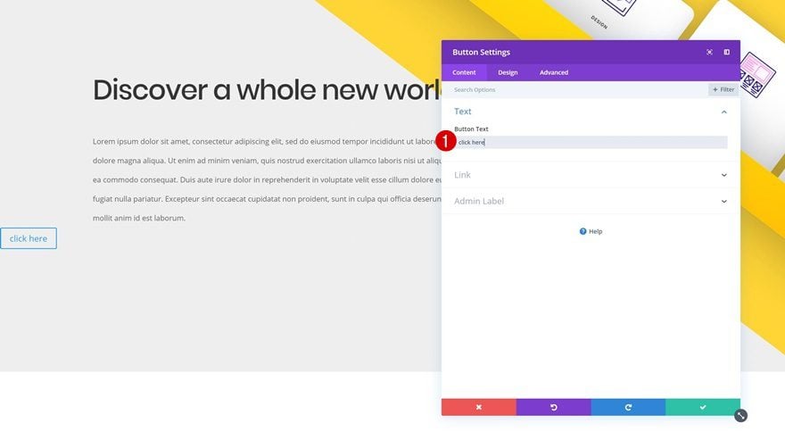
Add Copy
The next and last module we need is a Button Module. Add some copy of your choice.
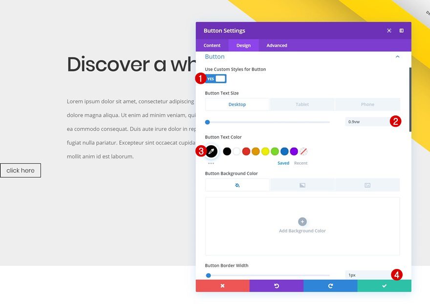
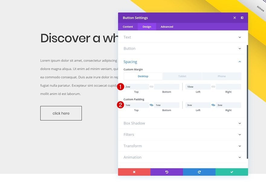
Button Settings
Then, go to the design tab and modify the button settings.
- Use Custom Styles for Button: Yes
- Button Text Size: 0.9vw (Desktop), 2.5vw (Tablet), 3.5vw (Phone)
- Button Text Color: #000000
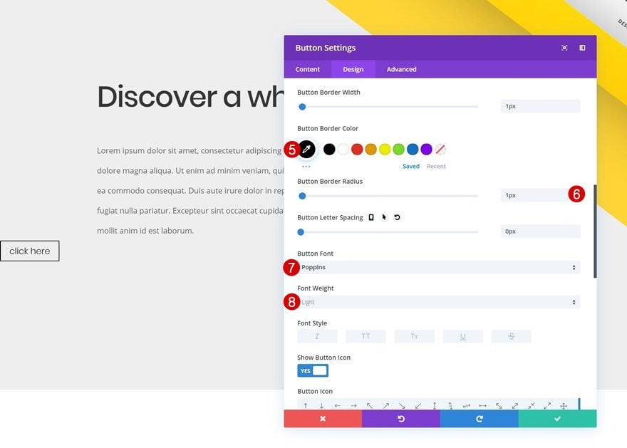
- Button Border Width: 1px
- Button Border Color: #000000
- Button Border Radius: 1px
- Button Font: Poppins
- Font Weight: Light
Spacing
Last but not least, shape your module using some custom spacing values and you’re done!
- Top Margin: 2vw (Desktop), 5vw (Tablet & Phone)
- Left Margin: 10vw
- Top Padding: 1vw
- Bottom Padding: 1vw
- Left Padding: 3vw
- Right Padding: 3vw
Download The Diagonal Design Section for FREE
To lay your hands on the free diagonal design section, you will first need to download it using the button below. To gain access to the download you will need to subscribe to our newsletter by using the form below. As a new subscriber, you will receive even more Divi goodness and a free Divi Layout pack every Monday! If you’re already on the list, simply enter your email address below and click download. You will not be “resubscribed” or receive extra emails.

Preview
Now that we’ve gone through all the steps, let’s take a final look at the outcome across different screen sizes.
Final Thoughts
In this post, we’ve shown you how to create a stunning diagonal design structure using Divi’s built-in options only. We hope this tutorial helps you get familiar with the new Divi transform options. If you have any questions or suggestions, make sure you leave a comment in the comment section below!


I must say that am very really impressed, Thanks for the update elegant themes
visual builder “transform feature” truely, elevate divi builder to the next level!! thank you Donjete for this “practical design but stuninng…
wooow guys! Thank you for sharing
This is SO cool. I’m having a small problem though because the row for the text is covering for the lowest card. I’m making individual links to each but the develop doesn’t work on desktop. Any thoughts on that?
I have tried with z-index: 1; and it gets in front of the decider but not the text
I never knew about Divi till i came across this website. I must say am really impressed, Thanks for the update
Awesome! This opens up a whole lot of new design possibilities with Divi and makes things simple! Thanks a lot! 😀
Really clever approach !
Hello,
Another good idea of design
Great job ??
Looks great! Thanks a lot!
Brilliant!
Thank you Donjete for an excellent design and your clear instructions.
A very thorough walkthrough. This certainly opens up a world of possibilities for web designers using Divi for themselves and their clients.
very nice thanks a lot