
Every website needs a contact section, but that doesn’t mean you need to go for a standard design. With Divi and its scroll effects, you can create a floating contact section that will stand out. Improve your user interaction with a vertical scrolling contact section layout that will invite visitors to engage with your contact form. In this post, we’ll show you how to create a full width floating contact section that you can add to any page. You could even add it at the top of a site-wide footer with the Divi Theme Builder.
Below, you’ll find a free downloadable folder with the JSON layout to upload to your own Divi Library. We’ve also included a PSD template to help you recreate the map background, plus an SVG of the map pin so you can personalize it with your own colors.
Let’s get to it!
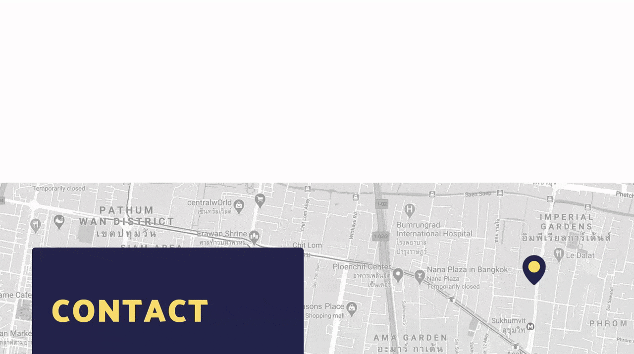
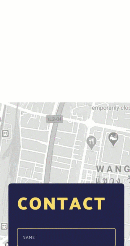
Preview
Before we start building the contact form layout, take a look at the outcome on different screen sizes.
Desktop
Mobile
Download The Floating Contact Section for FREE
To lay your hands on the free floating contact section layout, you will first need to download it using the button below. To gain access to the download you will need to subscribe to our newsletter by using the form below. As a new subscriber, you will receive even more Divi goodness and a free Divi Layout pack every Monday! If you’re already on the list, simply enter your email address below and click download. You will not be “resubscribed” or receive extra emails.

1. Create Map Background For The Floating Contact Section
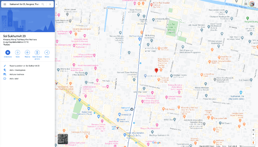
Open Google Maps
The first step to this tutorial is creating the black and white map background. To create your own, follow the steps below:
- First, open Google Maps and search for your address.
- When it loads, zoom out so that you can see a large section of the city or streets around your address.
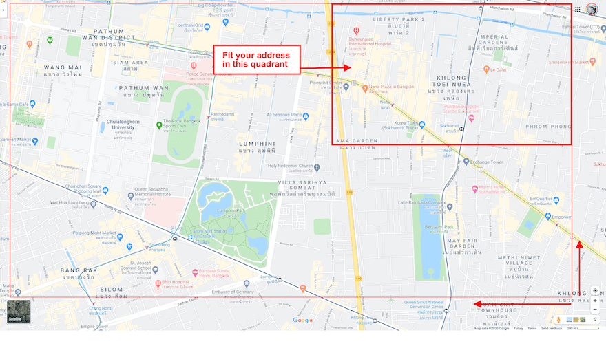
- Next, position the map so your location is on the top right quadrant of the map.
- Then, remove the location pin.
- Finally, screenshot the map avoiding the tabs on the corners.
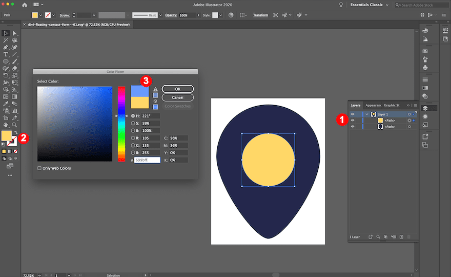
Personalize The Pin
In the downloadable files above, we’ve included an SVG file of the pin we used in the design. You are welcome to use it and change the colors with your vector graphics editor. We’ve also included a transparent PNG if you want to change the color in Photoshop.
Follow these steps for the SVG pin:
- First, download the free files at the beginning of this tutorial and unzip the folder.
- Second, open the SVG pin graphic with Illustrator, Inkscape or your favorite vectors editor.
- Third, change the color to match your brand or website.
- Finally, save as a transparent PNG.
Edit on Photoshop
Now it’s time to put it all together. First, open the map in your favorite graphics editor to desaturate the color. Second, add the pin.
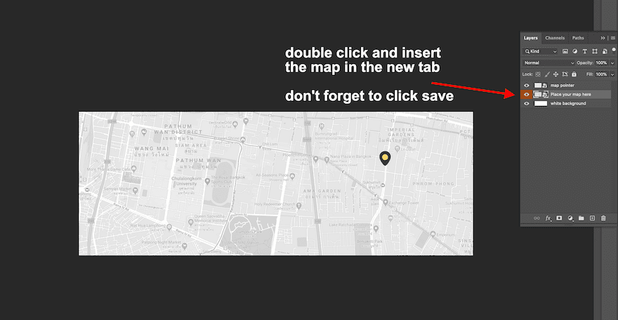
If you have Photoshop, you can use the PSD file we included and simply add your map screenshot to the smart object in the second layer.
To use the smart object, follow these steps
- Open the PSD file.
- Doubleclick on the layer with the orange color. A new window will open.
- Replace our map with yours.
- Don’t forget to click save.
- Go back to the main editing window and click save there too.
- Export for web as a .jpg.
If you don’t have Photoshop, follow these steps:
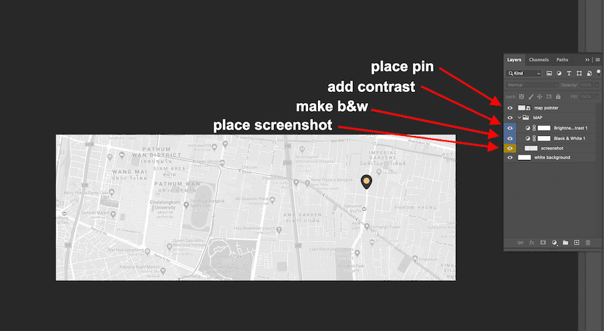
- First, create a new project at 1920 px x 700 px.
- Second, place the map screenshot onto the canvas. Make sure to keep your location in the top right quadrant, a little higher than the center.
- Third, using image adjustments turn the image into black and white.
- Also, add some contrast.
- Brightness: -25
- Contrast: -50
- Then, click on the image layer, and add transparency at about 55%.
- If you’ll be creating this design on a web page that has a non-white background, add a white layer below the image to keep the base color white no matter what background color the website has.
- Continue by placing the pin on your location. Size it to about 90px tall. Leave it on the topmost layer.
- Finally, download as a .jpg.
2. Create Element Structure
Add New Section
Background
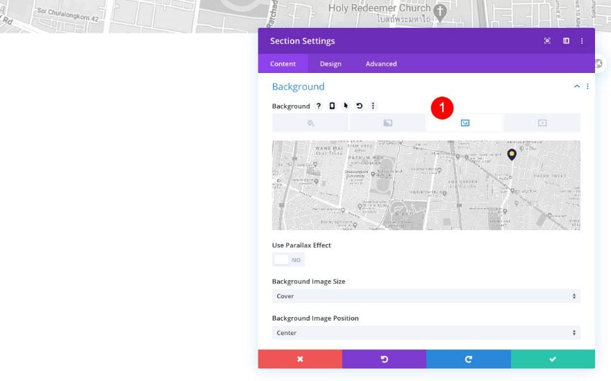
Now it’s time to start building the floating contact section with the Divi Builder! The first thing we’ll do is open a new or existing page and add a new section.
In the content tab, add the map background you’ve created in Photoshop.
- Background Image: Your edited map
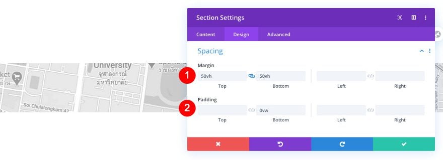
Spacing
Then, customize the section’s spacing settings in the design tab.
- Top and Bottom Margin: 50vh
- Bottom Padding: 0vw
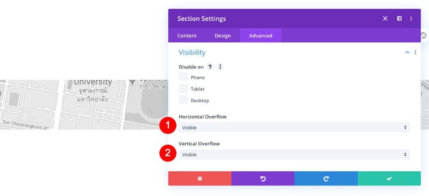
Visibility
Next, adjust the overflows to visible.
- Horizontal and Vertical Overflow: Visible
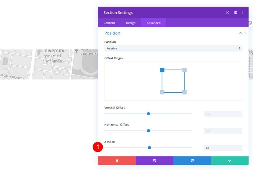
Position
Finally, set the Z index of the section to 10.
- Z Index: 10
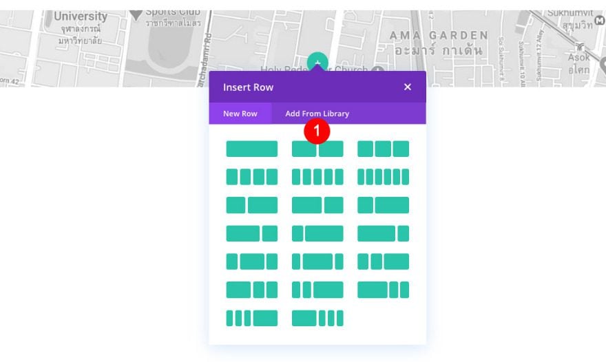
Add New Row
Column Structure
Now it’s time to add some elements. First, add a row with 2 columns.
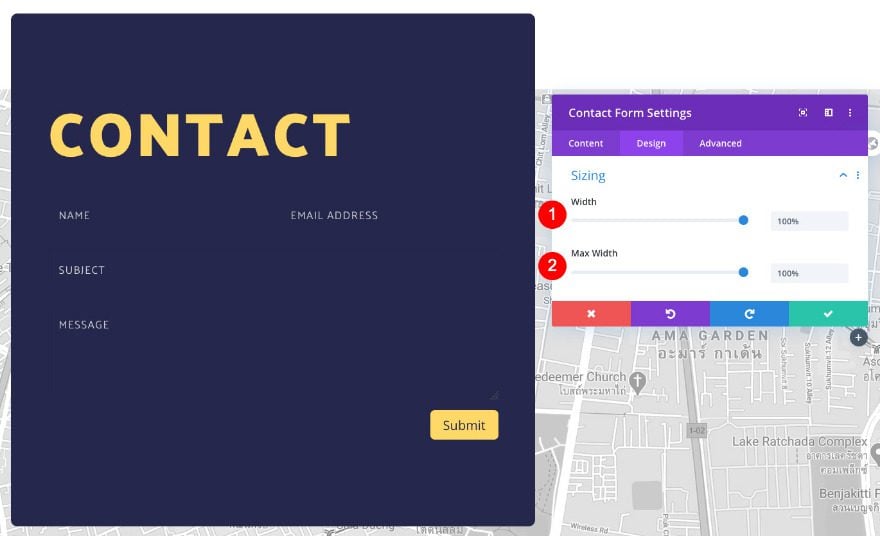
Sizing
Open the row settings and adjust the sizing as follows.
- Width
- Desktop: 90%
- Tablet and Phone: 80%
- Max Width: 90%
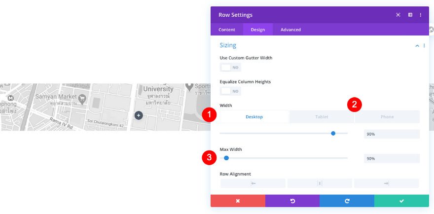
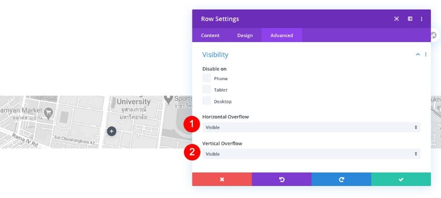
Visibility
Click on the advanced tab, and adjust the overflows next.
- Horizontal and Vertical Overflow: Visible
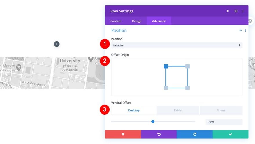
Position
Complete the row settings by modifying the position settings.
- Position: Relative
- Offset Origin: Top Left
- Vertical Offset
- Desktop: -8vw
Column 1 Settings
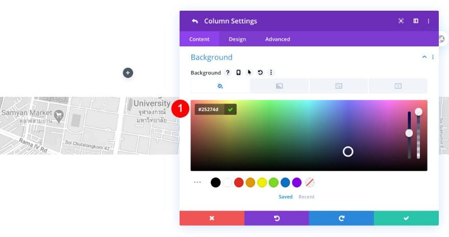
Background
Before adding modules, we’ll need to style the individual columns. Add a background color to column 1.
- Solid Color: #25274d
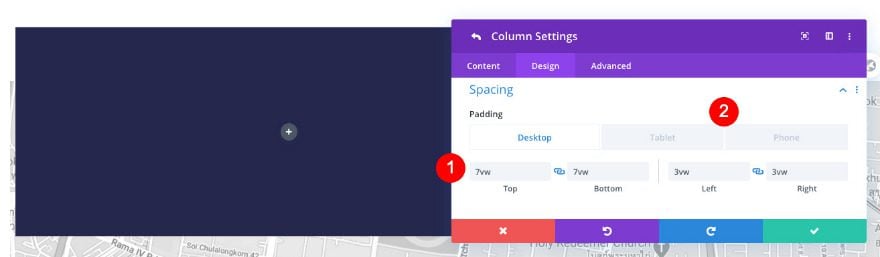
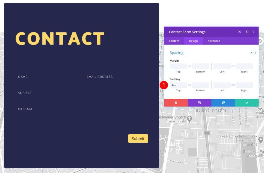
Spacing
Adjust the spacing settings next.
- Top and Bottom Padding
- Desktop and Tablet: 7vw
- Left and Right Padding
- Desktop: 3vw
- Tablet and Phone: 6vw
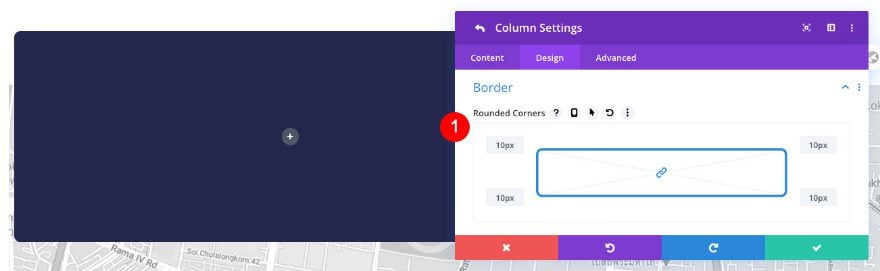
Border
Then, add some rounded corners to the border settings.
- Rounded Corners: 10px all four corners
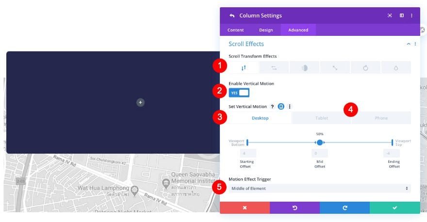
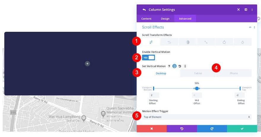
Scroll Effects
Last but not least, use some vertical motion in the scroll effects settings. This will help us create a floating effect.
- Scroll Transform Effects: Vertical Motion
- Set Vertical Motion / Desktop
- Starting Offset: 4
- Mid Offset: 0 (at 50%)
- Ending Offset: -4
- Set Vertical Motion / Tablet and Phone
- Starting Offset: 4
- Mid Offset: 0 (at 40% and 60%)
- Ending Offset: -3
- Motion Effect Trigger: Middle of Element
Column 2 Settings
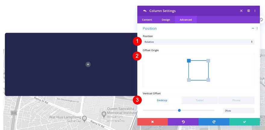
Position
Now, on to the second column settings. Adjust the position settings accordingly.
- Position: Relative
- Offset Origin: Top Left
- Vertical Offset
- Desktop: 25vw
Scroll Effects
We’re adding some vertical motion to this column too.
- Scroll Transform Effects: Vertical Motion
- Set Vertical Motion / Desktop
- Starting Offset: 2
- Mid Offset: 0 (at 50%)
- Ending Offset: -2
- Set Vertical Motion / Tablet and Phone
- Starting Offset: 0
- Mid Offset: 0 (at 50%)
- Ending Offset: -2
- Motion Effect Trigger: Top of Element
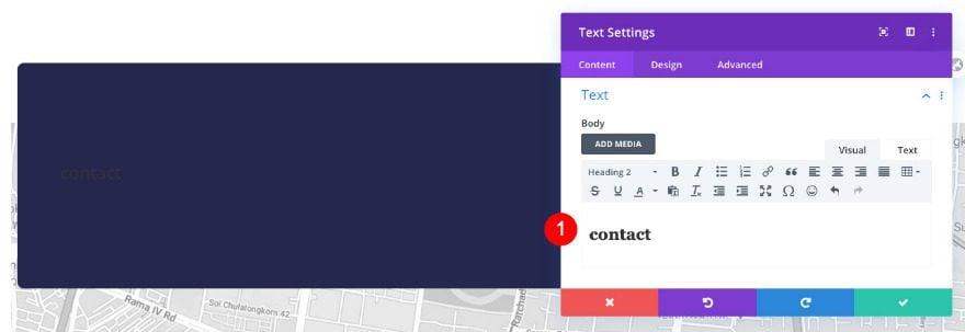
Add Text Module to Column 1
Content
Time to add modules, starting with a text module in column 1. Add some H2 content of your choice.
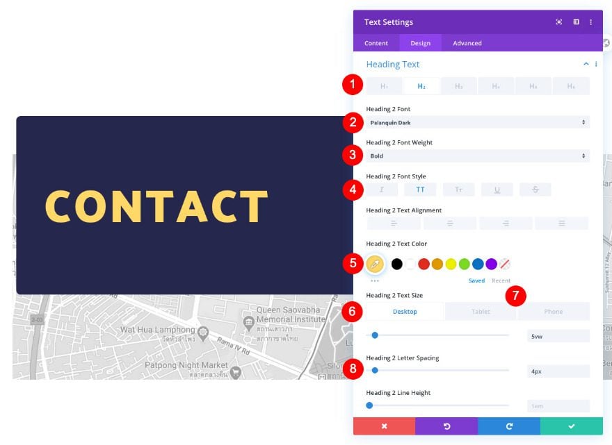
Heading Text
Move on to the design tab and style the H2 text as follows.
- Heading Level: H2
- Font: Palanquin Dark
- Font Weight: Bold
- Font Style: TT
- Color: Yellow #ffd868
- Size
- Desktop: 5vw
- Tablet: 10vw
- Phone: 12vw
- Letter Spacing: 4px
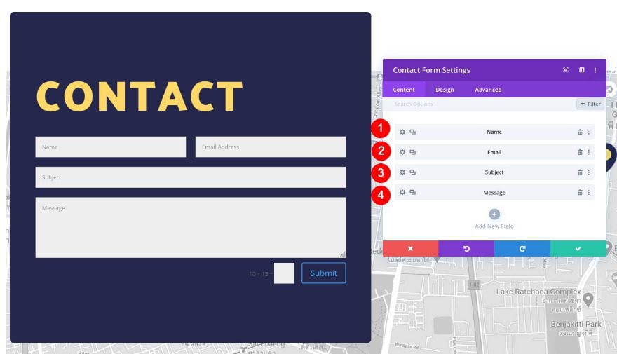
Add Contact Form Module to Column 1
Content
Below the text module, add a contact form. These are the fields we’re using:
- Name
- Subject
- Message
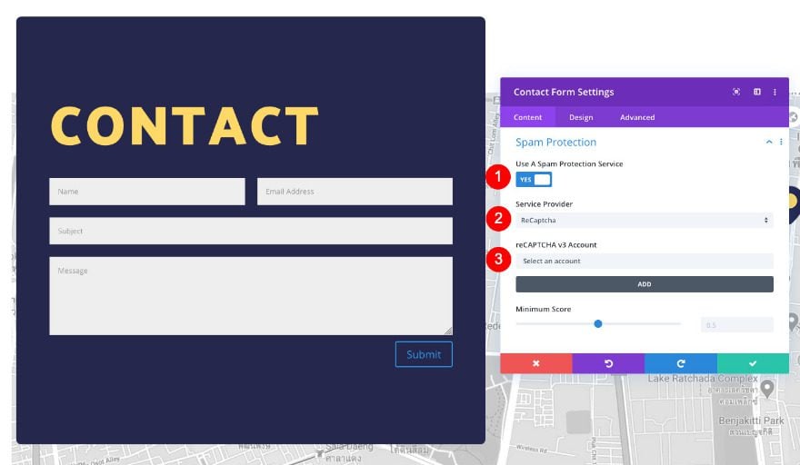
Spam Protection
Before styling the contact form module. turn the spam protection on and connect your ReCaptcha account.
- Use A Spam Protection Service: Yes
- Service Provider: ReCaptcha
- Select Account
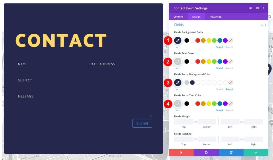
Fields
Move on to the design tab and style the fields as follows.
- Background Color: Dark Blue #25274d
- Text Color: Pale Grey #d1d1d1
- Focus Background Color: Dark Blue #25274d
- Focus Text Color: Pale Grey #d1d1d1
- Font: Palanquin
- Style: TT
- Text Size
- Desktop: 0.9vw
- Tablet: 2vw
- Phone: 3vw
- Letter Spacing: 1px
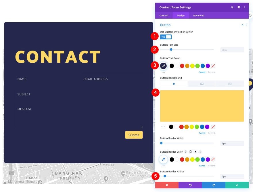
Button
Then, style the button.
- Custom Styles: Yes
- Text Size: 20px
- Text Color: Dark Blue #25274d
- Background Color: Yellow #ffd868
- Border Radius: 7px
- Icon Color: Dark Blue #25274d
- Top Margin: 5px
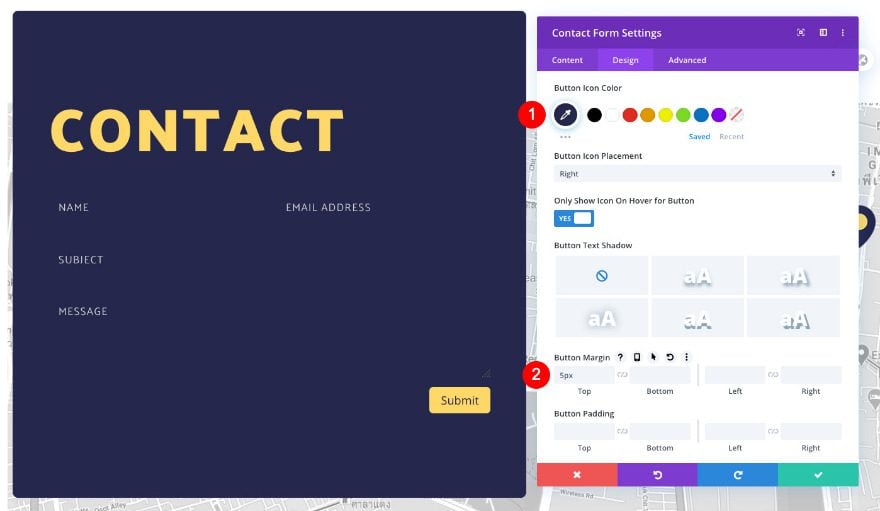
Sizing
We’re modifying the sizing settings next.
- Width: 100%
- Max Width: 100%
Spacing
We’ll add some top padding too.
- Top Padding: 4vw
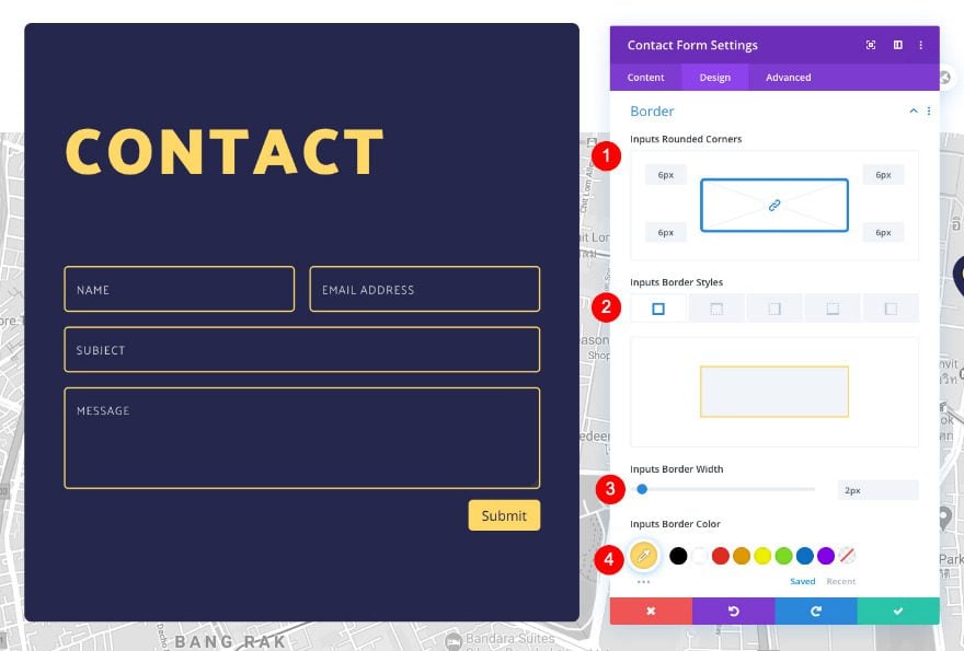
Border
Complete the module settings by customizing the border settings.
- Inputs Rounded Corners: 6px all four corners
- Inputs Border Styles: All four sides
- Inputs Border Width: 2px
- Inputs Border Color: Yellow #ffd868
Content
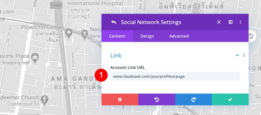
Move over to column 2 and add a social media module. Use all the social media networks you need.
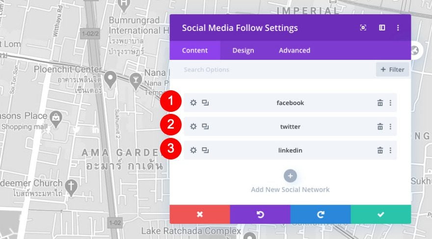
Link
Before styling, add links to the corresponding networks.
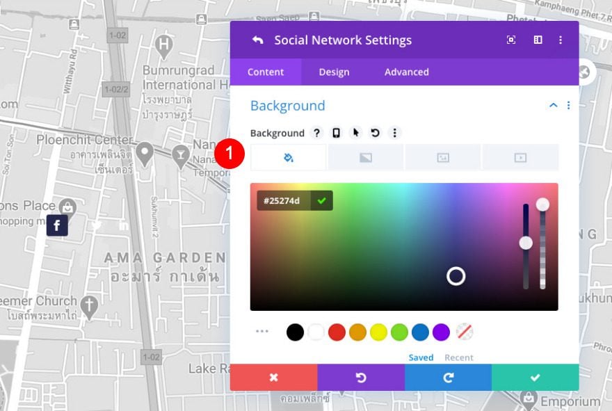
Item Background
Now, open the first social network and change the background color.
- Color: Dark Blue#25274d
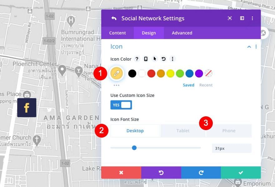
Item Icon
In the design tab of the same element, change the icon settings as follows.
- Color: Yellow #ffd868
- Icon Font Size
- Desktop and Tablet: 31px
- Phone: 26px
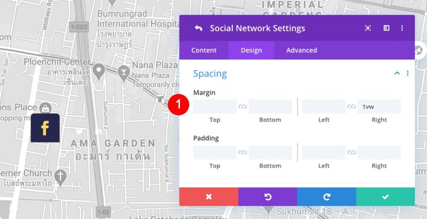
Item Spacing
Then, add a small margin to separate the icons from each other.
- Right Margin: 1vw
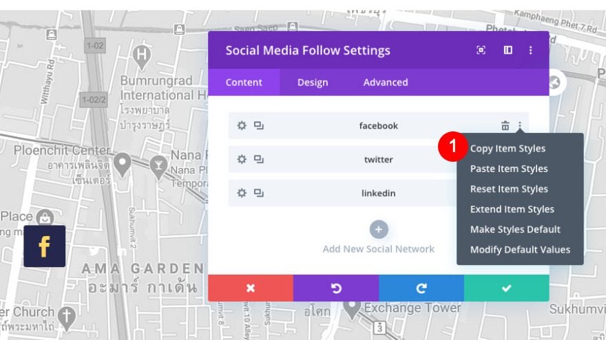
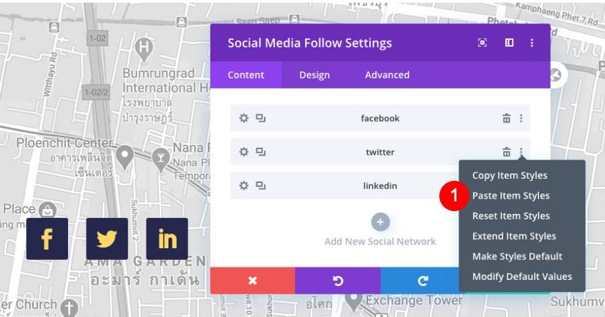
Copy and Paste Item Styles
To style the remaining social networks, go back to the main content window and copy item styles of the first icon. Then, paste the item styles on the remaining social networks.
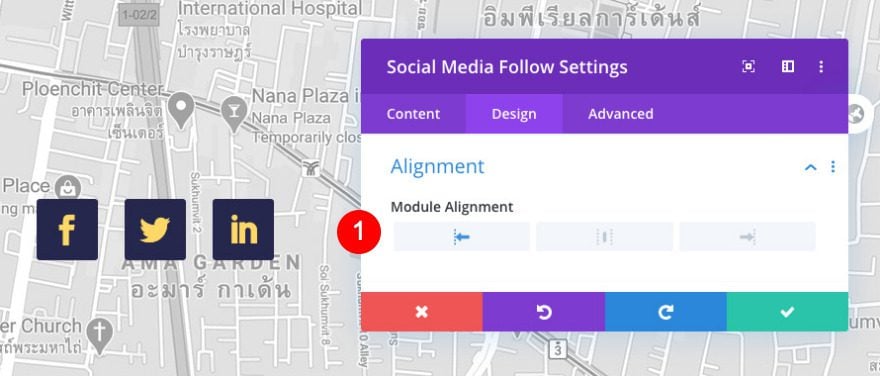
Alignment
Move on to the main design tab and make sure the module is aligned to the left.
- Module Alignment: Left
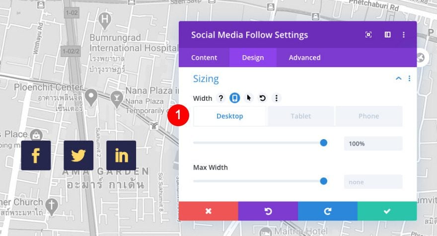
Sizing
Then, adjust the sizing of the module.
- Width: 100%
Spacing
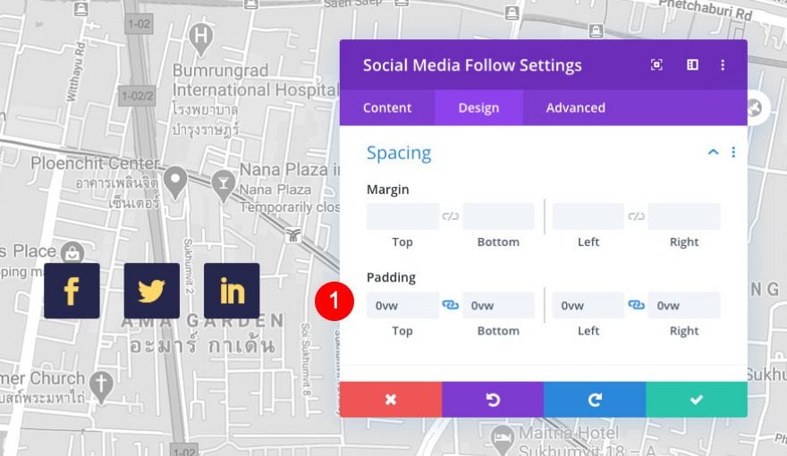
Erase all default padding too.
- Top, Bottom, Left and Right Padding: 0vw
Border
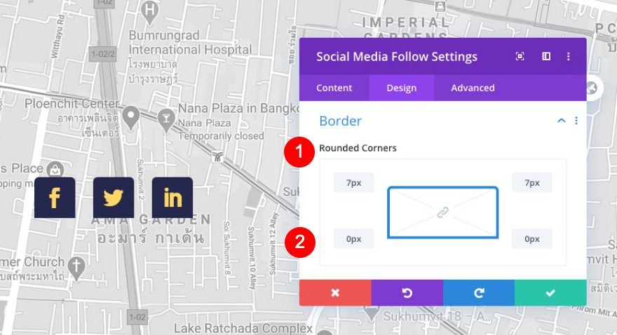
Finally, add some rounded corners in the border settings. This will adjust the borders for all icons at once.
- Rounded Corners
- Top Left and Right: 7px
- Bottom Left and Right: 0px
Add Text Module to Column 2
Content
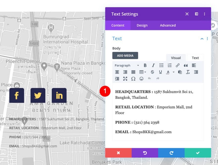
Below the social media module, add another text module. Add some content of your choice. We’ve added two addresses, a phone number, and an email. Use bold on the title of each item in all caps.
- HEADQUARTERS : 1587 Sukhumvit Soi 21, Bangkok, Thailand.
- RETAIL LOCATION : Emporium Mall, 2nd Floor
- PHONE : (321) 564 2398
- EMAIL : [email protected]
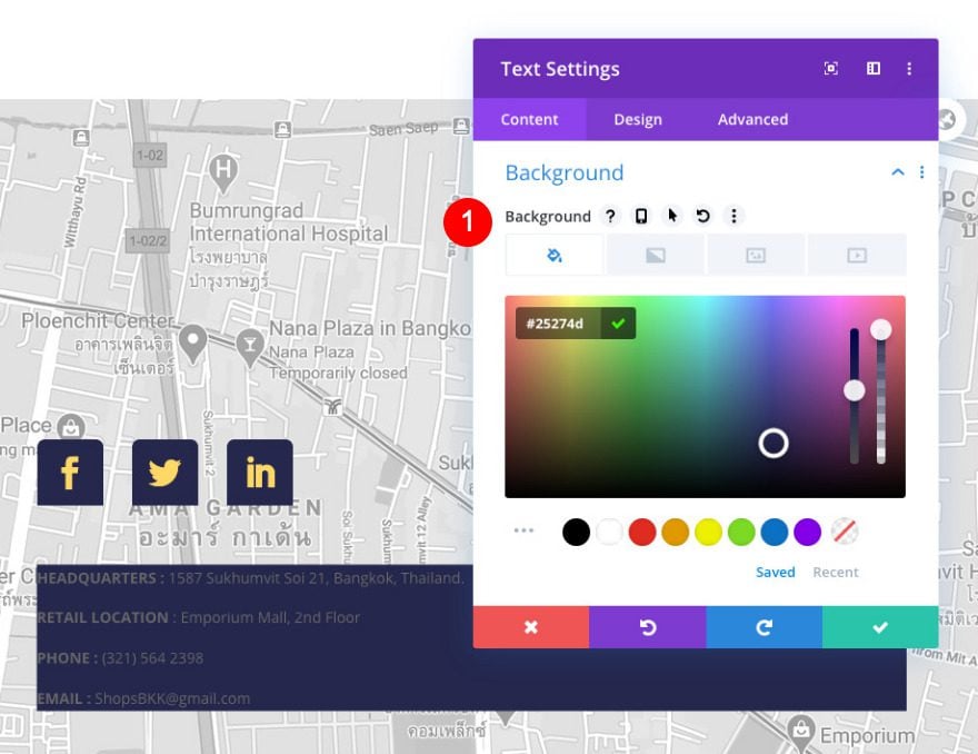
Background
Modify the module’s background color.
- Color: Dark Blue #25274d
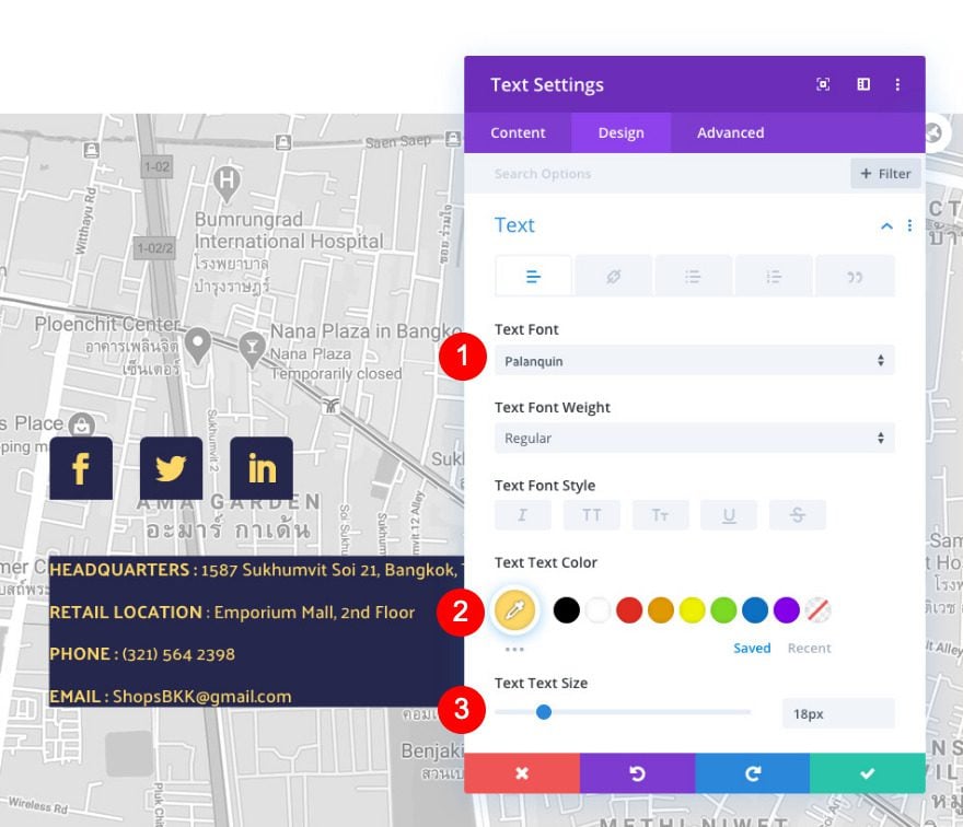
Text
Move on to the design tab and style the text.
- Font: Palanquin
- Color: Yellow #ffd868
- Size: 18px
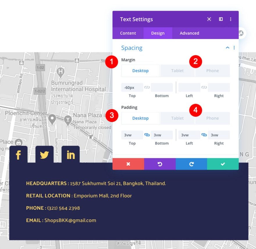
Spacing
Add some custom spacing values too.
- Top margin
- Desktop: -60px
- Tablet and Phone: -50px
- Top, Bottom, Left, and Right Padding
- Desktop:3vw
- Tablet: 6vw
- Phone: 8vw
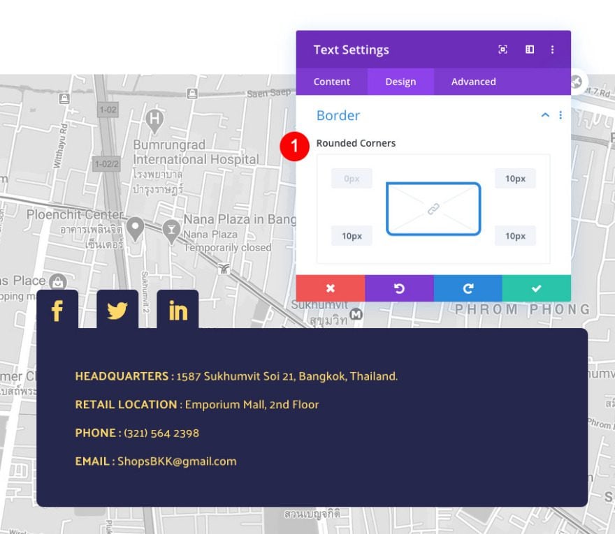
Border
And complete the module by adding rounded corners in the border settings. That’s it!
- Rounded Corners: 10px Top Right, Bottom Left, and Bottom Right.
Preview
Now that we’ve finished recreating the floating contact section, take a final look at the outcome across different screen sizes.
Desktop
Mobile
You’re Done Recreating The Floating Contact Section Layout!
Using the new Divi scroll effects helps turn any standard layout into a superb design. By creating your own map background, you have more control over how the finished design looks. If you have any questions or suggestions, leave a comment in the comment section below!


Hi Orana
Thanks very much for another great post.
I wonder if you could give a bit of advise for me to understand better.
You use both px and vx as measurements – there is text in both and padding in both – what is the rationale particularly for Tab & Mobile wouldn’t vx be better?
TIA and always looking forward to your posts
Tilak
Hi Tilak, thanks for your comment.
I used vx for the spacing that is affected by the scrolling effects so it would look better on all screen sizes.
I used px between modules so that I could control the distance between them regardless of screen sizes.
For example, the social media modules look like they are stuck on to the text module below. A vx spacing wouldn’t have kept those looking like they are “glued” to each other, some screens would have shown a separation.
Thanks very much Orana for a really clear explanation – much appreciated as I was always confused by this.