
Adding a title or a link to an image card sounds simple, but fitting everything in without crowding the layout is where it gets tricky. Put all the content outside the image and the card can feel busy. Leave the image on its own and the layout can feel unfinished.
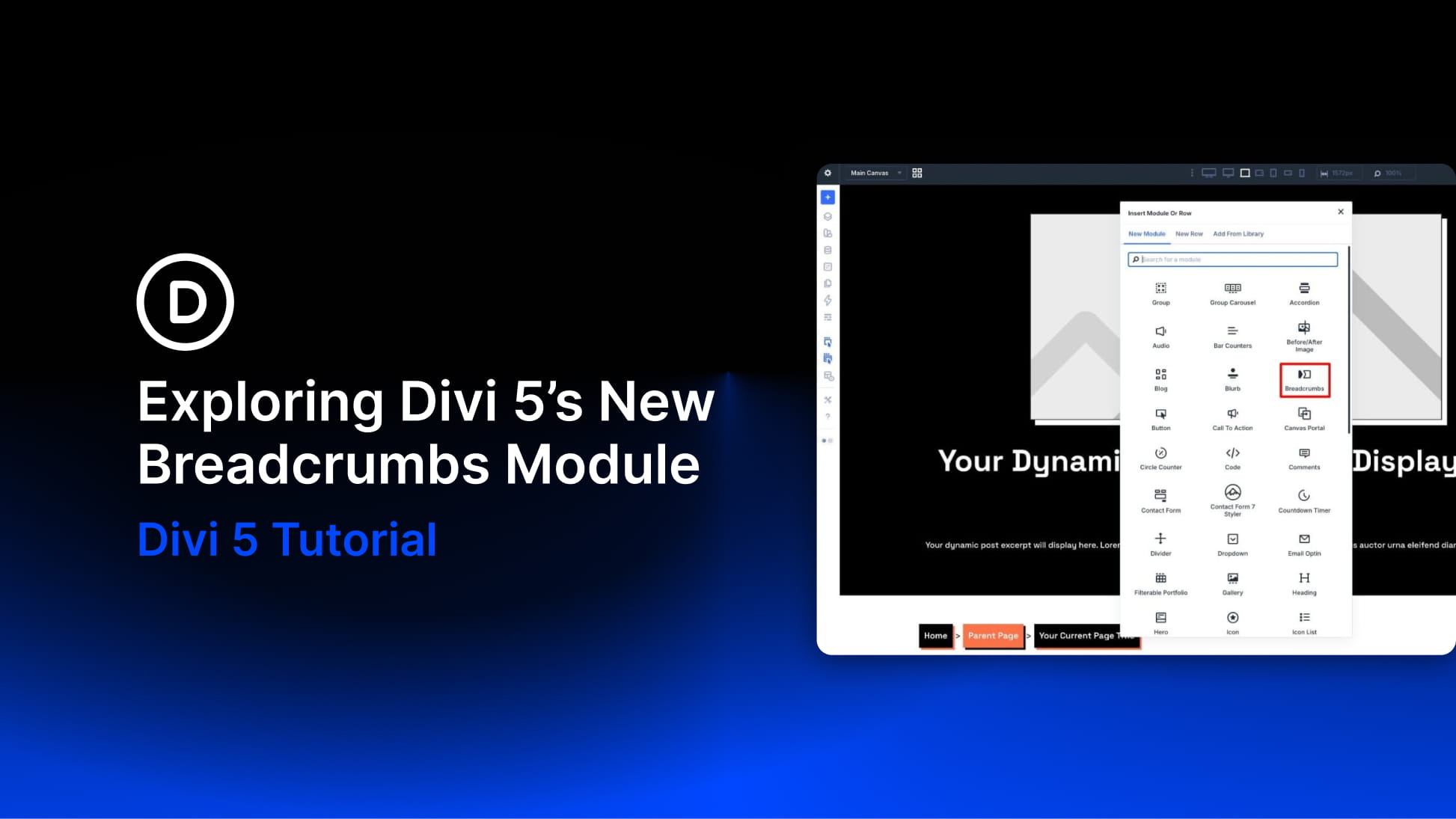
In this tutorial, we’ll build an interactive image-card carousel in Divi 5 using the Group Carousel module. Each card starts clean, then reveals its title and call to action when a user hovers over it. We will pair that reveal with a subtle image scale effect using Divi 5’s Interactions system.
- 1 What We’re Building
-
2
Step-By-Step Tutorial
- 2.1 Step 1. Create The Carousel Layout
- 2.2 Step 2. Build The First Carousel Card
- 2.3 Step 3: Hide The Content Group On Page Load
- 2.4 Step 4: Reveal And Hide The Content On Hover
- 2.5 Step 5: Add Image Scaling On Hover
- 2.6 Step 6: Add Transitions For A Smoother Reveal
- 2.7 Step 7: Duplicate And Customize The Remaining Slides
- 2.8 Step 8: Adjust The Carousel For Different Screen Sizes
- 3 Build Your Image Carousel In Divi 5 Today!
What We’re Building
This design example uses Divi 5’s Group Carousel module, with each slide acting as a container for a layered image card. A parent Group holds the card, an Image module provides the visual base, and a nested content Group holds the heading and button. That structure matters because Divi 5 Interactions can target labeled elements independently, letting you control the reveal without affecting the rest of the slide.
By default, each card shows only the image. On hover, two things happen at the same time: the image scales slightly inside its container, and the hidden content fades into view. Both behaviors are handled with Divi 5’s built-in Interactions and Transition settings.
Step-By-Step Tutorial
This build comes together in eight steps, starting with the carousel layout and finishing with the hover interactions, transitions, duplication workflow, and responsive adjustments.
Step 1. Create The Carousel Layout
Add a new Section to your page and set the Background Color to Black (#000000).
Next, set the Row Width to 70% and keep it center-aligned. Inside the row, add the Group Carousel module.
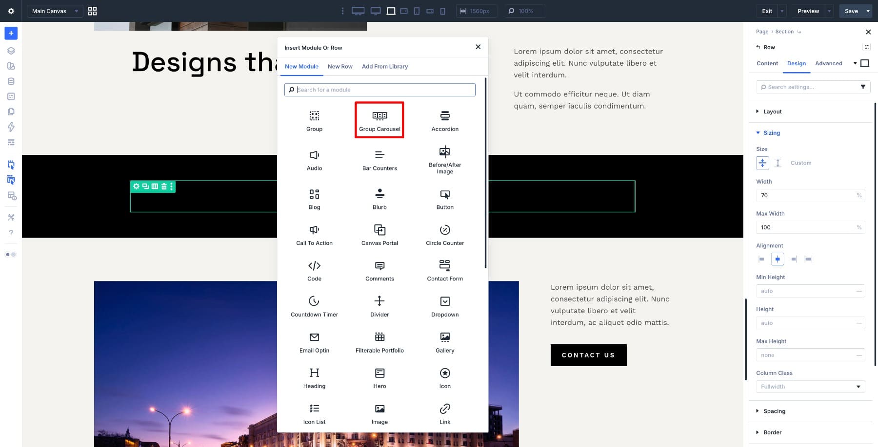
The Group Carousel module works well here because each slide can hold multiple Divi modules, not just a single image or text field. That makes it ideal for layered cards like the one we are building.
Once the module is in place, go to Content > Carousel Settings and set it to display 3 Slides. Then enable Automatic Rotation and Center Mode.
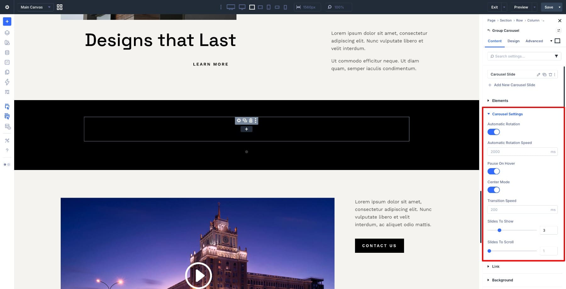
Three slides keep the layout readable on desktop, center mode puts more visual emphasis on the middle card, and automatic rotation adds motion before the user interacts with anything.
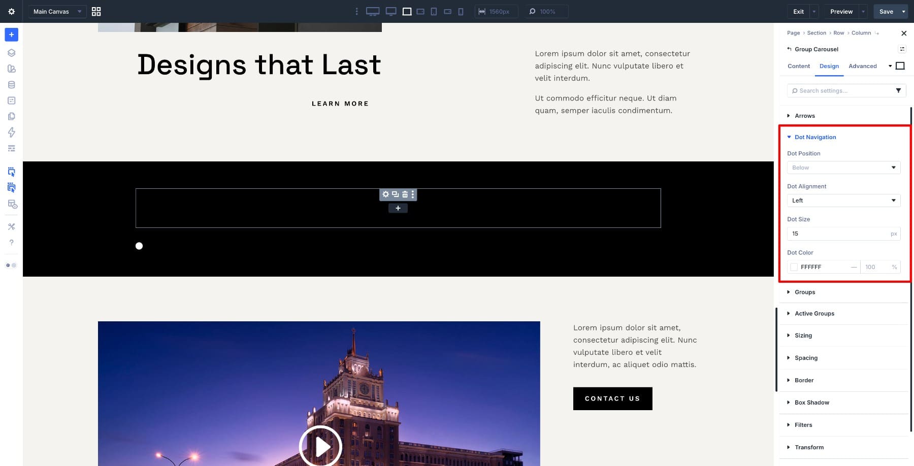
Next, open the Dot Navigation settings and set the position to Left. Then change the dot color to White so it remains visible against the dark background.
With the carousel in place, the next step is to build the first card inside it.
Step 2. Build The First Carousel Card
Select the first Carousel Slide and set its Padding to 20px so the card has breathing room inside the slide.
Next, add a Group inside the slide to act as the main card container. Then add an Image Module inside that Group and upload your image.
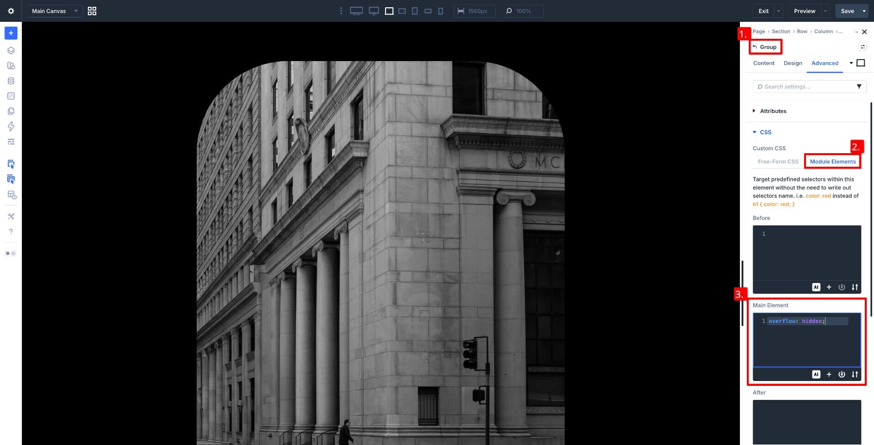
Select the parent Group and apply a Border Radius to shape the card. Apply the same radius to the Image Module so both edges align visually. To keep the image neatly cropped when it scales on hover, set the parent Group’s Overflow to Hidden in the Advanced tab.
Now add a second Group inside the same parent container to hold the card content. Place a Heading Module and a Button Module inside it for the title and call to action. Use spacing and positioning controls to place this content group toward the lower part of the card.
At this stage, everything is visible. In the next step, we will hide the content group on load so the card returns to its clean default state.
Step 3: Hide The Content Group On Page Load
Select the content group inside the card. Open the Content tab and scroll to Meta > Element Label. Give it a clear name, such as Meta Angles.
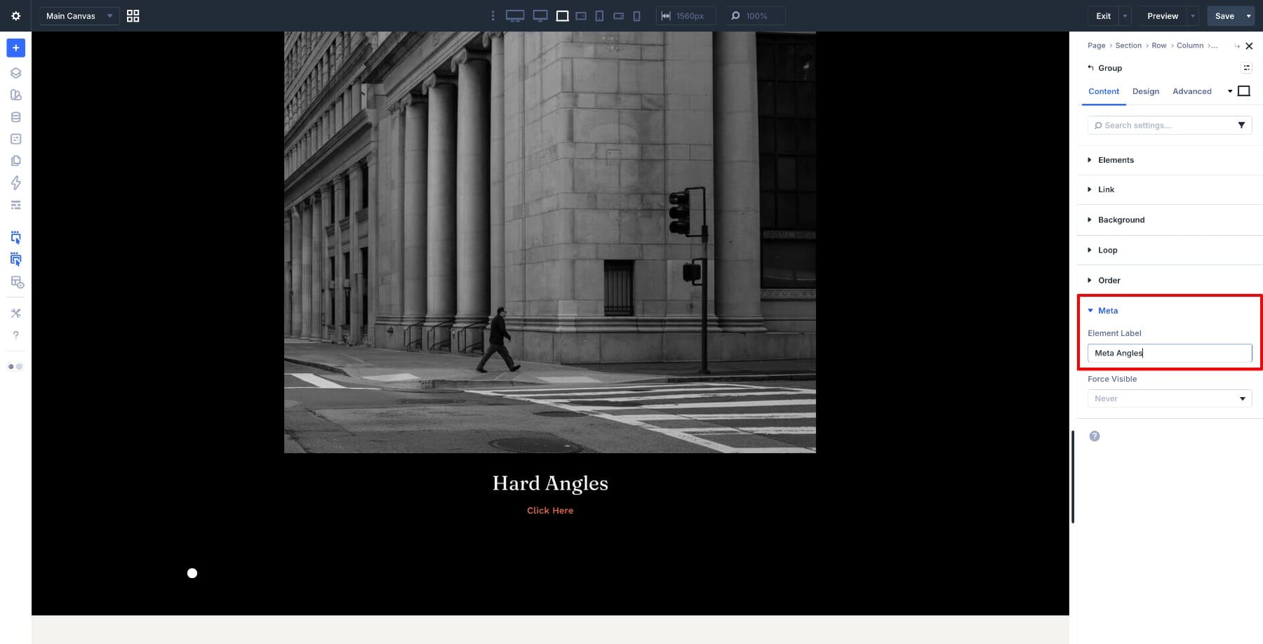
Divi 5 Interactions can target labeled elements directly, so this label is what lets you show and hide the content group later.
Next, open the Interactions panel and add a new interaction. Set the trigger to Load, the action to Hide Element, and choose Meta Angles as the target. When the page loads, the content group will be hidden automatically.
Note: You can also hide the content group in the module’s Visibility settings first, which is often a cleaner setup when you want the element hidden by default. This interaction-based method is still useful here because it keeps the hide and reveal behavior inside the same interaction workflow.
With the content group hidden, the next step is to reveal it when the user hovers over the card.
Step 4: Reveal And Hide The Content On Hover
Select the Image Module inside the card and open the Interactions panel. Add a new interaction, set the trigger to Mouse Enter, and set the action to Show Element, targeting the Meta Angles group.
If you want, you can add a second interaction to the same Image Module. Set the trigger to Mouse Exit, the action to Hide Element, and target the same Meta Angles group. Without it, the content stays visible after the first hover, which turns the effect into a one-time reveal instead of a true hover interaction.
Step 5: Add Image Scaling On Hover
Select the Image Module in the card, then open the Advanced tab. Open the Transform settings and set the default Scale to 100, then switch to the hover state and bring it up to around 105%.
The Group with a matching border radius keeps the scaling contained, so the image grows within the card boundary. If it ever spills beyond the edges, select the parent Group and add overflow: hidden; under the Main Element column in Advanced > Custom CSS.
Both the interaction and the scaling are working now, but neither one eases in or out yet. That’s what we’ll fix next.
Step 6: Add Transitions For A Smoother Reveal
Select the Image Module and open the Advanced tab. Scroll to Transition, set the Duration to around 400ms, and choose Ease as the Speed Curve.
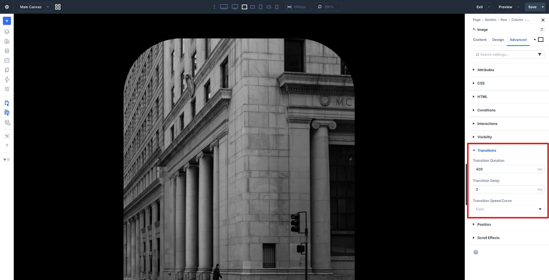
Next, select the Meta Angles group and apply the same transition settings so the content reveal and the image scale feel synchronized.
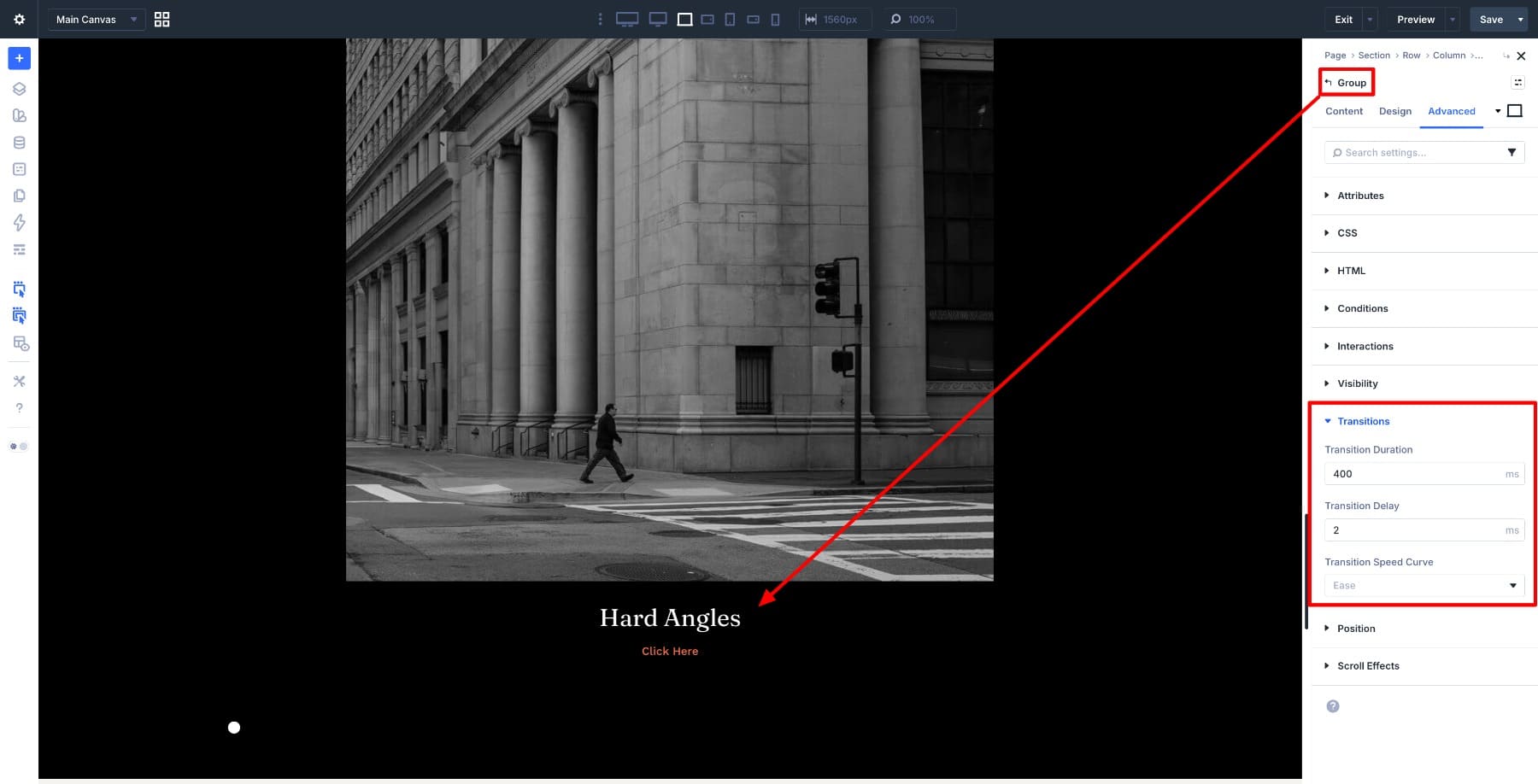
Applying transitions directly to both elements gives you more control over the pacing. The result is a cleaner interaction where the content and image feel like part of the same motion rather than two unrelated effects.
Step 7: Duplicate And Customize The Remaining Slides
Duplicate the first Carousel Slide until you have a total of five slides. This carries over the structure, styling, and interactions so each card starts from the same base.
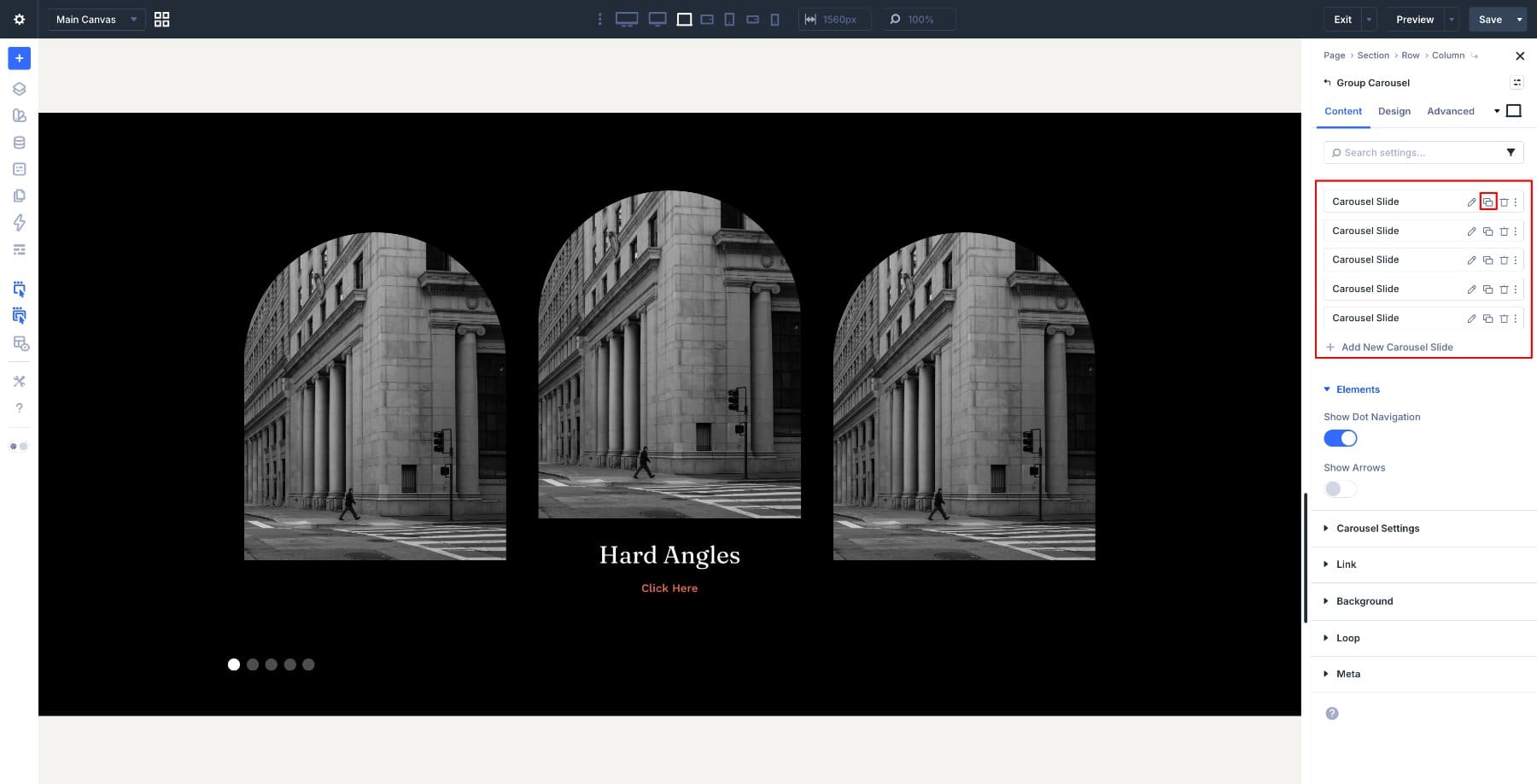
Go into each duplicated slide and replace the image, title, and button text to match your content. As you do, update the Element Label for each content group so every slide has a unique target.
This is important because Divi 5 Interactions target labeled elements. If multiple slides share the same label, the wrong content can respond when the interaction fires.
After renaming the labels, open each slide’s Interactions settings and point the Show Element and Hide Element targets to the correct content group for that slide.
Step 8: Adjust The Carousel For Different Screen Sizes
Open the Group Carousel module and enable the Responsive Editor. In Content > Carousel Settings, adjust the number of visible slides for each device. Keeping 3 slides on desktop, 2 on tablet, and 1 on mobile gives each card enough room without crowding the layout.
Also test the interaction on touch devices. Hover does not behave the same way on phones and tablets, so if the reveal feels unreliable on smaller screens, consider simplifying the card by keeping the content visible there or swapping to a tap-based interaction pattern.
And with that, the carousel is fully built. You now have an image-card layout that stays clean by default, reveals content on interaction, adds a subtle zoom effect, and adapts across screen sizes.
Build Your Image Carousel In Divi 5 Today!
This pattern works because it keeps the card visually simple until the user engages with it. The Group Carousel module gives each slide a flexible structure, and Divi 5 Interactions handle the reveal logic without extra plugins or custom code.
Once you build the first card, the rest of the carousel is mostly repetition: duplicate the slide, swap the content, update the labels, and retarget the interactions. That makes this a practical approach for portfolios, service highlights, product showcases, featured posts, and other image-led layouts.


Leave A Reply