")
Divi is a web designer’s best friend. The visual page builder streamlines the design process and comes supercharged with an impressive ecosystem of Divi products and services, including Divi Cloud, Divi Teams, Divi AI, and more. However, regardless of the current hype around these features, in the world of web design, typography is a foundational design element that cannot be ignored. That’s where Divi’s enormous font library (thanks to our Google Fonts Integration) and robust text styling options come into play.
In this post, we’ll highlight fifteen of the best Divi fonts and combinations for you to try this year, as well as tips and best practices for using them on your Divi site.
About Divi Font and Text Styling Options
Divi offers an extensive range of font and text styling options that allow you to customize the look and feel of your content. You can easily adjust text styles such as size, weight, line height, letter spacing, and font family for any text element on your website.
You can extend Divi’s text design options with third-party plugins from the Divi Marketplace, like Text-On-A-Path, Divi Next Text Plugin, Divi Sensei Fancy Text, and Divi Sensei Typing Text.
15 Best Divi Fonts & Font Combinations
It can be daunting to approach a list of 800+ fonts and try to decide which ones are right for your project. Hopefully, this list (in alphabetical order) will help you cut through the noise and make strong design choices.
I’ve done my best to highlight fonts we haven’t covered on our blog before. In our post 12 Best Google Fonts for WordPress, we covered many popular Google Fonts that tend to be recommended. Some of the most popular Google Fonts for websites include:
- Lato (that’s the font you are reading right now 😁)
- Merriweather
- Poppins (see demo)
- Playfair Display
- Montserrat
- and more.
The list below consists of additional popular fonts (as well as some hidden gems) that you can try out when designing your Divi websites. They are available in the Divi builder, and many have also been incorporated into our 250+ pre-made Divi layout packs.
The Best Divi Fonts Listed In Order
1. Alegreya Sans
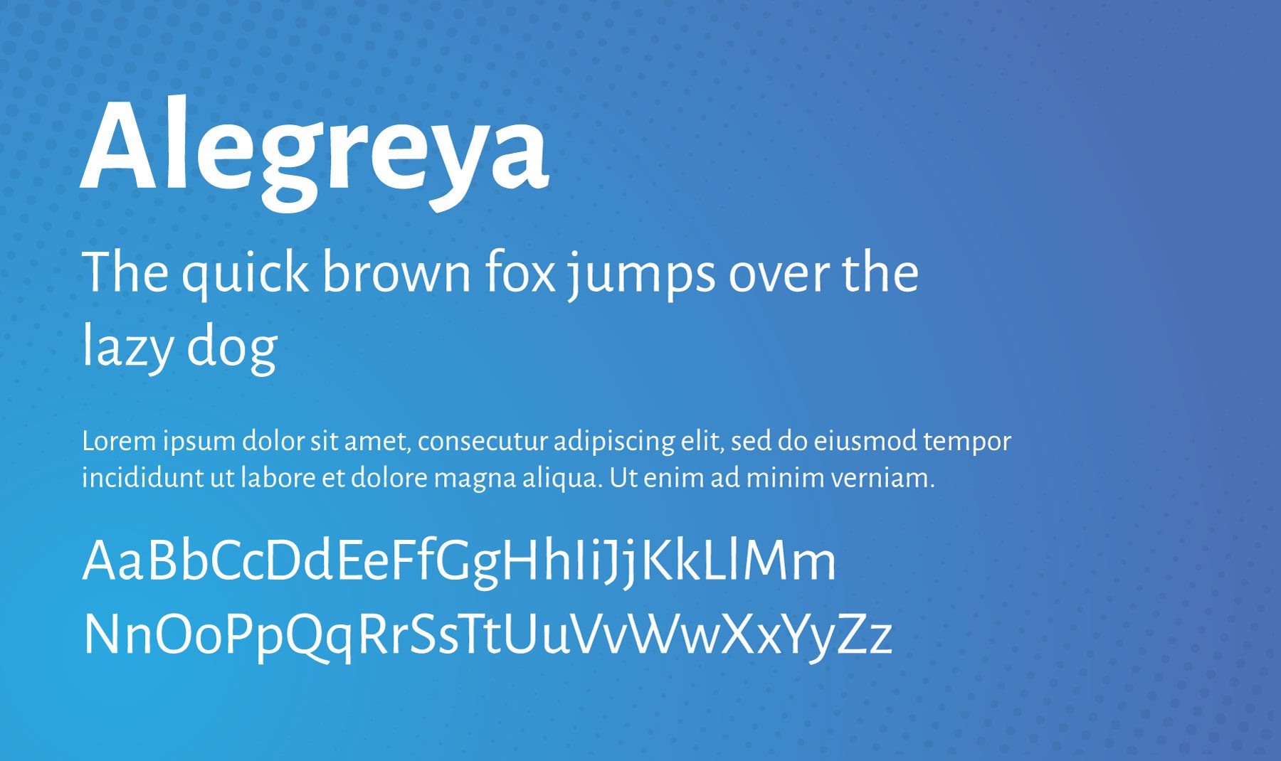
Alegreya Sans is a sans-serif typeface designed by Juan Pablo del Peral for the Spanish foundry Huerta Tipográfica. It has a friendly, relaxed, and approachable character that makes it ideal for web design projects with a softer brand voice. The font family consists of 8 weights ranging from Thin to Black, each of which includes small caps and italics.
Best For: blog posts, landing pages, and any long-form web content that needs a softer feel and is easy to read.
Combine with: Eczar, Open Sans, Lato, Merriweather, Source Sans 3, and Gowun Batang.
2. ASAP
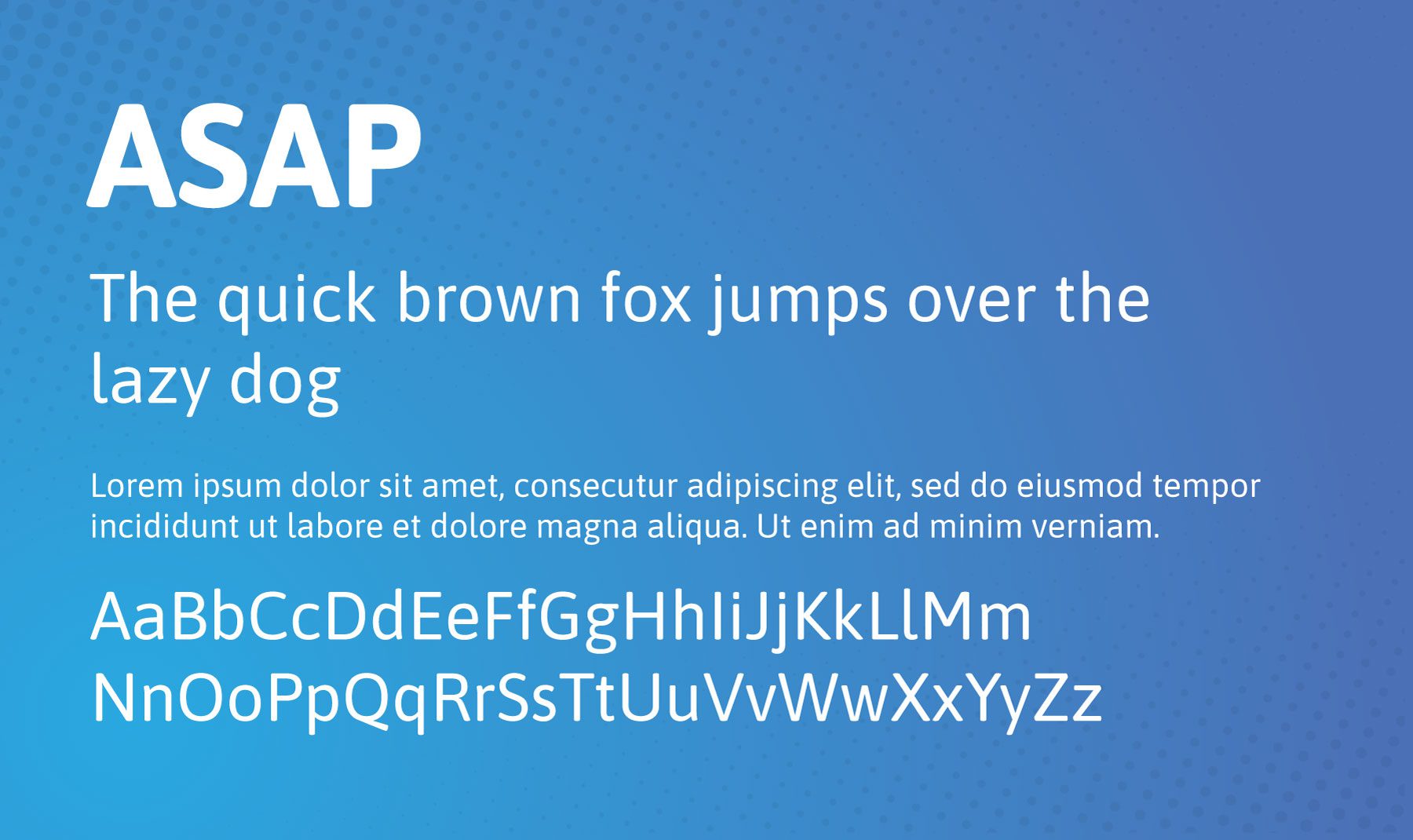
ASAP is a modern sans-serif typeface designed by Dušan Jelesijević. Its clean, minimalistic style makes it perfect for websites that want to convey a contemporary yet timeless brand voice. The font family consists of 8 weights ranging from Thin to Black, each of which includes small caps and italics.
Best For: both headings and body text. Due to its clean and modern look, it is particularly effective in tech-related and contemporary web designs.
Combine with: Flamenco.
3. Bitter
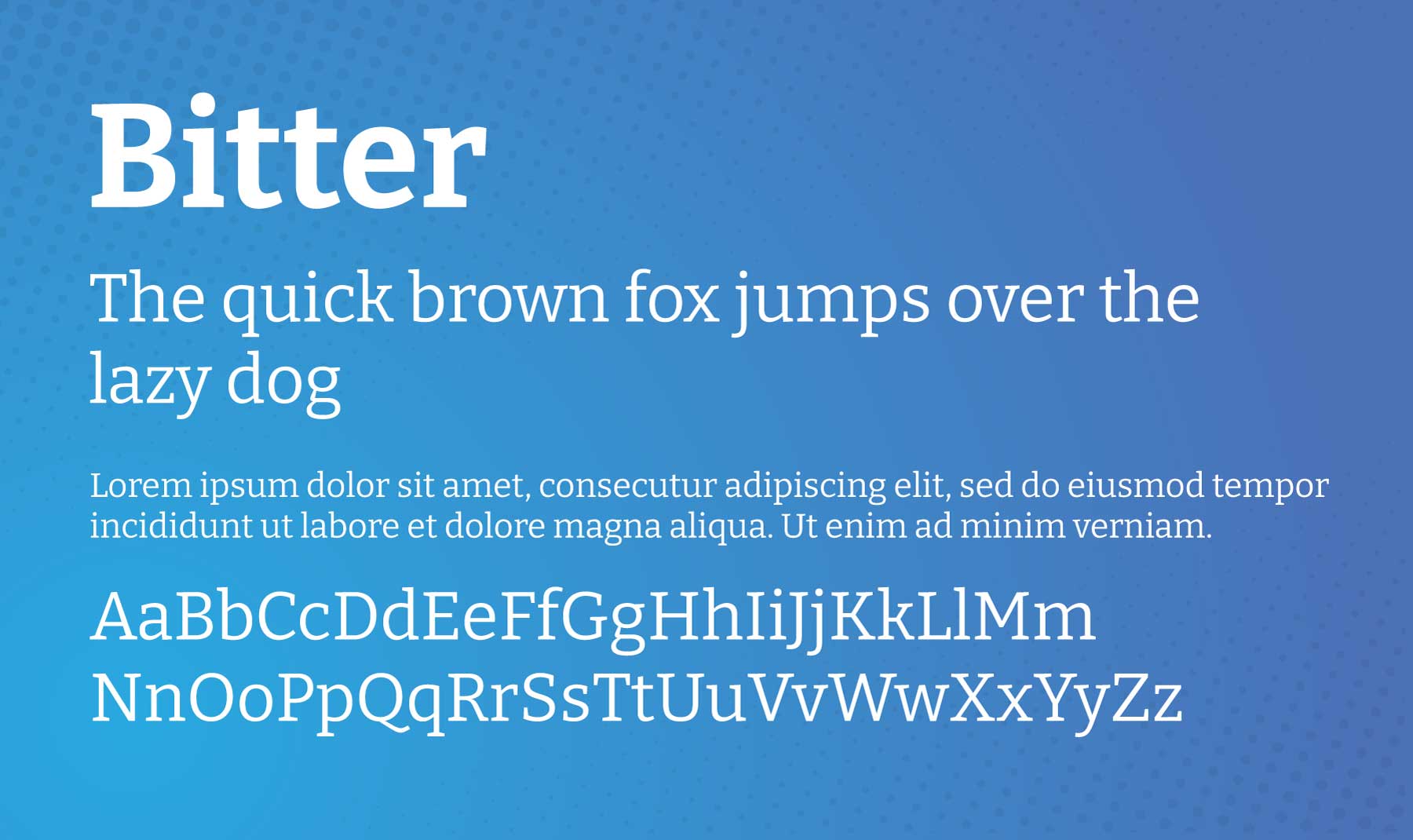
Bitter is a serif typeface designed by Sol Matas for Huerta Tipográfica. It has an elegant and classic feel with a slight hint of quirkiness, making it ideal for websites that want to maintain a sophisticated yet approachable brand voice. The font family consists of 8 weights ranging from UltraLight to Black, each of which includes small caps and italics.
Best For: body text. Can be used for headings too, but really shines when used for blog posts or page copy.
Combine with: Duru Sans, Montserrat, Arimo, Raleway, Roboto, Rubik, PT Sans.
4. Fira Sans
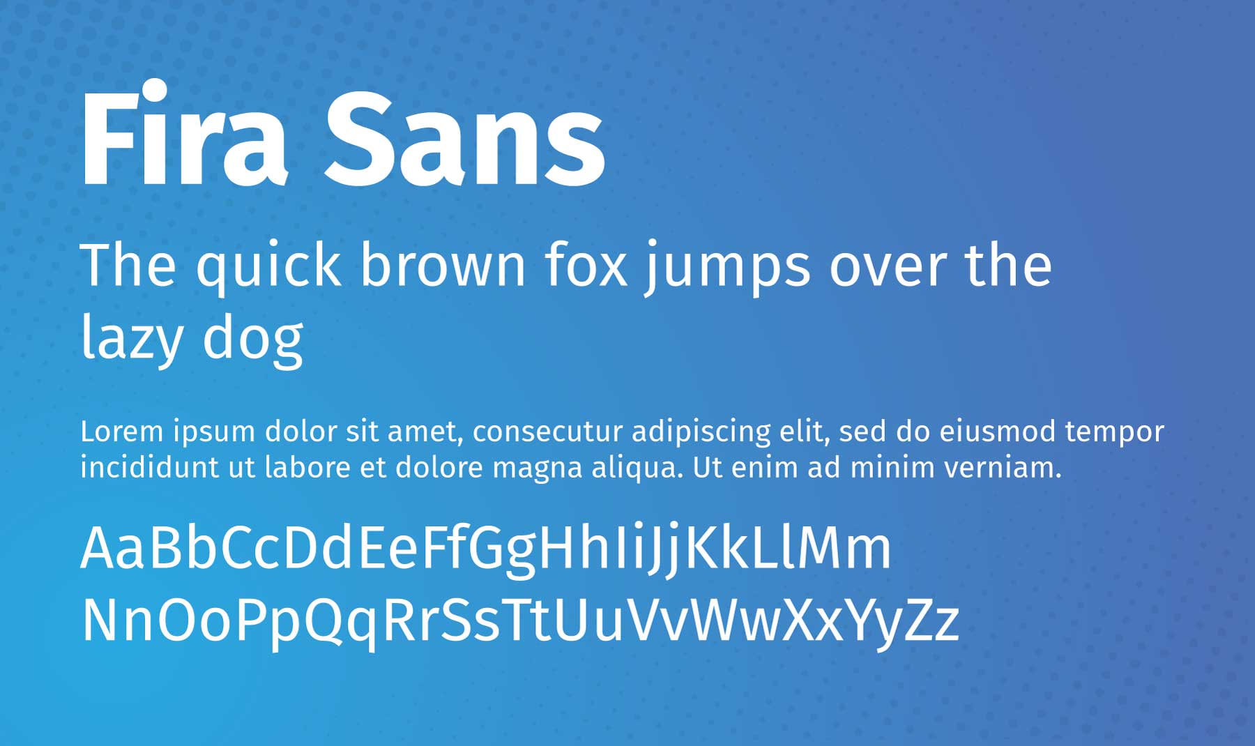
Fira Sans is a sans-serif typeface designed by Erik Spiekermann, Ralph du Carrois, Anja Meiners, and Botio Nikoltchev of Carrois Type Design. It was initially created for Mozilla’s FirefoxOS and aims to provide legibility across various devices.
Best For: both headings or body text. Due to its clean and modern look, it is particularly effective on tech-related websites. But don’t let that stop you from trying it out on different types of websites. Especially since it pairs with so many other Divi fonts so well.
Combine with: Inconsolata, Playfair Display, Montserrat, Lato, Source Sans 3, and Merriweather.
5. IBM Plex Mono
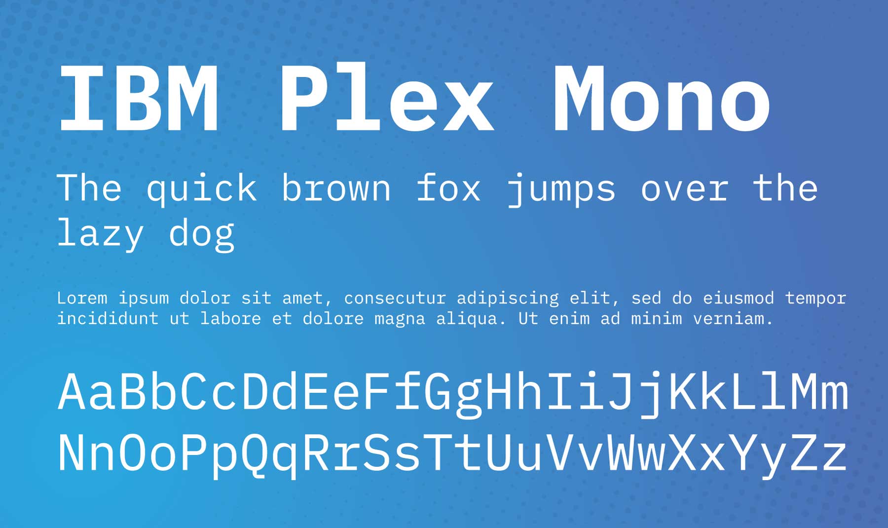
IBM Plex Mono is a monospaced typeface and part of the IBM Plex family, which was designed to embody IBM’s brand spirit and history. The typeface family was created by Mike Abbink and Bold Monday and released in 2017. The Mono variant draws inspiration from the IBM Selectric typewriter.
Best For: headings, body text, and code snippets. Due to its monospaced nature, which ensures that each character occupies the same amount of space, it’s easy to read and understand on screens. All of which makes it perfect for blog posts. If you have a retro-tech theme, even better!
Combine with: Roboto, Oswald, and Playfair Display.
6. Inter
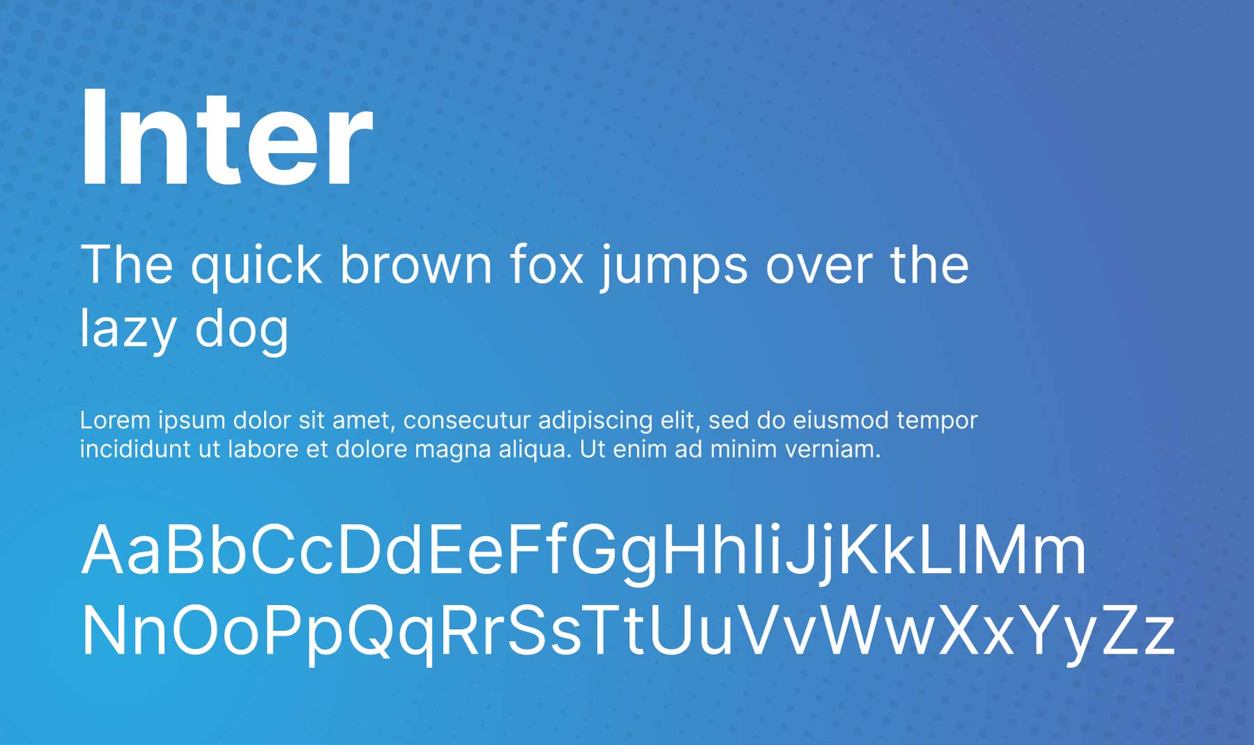
Inter is a versatile sans-serif typeface designed by Rasmus Andersson. It is optimized for readability in user interfaces, making it a popular choice for digital design. One of its distinctive features is the large x-height, which improves legibility at small sizes. It also supports various languages and scripts, including Latin, Greek, and Cyrillic.
Best For: user interface design elements. Use this font for menus, meta-text, breadcrumbs, CTAs, and more. Try pairing it with the fonts below to see which works best for you.
Combine with: Domine, IBM Plex Serif, Source Sans 3, Ovo, Rosarivo, Work Sans, and Favorit.
7. Kanit
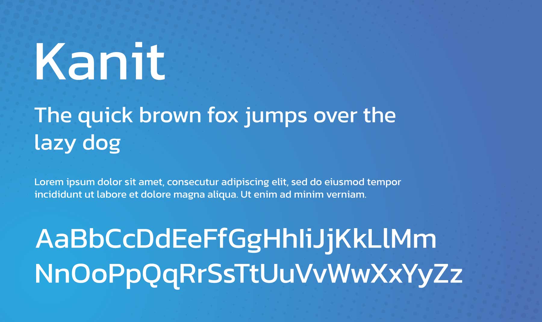
Kanit is a sans-serif typeface designed by Cadson Demak, a Thai-type foundry. The name Kanit means “mathematics” in Thai, indicating its geometric design basis. It’s a modern, futuristic-looking font with a unique personality, featuring rounded corners and semi-wide letter spacing. It supports Latin and Thai scripts, making it an excellent choice for multilingual environments.
Best For: news, science, security, and other brand types with a serious rather than casual tone. It’s suitable for both headlines and body text.
Combine with: Hind, Montserrat, Maitree, Archivo.
8. Libre Franklin
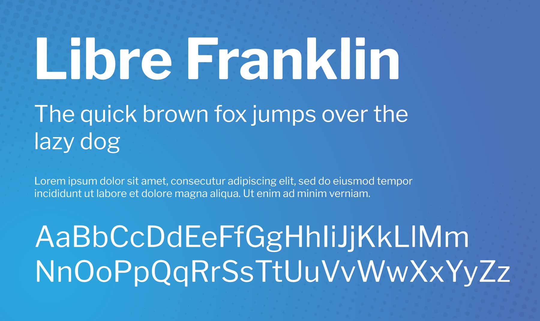
Libre Franklin is a reinterpretation and expansion of the classic 1912 typeface by Morris Fuller Benton, Franklin Gothic. The project was led by Impallari Type, with the goal of creating an open-source alternative. Libre Franklin is a friendly sans-serif font that supports complex branding and web design projects, making it perfect for tech and modern applications.
Best For: digital interfaces, text, and headings due to its strong, neutral appearance. The font’s wide range of weights also allows for much flexibility when creating a visual hierarchy in your design. Making it a good font for structure content like blog posts.
Combine with: Neuton, Libre Baskerville, Public Sans.
9. Newsreader
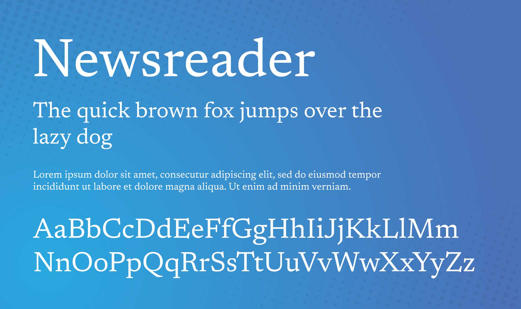
Newsreader is a unique serif typeface designed by Production Type. Google Fonts commissioned it to be used for continuous, on-screen reading in content-rich environments like news websites. Newsreader is highly versatile and comes in various styles, from Extra Light to Extra Bold. It’s primarily intended for longer-form reading, making it an excellent choice for blogs, articles, and digital books.
Best For: long-form blog posts, case studies, reports, or anything that requires a lot of reading.
Combine with: Arimo.
10. Noto Serif
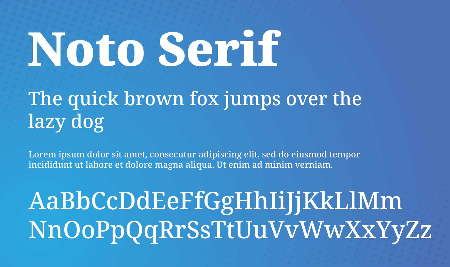
Noto Serif is a versatile and comprehensive font family developed by Google. This modulated serif font (meaning the thickness of the stroke varies throughout each character) supports Latin, Cyrillic, and Greek scripts, making it suitable for various languages and applications. Noto Serif is known for its adaptability, providing a harmonious typographic system.
Best For: body text and headlines, offering good readability and aesthetic appeal. If you have a multilingual website with an audience that speaks Greek or a Cyrillic language this is a solid choice.
Combine with: Noto Sans JP, Open Sans, Source Sans 3, Bebas Neue, Lato, and Oswald.
11. Nunito
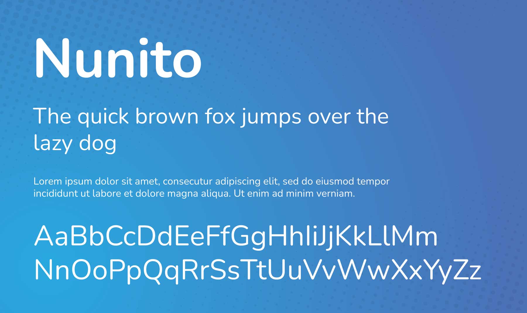
Nunito is a well-balanced, sans-serif typeface superfamily created by Vernon Adams. It features a rounded terminal sans design and is known for its thin, uniform stroke widths, making it highly readable and suitable for both body and display copy.
Best For: display text and headings–such a quotes, reviews, or blurbs on a landing page. It’s also good for design portfolio, finance, development, and agency websites.
Combine with: Asul, Domine, Teko, Vampiro One, Montserrat, Marcellus, Oswald.
12. PT Sans
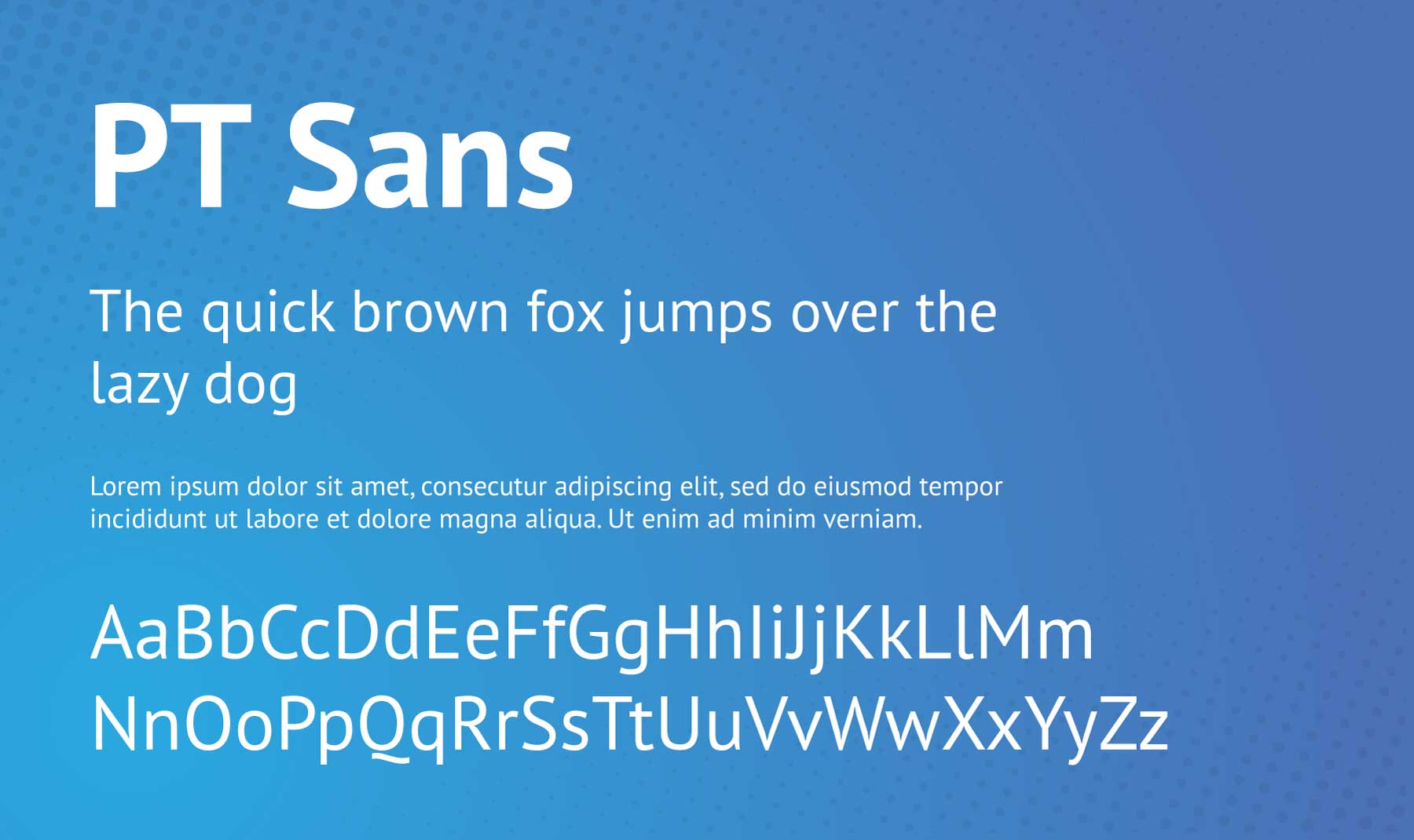
PT Sans is a universal sans-serif typeface designed by Alexandra Korolkova, Olga Umpeleva, and Vladimir Yefimov. Released by ParaType in 2009, it was developed as part of the “Public Types of Russian Federation” project. PT Sans is useful in many applications, from web to print, due to its high readability and clean design.
Best For: long-form reading materials such as blog posts, case studies, or reports. Its various weights also allow for flexibility when creating a visual hierarchy in your web design.
Combine with: Rubik, Playfair Display, Lato, Inconsolata, Poppins, Tenor Sans, IBM Plex, Vollkorn SC, and Nunito.
13. Questrial
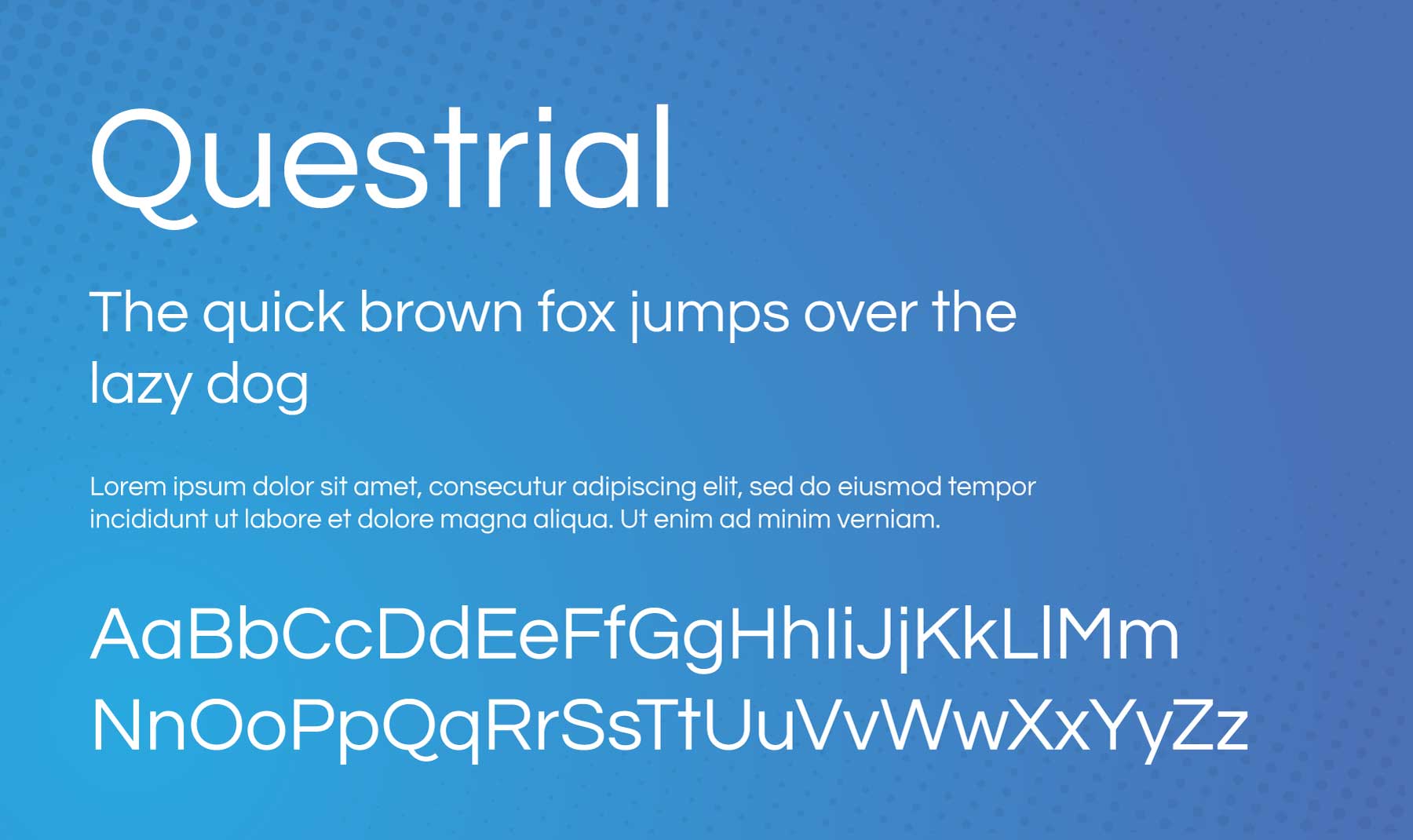
Questrial is a sans-serif typeface designed by Joe Prince. It offers a modern style that’s complemented with characteristics of classic typefaces. Questrial has somewhat short and extended letterforms, which can be useful in various design contexts.
Best For: post or page text and headings. Its clean and neutral aesthetic makes it ideal for web design projects that need to communicate elegance, class, and a dash of whimsy. (Just look at that deceptively playful “Q”!)
Combine with: Quattrocento.
14. Recursive
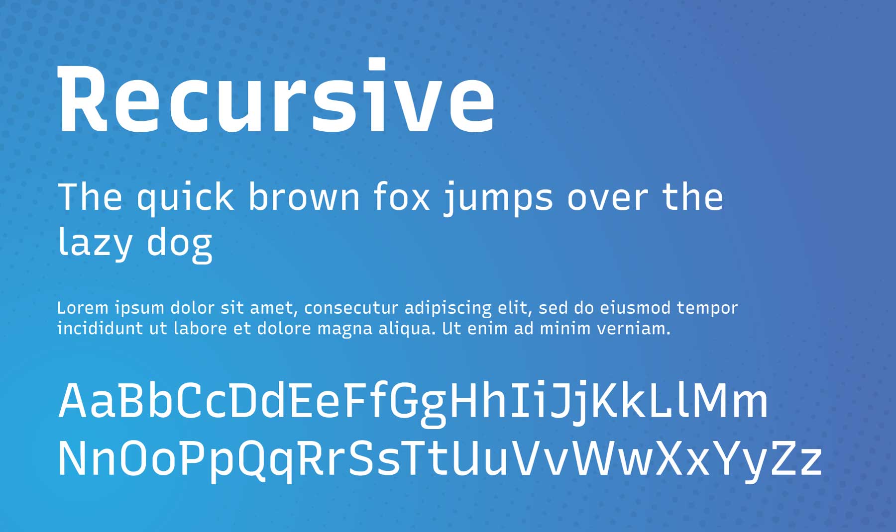
Recursive is a unique, versatile typeface created by Arrow Type. It offers a wide range of predefined styles, drawing inspiration from single-stroke casual, a style of brush writing used in sign painting, but is primarily designed to meet the needs of digital screens.
Best For: user interface design elements, display text, code snippets, infographics, and headings. Examples would include menus, breadcrumbs, code snippets in blog posts, case studies, customer reviews, and more.
Combine with: Nunito, Rubik, and IBM Plex Sans.
15. Vollkorn
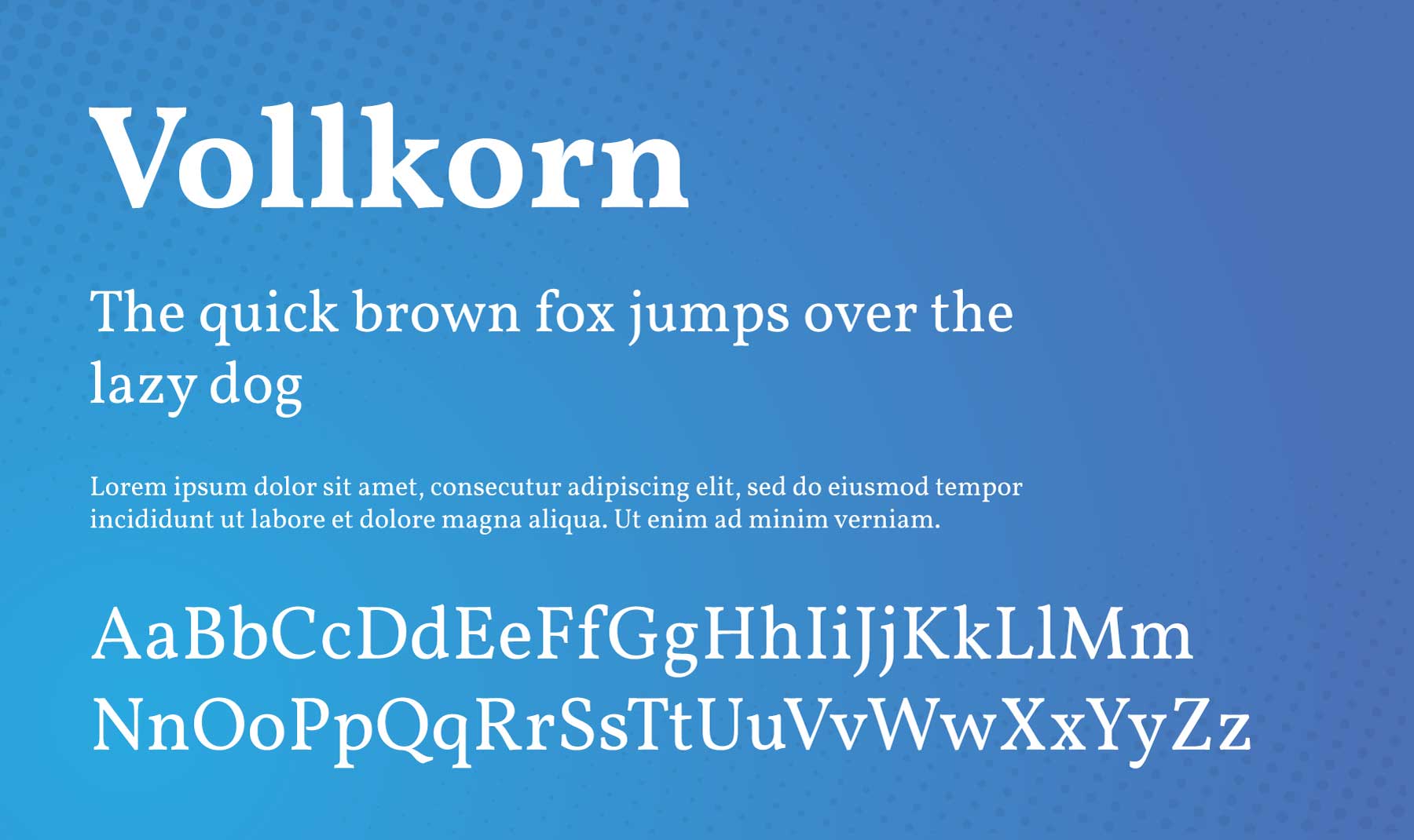
Vollkorn is a serif typeface designed by Friedrich Althausen. It was one of the earliest fonts to be included in Google Fonts in 2010. Vollkorn, which means “whole grain” in German, is intended to be a quiet, modest, and functional typeface for broad use.
Best For: body text, headlines, blurbs, and CTAs. It’s a font that can do it all. Its subtle characteristics make it a great choice when you need a font that’s readable and practical, yet still injects a bit of personality into your website.
Combine with: PT Sans, Poppins, Lato, Montserrat, Source Sans 3.
Honorable Mentions
When dealing with hundreds of fonts, it can be challenging to determine the “best” ones. The fonts below made my list of finalists for this post. If you didn’t find the font you’re looking for above, these are worth checking out.
Tips and Best Practices for Using Divi Fonts
Once your font (or fonts) are selected, we recommend a few tips and best practices for getting the most out of them within Divi.
Upload Custom Fonts with drag-and-drop
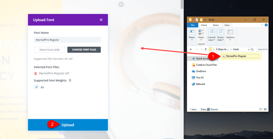
If you don’t find a font within Divi’s extensive font options, you can always use Divi’s Drag and Drop functionality to upload your custom fonts.
All you have to do is drag the OTF or TTF font file onto a page where the Divi Builder is enabled. A dialog box will automatically appear, prompting you to upload the font. It will even allow you to replace existing fonts with newly uploaded ones!
Add Text Gradient Designs with Divi AI
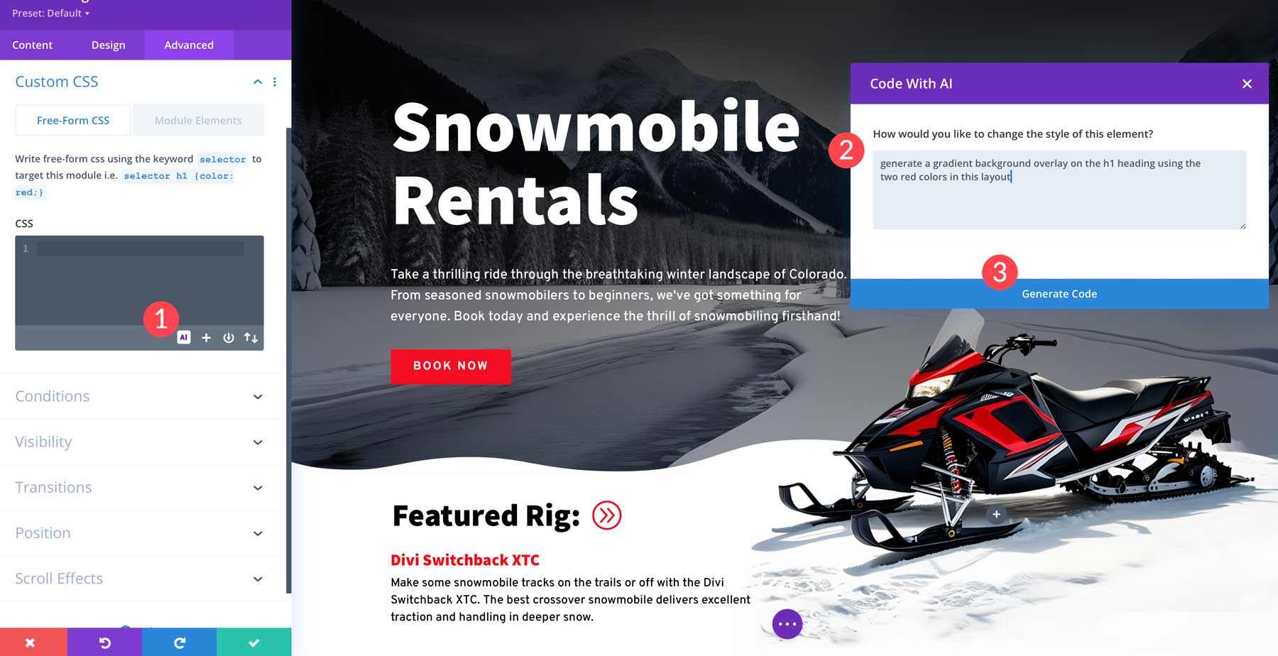
Divi AI opens up seemingly endless possibilities for custom design effects. For example, you can use Divi AI to add custom CSS to typography elements. In this example, we’ve used Divi AI to add a gradient overlay to this heading via a simple prompt: “Generate a gradient background overlay on the h1 heading using the two red colors in this layout.”
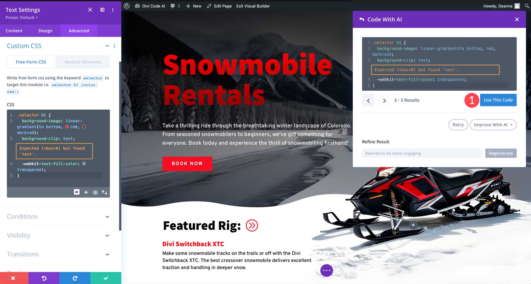
Enable the Divi Builder on any page to try this out for yourself. Then, select a text module with a heading, navigate to the Advanced tab > Custom CSS, and click the AI button. After that, type your prompt in the new dialogue box and watch Divi AI go to work.
Enable Google Fonts Caching
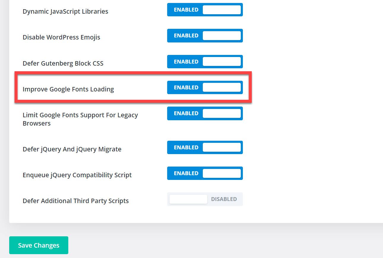
Finally, to ensure your site is operating at its optimal performance level, you’ll want to ensure you’ve enabled Google Font caching in Divi’s Theme Options. To do so, navigate to Divi Theme Options > General > Performance. Then, make sure you have the toggle next to “Improve Google Fonts Loading” enabled.
Best Divi Fonts: Summary and Conclusion
Divi comes loaded with over 800 fonts, easy-to-use text design settings, and advanced tools like Divi AI that open up endless design possibilities. In this post, we’ve covered fifteen of the best fonts available in Divi and some honorable mentions, all worth consideration for your next project.
You may also want to see what else is possible with Divi and text-based designs. These tutorials are a great place to start:
- How to Create Curved Text Designs in Divi
- How to Create Stunning Text Designs Using Section Dividers in Divi
- How to Animate Letters for Unique Text Designs in Divi
- How to Use Text as an Abstract Design Element in Divi
- The Complete Guide for Creating Fluid Typography in Divi (6 Methods)
You can take things even further with text-based extensions from the Divi Marketplace.
Featured Image via Vladimir Ivankin / shutterstock.com


That’s a pretty selection of fonts that I otherwise wouldn’t have known about.
Thanks.
Nice, thank you so much and i think there should be a better way to display the different Divi fonts, hovering over each and every font is not ideal at all
nice fonts, thanks!